City, University of London Institutional Repository
Citation: Goodwin, S., Dykes, J., Jones, S., Dillingham, I., Dove, G., Duffy, A., Kachkaev,
A., Slingsby, A. and Wood, J. (2013). Creative User-Centered Visualization Design for
Energy Analysts and Modelers. IEEE Transactions on Visualization and Computer Graphics,
19(12), pp. 2516-2525. doi: 10.1109/TVCG.2013.145
This is the accepted version of the paper.
This version of the publication may differ from the final published
version.
Permanent repository link: http://openaccess.city.ac.uk/id/eprint/2618/
Link to published version: http://dx.doi.org/10.1109/TVCG.2013.145
Copyright and reuse: City Research Online aims to make research
outputs of City, University of London available to a wider audience.
Copyright and Moral Rights remain with the author(s) and/or copyright
holders. URLs from City Research Online may be freely distributed and
linked to.
City Research Online:
http://openaccess.city.ac.uk/
[email protected]
1077-2626/13/$31.00 © 2013 IEEE Published by the IEEE Computer Society
Accepted for publication by IEEE. ©2013 IEEE. Personal use of this material is permitted. Permission from IEEE must be obtained for all other uses, in any current or future media, including reprinting/ republishing this material for advertising or promotional purposes, creating new collective works, for resale or redistribution to servers or lists, or reuse of any copyrighted component of this work in other works.
Creative User-Centered Visualization Design
for Energy Analysts and Modelers
Sarah Goodwin, Jason Dykes, Sara Jones, Iain Dillingham, Graham Dove, Alison Duffy,
Alexander Kachkaev, Aidan Slingsby, and Jo Wood,Member, IEEE
CHANGE PROPORTION OF APPLIANCE CONSUMPTION SHIFTED FROM ‘SHRINK’
PERIODS TO ‘GROW’ PERIODS TOOLS FOR
DATA SCULPTING CONSUMPTION WILL SHRINK
DURING THIS PERIOD CONSUMPTION WILL GROW
DURING THIS PERIOD
CLICK AND DRAG ON TIMELINE TO SELECT PERIODS
[image:2.612.80.530.144.301.2]SHIFT TO HERE ... FROM HERE CLOTHES DRYER
Fig. 1.Demand Horizonsshow modeled weekday energy demand over 24 hours amongst high consumption domestic appliances.
Data Sculptingallows us to shift consumption interactively by ‘moulding’ the horizons to explore ‘what if?’ scenarios. For example, here fifty percent of ‘Clothes Dryer’ consumption is shifted from the evening peak to a period when overall demand is lower.
Abstract—We enhance a user-centered design process with techniques that deliberately promote creativity to identify opportunities for the visualization of data generated by a major energy supplier. Visualization prototypes developed in this way prove effective in a situation whereby data sets are largely unknown and requirements open – enabling successful exploration of possibilities for visualization in Smart Home data analysis. The process gives rise to novel designs and design metaphors includingdata sculpting. It suggests: that the deliberate use of creativity techniques with data stakeholders is likely to contribute to successful, novel and effective solutions; that being explicit about creativity may contribute to designers developing creative solutions; that using creativity techniques early in the design process may result in a creative approach persisting throughout the process. The work constitutes the first systematic visualization design for a data rich source that will be increasingly important to energy suppliers and consumers as Smart Meter technology is widely deployed. It is novel in explicitly employing creativity techniques at the requirements stage of visualization design and development, paving the way for further use and study of creativity methods in visualization design.
Index Terms—Creativity techniques, user-centered design, data visualization, smart home, energy consumption
1 INTRODUCTION
These are exciting times for utility companies and their energy analysts – the energy domain is data rich and globally significant. Energy an-alysts and modelers are now striving to effectively use the volumes of data from emerging Smart Home technologies to understand consumer behavior, conserve energy and manage supply and demand. Data vi-sualization can offer great potential in this domain, but developing ap-propriate solutions presents considerable challenges, since the nature of the data are relatively unknown and the needs of energy data an-alysts and modelers are not yet well understood. The design brief is therefore essentially open-ended.
• Sarah Goodwin, Jason Dykes, Iain Dillingham, Alexander Kachkaev, Aidan Slingsby, Jo Wood are with the giCentre, City University London. E-mail:{Sarah.Goodwin.1, J.Dykes, Iain.Dillingham.1,
Alexander.Kachkaev.1, A.Slingsby, J.D.Wood}@city.ac.uk.
• Sara Jones, Graham Dove and Alison Duffy are with the Centre for Creativity in Professional Practice, City University London. E-mail:
{S.V.Jones, Graham.Dove.1}@city.ac.uk, [email protected]. Manuscript received 31 March 2013; accepted 1 August 2013; posted online 13 October 2013; mailed on 4 October 2013.
For information on obtaining reprints of this article, please send e-mail to: [email protected].
Here, we report on work in which we augment a user-centered ap-proach to design with techniques for deliberately stimulating creative thinking when establishing context of use and developing require-ments. We do so in the context of an investigation into ways in which a major energy supplier could use visualization to derive value from data that will become available following the wider adoption of Smart Home technology, by producing a series of prototypes to establish vi-sualization possibilities. We evaluate the prototypes in terms of appro-priateness, novelty and surprise and conclude that the creative impetus to our design activity had a long-term effect, contributing to designs that were found to be effective, informative and novel and a process in which creativity flourished. We offer a series of contributions that may be useful in energy visualization and beyond, namely:
i. acreative design case studywhere a user-centered process is aug-mented with means of deliberately stimulating creative thinking; ii. techniquesfor the visualization of a new data source, including methods that contain some novelty, that may be transferable as data of this type becomes more common and voluminous; iii. evaluation ofcreativity methodsin an applied context to support
the contention that deliberately stimulating creative thinking can result in designs that are novel and useful – especially in the con-text of open requirements in problem-driven visualization.
2 APPLIEDCONTEXT
Smart Meter technology enables energy consumption to be recorded for multiple appliances within the home at frequent intervals. Data are reported back to both energy supplier and consumer enabling near real-time feedback on energy use. The European Commission recom-mends all member states adopt intelligent meter technology with the majority to be fully equipped by 2020 [13]. The installation of Smart Meters forms a major component of the shift from passive electric-ity supply to ‘Smart Grids’, which use digital technologies to manage the regulation of energy demand and production, allow for flexible tariffs and provide the potential to communicate directly with Smart Homes or appliances [13]. Advances in Smart Meter technologies are consequently becoming increasingly important to both energy suppli-ers and consumsuppli-ers, whilst data yielded from these new technologies is increasing the volume and value of data available to the industry exponentially [44]. Energy data analysts and modelers are beginning to investigate opportunities to utilize the emerging data to understand consumption trends and consumer behavior [14] and to manage supply and demand effectively through optimization and flexible tariffs [4].
Data visualization and visual analytics offer real opportunities for the analysis of Smart Home data both for the energy supplier and the consumer. On the consumer side, energy use information is reported through a Smart Energy monitor. While this is seen as beneficial in comparison to the traditional energy bill [18] less intrusive forms of consumption awareness are now being investigated [43]. Visualization solutions to enable the energy industry to gain valuable insight into customer habits, identify areas where consumption can be reduced and effectively manage supply and demand levels are, however, scarcely investigated in the literature. The benefits of using visualization to study aggregated household energy use to discover patterns and trends have been highlighted [12], however the data are based on diary entries rather than volumes of frequent automated recordings.
Our research with data analysts from a major UK energy supplier begins to investigate the benefits that data visualization can bring to derive value from the data emerging from Smart Home technologies and opens up opportunities for further research. It uses the two sources of Smart Home data currently available:live datafrom a Smart Home trial andmodeled datasimulating future scenarios. The live data con-tains electricity and gas consumption for all appliances (e.g. refriger-ation unit or television set) as named by owners of a test-bed of 130 properties participating in a Smart Home trial. The data set consists of more than 18 million recordings taken over a 14 month period. It has challenging characteristics: timings are irregular; frequency of record-ings varies significantly – from minutes to days; the sample of house-holds is small (the UK contained 24.6 million househouse-holds in 2012),
self-selecting and biased in terms of geography and demographics. Householders are also inconsistent in the appliances they monitor. The model [17] uses a separate source of detailed consumption data [56] to generate appliance-based energy usage scenarios for any number of households at 15-minute intervals over a given period of time.
Both sources contain numeric information for individual house-holds (modeled or trial participant), such as total electricity consump-tion, consumption by individual appliance or outside temperature, along with the time of the recording. Derived values (average, max, min, count, standard deviation) are calculated in both cases by pe-riod of time (hour, day, week etc.) and by grouping categories (such as appliance type). The model can generate large volumes of data in this form with optimized outputs simulating the shifting and reduc-tion of demand over time. Different outputs reflecting weekday and weekend activity are also available. Daily and seasonal variations in consumption and standby options are modeled with some sophistica-tion for certain appliances. Outputs are somewhat limited however, in that appliance use and distribution of appliances to households are de-termined probabilistically [17] and so may not reflect real ownership or typical household usage patterns. Appliance co-ownership relation-ships are therefore not realistic and neither household demographics nor geographical location are accounted for in the simulation.
3 CREATIVEDESIGNPROCESS
Our design process for exploring the possibilities for data visualiza-tion within Smart Home data analysis followed an established user-centered approach [25, 27]. However, we augmented this by applying a number of creativity techniques [24, 29, 31, 37] early on in the pro-cess. Our aim here was to see whether we could tap into the latent creativity of our target users – the energy analysts – as well as that of the design team. While designers, of visualizations and other arte-facts, may be used to developing creative responses to problems or design briefs, their customers, users, and other stakeholders may not be. We have previously employed such deliberate creativity techniques with air traffic controllers [31] and the police [38], who have not been accustomed to making creative contributions to design. Through the use of techniques such as those described below, they have, in each case, been able to generate requirements and design ideas for new in-teractive systems that were considered both novel and useful. Here we apply these methods alongside our established means of encouraging data owners to engage actively in visualization design and develop-ment [25, 26, 27, 41, 49]. The process is summarized in Fig. 2 with the creativity techniques being inserted in the early stages with the in-tention of introducing a creative climate that we hoped would persist.
3.1 Creative Requirements Workshop
Creativity techniques for use in ourRequirements Workshopwere de-veloped through two internal pilot sessions. Techniques from method-ologies such as creative problem solving (CPS) [37] and Synectics [16] were considered and additional literature reporting similar tech-niques was consulted [22, 34]. These included: aspirational thinking, analogical reasoning, metaphor, constraint removal, storyboarding and random combination. We tried methods out internally and adopted the techniques that were thought to be most practicable and potentially useful whilst rejecting some that might constrain – such as building a priority list or listing ideas based on their complexity. We augmented others, such as an established “I wish” exercise for wishful thinking [33] with prompts specific to the visualization context – “I would like to see”. The methods were refined in collaboration with a professional creative facilitator, who coordinated theRequirements Workshop.
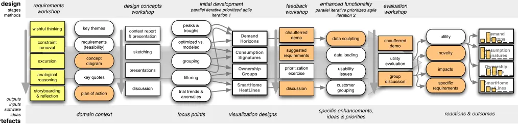
requirements (feasibility) concept diagram key themes key quotes peaks & troughs optimized vs. modeled grouping filtering Demand Horizons Consumption Signatures Ownership Groups SmartHome HeatLines sketching presentations discussion context report & presentation prioritization exercise chaufferred demo suggested requirements data sculpting data loading customer grouping usability issues group discussion chaufferred demo utility evaluation requirements workshop design concepts workshop feedback workshop evaluation workshop design stages methods initial development
parallel iterative prioritized agile iteration 1
enhanced functionality
parallel iterative prioritized agile iteration 2
trial trends & anomalies wishful thinking analogical reasoning storyboarding & reflection constraint removal excursion
focus points visualization designs specific enhancements, ideas & priorities reactions & outcomes
outputs inputs software ideas artefacts domain context
plan of action
[image:4.612.59.566.50.173.2]novelty impacts utility specific requirements Demand Horizons Consumption Signatures Ownership Groups SmartHome HeatLines discussion
Fig. 2. The design process. Rectangles are techniques, those with thick edges represent software prototypes. Concepts are round edged. Arrows show direct links between concepts and prototypes. Other links are implicit and less direct. Yellow indicates deliberate creativity mechanisms. Orange highlights processes and concepts in which creativity amongst analysts was strong. Prototype utility is reported in detail in section 5.
knowledge of the new data sets available to them and the opportunities offered by data visualization were limited.
We began with some warm up activities. These included a playful introduction that encouraged participation and trust-building and in-troduced some analogical thinking by asking all participants “if you were to describe yourself as an animal, what would you be?” Some statements and quotations that emphasized creativity and exploration were also shared – for example, Albert Einstein’s widely reported view that: “if at first, the idea is not absurd, then there is no hope for it.”
3.1.1 Wishful Thinking
The first creativity technique employed in the main part of the work-shop was wishful thinking, in which the energy analysts were asked to think about aspirations for the Smart Home programme. We captured visualization specific ‘opportunity statements’ [23] by asking: ‘What would you liketo know?’, ‘What would you liketo be able to do?’ and ‘What would you liketo see?’ Participants worked individually on Post-it notes in a brainstorming [36] exercise, then read their answers out to the group and placed them on flip-charts. We then asked the participants to form small groups and each was tasked with selecting the Post-it in which they were most interested. To push them further in their thinking, the analysts were asked to consider ‘What next?’ and further aspirations were recorded (again on Post-its) assuming the chosen aspiration(s) had been achieved. The process continued until ideas were exhausted and some initial requirements had been teased out, revealing some of the types of innovation in which participants were interested.
3.1.2 Constraint Removal
After coffee, participants built upon this forward thinking with a con-straint removal activity [24] in which barriers were transformed into a positive resource through which to create new ideas. Our energy analysts were first asked why the aspirations captured on Post-its had not yet been achieved. Once constraints were identified analysts were then asked for creative ideas about what would be possible if the bar-riers were removed to see whether ideas would develop further. A rapid flow of constraints resulted – from hardware technical issues, to people leading complicated lives and being difficult to understand, limited knowledge about Smart Homes, a lack of customer trust, lim-ited time, resources and expertise as well as conflicting business priori-ties. ‘Removing’ some of these constraints unlocked a number of ideas about moving forward: in particular about improving and expanding the product, gaining the trust of customers and the energy industry and deriving value and knowledge from the live Smart Home data source.
3.1.3 Lunchtime Excursion
Lunch was held in an adjoining building during a lengthy break. Par-ticipants were asked to use this time to find something that had a con-nection (however abstract) with the Smart Home programme. This was based on the idea of an ‘Imagery Trek’ in CPS [36] or ‘Excursion’ in Synectics [16]. Both are techniques that can help develop highly novel
or unexpected ideas and assist participants in refining or elaborating their ideas through ‘mental stretching’ [23]. The idea is that partici-pants remove themselves from a task, take a mental or physical journey to seek images or stimuli and then bring these back to make connec-tions with the task. Participants returned from their excursion with all sorts of artefacts including photos of a painting and the view from the lunch room and a copy of Dickens’ ‘Great Expectations’. This activity set the scene for the subsequent analogical reasoning task.
3.1.4 Visualization Awareness using Analogical Reasoning
The analogical reasoning task was an extension of the ‘Visualization Awareness’ activity that is central to our existing human-centered visu-alization design process [10, 25]. Here, however, we began by specif-ically explaining analogical reasoning and giving examples. We then asked the analysts to find analogies applicable to Smart Home visual-ization as they engaged in an otherwise relatively passive visual expe-rience that introduced visualization examples by theme. Participants were given time to consider any aspects of the examples (data, lay-out, interactions, colors, aesthetic) that sparked a connection with the thinking that had occurred during the morning sessions. Reactions were again written on Post-its, and some of the participants created mind-maps to link the different visualizations to their ideas. In total ten analogical ideas arose while watching the visualization demos, in-cluding an idea to show wasted energy flows that was sparked by an animated visualization of millions of bike journeys [55] and an idea for using bubbles of energy consumption increasing and decreasing as used in the home, inspired byEmpires Decline – Revisited[7]. Design requirements identified during the exercise included the need to filter, group and compare data such as by appliance type, temperature, user demographics, time and geography to understand consumption vari-ability. Design elements identified as important included: ‘everything in 3 clicks’, ‘beautiful’, ‘engaging’ and ‘simplicity’.
This activity took longer than planned, largely due to the large num-ber of wide-ranging and increasingly ambitious ideas that surfaced. The session ended with a highly creativePlan of Actionenvisaged for the focus of Smart Home data analysis involving a three stage process to which we could make an important contribution, namely:
1. discover – find out where energy is used;
2. displace consumption – change behavior and control devices; 3. reduce energy production – specifically by the amount needed to
close a power station (power plant).
3.1.5 Storyboarding
Table 1.Wishful Thinkingrevealed in ‘Know/Do/See’ and ‘What next?’ Numbers show total aspirations established at theRequirements Work-shop(Est.) and those deemed feasible by the design team (Feasible).
Activity Aspiration Topic Est. Feasible
Know Customers Habits 10 5
Know Appliance Consumption 6 6 Know The Value of the Data 2 2 Know Visualization Design 2 2 Do Improve Customer Experience 5 2
Do Manage Energy Demand 3 3
Do Advance the Technology 3 0 See Data Analysis & Visualization 8 6 See New Products and Services 1 1
— —————– -
-Next? Change Customer Behavior & Improve Life 5 0 Next? Improve & Expand the Product 6 0 Next? Understand Customer Habits 3 2 Next? Gain Trust & Increase Customers 5 0 Next? Educate Energy Industry & Manage Demand 5 1
Key themes that emerged from the storyboards included the need for greater understanding of consumers’ habits and the desire to under-stand customer behavior by grouping and comparing relevant data.
3.1.6 Reflection
To round off the workshop, participants were asked what they knew at the end of the workshop that they hadn’t known at the outset. Their responses at this point were very positive, both in regard to the possi-bility of developing appropriate visualizations “It’s amazing how many techniques are applicable to energy” and in regard to the workshop it-self “I understand more about the large scope of possibilities.”
Overall the outcomes from the day’s activities allowed us to identify five key themes that can be seen as important to the continuation of the Smart Home programme:Analyze the Data: to understand more about customers’ energy habits and appliance consumption;Develop Knowl-edge: to start to prove / disprove myths and theories of energy saving and behaviors;Communicate and Engage: within the business, and with industry and the general public to manage demand and change behaviors;Build Trust: in the company and the products;Improve and Expand Smart Products: beyond energy to improving comfort and se-curity. The first of these themes links directly with the first stage of thePlan of Action:discover – find out where energy is used(see end of 3.1.4), a key objective in which visualization can play an important role. Improving the understanding of customer and appliance con-sumption will also help pave the way to targeting some of these other themes and reaching the second and third stages in thePlan of Action. The wishful thinking exercise generated 64 aspirations and oppor-tunities of broad scope as shown through their grouping into topics (Table 1). We identified 30 of these as feasible for data visualization solutions in terms of the expertise, data and other resources available.
These key themes and feasible aspirations were reported to design-ers and developdesign-ers in the team at aDesign Concepts Workshop. We also presented other artefacts from theRequirements Workshopto es-tablish the problem domain, describe the analysts’ needs and identify where and how effective data visualization design might be beneficial.
3.2 Design Concepts Workshop: Development Iteration 1
Development took place over a one month period with two iterations using a rapid agile approach. Within each iteration features were pri-oritized using the MoSCoW technique [2] with frequent meetings be-tween designers and developers in the team to re-prioritize and discuss design decisions in light of requirements.
The first iteration began at a half-dayDesign Concepts Workshop
that brought together seven visualization designers and developers (all are co-authors) many of whom had limited background knowledge of the energy industry. We began the session by presenting and sharing the domain knowledge as well as the key themes and ideas from the
Requirements Workshop. Contextual information including the 3 stage
Plan of Action, key themes, feasible aspirations, design requirements, mind-maps and a concept diagram generated in part from these, story-boards and some direct quotes were introduced and then pinned to the walls of the room in order to prompt movement, discussion and idea generation amongst designers. The two energy data sets were also introduced and their structure, provenance and limitations discussed.
Working in pairs we generated ideas, developed sketches and re-ported back to the group with reference to the requirements that the idea was targeting. This enabled us to derive visualization focus points – abstract combinations of task, data and design that form a basis for ongoing development: showpeaks and troughsin daily demand to understand when different appliances are used;compare modeled to optimized solutionsto see whether shifting consumption could help demand management;group and filterconsumption by appliance and types of appliance across time to identify patterns in user behavior; and, identifytrends and anomaliesin the Smart Home trial data.
These focus points were further developed during the workshop and through subsequent activity into four prototype visualization designs. These addressed generic aspirations from the wishful thinking exer-cise, such as: “to know how to show the business stakeholders the data in an engaging way,” “to find typical patterns and make predictions,” “to know where energy is going” and “to ‘slice and dice’ the data,” as well as specific aspirations and questions as follows:
Demand Horizons: highlight peaks and troughs in the modeled
hourly energy demand during typical weekend and week days to show how each appliance contributes – “to know what an ‘average home’ does with their energy” and “to better understand how different appli-ances contribute to the peaks in energy demand throughout the day.”
Consumption Signatures: show how each appliance has a different
signature over time-of-day and day-of-week in the modeled data by visualizing large amounts of energy consumption data in comparable form on one screen – “how can we visualize large amounts of energy consumption data on one screen?” and “can we compare the energy consumption signature of appliances or groups of appliances?”
Ownership Groups: group appliances in the modeled data by
own-ership, time of use and average consumption – “to know how lifestyle links to energy demand” and “to better understand how the data re-lates to the users.”
Smart Home HeatLines: use a per-household representation of the
live Smart Home trial data to identify patterns and anomalies – “how to visualize all the data from the Smart Home trial to understand the usefulness of the data?”
Developing designs in parallel enabled us to address multiple focus points concurrently, present alternative techniques of potential value to the domain experts and use an established means of generating high quality and diverse outputs [9]. It also offered plenty of ‘breadth’ in terms of enabling us to explore opportunities for ongoing creativity.
3.3 Feedback Workshop: Development Iteration 2
Following the first development iteration a number of enhancement possibilities were suggested by the design team and associated effort estimated for each. These suggested enhancements were the focus of a
Feedback Workshop, involving the four analysts who had taken part in theRequirements Workshop, and four others from related departments in the same organization. We presented the aspirations gathered from theRequirements Workshop, reflected on how we had formulated these into focus points and demonstrated our initial designs by chauffeur-ing the visualization prototypes in an engagchauffeur-ing and increaschauffeur-ingly in-teractive visualization session held at the company’s Smart Home test house. We then suggested enhancements (Table 2, ‘Design Team’).
Fig. 3.Consumption Signaturesallows modeled data to be loaded (columns) and reordered so that the weekly consumption patterns of appliances can be compared. Various coloring options scale sequential schemes by selected row, column or cell and allow diverging schemes to emphasize difference from selected items. Patterns in daily (Lighting), seasonal (Heating) and modeled (Washing and Cleaning) data are clear as are weekend differences (bottom two rows of each cell) such as the delay in the morning heating peak and more cooking during daytime at weekends.
Table 2. Prototype Enhancements – suggested by the design team and by analysts in theFeedback Workshop, and implemented in iteration 2.
Prototype Name Design Team Analysts Implemented
Demand Horizons 11 7 6
Consumption Signatures 7 5 10
Ownership Groups 10 3 8
Smart Home HeatLines 10 3 6
4 RESULTS: VISUALIZATIONPROTOTYPES
The four prototypes were developed with complimentary characteris-tics to explore different tasks, data and designs – as characterized by the focus points (section 3.2). The features are described below with detail of specific interactions explained in the supplementary video.
4.1 Modeled Data
Two of the prototypes used hourly consumption data modeled for 2000 households over a period of 30 days, with different average hourly rates calculated for households at weekdays and weekends
Demand Horizons: (Fig. 1) uses horizon charts [20] to show
ag-gregated and appliance-based energy demand during a typical 24 hour period. Horizon charts can be switched to area graphs to aid under-standing. Animated transitions [21] highlight the differences in con-sumption between typical days during the week and weekend. Ap-pliances can be re-ordered by contribution to the total, morning or evening peaks and individual appliance charts can be added or re-moved for detailed investigation of the differences in demand between appliances and their effect on overall consumption. Several amend-ments were implemented in the second development iteration, includ-ing quick switchinclud-ing between gas and electricity appliances. In particu-lar, a new feature was created in order to allow demand to be modified directly through the metaphor ofdata sculpting. This allows peaks to be flattened through the interface in two ways: the overall consump-tion of any appliance can be interactively varied to simulate improved efficiency; consumption can be time-shifted, using thegrow,shrink,fix
orfreebuttons, to simulate change in behavior (see Fig. 1 and video).
Ownership Groups: (as shown in the supplementary video)
con-sists of a bar chart linked to a set of Tufte’s [50] redesigned Tukey box plots [51]. Bars representing each appliance are sized by the number of households that own at least one of each. Bars can be re-ordered to show the appliances by proportion or alphabetically. The box plots show average hourly consumption of households. Upon se-lection of a particular appliance these are updated to show the aver-age consumption of the households owning this appliance. Design en-hancements implemented after theFeedback Workshopincluded new selection mechanisms and three additional means of ordering – by ap-pliance type, subtype and total power/load on the grid. Alternative views related to co-ownership of appliances were also investigated.
Consumption Signatures: (Fig. 3) visualizes the model’s highest
resolution data, with records at 15 minute intervals aggregated accord-ing to time of day and day of week. Multiple outputs can be structured in to this weeklysignaturefor comparison, including a six month sim-ulation to show seasonal variation and a one week simsim-ulation with two algorithmically optimized alternatives. Multiple derived values (such as minimum, maximum and average consumption) were abstracted from the model outputs and households were sampled in the case of large data sets to ensure rapid responses. Calendar views [52, 54] vi-sualize weekly consumption: seven rows relate to days of the week, with 96 columns – one for each 15 minute period of the day. These signatures are positioned in a matrix of small multiples in which data sets (columns) and appliances or groups of appliances (rows) are juxta-posed for comparison [15]. They are colored according to their values with two alternative schemes: a sequential scheme represents absolute values and a diverging scheme [19] shows the numerical difference between each signature and a selected item: a column (data set); row (appliance); cell (particular signature) or pixel (individual value). Dur-ing the second development iteration the need to rescale the legend to the ‘best fit’ for each signature was identified and implemented.
4.2 Smart Home Trial Data
Smart Home HeatLines: (Fig. 4) represents the raw live data from the
Smart Home trial. Individual households are represented as rows of values varying over time. Summaries (count, average, maximum and minimum) are calculated by household for each variable for particular time periods. Further data abstraction is available in real time as the temporal kernel can be interactively re-sized to aid pattern identifica-tion and avoid distoridentifica-tion due to inconsistencies in collecidentifica-tion times. Sequential color schemes [19] are used to represent values, with a line graph to aid in the identification and interpretation of patterns and trends for any selected household. The summary statistic, source (electricity, gas or appliance) and time period (total and weekly or daily averages) can be varied interactively. Households (rows) can be re-ordered by value at a particular time period. Grouping by demo-graphic type, sorting by similarity of profile and a map to show ani-mated geographical variations over time were added during the second development iteration – as shown in the supplementary video.
5 RESULTS: VALIDITY ANDCREATIVITY
Reflecting on both the visualization design evaluation literature [47] and methods for evaluating creativity [8, 28] we constructed a struc-tured process to determine the extent to which both the visualization prototypes themselves and the design process through which they were generated were seen as both valid and creative (Table 3).
Fig. 4. SmartHome HeatLines: visualizes Smart Home trial data per household by time. Here, data are aggregated to show average weekly electricity consumption, with households ordered (top to bottom) by type of participant and consumption on Monday at 6pm.
stimulating creative thinking into the design process. A review by Deanet al. [8] reveals that most authors evaluate creative outputs through some combination of the dimensions of appropriateness, nov-elty and surprise. Our evaluation was therefore structured in this way, with questionnaires, a structured group discussion, and subsequent analysis of responses. The objective was to gather analysts’ views of theappropriatenessof the designs, in terms of whether or not they sat-isfied relevant requirements, theirnovelty, in relation to the analysts’ previous experience, and thesurprisethat they engendered.
We conducted an Evaluation Workshopwith four of the five en-ergy analysts who participated in theRequirements Workshopat the Smart Home test house. We began by presenting the four prototypes and demonstrating the enhanced functionality that had been added dur-ing the second development iteration through (increasdur-ingly analyst di-rected) chauffeuring, linking this to specific requirements and feed-back. Chauffeuring was deemed appropriate as a rapid means of get-ting analysts to use the software to access the data and as we were not evaluating the usability of the prototypes but rather the value of the approaches developed in regards to established opportunities.
After each demonstration analysts evaluated the appropriateness, or utility, of each prototype by completing a questionnaire that asked them to assess the extent to which various relevant requirements were satisfied by the prototype by rating strength of agreement on a six point scale ranging from strongly agree (1) to strongly disagree (6). Due to the small numbers of prototypes and participants involved in the study, it was not appropriate to attempt any quantitative evaluation of the novelty or surprise factors of the prototypes, and we therefore adopted a qualitative approach to evaluating these aspects. Thus the Evalu-ation Workshopended with a structured group discussion where the prototypes were again used through directed chauffeuring on a shared screen to prompt discussion relating to the novelty of each design, and the surprise they engendered.
Our aim in evaluating the creative user-centered process through which the designs were developed was to gain some initial insights into the extent to which it could be seen as being effective and cre-ative, and the impacts this may have had on designers and other stake-holders, as well as on the prototypes that were developed. We relied predominantly on the reflections of our experienced design team, in-formed by inputs from other stakeholders during the structured group discussions (see section 5.3), as documented in section 7.
5.1 Appropriateness of The Prototypes
Responses to the questionnaires reveal that 3 of the 4 prototypes score highly for meeting the needs of the energy analysts as expressed during theRequirements Workshop– responses tending to the left in Fig. 5.
Demand Horizonsreturned a modal score of 2 for the questionnaire responses, and the energy analysts thought of many uses for the
tech-STRONGLY DISAGREE STRONGLY
AGREE Demand Horizons
STRONGLY DISAGREE STRONGLY
AGREE Consumption Signatures
STRONGLY DISAGREE STRONGLY
AGREE Ownership Groups
STRONGLY DISAGREE STRONGLY
AGREE SmartHome HeatLines
Fig. 5. Responses to the PrototypeAppropriateness Questionnaire. Strong agreement (1) with positive statements about utility in light of requirements to the left, strong disagreement (6) to the right.
Table 3. Evaluation Process
Considering Evaluating Method The Prototypes Appropriateness Questionnaire The Prototypes Novelty Structured Group Discussion The Prototypes Surprise Structured Group Discussion The Design Process Validity & Effect Structured Group Discussion The Design Process Creativity Reflection by Designers
nique, some of which were beyond the initial remit: “it starts to be-come an interesting customer’s view.” The analysts found the design particularly appealing and engaged especially with the data sculpt-ingfeature, which is discussed in more detail in section 6.
Consumption Signaturesscored 1s and 2s in the questionnaire (sig-nifyingstrong agreementoragreementthat requirements were satis-fied). The energy analysts were excited and fascinated by this appli-cation. It was seen as “very powerful and very useful,” highlighted as being a particularly intuitive design that allowed analysts to gain insights quickly: “you could spend months searching the data for in-sights but this just points you straight at it.” It was also seen as an excellent knowledge building tool: “I could imagine ... just taking a week off and just letting your curiosity dive in and out.”
Ownership Groupsscored 3s – 5s in the questionnaire and was the only prototype not seen as immediately useful by the analysts. While the questions being asked were notably valid and useful to the indus-try: “just knowing what people have allows you to size up the mar-ket,” the modeled data does not group appliances with users in real-istic ways. This lack of validity in our data limited opportunities for insight and thus utility. The slick and elegant design, whilst meeting the criteria gathered from theRequirements Workshop, was in part also deemed inappropriate – the Tufte [50] style box plots being unpopular. Showing the live trial data throughSmart Home HeatLinescaused particular excitement and engagement. All scores were between 1 and 3 with a mode of 1 indicating that it was considered highly relevant to the analysts’ needs. The tool was deemed appropriate for “a very wide user base” in fact “anyone interested in gaining insight from energy consumption data.” The focus group discussion also revealed that it could improve communication of the Smart Home project amongst colleagues: “we could be there for days, sharing it with other people.” The value of exposing the analysts to the trial data in this way was explicit: “this would be invaluable in starting to prove that some of these electronic [Smart Home technology] approaches work.”
[image:7.612.315.548.56.212.2]en-ergy industry and in particular to the needs of a modeler: “The way you solve a problem is by doing some visualization in your mind and these tools help you greatly to facilitate that.”
5.2 Prototype Novelty and Surprise
[image:8.612.320.567.416.568.2]The four design prototypes in general were described by one of the analysts as “creative approaches which show us the density, variability and value of our data.” The techniques used were “very different” and new to the analysts: “the methodologies would not have come out of my head.” Overall the designs were deemed novel and valuable: “you have brought something that we couldn’t have thought of ... and the [Smart Home] project will be better for it.”
Novelty and surprise were expressed in reactions toSmart Home HeatLinesduring theFeedback Workshop: “I think this is brilliant”; as well as after reflection in theEvaluation Workshop: “it gives us a whole new way of analysing people,” “18 million data points! [It] is just impossible for us to get our head around the real value that is contained in that” and “I did not realize how diverse the different pro-files were.” The prototypes visualizing the less familiar modeled data also resulted in expressions of surprise and evidence of novelty. The heat mapping inConsumption Signaturescan not be termed novel as a technique, but the sheer volume of data and the possibility to compare so much through juxtaposition and color variation was deemed by an-alysts to be “really clever.” The appliance based sorting inOwnership Groupswas seen as both novel and useful: “The 5 way sorting ... by category, load, subclass is not something we’ve seen before.” Initial reactions to the animated transitions inDemand Horizonswhen shift-ing from weekday to weekend highlighted the novelty of this feature and the sorting of the appliances by their contribution to the peaks was seen as: “really interesting – you just could not get that out of num-bers.” Thedata sculptingfeature also received positive feedback from analysts suggesting novelty and surprise (see section 6).
Interviews conducted with the data modelers revealed that they also regarded the designs to be novel: “they give me the opportunity to ana-lyze the data in a different way.” The designs also enabled the modelers to see surprising structure in their outputs: “I didn’t expect to see these patterns” and “I wouldn’t be able to spot the problem before I saw this graph.” The modelers’ view on the trial data changed completely upon seeingSmart Home HeatLines: “before I thought the trial data could not be used due to errors and outliers. The visualization showed me that you can use this data and detect different patterns and user behavior.” There were also clear opportunities identified for data vi-sualization within the energy data modeling domain: “it has got great potential ... to spot problems, abnormalities, see the patterns, come up with new ideas, new theories, new models.”
5.3 Process Validity and Effect
The analysts felt engaged in the process, that they had contributed and that they had learned through doing so. They were pleased with the responses to their suggestions: “you actually listened to our feedback, helped us shape that feedback and then delivered.” The process of de-veloping the prototypes was deemed to be educational and stimulating helping the analysts understand the possibilities that data visualization can offer and the value of considered visual design: “I realize that ac-tually this has got many potential applications and many many uses,” “the data is a crucial thing and the visualization of that data is almost as important to move ... from information to insight.”
6 CASESTUDY: DATASCULPTING
One example of novelty, as perceived by the energy analysts, relates to the ability in the Demand Horizonsprototype to engage in data sculpting. Documenting the lineage of the idea through our develop-ment process draws attention to the creative processes and enables us to reflect on the impact of the creativity methods we used.
6.1 Requirements Workshop
It was evident that the potential impact of successfully implementing thePlan of Action(see section 3.1.4), that arose out of visualization awareness with analogical reasoning, would be significant in economic
and environmental terms: power stations are costly on both counts. The importance of the power station as a unit of production was also very clear: they are used to accommodate peaks in energy consump-tion, difficult to switch on and off and expensive to maintain – hence the significance of reducing peaks below the threshold at which a par-ticular plant is needed. We thus took thePlan of Actionto theDesign Concepts Workshopas one of our key inputs as we had been informed that: “the better stage 1 is, the better stage 2 and 3 will be.” A designer explains how this inspired the development ofDemand Horizons.
The Designer’s Story – Initial Development
I chose to design to “How can we use visualization to better un-derstand how different appliances contribute to the peaks in
en-ergy demand throughout the day?” The objective was to design
paper prototypes to meet this requirement without consideration of data or development constraints. Having some experience of de-veloping data visualization techniques and systems, I was keen to make a contribution that fitted technique to requirement in a creative way. Knowing that many appliances might have to be shown con-currently, I was looking for a visual technique that was graphically compact, but visually distinctive. Horizon charts [20] seemed par-ticularly appropriate as energy production jumps between discrete quanta when power stations are fired up or shut down in line with demand. This had a natural fit with the discrete ‘horizons’ of the chart. Thus the initial prototype comprised a set of horizon charts – one per appliance – and a single summed horizon chart repre-senting total consumption. Each discrete band might represent the consumption necessary to cause a power station to be brought online (see Fig. 6).
The modeled data populating the horizon application were some-what approximate and subject to change as the consumption model changed. This uncertainty informed the smoothed line design of the horizons as well as the smooth transitions implemented when moving between weekend and weekday consumption models (see Fig. 1).
Fig. 6. Design Sketch: TheDemand Horizonsview of thePlan of Action.
6.2 A Creative Feedback Workshop
fluidity of the interface and ability to change the data seamlessly and quickly to suit particular lines of enquiry. This emphasis on fluidity and flexibility seemed to inspire some creative thinking about using the data that gave rise to interesting ideas and subsequent requirements in terms of managing energy consumption – “cooker goes off, dishwasher comes on! Can we shift the dishwasher?” – and important discussion around the timings of usage of washing machines (mainly in the morn-ing) and driers (main usage in the evenmorn-ing): “[could consumers] use the washer, they leave it and then they dry it when they come home?” The significance here is that if consumers are prepared to wait to use energy consuming devices there is scope for offsetting usage to reduce the evening peak – perhaps below a power stationhorizon.
This exploration of patterns in the modeled data gave rise to fur-ther creative thinking about using the interface to model changes in consumption – through changes in behavior and more energy efficient devices: “you can’t shift lighting time ... but we can remove a per-centage by changing the bulbs” and “[what if we] switched everyone to a more efficient fridge freezer for example?” The aim of moving the dark peak below the upper horizon was implicit in the vigorous discussion. The design appeared to have been revealing and instruc-tive in focusing activity on the need to reduce consumption below the levels emphasized by our horizons – much in the way anticipated by our designer, and clearly in line with thePlan of Action.
In turn these ideas rapidly gave rise to discussion about the interface and how we might interact with data to explore these theories: “could we drag and drop and move something from that time to another time - to imagine [model] time shifting?” We began to explore these ideas collectively: of reducing the consumption profiles of particular devices by a proportion and of moving consumption of particular devices from one time to another to remove the top horizon. Animated discussion ensued in front of the projected images with ideas being developed rapidly about how to select and represent times, percentages and shifts. This was intensive, creative design work inspired directly by data and analytic need, the latter being identified directly prior to the design ideas discussion through our prototype interface. The analysts were excited by their increased understanding and interpretation of the data, design possibilities and new ways of interacting with the models to ad-dress their objectives. This was evident in ensuing discussions about deployment and the immediate request for screen dumps to be used in an imminent internal meeting. Our focus here was very definitely on step 2 of thePlan of Action–displacement– as the data prototype had addressed much of step 1 –discovery. The ideas captured during this highly creative discussion at theFeedback Workshopwere particularly useful as they were stimulated by both interface and the data analysis it enabled, in the context of an identified objective. They were com-municated to our developers for the second development iteration.
The Designer’s Story – Enhanced Functionality
The requirement to allow ‘what if?’ remodeling of consumption patterns was clearly expressed, leading to the need to be able to edit the data shown in the horizon charts. Rather than separate the editing from the data exploration tasks, I combined the two pro-cesses under the metaphor of ‘data sculpting’, enabling analysts to interactively select time periods and then vary consumption levels for particular appliances with immediate graphical feedback. This idea arose in part from previous work I had seen and developed for
‘sculpting’ terrain models where interactive graphical tools are used
to raise and lower parts of a gridded elevation model [39, 40]. It also follows the design pattern of ‘data as interface’ that I had found successful previously [10]. The metaphor was reinforced and partly inspired by the use of a clay colored color scheme and the smooth curves used in the charts that make the graphs look as though they are mouldable.
6.3 Evaluation Workshop
Thedata sculptingfeature sparked a vibrant discussion at the Evalua-tion Workshopwith plenty of ideas of possible uses. It seems to be a technique with scope for helping explain the concept of demand shift-ing and reduction and to explore its possibilities: “I am more confident
that internally I could use something like this to demonstrate that it [flexible demand] will work.” Known aspirations for switching cold appliances off and on were discussed, with the interface encouraging new thinking: “the fantastic thing about grow is you can grow before hand as well so you can super cool fridges or freezers.” The feature was deemed “a very useful dynamic tool” that could pave the way for a new data storage strategy to ensure that data is of sufficient resolution to allow for this kind of visualization.
The modelers also liked the idea ofdata sculptingand had not con-sidered using visualization in this way: “this is really good. It rep-resents what we have tried to do with the optimization tool but when I produce a model or amend it we need to re-run it. This does it in-stantly!” The modelers were positive when asked whetherdata sculpt-ingwould be useful to help with building and editing the optimiza-tion algorithm itself: “yes, if I had something similar to that I would definitely use that.” New ideas were also created such as relating the horizons to energy cost thresholds: “if the cost exceeds the thresholds you would have a penalty. You could visualize it and see it.”
7 REFLECTION
The evaluation and case study reported above demonstrate some suc-cess in terms of our applied designs. Approaches such asdata sculpt-inginDemand Horizonsand the comparison through color variation and alignment used inConsumption Signaturesand the multi-scale in-teractive analysis throughSmart Home HeatLinesdemonstrate some novelty, seem useful in this context and may be applicable in other domains and scenarios. In this section, we share the reflections of experienced designers on the extent to which the process we have un-dertaken can be seen ascreative, and consider the impacts this may have had on designers and other stakeholders.
In an applied client-based project such as this, evaluating the im-pact of the methods used by means of a controlled study is not feasi-ble. Our approach to gaining some initial insights on the impact of our creative methods on the process of visualization design has therefore been to reflect, as designers, on our experience in this project, in or-der to compare it with the numerous other projects in which we have been involved over the years. Without a control we are unable to prove that adding the creativity methods at the outset of the project had any specific impacts on the process as a whole: good visualization design projects almost always involve creativity and novelty and we actively emphasized and valued these characteristics here. However, we did feel that the creativity methods opened up particular opportunities for creative thinking. They established the true breadth of a situation in which requirements are open with familiar reference points. They took participants out of their comfort zones and enhanced the ‘away day ef-fect’ of shared purpose. The explicitly creative activities helped visual-ization designers and domain experts communicate, share experiences, establish trust and work as a team. We experienced creative thinking about using data as well as about design and the creative thinking may indeed have helped us “push domain experts to discuss problems, not solutions” [47]. Based on our experience of past projects, we identify the elements where we feel the use of deliberate creativity methods had the greatest impact in Fig. 2 and discuss these further below.
Some of the simplest creativity methods seemed surprisingly effec-tive. The animal introductions required some audacity on the part of our facilitator, but this was handled with aplomb. Developing analo-gies and revealing some personal information in a controlled and safe manner required openness on behalf of all participants. It seemed use-ful preparation for future exercises in initially putting all participants on an equal footing, establishing trust and involving surprise – sug-gesting that anything was possible from the outset. The excursion worked well as a preparation exercise to get participants in the frame of mind for the next activity and remind them that lunch was an op-portunity to think and communicate. Everyone understood, brought something interesting back and had time to make a contribution.
interesting conversation about what was possible with the data to hand and might be achievable given the visualization examples presented. It seemed that these ideas generated after the visualization demos were stimulated by the morning’s activities. We regarded them to be more numerous and creative than is the norm in these sessions and the out-puts – such as mind maps developed during the awareness activity – were sophisticated. The storyboards produced in the activity that fol-lowed were not as useful as we had hoped. This may have been due to a lack of energy or the fact that previous discussions meant that we were overrunning – partly because graphical summaries were already being produced as participants took the initiative to generate mind maps in response to the analogical reasoning activity. Sketches or stories that are more data focussed may be more useful in our domain and we are likely to encourage the mind-mapping as a visualization storyboard during analogically focussed awareness activity in the future.
The novel ideas established at the subsequent Feedback Work-shopare not easy to attribute directly to the initial use of creativity methods, but were rare in our experience of user-centered visualiza-tion design in terms of their quality, relevance and originality. The expressions of novelty and surprise (see section 5.2) were particularly embedded in organizational context, including evidence of insights, and realizations of new capacity and scope for the group. Possible changes in the way that the organization stores and uses data were sug-gested. Our sense was of a strong link and our activity felt focussed with participants particularly engaged and able to make excellent and sometimes unexpected suggestions for design possibilities through-out the process. We claim above that creativity may have persisted throughout the one-dayRequirements Workshop. We also suggest that the early use of creativity methods may have had longer lasting effect through our study. Equally, being explicit about our desire and ef-forts to be creative may have been beneficial – a positive example (in design terms if not in experimental terms) of the experimenter effect in anin vivosituation where controls are not feasible. TheDesigner’s Story(see section 6.1) offers some evidence to support this suggestion. In terms of process, the analysts felt that they had made beneficial contributions and been able to communicate effectively with the de-sign team. They reported benefits in terms of both understanding the data and visualization possibilities (sections 3.1.6 and 5.3). We felt that levels of engagement and learning were high and would associate this with the persistent sense of creativity that we are reporting. We acknowledge that this sense of contribution and ownership may have an effect on the evaluation – a positive bias being highly likely. How-ever, it may also have an effect on uptake, which could be evaluated through a longitudinal study post implementation [48].
Our designs were not wholly successful in terms of analyst reac-tions however. Ownership Groupsquickly revealed that the modeled data did not capture the kinds of relationships between users and ap-pliances that we had hoped to explore. The lack of a realistic pattern emerging meant that analysts were less engaged with this application than the others, reinforcing established findings [27]. Reflecting back, it seems that we may have been collectively over-optimistic in antic-ipating that we could either find or imagine patterns where our data did not support them (see the data description in section 2). Perhaps the creative nature of ourDesign Workshopresulted in some ineffi-ciency and inappropriate design. Perhaps explicitly creative visualiza-tion design processes may produce more ‘misses’ than standard ap-proaches and thus be particularly costly. Perhaps – but benefits may also be associated with this cost. We captured plenty of suggestions that our prototypes were relevant beyond the original use cases and target group (see section 5), with various ideas forSmart Home Heat-LinesandDemand Horizonsbeing used in other organizational and customer facing contexts. Additionally our designs were deemed use-ful by the modelers, who used them to develop insights and expressed interest in building aspects of the prototypes into their workflows (see section 6.3). We are unable to establish whether this is due to the open requirements, unknown data and design to focus points rather than for-mal task analysis (all used in previous design studies), or the parallel design or the creative approaches used in this case. Further work is needed to explore these various possibilities and any effects.
8 CONCLUSION
Our experience of using deliberate creativity techniques in the visu-alization design process has been very positive. We present reactions from the domain experts – energy analysts and data modelers – and re-flect on our own experiences to support this view. We describe a series of candidate designs for energy visualization that have been developed through intensive user-centered collaboration. They have been enthu-siastically received in most cases in light of initial requirements and expectations and have resulted in insights about data, new knowledge about analytical and visualization possibilities and potential behavior change in individuals and within organizations. They may be more widely useful as energy visualization becomes more widespread. Our evaluation supports the conclusion that they constitute a successful ex-ploration of possibilities for analytical Smart Home data visualization. Energy analysts and modelers found the designs novel and useful. Designers also developed methods they deemed novel in collaboration with and response to analysts. We claim, through reflection informed by our experience of what has been a lengthy and intense process, that
the explicit use of creativity methods is likely to have contributed to the development of novel and effective solutions that are well aligned with established need. This is particularly significant in a situation where requirements are open and data largely unknown. We cannot trace back through the hundreds of prioritized requirements and captured reactions, the hours of discussion and the piles of sketches to establish a direct causal link between the creativity sessions and our designs – we don’t think this is how it works. Visualization design is much more holistic, taking ideas from all sorts of influences often in parallel – just as good visual thinking uses multiple stimuli concurrently to generate ideas and make decisions. Indeed, we suspect thatthe very fact that we were explicit from the outset about creativity being a focus in the project may well have made us more creative in our approaches. The
Designer’s Story(section 6.1) suggests that this may well be the case. We conclude thatthe deliberate use of techniques to enhance cre-ativity early in the visualization design process can contribute to suc-cess in terms of prosuc-cess and outcomes. In our experience this proved highly likely to be the case in: establishing a creative working environ-ment; developing requirements; pushing designers and developers to novel solutions; and building a sense of trust, common purpose and ul-timately achievement in a diverse team. Furthermore we suggest that
using creativity techniques early in the visualization design process may have longer term positive effects on creativity and satisfaction that persist throughout a design processand perhaps beyond.
In applied design projects domain experts’ time is limited and valu-able. We find real benefit in encouraging them to be as creative as possible early in the process as our experience suggests that creative methods challenge mental and social barriers, can enthuse and ener-gize participants and engage them in design. Carefully facilitated, vi-sualization focussed, use ofwishful thinking,constraint removal, ex-cursion,analogical reasoning andreflectionmay be straightforward ‘discount’ methods that contribute to buy-in, satisfaction and the effi-cient use of participants’ time. We see room for using these creativity techniques and others, such as creativity through random combination [37], at various stages through the design process to explore their ef-fects. Indeed, we plan to use creativity techniques in future projects as they seem to provide a low cost means of establishing a beneficial creative climate. We call on others to do the same. Perhaps document-ing and reflectdocument-ing upon the creative aspects of the design and indeed analytical processes in a series of projects will be the best way to share and assess experiences. We may then begin to understand more about the specific effects of creativity on user-centered visualization design.
ACKNOWLEDGMENTS
REFERENCES
[1] N. Bonnardel. Creativity in design activities: The role of analogies in a constrained cognitive environment. InProceedings of Creativity & Cog-nition 3, pages 158–165. ACM, 1999.
[2] K. Brennan.A Guide to the Business Analysis Body of Knowledge. Inter-national Institute of Business Analysis, 2nd edition, 2009.
[3] B. Buxton. Sketching User Experiences: Getting the Design Right and the Right Design.San Francisco: Morgan Kaufmann, 2007.
[4] C. Clastres. Smart grids: Another step towards competition, energy secu-rity and climate change objectives.Energy Policy, 39:5399–5408, 2011. [5] M. Cohn. Techniques for estimating. InAgile Estimating and Planning,
pages 49 – 60. Addison-Wesley, Boston, 2005.
[6] N. Cross. Creative cognition in design: Processes of exceptional design-ers. InProceedings of Creativity & Cognition 4, pages 14–19. ACM, 2002.
[7] Cruz, P. Empires Decline: Revisited - (http://bit.ly/10qlaEA), 2010. [8] D. Dean, J. Hender, T. Rodgers, and E. Santanen. Identifying quality,
novel, and creative ideas: Constructs and scales for idea evaluation. Jour-nal of the Assoc. for Infomation Systems, 7(10):649–699, Oct. 2006. [9] S. P. Dow, A. Glassco, J. Kass, M. Schwarz, D. L. Schwartz, and S. R.
Klemmer. Parallel prototyping leads to better design results, more di-vergence, and increased self-efficacy. ACM Transctions on Computer-Human Interaction, 17(4):1–24, Dec. 2010.
[10] J. Dykes, J. Wood, and A. Slingsby. Rethinking map legends with visu-alization.IEEE TVCG, 16(6):890–899, 2010.
[11] G. Ekvall, J. Arvonen, and I. Waldenstr¨om-Lindblad.Creative Organiza-tional Climate: Construction and Validation of a Measuring Instrument. Swedish Council for Management and Organizational Behaviour, 1983. [12] K. Elleg˚ard and J. Palm. Visualizing energy consumption activities
as a tool for making everyday life more sustainable. Applied Energy, 88:1920–1926, 2011.
[13] A. Faruqui, D. Harris, and R. Hledik. Unlocking the 53 billion euro sav-ings from smart meters in the EU.Energy Policy, 38:6222–6231, 2010. [14] S. Firth, K. Lomas, A. Wright, and R. Wall. Identifying trends in the use
of domestic appliances from household electricity consumption measure-ments.Energy and Buildings, 40(5):926–936, Jan. 2008.
[15] M. Gleicher, D. Albers, R. Walker, I. Jusufi, C. D. Hansen, and J. C. Roberts. Visual comparison for information visualization. Information Visualization, 10(4):289–309, 2011.
[16] W. J. Gordon.J.(1961) Synectics: The Development of Creative Capacity. New York: Harper & Row, 1960.
[17] J. Gruber and M. Prodanovic. Residential energy load profile generation using a probabilistic approach. In6th European Symposium on Computer Modeling and Simulation, pages 317–322, Valetta, Malta, Nov. 2012. [18] T. Hargreaves, M. Nye, and J. Burgess. Making Energy Visible: A
Qual-itative Field Study of How Householders Interact with Feedback from Smart Energy Monitors.Energy Policy, 38(10):6111–6119, Oct. 2010. [19] M. Harrower and C. Brewer. Colorbrewer.org: An online tool for
select-ing colour schemes for maps.Cartgraphic Journal, 40(1):27–37, 2003. [20] J. Heer, N. Kong, and M. Agrawala. Sizing the horizon: the effects of
chart size and layering on the graphical perception of time series visual-izations. InProceedings of Human Factors in Compter Systems, pages 1303–1312. ACM, 2009.
[21] J. Heer and G. Robertson. Animated transitions in statistical data graph-ics.IEEE TVCG, 13(6):1240–1247, Nov. 2007.
[22] L. Hohmann. Innovation Games: Creating Breakthrough Products Through Collaborative Play. Boston: Addison-Wesley, 2007.
[23] S. G. Isaksen, K. J. Lauer, and G. Ekvall. Situational outlook question-naire: A measure of the climate for creativity and change.Psychological Reports, 85(2):665–674, 1999.
[24] S. Jones, P. Lynch, N. Maiden, and S. Lindstaedt. Use and influence of creative ideas and requirements for a work-integrated learning system. In
16th IEEE International Conference on Reqirements Engineering, pages 289–294. IEEE, 2008.
[25] L. Koh, A. Slingsby, J. Dykes, and T. Kam. Developing and applying a user-centered model for the design and implementation of information visualization tools. In15th International Conference on Information Vi-sualisation, pages 90–95, London, 2011. IEEE.
[26] D. Lloyd.Evaluating Human-Centered Approaches for Geovisualization. PhD thesis, City University London, 2009.
[27] D. Lloyd and J. Dykes. Human-centered approaches in geovisualization design: Investigating multiple methods through a long-term case study.
IEEE TVCG, 17(12):2498–2507, 2011.
[28] M. Maher and D. Fisher. Using AI to evaluate creative designs. In2nd In-ternational Conference on Design Creativity, Glasgow, UK, Sept. 2012. [29] N. Maiden, A. Gizikis, and S. Robertson. Provoking creativity: Imagine
what your requirements could be like.IEEE Software, 21(5):68–75, 2004. [30] N. Maiden, S. Manning, S. Robertson, and J. Greenwood. Integrating cre-ativity workshops into structured requirements processes. InProceedings of 5th Conference on DIS, pages 113–122. ACM, 2004.
[31] N. Maiden, C. Ncube, and S. Robertson. Can requirements be creative? experiences with an enhanced air space management system. In29th IEEE International Conference on ICSE, pages 632–641, 2007. [32] N. Maiden and S. Robertson. Developing use cases and scenarios in the
requirements process. InProceedings of 27th International Conference on Software Engineering, pages 561–570. ACM, 2005.
[33] E. McFadzean. The creativity continuum: Towards a classification of cre-ative problem solving techniques.Creativity and Innovtion Management, 7(3):131–139, 1998.
[34] M. Michalko. Thinkertoys: A Handbook of Creative-Thinking Tech-niques. California: Ten Speed Press, Dec. 2010.
[35] M. J. Muller and S. Kuhn. Participatory design.Communications of the ACM, 36(6):24–28, 1993.
[36] A. F. Osborn. Applied Imagination, Principles and Procedures of Cre-ative Thinking. New York: Scribner, 1953.
[37] A. F. Osborn. Applied imagination: Principles and Procedures of Cre-ative Problem-Solving. New York: Scribner; Rev. ed edition, 1957. [38] L. Pennell and N. Maiden. Creating requirements–techniques and
expe-riences in the policing domain. InProceedings of REFS 2003 Workshop, 2003.
[39] Pixologic Inc. Pixologic :: Sculptris - (http://bit.ly/YMtHEI), 2013. [40] Planetside Software. Terragen 2 - (http://bit.ly/10n2B5O), undated. [41] R. Radburn, J. Dykes, and J. Wood. vizLib: Using the seven stages of
visualization to explore population trends and processes in local authority research.Proceedings of GIS Research UK, pages 409–416, 2010. [42] J. Robertson. Eureka! Why analysts should invent requirements. IEEE
Software, 19(4):20–22, 2002.
[43] J. Rodgers and L. Bartram. Exploring Ambient and Artistic Visualization for Residential Energy Use Feedback.IEEE TVCG, 17(12):2489–2497, Dec. 2011.
[44] S. Rusitschka, K. Eger, and C. Gerdes. Smart grid data cloud: A model for utilizing cloud computing in the smart grid domain. In1st IEEE In-ternational Conference on Smart Grid Communications, pages 483–488, 2010.
[45] E. B.-N. Sanders. Information, inspiration and co-creation. In Proceed-ings of 6th International Conference of European Academy of Design, 2005.
[46] K. Schmid. A study on creativity in requirements engineering.
Softwaretechnik-Trends, 26(1):20–21, 2006.
[47] M. Sedlmair, M. Meyer, and T. Munzner. Design study metholdogy: Re-flections from the trenches and the stacks. IEEE TVCG, 18(12):2431– 2440, Dec. 2012.
[48] B. Shneiderman and C. Plaisant. Strategies for evaluating information visualization tools: Multi-dimensional in-depth long-term case studies. InProceedings of BELIV - BEyond time and errors: novel evaLuation methods for Information Visualization, pages 1–7. ACM, 2006. [49] A. Slingsby and J. Dykes. Experiences in involving analysts in
visuali-sation design. InProceedings of BELIV- BEyond time and errors: novel evaLuation methods for Information Visualization, page 1. ACM, 2012. [50] E. Tufte.The Visual Display of Quantitative Information. Graphics Press,
Cheshire, CT, 1983.
[51] J. W. Tukey. Exploratory data analysis.Reading, MA, 231, 1977. [52] J. J. Van Wijk and E. R. Van Selow. Cluster and calendar based
visual-ization of time series data. InProceedings of 1999 IEEE Symposium on InfoVis, pages 4–9, 1999.
[53] A. Warr and E. O’Neill. Understanding design as a social creative pro-cess. InProceedings of Creativity & Cognition 5, pages 118–127. ACM, 2005.
[54] J. Wood, A. Slingsby, and J. Dykes. Using treemaps for variable selection in spatio-temporal visualization.Information Visualization, 7(3):4, 2008. [55] Wood, J. Experiments in bicycle flow animation - (http://bit.ly/10f2jie),
2012.