RIT Scholar Works
Theses
11-7-2018
Co-exist
Samyuktha Valluru
Follow this and additional works at:https://scholarworks.rit.edu/theses
This Thesis is brought to you for free and open access by RIT Scholar Works. It has been accepted for inclusion in Theses by an authorized administrator of RIT Scholar Works. For more information, please [email protected].
Recommended Citation
ROCHESTER INSTITUTE OF TECHNOLOGY
A Thesis Submitted to the Faculty of
The College of Imaging Arts and Sciences
School for American Crafts
In Candidacy for the Degree of
MASTER OF FINE ARTS in (Metals and Jewelry Design)
CO-EXIST
by
Samyuktha Valluru
Thesis Title: Co-exist
Thesis Author: Samyuktha Valluru
Thesis Committee Final Approvals
Chief Advisor: Leonard Anthony Urso
Signature: ____________________________
Date: _____________
Associate Advisor: Juan Carlos Caballero-Perez
Signature: ____________________________
Date: _____________
Associate Advisor: David Shnuckel
Signature: ____________________________
Date: _____________
Department Chairperson: Glen Hintz
Signature: ____________________________
ABSTRACT
My thesis is a visual narrative expression of co-existence in relationships. As I look deep
inwards, I think about what has shaped the person I am today. I realize that if it were not for my
learning to adapt and co-exist and the people I have met in my life, I would not be able to
appreciate my personal evolution. Whether with self, family, society or the universe - behaviors
like maintaining balance, flexibility, self-introspection, respect and transformation are all some
fundamental stepping stones to co-existence.
For my thesis, I have crafted wearable jewelry, interactive small-scale objects and kinetic
body sculptures that symbolize supporting aspects of co-existence. I have also used the physical
body parts to be a sign of co-existence in my design compositions, as it offers a beautiful
coordination between our thoughts and actions.
Synchronization of diversities being the core concept of my thesis, I hunted for materials
to translate this idea. I found that paper and plastic sheets have a similar way of molding, but are
also different in how they resist change. In the same way, metal and glass are also similar in how
they flow in the molten state, but once solidified, they change. These contradictions in material
behaviors are some elements that I have used as an additional metaphor to my theory. Applying
design elements such as repetition, rhythm, contrast and balance, I designed a collection that
speaks of various phases in togetherness. I used a classic combination of black, grey and half
white with transparent, matte and metallic finishes as contrasts, since the look they build together
is an apt vibe that can suit my idea of unity in diversity.
My thesis therefore is a visual evidence of co-existence in every sense of concept, material,
Table of Contents
ABSTRACT
3
INTRODUCTION
5
CONTEXT
6
●
Personal Background
6
●
Discussion of Research and Evolution
6
●
Influences
9
BODY OF WORK
13
●
Anubhavana: Part 1
13
●
Anubhavana: Part 2
16
●
Duality Within
19
●
Karma – Rebirth
22
●
Equilibrium
25
●
Transform
28
●
Eternal
31
CONCLUSION 34
INSTALLATION
35
LIST OF IMAGES
39
INTRODUCTION
Spanning a legacy of 5,000 years, jewelry of India is a striking expression of the country’s
aesthetic and cultural history. The historic significance of Indian jewelry was a representation of
social status more than anything else. The traditional symbols of various kingdoms are intricately
detailed in gold, semi-precious stones and diamonds to depict both architectural and religious
influences. However, the history of Indian jewelry has always remained traditional in its style of
representation. Being a fine arts student specializing in metals and jewelry in the modern context,
I wanted to take this opportunity to rethink and explore ways of presenting some of our cultural
systems. Having finished my undergraduate studies in Industrial Design, influences from design
movements such as minimalism and modernism played a role in the concept building process of
my work. The furniture designer (Charles Eames) once said:
“Design is an expression of the purpose, and it may (if it is good enough) later be judged as art; design depends largely on constraints and it is a method of action (there are always
constraints and these usually include ethic).”
This theory made me search for answers on what more can jewelry mean? Can I
transition from the common belief that jewelry is not just about showcasing beauty and wealth
but also an object that has a potential function of creating an experience to the body? Could there
be any specific reason of its existence on a certain part of our body? Is it possible to make the
wearer develop a bond with an object’s presence on their body? These are some of the questions
CONTEXT
Personal Background
What made me, me?
Having grown up in tightly knit bonds of friends and family, my most personal morals
and values are inherently a part of my close people and the environment I was raised in. I firmly
believe that our mental health and personal well-being are dependent on the quality of our
personal relationships. The closer we are to the people we love, the happier we feel and the more
personal satisfaction we have in our lives. Nonetheless, creating and maintaining happy personal
relationships is not straightforward or simple. It takes a conscious effort and appreciation and
gratitude for the relationship to thrive. A lot of behavioral aspects that form co-existence play a
major role in human relationships. However, it is not very often that I see myself being
appreciative of the relations that I am blessed with. Despite their support and encouragement, I
am always lost in my own world of dreams.
I aim to use my thesis to represent important aspects of relationships that not just I but
many other people miss out on looking into.
Discussion of research and evolution
I have a strong personal association to our socio-cultural roots of jewelry, and so I started
looking into the significance and benefits of adornment in Hindu culture. It is only in
ears, nose, neck, arms, hands, fingers, waist and feet. As per Hindu Janajagruti Samiti, Vol 8,
(Achardharma)
“These ornaments are not merely objects for display or deriving pleasure, but are an important medium to provide the woman with Chaitanya (Divine Consciousness) and activate divinity within her. In Hindu dharma, ‘adorning with ornaments’ is a principle Achar (Conduct). Ornaments are Raja-predominant and bestow Tej (Radiance). Without the ornaments, there is no Tej-imparting manifestation. Without manifestation, there is no activity. Without activity, there is no Prakruti (Primeval Nature). Without the Prakruti, there is no Maya (The Great Illusion). To bestow the world that has taken the form of Maya with Chaitanya (Divine Consciousness), ornaments are necessary”.
This philosophy in our culture inspired me to create objects that would treat human body
as a divine space to manifest consciousness. I could see the potential of my work play a
mediating role in mind-body coordination, and so I started learning how to empower the
awareness and sensitivity in the wearer. My readings about the body’s automatic defense
mechanisms from a research article “Neurophysiology of postural movements” by (Roberts,1967)
showed me an evidence that:
“Postural state of a living body, at any moment, is the resultant state of all the mechanical forces acting upon it and its reactions to them include those produced by voluntary and involuntary movements”.
Using this, I started to design the form and function of my work to explore body parts in
different reactive postures. I made prototypes and placed the wearer in a controlled situation
As a result, I was able to envision behaviors like balance, flexibility and transformation come to
life. These observations helped me gain confidence with every piece designed.
On a technical note, to be able to execute the forms and ideas into physical reality, I
wanted to use materials with different behaviors. My undergraduate studies in Industrial Design
has given me experience with basic materials like wood, paper, plastic, thermocol, steel, plaster
of paris and various types of fabric, but the lustrous appeal of metal always fascinates me.
However, it wasn’t an easy material to start working with. I started practicing basic techniques of
riveting, forging, soldering, wire and sheet forming, reticulation, sweat soldering, hollow
forming, hinge making and locking mechanisms to understand metal behavior in different scales
and applications. Books like Jewelry: Concepts and Technology by Oppi Untracht provided me a
visual reference for techniques.
Paper as a material surprises me every time I work with it due to how easily its physical
dynamics change whenever it is folded or bent or weaved. Soon, my curiosity about using paper
with metal grew. The playful and flexible nature of paper urged me into making forms the
wearer can interact with. After countless YouTube tutorials, I made some prototypes using a
specific four strip weaving technique. Since the creative process of building is more important to
me as a maker, I could relate the technique of weaving four different strips coming from four
directions to be a metaphoric expression of co-existence in relationships. Using simple geometric
shapes like cubes, squares and circles, I discovered the joineries of these weaved forms with
metal frames, using a minimalistic approach to detailing. In this process, I used metals like brass
and copper to achieve a certain strength and contrast in the structures I crafted. Glass used in
flame-working techniques offers a delicate behavior and as I work with it, I observe the layers of
aspect, as I observe its presence in my work bringing the wearer’s attention to the entire
experience.
As an artist, designer and a maker, throughout my research into cultural, psychological,
technical and material aspects from online articles, videos and experiences with the wearers, I
have cultivated a body of inspiration and knowledge sufficient enough to nourish my thesis
implementation.
Influences
In history, jewelry is limited by hierarchical values, like being worn only as a status
symbol and luxury. However, the most notable period of expression and creative exploration,
known as the New Jewelry Movement, took place in Europe during the 1960s and 1970s.
(Turner, 1976). Jewelers began to reject the elitist expressions of the past and chose to define a new concern that supported the inexpensive material and spoke of a much deeper conceptual
ideology. The quest for materials and meaning departed radically from the conventional
ornamentation and its monetary significance which informed the pedagogy of jewelry-making.
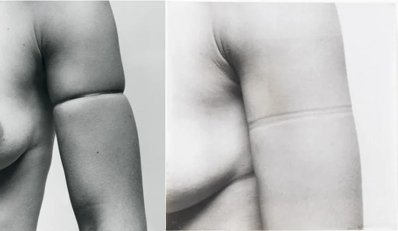
In the same timeline, the work of Gijs Bakker redefined jewelry in all it means. In
‘Shadow Jewelry’ (Bakker, 1976), he designed the so-called “Organic” pieces, which marked on the advanced dematerialization of jewelry. This minimalistic approach to form and material
attracted me to design my work using it.
With photographic aid, he showed the impression of a gold-wire which had been tightly bound
to the body. These pieces are literally ‘molded to the body’: jewelry which, through a minor
modification, brings about a startling transformation in the body itself. This thought process
inspired me to see a deeper relationship between jewelry and human body, where the body holds
[image:11.612.109.506.182.412.2]a stronger element of communication rather than the jewelry by itself as an object.
Fig.1: Gijs Bakker, Shadow jewelry, 1976
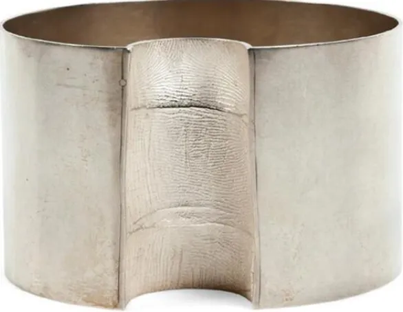
Gerd Rothmann is another artist I always deeply admire, as I like how he involves the
human body in his work. In Figure 2, the artist uses his hand as a physical signature in
the Zeigefinger bracelet (Rothmann, 1992). The body for which the object is destined will be wearing a work of art which is not just the result of personal research, but also a bodily mark and
physical evidence of a relationship.
Using a contemporary language of expression, he revived the ancient functions of
ornaments, the sentiments, intimacy and a personal dimension of the most heartfelt affections.
These ideologies have influenced me to imagine newer ways of creating a deeper relationship
Fig.2: Gerd Rothmann, Bracelet Zeigefinger, 1992
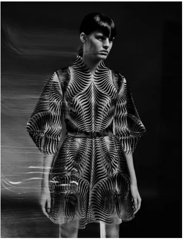
Another artist who motivates my work is a Dutch fashion designer Iris Van Herpen. Her
multidisciplinary approach to creation goes beyond fashion, and is a huge inspiration to me.
Movement being the key element in her work, I’ve been possessed by the strong visual images
she creates on the body. In one of her collections ‘Between the lines’ (Van Herpen,2017)
“Van Herpen focuses on the gaps in between the structures of her materials, rather than the structures themselves, by shaping patterns that dissimulate the body’s perspective or subtract it. By building up the patterns and then distorting them, the eye’s perspective is tricked and challenged to see new patterns occurring in between”.
This intentional eye play attracts me to visualize optically illusionistic forms as they have a potential to intrigue the viewer’s thoughts. The fact that they can make a person question the
BODY OF WORK
Anubhavana: Part 1
For the initial piece, I started with simple shapes like squares and cubes as I want the
audience to connect to one uniform character throughout my collection. The term ‘Anubhavana'
is a Sanskrit word meaning ‘Act of indicating feelings by sign or gesture’. Relationships being
my core concept, I designed my first wearable sculpture to be the common element of
connectivity between two people. This is to make my work be a visual platform of
communication, where two ends can come together through my piece; to observe how people in
various kinds of relationships will behave when put in contact and interaction with each other.
By keeping both the wearers in a controlled environment, I had them communicate only with
their fingers and hands with no verbal speech. I wanted to see how my work can help bring out
some unexpressed feelings the wearers had. After the wearers developed some comfort between
themselves, I could direct the wearers to depict few symbols that I had in mind.
As a result, I could interpret a lot of subtle aspects such as balance, flexibility and
adjustment from their interactions as it takes a certain coordination from both the ends to show
my thoughts symbolically. While some wearers adapted to work together in the same plane of
thought, I noted that even everyday relationships function in the same way, where every situation
is to be dealt with understanding and sensitivity.
I used regular sketchbook paper as a primary medium of connection in this piece as its
simple flexible behavior give the required freedom to the wearers. While the weaving technique
used for it is done by weaving four paper strips coming from four directions, I see even the
The metal cubes are hollow formed in 18g brass sheet and the ring shank is soldered in
16g brass wire. As I used the metal cubes to be an abstract depiction of two different individuals,
I connected them by gluing the paper weaved form which is the bridging relationship I’m
attempting to build.
Samyuktha Valluru 1; Anubhavana (Part1), Brass, sketchbook paper
Samyuktha Valluru 3; Anubhavana (Part 1), Brass, sketchbook paper
Samyuktha Valluru 4; Anubhavana (Part 1), Brass, sketchbook paper
After my experience of seeing the wearers interact with this design, I realized that this paper
weaving form has a lot of potential to be a mediating ground for my wearers. As I progressed, I
Anubhavana: Part 2
In reaction to the first piece I created using fingers as a form of expression, I wanted to
see how the same idea can translate for palms. I used the same principle of material and concept,
with few variations in scale, color and technical details. Influenced by the philosophy of
dematerialization from artists like Gijs Bakker, I designed the form to be as minimalistic as it can
be, because the purpose of every detail in my design is purely functional and not ornamental.
Samyuktha Valluru 5; Anubhavana (Part 2), Brass, grey chart paper, plastic
While palms allow the depiction of newer aspects like support and growth as well, I
understood that the change in scale and placement of jewelry on a different body part can also
create a shift in the dynamics within wearers.
After exploring the piece by wearing it in my own hands, I wanted to demonstrate how
two ends can bring a world of expansion together. I directed the wearers to pose with my jewelry
as seen in the images 7, 8, and 9. The form is fabricated by soldering a 16g brass wire frame with
an 18g square shaped copper sheet in the center, so that the surface of the copper sheet can be
glued as a support to the paper weaved form. Following the same paper weaving technique, I
used paper with plastic in this piece as I wanted to try a contrast through a combination of
materials as well. By using the spray painted glossy black plastic sheet for weaving the form, I
wanted to see how flexible the movability can be. As I expected, the kinetics changed to a stiffer
side as plastic is a material more resistant to folds and bends. It was an interesting observation,
because I could interpret the weaving of contrasting behaviors to my thesis concept of
coexistence.
With an intentional choice to follow a uniform color for the whole piece, I used liver of
Sulphur patina for the copper sheet, as it results in a dark grey shade that is similar to the paper
color used. These combinations slowly opened me to a new realm of material possibilities, as the
use of plastic with paper expanded my options to try out new textures, colors and finishes. The
color palette and material incorporation for my collection slowly started to set in from here, as
the techniques and finishes I explored for metals, paper and plastic became a potential choice for
Samyuktha Valluru 7; Anubhavana (Part 2), Brass, grey chart paper, plastic.
Samyuktha Valluru 8; Anubhavana (Part 2), Brass, grey chart paper, plastic.
Duality Within
Based on the learnings from my first two pieces, I designed my third sculpture titled
‘Duality Within’. Through this piece, I talk about the relationship with our own self, as
self-introspection helped me realize some of my strengths as well as weaknesses. Though it’s a
never-ending process of self-analysis for any person, I realized that being aware of them at the
least can become the starting point to balance all sides.
Every person has their own strengths and weaknesses, but it is not so common for
everyone to address those contrasts within. Through my sculpture, I want the viewer to see this
dual factor as well as how it is balanced as my work is not just about the symbolic depiction, but
also about the experience it gives to the person wearing it. Keeping that as a base, I created a
sculpture that visually divides the face into two main halves. In doing so, I want to emphasize the
idea that despite the existence of two main contrasting sides within the same person, there is a
need to balance them both as the integrity of the whole is important.
The face being the top most part of our body, any weight on it immediately changes how
we handle the weight. I used the same principle in this sculpture, where the wearer is consciously
handling the form. Using glass rods as the elements to distribute that weight, I composed their
design so that the opposite directions that they are pointing towards become a metaphoric
expression of the contrasts within a personality.
Moving to the technical aspects, the choker is fabricated using a 14g square contoured
copper wire, which is then coated in liver of Sulphur Patina to achieve a dark grey tone to match
the vibe. In order for the structure to open and close, I soldered a hinge mechanism on one side
and a magnetic lock on the opposite side.
While the central bridge going around the face is constructed by weaving it, I started
using a high polish mirror finish Mylar in combination with matte finished grey paper as I
wanted to expand my color palette of flat colors and finishes into metallic shades as well. The
flame worked glass rods are interlocked into this structure by passing them through the negative
spaces of the weaving, where them standing out makes the wearer balance them with caution.
This experience is what I want to show through my photographic evidences as well. Before this
piece, I always had the fear of making my design come into reality as I always question myself
even before trying to make it. But at this point after finishing this sculpture, I feel like I was able
to problem solve my design visions in a more practical way. I could see myself handling the
physical dynamics of material, weight and composition with the body.
Karma - Rebirth
My next piece ‘Rebirth’ is a neck sculpture that speaks about the relationship of our
actions with the universe. This piece is an abstract representation of the Hindu term ‘Karma’
which means action, work or deed. It also refers to the spiritual principle of cause and effect
where intent and actions of an individual (cause) influence the future of that individual (effect).
‘Karma’ - good or bad - can be affected by the conditions under which the actions are performed.
As one sows, so shall they reap. This is a universal principle on which Buddhist morality is
based. The truth applies to both physical and moral worlds.
In relation to the physical world of cause and effect, I wanted to bring this idea using our
neck and shoulder as the main platforms of expression as our torso is a central part of the body
that first draws the viewer’s attention. With or without our knowledge, every action always has a
massive impact on the bigger aspects. This is exactly what I want my viewer to see through the
kinetic sculpture I built.
After the experience built with materials I want to use for my thesis, I designed a
structure that can change with the way we move as I want to create a wearable experience that
emphasizes the principle of cause and effect. Since the paper weaving used as the main structure
has a flexible nature, I framed it around the neck using a metal lock in the back. This metal lock
is a screw in mechanism that matches the design language of the whole. I then interlocked the
flame worked glass rods into this paper weaved structure in such a way that each and every other
chord is interconnected with the movements that happen in the whole form.
This physical dynamic of each detail interdependently moving in relation with each other
is a great evidence that is depicting the cause and effect phenomenon. Action that starts with the
wearer’s movements (cause) can actually result in the paper form and every single glass cord
attached to it to move (effect). This piece is therefore an experience created to the wearer, where
even a slight shift in their own movements can show them how the whole form is affected.
Samyuktha Valluru 15; Karma, Copper, grey chart paper, glass
This sculpture gains its essence only when in relation with the wearer and their actions.
Since our eyes are framed to see the rhythmic arrangement of paper and glass in a certain
fashion, even a slight motion caused to disturb that pattern makes the ‘effect’ be seen in an
evident way. This relationship that I built between material, body and action is what gives the
Equilibrium
After my understanding of the significant role our body plays in relation to objects, I
created my next piece ‘Equilibrium’ - a shoulder sculpture that takes its inspiration from the way
our body is naturally designed. When I say ‘naturally designed’, I’m talking about the visual and
functional aspects of our body. There is always a visual symmetry that it follows, where the left
side details match with the right side details. In a similar way, when I exercise, I try to exercise
for both the sides of the body as I feel like my body instinctively functions by demanding that
equal attention. This equality aspect that our body naturally operates with is what I use in my
piece ‘Equilibrium’.
While the term “Equilibrium" means ‘a state in which opposing forces or influences are
balanced’, I wanted to show how important this term is for relationships.
Be it a relationship with anyone, it is always essential for one end to give equal importance to the
other end. This is what I want to leave my viewers with, along with a strong visual.
Samyuktha Valluru 17; Equilibrium, Brass, steel, grey chart paper glass
I see shoulders as the supporting space for carrying weight on the body. It transfers an
image of power and responsibility. Keeping that image in mind, I wanted to design a
construction that shows equality in all its senses. I created a form which is not just symmetric in
aesthetics, but which also makes the wearer feel an equal responsibility of handling the weight.
The anatomy that I designed for this sculpture is a little more complex and advanced in
comparison to my previous pieces, as I had to problem solve a lot of technical aspects that can
achieve the model I had in vision. To start with, I designed an elaborate wire frame structure that
connects the arms, shoulders and neck together. These connections are made in order to support
the weight that I planned to install on the top. Using an 18g square formed brass wire; I created a
soldered a hinge that is the length of the whole shoulder because this same part which locks at
the arms had to be opened and closed for the wearer to put it through. This long hinge frame that
continues to extend till the neck choker is soldered to a steel screw lock on the front, where the
detail of the screw in lock is where the whole anatomy takes the support to stabilize. After
finishing the metal fixture with as minimal detailing as possible, I glued the four-strip paper
weaving structure to both the sides as I wanted to represent the equal distribution of weight and
volume through it. I then passed a complex web of glass rods through the paper form to see how
well even the individual parts of my design will support each other. To my surprise, though
metal, paper and glass are all very different in their own ways, it was only through my design
composition that I was able to balance them in the right way. Thus, making this complex design
become a unique symbol of equilibrium, where the wearer and their body act as the major
supporting grounds to depict it.
Transform
‘Transform’ is a small scale kinetic sculpture that speaks about the evolution that happens
within a personality, in context to human relationships. Talking about marriage in specific, I
wanted to address how two people involved in the marriage go through a change in order to
maintain the unity. In my knowledge, there is no single person who is the same; there is only a
similarity which can help them come parallel with each other. However, even that smallest
difference between them can make it a situation for any kind of couple to accommodate and
adapt with each other. Now, one other perspective lies in how much ever change an individual
goes through, there is one true inner personality that they would possess. It is this innate
personality that anyone will go back to because there is something about that originality within.
We grew up being that, learnt and adapted to become a better one, but that ‘individual nature’
that one has is like a signature style of their own. Through my work, I want to represent this
phase that everyone goes through when being in a marriage. I want to show how two individuals
coming from their own different paths try to align with each other, and then even if they go back
to being their original selves, how they function to maintain that unity by adapting to each other.
I designed this idea by creating a kinetic sculpture that the user can interact with. For the
depiction of two different characters, I handcrafted two hollow formed squares. Square shape
being the primary element of my design language from the start, and to highlight the possibility
of two people being similar but not same, I chose to keep their shape same but color different.
Using sterling silver in combination with copper (liver of Sulphur patina), I was able to achieve a
Samyuktha Valluru 19; Transform, sterling silver, copper
Transformation being the journey that it is, I wanted to show it as a process rather than as
an end result. In my vision, marriage is a complex web where two different people come from
two different worlds, interconnect and adapt so that the union of them stays strong. Keeping this
in mind, I designed the form to look like an interlinked maze, where every individual character is
connected using a movable hinge as the joinery. This kinetic joint is created at every single point
of connection, where the movement caused by every single character interdependently influences
the orientation of all the characters. Therefore, this piece becomes a visual evidence of my idea
that when a transformation happens, it starts from a point where two different people align with
each other (marriage), then as the relation progresses, they try to adapt by growing with each
other (transformation), and after they get comfortable, they go back to being their original selves
(originality) by also maintaining that unity of the bond in the end.
Since I always thrived on experience, I wanted this piece to be an interactive sculpture where the
This process is seen through the video that I uploaded on YouTube
Transform Video link: https://www.youtube.com/watch?v=LBmTk4yH7fc
Samyuktha Valluru 20; Transform, Sterling silver, copper
Unlike my other pieces, this piece involved a complexity of other kind due to the scale and the
kinetics it needed. The hinge that is soldered at every connecting point had to be oriented in the
right direction as it would change the alignment of every individual piece if not planned right. As
the whole form is designed to rotate at 180-degree angle, starting from one end and shifting to
another end, I had to space every individual character with equal amount of hinge gap so that the
design can fold back to where it started. This experience of designing and building this piece
Eternal
My next piece ‘Eternal’ is a table top sculpture that takes its inspiration from the relationship we
have with the whole world around us. After crafting a collection that depict various phases of
relationships, I wanted to make this last piece as a tribute to all of them together. In this circle of
life, there is always an endless network of people and relations we keep building. From our birth
till we pass, we crisscross paths with people we know, met and grew up with. But we do not
really look back on how beautiful a path we lay as we build our network of relations. This
sculpture ‘Eternal’ is a visual accolade to the journey of life that is an endless network of people
that we share our paths with.
My inspiration to depict this endless journey comes from the infinity symbol. This shape has a
lot of significance in various cultures. However as suggested by history, its meaning in context to
the yogi connection (Sehra,2017) says that “there is no beginning or end. It represents the
universe as an ongoing and continuous entity. The visual of two separate circles coming together means that we are all united in this cycle of life.”
Following this theory, I crafted the paper weaving technique using matte grey chart paper
and high polish mirrored Mylar to show the high contrast of variables coming together. This
paper form starts at one point and closes back at the same point but by forming the shape of
eight, where the resulting infinity shape is seen from the top view. As this woven structure forms
a base for the whole form to stand, I relate its infinity shape to the intercrossing paths of every
individual. While the glass rods locked into every consecutive detail are a metaphoric sign of the
people that we meet in life, their ascending and descending arrangement represent every growing
phase starting from childhood to old age.
Though the construction of the piece involves only two main techniques, paper weaving
and glass flame working, the way every chord aligns and composes with each other in the
structure makes it a complex puzzle to figure out their stability. The fact that they are arranged
from ascending to descending orders creates a weight shift in the structure. Thus, making it a
complex design to plan and compose each element involved in it.
After finishing this piece, I found myself become open in not just thinking through the
design process, but also in implementing that vision with right understanding of materials that
CONCLUSION
The biggest challenge that I came across is the execution of every new design that had to be in
coordination with body, its proportion and action. Human body, its actions and postures being
the biggest supporting aspects for my models, I could see my works advancing from small scale
to big sculptures where each body part was explored to symbolize my ideas of relationships.
Though I followed one similar paper weaving technique throughout my designs, I faced other
bigger challenges in terms of scale, structural supports and other physical dynamics that can
make the design work. I learnt from my mistakes, and overcame whatever was next. Each piece
pushed me forward to make much elaborate designs that I once used to be afraid of even starting.
During my journey to becoming a craftsperson, I can finally see myself balance that
thought process of going wild but still being able to handle the practical issues that would arise.
Though I never had a background of crafting with materials, through my thesis, I could
understand the way each different material works. In my voyage to represent coexistence in
relationships, I myself started to build a deep connection with every piece as a maker. All of
these works and experiences throughout my thesis not only allowed me to define my voice as an
artist, designer and a maker, but also aided me to decide what I want to do in future.
As a fine art student specializing in jewelry, I did not limit myself to the traditional norms
of jewelry making and precious materials. I pushed every possible convention by discovering
new ways of wearability and self-expression that stayed true to my concept. It is with this
journey and knowledge that I want to go back to India to start spreading awareness on new
INSTALLATION
Installation image 1; 2017
Installation image 3; 2017
Installation image 5; 2017
Installation image 7; 2017
LIST OF IMAGES
Research Images
Figure.1, Gijs Bakker, Shadow jewelry, 1976.
Figure.2, Gerd Rothmann, Bracelet Zeigefinger, 1992.
Figure.3, Iris Van Herpen, Between the lines, 2017.
Personal Images
Samyuktha Valluru 1; Anubhavana (Part 1), Brass, sketchbook paper
Samyuktha Valluru 2; Anubhavana (Part 1), Brass, sketchbook paper
Samyuktha Valluru 3; Anubhavana (Part 1), Brass, sketchbook paper
Samyuktha Valluru 4; Anubhavana (Part 1), Brass, sketchbook paper
Samyuktha Valluru 5; Anubhavana (Part 2), Brass, grey chart paper, plastic
Samyuktha Valluru 6; Anubhavana (Part 2), Brass, grey chart paper, plastic
Samyuktha Valluru 7; Anubhavana (Part 2), Brass, grey chart paper, plastic
Samyuktha Valluru 8; Anubhavana (Part 2), Brass, grey chart paper, plastic
Samyuktha Valluru 9; Anubhavana (Part 2), Brass, grey chart paper, plastic
Samyuktha Valluru 10; Duality, Copper, grey chart paper, Mylar, glass
Samyuktha Valluru 11; Duality, Copper, grey chart paper, mylar, glass
Samyuktha Valluru 12; Duality, Copper, grey chart paper, mylar, glass
Samyuktha Valluru 13; Karma, Copper, grey chart paper, glass
Samyuktha Valluru 14; Karma, Copper, grey chart paper, glass
Samyuktha Valluru 16; Equilibrium, brass, steel, grey chart paper, glass
Samyuktha Valluru 17; Equilibrium, brass, steel, grey chart paper, glass
Samyuktha Valluru 18; Equilibrium, brass, steel, grey chart paper, glass
Samyuktha Valluru 19; Transform, sterling silver, copper
Samyuktha Valluru 20; Transform, sterling silver, copper
Samyuktha Valluru 21; Eternal, Mylar, glass, sketchbook paper
Samyuktha Valluru 22; Eternal, Mylar, glass, sketchbook paper
Installation Images
Installation Image 1; 2017
Installation Image 2; 2017
Installation Image 3; 2017
Installation Image 4; 2017
Installation Image 5; 2017
Installation Image 6; 2017
Installation Image 7; 2017
BIBLIOGRAPHY
1. Valentine, Angelica. “How form and function play into the rise of good design”.
Proto.10, March 14, 2017, https://blog.proto.io/form-function-play-rise-good-design/
retrieved on October 9, 2018.
2. Hindu Janajagruti Samiti. "Hinduism and importance of jewellery". Importance of
jewelry and benefits of wearing ornaments, 2014,
https://www.hindujagruti.org/hinduism/importance-of-jewelry retrieved on
October 9, 2018.
3. Purdon, Martin J. "A short essay on posture and movement". Journal of Neurology,
Neurosurgery, and Psychiatry, 1977,
https://jnnp.bmj.com/content/jnnp/40/1/25.full.pdf retrieved on October 9, 2018.
4. Dormer, P and Turner, R. The New Jewelry: Trends and Traditions. Thames and Hudson,
1985
5. Besten, Liesbeth den. "The Jewelry of Gijs Bakker". Metal smith Magazine - 1987
winter, https://www.ganoksin.com/article/jewelry-gijs-bakker/ retrieved on
October 9, 2018.
6. Carbone, Gio. "The Human Body in Jewelry". Farlang, Nov 26, 2015,
http://farlang.com/gijs-bakker-becker-rothmann-martinazzi retrieved on October 9,
2018.
7. Van Herpen, Iris. "Between-the-lines". 2017, PU Fabrics, Mylar Fabric.
https://www.irisvanherpen.com/haute-couture/between-the-lines retrieved on
October 29, 2018.
8. (2018), “Equilibrium”. Retrieved from
https://en.oxforddictionaries.com/definition/equilibrium