An Introduction To Internet Based Climate Science Teaching
Ribbe, Joachim (2002) An Introduction to Internet Based Climate Science Teaching.
Australian Sciences Teachers Journal, 48 (3). pp. 28-35. Author’s final manuscript, accessed in USQ ePrints http://eprints.usq.edu.au
Abstract
No other field of scientific endeavour lends itself better to Internet based research and teaching than that of the climate sciences. With the advent of the Internet, the dissemination of climate data and related information via interactive web sites is a common practise. Internet access allows to connect to data archives, extract, manipulate and graphically display climate data. It is possible to learn about global climate change, the greenhouse effect and El Niño through hands-on practical work. This article aims to interest educators in utilizing the internet in classroom activities when teaching about climate, the atmosphere and ocean.
1. Introduction
One of the currently most exiting and emerging new fields of scientific endeavour is that of the Earth System Sciences. Its ultimate goal is to develop global climate system models and predict future climate changes. The climate system is made up of many individual components such as atmosphere, ocean, continental ice sheets, sea-ice, and biosphere to name just a few. These are interconnected via a myriad of physical, chemical and biological processes and continuously exchange properties. Water, for example, is most fundamental to life on Earth and is cycled through all components of the climate system. The Earth System Sciences aim to understand how each of the climate components operate, what are the important physical processes, what are the exchange mechanisms that operate between the individual system components, and what are the magnitudes of property fluxes between the systems. To answer these questions Earth System Scientists require observational data spanning the planet and describing the state of each Earth System component.
The emergence of the Earth System Sciences coincided with the growth of the World Wide Web or Internet. It facilitates an efficient exchange of data, the management of data depositories, fast communication between scientists and more lately, also the actual research and teaching of climate processes. There are many institutions around the globe maintaining interactive web sites that allow the access to data depositories, the extraction, manipulation, and graphical display of climate data. Many of the data are in the so-called public domain and they can be freely accessed. Site owners encourage the use of information provided for teaching and research purposes, often providing relevant tools, ideas, and background information for class room activities.
(ENSO) and the Global Thermohaline Circulation (GTC). Both are well-known and understood phenomena of our present-day climate system. An excellent introductory reading text for students is an October 2000 National Geographic article about the climate system (see reference section for web link). Online climate information is available via the Australian Bureau of Meteorology web page on climate. Further source material is referred to throughout the article.
The following section provides some background information on ENSO and the role of the GTC within the global climate system. Each phenomenon is studied in two exercises. These are just examples, and upon completion the interested educator will be able to use this article and the provided information, to design a suite of new exercises, demonstration material, etc. for class room activity. It is recommended, that the educator has access to the internet to follow the given examples and instructions.
2. Background Information
Two phenomena of the present-day global climate system introduced in this section are ENSO and the GTC. The former is a quasi-periodic atmosphere-ocean process, repeating itself about every 3-4 years, while the latter is a very slow circulation operating within the interior of the ocean.
2.1 The El Niño Southern Oscillation - ENSO
ENSO is an atmosphere and ocean phenomenon. It is associated with quasi-periodic, sea-saw like changes in the distribution of sea surface temperature, elevation of sea surface level, sea surface level atmospheric pressure that results in large scale perturbations to the mean, averaged atmospheric and oceanic circulation. The phenomenon is primarily confined to the Equatorial Pacific Ocean, although its influence upon the state of the atmosphere and ocean can be felt around the planet.
The existence of ENSO was first recognized as a reoccurring atmospheric oscillation in atmospheric pressure differences between Darwin, Australia and Tahiti, French Polynesia at the end of the 19th century. The pressure difference is now expressed through the Southern Oscillation Index (SOI). It sea-saws between values of about +30 and –30 (Figure 1). At about the same time, reports of reoccurring, quasi-periodic changes in sea surface temperature, i.e. an unusual warming off the South American coast became known to western scientists as El Niño.
both extreme phases of ENSO and are often also referred to as the ENSO warm and ENSO cold phase. During the warm event, the SOI value is negative and during the cold event it is positive (Figure 1).
Year
-35 -25 -15 -5 5 15 25 35
Jan-70 Jan-80 Jan-90 Jan-00
[image:3.595.131.465.115.340.2]Southern Oscillation Index
Figure 1: A time series of the Southern Oscillation Index based upon the sea level pressure difference (anomaly) between Tahiti and Darwin for the period 1970 to 2000. The index oscillates between values of about –30 and +30 with a period of about 3-4 years. Strongly negative and positive values are associated with an unusual warming (El Niño or ENSO warm phase) or cooling (La Niña or ENSO cold phase) of the eastern equatorial Pacific Ocean. A very distinct, clear-cut example is the warm event in 1987-88 which was followed by a cold event in 1988-1989.
The impacts of ENSO upon, for example, the Australian climate, are most profoundly felt through a lack of rainfall and persistent drought for many parts of the country. The absence of rain is a direct result of the changes in the atmospheric circulation that usually transport moist air from the open ocean toward land. While the causes for drought may be manifold, it is most likely that during El Niño the northern parts of Australia are characterised by lower than average rainfall for sustained periods. Consequently, ENSO has a profound impact upon the Australian economy and society as whole. Glantz (2001) reviews the current state of ENSO research in a non-scientific manner and discusses the many impacts of this climate event upon the world. The book provides excellent reading material which may serve the interested educator/teacher as background material.
2.2 The Global Thermohaline Circulation - GTC
Figure 2: The Global Conveyor Belt or Thermohaline Circulation Reproduced with permission from Professor M. Tomczak, Flinders University of South Australia.
In this particular view of the GTC introduced to the scientific community during the 1980s (Broecker, 1991), the sinking process operates most vigorously and very localized in the North Atlantic (Figure 3). In the deep ocean water moves slowly as a deep ocean current into the Southern Hemisphere. It is obvious that the removal of surface water requires a process that replaces it. This is facilitated through a return flow of surface water which has its origin in the surface of the Indian and Pacific Ocean. This return flow closes a global circulation loop, which operates on very long time scales. If one thinks in terms of water parcels, then it takes many hundreds of years for a water parcel that left the surface ocean in the North Atlantic Ocean, to complete one circulation loop.
The GTC is often also referred to as a conveyor belt circulation, since it, for example takes up heat at the Equator, moves it into the polar regions, and disposes it off to the atmosphere. Similarly, other atmospheric properties such as oxygen that is exchanged between the ocean and atmosphere at the surface, is loaded onto the conveyor. The sinking process removes oxygen from the surface, transports it into the deep ocean from where it spreads into other ocean regions. Scientists often refer to the sinking as a ventilation process. The sinking regions of the world ocean are the lungs of the world ocean or the windows through which the ocean communicates with the atmosphere. Like oxygen other atmospheric gases such as carbon dioxide, which is an important greenhouse gas, is removed from the atmosphere and temporarily stored in the interior of the ocean.
In trying to understand the mechanisms that operate the GTC, it becomes evident that the GTC is actually a huge regulator of Earth’s climate. The ocean is thought of as driving the climate by transporting, storing, and exchanging properties such as heat and greenhouse gases with the atmosphere. Any changes or perturbations to the operating of the GTC, will have immense consequences for Earth’s present day climate.
In two example exercises, the atmospheric and oceanic circulation during ENSO warm and cold events is investigated by using an electronic data atlas of the atmosphere. The data set is available through the National Centre for Environmental Predictions (NCEP, see reference section for web link), in Boulder, USA. The web site provides ample background information about the data product itself and in addition to the examples given here, lists alternative possibilities to study ENSO. In essence, the dataset is a combination of all atmospheric observations made in the past and the present. The data are collected from observation points all over the world. Gaps in the data archive are filled through a sophisticated temporal and spatial numerical interpolation and extrapolation scheme. The data provided through NCEP are averaged for specified periods, for example, days, months, and years.
3.1 Exercise 1: Sea Surface Level Pressure
In this first example, the sea-saw mechanism in sea surface level atmospheric pressure associated with ENSO and referred to as the Southern Oscillation is revisited. As previously indicated, the sequence of ENSO warm and cold events during the late 1980s represented a clear signal of the phenomenon and is used here as an example. In the following section, the reader is stepped through the procedure of graphically and interactively displaying the sea surface level pressure. It is recommended that the reader is connected to the internet and follows the instructions outlined in Table 1. Changes in pressure, temperature etc. (see below) are always represented as anomalies, that is the difference between the actual, present-day temperature or pressure and a climatological value. The latter is calculated as a mean value from many years of observations; the period is also referred to as the reference period and is representative of the climatological mean state of the Earth’s climate system.
Step Action
1 Connect to the NCEP Atlas: http://www.cdc.noaa.gov/ncep_reanalysis/
2 Select Go to Electronic Atlas
3 Check No Difference Processing and Continue Image Specification
4 Select data set: Anomaly (red arrow will point to the section made). Select variable Surface Sea Level Pressure, and then click on Continue
Image Specification.
5 Select Dimension 1 lat (latitude) and Dimension 2 lon (longitude) 6 Select axis dimensions and use 40o S - 20o N for latitude and 120o E -
300o E for longitude. Specify time with Begin January 1987 and End May 1987, select Create a Plot (default option), and under Plot Options
check the following boxes: Plot on White Background, Gif, Color Plot, and Fill/Shade (and use land mask when working with Exercise 2)
[image:5.595.98.500.457.673.2]7 Check on Create Plot or Subset or Subset of Data. If all option were selected properly the graphic shown in Figure 4 will appear.
Table 1: Instructions to graphically display sea surface level pressure during the ENSO warm and cold event in 1987 – 1988. For the warm event choose data averaged for January to May 1987, for the cold event choose data averaged for August to December 1988.
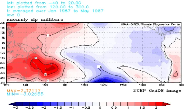
value is characterised by higher than usual values (positive anomaly) in the western and lower than usual values (negative anomaly) in the eastern Pacific Ocean. During this period, unusually warm surface water appeared in the eastern Pacific Ocean (see exercise below). This is the so called El Niño, or ENSO warm event.
Figure 3: The graphic shows the anomaly in sea surface level pressure (in millibars) during the period January to May 1987. Australia on the left, South America on the right. Positive contour labels east of about 180o indicate higher than normal sea surface level pressure. During this period a very strong El Niño event, i.e. an unusual warming of the eastern Equatorial Pacific Ocean was observed.
About 12-14 months after the warm event, ENSO approaches another extreme state referred to as an ENSO cold event or La Niña. While the eastern Pacific surface ocean is unusually cold during this period, the distribution of sea level surface pressure is the opposite to that shown in Figure 3. The regions in the western Pacific Ocean characterised by higher than usual pressure are now characterised by lower than usual pressure (Figure 4), while the eastern Pacific Ocean exhibits higher than usual pressure. The figure is obtained by replacing the averaging period of step 6 (Table 1) with the period August to December 1988.
Figure 4: The graphic shows the anomaly in sea surface level pressure during the period August to December 1988. Positive contour labels east of about 180o indicate higher than normal sea surface level pressure. During this period a very strong La Niña event, i.e. an unusual cooling of the eastern Equatorial Pacific Ocean was observed.
3.2 Exercise 2: Sea Surface Temperature
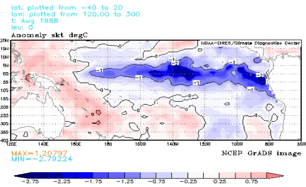
Changes in sea surface temperature are dramatic during ENSO warm and cold events and oscillate in a manner similar to that of atmospheric pressure. This exercise involves displaying graphically the sea-saw mechanism in sea surface temperature associated with ENSO, data are used for the period 1987 – 1988, and the instructions are identical to those listed in Table 1 with the exemption that the variable to be selected is that of skin temperature. Over the ocean area, the skin temperature is identical to the sea surface temperature, which is of interest here. So, when following the instructions of step 5 in Table 1, choose skin temperature, select time begin and end with either April 1987 (Figure 4) or August 1988 (Figure 5), i.e. no averaging period as for pressure and check use land mask, since only ocean temperatures are of interest. The resulting graphic displays the anomaly in sea surface temperature during the ENSO warm event (Figure 5) and cold event (Figure 6).
Figure 5: Anomaly in sea surface temperature during the 1987 El Niño. The eastern equatorial ocean is unusually warm with temperature more than 2 degree higher than normally, i.e. contour labels are positive numbers in the east and negative in the west.
Figure 6: Anomaly in sea surface temperature during the August 1988 La Niña event. The eastern equatorial ocean is unusually cold with temperature more than 2 degrees lower than normally, i.e. contour labels are negative numbers in the east and positive in the west.
To gain further insight into the temporal evolution of ENSO warm and cold events, it is recommended to view animations of the temperature distribution at
[image:8.595.147.457.352.541.2]4. The Ocean: GTC Study
The Global thermohaline circulation (GTC) is a key feature of the present-day global climate system. It is not a climate anomaly such as ENSO, but a global-scale circulation of the ocean. The following two exercises explore the pathway of this globe spanning ocean current. The data set to be used is available through the Pacific Marine Environmental Laboratory (PMEL, see web link below) in Seattle, USA. Data at PMEL also provide insight to the ocean component of ENSO and may be consulted for further study activities of the above section.
The ocean data set applied in the examples below represents the climatological mean state of the ocean. It was assembled from all available ocean observations of temperature, salinity, dissolved oxygen and other ocean properties. The data base and display software allows to slice, cut, and dissect the ocean displaying north to south, west to east or horizontal ocean property distributions. The climatology is consulted to gain insight into the three dimensional circulation of the world ocean.
4.1 Exercise 1: Deep Ocean Ventilation From Dissolved Oxygen Distribution
In this first exercise, the oxygen content of sea water is used as an indicator for the pathway of the GTC. Water removed from the ocean surface is high in oxygen, i.e. all oxygen in the deep ocean originated at the surface. Oxygen is continuously supplied from the surface to the deep ocean in isolated regions of the North Atlantic ocean. In the deep ocean, this oxygen rich water is mixed with water that is depleted in oxygen. The further oxygen rich water propagates into the Southern Hemisphere, the lower its oxygen content since it is continuously mixed with low oxygen water. The on-going reduction in oxygen can also be thought of as an aging process. The longer the water is removed from the surface, the older and the more depleted in oxygen the water is. To graphically display this process of aging and deep ocean ventilation, the oxygen distribution within the interior of the world ocean is displayed. The instructions to follow are listed in Table 2.
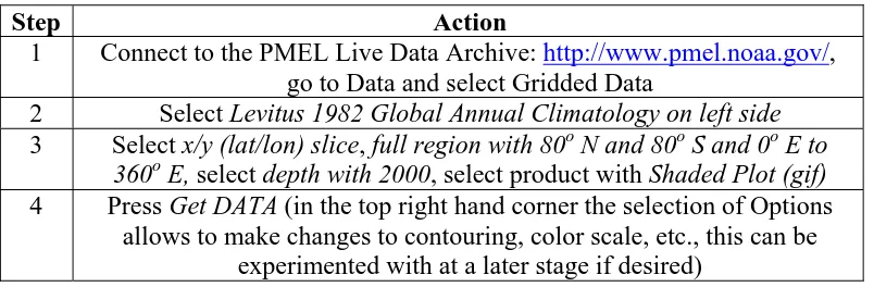
Step Action
1 Connect to the PMEL Live Data Archive: http://www.pmel.noaa.gov/, go to Data and select Gridded Data
2 Select Levitus 1982 Global Annual Climatology on left side
3 Select x/y (lat/lon) slice, full region with 80o N and 80o S and 0o E to 360o E, select depth with 2000, select product with Shaded Plot (gif)
4 Press Get DATA (in the top right hand corner the selection of Options allows to make changes to contouring, color scale, etc., this can be
[image:9.595.99.501.539.671.2]experimented with at a later stage if desired)
Table 2: Instructions to plot the distribution of oxygen in the interior of the deep ocean. The oxygen distribution is an indicator of the deep ocean ventilation process and for the pathway of the Global Thermhaline Circulation.
boundaries of the Atlantic Ocean penetrating southward into the Southern Hemisphere Oceans. From the South Atlantic via the South Indian and into the South Pacific Ocean, the dissolved oxygen values continue to decrease reaching the absolute minimum in the North Pacific Ocean. Generally, values are also higher in the Indian than in the Pacific Ocean indicative of an inflow from the South Atlantic into the South Indian Ocean, meaning the source for fresh, oxygen rich water is closer to the Indian Ocean than it is to the Pacific Ocean. This pattern identified here in the global dissolved oxygen distribution clearly traces the path of the GTC.
Figure 7: Global distribution of the dissolved oxygen concentration at a depth of 2000 m. Highest values are found in the North Atlantic Ocean, lowest values in the North Pacific Ocean, with a gradual decrease from the South Atlantic via the Indian into the South Pacific Ocean and northward.
4.2 Exercise 2: Vertical Distribution of Salinity
In this second example, the distribution of salinity with depth and along a north to south section is studied. Salinity is another property of ocean water allowing to draw conclusions about the pathway of the GTC. It is known, for example, that the surface water of the North Atlantic is saltier than that of the surface water in the Southern Hemisphere. Salt is transported northward in the Atlantic Ocean surface and removed by sinking. We expect this high salinity therefore to be found in the deeper ocean of the North Atlantic, since it is here where water sinks and flows southward (see exercise above). This pattern is indeed verified by displaying the salinity distribution with depth in the North Atlantic via a north-southward (Figure 8) section. Table 3 lists the settings to be chosen for this graphic.
Step Action
1+2 As in Table 1
3 Select y/z (lat/depth) slice, Full region with 65o N and 80o S and 20o W to 20o W, select depth with 0-5500, select product with Shaded Plot (gif)
[image:10.595.99.498.649.722.2]Table 3: Instructions to plot the distribution of salinity along a north south section in the Atlantic Ocean.. The salinity distribution is another indicator of the deep ocean ventilation process and for the pathway of the Global Thermhaline Circulation.
[image:11.595.130.466.231.450.2]The salinity distribution displayed for the Atlantic Ocean traces the global conveyor belt circulation. High salinity water is removed in the North Atlantic. A tongue of high salinity is seen clearly penetrating from the surface down to depths of about 2000-2500 m from where is spreads southward across the Equator and filling most of the deep ocean. Interestingly, a tongue of very fresh water is seen to extend from the surface of the South Atlantic Ocean to depths of about 1000 m and spreading northward into the North Atlantic Ocean.
Figure 8: The distribution of salinity (ppt ~ parts per thousand) in the Atlantic Ocean. High salinity is found in the north, low salinity in the south.
This tongue of very fresh water originating in the South Atlantic Ocean and in proximity to the Antarctic continent, provides another clue how the sub-surface ocean is being renewed. This water sinks from the surface and ventilates the upper ocean with low salinity water. It is anticipated that the oxygen content of this water is high, i.e. the dissolved oxygen concentration in the South Atlantic Ocean should exhibit an oxygen maximum in the south with decreasing values to the north. This is indeed the case and can easily be verified by following the step outlined in Table 2, but for a depth of about 1000 m, or repeating this exercise but plotting oxygen instead.
5. Summary
The Earth System Sciences is a new, emerging science studying the climate of Earth and utilizing in its approach new technologies such as internet based, interactive data depositories and other research resources. This article seeks to identify two of the most frequently accessed internet sites and provides a few examples for class room activities. Once familiar with these sites, the resources available, and the sample exercises, it is an easy task to adopt and develop new material for teaching purposes.
Broecker, W. S. 1991: The Great Ocean Conveyor. Oceanography, 4, 79-89.
Glantz, M. H., 2001: Currents of Change. Impacts of El Niño and La Nina on Climate and Society. Cambridge University Press, Cambrigde, 252pp
National Geographic Magazine, 2000: New Eyes on the Ocean. October Edition. http://www.nationalgeographic.com/ngm/0010/feature5/index.html.
7. Weblinks
Climate background available through the web page of the Australian Bureau of Meteorological Research: http://www.bom.gov.au/climate.
Electronic Atlas of the National Centre for Environmental Predictions (NCEP), United States: http://www.cdc.noaa.gov/ncep_reanalysis/.
Pacific Marine Environmental Laboratory Ocean Climatology, Seattle, United States: http://www.pmel.noaa.gov/.
8. Figures
Figure 1: A time series of the Southern Oscillation Index based upon the normalised sea level pressure difference (anomaly) between Tahiti and Darwin for the period 1970 to 2000. The index oscillates between values of about –30 and +30 with a period of about 3-4 years. Strongly negative and positive values are associated with an unusual warming (El Niño) or cooling (La Niña) of the eastern equatorial Pacific Ocean. A very distinct example is the warm event in 1987-88 which was followed by a cold event in 1988-1989.
Figure 2: The Global Conveyor Belt or Thermohaline Circulation Reproduced with permission from Professor M. Tomczak, Flinders University of South Australia.
Figure 3: The graphic displays the anomaly in sea surface level pressure during the period January to May 1987. During this period a very strong El Niño event, i.e. an unusual warming of the eastern Equatorial Pacific Ocean was observed.
Figure 4: The graphic displays the anomaly in sea surface level pressure during the period August to December 1988. During this period a very strong La Nina event, i.e. an usual cooling of the eastern Equatorial Pacific Ocean was observed.
Figure 5: Anomaly in sea surface temperature during the 1987 El Nino. The eastern equatorial ocean is unusually warm with temperature more than 2 degrees higher than normally
Figure 6: Anomaly in sea surface temperature during the August 1988, the La Niña event. The eastern equatorial ocean is unusually cold with temperature more than 2 degrees lower than normally.
North Pacific Ocean, with a gradual decrease from the South Atlantic via the Indian into the South Pacific Ocean and northward.
Figure 8: The distribution of salinity (ppt) with depth along a north to south section in the Atlantic Ocean. High salinity is found in the north, indicating sinking to depths of about 2000 m and southward movement. In the south, a low salinity signal is indicating sinking to depths of about 1000 m and northward movement.
9. Acknowledgement:
The data and images were provided by the NOAA-CIRES Climate Diagnostics Centre, Boulder, Colorado, USA, from their Web site at
http://www.cdc.noaa.gov/ and by the Pacific Marine Environmental Laboratory,