ForWord: A Study on an Interactive Learning
Environment in Foreign Language
Christina A. Curtis
Follow this and additional works at:
http://scholarworks.rit.edu/theses
This Thesis is brought to you for free and open access by the Thesis/Dissertation Collections at RIT Scholar Works. It has been accepted for inclusion in Theses by an authorized administrator of RIT Scholar Works. For more information, please [email protected].
Recommended Citation
A Thesis Submitted in Partial Fulfillment of the Requirements
for the Degree of Master of Fine Arts in Visual Communication Design
Rochester Institute of Technology School of Design
College of Imaging Arts and Sciences Visual Communication Design Rochester, NY
Chief Advisor Chris Jackson
School of Design
Associate Advisor
Shaun Foster School of Design
Associate Advisor
Timothy Foxsmith School of Liberal Arts
Abstract
Introduction & Review of Literature Introduction
Existing Tools and Technologies Design for Teens and Education Education and Technology Process
Overview Stage 1: Branding Stage 2: Early Concepts
Stage 3: Feed Layout and Interactions Stage 4: High Fidelity Wireframes Stage 5: Prototype and Game Demo Stage 6: Promotional Components User Testing & Feedback
The Solution & Conclusion Appendices
Appendix A: Original Thesis Proposal Appendix B: User Survey 1 with Results Appendix C: User Survey 2
Keywords
interactive learning, collaborative learning, shared learning, secondary education, language, ESL, EEL, Spanish, social network, user experience, user interface, web application
With constant advances in technology, the world becomes a smaller community each day. In line with its reputation as a cultural melting pot, children of immigrants are the fastest growing student population in the United States today. It’s clear that the U.S. needs a strong approach in language education; one that can keep pace with our potential and our lives. Technology can be used to foster student collaboration and shared learning experiences, thereby increasing learner interest, motivation and learning outcomes. ForWord aims to use interaction design in foreign language education to meet this need.
ForWord has four main goals:
Provide a user-friendly online learning environment Promote teacher-student interaction and collaboration Promote student-student interaction and collaboration Increase learner interest and motivation
This project takes the form of a proof-of-concept web application. The outcome relies heavily on research, design principles, user experience and human-computer interaction theory, and the use of technology to demonstrate the overarching concepts.
1 2 3 4
Introduction & Review of Literature
While there are a number of educational tools in existence, many of those in the language-learning domain do not make use of cutting edge technologies. Textbooks are still widely used in schools and while they may offer an online component, these supplementary pieces are often lacking in engagement, student collaboration, and design. Outside of the classroom, a multitude of available software, services, and tools exhibit a range of pros and cons. Language education is an area to be explored and enhanced by technology.
As a preliminary step of an ongoing research process, it was important to review existing educational tools and services that aim to help users learn a new language. While this review included a variety of applications and software, it was in the best interest of the goals of the project to focus on the most relevant tools: the tools that had a similar mission or took a related approach to the initial concept of ForWord.
Duolingo served as an inspiration for the project, both from an aesthetic and a user experience perspective. In using the tool, it is evident that it is a strong vocabulary building resource. It showcases great design and user onboarding, and one of its largest successes is the incorporation of gamification into every aspect of its lessons. While this tool is engaging and beautifully presented, it is lacking the key elements of community and collaboration.
Livemocha, an online language-learning tool that was acquired by Rosetta Stone in 2013, takes another approach by placing importance on practice. With a focus on community, this service provides opportunities for its members to work with native speakers and build their conversational skills. Users also have access to resources to build vocabulary and learn grammar. A large benefit of Livemocha is easy access to a large pool of members with varying language backgrounds. On the other hand, peer reviews and feedback can be less than useful and there is a lack of supervision, which allows some users to take advantage of the system.
Introduction
Fluenz, a primary competitor of Rosetta Stone, aims to teach language via one-on-one digital tutoring, while infusing cultural experiences and context at the same time. A series of lengthy video sessions provide the user with information that is reinforced with activities and testing. The founders proclaim that good design is relevant in education. Much of their product utilizes beautiful, full-screen photography. However, the UI (user interface) could use improvement. Similar to Duolingo, there is a lack of community and collaboration in that all interaction takes place with a digital persona. Additionally, the educational workflow follows a very linear path.
Today, children of immigrants are the fastest growing student population in the United States. Students that learn English as a second language represent 10.6 percent of the K-12 public school enrollment, with the fastest increasing numbers in grades 7 through 12, and about 79 percent of these students speak Spanish as their first language (Calderón et al. 2011). These statistics confirm the need for an educational tool such as ForWord, especially for the American student population. It was crucial to perform research on the abilities, interests, and behaviors of this particular demographic to hone in on the intended target audience: English and Spanish learners ages eleven to fourteen.
As of 2007, it was found that 93% of teens aged twelve to seventeen were using the Internet, and 64% of those teens have participated in content-creating activity (Lenhart et al. 2007). It is reasonable to assume that these numbers have only increased with the popularization of smartphone technology and the shift in online behavior that has come along with this.
These possibilities need good planning and implementation if they are to come to fruition. Educational approaches that utilize technology must place high importance on usability with special consideration given to the target audience. As a generation that grew up with technology and the Internet, the teenage audience calls for certain design guidelines and design needs.
According to Nielsen Norman Group, teens perform worse than adults in website usage for three main reasons: insufficient reading skills, less sophisticated research strategies, and lower levels of patience (Loranger and Nielsen 2013). To maintain engagement, it’s imperative to provide well organized and easy-to-scan content. Teenagers place a lot of value on aesthetics and appreciate interactive features such as online quizzes, online voting, games, features for sharing pictures or stories, message boards, and forums (Loranger and Nielsen 2013).
For these reasons, ForWord presents educational material in a way that is familiar, direct, and engaging. The structure and navigation is minimal and plays off of popular social media platforms. In addition, the majority of the layout is used to display shared and collaborative content. This content comes from the users themselves, making ForWord a unique experience for each person.
The importance of language learning in schools is undeniable. With constant advances in technology, there is vast potential in the field of education. In recent years, there has been an emergence of technologies that revolutionized the classroom, such as smart boards, touch tables, and iPads. The role of digital technology in the classroom has been proven to be valuable for both learning outcomes and student motivation (Dhir et al. 2013).
Furthermore, collaboration is a significant factor in learning. Cooperative learning is defined as a systematic instructional method in which peers work together in groups to accomplish shared learning goals (Zhang 2010). This method of learning has been tied to higher achievement levels as well as positive effects on relations among students, self-esteem, long-term retention, and depth of understanding of material (Zhang 2010). With collaboration as a primary feature, this project employs technology in the classroom to achieve cooperative learning, among other instructional goals.
Process
The core concept of ForWord is to use interaction design to create a language-learning environment where users can build, share, and collaborate with one another and their educators. The target audience is English and Spanish students that range from age eleven to fourteen. As this is an extensive objective, this project takes the form of a proof-of-concept with a series of components.
The process was largely iterative and cumulative; each step and each piece shaping the others. To demonstrate the overall idea and experience, an interactive prototype of the web application was built with Axure. An instructional game demo was created with HTML5 Canvas, JavaScript, and jQuery in Adobe Flash. A promotional motion graphics piece was made in Adobe After Effects. Lastly, to provide an overview of the project and to briefly present each aforementioned component, a promotional website was built using the Bootstrap framework with HTML5, CSS3, and JavaScript. All assets were designed in Adobe Photoshop and Adobe Illustrator.
The initial design work for ForWord was geared toward the overarching vision and branding. The color palette consisted of a bright medley of colors to convey the energetic nature of the tool and its youthful target audience (fig. 1). Two cooler shades of grey were utilized as neutral colors for visual organization and the increased readability of text. Based on the three primary colors, this color scheme hints at the importance of a strong foundation in any field of study. On a deeper level, it communicates the idea that there are an unlimited number of possibilities when one uses basic elements in combination.
Overview
Stage 1 – Branding
Museo Sans was the selected typeface for ForWord branding. It is a geometric and highly legible sans-serif typeface that works well for both display and body text. It is open, friendly, and a well suited typeface for digital applications.
The ForWord logo (fig. 3) is based on three main concepts: moving forward, getting through something, and the creation of new elements through combination and collaboration. These ideas are the basis for the educational tool. Soft, rounded shapes give a friendly and welcoming appeal to the logo.
A repeating, square shape suggests books, screens, and boxes of content, which will be used in the tool. Via negative space, one can visualize an arrow. All of the elements are arranged in such a way to show a forward and upward directional movement. The Spanish word for forward is included in the logotype to reinforce meaning and indicate the nature of the tool.
Figure 3. Final ForWord Logo
Figure 2. A Sampling of Early Logo Concepts
ForWord
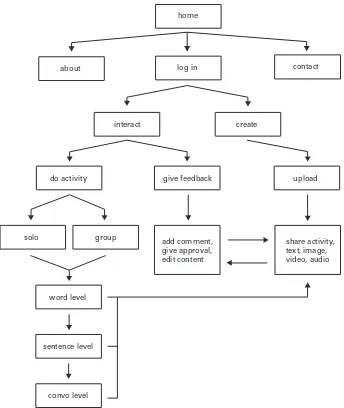
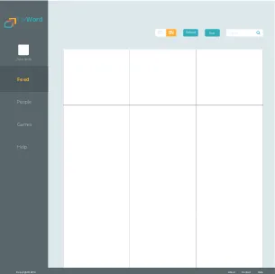
Once the branding was underway, I began preliminary ideation and planning for the web application and the educational games. A basic UI flow diagram was created to establish high-level relationships within the app (fig. 4). At this point, the main actions and interactions were clear enough to begin developing some rough wireframes. This would be the start of a process that persisted up until the final weeks of the project, which required continual refinement.
[image:11.612.199.543.292.700.2]Stage 2 – Early Concepts
Figure 4. UI Flow Diagram
give feedback upload
share activity, text, image, video, audio add comment,
give approval, edit content
create interact
do activity
solo
word level
sentence level
convo level group
home
log in
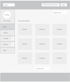
The first and most crucial piece to wireframe was the content feed, as this was the primary feature of the tool (fig. 5). The feed is where the user would first land upon arriving to the site and where collaboration and sharing among users would take place. This was accounted for within the initial layout, as the feed was given the largest amount of space. Initial concepts used both a top and left navigation menu.
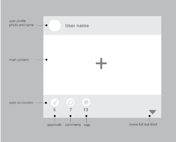
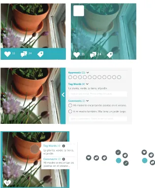
[image:12.612.251.534.280.610.2]Encouraging interaction with the feed was one of the main goals and it was important to visually indicate this to the user. Rough concepts for the content boxes included indicators of the content creator, peer approval, a comment feed, and vocabulary tags (fig. 6). At first glance, users would be provided with numerical information, i.e. the number of users that approved the particular piece of content, and it was necessary to also give the ability to interact with and reveal the full scope of activity within a piece of content.
Figure 5. Initial Content Feed Wireframe
Logo Welcome, John Smith! Login
Search bar
User name
Feed
Create
Friends
Games
Help
Load more Sorting Navigation
Content Content Content
Content Content Content
Content Content Content
0
Based on the fact that users would build and share content, I developed three game concepts. ForWord users would ultimately create each game. This could happen directly by physically building the game within the application or indirectly by contributing content to it via the feed.
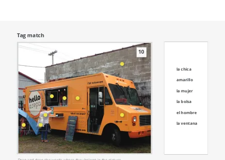
[image:13.612.240.540.168.410.2]The games would make use of the uploaded photos and content, such as the vocabulary tags. Initial ideas included matching vocabulary words with content found within an image (fig. 7), matching sentences to the context of an image, and a two-player game where live conversation via message feed would guide a player to complete a puzzle that the opposing player had created.
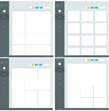
Once the basic framework of the project was established, the next step was a deeper exploration of the feed layout and interactions. A few variations of the navigation were designed. A single, standard top navigation would maximize the amount of space for the actual content. In this case, buttons and other actionable items could be incorporated into the page itself (fig. 8). A layout with off-canvas navigation was briefly considered and later abandoned (fig. 9). It was imperative that content was not hidden or difficult to find.
Figure 7. Vocabulary Match Game Concept Drag and drop the words where they belong in the picture.
Tag match
la chica
amarillo
la mujer
la bolsa
el hombre
la ventana
10
Figure 8. Feed concept wireframe
Figure 9. Feed concept wireframe with off-canvas navigation
Copyright ©2013 About Contact Help LOGO
Load More
November 22, 2013
Feed Games Groups People
Sort Upload Seach
Feed
Copyright ©2013 About Contact Help
Copyright ©2013 About Contact Help LOGO
Load More
November 22, 2013
Sort Upload Seach
Feed
EN
[image:15.612.160.540.452.679.2]After some research and feedback from advisors and peers, it was concluded that a combination of a top navigation and a left navigation would provide the best user experience (fig. 10). Both menus would be fixed, allowing the user to continually scroll through potentially lengthy content areas without losing orientation or important features.
[image:16.612.235.540.415.719.2]The left navigation would contain the items of highest importance, giving easy access to the areas of the website that users would frequently navigate between. This type of menu system has been found to be faster and more efficient to scan when presenting a minimal amount of options. It is natural for users to scan vertically from top to bottom, and a straightforward user interface was a top priority for the target audience. Using a top navigation in conjunction with the left navigation would help to separate distinct items. The top menu bar would be a domain for the logo and for actions that would apply to every area of the site, i.e. content sorting and language options.
Figure 10. Feed concept wireframe with top and side navigation
Feed
People
John Smith
Games
Help
Sort Upload Search
EN
ES
Copyright ©2014 About Contact Help
Feed People John Smith Games Help Sort Upload Search EN ES
Copyright ©2014 About Contact Help
ForWord Adelante Feed People John Smith Games Help Sort Upload Search EN ES
Copyright ©2014 About Contact Help
ForWord Feed People John Smith Games Help Sort Upload Search EN ES
Copyright ©2014 About Contact Help
ForWord Adelante Feed People John Smith Games Help Sort Upload Search EN ES
Copyright ©2014 About Contact Help
ForWord Adelante
[image:17.612.178.541.324.692.2]Several variations of the feed were designed to help determine the best method for displaying content and also encouraging interaction (fig. 11). Feed layout options included a grid of square content boxes that were equal in size and several versions of grids with content boxes of varying sizes, shapes, and arrangements. Would these content boxes have spacing between them or would they meet at the edges to create one large mosaic? Would the boxes have borders? The idea of borders sparked the exploration of the use of color (of borders and tags) to indicate different types of content within the feed (fig.13). These are a sampling of design questions that were debated and answered.
The next step in the process involved defining the UI elements and interactions of the content presented in the feed. Early concepts displayed the content creator and the number of peer approvals, comments, and tag words for each image. A number of concepts were designed and deliberated (fig. 12). Several options proposed showing this information by default, using icons, content bars, etc. Other ideas proposed displaying the information on hover of the image or on click of a tab or button to reveal the content. Further explorations included popups to show content, the use of a radial menu system, and dynamic indicators and buttons that would change in size or color based on the type or amount of content they represented.
Figure 12. A sampling of feed interaction concepts
11 24 11 24
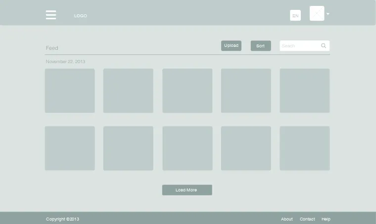
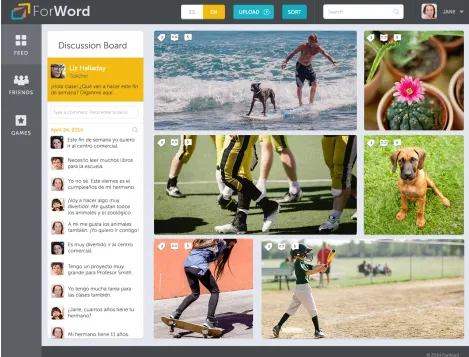
The final high fidelity wireframes reveal the final design decisions (fig. 14). Many modifications were made after research, advisor and peer review, and user testing. In terms of navigation, both the left navigation and top navigation are minimal in size to give as much emphasis to the content as possible. The profile is located in the top bar, as this is an expected location for this element and its associated menu items (My Account, Settings, and Logout). Furthermore, this organizes the related items of Feed, Friends, and Games into one area in the left navigation with easy access. Left menu items are presented as icons with supporting labels to add personality while retaining quick recognition. Stage 4 – High Fidelity Wireframes
Copyright © 2014 ForWord Adelante. All rights reserved.
LOAD MORE...
7 23
12 26
33
GAMES FRIENDS
FEED
JANE SMITH Search
SORT UPLOAD
EN ES Adelante
[image:19.612.72.539.165.442.2]ForWord
Figure 14. FInal ForWord Feed Design
Figure 15. Feed Design with Expanded Content View
In the final stages, icons and interactions of the feed content were refined. Icons are designed to accommodate double-digit numerical values and are unified in style and weight. The peer approval feature was removed and replaced with a dictionary feature, which adds significant value to the tool (fig. 16). This is in line with the instructional nature of ForWord. The removal of the approval factor helps to avoid unfair advantages or potential peer relation issues tied to popularity.
Due to limitations on timeline and scope of this project, the Friends and Games aspects of the tool are not fully realized. Nevertheless, landing page designs were created for both pages. The Friends design took the form of a grid of the user’s peers or classmates that they are connected with via ForWord. Users have the ability to create or join a group of users. The concept is that students could collaborate on projects and share information and materials, inside or outside of the classroom.
[image:23.612.125.541.441.713.2]The Games design also takes the form of a grid, and lists games that are available to the user (fig. 17). Basic information, such as the creator, title, type, best time, and total plays are available at first glance. This gives the user an introduction to the game before they commit to playing. The design for Games has two unique elements: a leaderboard and Friends Online module. The leaderboard encourages recognition and healthy competition among peers by tracking user activity. The Friends Online module provides a list of the user’s friends and their current system status (available, busy, offline). This gives the user an indication of which friends they can invite to collaborate or play games with at any time.
With finalized designs, it was crucial to introduce the element of interaction to bring the project to life. The prototype was used to demonstrate the overall user experience and interactions of the tool. This allowed for review and testing of the navigation and layout, as well as the application from a holistic point of view. During this process, additional items had to be fully considered and designed, such as the workflow for a user to upload content (fig. 18). The image tagging process was designed as well and incorporates an engaging drawing tool interaction (fig. 19).
[image:24.612.207.539.309.490.2]Stage 5 – Prototype & Game Demo
Figure 18. Upload a Picture Process
[image:24.612.247.539.529.715.2]After much training and trial and error, an interactive proof-of-concept was built with the prototyping tool Axure (fig. 20). Most assets were taken from the high fidelity designs and exported as separate pieces to be used in Axure. This included designing various states for buttons and other interactive elements. This proved to be somewhat problematic, as the use of high quality images increased the initial prototype load time. It was best to recreate elements in Axure where possible, and this was done with the left navigation. In hindsight, Axure may have been better suited for the creation of a lower fidelity prototype. Nonetheless, the prototype was very successful in easily demonstrating complex interactions and served its chief purpose as a proof-of-concept.
The HTML5 Canvas game demo is incorporated into the Axure project itself, which gave an additional layer of realism to the prototype. The game demonstrates the use of word tags in an image and how they can be used to test and reinforce knowledge in a fun way. Players must correctly match the given vocabulary words with their respective locations in a photograph.
Assets for the game were created in Adobe Illustrator and Adobe Photoshop and imported into Adobe Flash. JavaScript and jQuery were used to create a timed game where the vocabulary words are dynamic, draggable items that react to mouse events. The game went through several iterations and the final product is largely based on user feedback, collected in written form and through direct observation.
[image:26.612.253.539.458.708.2]It was important to provide visual feedback to the user throughout gameplay. In the first version of the game, when a user placed a vocabulary word on an incorrect tag location, the tag icon would turn red to indicate the wrong choice. If placed on the correct tag location, the tag icon would turn green and the vocabulary word item would disappear, indicating the right choice and completion of that step.
Initial user testing revealed a common, primary concern: the tag icons were difficult to perceive among the content of the imagery. Other data collected indicated that the visual feedback provided, specifically the green and red color changes, weren’t apparent enough. Additionally, some users would prefer more of an introduction to the game upfront.
The second version of the game aimed to address these shortcomings. After some exploration and review, a circular overlay was added behind each tag to increase the contrast between the icon and the background (fig. 23). To increase readability, the vocabulary words were modified and set in all lower case. The definite article of each word was added (“el” or “la”) to indicate the gender of the noun, as this is of great importance in the Spanish language.
[image:27.612.134.541.256.421.2]Figure 23. Game Demo Version 2 Intro Screen
[image:28.612.140.540.437.672.2]To bring each component together in one common place, a one page website was created to showcase the project and the process (fig. 25). Built with Bootstrap as a framework, the website is responsive and simple in structure. Included in this promotional website is a short motion graphics piece that was created in Adobe After Effects. It builds off of the ForWord branding to hint at the project mission and ultimately, to pique interest in the project long after it was completed.
[image:29.612.155.541.291.644.2]Stage 6 – Promotional Components
User Testing & Feedback
Throughout the process, feedback was collected from a variety of audiences. The testing and review process included thesis advisors, RIT faculty, peers, foreign language educators, and members of the target audience and their parents. Two formal user testing sessions were conducted and each took a different approach.
The first user study was an evaluation of the initial version of the game demo (Appendix B). This session was conducted in a computer lab at RIT and had ten total participants. All users were RIT graduate students of mixed gender and ethnic backgrounds. The feedback was collected through a brief written survey. Users were provided with basic information about the demo and were asked to play the game as many times as they wished.
Once users were finished playing, they were asked to provide their feedback anonymously by completing a survey. Users were directed to rate the game across three areas on a scale of 1 (needs improvement) to 5 (strong). These three areas were design, graphics, and technical. In addition, users were asked to give their “thoughts about the game” in written form. The results revealed that the design of the game was unianimously ranked as strong (5). Both the graphics of the game and the technical aspect of the game were given an average rating of 4.1. Written comments indicated that some elements and graphics were difficult to see or understand.
The second user study was an evaluation of both the website prototype and the second version of the game demo and took the form of user observation. This session was conducted in a computer lab at RIT during the Image RIT Innovation and Creativity Festival. There were five total participants that fell within the target age group. Each participant was randomly approached from the pool of festival attendees.
Once the participant agreed to play the game, I watched them closely to study their experience, taking notes on their behaviors and any perceived pain points. When the user was finished playing the game and using the website, I asked that they complete a short survey (Appendix C). In some cases, I had the opportunity to further discuss the project with the participant and occasionally their guardian as well. This allowed me to gather feedback in a casual, conversational manner.
Results of the second survey indicated that the participants responded positively to the aesthetics of the project. In a simple rating question about the visual style of the website prototype, four out of five participants gave the highest possible rating of 5 to indicate that the look and feel the website was “excellent.” In a similar question, all five participants unanimously rated the visuals of the game demo with a 4, the second highest rating on the scale.
The survey showed mixed reviews in terms of the usability of the website and game demo. In a simple rating question about the ease of use of the website prototype, participants gave an average rating of 2.2, with 1 being easy and 5 being hard. In a similar rating question about the ease of use of the game demo, participants gave an average rating of 3.6, with 1 being easy and 5 being hard. These results may be attributed to the Spanish experience levels of the participants. While the majority of the particpants indicated that they had some knowledge of the Spanish language, user reliance on the Spanish cheat sheet that was provided may have hindered their experience and perception of the game. Further user testing would be required to draw clear conclusions.
Overall, the outcomes from both sessions were informative. The aesthetics of the game demo and the prototype were given high ratings. Testing results and discussion with participants indicated that most people found the project motivating. As intended, some individuals expressed that ForWord had the potential to be educationally engaging. Unexpectedly, many user testing comments were directed toward the teacher tools and resources. Several users suggested incorporating a feature for educators to upload materials.
ForWord utilizes modern, innovative technologies and interactions to guide learning within a classroom setting. It puts power in the hands of the learner and helps to create a sense of self-efficacy by allowing users to build and share their own educational material. ForWord builds upon the concept of sharing, which is at the very core of social media platforms, and incorporates this into education to add a level of community and collaboration. This creates an environment that fosters communication and growth over time. The project is designed in a smart and engaging way, placing importance not only on the material but also on the presentation and user experience.
Ultimately, ForWord is just the starting point of a larger undertaking. The concept has the potential for growth and expansion to other target audiences. On a smaller scale, future work could entail further development of each feature of the application, with emphasis on the community elements such as group creation. The incorporation of messaging and video would foster conversational activities and practice.
An educator’s version of the tool could be designed as well,
demonstrating how ForWord would work from a teacher’s perspective and how it could fully integrate into a classroom. Some additional features include the ability to upload and share documents and teaching materials. Furthermore, educators could have access to forums, discussion boards, or language-specific training tools. A mobile strategy for ForWord would be a necessity. Additionally, to further increase its relevance in the educational sphere, this tool could utilize analytics and data mining to gather student data and consequently improve instruction. Emerging and innovative technologies, such as computer vision and augmented reality, could be harnessed in the learning process by allowing for the identification of objects in the real world.
From a personal standpoint, ForWord offered insight into the process of creating a complex web application. The extensive research and iterative problem solving that went into this project provided invaluable knowledge about instructional design and user experience design as a whole. Incorporating a variety of deliverables into the project scope helped to strengthen my skills in these areas.
Appendices
Thesis Proposal for
Masters of Fine Arts Degree
Rochester Institute of Technology CIAS Visual Communication Design Christina Curtis
ForWord:
Christina Curtis
Rochester Institute of Technology School of Design
MFA Visual Communication Design
ForWord: a study of an interactive learning environment in foreign language
Christina Curtis 5 May 2014
Chief Advisor Date
Chris Jackson School of Design
Associate Advisor Date
Shaun Foster School of Design
Associate Advisor Date
Timothy Foxsmith School of Liberal Arts Title
Submitted by
Approvals
Thesis Proposal for
Keywords
interactive learning, collaborative learning, shared learning, secondary education, language, ESL, EEL, Spanish, social network
Today, children of immigrants are the fastest growing student population in the United States, necessitating a strong approach in education for English learners. Technology can be used to foster student collaboration and shared learning experiences, thereby increasing learner interest, motivation and learning outcomes. This project aims to use interaction design via new technologies in foreign language education.
Problem Statement
Education in the United States has transformed drastically over the past fifty years and is continually changing today. As we grow as a nation and as part of an increasingly connected international network, our educational system must reform to match the needs and best interests of both the population and the surrounding world.
Today, children of immigrants are the fastest growing student population in the United States. Students that learn English as a second language represent 10.6 percent of the K-12 public school enrollment, with the fastest increasing numbers in grades 7 through 12, and about 79 percent of these students speak Spanish as their first language (Calderon, Slavin, and Sanchez 2011).
The importance of language learning in schools is undeniable. With constant advances in technology, there are a multitude of new
possiblities in the field of education. In recent years, there has been the emergence of new technological devices that are utilized in education, such as smart boards, touch tables, and iPads. The role of digital technology in the classroom has been proven to be valuable for both learning outcomes and student motivation (Dhir, Gahwaji, and Nyman 2013).
The idea of “sharing” has become a part of our daily lives, and especially for children of the tech savvy Generation Z. Social media outlets and applications promote the sharing and subsequent peer approval of information, images, and videos, both personal and popular. Social media in the classroom remains relatively unexplored; an untapped resource.
Survey of Literature
Designing for children
Heller, Steven and Guarnaccia, Steven. Designing for children. New York, NY: Watson-Guptill, 1994.
This book provides good insight about how to design for young audiences. The authors look at hundreds of case studies to address important criteria and considerations in designing for children.
Design for kids
Eckert, Vicky, Efrén, Zúñiga, and Ana Freixas. Growing graphics: Design for kids. Barcelona: Index Book, 2009.
This book addresses designing for children and their parents from both a design and a marketing perspective. They divide the book into a number of age groups, covering ages 0-12 and discussing a number of important factors that designers should take into account.
Usability Issues in Designing for Kids
Nielsen, Jakob. “Children’s Websites: Usability Issues in Designing for Kids,” Nielsen Norman Group, September 13, 2010, accessed September 12, 2013, http://www.nngroup.com/articles/childrens-websites-usability-issues/.
This article covers important findings from the Nielsen Norman Group’s 259-page report on usability for Children ages 3-12. It points out some important findings, covering information ranging from their goals to physical limitations and guidelines for font size.
Design
Designing mobile interfaces
Hoober, Steven and Eric Berkman. Designing mobile interfaces. (O’Reilly Media, 2011), accessed September 11, 2013, Rochester Institute of Technology Catalog.
This book provides principles for designing user interfaces as well as some common patterns for interaction design on a number of different devices.
Mobile design pattern gallery
Neil, Theresa. Mobile design pattern gallery. (O’Reilly Media, 2012), accessed September 11, 2013, Rochester Institute of Technology Catalog.
This book acts as a user interface reference and has 70 mobile app de-sign patterns using real examples from current apps on various devices.
Designing for User Engagement
Sutcliffe, Alistair. Designing for user engagement: Aesthetic and attractive user interfaces. (San Rafael: Morgan & Claypool Publishers, 2010), accessed September 12, 2013, Rochester Institute of Technology Catalog.
This book focuses on the design process for user experience and engagement, going beyond the technical to give information about aesthetics and creating fun, engaging interfaces which will be especially important when designing for children.
User Interface Design Rules
Johnson, Jeff. Designing with the Mind in Mind. Boston: Morgan Kaufmann, 2010.
Digital Media Habits of Children
Gutnick, Lucas Aviva et al., Always connected: The new digital media
habits of young children (New York: The Joan Ganz Cooney Center at
Sesame Workshop, 2011).
This report looks at data of children and their lives with increasing exposure to digital media and technology. It examines children’s access to digital technology, how they spend their time, and their preferences. This will help to determine the extent to which an application or web-based tool would reach the intended audience.
Teens and Content
Lenhart, Amanda and Mary Madden, Teen Content Creators and
Con-sumers (Washington, D.C.: The PEW Internet and American Life Project,
2005).
This report looks at teens and their relationship to content on the internet. It offers statistics about demographics and teen behavior. They also provide teen’s opinions in relation to the internet and content. This will help in understanding the behavior and thoughts of the target audience.
Teens and Social Media
Lenhart, Amanda et al., Teens and Social Media (Washington, D.C.: The PEW Internet and American Life Project, 2007).
This report examines teenagers and their use of social media, specifically focusing on the conversational nature of online media. They report statistics regarding social networking, blogging, image and video-sharing, etc. This will help to provide a basis for the design of an educational tool that incorporates social media.
Subject Matter
The Role of the iPad
Dhir, Amandeep, et al. “The Role of the iPad in the Hands of the Learner,” Journal of Universal Computer Science 19, no. 5 (2013): 706-727.
This study reviews the benefits of using an iPad in an educational setting. They review a vast body of research to draw conclusions about the impact of interactive technology on learning and address common misconceptions. They also discuss the issues and challenges of this type of technology.
How Teachers Are Using Technology
Purcell, Kristen et al., How Teachers Are Using Technology at Home and
in Their Classrooms (Washington, D.C.: The PEW Internet and American
Life Project, 2013).
This report presents statistics about digital technology and its place in the classroom, discussing both the pros and cons from the perspective of teachers.
Tablets and Early Childhood Education
Couse, Leslie J., and Chen, Dora W. “A Tablet Computer for Young Children? Exploring It’s Viability for Early Childhood Education,” Journal
of Research on Technology in Education 43, no. 1 (2010): 75-98.
This article discusses the tablet and its viability for education,
specifically in motivating young children to draw. They note differences in success related to age and also in how the technology was
implemented by the teacher.
Motivation through Technology-supported Learning
Godzicki, Linda, et al. “Increasing Motivation and Engagement in Elementary and Middle School Students Through Technology-supported Learning Environments,” (master’s thesis, Saint Xavier University, 2013).
This thesis presents the results of a study involving middle school aged children and the effect of technology-supported learning environments on motivation. Teachers implemented a different technologies including computers, iPods, iPads, and interactive whiteboards. Results
indicated that the incorporation of technology increased motivation and engagement.
Apps for Learning
Dickens, Harry and Churches, Andrew. Apps for Learning: 40 Best iPad/
iPod Touch/iPhone Apps for High School Classrooms. Vancouver: 21st
Century Fluency Project Inc., 2011.
This book provides case studies for 40 successful iPad applications for high school education. In addition to an informative summary, they also discuss each app’s place in the classrom and benefits to education.
Tablets and Informal Language Learning
Chen, Xiao-Bin. “Tablets for Informal Language Learning: Student Usage and Attitudes,” Language Learning & Technology 17, no. 1 (February 2013): 20-36.
This article focuses on mobile-assisted language learning. They investigated how students use tablets to learn English in settings outside of the classroom, finding that mobile devices are ideal in creating interactive and collaborative environments for learning a language. Students also gave positive feedback regarding the usability of these devices for learning tasks.
Cooperative Language Learning
Zhang, Yan. “Cooperative Language Learning and Foreign Language Learning and Teaching,”Journal of Language Teaching and Research 1, no. 1 (January 2010): 81-83.
This article discusses the benefits of cooperative language learning in foreign language education. The author reviews relevant literature and compares traditional learning with cooperative learning.
Digital Storytelling in Foreign Language Teaching
Torres, Agustin Reyes, et al. “Digital Storytelling as a Pedagogical Tool within a Didactic Sequence in Foreign Language Teaching,”Digital
Education Review, no. 22 (December 2012).
Effective Instruction for English Learners
Calderon, Margarita, Slavin, Robert, Sanchez, Marta. “Effective Instruction for English Learners,” The Future of Children 21, no. 1 (Spring 2011).
This research review summarizes elements of effective instruction and successful program models in teaching English learners. The fastest-growing student population in the U.S. is children of immigrants. They discuss language and literacy instruction, and cooperative learning. This article gives a historical background and suggests a direction for the future.
Mobile Devices in Informal Language Education
Rahman, Mizanoor and Panda, Santosh. “Teaching English Through Open Non-formal Education in Bangladesh with an Effective Integration of ICT to Support Learning,”Turkish Online Journal of Distance
Education 13, no. 3 (July 2012).
This article discusses a program called “English in Action” which is a 9 year long funded project which aims to bring a change in English Language learning in Bangledesh. It provided English language lessons to people via their mobile phones and shows the relevence of using an ubiquitous ICT device for language learning, in terms of convenience as well as equity and reaching the widest audience.
Cognitive Psychology
Galotti, Kathleen M. Cognitive Psychology: In and Out of the Laboratory. United States: Thomson Wadsworth, 2008.
This textbook discusses core concepts in cognitive psychology, including cross-cultural perspectives. There is a lot of information that relates to learning and one chapter specifically covers language.
Educational Data Mining
Calders, Toon and Pechenizkiy, Mykola. “Introduction to The Special Section on Educational Data Mining,” SIGKDD Explorations 13, no. 2 (May 2012).
This article gives a brief overview of Educational Data Mining (EDM) as an emerging multidisciplinary research area and discusses four selected papers that show different application areas for data mining in education. This will be a good starting point to learn about EDM and its relevance to my project.
Sakai
sakaiproject.org
Sakai is a popular online global community that is currently creating technology that enhances teaching, learning and research. It provides open source software that offers various educational tools. Its usage by real students ultimately contributes to a large database of information.
LearnLab
learnlab.org
HTML5: Designing rich internet applications
David, Matthew. HTML5: Designing rich internet applications. Focal Press, 2013.
This book is a good reference for information and demos on HTML5, specifically its interactive and multimedia capabilities.
w3schools.com
Refnes Data, “w3schools.com,” w3schools, accessed September 12, 2013, http://www.w3schools.com.
This website offers an expansive and up-to-date library of information about HTML and CSS. It is a great, quick way to find an answer or learn new things.
Foundations of UX: Prototyping
Foundations of UX: Prototyping, James Williamson, in the lynda.com
library, accessed September 12, 2013, http://www.lynda.com/Web-Inter-action-Design-tutorials/Foundations-UX-Prototyping/133349-2.html.
This tutorial offers information about a number of prototyping options to help the viewer find the right solution for their design. It covers the basic concepts and goals of a prototype as well as some tools and resources to actually create one.
Create an iPad Web App
Create an iPad Web App, Chris Converse, in the lynda.com library,
accessed September 12, 2013, http://www.lynda.com/CSS-tutorials/Cre-ate-iPad-Web-App/98830-2.html.
This tutorial demonstrates how to create a Web App that will function successfully on both a desktop and a tablet using HTML5, CSS3, and jQuery. This offers a great solution to creating a prototype without having to dig deep into the development end of the process.
Creating an App Walkthrough in After Effects
Quick Tip – Creating an App Walkthrough in After Effects, Jesse Snyder,
in the aetuts+ library, accessed September 12, 2013, http://ae.tutsplus. com/tutorials/motion-graphics/quick-tip-creating-an-app-walkthrough-in-after-effects/.
This tutorial presents an overview of how to create a proof of concept for an appliation using motion graphics.
Technology
HTML & CSS
HTML5 Drag and Drop
Drag and Drop, @rem, in the html5demos library, accessed September
12, 2013, http://html5demos.com/drag#.
This demo shows how to use the native HTML5 drag and drop, which is one type of interactivity I would find useful in demonstrating the actual function of my design.
Axure
www.axure.com
This tool enables you to make interactive HTML prototypes of websites and applications. It allows you to design and sketch right within the program. You can incorporate dynamic content, animations, drag and drop, and calculations. This would be a good tool for my project because it would allow for relatively quick and straight-forward user testing.
Stand In
www.standin.io
This tool allows you to create prototypes from Photoshop in real time. It offers interactivity with button states, live text that users can edit, etc. You may also incorporate motion via transitions and animations. The drawback is that it is currently in private beta, and I am waiting for access.
Figure 1. Bubu Coloring Book Logo.
Figure 2. Five Kids Branding.
Figure 3. Next Liberty Graz Magazine.
Typography
[image:48.612.252.541.556.699.2]Visual Style
[image:49.612.251.541.347.477.2]Clean, fun, inviting, and youthful with subtle textures, organic forms, and combo of photo and illustration
[image:49.612.253.538.516.608.2]Figure 4. Property Management Website
Figure 5. Physics Textbook
Figure 6. Google Global Impact Website
[image:49.612.252.541.646.739.2]UI Influences
Minimal, user-friendly, engaging, incorporation of profile, icons, emphasis on display of contentFigure 8. Duolingo App
[image:50.612.251.542.607.737.2]Figure 9. AgenceMe Website
Concept
User Flowchartgive feedback upload
share activity, text, image, video, audio add comment,
give approval, edit content
create interact
do activity
solo
word level
sentence level
convo level group
home
log in
Login Page/Feed Wireframe
Content Box Wireframe
Logo Welcome, John Smith! Login
Search bar Profile
User name
Feed
Create
Friends
Games
Help
Load more Sorting Navigation
Content Content Content
Content Content Content
Content Content Content
0
0
User name
5 7 13
user profile photo and name
main content
stats on content
Promo Website Wireframe Logo Navigation
The Problem
The Solution
Check it out
Footer
Document Video
Blog
Game Demos
Game Concept 1
Utilizes user uploaded content as well as user created tags. Could use words or sentences. May involve a timer.
Drag and drop the words where they belong in the picture.
Tag match
el camión
la chica
amarillo
la mujer
la bolsa
el hombre
la ventana
el edificio
Game Concept 2
Utilizes user uploaded content as well as user created tags. May involve a timer.
Select and drag the photos in order of the story above.
Story Build
1
2
3
4
5
6
7
1
Laura espera en el aeropuerto en frente de un avión.2
Hay muchas personas en el aeropuerto hoy.3
Las casas son muy pequeñas de la venta del avión.4
Laura tiene un cuarto amarillo en el hotel.5
Ella bebe jugo de mango en el restaurante.6
Laura encuentra muchas conchas en la playa.Game Concept 3
Utilizes user uploaded content. One user creates the puzzle and the second user must ask questions to figure out where the pieces go. Stimulates conversation and the use of various vocabulary words.
Complete the photo puzzle by chatting with your partner. Drag and drop the photo in the correct spot.
Photo Puzzle
10
12
2
3
4
5
6
8
9
Send
Hay personas en el foto para cuadro número 4?
Si hay personas.
Una.
Deliverables
Promotional Website
I will design and build a single-page website in HTML5 and CSS3 to give information about the project and to provide access to the prototypes, game demos, thesis blog, and process.
Website Protype
I will use Axure to build a prototype of ForWord to show the design in a web environment and demonstrate the user interface. This prototype will be utilized in user testing. All assets will be created using Adobe Photoshop and Adobe Illustrator.
Game Demos
I will create a couple of the single player games using HTML5, CSS3, and JavaScript. These games will involve matching images and words through drag and drop interactivity. I may include tooltips to give the user help or to offer more information if needed.
Motion Graphics Prototype / Promo Video
Methodology / Implementation
The target audience for this project is English and Spanish learners from ages 11 to 14, but it will be relevant as an introductory language resource for anyone. These users would be students in the process of learning beginner level Spanish or English. The educational tool will take the form of an interactive and collaborative web environment. For the scope of this particular project, demonstrations will focus on vocabulary building. I might explore the possibility of utilizing educational data mining information to aid in the design of the content and UI structure.
The project will have three main design components: user interface, interaction, and motion graphics.
User Interface
I will design a web-based educational tool that will consist of several different pages. This will include flowcharts, wireframes, and the development of visual style via Adobe Illustrator and Adobe Photoshop. It will be tailored for desktop, tablet, and mobile use. The design will use the structure of a social media site in that it would allow for the creation and exchange of content. Each member would have their own profile and would be able to interact with other members. Content would be published and shared across this platform, forming the elements of educational games and lessons.
Interaction
This educational tool would allow for interaction and collaboration between members. Interactivity would also be present within the lessons and games available on the website. Such games would include flash cards, grouping imagery, creating drawings and visuals, developing short narratives, finishing incomplete narratives, etc. Interactions might include sorting, drag and drop, CSS3 transforms, tool tips, forms, etc. I will use HTML5, CSS3, JavaScript and jQuery to demonstrate a select group of these interactions.
Motion Graphics
Evaluation
Professionals in Foreign Language Education
I plan to speak with higher education Spanish professors as well as middle school Spanish teachers to gather information about successful teaching strategies and educational materials. At various stages, I will present them with my design and gather feedback on content, visual style, and usuability. Surveys and questionnaires will be used.
Target Audience
Dissemination
Pragmatic Considerations
To promote my thesis project, I will post content on a personal blog, as well as on design community websites such as vimeo, dribbble, and hunnie to get both traffic and feedback. I may also submit my project to various design competitions such as:
The 2014 RAF ADDY Awards tba
HOW Interactive Design Awards tba
AIGA (Re)design Awards tba
AIGA Design Ignites Change Fellowship tba
Art Directors Club Annual Awards tba
Communication Arts Interactive Competition tba
Adobe Design Achievement Awards tba
Promotion
Cost for posters and thesis displays $50
Competition Entrance Fees $300
Purchasing Domains
Promotional Website $20
Demonstration Website $20
Project Assets
Product Mockup Files (iPad, iPhone, desktop) $20
Stock Imagery $50
Research
Proposal Defense October 21, 2013
Thesis Defense May 5, 2014
1st Meeting October xx, 2013
2nd Meeting October xx, 2013
3rd Meeting October xx, 2013 Evaluation & User Testing
Concept Sketches
Flowcharts & Wireframes
Demo Development
Publish Website Website Development
Motion Graphics
Documentation
Print Posters High Fidelity Wireframes
Visual Style Thesis Proposal
Prototype Creation
Thesis Show May 23, 2014
Bibliography
AgenceMe. accessed October 11, 2013, agence-me.com.
Anderson, Kelli. “Book Covers, re-imagined in Paper”, dribbble, accessed October 11, 2013, http://dribbble.com/shots/1174628-Book- Covers-re-imagined-in-Paper?list=users.
Calderon, Margarita, Slavin, Robert, Sanchez, Marta, “Effective
Instruction for English Learners,”The Future of Children 21, no. 1 (Spring 2011).
Calders, Toon and Pechenizkiy, Mykola. “Introduction to The Special Section on Educational Data Mining,” SIGKDD Explorations 13, no. 2 (May 2012).
Chen, Xiao-Bin, “Tablets for Informal Language Learning: Student Usage and Attitudes,” Language Learning & Technology 17, no. 1 (February 2013): 20-36.
Couse, Leslie J., and Dora W. Chen, “A Tablet Computer for Young Children? Exploring It’s Viability for Early Childhood Education,” Journal of Research on Technology in Education 43, no. 1
(2010): 75-98.
Create an iPad Web App, Chris Converse, in the lynda.com library, accessed September 12, 2013, http://www.lynda.com/CSS-tu torials/Create-iPad-Web-App/98830-2.html.
David, Matthew, HTML5: Designing rich internet applications. Focal Press, 2013.
Dhir, Amandeep, Gahwaji, Nahla M., and Gote Nyman, “The Role of the iPad in the Hands of the Learner,” Journal of Universal Computer Science 19, no. 5 (2013): 706-727.
Dickens, Harry and Andrew Churches, Apps for Learning: 40 Best iPad/ iPod Touch/iPhone Apps for High School Classrooms.
Vancouver: 21st Century Fluency Project Inc., 2011.
Eckert, Vicky, Efrén, Zúñiga, and Ana Freixas, Growing graphics: Design for kids. Barcelona: Index Book, 2009.
Fleve, Balina, Olga, Poydo, Sergey, Abramov, Vit, and Crime, Art, “Five Kids”, Behance, accessed October 11, 2013, http://
www.behance.net/gallery/Five-Kids/9854321.
Foundations of UX: Prototyping, James Williamson, in the lynda.com library, accessed September 12, 2013, http://www.lynda.com/
Web-Interaction-Design-tutorials/Foundations-UX-Pro
totyping/133349-2.html.
Galotti, Kathleen M., Cognitive Psychology: In and Out of the
Laboratory. United States: Thomson Wadsworth, 2008.
Godzicki, Linda, Godzicki, Nicole, Krofel, Mark and Rachel Michaels, “Increasing Motivation and Engagement in Elementary and Middle School Students Through Technology-supported Learning Environments,” (master’s thesis, Saint Xavier University, 2013).
Gutnick, Lucas Aviva, Robb, Michael, Takeuchi, Lori, and Jennifer Kotler. Always connected: The new digital media habits of
young children (New York: The Joan Ganz Cooney Center at Sesame Workshop, 2011).
Heller, Steven and Guarnaccia, Steven, Designing for children. New York, NY: Watson-Guptill, 1994.
Hoober, Steven and Eric Berkman, Designing mobile interfaces. (O’Reilly Media, 2011), accessed September 11, 2013, Rochester Institute of Technology Catalog.
Johnson, Ben, “Prop Management Web”, dribbble, accessed October 11, 2013, http://dribbble.com/shots/602867-Prop-Management- Web?list=users.
Lenhart, Amanda, Madden, Mary, Macgill, Alexandra Rankin, and Aaeon Smith, Teens and Social Media (Washington, D.C.: The PEW
Internet and American Life Project, 2007).
Lenhart, Amanda and Mary Madden, Teen Content Creators and Con
sumers (Washington, D.C.: The PEW Internet and American
Life Project, 2005).
Loranger, Hoa and Nielsen, Jakob, “Teenage Usability: Designing Teen- Targeted Websites,” Nielsen Norman Group, February 4, 2013, accessed March 12, 2014, http://www.nngroup.com/articles/ usability-of-websites-for-teenagers/.
Moodley Brand Identity, “Next Liberty”, Behance, accessed October 11,
2013, http://www.behance.net/gallery/Next-Liber
ty-Corporate-Publishing/11220647.
Neil, Theresa, Mobile design pattern gallery. (O’Reilly Media, 2012), accessed September 11, 2013, Rochester Institute of Technology Catalog.
Nielsen, Jakob, “Children’s Websites: Usability Issues in Designing for Kids,” Nielsen Norman Group, September 13,
2010, accessed September 12, 2013, http://www.nngroup.com /articles/childrens-websites-usability-issues/.
“Photo Challenge”, Duolingo, accessed October 11, 2013, http://www. duolingo.com/info.
Quick Tip – Creating an App Walkthrough in After Effects, Jesse Snyder, in the aetuts+ library, accessed September 12, 2013,
http://ae.tutsplus.com/tutorials/motion-graphics/quick-tip-creat ing-an-app-walkthrough-in-after-effects/.
Rahman, Mizanoor and Santosh Panda, “Teaching English Through Open Non-formal Education in Bangladesh with an Effective Integration of ICT to Support Learning,”Turkish Online Journal of Distance Education 13, no. 3 (July 2012).
Strawiak, Zaneta, “Physics Textbook”, Behance, accessed October 11, 2013, http://www.behance.net/gallery/Phys
ics-textbook-BA-project/7289873.
Sutcliffe, Alistair, Designing for user engagement: Aesthetic and attractive user interfaces. (San Rafael: Morgan & Claypool Publishers, 2010), accessed September 12, 2013, Rochester Institute of Technology Catalog.
Szende Brassai, “Bubu Coloring Book”, dribbble, accessed October 11, 2013, http://dribbble.com/shots/393051-Bubu-Coloring- Book?list=searches&tag=bubu.
Thorleifsson, Haraldur, “Google Impact Challenge”, dribbble, accessed October 11, 2013, http://dribbble.com/shots/1003502-Google- Impact-Challenge?list=searches.
Torres, Agustin Reyes, Ponce, Eva Pich, and Dolores Garcia Pastor, “Digital Storytelling as a Pedagogical Tool within a Didactic Sequence in Foreign Language Teaching,”Digital Education
Review, no. 22 (December 2012).
Van Der Bent, Erika, “Education platform profile page”, dribbble, accessed October 11, 2013, http://dribbble.com/shots/809475- Education-platform-profile-page?list=users.
www.axure.com
www.learnlab.org
www.sakaiproject.org
www.standin.io
Appendix C: User Survey 2
Demographics
Age
Gender
Education Level
Spanish Experience Level
The Website (Prototype)
How easy is it to use the website?
1 2 3 4 5 easy hard
The Game
How easy is it to play the game?
1 2 3 4 5 easy hard
Thanks!
a short survey about the projectHow motivated would you be to use this website to learn?
1 2 3 4 5
not at all very
How motivated would you be to use a game like this to learn in class?
1 2 3 4 5
not at all very
How would you rate the look and feel of the website?
1 2 3 4 5 poor excellent
Comments and Feedback
How would you rate the look and feel of the game?
1 2 3 4 5 poor excellent
Do images and other kinds of visual media help you to learn new things?
1 2 3 4 5 not at all very much
Does working with others motivate you to learn?
Photography Credits
Stock photography was purchased from Stocksy United for some of the photographic images that appear within the various User Interface designs of this thesis project. Credit and gratitude is given to the following list of photographers.
© Alexey Kuzma / Stocksy United © Eduard Bonnin / Stocksy United © Gillian van Niekerk / Stocksy United © Kelly Knox / Stocksy United © Laura Stolfi / Stocksy United © Marija Anicic / Stocksy United © Sean Locke / Stocksy United © Shelly Perry / Stocksy United © Tomas Kraus / Stocksy United
Bibliography
Calderón, Margarita, Slavin, Robert, and Marta Sánchez. “Effective Instruction for English Learners,”The Future of Children 21, no. 1 (2011): 103-127.
Dhir, Amandeep, Gahwaji, Nahla M., and Gote Nyman, “The Role of the iPad in the Hands of the Learner,” Journal of Universal Computer Science 19, no. 5 (2013): 706-727.
Lenhart, Amanda, Madden, Mary, Macgill, Alexandra Rankin, and Aaeon Smith. Teens and Social Media (Washington, D.C.: The PEW
Internet and American Life Project, 2007).
Loranger, Hoa and Nielsen, Jakob. “Teenage Usability: Designing Teen- Targeted Websites,” Nielsen Norman Group, February 4, 2013, accessed March 12, 2014, http://www.nngroup.com/articles/ usability-of-websites-for-teenagers/.