City, University of London Institutional Repository
Citation
: Turkay, C., Mason, S., Gashi, I. & Cukic, B. (2014). Supporting Decision-making
for Biometric System Deployment through Visual Analysis. Paper presented at the Reliability
and Security Data Analysis (RSDA) Workshop, International Symposium on Software
Reliability Engineering, 03-11-2014-06-11-2014, Naples, Italy.
This is the accepted version of the paper.
This version of the publication may differ from the final published
version.
Permanent repository link:
http://openaccess.city.ac.uk/4535/
Link to published version
:
Copyright and reuse:
City Research Online aims to make research
outputs of City, University of London available to a wider audience.
Copyright and Moral Rights remain with the author(s) and/or copyright
holders. URLs from City Research Online may be freely distributed and
linked to.
Supporting Decision-making for Biometric
System Deployment through Visual Analysis
Cagatay Turkay1, Stephen Mason2, Ilir Gashi2
1giCentre,2CSR,
Department of Computer Science, City University London
{Cagatay.Turkay.1, stephen.mason.1, ilir.gashi.1}@city.ac.uk
Bojan Cukic
Department of Computer Science, College of Computing and Informatics, University of North Carolina, Charlotte
Abstract—Deployment of biometric systems in the specific environment is not straightforward. Based on pre-deployment performance test results, a decision maker needs to consider the selection of sensors and matching algorithms in terms of the cost, expected false-match and false-non-match failure rates and the underlying quality factors. which depend on operational scenarios, personnel training, demographics, etc. In this paper, we investigate information aggregation through vi-sualization of fingerprint authentication experiments obtained from a large scale data collection with 494 participants. The data was collected using four biometric image capture devices. Each fingerprint image was analysed with two image quality algorithms, and the matching scores were generated using three different matchers. Additionally we collected and analyzed the impact of demographic characteristics, such as gender, age, ethnicity, height and weight, on system performance.
Keywords-Security data analysis, Visual analytics, Biomet-rics, Decision support.
I. INTRODUCTION
Fingerprint biometric systems are commercially the most widely used biometric modality, popular in user identifica-tion or user identity authenticaidentifica-tion. Fingerprints get used in a variety of applications from border control and military operations, to business applications and mobile phones.
A complete biometric system deployment is usually com-posed of several off-the-shelf components: a hardware and software component for fingerprint image capture; a soft-ware component for rating the quality of the captured image files; and a software matching algorithm(s) which, when given two fingerprint images as input, produce as output a match score - an estimate of the likelihood that these two images come from the same finger(s).
The authentication process needs (at least) two samples of the fingerprint image from each user, one stored in the
gallery following the enrollment, and the other collected
as a probe. System architects need to anticipate a realistic
scenario in which image capture components/devices used for collecting the gallery entry will not be the same as the device used at the time of authentication. Hence an important consideration for system deployment is the level of interoperability between these devices.
Recently, we have provided a comprehensive analysis of the effects of interoperability on the overall dependability of the fingerprint matchers [1]. One limitation we identified during this analysis is that system deployment teams may have a number of questions with system performance impli-cations that are not covered in ours or similar studies. The users need flexible methodologies where they can quickly investigate different questions about the data. For example, an interesting question may be ”how do devices perform for males who are tall and underweight”; the data set may have relevant information for this question which may be easily discernible with the right visualization aids.
In this paper we explore how data visualization tech-niques help a decision maker to make better decisions on biometric system deployment to balance the trade-offs between cost and failure rates when combining the different components (e.g., fingerprint image capture devices, image quality algorithms and matchers) in a complete system for a given environment. Because the data that the decision-maker needs to use to make a decision is multi-dimensional (e.g., different components and multiple demographic aspects), data visualization techniques are a useful mechanism to allow the user to identify trends, anomalies and trade-offs in a fast and intuitive manner. We introducedistinction plots, a novel visualization technique, to represent the matching performance for device pairs. We demonstrate the use of these plots within a visualization framework that presents a decision-maker with simultaneous, multiple views of the data, giving them a rich, dynamically-changing, intuitive interface which supports detailed analysis. We then illustrate the use of the tool with the fingerprint biometric data.
II. RELATED WORK
Diverse fingerprint capture platforms: Marasco et al.
for all device pairs. Poh et al. designed a Bayesian Belief Network (BBN) to estimate the posterior probability of the device d given quality q, referred to as p(d—q) [3]. Clustering is applied to each device to explain hidden quality factors. However, such data clustering does not explicitly model the influence of each device. Jain and Ross considered the interoperability issue as one related to the variability induced in the feature set when different sensor technologies are used (e.g. optical vs. capacitive) [4]. Ross and Nadgir subsequently proposed a compensation model which com-putes the relative distortion between images acquired using different devices [5]. The model is based on a thin-plate spline whose parameters rely on control points manually selected in order to cover representative areas where dis-tortions can occur in the fingerprint image. Their method is, therefore, not completely automated.
Age/Gender Literature in Biometrics: Past studies
ex-amined fingerprints from different age groups and gender [6]. Effects of ageing impact the quality of fingerprints. Over the life of the individual, the skin becomes drier and thinner; reduction of collagen causes skin wilting. These factors affect the sample provided to the fingerprint sensor [7]. Age affects the differences in quality of the physical state of the fingerprint (e.g., skin deterioration), while the ridge/valley pattern is believed to remain stable over the life time of an individual. Regarding gender, most of the works analysed ridges in the spatial domain. They observed that females present a higher ridge density compared to males, due to finer epidermal ridge details. In 1999, Acree manually counted ridges in a well-defined fingerprint area [8], indi-cating a higher density in females. In [9] [10] fingerprints are classified based on gender / age using statistics such as white lines count and ridge count that are manually extracted as proposed by Acree.
Visualization: Interactive visualizations have been used
extensively in the analysis of multivariate and high-dimensional data [11], [12] and feature selection [13]. In-teractive visual analysis methods have also helped decision makers to evaluate options when giving decisions [14]. Such solutions have been applied to various domains from epidemic mitigation [15] to financial decision making [16].
III. DATA COLLECTION AND ANALYSIS
A. Data collection
In this study, we analyse data from a large-scale study from 2012 in which we collected all ten fingerprints of 494 participants using 4 different biometric devices. The order of use of fingerprint scanners was the same for all 494 volunteers. Each of them self-reported age, gender, ethnicity, height and weight. Failures in our case are defined as false-matches (a fingerprint is judged to belong to a person when in fact this is not the case) and false-non-matches (a finger-print is judged to not belong to a person when in fact this is the case). In our analysis we use right point fingers only,
typical for authentication applications. The sample of 494 is appropriate since we are dealing with human participants and we followed a properly approved collection protocol that required volunteers to dedicate one hour of time to biometric data collection for which they were adequately compensated. The fingerprints were captured twice per person: once for the purpose of creating the enrolment orgallery imageand the second time for the purpose of creating theprobe image
for identification or authentication.
Fingerprints were acquired using four Live-scan devices (D0 - D3)1. The devices are widely used in industry and hence representative of common real world installations. For each Live-scan device participants provided two sets of fingerprints (in the same lab visit, i.e. one after the other), for each device consisting of: rolled individual fingers on both hands, left slap (i.e. slapping the four (non-thumb) fingers on the device), right slap, and thumbs slap. Fingerprints were collected without controlling the quality or the position of the finger. For the purpose of the analysis in this paper we have used the right hand’s index fingerprints only.
Fingerprint image quality was assessed using two different quality algorithms: NIST Fingerprint Image Quality (NFIQ) algorithm2; and MITRE IQF3.
We generated the match scores using three Commercial Off-the-Shelf (COTS) fingerprint matching products:
• (M1) Identix BioEngine Software Development Kit4 ; • (M2) Bozorth3, an open source minutiae based
finger-print matcher developed by NIST5;
• (M3) BIO-key WEB-key Software Development Kit6.
In the rest of the text, we use the abbreviations M1, M2 and M3 to refer to these three matching algorithms. A matching algorithm compares two fingerprint images and returns a score based on the similarity between the two templates. The higher the score the more likely it is that the two templates come from the same finger.
As we can see from above, we have several different dimensions to the dataset: two fingerprint images per par-ticipant per device, captured with four devices (D0-D3), each image quality score calculated with two image quality algorithms (NFIQ and MITRE), gallery and probe images matched with three matchers (M1-M3). Additionally we have soft biometrics on each participant (gender, age, height and weight). Depending on whether the probe and gallery images are captured with the same device then we have two matching scenarios: i) comparing two fingerprints captured with the same device (intra-device), and ii) comparing two fingerprints captured with different devices (inter-device). The large number of dimensions to this dataset can be
1See [1] for details on these devices 2http://www.nist.gov/itl/iad/ig/nbis.cfm
overwhelming for a decision maker who needs to decide on an optimal deployment for a given environment. Hence, we decided to study data visualization techniques that may help make this task easier for the decision maker.
B. Analysis Tasks & Requirements
As mentioned previously, in biometric systems, a match-ing algorithm returns a matchmatch-ing score as output given two fingerprint images (templates) as input. The higher the matching score the more likely it is that the two images belong to the same individual. During system deployment and configuration a decision is made on where to set the matching score threshold for genuine claims of identity: any matching score above this threshold is assumed to result in a claim of identity being accepted; and any value lower than this threshold results in the claimed identity being rejected. There are two types of failures that are important to consider during authentication and identity verification: false-matches (incorrectly accepting a claimed identity of an impostor -this would result from a matching score of two images from two different people being higher than the threshold) and false-non-matches (incorrectly denying a claim of identity from a genuine person - this would result from a matching score of two images from the same person being lower than the threshold). A good biometric system minimises both of these types of failures, but there is a clear trade-off during configuration as attempting to minimise the probability of one type of failure, increase the probability of another type of failure occurring. We have previously shown [1] that the decision on where to set the threshold seems to be highly influenced by several factors, including the type of devices that have been used to capture the images, the image quality, the matcher that has generated the scores, the gender and age of the identity claimant etc. In order to inform our design and the analysis process we employ, we identify a number of questions (tasks) to be addressed that are critical in making decisions in deploying biometric systems:
T1 :Visualize the ”distinctiveness” for each probe device, gallery device and algorithm combination: the extent to which a threshold value clearly separates the genuine scores from the impostor scores.
T2 :Visualize the overallinter-device,intra-device match-ing performance and matchmatch-ing algorithm performance.
T3 :Investigate through visualization the relation between soft biometrics (age, gender, height, weight) and the match-ing performance.
IV. VISUALIZATION DESIGN
The design of our visualization is guided by the three analysis tasks listed above. The basic building block of our analysis is adistinction plot: the distribution of the matching scores for a given matcher (M1, M2 and M3), using the images (probe and gallery) captured with a given pair of devices (from D0-D3). The device used to capture the probe
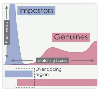
Impostors
Genuines
Overlapping region
Matching Scores
F
re
q
u
e
n
ci
e
[image:4.612.336.526.71.244.2]s
Figure 1. Distinction plots visualize the score distribution for the impostors and genuines separately. The overlapping region is an indication of how likely is a classification error.
image will be abbreviated PD, and the device used to capture the gallery image is abbreviated GD. Hence each distinction plot gives the matching scores for a given pair of devices (e.g. PD0-GD1-M1: represents a distinction plot of matching scores calculated with M1, where the D0 device was used to capture the probe images, and D1 was the device used to capture the gallery images). As stated previously, we can have two matching scores depending on whether the two images belong to the fingerprint of the same person or not:genuines andimpostors. Genuines are calculated from matching two images of the right index finger of the same participant and impostors are calculated from matching the images of the right index finger of each participant against the other participants in the study.
In the plots, the genuine scores are plotted red, while the impostor scores are plotted in blue/purple (see example in in Figure 1). The x-axis represents the normalised matching score (high scores to the right of the origin), and the y-axis represents the frequency of given scores. We have a maximum of 494 genuine matching scores per device combination (as we have 494 participants), whereas a much higher number of impostors scores (as each participants image is matched with 493 others from the study). Plotting the graphs with these actual frequencies would make it difficult to visually compare the overlapping regions of red and blue scores. We have therefore set the maximum of the y-axis to be 10% of the impostor scores frequency (though of course this can be varied depending on what the analyst wishes to view).
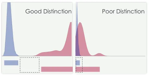
Good Distinction Poor Distinction
Figure 2. The distinction plot on the left shows a good discrimination of genuine and impostors. This is visible from the gap between the ranges. While in a poor distinction in a subset, the overlapping region is wider.
of scores and coloured them correspondingly (see bottom in Figure 1). These views together are an indication of how successful is a combination at distinguishing genuines from impostors. A gap between the two ranges indicates a good distinction (Figure 2, left), while a large overlap (Figure 2, right) indicates that we cannot choose a threshold that will perfectly separate the two classes.
To allow the analyst to visually inspect and compare the performance of each device pair with each matcher we had to decide how best to design the layout of the different plots (with 4 devices and 3 matchers, this gives us 48 different distinction plots). We present these plots in a structured ordering as a small multiple view [17] as seen in Figure 3. They are grouped vertically according to the different matcher algorithm used and horizontally according to whether the gallery and probe images where captured with the same device (e.g. GD0-PD0) (top 4 plots per matcher) – what we calledintra-devicematching earlier, or with different devices (e.g. GD0-PD1) (bottom 12 plots per matcher) – inter-devicematching. We took this design decision to enable the discussion ofT2 from Section III-B. In order to be able to compare all these small multiples within the view, we use exactly the same y-axis cut-off value for all the graphics, i.e., they all share the same scale.
The top left corner of Figure 3 shows four graphs of normalised matching scores, generated with M1 and using the same devices for gallery and probe. In these four graphs we are showing the matching scores when comparing two fingerprints captured with the same device (intra-device). Hence the title of the top-left most graph ”PD0-GD0-M1” means the Probe image P was obtained with device D0, the gallery image G was obtained with device D0, and the matching score was obtained with matcher M1. The same convention was used for all other graphs. The left-most bottom corner shows 12 graphs for the inter-device comparisons (where the gallery and probe images where obtained with different image capture devices) with matcher
M1. The middle part of Figure 1 shows the inter-device (top 4 graphs) and intra-device (bottom 12 graphs) for matcher M2 and finally the right most part of Figure 3 contains the corresponding graphs obtained with matcher M3.
This view is embedded within a linked multiple view system where the user is able to bring up several other visualizations of the data using common statistical graphics such as histograms and scatterplots. Such views provide the capability to interactively generate visual queries based on the soft biometrics. Whenever a selection in these views is performed, all the distinction plots update automatically to reflect the score distributions within the selected data. This enables a decision maker to quickly vary the scope
of the analysis and get immediate feedback on how soft
biometrics affect the matching performance for different combinations.
V. ANALYSIS OF THERESULTS
In this section we demonstrate how the visualization of the biometric data may help a decision maker with analysing trends and trade-offs and hence improve their decision on the deployment of a biometric system.
As introduced above, Figure 3 displays several normalised matching scores for the different device combinations and matchers in our study. The 48 distinction plots is the main view that the data analyst observes throughout the analysis. There are a number of observations that are immediate from Figure 3. We notice that intra-device (same device) matches perform better in terms of distinction. When the algorithms are compared, we see that for the M3 plots the blue and read plots are much easier to distinguish visually and hence should make it easier to set a threshold for distinguishing genuine scores from imposter scores (a desirable quality for a matcher), although we also notice that the impostor matching scores are higher with M3.
In Figure 4, we select the younger participants in the study (notice the selection on the top-left plot). In response, the distinction plots are automatically updated and they visualize the results showing only the selected data. One observation that pops up immediately is that the distinctions are now much more clear. Especially the gaps between impostors and genuines for M3 becomes very distinctive. This is a clear indication that different device combinations and matchers can better distinguish imposter and genuine claims of identity for younger participants. Therefore if the deployment for which this system is aimed is mainly targeted towards younger participants then even possibly cheaper devices and matchers may perform reasonably well.
M1 M2 M3
Probe X Gallery X Matcher
In
tr
a
-
de
v
ice
In
ter
-
dev
[image:6.612.149.452.70.297.2]ice
Figure 3. Distinction plots as small multiples to provide an overview of all the combinations. Each graphic (multiple) represents a probe, gallery, and algorithm combination. The multiples are grouped vertically according to the matcher algorithm and horizontally to the type of device pairs. Notice that intra-device (same device) matches perform better in terms of distinction. Similarly, M3 appears to out-perform the two other algorithms.
of the analyst to investigate other factors more closely (e.g. image quality of the captured fingerprint images).
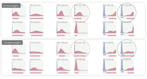
We continue with an investigation of how weight affects the matching scores (Figure 6). To investigate this we make two selections: one for overweight (relative to average weight of participants in our sample) and another for under-weight participants. We notice that the performance of the matchers M1 and M3 are in general better with overweight participants (marked with green circles). However, for M2, we notice that this behaviour is different and it operates better with underweight participants (marked with orange circles). This is an interesting finding which with support of interactive visualization is quick and easy to spot.
Figure 4. Distinction plots for younger participants. The distinction performance is much higher.
Due to space constrains, we stop with the results here but our visualization tools is easily extendible to help the analyst with other types of constrains such as height, ethnicity, image quality, etc., which can lead to other insights that have potentially impacts on the decision making process about the biometric systems deployment.
VI. DISCUSSION& CONCLUSIONS
[image:6.612.56.293.540.676.2]We present a visualization tool that helps a decision maker with analysing data from a biometric fingerprint experiment. Our framework allows for a dynamic analysis with multiple control criteria and enables an analyst to visualise the spread of the genuine and imposter matching scores, and hence help
[image:6.612.318.557.542.676.2]Overweight
[image:7.612.55.297.71.201.2]Underweight
Figure 6. Distinction plots (only intra-device ones) to display the
differences for overweight and underweight participants. Notice that apart from M2, matching performances are better for overweight participants.
them with the decision on setting the threshold that will best separate the red values (the genuine scores) from the blue values (the impostor score) with the least amount of overlap between the two. The actual threshold can of course be calculated precisely with the aid of Receiver Operating Curves (ROCs) - and we would expect that to be the next stage of the analysis - but this earlier visualization stage is necessary to help the decision maker analyse the raw data and try alternatives rapidly and make decisions on where to put the emphasis on more detailed analyses.
Our method allows a decision maker to intuitively walk through the data and study the effects of different parameters of interest (e.g. age, gender, height, ethnicity, weight of participants) on the optimal threshold that should be set for a given deployment of a biometric system with different image capture devices, matchers, and image quality algorithms.
We plan to continue this work and engage with relevant stakeholders from the biometrics industry so that we can tailor the visualization environment according to the require-ments of an analyst.
ACKNOWLEDGEMENT
This work was supported in part by the City University London Pump Priming fund via grant Empirical Analysis of Diversity for Security, the NIJ award 2010-IJ-CX-K024 and NSF award IIP-1066197. Any opinions, findings, and conclusions or recommendations expressed in this material are those of the author(s) and do not necessarily reflect the views of the sponsors.
REFERENCES
[1] S. Mason, I. Gashi, L. Lugini, E. Marasco, and B. Cukic, “Interoperability between fingerprint biometric systems: An empirical study,” inDependable Systems and Networks Work-shop (DSN), 2014 44th Annual IEEE/IFIP Conference on, June 2014, pp. 586–597.
[2] E. Marasco, L. Lugini, B. Cukic, and T. Bourlai, “Minimizing the impact of low interoperability between optical fingerprints sensors,” in Biometrics: Theory, Applications and Systems (BTAS), 2013 IEEE Sixth International Conference on, Sept 2013, pp. 1–8.
[3] N. Poh, J. Kittler, and T. Bourlai, “Quality-based score nor-malization with device qualitative information for multimodal biometric fusion,” Systems, Man and Cybernetics, Part A: Systems and Humans, IEEE Transactions on, vol. 40, no. 3, pp. 539–554, May 2010.
[4] A. Ross and A. Jain, “Biometric sensor interoperability: A case study in fingerprints,” in Biometric Authentication, ser. Lecture Notes in Computer Science, D. Maltoni and A. Jain, Eds. Springer Berlin Heidelberg, 2004, vol. 3087, pp. 134– 145.
[5] A. Ross and R. Nadgir, “A thin-plate spline calibration model for fingerprint sensor interoperability,”IEEE Transactions on Knowledge and Data Engineering, vol. 20, no. 8, pp. 1097– 1110, 2008.
[6] A. K. Jain, S. C. Dass, and K. Nandakumar, “Can soft biometric traits assist user recognition?” pp. 561–572, 2004. [7] S. Modi, S. Elliott, J. Whetsone, and H. Kim, “Impact of age groups on fingerprint recognition performance,” inAutomatic Identification Advanced Technologies, 2007 IEEE Workshop on, June 2007, pp. 19–23.
[8] M. A. Acree, “Is there a gender difference in fingerprint ridge density?”Forensic Science International, vol. 102, no. 1, pp. 35 – 44, 1999.
[9] A. Badawi, M. Mahfouz, R. Tadross, and R. Jantz, “Fingerprint-based gender classification,” June 2006. [10] M. Nithin, B. Manjunatha, D. Preethi, and B. Balaraj,
“Gen-der differentiation by finger ridge count among south indian population,”Journal of Forensic and Legal Medicine, vol. 18, no. 2, pp. 79 – 81, 2011.
[11] C. Turkay, F. Jeanquartier, A. Holzinger, and H. Hauser, “On computationally-enhanced visual analysis of heterogeneous data and its application in biomedical informatics,” in Inter-active Knowledge Discovery and Data Mining in Biomedical Informatics. Springer, 2014, pp. 117–140.
[12] J. Kehrer and H. Hauser, “Visualization and visual analysis of multifaceted scientific data: A survey,” Visualization and Computer Graphics, IEEE Transactions on, vol. 19, no. 3, pp. 495–513, 2013.
[13] T. May, A. Bannach, J. Davey, T. Ruppert, and J. Kohlham-mer, “Guiding feature subset selection with an interactive visualization,” in Visual Analytics Science and Technology (VAST), 2011 IEEE Conference on. IEEE, 2011, pp. 111– 120.
[14] T. May and J. Kohlhammer, “Towards closing the analysis gap: Visual generation of decision supporting schemes from raw data,” in Computer Graphics Forum, vol. 27, no. 3. Wiley Online Library, 2008, pp. 911–918.
[15] S. Afzal, R. Maciejewski, and D. S. Ebert, “Visual ana-lytics decision support environment for epidemic modeling and response evaluation,” in Visual Analytics Science and Technology (VAST), 2011 IEEE Conference on. IEEE, 2011, pp. 191–200.
[16] A. Savikhin, R. Maciejewski, and D. S. Ebert, “Applied visual analytics for economic decision-making,” inVisual Analytics Science and Technology, 2008. VAST’08. IEEE Symposium on. IEEE, 2008, pp. 107–114.