City, University of London Institutional Repository
Citation:
Nguyen, P., Xu, K., Walker, R. & Wong, B.L.W. (2016). TimeSets: Timeline visualization with set relations. Information Visualization, 15(3), pp. 253-269. doi: 10.1177/1473871615605347This is the accepted version of the paper.
This version of the publication may differ from the final published
version.
Permanent repository link:
http://openaccess.city.ac.uk/15534/Link to published version:
http://dx.doi.org/10.1177/1473871615605347Copyright and reuse: City Research Online aims to make research
outputs of City, University of London available to a wider audience.
Copyright and Moral Rights remain with the author(s) and/or copyright
holders. URLs from City Research Online may be freely distributed and
linked to.
Information Visualization 1–17
ÓThe Author(s) 2015 Reprints and permissions:
sagepub.co.uk/journalsPermissions.nav DOI: 10.1177/1473871615605347 ivi.sagepub.com
TimeSets: Timeline visualization with
set relations
Phong H Nguyen, Kai Xu, Rick Walker and BL William Wong
Abstract
In this article, we introduce a novel timeline visualization technique, TimeSets, that helps make sense of com-plex temporal datasets by showing the set relationships among individual events. TimeSets visually groups events that share a topic, such as a place or a person, while preserving their temporal order. It dynamically adjusts the level of detail for each event to suit the amount of information and display estate. Various design options were explored to address issues such as one event belonging to multiple topics. A controlled experi-ment was conducted to evaluate its effectiveness by comparing it to the KelpFusion method. The results showed significant advantage in accuracy and user preference.
Keywords
Timeline, time-series data visualization, set visualization
Introduction
A timeline is a sequence of events and is typically visualized by plotting them along a time axis at the instant at or interval over which they occur.1Timelines are applied in many domains including personal bio-graphies,1 analytic provenance,2 medical records,3 music,4and historical events.5Events in a timeline are commonly categorized into groups or sets. For exam-ple, academic publications usually belong to one or more disciplines; similarly, news articles fall into differ-ent categories such as politics and sports. Back in 1765, one of the oldest documented timelines pro-duced by Joseph Priestley6—the Chart of Biography— already used set visualization. The timeline includes 2000 famous persons from 1200 BC to 1800 AD, and Priestley classifies them into six categories based on their most well-known achievement. The timeline is divided into six horizontal bands, one for each cate-gory, to visualize the set relations.
Timeline visualizations typically use icons to indi-cate time-point events7and horizontal bars for interval ones.1 These are usually accompanied by a short line of text describing the event. To show set relations, the existing methods either color-code the icons or use
different shapes.8The layout algorithm of these meth-ods usually focuses on avoiding event text overlap only.7,8 As a result, events in the same set are not always placed close to each other. This makes it diffi-cult to follow them chronologically or have an overview of the distribution of events in a set. Another common approach is to visually connect events in the same set.9 Such a method can introduce extra edges and cross-ings, which hamper the readability of the timeline.
There has been considerable work on set relation-ship visualization, which commonly uses closed con-tours as in Venn or Euler diagrams. Texture and color can be used to depict more complex set relations.10 However, these cannot be applied to the set relation-ships in timelines because the event position along the time axis is fixed. Recently, there have been a number of articles on visualizing the set relationships of data items with fixed locations. To connect same-set ele-ments, Bubble Sets11 draws an iso-contour
Middlesex University, London, UK
Corresponding author:
surrounding them, and LineSets12 uses a Be´zier curve passing through all the elements. KelpFusion employs both lines and areas to connect elements and has been shown to have a significant advantage in readability tasks when compared to Bubble Sets and LineSets.13 However, directly applying KelpFusion to timeline set visualization will intro-duce extra line segments and edge-text crossings that may reduce readability.
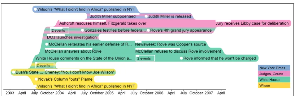
In this article, we propose a novel timeline visuali-zation, TimeSets, that facilitates making sense of set relations among events in a timeline. It provides an overview of set distribution, helps identify the trend of a set, and makes it possible to compare sets over time. Figure 1 visualizes the CIA leak case, in which the identity of CIA operative Valerie Plame was made public.14 There are many more events related to ‘‘White House’’ compared to other topics. Among ‘‘Judges, Courts’’ events, those related to ‘‘White House’’ are more than those related to ‘‘New York Times,’’ Also, events about ‘‘Wilson’’ only appear at the beginning of the case, while ‘‘Judges, Courts’’ events appear later.
The design of TimeSets follows two Gestalt princi-ples of grouping—proximity and uniform connected-ness.15It places related events close together and colors the set background to connect its events visually. More specifically, TimeSets:
Clearly shows the events within a set over time and their relationships with other sets;
Dynamically adjusts the level of details of each event to suit the amount of information and dis-play estate;
Uses color gradient backgrounds for events belonging to multiple sets and curved set outlines to emphasize its grouping.
To show possible applications of TimeSets, we dis-cuss a case study with publication data. Also, a con-trolled experiment was conducted to evaluate its effectiveness. The results showed that TimeSets was significantly more accurate than KelpFusion13 (a state-of-the-art set visualization method) and was the preferred choice by the participants for aesthetics.
Related work
Timeline visualizations
The most common form of timeline visualization uses a horizontal axis to represent time progressing from left to right, with events positioned horizontally according to their timestamps. A well-known example is LifeLines3—a visualization of personal medical records. LifeLines uses icons to indicate discrete events and thick horizontal lines for continuous ones. Timelines can be integrated into a tree format to rep-resent changes in a hierarchy over time as in TimeTree.16 Geographical information can also be embedded in timelines as in the classic visualization of Napoleon’s March in Moscow in 1812–1813 by Charles Joseph Minard.17The book by Aigner et al.18 provides a comprehensive review of timelines and other time-oriented data visualizations.
[image:3.595.53.530.67.223.2]be grouped together. ThemeRiver19or Streamgraph20 uses a river metaphor to represent aggregated changes of themes over time in a large document collection. Each river is a theme, and its width at certain time points shows the number of documents in that theme. Common interaction techniques are often used in the visualization of large timelines to support their explora-tion, including overview+detail,4 filtering,1 and details-on-demand.21
Set relations in timelines
According to the Gestalt principles of grouping, humans naturally perceive objects as a whole rather than as the sum of their parts.15 Three of the princi-ples are commonly used to show set relationships among events: similarity, proximity, and uniform connectedness.
The principle of similarity states that objects are perceptually grouped together if they are similar to each other.15 This principle is extensively applied to show set relations in timelines by using colors and shapes. Time indicators as icons (time-point events)7 and bars (interval events)22 are colored according to event set memberships. Different shapes for icons8 and bars3 are also used to distinguish set member-ships. It is more challenging to represent multiple-set memberships. LineSets12 uses concentric circles for icons, where each circle is colored to represent one set.
According to the proximity principle, objects that are close together are perceived to be more related than objects that are spaced further apart.15 In Chart of Biography,6people within a category are placed in a horizontal band, away from people in other categories. LifeLines3 splits medical records into different sets, such asmedicationand diagnosis, and places them into vertical stacks, which works well if no two sets overlap. Storyline visualizations23,24 use curved lines to show interactions among characters within the movie time-line. Character lines converge to a bundle if they appear in the same interaction and diverge when it ends. Each line can be considered as a set passing through all its members, and each interaction is a multi-set event. Thus, this method only works for interval events.
Elements tend to be grouped together if they are visually connected.25Following thisuniform connected-nessprinciple, SchemaLine26 draws a rectilinear path connecting events belonging to a same set together. Also, tmViewer9 links related entities with line seg-ments. Different line colors, thicknesses, and styles were used to distinguish set relations. This method can show events with multiple-set memberships by connecting them with multiple edges. However, extra
edges and crossings may negatively impact the read-ability of the timeline.
When similarity and proximity are applied together, the later principle dominates.10 Moreover, uniform connectedness is stronger than proximity.25For exam-ple, objects with different colors and shapes but located close together are more likely to be perceived as a group, and distant objects but with a closed con-tour surrounding them also provide a strong sense of grouping. Applying these ideas to visualize set rela-tions for timelines, methods relying on similarity such as colored icons22are less effective than spatial group-ing methods such as LifeLines.1 And those, in turn, are less effective than methods using line segments such as tmViewer.9
Set visualizations
Sets and their relationships can be visualized using Venn27 or Euler28 diagrams. Simonetto et al.29 pro-posed a technique to automatically visualize sets that were previously not possible with Euler diagrams. However, the complex shapes it produces may reduce visualization readability. In their controlled study, Henry Riche and Dwyer30showed that for complex set intersections, duplications of shared elements resulted in a better performance in readability tasks than a none-duplicated visualization with more complex shapes.
These methods assume the positions of set elements are not fixed, which reduces their applicability for geo-located or timeline events. Techniques without such constraints include Bubble Sets,11 LineSets,12 and KelpFusion.13These methods employ the connected-ness principle of the Gestalt laws25 by connecting set elements using extra visual elements. Bubble Sets draws an iso-contour surrounding elements within a set. This iso-contour is filled with a semi-transparent color so that the intersection between sets is shown as an area of blended color. Collins et al.11 provided an example of applying Bubble Sets to a timeline, in which case a force-directed algorithm is used to adjust the vertical positions of elements while the horizontal position along the time axis is fixed.
timeline visualizations. It is expected that crossings between lines, areas, and the event text may reduce the timeline readability.
TimeSets visualization
Events
In TimeSets, an event is visualized as a line of text, showing itslabel. The visual indicator of event time is a circle (for a time-point event), or a horizontal bar (for an interval event). Thetime circleis shown to the left of the label, while the time baris shown above the label. The time bar is semi-transparent for overlapping inter-val events, so the intersection part is visually different. To accommodate a large number of events, labels have three possible levels of detail:
Complete: the entire event label is shown.
Trimmed: only the first few words are shown, fol-lowed by three dots at the end.
Aggregated: a few events are combined into a new one with its label indicating the number of events, such as ‘‘2 events.’’
The text border of an aggregated event is colored to make it visually different from non-aggregated events. Its time bar begins at the starting time of the earliest event and ends at the finishing time of the latest event within the aggregate. Figure 2 shows a complete time-point, a trimmed time-time-point, an interval, an aggregate of two events, and two overlapping interval events.
Sets
Design overview. As discussed in the related work, Gestalt principles of grouping are commonly used to show set relationships among events, most effectively uniform connectedness and proximity. Therefore, we also apply these two principles in our design. Proximity is achieved by moving same-set events close together, and coloring the set background makes the events visually connected.
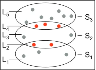
Because the horizontal position of each event is decided by its timestamp, spatial grouping is achieved through vertical positioning. The sets are stacked ver-tically, and each set is further divided into a maximum of three horizontal layers: a top and a bottom layer for events shared with the set above and below, respec-tively (if they exist), and a middle layer for other events in the set. There are maximal 2n1 layers in a total for n sets of events. Figure 3 shows the layering for three sets.
[image:5.595.339.493.72.184.2] [image:5.595.55.292.75.130.2]Shared events between two non-neighboring sets can reside in one set and connect to the other set using visual links such as curves12 and areas.13 Figure 4(a) shows a possible method of connecting the shared events (red squares) using edges and linking them to the yellow set to indicate that they also belong to that set. The alternative approach is to duplicate them in both sets. In Figure 4(b), red squares are duplicated in both the blue and yellow sets. Duplication consumes more display space and could make viewers confuse when seeing same events multiple times. However, duplication allows all events of a same set being placed close together, which provides a compact visualization and easy comparison. Also, the study by Henry Riche Figure 3. Layering for three setsS1,S2, andS3.L2consists of events shared byS1andS2, andL4consists of events shared byS2andS3. Those shared events are red circles.
Figure 2. Visual representations of complete and trimmed time-point events, interval, aggregated, and overlapping events.
[image:5.595.297.540.247.372.2]and Dwyer30 shows that complex set intersection shapes reduce readability compared to item duplica-tion. Aiming for a clear visualization, we decided to duplicate events that belong to non-neighboring sets. Confused duplication and scalability will be addressed later using interaction and layout algorithm, respec-tively. In subsequent sections, we discuss the detail of the set visualization algorithm, which consists of two main steps: the generation of set shapes and then their coloring.
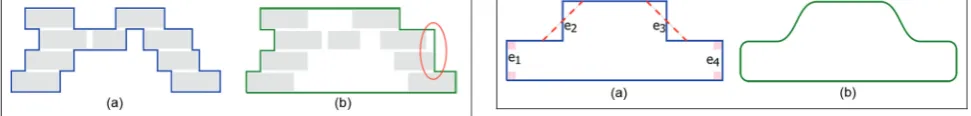
Shape generation. This algorithm takes as input a list of bounding boxes of the set’s events and generates a closed curve containing all these rectangles. The sizes and positions of the bounding boxes are decided by the layout algorithm described in the next section. A rectilinear shape can be generated using the scan-line algorithm,31 as shown in Figure 5(a). The number of bends along the line is often used to assess the aes-thetics and legibility of visualizations.23 Even though the generated shape provides the minimal data-ink
ratio,32 a large number of line bends may reduce its legibility.
To reduce the number of line bends, the top and the bottom sides of the set outline are flattened. The left and right sides are kept unchanged because they indicate the event timespan. On either side, the path can be ‘‘jagged’’ if two events start or end close to each other. Those close vertical segments are combined to reduce line bends if their horizontal gap is smaller than a threshold. This trades off time accuracy for outline smoothness and can be controlled by the user. Figure 5(b) shows the result of this simplification.
To reduce the degree of line bends, the algorithm con-verts vertical segments into diagonal ones wherever possi-ble, such ase2ande3in Figure 6(a). Smoother lines are
easier to follow;33 thus the algorithm further converts diagonal segments into Be´zier curves and replaces right corners with quadrant arcs as in Figure 6(b).
Coloring. Each set is filled with a color selected from Qualitative Set 2 of ColorBrewer34to make them easily
distinguishable. Two color filling options are consid-ered: only the time circle or the entire event label. Our design follows uniform connectedness principle requir-ing visual connection among same-set events. When they are visually connected and only their time circles are filled, additional edges may reduce the readability. KelpFusion13 follows this approach using lines and areas to connect time circles reducing its readability as in Figure 14(b). In the second option, filling the entire label may produce a false impression about the event’s time range. We choose this option and lessen the effect by coloring the gap between events as in Figure 14(a). It also helps increase the sense of grouping compared to filling only the time circles.
The standard coloring method for set intersections is color blending as commonly used for Venn dia-grams.10 Color for each set is half-transparent, and alpha blending is applied to produce the new color for the intersection. However, the result may be irrelevant to the two inputs and confused as the color for a new set. For instance, in Figure 3, the yellow color of layer
L2is not naturally considered as the common between
light yellow of setS1and light green of setS2.
To address this issue, we fill the intersection with a linear color gradient changing between the two set col-ors as in Figure 7(a). While the gradient provides a smooth transition, it becomes difficult to recognize the two ends of the intersection. For example, it is not clear from Figure 7(a) that the background of the eventRove’s 4th grand jury appearance(second row top down) is pure yellow or it has a mix of green as well. To solve this problem, multiple color transitions are used instead of a single transition. For instance, in Figure 7(b), the color transitions between green and yellow are repeated multiple times so that both colors are clearly shown in every row of the intersection, and there is no significant difference in color perception among these rows.
[image:6.595.62.548.77.135.2]Multiple-set events’ visualization. With the vertical layering of sets as discussed above, three sets cannot be placed closed to each other; therefore, it is Figure 5. Rectilinear shape generation. (a) The rectilinear
shape, generated by a scan-line algorithm. (b) The simplified shape by flattening and removing jags (red eclipse).
impossible to visualize intersections among three sets or more. This is also a challenging problem with many state-of-the-art methods.35To address this issue, simi-lar to non-neighboring sets, we replicate events for each set they belong to so that all events in a same set stay close together providing a compact visualization and easy comparison. To provide full set memberships of events, one method is drawing edges to connect all replicates of the same event together. However, this may produce a cluttered visualization with many edge crossings. Another method is to color-code the event according to its set memberships. One approach is to color the event’s time icon preceding its label using either multiple circles (Figure 8(a)) or concentric rings (Figure 8(b)). The former requires more horizontal space, while the latter needs more vertical space. Another approach is to color the background of the event’s label. Color gradient is used for a smooth color transition as in Figure 8(c). This visual encoding is consistent with the use of color gradient to show two-set intersections. However, a timeline with many long-label events may produce a too colorful and distracted visualization. Also, limited label height may hamper the detection of color transition. To solve these prob-lems, color is transitioned from left to right and only run through a first few characters of the event label.
Figure 5 shows this technique in a visualization with 200 events.
For interval events, only the label background method can work because it does not have time circles, which can be added but at the cost of extra display space. Time bars can be used to show set memberships by dividing into multiple horizontal parts, each color for one set. However, this could be mis-interpreted as an event having different set membership in each part of its timespan.
Interaction
Interactive features are implemented to support time-line exploration. Details-on-demand provides related information without information overload. Mouse-over an event reveals its starting/ending time and com-plete label. When none of the multiple-set visualiza-tion techniques proposed above is used to statically display the full set memberships of an event, it is possi-ble to use interaction to reveal that information. When an event is hovered, all its replicates are highlighted, thus allows detecting all sets it belongs to. This method prevents adding an extra ink to the visualiza-tion; however, it requires users to discover the set information manually.
TimeSets provides interactive set filtering and time range navigation (zooming and panning). Clicking on a set in the legend (bottom-right corner in Figure 1) toggles its visibility. Time range zooming is performed using the mouse-wheel and the panning is controlled by dragging. Users can also interactively modify set ordering by changing the order in the legend through drag-and-drop. A smooth animated transition is pro-vided for all the interactions to help users maintain their mental map.36A demonstration of these interac-tive features can be found in the supplemental video. Figure 7. Color gradient technique to encode set memberships. The gradient area shows three shared events
between two sets. (a) Intersection shown as a single color gradient. (b) Intersection shown as multiple color gradients.
[image:7.595.50.286.258.340.2]TimeSets layout
The layout algorithm, determining the positions of sets and events within them, consists of four steps. First, the vertical ordering of sets is computed to ensure that two sets that share events are next to each other wher-ever possible. Then, sets are further divided into layers, and events are assigned to them according to their memberships. After that, the position and length of each event are computed, within the given display space. Finally, layers are compacted to remove any gaps between them, before layer sizes are adjusted to allow for a consistent level of detail across all sets.
Sets ordering
The set ordering algorithm aims to maximize the num-ber of events shared by neighboring sets. This can be mapped to a graph path problem. Given a list of sets
S=fs1,s2,. . .,sng, an undirected graphG= (V,E)is
created with each vertex vi representing a set si2S.
Two verticesvi andvj are connected if si andsj share
an event. The weight of edgeeij is the number of events
shared bysi andsj. Finding a set order with the
maxi-mum number of events shared by neighboring sets is equivalent to finding a path with the maximum weight connecting all vertices inG. This longest path problem is known to be Non-deterministic Polynomial-time hard (NP-hard), but the number of sets we plan to support is limited by the number of colors that human can easily distinguish when they are shown together. Therefore, we decided on a brute force approach to find the optimal solution.
Layer layout
This algorithm positions all the events within a layer. Its inputs are as follows:
The events belonging to the layer with their label
andtime;
The maximum width and height of the layer.
The outputs are event locations within the con-strained display area, optimizing for the following criteria:
Completeness, which measures how much event label is visible. More specifically, the completeness ratio is defined asu= (aj jEc +bj jEt)=j jE, wherej jEc is the
number of complete events, j jEt is the number of
trimmed events, and j jE is the number of all events. aandbare the coefficients to indicate how strongly a complete event and a trimmed event contribute to the
overall content richness of the layer. We practically set a=1 andb=0:5.
Traceability, which measures how easy it is to follow the events chronologically. Events happened close in time should have small changes in their row levels to facilitate the tracing of them. More specifically, the
traceability ratiois defined asg= (Pj jiE=1(jli+1lij))= (j j E 1), wherej jE is the number of all events within the layer andliis the row level of eventei.
The horizontal position of an event is fixed by its time. The layout algorithm decides on which row to position an event and the level of detail for its label.
Completeness algorithm. Starting with an empty layer, the algorithm inserts events chronologically. An event is placed in the lowest possible row where it does not overlap with any other events. If such a row does not exist, one of the earlier events is trimmed to make space for it. Among these events, the one with the least trimming is selected. However, if the label space is too short for a single word after trimming, the event will be combined with the current event to form a new aggregated event titled ‘‘2 events.’’ Aggregated events cannot be trimmed; thus a new event overlapping with them should also be aggregated. For example, a new event that overlaps with a 2 events aggregated event will be aggregated, resulting in a ‘‘3 events’’ aggregated event. The completeness algorithm maximizes the number of complete events j jEc and trimmed events
Et
j j, thus yielding a maximum completeness. This algorithm is not optimized for traceability because an event is placed in the lowest possible row disregarding the row level of its preceding event.
Traceability algorithm. To improve traceability, this algorithm inserts a new event at the same row as its previous event. If there is an overlap, the previous event is trimmed to make space. The trim ratioof an event is defined as the ratio of the remaining text length to its original length. An event can only be trimmed if the resulting trim ratio is greater than a minimum thresholdtmin, where 04tmin41. This value
determines how much completeness can be traded for traceability. If the resulting trim ratio is smaller than
tmin, the event moves up or down to find a suitable
row, up tormaxrows on both sides. This value decides
how far an event can be, in terms of row level differ-ence, from the previous event, which essentially trades traceability for completeness. If no suitable row can be found within the 6rmax rows, the new event comes
completeness algorithm. Figure 9 shows an example of these two algorithms used to layout seven events.
Both layer layout algorithms run in linear time in terms of the number of events, because during the event insertion, the completeness algorithm checks up to a constant value—the layer height, and the trace-ability algorithm checks at most (23rmax+1) rows.
Compacting
The aforementioned layer layout needs a maximum number of rows it can use as an input. Initially, it is assigned proportionally to the number of events within each layer. After the layout of each layer is indepen-dently computed, some may be moved to fill the new space that appears between layers. This includes mov-ing two layers closer if there is a gap in between, or moving a layer into a newly created space if its set does not share events with any other sets. Figure 10 shows an example of compacting. The freed space is assigned to the layer with the lowest completeness ratio u. Then, layouts of all layers are recomputed and com-pacted again. The process repeats until no more space can be saved.
Balancing
This last step ensures that all the layers have similar levels of detail, that is, it minimizes the variance of completeness,(Pni=1(uiu)
2
)=n, wherenis the num-ber of layers anduis the mean of completeness ratiou. A brute force approach tests all possible combinations of layer height hi such that Pni=1hi=H for a
mini-mum variance. However, the number of combinations is an exponential of n. Instead, we used a heuristic algorithm that relies on the fact that completeness ratio increases with layer height because there is more space to display labels. The algorithm reduces the complete-ness ratio variance by iteratively taking a row from the layer with the largest ratio and giving it to the layer with the smallest one, until the variance no longer decreases. Figure 11 shows an example of balancing.
Scalability
Aggregation allows TimeSets to handle a large number of events. However, the visual encoding of aggregated events is imperfect: ‘‘2 events’’ and ‘‘100 events’’ are visually represented in the same way with rectangular border. Four options are considered to address this issue and illustrated in Figure 12. First, the width of the bounding rectangle can be scaled to indicate the number of events (Figure 12(b)). However, the visual difference could be subtle and difficult to attract atten-tion from an overview. The second opatten-tion is to plot each individual event as a dot when it happens (Figure 12(c)). This also provides a temporal distribu-tion of events rather than just the quantity. When events happen at close or exactly the same time, dots are overlapped, and it is more difficult to see the pat-tern. Another approach is to color-code the back-ground of the bounding rectangle using luminance or intensity (Figure 12(b)). However, when many aggre-gated events are displayed, their backgrounds could interfere with the set colors. Last is to scale the font size of the label according to the number of events (Figure 12(e)). Currently, each event is completely placed in one single row with uniform height. Scaling the height of aggregated events needs to revise the lay-out algorithm. All these methods have their strength and limitation, thus deciding the best one is challen-ging and out of scope for this article. We leave the implementation and evaluation of these methods as future work.
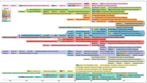
The existing layout is suitable for a small timeline with a few hundreds of events or a detailed view where individual events are of high importance. Figure 13 shows 225 publications within 15 years. TimeSets relies on color to distinguish sets; therefore, it is con-strained by the number of colors that human can dif-ferentiate at the same time, which is about 12, according to Munzner’s37book.
Case study
[image:9.595.50.285.76.131.2]TimeSets can be applied to domains requiring the understanding of temporal events including history, movies, publications, and so on. Figure 1 shows a timeline of the CIA leak case14 covering both time-point and interval events happening from 2002 to 2007. In this section, we choose another domain, aca-demic publications, to demonstrate TimeSets. A sub-set of 200 publications with the most citations is extracted from the IEEE InfoVis articles.38Each pub-lication is assigned one or many concepts such as net-work orevaluation. We use concept as the set attribute to group publications. Figure 5 shows the visualization of this dataset. No aggregation is needed when Figure 9. Two layout algorithms. Each rectangle is the
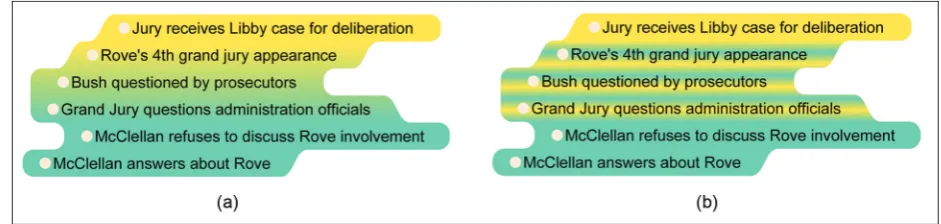
bounding box of an event with its label (a) Completeness algorithm:u¼1;g¼5=3:(b) Traceability algorithm
producing the layout; only complete and trimmed labels are displayed in the visualization.
TimeSets can show distribution of categorical data over time as in ThemeRiver.19 A quick glance at the visualization brings us a surprise. There is much void space on the left as opposed to a very dense area on the right indicating that there are many more highly cited articles published in the last 10 years of the data-set than in the first 10 years. This trend also holds for individual concepts. Each colored band starts with a single row and increases its height toward the end of the timeline. This observation is in contrast to the common thought: articles published in a longer time would have more citations. One possible explanation is that the IEEE InfoVis conference accepts more arti-cles over time—in the dataset, there are 18 artiarti-cles in 1995 while 37 articles in 2013. Another reason could be that publications in the last 10 years are really of high quality.
TimeSets cannot show all intersections among sets; however, its layout maximizes the number of shared elements between two neighboring sets. As a result, the visible intersections usually have the most elements among all intersection. In the visualization, the most notable gradient area is the intersection between yellow and purple sets implying that there are many excellent articles focusing on both evaluation and interaction. Another observation at the top of the visualization with three concepts—networking, clustering, and overview— with clustering is in between the other two. This is expected because clustering techniques are important in visualizing large networks or getting the overview of a large dataset.
In this figure, TimeSets uses the color gradient method to show full memberships of multi-set ele-ments. For instance, inside the pink band, there are quite a few small blue gradients for network papers, there are quite a few small blue gradientsgraphpapers. This is sensible because of the closeness between these two concepts and they may often appear together in an article. Another interesting observation is at the bot-tom band—hierarchy. The last article ‘‘Flow Mapping and Multivariate Visualization .’’ includes five
concepts:hierarchy(blue background) and interaction, graph, overview, andnetwork(small gradients).
Evaluation
Method
We considered timeline visualizations that apply the two most powerful Gestalt principles of grouping to include in the evaluation. For proximity principle, as discussed in the related work, LifeLines1cannot show multi-set events, and storyline visualizations24 only work for interval multi-set events. Foruniform connect-edness principle, methods that connect all events belonging to the same set together without using a designated layout to reduce edge crossings such as tmViewer9 produce a cluttered visualization. To the best of our knowledge, there is no existing visualiza-tion that is designed to show multi-set relavisualiza-tions and temporal information of events together. Therefore, rather than evaluating both the layout and the set visualization technique of TimeSets, we decided to focus only on the second one. We compared TimeSets with a set visualization technique that can apply on top of an existing timeline. We chose KelpFusion because among similar techniques, it has been shown to have the best performance in readability tasks in both accuracy and completion time.13 We acknowl-edged that KelpFusion was not specifically designed to work with timelines. However, KelpFusion can work with any given layouts, and it is the best choice for this evaluation. We conducted a controlled experi-ment to compare TimeSets and KelpFusion. It fol-lowed a within-subject design; and accuracy, time, and user preference were collected.
Datasets. We used generated data for the experiment to remove the possibility that participants might be dis-tracted by their existing knowledge of scenarios. Only time-point events are used because KelpFusion needs a set of points as its input. The complexity of dataset was controlled by two parameters: the number of sets and the average number of events per set. Overall, half of the events were part of more than one set; this is the Figure 10. Layer compacting example. (a) Before
[image:10.595.64.545.72.157.2]compacting. (b) After compacting.
Figure 11. Layer balancing example. (a) Before balancing: ugreen¼0:25;uyellow¼1. (b) After balancing:
same ratio as in the CIA Leak case dataset. The details of the four levels of complexity used in the experiment are shown in Table 1.
We introduce three approaches to visualize intersec-tions between more than two sets; however, evaluating all of them would triple the number of trials and make the experiment too long. We plan a separate experi-ment to study which method is the most effective as our future work. In this experiment, we only tested two-set intersections and simple white circles are used for events’ time indicators.
Images of this dataset using the KelpFusion method were generously provided by the method’s author. To avoid bias, our method also used static images instead of interactive visualizations. Colors for both methods were Qualitative Set 2 of ColorBrewer.34 KelpFusion does not have its own layout; therefore, our layout algorithm was used for both settings. Only one algo-rithm is used to prevent adding another factor to the experiment, which doubles the number of trials for participants. The traceability algorithm was chosen because reading comprehension is not required for the tasks. Figure 14 shows example images used in the experiment.
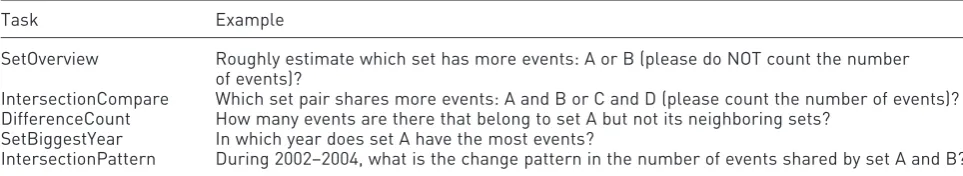
Tasks. We followed the task design in the KelpFusion technique evaluation,13 including estimation and pre-cise comparison of set sizes and counting the number of elements in a set. Two time-related tasks were added to evaluate the temporal aspect of the visualiza-tion. Therefore, there are five tasks in total. We con-sidered three categories of set readability tasks, relating to thesetitself, theintersectionof two sets, and the difference between two sets. However, it was impractical to include all 5 33 task types in the experiment. Therefore, we decided to use two tasks for the set, two tasks for the intersection, and one task for the difference. Tasks together with examples are listed in Table 2. Each participant would complete a total of 40 questions.
We use general questions to help preserve the exter-nal validity of the experiment. It is straightforward to convert them into context-sensitive questions. For example, the last task in the context ofnews mediacan be written as ‘‘what is the trend of news articles related to both science and fashion during the last 3 years?’’ We chose to use multiple-choice answers to reduce the completion time, thus to allow the within-subject com-parison to finish in a reasonable time. This reduces the possible effect of boredom or fatigue as confound-ing factors. It also removes the requirement to con-sider the typing speed of subjects when evaluating time taken to complete tasks.
Participants and apparatus. Thirty students (23 males and 7 females) voluntarily participated in the experi-ment. They came from various backgrounds including computing, law, and psychology. One participant was less than 19 years, 16 participants were aged between 19 and 25 years, 12 were aged between 26 and 39 years, and one was aged between 40 and 60 years. All participants reported that they can distinguish all colors used in the experiment. Participants completed the experiment using a 23-in monitor with a resolution of 19203 1080.
Procedure. The study lasted approximately 45 min and consisted of two sessions (one for each visualiza-tion technique), followed by a quesvisualiza-tionnaire. At the beginning of each session, the visualization technique was explained, and participants were shown how to answer each question type using that method. This was followed by five practice questions to familiarize participants with the tasks and the experiment inter-face. Solutions and explanations were given for these practice questions to help them understand better.
[image:11.595.71.263.70.344.2]We used two question sets with comparable diffi-culty and counterbalanced the order of the visualiza-tion techniques as well as the order of quesvisualiza-tion sets to Figure 12. Different visual representations of the number
reduce learning effects. We fixed the order of task types and the order of difficulty in each type from sim-ple to comsim-plex. For each task, the question and all the answer options were displayed without the visualiza-tion. Once participants finished reading, they clicked a button to reveal the figure, when the timing started. This is to reduce the effect of individual differences in reading and comprehension speed on the measured time.
Hypotheses
H1: TimeSets will have higher accuracy and shorter completion time for all tasks compared to KelpFusion. The colored set background in TimeSets can have a stronger sense of grouping than the line connection in
KelpFusion, which may make the set-related tasks eas-ier. Also, shared events are visually grouped in TimeSets, separating from the non-shared ones. This may help its performance in tasks related to shared events.
H2: TimeSets will require less time for the SetOverview task than KelpFusion, but will be less accurate. The color background in TimeSets makes it easier to recognize a group. However, the set size is not a precise indicator of event number because it is also affected by the label lengths and the gap between events.
[image:12.595.65.552.69.342.2]H3: TimeSets will outperform KelpFusion in time and accuracy on both IntersectionCompare and IntersectionPattern tasks. In TimeSets, shared events are visually grouped in its own layer, whereas in Table 1. Data set statistics.
Complexity # Sets # Events # Intersections
Level 1 3 30 15
Level 2 3 45 23
Level 3 5 50 25
[image:12.595.66.546.422.493.2]Level 4 5 75 38
KelpFusion, they are mixed with non-shared events, which may affect its performance for tasks involving share events.
[image:13.595.61.525.69.642.2]have their own layer with a unique background color, whereas in KelpFusion such events are mixed with the shared events. This can make this task easier with TimeSets.
H5: KelpFusion will outperform TimeSets in the SetBiggestYear task. When looking at elements in each year, connected lines in KelpFusion make it easier to count, compared to TimeSets.
For user preference, we hypothesized that
H6: Participants will be more confident with TimeSets because it provides better visual support, especially in intersection and difference tasks.
H7: TimeSets will be more aesthetically pleasing than KelpFusion with smooth curves and smooth color changes compared to straight lines and plain colors. H8: TimeSets will be less cluttered than KelpFusion because it uses simple shapes, while KelpFusion uses a combination of lines and areas.
H9: TimeSets will provide a stronger sense of group-ing than KelpFusion because it colors the entire back-ground of the set.
Results
We used a repeated-measure analysis of variance (RM-ANOVA) to analyze the task accuracy and com-pletion time. Accuracy is measured as the percentage of correct answers. The logarithm of completion time is used to normalize its skewed distribution.
Accuracy. Figure 15(a) shows the mean accuracy. The RM-ANOVA test revealed a significant main effect of visualization technique (F(1,29) =4:99,p\0:05), showing that accuracy was significantly higher with TimeSets. There was also a significant main effect of task type (F(4,116) =8:89,p\0:00001). No signifi-cant effect of the visualization3task interaction was found (F(4,116) =1:85,p=0:12). Paired t-tests were conducted to investigate the performance difference for each task. A significant effect was found in three tasks: IntersectionCompare (p\0:05),
DifferenceCount (p\0:01), and IntersectionPattern (p\0:05), indicating TimeSets was significantly more accurate than KelpFusion in them. Only task DifferenceCount still had a significant effect with cor-rected p-value for multiple tests using Bonferroni correction.
Time. Figure 15(b) shows the mean completion time. The RM-ANOVA test revealed no significant main effect of visualization technique (F(1,29) = 0:05,p=0:82), indicating that the completion time for TimeSets (M=23:87,SD=9:18) and KelpFusion (M=23:72,SD=11:38) was not signifi-cantly different. There was a significant main effect of task type (F(4,116) =23:80,p\1012). The
visuali-zation3task interaction was also significant (F(4,116) =3:23,p\0:05), indicating that difference in completion time due to visualization technique was significantly different across tasks. To further investi-gate this, a paired t-test for each task was conducted. Significant effects were found in DifferenceCount (p\0:01), indicating TimeSets is significantly faster in this task, and SetBiggestYear (p\0:01), indicating KelpFusion is significantly faster in this task. Both tasks still had a significant effect with correctedp-value for multiple tests using Bonferroni correction.
User preference. Participants were asked to rate both methods using a Likert scale 1 (worst) to 5 (best) after they completed all the tasks. Four questions were asked for each visualization technique:
How confident were they in answering the questions?
How aesthetically pleasing were the visualizations?
How cluttered were the visualizations?
How strong was the sense of grouping?
[image:14.595.62.544.86.174.2]Figure 16 shows the summary of user ratings. Fisher’s exact tests found significant effects in all ques-tions: Confidence (p\0:01), Aesthetically Pleasing (p\0:01), Not Cluttered (p\0:01), and Sense of Table 2. Tasks used in our experiment.
Task Example
SetOverview Roughly estimate which set has more events: A or B (please do NOT count the number of events)?
IntersectionCompare Which set pair shares more events: A and B or C and D (please count the number of events)? DifferenceCount How many events are there that belong to set A but not its neighboring sets?
SetBiggestYear In which year does set A have the most events?
Grouping (p\0:0001), indicating users preferred TimeSets to KelpFusion in those aspects.
Discussion
The results show that overall, TimeSets is more accu-rate than KelpFusion, but there is no significant differ-ence in completion time. This partly agrees with hypothesis H1.
There was no significant effect of visualization tech-nique on accuracy or completion time for the SetOverview task, which disagrees with hypothesis H2. The average accuracy of both methods is low, relatively to the other tasks in the experiment. Possible causes for TimeSets are discussed earlier in the hypothesis statement, and the edge length in KelpFusion, which is a prominent visual feature, is possibly not a good size indicator, either.
The results also show that for intersection tasks, TimeSets has higher accuracy than KelpFusion; how-ever, their completion time performances are not sig-nificantly different. This partly confirms hypothesis H3. Shared events in TimeSets are highlighted by color gradient, and participants are less likely to mis-count them, resulting in higher accuracy. In KelpFusion, shared events are horizontally aligned, because it shares the same layout as TimeSets. We observed that some participants tried to trace shared events this way, which is prone to missing events, thus similar speed but lower accuracy.
Hypothesis H4, about the DifferenceCount task, is supported by the results. Events that belong to a single set are clearly shown in TimeSets as a region with a single color background. This helps improve perfor-mance in both accuracy and completion time.
The results show that KelpFusion has faster com-pletion time than TimeSets for the SetBiggestYear task, but there is no significant difference in accuracy. This partly agrees with hypothesis H5. The vertical lines used to denote year boundaries in this task may have helped, by splitting the visual area into columns. To solve the task, participants count the number of events in each column and pick the highest one. A KelpFusion visualization is quite similar to a network, and edges connecting events within each column can make counting easier. This may explain why partici-pants counted faster with KelpFusion, but had the same accuracy as with TimeSets.
To visualize sets, Bubble Sets11uses a similar meta-phor as TimeSets—filling the area of same-set events with a unique color. However, KelpFusion outper-forms Bubble Sets,13 while TimeSets outperforms KelpFusion in solving similar tasks. One possible explanation is that the irregular shapes generated using
iso-contours in Bubble Sets make set memberships difficult to perceive. Also, the layout in TimeSets groups same-set events together, which allows partici-pants to count or estimate easier. Another reason could be that the color gradient in TimeSets may be more effective than color blending in Bubble Sets for visualizing shared events.
[image:15.595.298.535.71.326.2]time. More than half of the participants (17 of 30) rated TimeSets as less cluttered than KelpFusion. One said ‘‘TimeSets is more organized. I know event labels aren’t important, but they seem easier to read.’’ Three quarters of the participants (22 of 30) agreed that TimeSets provided a stronger sense of grouping than KelpFusion. Many of them commented that KelpFusion figures looked more like a network than a group.
Conclusion and future work
In this article, we introduced the TimeSets method to visualize set relationships among events in a timeline. Following the proximity and uniform connectedness principles of grouping, TimeSets groups temporal events vertically with colored backgrounds according to their set memberships. Events shared by two sets are visualized using layers with a color gradient back-ground. TimeSets also dynamically adjusts the event labels between three levels of detail to scale with the number of events. The amount of event labels dis-played can be traded for ease of following events chron-ologically using the traceability layout algorithm. The results from the controlled experiment comparing TimeSets to KelpFusion showed that overall, TimeSets was significantly more accurate and the participants preferred TimeSets for aesthetics and readability.
Currently, duplicated events can only be discovered when mouse hovering. We are investigating a better visual hint without making the visualization too much cluttered. A formal evaluation is needed to study which technique for multi-set memberships, that is, multiple/concentric circles and multi-colored label background, is the most effective. To improve the visual representation of aggregated events, we will explore and evaluate approaches mentioned in the dis-cussion of the scalability of the layout. Also, we will address the issues identified in the user evaluation, such as the set area not being a reliable indicator of event number and the irritation from bright set colors after a long viewing period.
Acknowledgements
The authors would like to thank Wouter Meulemans for his generous assistance in providing details on the
KelpFusion method and for producing the
KelpFusion images used in the experiment. They would also like to thank Joshua C. Nwokeji for recruit-ing participants for the experiment.
Funding
[image:16.595.66.544.70.313.2]References
1. Plaisant C, Milash B, Rose A, et al. LifeLines: visualiz-ing personal histories. In: ACM conference on human fac-tors in computing systems, 13–18 April 1996, pp. 221–227. New York: ACM Press, http://dl.acm.org/ft_gateway. cfm?id=238493&type=html
2. Xu K, Attfield S, Jankun-Kelly TJ, et al. Analytic prove-nance for sensemaking: a research agenda.IEEE Comput Graph Appl 2015; 35(3): 56–64, http://www.ncbi.nlm. nih.gov/pubmed/26010789
3. Plaisant C, Mushlin R, Snyder A, et al. LifeLines: using visualization to enhance navigation and analysis of patient records. Proc AMIA Symp 1998; 8(98): 76–80, http://www.pubmedcentral.nih.gov/articlerender.fcgi?artid =2232192&tool=pmcentrez&rendertype=abstract 4. Andre´ P, Wilson ML, Russell A, et al. Continuum:
designing timelines for hierarchies, relationships and scale. In: ACM symposium on user interface software and technology, 7–10 October 2007, pp. 101–110. New York: ACM Press, http://dl.acm.org/citation.cfm?id=1294211. 1294229
5. Rosenberg D and Grafton A.Cartographies of time: a his-tory of the timeline. Princeton Architectural Press, 2013, http://books.google.com/books?hl=en&lr=&id=DqWqKV zipToC&pgis=1
6. Priestley J.A chart of biography. London: J. Johnson, St. Paul’s Church Yard, 1765.
7. SIMILE timeline widget, 2009, http://simile-widgets. org/timeline/
8. Mnemograph LLC. TimeGlider, 2012, http://timegli-der. com/
9. Kumar V, Fur R and Allen RB. Metadata visualization for digital libraries: interactive timeline editing and review. In:ACM conference on digital libraries, Pittsburgh, PA, 23–26 June 1998, pp. 126–133. New York: ACM Press.
10. Ware C. Information visualization: perception for design. Elsevier, 2013, http://books.google.com/books?hl=en&lr= &id=qFmS95vf6H8C&pgis=1
11. Collins C, Penn G and Carpendale S. Bubble sets: revealing set relations with isocontours over existing visualizations.IEEE T Vis Comput Gr2009; 15(6): 1009– 1016, http://www.ncbi.nlm.nih.gov/pubmed/19834166 12. Alper B, Henry Riche N, Ramos G, et al. Design study
of LineSets, a novel set visualization technique.IEEE T Vis Comput Gr 2011; 17(12): 2259–2267, http://www. ncbi.nlm.nih.gov/pubmed/22034345
13. Meulemans W, Henry Riche N, Speckmann B, et al. KelpFusion: a hybrid set visualization technique. IEEE T Vis Comput Gr 2013; 19(11): 1846–1858, http:// www.ncbi.nlm.nih.gov/pubmed/24029905
14. npr. Timeline: the CIA Leak Case, 2007, http://www. npr.org/templates/story/story.php?storyId=4764919 15. Koffka K. Principles of Gestalt psychology. Oxford:
Har-court, Brace & World, 1935.
16. Card SK, Suh B, Pendleton BA, et al. Time tree: explor-ing time changexplor-ing hierarchies. In: IEEE symposium on visual analytics science and technology, Baltimore, MD, 31 October–2 November 2006, pp. 3–10. New York: IEEE.
17. Minard CJ. Carte Figurative des pertes successives en hommes de l’arme´e Francxaise dans la campagne de Russie 1812–1813. Paris: Regnier et Dourdet, 1869.
18. Aigner W, Miksch S, Schumann H, et al.Visualization of time-oriented data. Springer, 2011, http://books.google. com/books?hl=en&lr=&id=YnDivwba2nkC&pgis=1 19. Havre S, Hetzler E, Whitney P, et al. ThemeRiver:
visualizing thematic changes in large document collec-tions. IEEE T Vis Comput Gr2002; 8(1): 9–20, http:// ieeexplore.ieee.org/lpdocs/epic03/wrapper.htm?arnumber= 981848
20. Byron L and Wattenberg M. Stacked graphs-geometry & aesthetics.IEEE T Vis Comput Gr2008; 14(6): 1245– 1252, http://www.ncbi.nlm.nih.gov/pubmed/18988970 21. Stab C, Nazemi K and Fellner DW.
SemaTime—time-line visualization of time-dependent relations and seman-tics. In: Bebis G, Boyle R, Parvin B, et al. (eds)Advances in visual computing. Berlin: Springer, 2010, pp. 514–523. 22. Wang TD, Plaisant C, Quinn AJ, et al. Aligning
tem-poral data by sentinel events. In: ACM conference on human factors in computing systems, 5–10 April 2008, pp. 457–466. New York: ACM Press, http://dl.acm.org/ citation.cfm?id=1357054.1357129
23. Tanahashi Y and Ma KL. Design considerations for opti-mizing storyline visualizations. IEEE T Vis Comput Gr
2012; 18(12): 2679–2688, http://ieeexplore.ieee.org/xpl/ articleDetails.jsp?arnumber=6327274
24. Liu S, Wu Y, Wei E, et al. StoryFlow: tracking the evolution of stories. IEEE T Vis Comput Gr 2013; 19(12): 2436–2445, http://www.ncbi.nlm.nih.gov/pubmed/ 24051810
25. Palmer S and Rock I. Rethinking perceptual organiza-tion: the role of uniform connectedness. Psychon Bull Rev 1994; 1(1): 29–55, http://www.ncbi.nlm.nih.gov/ pubmed/24203413
26. Nguyen PH, Xu K, Walker R, et al. SchemaLine: time-line visualization for sensemaking. In:IEEE international conference on information visualisation, 15–18 July 2014, pp. 225–233, http://ieeexplore.ieee.org/lpdocs/epic03/ wrap per.htm?arnumber=6902908
27. Ruskey F and Weston M. A survey of Venn diagrams.
Electron J Comb1997; 4.
28. Rodgers P. A survey of Euler diagrams. J Visual Lang Comput 2014; 25(3): 134–155, http://www.sciencedir-ect.com/science/article/pii/S1045926X13000499 29. Simonetto P, Auber D and Archambault D. Fully
auto-matic visualisation of overlapping sets. Comput Graph Forum 2009; 28(3): 967–974, http://doi.wiley.com/ 10.1111/j.1467-8659.2009.01452.x
30. Henry Riche N and Dwyer T. Untangling Euler dia-grams.IEEE T Vis Comput Gr2010; 16(6): 1090–1099, http://www.ncbi.nlm.nih.gov/pubmed/20975147 31. Foley JD, Dam AV, Feiner SK, et al.Introduction to
com-puter graphics. Addison-Wesley, 1997, http://books.google. com/books?id=_82EKQEACAAJ&pgis=1
32. Tufte ER. The visual display of quantitative information. 1986, http://dl.acm.org/citation.cfm?id=33404
advanced visual interfaces, 26–28 May 2010, pp. 241–248. New York: ACM Press, http://dl.acm.org/citation.cfm? id=1842993.1843035
34. Harrower M and Brewer CA. ColorBrewer.org: an online tool for selecting colour schemes for maps. Car-togr J2003; 40(1): 27–37, http://www.ingentaselect.com/ rpsv/cgi-bin/cgi?ini=xref&body=linker&reqdoi=10.1179/ 000870403235002042
35. Alsallakh B, Micallef L, Aigner W, et al. Visualizing sets and set-typed data: state-of-the-art and future chal-lenges. In: Borgo R, Maciejewski R and Viola I (eds)
Eurographics conference on visualization (EuroVis)—state of
the art reports, 9–13 June 2014, pp. 1–21. Eurographics, http://publik.tuwien.ac.at/files/PubDat_228538.pdf 36. Elmqvist N, Moere AV, Jetter HC, et al. Fluid
interac-tion for informainterac-tion visualizainterac-tion. Inform Visual 2011; 10(4): 327–340, http://ivi.sagepub.com/content/10/4/ 327.short
37. Munzner T. Visualization analysis and design. Boca Raton, FL: CRC Press, 2014.