Rochester Institute of Technology
RIT Scholar Works
Theses
5-2014
Raine Azure
Lucas Gonzalez
Follow this and additional works at:https://scholarworks.rit.edu/theses
This Thesis is brought to you for free and open access by RIT Scholar Works. It has been accepted for inclusion in Theses by an authorized administrator of RIT Scholar Works. For more information, please [email protected].
Recommended Citation
RAINE AZURE
by Lucas Gonzalez
SUBMITTED IN PARTIAL FULFILLMENT OF THE REQUIREMENTS FOR THE DEGREE OF MASTER OF FINE ARTS
IMAGING ARTS/COMPUTER ANIMATION SCHOOL OF FILM AND ANIMATION ROCHESTER INSTITUTE OF TECHNOLOGY
ROCHESTER, NEW YORK
MAY 2014
________________________ Brian Larson, Chair
Assistant Professor
School of Film and Animation
________________________ Mark Reisch
Visiting Professor
School of Film and Animation
TABLE OF CONTENTS
Abstract iii
Acknowledgements iv
Introduction 1
Proposal and Initial Artistic Directions 3
Production 10
Color and Character 10
Protagonists 11
Antagonists 12
Environmental Design 14
Medium Finalization and the Death of Art Direction 17
Toon Boom Rigging and Effects 19
Background Development 25
Music and Story 27
Story Development 28
False Start 32
Asset Reboot 34
Animation 36
Post-Production 38
Sound Design and Mixing 41
Titles and Credits 43
Critique 44
ABSTRACT
Raine Azure is an animated graduate thesis film, with a runtime of 6:27. This animation
follows the story of March and Autumn, a brother and sister (respectively) tasked to protect a
crystal altar that serves as the world’s rain dynamo. They set off to save the world from a beast
which has stolen the power of the altar and upset the world’s balance. Along the way, March
discovers that a balance exists between self-reliance and dependence on others.
The primary goals during the production of this film were to explore and develop my
skills in animation, character design, and music integration. However, due to the production
pipeline, story development, rigging structure, and project management became unexpected
points of development, until the primary goals returned within the last months of production.
The film was produced in Toon Boom Animate Pro 3, via a 2D cutout animation
workflow. Music was produced via Cakewalk Sonar X3, utilizing virtual instruments from IK
Multimedia, Kong Audio, and Garritan, amongst others.
This document covers all aspects of the film creation process from start to finish.
ACKNOWLEDGEMENTS
Throughout this project, a select few were privy to the ongoings of my thesis project.
Each has been of great help and helped me achieve my end result. Brian Larson, my thesis
advisor and professor, was of the utmost importance in the development process. His shrewd
judgment of story, animation experience, and carefully delivered critique were instrumental in
helping me safely plan and execute this film, despite its ambitious beginnings.
My committee members, Mark Reisch and Peter Murphey, were also very important to
the growth of this film, despite my admittedly limited interaction with them during production.
Both pushed for story and character development, a path which I first avoided for the sake of
simply animating. The influx of story points brought about by my interaction with them helped
create a thread within the film for the audience to follow.
Although I took on final the duties of sound myself, fellow graduate student Alex
Montoya originally was on board as a sound designer. Due to time constraints and insufficient
communication leading up to the sound sessions, our artistic directions diverged and I released
him from the project. Regardless, his efforts are greatly appreciated. While his sound subverted
the music-driven direction of the film, his mix gave me an aural window through which to view
the work, which helped me find a framework for creating my own sound treatment.
While I did not discuss this project at any great depth with my classmates, their presence
was greatly appreciated for social support and diversion. I also thank the RIT School of Film and
Animation, which has supported my stay here in various ways. The employment and facilities
that SOFA has provided have ensured that I had what I needed to complete this thesis.
Finally, I would like to thank my family, who have stood by me throughout my twisting
lucrative career path, but their understanding of interest, passion and the fostering of intuitive
INTRODUCTION
The production process of Raine Azure started in Spring 2013 with a preliminary
treatment, and ended in May of 2014 at the final SOFA screenings at RIT. This project
was executed under the supervision of my thesis committee: Brian Larson, Mark Reisch,
and Peter Murphey. During the course of the project, I progressed through the entire
production pipeline. This entailed preproduction: story development, concept design,
character and environmental design, storyboards; production: music, puppet rigging,
backgrounds, and animation; and postproduction: compositing, visual effects, credits, and
sound.
My main goals have shifted greatly over time. Early on, I aimed to integrate
animation and music together, while exploring a very loose story and going wild with
animation and char design. Eventually this changed to the following:
● Solidly communicated and, coherent story
● Good animation- with my focus as a generalist animator, I didn’t mind so much
what medium I was working in, be it 3D, 2D, or stop-motion. While I had an
inkling of my workflow early on, I didn’t solidify my choice of medium until
several months into preproduction.
● Finish full production in one year. While this is presumably a given, previous
graduate students were unable to complete their projects in one year, and as such,
have lingered for several years juggling work, life, and their thesis.
While I had a clear idea of what I wanted to do during the proposal process, my
proposal committee was skeptical, and required that I have a simplified project, and a
PROPOSAL AND INITIAL ARTISTIC DIRECTIONS
The earliest stages of production began in February 2013. After the screening of
my somewhat experimental two-quarter film, I was of the stance that having a familiar,
simple story structure was better than having something eclectic that is harder for most
people to understand. As such, I decided upon doing a story loosely following the classic
“journey” story structure, albeit in a simplified fashion. Prevalent in the role-playing
video games I had enjoyed in the past, It was a genre that had served me well in terms of
entertainment, and I thought it would be a good direction to pursue. While I perceived a
preexisting bias within SOFA against the medium I was drawing influence from, I was
looking to create a work that I would not quickly get tired of and drop mid-semester. This
approach would fit the bill nicely.
With my direction established, I began with various character sketches, exploring
forms that may or may not be interesting, to see if they sparked any ideas. I quickly found
myself going in artistic circles. To get myself out of this predicament, I decided to lay out
my influences for this film and research them. For the sake of simplicity and fun, I
referred to the Kirby video game series1, which features wonderfully simple character
designs with rhythm and charm. Also in this category was Super Mario RPG2, which has
a similar aesthetic, with a slightly more mature tinge to the evil character designs. For
architectural and clothing reference, I began with the Japanese role-playing games
(JRPGs) that I had grown up enjoying. Games such as Golden Sun, Chrono-Trigger, and
1 Kirby is a video game character and franchise developed by HAL Laboratories and Nintendo.
Final Fantasy3 were all steeped heavily in traditional Japanese culture fusing with
Medieval European culture. Having realized this, I researched the distinctive
characteristics of architecture and clothing, and considered the reasoning behind each
clothing choice. Much of it is very functional, or religious/honorific in nature. For
instance, there was no reason to do excessive amounts of armor tight fitting clothing,
given the roles I was considering for my characters. At this point, they were most likely
to shape up as the typical “unlikely heroes” or in some sort of ceremonial defense role,
and as such, would have no reason to be uncomfortable. This helped lead me towards
loose-fitting and simple, yet elegant clothing, which will be further detailed in the section
on character designs.
It is important to note that while I was looking to take a safer path with this
thesis's story direction, I was not interested in simply doing another swords-and-sorcery
film, just like everything I had seen before. Rather, I was interested in taking some of the
key elements of my influences and melding them together into something a bit different.
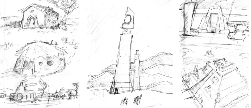
To add a level of monumentality to the objects found in the film, I decided to investigate
two monumental cultures, the Mayans and ancient Egyptians. These two came into play
primarily via the architecture of the world. I created building sketches, clothing sketches,
landscape sketches, and monument sketches to describe the world I was envisioning. The
most obvious trait shared between the two is the presence of giant pyramids. This was
one of the things, that in some diluted form, did indeed make it into the final film,
although it seemed very out of place due to lack of sufficient integration.
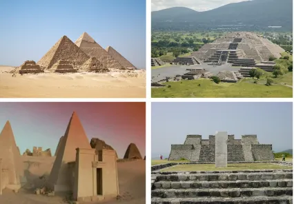
FIG A: Example architectural references for monolithic and pyramidal structures. Clockwise from top left
to bottom left are: 1) the Pyramids of Gizeh outside of Cairo, Egypt; 2) the Mayan Temple of the Moon,
Teotihuacan; 3)Aztec temple at Xochicalco; 4) Nubian pyramids in Egypt. Photos are public domain
The irony in all of this is that despite my interest, research, and development into
the world itself, environmental development was later cast aside due to a combination of
story and production time.
Following a discussion amongst some of my peers that I had been listening in on
recently, I was intently trying to find a path that would not offend the feminist camp. I
did not want to cast the main characters in a regular “man wins the world” or “helpless
be a brother-sister relationship, in which they are on nearly equal footing, and there could
be no romance between them. To avoid the stereotype of “save the little sister,” I chose
to have the sister be the older one, although near to the brother in age. With this
established and some of my research in hand, I was able to hone in on a character design
that unified the two.
I then began considering other aspects of the film. I decided that music, while not
as overbearing as a film such as Love & Theft4, would steer the film via mood and pacing.
The film would not be designed as a simple “musical experience” such as the
aforementioned Love & Theft, but instead would tell a traditional story using all elements
of the film, with the music serving as the structural framework of the piece. Stylistically,
I intended this music to have a similar flavor to that of the JRPG games mentioned
earlier- epic and majestic, yet delicate and layered. Although it is of a somewhat different
genre, a major musical influence were several Nintendo composers that have worked on
the Legend of Zelda series. As a whole, the series features several musical themes that
weave throughout the score, and both eastern and western instrumentation is blended
together to create a particularly unique sound signature. Of specific note are Koji Kondo
and the duo of Minako Hamano and Kozue Ishikawa.
Koji Kondo worked on the original Legend of Zelda game and the Ocarina of
Time (OoT), along with much of the franchise's other games, such as my personal
favorite, Majora's Mask (MM). Songs such as “The Happy Mask Salesman's Theme” and
“Last Day” from this particular game are heavy in mood, which is something I always
Kondo's work. There is also a significant amount of “epicness” present in many of his
pieces, notably the ones based around the Hyrule theme, such as “Termina Field” (MM).
These tend to have a dominant traditional European, epic sword-and-sorcery feel,
compared to some of his more traditional Japanese influenced pieces, such as “Kotake
and Koume (Twin Sisters)” (OoT) and “Kamaro's Dance” (MM).
Minako Hamano and Kozue Ishikawa, however, worked on the Game Boy title,
Link's Awakening. This game was one that I spent many hours with, and quite frankly,
was one of my most heavily played games during my middle school years. There is a
very distinct fusion of quirkiness, rhythmic layering and discord present in Link's
Awakening. It is present to some extent in the other games of the series, but never quite
at this game's level. It seems this compositional signature is present everywhere- from the
simple and repetitive “Shop” to the final, bittersweet “Ballad of the Wind Fish.” While
brainstorming ideas, melodies and countermelodies with strong similarities to this game
arose quite frequently. This is likely due to the timing of my exposure to the work. I had
begun composing music during the 6th or 7th grade, using basic MIDI composition tools,
which had a similar crude sound to the Game Boy's synthesized notes. Having the notion
that “I can make music that sounds as good as this great game” was a great motivator and
driver in my composition, and since I acquired the game near this same time, a piece of it
remains. A certain degree of its flavor of layering, call-and-response, arpeggio use, and
counterpoint are all things that I have taken away from it and incorporated into my own
The work of Yoko Shimomura — specifically, music from the game Super Mario
RPG — was also a strong influence, both for musical composition and general sound
design work. It featured a very responsive score that interacted with the visuals on screen,
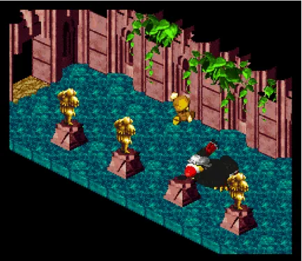
[image:14.612.90.523.207.582.2]and often dictated these elements' behavior.
FIG B: This screenshot from the sequence, “Dodo's Coming” in Super Mario RPG, illustrates the visual
The most obvious example is that of “Dodo's Coming!” in which an antagonistic
fat Toucan named Dodo attempts to investigate a “Statue,” which is actually the
protagonist, Mario, disguised in gold paint. Dodo does so by pecking statues violently,
and is baffled as this “statue” mysteriously moves when Dodo is not looking, and is
immune to (dodges) his pecks. Timed action, emotion, anticipation, and overall mood
intertwine with both the music and visuals in a way that is reminiscent of spoken
dialogue. The sound design is handled such that it often is hard to tell what is a musical
soundtrack and which is sound effect- which, for this game, is a very good thing.
During my first semester of college at MIT (and completely unrelated to my
studies), I had done a multi-movement composition that contained elements of all of
these musical influences. It was in a similar style of musical dialogue and variations on a
theme, so for me, confidence in my composition skills was not in question. During the
proposal stage, I feigned that I could use this piece for my final animation, although this
was not the goal. I feel that generally, a new world (or, to be more pragmatic, “property”)
requires the music to be created for it specifically. While I would draw on this
experience, I was intending to head in a somewhat new direction. With this in mind, I
knew that a skeleton of the score would be required early on to guide the mood, via
PRODUCTION
After the proposal process had been completed, several concessions were made.
Story was now a required development, and the scope of the epic journey had to be
reduced. At this point in time, I decided to re-evaluate my character designs to better suit
the direction the film was now taking.
Color and Character
While the story and music may have been heavily influenced by the JRPG genre,
visually, I intended to go in a very different direction. My original drawings as provided
in my proposal were not well received by my professors, despite their relatively
distinctive look. As such, I felt that I needed to choose a new art direction that would be
palatable and interesting. I wanted to keep the characters simple, charming, and energetic.
Ease of animation was definitely a concern- and while I did not want that concern to steer
the look, I had to find something that would be flexible and feasible for the medium.
The realistic, volumetric look of the JRPG genre was unmanageable for my plans.
Similar to the Anime genre of animated film, JRPG games capitalize on gorgeous
backgrounds and limited animation. As mentioned previously, I wanted to take a cue
from the simplicity of games such as Kirby, along with television shows like Powerpuff
Girls, and minimize unnecessary details. This, combined with my desire to finish the film
in a year, meant that I wouldn't be taking this direction.
I was not a fan of extremely limited animation, as seen on films such as “The
Furthermore, the thin-lined, weak presence of the characters in said current-day TV
shows, such as the Regular Show, was not of interest. Rather, bold characters, as seen in
the 2012 Nickelodeon incarnation of Teenage Mutant Ninja Turtles or Samurai Jack were
closer in direction to what I wanted to create. Both of these feature bold, large shapes that
[image:17.612.86.518.233.473.2]are easy to read and animate in dynamic ways.
FIG C: From left to right, top to bottom: Samurai Jack (Cartoon Network), Powerpuff Girls (CN),
Teenage Mutant Ninja Turtles (Nickelodeon), Spongebob Squarepants (Nickelodeon), The Regular Show
(CN).
Protagonists
I had chosen orange and a warm off-white for the primary colors of my
to project an air of elegance and solidarity with the characters' attire, and as such, drew
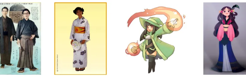
from my research. The robes were influenced by ceremonial robes of various cultures-
ceremonial robes, fantasy clothing, and Far-Eastern attire such as the Kimono were the
biggest influences.
FIG D: Some sample influences for the main character's attire. From left to right, Kimono, Yukata,
“Sorcerer” by Eelgod, “Seikoru” by Marmolotus-chz.
Much to the amusement of the Chinese RIT graduate students, the characters’
ethnicities gravitate towards the east-asian due to their blue-black hair, fair complexion,
and almond eyes. While that is part of the design, there are practical reasons for these
choices as well. The contrast between the hair and skin helps provide definition,
particularly against light skies. Their light skin and robes allows them to stand off of the
predominantly dark backgrounds easily.
[image:18.612.103.513.206.342.2]The evil characters all needed a united look and feel, so that the audience could
see a creature and immediately associate it with the primary antagonist. This was a
problem in during the proposal stage, as I had originally done unrelated monster designs
that were simply fun to draw, but felt random and disjointed in terms of an overall story
arc. To help hold them together, I chose a dark blue-purple color scheme, and placed an
emphasis on triangles and spines. I wanted to keep the characters easy to rotate, and used
a symmetrical body core for this purpose. I foolishly gave the most common creature four
legs as well, to give it some semblance of a crab or spider. This would change much later
in the production, after I realized the challenges involved with this character’s design.
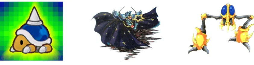
Influential in this process were the Sidehopper from Nintendo's Metroid series,
Nightmare from the Kirby series, and enemies such as the Buzzy Beetle from the Mario
[image:19.612.93.515.428.537.2]series.
FIG E: From left to right, Nintendo characters Buzzy Beetle, Nightmare, Sidehopper.
Over the summer, I created maquettes of the main characters in an attempt to
on track for production. These consisted of March, Autumn, the Torrith, and some statues
from the cavern at the end of the film. In three dimensions, these informed me of the
[image:20.612.89.522.182.433.2]difficulties and benefits of working in each of the mediums that I had been considering.
FIG F: Character Maquettes. The rear left and rear center are the original forms of the Torrith. Autumn is
at front-left, and March is at front-right. The other maquette designs (which are not to scale) were later cut
from the film.
Environmental Design
During the summer between the proposal and main production, I also engaged in
development of the environment, and determining the scale of the world that the
comprised of architecture and landscapes. As previously mentioned, I had researched
numerous architectural structures to compose my own variations. I took strongest
influence from Mayan pyramids, feudal Japanese houses, Medieval European castles,
Southwestern American and colonial Spanish architecture, and ancient Egyptian
architecture. All have strong and simple geometry, often with an emphasis on symmetry
[image:21.612.88.527.265.455.2](Refer to FIG A for further examples of reference material).
FIG G: Environmental development sketches.
I originally envisioned this story to be taking place on one large, Pangean5
continent. This was in no doubt inspired by many of the stories I had consumed over the
years, which often were partially told via intricate world maps. Tolkein's Lord of the
Rings series, C.S. Lewis's Narnia series, nearly all JRPG games, and even more
traditional games like Mario all sported these maps, usually in printed form. Using these,
I would often wander the details of these illustrated lands, imagining what the world and
a journey across it would look like. As such, my intention was that the journey
undertaken in this film would take the protagonists from calm, coastal plains across the
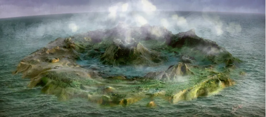
landscape into the heart of a giant, living rain-generator whose heart had been plugged by
a dark crystal guarded by the main antagonist. Due to some animation and scale concerns,
this was scrapped, and the living rain-generator was replaced with a temple atop a central
volcano, in which the final conflict would occur. I had been making sketches of potential
worlds for some time, but I decided to create a maquette of the landscape to solidify some
features and give myself some unchanging points of reference.
The plaster island I ended up creating had the same major features I had planned
before- a mix of plains, mountainous regions, valleys, rivers, and towns. However, with
an unchanging landscape with tangible geologic obstacles. While somewhat overzealous
in planning, creating these restraints helped solidify the situation and create new hills and
valleys for the story’s progression. While this world map’s destiny would ultimately be
FIG H: World map maquette with digital color and effects applied.
Medium Finalization and the Death of Art Direction
While I had been tentatively planning on executing the film in a fusion of 2D and
3D animation, I realized that wrangling people in to assist on the 3D side would not be
practical. As such, I re-evaluated my options.
I briefly decided to entertain the idea of stop-motion animation again. If animated
within stop motion, I expected my animation style to be along the lines of Laika6 or the
freshly-piloted TumbleLeaf by BixPix. The quick-and-dirty approach of the Adult Swim
studios7 was too “hammy” and over-animated for my tastes. Although high in
frame-needs, I knew it was well within my skill levels to achieve. My fabrication skills were up
to par for the project, and this was not a major concern. Funding was a concern, as at the
6 Successor to Vinton Studios and creators of films such as Paranorman and Coraline, Laikia is one of the largest stop-motion animation studios in the world.
time, I was not teaching any classes, and TAing prospects were up in the air at the time. I
knew I could use economical methods, but the final look and feel could require some
slightly more expensive materials like silicone rubber, particularly on the antagonistic
characters such as the Torrith, which sported flexible tentacles. Space was the largest
concern with this medium. Due to the “epic quest” nature of the project, I needed many
sets and storage for the sets and puppets, which, considering the limited stop-motion
facilities of RIT and my small living space, it didn’t look feasible in the long run.
Shooting space was also an issue, as several undergraduates and classes needed our two
stop motion studios, and our third space was limited to shop operating hours. These final
issues helped me commit to 2D animation.
My drawings skills were sufficient for hand drawn 2D animation, but the
potential length of the film worried me, as did the need to ink and color the film. My
lackluster experiences with coloring in TVPaint quickly eliminated it from contention,
and my possession of ToonBoom Animate Pro 2 (Acquired via RIT’s AniJam
competition) assisted in this choice. Knowing the speed of animating with cutout
components, I opted to do the film via digital cutouts. However, the individual cutout
pieces would force a certain amount of efficiency and simplification on the animation due
to the replacement-part requirements, and I expected to use a snappier, “TV-look”
animation style than I had originally intended. This would also require me to make
additional puppet components for slight changes in camera angle, which could either
slow me down significantly, or restrict shot variation. I decided that the benefits
After the choice of medium had been made, I realized that the original budget
from my proposal became somewhat irrelevant. While I could do all of this work on
campus, competition with other students was growing very unappealing, and the recent
upgrade to ToonBoom Animate Pro 3 meant that I could no longer jump between home
and campus computers for those occasions in which I absolutely needed to work on
campus. With this in mind, and with graduation and a long term of relatively low
projected income following that (meaning difficultly in acquiring the following
equipment), I decided to invest in TBA3, a new computer build, and a very-well-priced
Cintiq monitor to assist and accelerate the production process.
This is also the point at which my original vision began to morph tremendously,
and the technical aspects of filmmaking overtook any artistic vision that the film once
had. Being immersed in the “How” started to stand in the way of the “Why,” and the
concept of “Git 'er done” superseded the drive to “Make it beautiful.”
Toon Boom Rigging and Effects
As the semester and asset production began, the first order of business was to
create puppets for my characters. Based off of my sketches and maquettes, I began
creating basic vector drawings of the characters. Specifically because of the similar
design of Autumn and March, I began with the more mechanically complex of the two
characters- Autumn. I cut Autumn’s components (or pre-separated them upon creation)
into layers so that each could move independently of the other. This was the basis of the
completing this and setting rotation pivot points, I had a puppet that had movable and
replaceable facial features, bendable arms and legs, and movable heads. This would be
sufficient for a basic puppet, and in all reality, would have been sufficient for telling the
story I was looking to tell.
Because of ToonBoom's workflow and its lack of referencing8, it is imperative to
set up the puppet with its final look before starting animation. As such, I added a slew of
effects to the puppets, to add depth and flexibility to the world I was creating.
I found that the pseudo lighting was particularly simple to do to the puppet via the
Tone module, but I required layers of shading to suggest interior topographies. I found
that to avoid “double transformations9,” I had to be very careful with my hierarchy to
avoid strange behavior with the puppet, such as dislocating heads and fleeting shadows.
When following the chain, it is extremely important that any successive “Apply Peg
Transformation” elements do not stack by influence of a parent controller. While my
master peg was capable of controlling the character, I had to make sure that all lighting
elements were controlled at the highest level by a separate “Global Lighting” peg to keep
them isolated and consistent as the character moved. Further within this lighting chain
were similar separations for individual shadow needs, such as eye sockets.
8 “Referencing” is the process of a computer animation program locating and using a pre-made file
within a project. ToonBoom uses “instancing,” which makes a copy that is not influenced by changes made to the sourced puppet file. This is contrary to Autodesk's Maya 3D animation program, which will dynamically update the puppets in animation files if the puppet file is updated.
I realized that the arms of my characters and their respective shadows would often
need to overlap the body of their robes, without creating an unsightly seam. To achieve
this transparency, I used a blend mode node, “Erase,” on a composite with the arm and a
radial gradient (black to white mask) circle, which smoothed the transition of both the
shadow and the arm's edge. While not perfect for all situations, this rig was quite flexible
[image:27.612.86.528.265.507.2]and would be sufficient for most shots.
FIG I: March Rig and its network view, as seen within ToonBoom Animate Pro. Green modules and lines
denote “Pegs,” which act as animation controllers, while blue modules and lines denote images and visual
effects.
After doing some testing, I realized that I had stiff, large bodies that were
would require me to create a new body for every frame that the character needed to bend.
As this is an animation killjoy and would severely slow the process, I decided to use a
feature that had recently trickled down into Toon Boom Animate Pro 3 from the
professional version of ToonBoom, known as Harmony- bone deformation. With this, I
was able to flex the body as needed without having to create numerous body
replacements. This new tool was not without its caveats, however. One of the first things
I attempted to achieve was a billowing cloak- but when I tried to include multiple
deformation bones within the same drawing, the result was broken rigs, gross
deformations, and rampant double transformations. To make things worse, stacked
deformation bones (meaning, one acting as a parent to another) caused even stranger and
more unpredictable distortions and transformations. I spent a month or two going through
different iterations of the rig, ending with some 30 or 40 variations before finally fully
understanding the tools at hand and finding something that worked in compromise. In
short, I opted to use motion tweening for any widening of the cloak, and discovered how
to decouple bone deformations so that the effects didn’t stack into a twisted mess.
After this fiasco, I had a tangled but organized network, much to the amusement
and terror of my classmates and professors. However, by Christmas break, I had worked
FIG J: Detail view of the ToonBoom network view. With a deformation rig, modules connected via the
right node, denoted in yellow, are deformed with the rig. The kinematic output, denoted to the left via the
red circle, allows for components to be moved but not distorted with the deformation.
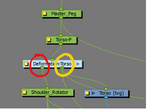
In short, there are several things to take away from this experience. Firstly,
deformation is tied to each drawing (not layer!). If a piece is replaced, it must be set up
separately, or be copy-pasted from a previous drawing and renamed accordingly within
the deformation node. The name of the group within the deformation node must be
FIG K: Detail of the network view within the “Deformation Torso” node. Each blue module, labeled “1”
and “2,” corresponds to a drawing in the layer of the same name.
After making changes to the rig in the setup view, the “apply default positions”
button in the deformation toolbar must be pressed with the respective deformation chain
(Drawing 1, 2, etc.) selected in the network view. Otherwise, things break when you
revert to the non-setup view.
Use the Kinematic Output button to daisy-chain deformations. This creates the
node denoted by the red circle in FIG H. If you want a body to bend and a cape to bend
separately, you need to have the cape attached to the Kinematic Output point.
Deformations do NOT stack. Unpredictable results occur if the secondary deformation is
Background Development
Alongside the production of the puppets, I also had been developing backgrounds
for the film. Originally, I had drawn up some mock environments in a broad-brush style,
at times reminiscent of Bill Watterson’s handling of environment. However, this was a
holdover of the film’s early stages of art direction, which featured characters that were
delineated in a similar fashion. When evaluating new background directions to match the
vectorized look of the characters, I looked to TV shows such as Pucca, Samurai Jack, and
Powerpuff Girls. These had very simple characters, but complex backgrounds. This
would be easy to match if I were hand drawing my backgrounds, but I knew from
previous work in vector media that working in wide landscapes is quite difficult. The
background scene needed to be simple enough for the characters to be readable, yet not
so simple that the scenes became boring.
To figure out the colors that I would use in my backgrounds, I initially created a
color script using my storyboards, exported in grid fashion into a PDF document. I did
quick color sketches directly on top of this. While the details could not be worked out, the
general atmosphere and mood of the film was communicated quite clearly at this stage.
However, as I began working with the actual production backgrounds for the film, I
deviated from this color script, and its development became somewhat pointless.
I made a few attempts to create environmental features, particularly foliage and
architecture, that would fit into the world. To do this, I took a similar approach to that of
For some elements, this worked well, for others, particularly shadows on the ground, it
did not, and required many iterations of cumbersome, transformed quadmap modules.
Furthermore, I found that while employing the Tone module for shadows worked well
with individual puppets, the sheer number of Tone modules in a complex forested scene
was causing ToonBoom to bog down in both the Render mode and Open GL mode. As
such, I tried creating greatly simplified backgrounds solely out of vector shapes with
solid and gradient fills.
Unfortunately, this approach did not mesh very well with transitions. Objects
such as buildings or a crop of trees looked to be simply pasted onto the scene. The root of
this was primarily value structure, as usually, the light-to-dark seams between objects and
the background were difficult to hide when using simple, uniform gradients as transitions.
Once I started testing the combination of the character and background, I ran into
more problems, as ToonBoom color palette system was working against me. This
problem was sourced from ToonBoom’s ID system, which “names” colors with IDs, such
that one palette can be re-used across scenes, and swapped to another color scheme (such
as day to night) with a simple click. Unfortunately, because I was using other files as
templates and modifying colors after the fact, my colors were conflicting across .anim
files due to identical IDs, and when combined, I would be faced with problems like
strangely colored patches of ground and the wrong color of sky. Unfortunately, time was
running thin, so I opted to get my characters laid out in the scene and fix the color
Music and Story
I chose to use music as a framework for the film, primarily to solidify the mood and
pacing of the story. As mentioned earlier, I took stylistic influence from video games
such as Super Mario RPG and the Legend of Zelda, but also included instruments from
the Far East, such as the Erhu10 and Koto11. I wanted to ensure that I had a basic skeleton
before the story developed too far, for structural reasons as well as communicative
reasons. I find music communicates a mood much more quickly and effectively when
compared to words, which would help my advisor understand the direction that I was
taking the film despite rough storyboard sketches.
During my preliminary research, I discovered that much of the “sound” that I was
looking for was based around the Hirajoshi scale. Primarily heard on the traditional
plucked Japanese instrument known as the Koto, the scale roughly follows the pattern
C-D-Eb-G-Ab, which can also be written as 1-2-b3-5-b6, where 1 is the root, and each
number is a whole tone in the traditional Western twelve tone scale. There are conflicting
definitions for this scale, which are far too involved in music theory for me to truly care
about, but the feel conveyed in the scale is what I was looking for. This served as the
basis for the opening of the film, with recurrences throughout to tie everything together.
As I was blending this with a traditional western sound, however, I simply used this
structure as a guidepost, often deviating from the pattern into other musical directions as
dictated by the needs of the film.
10 Erhu (pronounced ar-hue)- A single-stringed, bowed, violin-like instrument, commonly heard in
traditional Chinese music.
11 Koto (pronounced koh-toh)- a multi-stringed, plucked, harplike instrument, commonly heard in
As mentioned earlier, the musical structure of the film was established early on,
working in tandem with storyboards. The basic flow of the music was as follows:
● Serenity- well-separated, light sounds. Smooth, flowing melody. Hirajoshi scale.
● Tension- Strong beats and dissonance cut through the serenity.
● Recovery- Relative quiet.
● Confidence- Strong, energetic, and a march-like pace. Major key.
● Inadequacy- Dominated by well-separated, light, almost comical sound. Minor
key structure.
● Solitude- Strong, well-separated, but heavy sound. Swells build up to punctual
hits. Hirajoshi and minor scale basis.
● Uneasiness- Dissonance, building.
● Danger- Aggressive, dissonant, and chaotic. Build to climax.
● Valiance-Presumably seventh suspended based chord. Half time, strong
downbeats.
● Triumph- major scales, loud, building, ending with several strong, separated hits.
While the details of the story did change over time, this basic structure was
retained. Having the skeleton early on was very important, as it prevented me from
changing my mind too drastically while I developed the story over the course of the year.
Story development began early, during the proposal stage. A brief treatment of
this story was as follows:
ACT I:
The CloudSpring, a large creature that produces clouds for the world, towers over the horizon. A light descends onto the cloud spring, and there is an immense flash. The previous landscape is now dried and brown, and the blight expands in a slow shock wave across the land. Vivian climbs a hill to a lone flower and collects its nectar in a vial, just before it withers and dies. Vivian runs back down the hill to her house, Autumn and March. Vivian gives the vial of nectar to March, and explains that it will revive the CloudSpring. Vivian sends both Autumn and March on their trek to the CloudSpring.
ACT II :
March and Autumn travel across the landscape, engaging in small skirmishes with various creatures, which Autumn usually ends decisively, much to the chagrin of March. March maintains this rivalry against Autumn whenever he can, witholding food that he catches and trying to hold his own (however momentarily) against a huge foe.
March shows his power by taming a Glowerface, which he and Autumn ride to the dead jungle of Lusuh. Here, the two disembark the creature and traverse the jungle. March falls through a log here, and after failing to get out on his own, is rescued by Autumn.
After exiting the jungle, Autumn collapses in desperation after seeing the large plains between them and the CloudSpring. March takes the upper hand and successfully encourages Autumn to press on with him.
Autumn and March enter the CloudSpring (and subsequently its heart), where they discover a Black Crystal plugging its center and a Dark Wraith guarding it. The Dark Wraith raises a force field to separate March and Autumn, and March is forced to defeat the spectre on his own. After a battle in which March is nearly suffocated by the Wraith’s smoke, March manages to impale and defeat the Dark Wraith, although March is severely injured in the process. The force field falls, the Black Crystal shatters, and Autumn rushes to March’s aid. At his behest, she takes the vial of nectar and pours it into the center of the CloudSpring’s heart.
ACT III:
The skies turn blue once again, while both precipitation and the fields become lively once more. Meanwhile, March and Autumn have returned home to Vivian, and under a downpour, they feast while their roof pleasantly leaks.
I had created a few variations on this, including a version in which Autumn dies,
a version that included the protection of an entire town (which gave reason for these two
creatures along the way. For brevity’s sake, I will not include them in this document, but
they shared most of the main events of this story.
Unfortunately, this story was far too complex for the time I had ― there were at
least 12 characters involved, and nearly one hundred backgrounds would be required. I
needed to find a way to reduce the content while still retaining the core messages that this
story was trying to communicate- primarily, learning the balance between self-reliance
and depending on others.
My first rough animatic was put together in August. By this point, the story had been pared down somewhat.
The clouds rumble, and rain starts pouring. The environment is placid and calm, until the arrival of an ocular meteorite, which sets upon the central mountain, and desiccates the world. Autumn and march run inside to consult their conveniently placed library, and find a story foretelling the arrival of the meteor and their role as protectors.
They set off to save the world. Along the way, the encounter the first incarnation of the Torrith, who, after a brief and one-sided battle with March, destroys the bridge leading to the mountain. March escapes the crumbling bridge, and after being scolded by his sister for his brashness, the two take the long route around the river towards the mountain.
Somewhere in the ridges near the mountain, Autumn and March encounter a horde of creatures resembling the Torrith, and the duo lay waste to them- at least, Autumn does. She creates a huge pile of dead enemies, while March had been preoccupied and defeated a single enemy. Jealous, March storms off, and Autumn leaves him to his own devices.
March continues along against sandstorms, sheer cliffs, and evades unexpected groups of enemies until he finally reaches the temple at the top of the mountain. Coming to the steps, he climbs to the top of the temple, enters, and descends into its depths.
Within, March finds a dry cavern with an inactive statue in the center. The Torrith steps out of the shadows and calls forth a horde of minions. March defeats the minions, impressing himself in the process with a pile of his own. March engages the Torrith, loses, and starts to get crushed. While being crushed, his hands begin to glow as his latent powers are activated. He fends off the Torrith, and then blasts it with a powerful beam. It crumbles into a heap, and March looks on, proud.
This basic core would be consistent from this point onward. I had cut unnecessary
characters and interactions, and simplified the story into a few major events that can be
compared to the typical “hero’s journey” story. These core elements worked in tandem
with the skeletal score that I had composed:
● Call to action
● Setting off on the journey
● Road of trials
● Conflict with the superior
● Separating from safety
● Proving oneself
● “Death”
● Rescue
● Reconciliation
● All is well
I went through many more revisions of storyboards, generally removing
redundancies and expanding sections that were unclear due to fast action. By November,
I had a significantly longer animatic, as it had extended itself to 5:30 from the originally
projected 3:30, and its pacing was far too fast for a film of this length- 10-15:00 was a
more suitable estimate for the film’s length. Once I realized this, I re-evaluated the
eliminated without the core, outlined above, being affected. At this time, I also tested out
some of my rigs on approximately five shots, and incorporated them into the animatic.
After meeting with my committee just before Christmas break, I also found that I needed
to strengthen the relationship and rivalry between the two characters while giving more
reason for the strong reactions that March has to his sister’s presence and actions.
This process of cutting went on through the winter months. There were
interactions that I really enjoyed and potential compositions that would really stand out
nicely, but because of redundancy or frivolousness, I had to cut. I eliminated any
presence of characters beyond the main duo, the Torrith, and the minions that pushed the
story forward. The broad environment was now unnecessary, as the story between March
and Autumn was now the focus. As such, the world shrunk from a place that would take
days to cross to one that would take an afternoon. Remnants of the architecture and lore
that were present in the original proposal story were lost, in favor of simplicity. This
process continued until March (ironically), at which point, I decided that the story needed
to be finalized, as animation needed to start.
False Start
Animation blocking began on February 1. I had just met with my advisor, and
realized that my state of Story Limbo could be indefinite. As such, I needed to finalize
the story and begin animating if I hoped to finish on time. As I had spent most of my time
on rigging and story development, I blocked out the animation at a breakneck pace.
characters into their places, just as on the storyboards. I stumbled across many situations
where the rigs were unable to match the pose, but elected to keep moving and fix the
issues later. By February 14th, I had blocked out roughly half of the film, and by the 19th
of February, I had most of the film's blocking completed. However, because of the
shortcomings of the backgrounds and the puppets, along with my relatively reckless
blocking, the result looked terrible. Animating the minor antagonist characters was
proving to be frustratingly slow due to their quadruped nature, and the main character
rigs were overdesigned with too much cumbersome flexibility for what they needed to
do. The background color ID problems had not been resolved at this point either, so many
of the test renders had swaths of background in a clashing color or simply black. After a
meeting with my advisor in which all of the punches were pulled (which I was quite
perceptive of), I decided that this result was inadequate, and that the best course of action
FIG L: Abridged evolution of Autumn's character design, with the top left being among the earliest
designs. Note the simplification of form, progressing from left to right and top to bottom, culminating in
the near-final sketch at the bottom right.
Asset Reboot
Despite the fact that the first rigs took half of a semester to create, I now
understood the process and structuring required for the characters I was making. I created
a fully functional and much-improved Autumn puppet in approximately four hours, and
the transition to March was trivial due to their similarities. I removed the characters’ feet,
and simplified their hands into simple shapes that had four options that could be swapped
out. The body decoration was also greatly simplified into something relatively
egg-shaped. Autumn’s long cloak was removed in favor of a cape, and March’s asymmetrical
rounded out, and deformation bones were used for limbs rather than individual cutout
[image:41.612.81.527.153.311.2]pieces. Furthermore, lighting effects were greatly simplified.
FIG M: Comparison between final Autumn puppet render versus the prior Autumn puppet's render.
The Torrith was overhauled into a rounder shape that could be rotated easily, and
had a color scheme change that gravitated towards the darker blues rather than the
medium-to-light purples that were present before. It gained hands and claws as well, as
the prior deformation-based tentacles were cumbersome to work with and lacked the
possibility of expression.
The minor antagonist character was turned into three variations- a flying type, a
turtle-like type, and a floating type. All were done in the new color scheme, had similar
designs to the new Torrith, and had a circular core that made rotations easy. Limbs were
I recreated all of my backgrounds again in Photoshop, rather than try to fight with
Toonboom. I often worked directly on top of my old layouts, to ensure that the space was
compatible with what I had before. I did make some minor layout changes changes for
spatial reasons, and removed almost all remnants of architecture for simplicity’s sake.
The primary creation method was one that I had experimented with shortly before. The
technique involved drawing the shape I required with the lasso tool. I would create a
layer, and then create a mask for the layer based on the lasso shape I had drawn. This
allowed me to soften and otherwise manipulate the shape without losing the color
information saved in the actual layer. I would fill this layer with one solid color, and then
would soften many of the hard edges of the mask with a simple large, soft brush. To help
add some texture, I brought in several watercolor wash scans, the most important of
which encompassed smooth, speckled, cloud-like, and aggressive textures. These were
used in all shots, including the anime-esque action shots, to ensure that the vector look
did not draw too much attention to itself.
After recreating all of my assets, I worked on top of my old poses and re-blocked
the entire film with the new puppets. Because the basics had been done already, this
process went quickly, and the entire film was blocked by the end of March.
Animation
I started the final animation at the beginning of April. At this time, I started
running various TV shows on the side as I worked, partially to entertain, partially to
Girls, My Little Pony, all of which are relatively modern digital 2D cutout-based
animated TV shows.
Looking at the way they handled snappy motion and cush helped me get between
strong poses in a way that wasn’t entirely a surprise. Generally 4-5 frames was plenty to
get from one pose to another, with perhaps 3 frames of cush afterwards. However, they
also brought to my attention the difficulty in doing slower, smoother actions, like a walk,
in conjunction with these snappy actions. If the slower, smoother actions are done
snappily, they communicate as unfinished or hokey, while if they are done too smoothly,
the actions seem like they originate from a different animation entirely.
This timing played well into the music I had composed for the film. Most of the
music was timed at 80 beats per minute, which translates to 18 frames per beat. This
means that half of a beat lasts for 9 frames, and a quarter of a beat lasts for 4.5 frames,
and could be pushed either way depending on the needs of the animation. Walks were
generally done with each step lasting 9 frames. Having the walks land on the beat
constantly felt awkward, something like a forced march, so I generally offset these
actions by a few frames to negate the effect. Desynchronizing the characters in this
regard was particularly important, partially to avoid a marching feel, but partially to
allow attention to shift between characters, rather than compete.
In the middle stages of animation, one particular series became particularly
influential. This Anime series, known as Kill La Kill, features over-the-top, yet efficient
animation that helped me realize how to put together my action scenes. I found that to
emphasis and punch to the action, while anything longer tended to sap the energy from
the shot. Camera moves leading into these hits, combined with tight framing, were some
effective techniques in Anime films like Kill La Kill that I chose to incorporate into these
scenes.
By the time I reached the later stages of animation, I had become comfortably
immersed in the rhythm of the animation, and issues in arcs, momentum, and weight
became obvious and quickly fixable. As the deadline drew near, I did become aware of a
few particular issues, such as awkward, inconsistent staging with a camera move in the
staff-passing scene, and had to make do as best I could without scrapping the shot.
Post Production
Thankfully, due to the way I had set up my project, most of my film did not
require any compositing or effects work outside of ToonBoom. To ensure that my
characters did not stick out from my backgrounds too severely, I created a module within
ToonBoom that blended a gradient that sampled color from the sky and the ground,
reversed the gradient, and overlaid it onto the characters. This ensured that they had
complementary contrast with the background, while still retaining influence from the
FIG N: Example of gradient overlay technique. The conspicuous gradient rectangle is actually overlaid on
the character via a blend mode to tint the character. This image simply demonstrates the rough positioning
of the gradient colors.
Overlaid clouds, glowing objects and rain were the main effects that required
compositing work in After Effects. Thankfully, with the lack of rain throughout most of
the film, I did not have to run most of the final footage through this process. Rain was
created with a rain particle generator that was overlaid onto the source footage with a
“screen” blend mode. Although it wasn’t the most appealing and realistic result, it was
quick and sufficient to communicate the message of rain.
The most time-consuming of these effects to render was that of overlaid clouds,
transparency, a blend mode engaged on each, and motion over the course of the long
shot. A layer of rain and a camera move were also included in this shot, which led to 20
to 40 minute render times.
Glows were done simply with the glow effect. These were primarily intended to
be seen in wisps of energy that were emitted from the altar in my original storyboards,
along with effects during the final fight scenes. I eliminated the wisps in the beginning
for two reasons- they looked rough, unfinished, and aesthetically unpleasing, and I also
had forgotten to include them in the 20 second altar shot in which the Torrith appears. I
opted to remove them entirely, since the 20 second shot could take 45 minutes to render
every time I needed to make a change.
The final fight scenes became a bit more elaborate in their compositing needs. I
had to separate the layers of energy blasts, explosions, and flashes from the primary
animation, and occasionally, layers of characters needed to be separated from each other
as well. Most effects required the standard glow effect I had been using before, combined
with some transparency shifts.
However, there were several effects that I had to completely synthesize within
AfterEffects. The energy ball that is ejected from the Torrith’s remains was one of the
effects created in this fashion.
First, I created via a circle shape, then applied a “Fractal Noise” effect with an
evolution in its pattern applied while it is onscreen. I also applied “Light Burst” and
The disintegration of the Torrith was accomplished in a somewhat risky way.
Since the disintegration was a complicated animation, I knew early on that I couldn’t do
it by hand in a timely fashion. I assumed that some sort of effect existed within
AfterEffects that would break apart a video file like glass, and allow it to scatter. As
expected, I found the aptly-named “Shatter” effect would work perfectly- I would just
have to find a way to make the shards move in a way that was cohesive with the rest of
the animation. By changing the direction and strength of the particle system’s gravity, the
thickness of the glass, and the shard size, I found a combination that satisfied my needs
and looked good in the process.
Sound Design and Mixing
While working on my proposal in the Spring, I had been approached by a fellow
graduate student that volunteered to do the sound design for my film. I explained that I
was looking for certain sounds reminiscent of the 16 bit era of video games, with some
degree of realism mixed in. I thought this description, along with some references and a
rough copy of my film was sufficient for him to work with, and expected him to think it
over and devise some solutions.
I originally intended to have my rough film to him with five weeks to spare
before submissions, but due to the massive changes that my film underwent, I was unable
to get a time lock to him until approximately three weeks before the due date. Because of
prior commitments that he had made, this meant that he had only one or two nights to
of a 1980s news show, with obnoxious phase and flange effects, and too much of a
“stereotypical” video game sound (not in a good way), with lasers. This was partially a
product of my lack of sufficient communication, and partially from the lack of time. The
sound was also mixed such that the sound effects sat at the forefront and attempted to
drive the film. As I had explained to him in our prior meeting, this was not how I
envisioned it, as music was supposed to drive the film.
Furthermore, due to an agreement I had made with him beforehand, I was not
permitted to modify the bounced sound file as extensively as would be required to
remedy the issue (which was complicated by the presence of strong room tones). After
some thought and discussion with professors, I hesitantly dropped this sound from my
film, and decided to do my own treatment.
Seeing as this was the final night of the semester before submissions, my sound
session was rushed, and was not conducted in an ideal mixing environment. I was able to
cobble together most of the film's sound in a way that was more or less satisfactory,
although there were several sounds that were still very strange, or that I could not work
out with my limited experience with synthesizers and modulators.
To mix down the audio, I first used headphones, then moved to my desktop
speakers, which was a huge mistake. While I know my headphones12, I can not judge the
low bass with them, and decided that the desktop speakers13, with their subwoofer, would
be a good choice. Unfortunately, these speakers seem to have a large 500-800hz bump,
which caused me to mix sounds that sat in that section too low. I was also conservative
on the whole, with a maximum volume of -7dBFS. While not a film-killer, this choice did
come back to bite me later.
Titles and Credits
I originally intended to have someone from the design school at RIT do my
credits, as I felt focusing on my animation would be the best choice. However, near the
end of the semester, I hadn't chosen my final title yet, and I found myself with some free
time before submissions (before my inadequate sound came back). I decided to undertake
the task of title design myself. Having had an undergraduate degree in Visual
Communications and a bit of typography under my belt, I felt capable of delivering good
results.
When creating the title, I was not referencing any outside type in particular. I was
looking to create something with curviness and organization, which were characteristics
that were found in the final look of the film. A sans-serif typeface felt too generic and
cartoony, while a fully serifed typeface felt too formal and uptight. I decided to create my
title with a rounded, small serif, and have broad curvature to my type.
I created several sketches, and traced over a final choice in Adobe Illustrator. This
required a significant amount of finessing, however, as the translation from outline to
lineless vector changed the perceived form of the letters. Once I found a good balance of
space and readability, I created graphical elements to be placed behind the text, to assist
in its readability on a potentially busy background and unite it with the rest of the film a
The creation of my credits were non-eventful. I simply created a simple
background for the text to sit on, and added a slight dark patch in the middle for the white
to contrast against.
CRITIQUE
Charles Bandla acted as my respondent. This began in a relatively benign fashion,
simply walking the audience through the proceedings of the film with occasional
humorous flair. However, Charles saved his notorious sense of humour for the very end,
at which point, he connected the elements of a male, staff, and blast of white energy into
some sort of sexual-angst-derived interpretation of the film. This was definitely not the
intention of the film, but I understood that once in the wild, films take on a life of their
own.
Due to Charles Bandla’s diversion during the response segment of my screening,
the audience decided to run with the concept and draw further sexual conclusions, much
to their amusement. Unfortunately, most of these comments were simply riffing off of
Charles’s response and my reaction, and did not offer much real critique in terms of
story, animation, or anything else.
A second, somewhat related diversion was brought about by Atia Quadri, who
interpreted the film as steeped in male-superiority chauvinism. This was a disappointing
eye-opener, as early in the film’s production I explicitly did not want to offend the
very valid points, however, and I realized that some small revisions could be made to
alleviate some of the issues that Atia had with the film.
Aside from the aforementioned diversions, the reception of the film was generally
lukewarm, if slightly on the positive. The animation worked and communicated well, but
unsurprisingly, the story was mediocre at best. The live-action professors in particular did
not consider there to be a story at all, as they expect more depth to action, reaction, and
interaction than was present in my film.
A few people in the audience correctly spotted my influences, with specific video
games such as Metroid, Zelda, and Final Fantasy being explicitly called out. The
relatively effective fusion of animation styles was also noted, with influence from anime
action and snappy animation being specifically referenced.
While my final mix was, at its loudest, about 4-5 decibels too quiet, Dave
Sluberski noted that the subtleties in the beginning worked well, and that the high points
needed just a bit more presence and volume. A few others in the audience echoed this,
asking for more energetic and exciting music during the tense parts of the film.
CONCLUSIONS AND REFLECTION
Overall, I’m not particularly satisfied with the film. It works- the animation and
story both make sense, but the story and art direction aren't as impressive or as interesting
as they could be. The story doesn’t make a strong enough statement in either direction,
due in no small part to the limited character development imposed by the film's fast pace.
crucial towards developing a memorable film. More importantly, creating something that
goes beyond the tried-and-true makes a film really stand out. Furthermore, I have also
found that story alone can't save a film- if it doesn't stand out visually, it will easily be
lost in the aether of other student films.
Having gone through all of the stages of creating this film, I have found many of
my strengths, many of my weaknesses, and learned the ins and outs of software. I find
that rigging is a dangerous task for me ― not because it is difficult, but quite the opposite
― it is a very repetitive process, almost factory-like. Once you understand the process, it
goes like clockwork, and it is easy to get comfortable and complacent working in that
rhythm. Animation, on the other hand, requires a good amount of thinking, which, once I
get immersed in it, is much more enjoyable and rewarding than the rigging process.
If I were to re-approach the creation of this film in terms of assets (not story), I
would place much more time on the backgrounds to create a more interesting, engaging
landscape that could take better advantage of layout and design principles. At the
moment, it is one of the most bland parts of the film, and causes any architecture that
does appear to stick out like a sore thumb.
While the final result was not as fulfilling as I would have liked, creating this film
has been a wonderfully enlightening experience. While there is much more to learn, I
have come a long way over this past year and developed my skills in all areas
significantly. This will prove to be an important asset as I continue in my career within
APPENDIX A
Cloud Spring
By Lucas GonzalezThesis Proposal
For MFA in Film and Animation School of Film and Animation
Rochester Institute of Technology, Rochester, New York April 2013
Approved for Submission by: