Proceedings of the SURVEYING & SPATIAL SCIENCES BIENNIAL CONFERENCE 2011 21-25 November 2011, Wellington, New Zealand
341
Mapping Cycling Pathways and Route Selection Using GIS and GPS
Matthew Huntley, Xiaoye Liu, Kevin McDougall, Peter Gibbings
Faculty of Engineering and Surveying The University of Southern Queensland
Toowoomba, QLD 4350, Australia
Email:[email protected] [email protected]
[email protected] [email protected]
ABSTRACT
Increasing demand for crude oil is a major factor affecting the price of fuel for motor vehicles, which also can influence public transport prices. Future transport could prove to be costly so the use of bicycles could become more common for local travel. When riding a bicycle from one place to another, the shortest route is not always the easiest one; terrain has more of an influence on how tired a person gets than the distance travelled A commuter cycling to work may know that shortest route, however they may not realise that this route requires the outlay of more energy than a longer route.
This study investigated the easiest route from the University of Southern Queensland (USQ) to the central business district (CBD) in Toowoomba in terms of energy used. This was done by collecting GPS data of cycling lanes and pedestrian paths for six different routes. The data was uploaded to GIS software, then processed and analysed to ensure the data was suitable for calculating energy usage. An energy equation was then developed to calculate the energy expenditure for a cyclist riding up and down terrain. Using this equation the energy for the six different routes were calculated to find the route that used the least amount of energy and to also find the route that was the most energy efficient from USQ to the CBD.
KEYWORDS:Cycling, pathways, route selection, energy, GIS and GPS
1 INTRODUCTION
With the price of fuel rising and the cost to operate motorised vehicles becoming more expensive, the use of bicycles will become a more common method of travel. Active transport is now being encouraged to reduce the use of automobiles, save energy and to reduce pollution. Cycling has been around for over century. Over time it has advanced dramatically, today being used not only as a means of transportation but also for recreation. It is used for a range of applications such as competitive cycling, downhill mountain biking and many other sports. A study done on bicycle commuter routes in Guelo, Canada, found that most commuters travelled up to 5.5 kilometres from home to work. Most commuters didn’t divert much from the shortest path and were found to use major road routes (Aultman-Hall et al., 1997).
continuous, reasonably direct, functional (serving a variety of destinations), part of a network, safe, and passing through parks and open spaces where possible (IBI Group, 2000). The pathways also need to have smooth surfaces, be well marked and be easily accessible.
Creating a network that incorporates all the above factors, takes considerable time and planning (ANJEC, 2004). A way of encouraging cycling and making it more convenient is to have facilities such as bike racks and lockers, amenities (showers and toilets) at desired locations and along the way and lastly for it to be aesthetically pleasing. To do this, town planners must find the most popular routes and develop these facilities (Leigh et al., 2009). One way in which the local city councils can find the most common routes of the commuters and recreational cyclists is to survey the community (Rissel et al., 2010). This gives the council insight into what paths people like to travel to work or what paths are available. This can help the council to plan or update cycling pathway or road networks. The authorities must also ensure that the networks provide sufficient access to the most important areas such as: schools, businesses, shopping centres, churches, libraries and other community facilities. Studying all the factors together with how people use, need and feel about cycling pathways can help increase the use of cycling.
Previous research on analysis of cycling routes using GIS shows some of the processes used when analysing data (Aultman-Hall et al., 1997). The data was collected using surveys of the community and digitalising all the data into a GIS. Using the surveys filled out by the commuters, a number of possible routes were established. Attributes were then given to the different routes for further analysis. The attributes used included; what intersections had traffic lights, major intersections, gradient, speed limits, bridges & railway crossings.
Shumowsky (2005) discussed the process of creating a map of the pedestrian and bike pathways using GIS software. This map would also be used for planning for future pathways. A key element in the pathway design was the traffic volumes. Keeping away from roads that were too busy was important so that bikers and pedestrians would both feel and be safe when enjoying the routes (Shumowsky, 2005). This is information that needs to be noted in the analysis of routes. Routes that followed creeks and rivers were also a key element in the planning. Using all the information from the GIS system and the public input the best routes around the city were determined.
Gray and Bunker (2005) used GIS as a tool to analyse data and select common routes of commuters. The sources of data used to do this include public transport route and stop data, public transport timetables, street, park, topography, bikeway data, public domain aerial photographs, population data, employment data, and infrastructure and services benchmarks. By analysing all this data, the best routes to Brisbane CBD (central business district), the unsafe bicycle routes and the best locations for new routes could be determined (Gray and Bunker, 2005).
With the active transport networks on a Geographic Information System (GIS), users can view all the different pathways and can also see the inventory and facilities (toilets and parking) of routes (Gray and Bunker, 2005). Viewers can decide whether they want to take a route that has bike paths or whether they want to use bike lanes on a street. Today, most methods of choosing cycling routes are determined on the shortest and safest routes. This however may be a poor way of determining a route as these routes may mean that more energy is expended.
343
This paper presents a way to map cycling pathways when considering the energy usage and route selection from Toowoomba campus of the University of Southern Queensland (USQ) to the CBD of Toowoomba using GIS and GPS. It aims to assist people in identifying the easiest way from USQ to CBD and accordingly create greater incentive to use a bicycle.
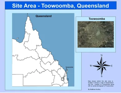
[image:3.595.117.507.185.487.2]2 MATERIALS AND METHODS 2.1 Study area
Figure 1: Study area
The study area is in the region of Toowoomba Regional Council, Queensland, Australia, covering the area of the Toowoomba city. The Toowoomba City is the regional centre of the Darling Downs, located approximately 130km out of Brisbane, Queensland, Australia (ANRA, 2009). The city sits on the crest of the Great Dividing Range, around 700 metres above sea level. The majority of the city is west of the divide.
2.2 Data
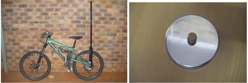
taking these statistics into account it was clear that the best time to collect the data would be either from 6:00am till 8:00am or from 9:30am till 12:30am.
Figure 2: Bike frame and magnet
2.3 Methods
The GPS data was post-processed in Trimble Pathfinder Office software. Once the data was post-processes and the accuracy was checked, the data was then exported as a shape file so it could be used in ArcGIS software. The DEM was used to create a slope map in the study area. The slope was classified as seven classes: 0 – 1%, 1 – 3%, 3 – 5%, 5 – 7%, 7 – 10%, 10 – 15%, and 15 – 30%.
Equation one for the ascent, while equation two is used for the decent, which are modified version of Mueller (2010):
))
28
.
3
(
22
.
0
(
)
(
)
60
)
2
.
2
(
(
×
×
×
×
+
×
×
=
HD
S
D
BW
S
Calories
C (1)))
28
.
3
(
1
.
0
(
)
(
)
60
)
2
.
2
(
(
×
×
×
×
−
×
×
=
HD
S
D
BW
S
Calories
C (2)where, S is average speed; Sc is speed coefficient; BW represents the body weight (kg) of
the cyclist; D is the distance (km); and HD represents the height difference.
The equation 1 can be divided into two sections. The first section computes the energy use for riding a bike on level terrain. The second section is adding energy to compensate for travelling uphill because it takes more energy to ride up a hill. The equation 2 is similar to the first and it calculates the energy usage of riding downhill, while the second part of this equation subtracts energy to compensate for riding downhill.
Calculations were carried out using the above equations in the ArcMap and a Microsoft Excel spreadsheet. The routes were divided up into a number of small sections to make it easier to calculate. The information gathered using ArcMap was collected by using the slope classification layer and the collected GPS point data. Where a slope started a point would be selected and the point number and its height were noted. Where there was another change in grade, another point was selected and again the number and height was noted. A distance between these two points was then calculated using the inquire function and all this information was stored in the spreadsheet.
345 3 RESULTS AND DISCUSSION
The total energy used and the length of the six routes are shown in Table 1. The results show that route 4 used the least amount of energy to get from USQ to the CBD while route 5 used the most energy. Route 1 is the shortest route while route 5 is the longest one. These three routes are analysed in details.
Table1 Energy used and length of the six routes
Route Energy (calories) Distance (kilometres)
1 144.97 6.031
2 149.99 6.147
3 148.46 6.234
4 144.19 6.151
5 154.67 6.434
6 152.40 6.297
Figure 3: Route1 Profile
Figure 4: Route 1 Acquired Distance versus Energy
peak which can be seen in the green box. The green circle in the profile graph shows that there is a small rise in the terrain and this is what is causing this energy peak. The larger fluctuations before these points are cause by large distances between points which causes a build-up of energy. From two kilometres to three, the energy drops all of a sudden and this is because of the steep slope in the terrain, which can be seen in the Figure 3. These areas of interest are highlighted with the red rectangles and circles in each graph. From this point there is a large rise in energy use and this is because of the uphill section in the terrain which again can be seen in the graph. After the three kilometre mark the energy usage decreases and fluctuates again. This is because there are two small rises or ridges in the terrain which is causing the rises in energy usage. These peaks can be seen in the purple and cyan circles. As the graph reaches the five kilometres mark there is another spike in the energy seen in blue. This is because the terrain has reached a low point and there is a steep slope, which can be seen in the blue circle on the profile graph. The energy graph then shows a slow decline in the energy used from the five kilometre mark to approximately the five and a half kilometre mark. In this section the profile shows that the terrain is downhill before it rises from the five and a half kilometre mark to the finishing point. This small rise is reflected in the energy graph with another spike in the energy used which can be seen in orange.
Figure 5: Route 1 Acquired Energy versus Acquired Distance
347
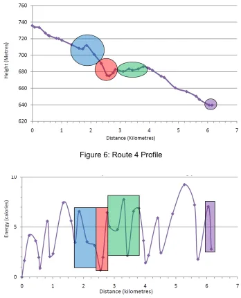
Figure 6: Route 4 Profile
Figure 7: Route 4 Acquired Distance versus Energy
Figure 8: Route 4 Acquired Energy versus Acquired Distance
The Figure 8 shows the corresponding colours of Figures 6 and 7. These coloured circles help to show which areas use large or small amounts of energy. It is evident that the areas in the blue circle (1.8 km mark) and the red circle (2.6 km mark) are sections of the route that influenced the total energy usage. The blue circle section is an area where a considerable amount of energy was saved due to the large downhill section. The red circle also saved some energy however there was a steep incline in the terrain which caused a large amount of energy to be used.
The route 5 is the one that requires the most amount of energy and it is also the longest route. It used a total of 154.67 calories over the total distance of 6.434 km.
[image:8.595.139.508.408.639.2]349
Figure 10: Route 5 Acquired Distance versus Energy
[image:9.595.115.515.508.729.2]From the start point to the approximately the one kilometre mark there are fluctuations in the energy usage. Like the other routes this is due to the different distances used between grades amounting to spikes in energy. The blue circle seen in Figure 9 from the 1km mark to the 1.5 km mark, shows that there is a steep decline in the terrain. This is reflected in Figure 10 where the energy used is very low around 2-3 calories. The terrain then goes into a continuous decline from 1.5 km mark to the 3.75 km mark and this is represented by the red rectangle in Figure 10. Again Figure 10 reflects the terrain in the red rectangle showing the energy staying quite low and having small fluctuations. Figure 9 shows the green circle from the 3.75 km mark to the 4.8 km mark. This green circle illustrates where the terrain rises steeply. This is reflected in green in Figure 10 where the energy expenditure rises steeply as well. From this point to the 6.25 km mark the terrain begins to decline again at a slightly steeper grade then the previous section. The grade changes fluctuate in areas before flattening out after the 6.25 km mark seen in purple. Figure 10 shows that there are fluctuations in energy usage from the 4.8 km mark to the 6.25 km mark. This is because of the inconsistent distances used as well as areas where the grade changes slightly. The purple rectangle in Figure 10 also represents where the terrain flattens out and there is a spike in the energy.
Figure 11 shows the acquired energy used along the route. It helps display where the energy was used and saved. The blue circle (1.2 km mark) is an area where a large amount of energy was saved because of the decline in the terrain. Although the red rectangle shows an area where the energy is increasing this is also an area where energy has been saved. The grade of this section is not very steep which indicates that the terrain is downhill which it is when looking at Figure 9. The green circle (4.2 km mark) in Figure 11 shows an area where the most energy of the route was used. This was caused by the steep incline in the terrain. Overall the route only had one major uphill section in the terrain, the rest was consistently downhill. The main reason for this route using so much energy is predominantly because it is approximately 250 m longer than most of the other routes.
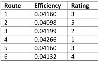
[image:10.595.217.377.435.535.2]Route 2, route 3 and route 6 are also broken down and viewed individually as the route 1, route 4 and route 5. After analysing all the routes, areas that have influenced the energy expenditure have been identified. It was also discovered that different distances in the routes could also have contributed to the differences in energy used. By dividing the distance by the calories a ratio can be established that gives energy efficiency. This means that the energy efficiency can be determined for each route to work out which route was the most energy efficient. The Table 2 shows that route 4 is not only the route that used the least amount of energy but it is also the route that is the most energy efficient. It can also be seen that route 3 was the next most energy efficient route. Route 3 used the third lowest amount of energy and is also the fourth shortest route. The results also show that route 1 and 5 were both the third most efficient routes. This is a very interesting result as route 1 is 403 metres shorter than route 5. This proves that the shortest route is not always the easiest route. Route 5 is the longest route so by it being the third most efficient route also reinstates the fact the shortest route is not always the most easiest. Route 6 is the fourth most energy efficient route with it being the route that used the fifth least amount of energy and it was the second longest route. The least energy efficient route was route 2. Route 2 is the second shortest distance and used the fourth lowest energy. This reinstates the fact that the shorter the route doesn’t mean it is easier.
Table 2 Route Energy Efficiency
Route Efficiency Rating
1 0.04160 3
2 0.04098 5
3 0.04199 2
4 0.04266 1
5 0.04160 3
6 0.04132 4
4 CONCLUSION
351 REFERENCES
Abbiss, C. R., Peiffer, J. J. & Laursen, P. B. (2009). Optimal cadence selection during cycling. International SportMed Journal, 10(1), 1-15.
Al-Haboubi, M. H. (1999). Modelling energy expenditure during cycling. Ergonomics, 42(3),
416-427.
ANJEC. (2004). Pathways for the Garden State: a local government guide to planning walking, bikeable communities. Association of New Jersey Environmental Commissions, http://www.anjec.org/pdfs/pathways.pdf.
ANRA. (2009). Groundwater management unit: Toowoomba City Basalt. Available: http://www.anra.gov.au/topics/water/overview/qld/gmu-toowoomba-city-basalt.html Accessed 08 August 2011.
Atkinson, G., Davison, R., Jeukendrup, A. & Passfield, L. (2003). Science and cycling: current knowledge and future directions for research. Journal of Sports Sciences, 21(9),
767-787.
Aultman-Hall, L., Hall, F. L. & Baetz, B. B. (1997). Analysis of Bicycle Commuter Routes Using Geographic Information Systems: Implications for Bicycle Planning. Transportation Research Record 1578(1), 102-110.
Gray, M. & Bunker, J. M. (2005). Kelvin Grove Urban Village: The use of GIS in active transport planning. Proceeding of 27th Conference of Australian Institutes of Transport Research, 7-9 December 2005, Brisbane, Australia.
IBI Group. (2000). Calgary Pathway and Bikeway Plan Report 2000.
http://www.calgary.ca/docgallery/BU/trans_planning/cycling/pathway_and_bikeway_plan/p art_1.pdf.
Leigh, C., Peterson, J. & Chandra, S. (2009). Campus bicycle-parking facility site
Selection: exemplifying provision of an Interactive facility map. Proceeding of Surveying & Spatial Sciences Institute Biennial International Conference, 28 September – 2 October 2009, Adelaide, Australia.
Mueller, K. (2010). Cycling calories. Available:
www.infinitnutrition.eu/library/Products%20page%20infinIT.doc. Accessed 25/06/2010.
Rissel, C., Merom, D., Bauman, A., Carrard, J., Wen, L. M. & New, C. (2010). Current cycling, bicycle path use and willingness to cycle more - findings from a community survey of cycling in Southwest Sydney, Australia. Journal of Physical Activity and Healty, 7(267-272.