Scholarship@Western
Scholarship@Western
Electronic Thesis and Dissertation Repository
4-5-2017 12:00 AM
Multi-View Ontology Explorer (MOE): Interactive Visual Exploration
Multi-View Ontology Explorer (MOE): Interactive Visual Exploration
of Ontologies
of Ontologies
Zhao Lin
The University of Western Ontario
Supervisor Dr. Kamran Sedig
The University of Western Ontario Graduate Program in Computer Science
A thesis submitted in partial fulfillment of the requirements for the degree in Master of Science © Zhao Lin 2017
Follow this and additional works at: https://ir.lib.uwo.ca/etd
Part of the Graphics and Human Computer Interfaces Commons
Recommended Citation Recommended Citation
Lin, Zhao, "Multi-View Ontology Explorer (MOE): Interactive Visual Exploration of Ontologies" (2017). Electronic Thesis and Dissertation Repository. 4475.
https://ir.lib.uwo.ca/etd/4475
This Dissertation/Thesis is brought to you for free and open access by Scholarship@Western. It has been accepted for inclusion in Electronic Thesis and Dissertation Repository by an authorized administrator of
Abstract
An ontology is an explicit specification of a conceptualization. This specification consists of a
common vocabulary and information structure of a domain. Ontologies have applications in many
fields to semantically link information in a standardized manner. In these fields, it is often crucial
for both expert and non-expert users to quickly grasp the contents of an ontology; and to achieve
this, many ontology tools implement visualization components. There are many past works on
ontology visualization, and most of these tools are adapted from tree and graph based visualization
techniques (e.g. treemaps, node-link graphs, and 3D interfaces). However, due to the enormous
size of ontologies, these existing tools have their own shortcomings when dealing information
overload, usually resulting in clutter and occlusion on the screen. In this thesis, we propose a set
of novel visualizations and interactions to visualize very large ontologies. We design 5
dynamically linked visualizations that focus on a different level of abstraction individually. These
different levels of abstraction start from a high-level overview down to a low-level entity. In
addition, these visualizations collectively visualize landmarks, routes, and survey knowledge to
support the formation of mental models. Search and save features are implemented to support
on-demand and guided exploration. Finally, we implement our design as a web application.
Acknowledgements
I would like to express my deepest gratitude for my supervisor Dr. Kamran Sedig, who have
provided me with ongoing support and constructive criticism on this thesis. I would also like to
Table of Contents
ABSTRACT ... I
ACKNOWLEDGEMENTS ... II
TABLE OF CONTENTS ... III
LIST OF TABLES ... V
LIST OF FIGURES ... VI
CHAPTER 1 INTRODUCTION ...2
1.1 MOTIVATION ... 2
1.2 APPLICATIONS OF ONTOLOGIES ... 4
1.3 PROBLEM BACKGROUND ... 5
1.4 PROBLEM STATEMENT: ... 6
1.5 APPROACH ... 7
1.6 THESIS OUTLINE ... 7
CHAPTER 2 ONTOLOGY VISUALIZATION TOOLS ...9
2.1 SURVEY OF PAST ONTOLOGY VISUALIZATION TOOLS ... 9
2.1.1 Indented List ... 9
2.1.2 node-link ... 10
2.1.3 zoomable ... 11
2.1.4 space-filling ... 11
2.1.5 focus+context or distortion ... 12
2.1.6 3D ... 13
2.2 CONTEMPORARYONTOLOGY VISUALIZATION ... 14
2.2.1 KC-Viz ... 14
2.2.2 OntoTrix ... 15
CHAPTER 3 INFORMATION VISUALIZATION BACKGROUND ... 17
3.1 INFORMATION VISUALIZATION ... 17
3.2 REPRESENTATIONS ... 19
3.2.2 Visual Representation Patterns ... 23
3.3 PRESENTATION ... 24
3.3.1 Focus+Context distortion ... 24
3.3.2 Magic Lenses ... 25
3.4 INTERACTION ... 26
3.4.1 Levels of Interaction ... 27
3.4.2 Interaction Patterns ... 28
3.4.3 Interactivity ... 29
CHAPTER 4 PROTOTYPE DESIGN ... 32
4.1 METHODS ... 32
4.2 V1:ONTOLOGY OVERVIEW... 35
4.2 V2:SUBSECTION LEVELS ... 37
4.3 V3:LANDMARK DISTANCES ... 41
4.4 V4:ENTITY NETWORK ... 43
4.5 V5:PATH EXPLORER ... 44
4.6 SEARCH,PIN, AND DETAILS ... 45
4.7 IMPLEMENTATION ... 46
CHAPTER 5 CONCLUSIONS ... 48
5.1 SUMMARY ... 48
5.2 COMPARISON OF MOE WITH OTHER ONTOLOGY VISUALIZATION TOOLS ... 51
5.3 FUTURE WORK ... 53
REFERENCES: ... 54
APPENDICES ... 59
APPENDIX A:VISUAL REPRESENTATION PATTERN FRAMEWORK ... 59
APPENDIX B:EDIFICE-APCATALOGUE OF EPISTEMIC ACTION PATTERNS ... 61
APPENDIX C:EDFICE-IVT MICRO LEVEL CONSIDERATIONS ... 62
List of Tables
List of Figures
FIGURE 1.A SUBSET OF THE WINE ONTOLOGY ... 3
FIGURE 2PROTÉGÉCLASS BROWSER ... 10
FIGURE 3VOWL ONTOLOGY VISUALIZATION ... 11
FIGURE 4TREEMAP VISUALIZATION ... 12
FIGURE 5HYPERBOLIC TREE VISUALIZATION ... 13
FIGURE 6,3DCONE TREE VISUALIZATION... 13
FIGURE 7KC-VIZ ONTOLOGY VISUALIZATION... 15
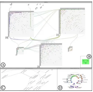
FIGURE 8ONTOTRIX VISUALIZATION.(A) MAIN NODETRIX VIEW (B)BIRD'S EYE VIEW,(C)CLASS HIERARCHY VIEW,(D) PROPERTY HIERARCHY VIEW ... 16
FIGURE 9EMPLOYMENT RATE IN EXCEL (LEFT) AND A CHOROPLETH MAP (RIGHT) ... 18
FIGURE 104STAGES OF VISUALIZATION PROCESS... 19
FIGURE 11VISUAL VARIABLES ... 20
FIGURE 12APPROPRIATENESS OF VISUAL VARIABLES BASED ON DATA TYPE, ADAPTED FROM (CARD ET AL.,1999)... 20
FIGURE 13CHERNOFF FACES FOR GEOLOGICAL DATA, ADAPTED FROM (CHERNOFF,1973) ... 22
FIGURE 14THE PERSPECTIVE WALL WITH FOCUS+CONTEXT DISTORTION ... 25
FIGURE 15FISHEYE DISTORTION BOTH THE X AND Y AXIS ... 25
FIGURE 16LEFT:SUPPRESSION LENS,RIGHT:ENRICHMENT LENS, ADAPTED FROM (CTOMINSKI ET AL.,2016) ... 26
FIGURE 17INTERACTION AS GULF OF EXECUTION AND EVALUATION, ADAPTED FROM (CHRISTIAN TOMINSKI,2015) ... 27
FIGURE 18CATEGORIZATION OF INTERACTION, ADAPTED FROM (SEDIG,PARSONS,DITTMER,&HAWORTH,2013) ... 28
FIGURE 19MOE OVERALL INTERFACE.A)SEARCH AND PIN INTERFACE B)FULL ENTITY DETAILS V1) OVERALL STRUCTURE, MAP V2) NODES AND PARENTS AT EACH LEVEL V3)SHORTEST DISTANCE AMONG LANDMARKS IN EACH LEVEL,V4)IMMEDIATE CHILDREN AND PARENTS OF A NODE,V5)ALL PATHS TO A NODE V6) FULL DETAILS AND LINKING PANEL, AND V7) SEARCH AND PIN INTERFACE .... 33
FIGURE 20V1ONTOLOGY OVERVIEW.VISUALIZATION OF OVERALL STRUCTURE. ... 35
FIGURE 21.V1 ACTIVATED WITH DISTORTION LENS.THE SLICE ‘IMMUNE SYSTEMS’ IS UNDER FOCUS. ... 35
FIGURE 22V2.OVERVIEW OF NODES FOR EACH LEVEL WITH A SLICE.LEFT: ALL LEVELS COLLAPSED.RIGHT:LEVEL 6 IS EXPANDED. ... 38
FIGURE 23V2.DISTRIBUTION OF LANDMARKS ... 38
FIGURE 24EXPANDED LEVEL 3 IN DETAIL.CIRCLES ENCODE NODES AT LEVEL 3.HORIZONTAL BARS ENCODE PARENTS THAT CONTRIBUTE TO THE NODES DIRECTLY UNDER IT. ... 39
FIGURE 25V2.LEVEL 6 OF SKELETAL SYSTEM EXPANDED.A LOT OF CLUTTER AND OCCLUSION. ... 40
FIGURE 26V2.ZOOMED IN LEVEL.USERS AND ZOOM AND DRAG AROUND THE LEVEL. ... 40
FIGURE 27V3(RIGHT) ALONGSIDE V2.EACH CELL ENCODES A LANDMARK PAIR WITH THEIR DISTANCES AS A NUMBER.DISTANCE IS ALSO ENCODED AS A COLOUR (ORANGE FOR LOW, GREEN FOR HIGH DISTANCE).SELECTED CELLS HIGHLIGHT THEIR NAME IN BOLD, AND HIGHLIGHT THEIR POSITION IN V2 IN BLUE. ... 41
FIGURE 29V4.ENTITY NETWORK OF TWO LANDMARKS ... 43 FIGURE 30V5.PATH EXPLORER SHOWS ALL PATHS TO A NODE.WIDTH OF A BOX ENCODES IMMEDIATE CHILDREN COUNT.HUE ENCODES
TOTAL CHILDREN, WITH RED BEING HIGHEST VALUE AT THE LEVEL, AND WHITE BEING LOWEST.PURPLE PROTRUDING BOXES ARE LEAF NODES. ... 44 FIGURE 31SEARCHING AND PINNING ITEMS.PINNED ITEMS ARE BRUSHED THROUGHOUT ALL VISUAL REPRESENTATIONS. ... 45 FIGURE 32V6)DETAILS PANEL LINKING TO HPO-BROWSER ... 46
Chapter 1 Introduction
1.1 Motivation
With advances in computer technologies there has been a growing dissemination of huge data sets
in various disciplines and industries. Across domains of information, data is being accessed,
modified and interchanged among users and software applications. A growing challenge for
systems dealing with large shared or reused data sets is keeping a consistent set of vocabulary and
understanding the underlying meaning of the data—the semantics. For instance, in the field of
biomedicine, if a phenotype (an observable characteristic of an individual) is transferred from one
software agent to another, how can we systematically ensure that it is the intended phenotype
across all the software agents? Given two phenotypes from different applications, how can we
compare their semantic relationships? that is, is one a more general term of the other? or are they
the same phenotype but with a different spelling? An approach first introduced in the field of
Artificial Intelligence, and later popularized with the Semantic Web, is to employ domain specific
meta-data, or an ontology, to formally represent a domain of knowledge through explicit entities
and relationships.
More formally, an ontology1 is defined as: “an explicit specification of a conceptualization”
(Gruber, 1993). An ontology defines a common vocabulary for a domain of knowledge. Among
others, an ontology enables sharing of the structure of information; enables reuse of domain
knowledge; and make domain assumptions explicit (Noy & McGuinness, 2001). An ontology
contains classes, properties, and relations that formally describe a domain of discourse. Each class
represents an entity in the domain. Each class contain properties that describe features of the class.
A set of is-a relations define the inheritance relationship among the classes. In addition, class
properties can contain object relations that connect classes through domain specific relationships.
For instance, in the foundational Model of Anatomy ontology (FMA)2, the part-of relation
describes containment among classes. More specifically, an ontology is a triple O = {C, R, isa}
where:
1 The term ontology is borrowed from Philosophy, meaning a systematic account of Existence.
1. C = {c1, c2, c3, …cn} is the set of classes;
2. S = {s1, s2, s3… sn} is the set of slots (properties) or binary roles/relations among classes;
and
3. isa, the set of inheritance relations.
Further, a set of instances i = {i1, i2, i3… in} where iw is an instance of class cw with concrete values
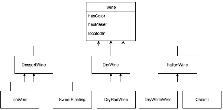
for each property of the class (Amann & Fundulaki, 1999). As an example, Figure 1 depicts a
subset of the wine ontology3 represented in a UML diagram. Each box is a class, and each arrow
represents an inheritance relationship. Here, each wine has the properties color, maker, and
location. Applications that adopt the use of this wine ontology can keep a consistent set of
vocabulary and semantic relationships. For instance, both IceWine and SweetRiesling is
semantically related, as they are both a type of DessertWine. Communications in wine data among
applications using this ontology would therefore be less ambiguous and systematic.
Figure 1. A subset of the Wine Ontology
1.2 Applications of Ontologies
Ontologies are used in in almost every domain and industry, both academic and commercial,
including medicine, chemistry, law, business, and engineering, among others. In life sciences, an
ontology has applications in 3D modeling and visualization. For instance, in the field of
embryology, the discipline concerning morphologic changes of organisms, it contains a high level
of complexity concerning physiological and pathological mechanisms. To address the complexity,
computer modeling and simulation are used to assist and visualize the information. In addition, the
ontology My Corporis Fabrica Embryo (MyCF) (Rabattu et al., 2015) is developed to keep the 3D
models consistent with the knowledge base. MyCF, among others, aims to make explicit links
between anatomical entities, human body functions, and 3D models. In the absence of the link
among the 3D models and the anatomical ontologies, it is difficult and time-consuming to access
the anatomical content from the 3D models and vice versa.
Another purpose of ontologies is rooted in the Semantic Web initiative. The Semantic Web aims
to shift the World Wide Web in the direction of linked-data. Historically, web pages are linked
from pages to pages by an HTML hyperlink. However, the with the explosion of data in every
domain, it is now beneficial to link the data itself from resources to resources. Hence, the term
linked-data links the underlying data and its semantics across the sea of information to form the
web of data (WOA) (Bizer et al., 2008). Much like an URL (Uniform Resource Locator) for a
webpage, data resources have an URI (Uniform Resource Identifier) to uniquely identify itself.
Resource data that are linked allow users to navigate from one data source to another that share
connected information more efficiently. For example, suppose we have two databases: one
containing geographic information including geographic locations and their rock formations, and
another database regarding rocks. In this scenario, linked-data aims to connect the two databases
via a common knowledge (i.e., rocks) to allow a systematic linking of geography and rocks data.
An example of using ontologies in linked databases on the web can be seen in marine biology in
the works of (Dhillon et al., 2013). In their work, Dhillon et al. investigated in creating a digital
biological ecosystem of fish. Such digital systems can help solve many business problems. In
creating the digital biological environment, a series of databases are incorporated: geographic
Their work includes a visualization tool that connects fish distribution data with map contours on
to a geographic map representation. These databases are ‘linked’ in the sense that users can analyze
the fish distribution data from the scientists while seeing their connections with other associative
data sources, i.e. map contours, or detailed fish information.
In describing the ontology for machine reading, the W3C4 recommends RDFs (Resource
Description Framework Schema) and OWL (Web Ontology Language) file formats. Another
format of ontologies is OBO, which is more prominent in the biomedical community. Both RDFs
and OWL is a data model in XML describing declarative data statements. Each statement is a triple
of the form object-attribute-value (Antoniou, Groth, Van Harmelen, & Hoekstra, 2012). As an
example, in describing the wine ontology, we can compose it from a set of statements, and once
such statement is: “IceWine is a subclass of DessertWine”. Where the IceWine class is the object,
subclass of is an attribute, and DessertWine is the value. Indeed, there are much more technicalities
in the specifications of an ontology file such as property value ranges, property types, and logical
inferences among classes. A more in depth introduction to the construction of such files can be
found in (Antoniou et al., 2012).
1.3 Problem Background
The process of creating and maintaining an ontology is in the field of ontology engineering
(Suárez-Figueroa, García-Castro, Villazón Terrazas, & Gómez-Pérez, 2011). Here, maintainers
are concerned with the life cycle of an ontology using methodologies, tools, and languages to
implement the ontology (e.g. RDFS or OWL). A few prominent ontology editors include Protégé5
(Noy et al., 2001), Apollo6, and NeOn7 (Suárez-Figueroa, Gómez-Pérez, & Fernández-López,
2012). However, ontology sizes can get extremely large, and it may be difficult for maintainers
and users to grasp the ontology contents and effectively complete their tasks. For instance, in the
4 The World Wide Web Consortium (W3C) is an international community working to develop
Web Standards.
5http://protege.stanford.edu/
6http://apollo.open.ac.uk/
Human Phenotype Ontology8 (HPO), there is a total of over 11,000 terms, and in the Gene
Ontology9, there are over 47 thousand terms10. In short, ontologies can be huge in scale with
heterogeneous contents and have a very complicated structure to understand.
An approach to assist in dealing with this complexity is with computer based interactive
visualization tools. There has been numerous past works on ontology visualizations. Because
ontologies take form of an acyclic11 directed graph, many graph visualization techniques have been
applied (e.g. node-link graphs). In addition, because there is a hierarchical nature through the is-a
inheritance relationships, many tree visualizations techniques have been applied (e.g. treemaps).
Nonetheless, the huge complexity of an ontology is astronomical compared to a computer screen
real-estate. In effect, many ontology visualization tools suffer from over-crowding and occlusion
of data.
1.4 Problem Statement:
A moderately large ontology (>10,000 entities) can be difficult to visualize effectively with
traditional methods. If abstraction techniques are avoided, an attempt the visualize the whole
ontology is futile given the limited screen space. In addition, by using traditional methods that
temporarily hide specific areas of the ontology and reshowing them again on demand (via
interaction) is susceptible to the loss of surrounding context. Finally, many ontology visualization
tools lack the facilities to support the formation of mental models, that is, many tools are
inconsistent with the encoding of key landmarks, routes, and survey knowledge formation. Given
these considerations, we present a prototype of an interactive visualization tool for ontologies with
the following goals:
1. Support the visualization of very large ontologies;
2. Support the rapid exploration and navigation of ontologies; and
3. Support sense-making in the formation of mental models of ontologies.
8http://human-phenotype-ontology.github.io/
9http://www.geneontology.org/
10 These counts are determined from Protégé’s Ontology metrics panel
1.5 Approach
In supporting the task of sense-making, we use techniques from the literature of information
visualization, visual analytics, and human-computer interaction to develop a prototype of a novel
interactive visualization tool. Indeed, visualization techniques have been shown to support the
exploration of large data sets (Keim, 2002). Traditional software algorithms are very good at
solving well-defined problems that concerns with only the computer (e.g. finding the shortest path
in a graph). However, here, the problem is much more ill-defined as we are concerned with
continuous interactions between the user and the tool. Therefore, we need to take into
consideration the ease of use, user interface design, representation techniques, and interaction
techniques, among others, to best accommodate the formation of a user’s internal mental model.
To address the complexity of the ontology, we take a multi-view approach to visual exploration.
That is, a single representation is generally not enough to show every perspective of an ontology’s
structure. This approach uses multiple coordinated visual representations that focus on different
levels of abstraction. These different levels of abstractions start from a high-level overview down
to a low-level entity12. In addition, we employ a metaphor consistent with ideas in the formation
of spatial mental models (Tversky, 1991). That is, much like forming a mental model of a physical
space, we take consideration in encoding key landmarks, routes or paths from entity to entity, and
surveys knowledge, or a general overview. In result, the prototype aims to effectively visualize
very large ontologies and provide interactions to allow incremental navigation and exploration of
the ontology information space.
1.6 Thesis Outline
This thesis is organized as follows: Chapter 2 is a review of previous related ontology
visualization tools with an analysis on their advantages and disadvantages. Chapter 3 reviews
background on visualization design methodologies and interaction techniques used in building the
12 Henceforth, entity, class, and node may be used interchangeably to refer to an entity or class in
prototype. Chapter 4 describes the prototype in detail. And Chapter 5 concludes the thesis with
Chapter 2 Ontology Visualization Tools
2.1 Survey of Past Ontology Visualization Tools
In literature, there is a numerous number of past work on ontology visualization. In previous years,
many visualization methods and representation styles originally designed for tree and graph based
structures has been adopted for ontologies, and in more recent years, more sophisticated interaction
and distortion techniques has been adopted to deal with the complexity of ontologies. In survey
works such as (Katifori, Halatsis, Lepouras, Vassilakis, & Giannopoulou, 2007), (Wang &
Almeida, 2007), (Sagha, 2014), and (Bikakis & Sellis, 2016), a list of past and state-of-the-art
ontology visualization methods and tools are described and compared. Here, we present a summary
of the survey works’ findings.
Katifori et al. groups the existing visualization tools into six groups, namely, they are indented list,
node-link and tree, zoomable, space-filling, focus+context or distortion, and 3D information
landscapes (Katifori et al., 2007; Katifori, Torou, Vassilakis, Lepouras, & Halatsis, 2008). These
groups differ primarily based on their representation, presentation, and interaction techniques. A
tool can be in one or more groups, e.g. a treemap is both space-filling and zoomable. The following
outlines the key groups in more detail and discuss their advantages and disadvantages.
2.1.1 Indented List
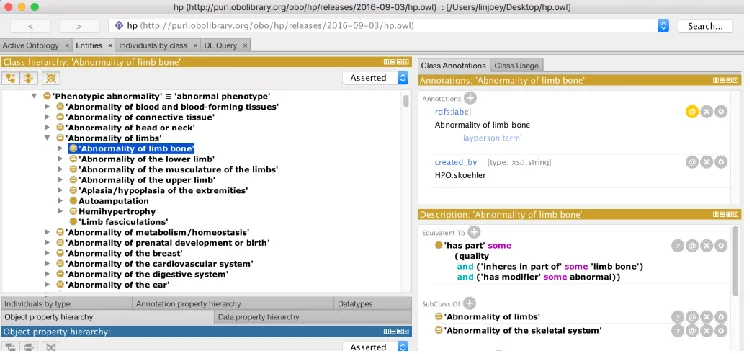
The indented list is a visualization style that is commonly found in file managers such as Microsoft
Windows’ File Explorer or Apple Macintosh’s Finder application. It is also a common baseline
display for hierarchies in ontology editors such as Protégé (shown in Figure 2) or Kaon213. In this
visualization style, the children of a node are slightly indented below the parent, and in effect, all
nodes on the same level will have the same amount of indentation. Browsing the ontology, i.e.
traversing downwards, involves clicking the arrow beside the parent node, thus expanding the
children. In many evaluations (Katifori et al., 2007; Lanzenberger, Sampson, & Rester, 2010), this
simple technique outperforms many other visualization styles in terms of clarity and ease of use.
As shown in Figure 2, the full name of the ontology class name is displayed showing no occlusion.
In addition, there is a clear indication of hierarchy from the indentation. However, this
representation of hierarchy has its limitations with ontologies. Because it is displaying a strict tree
hierarchy, nodes that appear under multiple parents (i.e. multiple inheritance) are duplicated in all
the respective parents, and in result, the graph-like nature of inheritance is hard to see. In addition,
if a user traverses very deep into an ontology, the relationships among expanded siblings can
become unclear. Further, a deep nested tree can lose the original context.
Figure 2 Protégé Class Browser
2.1.2 node-link
The node-link representation style borrows ideas from the traditional visualization techniques for
graphs. Here, classes are displayed as circular or square nodes connected by lines (or links). In this
representation style, parentage (including multiple inheritance) is explicitly displayed. Many
ontology visualization tools adopt this approach as their representation due to its clear
representation of relationships. InFigure 3, the VOWL14 web visualization tool adopts this style.
However, this representation style has many limitations in visualizing very large ontologies. There
is a very inefficient use of space: the space between nodes and links are never used. As seen in
Figure 3, only a handful of terms are displayed clearly. In attempting to display hundreds or
thousands of nodes, the computer screen would quickly clutter and occlude information.
Figure 3 VOWL ontology visualization
2.1.3 zoomable
In dealing with information overload (Meyer, 2013), i.e. having to process and understand too
much information at once, visualization systems have adopted interaction techniques to
progressive show or hide information; one of such techniques is zooming or drilling. The zooming
capability is available in VOWL: scrolling up or down on a mouse moves the visualization
progressively larger with less information or smaller with more information, respectively.
However, zooming too much or too little can have negative consequences. For instance, if a view
is zoomed too much, it can lose the global context. And if view is zoomed too little, clutter can
appear and occlude information.
2.1.4 space-filling
The space-filling technique tackles wasted space, as seen in node-link visualizations, by using the
entire screen and subdividing sections to each child. This subdivision of space can be based on any
numerical property values of a node or simply the number of children of a node. A representation
in a zoomable treemap15. Here, each subdivision size is proportionate to a node’s total connected
children, that is, the larger squares represent nodes with more children. The treemap has been
shown to display attributes of leaf nodes effectively (Johnson, 1992), this is because color
encoding on each subdivision based on a node’s property value can be shown clearly without
clutter. However, in a treemap, hierarchical information is very hard to decipher. Despite attempts
to mitigate this issue, such as in the works of cushion treemaps (Van Wijk & Van de Wetering,
1999), specific object or inheritance relationships of an ontology is very difficult to see.
Figure 4 Treemap visualization
2.1.5 focus+context or distortion
A drawback of zoomable interfaces is that the surrounding context can be lost. In visualization
tools such as node-link graphs or space-filling treemaps, we can lose sense of a node’s surrounding
siblings or parentage when then interface is zoomed. A technique to mitigate this issue and
maintain the context is through distortion or focus+context. An example of this is done in the
hyperbolic tree visualization (Lamping, Rao, & Pirolli, 1995), seen in Figure 5. In this technique,
the node of interest is enlarged on the centered of the screen while surrounding nodes (the context)
is shrunken on the edges, much like if the nodes were placed on a hyperbolic space. However, an
issue concerning this visualization is, during navigation, the constant change of moving nodes to
the center can be disorienting and result in the loss of global overview.
Figure 5 Hyperbolic tree visualization
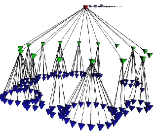
2.1.6 3D
Figure 6, 3D Cone Tree visualization
The last group of ontology visualization styles concerns with using 3D objects as the representation.
Many traditionally 2D visualizations such as treemaps, node-link graphs, or hyperbolic trees can
be implemented in the 3D space. In particular, the Cone Tree (Robertson, Goerge G.; Mackinlay,
Jock D.; Card, 1991), as seen in Figure 6,visualizes each subtree as a 3D cone that connects to the
root. 3D visualizations like the Cone Tree take advantage of the 3rd dimension and this allows them
animation techniques are required. In addition, evaluations (Katifori et al., 2007) have shown that
3D visualizations are generally problematic for novice users—usually suffering loss of context
when zooming.
2.2 ContemporaryOntology Visualization
The ontology visualization methods outlined above mostly pertain to works prior to 2007.
However, each style has its own advantages and disadvantages, and not one is particularly stronger
than the other in terms of the overall visualization goals outlined in this thesis. That is, each
visualization style has a strong advantage in one area (e.g. node-link graphs in showing
relationships), but also lack in other areas (e.g. zoomable treemaps losing context). It is clear that
these visualization styles alone are insufficient in dealing with large ontologies. More recent work
attempts to address this issue and we outline them below.
2.2.1 KC-Viz
KC-Viz (Motta, 2012) is a more recent approach to visualizing ontologies. Here, the authors are
concerned with the sense-making tasks involved in exploring ontologies. The importance of
supporting tasks related to understanding an ontology’s structure or a ‘global’ model of the
ontology is emphasized. In their work, an ontology is first preprocessed through a summarization
algorithm to determine the nodes of most importance. This network of ‘key concepts’ is then
displayed in a node-link graph representation as shown in Figure 7. This starting point of key
concepts then support a ‘middle-out’ approach to exploration. KC-Viz supports interactions such
as zooming and history keeping to support the exploration tasks. In addition, each subtree that are
hidden is indicated in a green arrow. Further, the sizes of a hidden subtree are displayed in brackets
with two numbers, one indicating the number of immediate children, and the other indicating the
number of total children. Although the authors have not yet conducted an evaluation on KC-Viz,
it may suffer similar issues pertaining to node-link representations; that is, a very limited number
of nodes can be displayed on the screen before the context or overview is lost through clutter or
Figure 7 KC-Viz ontology visualization
2.2.2 OntoTrix
Another recent approach in visualizing ontologies is OntoTrix (Bach et al., 2011) (Figure 8). In
OntoTrix, the authors are more concerned with visualizing the instances of the ontology, or a
populated ontology. OntoTrix takes inspiration from a previous visualization technique known as
NodeTrix (Henry, Fekete, & Mcguffin, 2007). Here, OntoTrix uses a style of hybrid visualization
using both node-link and adjacency matrix representations. According to the authors in (Bach et
al., 2011; Henry et al., 2007), this style is very efficient at visualizing locally dense but globally
sparse networks. That is, each matrix focus on dense subgraphs while the matrices are connected
via links providing global overview. In addition to the NodeTrix style representation (Figure 8 A),
OntoTrix provides multiple coordinated views that show a different aspect of the ontology. That
is, Figure 8 (B) provides an overview, Figure 8.C provides a class hierarchy, and Figure 8 (D)
provides a hierarchy of class properties. Overall, OntoTrix conforms to the information-seeking
mantra originally proposed by Shneiderman (Shneiderman, 1996), that is, overview first, zoom
and filter, and details on demand. Although each matrix aims to handle dense subgraphs efficiently,
it may still face challenges with extremely large ontologies. Here, the authors visualized the NTN
ontology16 which contains only 49 classes and 724 instances. In the case of ontologies with tens
of thousands of classes or instances, each matrix would potentially still have the problem of
scalability leading to clutter and occlusion.
Figure 8 OntoTrix visualization. (A) main NodeTrix view (B) Bird's eye view, (C) Class hierarchy view,
Chapter 3 Information Visualization Background
In previous chapters, terms such as visualization, representation, presentation, and interaction has
been used loosely to describe a visualization technique or tool. Here, a formal background is
provided. In addition, these concepts are later applied in the design of our prototype.
3.1 Information Visualization
The term ‘visualization’ is often used loosely to mean many concepts including visualization tools,
visual representations, and the process of forming mental images. Spence (Robert Spence, 2014)
defines ‘visualization’ closely related to its dictionary counterpart, that is, ‘visualization’ refers to
the formation of mental images and is internal to human beings. However, in the literature, there
is no definition that is commonly agreed upon (Parsons & Sedig, 2014). For instance, in (Card,
Mackinlay, & Shneiderman, 1999), the term ‘visualization’ is defined as: “the use of
computer-supported, interactive visual representations of data to amplify cognition”. In this thesis, the term
is used for its general definition including meanings for visual representations, and visualization
tools, etc.
Information Visualization (InfoVis) is a field that is concerned with using visual representations
of data to reinforce human cognition (R Spence, 2002). That is, we are concerned with gaining
insight from data by means of visualization tools. As mentioned earlier, computers are very good
at solving specific, or well-defined, problems. However, part of the goal of an information
visualization is to assist the human in data exploration (Keim, 2002). Here, the problem is more
ill-defined, and often the tasks involve activities like browsing, exploration, and gaining insight
(Fekete et al., 2012). Often, the user doesn’t know at hand the specific goals or problems, and it
is through navigation and exploration of data, does insight emerge.
One of the main reasons to apply InfoVis is to take advantage of human perception. Through
perception, a visual display provides the highest bandwidth of information from the computer to
the human (Ware, 2012). This has strong implications in fields with very large amounts of data.
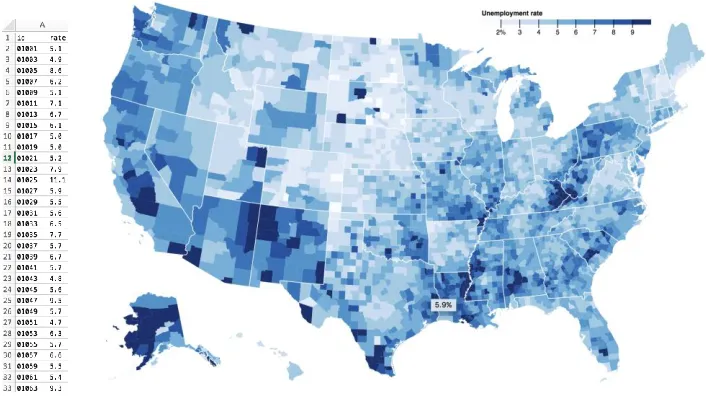
and a visual map representation (choropleth map17) on the right. It is almost impossible to quickly
see patterns or insights from the excel table, but the visual map instantly reveals areas of interest.
Among others, a well-designed visualization has a number of benefits in dealing with data: they
provide an ability to comprehend large amounts of data; they allow perception of emergent
properties that were not anticipated; make data become immediately apparent; and facilitate in
understanding both small-scale and large-scale features of the data (Ware, 2012).
Figure 9 Employment rate in Excel (Left) and a Choropleth Map (Right)
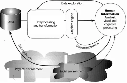
The visualization process involves both the computer and the human. There are 4 main stages that
form a feedback loop, namely: data collection, data preprocessing, visual display of data, and
human visual processing. Figure 10(Ware, 2012)shows the stages in a graphic form. In the context
of ontology visualization, the data collection stage involves ontology engineering from domain
experts to curate the ontology. This thesis is concerned with the other three stages. That is, we first
preprocess the ontology with derived data, and transforming it into an appropriate format. Next,
the processed data is passed through a graphic algorithm to generate the visual displays. Because
this is an interactive system, users can interact and manipulate the generated displays to further
transform the displays. This loop of incremental user interaction and visual display transformation
forms the feedback loop that ultimately support the exploration of the ontology.
Figure 10 4 Stages of Visualization Process
3.2 Representations
The visual display of encoded data is the visual representations (VR). Representations can be
internal or external (Scaife, Rogers, & SC, 1996). Internal representations refer to the human’s
mental model of a concept. External representations refer to representations of data through media,
this can be pictorial graphs in a newspaper, or a VR on the computer screen. The internal
representation of humans is often incomplete or contain errors (Tversky, 1993). Thus, it is through
the interplay of external aid (e.g. VRs), and interactions (i.e. a feedback loop), does the mental
model of the human become more complete and contain less errors. In our context, an ontology
user may have little to no knowledge of the ontology’s structure. That is, the user may have a weak
mental model of structural information such as the ontology’s depth, breadth, general size at each
level, or the key terms at each level. It is our goal to design effective VRs and interactions to
support the closing of the gap between the user’s internal mental model and the underlying
ontology.
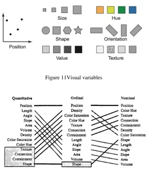
The design of VRs is based on the idea of abstraction of some entity or concept. This abstraction
is usually encoded visually in many forms such as position, length, or color hue. In the example
This process of mapping data attributes into a visual form is called encoding (Robert Spence, 2014).
The design of representations depends heavily on the data type. Shneiderman (Shneiderman, 1996)
lists 7 datatypes, namely, 1-dimentional, 2-dimentional, 3-dimentional, multi-dimensional,
temporal, tree, and network. To support the encoding multidimensional data, visual variables is
used to encode each dimension. Figure 11 shows a set of visual variables. The choice of visual
variables can have different influences on perception depending on the data type. For instance,
using color hue to encode quantitative data may be less appropriate than compared to encoding
ordinal data. To aid in the choice of selecting visual variables, Mackinlay (Card et al., 1999)
outlined a ranking of most visually distinguishable visual variables for quantitative, ordinal, and
nominal data types in Figure 12.
Figure 11Visual variables
3.2.1 Cognitive Influences of Visual Representations
The design of a new visualization system is often a creative process. There is not a perfect or
definitive way to determine visual representations that will best suit the data. Generally, there is
an element of trial-and-error in mapping data types and properties onto different visual encodings.
For instance, in designing a visual representation of a multi-dimensional dataset containing a tree
structure, which combinations of visual variables and representation techniques should be
considered? Should we encode entities in a node-link layout or a treemap layout? Many designers
may base their decisions on intuition, inspiration from past works, or simply by visual appeal.
However, without a systematic design thinking, finding a suitable representation can be time
consuming or prone to unsuitable designs. Moreover, only designing a beautiful visualization
without considering its cognitive consequences may provide little to no benefit in supporting a
user to understand the data (Hansen & Johnson, 2004). In addressing this issue, Sedig and Parsons
(Parsons & Sedig, 2014) explored the perceptual and cognitive influences of common visual
representation designs. In their works, a comprehensive and systematic framework of visual
representations patterns and cognitive utility of common visualizations is developed to better
support a visualization designer’s choice of representations. Below is a summary of their works in ‘Common Visualizations: Their Cognitive Utility (Parsons & Sedig, 2014)’ and “Design of Visual
Representations for Human-Information Interaction: A Pattern-Based Framework (Sedig &
Parsons, 2015).”
The building blocks of encoding information is through visual marks. Visual marks include atomic
visual entities such as dots, lines, colour, or simple shapes. To visually encode a multidimensional
entity, visual marks can be composed to form multidimensional icons or glyphs. A technique that
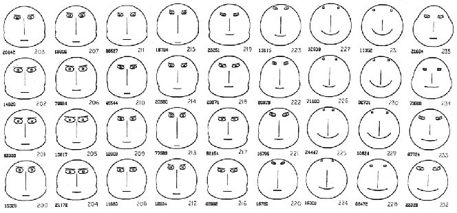
uses this idea is the Chernoff faces (Chernoff, 1973). In Figure 13,each feature of the face (e.g.
length of nose, width of mouth, or slant of eyes) encodes a different property of the dataset.
Through this encoding, a user can quickly discern entities that have specific values of a property.
For instance, if the slant of the mouth encodes happiness rating of a neighborhood, it is easy to
visually detect faces that are smiling. Indeed, glyphs exploit the perceptual system’s ability to
according to the Semiotics Theory18, stimuli are processed in two phases: pre-attentive processing,
and, post-attentive processing (Eco, 1977). The pre-attentive stage refers to the near instantaneous
(250 ms) perceived impulses such as shape or colour. And the post-attentive stage refers to the
emergent features detected after conscious cognitive processing. Accordingly, glyphs can support
both the quick detection of visual differences in addition to facilitating higher-order cognitive
processes due to their emergent features (Parsons & Sedig, 2014).
Figure 13 Chernoff Faces for Geological Data, adapted from (Chernoff, 1973)
Beyond glyphs, visual marks can be placed spatially based of different coordinate systems to show
relationships among entities. Some examples of these spatial arrangements include plots and charts,
maps, trees and graphs, and enclosure diagrams. In choosing a spatial arrangement visual marks,
the underlying data structure must be examined (e.g. multidimensional, tree or graph); but also,
and more importantly, the cognitive utility of these common visualizations should be reviewed. A
plot or chart maps information onto a coordinate system. In the case of a scatterplot, this coordinate
system is a 2-dimensional X and Y linear system. A plot can facilitate the perception of deviations
and outliers, and consequently, this can support cognitive activities that involve reasoning about
patterns or trends. A map is a coordinate system based on a geological map where visual marks
are superimposed on top of. A map facilities high-level cognitive activities such as route planning
or spatial navigation regarding geographic information. Trees or graphs spatially connect visual
entities by a line. The lines are readily detected by our perceptual system to reason about
relationships. Finally, the enclosure diagrams place entities in different regions of space. An
example of this is a treemap. Here, each region suggest commonality, and in the case of a treemap,
all further subdivision under a subdivision belongs to a common parent. Cognitively, enclosure
diagrams facilitate reasoning about set memberships or inclusion and exclusion of information
(Parsons & Sedig, 2014).
3.2.2 Visual Representation Patterns
Hitherto, many visualization techniques have been mentioned, e.g. chernoff faces, scatter plots,
treemaps, node-link graphs, and choropleth maps. Each of these techniques generally require a
very specific data format or structure for the technique to apply. For instance, scatter plots require
two numerical properties of the entity for each axis; choropleth maps require geological data
coupled with another numerical density; and treemaps require a parent-child relation among the
entities. However, much of the datasets in the real-world may not exactly fit these specific formats
or structures. Moreover, these visualization techniques may not adequately support the cognitive
tasks required by the users. In these cases, new and novel visual representations should be
developed to accommodate the users’ requirements.
In their book “Design of Visual Representations for Human-Information Interaction: A Pattern-Based Framework”, Sedig and Parsons [35], attempt to move towards a science of visual
representations. In doing this, a pattern-based framework is developed from unifying previously
relevant ideas and reviewing thousands of visualization techniques. This pattern framework
contains a set of 14 representations patterns in which specific techniques are instantiated from.
Here, a pattern is not a directly usable pattern but rather an abstract idea of a whole class of
representation techniques. As an example, one of the patterns is hierarchy. Hierarchy is characterized by: “[Mapping] information items onto VRs and organize them in a hierarchical,
multi-level, pyramid-like fashion, where higher levels are superior to or contain and encompass
lower level VRs [35].” This characterization contains techniques such as treemaps and node-link
trees, as they both implement this hierarchy pattern. The framework becomes powerful when
multiple patterns are blended to create new and novel visualizations. As an example, the scatter
extend our scatter plot by integrating the link pattern and connect entities via a line (should the
data fit suitable). In result, these abstract patterns provide a comprehensive and systematic way to
support the process of designing new and novel visual representations. The remaining patterns are
detailed in Appendix A.
3.3 Presentation
After the design of visual representations, they need to be presented to the users. That is,
presentation is concerned with how to spatially display the visual representations on a screen. For
instance, if we decided to encode an ontology in the form of a node-link graph representation, how
should we arrange the nodes and links to properly display the graph? In the case of large ontologies,
this graph will clutter the screen no matter how we try to fit or arrange it. This presentation problem,
i.e.,trying to fit a very large amount of information on a very small screen (Robert Spence, 2007)
is central to many presentation techniques. Because there is often no way to fit everything on the
screen, unimportant or irrelevant information must be temporarily omitted. A simple example is
scrolling. In a Word document or a mobile device, scrolling is used to shift information in and out
of the screen and only present the relevant page of information at any instance. Other more
complex presentation techniques often include distortions or incorporate interactions. A few
examples of these techniques are presented below.
3.3.1 Focus+Context distortion
A problem with simply scrolling information out of the screen is that users may lose context. Here,
the context refers to the set of information directly on the edge of our data of interest. In a
node-link graph, the context may contain neighboring nodes that are a few depths away. Or in a zoomed
in geographic map, the context may be the province or country in which the current city is focused.
A technique to address this issue is focus+context, or distortion. The idea behind focus+context is
to expand the area of interest (i.e. the focus), and at the same time, distort or minimize the
surroundings (i.e. the context). An example of this technique is shown in The Perspective Wall
(Mackinlay, Robertson, & Card, 1991), where a bifocal display is implemented to show
focus+context. In Figure 14,the Perspective Wall displays a set of documents, files, phone calls
and emails over a timeframe. The center is the focus, representing the current data of interest, while
distorts on the y-axis, but we can extend this idea and further distort the x-axis. This distortion of
both the x and y-axis if often referred to as the fisheye lens effect (Gutwin & Fedak, 2004). In
Figure 15, a Cartesian plane with straight lines is applied with fisheye distortion near the left center.
Here, only the cell under the ‘lens’ is focused while the rest is more and more distorted smaller.
Figure 14 The Perspective Wall with focus+context distortion
Figure 15 Fisheye distortion both the X and Y axis
3.3.2 Magic Lenses
The fisheye lenses are part of a realm of techniques known as magic lenses. The magic lenses are
based on a metaphor of placing a physical lens (either circular, square, or other shapes) on top of
a representation, and the items directly under the lens would be distorted in some way—much like
a magnifying glass. However, magic Lenses can do more than just spatial distortion. In Tominski et al.’s survey (C Tominski, Gladisch, Kister, Dachselt, & Schumann, 2016), some other
applications of magic lenses include suppression and enrichment, in addition to alteration. In a
suppression of extra information can help clear up clutter and reduce occlusion (Figure 16, left).
An enrichment lens, on the other hand, provides extra information for the items under then lens.
For instance, in Figure 16(right), text labels are only shown for nodes under the lens, as we cannot
show the text labels for every node by default.
Figure 16 Left: Suppression lens, Right: Enrichment lens, adapted from (C Tominski et al., 2016)
3.4 Interaction
The magic lenses are not static. That is, the lenses can be dynamically moved across visual
representations by the user, and the computer will update the representations accordingly. This
dynamic interplay between the computer and user is studied in the field of Human-Computer
Interaction (HCI). Although HCI draws research from many fields—including psychology,
cognitive science, visual analytics, and interaction design (Dix, Finlay, Abowd, & Beale, 2004)—
in this section, we focus on the interactions on visualizations, and how they support cognitive tasks.
As previously mentioned, to avoid information overload, only a subset, or a specific view-point,
of the complex dataset is presented at any one point. However, this limited view is often not enough
to convey every aspect of large or complex datasets. To help mediate this problem, interactions is
usedto ‘construct’ and ‘reconstruct’ new graphics until all relationships constituted by the data is
revealed (Bertin, 1981). The role of interactions is therefore heavily coupled with the human to
support the exploration of data (Christian Tominski, 2015). That is, there is an ongoing loop of
In HCI literature, this action-feedback loop is characterized by the gulf of execution and the gulf
of evaluation,first coined by Norman in (Norman, 1988). The gulf of execution refers to the gap
between what the user perceives are possible actions and what the system is possible of providing.
And the gulf of evaluation refers to the gap between what the system provides as a feedback (in
our context, in the form of new or updated visual representations) and what the user’s expected
results are (Norman, 1988). This model can be further extended with the execution phase starting
with a goal, then an intent to interact, and then a mental planning of interaction, and finally
performing the action (Christian Tominski, 2015). Further, the evaluation phase starts with a
response from the system, and then the perception of the response, and then the interpretation of
the response, and finally the evaluation of the response. Figure 17 provides a schematic
representation of the twin gulfs. It is the goal of the interaction designer to minimize, or bridge,
the twin gulfs of execution and evaluation to allow a user to efficiently and effectively (Christian
Tominski, 2015) carry out their visualization tasks.
Figure 17 Interaction as gulf of execution and evaluation, adapted from (Christian Tominski, 2015)
3.4.1 Levels of Interaction
The gulfs of execution and evaluation presents a very high level idea of how interactions should
work, i.e. an action from the user and a reaction (feedback) from the system. However, this
description is not enough to help communicate the large diversity of possible interactions. For
instance, consider the interaction of comparing, do we mean compare at a low level of perceptually
comparing two visual representations, or compare at a high level as a cognitive task resulting from
multiple interactions? A step forward is to classify, or characterize the interactions based on levels
intermediate-level, and high-level interaction (Christian Tominski, 2015). Low-level interaction
(or data manipulation loop) refers to primitive actions such as moving or clicking the mouse.
Intermediate-level interaction (or the exploration and navigation loop) refers to the combination
of low-level interactions to explore and navigate a large visual data space. And the high-level
interaction refers to processes such as problem-solving or falsifying hypothesis about the data
(Christian Tominski, 2015).
Figure 18 Categorization of Interaction, adapted from (Sedig, Parsons, Dittmer, & Haworth, 2013)
Sedig et al. further extends this classification of interactions into four main levels: events, actions,
tasks, and activities (Sedig et al., 2013)(see figure 18). Here, events refer to the building blocks
of interaction, e.g. mouse clicks and keyboard presses; actions refer to the what is performed upon
an interface, e.g. filtering, and drilling; tasks are activities that are goal-oriented and often require
a combination of actions, e.g. browsing, and locating. Finally, activities are at the highest level
that are often complex and open-ended (Sedig et al., 2013). Conceptually, higher level tasks and
activities only emerge from a combination of repeated lower level interactions.
3.4.2 Interaction Patterns
Of the four levels of interactions described earlier, we are more concerned with the actions (or
interactions) level. Because it is at this level that we can design actions and reactions in which the
users can directly act upon. Some interactions mentioned earlier include filtering and drilling. As
an example, we can implement drilling in a geographic map visualization by means of mouse
wheel scroll to zoom in and out the map. But are there more interactions? And what about their
(Sedig & Parsons, 2013) approach the design of interactions systematically through a pattern based
framework called EDIFICE-AP19.
Here, we make a distinction between pragmatic and epistemic actions. Pragmatic actions set out
to achieve a physical goal, e.g. pushing open a door. However, epistemic actions aim to transform
the world to facilitate mental processing (Kirsh & Maglio, 1994; Sedig & Parsons, 2013), e.g.,
zooming (or drilling) into a visual interface to bring out latent information to support cognitive
tasks. The framework EDIFICE-AP consists of 32 epistemic action and reaction patterns that aim
to facilitate the systematic design of interactions. These actions are general enough to be
independent of specific implementation styles, yet specific enough to stimulate the systematic
thinking of interaction design for complex cognitive activities. Here, we present the pattern of
Collapsing/ Expanding as an example to show its application. The remainder patterns are detailed
in Appendix B.
The Collapsing/ Expanding pair is characterized by the folding an unfolding of visual
representations. This is often useful for representations that are very dense in information. Indeed,
by reducing the complexity of a visualization, it also reduces the perceptual and cognitive burden
it places on a user (Sedig & Parsons, 2013). An example of this pattern is used in the SpaceTree
(Plaisant, Grosjean, & Bederson, 2002), a visualization to support the exploration of large
node-link trees. In the SpaceTree, subtrees can be subsequently collapsed and expanded to and from an
icon that encodes the depth and breadth of the subtree. By collapsing subtrees that are unimportant
to the user, the visualization reduces clutter and occlusion on the screen and in turn better aid the
exploration of tree data structures.
3.4.3 Interactivity
As mentioned earlier, the interaction patterns are characterized at an abstract level independent of
implementations. That is, each of the interaction patterns can be operationalized through various
19 Epistemology and Design of human-InFormation Interaction in complex Cognitive activitiEs
techniques (Sedig, Parsons, & Babanski, 2012). For instance, the arranging pattern (the reordering
of representations spatially or temporally) can be operationalized by ways of keyboard clicks,
using mouse clicks on buttons, or directly dragging on the visual representations via a mouse. This
discrepancy in the way a pattern is operationalized can either help or hinder in the coupling of a
user’s internal representation with the external visual representations (Sedig et al., 2013). For
example, if an arranging action is performed but the feedback is slow, sluggish, or non-existent,
then this would directly lead to poor user experience. A step towards designing effective
interactions is to recognize the quality of interactions—also referred to as interactivity (Parsons,
Sedig, Didandeh, & Khosravi, 2015).
In characterizing interactivity, it can be classified into two levels, i.e. at the granularity of micro
and macro levels (see Figure 18). At the micro level, it is concerned with the interactivity of
lower-level interactions including the action-reaction patterns described in the EDIFICE-AP framework.
And at the macro level, it is concerned with interactions at the higher levels, including tasks and
activities. In other words, macro level interactivity is concerned with the overall quality of
interaction from the combined whole of the lower level interactions. To aid in the characterization
of interactivity in both the micro and macro levels, Sedig et al. (Sedig et al., 2012) developed a
conceptual framework called EDIFICE-IVT20 with 12 characterizations for the actions and
reactions (micro level) and 5 characterizations for macro level interactivity. Here, we describe the
interactivity element of granularity for actions, and activation for reactions at the micro level, the
remainder elements are detailed in Appendix C and (Sedig et al., 2013).
Granularity is concerned with the required steps an action needs to fully activate itself. It can be
either atomic or composite (Sedig et al., 2013). Atomic granularity requires only one step, whereas
composite granularity requires more than one steps. As an example, to implement the drilling
pattern on a geographic map visualization, we can implement it in two ways: 1) using mouse wheel
scroll, and 2) allowing the user to specify the magnification size followed by a ‘go’ button. Here,
the first method, a single wheel scroll, has an atomic granularity, whereas method 2 is composite.
Activation is concerned with the point at which a reaction begins after an action. It can be
immediate, delayed, or on-demand. Immediate activation happens when the system reacts
instantaneously to an action. Delayed activation happens with a temporal gap after the action. And
on-demand activation only happens after a subsequent request by the user (Sedig et al., 2013).
In designing with interactivity considerations, there is often not one form of an element (e.g. atomic
or composite granularity) that is better than the other. For instance, it is not always best to design
with immediate activation, there are some cases in which delayed or on-demand activation can be
Chapter 4 Prototype Design
In this chapter, we detail the design of an interactive visualization prototype for the exploration
and navigation of ontologies. This prototype’s general approach is to apply multiple coordinated
views to support the ontology exploration process—hence the name MOE (Multi-View Ontology
Explorer). Here, we apply design considerations into the prototype from previous chapters
including the conceptual frameworks for visual representations, interactions, and interactivity, i.e.,
EDIFICE-AP, and EDIFICE-IVT, respectively. Finally, an overview of the implementation for
MOE is provided.
4.1 Methods
In Chapter 2, we outlined the various tree and graph based visualization techniques used to
visualize ontologies. Namely, these techniques include the indented list, node-link graphs,
zoomable interfaces, space-filling, focus+context, and 3D interfaces. However, these techniques
have their own individual shortcomings when an extremely large ontology dataset is applied. Most
notably, these visualizations suffer from clutter and occlusion when they attempt to visualize a
large portion of the ontology—or the information overload problem. Moreover, many
visualizations suffer from the loss of overview, or orientation, when zoomed in or traversed. Many
interaction and distortion techniques have been studied to mitigate the issue of information
overload, some of these techniques include hyperbolic distortion, magic lenses, and node
summarizing techniques (KC-Viz). Although these distortion and interaction techniques help
mitigate information overload at a smaller scale, it still cannot fully scale to the full size of
ontologies (tens of thousands of nodes).
In our prototype design, we take a multi-view (or separated views) approach to aid in the
exploration and navigation of ontologies. Separated views have the advantage of combining
different visualization techniques to overcome the drawbacks of visualizations in a single view.
However, an issue with using separated views is to coordinate all the separate visualizations when
dynamic brushing and linking (Keim, 2002). That is, changes in one visualization is automatically
and instantaneously reflected upon the other visualizations.
At each separated view, we visualize a different level of abstraction in the ontology from a
high-level overview to a low-high-level entity. More specifically, we visualize five high-levels of abstraction
which are divided with the following concerns: show an overview structure of the ontology; show
entity and hierarchical parent relationships at an individual level; show shortest distances between
landmark entities at a level; show immediate parent and children entities; and show the paths to
reach an entity. Collectively, we name these visualizations V1 to V5, where V1 refers to the
overview visualization, V2 entities at each level, and so on. In addition, we provide user interfaces
to view the full details of an entity, and enable searching and saving (see Figure 19 V6, V7,
respectively). An overview of our prototype is depicted in Figure 19.
Figure 19 MOE overall interface. V1) overall structure, map V2) Nodes and Parents at each level V3)
Shortest distance among landmarks in each level, V4) Immediate children and parents of a node, V5) All
Paths to a node V6) full details and linking panel, and V7) search and pin interface
Lastly, to support the formation of mental models, i.e. the sense-making process, we employ a
metaphor consistent with the formation of spatial mental models. That is, we encode specific
entities in the ontology to support the formation of landmark, route, and survey knowledge. Each
the ontology, we encode landmarks only relative to that level. In this prototype, we identify
landmarks by their connectivity, or the total number of accessible nodes. In graph theory, this
measure of importance is the transitive closure of a node. Indeed, other measures of importance
can be used in place of the landmark value, e.g. betweenness or closeness measures (White &
Borgatti, 1994).
The general flow of exploration in MOE to support the process of sense-making is as follows. First,
the user can search for a specific term (Figure 19, V7) and explore the results’ locations, children
nodes, parent nodes, and surrounding entities, among others. However, often novice users don’t
any have previous knowledge of the ontology, and in this case, the user may start the exploration
process in V1. In V1, we provide a general overview of the ontology’s structure in terms of total
major subsections (henceforth also referred to as a slice), depth (i.e. levels), breadth, and nodes at
each level. A user can select a slice’s level and explore the nodes and landmarks under that level
in V2. Alongside V2 is V3 that provides the top landmarks at the level selected in V2. In V3, we
encode for the shortest paths among these landmarks. The purpose of V3 is to quickly show
landmarks that are very close together or far away. Digging deeper, a user can select a specific
landmark in V3 to activate V4 and V5. In V4 we show the surrounding nodes of one or two
landmarks that are above it (i.e. immediate parents), and nodes directly below it (i.e. immediate
children). And in V5, we focus on a single node to show all the specific paths and parents to reach
that node. Finally, we list all the detail properties of an ontology entity in V6.
Outside this exploration loop, we provide interfaces to search and pin any items in the ontology.
That is, a user may explore one path in the ontology and choose a pinone or more nodes, and start
the exploration process down other paths, and further pinning more nodes. These pinned nodes
persist throughout all the visualizations in a colour coded manner. This way, a user can always see
their items of interest fit inside the ontology, and how they compare to other key landmarks.
In this thesis, we demonstrate our prototype with the Human Phenotype Ontology21 (HPO). In
HPO, each term describes a phenotypic abnormality such as skeletal system abnormalities, nervous