WEB GEOSPATIAL VISUALISATION FOR
CLUSTERING ANALYSIS OF
EPIDEMIOLOGICAL DATA
Jingyuan Zhang
A thesis submitted in fulfilment of the requirements for the degree of
Doctor of Philosophy
College of Engineering and Science VICTORIA UNIVERSITY
i
Abstract
Public health is a major factor that in reducing of disease round the world. Today, most governments recognise the importance of public health surveillance in monitoring and clarifying the epidemiology of health problems. As part of public health surveillance, public health professionals utilise the results of epidemiological analysis to reform health care policy and health service plans. There are many health reports on epidemiological analysis within government departments, but the public are not authorised to access these reports because of commercial software restrictions. Although governments publish many reports of epidemiological analysis, the reports are coded in epidemiology terminology and are almost impossible for the public to fully understand.
been identified, based on Davies-Bouldin index validation, as the best clustering algorithm for epidemiological data. The geospatial visualisation requires a Geo-Mashups engine and geospatial layer customisation. Because of the capacity and many successful applications of free geospatial web services, Google Maps has been chosen as the geospatial visualisation platform for epidemiological reporting.
In summary, there are three significant contributions in this research:
Investigation of the best algorithm for clustering analysis of epidemiological data.
Creation of geospatial visualisation for clustering analysis of epidemiological data.
Declaration
I, Jingyuan Zhang, declare that the PhD Thesis entitled “Web Geospatial Visualisation for Clustering Analysis of Epidemiological Data” is no more than 100,000 words in length including quotes and exclusive of tables, figures, appendices, bibliography, references and footnotes. This thesis contains no material that has been submitted previously, in whole or in part, for the award of any other academic degree or diploma. Except where otherwise indicated, this thesis is my own work.
_________________
_______
Acknowledgements
My first words of appreciation go to my supervisor, Associate Professor Hao Shi, for her full support and encouragement throughout the course of my study at Victoria University. Professor Shi is an excellent mentor. She is one of the most reliable and kindly people I have ever met. She spent a great deal of her time on my research and publications. Her guidance and advice have been the major contributors toward my PhD.
I would like to thank my co-supervisor Professor Yanchun Zhang for his support and feedback on my research study. He has been very supportive of my research. He and Professor Shi applied for a special Innovation Research Grant from the former Faculty of Engineering and Science, Victoria University for my research project and then I was offered the Faulty postgraduate scholarship to commence my PhD study. I would also like to thank the Australia Government for the Australian Postgraduate Award (APA) scholarship which supported me during the rest of my PhD studies. I would like to convey thanks to Dr Peter Wan and the Department of Health and Human Services in Tasmania, Australia for providing research data and feedback on my research results.
List of Publications and Awards
[1] Zhang J. and Shi H. “Geo-visualization and Clustering to Support Epidemiology Surveillance Exploration” Proceedings of Digital Image Computing: Techniques and Applications (DICTA2010), 01-03 December 2010, Sydney, Australia, pp. 381-386.
[2] Zhang J., Shi H. and Zhang Y. "Self-Organizing Map Methodology and Google Maps Services for Geographical Epidemiology Mapping", Proceedings of Digital Image Computing: Techniques and Applications (DICTA2009), 01 – 03 December 2009, Melbourne, Australia, pp. 229-235.
[3] Shi H., Zhang J. and Zhang Y. "New WebEpi Technologies for Epidemiology Data Geo-Visualization Mashups", Proceedings of the International Conference on Modeling, Simulation and Visualization Methods, (MSV'09), 13 – 16 July 2009, Las Vegas, USA, pp. 36-41.
[4] Zhang J., Shi H. and Zhang Y. "Geo-Mashups Automation for Web-Based Epidemiological Reporting System", Proceedings of the International Conference on Modelling, Simulation and Visualization Methods, (MSV'09), 13 – 16 July 2009, Las Vegas, USA, pp. 56-61.
[5] Shi H., Zhang Y., Zhang J., Wan P. and Shaw K., "Development of Web-Based Epidemiological Reporting System for Tasmania Utilizing a Google Maps Add-On", Digital Image Computing: Techniques and Applications (DICTA2007), 3-5 December, 2007, Adelaide, pp. 118-123.
and Applications (CSNA 2007) on 08-10 October 2007, Beijing, China, pp. 220 - 224.
[7] Zhang J. and Shi H. “Geospatial Visualization using Google Maps: A Case Study on Conference Presenters ”, International Multi-Symposiums on Computer and Computational Sciences (IMSCCS), The University of Iowa, Iowa City, Iowa, USA , 13 – 15 August, 2007, pp. 472-476.
[8] Faculty Postgraduate Scholarship, Victoria University, Australia (2007-2008)
[9] Australia Postgraduate Award, Victoria University, Australia (2008-2012)
Table of Contents
Abstract ... i
Declaration ... iii
Acknowledgements ... iv
List of Publications and Awards ... v
Table of Contents ... vii
List of Figures... xi
List of Tables ... xiv
Chapter 1 Introduction ... 1
1.1 Background and Motivation ... 2
1.2 Research Challenges ... 4
1.2.1 Clustering analysis of epidemiological data ... 4
1.2.2 Geospatial visualisation ... 5
1.2.3 WebGIS automation application ... 6
1.3 Research Objectives and Contributions ... 6
1.3.1 Clustering analysis of epidemiological data ... 7
1.3.2 Geospatial processing ... 7
1.3.3 WebEpi ... 8
1.4 Scope of Thesis ... 9
Chapter 2 Literature Review ... 10
2.1 Introduction ... 10
2.2 Epidemiological Data ... 11
2.3 Clustering and Clustering Analysis ... 13
2.3.1 SOMs ... 14
2.3.2 FCM ... 17
2.3.3 K-means ... 21
2.4 Geospatial Visualisation ... 26
2.4.1 WebGIS ... 27
2.4.2 Google Maps ... 28
2.4.3 Bing Maps ... 31
2.4.4 Comparison between Google Maps and Bing Maps ... 34
2.4.5 Geo-Mashups ... 36
2.5 Clustering Analysis for Geospatial Health Data Application ... 40
2.6 Summary ... 43
Chapter 3 WebEpi System Architecture ... 44
3.1 Introduction ... 44
3.2 DHHS Epidemiological Reporting System ... 45
3.2.1 Epidemiological data hierarchy ... 46
3.2.2 Epidemiology reporting system ... 48
3.3 WebEpi System Architecture ... 50
3.3.1 WebEpi feasibility study ... 51
3.3.2 Epidemiological data pre-processing ... 57
3.3.3 Clustering analysis of epidemiological data ... 60
3.3.4 Geo-processing of epidemiology data analysis ... 63
3.4 Summary ... 65
Chapter 4 Clustering Analysis ... 67
4.1 Introduction ... 67
4.2 Clustering Analysis ... 67
4.3 Epidemiological Data Analysis ... 69
4.4 Epidemiological Data Clustering ... 70
4.5 SOM Clustering Analysis for Epidemiological Data ... 71
4.5.1 SOM clustering algorithm ... 72
4.6 FCM Clustering Analysis for Epidemiological Data ... 76
4.6.1 FCM algorithm ... 77
4.6.2 FCM cluster analysis for WebEpi data ... 79
4.7 K-means Clustering Analysis for Epidemiological Data ... 79
4.7.1 K-means clustering algorithm ... 80
4.7.2 K-means cluster analysis for WebEpi data ... 82
4.8 Summary ... 84
Chapter 5 Clustering Experiments ... 85
5.1 Introduction ... 85
5.2 Pre-Processing ... 85
5.3 Experiment Results ... 88
5.3.1 SOM ... 88
5.3.2 FCM ... 92
5.3.3 K-means ... 92
5.4 Experiment Evaluation ... 95
5.5 Epidemiological Data Clustering Automation ... 106
5.6 Discussion ... 108
Chapter 6 Geospatial Processing ... 110
6.1 Introduction ... 110
6.2 WebGIS ... 110
6.2.1 WebGIS infrastructure ... 111
6.2.2 WebGIS Geo-Mashups ... 112
6.2.3 WebGIS layer file ... 114
6.3 WebEpi Geo-Processing ... 115
6.3.1 WebEpi Geo-processing infrastructure ... 117
6.3.2 WebEpi Geo-Mashups ... 118
6.4 WebEpi Geo-processing Automation ... 125
6.5 WebEpi Case Study ... 128
`6.6 Summary ... 134
Chapter 7 Conclusions ... 135
7.1 Summary of Contributions ... 135
7.1.1 Clustering analysis of epidemiological data ... 136
7.1.2 Geospatial visualisation of epidemiological data ... 137
7.1.3 WebEpi ... 138
7.2 Conclusions ... 138
7.3 Future Work ... 139
References ... 140
Appendices ... 154
A. Demonstration Files ... 154
A.1 Google Maps visualisation ... 154
A.2 Google Earth visualisation ... 156
B. WebEpi Guideline... 158
C. Clustering Algorithms ... 164
List of Figures
Fig 2.1 Tracking graphic ... 13
Fig 2.2 Banquet facilities maps on Google Maps ... 30
Fig 2.3 Housing information on Google Maps ... 30
Fig 2.4 Food shops on Google Maps ... 31
Fig 2.5 Real estate using Bing Maps ... 33
Fig 2.6 Movie gallery with Bing Maps ... 33
Fig 2.7 Washington state tourism map ... 33
Fig 2.8 Geo-Mashups model ... 37
Fig 3.1 Epidemiological data hierarchy ... 47
Fig 3.2 Epidemiological reporting system ... 49
Fig 3.3 Geographic information mapping system ... 52
Fig 3.4 MySQL database tables ... 53
Fig 3.5 Map feature server ... 54
Fig 3.6 GeoRSS conversion ... 55
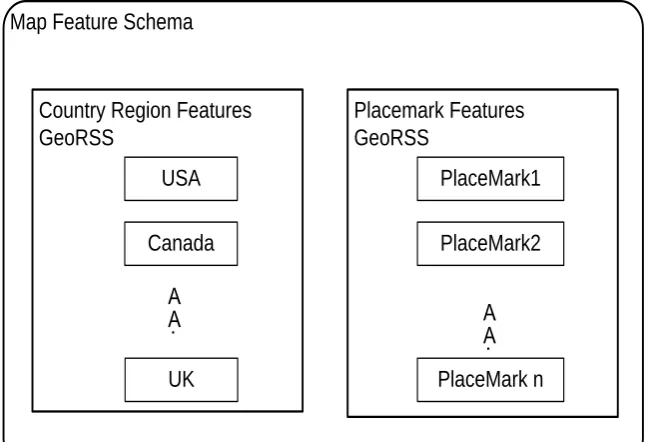
Fig 3.7 APWeb05 presenters’ mapping on Google Maps by country and region ... 56
Fig 3.8 APWeb05 presenters’ mapping on Google Maps by city using Place Markers ... 56
Fig 3.9 WebEpi system architecture ... 58
Fig 3.10 Epidemiological data pre-processing ... 59
Fig 3.11 Epidemiological data clustering process ... 62
Fig 3.12 Geo-processing ... 66
Fig 4.1 SOM learning steps ... 73
Fig 4.3 Program code of WebEpi FCM plot ... 80
Fig 4.4 WebEpi k-means plot function ... 84
Fig 5.1 Male-Standard Mortality Ratio (SMR) in 2005 ... 86
Fig 5.2 MATLAB code of data pre-processing ... 87
Fig 5.3 SOM training results... 89
Fig 5.4 SOM injury & poisoning... 90
Fig 5.5 Colour coding for 29 LGAs ... 90
Fig 5.6 SOM clustering results ... 91
Fig 5.7 FCM clustering results ... 93
Fig 5.8 K-means clustering results ... 94
Fig 5.9 Comparison of clustering algorithms for Breast Cancer ... 97
Fig 5.10 Comparison of clustering algorithms for circulatory ... 98
Fig 5.11 Comparison of clustering algorithms for injury ... 99
Fig 5.12 Comparison of clustering algorithms for ischaemic heart ... 100
Fig 5.13 Comparison of clustering algorithms for lung cancer ... 101
Fig 5.14 Comparison of clustering algorithms for prostate cancer ... 102
Fig 5.15 Comparison of clustering algorithms for stroke ... 103
Fig 5.16 Comparison of clustering algorithms for ‘cancer all’ ... 104
Fig 5.17 Evaluation of the SOM, FCM and k-means ... 105
Fig 5.18 WebEpi clustering automation (Part A) ... 107
Fig 5.19 WebEpi clustering automation (Part B) ... 108
Fig 6.1 Map mashups layer model ... 113
Fig 6.2 WebEpi Geo-processing data flow diagram ... 118
Fig 6.3 WebEpi Geo-processing block diagram ... 119
Fig 6.5 (a) Epidemiological data structures ... 121
Fig 6.5 (b) Epidemiological data structures ... 122
Fig 6.6 Epidemiological data attribute values ... 123
Fig 6.7 Colour legend ... 124
Fig 6.8 Data query ... 126
Fig 6.9 Geo-Mashups ... 127
Fig 6.10 Map feature loading ... 128
Fig 6.11 Sample of Epidemiology source data in Excel ... 129
Fig 6.12 Epidemiology KML file ... 130
Fig 6.13 Mapping layer file on Google Maps ... 131
Fig 6.14 Mapping for Males SMR in injury & poisoning ... 132
Fig 6.15 Mapping for females hospitalisation data in musculoskeletal disease ... 133
Fig A.1 Security settings(1) ... 155
Fig A.2 Security settings(2) ... 156
Fig A.3 File location ... 156
Fig A.4 WebEpi mapping ... 156
Fig A.5 GoogleEarth installation... 157
Fig A.6 GoogleEarth mapping ... 157
Fig B.1 WebEpi file location ... 159
Fig B.4 MATLAB code(1) ... 161
Fig B.5 MATLAB code (2) ... 162
Fig B.6 Mapping file location ... 162
List of Tables
Glossary
ABS Australian Bureau of Statistics
AJAX Asynchronous JavaScript and XML
API Application Programming Interface
ArcGIS A commercial GIS software package developed by ESRI
http://www.esri.com/software/arcgis
ASP .NET A server-side Web application framework designed and
developed by Microsoft, http://www.asp.net
DHHS Department of Health and Human Services, Tasmania,
Australia
Epidemiological data clustering analysis
The clustering analysis for epidemiological data
Epidemiologist People who are conduct epidemiological studies.
ESRI
Environmental Systems Research Institute, Inc. (Esri), in Redlands, California,
http://www.esri.com/about-esri/history/history-more
FCM
Fuzzy c-means
http://home.dei.polimi.it/matteucc/Clustering/tutorial_html/cme ans.html
Geocoding Finding associated geographic coordinates
Geo-Mashups Geospatial information mashups with geospatial related
information
GeoMedia
GIS application provided by Intergraph company
http://geospatial.intergraph.com/products/GeoMedia/Details.as px
Geo-processing
Geo-Mashups and creation of geospatial layers
GeoRss Geographically Encoded Objects for Really Simple
Syndication
Geospatial
layer A geospatial file on WebGIS or GIS
Geospatial
Visualisation Information Visualisation on GIS or WebGIS
GML Geography Markup Language
GPS Global Positioning System
k-means k-means
http://en.wikipedia.org/wiki/K-means_clustering
KML Keyhole Markup Language
LGA Local Government Area
MapInfo A commercial GIS software developed by Pitney Bowes
http://www.pbinsight.com/welcome/mapinfo/
MATLAB
A high-level technical computing language and interactive environment for algorithm development
http://www.mathworks.com.au/products/matlab
MySQL My Structured Query Language
PHP Hypertext Preprocessor, a web development language
ProMED-mail An Internet-based reporting system
http://www.isid.org/promedmail/promedmail.shtml
Silverlight
development tool for creating engaging, interactive user experiences for Web and mobile applications.
http://www.microsoft.com/silverlight
SMR Standardised Mortality Ratio
SOAP Simple Object Access Protocol
SOM Self-Organizing Map
SQL Structured Query Language
SuperMap A complete integration of a series of GIS platform software
produced by GIS Software Co. Ltd http://www.supermap.com
SVG Scalable Vector Graphics
Tiles2KML Pro convert GIS data into KML file
http://tiles2kml-pro.software.informer.com/
UML Unified Modeling Language
URL Uniform Resource Locator
WebEpi Web-based Epidemiological data visualisation system
epidemiological data on Google Maps
WebGIS Web based Geographic Information System
WFS Web Feature Service
WHO World Health Organisation
WMS Web Map Service
1
Chapter 1 Introduction
The World Wide Web has changed almost everything, and Geographic Information Systems (GISs) are no exception (Esri Australia 2012). Web based Geographic Information Systems (WebGISs) (Fu & Sun 2010), as the combination of the Web and geographic information systems, have grown into a rapidly developing discipline. The vast majority of Internet users use simple mapping for Internet applications. For example, government agencies map the transmission of infectious diseases, real-time earthquakes and wildfire disasters online to monitor public health and safety (Fu & Sun 2010). Public health organisations’ use of WebGIS not only helps to improve the community’s health and wellbeing, but also helps to manage or even prevent outbreaks of infections before they occur (Australian Bureau of Statistics 2010). The research of public health epidemiological study examines the relationships between potential risk factors for diseases and their associated morbidity and Standardised Mortality Ratio (SMR). Identifying causal relationships between these risk factors and diseases is an important aspect of epidemiology (Shi et al. 2007).
the geospatial visualisation of epidemiological data. This research topic has been designed to assist in these areas. First of all, it was required to identify a data analysis algorithm which could make epidemiological analysis reports easily understood. Then, it was important to choose a platform which could visualise epidemiological analysis reports. Geospatial maps visualisation is wildly used in public health surveillance; however, currently it relies heavily on expensive commercial software such as MapInfo.
1.1 Background and Motivation
The advent of electronic health records in recent decades has provided medical professionals with increasing availability of population-level health data. This has highly influenced the practice of epidemiology. Modern epidemiologists use disease informatics as a tool to identify health care needs (Australian Bureau of Statistics 2010; Shi et al. 2007). In general, the process of producing epidemiological data reports includes two components. One is the clustering analysis of epidemiological data, and the other is the geospatial visualisation of epidemiological analysis results.
(Australian Bureau of Statistics 2010). Clustering algorithms can translate the massive amounts of epidemiological data into useful information.
In order to visualise epidemiological analysis results, commercial software tools such as MapInfo and ArcGIS are most widely used. These tools are sophisticated but, unfortunately, they are expensive and have limited accessibility. Also, the full mapping capability of these tools is often not required for purposes of epidemiological data visualisation (Shi et al. 2007). Furthermore the geospatial visualisation of epidemiology data is only readily understood by health researchers because of the widespread use of jargon. These factors make it highly unlikely that the public will access this data.
1.2 Research Challenges
There were two major challenges in this research, one was the clustering analysis of epidemiological data; the other one was the geospatial visualisation. There are various clustering algorithms available. The selection of the best performer for clustering analysis of epidemiological data is very important. The visualisation of epidemiological data on a free geospatial visualisation platform determines the epidemiological data accessibility.
1.2.1 Clustering analysis of epidemiological data
Clustering analysis is commonly used in disease surveillance and spatial epidemiology. Clustering algorithms and clustering validation algorithms are crucial for the clustering analysis of epidemiological data. Finding an appropriate clustering algorithm and choosing a suitable clustering validation algorithm are the main challenges in the clustering analysis of epidemiological data.
Clustering algorithms which have been widely used for both epidemiological data and geospatial data analysis had to be reviewed. There are several clustering algorithms which may be suitable for epidemiological data analysis. The selection of clustering algorithms for the epidemiological data had to be based on performance.
algorithm. The evaluation algorithm had to meet the health researchers’ clustering requirements for epidemiological data.
1.2.2 Geospatial visualisation
The Internet is based on standard protocols which can be accessed globally. Information has been widely shared and transferred on the Internet. Interactive Internet geospatial mapping services, which can be called a geospatial web, have been introduced as an extension of conventional stand-alone GISs in recent decades (Zhang & Shi 2007). Geospatial web services provide a better information access platform and can overcome some access limitations of stand-alone GISs. In this research, one significant task was to develop a free geospatial web service which would be applied for the geospatial visualisation of epidemiological data. However, there were certain challenges to achieving this.
The first challenge was how to combine the epidemiological clustering analysis with geospatial data. There are many techniques which have been used for data combination, but to investigate the most suitable one for free geospatial web service and clustering analysis was still a challenge.
clustering analysis on a geospatial map was a challenge because it had not been developed on free web mapping platform before.
1.2.3 WebGIS automation application
An effective, reliable, easy and interactive WebGIS application is the system envisioned by the DHHS. They wanted to build a fully automated web-based geospatial visualisation application for the clustering analysis of epidemiological data. However, DHHS health researchers are public health professionals, and they usually do not have sufficient IT knowledge such as programming and website development, to build a system to process the large amounts of epidemiological data. The application was required to provide a seamless transition between the clustering analysis and the geospatial visualisation of the epidemiological data.
1.3 Research Objectives and Contributions
The successful development of the clustering analysis and the geospatial visualisation became the integral parts of the user interactive application for geospatial visualisation of the clustering analysis of epidemiological data. This system has been named WebEpi.
1.3.1 Clustering analysis of epidemiological data
Clustering experiments of epidemiological data were conducted based on epidemiological SMR. The values came from the population of the local government area. In order to solve the challenges for epidemiological clustering analysis, two steps were involved.
Firstly, three clustering algorithms for investigation were selected, i.e., Self-Organizing Map (SOM), Fuzzy c-means (FCM) and k-means. All these algorithms were applied to the epidemiological clustering experiments.
The second step was to select a clustering evaluation method. The Davies-Bouldin index was chosen to validate the clustering results of epidemiological data for the reasons described in Chapter 2 and Chapter 5. In this research this clustering evaluation algorithm was used to select the best clustering algorithm for WebEpi.
1.3.2 Geospatial processing
The first part is Geo-Mashups which could be explained for this research as the combination of epidemiological data and geospatial data. Geo-Mashups had to be developed to combine the geospatial information and epidemiological clustering analysis. The Geo-Mashups engine was built to conduct mashups browsing, information classification, information rating and information formatting.
The second part is geospatial layer customisation. The reason for customising the geospatial layer is to produce an effective geospatial visualisation for the clustering analysis of epidemiological data. The colour in the map can be utilised to indicate the value of each epidemiological data cluster. In this research, the geospatial layer of coloured Local Government Area (LGA) polygons had to be created for the geospatial visualisation.
1.3.3 WebEpi
1.4 Scope of Thesis
10
Chapter 2 Literature Review
2.1 Introduction
The development of geospatial data and services has blossomed in recent years. Geospatial studies for epidemiological analysis have been investigated by many health researchers (Fu & Sun 2010). However, the results of these studies have limited accessibility because epidemiological analysis reports are coded in public health glossaries and indicators. Therefore, the public are not aware of these reports. The major problem of this epidemiological data access limitation is the lack of a visualisation platform. Almost all health research departments utilise commercial geospatial applications. The public are not authorised to use these expensive applications. Therefore, in order to improve public awareness and public health information accessibility, the DHHS proposed to develop a new application would integrate data clustering and web geospatial visualisation techniques.
applications are discussed in Section 2.4. The clustering analyses for geospatial health data applications are explored in Section 2.5.
2.2 Epidemiological Data
The epidemiological data include mortality by disease, sex and year. Disease includes cancer incidence, death, hospitalisation and notified infectious. Cancer incidences include ‘cancer all’, colorectal, lung and prostate. Death includes all cause, breast cancer, ‘cancer all’, circulatory disease, injury & poisoning, ischaemic heart disease, lung cancer and prostate cancer. Hospitalisation includes accidental falls, acute respiratory infections, all cause, asthma, ‘cancer all’, circulatory disease, diabetes, injury and poisoning, musculoskeletal disease, pneumonia and influenza prostate cancer, respiratory disease, stroke and transport accidents. Notified infectious include all cause, campylobacter, chlamydia, hepatitis c and salmonella. Sex includes male, female and people. In Australia, epidemiological data are collected from different sources such as ABS, Department of Health and Ageing, Pharmaceutical Benefits Scheme, Australian Institute of Health and Welfare, and Department of Human Services. State, territory and local governments also collect residency health and wellbeing data for monitoring a number of disease sources (Australian Government Department of Health and Ageing 2013). Australian federal government produces enormous health reports which include
the number deaths from cancers or accidents, and types of cancers or accidents
residential areas, and
gender and age groups
Table 2.1 Male-standardised mortality ratio (SMR) for selected diseases in Tasmania 2003
Male-standardised mortality ratio (SMR) for selected diseases in Tasmania 2003
Disease LGA SMR
All causes Break ODay 110
All causes Brighton 135
All causes Burnie 104
All causes Central Coast 95
All causes Central Highlands 102
All causes Circular Head 99
All causes Clarence 93
All causes Derwent Valley 122
All causes Devonport 90
All causes Dorset 102
All causes Flinders 123
All causes George Town 132
All causes Glamorgan/Spring Bay 87
All causes Glenorchy 107
All causes Hobart 98
All causes Huon Valley 100
All causes Kentish 106
All causes King Island 96
All causes Kingborough 93
All causes Latrobe 86
All causes Launceston 105
All causes Meander Valley 89
All causes North Midlands 101
All causes Sorell 94
All causes Southern Midlands 108
All causes Tasman 103
All causes Waratah/Wynyard 105
All causes West Coast 143
Fig 2.1 Tracking graphic
At DHHS, the epidemiological data statistics are based on region population, proportion of people and disease. DHHS produces epidemiological reports with tables and tracking graphs. In a table a mortality rate for a specific disease is listed by year and sex as shown in Table 2.1. A tracking graph plots all the numbers in the table and creates a trend line to calculate the percentage increase or decrease of mortality rate as shown in Fig 2.1 (Department of Human Service and Health Tasmania 2003). Unfortunately the epidemiological reports could only be understood by health professionals. Without any description, SMR just means purely number to public.
2.3 Clustering and Clustering Analysis
The term Cluster Analysis (CA) was first introduced by Tryon (1939) in his monograph. Cluster Analysis or Clustering is well defined by Wikipedia contributors (2013) as “the task of grouping a set of objects in such a way that objects in the same group (called cluster) are more similar (in some sense or
60 80 100 120 140 160
0 5 10 15 20 25
SM
R
29 LGAs
Male-standarided All cause mortality ratio
(SMR) for selected diseases in Tasmania
2003
SMR
another) to each other than to those in other groups (clusters)”. Clustering analysis aims to assign numbers of objects into clusters by the similarity and dissimilarity between the objects. Similar objects are grouped as one cluster. In the research, clustering analysis of epidemiological data focused on statistical data analysis.
The proposed clustering of epidemiological data was by grouping the specific epidemiological attributes by their SMR. However, there were two criteria for clustering analysis of DHHS epidemiological data. Firstly, the nature of the epidemiological data should strongly influence the choice of the cluster measure. Secondly, the choice of measuring should depend on scale of the data. A clustering evaluation algorithm should also be chosen. There are many clustering algorithms available, and, according to the criteria, three clustering analysis algorithms are commonly used and reviewed in this chapter: SOMs (Self Organising Maps), FCM (Fuzzy c-means), and k-means.
2.3.1 SOMs
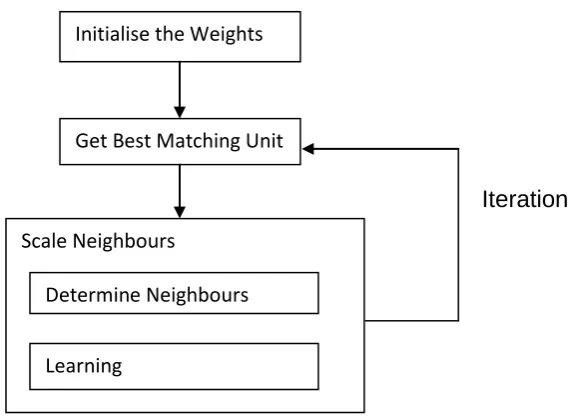
Qiang, Cheng & Li (2010) suggest that having some basic knowledge of the human brain will improve the understanding of SOM processes. The development of SOMs simulates the topological maps of human brains. The design of a SOM algorithm is based on local neighbourhoods of interconnected networks. The SOM integrates dimensional plans of neuron system and complex spatial mapping (Qiang, Cheng & Li 2010). The implementation of a SOM can project high dimensional inputs, which are extracted by instance attributes of input signals, into lower dimensions. The projection results on lower dimensions still maintain the topological map of the input objects. In other words, the multidimensional data is projected into low dimensional space. The low dimensional space is able to match the input objects’ topological map. Therefore, a SOM can produce better low dimensional projections for multidimensional data (Qiang, Cheng & Li 2010).
In Kohonen’s SOMs, all the data processing layers can be visualised, the output layer contains restructured neurons’ plan map. After the calculation of distances between neurons, the weights of the neurons will be updated. Accordingly, other neurons near the one which has been updated, have to undergo the updating process as well. Therefore one of the most significant features of a SOM is the distance relationship between the nearby neurons. However, in Kohonen’s original theory, the distances between the neurons were fixed during the learning process. Therefore, the structure of neural network is not applicable for some data structures, such as liner or mesh structures (Chang, Yu & Heh 1998).
phase and the mapping phase. In their SOM model, the SOM was having been trained, it was used to find and map its best clusters. (Jin et al. 2011)
The procedure of the training phases is described below (Jin et al. 2011):
1) Input dataset
2) Initialise the weight vectors of nodes as tiny random numbers, initialise the iteration count as 1
3) Traverse each node in the origin map and process:
By selecting the index of the vector to measure the distance between the input vector and weight vector. The distance can describe their similarity.
Calculate the distances between nodes to find out the shortest distance.
4) Compare the distances, update the neighbourhood of shortest distance unit by moving the neighbours close to the winning unit.
5) Go to step 3) unless the cluster centre differences reduced to 0.0001 or less, or the number of iterations reaches 200.
presented an approach to cluster the data from programming without a manual process. They created syntax trees for programming. The similarities between the syntax trees were computed in order to get a generalised mean for a SOM model. They then used programming to extract the data and present it to their SOM for visualisation. By contrast with traditional SOMs, their work can be used for data set clustering and visualisation. A similarity measurement between the programming codes can be then defined (Zhu & Zhu 2010b).
SOMs have been utilised as a classic tool in MATLAB software. A SOM toolbox is provided by MATLAB and it has been build based on neural network theory. Many classic activation functions such as a linear function are provided by the SOM toolbox (SOM 2000; Yin & Gang 2010). Users can customise the number of clusters and times of iteration by changing the SOM function reference or writing a calling function in MATLAB. Furthermore, if the user does not know how to customise the function, the user can directly call the function or sub functions in the SOM toolbox. Therefore, MATLAB SOM toolbox is very helpful in clustering analysis tasks (Yin & Gang 2010).
2.3.2 FCM
process, the way of discovering the relationships between objects is by rating the similarity and dissimilarity between the objects (Wang 2010).
The FCM clustering algorithm was proposed by Dunn (1973) and extended by Bezdek in 1981 (Bezdek 1981). In FCM clustering process, the vectors that have more similarity are assigned to the same cluster. Each vector presents the location of the object in the vector. Also information about the objects is analysed by mapping the objects into d-dimensional vectors. The measurements of the d-dimensional of the object are chosen as a basis for comparison with the rest of the objects. As result, the vectors location represents the relationships between the input objects (Windham 1982).
FCM is one of the most widely used and investigated clustering algorithms. It was designed for handling numerical data (Rong & Fan 2009). The FCM algorithm has been recognised as the most suitable clustering algorithm for image segmentation. In addition, FCM enables robust characteristics for ambiguity which aims to allow for elements to be in more than one cluster (Sathiracheewin & Surapatana 2011). The FCM technique is the combination of grouping of similar data (Sathiracheewin & Surapatana 2011). The combination process calculates a degree of membership of each data point to every cluster’s centre. The grouping process combines the points determined by which has a high degree of membership to a cluster’s centre (Sathiracheewin & Surapatana 2011).
object (Santhalakshmi & Bharathi 2011). FCM finds a good partition of an image by searching a suitable prototype that minimises the object function (Rong & Fan 2009). However, the FCM clustering algorithm is sensitive to the initialisation and easily to falls into a local minimum or a saddle point during iteration. The object function can be described as
𝐽𝑚 = ∑ ∑ 𝑢𝑗𝑖𝑚 𝐶 𝑗=1 𝑁 𝑖=1
𝑑2(𝑥
𝑖, 𝑣𝑗) (Santhalakshmi & Bharathi 2011)(𝐸𝑞𝑢. 2.1)
The above function has to be run iteratively to get the best solution. The iteration procedure is conducted as the following steps: (Santhalakshmi & Bharathi 2011)
1) Initialise the value for 𝑐, 𝑚 , and 𝜀.
2) Initialise the fuzzy partition matrix 𝑈(0)
3) Initialise the iteration counter 𝑏 = 0
4) Calculate the ′𝑐′ cluster centres 𝑣𝑗(𝑏) with 𝑈(𝑏)
5) 𝑣𝑗(𝑏) =∑ (𝑢𝑗𝑖
(𝑏))𝑚𝑥 𝑖 𝑁
𝑖=1
∑𝑛𝑖=1(𝑢𝑗𝑖(𝑏))𝑚 (Santhalakshmi & Bharathi 2011)(𝐸𝑞𝑢. 2.2)
6) Calculate the membership matrix 𝑈(𝑏+1)
𝑢𝑗𝑖(𝑏+1) = 1
∑ (𝑑𝑗𝑖 𝑑𝑘𝑖) 2 𝑚−1 𝑐 𝑘=1
If max {𝑈(𝑏)− 𝑈(𝑏−1)} < 𝜀 then stop else set 𝑏 = 𝑏 − 1 and go to calculation of the cluster centre step, step 4.
Where
𝑥 is the dataset which located in m-dimensional space.
𝑁 is the total number of data items,
𝑐 is the total number of clusters, the interval value is from 2 to 𝑁 .
𝜀 is the threshold value of clustering.
𝑈𝑗𝑖 is the degree value of relationship between 𝑥𝑖 in the 𝑗𝑡ℎ cluster,
𝑚 is the weighting exponent of the degree of relationship,
𝑣𝑗 is the initial location of the cluster centre,
𝑑2(𝑥
𝑖, 𝑣𝑗) is a distance measured between the object and the cluster
centre (Santhalakshmi & Bharathi 2011).
FCM is based on the minimisation of an objective function. The initial step of the FCM algorithm is to decide the number of clusters, and initialise the membership of matrix U. The initialisation of matrix U is conducted randomly, and the cluster centres are selected by using matrix U. The matrix U contains all datasets in each cluster (Srinivasa et al. 2005).
is updated according to the cluster centres which have better membership value. In order to get better cluster centres, the membership calculations not only consider distance to particular clusters, but also take into account the distance of the point from all other cluster centres. The difference of the membership matrix before the change and after the change is calculated. If the value of the difference is less than the initialised threshold, the cluster centre updating process will be terminated, otherwise the updating process will continue. The membership matrix will be renewed as well. The process of finding better cluster centres will be terminated depending on the minimum changes in the membership matrix (Srinivasa et al. 2005).
FCM as a clustering allocation algorithm has many advantages, such as: it is adaptable to many areas of application, able to handle large amount of data and is efficient in calculation (Chu et al. 2010). FCM has been applied to many areas of data analysis. Chi utilised FCM for forecasting bus incidents. This application used MATLAB to verify the effectiveness of the method (Chi et al. 2010). FCM has been used in health data analysis as well. Yun Chi Yeh and Hong-Jhih Lin applied FCM for classifying cardiac arrhythmia on ECG signals. Using FCM, the total classification accuracy was approximately 93.57% (Yeh & Lin 2010).
2.3.3 K-means
discovering clusters. The dissimilarity of clusters can be explained as finding the disjoint clustering. K-means has been recognised as the most reliable disjoint clustering algorithm (Yu, Soh & Bond 2005).
This algorithm was originally developed by MacQueen in 1967 (MacQueen 1967). K-means has been considered the most efficient unsupervised learning approach (Zhou & Liu 2006). K-means aims to discover the similarity and dissimilarity between objects and clusters. Objects which have similar features are clustered, and objects with dissimilarities are assigned to other clusters. Therefore, compared with other clustering algorithms, k-means also considers dissimilarities between objects and clusters (Zhou & Liu 2006).
K-means clustering algorithm is efficient and effective. This clustering algorithm adopts a segmentation cluster approach. K-means clustering divides objects into k clusters, therefore k needs to be initialised before the clustering process. The centre of a cluster is the average value of the objects in the cluster. The process of clustering is according to the changes of the centre (Wu & Yao 2010). The number of clusters is taken as a parameter in the k-means algorithm. After getting the number of clusters, k-means will distribute the input objects into the clusters. The distribution of objects is based on the similarity between the objects and other objects within the same cluster. As a result, the measurement of similarity within the cluster is calculated by the mean value of all the objects within the same cluster (Deng & Mei 2009).
K-means algorithm process is as follows:
2) Objects are assigned to their closet cluster, according to their similarities to the cluster centres (Wu & Yao 2010).
3) Re-calculate the average values of all data objects within each cluster, and set the new average value as a new cluster centre, and go to step 2 (Wu & Yao 2010).
4) The new centre is compared with the original centre, if the cluster centre needs to be changed, return to step 2. The iterative process stops when the difference reaches 0.0001 or less (Deng & Mei 2009).
In the k-means clustering process, each object must belong to one cluster, it does not allow two or more clusters to contain the same object. K is the number of clusters, and the centres of the k clusters are selected from the input objects. In order to get better results, it is recommended to run k-means many times (Wang et al. 2009). K-means requires having initial cluster centres and cluster centres which are sensitive to clustering results. The k-means classification process uses the smallest distance to determine the maximum degree of membership categories. It is a gradually iterating algorithm (Yang & Deng 2010).
K-means has been used in the geospatial area as well. Xiao JiaoHuo et al utilise k-means for GIS map copyright protection. They used a k-means clustering algorithm to create a watermarking schema, based on a polygon type of ESRI (Environmental Systems Research Institute, Inc.) which is one of the most professional GIS development and GIS service support companies. Huo et al. (2011) distributed polygons into clusters and then utilised a watermark bit to calculate the mean distance between polygons within a cluster. They improved the performance by updating coordinates according to the mean distance between polygons. In the end, their research resulted in outstanding invisibility (Huo et al. 2011).
2.3.4 Davies–Bouldin index
However, according to DHHS requirements, the closest distance between elements in clustering was the most important element. The Davies–Bouldin index is an interval criterion, and was selected for evaluation purposes. It aims to discover the clusters which have high similarity by calculation of the interval distance of objects within cluster.
Davies–Bouldin index algorithm can not only be allocated a criteria to select better clustering results for objects, but can also discover the differences between different clustering algorithm computation results. The clustering validation results are not affected by the total number of clusters and the type of algorithm which produces the cluster results. It can also be used to assess a cluster seeking algorithm. The following distance functions: dispersion measurement (Equ. 2.4) and characteristic vector (Equ. 2.5) were chosen: (Davies & Bouldin 1979).
𝑆𝑖 = √ 1 𝑇𝑖∑|𝑋𝑗− 𝐴𝑗| 𝑞 𝑇𝑖 𝑗=1 𝑞
(Davies & Bouldin 1979) (𝐸𝑞𝑢. 2.4)
𝑋𝑗 is a dimensional feature vector where 𝑇𝑖 is the number of vectors in cluster 𝑖.
Aj is the centroid of cluster 𝑖
𝑀𝑖,𝑗 = √ 1 𝑇𝑖∑|𝑎𝑘,𝑖− 𝑎𝑘,𝑗| 𝑝 𝑇𝑖 𝑗=1 𝑝
(Davies & Bouldin 1979)(𝐸𝑞𝑢. 2.5)
Mi,j is a measure of separation between clusters where ak,j is the k th
2.4 Geospatial Visualisation
GISs consist of geospatial application tools, geospatial data analysis, geospatial file production and none geospatial data integrated web services (Colantonio et al. 2011). Currently, many popular GIS software platforms are available. The selection of platform plays an important role in mapping data. At present, popular GIS platforms include ArcGIS, MapInfo, SuperMap and GeoMedia. They all have advantages and disadvantages. ArcGIS was developed by ESRI (http://www.esri.com/) (Esri 2012). It contains several products such as ArcGIS for desktops, ArcGIS for mobiles, ArcGIS for servers and ArcGIS online. MapInfo is owned by the Pitney Bowes Software company (http://www.pbinsight.com). MapInfo has been developed for many platforms. Based on Mapinfo, Pitney Bowes developed many applications such as Enterprise Asset Management, Enterprise Address Management and Customer Communication Management. SuperMap GIS was developed by the SuperMap Company (http://www.supermap.com/). They provide a SuperMap GIS platform, based on Java and .Net, which enables GIS developers to choose their own GIS platforms. The SuperMap Company also developed applications for Desktop GIS, Service GIS, Component GIS and Mobile GIS. GeoMedia
Intergraph is owned by Intergraph Pty Ltd
(http://www.intergraph.com/global/au/geomedia/). Intergraph has products such as GeoMedia 3D, GeoMedia Image, GeoMedia Map Publisher etc.
companies or organisations. Their customers are from both professional and national or multinational companies and organisations. At the same time, ArcGIS and MapInfo compete with each other in mapping functionality, map visualisation and geospatial data management. They also support each other by the significant achievement of data conversion between two the different platforms (Wang et al. 2011). These tools are sophisticated but expensive and have limited accessibility. Also, the full mapping capability of these tools is often not required for simple epidemiological purposes. An alternative that is less expensive and more accessible to health professionals and the public would, therefore, be useful (Shi et al. 2007).
2.4.1 WebGIS
The web provides a platform which enables data sharing and web applications. Data is presented to people in a visualised way such as images and text. At the present time, however, images and text alone are not enough for information presentation (Markovic & Kloos 2009). With the popularisation of the Internet, GISs are moving from isolated, standalone systems to Internet applications which can be called WebGISs. The advantages of WebGISs include real-time accessibility, public accessibility and low cost. WebGISs integrate GISs and Internet technologies.
data sharing. The development of WebGISs offers an effective and efficient methodology to conduct geospatial research. However, the implementation of WebGISs places higher demands on hardware and GIS software, particularly the software support GIS system architecture and GIS application development (Han et al. 2010). Google Maps and Bing Maps are becoming the most popular, free WebGIS applications on the Internet. However, which one performs better is still under investigation, as each company works on the improvement of their WebGISs services. In addition, WebGIS services are being continually increased and improved.
2.4.2 Google Maps
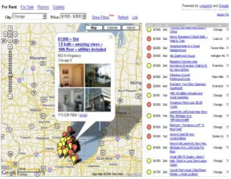
Google Maps which was launched by Google in February 2005. It is a free electronic map service (Su 2011). Google Maps provides a high resolution Satellite view, Map view and a Hybrid view of the Satellite and Map views. Google Maps integrates the Internet map services with third-party applications. Google Maps has become more and more popular with wide scale service applications and has free accessibility (Fu et al. 2010).
developers develop their client side script to access Google Maps server applications. Google Maps is a functional platform of geospatial data, because Google Maps can unite different sources of web service interface for information visualisation (Tan et al. 2008).
In order to extend the functionality of Google Maps, the GIS file is the most important data source. The GIS file uses a standard format for encoding geographical information. Most GIS files are produced by government or professional GIS companies. Meta data of a GIS file often includes elevation data in either raster or vector form. Map layers are usually expressed as point, line and polygon combined with coordinate system description. Google Maps is associated with XML-based Keyhole Markup Language (KML), Geographically Encoded Objects for Really Simple Syndication (GeoRss) and Scalable Vector Graphics (SVG). They serve as modelling languages for geographic information systems and also produce an open standard format for geospatial data transactions (Shi et al. 2007).
application provides global disease alert mapping. The Healthmap project aims to enhance surveillance of infectious diseases through the integration of a number of datasets, including World Health Organisation (WHO) data, ProMED-mail and Google News (Shi et al. 2007). The Healthmap application extends the usefulness of each individual dataset. The data can be used for both research and interventions to improve public health communication (Shi et al. 2007).
Fig 2.2 Banquet facilities maps on Google Maps
Fig 2.4 Food shops on Google Maps
2.4.3 Bing Maps
Bing Maps has been embedded into many web applications to support geospatial visualisation. Bing Maps supplies APIs for WebGISs developers to develop their own applications. APIs allow developers to overlap their customised geospatial layers onto Bing Maps. Bing Maps APIs support Geography Markup Language (GML), KML and GeoRSS geospatial file types. By comparing with Google Maps, Bing Maps also supports time series animation or geospatial visualisation. Time series animation is extremely helpful for GIS decision making. The comparison of time difference is the principle mechanism for historical data analysis. Furthermore, Bing Maps APIs also have polymorphism. It can be used in different web development techniques such as Silverlight, AJAX and Simple Object Access Protocol (SOAP). Bing Maps has fully demonstrated the characteristics of object oriented development (Qu et al. 2011).
Fig 2.5 Real estate using Bing Maps
Fig 2.6 Movie gallery with Bing Maps
2.4.4 Comparison between Google Maps and Bing Maps
The two free WebGISs servers, Bing Maps and Google Maps have attracted a great deal of attention from web users, developers and researchers. Each server has its unique way to present the data and its own approach to business solutions. The similarity and difference between Bing Maps and Google Maps in the areas of Map Visualisation, Online Functionality and API usability are discussed as follows (Zhang, Shi & Zhang 2007).
Google Maps provides three types of web images, i.e. Map view, Satellite view, and Hybrid view. Satellite view presents photos taken from the sky, Map view is the road map of a city, and Hybrid view overlaps the Map view over the Satellite view. Google Maps is continually updating its images, and more and more cities round the world have become clearer; even cars on roads and local intersections are clearly visible (Zhang, Shi & Zhang 2007).
Table 2.2 Map Image Comparison of Google Maps and Bing Maps
The Google Maps website provides search functions such as search by address, by business and by direction between two places. Users can create their local business marks on Google Maps although at this stage the service is only available for twelve counties such as Canada, Australia, Japan, the United Kingdom and the United States. Searching based on street number and Get Directions function are both working on Google Maps in Australia (Zhang, Shi & Zhang 2007).
Bing Maps also has an address search function by specifying street, city and country. Users can custom tag the location by adding pushpins on Bing Maps, and the pushpins’ coordinate locations can be saved on the user’s hard disk. Bing Maps has a drawing polygon layer function. A functionality comparison between the two servers is shown in Table 2.3 (Zhang, Shi & Zhang 2007).
Table 2.3 Online Functionality Comparison between Google Maps and Bing Maps
Web Map Satellite View Road View Hybrid View 3D View Max Zoom in Satellite View Max Zoom in Road View Google Maps Bing Maps
Web Map Search place by road, city, and
Country (Australia) Add place mark by pushing point Draw Path/Polygon Search business place
Google Maps
Both Google Maps and Bing Maps provide APIs for business and personal applications. Their APIs are compared based on attributes like API Key Request, Geocoding Request Limit, Route and Drive Direction, Geo Layer File Size Limited, and SVG support (Zhang, Shi & Zhang 2007).
The Google Maps server asks for an API key when the client sends a query to convert address to the geographic coordinate. There is also a limit on the maximum number of Geocoding requests for a particular API key: 50,000 per day. Route and Drive Direction are available on both Google Maps and Bing Maps. Both Google Maps and Bing Maps provided APIs can load a Geo layer file, but, once the layer file size exceeds 4MB, the webpage will generate an unexpected error. SVG is a kind of XML file which describes two dimensional graphics and is supported by both Google Maps and Bing Maps. Table 2.4 illustrates the major difference between Google Maps and Bing Maps APIs (Zhang, Shi & Zhang 2007).
Table 2.4 Differences between Google Maps and Bing Maps APIs
2.4.5 Geo-Mashups
Web mashups (Markovic & Kloos 2009) are web applications generated by combining contents, presentations or application functionalities from disparate web sources. There is a large amount of geospatial information available
API API Key
Request Geocoding Request Limit Route and Drive Direction Geo Layer File Size Limit SVG Support Google Maps
through the Internet, but geospatial data exploring and conversion are challenges. Web mashups for geospatial information can also be called Geo-Mashups (Zhang, Shi & Zhang 2009).
Geo-Mashups enable the remixed geospatial layers or features from different sources to be combined into an integrated geospatial file. Mashups technology promotes communication between geospatial data access and the web geospatial data source. Geo-Mashups can be in the form of map-based applications and services mashups. There are some free Geo-Mashups web services available, such as Google Maps, Yahoo Maps and Bing Maps. These free Geo-Mashups services support map APIs with built-in AJAX, JavaScript, and Flash software. The map APIs allow users to build amazing map applications (Zhang, Shi & Zhang 2009). Healthmap is a typical WebGIS application utilising Geo-Mashups which enhances the surveillance of infectious diseases through global disease alert mapping (Zhang, Shi & Zhang 2009).
The general form of a Geo-Mashups model can be summarised as shown in Fig 2.8
Fig 2.8 Geo-Mashups model
Mashups Platforms/Engine for Data modeling
URL Builder with query parameters
Web data source
Source data Query result of (xml,xls...)
First the web data source has to be presented and a Uniform Resource Locator (URL) builder is constructed. The results of the source data are retrieved from the URL Builder using a semantic query. The results may contain different formats such as XML, EXtensible Stylesheet Language (XSL) and Really Simple Syndication (RSS). A uniform output can be achieved by using a data formatter to convert results between different data formats. The output is then well formatted and is ready to be used in the next stage.
Because of the advantages of Geo-Mashups, many applications utilise them for data presentation and decision making. An application presented by Rui Zhu et al utilise Google Earth API based mashups for visualisation of a weather induced disaster warning information system (Zhu et al. 2011). The reason for their use of the Google Earth API is that it provides a 3D visualisation. The Google Earth API integrates Satellite view, Map view, Hybrid view and 3D images for the major cities. The Google Earth API offers basic functions of 3D GIS efficiently (Zhu et al. 2011).
Meteorological Observatory servers. Their example demonstrates how a Geo-Mashups application could be created to generate results in the client-side browsers (Zhu et al. 2011).
A research related visualisation of Geo-Mashups was conducted by Wood et al (2007). They demonstrated a Geo-Mashups case study. Google Earth is utilised as a geospatial visualisation tool. The source data is located in a My Structured Query Language (MySQL). Hypertext Preprocessor (PHP) is applied as the middle layer between MySQL and a geospatial data processing server. LandSerf (http://www.soi.city.ac.uk/~jwo/landserf/) was selected as the geospatial map processor which aims to conduct spatial data calculations. The KML data type can be visualised on Google Maps and Google Earth. The KML data type was adopted as the final geospatial data type for the application. The integration of geospatial application and a different source of data enables geospatial researchers to query, store, process and create of geospatial maps. The successful implementation of this case study proves that Google Earth can be utilised as professional geospatial data analysis tool.
2.5 Clustering Analysis for Geospatial Health Data
Application
The combination of clustering analysis and geospatial studies is becoming very common in health data management, eg. Pathak et al’s reference point location based geospatial analysis of heart disease incidence in Florida metropolitan areas (Pathak et al. 2011). The USA collects heart disease death incidence for non-transported and transported patients. This data is analysed by a geospatial clustering algorithm. In the clustering results, they demonstrated that there are significant differences between clusters that are close to a hospital and those which are far from a hospital. In their research, they used residential addresses as geospatial references to record the incidence of heart related deaths. They utilised ESRI's ArcGIS street name database as their map base reference (Pathak et al. 2011).
Geospatial research on the incidence of heart disease deaths in Florida has been successfully conducted. In this research, the geospatial data analysis was based on a street level map base. It also included route calculation between a patient home address and the hospital address. The distance calculation results have been clustered as well. In their research, they claim that they use probability weights for the inferential testing of clusters. This method has been implemented on public health literature research. In their future research, they are going to conduct geographical epidemiology using the same methodology (Pathak et al. 2011).
proved that clustering analysis facilities could be combined with a geospatial application (Goujon-Bellec et al. 2011). They used circular and elliptic scan methods for detecting regularly shaped clusters. The circular scan method was based on a circular window that scanned the entire map from one area to another. The elliptic scan method was based on the screen scan. The size of window was set by the length of its semi major axis. The shape ratio of the window was set by semi-major and minor axes. The angle degree was defined by horizontal line and its semi-major axis. In order to include a large geospatial area, the major axis length was set differently. In their research, they utilised living zones as geospatial data and mapping regions (Goujon-Bellec et al. 2011).
They achieved a significant conclusion from the research; it is that a circular scan does not fully support the determination of clusters. When compared with the circular scan, the elliptic scan performed better in large geospatial area cluster analysis and it was compatible for liner clustering detection. The elliptic scan also performed better over large geospatial areas (Goujon-Bellec et al. 2011).
detailed processes for geospatial visualisation using ArcGIS (Basara & Yuan 2008).
Basara and Yuan demonstrated the significant relationship between SOM classifications and the geographic visualisation of population-adjusted rates for selected diseases (Basara & Yuan 2008). Their research presented an important relationship between environmental conditions and health reports. The reports described the area environment as a major factor in public health (Basara & Yuan 2008). The research showed that it was possible to combine environment analysis and a geospatial system. The research focused on population infectious diseases at a community level. Population health analysis was based on geospatial environmental conditions related to health outcomes. Various environmental assessments might have been utilised as alternative attributes for ‘practice-based’ health assessments in cases where data was limited (Basara & Yuan 2008).
can be integrated together for geospatial data analysis. This concept can be expanded to other applications (Lebel, Pampalon & Villeneuve 2007).
2.6 Summary
44
Chapter 3 WebEpi System Architecture
3.1 Introduction
One of the research tasks was to develop an automated process for epidemiological data clustering analysis on a web-based geospatial system. In the past, the DHHS used MapInfo, a commercial software package, for their epidemiological data reporting services. This was costly and time consuming as it required manual analysis of the epidemiological data. In order to improve public accessibility, the performance of epidemiological data clustering analysis and geospatial visualisation, the DHHS were very interested in developing a new application for Web based geospatial visualisation, this application is called WebEpi.
3.2 DHHS Epidemiological Reporting System
The Population Health Epidemiology Unit of the DHHS uses Cancer Incidence, Death, Hospitalisation, and Notified Infectious data to conduct monitoring and surveillance of the health of the Tasmanian population (Shi et al. 2007). The data is coded according to LGA. Traditionally, commercial mapping software tools such as ArcGIS and MapInfo have been used to map this type of epidemiological data. However, these tools are very expensive, demand high computer resources and have very limited accessibility (Shi et al. 2007). The epidemiology data geographical mapping was obtained manually and the mapping steps were complicated and inefficient. The manual mapping process produced the proposed epidemiology layer files and all the records were manually clustered, but it was very time consuming in exporting source data, converting data format, rating data and creating a layer file. Normally it took 4 weeks to create one group of epidemiology data. Owing to the large amount of data, the data clustering procedures required a special process (Zhang, Shi & Zhang 2009).
integrate free web mapping services with epidemiological data analysis (Shi et al. 2007).
3.2.1 Epidemiological data hierarchy
Fig
3
.1
E
p
id
e
m
iolo
g
ica
l d
a
ta
h
ierarch
3.2.2 Epidemiology reporting system
Fig
3
.2
E
p
id
e
m
iolo
g
ica
l r
e
p
o
rting
syst
e
m