0
Neighborhood Change Near
Local Rail Service
Demographic Analysis in Four US
Regions and Recommendation for Practice
1 Abstract
2 Table of Contents
Introduction…. 4
I. Literature Review.... 5
II. Case Studies and Overview of Methods…. 8 A. Los Angeles Metro: Exposition Line…. 13 B. Twin Cities: Green Line…. 21
C. Denver: W Line…. 29 D. Seattle: Link/ULink…. 36 III. Discussion and Key Findings…. 43
IV. Policy Interventions for Ensuring Equity and Affordability…. 46 A. Federal Policies…. 46
B. State Policies…. 48 C. Local Policies…. 49
V. Recommendations for Rethinking Local Rail Service Projects…. 57 VI. Implications for Further Research…. 62
3 Acknowledgments
4 Introduction
Local rail transit infrastructure1 is a great tool for connecting communities and is often associated with positive impact on land and property values within proximity to transit station (Mohammed et al 2013). While this increased connectivity and increase in property and land value has real benefits for property owners it also has a downside. It can result in significant pressure on low and moderate income renters who face steep rent hikes. With rising costs, vulnerable populations may find themselves priced out of communities, causing both financial and emotional strain with negative downstream impacts on wealth creation, community cohesion, and childhood development. Simply put, local rail infrastructure can be a blessing and a curse depending on how development is managed within proximity to new or expanded service. This report endeavors to explore how local rail projects have impacted neighborhoods in four major metropolitan areas in the US and how negative impacts can be mitigated through better planning and policy.
As cities across the country make large investments in transportation and transit infrastructure, especially local rail service, it is critically important that local planners and politicians have a clear understanding of the neighborhood change that are likely to accompany these investments in order to ensure project benefits are distributed equitably. This paper seeks to answer three questions: first, are there common demographic shifts that occur disproportionately in neighborhoods near local rail stations? Second, if disproportionate changes do occur near stations, are certain groups benefiting at the expense of others? In other words, are the impacts equitably distributed amongst groups? Third, are there policies in place that effectively mitigate the negative impacts on certain groups?
This report is divided into Six sections. First, I will provide a brief literature review outlining existing research on the impact of rail infrastructure on property values. The second section is comprised of four case studies. Each case study consists of a GIS analysis of current and historic demographic conditions for four local rail projects put into service since 2000. The third section discusses several key results from the case studies.
The fourth section of the report is a discussion of policy and planning for equitable and affordable housing options around local rail service, including federal, state, and local policies,
1 The definition of local rail infrastructure used throughout this paper is concerned with the frequency of stations,
5 plans, and programs. In the fifth section, I propose a list of best practices for more effective and equitable transit-oriented development, as well as proposing a new approach to station area planning and development. Finally, I conclude with implications for further research.
I. Literature Review
There is ample literature that supports the claim that new transit infrastructure increases property values. Of particular weight is a meta-analysis conducted by Mohammad, et al, in 2013, which compiled data from 23 studies from across the United States and around the world (Mohammad, et al 2013). The results of the meta-analysis show that, in general, there is a positive relationship between property value and proximity to rail transit, regardless of the property land use (Mohammad, et al 2013). However, context matters and the degree of change varies widely. A 1998 study in the Atlanta, Georgia, region showed that proximity to the Atlanta regional rail system, MARTA, had no impact on property value and in some cases was attributed to significant negative influence on property value (Bollinger 1998). On the other hand, a 2003 report showed that in San Diego, commercial properties may see as much as a 91% price premium for proximity to transit (Cervero 2003). In addition, the type of property studied also has an impact on the magnitude of property value increases. As mentioned above, Cervero showed dramatic increases in property value for commercial properties near transit (2013). However, Zong and Li show that single family residential property values may decline in close proximity to light rail transit, while multifamily property values rise (2016). In summary, there is broad consensus that there is a positive relationship between rail infrastructure and property value, with the possible exception of single-family residences.
6 Federal level, there is consensus that high-quality transit is positively correlated with property value.
There are two important caveats to highlight regarding the literature on the relationship between rail and property values. First, most US studies have not captured the relatively recent phenomenon of urban and suburban infill development. Post-recession real estate trends (roughly 2011 and on) have had a big influence on urban and suburban areas due to significant market pressure for rental properties brought about by a tightened home mortgage market and increasing demand for urban living. Second, and related, it is difficult to parse out the impacts of changes in land use and zoning on property values from the impact of transit proximity. With the recent uptick in demand for urban living, many cities and regions are pursuing land use and zoning amendments. While Muhammad et al controlled for land use impacts in their 2013 meta-analysis, their conclusions should be met with some skepticism given recent trends. It is possible that some amount of new development and increases in rent or home values would have occurred as a result of zoning and land use changes without the addition of new local rail transit. Regardless of the complex interactions between transit infrastructure, regulatory environment and planning, and property value, there is little question that new local rail infrastructure has a lasting and transformative effect on neighborhoods into which it is introduced.
Given this transformative effect, it is important that planners carefully consider the motivations for where new local rail infrastructure is built and who will receive the benefits from that investment. The motivations for large capital investments in local rail infrastructure are likely to vary based on location but in general local rail projects seek to benefit people and places by providing a reliable alternative to congested roads and to channel growth around transit hubs, among many other reasons. But these motivations need not benefit some people at the cost of others.
7 more benefits than households with less ability to pay. It goes without saying that this should be cause for concern for equity-minded planners and government leaders.
However, the location efficiency framework can also be used to justify public expenditure in places which allow recipient to incur the fewest other expenses (Beri and Hawkins 2016). For example, it is a more cost-effective to spend public dollars to build a free health clinic near a transit hub, allowing low-income users to access the facility easily and without incurring substantial additional expenses associated with driving to a clinic located in an auto-dependent place. Though the cost of land and construction may be more expensive near a transit hub, Beri and Hawkins’ model argues that in the long-run it is a more efficient use of public dollars to build the facility there (2016). The same argument can be applied to the relationship between local rail transit and affordable housing. It is common knowledge that public transit is less expensive than private vehicle ownership. If one presumes that a person unable to afford market rents will also be significantly burdened by the cost of private vehicle ownership, it is more efficient to locate below-market rate housing near high-quality transit that enables the resident of the below-below-market rate housing to incur fewer expenses, even if the cost of construction is significantly higher than locating the same housing elsewhere in the region.
In summary, location efficiency can be viewed as a demand-side phenomenon with benefits going towards those with the most ability to pay, or as a supply-side phenomenon, with benefits going to the local government whose facilities are more cost-effective for users. Each is internally consistent. The challenge for planners and local government officials is to make a value judgment about which guiding framework will influence decision-making when it comes to designing and planning for local rail service. I argue that planners and local officials should consider the benefits accrued to households with lower ability to pay as being worth more than the benefits accrued by households with high ability to pay. Obviously, this would be a point of contention with any local government or planning agency.
8 low-to-middle income people and families to live in close proximity to the amenities and services from which they stand to benefit most, and which represent the most efficient allocation of public dollars.
II. Case Studies Overview and Methods
This section contains the current and historic demographic conditions in four regions across the country. The demographic analysis includes several factors from the 2011-2015 American Community Survey and the 1990 and 2000 Decennial Census data at the block group level. The data is measured at two different geographies: the municipal level, using the most recently published municipal boundaries; and for each block group intersected by a half-mile radius of each rail station along a local rail alignment. The two geographies are presented and compared to show how closely the municipal level block group demography aligns with half-mile intersected block group demography.
Methodology and Data
The four case study regions are Los Angeles, the Twin Cities of Minneapolis and St. Paul, Denver, and Seattle. Each of these regions was selected because they have opened new local rail lines or expanded existing service, or both, in the last decade.2 It was important to capture the most recent demographic data available in order to establish a baseline of demographic conditions that can be compared over time using historic data from 1990 and 2000. Although 5-Year ACS data is a sampled dataset with large margins of error for the small geographies like block groups, ACS data is sufficient for establishing a baseline of neighborhood conditions that can be compared with historic Decennial Census data.
Each demographic factor analyzed here can easily be used to distinguish clear patterns of segregation between different groups based on income, race, or age, for example. Many of the traits represent groups who benefit disproportionately from access to transit, such as elderly and younger people who may lack the ability to drive, or low-to-middle income households for whom personal vehicle ownership is a significant financial burden. Several of the factors can also be used
2 These are not the only US regions that have opened new or expanded local rail service in the last ten years. They
9 as proxies to measure vulnerability. For example, low-income race or ethnic minority populations, may face greater risk of being displaced as property values rise following the introduction or expansion of transit. If, in fact, the data suggests that some populations are being displaced over time, this brings with it additional costs, both at the municipal level, economically, and socially. These costs won’t be explored in detail in this report but they should nonetheless be taken into consideration by planners evaluating costs and benefits of local rail projects.3
Collecting and analyzing municipal level Census block group data was relatively straightforward. Using GIS, each block group located within the formal boundary of each municipality through which the alignment passed was selected and exported for calculation.
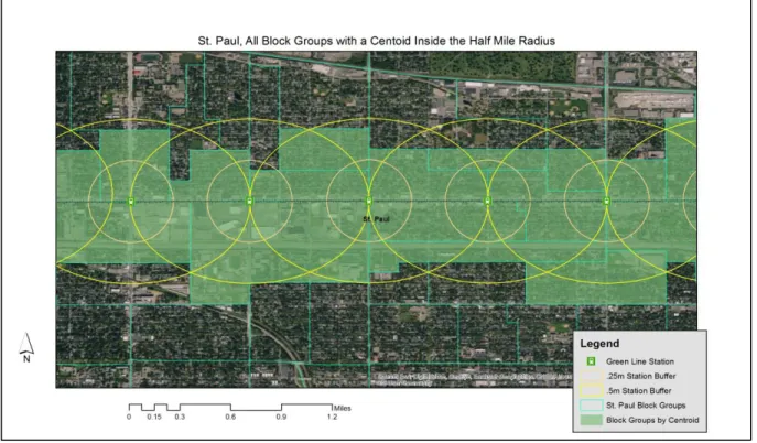
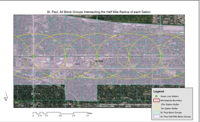
It is common practice in transit planning to use a half mile radius from a station as the definition of the “station area” (CTOD 2016). In each case study, block group geographies with a centroid within the half mile radius of each station generally resulted in large portions of land within the half mile radius going unanalyzed (Figure 1). Rather than limit the analysis to block groups with a centroid located within the half mile radius of each station, the station area analysis
was expanded to include each block group intersected by the half mile radius of each station
3 In particular, these downstream impacts should be measured by economists and financial analysts when
considering the costs of a project.
10 (Figure 2). This resulted in the station area expanding outside of the traditionally accepted half mile station area radius in most cases.
There is some room for criticism for using a methodology for selecting block groups that
extend beyond the half mile radius of the station. However, the half-mile station area radius should be considered a guideline for determining the station area, and other methodologies for determining the extend of a station also exist. For example, In Denver, Colorado, station area plans defined each station area by performing a transportation network analysis of existing transportation infrastructure including sidewalks, bicycle facilities, and roads, to create a “five minute travel time” to measure the effective station area (City of Denver 2014).
These produced radii of roughly .25 miles for walking, .75 miles for cycling, and 2 miles for driving and parking at a station. In some areas where transportation facilities were limited by large features such as highways, the effective station area was significantly reduced (City of Denver 2014). The city of Denver transportation network analysis involves a much more complex analysis than this report endeavors to make; but it illustrates that the definition of a “station area” is fungible and can extend beyond the often-used accepted half mile station radius.
11 Finally, there are outlying block groups in each of the case study cities that are easily visible. Study areas extend well beyond the half mile radius of the station area in several cases. However, rather than selectively removing outlying block groups that extended well beyond the half mile radius of the station area or selectively omitting the block groups with highly irregular shapes, for the sake of keeping the analysis consistent across each of the four case study areas, all outliers were included in the analysis. Upon inspection of aerial imagery, it is clear that most of the outliers are block groups that capture both residential and commercial activities (single family, strip retail, and office), and also large-scale non-residential uses such as airports, seaports, heavy industry, or large geographic features like rivers, lakes, and steep slopes. In summary, this data is a snapshot of station areas and the cities in which those station areas are located. A more precise evaluation of station area conditions and unique traits would require more time and technical capacity than this project is seeking to uncover.
Case Studies: Los Angeles, Minneapolis-St. Paul, Denver, Seattle
Each of the case studies presented in this section opened for service or expanded service in the last 10 years. Unlike many rail transportation inquiries, the scope of this report is not concerned with the number of riders boarding at each station. Rather, my focus is on gaining a better understanding of who lives near rail stations and whether those populations living nearest to each station are those who stand to benefit most from the rail line. The table below highlights several features of each of the rail lines studied in this report.
*In 1997, RTD officials recognized the need for a “Major Investment Study” for the W Line Corridor. RTD had acquired a large portion of the W Line right of way from a defunct rail operator in the 1970s and 80s.
4BuildExpo. 2017. “Project Timeline.” Accessed online: http://www.buildexpo.org/about-expo/timeline/
5Sound Transit. 2017. “Regional Transit History 1997-2003.” Accessed online:
http://www.soundtransit.org/About-Sound-Transit/News-and-events/Reports/1997---2003
6Metropolitan Council. 2017. “Project Timeline.” Accessed online:
https://metrocouncil.org/Transportation/Projects/Current-Projects/Central-Corridor/History.aspx
7Regional Transportation District: FasTracks. “Project History.” Accessed online:
http://www.rtd-fastracks.com/wc_3
Region Line Name
Length in miles (stations) Announce d Alignment
Finalized Year Operations Began
Los Angeles4 Exposition
Line 15.2 (19) 2003 2005
2012 (to Culver City); 2016 (Culver City to Santa Monica)
Seattle5 Link/ULink 20.4 (16) 1997 2003 2009 (downtown to SeaTac airport); 2016 (to
UW, plus 1 station south of airport)
Minneapolis-St. Paul6 Green Line 11 (23) 2001 2006 2014
12 Historical Analysis
After establishing the 2011-2015 5-Year ACS demographic data a baseline, I repeated the same process for demographic analysis for decennial census years 1990 and 2000. The intent of the historic analysis is to compare the most-recent ACS baseline data with historical data to identify changes over time that disproportionately impact areas closest to transit. The rest of this portion of the report looks at each of the several demographic traits separately including population density per square mile, percentage of the population identifying as African American alone, Asian alone, and Hispanic, median home value for owner-occupied units, median income, and median gross rent. All of the financial variables have been adjusted for inflation to 2015 dollars.
In each of the four case study cities, the new local rail projects finalized alignments and opened between 2000 and 2015. Therefore, the changes that take place between 2000 and 2015 data represent pre- and post- project impacts and discrepancies, if they exist. My hypothesis is that median home values and median incomes will increase between 1990 and 2000 and will decrease between 2000 and 2015 due to the 2008 Recession. I do not anticipate finding significant discrepancies pre- and post-project across all study areas. Similarly, I believe that deciphering changes caused by the recession and changes caused by the local rail development will be equally unclear. However, I do anticipate seeing increases in median gross rent across all half mile study areas.
Population density serves as a proxy to show the amount of development pressure facing an area. Station study areas where population density has increased significantly in the last 25 years are areas where significant development or redevelopment has occurred, or are places where people simply wish to live and are migrating to. Median income is used as a proxy to measure neighborhood change in general. If there are significant increases in median income, especially disproportionately within proximity to a rail station compared with the municipality, one can assume that there is significant neighborhood change occurring in terms of neighborhood desirability, and likely also represents an increase in outside investment. This could represent significant displacement pressure for lower-earning families or households with less ability to pay.
13
desirability changes over time. In places with a large inventory of rental properties, like many high-density urban city center area’s median gross rental rates are a good indicator for neighborhood affordability and desirability in general.
Changes in population density and median gross rent are good indicators for changes that have occurred since the announcement and opening of the rail alignment. I anticipate disproportional increases in population density and median gross rents in the station study areas of each of the four regions. I believe that each of these traits serves as a good proxy for understanding better some of the localized impacts of new local rail infrastructure on the areas through which they pass. If my hypotheses are correct, I will explore more of their implications in the discussion section of this report.
Finally, changes in the number of people identifying as race or ethnic minorities are also good indicators of neighborhood change. Similar to median household incomes indicating possible displacement risk, changes in different race and ethnic groups also represent possible displacement risk. If areas see large changes in population of minority groups, it could be representative of substantial displacement pressure on those minority groups. It could also represent user preference, in other words increases or decreases in minority populations within the half mile study area might represent a preference within a particular race or ethnic group to prioritize living in closer proximity to local rail transit.
A. Los Angeles Metro, Exposition Line
14
15
Table 1: ACS 2011-2015 % Under
18
% 65 and Over % White Alone % Black Alone % Asian Alone % Hispanic Median Income Median Home Value Population Density Median Gross Rent
Los Angeles 21% 11% 56% 4% 7% 47% $ 49,739 $ 421,600 13,292 $ 1,210
Los Angeles, Half Mile Study Area 20% 10% 37% 14% 8% 41% $ 44,769 $ 361,900 14,770 $ 1,108
Santa Monica 14% 13% 81% 2% 9% 11% $ 80,386 $ 737,100 12,674 $ 1,567
Santa Monica, Half Mile Study Area 13% 13% 75% 4% 10% 20% $ 70,015 $ 723,250 13,072 $ 2,045
Culver City 17% 15% 68% 4% 13% 12% $ 85,759 NA 7,618 $ 1,632
Culver City, Half Mile Study Area 13% 12% 69% 6% 10% 24% $ 95,041 $ 111,300 5,462 $ 1,608
Municipality Mean 17% 13% 68% 3% 10% 23% $ 71,961 $ 579,350 11,195 $ 1,470
Half Mile Study Area Mean 15% 12% 60% 8% 9% 28% $ 69,942 $ 398,817 11,101 $ 1,587
Table 2: Census 2000 % Under
18
% 65 and Over % White Alone % Black Alone % Asian Alone % Hispanic Median Income Median Home Value Population Density Median Gross Rent
Los Angeles 26% 9% 45% 4% 6% 43% $ 52,120 $ 251,065 11,942 $ 936
Los Angeles, Half Mile Study Area 25% 8% 30% 18% 6% 42% $ 42,304 $ 223,735 11,580 $ 826
Santa Monica 14% 13% 82% 2% 7% 10% $ 72,090 $ 595,754 10,750 $ 1,074
Santa Monica, Half Mile Study Area 14% 11% 76% 6% 8% 16% $ 59,245 $ 442,375 10,715 $ 1,037
Culver City 22% 14% 65% 4% 12% 22% $ 74,013 $ 418,074 8,239 $ 1,176
Culver City, Half Mile Study Area 25% 10% 57% 8% 10% 40% $ 71,895 $ 342,417 6,036 $ 1,108
Municipality Mean 21% 12% 64% 3% 8% 25% $ 66,074 $ 421,631 10,310 $ 1,062
Half Mile Study Area Mean 21% 10% 54% 11% 8% 33% $ 57,815 $ 336,176 9,444 $ 990
Table 3: Census 1990 % Under
18
% 65 and Over % White Alone % Black Alone % Asian Alone % Hispanic Median Income Median Home Value Population Density Median Gross Rent
Los Angeles 24% 10% 59% 3% 6% 30% $ 59,703 $ 381,138 10,943 $ 1,168
Los Angeles, Half Mile Study Area 23% 10% 23% 13% 7% 30% $ 45,524 $ 292,161 11,612 $ 1,003
Santa Monica 14% 15% 87% 2% 6% 10% $ 69,043 $ 903,341 12,019 $ 1,041
Santa Monica, Half Mile Study Area 13% 12% 82% 5% 7% 16% $ 55,533 $ 660,398 12,024 $ 954
Culver City 19% 14% 73% 3% 12% 21% $ 87,891 $ 612,039 8,562 $ 1,449
Culver City, Half Mile Study Area 21% 11% 64% 6% 12% 29% $ 67,171 $ 547,911 5,589 $ 1,202
Municipality Mean 19% 13% 73% 3% 8% 20% $ 72,212 $ 632,173 10,508 $ 1,219
16
Table 5: Change in Median Home Value
1990
Census % Change
2000
Census % Change 2011-15 ACS
Los Angeles $ 381,138 -34% $ 251,065 68% $ 421,600
Los Angeles, Half Mile Study Area $ 292,161 -23% $ 223,735 62% $ 361,900
Santa Monica $ 903,341 -34% $ 595,754 24% $ 737,100
Santa Monica, Half Mile Study Area $ 660,398 -33% $ 442,375 63% $ 723,250
Culver City $ 612,039 -32% $ 418,074 -- --
Culver City, Half Mile Study Area $ 547,911 -38% $ 342,417 -67% $ 111,300
Municipality Mean $ 632,173 -33% $ 421,631 37% $ 579,350
Half Mile Study Area Average $ 500,157 -33% $ 336,176 19% $ 398,817
In Los Angeles, real owner-occupied home values fell steeply in the 1990s in every jurisdiction, including within the station study area. The 1990s stand in stark contrast to the 2000 to 2015 changes. Insufficient data for Culver City led to some data collection challenges, though the remainder of the household values rose dramatically after a dismal decade in the 1990s. In Los Angeles, home values in both the city in general and the half mile study area rose at similar magnitudes, though the half mile study area home values are still significantly lower than the city in general. In Santa Monica, home values within the half mile study area are nearly the same as those in the rest of the city, which is a stark contrast to both 1990 and 2000 data. Despite the severity of the increase, it is consistent with what one would expect to find based on the literature. Insufficient data for Culver City makes it difficult to draw any conclusions. However, the steep decrease in home values within the half mile study area may be indicative of a change in product type, perhaps with more owner-occupied condo units on the market, or some other exogenous market shock.
Table 6: Change in Median Household Income
Census
1990 % Change
Census
2000 % Change
2011-015 ACS Los Angeles $ 59,703 -13% $ 52,120 -5% $ 49,739
Los Angeles, Half Mile Study Area $ 45,524 -7% $ 42,304 6% $ 44,769
Santa Monica $ 69,043 4% $ 72,090 12% $ 80,386
Santa Monica, Half Mile Study Area $ 55,533 7% $ 59,245 18% $ 70,015
Culver City $ 87,891 -16% $ 74,013 16% $ 85,759
Culver City, Half Mile Study Area $ 67,171 7% $ 71,895 32% $ 95,041
17
Despite predicted declines in real median income as a result of the 2008 recession, only the city of LA saw a decline in median household income between 2000 and 2015. In every other geography station areas out-performed the municipality in which it is located, both between 1990-2000 and 1990-2000-2015. However, the magnitude of the difference between the half mile study area and the municipality varied. Culver City saw the most disproportional increase between the city and the station area by far, with station area median income far surpassing the municipal median. It is also noteworthy that the relatively high-earning cities of Santa Monica and Culver City both saw larger percentage increases compared with Los Angeles, which is, in general, lower-earning.
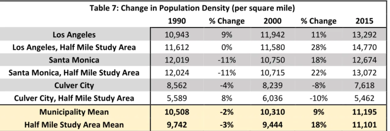
Table 7: Change in Population Density (per square mile)
1990 % Change 2000 % Change 2015
Los Angeles 10,943 9% 11,942 11% 13,292
Los Angeles, Half Mile Study Area 11,612 0% 11,580 28% 14,770
Santa Monica 12,019 -11% 10,750 18% 12,674
Santa Monica, Half Mile Study Area 12,024 -11% 10,715 22% 13,072
Culver City 8,562 -4% 8,239 -8% 7,618
Culver City, Half Mile Study Area 5,589 8% 6,036 -10% 5,462
Municipality Mean 10,508 -2% 10,310 9% 11,195
Half Mile Study Area Mean 9,742 -3% 9,444 18% 11,101
Population density increased disproportionately in each of the station study areas with the exception of Culver City station area.8 The half mile study in Los Angeles saw the most significant increase in population density, indicating significant growth between 2000 and 2015. Santa Monica received slightly more growth in population density between 2000 and 2015, but the half mile station area only received a slight increase in population density. Culver City is the obvious outlier, losing population density between 2000 and 2015. The reasons for this are myriad but could be explained by changes in census designation boundaries between 2000 and 2015. Furthermore, Culver City station areas are mostly detached single-family homes, which could have seen loss in population as children move out of the house, or new families move into the area without children. Comparing the percentage of residents less than 18 in Culver City, one can see that between 2000 and 2015, the percentage decreased from 22% to 17% in the city and 25% to
8It is also important to note that while Census designated block group geographies shift between 1990, 2000, and
18
13% in the station area (Table 1-3). This shift could be responsible for the change in population density between time periods. Still, there were significant increases in population density between 2000 and 2015 in both geographies of LA and Santa Monica, which likely indicates significant real estate development.
Table 8: Change in Median Gross Rent
1990 % Change 2000 % Change 2015
Los Angeles $ 1,168 -20% $ 936 29% $ 1,210
Los Angeles, Half Mile Study Area $ 1,003 -18% $ 826 34% $ 1,108
Santa Monica $ 1,041 3% $ 1,074 46% $ 1,567
Santa Monica, Half Mile Study Area $ 954 9% $ 1,037 97% $ 2,045
Culver City $ 1,449 -19% $ 1,176 39% $ 1,632
Culver City, Half Mile Study Area $ 1,202 -8% $ 1,108 45% $ 1,608
Municipality Mean $ 1,219 -13% $ 1,062 38% $ 1,470 Half Mile Study Area Mean $ 1,053 -6% $ 990 60% $ 1,587
19
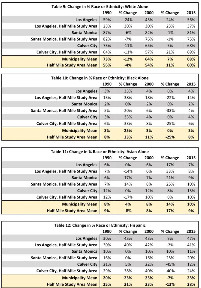
Table 9: Change in % Race or Ethnicity: White Alone
1990 % Change 2000 % Change 2015
Los Angeles 59% -24% 45% 24% 56%
Los Angeles, Half Mile Study Area 23% 30% 30% 23% 37%
Santa Monica 87% -6% 82% -1% 81%
Santa Monica, Half Mile Study Area 82% -7% 76% -1% 75%
Culver City 73% -11% 65% 5% 68%
Culver City, Half Mile Study Area 64% -11% 57% 21% 69%
Municipality Mean 73% -12% 64% 7% 68%
Half Mile Study Area Mean 56% -4% 54% 11% 60%
Table 10: Change in % Race or Ethnicity: Black Alone
1990 % Change 2000 % Change 2015
Los Angeles 3% 33% 4% 0% 4%
Los Angeles, Half Mile Study Area 13% 38% 18% -22% 14%
Santa Monica 2% 0% 2% 0% 2%
Santa Monica, Half Mile Study Area 5% 20% 6% -33% 4%
Culver City 3% 33% 4% 0% 4%
Culver City, Half Mile Study Area 6% 33% 8% -25% 6%
Municipality Mean 3% 25% 3% 0% 3%
Half Mile Study Area Mean 8% 33% 11% -25% 8%
Table 11: Change in % Race or Ethnicity: Asian Alone
1990 % Change 2000 % Change 2015
Los Angeles 6% 0% 6% 17% 7%
Los Angeles, Half Mile Study Area 7% -14% 6% 33% 8%
Santa Monica 6% 17% 7% 21% 9%
Santa Monica, Half Mile Study Area 7% 14% 8% 25% 10%
Culver City 12% 0% 12% 8% 13%
Culver City, Half Mile Study Area 12% -17% 10% 0% 10%
Municipality Mean 8% 4% 8% 14% 10%
Half Mile Study Area Mean 9% -8% 8% 17% 9%
Table 12: Change in % Race or Ethnicity: Hispanic
1990 % Change 2000 % Change 2015
Los Angeles 30% 43% 43% 9% 47%
Los Angeles, Half Mile Study Area 30% 40% 42% -2% 41%
Santa Monica 10% 0% 10% 10% 11%
Santa Monica, Half Mile Study Area 16% 0% 16% 25% 20%
Culver City 21% 5% 22% -45% 12%
Culver City, Half Mile Study Area 29% 38% 40% -40% 24%
Municipality Mean 20% 23% 25% -7% 23%
20
The above tables show race and ethnicity trends for the areas surrounding the Expo Line across all three time periods.9 Analyzing the changes in race and ethnicity looking at pre- and post-project, the most obvious changes are those that took place between 2000 and 2015. The half mile study areas in Los Angeles consist of block groups that are all majority minority. However, the Los Angeles half mile station areas appear to be shifting: In 2000, White alone made up 30% of the population and by 2015, they represented 37% of the population. Black alone decreased from 18% to 14%, Hispanic decreased from 42% to 41%, and Asian increased from 6% to 8%. Santa Monica was overwhelming White Alone in 2000, 82% and 76% respectively in the city and station areas, and that remained nearly the same in 2015, with each geography gaining one additional percentage point. All other groups in Santa Monica still make up only a very small proportion of the population; but in general the station areas in Santa Monica are more ethnically and racially more diverse than the city as a whole.
Culver City had the most substantial change. In 2000, the Culver City half mile station areas were 57%, but 69% by 2015. At the same time, the half mile station area fell from 8% Black Alone to 6% Black Alone and 40% Hispanic to 24% Hispanic. In other words, the areas closest to the Culver City station saw a huge influx of people identifying as White alone and, knowing that population density decreased between 2000 and 2015 in the Culver City station area, it is unlikely that the large influx of people identifying as White Alone were attracted only to new developments, but to existing housing inventory. Combine a decrease in population density in the Culver City station area with a 45% increase in median gross rent between 2000 and 2015, a 32% increase in income, and a decrease in the number of residents under 18 years old and the evidence indicates that the Culver City station area saw significant out-migration of lower-income, mostly Hispanic households between 2000 and 2015. And, given that Culver City in general saw a decrease in Hispanic population from 22% to 12% between 2000 and 2015, it is unlikely that those displaced households relocated elsewhere in Culver City. In summary, in terms of neighborhood change along ethnic and/or race lines, it is clear that residents identifying as Hispanic made way for residents identifying as White alone, non-Hispanic, and that those new residents were higher-earning and were less likely to have children in the home.
9 Between 1990 and 2000, the Census changed the questionnaire from “mark one box” for race, to “mark one or
21 B. Minneapolis-St. Paul Metro Transit, Green Line
The Metro Transit Green Line (Green Line) is one of two local light rail lines in the Twin Cities. It opened in 2014. The line operates at-grade, connecting downtown Minneapolis with downtown Saint Paul, travelling 11 miles. In downtown Minneapolis, the Green Line meets the Metro Transit Blue Line and travels through the same corridor to the combined lines’ terminus on the western edge of downtown Minneapolis. Counting the stations the Green Line shares with the Blue Line, the Green Line has 23 stations. The line passes through two municipalities, Minneapolis, in which there are 9 stations, and St. Paul, in which there are 14 stations.
23
Table 13: Census 1990 % 18 and Younger % 65 and Over % White Alone % Black Alone % Asian Alone Hispanic % Median Income Home Value Median Population Density Gross Rent Median
Minneapolis 21% 11% 90% 5% 2% 2% $ 49,115 $ 118,001 8,029 $ 818
Minneapolis, Half Mile Study Area 4% 5% 85% 7% 3% 2% $ 30,123 $ 153,250 6,713 $ 683
St. Paul 24% 12% 91% 3% 3% 3% $ 51,155 $ 118,559 7,658 $ 756
St. Paul, half Mile Study Area 24% 11% 78% 11% 4% 3% $ 39,099 $ 107,801 7,600 $ 702
Municipal Mean 23% 12% 91% 4% 3% 3% $ 50,135 $ 118,280 7,844 $ 787
Half Mile Study Mean 14% 8% 82% 9% 4% 3% $ 34,611 $ 130,526 7,157 $ 693
Table 14: Census 2000 % 18 and Younger % 65 and Over % White Alone % Black Alone % Asian Alone Hispanic % Median Income Home Value Median Population Density Gross Rent Median
Minneapolis 21% 8% 77% 9% 4% 4% $ 56,089 $ 144,017 8,072 $ 851
Minneapolis, Half Mile Study Area 4% 3% 71% 11% 5% 3% $ 31,238 $ 157,893 10,995 $ 741
St. Paul 26% 9% 75% 7% 5% 5% $ 58,834 $ 135,755 7,846 $ 794
St. Paul, half Mile Study Area 26% 8% 63% 19% 8% 5% $ 48,026 $ 123,640 7,869 $ 745
Municipal Mean 24% 9% 76% 8% 5% 5% $ 57,462 $ 139,886 7,959 $ 823
Half Mile Study Mean 15% 6% 67% 15% 7% 4% $ 39,632 $ 140,767 9,432 $ 743
Table 15: ACS 2011-2015 % 18 and
Younger
% 65 and Over
% White Alone
% Black Alone
% Asian Alone
% Hispanic
Median Income
Median Home Value
Population Density
Median Gross Rent
Minneapolis 21% 8% 76% 9% 3% 4% $ 56,537 $ 190,800 8,283 $ 921
Minneapolis, Half Mile Study Area 5% 4% 66% 10% 8% 3% $ 42,308 $ 197,800 11,847 $ 957
St. Paul 24% 8% 68% 9% 7% 6% $ 52,543 $ 161,500 7,567 $ 905
St. Paul, half Mile Study Area 21% 7% 66% 18% 6% 5% $ 50,370 $ 161,800 7,861 $ 907
Municipal Mean 23% 8% 72% 9% 5% 5% $ 54,540 $ 176,150 7,925 $ 913
24
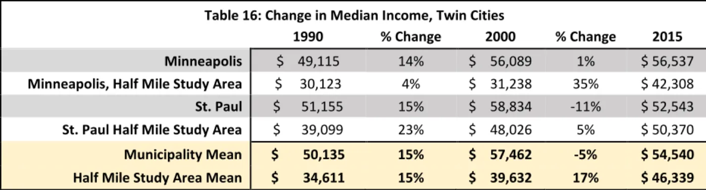
Table 16: Change in Median Income, Twin Cities
1990 % Change 2000 % Change 2015
Minneapolis $ 49,115 14% $ 56,089 1% $ 56,537
Minneapolis, Half Mile Study Area $ 30,123 4% $ 31,238 35% $ 42,308
St. Paul $ 51,155 15% $ 58,834 -11% $ 52,543
St. Paul Half Mile Study Area $ 39,099 23% $ 48,026 5% $ 50,370
Municipality Mean $ 50,135 15% $ 57,462 -5% $ 54,540
Half Mile Study Area Mean $ 34,611 15% $ 39,632 17% $ 46,339
Change in median income in the Twin Cities was less pronounced than it was in the Los Angeles area, though it was still highly varied. In the 1990s, incomes rose across the board. Between 2000 and 2015, the pre- and post-Green Line time periods, the half mile station study areas fared better than the municipalities. In particular, the Minneapolis half mile study area saw a 35% increase, while the city median increase was only 1%. In St. Paul, the station area saw a modest 5% increase in median household income between 2000 and 2015 but the city as a whole saw a decrease of over 10%. However, in both Minneapolis and St. Paul the median household income was lower in the half mile station area than in the municipality as a whole.
Table 17: Change in Median Home Value, Twin Cities
1990 % Change 2000 % Change 2015
Minneapolis $ 118,001 22% $ 144,017 32% $ 190,800
Minneapolis, Half Mile Study Area $ 153,250 3% $ 157,893 25% $ 197,800
St. Paul $ 118,559 15% $ 135,755 19% $ 161,500
St. Paul Half Mile Study Area $ 107,801 15% $ 123,640 31% $ 161,800
Municipality Mean $ 118,280 18% $ 139,886 26% $ 176,150
Half Mile Study Area Mean $ 130,526 8% $ 140,767 28% $ 179,800
25 In St. Paul, home values at the municipal level and within the half mile station areas grew at identical rates during the 1990s, with each appreciating by 15%. Between 2000 and 2015, the half mile station areas far out-performed the city of St. Paul. The city as a whole gained 19% but during the same time period the half mile station area saw a 31% increase in value, rising to almost identically match the city median home value. This disproportional growth in home values is clear in St. Paul half mile station areas and is consistent with what one would expect to find based on what the literature regarding property values in proximity to transit.
Table 18: Change in Population Density (per square mile), Twin Cities
1990 % Change 2000 % Change 2015
Minneapolis 8,029 1% 8,072 3% 8,283
Minneapolis, Half Mile Study Area 6,713 64% 10,995 8% 11,847
St. Paul 7,658 2% 7,846 -4% 7,567
St. Paul Half Mile Study Area 7,600 4% 7,869 0% 7,861
Municipality Mean 7,844 1% 7,959 0% 7,925
Half Mile Study Area Mean 7,157 32% 9,432 4% 9,854
In the Twin Cities, population densities, in general, are less than in any of the other case study regions. Only Minneapolis half mile block groups increased dramatically during the 1990s, increasing by over 60%. Because the Green Line travels through the University of Minnesota and downtown Minneapolis, the substantial change in density during the 1990s is likely a reflection of growth in those two areas. Saint Paul remained basically static, with less than 5% change in estimated population density in the 1990s. Between 2000 and 2015, Minneapolis station areas saw much slower population density growth compared with the 1990s; however, there was more growth in the Minneapolis half mile study area compared to the city as a whole but the magnitude of those changes is small at 3% and 8% increases, respectively. Similarly, Saint Paul saw insignificant changes in population density between 2000 and 2015.
Table 19: Change in Median gross rent (in 2015 Dollars), Twin Cities
1990 % Change 2000 % Change 2015
Minneapolis $ 818 4% $ 851 8% $ 921
Minneapolis, Half Mile Study Area $ 683 8% $ 741 29% $ 957
St. Paul $ 756 5% $ 794 14% $ 905
St. Paul Half Mile Study Area $ 702 6% $ 745 22% $ 907
Municipality Mean $ 787 5% $ 823 11% $ 913
26 The Twin Cities show the most definitive changes over time in median gross rent. There were small changes in median gross rent during the 1990s at both the municipal level and at the station study areas; however, these changes were relatively small during the 1990s, with a range of 4% to 8% growth in median gross rent across all geographies. Between 2000 and 2015, the municipalities saw more substantial increases in median gross rent of 8% in Minneapolis and 14% in St. Paul, but the station study areas saw increases of 29% and 22% respectively. This is a marked increase in median gross rent compared with the municipalities over the same time period and compared with the 1990s.
In both cities and at both geographies, the median gross rent for the half mile station study area remains relatively similar to the city median. In Minneapolis, in both 1990 and 2000, median gross rent in the half mile station areas was between $135 and $110 less per month than the city in general, respectively. However, the poles reversed between 2000 and 2015, with the station area surpassing that of the city in general, resulting in what appears to be a roughly $30 per month premium for rental units located within the half mile study area. The trend in St. Paul is similar. In both 1990 and 2000, half mile station area median gross rents are about $50 less per month. But by 2015, the half mile station areas in St. Paul had caught up to the city median.
The Twin Cities clearly illustrate the catch-22 that will be explored more fully in later in this paper. After building a new piece of high-quality transit infrastructure linking neighborhoods in the Twin Cities, previously below-median areas with relatively affordable rents saw rents rise dramatically, even surpassing city medians. While this is great for attracting new private investment into station areas where low rents made private investment unfeasible, it simultaneously puts pressure on middle to low-income households seeking lower rents.
Below are race and ethnicity tables for the Twin Cities:
Table 20: Change in Percent of Race or Ethnicity: White Alone, Twin Cities
1990 % Change 2000 % Change 2015
Minneapolis 90% -14% 77% -1% 76%
Minneapolis, Half Mile Study Area 85% -16% 71% -7% 66%
St. Paul 91% -18% 75% -9% 68%
St. Paul Half Mile Study Area 78% -19% 63% 5% 66%
Municipality Mean 91% -16% 76% -5% 72%
27 Table 22: Change in Percent of Race or Ethnicity: Asian Alone, Twin Cities
1990 % Change 2000 % Change 2015
Minneapolis 2% 100% 4% -25% 3%
Minneapolis, Half Mile Study Area 3% 67% 5% 60% 8%
St. Paul 3% 67% 5% 40% 7%
St. Paul Half Mile Study Area 4% 100% 8% -25% 6%
Municipality Mean 3% 80% 5% 11% 5%
Half Mile Study Area Mean 4% 86% 7% 8% 7%
Table 23: Change in Percent Race or Ethnicity: Hispanic, Twin Cities
1990 % Change 2000 % Change 2015
Minneapolis 2% 100% 4% 0% 4%
Minneapolis, Half Mile Study Area 2% 50% 3% 0% 3%
St. Paul 3% 67% 5% 20% 6%
St. Paul Half Mile Study Area 3% 67% 5% 0% 5%
Municipality Mean 3% 80% 5% 11% 5%
Half Mile Study Area Mean 3% 60% 4% 0% 4%
Changes in race and/or ethnicity in the Twin Cities is less pronounced than in some of the other regions studied in this paper. The Twin Cities are majority White alone, though since 1990, the percentage of people identifying as White alone has decreased steadily with the exception of the St. Paul half mile study area which saw a slight increase in the percentage of the population identifying as White alone between 2000 and 2015, growing from 63% to 66%. However, during that same 25-year time period, St. Paul dropped from 91% White alone to 68%, so the half mile station area is still similar to the city as a whole in terms of its proportion of residents that identify as White alone.
Looking specifically the at the self-identified race and/or ethnicity of the people living within the half mile study areas, there was no change in the percentage of population identifying as Hispanic of any race between 2000 and 2015. Minneapolis half mile study areas saw an increase
Table 21: Change in Percent of Race or Ethnicity: Black Alone, Twin Cities
1990 % Change 2000 % Change 2015
Minneapolis 5% 80% 9% 0% 9%
Minneapolis, Half Mile Study Area 7% 57% 11% -9% 10%
St. Paul 3% 133% 7% 29% 9%
St. Paul Half Mile Study Area 11% 73% 19% -5% 18%
Municipality Mean 4% 100% 8% 13% 9%
28 in residents identifying as Asian alone, while the St. Paul half mile study areas saw a decrease in the same timeframe. Both the Minneapolis and St. Paul half mile study areas saw a 1% decrease in the percentage of the population identifying as Black alone. In summary, it does not appear that there were any large or disproportional shifts in Race or Ethnic groups within the half mile study areas of either the Minneapolis or St. Paul; however, that does not mean that impacts should be considered more precisely in future research.
C. Denver, W Line
The Regional Transportation District (RTD) in Denver, Colorado, opened the West Rail Line (W Line) in 2013. The line is mostly at-grade with a few areas of elevated crossings over major roads. It is roughly 12 miles long and has 11 stations. The line passes through three municipalities: Denver, Lakewood, and Golden. Similar to the Green Line in the Twin Cities, the W Line joins an alignment used by two pre-existing rail lines near downtown Denver, overlapping for 4 stations. In total, Denver has the majority of stations with 8, Lakewood has 6 and Golden 1. The W Line connects downtown Denver with many of its suburban neighbors to the west. A figure of the rail alignment and block group study area is presented below.
29
30
Table 24: Census 1990 % 18 and Younger % 65 and Over % White Alone % Black Alone % Asian Alone Hispanic % Median Income Home Value Median Population Density Gross Rent Median
Denver 22% 13% 81% 3% 1% 12% $ 43,929 $ 130,311 6,553 $ 758
Denver, Half Mile Study Area 33% 10% 52% 2% 2% 61% $ 29,056 $ 101,998 6,732 $ 594
Lakewood 22% 11% 94% 1% 2% 7% $ 66,394 $ 155,987 4,380 $ 867
Lakewood, Half Mile Study Area 20% 15% 93% 1% 2% 8% $ 46,951 $ 153,877 4,167 $ 749
Golden 18% 12% 96% 1% 1% 4% $ 49,968 $ 153,700 3,492 $ 747
Golden, Half Mile Study Area 17% 12% 96% 1% 1% 5% $ 48,622 NA 1,100 $ 784
Municipality Mean 21% 12% 90% 2% 1% 8% $ 53,430 $ 146,666 4,808 $ 791
Half Mile Study Area Mean 23% 12% 80% 1% 2% 25% $ 41,543 $ 127,938 4,000 $ 709
Table 25: Census 2000 % 18 and Younger % 65 and Over % White Alone % Black Alone % Asian Alone Hispanic % Median Income Median Home Value Population Density Gross Rent Median
Denver 21% 9% 73% 3% 2% 19% $ 55,648 $ 223,735 7,083 $ 932
Denver, Half Mile Study Area 32% 7% 52% 2% 1% 70% $ 45,082 $ 163,223 9,221 $ 827
Lakewood 22% 13% 89% 1% 2% 11% $ 69,304 $ 231,445 4,722 $ 1,060
Lakewood, Half Mile Study Area 21% 11% 86% 2% 2% 12% $ 60,184 $ 222,702 4,966 $ 886
Golden 19% 10% 93% 1% 2% 7% $ 61,966 $ 252,649 3,849 $ 1,001
Golden, Half Mile Study Area 19% 9% 92% 1% 2% 9% $ 52,492 $ 240,945 1,526 $ 1,077
Municipality Mean 21% 11% 85% 2% 2% 12% $ 62,306 $ 235,943 5,218 $ 998
Half Mile Study Area Mean 24% 9% 77% 2% 2% 30% $ 52,586 $ 208,957 5,238 $ 930
Table 26: 2011-2015 ACS % 18 and
Younger
% 65 and Over % White Alone % Black Alone % Asian Alone % Hispanic Median Income Median Home Value Population Density Median Gross Rent
Denver 19% 10% 83% 3% 2% 17% $ 54,702 $ 263,900 7,473 $ 944
Denver, Half Mile Study Area 17% 7% 81% 3% 1% 30% $ 43,787 $ 161,200 8,199 $ 1,018
Lakewood 19% 15% 90% 0% 2% 17% $ 64,722 $ 281,500 4,568 $ 1,240
Lakewood, Half Mile Study Area 19% 13% 87% 1% 1% 24% $ 52,097 $ 279,050 3,959 $ 1,215
Golden 16% 8% 92% 0% 1% 9% $ 66,166 $ 213,300 4,059 $ 943
Golden, Half Mile Study Area 20% 8% 93% 2% 2% 22% $ 69,703 $ 210,000 1,857 $ 886
Municipality Mean 18% 11% 88% 1% 2% 14% $ 61,863 $ 252,900 5,367 $ 1,042
31
Table 27: Change in Median Income
1990 % Change 2000 % Change 2015
Denver $ 43,929 27% $ 55,648 -2% $ 54,702
Denver, Half Mile Study Area $ 29,056 55% $ 45,082 -3% $ 43,787
Lakewood $ 66,394 4% $ 69,304 -7% $ 64,722
Lakewood, Half Mile Study Area $ 46,951 28% $ 60,184 -13% $ 52,097
Golden $ 49,968 24% $ 61,966 7% $ 66,166
Golden, Half Mile Study Area $ 48,622 8% $ 52,492 33% $ 69,703
Municipality Mean $ 53,430 17% $ 62,306 -1% $ 61,863
Half Mile Study Area Mean $ 41,543 27% $ 52,586 5% $ 55,196
Like Los Angeles and the Twin Cities, incomes grew substantially in the 1990s. The Denver half mile station area saw the largest increase in median income throughout the 1990s, but by 2000 the median household income in the half mile station area in Denver was still over $10,000 below the city’s median household income. Both Denver geographies saw small decreases in median household income between 2000 and 2015. In Lakewood in the 1990s, half mile station areas experienced substantial increase in median household income but still remained well below the city’s median. Both the half mile station areas and the city experienced a decline in household income between 2000 and 2015, but the half mile station areas were hit harder, declining 13% versus the city’s 7%. The city and station areas around Golden were the outliers regarding median household income. The city of Golden saw median household incomes increase by 24% in the 1990s, and then rise another 7% between 2000 and 2015. The station area in Golden saw only a small increase during the 1990s, gaining 8%, but a major increase between 2000 and 2015, with the station areas surpassing the city’s median household income. This could be due, in part, to Golden’s largely density development. There may have been significant growth in low-density residential between 2000 and 2015 that attracted higher-income homeowners to the area.
Table 28: Change in Home Value
1990 % Change 2000 % Change 2015
Denver $ 130,311 72% $ 223,735 18% $ 263,900
Denver, Half Mile Study Area $ 101,998 60% $ 163,223 -1% $ 161,200
Lakewood $ 155,987 48% $ 231,445 22% $ 281,500
Lakewood, Half Mile Study Area $ 153,877 45% $ 222,702 25% $ 279,050
Golden $ 153,700 64% $ 252,649 -16% $ 213,300
Golden, Half Mile Study Area NA NA $ 240,945 -13% $ 210,000
Municipality Mean $ 146,666 61% $ 235,943 7% $ 252,900
32 In the 1990s, Denver had significant increases in median home value in every geography. Between 2000 and 2015 changes in median home values were varied. In the city of Denver, median home values continued to rise during the 2000s, appreciating 18%, while the half-mile station area median home values declined by 1% after gaining 60% during the 1990s. Lakewood saw nearly identical rates of median home value growth in the 1990s and between 2000 and 2015. Unfortunately, there was insufficient data for the Golden half mile study in 1990, but there were similar orders of decline between 2000 and 2015 for both the city of Golden and the Golden half mile study areas. In summary, there was a lot of movement in median home values throughout the W Line corridor; however, the impacts varied widely and it is difficult to parse out the impacts of the 2008 Recession from the impacts of the W Line.
Table 29: Change in Population Density (per square mile)
1990 % Change 2000 % Change 2015
Denver 6,553 8% 7,083 6% 7,473
Denver, Half Mile Study Area 6,732 37% 9,221 -11% 8,199
Lakewood 4,380 8% 4,722 -3% 4,568
Lakewood, Half Mile Study Area 4,167 19% 4,966 -20% 3,959
Golden 3,492 10% 3,849 5% 4,059
Golden, Half Mile Study Area 1,100 39% 1,526 22% 1,857
Municipality Mean 4,808 9% 5,218 3% 5,367
Half Mile Study Area Mean 4,000 31% 5,238 -11% 4,672
Change in population density throughout the W Line corridor and in the Denver region in general are highly varied as well. Like household incomes, there were increases in density across the board throughout the 1990s, though the magnitudes varied dramatically. As is the case in other regions, population density estimates in this report are indicative of either a significant increase in real estate growth or a shift in the household types moving into an area, or both.
33 Table 30: Change in Median Gross Rent
1990 % Change 2000 % Change 2015
Denver $ 758 23% $ 932 1% $ 944
Denver, Half Mile Study Area $ 594 39% $ 827 23% $ 1,018
Lakewood $ 867 22% $ 1,060 17% $ 1,240
Lakewood, Half Mile Study Area $ 749 18% $ 886 37% $ 1,215
Golden $ 747 34% $ 1,001 -6% $ 943
Golden, Half Mile Study Area $ 784 37% $ 1,077 -18% $ 886
Municipality Mean $ 791 26% $ 998 4% $ 1,042 Half Mile Study Area Mean $ 709 31% $ 930 12% $ 1,040
In the Denver region, similar trends emerge with regard to median gross rent, with the exception of the city of Golden. One would expect to see disproportional increases in median gross rent in the station areas between 2000 and 2015. Indeed, the station study areas in Denver and Lakewood did see disproportional increases in median gross rent between 2000 and 2015. Like the Twin Cities and LA region, median gross rents in the station study areas were well-below the city median in 2000 but were roughly the same or higher than the city median in 2015.
34 Table 31: Change in Percentage of Race or Ethnicity: White Alone
1990 % Change 2000 % Change 2015
Denver 81% -10% 73% 14% 83%
Denver, Half Mile Study Area 52% 0% 52% 56% 81%
Lakewood 94% -5% 89% 1% 90%
Lakewood, Half Mile Study Area 93% -8% 86% 1% 87%
Golden 96% -3% 93% -1% 92%
Golden, Half Mile Study Area 96% -4% 92% 1% 93%
Municipality Mean 90% -6% 85% 4% 88%
Half Mile Study Area Mean 80% -5% 77% 13% 87%
Table 32: Change in Percentage of Race or Ethnicity: Black Alone
1990 % Change 2000 % Change 2015
Denver 3% 0% 3% 0% 3%
Denver, Half Mile Study Area 2% 0% 2% 50% 3%
Lakewood 1% 0% 1% -100% 0%
Lakewood, Half Mile Study Area 1% 100% 2% -50% 1%
Golden 1% 0% 1% -100% 0%
Golden, Half Mile Study Area 1% 0% 1% 100% 2%
Municipality Mean 2% 0% 2% -40% 1%
Half Mile Study Area Mean 1% 25% 2% 20% 2%
Table 33: Change in Percentage Race or Ethnicity: Asian Alone
1990 % Change 2000 % Change 2015
Denver 1% 100% 2% 0% 2%
Denver, Half Mile Study Area 2% -50% 1% 0% 1%
Lakewood 2% 0% 2% 0% 2%
Lakewood, Half Mile Study Area 2% 0% 2% -50% 1%
Golden 1% 100% 2% -50% 1%
Golden, Half Mile Study Area 1% 100% 2% 0% 2%
Municipality Mean 1% 50% 2% -17% 2%
Half Mile Study Area Mean 2% 0% 2% -20% 1%
Table 34: Change in Percentage Race or Ethnicity: Hispanic
1990 % Change 2000 % Change 2015
Denver 12% 58% 19% -11% 17%
Denver, Half Mile Study Area 61% 15% 70% -57% 30%
Lakewood 7% 57% 11% 55% 17%
Lakewood, Half Mile Study Area 8% 50% 12% 100% 24%
Golden 4% 75% 7% 29% 9%
Golden, Half Mile Study Area 5% 80% 9% 144% 22%
Municipality Mean 8% 61% 12% 16% 14%
35 Like the Twin Cities, the Denver region is largely made up of residents who identify as White alone. Denver is the most racially and ethnically diverse of the three cities through which the W Line passes and in 2015 over 80% of residents in the city of Denver and the half mile station areas identified as White alone. The percentages of residents identifying as Asian alone or Black alone makes up such a small percentage of the population, less than 5% of the population in each of the cities and in each geography, that the data on those two groups is difficult to analyze. Certainly, attention should be paid to underrepresented groups of any race or ethnicity; however, given the restraints of the data being used on this project, it is not possible to explore more fully how these small minority groups were impacted over time. This is an area that future research on the W Line and local rail service in general should pursue more vigorously than I have the capacity to do here.
Residents identifying as Hispanic reveal some very significant shifts over time. All the cities and both the half mile station areas and the cities in general saw very significant increases in populations identifying as Hispanic throughout the 1990s. Perhaps the most interesting trend between the 2000 and 2015 is what occurred in both the city of Denver and the half mile station areas within Denver. Between 2000 and 2015, the city of Denver saw a 2% decline in the percentage of the population identifying as Hispanic, from 19% to 17%. At the same time, Lakewood saw its Hispanic population increase from 11% to 17% and Golden saw its Hispanic population increase from 7% to 9%. By far the biggest change in Hispanic population is the half mile station areas in Denver, which went from 70% Hispanic in 2000 to 30% Hispanic in 2015. Knowing that Asian alone and Black alone households make up such a small proportion of the population in both Denver and the half mile study areas in Denver, it is safe to say that the people who filled vacancies left behind by the out-going Hispanic population were primarily people identifying as non-Hispanic, White alone. Whether these people left voluntarily or found themselves squeezed out by the increase in rents in the Denver half mile station areas, which increased 28% between 2000 and 2015, is uncertain.
36 2015 in Golden, the Hispanic population increased from 7% to 9% and in the Golden half mile study areas the Hispanic population grew even more dramatically, from 9% to 22%. Like Culver City, California, it appears that the group that saw the most significant changes, were places with high numbers of residents identifying as Hispanic.
D. Seattle, Link/ULink Light Rail