Praise for
Vector Basic Training
“ The problem with vector images today is that I hate most of them! Mainly because something dies between the drawing and the precision vector graphic version. Perhaps it’s the illustration’s soul lost in the transition? Most vector images today contain too many cyber-slick gradations, they are too mathematically perfect, like many of the billions of images populating millions of microstock sites that lack anything real and human. If Von’s book can help improve a designer’s ability to create better vector images, I’m all for it. And remember: Just because you can make everything a gradation doesn’t mean you should make everything a gradation.”
— Charles anderson, CSA Design
“ With Vector Basic Training, Von Glitschka shames me. And I thank him for it. He reminds me that I am walking a tightrope of forsaking my first love: draw-ing. Von approaches the process with an honor and reverence that emerges from a tradition rooted in art as much as design. His depth of thought, trained hand, and ability to art direct himself has produced a stunning body of work and he brings it all home in VBT to share with the reader. That’s the thing with Von—not only is he a powerful talent, he’s gracious enough to share it all. I’ll
be keeping my copy of VBT next to my Mac and, yes, my sketchpad.”
— Terry Marks, TMARKS Design
“ Von’s experience as an award-winning ‘illustrative designer’ enables him to provide a valuable methodology for creating vector artwork guaranteed to produce results for every designer.”
— earl Gee, Creative Director, Gee + Chung Design
“ As president of the School of Advertising Art (saa), I would like to thank Von for writing this book. Young designers need to understand the power of the drawing process, and they need to know that time spent sketching before jumping to the computer is time well spent on any project. Von clearly dem-onstrates this philosophy throughout the book by incorporating interesting visual examples of his work. I am excited to share Vector Basic Training with SAA students.”
A SYSTEMATIC CREATIVE PROCESS
FOR BUILDING PRECISION VECTOR ARTWORK
F R O M T H E D E P A R T M E N T O F I L L U S T R AT I V E D E S I G N
DEVELOPED & WRITTEN BY
Vector Basic training:
a systematic creative Process for Building Precision Vector artwork
Von glitschka
New Riders 1249 Eighth Street Berkeley, CA 94710 510/524-2178 510/524-2221 (fax)
Find us on the Web at: www.newriders.com
To report errors, please send a note to [email protected] New Riders is an imprint of Peachpit, a division of Pearson Education. Copyright © 2011 by Glitschka Studios
Project Editor: Nikki Echler McDonald Development Editor: Cathy Fishel-Lane Production Editor: Tracey Croom Proofreader: Liz Welch
Indexer: Ken Della Penta Cover Design: Von Glitschka
Composition and Interior Design: Kim Scott, Bumpy Design Media Producer: Eric Geoffroy
Video Producer: Mary Sweeney
notice of rights
All rights reserved. No part of this book may be reproduced or transmitted in any form by any means, electronic, mechanical, photocopying, recording, or otherwise, without the prior written permission of the publisher. For information on getting permission for reprints and excerpts, contact [email protected].
notice of Liability
The information in this book is distributed on an “As Is” basis without warranty. While every precaution has been taken in the preparation of the book, neither the author nor Peachpit shall have any liability to any person or entity with respect to any loss or damage caused or alleged to be caused directly or indirectly by the instructions contained in this book or by the computer software and hardware products described in it.
trademarks
Many of the designations used by manufacturers and sellers to distinguish their products are claimed as trademarks. Where those designations appear in this book, and Peachpit was aware of a trademark claim, the designations appear as requested by the owner of the trademark. All other product names and services identified throughout this book are used in editorial fashion only and for the benefit of such companies with no intention of infringement of the trademark. No such use, or the use of any trade name, is intended to convey endorsement or other affiliation with this book.
ISBN 13: 978-0-321-74959-8 ISBN 10: 0-321-74959-6 9 8 7 6 5 4 3 2 1
To my two wonderful daughters, Savannah and Alyssa.
You both inspire me in such unique and funny ways at times.
I love when you two make me laugh, and seeing you both
exercise your creativity is a joy to my heart. I love you both so
very much, and I look forward to seeing you both grow up into
acknowledgements
The first and foremost person I need to thank is my lovely wife Rebecca. Her understanding and support for my work over the years is a living demonstration of caring patience and wisdom. I’ve spent many months writing this book and numerous late-night creative ses-sions compiling its content, and she graciously supported me every step of the way. Love you, Becky!
When I was first approached by Peachpit acquisitions editor Nikki “The Whip” McDonald to write a book, I wasn’t sure if the project was a good fit for me, or for Peachpit. After wres-tling with the idea, I initially turned it down. But Nikki, being a relentless and gentle persuader, encouraged me to reconsider. She also listened to my concerns and provided both answers and a shared vision. I couldn’t be happier with the end result. Thanks, Nikki.
There is only one person who has shown me more about English than Cathy “Soothsayer” Fishel-Lane, and that would be my high school English teacher Mr. Parsons. Unfortunately, I spent most of my time drawing in his class. So I’m very thankful to have a rock star editor like Cathy performing textual plastic surgery on my bad grammar and improper use of indus-try nomenclature. Thanks for making me read smarter than I sound in real life, Cathy.
When it comes to the technical aspects of video production, I’m about as informed as a small neck clam. The guidance and coaching I received from Mary “Zapruder” Sweeney made
the work as painless as possible, so thank you for your dedication and help. I appreciate it.
A big techno thank you also goes to colleague Jean-Claude “Van Damme” Tremblay, whose expert tech-editing and suggestions improved the accuracy of what you’ll be reading. Thanks, Jean-Claude.
To everyone else on the Peachpit team, includ-ing design manager Charlene Will, production editor Tracey Croom, and designer Kim Scott: You have a well-thought-out process that made working with you not only easy, but precise. My OCD tendencies thank you. And knowing that Peachpit prints the vast majority of its books, including this one, here in the United States, is just icing on the publishing cake.
To my fellow design friends with whom I shared as I created this book (you know who you are): Thank you for your willing feedback and sug-gestions at critical times. It helped me break through mental walls and keep moving forward on this project.
about the author
Von Glitschka is principal of Glitschka Studios and has worked in the communication arts industry for over 23 years. His work reflects the symbiotic relationship between design and illustration. This duality of skills within his own creative arsenal inspired him to coin the phrase and title “Illustrative Designer.”
In 2002, Glitschka founded Glitschka Studios, a multi-disciplinary cre-ative firm. The studio shines as a hired gun for ad agencies, medium-to-large design firms, and in-house corporate art departments working on a diverse range of illustrative design projects.
His exuberant graphics have garnered numerous design and illustration
awards and have appeared in such publications as Communication Arts,
Print, HOW, Society of Illustrators annuals, Graphis, American Illustra-tion books, and LogoLounge II, III, IV, V, and VI.
Glitschka has spoken nationally at the HOW Design Conference, Adobe MAX Conference, The Illustration Conference (ICON), AIGA chapter events, ADFED groups, design schools, in-house art departments, and marketing groups.
His mix of humor, inspiration, great design, and solid creative methodol-ogy are all part of his presentation productions, which always draw a large following.
Glitschka works out of his home studio in the Pacific Northwest (Land of Bigfoot) and can usually be found spending an unhealthy amount of time on Twitter conversing in all manner of witty banter and sarcasm. Follow him at @vonster or visit his website at www.vonglitschka.com.
CONTENTS
INTRODUCTION . . . .xi
CHAPTER 1 BézIER CURVES: A BRIEF HISTORY . . . . 1
Fear of Math . . . .2
Who Created Bézier Curves? . . . .3
What Is a Bézier Curve? . . . .6
Design Drills: Behind the Vector Curtain . . . 11
CHAPTER 2 YOUR CREATIVE ARMAMENT . . . . 15
A Love-Hate Relationship . . . 16
Core Tools for Vector Building . . . 17
Customize Your Environment. . . . 26
Stop Re-creating the Wheel. . . . 29
Design Drills: Deconstructing Design . . . . 35
CHAPTER 3 ANALOG METHODS IN A DIGITAL AGE . . . . 41
Don’t Be a Tooler . . . . 42
I Get Paid to Draw . . . . 43
Concepts and Ideas . . . .44
Analog Tools . . . . 45
The Lost Art of Thumbnailing. . . . 45
Refine Your Drawing . . . . 49
Systematic and Creative . . . . 57
CHAPTER 4 GETTING TO THE POINTS . . . . 71
The Good Anchor Point and Path . . . . 72
The Bad Anchor Point and Path . . . . 74
The Ugly Anchor Point and Path . . . . 75
A Scrutinizing Eye . . . . 76
A Good Example . . . .80
Design Drills: Vector Skeletons . . . . 83
CHAPTER 5 SHAPE SURVEILLANCE . . . . 87
The Clockwork Method . . . .88
Prime Point Placement. . . . 100
Deconstructing the Vector Monster. . . . 108
Progressive Improvements . . . . 112
Design Drills: Spotting Clocks. . . .113
CHAPTER 6 VECTOR BUILD METHODS . . . .117
Point-by-Point Method. . . 120
Shape-Building Method . . . 126
BetterHandles Plug-in . . . 134
E Pluribus Buildum . . . 136
Symmetry Is Your Friend . . . 139
A Healthy Creative Process. . . 145
Design Drills: Fast and Easy . . . 147
CHAPTER 7 STYLE APPROPRIATE . . . 151
Design Chameleons . . . 152
x C O N T E N T S
CHAPTER 8 ART DIRECTING YOURSELF . . . 181
Fresh Eyes Effect . . . 182
Your Inner Art Director . . . 185
Avoid Visual Tension . . . 189
Full-Tilt Creative Boogie . . . 194
Design Drills: Hop to It . . . 195
CHAPTER 9 GOOD CREATIVE HABITS . . . 201
Doodle Binders . . . . 203
Layers Are Your Friend . . . . 205
Colors and File Naming . . . 219
Last, But Not Least . . . 221
Design Drills: Top-Eight List . . . . 223
INDEx . . . 231
Introduction
Vector Basic Training
The one question I get asked most by other creatives is, “How do you get your vector artwork to look so nice?” When people ask me this, they’re not talking about any specific art project or illustration, but rather how I go about building my artwork in vector format so precisely.
Truth is that many designers, whether they are students or seasoned professionals, struggle with building precise vector shapes. I have wres-tled with it myself. There are times I have to access old art files from my personal archive, and when I open them, I cringe, thinking, “Why did I build it that way?” or “That could have been done a lot better.”
The point is: We all have room for improvement.
Vector Basic Training exhaustively documents my own creative process and approach to building vector artwork. The methods I’ll cover in this book (with exception to the plug-ins covered in chapter 2) are what I’d call application-agnostic. No specific software is required because you’ll be able to take these methods and use them within the vector draw-ing application of your choice. For sake of demonstration, I’ll be usdraw-ing Adobe Illustrator, which is the drawing application of my choice.
xii i n t r o d u c t i o n
My creative process is systematic in its approach. You may not agree with everything I have to say, but you can’t argue with the end results you’ll be able to produce over time if you apply the methods to your own creative endeavors.
Why Designers Should Draw
Yes, this is a book about vector build methods, but its creative foun-dation is firmly established on core drawing skills—something I stress repeatedly throughout this book because I feel so strongly about its importance to the creative process.
We all drew pictures when we were children, freely and joyfully with arms and legs protruding madly from the heads of our very first crudely rendered self-portraits. Many of you continued to draw as you grew older and that creative passion is probably one of the main reasons you’re a designer today.
Some of you, however, didn’t stick with drawing and have evolved into the type of designer who can’t, or simply doesn’t, draw. This is unacceptable.
If you drew every day, in five years you certainly would not say to yourself, “I wish I never would have started drawing again. I am a worse designer now.” Your creative skills will only improve by integrating draw-ing into your creative process. The practical benefits from drawdraw-ing will be self-evident and a lot of fun.
I should point out that when I say “drawing” I don’t mean that everyone needs to become a full-fledged illustrator. Being able to draw allows you to take the ethereal concept in your mind and formulate it visually. The more you draw, the better you’re able to capture and leverage ideas and expand your creative potential. Combine improved drawing skills with the vector build methods in this book, and you will definitely execute better artwork with more precision.
i n t r o d u c t i o n xiii
Digital vs. Analog
Even though our industry may be digitally driven, ideas are still best developed in analog form. You should always work out your ideas by drawing out your visual explorations on paper before you ever jump onto a computer. Failure to do so is the primary cause of many design-ers’ problems when building vector artwork. If you can’t draw accurately on paper, you won’t be able to draw accurately on a computer either.
Building vector artwork before you know exactly what to build is an exercise in design futility. In this book, I’ll show you how to utilize both analog and digital methods throughout the entire creative process. You’ll learn how to go back and forth between the two realms to create effec-tive and precise vector artwork.
As part of the creative process that I’ll teach you in this book, I’ll ask you to start by drawing out your ideas as thumbnail sketches using good old-fashioned pencil, pen, and paper. After refining your sketchwork, we’ll scan it into a drawing application and begin our vector build process. I have several tried-and-true methods and build processes, which I’ll explain throughout this book, that will give you a firm understanding of how to place just the right amount of points in just the right places for any design. The end result? Precision vector graphics nearly every time.
Process Makes Perfect
You’ve heard the saying, “Practice makes perfect.” But I’d argue that when building vector art, your process must be precise from the start. A flawed or sloppy creative process will handicap your design poten-tial. Worse, repeated over time, it will make you a consistent builder of marginal vector artwork.
xiv i n t r o d u c t i o n
Direct to DVD
The build methods and plug-ins showcased in this book are also thor-oughly documented in action through more than four hours of screen-casts, which are included on the DVD. You’ll also find helpful resource files so you can test drive these methods yourself and deconstruct art shown in the book so that you can better understand how it was built.
When you see the DVD camera icon anywhere in the book, it means the content provided on that page has a video on the DVD that is associated with it.
When you see the Resource Ai icon appear in the book, it means the content being discussed on that page has a vector source file associated with it that is provided on the DVD. Again, these are yours to play with and study.
Don’t be a Design-O-Saur
Nothing hangs me up more in my workflow than an unforeseen soft-ware bug or computer problem. I’ve often thought what it would be like if other industries had to deal with the types of problems we face all the time.
Imagine, for example, if a construction worker backed his truck over his tool belt and broke his hammer in half, forcing him to head to the local hardware store and buy a new hammer. The man returns to the work site to finish the job, but when tries to use the new hammer to drive in some nails, the hammer shifts to the right, causing the construction worker to hit the board instead of the nail. Uh-oh—looks like his new hammer isn’t compatible with his older version nails.
I know this is silly, but it’s the type of reality we designers have to deal with every day.
i n t r o d u c t i o n xv
A creative process should be flexible enough to accommo-date new technology, methods, and tools that will improve its efficiency without compromising its effectiveness.
Vector Basic Training won’t cover every possible tool for building vector art, but it will introduce you to a systematic creative process that you can use to create high-quality design work, regardless of which vector drawing program you use.
Along the way, I’ll touch on additional tools and tech-niques that make certain vector build methods easier to accomplish. The methodology I cover may stretch your creative comfort zone, but unless you adapt to new meth-ods and constantly strive to improve your design skills,
you risk becoming a dreaded design-o-saur, and your once
forward-looking design work will start to resemble a thing of the past.
field notes
A Systematic
Creative Process
Having a plan of creative attack as you approach any given design project is essential in order to produce work that is both appro-priate and effective for your clients. Here is how my creative process breaks down into specific stages:
1. Research 2. Style Selection 3. Thumbnail Sketching 4. Refinement Sketches 5. Building Your Artwork 6. Final Artwork
c h a p t e r 1
Bézier curves:
a Brief history
2 c h a p t e r 1
Fear of Math
I remember the day like it was yesterday. Mrs. Jerkins had called me up to the chalkboard to solve a math problem. As was her practice, she stood scowling off to the side of the chalkboard as I approached. In one hand, she held a rubber-tipped wooden dowel, and in the other, she gripped a chain that hung from an intercom speaker with which she could call the office in one quick, furious pull.
For what seemed like an eternity, I stood with my face a few inches from the chalkboard, staring at the math problem with no clue of how to solve it. Nervously, I turned to Mrs. Jerkins and asked, “How do I do it?”
In response, she furrowed her brow and angrily slapped the wooden dowel against the chalkboard, saying, “Solve the problem or I call the office!”
I knew I couldn’t give her the correct answer. Frustrated, I began to cry. From that point forward, I loathed math. It scared me.
Math Is Cool
Throughout the remainder of my school years, I both feared and loathed math. When I started thinking about college, I chose art school because I loved art and was excited by the possibility of drawing for a living. But, to be honest, I also thought to myself, “Plus, art school won’t have any math classes!”
But, as some kids learn to appreciate things like Brussels sprouts, sushi, and a well-aged cheese plate as they grow older, I’ve learned to appre-ciate math. Over the years, I’ve come to realize just how much math is a part of everything we experience in life. And, the more I’ve learned about building vector shapes with Bézier curves, the more I’ve come to appreciate the geometric equations that compose my art.
FIgure 1.1 I suppose
B é z i e r c u r v e s : a B r i e f h i s t o r y 3
Even though I’m not that great at math myself—my daughter’s fourth-grade homework has been known to stump me—math no longer scares the bejeezus out of me. In fact, I think it’s pretty cool. And it’s behind all of the digital art we create.
Who Created Bézier Curves?
I won’t pretend to be an expert in math history, but I’ve done enough sleuthing to trace the family history of the modern Bézier curve, which forms the basis of all vector drawing programs in use today. An under-standing of this history won’t improve your drawing skills, but it will give you a better appreciation of the tools we use.
The Vector Family Tree
Mathematics is an ever-expanding knowledge base driven by fertile minds. One person’s work in the field has historically enabled the next generation to progress and evolve. The vector family tree that fruited the Bézier curve sprouted from this same form of progressive develop-ment, by way of four key individuals:
1. Karl Weierstrass (1815–1897): A German mathematician who created the Weierstrass theorem, which stated (in very basic terms here) that any function or set of data points can be modeled with a polyno-mial. A polynomial is an algebraic equation that sounds scary, but is actually the vector artist’s best buddy. Suffice it to say that simple polynomials are very easy to graph, as they produce smooth and continuous curves or lines. Sound familiar?
2. Sergei Natanovich Bernstein (1880–1968): A Jewish Soviet math-ematician who proved the Weierstrass theorem through his own namesake, Bernstein polynomials.
4 c h a p t e r 1
4. Pierre Bézier (1910–1999): The French contemporary of Paul de Casteljau, Bézier was an engineer who worked for the car manufac-turer Renault. He is directly responsible for patenting and popular-izing Bézier curves within a digital context through the development of CAD/CAM software, and because of that, Bézier curves bear his name (Figure 1.3).
Before Bézier curves, it was impossible to create graceful or elegant curves on early CAD/CAM systems. As the technology developed in the 1970s and 1980s, it appeared in Illustrator and then in FreeHand.
Personally, I think de Casteljau got shafted on the legacy end of things. After all, he was the rightful inventor. But, then again, “de Casteljau curves” just doesn’t roll off the tongue half as easy as “Bézier curves.”
Bézier curves might be math-driven, but it was the design thinkers who breathed life into those equations and used them to form something beautiful.
As much as I think analog methods, such as drawing, are vital to the cre-ative process, I can’t imagine doing my job without my digital tools. I’m a geek: I love my Mac, and I thoroughly enjoy how it equips my creativity and makes my work flow so easily.
We can all thank Pierre Bézier for taking Bézier curves from analog to digital, making Bézier curves as ubiquitous in the design industry as black clothes and designer frames.
FIgure 1.2 Paul de
B é z i e r c u r v e s : a B r i e f h i s t o r y 5
6 c h a p t e r 1
What Is a Bézier Curve?
So what does the mathematical equation of a Bézier curve look like? I asked Bill Casselman, professor of mathematics at the University of British Columbia, to give us a peek at a basic Bézier curve and the math behind the art (Figure 1.4).
I think it’s safe to say you’d have an easier time learning to speak Klingon than trying to wrap your brain around the math required to create a Bézier curve. And thanks to Pierre Bézier, you’ll never have to. All you really need to know is that vector art is made up of anchor points and paths and that a Bézier curve is any segment of that path between two anchor points that requires a curved shape. One piece of art can have thousands of Bézier curves in it, as shown in Figure 1.5.
Put even more simply, a Bézier curve is a path that you can bend from one end or the other using the handle bars extended from the anchor points at each end of the path.
FIgure 1.4 A basic
B é z i e r c u r v e s : a B r i e f h i s t o r y 7
8 c h a p t e r 1
When to Use a Bézier Curve
Odds are good that if your vector drawing has curves in it, you’ll be using Bézier curves to build it. A Bézier curve will have handlebars that protrude out of the various anchor points in your design. You use these to control and manipulate the curves so you can create the exact shapes you need for your design. The more organic and free-form your design is, the more likely you’ll need to manipulate Bézier curves to build the vector shapes. It’s impossible to get elegant and graceful curves with-out them (Figure 1.6).
That said, you won’t need to use Bézier curves for every project. For example, if you’re creating an image that’s chunky and graphic—without smooth curves—you can use just anchor points and paths. I didn’t need to grab the handle bars at all when creating Figure 1.7 (that said, see the Field Notes at the end of this chapter).
Knowing when to use a Bézier curve and when not to has a lot to do with what you’re creating. In Chapter 6, “Rules of Creative Engagement,” we’ll go into more detail about vector build methods and discuss how they can help or hinder your final art.
FIgure 1.6 This funky “C” uses
nothing but Bézier curves and handles.
FIgure 1.7 This chunky,
B é z i e r c u r v e s : a B r i e f h i s t o r y 9
A Beautiful Irony
The use of Bézier curves in vector-based graphic programs has transformed our industry. We can now take our pen and paper ideas and build them precisely using digital tools. This method allows us to scale our work to any size with-out degrading its quality and makes repurposing our work easier than ever before.
It was math that created the Bézier curve, but it was artists (many of whom were likely math-phobic) who took those curves and who can now use them to tell fantastic visual stories.
It’s a beautiful irony, and for that I say, “Viva Bézier!”
field notes
Vector Detailing
Trick
When you create artwork that is chunky, like the “C” shown in Figure 1.7, you can build it using just points and paths, but I recom-mend building it with Bézier curves. You can use Bézier curves to create very subtle curves between the anchor points so that the line isn’t absolutely straight.
This is a method I use to improve the visual aesthetics of my design work. Simply using the computer to create art runs the risk of cre-ating work that is too perfect, too straight, too sterile.
b e h i n d t h e v e c t o r c u r t a i n 11
Design Drills:
Behind the Vector Curtain
Whenever you’re working in Adobe Illustrator, you can toggle between Preview and Outline mode (Command-Y or Control-Y) to see the raw vector work behind your design. Flipping to outline mode is a fast and easy way to see how Bézier curves make vector art possible.
In fact, the earliest version of Illustrator forced you to build all of your art in Outline mode. You could only take sneak peeks using Preview to visually gauge your progress. But then you’d have to revert back to Outline mode to continue building or editing your vectors.
This all changed when another drawing program, Aldus FreeHand, was released. It allowed its users to build in Preview mode, which made the whole process far easier and more intuitive. Eventually, Illustrator adapted the same modus operandi.
Let’s take a sneak peek behind the vector curtain and view the Bézier curves of three designs from my project archives. I’ve selected these because they represent three dis-tinctly different styles and project types. Styles and project types vary, but the fundamental Bézier curve structure behind them all works the same. A simple style such as shown in Figure 1.12 takes far fewer Bézier curves to pull off than the project shown in Figure 1.9. The more shapes within a design, the more Bézier curves your art will have.
Figure 1.9 The raw Bézier
12 d e s i g n d r i l l s
Figure 1.10 Final “Body & Soul” illustration was created
b e h i n d t h e v e c t o r c u r t a i n 13
Figure 1.11 What does this design lack? Answer: Straight lines. All of the raw vector
14 d e s i g n d r i l l s
Figure 1.12 This design was created for an art showing in Mexico City.
c h a p t e r 2
Your creative
armament
16 c h a p t e r 2
A Love-Hate Relationship
It’s hard to use something day in and day out—especially something so closely tied to my personal passion for design and creativity—without becoming somewhat fanatical about it. Let me start by saying that I love
how Adobe Illustrator makes it so easy for me to turn my designs into precise, well-built vector illustrations.
However, as much as I appreciate Illustrator’s many, many fine qualities, there are times when it drives me absolutely nuts. (Some of you may be nodding your heads in agreement.) Years ago, I wrote a blog post about my “switcher” frustrations and in the process coined the phrase “Adobe Frustrator.” (You can see the post at http://snipurl.com/vonsterswitch.) Adobe’s lead marketing director for Illustrator saw my post, agreed with many of my criticisms, and invited me to be on the Illustrator beta team. I’ve been part of that team since the release of Illustrator CS3 and have consulted on a handful of potential tools. So, as you can see, I’ve been watching the software’s development for a long time.
After several years working with Illustrator and contributing to its devel-opment as a beta tester, I still have some big gripes about several of Illus-trator’s shortcomings, and I’ll touch on these throughout this chapter. That said, the program has much improved since I first started using it and I have to admit that Adobe Illustrator is the best professional appli-cation for creating precise vector graphics in our industry. Hands down.
As a former die-hard FreeHand user for 14 years, you can be sure that I do not say these words lightly.
Y o u r c r e a t i v e a r m a m e n t 17
For ease of communication, this book uses Adobe Illustrator to show-case the creative process. In this chapter, I’ll tell you about the 12 core Illustrator tools you’ll need to use to build precise vector graphics. If you don’t have Illustrator, 11 of these tools have equivalents in the other vec-tor drawing programs. The few exceptions are the Xtream Path plug-in (www.cvalley.com) and the BetterHandles plug-in (http://www.nineblock. com), which were created specifically for Illustrator.
Vector building can be accomplished in any vector drawing program. The tools may have different names and might not work exactly the same way, but they should all enable you to arrive at the same precise solution. The key to success as an illustrative designer is to get back to basics. A sound and systematic creative process that includes analog drawing at its core will improve any designer’s ability to execute digital art at a higher level.
Core Tools for Vector Building
Illustrator is replete with an array of tools that grows with each new soft-ware release. Whole books are dedicated to documenting these new tools and how to use them. This book, however, is dedicated to “basic training,” so we’ll only cover the 12 core tools needed to create precise vector shapes within any given drawing program.
The 12 Disciples of Design
Each of the 12 tools listed here serves a specific function in the build process. Keep in mind that some of these tools lend themselves to spe-cific build methods, which we’ll go over in more detail in Chapter 6.
The 12 core tools you’ll use to create precise vector shapes are:
18 c h a p t e r 2
2. Add Anchor Point tool (+): This tool allows you to add an additional
anchor point to any path you have created (Figure 2.2).
3. Delete Anchor Point tool (–): This tool will remove any anchor point from any path you’ve created without breaking the path (Figure 2.3). I have a beef with this tool. You really shouldn’t need it. This is a case of Illustrator making my life harder than it needs to be. We can only hope that the next version of Illustrator will allow you to simply highlight an anchor point and hit Delete—no special tool required to make it happen.
You can also select your anchor points and click “Remove selected anchor points” from the Control panel menu at the top of your screen. The results are the same.
FIgure 2.1 Pen tool. FIgure 2.2 Add Anchor Point tool.
Y o u r c r e a t i v e a r m a m e n t 19
4. Convert Anchor Point tool (Shift-C): This tool converts smooth points to corner points. It can also reveal, isolate, manipulate, and/or retract handlebars independently to adjust a Bézier curve (Figure 2.4).
5. Selection tool (V): Use this tool to scale objects larger or smaller. It also allows you to click or drag to select shapes as individual objects, and you can use it to manipulate handlebars to adjust a Bézier curve (Figure 2.5).
6. Direct Selection tool (A): This tool lets you directly click or drag to select a specific segment of a path or individual anchor points. It can also reveal, isolate, and manipulate handlebars to adjust a Bézier curve (Figure 2.6).
FIgure 2.4 Convert Anchor Point tool.
20 c h a p t e r 2
7. rectangle tool (M): This tool will create complete shapes with
90-degree angles (Figure 2.7). For more information, see “Shape
Building Method” in Chapter 6.
8. ellipse tool (L): This tool will create complete circular or elliptical
shapes (Figure 2.8). For more information, see “Shape Building
Method” in Chapter 6.
9. Pathfinder tool (Shift-Command-F9 or Shift-Control-F9): This tool enables you to create using shape-building techniques (think cookie cutters) using the tool’s Unite, Minus Front, Intersect, and Exclude
modes (FigureS 2.9A–2.9D). There are other functions within the
tool, but we’ll only focus on these four shape modes.
Y o u r c r e a t i v e a r m a m e n t 21
FIgure 2.9a Pathfinder’s Unite shape mode,
before and after. FIgure 2.9B mode, before and after.Pathfinder’s Minus Front shape
FIgure 2.9c Pathfinder’s Intersect shape
22 c h a p t e r 2
10. rotate tool (R): This tool allows you to define the rotat-ing axis of any selected object and rotate it on the fly or via a specific numerical amount (Figure 2.10).
11. reflect tool (O): With this tool, flip a selected object either horizontally or vertically. You’ll use it mainly for creating symmetrical designs (Figure 2.11). For more information, see “Symmetry Is Your Friend” in Chapter 6.
12. Xtream Path plug-in (CValley Software): This plug-in makes editing and forming your final vector shapes far easier and more precise than Adobe’s own tools (Warp tool, Shift-R). The plug-in comes with many useful tools, but we’ll focus specifically on the Segment Direct Edit tool, Symmetric Edit tool, Round Fillet tool, and a drop-down menu object filter it adds called Smart Rounding (Figure 2.12).
FIgure 2.11 Reflect tool. FIgure 2.12 Xtream Path plug-in’s Segment Direct Edit tool,
Symmetric Edit tool, Round Fillet tool, and the Smart Rounding filter.
Y o u r c r e a t i v e a r m a m e n t 23
Xtream Path Plug-in
When I first discovered the Xtream Path plug-in, I knew I had found the Holy Grail of vector building. It has not only made creating vector art within Illustrator easier and more precise, but it’s also proven to be a far superior build method to anything I used to know and love in FreeHand.
FreeHand made editing anchor points and paths easier than Adobe Illustrator did, with fewer tools, less hassle, and in less time. When I switched to Adobe Illustrator, my build time slowed down. The Xtream Path plug-in simplified the Illustrator process with one tool, no hassle, and resulted in a faster build time than either FreeHand or Illustrator provided. Should you use the Xtream Path plug-in? It’s a no-brainer.
The Xtream Path plug-in is a superior tool for editing and shaping vector graphics. The plug-in is well worth the investment (about $140) because the time you’ll save in frustration-free building will more than cover the cost.
The Three Amigos, Plus One
The Xtream Path plug-in is made up of 33 individual tools, but we will use three of these and one drop-down menu in this book. They are:
1. Segment Direct edit tool: This tool allows you to literally grab a vector path anywhere (between two anchor points) and bend it into any freeform shape (Figure 2.13).
FIgure 2.13 Grab a vector path anywhere between two
24 c h a p t e r 2
2. Symmetric edit tool: With this tool, you can grab a path (between two anchor points) and symmetrically distort it evenly in the direc-tion in which you are moving the path (Figure 2.14).
3. round Fillet tool: This tool allows you to drag over independent anchor points and visually round them off on the fly, or you can round off points to an exact specification that you set in the Control panel. It only works on corner anchor points that have no Bézier curves pulled out (Figure 2.15).
FIgure 2.14 Evenly distort a path with
mathematical precision using the Symmetric Edit tool.
FIgure 2.15 Simple, on-the-fly rounding of
Y o u r c r e a t i v e a r m a m e n t 25
FIgure 2.16 Round off any type of
path with the Smart Rounding filter.
26 c h a p t e r 2
Customize Your Environment
Every vector drawing program comes with default settings. In general, the defaults are OK, but customizing your preferences will make creat-ing your vector graphics a lot easier. The followcreat-ing customizations are geared for Adobe Illustrator. Look for equivalent controls and features in the drawing application of your choice.
My Preference for Preferences
You’ll want to customize these three areas.
1. Preferences/general: The settings shown in Figure 2.17 will help you make adjustments to your art as you work and scale properly when resizing.
2. Preferences/Selection and Anchor Display: The settings shown in Figure 2.18 will make it easier for you to notice and isolate problem areas in your vector shapes. They will also assist you in editing and adjusting your anchor points, their handles, and Bézier curves as you build.
FIgure 2.17 Preferences > General: Keep Keyboard
Increment set at 1 point or lower. Make sure you have Scale Strokes & Effects checked.
FIgure 2.18 Preferences > Selection & Anchor
Y o u r c r e a t i v e a r m a m e n t 27
3. Preferences/Smart guides: The set-tings shown in Figure 2.19 will enable the assistance of Smart Guides as you build. This will help you know when you’re hover-ing over an anchor point in a path that isn’t selected, for example.
Keyboard Shortcuts and Actions
The ability to customize your own keyboard commands and create actions in Adobe Illus-trator are, in my opinion, two of IllusIllus-trator’s most underrated features. Most people never even tap into them.
Keyboard shortcuts are just what they sound like: the ability to use a key command instead of hunting down the command in a pulldown menu. They allow you to be more efficient.
Not all functions in Illustrator allow you to add a shortcut command, though. In those cases, actions are your best bet. Actions allow you to record multiple keyboard commands. Once you are done recording, you can assign the recording to a specific key command. The end result is that with one push of a key, you can run a series of commands instantly, which obviously saves time. The best way to determine how you can best use actions is to simply experiment. Anything you do routinely is a good candidate for an action.
To create your own keyboard shortcuts, go to Edit > Keyboard Short-cuts > Select, and pick either Tools or Menu Command from the pulldown menu in the pop-up window. Select a specific tool or menu command, and then enter in the key you want the task to be assigned to. Illustrator will tell you if the key is already assigned, and you can decide to ignore or override it. Click Save, and your keyboard shortcut is ready to use. It’s that simple.
FIgure 2.19 Preferences > Smart Guides: Make
28 c h a p t e r 2
To create an action, go to Window > Actions. On the Actions panel, click the fly-out menu in the top-right corner. Then click New Action. In the pop-up window that opens, name your action, assign it to an action set, assign a key command to it, and click Record > Proceed to compile the series of commands you want to record (see Figure 2.20). (Remember that not all functions in Illustrator are recordable.) Once done, click Stop in the Actions palette. You now have a customized action at the ready.
How you ultimately use these features will depend greatly on what type of work you’ll be creating, but when it comes to building vector graphics, I have customized a handful of commands to make routine tasks easier. Here are six shortcuts and two actions that I use regularly via my F keys to save time.
1. F1 is Make Clipping Mask (Command-7 or Control-7).
2. F2 is Release Clipping Mask (Option-Command-7 or Alt-Control-7).
3. F3 is Clone. Adobe Illustrator has no clone command. To clone an
object, you must copy a shape (Command-C or Control-C) and then paste it in front (Command-F or Control-F). That’s a total of four
keys to hit. Keyboard shortcuts don’t allow multiple commands, so you’ll need to record an action and assign the action to the specific F key you want (Figure 2.20).
FIgure 2.20 To create the Clone shortcut, from
Y o u r c r e a t i v e a r m a m e n t 29
4. F4 is Send to Back (Shift-Command-[ or Shift-Control={).
5. F5 is Bring to Front Again (Shift-Command-] or Shift-Control-]).
6. F6 is Ungroup (Shift-Command-G or Shift-Control-G).
7. F7 is Unite. This allows me to take two selected shapes and unite them into one shape without having to move my cursor to the Pathfinder panel. In Adobe Illustrator CS5, the Shape Building tool (Shift-M) could be assigned to this F key, if you want.
Since the Pathfinder panel functions don’t have keyboard com-mands, I created an action for this function and assigned the action to the F7 key.
8. F8 is Deselect (Shift-Command-A or Shift-Control-A). Sometimes
when you’re zoomed into your design, you can’t click on the artboard to deselect an object. Assigning the Deselect shortcut to the F8 key is like killing three keys with one click.
Stop Re-creating the Wheel
When you begin a new project, you should be able to start building immediately. Your creative process shouldn’t waste a bunch of time set-ting preferences, imporset-ting your styles and color swatches, creaset-ting new layer structures, and so on at the start of each and every project. I save myself a ton of time and frustration by creating a new document profile in Illustrator that saves many of my favorite settings and uses them as the default settings for each document.
In this section, I’ll show you how to set the foundation for a creative process that enables you to spend less time fussing with your computer and more time creating great designs.
Create a New Document Profile
30 c h a p t e r 2
1. Create a new document (Command-N or Control-N). In the New Document dialog, select the general properties you want, name the file, and click OK (Figure 2.21).
2. Customize your properties. In your new document, set up proper-ties in the way you like to work. Maybe you prefer rules to always be visible, specific colors to be loaded in your swatches panel, and so on. It’s up to you. (We’ll go over three essential properties that you should include in your new document profile in “Set Graphic Styles for Building” later in this chapter.)
3. Save your startup profile (Command-S or Control-S). Once you have your file set up with all the properties you want it to contain, it’s time to save it. Go to File > Save (Command-S or Control-S) and save your startup profile in this location: User/Library/Application Support/Adobe/Adobe Illustrator Version/Language/New Docu-ment Profiles.
From this point forward, your new profile will appear in the New Docu-ment dialog (Figure 2.22). You can simply select it and get straight to work.
A fringe benefit of working within a systematic creative process is that it removes a lot of guesswork. When you approach a new project using your customized new document profile, you can focus on the creative
FIgure 2.21 Many
Y o u r c r e a t i v e a r m a m e n t 31
work rather than the tools needed to pull it off. Being consistent will help you be more efficient and allow you to spend more time on actual creative work rather than file management.
There are other ways to speed up your vector build times as well, and we’ll get to those next.
Set Graphic Styles for Building
Two primary tasks define the creative process described in this book: drawing and building. You’ll draw out your art, scan it in, and then build it within your vector drawing program. Drawing is the creative foundation upon which you build.
Prior to starting the building process, you’ll want to create two simple graphic styles and save them in your new document profile. These deter-mine your working line weight and color during the build process. To create a graphic style, just create any shape with any fill or stroke color and width you want, and drag it into the Graphic Styles palette. Done.
FIgure 2.22 This is
32 c h a p t e r 2
When I scan in a drawing that will form the basis of a digital illustration, the scan shows up in black and white and then is grayed back for build-ing. By setting my default line styles in magenta, the colored lines pop off the background and I can clearly see what I’m creating. The color you
choose doesn’t have to be magenta—that’s just my personal preference.
Use whatever color you want as long as it’s not black, which would be too hard to see (Figure 2.23).
As you build your vector art, you’ll zoom in and out so you can see certain portions better. When I’m zoomed out, I use the .5 pt. stroke, and when I’m zoomed in I use the .25 pt. stroke (Figure 2.23). Using a .5 pt. stroke when zoomed in produces a line that’s too fat, which makes it hard to analyze contoured shapes as you build. Using a .25 pt. stroke when zoomed out does the opposite: The line is too thin and hard to see.
Enable Smart Guides for Building
I highly recommend that you enable Smart Guides (Command-U or Control-U) as you build your artwork. Smart Guides make snapping to points and paths more obvious, and without them, it’s easy to think something is snapped into the correct location, only to find out later that it’s slightly off.
Smart Guides will also help you select items with more precision and assist you with live pop-up information when you rotate items or hover
over content in your document (Figure 2.24).
Using Smart Guides is a balancing act, however. I find myself toggling them on and off throughout the creative process because sometimes they can get in the way or force a snap when you don’t want it.
If you’re not used to working with these guides turned on, I suggest you get used to it. The benefits outweigh the annoying GUI behavior.
Establish a Layer Structure for Building
For whatever reason, Adobe has decided that layer information isn’t worthy of being one of the properties you can add to a new document profile. This is highly annoying and should be added to a future version of the software, in my humble opinion.
FIgure 2.23 My default
Y o u r c r e a t i v e a r m a m e n t 33
For now, we have to establish layers manually. Whether I’m work-ing on a logo design, character illustration, or a pattern design, I fol-low the same hierarchy when it comes to layering during my building stage (Figure 2.25). I start with four layers: storage, temporary, build, and scan.
From the top down, my layers are as follows:
1. Storage Layer: As I build artwork, I tend to experiment. So I make copies of elements and move them to my storage layer, which is not visible. I also make a copy of all of my paths before I start coloring and put those in the storage layer as well. Think of this approach as vector insurance in case you mess something up. It also allows me to more easily take elements I may have created for one project and reuse them in another.
FIgure 2.24 Left: With Smart Guides enabled, you can select a point or path, or rotate a selected
object. Also, Smart Guides will give you immediate information. The information displayed by Smart Guides changes based on the tools you are using and what shapes you happen to mouse over as you work. Right: With Smart Guides turned off, a selected point, path, or rotated object displays no information.
FIgure 2.25 I begin every
34 c h a p t e r 2
2. Temp Layer: I use this layer to test things before I actu-ally make them part of the build art. The more I build, the more a file can get cluttered visually, so this allows me the space to turn off the other layers and work on a clean surface. Once I have the specific vector art dialed in, I then move it to the build layer.
3. Build Layer: This is where most of my building takes place. It serves as my vector staging ground on which to construct the vector artwork and finesse my Bézier curves.
4. Scan Layer: This is where I place my refined drawing scan (either a .tif or .psd file with transparency set to around 20). I then lock the layer so it cannot move.
As a project progresses from building the core vector graphics, and I begin the process of coloring and detailing the artwork, I’ll add additional layers to make managing and editing the artwork easier. We’ll cover this in more detail in Chapter 9.
field notes
Bézier Curve
Jedi Master
Do not be intimidated by the systematic creative process, new methods, or new tools we’ll tackle in this book, my Padawan learner.
Think of your vector drawing program as your design light-saber. How well you wield it will determine how precise your final vector artwork turns out. Let the creative force flow through you. I’ll play the part of a little green Muppet.
Yes, there is a lot to master. But master you must.
d e c o n s t r u c t i n g d e s i g n 35
Design Drills:
Deconstructing Design
All professional designers and illustrators prac-tice good layer management, and you should, too. In fact, you’ll want to set up an established layer structure for each and every vector art file that you create.
Organize and group related content on its own layer as you build, and you’ll be able to isolate a specific group easily when edits are needed
down the road. And, I assure you, edits will be needed. They always are. Grouping related con-tent by layers allows you to make adjustments faster and refine details in your design without other vector shapes getting in your way.
Let’s deconstruct two of my designs. By turning the layers on and off, you’ll be able to see how the vector content is organized.
Figure 2.26 These two layers, part of a poster
design, host the background content.
Figure 2.27 Keeping my outlines for this design on
their own layer makes experimenting with the stroke thickness much easier.
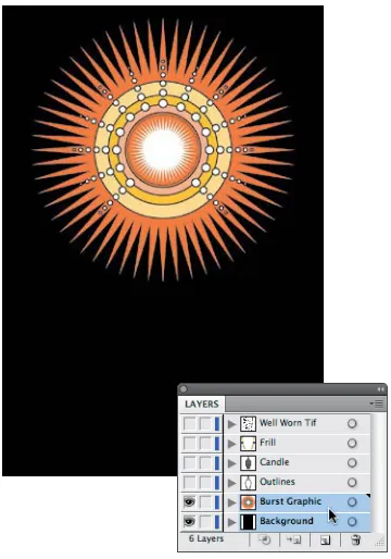
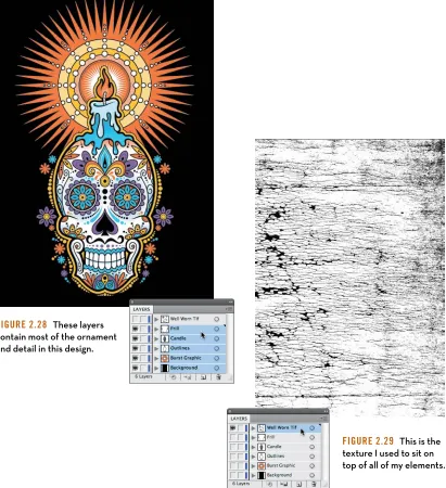
Señor Skully
[image:52.540.292.495.321.581.2] [image:52.540.77.257.323.580.2]36 d e s i g n d r i l l s
Figure 2.28 These layers
contain most of the ornament and detail in this design.
Figure 2.29 This is the
[image:53.540.52.463.113.563.2]d e c o n s t r u c t i n g d e s i g n 37
[image:54.540.106.466.70.584.2]38 d e s i g n d r i l l s
Figure 2.31 These
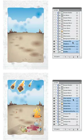
five layers make up the background elements and texturing for a poster design.
Figure 2.32 These
six layers hold the secondary illustrative elements.
Loyal Order of Wormwood
[image:55.540.144.430.135.619.2]d e c o n s t r u c t i n g d e s i g n 39
Figure 2.33 These
four layers flesh out the entire interior illustration of my design.
Figure 2.34 The
[image:56.540.101.491.105.604.2]40 d e s i g n d r i l l s
Figure 2.35 The
[image:57.540.136.483.76.615.2]c h a p t e r 3
analog Methods
in a Digital age
42 c h a p t e r 3
Don’t Be a Tooler
I graduated from art school in 1986. Even though the program was specifically geared for training graphic designers, we had to take drawing and illustration classes regardless of if we ever wanted to become pro-fessional illustrators. At the time, our industry fully realized the impor-tance of drawing as it relates to design.
But times have changed. Most art schools that offer visual communica-tions degrees don’t require students to take any drawing classes. The majority focus on software-oriented design (a tool-driven process), which only compounds the problem.
This issue isn’t relegated to the realm of just recent design school gradu-ates, however. Even seasoned designers who have been trained to draw have sometimes been lulled into creative torpor by the ease and accessi-bility of digital tools as well, either occasionally or permanently.
This dumbing down of creativity in our industry is a serious pet peeve of mine. Those who bake down the creative process so it’s not too demanding on the individual believe the computer and not the artist is the wellspring of creativity.
The fundamental problem for many designers is the lack of a well-defined and systematic creative process. In today’s design reality, it’s far too easy to fall into the routine of jumping on the computer as the first step in a creative task. We’ve all been guilty of this at one time or another. But any designer who jumps directly onto the computer is what I would call a “tooler.”
a n a l o g M e t h o d s i n a d i g i t a l a g e 43
Toolers don’t draw. In making that choice, they not only lessen the quality of the final product, but they also fail to grow as designers. It’s a lose-lose situation.
Analog—that is, drawing—and digital are not independent of each other when it comes to creating artwork. Nothing I do is fully digital, nor is it fully analog. I’m constantly going back and forth between the two throughout the creative process.
I Get Paid to Draw
Early in my career (pre-computer), people would ask me what I did for a living and I’d say, “I’m a graphic designer.” The usual response was something like, “You get paid to draw? I can’t draw a stick figure,” and they’d proceed to admire, recognize, and clearly associate my core skill and craft with what I did for a living.
But now (post-computer) when I tell people what I do, the normal response tends to be something like this: “That’s cool. I have a computer, too. I printed some inkjet business cards for…” And they proceed to associate what they do on a hack PC in their spare time using Microsoft Paint, prefab templates, Comic Sans font, and clip-art with what I do as a professional for a living.
Gone is the appreciation or even recognition of a skill or craft we as art-ists possess to do our jobs. For the most part, toolers don’t view them-selves as lacking any core ability as “designers” because the computer, in their minds has replaced the skill and craft they once associated with an artist’s ability.
44 c h a p t e r 3
As I stated in the introduction of this chapter, I don’t expect every designer to be a full-blown illustrator, but I do think every designer should integrate basic drawing skills into the creative process in order to create to his or her fullest potential (Figure 3.1). This chapter will help you understand the importance of working your ideas out in analog form before moving to digital—that is, working your ideas out on paper before ever approaching the computer.
Concepts and Ideas
I teach digital illustration at a local college, and I tell all of my students on the first day of class that I cannot teach them to be creative. I can only show them methods that will aid them in their quest to create and execute unique concepts and ideas.
A tome could be written on the subject of idea generation and how someone uses creative thinking and mental problem solving within a design context. Suffice it to say that this book is geared to facilitate the execution of your ideas and not the creation of them.
Every creative process has a beginning. A solid creative foundation starts with research, knowing your audience, and thinking through ideas that are appropriate for that audience both strategically and aesthetically. Only then can you begin to draw.
Your brain is the only computer you need at this point. You’re mining, not refining, so it’s important to load the chamber (your brain) with as much relevant information as you can in order to fuel your creative exploration as you draw out your ideas (Figure 3.2).
FIgure 3.1 Stop looking for
ideas in pulldown menus and start improving your analog drawing skills.
FIgure 3.2 Everyone has a potential super computer sitting
a n a l o g M e t h o d s i n a d i g i t a l a g e 45
Analog Tools
As I draw out my ideas and work through the creative process, there are
three main tools I depend upon every day (Figure 3.3):
1. 2B pencil for roughing out concepts and chewing on.
2. Ballpoint pen to quickly create thumbnail sketches.
3. Mechanical pencil for drawing out my refined sketches, which I then
scan and build upon in my vector drawing program.
I also like to use a black Sharpie and a red pen as I work, but those don’t play a part in the foundational stage of my creative process. I use them in refining my artwork, as you’ll see later.
The Lost Art of Thumbnailing
I love the term “thumbnailing.” It’s an apropos term to define the captur-ing of ideas in a simple and small (thumbnail-sized) drawcaptur-ing. Because you’re just mining for concepts at this point, you don’t need to worry about how precise or technically accurate the image is. Thumbnails are nothing more than visual triggers to help you explore the creative possibilities.
Think of the process as “brain dumping.” You’re simply opening up the floodgates of your mind and letting the ideas flow out on to paper. Have fun with the process: Don’t get hung up on how appropriate the con-cept is at this point or how good the sketches are. You’ll go through and refine your direction later.
You could also refer to these as doodles. In reality, the only difference between a traditional doodle and a thumbnail sketch is that one tends to be purposeful and the other merely spontaneous or random, lacking a focused intent. But if calling these sketches “doodles” takes the pres-sure off, then go for it.
[image:62.540.400.492.105.304.2]An aside: As much as I try to specifically plan for a project, I never know when inspiration will hit me. Many times something I see or think will
FIgure 3.3 If the pen is
46 c h a p t e r 3
trigger an idea and I’ll grab a pen and whatever paper is handy to thumb-nail the concept out and just capture the idea. This is why you’ll see different ink and paper colors in my thumbnail sketches (Figure 3.4).
[image:63.540.11.533.195.645.2]Thumbnails may start out very crude, but through a process of refine-ment they lead to well-crafted and precise digital artwork (Figure 3.5).
FIgure 3.4
a n a l o g M e t h o d s i n a d i g i t a l a g e 47
FIgure 3.5 Thumbnailing forms the foundation for any type of
48 c h a p t e r 3
More Is Better
You can never have too many thumbnails, but you can have too few. Always push yourself to create more than what you need for any given project. This will ensure you’ve fully vetted your exploration.
“ Nothing is more dangerous than an idea when it is the only one you have.” — Émile Chartier
There’s a nice fringe benefit to over-thumbnailing: Over time, you’ll build an archive of “homeless” ideas. When a new project comes along that aligns with a previous project’s theme, you can harvest ideas from your unused archive. It’s like renewable creative energy!
An Exception to the Rule
That said, there are exceptions. Not all projects need lots of thumbnails. Sometimes the design motif is iconic and simple and you don’t need to refine it beyond your initial thumbnail sketch.
A creative process should be flexible enough to allow this approach without compromising the end results. It obviously won’t apply to every job you work on, but in the case of my “Freedom of Speech” project, it did (Figure 3.6). The speech bubble element was clearly going to be an “easy-to-build” object (Figure 3.7).
This project was built primarily using basic shapes within my drawing program. In essence, why try to draw a perfect elliptical shape when there’s a tool that already does it with precision? This applies to the star shape as well.
FIgure 3.6 My concept was a very graphic
[image:65.540.49.217.327.558.2]and stylized speaking bubble that also read as an eagle.
FIgure 3.7 Final “Freedom of
a n a l o g M e t h o d s i n a d i g i t a l a g e 49
This project is, of course, the exception, not the rule. More often than not you’ll want to thumbnail out your ideas and then redraw and refine before trying to pull off the vector artwork.
Refine Your Drawing
Before you’d get into your car and drive somewhere you’d never been to before, you’d likely check a map for directions. If you didn’t bother getting a map, you’d probably get lost, drive a route that was not very efficient, and experience a lot of frustration trying to figure things out on the fly.
The same is true when it comes to building vector artwork. Drawing out and refining your ideas will give you a precise road map that you can then follow within your vector drawing program. It removes the guess-work out of building your art (Figure 3.8).
But if you don’t take the time to think through and draw what you need to build before you build it, you’ll waste a lot of time noodling around looking for that result you’re after. If in doubt, redraw on paper.
Refinement is a process of evolving your art from a rough idea into a clari-fied plan from which you can build.
But if something just doesn’t look right after redrawing your art as you refine it, then it’s a good bet you need to rework it more. Whenever you’re in doubt about how your drawing looks, redraw it (Figure 3.9).
[image:66.540.3.203.365.525.2]Refinement isn’t a task reserved for just this stage of the creative process: it should blanket the whole process. A smart designer will learn to art direct him- or herself over time and make continual refinements along the way (Figure 3.10).
FIgure 3.8 Thumbnail
50 c h a p t e r 3
I find it a lot easier to draw on vellum and use a light box. I usually only redraw the parts of a drawing that I don’t like and then just tape the vari-ous “right” parts together to form the final refined sketch that I can scan.
This process takes dedication. If you’re not used to working this way, it will seem foreign, but hang in there. Over time it will get easier, and you’ll get better at it.
[image:67.540.104.249.272.525.2]You may invest more time upfront, but in the long run it will save you even more time, expand your creative skill sets, and produce better work.
FIgure 3.9 A more refined version of
my original thumbnail, shown on the previous page.
FIgure 3.10 Final refined sketch I’ll
[image:67.540.303.451.273.530.2]a n a l o g M e t h o d s i n a d i g i t a l a g e 51
Create a Better Road Map
Have you ever tried to follow a map that wasn’t accurate? It kind of defeats the purpose. The same is true when you draw out your refined artwork. The more precise it is, the easier it will be to build it in vector form. Once you’re happy with your drawing, you can scan it into your vector drawing program.
The following project is one that shows how to build an accurate road map (Figures 3.11–3.14). Its earlier thumbnails are shown on the two previous pages.
FIgure 3.11 This more
refined version is closer to what I need but it still could be improved upon. The amount of time you’d spend finessing vectors would take more time than just redrawing it in a more precise form on paper.
FIgure 3.12 All
guesswork has been removed. You now have a clear road map of where to place your points and how your vector paths should be built.
FIgure 3.13 My refined final sketch
has enabled me to build my artwork with precision. In other words, analog equips digital to be more effective.
FIgure 3.14 Final
[image:68.540.259.502.346.606.2]52 c h a p t e r 3
This sketch-and-refine process can apply to any type of design project that needs to end up in vector form. In this example, we’re showcasing a
custom hand-lettered logotype design (Figures 3.15–3.21).
FIgure 3.15 A thumbnail sketch
establishes a direction for my logotype design.
FIgure 3.16 Rough sketching
and refining my concept. I’m not worrying about precise shapes at this point; I’m just trying to flesh out the look and feel and balance the weight of the letterforms and negative space.
FIgure 3.17 I start drawing
out my refined sketch. I’m now thinking about vector shapes. How will I go about building this in vector form? Drawing my art precisely in analog facilitates the building of it in digital.
FIgure 3.18 Final refined sketch
ready to scan in and place in my drawing application.
FIgure 3.19 Using my refined
[image:69.540.52.464.143.624.2]