Microsoft Excel 2013: Building
Data Models with PowerPivot
Alberto Ferrari
Marco Russo
Special Upgrade Offer
If you purchased this ebook directly from oreilly.com, you have the following benefits:
DRM-free ebooks—use your ebooks across devices without restrictions or limitations
Multiple formats—use on your laptop, tablet, or phone
Lifetime access, with free updates
Dropbox syncing—your files, anywhere
If you purchased this ebook from another retailer, you can upgrade your ebook to take advantage of all these benefits for just $4.99. Click here to access your ebook upgrade.
A Note Regarding
Supplemental Files
Supplemental files and examples for this book can be found at
http://examples.oreilly.com/9780735676343-files/. Please use a standard desktop web browser to access these files, as they may not be accessible from all ereader devices.
All code files or examples referenced in the book will be available online. For physical books that ship with an accompanying disc, whenever
Introduction
Microsoft Excel is the world standard for performing data analysis. Its ease of use and power make the Excel spreadsheet the tool that everybody uses, regardless of the kind of information being analyzed.
You can use Excel to store your personal expenses, your current account information, your customer information or a complex business plan, or even your weight-loss progress during a hard-to-follow diet. The
possibilities are infinite—we are not even going to try to start
enumerating all the kind of information you can analyze with Excel. The fact is that if you have some data to arrange and analyze, your chances are excellent that Excel will be the perfect tool to use. You can easily arrange data in a tabular format, update it, generate charts, PivotTables, and calculations based on it, and make forecasts with relatively limited knowledge of the software. With the advent of the cloud, now you can use Excel on mobile devices like tablets and smart phones, too, using Internet to have constant access to your information. Also, in earlier versions of Excel, there was a limit of 65,536 rows per single worksheet, and the fact that so many customers asked Microsoft to increase this number (which Microsoft did, raising the limit to 1 million rows in Excel 2007) is a clear indication that users want Excel to store and analyze large amounts of data.
Besides Excel users, there is another category of people dedicating their professional lives to data analysis: business intelligence (BI)
professionals. BI is the science of getting insights from large amounts of information, and, in recent years, BI professionals have learned and
systems require the effort of many professionals and expensive hardware to run. They are powerful, but they are expensive and slow to build,
which are serious disadvantages.
Before 2010, there was a clear separation between the analysis of small and large amounts of data: Excel on one side and complex BI systems on the other. A first step in the direction of merging the two worlds was
already present in Excel because the PivotTable tool had the ability to query BI systems. By doing that, data analysts could query large BI
systems and get the best of both worlds because the result of such a query can be put into an Excel PivotTable, and thus they could use it to perform further analysis.
In 2010, Microsoft made a strong move to break down the wall between BI professionals and Excel users by introducing xVelocity, a powerful engine that drives large BI solutions directly inside Excel. That happened when Microsoft SQL Server 2008 R2 PowerPivot for Excel was released as a free add-in to Excel 2010. The goal was to make the creation of BI solutions so easy that Excel would start to be not only a BI client, but also a BI server, capable of hosting complex BI solutions on a notebook. They called it self-service BI.
Microsoft PowerPivot has no limits on the number of rows it can store: if you need to handle 100 million rows, you can safely do so, and the speed of analysis is amazing. PowerPivot also introduced the DAX language, a powerful programming language aimed to create BI solutions, not only Excel formulas. Finally, PowerPivot is able to compress data in such a way that large amounts of information can be stored in relatively small workbooks. But this was only the first step.
The second definitive step to bring the power of BI to users was the
BI started in 2010, and it has advanced in 2013.
Because you are reading this introduction, you are probably interested in joining the self-service BI wave, and you want to learn how to master PowerPivot for Excel. You will need to learn the basics of the tool, but this is only the first step. Then, you will need to learn how to shape your data so that you can execute analysis efficiently: we call this data
modeling. Finally, you will need to learn the DAX language and master all its concepts so you can get the best out of it. If that is what you want, then this is the book for you.
We are BI professionals, and we know from experience that building a BI solution is not easy. We do not want to mislead you: BI is a fascinating technology, but it is also a hard one. This book is designed to help you take the necessary steps to transform you from an Excel user to a self-service BI modeler. It will be a long road that will require time and dedication to travel, and you will find yourself making the adaptations you need to learn new techniques. However, the results you will be able to accomplish are invaluable.
The book is not a step-by-step guide to PowerPivot for Excel 2013. If you are looking for a PowerPivot for Dummies book, then this is not the book for you. But if you want a book that will go with you on this long,
satisfying journey, from the first simple workbooks to the complex
simulations you will be creating soon, then this is your ultimate resource.
When writing this book, we decided to focus on concepts and real-world examples, starting at zero and bringing you to mastering the DAX
This last sentence highlights the main characteristic of this book: it is a book to study, not just to read. Get prepared for a long trip—but we promise you that it will be well worth it.
NOTE
The PowerPivot and Power View features are included only with specific
configurations of Office 2013. The PowerPivot feature, which was available in all versions of Excel 2010, is available only in Office 2013 Professional Plus,
SharePoint 2013 Enterprise Edition, SharePoint Online 2013 Plan 2, and the E3 or E4 editions of Office 365. The Power View feature, new in Excel 2013, is included with the same versions as PowerPivot. Fortunately, the Excel Data Model is
Who this book is for
The book is aimed at Excel users, project managers, and decision makers who wish to learn the basics of PowerPivot for Excel 2013, master the new DAX language that is used by PowerPivot, and learn advanced data modeling and programming techniques with PowerPivot.
Assumptions about you
This book assumes that you have a basic knowledge of Excel 2010 or Excel 2013. You do not need to be a master of Excel; just being a regular user is fine. We will cover what is needed to make the transition from Excel to PowerPivot, but we do not cover in any way the fundamentals of Excel, like entering a formula, writing a VLOOKUP function, or other basic functionalities.
No previous knowledge of PowerPivot is needed. If you already tried to build a data model by yourself, that is fine, but we will assume that you never opened PowerPivot before reading the book.
Organization of this book
The book is designed to be read from cover to cover. Trying to jump
directly to the solution of a specific problem, skipping some content, will probably be the wrong choice. In each chapter, we introduce concepts and functionalities that you will need to understand the subsequent chapters. Moreover, we wrote some chapters knowing that you will need to read them more than once, because the theoretical background they provide is hard to take in at a first read.
The book is divided into 16 chapters:
Excel 2013. By following a step-by-step guide, we show the main
benefits of using PowerPivot for your analytical needs. We show how to create a simple Power View report as well.
Chapter 2, shows the features that are available only if you enable the PowerPivot for Excel add-in. This includes calculated columns,
calculated fields, hierarchies, and some other basic features. It is the logical continuation (and conclusion) of Chapter 1.
In Chapter 3, we start covering the DAX language, including its syntax and the most basic functions. We highlight the difference between a calculated column and a calculated field, and at the end, we show a first practical example of DAX usage.
Chapter 4, is a theoretical chapter, covering the basics of data modeling and showing the different modeling options in a PowerPivot database. We describe several concepts that are not evident for Excel users, like
normalization and denormalization, the structure of a SQL query, how relationships work and why they are so important, the structure of data marts, and data warehouses.
In Chapter 5, we cover the process of publishing workbooks to Microsoft SharePoint to do team BI. Moreover, we introduce the concept of
PowerPivot for SharePoint being a server-side application that you can program and extend using Excel and PowerPivot.
Chapter 6, is dedicated to the many ways to load data inside PowerPivot. For each data source, we show the way it works and provide many hints and best practices for that specific source.
Chapter 7, and Chapter 8, are the theoretical core of the book. There, we introduce the concepts of evaluation contexts, relationships, and the
Chapter 9, shows how to create and manage hierarchies. It covers basic hierarchy handling, how to compute values over hierarchies, and finally, it shows how to manage parent/child hierarchies by using the concepts learned in Chapter 7 and Chapter 8.
Chapter 10, is dedicated to the new reporting tool in Excel 2013: Power View. There, we show the main feature of this tool, how to create simple Power View reports, and how to filter data and build reports that are
pleasant to look at and provide useful insights in your data.
Chapter 11, covers several advanced topics regarding reporting. It
includes Key Performance Indicators (KPIs), how to write them, and how to use them to improve the quality of your reporting system. We also
cover the Power View metadata layer in PowerPivot, drill-through, sets in Excel or in MDX, and perspectives.
Chapter 12, deals with time intelligence. Year to Date (YTD), Quarter to Date (QTD), Month to Date (MTD), working days versus non-working days, semiadditive measures, moving averages, and other complex calculations involving time are all topics covered here.
Chapter 13, is a collection of scenarios and solutions, all of which share the same background: they are hard to solve using Excel or in any other tool, whereas they are somewhat easier to manage in DAX, once you gain the necessary knowledge from the previous chapters in the book. All
these examples come from real-world scenarios and are among the top requests we see when we do consultancy or look at forums on the web.
Chapter 14, is dedicated to using DAX as a query language (as you might guess). It covers the various functionalities of DAX when used to query a database. It also shows advanced functionalities, like reverse-linked and linked-back tables, which greatly enhance the capabilities of PowerPivot to build complex data models.
(VBA) to manage PowerPivot workbooks in a programmatic way,
automating a few common tasks. We provide some code examples and show how to solve some of the common scenarios where VBA might be useful.
Chapter 16, compares the functionalities of the three flavors of PowerPivot technology: PowerPivot for Excel, PowerPivot for
SharePoint, and SQL Server Analysis Services (SSAS). The goal of this final chapter is to give you a clear picture of what can be done with
PowerPivot for Excel, when you need to move a step further and adopt PowerPivot for SharePoint, and what extra features are available only in SSAS.
Conventions
The following conventions are used in this book:
Boldface type is used to indicate text that you type.
Italic type is used to indicate new terms, calculated fields and columns, and database names.
The first letters of the names of dialog boxes, dialog box elements, and commands are capitalized. For example, the Save As dialog box.
The names of ribbon tabs are given in ALL CAPS.
Keyboard shortcuts are indicated by a plus sign (+) separating the key names. For example, Ctrl+Alt+Delete mean that you press Ctrl, Alt, and Delete keys at the same time.
We have included companion content to enrich your learning experience. The companion content for this book can be downloaded from the
following page:
http://go.microsoft.com/FWLink/?Linkid=279953
The companion content includes the following:
A Microsoft Access version of the AdventureWorksDW databases that you can use to build the examples yourself.
All the Excel workbooks that are referenced in the text (that is, all the workbooks that are used to illustrate the concepts). Note you need to have Excel 2013 to open the workbooks.
Acknowledgments
We have so many people to thank for this book that we know it is
impossible to write a complete list. So thank you so much to all of you who contributed to this book—even if you had no idea that you were doing it. Blog comments, forum posts, email discussions, chats with attendees and speakers at technical conferences, and so much more have been useful to us, and many people have contributed significant ideas to this book. That said, there are people we need to cite personally here because of their particular contributions.
We want to start with Edward Melomed: he inspired us, and we probably would not have started our journey with PowerPivot without a passionate discussion that we had with him several years ago.
We have to thank Microsoft Press, O’Reilly Media, and the people who contributed to the project: Kenyon Brown, Christopher Hearse, and many others behind the scenes.
preparation for writing it. A group of people that we (in all friendliness) call “ssas-insiders” helped us get ready to write this book. A few people from Microsoft deserve a special mention as well because they spent precious time teaching us important concepts about PowerPivot and DAX. Their names are Marius Dumitru, Jeffrey Wang, and Akshai Mirchandani. Your help has been priceless, guys!
We also want to thank Amir Netz, Ashvini Sharma, and T. K. Anand for their contributions to the discussion about how to position PowerPivot. We feel they helped us in some strategic choices we made in this book.
Finishing a book in the age of the Internet is challenging because there is a continuous source of new inputs and ideas. A few blogs have been
particularly important to our book, and we want to mention their creators here: Chris Webb, Kasper de Jonge, Rob Collie, Denny Lee, and Dave Wickert.
Finally, a special mention goes to the technical reviewer, Javier Guillen. He double-checked all the content of our original text, searching for
errors and giving us invaluable suggestions on how to improve the book. If the book contains fewer errors than our original manuscript, it is
because of Javier. If it still contains errors, it is our fault, of course.
Thank you so much, folks!
Support and feedback
The following sections provide information on errata, book support, feedback, and contact information.
Errata
was published are listed on our Microsoft Press site at oreilly.com:
http://aka.ms/Excel2013DataModelsPP/errata
If you find an error that is not already listed, you can report it to us through the same page.
If you need additional support, email Microsoft Press Book Support at
Note that product support for Microsoft software is not offered through these addresses.
We Want to Hear from You
At Microsoft Press, your satisfaction is our top priority, and your
feedback our most valuable asset. Please tell us what you think of this book at
http://www.microsoft.com/learning/booksurvey
The survey is short, and we will read every one of your comments and ideas. Thanks in advance for your input!
Stay in Touch
Let’s keep the conversation going! We are on Twitter:
Chapter 1. Introduction to
PowerPivot
Microsoft PowerPivot for Microsoft Excel 2013 is a technology aimed at providing self-service business intelligence (BI), which is a real
revolution inside the world of data analysis because it gives the final user all the power needed to perform complex data analysis without requiring the intervention of BI technicians. PowerPivot is an Excel add-in that implements a fast, powerful, in-memory database that can be used to
organize data, detect interesting relationships, and provide the fastest way to browse information.
Some of the most interesting features of PowerPivot are the following:
The ability to organize tables for the PivotTable tool in a relational way, freeing the analyst from the need to import data as Excel sheets before analyzing them.
The availability of a fast, space-saving, columnar database that can handle huge amounts of data without the limitations of Excel sheets.
DAX, a powerful programming language that defines complex
expressions on top of the relational database. It makes it possible to define surprisingly rich expressions compared to those standards in Excel.
Amazingly fast in-memory processing of complex queries over the whole database.
Some people might think of PowerPivot as a simple replacement for the PivotTable, while others might use it as a rapid development tool for complex BI solutions, and still others might believe that it is a real
replacement for a complex BI solution. PowerPivot is not a replacement for large and complex BI solutions like the ones built on top of Microsoft Analysis Services, but it is much more than a simple replacement for the Excel PivotTable, and it is a great tool for exploring the BI world and implementing end-to-end BI solutions.
PowerPivot fills the gap between an Excel sheet and a complete BI
solution, and it has some unique characteristics that make it appealing for both Excel power users and seasoned BI analysts. This book analyzes all the features of PowerPivot, but, as with any big project, we need to start from the beginning. This chapter starts with a simple introduction to the basic features of PowerPivot. We suggest that you follow the step-by-step instructions so you can see on your own computer the results that we
show in the book. Later, in the following chapters, we will not use step-by-step instructions anymore because we think that it is better to focus the book on concepts rather than on “click Next” instructions for more advanced topics.
Even though this book is about PowerPivot for Excel 2013, it is a good idea to start with a short review of how PowerPivot was born and how it worked in Excel 2010, so you can better appreciate the new features and understand some of the peculiarities of this add-in.
Using a PivotTable on an Excel table
it has been possible to analyze data using PivotTables. Prior to the availability of PowerPivot, using PivotTables was the main way to analyze data. The PivotTable is an easy and convenient way to browse huge amounts of data that you collect into Excel sheets. This book does not explain in detail how the PivotTable tool works; there are a lot of good descriptions available from other sources. However, it is helpful to recall the main features of the PivotTable to compare them with those of PowerPivot.
Suppose you have a standard Excel table, imported from a query run
against a database, that contains all the data that you want to analyze. To get this data, you probably asked IT to provide some means to access the database and a specific query to retrieve the information. Your Excel sheet would look like the one in Figure 1-1. Because the table contains raw data, it is very difficult to analyze. You can look at this worksheet in the companion workbooks under the name “CH01-01-Classical Excel PivotTable.xlsx.”
Now that you have all the data available in a sheet, you can choose to insert a PivotTable using the PivotTable button of the Insert tab of the Excel ribbon. The wizard prompts for the table to use as the source of the Pivot and for where to put the PivotTable, and then it provides the
standard Excel PivotTable interface shown in Figure 1-2.
Figure 1-2. This is the standard PivotTable interface in Excel.
From here, you can choose to take the Year (to cite one example) and put it as a column and the ProductCategory as a row, displaying the
showing how each category performed over time.
Figure 1-3. Here is an example of a report created with the PivotTable tool.
It is clear that by changing the way data is organized into rows and
columns, you can easily produce different and interesting reports with an intuitive, fast interface that helps you navigate the information.
Figure 1-3 shows what a standard PivotTable looks like. Users all around the world have been utilizing this tool for many years with great success, analyzing their Excel data in many different ways and producing reports according to their needs.
totals are aggregated using the SUM function because this is what is normally needed. If you want a different aggregation function, you can choose it using the various PivotTable options.
As easy as it is to use, PivotTables have some limitations:
PivotTables can analyze only information coming from a single table stored in an Excel sheet. If you have different sheets, containing
different information, there is not an easy way to correlate information coming from them.
It is not always easy to get the source data into a format that is
suitable for analysis. In the previous example, you saw a table that is extracted from a SQL query run against the AdventureWorks database and that you build to analyze data. The skills needed to build such a query are somewhat technical because you need to know the SQL syntax and the underlying database structure, and this often raises the problem of asking your IT department to develop such queries before you even start the analysis process.
Because only one table can be analyzed at a time, you can often end up building the queries needed for a specific analysis and, if for any
reason you want to perform a different analysis, then you will need to build different queries. For example, if you have a query that returns sales at the “month” level, you cannot use that same query to perform further analysis at the “day of week” level. To do that, you will need a new query. This, in turn, might involve the need to contact IT again, which can become expensive if IT charges based on the amount of work it performs.
When PivotTables are not enough, as is the case for medium-sized companies, it is very common to start a complete BI project with
pivoting features on complex data structures known as OLAP cubes.
OLAP cubes are difficult to build but provide the best solution to the complexity of free analysis of the company data. OLAP cubes will be discussed briefly later in this book, in Chapter 4; at this point, it is enough to point out that they are the definitive solution to BI
requirements, but they are expensive and still require great effort from the IT department.
Using PowerPivot in Microsoft Office 2013
PivotTables based on standard Excel tables are a pretty handy tool. Nevertheless, to let you analyze more complex data, Microsoft
introduced a feature called “self-service BI.” The goal of this technology is to let you build complex data structures and analyze them with
PivotTables, removing the current limitations of PivotTables. PowerPivot is the primary tool available from Microsoft to handle self-service BI, along with its companion Power View, which you will learn to use later in this chapter.
PowerPivot enables the user to analyze data without needing to contact IT to produce complex queries. Furthermore, it removes the limitation that a PivotTable can analyze only a single table because you will be able to query more tables at the same time, producing reports that easily
integrate information coming from different sources.
WORKING WITH THE ADVENTUREWORKS SAMPLE DATABASE
In order to provide examples, we will use the AdventureWorks database throughout this book. We have chosen AdventureWorks because it is well known, freely available on the web, and contains sample data that you can easily use for complex analysis. The database contains information about Adventure Works Cycles, which is a large multinational,
You can download the AdventureWorks database from
http://www.codeplex.com/SqlServerSamples, where you will find different versions of the database, depending on the release of Microsoft SQL Server that you have installed. If you do not have SQL Server on your PC, then you can use the Microsoft Access version of
AdventureWorks that is provided in the companion material. Moreover, all the demos in this book are available in the companion material as Excel workbooks. Thus, you will be able to follow most of the examples even if you do not have access to a database.
Moreover, for the interested reader, Microsoft provides sample data in Excel workbooks that can be used to test PowerPivot at http://tinyurl.com/PowerPivotSamples. Even if we do not use these files in this book, you might be interested in loading them to have some data to perform your tests.
In 2010, PowerPivot for Excel 1.0 was released as an add-in for Excel 2010. PowerPivot is a powerful columnar database that does not work with classical Excel tables. Rather, it works with data stored inside its proprietary database, and it can be queried using the DAX language or a PivotTable. Although this information seems to be just a curiosity about the history of PowerPivot, it is in reality very important: for PowerPivot to work, the data should not be stored inside Excel tables, it needs to be stored inside the PowerPivot database. Keep this fact in mind; it will come in handy later.
NOTE
The PowerPivot database is also referred to as the “Excel data model.” The two terms relate to the very same technology: the Excel data model is, in reality, a PowerPivot database; and the PowerPivot database is stored inside the Excel workbook. In this book, we will refer to it using both names, depending on the context. If we believe that it is important to separate PowerPivot from Excel, then we will refer to it as the PowerPivot database; otherwise, we adhere to the more standard terminology and call it the Excel data model.
users who decided to download and install the add-in. If an Excel
workbook containing PowerPivot data was opened on a PC where the add-in was not add-installed, it simply did not work, even if the data contaadd-ined add-in Excel sheets is always visible.
In Office 2013, PowerPivot comes preinstalled and should only need to be activated. Moreover, in Office 2013, the PowerPivot engine is fully integrated into the Excel code and starts to work even before being
activated. Some features are immediately available, whereas others have to be manually activated, as you will learn later in this chapter.
In order to start using PowerPivot, we are going to take the easy way: we will create PowerPivot tables (remember—they are different from Excel tables) without even activating the add-in. This happens smoothly as soon as you activate some of the advanced features of Excel for the analysis of data, such as
Power View reports
Relationships between tables
PivotTables over more than one table
Adding information to the Excel table
Let’s start making the analysis slightly more complex. The dataset provided by our Excel table contains information about product
categories. Assume that at AdventureWorks, each product category is assigned to a salesperson and this information is not stored in the
Figure 1-4. The SalesManager Excel table will prove useful to show performance of managers instead of categories.
In order to use this new information in the PivotTable, you need to bring the SalesManager column into the original data model and, as you
probably already know, VLOOKUP is invaluable here. Add a column to our original table with this formula:
=VLOOKUP([@ProductCategory],SalesManagers,2)
Figure 1-5. Using VLOOKUP, we have been able to bring the sales manager into the original table.
With the new dataset, the PivotTable can be easily re-created, adding the SalesManager to the rows. This results in the desired report, as shown in
Figure 1-6. The SalesManager column is now visible in the PivotTable.
This technique works fine, but if you now want to slice data using the Office column from the SalesManager table, you need to repeat the operation of using VLOOKUP to put the Office column in the original table. Even if it does not mean a huge amount of work in this specific example, it is better to move to the next level and learn some of the new features of Excel 2013.
Creating a data model with many tables
Instead of using VLOOKUP to populate a single dataset, as in the
PivotTable, so that all its columns can be used. You are moving from a classical single-table analysis to a more advanced multi-table one. Doing this is very easy. At the bottom of the PivotTable fields list is the MORE TABLES... option (see Figure 1-7).
Figure 1-7. The MORE TABLES... option lets you add more tables to a single PivotTable report.
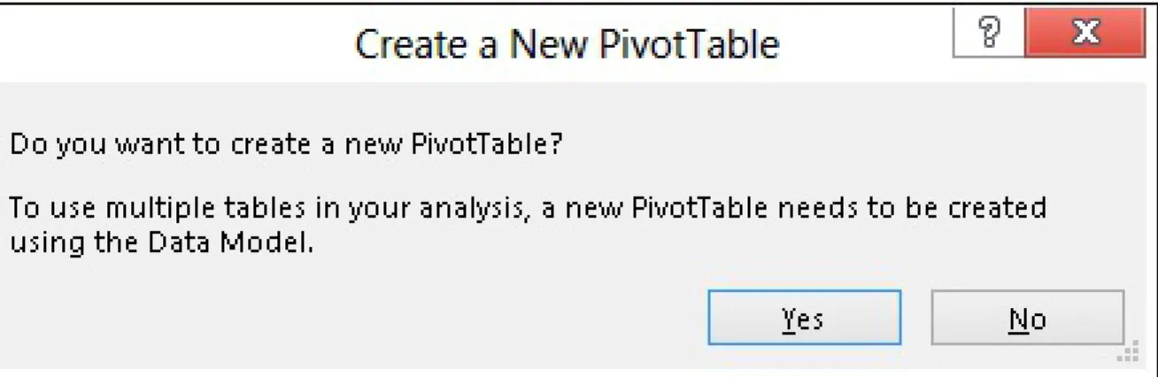
If you click MORE TABLES..., you will see an information message that asks you to confirm whether you want to continue creating a new
Figure 1-8. As simple as it is, this confirmation window contains a good deal of useful information.
If you click Yes, Excel creates a new PivotTable, with a structure that is identical to the current one but with more tables. You can see the result in
Figure 1-9, where the field list now contains two tables.
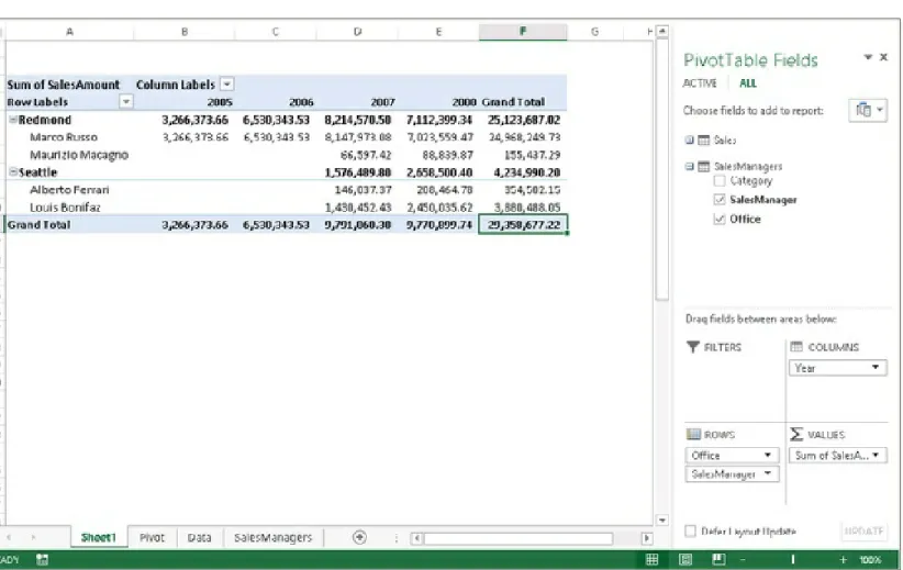
Now remove SalesManager and ProductCategory from the rows and, after expanding the SalesManagers table, add Office to the rows. The result is
not what you might expect. In fact, as Figure 1-10 shows, it seems that all the offices (two, in this example) have exactly the same sales, which is clearly false. The PivotTable seems to detect the same wrong situation because a warning appears in the Field List: “Relationships Between Tables May Be Needed.” There is also an inviting CREATE... button.
Figure 1-10. Adding the Office column to the PivotTable shows incorrect results and a warning about relationships.
Understanding relationships
At this point, there are two tables: Sales and SalesManagers. Each sale concerns a product, and the product has a category. Each category has a sales manager, and the relationship between a category and its sales manager is stored in the SalesManagers table. In order to bring a sales manager’s name into the sales table, you previously used VLOOKUP to search for the category name in the SalesManagers table and, after it found the category, grab the associated sales manager’s name.
In more technical terms, we can say that there is a relationship between the Sales and the SalesManagers tables, based on the Category column. To be more precise, the relationship is defined as follows:
Source Table. The source table from where the relationship starts. In this example, it is the Sales table, which contains only the
ProductCategory column.
Foreign Key Column. The column in the source table that contains the value to search. In this example, the column is ProductCategory, the category of the product, which we have used as the first parameter of VLOOKUP.
Related Table. The table that contains the values to look for. In this example, the related table is the SalesManager table, which contains both the product category and the sales manager’s name, along with that person’s office.
Related Column. The column in the related table containing the value that should match the foreign key column. In the example, the column is Category, in the SalesManager table.
VLOOKUP. The only information missing is the value of the column to retrieve because, once a relationship is in place, it allows you to retrieve any of the columns in the related table without needing to specify which ones (as was the case with VLOOKUP, which retrieved only a single column from the related table).
With this new information, click the CREATE... button and create the relationship, filling the boxes with the values shown in Figure 1-11.
Figure 1-11. Here are the correct parameters to enter to create the relationship.
NOTE
PowerPivot for Excel 2010, the previous version of this add-in, had an engine that automatically detected relationships, making life easier in some cases.
Unfortunately, the detection algorithm used a heuristic to check for the existence of relationships, and in some rare cases, it could detect the relationship incorrectly. For this reason, no automatic detection happens in Excel 2013; it is up to you to define the relationship. Although this characteristic might seem to be a downgrade, it really is a welcome development: it is always better to be safe when creating a relationship, and in this case, the human brain is much better than a heuristic algorithm.
office. Figure 1-12 shows the result, where the SalesManager column from the SalesManagers table is placed on the rows.
Figure 1-12. The PivotTable shows the correct results once the relationship is set.
Relationships play a very important role in PowerPivot, and you will
learn a lot more about them from this book. For now, it is enough to think of a relationship as a way to tie together two tables, using a column in both. If two columns share the same value for a specific row, then the relationship has a match, and the two rows are tied together.
But . . . wait! Did we not just say that relationships are important in
and the multiple-table PivotTable is, in reality, browsing that model. So let’s look at the data model.
Understanding the data model
As Figure 1-8 previously demonstrated, the confirmation window asked you to create a new PivotTable using the data model. It did not explain what a data model is, nor why it is needed if you want to show more than one table in the PivotTable, but it was clear about the fact that the new PivotTable would use the data model. Thus, it is interesting to understand better what the data model is before diving into more advanced topics.
Excel tables are exactly what their name suggests: they are tables. You can have hundreds of tables in an Excel workbook, but each table is
separated from the others. This is why you can create a PivotTable over a single table: adding more than one table to a PivotTable is meaningless because they share nothing. The key to turn a set of tables into a data model is the existence of relationships. If many tables are connected by relationships, then it is useful to show them all together inside a
PivotTable because filtering a table, as a side effect, filters other, related tables as well.
In this example, putting a filter on the Office column of the
SalesManagers table included a filter on the Sales table. In fact, rows with information about the Seattle office showed only values about categories that are handled by Seattle personnel. The reason why the
Sales table is filtered by Office is because each sale is pertinent to a sales manager who works in an office. The relationship between the two tables makes this mechanism work. Thus, the following is true:
A set of tables is nothing but a set of separate tables.
Excel 2013 introduced the concept of a data model as one of the tools available to users to analyze data. Each Excel table can belong to the data model: it is automatically added to the data model as soon as a
relationship is defined on the table, either as the source or as the target of the relationship.
All this seems fine, but what has PowerPivot got in common with this description of a data model? The data model in Excel is, in reality, a
PowerPivot data model. Whenever you add a table to the data model, you are really adding the table to the PowerPivot database that lives inside the Excel workbook.
The PowerPivot data model and the Excel table are two distinct entities. If you add an Excel table to the data model, you are not transforming the Excel table into a PowerPivot one. What happens is that the data in the Excel table is copied into a PowerPivot table. The two tables are then linked, so that if you update the original Excel table and refresh the
PivotTable, the updates are imported into the PivotTable data model. But, from the point of view of storage, the data is really duplicated in two
places: the original table in Excel and a copy in PowerPivot.
Creating a data model is very simple. It happens automatically as soon as Excel detects that it needs to create a data model to solve your specific needs. In this case, Excel turned the tables into a PowerPivot data model as soon as it was necessary to create a PivotTable with more than one
table. To accomplish this task, Excel created a PowerPivot data model for use, effectively eliminating the need to completely understand what is happening under the surface.
Nevertheless, it is important to understand that by using these automatic features, you are using only a very small portion of the real power of PowerPivot. In order to exploit all PowerPivot features, you will need to learn how to work with the PowerPivot data model by itself, without
does.
Querying the data model
In the previous section of this chapter, you learned that, by means of creating relationships among tables, you can create a PowerPivot data model inside your Excel workbook. Once the data model has been created for the first time, it can be queried with many PivotTables, without the need to add more tables to the same model. This section discusses how to perform this operation, which, although not very easy to find, is very
convenient.
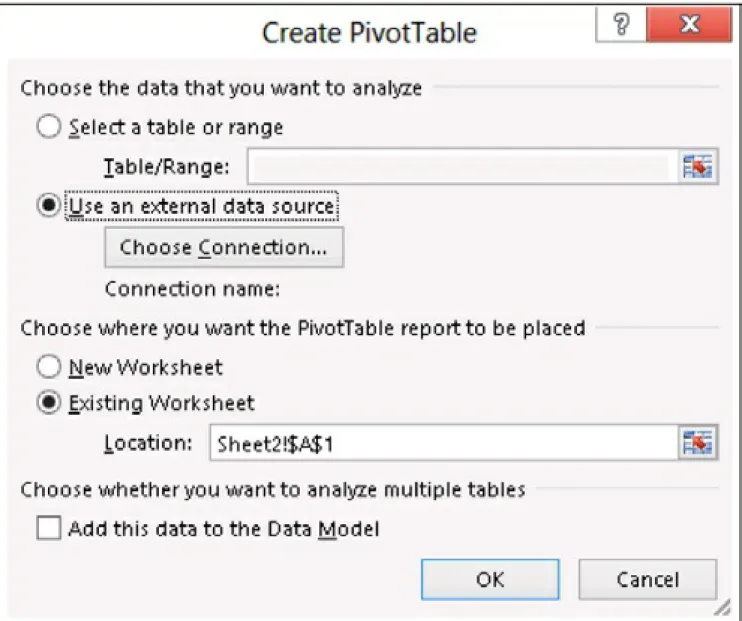
Figure 1-13. The Create PivotTable dialog box prompts you for the parameters of a new PivotTable.
From this dialog box, instead of choosing a range, as you are probably used to doing, you should choose Use An External Data Source and then click Choose Connection. Excel shows the external connection that can be used and, on the Tables tab, lists both the Excel tables and the data
Figure 1-14. The list of external tables contains the Workbook data model, which is also the PowerPivot data model.
Selecting the Workbook data model and confirming everything up to the end of the PivotTable creation process leads you to a new PivotTable connected to the same data model that you previously created, based on the original Excel tables.
In the previous sections of this chapter, you learned that the new features of Excel 2013 require you to create a PowerPivot data model to work with, and that this data model can be created without enabling the
PowerPivot add-in, which comes preinstalled but disabled. Once the data model has been created, you can query it with a PivotTable (or, as you will see later in this chapter, with Power View). If, on the other hand, you want to look at the data model, Excel does not offer a way to analyze it or simply look at its content. In order to see the data model, you need to
enable the PowerPivot add-in, as you are going to learn in this section.
Figure 1-15. You will need to enable the PowerPivot add-in to use the new PowerPivot features.
Figure 1-16. In the list of COM add-ins, you can enable or disable the PowerPivot add-in.
To enable the PowerPivot add-in, you simply have to select the Microsoft Office PowerPivot For Excel 2013 check box and then click OK. While you are here, it is a good idea to enable the Power View add-in (if it’s disabled), which is going to come in handy shortly. To do this, simply select the Power View check box. Power View is another great addition to your Excel analytical experience, and it works with the PowerPivot data model too.
Once the PowerPivot add-in has been enabled, you will see a new tab on the Excel ribbon named PowerPivot, which you can see in Figure 1-17.
From here, you will be able to use a wide number of exciting functions, which this book is going to explain. For now, we are interested only in opening the PowerPivot window and taking a very quick tour of the data model that you just created. In order to open the PowerPivot window, you need to click the Manage button on the ribbon, which opens the main
PowerPivot window, as Figure 1-18 shows.
Figure 1-18. The PowerPivot window is the main window that lets you use PowerPivot advanced features.
browse the rows and, at the bottom of the window, you can see the tabs of the tables already loaded in the data model. For now, we are not
interested in exploring all the features of this window. We want to use it to take only a brief look at the data model. In order to look at the data model, you need to click the Diagram View button on the ribbon.
As a result, the PowerPivot window switches from Data view to Diagram view is a very convenient way of visualizing the data model because, instead of focusing on the content of the tables, it shows the structure of the relationships, making it easier to represent relationships graphically, as shown in Figure 1-19.
The Diagram view is a canonical “boxes and arrows” representation of the relational model that is stored inside the data model. Each table is represented by a box, and if two tables are linked through a relationship, then there is an arrow running from the source table to the target table. Clicking a relationship highlights the columns that are part of that
relationship.
You will learn how to use the many features of this window throughout this book; for now, you can simply close it. Starting from Chapter 3, you will start using Diagram view to modify the data model. At the moment, we are more interested in taking you on a tour of the main features of Excel 2013 with PowerPivot than in describing them in detail.
Using OLAP tools and converting to
formulas
One of the new features of Excel, which is available on the data model but not on the single-table PivotTable, is the OLAP Tools section. This set of features was originally available only on PivotTables built on top of OLAP databases (hence its name), but because of the nature of the data model, which is in reality a PowerPivot database, the feature is now
available with the data model too.
PivotTables are really powerful tools to explore data. Nevertheless, they very often serve as the first step in the production of complex reports that gather data from PivotTables, perform computations and formatting, and provide the final results in compact reports, sometimes called
dashboards. Roughly speaking, a dashboard is nothing but a report
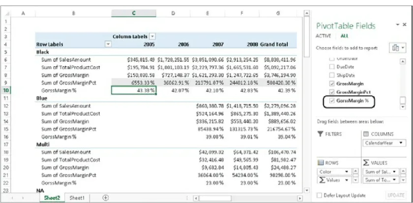
Suppose that you want to produce a report containing total sales, the growth in percentage of total sales, and the percentage of Internet and reseller sales of the last three years. The report should contain
information divided by region, so that you can use it to find which regions need your attention.
Figure 1-20 shows such a report in its final form, which you can find in the workbook “CH01-02-Dashboard.xlsx.”
Figure 1-20. Here, you can see a simple dashboard created from a PivotTable.
We are not interested in these specific results; the focus here is on the technique. So, having a clear idea of the results you want to produce, let’s take a closer look at the problems you will need to solve:
The first issue concerns the geographical slicing. In the final report, you have data at the group, country, and region levels, but countries with only one region have been compacted to remove the region level, which is useless. This is something that the PivotTable will not handle by itself, even though it is a very common request for reports.
selection of years in the two columns is different, since growth is not shown for 2006). Moreover, in the columns header, you want to show years divided by sales type (Internet and reseller). This mixed kind of slicing is not something that can be realized with a PivotTable.
Data inside the cells is a mix of Internet and reseller sales for some cells (the total sales ones); other cells display the ratio of Internet or reseller sales to the total.
Moreover, via the Conditional Formatting option in Excel, the report shows cells of various colors that will direct the reader’s attention to the most interesting data. Clearly, the conditional formatting uses different formulas for different cells.
Needless to say, you cannot produce such a report by using any type of PivotTable. Nevertheless, you surely can produce the original values needed to compute each single cell by using one or more PivotTables. All you need to do is to create some PivotTables that perform the
computation and then use standard Excel formulas to move the original piece of data inside the dashboard.
You can start building this dashboard by creating the PivotTable shown in
Figure 1-21. This PivotTable is the starting point for this dashboard.
You can start building your dashboard based on the PivotTable that you just made, creating formulas that move information from the PivotTable to the dashboard. Nevertheless, PivotTables are dynamic by their very nature. They can change their size if new values appear inside the source tables. Thus, if you reference directly the cells inside a PivotTable, you are at risk of needing to update formulas as the source data is updated. It would be much better if you found a way to fix the PivotTable so that it cannot change its size dynamically.
Luckily, Excel has an option that will help you to convert the dynamic PivotTable in a set of static formulas that show the same data, but
without the PivotTable’s dynamic nature. You will lose the ability to navigate through your data, but on the other hand, you will gain the immobility of cells.
On the ANALYZE tab of the Excel ribbon, there is a button called OLAP Tools, which contains several features. One of these is Convert To
Formulas, as shown in Figure 1-22.
If you choose this option, the PivotTable is deleted and returns as a
standard Excel worksheet that contains a formula for each of the original cells (see Figure 1-23).
Figure 1-23. The worksheet that contained PivotTable, after Convert To Formulas has been applied.
Now it is worth taking a look at the formulas inside the cells. They are of two different types:
columns and rows. It returns an object, called a member, which is basically the value of a column in a table. For example, the formula inside the “2008” header contains:
=CUBEMEMBER("ThisWorkbookDataModel","[DimTime].[FiscalYear].&[2008]")
This can be read as: Return the value of the column FiscalYear in table DimTime where the value is “2008.”
The formula might be confusing because its return value is “2008” and we provide “2008” as the parameter, which doesn’t seem to make
sense. This has to do with the internals of PowerPivot, which reasons in terms of members and values of an OLAP cube. Moreover, it might be worth noting at this point that the syntax used for the expressions in CUBEMEMBER and CUBEVALUE is not DAX syntax—it is MDX. Excel still uses MDX to interact with PowerPivot.
CUBEVALUE. This type of formula is used for the cells inside the table. Each cell asks for a value giving the set of members that form the coordinates of the requested value. For example, in the case of sales in North America for 2009, the coordinates are:
— [Measures].[Sum of SalesAmount]
— [DimTime].[FiscalYear].&[2009]
— [DimSalesTerritory].[SalesTerritoryGroup].&[North America]
The result is the value of the measure SalesAmount in 2009 for North America.
automatically processed by PowerPivot itself, which is something that we are going to show later in this chapter.
Now, it is not important to take this digression too far. The real interesting aspect of this is that the worksheet is now composed of formulas (the PivotTable disappeared) and the formulas can be moved wherever you want. Moreover, even if the source data changes, Excel will not change the position of any cell.
You can now create a new worksheet and proceed to write your
dashboard, referencing the values inside this new set of cells. The only caution is that if a cube does not return any data, it is returned by
CUBEMEMBER as an empty string. Thus, whenever you need to reference its value, you need to surround it with an IF, as in the cell Total Sales in
Europe for 2006 in Figure 1-20, which contains this formula:
= IF( Internet!D5 = "", 0, Internet!D5 ) + IF( Resellers!D5 = "", 0, Resellers!D5 )
The only precaution to take when using values coming from an OLAP cube is to remember that empty values are empty strings, not numbers. The remaining part of the dashboard can be easily created by using standard Excel formulas and some formatting, all of which is already well known and documented.
NOTE
Results from OLAP cubes are always strings, so the ISBLANK function in Excel will not help here.
from PowerPivot as the first brick of a more complex workbook, which uses the original data to provide values, indicators, and other information that can be processed later with the full power of Excel at hand.
Understanding PowerPivot for Excel 2013
Now that you have used the PowerPivot data model for the first time, it is worthwhile to learn some basics about what the PowerPivot engine is
before delving into all its features. This section of the chapter will give you a general understanding of this topic. It is not strictly required to use PowerPivot, at least at a basic level; however, we believe that it is
interesting. You can consider it as a small digression, just to give you some general background on the topic of columnar databases.
PowerPivot for Excel 2013 is, in reality, the Tabular engine of SQL Server Analysis Services 2012, running in process inside Excel. The PowerPivot engine is called the xVelocity analytics engine, and it is a space-saving columnar database running completely in memory.
Most databases, including SQL Server, are row-oriented databases, and they are easy to understand because they work in a very natural way: every table of the database stores data row by row, exactly the way you see data on the screen.
For example, consider the following table of data:
ID_Author FirstName LastName Blog Posts
1 Alberto Ferrari http://sqlblog.com/blogs/alberto_ferrari 27 2 Maurizio Macagno http://adventureworks.com/blogs/mmacagno 43 3 Marco Russo http://sqlblog.com/blogs/marco_russo 38
the second item in the list contains all the columns of the row describing Maurizio’s data, in a way that can be expressed in this table:
Row ID Row Data
1 1, Alberto, Ferrari, http://sqlblog.com/blogs/alberto_ferrari, 27
2 2, Maurizio, Macagno, http://adventureworks.com/blogs/mmacagno, 43 3 3, Marco, Russo, http://sqlblog.com/blogs/marco_russo, 38
The physical implementation depends on the database product. For
example, SQL Server divides the storage space into pages and every page stores one or more rows. Other databases might use different techniques, but the important point is that data is stored row-wise.
In general, a row-oriented database requires a full scan of all the rows of a table if you want to query all the values of a single column of a table (that is, to compute an aggregation). The cost of a complete table scan is the same regardless of the number of columns requested.
A column-oriented database uses a different approach. Instead of
considering the row of a table as the main unit of storage, it considers every column as a separate entity and stores data for every column in a separate way. For example, you might imagine that data of our initial table is logically stored in this way:
Column Name Column Data
ID_Author 1, 2, 3
FirstName Alberto, Maurizio, Marco
LastName Ferrari, Macagno, Russo
Blog http://sqlblog.com/blogs/alberto_ferrari,
http://adventureworks.com/blogs/mmacagno,
Posts 27, 43, 38
This makes it very fast to query data for a single column, but it requires a higher computational effort to retrieve data for several columns of a
single row. The worst-case scenario is the request of all the columns from a row, which requires access to the storage of all the rows. For example, to retrieve Maurizio’s data, Maurizio must be identified in the FirstName column. Because it is the second element in the column, getting the
second element from every other column will retrieve all of Maurizio’s data. Moreover, to calculate the total number of posts of all the authors, it will be necessary to access only the Posts column data.
From the point of view of data retrieval, a column-oriented database might be faster because data access is optimized for many query scenarios. In fact, the most frequent requests in an analytical system require data from only a few columns, usually to aggregate data from a column by grouping results according to the value of other columns.
Figure 1-24. Row-oriented vs. column-oriented databases.
PowerPivot is also an in-memory database. This means that it has been designed and optimized on the assumption that the whole database is loaded into memory. To store more data and improve performance, data is kept compressed in memory as well, and it is dynamically
uncompressed during each query.
Creating a Power View report
Power View is a great reporting tool that is integrated into Excel 2013 as an add-in. It needs to be activated following the very same procedure that you used previously to enable the PowerPivot add-in. Once it is activated, you will have the option to create Power View reports based on the
PowerPivot data model.
Power View does not work with Excel tables; it only works with the data model. Thus, if you create a Power View report, all the tables you use in the report will be automatically added to the data model, same as with the PivotTable, when you added more than one table to the PivotTable report. Because Power View works only with the data model, when you create a Power View report, you don’t have the option to choose the source of data —it is the data model by default. You can find the Power View reports built in this section in the companion workbook: “CH01-03-Power View Report.xlsx.”
Figure 1-25. You can use the Power View button to create a new Power View report.
NOTE
Power View requires the Silverlight component to be installed on your system. If you have never installed Silverlight, Power View will prompt you to do so,
directing you to the website where you can download it. Once Silverlight is installed, Power View will work fine. You will need to use Microsoft Internet Explorer to download the correct version of Silverlight; downloading it using a different browser might not activate the correct version of Silverlight that Excel needs.
Now you will create a simple report using the same workbook created in this chapter. The Power View environment is designed to be simple: most of its features require a single mouse click to be activated, and you do not have all the configuration options available in classical Excel charts. The major benefit of Power View is that it can create beautiful reports with a minimum of effort.
Once the Power View report is opened, you will see an empty canvas on the left of the window and the list of tables in the data model in the right panel, which resembles the PivotTable Field list. To start creating your first report, expand the Sales table and select the ProductCategory
Figure 1-26. The Power View report shows categories and sales.
The idea of Power View is to start with data and decide only later what format you want to use for them. For example, suppose that you are
interested in creating a report that shows the total sales for each category (which you already did) and, beside them, a report that shows the sales divided by geographical area.
Because you already have completed the first step, you now need to create a new table containing the country of sale, along with the total
Figure 1-27. The Power View report shows tabular data by default.
Although the data is there, it does not look very appealing. The tabular representation of information is less than wonderful—you need a way to show the same information with charts. Let’s start with the geography. It would be much better to show the sales on a map. To perform this
operation, simply select the table containing the TerritoryCountry and use the Map button on the DESIGN tab of the Excel ribbon, as shown in
Figure 1-28. The table is immediately transformed into a map, where the total sales are shown by the size of the points on the map.
You need an active Internet connection for the map to work because the map itself and the geographical resolution of the countries is created through the Bing web service.
Figure 1-28. The Map button transforms the tabular representation into a map.
At this point, you can follow the same procedure to transform the
Categories table into a Column chart, resize it, and put it below the map. You have seen that the idea of Power View is first the data, then the
graphical representation. The chart, at this point, looks like the one in
Figure 1-29. The Categories table is now a column chart.
NOTE
Now that you started using it, it is worthwhile to discuss briefly what Power View is. Power View is a graphical data exploration tool designed to let you investigate data using charts instead of PivotTables. In this way, you can easily look at pictures instead of numbers, and when you discover something worth investigating further, then you can continue using a PivotTable, drilling down to explore the details. Power View is not a sophisticated charting environment. Its goal is to let you create charts very quickly and look at data in different formats in a simple way.
Now you can click on an empty space of the report and, following the same steps, add two tables: one with the Office column from the
from the same table. As you might have noticed, you need to click on empty space to create a new table because if you have a table already selected, the columns on which you click will be added to the selected table.
The chart, at this point, has two tables, one map and a column chart, as shown in Figure 1-30.
Figure 1-30. The Categories table is now a column chart.
Figure 1-31, you can now see the final report, where we have selected the Seattle office and Alberto Ferrari as the Sales Manager.
Figure 1-31. A report like this one can be created in a matter of a few seconds.
It is impossible to explain in a book the feeling of performing these steps live, but we are sure that the simplicity of these operations and how easy it was for you to create this report speak for themselves.
giving you thousands of different options. Power View goes in the opposite direction: a few mouse clicks are always enough to build
beautiful charts, but if you need more configurability, then Power View is not the tool to use.
In order to be so easy to use, Power View requires the data model to
Chapter 2. Using the unique
features of PowerPivot
In the previous chapter, you learned the basics of the data model in
Microsoft Excel 2013, and you have seen that the key to exploiting some of the most interesting new features of Excel 2013 is the creation of a Microsoft PowerPivot data model. Finally, you learned that the
PowerPivot engine works even if you do not enable the PowerPivot add-in because the xVelocity add-in-memory analytics engadd-ine is add-integrated add-into Excel 2013, and it starts working as soon as you create a PivotTable working on more than a single table or Power View chart.
You might be wondering at this point why you would want to enable the add-in at all, if the PowerPivot engine can be executed without using it. The reason is that Excel makes available only a small fraction of the
features of PowerPivot by default. Most of the advanced, more interesting features are available only through the add-in. In this chapter, you will learn what some of these features are. Each feature will be analyzed and described in great detail later in the book. In this chapter, the goal is only to give you an overview of the most important features of PowerPivot that are available only through the add-in.
Loading data from external sources
than twice the space needed to work with your data.
You use more than twice the space because the PowerPivot data model uses xVelocity storage, which is highly compressed when data are loaded in memory, whereas Excel does not compress data for its tables in
memory and uses a less efficient compression technique when data is stored on disk. Moreover, PowerPivot is capable of storing hundreds of millions of rows in memory, whereas Excel still is limited to 1 million of rows for a table. Thus, by loading data first in Excel and only later in the data model, you are not making good use of resources: you are hitting the limits of Excel long before you hit the limits of PowerPivot.
One of the most interesting features of PowerPivot is its ability to load data directly inside the data model, without Excel even knowing it. Doing this, you are loading data only once and in its best format (highly
compressed). To give you a rough idea of what this means, note that the sales table you used in Chapter 1, to analyze sales resulted in an Excel workbook of around 10 MB. The same table, loaded directly inside PowerPivot without the extra step of Excel loading, resulted in a workbook that was only 1 MB in size (that is, 10 times smaller).
To load data directly into the data model, you need to open the
PowerPivot window from the PowerPivot tab on the ribbon by clicking the MANAGE button. Once the PowerPivot window is open, you can load data using the From Database button on the Home tab of the PowerPivot ribbon, as shown in Figure 2-1.
A lot of different drivers can be used to load data from different databases, and they are all explained in detail in Chapter 6. For the
purposes of this small demonstration, we are going to use the Microsoft SQL Server connection. Thus, from the drop-down list of databases, you will need to choose From SQL Server.
At this point, PowerPivot opens the Table Import Wizard, which will guide you through the full process of data loading. The first page of the wizard (see Figure 2-2) prompts you for the connection parameters: you need to specify the name of the server that hosts the database (Demo, in this example) and the database name (AdventureWorks DW2012). You can find the workbook with data already loaded in the companion
Figure 2-2. The Table Import Wizard asks for the basic information that is needed to perform the loading procedure.
Figure 2-3. You can choose to load data from tables or to write an SQL query.
option. The wizard shows, at this point, a list of all the tables that are available in the database, as shown in Figure 2-4.
Once you click Finish, PowerPivot starts loading data from the selected tables in memory. Once it finishes, it shows a summary report and returns you to the PowerPivot window, which now shows all the data loaded into the PowerPivot data model.
It is interesting to note that, when PowerPivot loads tables from a server, it not only loads the data, but it also performs an extra step that analyzes any existing relationship in the database, and if the relationship can be loaded in PowerPivot, it automatically creates it.
NOTE
Situations occur where PowerPivot cannot load a relationship into the data model or when the relationship can be loaded but not activated. It is beyond the scope of this chapter to go into more detail about the specific scenarios. We will investigate this topic more in Chapter 6.
In the example, we have loaded four tables: DimProduct, DimCustomer, FactInternetSales, and DimDate. If you switch to Diagram view right after loading these tables, as shown in Figure 2-5, you will notice that several relationships are automatically created during the loading
Figure 2-5. Relationships are automatically loaded in the data model if they are present in the source database.
As you have seen, loading data directly inside the PowerPivot data model is straightforward—incredibly, it is even easier than loading data into an Excel table. Nevertheless, there are some drawbacks to not performing the extra step of Excel loading: PowerPivot tables are read-only. Read that last sentence twice and digest it before moving on, because this is a big limitation that you always need to keep in mind when deciding
skip the extra step of Excel loading.
If you load a table in Excel, then you have all Excel editing features
available. If the table is loaded into PowerPivot directly, then no editing is permitted. For example, you cannot add Excel-calculated columns. That does not mean that you cannot make changes, though. In fact, with PowerPivot, you have an impressive number of calculations that can be easily performed on your table, and you can add new columns to the original tables using the DAX language. But you will not be able to modify the original content in any way. This feature might be also an advantage: it keeps you from modifying data by mistake. Either way you look at it, it remains a feature to consider when building your report.
Creating a PowerPivot PivotTable
You can create a new PivotTable on the PowerPivot data model directly from inside the PowerPivot window, by clicking the PivotTable button on the Home tab of the PowerPivot ribbon and selecting PivotTable, as
shown in Figure 2-6.
The dialog box that opens as soon as you select the option is a very simple one, much simpler than the one used by Excel (see Figure 2-7). The reason is that a PivotTable created from inside the PowerPivot
window is—by default—a PivotTable over the PowerPivot data model. Thus, there is no need to ask for the data source or any other parameter: Excel already knows that you want to query the PowerPivot data model.
Figure 2-7. PivotTables created from inside PowerPivot work only on the PowerPivot data model.
Clicking OK creates a new PivotTable in a new worksheet. You can now put the Color column from the DimProduct table on the rows, the Year column from the DimDate table on the columns, and the SalesAmount column on the Values area. The resulting PivotTable is shown in
Figure 2-8. This PivotTable aggregates and slices values using different tables, thanks to relationships.
It is interesting to note that with minimum effort, you have been able to aggregate and slice values from different tables, producing an interesting report from your data model. The magic that happens under the surface is due to the usage of relationships: thanks to them, you can divide sales in the FactInternetSales table using the product color and the calendar year, which are columns of other related tables.
Using the DAX language
Many chapters in this book are dedicated to the DAX language. In this introduction of the unique features of the PowerPivot add-in, you will learn why DAX is so important and the main usages of DAX.
DAX, which stands for Data Analysis eXpression language, is the
language of PowerPivot and of SQL Server Analysis Services Tabular. It originated with PowerPivot for Excel 1.0, which was included in Excel 2010. In the new version of PowerPivot, it has many interesting
Excel. However, it is not identical to the Excel language because the two languages work on completely different data structures.
Excel is focused on cell calculation. You define a cell and, inside the formula, you reference other cells by using their coordinates. Thus, a
formula like A2+B10 is a valid formula in Excel because A2 and B10 are the coordinates of a cell. DAX is focused on tables and columns because its environment is the PowerPivot data model, which is not built on top of cells but on top of tables. You will learn the basics of DAX beginning with Chapter 3.
Even before you know everything about DAX, you can start using it in a very simple way, by creating the two kinds of formulas that exist in the PowerPivot data model: calculated columns and calculated fields. Both kinds of calculation can be created only by using the add-in; there is no way to c