The effect of visual stimuli on the
horribleness of awful sounds.
Cox, TJ
http://dx.doi.org/10.1016/j.apacoust.2007.02.010
Title
The effect of visual stimuli on the horribleness of awful sounds.
Authors
Cox, TJ
Type
Article
URL
This version is available at: http://usir.salford.ac.uk/426/
Published Date
2007
USIR is a digital collection of the research output of the University of Salford. Where copyright
permits, full text material held in the repository is made freely available online and can be read,
downloaded and copied for noncommercial private study or research purposes. Please check the
manuscript for any further copyright restrictions.
The effect of visual stimuli on the horribleness of awful sounds
Trevor J. Cox Acoustics Research Centre
University of Salford Salford M5 4WT
UK
1. Abstract
A mass web-based experiment has been carried out to explore people‟s perception of horrible sounds. The advantage of a web-based methodology is that it enables hundreds of thousands of judgements to be obtained over a diverse population. As part of the project, the effect of what people saw on the screen on how they rated the sounds was examined. The sounds were auditioned with images that were either associated or unassociated with the sounds. It was found that images often affected how horrible the sound was perceived to be. For example, the image of finger nails on a blackboard made the associated sound more awful. However, in the case of disgusting sounds, such as the sound of someone eating, the images used had no significant effect on voting behaviour. The colour of the website was also varied. The hue of the website was found to be a significant factor, with a red website making the sounds less horrible than a blue/green website. The brightness and saturation of the website also altered people‟s perceptions, with the brighter, more saturated website making the most awful sounds, such as the sound of someone vomiting, less horrible.
Keywords: horrible sounds, noise, web experiment, finger nails, blackboard, disgust, audio-visual interaction
2. Introduction
A study has been undertaken to examine people‟s responses to horrible sounds. In this paper, horrible sounds are ones that evoke an unpleasant reaction when listened to. Examples of the sounds tested
included the sounds of: a dentist‟s drill, finger nails scraping down a blackboard, aircraft flying past, someone coughing, distress calls of animals and someone playing a violin badly. Music, where the unpleasant reaction might be a matter of taste, was not considered. Similarly speech was not included where the unpleasant reaction might be either due to who was speaking, for instance the voice of a famous person who is widely disliked, or what was being said. While there has been considerable research work into annoying sounds, such as noise from transportation, industrial plants or noisy neighbours, there has been considerable less attention paid to other horrible sounds. For example, scraping sounds, such as finger nails dragging down a blackboard, cause an extremely strong reaction among many people, but it is not known why this arises. To address this lack of knowledge, a mass web-based experiment was set up where people could audition and vote on how horrible a range of sounds were.
One purpose of this paper is to set out the general experimental methodology used, as this may well be the first mass web-based experiment in psychoacoustics. Consequently, the advantages and disadvantage of the experimental technique are examined. The paper then examines the results gathered on audio-visual interaction. Experiments were carried out to find out how visual stimuli, in this case what was on the screen, altered peoples‟ perceptions of the sounds. In the first case the effect of images were tested, in the second case the effect of colour was examined.
Viollon et al6 explored audio-visual interaction in relation to urban environments and noise. The effects of the visual stimuli varied with the type of sound. The more urban the visual stimulus, the less pleasant and relaxing the perceived sound environment was for bird song and traffic noise. But for human noises, such as footsteps, the visual stimuli did not alter the perception of the acoustic environment. The different responses to the different sound types was attributed to how orientating the sound was, with the human noises being more likely to draw attention to themselves and anyway from the visual stimuli.
Multi-sensory research is also carried out with more basic stimuli, for instance Laurienti et al7 examined how multi-sensory stimuli affected behavioural performance, where the stimuli were just colours and the colour name read out aloud. They found that whether the stimuli was perceived as semantically congruent i.e. to be part of the same event, or semantically incongruent, was crucial to the whether the performance of subjects in carrying out a task was enhanced or worsened.
These previous multi-sensory experiments were naturally small scale because they were laboratory-based. By using a web-based experiment, it is possible to examine the effects of visual stimuli on acoustics judgements with tens of thousands of people participating.
3. General Methodology
From a user‟s perspective, the experiment was as follows. When users first went to the website, they were asked for a few details about themselves: their gender, age (within 10-year age ranges) and location (in the World, and then, where applicable within the UK). This was to give some contextual data to be able to better interpret the voting patterns. A cookie was used to store this information on the subject‟s computer. A
primary aim of the project was to promote public engagement with science, indeed the project was funded as a public engagement activity, and so it was important that people who were unwilling to enter these details, or enable cookies, could still participate. Consequently, it was possible to skip entering the contextual data, and about 15% of the voters chose to do this.
Next participants were presented with the “sound-check” screen to ensure the sound on the computer was turned on and that the reproduction level was reasonable. A sample of speech was presented which said: “set the volume level so you can hear me speaking clearly, as though I was having a conversation with you”. One of the problems with carrying out acoustic experiments on the web is the lack of control over the loudness of the sound reproduced. In most perceptual experiments, the loudness of the sound will have a significant effect on people‟s judgements. This sound-check screen was intended to help reduce the variation in the volume levels, and to ensure the sounds reproduced were not too quiet, as horrible sounds needs to be reproduced at a reasonably loud level to be perceived as nasty. Even with this precaution, however, no proper calibration for the reproduced level could be achieved and this is a significant drawback to carrying out acoustic experiments on the web.
For most of the horrible sounds, the Leq,A measured over the whole sound sample was set to be about 12dB
higher than the speech extract used during the „sound-check‟. This increase in level was to ensure
reproduction at a reasonable level for subjective testing, and was found through informal trials. However, for a few of the horrible sounds, ones with high crest factors, this was not possible. In these cases, the sound samples were made as loud as possible without clipping occurring.
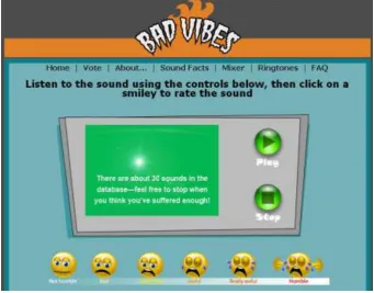
Next, participants came to the voting screen which can be seen in Figure 1. Users pressed play, listened to the sound and then voted using the smileys at the bottom of the screen. A key to making web experiments popular is to make the interface simple, intuitive and fun to use, and this is why smileys were preferred over tick boxes, radio buttons or sliders. Consequently, this is a direct scaling method on an ordinal scale. It would have been possible to use a slider scale and therefore obtain scale data, however the use of the visually-appealing smileys was preferred. The box in the middle might have displayed an image or just have been blank with a simple text message. After voting, a results page was given which showed the user‟s own response and compared this to the average response for that sound. Users could continue to audition as many sounds as they wanted. The results from the votes were stored in an mySQL database.
which are media-friendly and spark an interest in the general public. In the case of horrible sounds, most people have personal experience of sounds they do not like and this helped gain good media coverage. However, by running the experiment in this way, control is lost by the experimenter and naturally greater variance is introduced into the experiment. Unique to an acoustic experiment is the lack of control of the sound reproduction equipment used. For instance, it is not known whether the subject was listening over headphones or with loudspeakers. Also there are problems of getting reliable sound reproduction on
computers, for instance, does the user know how to turn the sound on? To reduce problems with software on the subject‟s machine, the sound was imbedded within Flash to be played by a player. The Flash-player is a common, almost ubiquitous plug-in on computers and circumvents the problems of incompatible media players. Another problem with using sound is that the download times for those on dial-up can be rather long. To minimise download times, the sound files are compressed with MP3 coding and were made short and in mono. If sound samples are too short, however, the horrible sounds may lack impact. For this reasons the sounds were set up to loop indefinitely once played. The sounds were distributed in MP3 format at 96 kps.
More general problems with web-experiments include: the difficulty of multiple people using one machine, people entering false data, self-selection of subjects and misunderstanding of instructions. During the running of the experiment, a few emails were received which indicated a small number of subjects were confused by the methodology, but the number was very small. Despite there being a message saying people should stop when they had heard enough, some people emailed to say they would have preferred to have had a fixed number of sounds to go through before stopping. To take another example, during the time that images unassociated with the sound were being used, a few people emailed because they wondered why they were listening to a metallic scraping sound while looking at a sheep. However, it was decided not to tell the subjects exactly why different images were being used, because this might have biased the results. Interestingly, emails from the public either asking about the study or to tell us their own personal horrible sound, only happened during the time there was publicity about the website. Once the media-attention had died away, and the website traffic was generated purely by word of mouth, these types of emails stopped being received.
A further issue with the methodology is the context within which the sound was heard. It is assumed that people were making judgements sat in front of a computer, probably at home or at work. It is well established that context can affect people‟s judgements; indeed the subject of this paper is how visual stimuli can alter sound judgements. It is hard to draw many conclusions about how context influenced perceptions in this case. The problem is probably no better and no worse in comparison to an experiment taking place in an artificial environment such as a laboratory. Field measurements would be superior in this respect, but it would be difficult in that case to get such a large database of votes.
All these confounding issues change the voting patterns, and particularly the rank ordering of the sounds. For example, frightening sounds, say the sound of an explosion, were thought unlikely to have sufficient impact over a set of computer loudspeakers with the typical listening contexts. Similarly, sounds which are annoying because they disturb normal activity, for example aircraft noise causing sleep disturbance, are problematic.
While the list of potential problems seem very large, the evidence presented later in the results section indicate that interesting and useful findings can be found using this methodology. In examining the voting patterns, it is possible to examine changes in voting patterns, for example comparing two visual stimuli. So while absolute judgements might be tricky to examine over the web, relative judgements can be examined and explored.
3.1.
Sound selection
People were given the opportunity to vote at anytime rather than forcing them to listen to the whole sound before voting. It would have been interesting to know when people had voted, but this was not recorded. It is suspected that this means there is a bias within the rank ordering towards sounds that make an immediate impact at the start of the recording, against those that take time to get horrible.
4. Some summary statistics
This section gives some idea of the population that took part in the voting, and how they voted. It is felt that this information helps sets the work on audio-visual interaction in context, as well as being useful to others who might wish to attempt running web experiments. This data is based on the first 765,082 votes. For the audio-visual interaction analysis, there may well be some differences in the population distribution, because the population was based on a smaller subset.
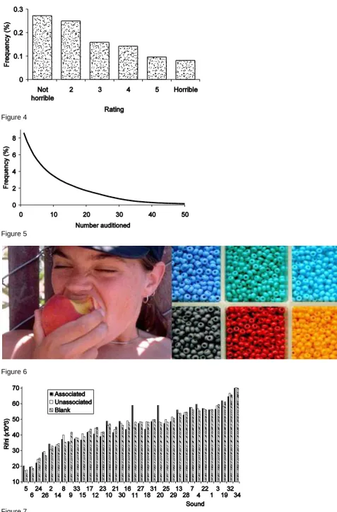
Figure 2 shows the frequency distribution for age. 29.6% of respondents were female, 54.1% male, with the rest unknown. Figure 3 shows the distribution of voting across the world with the expected bias towards places where there was most media publicity for the study, where English is spoken and where there is greater access to the Internet. Figure 4 shows a frequency distribution for the different points on the rating scale, showing a bias towards the least horrible end of the scale.
Figure 5 shows how many sounds were auditioned and voted on. On average people auditioned 11.5 sounds, which was more than was expected. However, a lot of people only heard a few sounds before stopping voting. This pattern of drop-out is, however, typical for a web-experiment8. The problem with people auditioning a different number of sounds is whether this biases the results from the study. However, as the sounds were presented completely randomly, and there seems no reason to treat the results from people who listened to a few sound as less valid than those who listened to a larger number, all data is included in the analysis. Similarly, the votes from people who didn‟t enter contextual data are used where this is
possible; the data from those voters is seen to be equally valid (if not as useful in some cases because of the lack of contextual data).
5. Effect of images on horribleness
At the start of the experiment, the sounds were presented either with an associated image, with an
unassociated image or with a blank (green) square – i.e. three visual stimuli were used. For example, for the sound of the screaming baby the subject might have been shown an associated image of a baby crying, an unassociated image of a lily flower and pad on a pond, or a green square. Each sound had one particular unassociated image which was used. This experiment into the effect of image continued until about 100,000 votes had been collected after which images were no longer used to allow other experiments to be carried out.
The votes were cast on an ordinal scale, and because the distributions are not necessarily normal, non-parametric tests are used in the analysis where possible. First, the data was analysed to check that there was a significant variation between the 102 presentations (34 sounds x 3 visual stimuli). This was done using the Kruskal-Wallis one-way analysis of variance by ranks. There was a significant variation. The data was examined to see if the changes in rating caused by using an image (in comparison to presentation without an image) caused a constant bias or was correlated to the rating of the sounds; no bias or correlation was found. (Later on, it will be shown that such systematic effects are seen with colour.)
Given the wide variety of sound types, and the previous findings in the literature about cross-modal interaction, it might be expected that the influence of the visual stimuli would be sound and image
dependent, for instance whether the sound and image are semantically congruent. Consequently, from now on, the analysis considered each sound separately. A Kruskal-Wallis test was used to find out whether the visual stimuli had a significant effect, and if a significant effect was found, a multiple comparisons method9 was used to determine where the differences lay between the three visual stimuli. The sounds were also collated into defined groupings (such as disgusting sounds) to evaluate possible overall trends.
populations were found to be similar except with respect to the world location. This test on audio-visual interaction was carried out early in the study, and consequently the vast majority of voters were in Australia, North America, UK and the Rest of Europe because this is where most of the media publicity had been. By restricting the following analysis to voters only from these countries, the populations for the different visual stimuli were found to be statistically similar.
For a few sounds, one of the images was absent, and these are noted as footnotes to the tables. Two sounds are not featured in this discussion - sound 32 which was feedback through a PA system and sound 31 which was mobile phone ring tones - this is because they were only presented with the green square. The absence of images was mostly due to the difficulty of getting good associated images for the sounds.
5.1. Results
There were two images which seem to provoke a strong reaction from respondents even without the sound, the image of finger nails on a blackboard and the picture of a dentist. The results for these two stimuli are shown in Table 1. The lines indicate when a particular visual stimuli belongs to the same group, i.e. when the two presentations produced results which were statistically the same. For example, sound 20 fingernails on the blackboard, the presentation with the unassociated image and green square belong to a group which was least horrible, and the presentation with the associated image is statistically different and more horrible. For sound 11, the dentist drill, the three visual stimuli produce results that are all significantly different from each other. Informal discussions with people indicate that some react strongly to the idea of these two sounds being horrible, even when they are just described verbally without the actual sound, or when a picture of a blackboard and finger nails or of a dentist is shown without the sound. In both cases, the sound is significantly more horrible when the associated image is shown when compared to no image or an unassociated image. The response to the visual stimuli is reinforcing the horribleness of the aural response. Two possible reasons for this result are suggested. First, the increase in horribleness might be happening because the image removes any ambiguity in the identification of the sound. As both images picture a scene normally accompanied by an unpleasant experience, a positive identification of the scene would be expected to increase the rating. Alternatively, it might be that a combined response of the horribleness of the image and sound separately – an example of stimuli via different senses amplifying a subject's response. However, because the image and sound are semantically congruent, the former is most likely to be true.
In these cases, not only is the sound made more horrible by the associated image, but the size of change in the rating of the sound is very much larger than it is for other sound and images. Figure 7 shows the
normalised ranking of the sounds with their three different visual stimuli (the normalised ranking used came from the Kruskal-Wallis test procedure, with larger values indicating a more horrible sound). The x-axis, which is the sound number, has been ordered according to the horribleness of the sound to make trends easier to see. The two sounds, number 11 the dentist, and number 20, the fingernails on the blackboard both show a dramatic change in the rating when the associated image is shown.
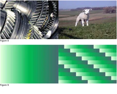
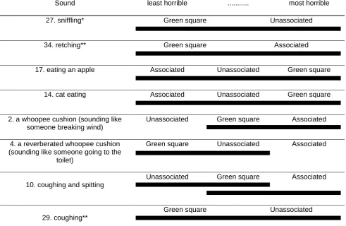
There were eight sounds in the database that were meant to possibly provoke a disgust reaction and the results are summarised in Table 2. For five of the sounds in the table, the ratings were not altered by the different visual stimuli. In the case of the whoopee cushions, although the idea was to generate disgust, these can also be seen as quite comical sounds. In the case of coughing and spitting, the “associated” image used was actually of someone cooking, and so perhaps it is unsurprising that people found the image made things more horrible to listen to. It is suggested that this is an example of sound and image interaction after the visual and audio stimuli had been identified. Overall, however, it seems that for the disgusting sounds, the image does not have a strong affect on the rating. Figure 6 shows an example of the images used in for the apple munching sound. The lack of a strong response is in some ways surprising, because even when there is a good match between the image and sound, as in Figure 6, and so where semantic congruence might be expected, there is no evidence of an inter-modal reaction between the visual and the audio. There has been a previous web-experiment examining disgust using images10 and this found statistically significant results, which would lend weight to an expectation of disgust-related visual images causing significant effects. However, when all the disgust data is pooled (excluding coughing and spiting because the associated image was inappropriate), there is not a significant effect for visual stimuli.
Dubois11 showed that people respond to everyday sounds by trying to associate the sound with the source or a meaningful event. It is assumed that people dislike these sounds because of what they are identified with. It seems unlikely that the horribleness is something intrinsic in the physical properties of the signal and how that is processed by the auditory system. It is assumed that the listeners identified the sounds as a
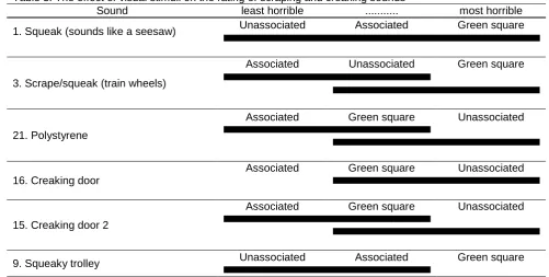
There were six scraping and creaking sounds the results from which are shown in Table 3 in addition to the fingernails down the blackboard sound which was considered above. Whether an image acts to make these sounds more horrible or not depends on the sound and also the image. For instance, for sound 1, the associated image was not particularly evocative, and so it is not that surprising that it made little difference to the sound perception. However, despite the differences between the results for some of the sounds, there is a general trend for the associated image to tend to make the sound less horrible. If the data for all these sounds is pooled in a single test, the effect for the associated image is found to be statistically significant; in addition it is also shown that the green square makes things more horrible. This is in line with previous work by Abe et al2 who found that images tended to make things more pleasant. Fastl5 and Hashimoto and Hatano4 found images made sounds less loud, and if it is assumed that the louder a sound is, the more horrible it is, which might be a fair assumption, then their results are similar to those shown here. Some of these sounds are easier to identify than others, and so it might be expected that for some the associated images make it possible to associate a meaningful event or source to the sounds, or to change the interpretation of the sound source or event, and hence alter the rating of the sound. For instance, the associated image could reduce ambiguity or give an interpretation to the sound that is less horrible. Figure 8 shows some typical images used.
For another type of sound, the issue of ambiguity can be explored. There is a strong desire in humans to classify and identify sensory stimuli12. Consequently, when sounds were presented to the subjects, it is very likely that alongside trying to rate the horribleness of sounds, subjects also tried to identify the sounds. When an image helps to identify an ambiguous sound source, then it is likely that this would change the rating. A good example of this is the baby crying sounds, the results of which are shown in Table 4. With sound 19, the multiple baby sound, the sound is somewhat ambiguous, and could be interpreted as being from animals, especially bleating sheep. However, with the associated image of a baby, the ambiguity in interpretation is removed, and the judgement is changed. In this case, the image of the baby makes the sound more horrible, which might be as expected as crying babies are more distressing, and therefore presumably the sound is more horrible, than bleating sheep. For the single baby crying, sound 7, the same effect is not seen because the sound file is less ambiguous. The ambiguity might be due to the ecological frequency, because it is more common for people to hear one baby screaming than to hear many babies screaming, or simply a causal uncertainty13. To confirm the different ambiguity of the two baby sounds, a brief laboratory test was carried out on 29 subjects. There were given a task of rating their confidence as to whether the sound was either babies crying or animals bleating on a five point scale. This was done without any visual clues. It was found that for the multiple baby sound, there was significantly less certainty that it was a baby sound, than for the single baby sound (as confirmed by a Wilcoxon signed rank test).
It is suggested, that the removal of ambiguity that occurs when the associated image is presented with the sound might have another effect. When the sound is presented alone, if it can not be identified by the subject, then the sound is rather unpredictable. Will it get louder? Will it get more unpleasant? It is hypothesised that this unpredictability is likely to change the horribleness of the sound, and will make the sound more horrible. An example of this might possibly be sound 9, the squeaky trolley, where the associated image is the side of an engine, and might help remove unpredictability from the sound. Furthermore, with only an ambiguous sound, people will tend to seek their own interpretations. These interpretations might be more or less horrible than when the sound is presented with the image, because the image will constrain the sound interpretation. As people were logging onto a site expecting to find the worst sounds in the world, it might be speculated that people were expecting to meet horrible sounds and therefore would seek the most horrible interpretations from ambiguous sounds. However, this issue of sound
unpredictability needs further investigation and testing.
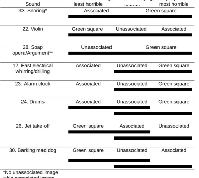
There were eight annoying, everyday sounds and the results from these are shown in Table 5. These do not form a very homogeneous group for analysis, but are a range of sounds that you might expect people to find annoying during their normal lives. The results for most of the remained sounds are shown in Table 6. Table 7 shows the animal distress calls. For both distress calls, the associated image (a picture of the animal) tended to make the sound less horrible, and the unassociated image makes things more horrible. Some other hypotheses for how the image might alter the sound rating were devised and tested in some short tests, examining issues of distraction and image pleasantness. These tests focussed on three sounds, 20 finger nails down the blackboard, 16 creaking door and 22 badly played violin. These sounds were chosen because they were in the middle of the rank ordering.
one moving image to examine this. The static images are shown in Figure 9. The moving image was of the right hand image in Figure 9, and the coloured blocks were made to slowly process sideways; a moving image was used because it is known to be powerful distracter. For each sound and image about 500 votes matched for contextual factors such as age were gathered. However, no distraction effect was found, and differences between the different visual stimuli were not statistically different. The indications were also that a very large increase in the number of votes was needed if statistical differences were to be found.
The second hypothesis to be tested concerned image pleasantness. The image and sound may be processed separately, and both rated by the subjects for their horribleness. The horribleness of the image and sound might then combine to give a combined response, even if the sound and image are not linked via associations through the interpretations. In other words, an unrelated but horrible image would change judgements in comparison with more pleasant images. This was tested by presenting the three sounds with four unrelated images. Two of the images, a picture of a lily and of a mountain village were chosen as pleasant images, and two images, the picture of a dentist and of a large pile of litter were chosen as unpleasant images. For each sound and image 850 votes were gathered.
Significant effects were found for the three sounds. The picture of the dentist made the sound of finger nails down the blackboard significantly worse. In the case of 16 the creaking door, the unpleasant images
increased the horribleness rating (p=0.04), and for 22 the badly played violin, the unpleasant images had the opposite effect making the sounds less horrible (p=0.02). Consequently, there is an effect, but because the effect of the unrelated horrible image varies with sound, it does not support the hypothesis.
Determining exactly what is happening is difficult. For simple sounds and images it is possible to demonstrate interactions between perceptions of sound and vision. For instance, brighter lights are associated with louder sounds. Working with more complex sounds and images has produced results that are much harder to interpret. Consequently, while some interesting results on the effects of image have been found, the tests have probably raised more questions than have been answered.
6. Colour
The effect of colour on people‟s judgements of the sounds was tested. The original website had a blue/green colour scheme. The controls and main square were green, and around this was an aqua background. There was also some orange and grey areas, but the predominate colours were green {147, 75, 59} and aqua {187, 37, 73} - the numbers in the brackets indicate the hue, saturation and brightness for these colours. A second red colour scheme was also used, where the controls and main square were blood red {346, 99, 72} and around this was a rose coloured background {346, 54, 80}. These two colour schemes were used at different times during the voting period, with the red colour being used for a week, about 3 weeks after the website launch. They were done at different times, because it was felt important to avoid users finding the website colours changing and wondering why they were changing and possibly working out the purpose of the study. A second test was carried out changing the brightness and saturation values of the original colour scheme. The green square was changed to {147, 88, 100} and the aqua background to {187, 100, 100}. It is noted that there was no control in this experiment over the settings of the monitors used to view the site, which means comments about absolute values of colour are problematic. However, comparisons between the colours will still be meaningful.
As the tests were carried out at different times, the populations for the different colours schemes were different. For example the original blue/green scheme had about 3 times more UK respondents because early on in the project, the media publicity was more concentrated in the UK. Consequently, it was necessary to select random populations, e.g. one from the voters who visited the blue/green site and the other from those who visited the red site, which were matched for age, gender and location in terms of their frequency distributions to prevent problems with covariates. (An alternative approach would have been to use a General Linear Model for categorical data and control for covariates15, but given the large amount of data available, it is possible and simpler just to select matched populations.)
First consider the two websites with different hues. There have been numerous studies on the effects of colour on people‟s state of relaxation. There have even been studies examining the effects on people‟s perception of websitese.g.16. Many studies e.g. 17,18 have shown that blue and green hues tend to elicit a state of relaxation, whereas yellow and red hues elicit more excitement. Consequently, it would be expected that the hue of the blue/green website would invoke a more relaxed response than the red website. (Note, although there were some small changes in the hue and saturation values between the green/blue and red website, if these differences were significant, they would tend to reinforce the impression that the blue/green website invokes a more relaxed response in comparison with the red website.)
It therefore seems that the contradiction between the more relaxed green/blue website and the horrible sounds promotes a stronger reaction resulting in higher horribleness ratings. Possible supporting evidence is provided by looking at the voting patterns across all sounds. It is found that the biggest difference between the red and blue/green votes occur for the sounds rated to be most horrible. To prove the significance of this effect the following test was used. First it was necessary to form a balanced experiment where the total number of red votes and total number of green/blue votes were the same. This was done by randomly matching pairs from the two data sets for age, gender and location. This left 65,732 votes in both data sets. The numbers 1-6 were assigned for each of the points on the ordinal scale, so the mean values can be treated as scale data. The mean rating for red and green were evaluated and then a plot of the difference between the means verses the average of the means was made. This is shown in Figure 10. A significant correlation is seen (p<0.01). There appears to be an outlier in Figure 10. This is sound 4, the whoopee cushion. It is unknown why this does not appear to follow the general trend.
The fact that green/blue website made the sounds to be perceived as more horrible, might be interpreted as contradicting the results found by Patsouraset al19, but this would be incorrect. In Patsouras‟ tests on trains, they found that the red train sound was louder. If it assumed that louder sounds are more horrible, than it might be expected that the red colouring would make the sounds on the website sound more horrible because they would sound louder, but this was not the case. It is suggested that there is a difference between the colour of a noisy object e.g. trains and the colour of a general environment, e.g. a red website. In the case of objects, it seems reasonable that objects with more stimulating colour schemes could be expected by subjects to be louder. In the case of website colouring, however, the colouring affects the context of the judgement.
Following on from the experiment on hue, the effect of brightness and saturation was then tested. Chroma is a measure of colour purity and vividness and is related to the saturation value. Higher chroma colours are found to be more arousing and induce a less relaxed-state20. The value of a colour is a measure of the brightness or how much white there is in a colour. Research suggests that brighter, high value colours, ones with more white in them, elicit a more relaxed response20.
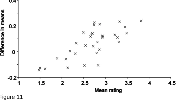
93,380 matched set of votes for the original and brighter/more saturated websites were used. As mentioned before, making the website brighter and more saturated had a significant effect. For 21 out of the 26 most horrible sounds, the brighter and more saturated website made the sounds less horrible. For the four least horrible sounds, the brighter and more saturated website made things more horrible. Figure 11 shows a plot of the difference in the mean ratings for the two different websites verses the mean rating for both website colours for all 34 sounds. A clear linear trend can be seen, which is again significant (p<0.01). Because brightness and saturation were simultaneously changed in forming the new website, it is hard to draw any strong conclusions as to how the effects might appear for brightness and saturation, separately. However, to put the effect in layperson terms, the brighter and more saturated website was more garish and less relaxing. Consequently, a similar result to that for the change in hues seems to have occurred, it seems to be the contradiction between the more relaxed original, less garish website and the horrible sounds that promotes a stronger reaction resulting in higher horribleness ratings.
7. Discussions and Conclusions
This study has demonstrated that it is possible to collate interesting pyschoacoustical data using web experiments on a scale not possible through laboratory-based testing. There is a need to accept less control over many experimental conditions; however, the ability to attract tens of thousands of participants makes the methodology appealing. To achieve this number of subjects requires the psychoacoustic tests to centre on a subject of interest to the general public and the media, as was done here with horrible sounds. During the testing, the visual stimuli that subjects met while auditioning and rating the horrible sounds were varied to examine cross-modal interactions between sound and vision. Results show that the visual stimuli does effect the judgement of most sounds, however, the reasons why this arises is unclear in many cases. For the work on images, the biggest effect was found for the sounds of finger nails scraping down the blackboard and the dentist drill. In both these cases, the associated image made the sounds more horrible. It is suggested that the increase in horribleness might be happening because the image removes any
ambiguity in the identification of the sound, leading listeners to associate the sound with an unpleasant source or event.
Two tests on the effect of colour were examined. It was found that the more relaxing website colour schemes, in terms of hue, brightness and saturation resulted in sounds being judged more horrible. For example, the green/blue website made sounds more horrible in comparison to the red website, with the biggest difference arising for the worst sounds. Although at first, this appears to contradict previous findings on the effect of colour on loudness, the differences might be explained by the different research questions posed. Previous work in the acoustics community has concentrated mostly on the effects of hue. However, the results from the website with changed brightness and saturation indicate that changes in these
parameters might have a bigger effect on sound ratings than changes in hue.
The findings for this study should be further examined in tests under laboratory conditions to better understand the responses from the web-experiment and to shed further light on the advantages and
disadvantages of large scale psychoacoustic testing via the Internet. Other future work will include examining the voting patterns for the different sounds across gender, age and culture for a fixed visual stimulus.
8. Acknowledgements
I would like to thank Louise Heatley, the web office for the School of Computing Science and Engineering for her work developing and maintaining the website, David Whitaker, Chris Plack and especially Peter Walker and Jean-Dominique Pollack for their insightful comments.
9. Figure legends
Figure 1. The voting screen used for the website.
Figure 2. Age distribution for votes for first 765082 votes.
Figure 4. Frequency distribution showing use of rating scale for first 765082 votes.
Figure 5. Frequency distribution showing number of votes per person for first 550000 votes. Figure 6. (Left) Associated and (Right) unassociated image for apple munching sound.
Figure 7. The normalised sum of the ranks (Ri/ni) for the different sounds and different visual stimuli - the vertical axis is a measure of horribleness. The sounds have been ordered according to their overall ranking. Figure 8. (Left) Associated and (Right) unassociated image for sound 3, scrape/squeak.
Figure 9, Two images used in distraction experiment, left least distraction, right more distracting. Figure 10, The difference in the mean score for red and green websites verses the mean score for both website hues. Each marker represents a different sound.
Figure 1
Figure 2
Figure 4
Figure 5
Figure 6
Figure 8
Figure 9
Figure 11
[image:14.595.65.546.521.617.2]10. Legends for Tables
Table 1. The effect of visual stimuli on the rating of sounds where anecdotal evidence suggests the image promotes a strong reaction without the sound. The lines indicate where the ratings with the visual stimuli were the same, i.e. not statistically different (p>0.05).
Table 2. The effect of visual stimuli on the rating of disgusting sounds. The double line for sound 10 indicates that the ratings with the unassociated and green square were statistically similar, forming one group, and that the ratings with the associated and green square formed another group. So it is possible to say that the response with the unassociated and associated images were statistically significantly different, but there were no statistically significantly difference between the green square presentation and either of the other two presentations.
Table 3. The effect of visual stimuli on the rating of scraping and creaking sounds. Table 4. The effect of visual stimuli on the rating of baby sounds.
Table 5. The effect of visual stimuli on the rating of annoying everyday sounds Table 6. The effect of visual stimuli on the rating of other sounds
Table 7. The effect of visual stimuli on the rating of animal sounds
Table 1. The effect of visual stimuli on the rating of sounds where anecdotal evidence suggests the image promotes a strong reaction without the sound. The lines indicate where the ratings with the visual stimuli were the same, i.e. not statistically different (p>0.05).
Sound least horrible ... most horrible 20. Nails down a blackboard Green square Unassociated Associated
Table 2. The effect of visual stimuli on the rating of disgusting sounds. The double line for sound 10 indicates that the ratings with the unassociated and green square were statistically similar, forming one group, and that the ratings with the associated and green square formed another group. So it is possible to say that the response with the unassociated and associated images were statistically significantly different, but there were no statistically significantly difference between the green square presentation and either of the other two presentations.
Sound least horrible ... most horrible 27. sniffling* Green square Unassociated
34. retching** Green square Associated
17. eating an apple Associated Unassociated Green square
14. cat eating Associated Unassociated Green square
2. a whoopee cushion (sounding like someone breaking wind)
Unassociated Green square Associated
4. a reverberated whoopee cushion (sounding like someone going to the
toilet)
Green square Unassociated Associated
10. coughing and spitting
Unassociated Green square Associated
29. coughing**
Green square Unassociated
Table 3. The effect of visual stimuli on the rating of scraping and creaking sounds
Sound least horrible ... most horrible 1. Squeak (sounds like a seesaw) Unassociated Associated Green square
3. Scrape/squeak (train wheels)
Associated Unassociated Green square
21. Polystyrene
Associated Green square Unassociated
16. Creaking door
Associated Green square Unassociated
15. Creaking door 2
Associated Green square Unassociated
[image:16.595.59.546.375.458.2]9. Squeaky trolley Unassociated Associated Green square
Table 4. The effect of visual stimuli on the rating of the baby sounds
Sound least horrible ... most horrible 7. Baby cry Green square Unassociated Associated
Table 5. The effect of visual stimuli on the rating of some annoying, everyday sounds Sound least horrible ... most horrible 33. Snoring* Associated Green square
22. Violin Green square Unassociated Associated
28. Soap opera/Argument**
Unassociated Green square
12. Fast electrical whirring/drilling
Associated Unassociated Green square
23. Alarm clock Associated Unassociated Green square
24. Drums Associated Unassociated Green square
26. Jet take off Green square Associated Unassociated
30. Barking mad dog Green square Unassociated Associated
[image:17.595.49.549.497.667.2]*No unassociated image **No associated image
Table 6. The effect of visual stimuli on the rating of other sounds
Sound least horrible ... most horrible 5. Low not-quite-eerie noise Unassociated Green square Associated
6. Gong/robotic rumble Green square Unassociated Associated
8. Electronic throb Green square Associated Unassociated
Table 7. The effect of visual stimuli on the rating of animal sounds
Sound least horrible ... most horrible 25. Tasmanian devil Associated Green square Unassociated
18. Cat spitting and howling Associated Green square Unassociated
11. References
1
C. Patsouras, T. G. Filippou and H. Fastl, "Influences of color on the loudness judgement", Forum Acusticum, PSY-05-002-IP, (2002).
2 Abe, K., Ozawa, K., Suzuki, Y., Sone, T., “The effects of visual information on the impression of
environmental sounds”, Inter-noise 99: 1177-1182, 1999
3
E. Pedersen and K. P. Waye, "Perception and annoyance due to wind turbine noise - a dose-response relationship," J. Acoust. Soc. Am., 116(6), 3460-70, (2004).
4 Hashimoto, T., Hatano, S., “Effects of factors other than sound to the perception of sound quality”, 17th ICA
Rome, (2001).
5
H. Fastl, "Audio-visual interactions in loudness evaluation", ICA, Japan, Tu3.X1, (2004).
6
S. Viollon, C. Lavandier and C. Drake, "Influence of visual setting on sound ratings in an urban environment," Appl. Acoust., 63(5), 493-511, (2002).
7
P. J. Laurienti, R. A. Kraft, J. A. Maldjian, J. H. Burdette and M. T. Wallace, "Semantic congruence is a critical factor in multisensory behavioral performance," Experimental Brain Research, 158(4), 405-14, (2004).
8
U.-D. Reips, "Standards for internet-based experimenting," Experimental Psychology, 49(4), 243-56, (2002).
9 W. J. Conover, “Practical nonparametric statistics,” 3rd
Ed. John Wiley & Sons, Inc, NY, (1999).
10
V. Curtis, R. Aunger and T. Rabie, "Evidence that disgust evolved to protect from risk of disease," Proc. R. Soc. Lond. Ser. B-Biol. Sci., 271, S131-S3, (2004).
11 D. Dubois, “Categories as Acts of Meaning: The Case of Categories in Olfaction and Audition,” Cognitive
Science Quarterly 1, 35-68, (2000).
12 W. W. Gaver, “What in the World Do We Hear? An Ecological Approach to Auditory Event Perception,”
Ecological Psychology, 5(1), 1-29, (1993).
13 J. A. Ballas, “Common factors in the identification of an assortment of brief everyday sounds,” Journal Of
Experimental Psychology - Human Perception And Performance, 19(2), 250-67, (1993).
14 W. James, “The stream of consciousness,” Psychology, Chapter XI, (1892).
15 A. Agresti, “An introduction to categorical data analysis,” Wiley series in probability and statistics, (1996). 16
G. J. Gorn, A. Chattopadhyay, J. Sengupta and S. Tripathi, "Waiting for the web: How screen color affects time perception," Journal of Marketing Research, 41(2), 215-25, (2004).
17
K. W. Jacobs and F. E. Hustmyer, "Effects of four psychological primary colors on gsr, heart-rate and respiration rate," Perceptual and Motor Skills, 38(3), 763-6, (1974).
18
K. W. Jacobs and J. F. Suess, "Effects of 4 psychological primary colors on anxiety state," Perceptual and Motor Skills, 41(1), 207-10, (1975).
19
C. Patsouras, T. G. Filippou and H. Fastl, "Influences of color on the loudness judgement", Forum Acusticum, PSY-05-002-IP, (2002).
20
P. Valdez and A. Mehrabian, "Effects of color on emotions," Journal of Experimental Psychology-General,