University of Kentucky University of Kentucky
UKnowledge
UKnowledge
Theses and Dissertations--Business
Administration Business Administration
2012
USE OF VISUALIZATION IN DIGITAL FINANCIAL REPORTING: THE
USE OF VISUALIZATION IN DIGITAL FINANCIAL REPORTING: THE
EFFECT OF SPARKLINE
EFFECT OF SPARKLINE
Priyanka Meharia
University of Kentucky, [email protected]
Right click to open a feedback form in a new tab to let us know how this document benefits you. Right click to open a feedback form in a new tab to let us know how this document benefits you.
Recommended Citation Recommended Citation
Meharia, Priyanka, "USE OF VISUALIZATION IN DIGITAL FINANCIAL REPORTING: THE EFFECT OF SPARKLINE" (2012). Theses and Dissertations--Business Administration. 1.
https://uknowledge.uky.edu/busadmin_etds/1
This Doctoral Dissertation is brought to you for free and open access by the Business Administration at UKnowledge. It has been accepted for inclusion in Theses and Dissertations--Business Administration by an authorized
STUDENT AGREEMENT: STUDENT AGREEMENT:
I represent that my thesis or dissertation and abstract are my original work. Proper attribution has been given to all outside sources. I understand that I am solely responsible for obtaining any needed copyright permissions. I have obtained and attached hereto needed written permission statements(s) from the owner(s) of each third-party copyrighted matter to be included in my work, allowing electronic distribution (if such use is not permitted by the fair use doctrine).
I hereby grant to The University of Kentucky and its agents the non-exclusive license to archive and make accessible my work in whole or in part in all forms of media, now or hereafter known. I agree that the document mentioned above may be made available immediately for worldwide access unless a preapproved embargo applies.
I retain all other ownership rights to the copyright of my work. I also retain the right to use in future works (such as articles or books) all or part of my work. I understand that I am free to register the copyright to my work.
REVIEW, APPROVAL AND ACCEPTANCE REVIEW, APPROVAL AND ACCEPTANCE
The document mentioned above has been reviewed and accepted by the student’s advisor, on behalf of the advisory committee, and by the Director of Graduate Studies (DGS), on behalf of the program; we verify that this is the final, approved version of the student’s dissertation including all changes required by the advisory committee. The undersigned agree to abide by the statements above.
USE OF VISUALIZATION IN DIGITAL FINANCIAL REPORTING: THE EFFECT OF SPARKLINE
____________________________ DISSERTATION
____________________________
A dissertation submitted in partial fulfillment of the requirements for the degree of Doctor of Philosophy in the
College of Business and Economics at the University of Kentucky
By
Priyanka Meharia
Lexington, Kentucky
Director: Dr. Radhika Santhanam, Gatton Endowed Research Professor of Management
Lexington, Kentucky
2012
2
ABSTRACT OF DISSERTATION
USE OF VISUALIZATION IN DIGITAL FINANCIAL REPORTING: THE EFFECT OF SPARKLINE
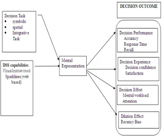
Information visualization (InfoViz) is an essential component of decision support systems (DSS). Sparklines is a visualization tool. This study examines if Sparklines in digital financial reports aids novice investors and if so under what circumstances? Does it enhances decision-making performance and facilitates effective decision-making experience? Additionally, does it lowers decision making effort; reduces dilution effect from non-relevant data in financial reports and mitigates recency bias in using digital financial reports?
The hypothesis is guided by the theory of Proximity Compatibility Principle and the Theory of Cognitive Fit. The research methodology for this study is a repeated measure, controlled laboratory based experiment. A pilot test was conducted in with a sample of forty undergraduate students from Gatton College of Business and Economics. The sample size for this study was 275 subjects.
The result revealed that there was significant effect of sparklines on decision making performance and it provides an incremental value over a tabular format. Sparklines makes an important contribution towards mitigating recency bias. The results also suggested that the irrelevant information cue in the shareholder’s report were not able to weaken the impact of relevant information in the audited financial data reported using sparklines. Sparklines increased the attention of the readers to the tables. Subjects performed the integrative tasks and spatial better when using Sparklines. For tasks such as symbolic tasks, Sparkline does not necessarily improve decision performance.
It was also found out that decision makers experience greater satisfaction when using sparklines. The overall cognitive load experienced by subjects was lower using sparklines when task demands are high (such as in a bankruptcy prediction task). Interestingly, the results indicate that there is no significant effect of sparkline on decision confidence and time. In conclusion, recall of facts and pattern among subjects was found superior with use of sparkline.
This study provides an empirical and justifiable basis for policy makers to make explicit recommendations about use of novel graphics such as sparkline in digital financial reports. Limitations of this study are noted.
KEYWORDS: Decision support system, Visualization, Decision making, Business Intelligence, Presentation format, digital reporting.
Priyanka Meharia Student’s Signature
July 3rd 2012
USE OF VISUALIZATION IN DIGITAL FINANCIAL REPORTING: THE EFFECT OF SPARKLINE
By
Priyanka Meharia
Radhika Santhanam, PhD Chair of Dissertation
Steven J. Skinner,PhD Director of Graduate Studies
iii
ACKNOWLEDGEMENTS
It is my great pleasure to thank the many people who have made this
dissertation possible. It is difficult to overstate my gratitude to my Ph.D. advisor,
Dr. Radhika Santhanam. Her enthusiasm, inspiration, and critiques helped me to
grow up as I followed the academic path. Throughout my dissertation writing
period, she provided encouragement, sound advice, support, and lots of good ideas.
She provided me with solid guidance in my research over the whole development
phase. With her great efforts to explain things clearly and simply, Dr. Santhanam
helped to make the whole process fun for me. I am thankful to her as she helped me
to overcome many difficulties in my life and research.
I am indebted to my many colleagues for providing a stimulating
environment in which to learn and grow. I am grateful to Dr. Melody Carswell, Dr.
Krishnamurty Muralidhar and Dr. David Hulse who provided a lot of helpful
comments and assistance in time. I am thankful to Dr. Clyde Holsapple for his kind
encouragement and support.
I wish to thank my entire family for providing a loving environment for me.
My sisters and my son were particularly supportive. Most importantly, I wish to
thank my mother, Veena Meharia and my late father Satish Meharia. They raised
me, supported me, taught me, and loved me. Lastly, I would like to give great
acknowledgement, appreciation, and thanks to my husband, Dr. Biswajit Panja,
who emotionally supported my need to become a researcher. I will never forget his
efforts on behalf of my education and career.
iv TABLE OF CONTENTS
Acknowledgements... iii
List of Figures... viii
List of Tables ... ix
Contents 1 CHAPTER ONE: VISUALIZATION AS A DECISION AID...1
1.1 DECISION SUPPORT SYSTEMS ...1
1.2 BUSINESS INTELLIGENCE FOR MAKING DECISIONS ...2
1.3 VISUALIZATION IN DECISION SUPPORT ...4
1.4 INTERACTIVE DATA FORMAT AND USE OF VISUALIZATION ...5
1.5 ROLE OF VISUALIZATION IN DECISION MAKING ...7
1.5.1 Visualization as a memory aid ...7
1.5.2 Visualization as representation aid ...7
1.5.3 Visualization as supporting parallel processing in the brain ...7
1.5.4 Visualization as support for creative thinking and insight ...8
1.5.5 Visualization as support for Pattern Recognition ...8
1.5.6 Visualization as support for Persuasion ...9
2 Chapter Two: Survey of visualization tools and techniques………10
2.1 DYNAMIC GRAPH ...10
2.2 DENSE GRAPHICS ...13
2.3 INTERACTIVE GRAPH ...16
3 Chapter Three: Presentation format and decision making: a review of literature……… ………..18
3.1 KEY FINDINGS FROM THE LITERATURE...19
3.1.1 Effect of Presentation Format on Decision Performance ...19
3.1.2 Effect of presentation format of tagged data and web syndication on decision performance……….. ...20
3.1.3 Effect of presentation format and individual differences on decision performance…………. ...21
3.1.4 Effect of presentation format and task/environment complexity on decision performance…………. ...22
3.1.5 Effect of presentation format with task interruption on decision performance 22 3.1.6 Effect of presentation format on memory and decision performance ...23
3.1.7 Effect of presentation format on compensatory choices under uncertainty ....24
3.1.8 Effect of presentation format and task type (spatial vs. symbolic) on decision performance………… ...24
v
3.1.10Effect of alternative forms of information presentation on evaluating
corporate performance ...25
3.1.11Effect of maps vs. table on decision performance ...26
3.1.12Effect of novel presentation format and task type on decision performance ..26
3.1.13Effect of presentation format, Cathode Ray Tube (CRT) versus hard copy terminal and heuristic versus analytical decision makers on decision performance. 28 3.1.14Effect of decision guidance/decision aid on tasks ...29
3.1.15Effect of graph and decision strategies on decision performance ...30
3.1.16Effect of decision-making incentives on decision performance ...31
3.1.17Impact of desired accuracy on preferences for different presentation formats 31 3.1.18Effect of video vs. text on decision performance ...32
4 Chapter Four: Review of theory frameworks used in visualization research………..36
4.1 DISTRIBUTED COGNITION THEORY (ZHANG AND NORMAN 1994;HOLLAN, HUTCHINS ET AL.2000;ZHANG AND PATEL 2006) ...36
4.2 THEORY OF GRAPH COMPREHENSION (PINKER 1990)...36
4.3 INTEGRATIVE MODEL OF GRAPH COMPREHENSION (CARPENTER AND SHAH 1998) 38 4.4 THEORY OF DUAL CODING (PAIVIO 1986;PAIVIO 1991;SADOSKI AND PAIVIO 2001) 38 4.5 THEORY OF PROPOSITIONAL REPRESENTATION (PYLYSHYN 1973) ...39
4.6 COGNITIVE LOAD THEORY (VAN MERRIENBOER AND SWELLER 2005) ...39
4.7 STEVENS’POWER LAW FOR ESTIMATING MAGNITUDES ...40
4.8 COMPUTATIONAL MODEL OF GRAPHICAL PERCEPTION (LOHSE 1993;LOHSE 1997) 41 4.9 WEBER'S LAW OF JUST NOTICEABLE DIFFERENCES (WEBER,ROSS ET AL.1996) 41 5 Chapter Five: Research Framework……… 43
5.1 IMPORTANCE OF REPORTING FORMAT ...43
5.2 SPARKLINES ...46
5.3 THEORY AND HYPOTHESIS ...49
5.3.1 Theory of proximity compatibility ...49
5.3.2 Theory of Cognitive Fit ...49
5.4 DEVELOPMENT OF HYPOTHESES ...50
5.4.1 Decision Experience: Decision Confidence and Satisfaction ...50
5.4.2 Decision effort: Cognitive load and Attention ...51
5.4.3 Dilution effect 53 5.4.4 Recency Bias 54 5.4.5 Decision Performance: Accuracy and Time ...55
5.5 RESEARCH DESIGN ...59
5.6 EXPERIMENTAL PROCEDURES ...59
5.6.1 Development of stock reports ...60
vi
5.7.1 Independent Variables ...62
5.7.2 Dependent Variables ...62
5.8 CONTROL VARIABLES ...65
5.9 PILOT STUDY PROCEDURE ...65
6 Chapter 6: Main Study………. 67
6.1 PARTICIPANTS ...67
6.2 VALIDITY CHECKS ...70
6.2.1 Counterbalancing ...70
6.2.2 Manipulation check ...70
6.3 RESULTS ...72
6.3.1 Data analysis 72 6.4 LIMITATIONS ...83
6.5 FUTURE RESEARCH DIRECTIONS ...85
6.6 CONTRIBUTIONS OF THE STUDY ...86
6.6.1 Implications for research ...86
6.6.2 Implications for practice ...88
Appendices Appendix A: Scanned copy of the Consent Form……… 90
Appendix B: Experiment………... 95
Appendix C: Pretask questionnaire (Demographics and background) ………96
Appendix D: Introduction to Sparkline ………98
Appendix E: Using tables ……….99
Appendix F: Case Scenario for the first condition……… 100
Appendix G:Shareholders Report and key financial ratiosof High Tech Systems Corporation Inc.………101
Appendix I: Case Scenario for second condition ………104
Appendix J: Shareholder's Report for the treatment condition ………...105
Appendix K: Measurement Scales………. 107
References………..……….112
vii LIST OF FIGURES
FIGURE 2-1: SCREENSHOT OF MOTION CHART IN ACTION. ... 12 FIGURE 2-2: SCREENSHOT OF TREE MAP HIGHLIGHTING STOCK MARKET
HAD FALLEN ON THAT DAY, WITH A FEW EXCEPTIONS ... 14 FIGURE 2-3: TREE MAP SHOWING THE BOMBAY STOCK EXCHANGE
PERFORMANCE ... 15 FIGURE 2-4 INTERACTIVE FINANCIAL CHART ... 17 FIGURE 4-1: THEORY OF GRAPH COMPREHENSION (PINKER 1990) ... 37 FIGURE 4-2: DIFFERENT PHYSICAL FEATURES OF A GRAPH AND ACCURACY OF JUDGMENTS ... 40 FIGURE 4-3: STEVENS’ POWER LAW FOR ESTIMATING MAGNITUDES IN
AREA MAP ... 41 FIGURE 5-1: RESEARCH MODEL: FACTORS INFLUENCING THE IMPACT OF
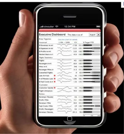
VISUALIZATION ON DECISION MAKING PERFORMANCE ... 46 FIGURE 5-2: : SNAPSHOT OF A MOBILE APPLICATION DEVELOPED FOR
EXECUTIVE DASHBOARD USING SPARKLINE ... 47 FIGURE 5-3: SPARKLINE TRACKS 250 DAYS OF PRICE OF FOREIGN
EXCHANGE ... 48 FIGURE 5-4: COLUMN FINANCIAL PAGE WITH SPARKLINE IN NEWSPAPER 48 FIGURE 5-5 THEORY OF COGNITIVE FIT ... 50 FIGURE 6-1: : GRAPHS THAT CAN BE REPRESENTED IN WORD SIZE FORMAT
viii
LIST OF TABLES
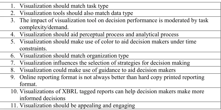
TABLE 3-1: RESEARCH BASED GUIDELINES FOR DESIGN AND USE OF
VISUALIZATION TOOLS ... 34
TABLE 5-1 SUMMARY OF HYPOTHESIS ... 58
TABLE 5-2: ALTMAN Z SCORE CALCULATION ... 61
TABLE 5-3: NASA TASK LOAD INDEX ... 64
TABLE 6-1: CFA OF THE PERCEPTUAL CONSTRUCTS ... 73
TABLE 6-2:SUMMARY OF HYPOTHESIS TESTING FOR STUDENT SAMPLE ... 74
TABLE 6-3: SUMMARY OF HYPOTHESIS TESTING FOR SAMPLE OF EXPERIENCED INVESTORS ... 75
TABLE 6-4: SUMMARY OF HYPOTHESIS TESTING FOR ALL PARTICIPANTS IN THE STUDY. ... 76
TABLE 6-5: SUMMARY OF RESULTS ... 77
1
1 Chapter One: Visualization as a Decision Aid
1.1 Decision Support Systems
Information technology (IT) plays a key role in creating knowledge (2000) and
supporting management in decision making activities (Keen and Morton ; Morton 1971;
Bonczek, Holsapple et al. 1981; Holsapple and Whinston 1996; Todd and Benbasat
2000). Decision support systems are Management Information Systems that aids a
decision maker in the decision making process. DSS include “business intelligence
systems, some workflow systems, groupware, conferencing software, management expert
systems and model-based analytics”(Holsapple 2003). In an article that classifies DSS
architecture and types; Holsapple writes that
“DSS relaxes cognitive, temporal, spatial and/or economic limits on the decision maker.
The support furnished by the system allows a decision episode to unfold
• in more productive ways (e.g., faster, less expensively, with less effort),
• with greater agility (e.g., alertness to the unexpected, higher ability to respond),
• innovatively (e.g., with greater insight, creativity, novelty, surprise),
• reputably (e.g., with higher accuracy, ethics, quality, trust), and/or
• with higher satisfaction by decisional stakeholders (e.g., decision participants,
decision sponsors, decision consumers, decision implementers)”
As per Simon’s intelligence-design-choice model; DSS should support all phases of the
management decision-making process; specifically the intelligence phase that refers to
the “process of searching the environment for conditions calling for decisions” (Simon
2
which can be used by DSS to support decision making. DSS aids the decision maker in
making sense from the large amount of digital data. In a decision making setting, the
decision maker progresses from six states of descriptive knowledge: data, information,
structured information, insight, judgment and finally the decision (Wali Van Lohuizen
1986). IT such as DSS can support the decision maker to progress through the different
states of knowledge and make more informed decisions.
1.2 Business Intelligence for making decisions
Business intelligence (BI) refers to inferences and knowledge discovered by analyzing
data acquired from different sources. A data warehouse is a repository of digital data
from which business intelligence can be derived. BI refers to “technologies, applications
and practices for the collection, integration, analysis and presentation of business
information” (AICPA 2010). BI systems can help decision makers in an organization to
derive knowledge from the data to make wiser and more informed business decisions.
In today’s economic climate, companies want quantifiable success measures. BI can help
in extraction, analysis, and reporting of historical data or data related to comparable
companies in order to provide valuable performance measure. As per the PAIR model,
organizations that use BI systems can potentially increase business competitiveness
through improved productivity, agility, innovation, and/or reputation (Holsapple and
Singh 2001). To increase competiveness the businesses need to be more agile and
innovative. They need to predict rather than react to changes in the conditions in which
they operate. The BI system supports the retrospective and predictive analytics on data
3
Independent researchers have predicted high future demand for BI systems. Gartner's
research reports that in spite of global recession businesses are interested in investing in
business intelligence (BI) platforms that are expanding their capabilities towards
advanced data visualization, scorecards and interactive dashboards. It predicts BI
market’s compound annual growth rate (CAGR) through 2012 to be 7.0% for stand-alone
BI platforms (Hostmann 2009) . Gartner predicts “Through 2015, organizations
integrating high-value, diverse, new information types and sources into a coherent
information management infrastructure will outperform their industry peers financially
by more than 20%.”
As competition in the knowledge economy gets more fierce, organizations are constantly
trying to get new insights from different sources of knowledge to gain competitive
advantage.
As per the Knowledge Management theory, an organization has two classes of
knowledge resources: content and schematic knowledge resources (Holsapple and Singh
2001). As per Holsapple et al (2001), a) Content knowledge resources are of two types:
knowledge conveyed in/by artifacts and Participants’ knowledge and b) schematic
knowledge resources are of four types: culture, infrastructure, strategy, and purpose.
Artifacts are usable representation(s) of knowledge on which digital processors like the
BI tools can be applied. The digital artifacts can be stored in database and be in the form
of records, files, images, video, reports, documents, books and so on. Participants’
knowledge is knowledge possessed by a participant in the decision making process. The
knowledge to make more informed decisions can be discovered from internal participants
4
network, experts in the field (consultants). Knowledge can be acquired from databases,
search engines, from remote sensing objects and from other environment knowledge
resources. On Participants knowledge and schematic knowledge resources, BI tools can
be applied if the knowledge is represented in a usable form.
1.3 Visualization in Decision Support
Information visualization (InfoViz) is an essential component of decision support systems
(DSS) that supports Business Intelligence. Visualization is the use of
“computer-supported, interactive, visual representations of abstract data to amplify cognition”(Card,
Mackinlay et al. 1999). Visualization tools are computer applications that produce
graphical representations that aid decision making. Visualization tools make it possible to
model the digital data on the basis of queries to create digital reports that can aid decision
making. Information visualization (InfoViz) has been gaining prominence recently
because it supports visual exploration of data resources by the use of computer graphics.
InfoViz is commonly used in reports and performance evaluation dashboards.
Business Intelligence Dashboard is a “reporting mechanism that aggregates and displays
metrics and key performance indicators (KPIs), enabling them to be examined at a glance
before further exploration by the additional BI tools”(Chandler 2007 ). InfoViz is
available in dashboards as they employ dense, interactive, color coded visual
presentations to provide at-a-glance information that provides situation awareness.
InfoViz is also available in simple spreadsheets to complex computer-based systems like
enterprise resource management (ERP); knowledge management (KM) systems; and
expert systems (ES). Sample vendors of companies selling visualization software include
5
interactive data visualization functionality and the list of such vendors include Board
International, IBM Cognos, MicroStrategy, SAP BusinessObjects, SAS and Tibco
Spotfire.
Chief economist of Google Inc. predicts that need for data visualization will be growing
rapidly in the next few years. He writes.
“the ability to take data—to be able to understand it, to process it, to extract value from
it, to visualize it, to communicate it—that’s going to be a hugely important skill in the
next decade.... because now we really do have essentially free and ubiquitous data. So the
complimentary scarce factor is the ability to understand that data and extract value from
it… Managers need to be able to access and understand the data themselves” (Sundberg
1998)).
1.4 Interactive data format and use of visualization
eXtensible Business Reporting Language (XBRL) is an XML-based, open technology
standard for the digital exchange of financial and business information in a
computer-readable format. The computer computer-readable format facilitates use of software to visualize
data in XBRL documents and prepare custom reports to support decision making. The
current 'paper centric' nature of reporting business information includes only few data
points. XBRL deployment increases the number of data points and the variety of
information that can be incorporated into management decision-making processes (Willis
2003). The financial-database available from companies like Compustat provide less
than 400 data points but a typical annual report may include in excess of 3,500 unique
information concepts through XBRL tags (Willis 2006). Data submitted as XBRL will
6
download, view and compare financial information across companies (SEC 2008; SEC
2009). Further, audit firms are considering using interactive data visualization to
streamline analytical procedures (Bay 2006; Gunn 2007). Several companies currently
incorporate interactive data visualization features on their investor relations web sites,
such as hyperlinked tables of contents, dynamic graphic images, and search engines
(Kelton and Yang 2008).
Starting with fiscal periods ending on or after June 15, 2011, the U.S Security Exchange
Commission rules require all public companies to submit their financial statements in the
eXtensible Business Reporting Language (XBRL); interactive data format, that is
intended to improve its usefulness to investors (SEC 2009). The Commission has also
issued rules that will require interactive data reporting by mutual funds and ratings
organizations. XBRL is a global reporting language for financial supply chain
management and business and financial reporting (Willis 2006). The XBRL reporting
format apply to public companies and foreign private issuers that prepare their financial
statements using U.S. generally accepted accounting principles (U.S. GAAP) or using
International Financial Reporting Standards (IFRS) as issued by the International
Accounting Standards Board (IASB). XBRL is widely used in China, Japan and Europe.
In this format used globally, financial statement information is being downloaded directly
into spreadsheets that will allow visualization of such data in any particular management
analysis. BI tools can also be applied to create, exchange, slice and dice numbers,
create analytical ratios and perform cross-company comparison of business reporting
7 1.5 Role of Visualization in Decision Making
Review of the literature on computer graphics as decision aid reports that the format in
which data is presented to decision makers is critical to provide information for making
decision (DeSanctis 1984; Sharda, Barr et al. 1988; Benbasat and Nault 1990). Effective
visualization tools are of great importance in supporting decision making because when
visualization tools are inadequate, decision making performance is impaired.
Visualization tools amplifies cognition, perceptual information processing and facilitates
knowledge generation in the some of the following ways.
1.5.1 Visualization as a memory aid
As per the Central capacity theory humans have limited working memory (Miller 1956).
Human beings also have limited visual working memory which allows human beings to
store simple images and visual objects in their brain (Haber 1969). Visualization of data
may improve the storage and accessibility of the information in the visual working
memory to support decision maker. It may reduce demands on working memory.
1.5.2 Visualization as representation aid
Visualization can help in representing data in a format that is easier to read and interpret.
For e.g., both pairs of following numbers represent the same quantities but Arabic
numbers are easier to read than roman numbers. 16 times 103 vs. XVI times CIII.
1.5.3 Visualization as supporting parallel processing in the brain
As per Dual Coding Theory, left side of the brain processes language in a sequential
order, whereas the right side of the brain is more visual and processes information
8
supports parallel processing of the visual object and the textual to aid decision making.
Visualization can aids recall of information for making decisions.
1.5.4 Visualization as support for creative thinking and insight
Decision making includes problem solving (Todd and Benbasat 2000). According to
Gestalt’s theory of problem solving, creative solutions to complex problems need
“insight”. Many complex business decision making also need “insight” and insight is a
sudden discovery of a solution to a problem which results in a subjectively catastrophic
experience (Weisberg 1992). Visualization tools can summarize and represent large
amount of data in a small screen space. This may help the decision maker to make sense
of the data and in this sudden discovery of a solution to a problem. For decision making;
Information acquisition task is data driven whereas the information evaluation task
requires parallel use of data and mental schema (Jarvenpaa 1989). Mental schema
influences what we pay attention to and what we ignore. Characteristics that are
consistent with our schema gets more attention and those that are inconsistent with our
schema gets filtered out (Nash 2006). The knowledge generated from effective
visualization of large volume of data can help the decision maker to build their mental
schema; to support information evaluation task and to solve complex problems creatively.
For solving semi structured or ill structured problem, visualization tools has the potential
to influence the ease of reaching an accurate solution.
1.5.5 Visualization as support for Pattern Recognition
Human brain is a powerful pattern-finding engine. Effective graph make patterns,
temporal trends, correlations, clusters, gaps, and outliers visible in seconds (Tufte 1990).
9
of human brain. Perceptual cues in graph can help identify the pattern, Visualization aids
in perceptual information processing to identify exceptions, trends, patterns, relationship
in the data (clusters, associations, causality etc.), detect outliers and to summarize data
perceptually (Carpenter and Shah 1998).
1.5.6 Visualization as support for Persuasion
Vivid and interactive graph can be persuasive and inspiring (Morrison and Vogel
1998).People trust visual cues (similar to seeing is believing) and patterns. Hence, it is
10
2 Chapter Two: Survey of visualization tools and techniques
There are a host of visualization tools and techniques emerging that are commonly used
today in the Business Intelligence to make sense of large volumes of data such as XBRL
financial data from the Securities and Exchange Commission, FDIC call reports and other
world financial, stock market and business data. Some of the popular and newer
visualization tools available are discussed below.
2.1 Dynamic Graph
There is a general belief that dynamic graphics should be more effective than
comparable static graphics and is more enjoyable because of aesthetics, ability to attract
attention or maintain motivation (Tversky, Morrison et al. 2002). For example
information can be presented dynamically in the format of Motion Charts which is
explained below. Over the last two decades several studies have investigated the effect of
dynamic graphics on comprehension, learning, memory, communication and inference
but the results have not reached a consensus. The review by Tversky et al. (2002) argued
that the difficulty to reach a conclusion can be attributed to the methodological and
theoretical problems with the research and that the animated and static graphics lacked
equivalence between in content or procedures. Where animation presented more
information or involved interactivity. Moreover, Tversky et al.(2002) agreed that
conveying real-time changes and reorientations in time and space seemed to be the most
promising uses of animation due to people’s natural cognitive correspondences based on
the congruence principle. Other studies have found evidence to say animations facilitates
in faster retrieval and recall of information than static images (Rieber and Boyce 1990;
11
animated graphics were found superior to static graphics and to no graphics (Rieber
1990). Compared to static graph (SG), Dynamic Graph (DG) facilitates in faster retrieval
and recall of information (Rieber and Boyce 1990; Morrison and Vogel 1998),
information comprehension required for decision making (Morrison & Vogel, 1998).
Dynamic graph enhances information comprehension (Morrison and Vogel 1998) but
verbal narration or text in conjunction with animation improves information
comprehension (Mayer and Anderson 1991). In another study it was found that in a
problem solving task, subjects who were presented with information in the form of a)
Text in conjunction with animation and caption performed better than subjects who were
presented with information in the form of both b) text plus animation and c) captions
plus animation. Animation was found to significantly improve the performance of the
problem-solving task that involved the highest level of cognitive effort (Large, Beheshti
et al. 1996). Animation enhances comprehension but this is determined by a variety of
factors, including the level of complexity of the information and the kind of information
being conveyed and differences in time lag between testing and viewing can have an
effect on information comprehension (Large, Beheshti et al. 1994). Speed at which
animations were portrayed effects comprehension of the display (Lightner 2001). Once
such example of dynamic graph used in Management Information systems is Motion
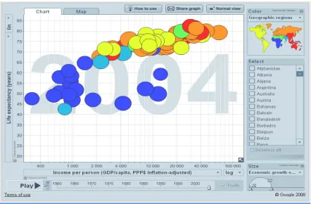
graph. Motion chart is a dynamic chart to explore several indicators over time. It
provides multi-dimensional analysis of all the metrics. Once the Motion Chart loads,
there is an array of bubbles. Each bubble represents a different metric. We can select four
different dimensions to plot data: X-axis, Y-axis, Color, and Size. There are several
12
superior to size as a mechanism to target a feature in a Motion Chart? We can press
"Play" at the bottom of the chart to see how metrics perform over time. The Motion chart
depicting the financial ratios and key financial data for a company for the years 2004 to
2010 is illustrated in Figure 2-1.
Figure 2-1: Screenshot of Motion Chart in action.
In this example the user can view and compare the different financial ratios of different
firms at a single screen by interacting with the data. The Motion chart is dynamic and
interactive chart to explore several indicators over time. Users can use Trails to trace the
path of individual bubbles. The chart generates moving graphics. The several indicators
such as Income per person, Life expectancy, Economic growth and geographic regions
are encoded in the graph in the form of changing color, changing shape and position of
13 2.2 Dense Graphics
Dense graph can plot millions of records in small screen space. In today’s world of
pervasive and mobile computing, there is a growing demand for Mobile Business
Analytics. The display area available in such smart phone and mobile PC is small. For
small screen space, graph excellence for high volume of data can be achieved with
creating dense graphics. Dense graphs for Business Analytics will continue to grow in
demand. Dense graph are graph that can maximize data density of graphics (Tufte 1990).
Dense graph would mean graph than can accommodate large set of data points in a small
screen space. Data density has been defined with the following formulae.
Data density of graphic = Number of entries in data matrix
Area of data graphic
One such example of dense graph is Tree Maps (Shneiderman 1992). Tree Maps encodes
numerical and categorical value in graphical attribute and lays them in Matrix format.
Tree map presentation (Figure 2-2) highlights that stock market had fallen on that day,
with a few exceptions. This presentation can be displayed on a small screen space and is
prepared using Tableu software with huge volume of single day, stock price data from
14
Figure 2-2: Screenshot of Tree Map highlighting stock market had fallen on that day,
with a few exceptions
The combination of spatial presentations and color coding in Tree maps helps the user
gain an overview of the data. Using the traffic color light schema, red meant the stock
price for the particular groups of stocks in a particular industry had fallen for the day and
green meant the prices had increased for the day. The Tree map illustrates that stock
market had fallen on that day, with a few exceptions. The Tree map as shown in the
example above can help create situation awareness by presenting current status and alerts.
In the above example, the few exceptions are highlighted in green.
While tabular displays and spreadsheets can show 30-60 rows at a time on typical
displays, Tree maps can accommodate hundreds or thousands of items in a meaningfully
organized display TreeMaps can be used for portfolio analysis (Figure 2-3).
Exception: Price for some stocks in the Technology sector had increased for the day. and are highlighted in green
15
Figure 2-3: Tree Map showing the Bombay Stock Exchange Performance
The guidelines proposed by Tufte (1997) are to arrange for decoding of data encoded in
the graph to take place at the perceptual level by making visual comparisons between
large datasets and make large datasets coherent. One particularly interesting way to create
dense graphics is through what Tufte calls micro/macro readings. These are graphics that
convey one layer of information on a micro (zoomed in) scale and another layer on a
macro (zoomed out) scale. In the Tree map above, by zooming on the green boxes users
can review the details of single or groups of stock. The viewer may glance from a
distance to observe an aggregate trend, and later peer in closely to examine individual
pieces of that trend. In the tree map the users can look at the exceptions highlighted in
green at the macro level and then zoom in on the individual stocks to get information
about the stocks at the micro level. The size of the blocks shows the market share
16 2.3 Interactive graph
Computer graph are often interactive and interactivity is known to facilitate performance
(Narayanan and Hegarty 1998). Interactive task can be overview, zoom, filter,
details-on-demand, relate, history, and extract (Shneiderman 1996) or dynamic projections,
interactive distortion, interactive linking and brushing (Keim 2002). Interaction types can
be transformable (decision makers can manipulate how the representation is rendered,
such as zooming, panning or resizing), or manipulable (decision makers may control
parameters during the process of image generation, i.e. filtering, visually encoding the
variables). Gonzalez and Kasper (1997) proposed a framework where four properties of
animation were identified: image abstraction (change of image from more realistic to
abstract representation), transition (movement of image: gradually or abruptly, or by
dissolving, fading, etc.), alteration (texturing, coloration, etc.), and interactivity
(manipulation, navigation). It was found in their study that decision quality was enhanced
by parallel navigation technique as compared to sequential navigation technique in
interacting with graph (Gonzalez and Kasper 1997). In a study by Tversky, Morrison, and
Betrancourt (2002), the results indicate that if learners are in control of the speed of
animation and can view and review, stop and start, zoom in and out, and change
orientation of parts and wholes of the animation at will, then learner performance is
enhanced. The results of the study suggests that if graph are both dynamic and
interactive then it can aid the decision maker better (Tversky, Morrison et al. 2002).
17
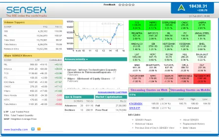
Figure 2-4 Interactive financial chart
An interactive line graph as shown in Figure 2-4summarizes the stock price data for
Google Stock from the year 2004 to 2010. Volume data informs the decision maker how
many shares of the stock have traded during the current trading period. As the user move
the cursor back and forth across the interactive Chart, there are two track balls following
the cursor. The first track ball moves back and forth across the historical price data of the
stock that has been charted. The second track ball moves back and forth across the
historical volume data of the stock. The decision makers can control the time periods for
which they want to view historical price and volume data. They can zoom and get the
details of stock on demand like the open, high, low and close prices for the stock on that
18
3 Chapter Three: Presentation format and decision making: a review of
literature.
The objective of the study is to focus on the interface components of DSS. Several
seminal laboratory based experiments that examined, the influence of information
presentation format on quality, process and outcome of decision making was identified
from the leading journals in Information systems and Accounting. Our literature search
follows the recommended four-step process (Vom Brocke, Simons et al. 2009): First,
using the MIS Journal Ranking (AIS 2010), we select six of the most popular IS journals
and other Accounting journals (Webster and Watson 2002). The journals selected were
Information Systems Research , Journal of Information Systems, Management Science,
MIS Quarterly, Decision Support Systems, Communications of the ACM, Accounting
Organizations and Society, Accounting Review, Behavioral Research in Accounting,
Accounting, Behavior and Organizations Conference, Journal of Accounting and Public
Policy, Accounting Education, Journal of Management and Journal of Emerging
Technologies in Accounting. Second, we use EBSCO host, Google scholar, Science
Direct, and Wiley Inter Science to access the journals. Third, using the keywords "
Decision making” and the terms "presentation format, decision aid, decision making,
visualization" we got several papers. Fourth, doing a backward and forward search, we
end up with 50 relevant publications. The key findings from 50 such research papers are
synthesized below. Based on the key findings and existing theories on visual perception;
we develop initial research based design guidelines for new-generation Visualization
19
components of DSS such as new-generation Visualization tools and other factors on
decision outcome, as part of future research in directions in chapter six.
3.1 Key Findings from the literature
3.1.1 Effect of Presentation Format on Decision Performance
Several seminal studies have studied the effect of presentation format in organizing data,
mitigating biases, accuracy and time taken to make decisions.
Roscoe and Horwoth (2009) studied the effect charting techniques on investment
performance. The results suggested that charting techniques may help decision
techniques to organize data but may not help decision makers to an optimal or correct
situation. Hutchinson et al.(2010) studied the effect of graphs to mitigate biases in
multi-attribute budget allocation decisions. Results suggested that graph were not effective in
mitigating biases. Vivien A. Beattie and Michael John Jones (1993) compared the
effects of visual and numerical presentations of financial information as well as
demonstrated an effective alternative method of accounting education and training. The
experimental studies suggested that graphs were more effective than numerical
presentation. Schulz and Booth (2009) studied accuracy of subjects’ sales account
balance prediction as well as subjects’ confidence in their account balance prediction.
They inferred that when actual normative value was used to measure prediction accuracy,
subjects receiving graphs arrived at a more accurate prediction of the future sales balance
account than by those receiving tables. The time taken by subjects receiving graphs to
20
3.1.2 Effect of presentation format of tagged data and web syndication on decision
performance
One source of knowledge to support decision making can be a document. If the document
is tagged with Meta data then the tagged data can help in improving decision
performance. Arnold et al. (2009)studied the effect of reports with information in XBRL
format using tagged data on judgment performance. It was found that investors using the
XBRL format spend less time viewing risk information than those using a standard text
display format. Investors with XBRL format assessed risk and predicted stock price for a
potential investment better than investors with standard text display format.
Hodge et al. (2004) studied the effect of tagged data and XBRL-enhanced search engine
on decision performance. They found out that decision makers who use XBRL enhanced
decision engine are more aware as they are likely to acquire footnote information and use
it in making investment decisions.
Web syndication technology helps the contents from one website to be available to other
people with a summary of the latest update. It could also mean to license website contents
so that other websites can use it. Cong et al. (2008) studied the effect of web syndication
technology on investment decisions. They found that individuals who use information
presented in the form of web feeds are more effective in making decisions than
individuals who do not use such technology. The results suggests that presenting
information as web feeds by acquiring current information frequently and integrating
information available from different sites can improve investment decision making
21
3.1.3 Effect of presentation format and individual differences on decision
performance
Carey and White (1991) studied the influence of Problem Representations (tables vs. line
charts), Graph-Reading Ability, and Forecasting Ability on decision performance for a
Time series prediction task. The results indicate that in terms of absolute errors, the better
decision performance with the graphical response was significant. The study also found
that there was no relationship between Graph-Reading Ability and Forecasting Ability
with either numeric or graphic response.
Vera-Munoz et al. (2001) found that experienced managers are better able to determine
relevant information than are less experienced managers when information is presented
inappropriately. Speier and Morris (2003) found that high spatial ability participants
using an interactive visual query interface had higher judgment accuracy than low spatial
ability decision makers.
Cardinaels (2008) found that more knowledgeable participants are more accurate when
using table and they spend more time in information search with tables. Less
knowledgeable participants are more accurate using graphs. Dilla et al.(2011) found that
nonprofessional investors relatively spend more time viewing graphs on a simulated
investor relations web site with text and graphical displays than professional investors.
Their results suggested that the nonprofessional investors found that graphical
22
3.1.4 Effect of presentation format and task/environment complexity on decision
performance
A study by Remus (1984) revealed that in the task of production scheduling , tabular
format is a better decision making aid in environments of low complexity as it reduces
the erratic component of a decision maker . In intermediate complexity environments, the
graphical format is a better decision making aid.
A study by Cheri Speier and Michael G. Morris (2003) compared the use of visual and
text-based interfaces on decision performance (subjective mental workload, decision
accuracy and decision time) for both low and high complexity task. The results of their
study concluded that when task complexity was low decision maker performed more
accurately using the text-based interface, and when task complexity was high, decision
makers using the visual interface performed better. When using the visual interface, the
decision makers’ subjective mental work-load was significantly lower, regardless of task
complexity. When task complexity was low decision maker took less time using the
visual interface but when task complexity was high decision maker took more time using
the visual interface.
In a study by Peng et al. (2007) it was found that presentation format; using drill-down
(OLAP) functionality with multi-dimensional hierarchical display of sales and
advertising expense; may only be effective in improving decision performance for less
complex tasks.
3.1.5 Effect of presentation format with task interruption on decision performance
A study by Speier et all (1997) concluded that when interruptions were experienced,
23
Interruptions consisted of four simple information acquisition tasks, which occurred
during each of the four experimental tasks. Task types stated in the study were spatial,
symbolic, and both simple and complex. The results of the study indicated that
interruptions facilitated decision making when the decision maker concentrated he/she
concentrated on a simple task and inhibited performance when concentrating on a
complex task. Increased interruption frequency inhibited decision
performance. Decision-making efficiency decreased when the information content
between the primary task and interruption was highly dissimilar.
3.1.6 Effect of presentation format on memory and decision performance
Study by Schmell and Umanath (1994) measured immediate and delayed Recall in terms
of Directional recall(rank order), Pattern recall and Simple fact recall. The results of the
study indicated that for simple task, recall between the decision makers were indifferent
towards presentation format. Pattern recall by decision makers were better when they
used graphs. Graphs not only helped in integrating data but also provided underlying data
which was good for perceptual problem solving in the area of Integration of multi
attribute data for bankruptcy prediction. Volmer (1992) studied the influence of Problem
Representations (tables vs. line charts) , on decision performance for Financial ratios
analysis. The results indicated that the visual information made it possible to pass quicker
judgment on the financial position. They found that there was a positive correlation
between the final result and strength of the memory when visual information was given,
24
3.1.7 Effect of presentation format on compensatory choices under uncertainty
Compensatory choices are rational decisions that involve selecting the option with the
best value. It was observed by Dilla and Steinbart (2005) that under uncertainty, with the
simple information display style effect with tables, the subjects made fewer
compensatory choices, more maximin choices, and selected dominated alternatives.
Whereas with the simple information display style effect with graph the subjects made
more compensatory choices with midpoint-variability than with min-max graphs. .
Participants who received information in graphical format gave fewer dominated
alternatives as compared to participants who received information in tabular format.
3.1.8 Effect of presentation format and task type (spatial vs. symbolic) on decision
performance
Vessey and Galletta (1991) studied influence of problem representations (in form of
tables vs. line charts) and order of problem representation on decision performance for a
bookkeeping task. The results suggested that matching both the problem representation
and the task had a greater effect on performance than matching only problem
representation or task. The results showed the characteristics of the mental
representations decision makers formulated were more frequently based on the problem
representation than on the task. The result of the study suggested that the subjects’ chose
tables to respond to symbolic tasks than to spatial tasks.(Vessey 1991).
3.1.9 Effect of presentation format, time constraint, color and individual
differences on decision performance
Benbasat and Dexter (1985) studied the effect of graph, color and individual differences
25
differentiate patterns from a complex field and disassembled parts from the whole. The
results indicated that in terms of decision quality (DQ), decision time and user perception
of IS attributes; color is better for graph than tabular display. Also they found that
decision quality was superior for field dependent individuals with color enhanced reports.
In a continuing study, Benbasat and Dexter (1986) examined the joint effect of time and
color and information presentation format (Tabular, graphical, combination) on decision
quality and time. They examined the influence for different task settings (Retrieval,
Communication of facts, Comparison of alternatives, Trend analysis, Recognition and
recall, Problem finding, Problem comprehension, Problem solving). The results of the
study suggested that under low time constraints (15 min), Tabular display resulted in
accurate decision making. Combined display was superior in terms of decision quality.
Under high time constraint (5 mins) condition, color led to improved decision making
3.1.10 Effect of alternative forms of information presentation on evaluating
corporate performance
Jan Bell (1984) investigated whether alternative forms of information presentation
affected the use of information in evaluating corporate performance. The investigation
concluded that for Research and Development oriented companies, a non-numeric
presentation form (such as letter or video presentation to shareholders) for president’s
comments was more salient than a numeric presentation form. For production companies
there was no significant difference between the two forms of presenting supplementary
26
3.1.11 Effect of maps vs. table on decision performance
Dennis and Carte (Dennis and Carte 1998) studied the influence of map-based vs.
tabular display on decision performance of Location selection decisions for different
type of tasks (geographic containment vs. adjacency). According to the results of the
study , subjects using the map-based presentation tend to use perceptual processes,
irrespective of tasks. Decision makers using the map based presentations made fewer
correct decisions for geographic containment task and more correct decisions for the
geographic adjacency task. As per the results of the study, subjects using the map-based
presentations were faster in making decision for both tasks, with greater variances for
containment task.
3.1.12 Effect of novel presentation format and task type on decision performance
3.1.12.1 Effect of Virtual Reality Environment on decision performance
Nelson et al.(1999) found that participants using an immersive virtual reality (VR)
were more accurate at detecting clusters and radial sparseness than those using an
interactive two-dimensional visualization tool. Selection of data through a brushing
technique took longer time than immersive VR. The results suggested that VR
environment may be helpful to the decision maker when working with complex data sets.
3.1.12.2 Effect of 2D vs. 3D scatter plot and block model display, data type on
decision performance.
Lee, MacLachlan et al.(1986) studied the influence of information representations (2D vs.
3D scatter plot and Block model display) with Continuous data and discrete data on
decision performance. The results from their study indicated that 3D had a positive effect
27
decision performance: for continuous data, 3D display was better whereas for
non-continuous data 3D, block model or tabular data was equally good. Arnold et al. (Arnold,
Bedard et al. 2009) studied the effect of reports with information in XBRL format using
tagged data on judgment performance. It was found that investors using the XBRL format
spend less time viewing risk information than those using a standard text display format
with more. Investors with XBRL format assessed risk and predicted stock price for a
potential investment better than investors with standard text display format.
3.1.12.3 Effect of 2D, 3D vs. Rotatable 3d display on decision performance
Dull and Tegarden (Dull and Tegarden 1999) studied the influence of information
representations (2D, 3D vs. rotatable 3D) on decision performance for wealth prediction.
The result of the study on standardized wealth accuracy implied that as the
dimensionality of the representation increased i.e. 2D to 3D to rotatable 3D, the accuracy
of decision also increased. In this study, the results implied that static visual
representations results in faster decision making than dynamic visual representations.
Also the combined time and accuracy results suggested that the static 3D (R2) visual
representations may be better than the static 2D (R1) or 3D rotatable (R3) visual
representations.
3.1.12.4 Effect of 2D, 3D display and data complexity on decision performance
Kumar and Benbasat (2004) study the influence of information representation (2D, 3D
graph) and Data complexity (data set with 8 or 25 data points ) on decision performance
for Task type (advanced and simple tasks that require extraction and comprehension).
The results indicated that 3D graph is superior than 2D for both advance and elementary
28
Amer (1991) studied the influence of Problem Representations (bar graphs, polygon
displays vs. Chernoff faces) on decision performance for an Integrative task (bond ratings
determination) and Selective task (bank debt monitoring). The summarized statistics for
selective covenant debt task indicates that the rank order of display with respect to
decision accuracy rates is: numerical = bar > polygon > face. The rank order of the
displays with respect to subjects’ decision times is: numerical < polygon < bar < face.
The rank order of the displays with respect to perceptions of ease of use and decision
confidence is: numerical = bar > polygon > face.
Umanath and Vessey (1994) studied the influence of problem representations
(Schematics faces Vs. graph vs. table) and information load (nominal vs. increased load)
on decision performance for bankruptcy prediction; which involves integrating
multi-attribute data. They found out that graph helped not only in integrating data but also
provided an underlying data and were good for perceptual problem solving. They found
that Chernoff did not provide an underlying data for judgment. The results indicated that
the schematic faces would result in faster decision making than graphs but there was no
difference in time as compared with tables. Consistent with previous findings, accuracy at
nominal information load was lower for graph than at higher information load. Also, the
prediction time for tables would be significantly higher at increased information load.
3.1.13 Effect of presentation format, Cathode Ray Tube (CRT) versus hard copy
terminal and heuristic versus analytical decision makers on decision performance.
Lucas (1981) presented the results of an experiment designed to investigate the impact of
computer-based graphics on decision making. For conducting the experiment
29
problem understanding was used in conjunction with graphical output and tabular output.
Comparing Cathode Ray Tube (CRT) versus Hard Copy Terminal (HCT), the results
showed that the decision maker using hard copy reports had superior performance and
better test scores on inventory understanding. Evidence suggested that decision makers
using graphs developed a better understanding of the problem as compared to decision
makers using tables. For Graphical and Tabular Versus Tabular on the CRT, the group
receiving both graphics and tabular information reported greater usefulness for the
simulation output as compared to the group that received tabular alone. Analytical
decision makers using graphs had the highest test scores as compared to heuristic
decision makers .
Hodge (2001) compared investor judgments using static hard copy displays to those
using a hyperlinked online display. Participants who viewed online hyperlinked materials
were less accurate than those who viewed hard copy materials. Decision aid in the form
of an “Audited / Not Audited” label to online participants mitigated these effects.
3.1.14 Effect of decision guidance/decision aid on tasks
Montazemi, Wang et al. (1996) concluded that for complex task Informative Guidance
(IG) is better than suggestive guidance (SG) but in the case of less complex tasks,
suggestive guidance is better than informative guidance.
A study by Thomassin Singh (1998) regarding decision guidance (DG) on the efficiency
and effectiveness of Planned v/s Actual Strategy together with the inclusion of
unnecessary action and exclusion of necessary action concluded that decision
guidance (Strategy support and memory support) improves decision effectiveness and
30
welcomed by decision makers, if it did not limit their options while making decisions and
also did not effect their decision performance negatively.
Todd and Benbasat (1991; 1992; 1992) conducted experiments with the use verbal
protocol analysis to compare the extent of information used by aided and unaided
decision makers to support preferential choice problems. With the help of unique units of
information referenced, total units of information referenced and number of alternatives
analyzed in details they identified the problem size and decision aid required. According
to the result the number of unique units of information referenced was not different
between aided and unaided decision makers. The total number of information units
referenced did not differ between the aided and unaided group. There was no difference
in the number of alternatives examined in detail between the aided and unaided groups
for the experiments. There were no significant interactions between decision aid and
problem size for any of the information use measures.
3.1.15 Effect of graph and decision strategies on decision performance
Jarvenpaa (1989) studied the influence of Presentation format (Attribute bar chart,
alternative bar chart, a grouped bar chart) and decision strategies (linear strategy,
conjunctive strategy, majority of confirming, elimination by aspect) on decision
performance. The task was multi-attribute choice task where the users had to perform
information acquisition and information evaluation. They found that the presentation
format influences the selection of strategies for information acquisition and evaluation
based on cost benefit considerations. The study also found support for congruence notion:
i.e. match between task and display format; where congruence influences cognitive
31
acquisition of information was dependent on information presentation format and for
evaluation of information; the effect of graph was contingent on task demand.
3.1.16 Effect of decision-making incentives on decision performance
Todd and Benbasat (1999) developed an integrated model that explained the relationship
of DSS with decision strategy and decision performance from an effort-accuracy
perspective and incorporated the effects of decision-making incentives. The results
showed that as the level of support of for Additive Compensatory (AC) strategy increased
the proportion of independent evaluations and elimination operations decreased, and the
portions of compensatory statements and the total number of statements in the protocols
increased.
The study by Lauritzen and Nilsson (2001) provided a solution for decision problems
and strategies by local computation of single policy updates with limited information.
According to the results of pure strategies evaluated in the table, it showed that the
obtained LIMID strategies are indeed both local and global maximum.
3.1.17 Impact of desired accuracy on preferences for different presentation formats
The study by Tractinsky and Meyer (1999) aimed to assess people’s preferences for
different presentation formats as determined by their objectives and motivation. The main
purpose for their study was to evaluate the impact of choice of presentation format,
suitability of the presentation format to the situation as well as the format of the
presentation on response latency accuracy and decision quality. For the above purpose
three experiments were conducted and it was observed that while conducting the first two
experiments that there was no difference in the pattern of presentation preferences