Transport System
Andreas Keler
a,*, Lukas A. Bug
b, Jukka M. Krisp
ba Chair of Traffic Engineering and Control, Technical University of Munich, Munich, Germany, [email protected] b Applied Geoinformatics, University of Augsburg, Augsburg, Germany; [email protected],
* Corresponding author
Abstract: Network-based visualisation provides a detailed and accurate way of estimating accessibilities in cities. In this paper, the city of Augsburg serves as an example for modelling changes in network-based accessibility inside the inner city. For improving the urban public transport network, the central transportation hub ”Königsplatz” recently underwent a major reconstruction. Therefore, a central detour of tram services was established. The change of accessibility is investigated using OpenStreetMap as database. The analysis was performed by a comparison of the spatiotemporal accessibility with bus and tram, in the period during and after the reconstruction. Geovisualisation of this accessibility analysis is accomplished via colour-coded accessibility maps and 3D-areal maps. A major change of accessibility can be detected between the reconstruction and post-reconstruction phase. Furthermore, this accessibility analysis reveals a far worse accessibility of public transportation in the eastern part compared to the western part of the city centre in Augsburg.
Keywords: accessibility, spatial analysis, geovisualisation, public transport
1. Introduction
Accessibility is one of the most important features for urban transport systems and is widely seen as a key criterion for location decisions (Benenson et. al. 2011). Commonly, accessibility is defined as the ability of people to move to other places, to be visited by other persons and to interact with them (Pearce and Timpf 2006). Regarding public transportation, accessibility implies a pedestrian access to public transport stops, connections and variation of services.
Accessibility proves to be an objective measure to determinate the quality of a transportation network. Therefore, the impact of scheduled works on infrastructure can also be represented (Hesse et. al. 2012). Considering the residents' point of view, the appeal of Public Transport Network (PTN) mainly is determined by its quality of coverage and connections. Planning PTNs should aim on a reduction of travel durations and make the most possible amount of activities reachable in a given period of time (Schwarze 2005).
The reconstruction of an important public transport hub in Augsburg in 2013 leads to several deviations in the PTN, which therefore majorly influence the accessibility of the inner city. For drawing a comparison between the phases during and after the reconstruction measures, an accessibility analysis using a new approach based on timetable and route data is performed within this paper. A network-based approach is applied and visualised using a three-dimensional method.
In the following, we introduce the definition of accessibility and its representation using 3D-visualisation. Subsequently, the used database, methodology and results are outlined.
2. Definition of accessibility
The definition of accessibility is context-based and shows versatile dimensions (Karrais 2014). Karou and Hull (2012) even present 31 different aspects of accessibility. In general, accessibility implies the comfortable access to goods, services, activities and destinations. Concerning geographical behaviours accessibility corresponds to an easy approaching to an area or location (Litman 2015). We can differentiate between a place accessibility and an individual accessibility (Makrí and Folkesson 1999). Spatial allocation and the quantity and mode of the opportunities, like transportation network and travelling time and costs, have to be considered for the place accessibility. For the individual approach, aspects concerning the personal needs and possibilities should be regarded. Here, the shortest distance and the resulting costs are essential (Karrais 2014).
registered. Possible changes in the behaviouristics, like visiting other activities or transformations in the personal environment, which cause high variations in the personal accessibility measure, are not detectable. As a consequence of this fact, data on individual accessibility is only applicable in a historic context, and, predictions of future accessibility measures do not make sense with individual accessibility data. Considering the network of transportation, the place accessibility should be investigated as well as meaningful factors like distance, costs and travelling time within the network in comparison to the present activities, their number and distribution in space. Within this measure all means of transport should be taken into account (Pearce and Timpf 2006).
3. Accessibility measures within PTNs
For proving the quality of PTNs, accessibility measures are established. We present the most common and easy measurable attributes below.
3.1 Stop Density and coverage
One of the most important indicators of accessibility concerning PTNs is stop density and coverage. Specific values are taken from technical guidelines defined for the investigation area.
Based on the Bavarian guideline for local transport planning (“Leitlinie zur Nahverkehrsplanung”) a service area of 400 metres is defined for tram stops in cities. Urban bus stops should be accessible within a linear distance of 300 metres. This measures do apply to central urban districts. Districts, which have a slightly larger distance to the inner city and contain a building density varying from a high to a middle standard should be accessible from a tram stop within 500 metres or within 400 metres from a bus stop. The aim of local urban transport planning is to reach a coverage of at least 80 % of the districts inhabitants by public transportation systems (Augsburger Verkehrs- und Tarifverbund 2015). In line with the integrated accessibility approach, which also includes the destinations of each journey in addition to journey durations, changes and the density of the transport network, the inner city has a notably function in public transport networks. Besides the function of the most important hub in the PTN, the inner city contains a multitude of possible activities. These activities should be reachable with public transport systems in a best possible way. The development of the PTN can be demonstrated using the measure coverage-degree. For estimating this indicator, the sharing of the urban population that lives inside the service area of tram or bus stops is set in proportion to the count of total inhabitants living in the city. This approach disregards the accessibility of activities and the count of routes, the headway and additional indicators are not intended to be measured (Schwarze 2005).
When we examine the case of two tram route corridors that are separated by a distance of 1000 metres, the average journey-distance is 4000 metres and the headway is 10 minutes, we can estimate an optimal stop distance of
approximately 520 metres. With this stop distance an optimal average journey duration can be established. At the same time, we should not omit to look at the route that pedestrians have to go to the tram stop. With a growing distance from the residence to the tram stop, the attractiveness of the tram stop drops exponentially. So the reduction of the journey duration is not the only important parameter. The headway and the count of changes should be integrated as additional parameters into the examination of optimal distances between tram stops in order to establish a cost-effective tram service. Regarding this study, a public transport network with a small amount of routes with a low headway and greatest possible distances between tram stops is a desirable aim for cities (Schäffeler 2001).
3.2 Headway and connection frequency
One of the most important criteria to rate a public transport system is the estimation of headways as well as the dependent connection frequency. The most important reason to decide using a public transport system is the availability of suitable connections between the origin and the destination. For ensuring frequent provisions of suitable connections for passengers, waiting times at stops and at transfer hubs in the network should be as low as possible. For lowering waiting times, the vehicles in PTNs should operate as frequently as possible. The attractiveness can be increased trough a very low headway considerably, so that the demand for PTNs can also be raised. The service in PTNs can be determined exactly by introducing an additional indicator called hours of service. It indicates if and how the connection quality changes during the course of the day (Schwarze 2005).
3.3 Travel duration in minutes
When we look at the journey durations, we can identify further indicators. The indicator travel time to rail-bound regional services displays how easily passengers can reach regional rail services with the PTN. It describes the effort that is needed for a journey and can be identified as an intermodal indicator. While applying this indicator, it is possible to check, whether the inclusion of regional rail services leads to a lower total journey duration or not. A lower journey duration is expected to improve the attractiveness of public transport services. The measure journey-duration-proportion draws a comparison between the journey durations in PTNs and the duration of journeys with the motorised individual transport. For improving the speed of PTNs, the duration for passing through sections of the PTN is set in proportion to journey times with private transport. When the PTN is significantly slower than individual transport in a section, this section inside the PTN should be speeded up (Schwarze 2005).
3.4 Number of connections
restricts the demand for this certain connection. Therefore, a PTN should be designed in a way, that either a least possible count of changes is required to reach the destination or that changes are best possible integrated and a minimal waiting time is required to reach the destination. The amount of changes in a connection can be easily acquired from timetables of bus and tram routes. For inspecting the changes in detail, a second indicator named waiting time on changes can be helpful. It is required to determine the quality of every single connection in every section of the PTN and thus makes the appeal of the public transport system measurable. Short waiting times reduce the effort needed for a journey and therefore increase the attractiveness of a PTN (Schwarze 2005).
3.5 Railway Bonus – Tram versus Bus
Schulz and Meinhold (2003) prove the existence of a phenomenon called Railway Bonus. It could be approved both by a survey on the preferences in public transport systems and a look at passengers counts using either bus or railway routes. In urban public transport systems, a correlation between passenger counts and a conversion of routes from bus to light rail operation can be detected. Regarding the group of car drivers, the survey results prove that an improvement of service in PTNs only produces a willingness to change to railway-bound means of transport. An optimisation of bus services and bus networks can not get car drivers to use public transport systems (Schulz and Meinhold 2003).
In the subsequent accessibility analysis, tram stops, that may have a longer distance to the point of interest as bus stops nearby, are exceptionally included into the analysis due to the existence of a Railway Bonus. Arguing for tram stops is very easy in most cases. On the one hand, tram routes are mostly placed on dedicated tracks separated from the road traffic, are therefore more reliable and have faster average speed compared to bus routes. On the other hand, the headway of tram routes is better especially during the rush hours compared to bus routes regarding the city of Augsburg. This leads to the fact, that tram stops have a higher importance than bus stops in this city.
In the following GIS analysis all presented measures are included except travel duration. Due to its high complexity for individuals it is not used in the analysis.
4. Approach on modelling accessibility in urban public transport networks
In the past two decades the technique of geographical information systems (GIS) has been established to model accessibility (Liu and Zhu 2004).
4.1 Overview of the approach
Meanwhile a vast number of approaches for data analysis is available and can be performed by using either a vector or a raster data structure and differ in the degree of realistic data representation. A multitude of tools for processing an accessibility analysis is available in geo-computational programs. They are ranging from a
relatively simple buffering of point features over raster processing to high computationally intensive network analysis tools.
In the beginning of the analysis, buffer- and overlay-tools are used, which are less suitable for usage on transportation networks as more for functional surfaces. In addition, the relative distances to the calculated destination are treated equally. Buffer-tools are used to generate zones of a certain distance from points, polygons or polylines, and, the attributes of the buffered output data are copied from the source layer. Overlay-tools can include spatial union and intersection implementations, and, the output layer does not necessarily include the same attributes as the source layer (De Lange 2013). The first time potential measures were used for a GIS-based accessibility modelling was in 1991 by Geertman and Bosveld. Liu and Zhu published in 2004 a geo-computing tool, which deals with an interactive and adjustable environment for modelling accessibilities (Karou and Hull 2012).
4.2 Database and modelling
The present study is realized with a network-based approach. A network can be generated and varied according to the intended usage of enriching vector data with nodes, edges and additional information.
The road network of Augsburg has been extracted from the OpenStreetMap (OSM) project and subsequently used as database for realising the accessibility analysis of the inner city. Everyone has free access and is able to contribute to the OSM-project. Due to the participation of a large community and the high regard for details, OSM provides a high data quality (Neis et al 2012).
For the space-time modelling of the PTN of Augsburg using analytical methods, we take the timetable data from the local transportation operator “Stadtwerke Augsburg Verkehrs-GmbH”.
The OSM data are verified by technical data of municipal utilities in Augsburg (“Stadtwerke Augsburg”) containing the positions of public transport routes and stops.
For getting a relatively accurate view on accessibility by public transportation in the inner city of Augsburg, we generate routes from landmarks to bus and tram stops nearby via the OSM road network. For ensuring that suitable routes for pedestrians can be found in all areas, we rework some parts of the network manually. Routing on the network only works in a reliable way when all nodes are connected to a matching edge nearby. For ensuring that the shortest path for pedestrians inside the network is calculated, we previously delete restrictions like turn or direction bans from the network dataset.
5. Network-based Visualization
used. A model, which is easily readable and comprehensible for everybody is more expressive on an abstract level consisting only of one or two-dimensional data (Pang et al. 2017).
5.1 Usability – 2D versus 3D
Two-dimensional visualisation is a common method for presenting spatial data and it has been the only method in the field of visualisation for a long time. With the development of a more and more powerful computation and rendering hardware during the last years of the late 2010s, a rising amount of possibilities for visualizing large and interactive datasets has been created. Therefore, the decision between two-dimensional and three-dimensional visualisations should be made appropriately to the given use case. Dübel et. al. (2014) present a systematic review on two- and three-dimensional spatial data visualisation approaches. A distinction between these visualisation approaches is made by using the concept of attribute and reference spaces and their dimensionality in space. Attribute space (Ai) and reference space (Rj) dimensions can be combined in four different ways. A visualisation may have a two-dimensional attribute space and reference space (A2 + R2), a two-dimensional reference space and a dimensional attribute space (A2 + R3), a three-dimensional attribute space and a two-three-dimensional reference space (A3 + R2), or a three-dimensional attribute and reference space (A3 + R3). The combination (A2 + R2) is used in ordinary 2D-maps, attributes are drawn directly inside the 2D-presentation of the given reference space and no projection of the map items is needed. Occlusions only occur, if the data values exceed the limits of the display space. Regarding the geo-spatial reference, this visualisation technique may cause distortions on a large scale, taking into account that the earth is a rough and curved surface (Dübel et. al. 2014). Two-dimensional diagrams located at different positions in a 3D-dimensional reference space (A2 + R3) enable the user to spot and decode spatial structures and facilitate the recognition of the presented attributes, as two-dimensional elements feature a low degree of visual complexity. The three-dimensional reference space exhibits a typical drawback for three-dimensional visualisations, as elements may be hidden by others, thus occlusion is likely to occur. When additional data unlike height information is presented in a conventional two-dimensional map, such as time data, a three-two-dimensional attribute space on a two-dimensional reference space might be helpful (A3 + R2). This visualisation possibility offers the user a better overview on the dataset but slightly enhances complexity compared to a two-dimensional attribute space. For allowing the user to experience the structure shown in the attribute space in a native way and to represent the reference space in a realistic way at the same time, a three-dimensional attribute and reference space is the method of choice (A3 + R3). Occlusion caused by high data density is a known disadvantage related to this visualisation method. Three-dimensional visualisation provides a way to enhance the
comprehensibility of structures in figures (distribution of elements) and have in general a higher number of graphical elements. However negative impacts on the shown data such as conclusion or distortion in the attribute or reference space may occur and the matching of elements in the attribute space to locations in the reference space may sometimes be complex. Enhancements and future visualisations may use the advantages of two- and three-dimensional figures by including two- and three-dimensional images in one figure and thus reducing drawbacks of both methods (Dübel et. al. 2014, p.16.).
5.2 Two-dimensional visualisation approach
The most common two-dimensional approach to represent travel-times is the utilization of isochrones maps. In this type of maps, areas with equal travel time are visualized in the same way, often separated by different colours and contours from regions with shorter or longer travel times. An estimation of exact travel times by regarding these types of visualisations cannot be easily performed, as insertion of too many contours and time labels would provide a confusing view (De Marchi 2015). A requirement to create isochrones is the definition of a set of space-time locations. In a second step the creation can be performed by either choosing a fast creation process based on the construction of circles around the locations or by using a slower, more complicated process, which applies calculation of routes on a road network. If the researched area contains an accurate road grid, the first mentioned process can generate realistic results. For most European cities, where no regular road grid exists, the network-based isochrone approach is able to provide lifelike results. Finally, it has to be considered, that network-based isochrone approaches require a higher amount of time to refine network-based data like walking speeds and waiting times at intersections but reward the researcher with a precise view on accessibility (O’Sullivan et al. 2000).
5.3 Inverse Distance Weighting
The Inverse Distance Weighting method is a spatial interpolation method which was introduced by Shepard in 1968. This approach can be described by the main idea, the distance to the estimated point values is inversely proportional to the weight of each measured value. A restriction to this method was proposed by Watson and Philip in 1985. They identified that the range of the extrema of the sample values has to contain the estimated values (Keler and Krisp 2015). The method is very simple to use and tram and bus stops modelled as points are available in a small amount inside this model so the previously mentioned restriction does not apply to our approach.
5.4 Three-dimensional visualisation approach for
transportation networks
time dimension (Kwan 2000). Nevertheless, 3D-visualisation in the transportation field is still in an early stage (De Marchi 2015).
Based on a three-dimensional grid-data structure, Forer und Huisman developed a first GIS-based approach with certain forms of visualisation. These are used for presentation and calculation of space-time-accessibility surfaces. In 1999 Kwan succeeded in the 3D-visualisation of space-time-paths and space-time-aquaria by using a vector data format in an appropriate vector-based GIS. Activity-journey-journals were used as a database (Kwan 2000).
The application of 3D-geovisualisation with a dynamic and interactive modelling environment in GIS allows a more flexible analysis of data in the field of transportation. Features of the examination zone can be changed as well as variation of parameters, data requests and modifications of views. The greatest benefit however is in the processing of a large amount of geographic data. Different data formats can be transformed into a comprehensible geographic database, which allows more realistic and diverse presentations of urban environments and therefore an effective performance of the spatial context. An additional benefit of 3D geographical visualisation methods is the multimedia usage of navigational functions within the data, like animations or round trips. Kwan concludes that all data dimensions in three-dimensional techniques are obtained, meanwhile a simplification takes place for two-dimensional analysis methods. At the same time the complexity can still be kept in line with processing of human visual data recognition (Kwan 2000).
For a better visualisation of accessibility Kwan developed a method using activities and their density in space. The activity density patterns and many other GIS-based 3D-visualisation methods are based on concept of time geography introduced by Hägerstrand (Kwan 2000).
6. Network-based Accessibility Analysis
For the following accessibility analysis, we select the inner city of Augsburg as the investigation area. The investigation takes place during and after the reconstruction of Augsburg’s central urban transportation hub, the “Königsplatz”. Due to several construction works, all tram routes were diverted or substituted by bus replacement services. That is why we can assume that reconstruction has a high impact on accessibility of the inner city. We investigate the scale of accessibility change in the following analysis.
Our approach is conducted in two steps. First of all, we calculate a two-dimensional analysis of accessibility using service areas. It is based on footpaths from interesting landmarks to bus or tram stops nearby. In a second step, we perform a three-dimensional analysis of the PTN regarding the measures “headway” and “count of routes”. Finally, we calculate an accessibility index as an average of the two measures for every stop.
6.1 Landmark accessibility from stops
Any additional supporting data may be appended, provided the paper does not exceed the limits given above. The landmarks, used to estimate accessibility, are distributed all over the inner city. For drawing comparisons between the different tram stops, we create four service areas within a distance from 400 up to 700 metres around every landmark using footpaths on the road network as a database. Routes during construction time are shorter from some places, as tram and bus stops are located at different positions during that period of time. We assume a walking speed of 5 kilometres per hour for pedestrians.
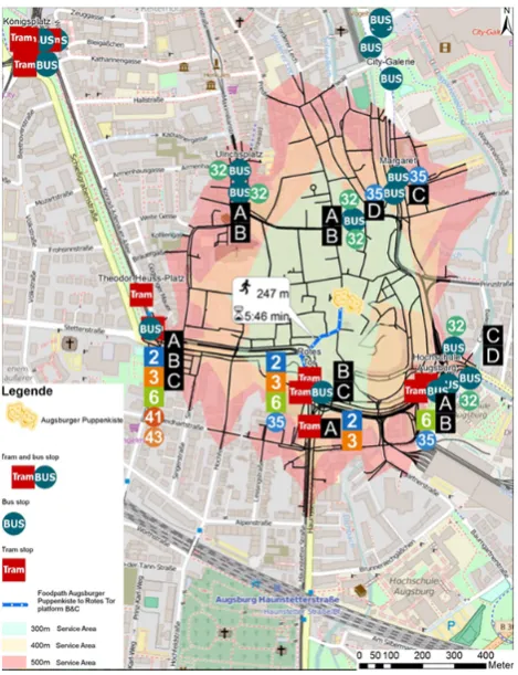
For the well-known tourist attraction “Augsburger Puppenkiste” a shorter path to the next tram stop is available during the construction phase. The stop “Margaret” provides access to three different tram routes and one bus route at the time “Königsplatz” is reconstructed. Within a distance of approximately 200 metres or a walking duration of nearly 5 minutes the stop can be reached, as pictured in Figure 1.
Figure 1. Accessibility of "Augsburger Puppenkiste" from the temporary tram stop "Margaret" during reconstruction of "Königsplatz".
Figure 2. Accessibility of "Augsburger Puppenkiste" from the tram stop "Rotes Tor" after reconstruction of "Königsplatz".
At present, passengers going to “Augsburger Puppenkiste” by tram are advised to alight at the stop “Rotes Tor”.
6.2 Accessibility of stops of public transport
The creation of an accessibility index requires the investigation of simple, easily detectable indicators on every stop. We collect the count of routes per stop and platform and add them up to a total count of routes per stop. We then compare this value to further stops in the PTN. For every stop, we divide the detected value by the highest value of a stop in the network. For drawing a temporal comparison between the reconstruction period of the “Königsplatz” and the phase beyond, we divide every stop by the highest value of a stop for both situations. The highest detected value is 10. This matches the count of lines at the “Königsplatz” after its reconstruction. The maximum index value for the routes count is therefore awarded to the “new Königsplatz” with a value of 1. We can apply a similar procedure to the headway index. For every stop, we identify the count of services per hour and add them up to a total count of services per stop. For obtaining an average headway in seconds per stop, we divide 3600 seconds (1 hour) by the total count of services per stop. In contrary to the total route index, the total headway index is generated with the lowest headway value in seconds of a stop in the PTN during and after the reconstruction of the “Königsplatz” divided by the average headway per stop, so that a normalised value between 0 and 1.0 per stop can be achieved.
Finally, we generate a total accessibility index and therefore calculate a mean value of the total accessibility index and the total routes count. Figure 3 shows the accessibility regarding the stops during the Königsplatz reconstruction works and Figure 4 the Accessibility regarding the stops after the Königsplatz reconstruction works. Both three-dimensional visualizations are enriched by label showing values of the accessibility index.
Figure 3. Accessibility regarding the stops during the Königsplatz reconstruction works. Legend: Bb = Barfüßerbrücke, CG = City-Galerie/VHS, Fg = Fuggerei, Fs = Frohsinnstraße, Gs = Gärtnerstraße, Fh = Fachhochschule, Kö = Königsplatz, Ma = Margaret, Mp = Moritzplatz, Rp = Rathausplatz, RT = Rotes Tor, Tm = Textilmuseum, Tp = Theodor-Heuss-Platz, Up = Ulrichsplatz
13,2 % → Accessibility index | RT → Stop name abr.| (a) →
Platform id.
During the reconstruction works, the stop “Rotes Tor” shows the highest accessibility value of 0.57 for the total accessibility index, as pictured in Figure 3.
Figure 4. Accessibility regarding the stops after the Königsplatz reconstruction works. Legend: Bb = Barfüßerbrücke, CG = City-Galerie/VHS, Fg = Fuggerei, Fs = Frohsinnstraße, Gs = Gärtnerstraße, HA = Hochschule Augsburg, Kö = Königsplatz, Ma = Margaret, Mp = Moritzplatz, Rp = Rathausplatz, RT = Rotes Tor, Tm = Textilmuseum, Tp = Theodor-Heuss-Platz, Up = Ulrichsplatz
13,2 % → Accessibility index | RT → Stop name abr.| (a) →
Platform id.
7. Discussion
The accessibility analysis provides a clear overview on the accessibility of PTN in Augsburg’s city centre. The two-dimensional analysis using a network-based pedestrian routing presents valuable information on the change of reachability of several landmarks in the city centre. Finally, the three-dimensional analysis proves that the western and central parts of the inner city are linked to public transportation in a better way than the eastern area. Accessibility is nearly homogeneously distributed across the whole western and central inner city during the reconstruction of “Königsplatz”. In the phase after the reconstruction, it is heterogeneously spread over the inner city. Accessibility in the central part is far worse than during the reconstruction. The western part is better connected to the PTN, obviously “Königsplatz” is again the main interchange in the city. During the reconstruction “Rotes Tor” is the best reachable public transport stop. After the completed reconstruction, the presented heterogeneous accessibility inside the inner city and the decline of reachability in the central part of the city centre encourages the local operator to improve service. They reroute the existing bus route 22 to serve “Maximilianstraße”. The headway of bus services across this worth seeing street is therefore enhanced from 15 to 7.5 Minutes starting with the timetable change 2016/17. Visualisation using three dimensions is a comparatively new approach, which therefore lacks some of the features provided by 2D-maps. Facilitating readability while simultaneously sustaining aspects presented by 2D-maps is the main challenge in 3D-visualisation. 3D-figures presenting accessibility may be further improved by adding graphs of tram routes and a city map for better orientation. Taking these measures into account, turns 3D-visualisations into a useful tool for the illustration of quality in PTNs.
8. Outlook
During the previously shown analysis, we mainly focus on a 3D-based technique to visualize accessibility using the Inverse Distance Weighting Method. The application of this method helps us understanding, which parts of the city centre are covered sufficiently by public transportation systems and which areas need to be better linked. However, we should take into account that areas, which are not covered by bus or tram stops can not be presented in a realistic way using this method. It is a highly point-based method, which is not capable of rendering a perfect view of all areas. Ordinary Kriging methods would be able to draw a slightly more accurate view on the accessibility of public transport stops as these stops are dispersed points in space, which is taken into account by this method. The IDW method is suited better for regular spaced grids of points. For using Kriging methods, a very time-consuming definition of the required variogram models would be necessary (Li and Heap 2008). Regarding the time aspect, we are able to provide a better sight on hourly or daily-based changes of this accessibility visualisations by creating a fully animated tool, that allows users to regard different areas
of the city. It could provide features like interactively clicking on points for detailed information on routes, headways and exploring POIs nearby. Adding maps and further helpful layers and setting visible time using a slider or checkboxes would also be helpful features. This tool would allow us to add interesting information on the cities’ retail and shopping facilities or even draw comparisons between now and future scenarios for the development of the public transport network.
9. References
Augsburger Verkehrs- und Tarifverbund. (2015). Nahverkehrsplan für den Nahverkehrsraum Augsburg 2015plus [online]. Augsburg, Augsburger Verkehrs- und Tarifverbund. Available from: https://www.avv-augsburg.de/tl_files/avv_files/Nahverkehrsplan/avv_nah verkehrsplan_2015.pdf [Accessed 17 March 2017]. Benenson I., Martens K., Rofé Y. and Kwartler A. (2011).
Public transport versus private car GIS-based estimation of accessibility applied to the Tel Aviv metropolitan area. The Annals of Regional Science, 47/3, 499-515. De Marchi, M. (2015). Visualizing Public Transport
Systems: State-of-the-Art and Future Challenges [online]. Illinois, University of Illinois at Chicago.
Available from: http://creativecoding.evl.uic.edu/courses/cs524/RESEA
RCH/DeMarchi_Transit.pdf [Accessed 22 March 2017]. De Lange N. (2013). Geoinformatik in Theorie und
Praxis. 3., vollst. überarb. u. aktualisierte Aufl. Berlin.[Accessed 04 December 2017].
Dübel S., Röhling M., Schumann H. and Trapp M. (2014). 2D and 3D presentation of spatial data: A systematic review. In: IEEE. 2014 IEEE VIS International Workshop on 3DVis (3DVis). New York City: Institute of Electrical and Electronics Engineers (IEEE).
Hesse C., Bohne S., Evangelinos C. and Püschel R. (2012). Erreichbarkeitsmessung: Theoretische Konzepte und empirische Anwendungen. In: Fakultät für Verkehrswissenschaften “Friedrich List”, ed. Diskussionsbeiträge aus dem Institut für Wirtschaft und Verkehr. Dresden: TU Dresden, 1-37.
Karou, S. and Hull, A. (2012). Accessibility Measures and Instruments. In: Hull, A., Silva, C. and Bertolini, L., eds. Accessibility Instruments for Planning Practice. Brussels: COST Office, 1-19.
Karrais, N. (2014). Modellierung der verbrauchsbasierten Erreichbarkeit mit GIS. In: Strobl, J., Blaschke, T., Griesebner, G. and Zagel, B., eds. Angewandte Geoinformatik 2014. Beiträge zum 26. AGIT-Symposium. Berlin: Wichmann, 56–67.
Keler, A. and Krisp, J. (2015). Spatio-temporal Visualisation of Interpolated Particulate Matter (PM2.5) in Beijing. GI_Forum ‒ Journal for Geographic Information Science, 1-2015, 464-474.
exploration with a large data set. Transportation Research Part C: Emerging Technologies, 8, 185–203. Li, J. and Heap, A. (2008). A Review of Spatial
Interpolation Methods for Environmental Scientists. [online]. Canberra, Geoscience Australia, Available from:
http://corpdata.s3.amazonaws.com/68229/Rec2008_023 .pdf [Accessed 11 May 2017].
Litman, T. (2015). Evaluating Accessibility for Transportation Planning [online]. Victoria, Transport Policy Institute. Available from: http://www.vtpi.org/access.pdf [Accessed 19 March 2017].
Liu S. and Zhu X. (2004). Accessibility Analyst: an integrated GIS tool for accessibility analysis in urban transport planning. Environment and Planning B: Planning and Design 2004, 31, 105-124.
Makrí, M.-C. and Folkesson, C. (1999). Accessibility Measures for Analyses of Land Use and Travelling with Geographical Information Systems [online]. Lund, Lund Institute of Technology. Available from: http://www.tft.lth.se/fileadmin/tft/dok/KFBkonf/4Makri folkesson.pdf [Accessed 20 March 2017].
Neis, P., Zielstra, D. and Zipf, A. (2012). The Street Network Evolution of Crowdsourced Maps: OpenStreetMap in Germany 2007–2011. Future Internet, 4 (4), 1-21.
O'Sullivan, D., Morrison, A. and Shearer, J. (2000). Using desktop GIS for the investigation of accessibility by public transport: an isochrone approach. In: Lees, B., ed. International Journal of Geographical Information Science, vol. 14 no. 1. Abingdon-on-Thames: Taylor & Francis, 85-104.
Pang J.,Tian C., Huang J., Buckles B. and Mirzaei A. (2017). Atvis: A new transit visualisation system. In: Griffith D. A., Chun Y., Dean D. J., Eds., Advances in Geocomputation: Geocomputation 2015--The 13th International Conference (Advances in Geographic Information Science). Cham: Springer Schweiz, 85-96. Pearce, O. and Timpf, S. (2006). Erreichbarkeit von
Haltestellen des öffentlichen Verkehrs zu verschiedenen Tageszeiten. In: Strobl, J., Blaschke, T. and Griesebner, G., eds. Angewandte Geoinformatik 2006. Beiträge zum 18. AGIT-Symposium Salzburg. Heidelberg: Wichmann, 535–544.
Schäffeler, U. (2001). Oft zu geringe Abstände: Haltestellen im ÖPNV: Berechnung optimaler Abstände mit Hilfe von Nachfrageelastizitäten. Der Nahverkehr, 3/2001, 24–27.
Schwarze, B. (2005). Erreichbarkeitsindikatoren in der Nahverkehrsplanung [online]. Dortmund, Technische Universität Dortmund. Available from:
http://www.raumplanung.tu-dortmund.de/irpud/fileadmin/irpud/content/documents/p ublications/ap184.pdf [Accessed 17 March 2017]. Schulz, M. and Meinhold, C. (2003). Quantifizierung des
Schienenbonus: Messung des Kundennutzens mittels