Visualizing Social Interaction in Open Source Software Projects
Michael Ogawa∗ Kwan-Liu Ma† Christian Bird‡ Premkumar Devanbu§ Alex Gourley¶
Department of Computer Science University of California, Davis
ABSTRACT
Open source software projects such as Apache and Mozilla present an opportunity for information visualization. Since these projects typically require collaboration between developers located far apart, the amount of electronic communication between them is large. Our goal is to apply information visualization techniques to assist software engineering scientists and project managers with analyzing the data.
We present a visualization technique that provides an intuitive, time-series, interactive summary view of the the social groups that form, evolve and vanish during the entire lifetime of the project. This visualization helps software engineering researchers under-stand the organization, structure, and evolution of the communi-cation and collaboration activities of a large, complex software project.
Keywords: software visualization, social networks, software engi-neering, time-varying data, information visualization, collaborative work
Index Terms: H.5.2 [Information Interfaces and Presentation]: User Interfaces—Graphical User Interfaces; D.2.9 [Software Engi-neering]: Management—Productivity
1 INTRODUCTION
Building large software systems involves sustained effort by large teams. Teams of people divide up a large system into manageable components. Then by collaboratively developing each part, they in effect develop the whole system. Communication and collab-oration activities are crucial to this process, and are therefore of critical interest to software engineering researchers. Just as a large system is broken into components, for manageability, a large devel-opment team forms sub-communities of interest in order to collab-orate in an orderly fashion. In commercial projects, these teams are organized by management command; however, the actual commu-nication among team members a) does not necessarily follow orga-nizational boundaries and b) is difficult to observe. On the other hand,open source software projectssuch as Apache, Mozilla and PostgreSQL conduct software development over the internet, using spontaneously formed, voluntary teams. All team communication occurs on public email lists. Developers discuss engineering activ-ities, bugs, and other issues on the list. Groups of interests form, evolve and disband spontaneously. The historical archives of these lists present a unique opportunity to observe first-hand the commu-nication behavior of software teams. However, the volume of email is huge, spans several years, and involves hundreds of participants.
∗email: [email protected] †email: [email protected] ‡email: [email protected] §email: [email protected] ¶email: [email protected]
We present a method for visualizing the evolving networks present in project mailing lists. Past visualizations of these time-varying networks have used animation or a layered technique to depict the flow of time. They focused on the representations of in-dividual timesteps rather than the transitions between them. Our technique abstracts the individual timesteps and puts the empha-sis on the transitions. Graph abstraction is accomplished through clustering. The clusters are represented in a modified Sankey di-agram with edges showing the transitions between timesteps. We make our own modifications to the Sankey diagram in order to en-hance clarity and provide more information, explained in detail in Section 5. Using Sankey diagrams in a novel way and emphasiz-ing the transitions between timesteps are the key elements of our approach. We combine the evolving network visualization with an easily navigable view of the file repository. Users are able to see the commit changes for each file, which includes who modified it, when it was modified, and how many lines were added or removed. We then present two case studies of open source software projects: the Apache webserver project and the PostgreSQL database man-ager project.
2 RELATEDWORK
Most work in visualizing software projects concentrates on the source code. SeeSoft [10] is an early example of visualizing a large amount of code. Lines, which are pixel-thin, are colored accord-ing to some statistic, such as how recently it was modified. CVSs-can [23] uses a history flow [22] to show, at the line level, how source code changes during the development process. EPOSee [5] uses infovis techniques such as parallel coordinates, pixelmaps and node-link diagrams to show file association rules. These works do not emphasize the social interaction of developers, which we are interested in.
More relevant work with social software collaboration are the following. The Bloom Diagram [13] visualizes the participation type and level of developers by first sorting the developers by their type of contribution, then wrapping them as wedges around a cir-cle. Within a developer’s wedge, there are animated dots which show their specific contributions at different points in time. While the Bloom summarizes the activities of individuals, it does not take into account their interaction with each other. Erickson and Kel-logg [11] have created “social proxies” which summarize the situ-ation between people interacting in an online converssitu-ation. While it is good for casual assessment of social interaction, it is too mini-mal for analysis of an evolving email network. The Sociable Media Group at MIT has done much work in visualizing the interactions in a “networked world.” Their research areas within social media are varied, comprising online conversations ([20], [9]), emails ([21]), website activity, textiles, mobile communications, and sociology relating to our digital world. But of particular relevance to our work is their “Open Sources” project [24], which seeks “to understand the relationship between the community’s communication patterns and the code” of software development. Their approach puts emphasis on the amount of code each author has contributed, which appear as stacked bars; much like the history flow diagram mentioned above. Communication events are represented as icons within the bars. Though correllation between email activity and code contribution Asia-Pacific Symposium on Visualisation 2007
5 - 7 February, Sydney, NSW, Australia 1-4244-0809-1/07/$20.00 © 2007 IEEE
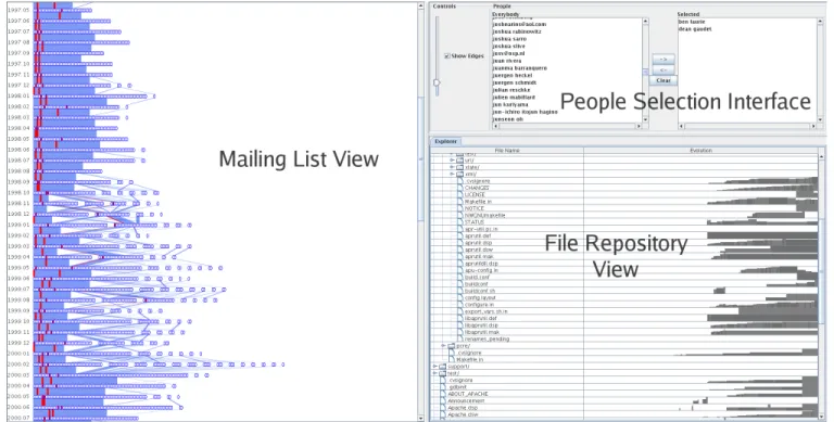
Figure 1: A view of the overall interface.
can be seen, we cannot see the context or the relationships between developers. Finally, Augur [8] offers a comprehensive visualization of a project’s source code, author network, and other development statistics. In their system, the developer network is represented as a standard node-link diagram. Its evolution can be visualized by use of a time slider. This puts it into the “Small Multiples & Anima-tion” category discussed below. In contrast, our system is able to display all timesteps in the network history at once.
2.1 Work with Evolving Networks
One of the challenges in our work is to visualize the evolution of the email network. Previous visualization methods relating to evolving networks can be grouped into two categories: 1) Small Multiples & Animation, and 2) Layers.
The Small Multiples technique [17] shows changes in the net-work by displaying snapshots of the graph at various points in time. Graph snapshots are laid out side-by-side in series, much like frames in a movie, so that viewers can see the differences between snapshots as they move across the page. Naturally, these snapshots may be viewed one after the other in the same space to produce an animation of the changing network.
Chen and Morris use spanning trees with small multiples and animation [6]. Branigan and Cheswick visualize changes in the Yu-goslavian communications network during a period of war [4]. Fr-ishman and Tal color and draw bounding boxes around graph clus-ters to help preserve the mental map between timesteps [12]. Chi et al. arrange disk tree representations along a timeline. Changes to the trees are highlighted with color while the structure stays the same [7].
The problem with small multiples is that, depending on the tem-poral resolution of the dataset, there may be large differences be-tween the visual representations of two timesteps. For example, in a dataset with yearly time slices, there may be a major change in the topology which causes the graph layouts before and after the change to appear quite different from each other. A person seeing this jump would lose context and may assume thateverythingabout
the network changed. This is apparent in [4]’s animation, where large chunks of the network disappear and reappear spastically. On the other hand, if the graph is moderately large, the differences be-tween timesteps may be imperceptible. A visually displayed large graph is a complex object to behold, and, consequently, small visual changes between two large graphs are difficult to detect.
The second technique, which we call Layers, stacks planes of graph representations at incremental timesteps. The stack is viewed from the top and blended, so that newer planes are in focus and older planes fade into the background. Brandes and Corman use a layering scheme to visualize the dynamic discourse between speak-ers [3]. Nakazono et al. create adifference layerby comparing two timesteps [15]. The difference layer is then colored and added to the original layer.
The Layers approach has the drawback of only being able to ef-fectively visualize a handful of timesteps simultaneously. As the blended planes pile up, the visibility of each plane is obscured or cluttered and thus the coherence of the visualization is diminished. Our approach does not fit squarely within either the Small Mul-tiples & Animation or Layers category. As such, we believe it to be a novel representation of evolving networks. It is most akin to Chi et al.’s Time Tube visualization [7], in that we present dis-crete representations of the network in series along a spatial axis. However, our technique for displaying the information emphasizes the changes that occur between timesteps rather than the individual graphs within the timesteps. It may be thought of as a variation on small multiples, where the graph representations are abstracted and there is linking information displayed between timesteps.
3 EXPLANATION OF THEINPUTDATA
The dataset for each software project consist of two parts: the repos-itory and the mailing list.
3.1 Repository
Data pertaining to files and authors was gathered from the public CVS repositories of their respective projects. The data contains the
entire collection of files and directory structure of the repository. Each file comes with a history of edits made by developers (i.e. who edited what and at when). Each edit also contains information on the number of lines added and removed.
3.2 Mailing List
As described in [2], mailing list data was gathered from the public archives of their respective projects. The format of this data is a list of emails. Emails which contain a reply-to header are considered as relationships between senders and receivers. Emails are grouped by the month in which they were sent. Thus, within each month, the relationships between senders and receivers form a network. An
evolving networkis formed over the timespan of the email list, with each monthly network being a timestep.
4 VISUALIZING THEFILEREPOSITORY
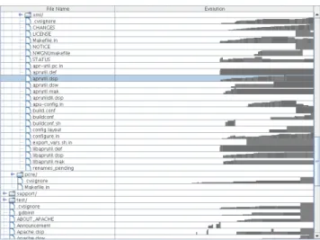
A standard Windows Explorer-type tree visualization is used to rep-resent the file repository (Figure 2). Users are free to expand and collapse the file hierarchy to view the directories they are interested in. To the right of each file is a sparkline [18] showing the edit his-tory for that file: its evolution. Time flows to the right, along the x-axis. Bars are drawn representing the relative size of the file at each point in time. Thus, an upwards-growing bar depicts a grow-ing file. Each author’s revision of the file is represented in one bar and the bars are alternately colored to distinguish successive revi-sions. Hovering over a bar creates a small popup with the revision’s author and date. The time scales for each sparkline are correct with respect to each other so that the user can compare file evolutions.
Figure 2: A view of the file repository. The repository directory hier-archy structure appears on the left and the file evolution sparklines appear on the right. The highlighted file shows typical growth.
If the user wants to see more details about a particular file, double-clicking will bring up a window with more information (Figure 3). This window contains the sparkline as above, but larger, and tables of author statistics for the file. These tables are titled “Most Frequent Authors,” “Most Line Additions,” and “Most Line Removals.” They are sorted so that the user can easily see who, for example, contributed the most lines. The user may click on an author in the table and see the author’s contributions highlighted in the sparkline.
5 VISUALIZING THEMAILINGLIST 5.1 Clustering
In our implementation we use the Markov Cluster Algorithm (MCL) to cluster each mailing list network timestep [19]. MCL
Figure 3: A file details dialog. The contributions from William A. Rowe, Sander Striker, and Allan Edwards have been highlighted.
works by starting with the entire edge set, then it iteratively removes edges based on their weight and topology. For email networks, the edge weights are equal to the number of messages exchanged be-tween two people. When all that is left is a collection of trees, the algorithm stops and considers each tree as a cluster.
5.2 Sankey Diagram
Representing an evolving network is challenging due to the addi-tional dimension of time. As discussed in Section 2, the techniques of Layers and Small Multiples & Animation are not ideal for rep-resenting the changes occurring between timesteps. To address this issue, we have adapted the well-known Sankey diagram for our pur-poses.
Sankey diagrams are mainly used to show energy or matter flow through a physical system. Their representation is a continuous one, with the flow being split and combined in arbitrary amounts. We use the diagram to show the flow of people between clusters; therefore it becomes adiscreteSankey diagram.
In our implementation, time flows downwards in monthly stages. At each stage, the people participating in the mailing list conversa-tion are depicted as ovals lined up horizontally, grouped together by their cluster. Each cluster is drawn in order from largest to small-est. This sorting allows the viewer to follow the larger core groups along a straight downwards path. The smaller clusters which rep-resent “side conversations” are then located, appropriately, to the side.
As in a regular Sankey diagram, edges are drawn between two stages if there are people continuing to participate in the mailing list. They connect two clusters in two different time stages, rep-resenting the flow of people between the two stages. Each edge has a certain width, proportional to the number of people stay-ing within the two clusters. By observstay-ing the edges, the user can achieve insight into the dynamics of the mailing list. For example, a large cluster may fragment into many smaller edges connecting to smaller clusters, indicating a fragmenting of conversation. Con-sistently thick edges across many stages indicates a strong conver-sational coherence within the group.
We solved the problem of edge occlusion by simply drawing translucent edges and eliminating exiting edges. Translucent edges allow the user to see the paths of all edges in a crossing. Further-more, eliminating the exiting edges reduces the number of edge crossings. We are able to do this because we do not carewherethe exiting flow goes. In this particular application, it is common to have many people leave the mailing list conversation, so drawing the exiting flow will not provide much more meaning. However, the user can still infer the amount of exiting people by visually sub-tracting the number of people continuing onto the next stage from the number of people in the current stage.
5.3 Interaction
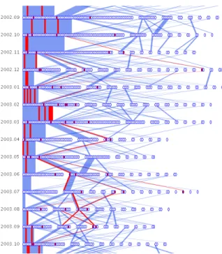
We allow users to interact with the Sankey diagram in a number of ways. When the diagram is first presented, the space between timesteps (where the edges exist) is set to a moderate length. Since the length of the entire diagram is proportional to the space be-tween timesteps, it is not possible to view the entire diagram with-out scrolling. The user may want to see an overview of the entire dataset. We provide a slider widget so the user can interactively control the amount of space between timesteps. Setting a small amount of spacecompressesthe diagram and allows the user to see more timesteps at once (Figure 4). The edges may be hidden via a checkbox for a simplified view. The user may want to see more detail of what happens between a few timesteps. Setting a large amount of spaceexpandsthe diagram and allows the user to see the edges more clearly (Figure 5).
Figure 4: Compressing the diagram displays more timesteps at once. Hiding edges provides a cleaner visualization.
The user will likely want to see which people comprise the nodes and edges. Casual queries about who is participating in the discus-sion is accomplished by hovering the mouse over a particular node or edge. The corresponding person’s name will then appear in a popup next to the cursor. Direct selection of the node and edge components are done through mouse clicks. If the user clicks on a person’s node or edge with the left mouse button, the correspond-ing person is selected. Then throughout the diagram, the node and edges containing that person are highlighted (Figure 6). If the user is looking to select a specific person by name, we provide a list in-terface to the side which contains the names of all people appearing in the network.
Multiple selections of people are allowed as well (shown in Fig-ure 7). Using the right mouse button to click on nodes or edges adds each corresponding person to the selected collection (as opposed to replacing it). The user can easily manipulate the selected collection via the list interface. People can be moved back and forth between the unselected and selected groups. The selected list may also be cleared by pressing a button.
The user can choose to see the details of conversations between particular people in a particular month. Double-clicking on a devel-oper or edge will pop up a window containing information on the mail sender, receiver, date, and subject (Figure 8). The subject is
Figure 5: Expanding the diagram shows more edge detail.
especially relevant because it allows the user to see the context of the mailing list clusters.
5.4 Combining Views
We combine the two views—the repository view and the mailing list view—in one user interface, shown in Figure 1. In addition to those views, we provide a list interface for selecting and deselecting developers. Linking between the repository view and the mailing list view is accomplished through the people. For example, double-clicking a file in the repository view selects the developers who have worked on that file and highlights them in the mailing list view. 6 CASESTUDY: THEAPACHEPROJECT
To evaluate our visualization technique, we examined the developer email archive of the Apache Project [1]. Apache is a well-known open source web server application. The archives are publicly ac-cessible via the web and contain all emails dating back to March, 1995. They were processed into a time-varying graph dataset for use with our system. The nodes of the graph are people who posted to the email list and the edges are replies between two posters. A message is considered a reply if the “reply-to” field is used. Edges are then weighted by the number of replies between two people. Inconsistencies in the dataset arise when individuals use different names or addresses to represent themselves. Bird et al. [2] used both fuzzy string matching and manual post-processing to alias the data. In all, there were 2008 unique people posting to the mailing list. The vast majority are casual posters asking questions and only a fraction are active developers. Our dataset contains over 68,000 email messages.
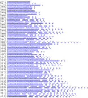
We begin our study by examining the overview of the network (Figure 9). Immediately we can see the growth of the core group during the early years (1995–1999). The core group remains close-knit during that period, as evidenced by the lack of other clusters besides the largest one. Then two-thirds of the way up, we can see satellite clusters becoming more prevalent. The core group con-tinues to dominate the clusters until about one-third of the way up (2000–2002), where it begins to diminish in size. This continues all the way to the bottom, with the core group shrinking and the smaller clusters becoming more numerous (2003–2005).
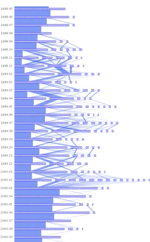
We note an unusual period with increased clusters beginning in September, 1998 and ending in March, 2000 (Figure 10). It is
un-Figure 6: An example of selection highlighting. The selected person’s nodes and edges are colored in red.
usual because the months preceding and following this period are relatively “calm,” with the core group changing very little. In con-trast, this period contains many edge crossings and people breaking off from the core group to join satellite conversations. At the very end of the period, there is a sudden merging of many small clusters into the large core cluster. To figure out the cause of this activity, we examined the release history of Apache. It turns out that in 1998, plans were being finalized for the development of Apache 2.0. This version would be written from scratch and was highly anticipated. Using our interface to look at 1998 mail headers, we indeed find many messages related to Apache 2.0 (such as those in Figure 8). In March of 2000, the alpha version (Apache 2.0a1) was released. This coincides exactly with all of the smaller clusters merging into one large cluster. Again, looking at the mail headers for this month, we find much discussion about preparing for the alpha release. It is interesting that, before the alpha release, the participants formed small groups throughout the entire period. Perhaps this is due to the division of labor between developers; each group working on one component of the project. Or perhaps people outside the project were emailing questions and suggestions. We find these smaller clusters to be discussing specific subjects such as “patch to force name virtual hosts,” “10x performance increase patch #9,” “C com-piler for NT,” and “XML apache conf.” These subjects indicate that the former hypothesis above is more likely: that there was a divi-sion of labor between developers. The alpha release then caused the participants to merge into one large cluster. It could be that, once everyone had a point of reference for discussion, the conversation became more organized. It is difficult to tell the nature of this large cluster, as the subject headers are many and varied among
techni-Figure 7: Multiple people may be selected.
Figure 8: Email header information corresponding to Ben Laurie in September, 1998.
cal issues. It appears that the division of labor seen previously has coalesced into a swarm-like group, with everyone having a hand in the different development sections. It is also interesting to note that, according to the online mailing list archives, there were 586 emails in February (the month before release) and in March there were 1504: a huge difference. Yet despite the large volume, the clusters converged, rather than split off.
We can easily visualize the involvement of notable figures within the Apache Project. For example, Rob McCool, while at NCSA, wrote the original HTTP daemon which Apache was based off of. Figure 11 shows that he contributed to the email list for one year from the beginning of the project, then moved on. Ken Coar (a.k.a. Rodent of Unusual Size) joined the Apache email list at the end of 1996. Figure 12 shows his activity starting from that time. He contributes to the list regularly until 2003, after which there are some months when he does not post at all.
Coar’s activity is similar to other large contributors, such as Ben Laurie and William A. Rowe, Jr. Their email postings had been consistent and within the core group until about 2003, when the frequency of emails subside and they are more often grouped with
Figure 9: Overview of the Apache email network.
Figure 10: The period leading up to the alpha release of Apache 2.0 in March, 2000. The graph appears uniform at the top, then more small clusters form as each month passes. There is a dramatic frag-mentation of clusters in February, 2000, before finally returning to uniformity.
Figure 11: Rob McCool, author of the original HTTP daemon, helped the Apache project during its infancy, then left the discussion.
Figure 12: Ken Coar (highlighted in red) joined the email list in De-cember, 1996. He is still a regular code contributor, though his email list involvement has become more sporadic.
smaller clusters. This is perhaps because the Apache software has become stable enough such that code updates are not needed as frequently.
7 CASESTUDY: POSTGRESQL
In our second case study, we examine the email network of the Post-greSQL project. PostPost-greSQL is an open source database manage-ment system. Like Apache, their email list archive is publicly ac-cessible. The email network we analyzed contains 3295 unique people and runs from 1998 to 2006. The dataset contains over 86,000 email messages.
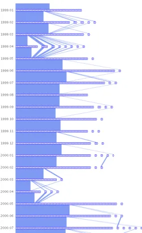
We started with the compressed overview shown in Figure 13. For the most part, the network remains consistent: a large core group with very few smaller clusters in each timestep. There are, however, two anomalies that occur at 1999-04 and 2000-04 (Fig-ure 14). They are characterized by a sudden drop off in the core group population and an increased number of smaller clusters. We are yet unsure of the exact cause of the anomalies. One possible explanation is the fact that the dates coincide with the beta releases of versions 6.5 and 7.0. But the question remains: Why does this pattern not occur at other beta release periods?
It appears that the core group is quite large. On closer inspec-tion, that is not the case. Using the selection tools we determined that most casual emailers (those who only post a few times) were grouped by the clustering algorithm into the largest cluster. What this indicates is that the casual poster’s message was replied to not by a single developer, but by multiple developers. The community aspect of the PostgreSQL project is therefore quite strong.
There is a noticeable difference in appearance between the Apache and PostgreSQL email networks. Whereas the Apache net-work contains many edge crossings and waxings and wanings of the core developer group, the PostgreSQL network remains rela-tively constant with few edge crossings and a steady core group. The reason may be summed up in a quote by Jolly Chen, an early PostgreSQL developer: “This project needs a few people with lots of time, not many people with a little time.” In other words, it takes a lot of effort to understand the backend code enough to make a useful contribution. We believe that this is why there is a core group of developers who stay together and why there are few side conversations.
8 DISCUSSION ANDFUTUREWORK
Since we run a separate MCL clustering process on each timestep, clustering the graph is essentially a greedy algorithm. That is, it chooses the clusters based on information found only in one timestep. The question is, when taken together as a whole, is the resulting Sankey diagram an accurate representation of the dynam-ics between developers? To determine the accuracy, experts who have worked within the project or studied the history of the project should evaluate the clusterings. Are major splits, fragmentations and merges of social groups correctly depicted? It may be insightful to see the clusterings that other algorithms, besides MCL, produce. For now, we use transparency to show how edges cross. It works well for the small datasets we use because there are only about two edges per crossing. We surmise that for larger datasets, there will be more clusters and thus more edge crossings. Thus a way to ar-range the nodes within each timestep is needed to minimize the number of edge crossings, in addition to transparency. Riehmann et al.’s paper [16], which uses Mansfield’s technique [14] for draw-ing edges with circular corners and parallel lines, may be useful for more clearly drawing edges and their crossings. It would also remedy the problem of having narrow edges when their angles are steep.
Our system currently arranges cluster nodes by their size. That is, the largest cluster node in a timestep is on the left and the small-est is on the right. This is likely not the optimal arrangement for a
Figure 13: Overview of the PostgreSQL email network.
Figure 14: Two anomalies at 1999.04 and 2000.04 in the PostgreSQL email network.
global minimization of edge crossings. A brute-force algorithm ex-ists for finding the optimal arrangement between two timesteps, but there is a larger problem: The cluster node layout of one timestep affects the ones immediately above and below it. Therefore, arrang-ing the clusters in one timestep optimally may lead to suboptimal arrangements in later timesteps. Simulated annealing, though ex-pensive, may be one way to obtain a satisfactory arrangement of nodes.
In order to visualize an email network, which is a time-varying graph, we use the Sankey diagram as our visual construct. We be-lieve that Sankey diagrams can be used to show the evolution of clusters inanytime-varying graph. These include evolving social networks, citation networks, and any other “living” network. We would like to perform more case studies to determine our method’s effectiveness at capturing the characteristics of these additional net-works.
Ideally we would like to include both repository and mailing list information in one coherent visualization construct. This would provide a better overview of the entire software process. The chal-lenge will be to represent a hierarchy (the repository) and a network (the mailing list) together in the same view and link them together. We are currently working on such a representation. We would also like to incorporate other aspects of software projects, such as the source code. Data such as the specific lines changed by each au-thor and the function call graphs may prove useful in the study of relationships between design, collaboration and communication in software engineering.
9 CONCLUSION
Network visualization and graph drawing are well-studied fields. However, as discussed in Section 2, there are few existing methods for visualizing evolving networks. We believe that the time-varying aspect of graphs will be increasingly desirable to analyze because most real-world graphs are evolving (e.g. the internet, social net-works and citation netnet-works).
We have applied the Sankey diagram—a classic visualization of energy flow—in a novel way to visualize network evolution over time. Specifically, we abstract the individual graph timesteps with clustering and draw edges to emphasize the transitions between timesteps. We have also added our own modifications to the Sankey design, such as discretized nodes and translucent edges, which en-hance comprehension. We created a system which allows the ex-ploration of these diagrams with simple, intuitive interaction mech-anisms. We then presented case studies which apply our technique to the domain of open source software development. In those case studies we found examples of social behavior which we related to events in the project’s development. The ability to visualize a large, evolving social network is of great use to software engineering re-searchers and open source project participants. Our system allows them to make sense of the complex dynamics of evolving networks and see features that would otherwise remain unnoticed.
ACKNOWLEDGEMENTS
This work is sponsored in part by the National Science Founda-tion under contracts CCF 0222991, OCI 0325934, IIS 0552334, and CCF 0634913.
REFERENCES
[1] Apache mailing list: [email protected].
[2] C. Bird, A. Gourley, P. Devanbu, A. Swaminathan, and M. Gertz. Min-ing email social networks. InICSE 2006 Workshop on Mining Soft-ware Repositories (MSR 2006), 2006.
[3] U. Brandes and S. R. Corman. Visual unrolling of network evolu-tion and the analysis of dynamic discourse.Information Visualization, 2(1):40–50, 2003.
[4] S. Branigan and B. Cheswick. The effects of war on the yugoslavian network, 1999.
[5] M. Burch, S. Diehl, and P. Weissgerber. Visual data mining in software archives. InProceedings of the 2005 ACM Symposium on Software Visualization (SOFTVIS’05), 2005.
[6] C. Chen and S. Morris. Visualizing evolving networks: Minimum spanning trees versus pathfinder networks.infovis, 00:9, 2003. [7] E. H. Chi, J. Pitkow, J. Mackinlay, P. Pirolli, R. Gossweiler, and
S. K. Card. Visualizing the evolution of web ecologies. InCHI ’98: Proceedings of the SIGCHI conference on Human factors in com-puting systems, pages 400–407, New York, NY, USA, 1998. ACM Press/Addison-Wesley Publishing Co.
[8] C. de Souza, J. Froehlich, and P. Dourish. Seeking the source: soft-ware source code as a social and technical artifact. InGROUP ’05: Proceedings of the 2005 international ACM SIGGROUP conference on Supporting group work, pages 197–206, New York, NY, USA, 2005. ACM Press.
[9] J. Donath. A semantic approach to visualizing online conversations.
Commun. ACM, 45(4):45–49, 2002.
[10] S. G. Eick, J. L. Steffen, and J. Eric E. Sumner. Seesoft-a tool for visualizing line oriented software statistics.IEEE Trans. Softw. Eng., 18(11):957–968, 1992.
[11] T. Erickson, C. Halverson, W. A. Kellogg, M. Laff, and T. Wolf. So-cial translucence: designing soSo-cial infrastructures that make collective activity visible.Communications of the ACM, 45(4):40–44, 2002. [12] Y. Frishman and A. Tal. Dynamic drawing of clustered graphs. In
INFOVIS ’04: Proceedings of the IEEE Symposium on Information Visualization (INFOVIS’04), pages 191–198, Washington, DC, USA, 2004. IEEE Computer Society.
[13] B. Kerr, L.-T. Cheng, and T. Sweeney. Growing bloom: design of a visualization of project evolution. InCHI ’06: CHI ’06 extended abstracts on Human factors in computing systems, pages 93–98, New York, NY, USA, 2006. ACM Press.
[14] P. A. Mansfield. Programmatic rendering of directed, weighted graphs. InProceedings of 2nd Annual Conference on Scalable Vec-tor Graphics, 2003.
[15] N. Nakazono, K. Misue, and J. Tanaka. Nel2: Network drawing tool for handling layered structured network diagram. In K. Misue, K. Sugiyama, and J. Tanaka, editors,Asia Pacific Symposium on Infor-mation Visualisation (APVIS2006), volume 60 ofCRPIT, pages 109– 115, Tokyo, Japan, 2006. ACS.
[16] P. Riehmann, M. Hanfler, and B. Froehlich. Interactive sankey dia-grams. InProceedings of the 2005 IEEE Symposium on Information Visualization (INFOVIS’05), 2005.
[17] E. Tufte.Envisioning Information. Graphics Press, 1990. [18] E. Tufte.Beautiful Evidence. Graphics Press, 2006.
[19] S. van Dongen. Graph Clustering by Flow Simulation. PhD thesis, University of Utrecht, 2000.
[20] F. B. Viegas and J. S. Donath. Chat circles. InCHI ’99: Proceedings of the SIGCHI conference on Human factors in computing systems, pages 9–16, New York, NY, USA, 1999. ACM Press.
[21] F. B. Viegas, S. Golder, and J. Donath. Visualizing email content: portraying relationships from conversational histories. InCHI ’06: Proceedings of the SIGCHI conference on Human Factors in comput-ing systems, pages 979–988, New York, NY, USA, 2006. ACM Press. [22] F. B. Viegas, M. Wattenberg, and K. Dave. Studying cooperation and conflict between authors with history flow visualizations. InCHI ’04: Proceedings of the SIGCHI conference on Human factors in comput-ing systems, pages 575–582, New York, NY, USA, 2004. ACM Press. [23] L. Voinea, A. Telea, and J. J. van Wijk. Cvsscan: visualization of code evolution. InSoftVis ’05: Proceedings of the 2005 ACM symposium on Software visualization, pages 47–56, New York, NY, USA, 2005. ACM Press.
[24] A. R. Zinman. Open sources: