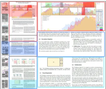
Stack Zooming for Multi-Focus Interaction in
Time-Series Data Visualization
Waqas Javed∗ Niklas Elmqvist†
Purdue University
ABSTRACT
Information visualization shows tremendous potential for helping both expert and casual users alike make sense of temporal data, but current time series visualization tools provide poor support for com-paring several foci in a temporal dataset while retaining context and distance awareness. We introduce a method for supporting this kind of multi-focus interaction that we callstack zooming. The approach is based on the user interactively building hierarchies of 1D strips stacked on top of each other, where each subsequent stack repre-sents a higher zoom level, and sibling strips represent branches in the visual exploration. Correlation graphics show the relation be-tween stacks and strips of different levels, providing context and distance awareness among the focus points. The zoom hierarchies can also be used as graphical histories and for communicating in-sights to stakeholders. We also discuss how visual spaces that sup-port stack zooming can be extended with annotation and local statis-tics computations that fit the hierarchical stacking metaphor. Index Terms: H.5.2 [Information Interfaces and Presentation]: User Interfaces—Graphical User Interfaces (GUI); I.3.6 [Computer Graphics]: Methodology and Techniques—Interaction techniques
1 INTRODUCTION
Almost all data found in the real world have a temporal component, or can be analyzed with respect to time. Temporal data is prevalent in virtually all scientific domains, and permeates societal phenom-ena as well—examples include computer and network logs, chrono-logical history, political poll data, stock market information, and climate measurements. One of the common properties of this wide range of data is that the datasets tend to be large, not only in the cap-tured time period but also in the number of observed attributes [2]. Visualization has been suggested as a way to handle this problem (e.g., [18]), but effectively exploring large-scale temporal datasets of this kind often requiresmulti-focus interaction[10]—the capa-bility to simultaneously view several parts of a dataset at high detail while retaining context and temporal distance awareness.
Consider for example a stock market analyst who is trying to pre-dict future market trends using line graphs of stock market indices by extrapolating from several similar situations at different times in the past. Multi-focus interaction would allow the analyst to see sev-eral time periods of the stock market graphs simultaneously while understanding their individual relations, temporal distances, and the market developments before and after each period. However, most existing temporal visualizations—for example, TimeSearcher [18], ATLAS [9], PatternFinder [13], and LifeLines [24, 38]—do not fully support the requirements of multi-focus interaction.
In this paper, we present a general technique to supporting multi-focus interaction for one-dimensional visual spaces—which in-cludes the temporal datasets motivating this work—that we call
∗e-mail: [email protected] †e-mail: [email protected]
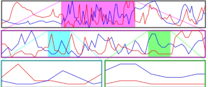
Figure 1: The stack zooming technique for line graphs. The analyst has focused on a period of radical changes in the main timeline (top).
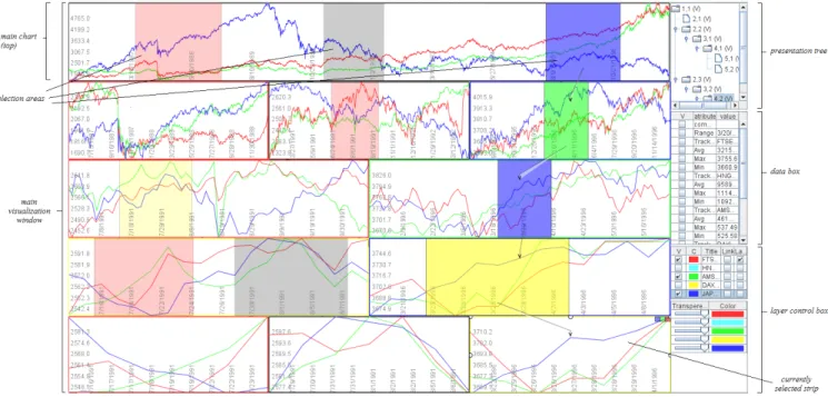
stack zooming. The technique is based on vertically stacking strips of 1D data into astack hierarchyand showing their correlations (Figure 1). To exemplify the new method, we also present a pro-totype implementation, called TRAXPLORER(Figure 2), that sup-ports multi-focus interaction in temporal data through stack zoom-ing, as well as additional functionality such as local statistics com-putation and annotation support. Our prototype would allow our analyst to create a large number of focus regions within the time-line to compare between and across different stocks and over time. Beyond directly supporting visual exploration, the stack hierar-chy also serves as a tangible graphical history [7, 17, 31] of the visual exploration session. Recent advances in visual communi-cation have suggested that to ameliorate the process of sensemak-ing [27], visualization should also support collaboration and com-munication [35, 37]. Our TraXplorer prototype takes this a step further by introducing apresentation treethat is automatically built during exploration, and which can then double as a management interface for annotations, computations, and, ultimately, presenta-tion of the results of the explorapresenta-tion. To complete our stock market example, this functionality would enable our analyst to present pre-dictions of future market trends to a manager using the tool itself, progressively expanding selected parts of the exploration history and displaying relevant statistics integrated with the visual display. The contributions of this paper are the following: (i)the gen-eral stack zooming technique and its implications to visualization of time-series data;(ii)the implementation of our prototype system for temporal visualization based on stack zooming and with support for communication based on the exploration history; and(iii)a us-age scenario conducted with the TraXplorer system showing how it can be used for visual exploration of a large financial dataset.
2 BACKGROUND
In this section, we give the background of temporal visualization, starting with the visual representations of time-series data, and then focus+context techniques [15] that few existing temporal analysis tools fully support. We also discuss collaboration and communica-tion aspects for visualizacommunica-tion that integrate with these ideas.
Figure 2: Stack zooming in a stock market dataset using TraXplorer. The horizon graph segments are arranged in a stack hierarchy that was built during visual exploration. The exploration and presentation interface of the tool is also visible on the right side of the image.
2.1 Time-Series Visualization
In the last two decades, a large number of research papers have been published related to visualization of time-series datasets—relevant surveys include [22, 32]. During this time, temporal visualization has evolved from basic timeline graphs [36] (some of these dating back hundreds of years), through becoming a novel approach for using visualization as a problem solving technique [7], and finally to encompass design considerations of sophisticated systems like ATLAS [9] for visualizing massive time-series datasets.
Correspondingly, considerable research efforts have been di-rected towards developing methods for interactive visual explo-ration of time-series data; here follows a representative sampling. The Perspective Wall [20] presents temporal data using a 3D ren-dering that incorporates a natural focus+context [15] perspective distortion. LifeLines [24] was one of the early systems that used vi-sualization to explore discrete events in personal histories. Wang et al. [38] recently presented a follow-up to the original LifeLines sys-tem as a support for electronic health records. TimeSearcher [18] is a time-series visualization tool that uses timeboxes to generate visual queries to explore the datasets. PatternFinder [13] provides an interface for querying temporal data of medical records. Con-tinuum [4] is a Web 2.0 tool for faceted timeline browsing. Most recently, LiveRAC [21] is an interactive visual exploration environ-ment for time-series data for system manageenviron-ment.
All of these projects concentrate mainly on interactive explo-ration of time-series datasets. However, beyond standard low-level visualization tasks [3], temporal visual exploration often require at-tention to the special properties of the time dimension [1, 2]. In particular, additional important temporal analysis tasks include [4] support for (a) dynamic temporal hierarchies, (b) across-concept re-lationships, and (c) large-scale overviews. Few of the above time visualization tools, with the exception of LiveRAC [21] and Con-tinuum [4], explicitly support all of these requirements.
2.2 Supporting Multi-Focus Interaction
We argue that the temporal analysis tasks discussed above can be generalized to the concept of multi-focus interaction [11].
Multi-focus interaction is a conceptual framework that integrates multiple focus+context [15] views with guaranteed visibility to support both focus, context, and distance awareness. This is the approach taken by the LiveRAC system, implemented using the Accordion Draw-ing framework [23, 33] for guaranteed focus visibility. In this paper, we take a different approach to multi-focus interaction compared to LiveRAC: instead of using a single integrated view with visual dis-tortion, we take advantage of the one-dimensional nature of the data to present hierarchies of undistorted visualization strips.
A number of general techniques have evolved to support multi-focus interaction, e.g., split-screen [30], fisheye views [15], and space-folding [11], etc. However, none of these techniques was originally developed for the exploration of time-series data. The Continuum faceted timeline browser [4] implements the above ex-tended temporal tasks, but provides only one level of overview of the timeline, meaning that detail and context awareness is limited.
Two existing systems are of particular relevance to the stack zooming technique presented in this work. The multi-resolution time slider for multimedia data presented by Richter et al. [25] uses a hierarchical zoom stack similar to ours, but their work is primarily an interaction technique for selecting single time periods in a hierar-chical fashion and does not support multiple focus points. The idea was also not designed for visual exploration. Second, the multi-page zooming technique presented by Robert and Lecolinet [26] defines a hierarchical zooming technique similar to our stack zoom-ing, but is defined for hypertext document graphs and has a different presentation approach compared to us.
2.3 Supporting Communication and Collaboration
Advances in visualization research have showcased the power of collaboration to amplify sensemaking [27] and enable distributed cognition [19] in a team of analysts, but collaboration requires a strong communication component to disseminate insights across participants [35, 37]. Communication-minded visualization [37] is also important in its own right for ultimately disseminating the re-sults of visual exploration to stakeholders outside the analysis team. A recent approach in human-computer interaction has been to
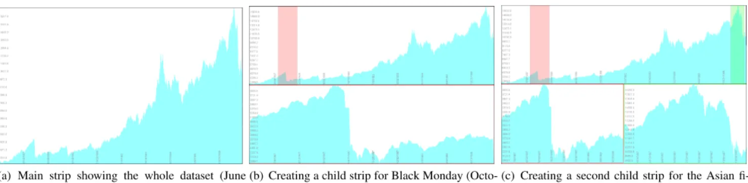
(a) Main strip showing the whole dataset (June 1986 to December 1997).
(b) Creating a child strip for Black Monday (Octo-ber 19, 1987).
(c) Creating a second child strip for the Asian fi-nancial crisis (starting July 1997).
Figure 3: Stack zooming in the Hongkong stock market index dataset. Transitions between views are animated, and the space-filling layout algorithm ensures that the whole space is used optimally.
utilize automatically captured interaction histories as a means of fostering awareness of your own (e.g. [8]) and your team’s (e.g. [6]) activities. Self and group awareness is a big research topic that is outside the scope of this article. We concern ourselves with the spe-cific use of visual exploration histories to support communication.
Branching interaction histories for visualization that capture multiple exploration paths were introduced as early as in the GRAS-PARC [7] system, and was recently utilized to great effect by Shrinivasan and van Wijk [31] for a scatterplot visualization. Their tool consists of a data view, a navigation view, and a knowledge view. However, their history mechanism stores all interactions in a visual exploration system, which can be a large and complex dataset with no real connection to the useful outcome from the analysis. In contrast, Heer et al. [17] use linear (non-branching) graphical his-tories in the Tableau (formerly Polaris [34]) system. Their event compression scheme is interesting, but the mechanism focuses on individual analysts and thus does not support using the history as a starting point for communicating analysis results to stakeholders.
3 STACKZOOMING
Consider a user trying to use line graph visualizations (Figure 4) to analyze a large-scale temporal dataset. Because such datasets often contain more data points than can be fit on the screen, the user will need to zoom and pan in the line graph to see details necessary to solve a particular task. However, using just a sequence of zoom and pan actions to support higher-level temporal analysis tasks such as comparison and correlation over time [2, 4], both between different time series and within the same time series, will quickly become tedious and ineffective [15, 16].
Figure 4: Two time-series datasets visualized as line graphs.
With thestack zoomingtechnique, the available display space is split evenly among the currently visible line charts, orstrips, that show subsets of the time-series dataset. When the user begins to analyze the dataset, the whole display is taken up by the full time series drawn as a line visualization on a single strip. Using a mouse drag on the surface of this strip, the user can create a child strip of the main strip that displays the selected subset of the time data. Additional zoom operations on the main dataset strip will create additional children in thezoom stack, all of them allocated an equal amount of the available display space for that particular level (space allocations can be changed by dragging the borders of a strip). Each child strip serves as a focus, and is guaranteed to always be visible.
Color-coded frames for the child strips and correspondingly color-coded selection areas in the parent strips show the correla-tion between parents and children, as well as provide intervening context and distance awareness between the focus points. Dragging a selection area in a parent strip will pan the connected child strip, and children can be panned directly by using the arrow keys. In this way, users can quickly explore the temporal dataset with a sequence of simple zoom and pans while retaining multi-focus support.
In the example in Figure 3(a), the user is studying a financial dataset of the Hong Kong stock exchange (HNGKNGI) from June 1986 to December 1997. He first creates a child strip for the Black Monday crash of October 19, 1987 by dragging on the main strip (see Figure 3(b)). Then, interested in comparing this crash to the Asian financial crisis in 1997, he creates a second child strip cen-tered around the period July to October, 1997 (Figure 3(c)). A con-tinued description of this usage scenario can be found in Section 5.
3.1 Zoom Stacks
The basic structure in stack zooming is a hierarchicalzoom stack(or
Z-stack)1. The zoom stack describes the layout of the hierarchy of focus regions, orthogonal to the underlying visual representation. In other words, the zoom stack can manage any one-dimensional visual space. Just like any other tree, a Z-stack is defined by a single root nodercontaining all of the nodes of the tree.
The Z-stack structure supports all basic tree operations such as finding the depth of individual nodes, the depth of the whole tree, the number of children, as well as all standard tree traversals.
Nodes in a zoom stack are calledzoom nodes(Z-nodes). A single Z-nodencaptures a singlestrip(a focus region in the 1D visual space) in the stack zooming technique. Thus, the nodenconsists of a range[e0,e1]describing the extents of the focus region in data
dimension space, aallocfactor describing the layout allocation for this particular node on the screen (width or height, depending on the orientation of the space), a parent nodep, and an ordered list of child nodesC. In our particular application, the data dimension is time and the visual representations are temporal visualizations, but stack zooming can be applied to any one-dimensional visual space. Screen allocations (alloc) are specified as scale-independent ra-tios of the full allocation of the whole zoom stack. This measure, along with the node order in the list of children for the parent, gov-erns the actual screen location of the node when it is visualized. Note that the technique does not stipulate the layout of the zoom stacks on the screen; in our examples so far, layers are stacked on top of each other (so the space allocation is a ratio of the horizontal space), but we will show a horizontal layout in Section 6 (where space allocations accordingly are ratios of the vertical space).
3.2 Layout
Nodes in a zoom stack are laid out on the visual 2D substrate using a space-filling layout (Figure 5) that splits the vertical space by the depth of the tree (assigning an equal amount to each tree level), and the horizontal space by the number of siblings for each level of the tree (assigning an equal amount to each sibling). At any point in time, the user is able to change the layout allocations by dragging the borders of individual strips. As discussed above, the layout may also be reversed, using horizontal space for stacking layers in the tree and vertical space for siblings for each level.
Figure 5: General layout mechanism for stack zooming. Color-coded zoom areas and corresponding colored frames show parent-child re-lationships, and visual arrows make the relations explicit.
The ordering of child strips for each level may be significant for the purpose of conveying the relative positions of the displayed in-tervals of a time series to the user. Therefore, the layout manager will always order child strips for each level in the zoom stack to be the same as the order of their intervals on the parent strip. Over-lapping intervals, such as when moving focus points, is a special case—see Section 3.4.
To preserve the tree structure of the zoom stack, one design alter-native is to not divide space equally across siblings of each level of the zoom stack, but rather to assign space to whole subtrees. This would mean that each child would have to stay within the extents of its parent. This would give an explicit indication of the parent-child relationships between strips in adjacent levels, and thus decrease the need for explicit correlation graphics (discussed next). How-ever, we found that because visual exploration using stack zoom-ing often results in unbalanced zoom trees, this design would result in suboptimal use of the available screen space. Therefore, global space allocation across each level is a better solution.
3.3 Correlation Graphics
If we are to retain focus, context, and distance awareness for a vi-sual space supporting stack zooming, we need to make explicit the relationship between parent strips and child strips in adjacent levels of the zoom stack. However, as argued above, we cannot directly show ancestor relationships in the layout, or we may waste valuable screen space. Therefore, we introducecorrelation graphicsthat vi-sually indicate the relationships between parents and children.
The correlation graphics take several forms (see Figure 5): • Color-coded zoom areas: Parent strips show color-coded
(but semi-transparent) selection areas that indicate the posi-tion and extents of each child strip in the time series. These areas can also be interacted with, see the next section. • Color-coded strip frames: Child strips have color-coded
frames that correspond to the color of its selection area in the parent. This gives a visual link between parent and child.
• Correlation links:For a complex visual exploration session, the above two graphics may not be sufficient to quickly un-derstand the correlation structure in the zoom stack. We in-troduce explicit correlation links drawn as arrows from zoom areas in parents to the respective children. In an effort to min-imize visual clutter, an implementation may choose to expose these arrows as a transient overlay.
3.4 Navigation
One of the basic requirements of effective temporal exploration is to allow the user to navigate the focus points through the dataset. We have already described the zoom functionality, which for stack zooming—unlike traditional visualization applications—is not a navigation operation in itself, but used to create new focus regions. Therefore, the zoom operation is intrinsic to stack zooming.
Instead, the main navigation operation ispanning—or moving— a focus point. In our technique, moving a focus point can either be done by dragging the zoom area selections in a parent strip, or by panning a child strip directly, such as using the arrows keys, or by a dragging mouse gesture at the left and right border of the strip.
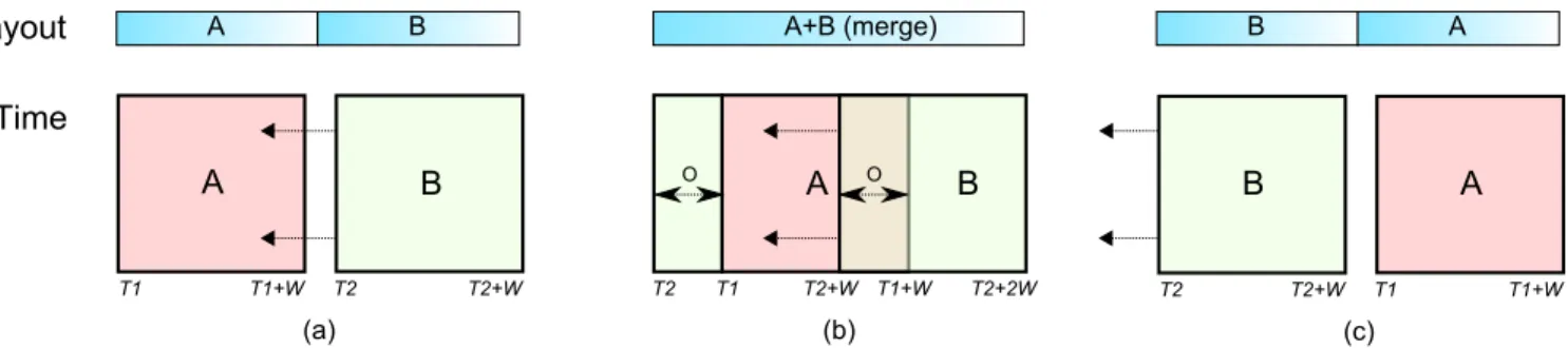
Moving a child strip may give rise to a special layout case when the interval covered by one strip overlaps that of another strip. Dur-ing overlap, the layout will not be changed to maintain stability of the display, but if the temporal order of two strips change as a re-sult of a navigation operation (i.e. a pan), the layout will switch the relative position of the two affected strips. Overlapping has spe-cial potential for reinforcing the awareness of a user navigating in the time series by merging adjacent child strips when their intervals overlap. Figure 6 gives a schematic overview in both layout and temporal space of this operation. However, strip merging requires that all zoom strips in a stack level cover the same length of interval
W =e1−e0(i.e., all strips should use the same zoom factor), or
visual stability of the display will not be maintained. Therefore, it may not be practical for all applications.
4 THETRAXPLORERSYSTEM
The TRAXPLORERsystem is a time-series visualization tool sup-porting multi-focus interaction using the stack zooming technique introduced in this paper. Time series are represented as multiple
tracks, hence the name of the tool. The system was designed to support a communication-minded [37] iterative workflow process depicted in Figure 7 where there are three phases involved: indi-vidual exploration, collaboration within the analysis team, and dis-semination to external stakeholders. For the TraXplorer tool, this is realized in the following ways (explained in subsequent sections):
• Exploration:An individual analyst, or potentially a number of analysts, use the stack zooming technique to explore com-plex time-series dataset in the tool and gain insights about the data (Section 4.1). Here, the zoom stack doubles as a branch-ing exploration history graph [7, 31].
• Collaboration:The analyst uses the zoom stack as an explo-ration history to communicate progress and insights to other members of the analysis team (Section 4.2). The analysis pro-cess can now be continued, potentially by other analysts, by backtracking to the exploration phase. We provide a method for pruning, annotating, and calculating local statistics for in-dividual strips or subhierarchies in the exploration history. • Dissemination: Insights gained during the internal
explo-ration and collaboexplo-ration phases are presented to external stakeholders (Section 4.3). The TraXplorer tool has a dissem-ination mode using the standard visual representations where the branching exploration history islinearizedinto a sequence (akin to a slide show) to better support communicating in-sights to non-experts while retaining the link to earlier stages.
Figure 6: Layout and temporal view of merge operations for strips during temporal overlap. (a) Two strips, A and B, at time positionsT1andT2, respectively, and both of interval widthWare approaching. (b) Temporal overlap between A and B, causing the layouts to merge into a single strip. To maintain the same combined layout size on the visual space, all temporal overlap is added to the beginning of the combined interval. (c) B has now passed A and there is no longer a temporal overlap, so the strips are separate and with correct temporal order in layout space.
Figure 7: Communication-minded workflow for TraXplorer.
The above workflow process gives a clear path from exploration to dissemination [35], and bridges the gap between visualization tools and traditional presentation tools such as MS PowerPoint.
4.1 Visual Exploration
The TraXplorer exploration interface (Figure 2) consists of the main visualization window, the data box for getting details and statistics about the dataset, and the layer control box for managing the visual display of the time series data. TraXplorer was designed for loading several tracks of time-series data (defined as comma-separated files, or similar) into the same visual space.
The main visualization window is a visual space supporting stack zooming. It contains a set of visualizations of time-series data on a common time axis and potentially different value axes. The type of visualization is independent of the layout management—our im-plementation currently supports basic line graphs, filled line graphs, and horizon graphs [14]. For line graphs, multiple time series will be drawn as tracks overlaid on the same temporal axis, whereas for filled line graphs and horizon graphs, the charts will be juxtaposed. To help manage multiple tracks, the layer control box can be used to move, to delete, and to toggle the visibility of individual tracks, as well as to change color mapping, transparency, and track title. Furthermore, using the layer control, two or several tracks can belinkedto use the same scale for the value (Y) axis, thereby sup-porting direct comparison of values across tracks. If tracks are not linked, they will be scaled to use the whole vertical space of each visualization strip, independent of other tracks (useful for compar-ing trends rather than absolute values). Layer control is also used to determine which track should be used for the value axis labels.
Our implementation of the stack zooming technique for the main visualization window allows the user to explore time series data by building zoom stacks. More specifically, the user can drag the mouse on a visualization strip to define a time interval. This will create a child strip for that interval in the zoom stack. Color-coded correlation graphics show the relationship between parent and child. Dragging the time window graphic in a parent will pan the corresponding child a corresponding amount. Each strip has ad-ditional decorations to allow for maximizing the size of a specific strip on the layout space, hiding it (see below), as well as deleting it.
Deleting a strip will delete all of its children. Furthermore, dragging the border of a strip enables directly resizing its space allocation.
To further support visual exploration, we also provide a data box that gives local statistics about the currently selected strip in the zoom stack. This provides detail-on-demand for computing mea-sures such as minimum, maximum, average, median, and standard deviation metrics for a particular track. The data box also doubles as a presentation tool; this is discussed more closely in the next sec-tion. In addition, users can always hover their pointer over a time series point to retrieve exact data about the point in a tooltip.
4.2 Collaboration
The TraXplorer objective is to support an analyst communicat-ing insights gained durcommunicat-ing an individual exploration session to the whole team, while allowing for continuing the exploration in col-laborative mode, or iterating back to individual exploration (by the same analyst or another) after conferring with other team members. In other words, for this setting, the analyst will need support from the visualization tool for a semi-structured presentation, while at the same time being able to continue visual exploration at any time. The zoom stack already captures the exploration history, and we reinforce this by providing a presentation tree (top right in Figure 2) that maintains a hierarchical representation of the zoom stack. This approach is similar to the branching exploration histories of GRAS-PARC [7] as well as of Shrinivasan and van Wijk [31].
In our work, we take the history concept a step further by utiliz-ing the history as a startutiliz-ing point for creatutiliz-ing a presentation of the exploration. The analyst can prune, move, or hide individual nodes (i.e. child strips) in the presentation tree to refine the presentation, while at the same time being able to extend the presentation by con-tinuing exploration at any time, even during the actual presentation. This feature is important to allow transitioning between exploration and presentation. Also, by selectively hiding and showing parts of the zoom stack using the presentation tree interface, analysts can better structure their narrative while presenting their results.
4.3 External Dissemination
Finally, there comes a point when the results collected by an analyst team must be communicated to the external, and often non-expert, stakeholders [37]. Our aim with TraXplorer was to bridge the gap between the visualization tool and the presentation tool, eliminating the need to, for example, cut and paste visualization images into traditional presentation applications like Microsoft PowerPoint.
Instead, the analyst (or the team of analysts) can use the ex-ploration history contained in the presentation tree tolinearizethe combined exploration sessions of the data, i.e., to create a linear sequence of views similar to a slideshow presentation suitable for presentation to the audience. Because stakeholders may not be ex-perts in data analysis, TraXplorer allows for hiding the exploration
interface entirely, and instead just show the visualizations (standard line graphs) in fullscreen mode. The analyst can still revert back to the whole branching exploration history, even during a presentation. Mere images may not be enough for an effective presentation, so the data box that supports details-on-demand in the exploration phase also doubles as an annotation mechanism. Checkboxes in the data box for each computed and user-supplied metric (i.e. annota-tion) allows the user to toggle display of these metrics on the actual visualization strip. In other words, this functionality can add local statistics—such as a key, the extrema, or the average of a particular data track—to the visual display of the track.
4.4 Implementation Notes
The TRAXPLORERsystem was implemented in Java using the Pic-colo2structured 2D graphics toolkit [5]. It accepts basic comma-separated (.csv) data files as input, and enables the user to select any two dimensions in the dataset as the time (X) and value (Y) axes for a particular time series. This way, the user can easily load several data series into the tool to allow for comparison between different datasets and not just within the same dataset.
The key components in our implementation include the time strip class (implemented as subclasses of Piccolo’sPNodebasic scene graph node class), the actual visualization (which is orthogonal to the strips and the layout), and the layout manager responsible for calculating and animating the layouts for a hierarchy of strip nodes. Although a recursive layout algorithm may seem to fit the zoom stack hierarchy, our implementation does not use recursion because the layout on each level is performed globally for the whole level.
5 USAGESCENARIO
To show how TraXplorer could be utilized to analyze a particular dataset, we return to our stock market analysis example. Our ana-lyst, Joe, is part of a team of financial analysts studying the history of stock market crashes to predict future behavior.
Joe has been tasked to study two crashes in particular: the Black Monday crash of October 1987, and the Asian financial crisis of July 1997. Because these events are spaced ten years apart in a large temporal dataset (daily values for all major stock market in-dices), Joe knows he will need multiple focus points, and thus loads the datasets into TraXplorer. Since the crashes affected European and Asian markets differently, he decides to study one represen-tative index for each continent, and loads the UK (FTSE100) and Hong Kong (HNGKNGI) time series from June 1986 to December 1997. Looking at the initial view of these two tracks (Figure 8), Joe notes that both indices were clearly affected by the two crashes. Pairwise comparison does not make sense for this task, because the two indices have different scales, so he does not link the tracks, but he uses the exploration interface to change transparency and toggle their visibility to better see the individual values.
Interested in understanding the buildup and aftermath of a crash, Joe creates two focus points, both spanning over an interval of two years around the events (Figure 9). This allows him to study the behavior of the market before and after the crashes. He notes that both indices have a steeply increasing trend prior to a crash, and the HNGKNGI index appears more effected during the Asian market crisis of 1997. From this data, Joe hypothesizes that there was a “bubble” effect in both cases, with the 1997 bubble being more confined to the Asian markets, whereas the 1987 one affected both. Next, Joe decides to seek more insight into market behavior to predict future market crashes. Looking at the two focus points, he creates two additional time windows in the Black Monday focus point. He centers one of them at the crash date and navigates the other time window to approximately a year before the crash time. Joe also resizes the child strips to give more visual space to the
2http://www.piccolo2d.org
Figure 8: UK (FTSE100, pink) and Hong Kong (HNKNGI, blue/purple) values for the period October 1987 to December 1997.
Figure 9: The 1987 and 1997 crashes (UK pink, Hong Kong blue).
new focus points and enables local statistics in them (Figure 10). By looking at these views, he notes that within only a year before the crash, both FTSE100 and HNGKNGI saw a steep increase of approximately 55% and 100%, respectively, and once the crash oc-curred there was a 35% drop in the FTSE100 index and a 50% drop in the HNGKNGI index.
Impressed by these results, he decides to repeat the same proce-dure for the Asian financial crisis of 1997 (Figure 11). Here, he ob-serves that for the buildup of this particular crash, there are approx-imately 50% and 60% increases in the FTSE100 and HNGKNGI indices, respectively, within a year before the crash. He also ob-serves that within a week after the crash, there is a 12% drop in FTSE100 and a 46% drop in HNGKNGI. Based on these observa-tions, he infers that a very steep “boom” (more than 50% increase) in the market index over a period of more than one year can signify a “bubble”, and that this increases the risk of a major crash. He also notes that in comparison to Black Monday, the UK market was less affected than the Hong Kong market during the 1997 crash.
Once done with his exploration of the two datasets, Joe decides to share his findings with his colleagues. To add more force to his points, he uses the presentation interface of the TraXplorer sys-tem to explain his exploration process. In doing so, Joe can use the system itself to prune away unused exploration branches and streamline his presentation. In addition, as he is communicating his findings, he is able to return to the exploration phase at any time as the discussion among the team members progresses. During the discussion, the team observes that markets remain unstable for next
Figure 10: Buildup and aftermath of the Black Monday crash.
Figure 11: Buildup and aftermath of the 1997 Asian crash.
few months following any major crash. After their discussion, the team collectively decides on a linear presentation sequence for an upcoming board meeting where Joe will use TraXplorer to share the team’s results with the whole company.
6 DISCUSSION
It is worth pointing out that although this paper has focused on visualizing temporal data, the stack zooming technique is really not limited to such visual representations, but can be utilized for any one-dimensional—or virtually one-dimensional—visual space. “Virtually one-dimensional” means that the technique could be ap-plied to any other visual representation that has a natural extension in one dimension, and limited in another. Examples include visual representations of multimedia data (the multi-scale slider presented by Richter at al. [25] uses a similar idea for this very purpose), text and hypertext documents (see the multi-page zooming technique by Robert and Lecolinet [26]), space-time diagrams (such as the Grow-ing Polygons [12] causality visualization), and bipartite graphs.
The reason for this restriction is obviously that stack zooming uses one of the dimensions of the visual space for layout. It may be argued that we could support stack zooming in an inherently two-dimensional visual space, such as a treemap [29], if we only extended our technique to three dimensions, and thus used the Z (depth) axis for layout. Another method may be to use dynamic layout of focus regions drawn as insets on top of the main visual-ization. However, this is outside the scope of our current work.
To illustrate another use of stack zooming, Figure 12 shows an example of a multi-scale representation of a document visualized
Figure 12: Stack zooming in vertical layout for a multi-scale document (mockup screenshot, not implemented in this paper).
using stack zooming. This approach might be useful for comparing several passages of a long document (e.g., when studying an ad-vanced software manual), or for showing several occurrences of a specific word in a document as well as their surrounding context.
We designed the stack zooming technique to be an alternative to existing multi-focus interaction techniques such as rubbersheet dis-plays [28], accordion drawing [23, 33], and space-folding [11]. The tradeoff with stack zooming in comparison to these is that the com-peting techniques generally provide integrated focus and context, whereas stack zooming lays out focus points as separate viewports on the visual space. It may even be argued that stack zooming is not a true multi-focus interaction technique because of this. However, our intention was to provide a distortion-free display that retains the familiarity of the original visual representations drawn on the display, and that is what distinguishes the technique from its com-petitors. We are naturally interested in comparing stack zooming to these techniques through empirical user studies.
7 CONCLUSIONS ANDFUTUREWORK
We have presented a theoretical background and a practical imple-mentation of a multi-focus interaction technique calledstack zoom-ingthat integrates multiple focus points in time-series dataset visu-alizations with their respective context and relationships. We have also shown how the zoom hierarchy built during visual exploration can serve as an input to presenting the insights gained during a par-ticular session. Our prototype is built using Java and showcases the basic functionality of the stack zooming technique for temporal data. To further showcase our contribution, we have exemplified how to use the tool for exploring stock market crashes in a financial dataset consisting of several market indices for a 10-year period.
Our future work will entail studying the empirical performance of the tool in comparison to similar tools, such as LiveRAC [21], Continuum [4], and the M´elange [11] technique. We would also like to improve the tool to better support collaborative visual explo-ration settings involving teams of analysts working together, and study how the tool can help analysts fill different roles in the anal-ysis process. Some temporal data consists of discrete events rather than quantitative values, and we would like TraXplorer to support this as well. Finally, we are also interested in exploring similar applications of communication-minded visualization [37].
ACKNOWLEDGEMENTS
This work was partly funded by Google under the research project “Multi-Focus Interaction for Time-Series Visualization.”
REFERENCES
[1] W. Aigner, S. Miksch, W. M¨uller, H. Schumann, and C. Tominski. Visualizing time-oriented data—a systematic view. Computers and Graphics, 31(3):401–409, 2007.
[2] W. Aigner, S. Miksch, W. M¨uller, H. Schumann, and C. Tominski. Vi-sual methods for analyzing time-oriented data.IEEE Transactions on Visualization and Computer Graphics, 14(1):47–60, Jan./Feb. 2008. [3] R. A. Amar, J. Eagan, and J. T. Stasko. Low-level components of
analytic activity in information visualization. InProceedings of the IEEE Symposium on Information Visualization, pages 111–117, 2005. [4] P. Andr´e, M. Wilson, A. Russell, D. A. Smith, A. Owens, and M. C. Schraefel. Continuum: designing timelines for hierarchies, relation-ships and scale. InProceedings of the ACM Symposium on User In-terface Software and Technology, pages 101–110, 2007.
[5] B. B. Bederson, J. Grosjean, and J. Meyer. Toolkit design for interac-tive structured graphics.IEEE Transactions on Software Engineering, 30(8):535–546, 2004.
[6] J. T. Biehl, M. Czerwinski, G. Smith, and G. G. Robertson. FAST-Dash: a visual dashboard for fostering awareness in software teams. InProceedings of the ACM CHI 2007 Conference on Human Factors in Computing Systems, pages 1313–1322, 2007.
[7] K. Brodlie, A. Poon, H. Wright, L. Brankin, G. Banecki, and A. Gay. GRASPARC: A problem solving environment integrating computa-tion and visualizacomputa-tion. InProceedings of the IEEE Conference on Visualization, pages 102–109, 1993.
[8] A. J. B. Brush, B. Meyers, D. S. Tan, and M. Czerwinski. Under-standing memory triggers for task tracking. In Proceedings of the ACM CHI 2007 Conference on Human Factors in Computing Systems, pages 947–950, 2007.
[9] S.-M. Chan, L. Xiao, J. Gerth, and P. Hanrahan. Maintaining interac-tivity while exploring massive time series. InProceedings of the IEEE Symposium on Visual Analytics Science & Technology, pages 59–66, 2008.
[10] N. Elmqvist, T.-N. Do, H. Goodell, N. Henry, and J.-D. Fekete. ZAME: Interactive large-scale graph visualization. InProceedings of the IEEE Pacific Visualization Symposium, pages 215–222, 2008. [11] N. Elmqvist, N. Henry, Y. Riche, and J.-D. Fekete. M´elange: Space
folding for multi-focus interaction. InProceedings of the ACM CHI 2008 Conference on Human Factors in Computing Systems, pages 1333–1342, 2008.
[12] N. Elmqvist and P. Tsigas. Animated visualization of causal relations through growing 2D geometry.Information Visualization, 3:154–172, 2004.
[13] J. A. Fails, A. Karlson, L. Shahamat, and B. Shneiderman. A visual interface for multivariate temporal data: Finding patterns of events across multiple histories. InProceedings of the IEEE Symposium on Visual Analytics Science & Technology, pages 167–174, 2006. [14] S. Few. Time on the horizon. Visual
Busi-ness Intelligence Newsletter, June/July 2008. http://www.perceptualedge.com/articles/visual business intelligence/ time on the horizon.pdf.
[15] G. W. Furnas. Generalized fisheye views. InProceedings of the ACM CHI’86 Conference on Human Factors in Computer Systems, pages 16–23, 1986.
[16] G. W. Furnas. A fisheye follow-up: further reflections on focus + context. InProceedings of the ACM CHI 2006 Conference on Human Factors in Computing Systems, pages 999–1008, 2006.
[17] J. Heer, J. D. Mackinlay, C. Stolte, and M. Agrawala. Graphical histo-ries for visualization: Supporting analysis, communication, and eval-uation. IEEE Transactions on Visualization and Computer Graphics (Proc. InfoVis’08), 14(6):1189–1196, 2008.
[18] H. Hochheiser and B. Shneiderman. Dynamic query tools for time series data sets: timebox widgets for interactive exploration. Informa-tion VisualizaInforma-tion, 3(1):1–18, 2004.
[19] Z. Liu, N. J. Nersessian, and J. T. Stasko. Distributed cognition as a theoretical framework for information visualization. IEEE Trans. of Visualization and Computer Graphics, 14(6):1173–1180, 2008. [20] J. D. Mackinlay, G. G. Robertson, and S. K. Card. The Perspective
Wall: Detail and context smoothly integrated. InProceedings of the ACM CHI’91 Conference on Human Factors in Computing Systems, pages 173–179, 1991.
[21] P. McLachlan, T. Munzner, E. Koutsofios, and S. C. North. LiveRAC: interactive visual exploration of system management time-series data. InProceedings of the ACM CHI 2008 Conference on Human Factors in Computing Systems, pages 1483–1492, 2008.
[22] W. M¨uller and H. Schumann. Visualization methods for time-oriented data—an overview. InProceedings of the Winter Simulation Confer-ence, pages 737–745, 2003.
[23] T. Munzner, F. Guimbreti`ere, S. Tasiran, L. Zhang, and Y. Zhou. Tree-Juxtaposer: scalable tree comparison using focus+context with guar-anteed visibility. InComputer Graphics (ACM SIGGRAPH 2003 Pro-ceedings), pages 453–462, 2003.
[24] C. Plaisant, B. Milash, A. Rose, S. Widoff, and B. Shneiderman. Life-Lines: Visualizing personal histories. In Proceedings of the ACM CHI’96 Conference on Human Factors in Computing Systems, pages 221–227, 1996.
[25] H. Richter, J. A. Brotherton, G. D. Abowd, and K. N. Truong. A multi-scale timeline slider for stream visualization. Technical Report GVU-99-30, GVU Center, Georgia Institute of Technology, July 2006. [26] L. Robert and E. Lecolinet. Browsing hyperdocuments with multi-ple focus+context views. InProceedings of the ACM Conference on Hypertext, pages 293–294, 1998.
[27] D. M. Russell, M. J. Stefik, P. Pirolli, and S. K. Card. The cost struc-ture of sensemaking. InProceedings of the ACM INTERCHI’93 Con-ference on Human Factors in Computing Systems, pages 269–276, 1993.
[28] M. Sarkar, S. S. Snibbe, O. J. Tversky, and S. P. Reiss. Stretching the rubber sheet: A metaphor for visualizing large layouts on small screens. InProceedings of the ACM Symposium on User Interface Software and Technology, pages 81–91, 1993.
[29] B. Shneiderman. Tree visualization with tree-maps: A 2-D space-filling approach. ACM Transactions on Graphics, 11(1):92–99, Jan. 1992.
[30] G. Shoemaker and C. Gutwin. Supporting multi-point interaction in visual workspaces. InProceedings of the ACM CHI 2007 Conference on Human Factors in Computing Systems, pages 999–1008, 2007. [31] Y. Shrinivasan and J. van Wijk. Supporting the analytical reasoning
process in information visualization. InProceedings of the ACM Con-ference on Human Factors in Computing Systems, pages 1237–1246, 2008.
[32] S. F. Silva and T. Catarci. Visualization of linear time-oriented data: a survey. InProceedings of the First International Conference on Web Information Systems Engineering, pages 310–, 2000.
[33] J. Slack, K. Hildebrand, and T. Munzner. PRISAD: A partitioned rendering infrastructure for scalable accordion drawing (extended ver-sion).Information Visualization, 5(2):137–151, 2006.
[34] C. Stolte and P. Hanrahan. Polaris: a system for query, analysis and visualization of multi-dimensional relational databases. In Proceed-ings of the IEEE Symposium on Information Visualization, pages 5– 14, 2000.
[35] J. J. Thomas and K. A. Cook, editors. Illuminating the Path: The Research and Development Agenda for Visual Analytics. IEEE Press, 2005.
[36] E. R. Tufte.The Visual Display of Quantitative Information. Graphics Press, Cheshire, Connecticut, 1983.
[37] F. B. Vi´egas and M. Wattenberg. Communication-minded visualiza-tion: A call to action. IBM Systems Journal, 45(4):801–812, Apr. 2006.
[38] T. D. Wang, C. Plaisant, A. J. Quinn, R. Stanchak, S. Murphy, and B. Shneiderman. Aligning temporal data by sentinel events: dis-covering patterns in electronic health records. InProceedings of the ACM CHI 2008 Conference on Human Factors in Computing Systems, pages 457–466, 2008.