Towards greater clarity for the
analysis of imaging studies:
Development & validation of an
alternative to the area under the
receiver
-
operator characteristic
curve.
Submitted for the postgraduate research degree of PhD,
March 2015
Division of Medicine, UCL
Candidate:
Professor Steve Halligan MB BS, MD, FRCP, FRCR Head, UCL Centre for Medical Imaging,
3rd Floor East 250 Euston Road London NW1 2PG Telephone: 0044 2034567890 (Ext: 9094) Direct Line: 0044 20 3447 9094 email: [email protected]
UCL student number: HALLI02 Declaration of interests:
SH acted as a consultant for Medicsight plc, a company who developed CAD software for CT colonography, until 2010. He is currently consultant for iCAD, a company who also develop CAD software for CTC.
Declaration:
I, Professor Steve Halligan confirm that the work presented in this thesis is my own. Where information has been derived from other sources, I confirm that this has been indicated in the thesis. Specifically, a full breakdown of responsibilities is presented in the “Contribution and acknowledgements” section of the thesis.
Thesis abstract
This thesis arose from a 2006 study performed by the author and his collaborators that attempted to gain regulatory approval for computer-assisted detection (CAD) software. The USA Food & Drug Administration (FDA) obliged us to use the change in the area under the receiver-operator characteristic curve (ROC AUC) as our primary outcome. Despite its wide dissemination in radiology research, we found implementation of ROC AUC very problematic. This thesis explores the hurdles we encountered and argues for an alternative approach.
Chapter 1 describes the rationale for and against ROC AUC as a measure of diagnostic performance. An alternative analysis based on net benefit is proposed on the basis that it is more transparent and simpler to interpret.
Chapter 2 uses the net benefit method to analyse a multi-reader multi-case (MRMC) study of CAD for CT colonography. The analysis requires an estimate of relative misclassification costs for false-negative versus false-positive diagnoses; “W”. This study used a conservative value for W, arrived at via consensus.
In Chapter 3 an evidence-based value for W in the context of screening for colorectal cancer and polyps by CT colonography is arrived at via a discrete choice experiment (DCE) of patients and healthcare workers.
Chapter 4 uses the value for W obtained in Chapter 3 in a net benefit analysis to compare observer performance in two MRMC studies of CAD for CT colonography.
Chapter 5 obtains W by DCE for a different clinical context – detection of extracolonic pathology by CT colonography.
Chapter 6 describes a systematic review that aims to determine whether reporting of MRMC ROC AUC methods in the radiological literature is comprehensive.
Chapter 7 then provides guidelines for the comprehensive reporting of MRMC ROC AUC studies.
The thesis finishes with a summary of the work performed and suggestions for further research.
Dedication
To Julia and Sarah.
Table of Contents
Candidate: ... 1
Thesis abstract ... 2
Dedication ... 3
List of Tables ... 7
List of Figures ... 9
List of abbreviations/glossary ... 11
Chapter 1: Disadvantages of using the area under the receiver operator
characteristic curve (ROC AUC) to assess imaging tests: A discussion &
proposal for an alternative approach. ... 12
Abstract ... 12
Introduction ... 13
The ROC plot ... 13
ROC AUC ... 16
MRMC ROC studies ... 21
What are the advantages of ROC AUC? ... 22
What are the disadvantages of ROC AUC? ... 23
Clinical comprehension and relevance ... 23
Are sensitivity and specificity equally important? ... 24
Confidence scores may be inconsistent and unreliable ... 25
Curve extrapolation ... 29
Prevalence of abnormality ... 32
Alternatives to ROC AUC ... 33
Advantages of net benefit methods ... 37
Summary ... 37
Chapter 2: Incremental benefit of computer-aided detection when used as
a second- & concurrent-reader for CT colonography: Multi-observer study.
... 39
Abstract ... 39
Introduction ... 40
Methods ... 40
Definition of ground truth ... 42
Readers and case interpretation ... 42
Statistical analysis ... 43
Results ... 44 Per-patient analysis ... 44
Per-polyp analysis ... 47
Interpretation time ... 48
Discussion ... 48
Chapter 3: Patients’ & healthcare professionals’ values regarding true- &
false-positive diagnosis when colorectal cancer screening by CT
colonography: Discrete choice experiment. ... 52
Abstract ... 52 Introduction ... 53 Methods ... 54 Ethical statement ... 54
Design ... 54
Pilot ... 56
Recruitment ... 56
Statistical analysis ... 57
Results ... 60 Non-traders ... 60
Cancer ... 61
Polyps ... 62
Willingness-to-pay ... 62
Discussion ... 63
Chapter 4: Assessment of the incremental benefit of computer-aided
detection (CAD) for interpretation of CT colonography by experienced and
inexperienced readers. ... 67
Abstract ... 67
Introduction ... 68
Methods ... 68
Data sources and readers ... 68
Data characteristics ... 69
Reading environment and CAD paradigm ... 69
Statistical analysis ... 70
Results ... 72 Per-patient analysis ... 72
Per-polyp analysis ... 74
Second-read CAD ... 75
Other analyses ... 77
Discussion ... 77
Chapter 5: Detection of extracolonic pathology by CT colonography: A
discrete choice experiment of perceived benefits versus harms. ... 81
Abstract ... 81 Introduction ... 82 Methods ... 83 Recruitment ... 83
Attributes ... 83
Experiment format ... 86
Pilot testing ... 87
Statistical analysis ... 87
Results ... 88 Non-traders ... 89
Radiological testing discrete choice experiment ... 90
Invasive testing discrete choice experiment ... 92
Discussion ... 93
Chapter 6: Multi-reader multi-case studies using the area under the
receiver operator characteristic curve as a measure of diagnostic
accuracy: Systematic review with a focus on quality of data reporting.
.... 97
Abstract ... 97
Introduction ... 98
Methods ... 98
Search strategy, inclusion and exclusion criteria ... 98
Data extraction ... 99
Analysis ... 100
Results ... 100
Study characteristics ... 102
Study design ... 103
Methods of reporting study outcomes ... 104
Model assumptions ... 105
Model fitting ... 106
Presentation of results ... 107
Chapter 7: Guidelines for the reporting of multi-reader multi-case imaging
studies using the area under the receiver operator characteristic curve as
a measure of diagnostic accuracy.
... 112
Abstract ... 112
Introduction ... 113
Methods ... 113
Results: The guidelines. ... 114
Item #1: The imaging test ... 114
Item #2: Patients (cases) used for the study ... 114
Item #3 Study readers ... 114
Item #4 Readers’ diagnostic task(s) ... 115
Item #5 Confidence rating scales ... 115
Item #6 Study design ... 115
Item #7 Unit of analysis ... 116
Item #8 Distribution of rating scores and data fitting ... 116
Item #9 Data analysis ... 116
Item #10 Data presentation ... 117
Item #11 Study interpretation ... 117
Discussion ... 118
Chapter 8: Thesis summary and recommendations for future research . 121
Contribution and acknowledgements ... 128
Appendix 1: Indexed, peer-reviewed journal articles arising from this
thesis. ... 131
List of Tables
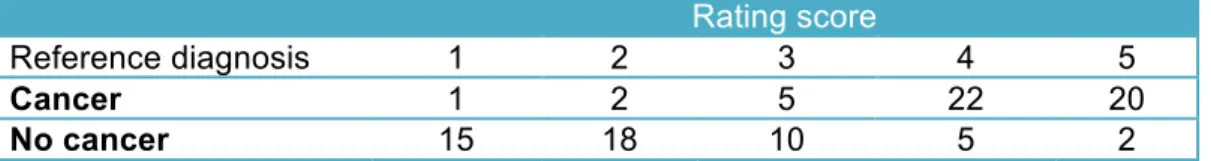
Table 1: Data from a hypothetical study of diagnosis of colorectal cancer by CT colonography showing 50 patients with and 50 patients without cancer by reference standard, and the diagnostic rating score attributed by a radiologist observer who uses the following scale to rate their belief that cancer is present or absent: 1 – Definitely normal; 2 – Probably normal; 3 – Equivocal; 4 – Probably has cancer; 5 – Definitely has cancer. ... 15
Table 2: Example data for the situation where CT more sensitive than the test in Table.
1 but which retains identical specificity. ... 17
Table 3: Example data for the situation where CT is more specific than the test in Table.
1 but which retains identical specificity. ... 18
Table 4: Example data for the situation where CT is as sensitive as the test in table1 but
where these gains are exactly offset by diminished specificity. ... 19
Table 5: Demographic and data acquisition details for the 112 patient cases interpreted.
... 41
Table 6: Per-patient sensitivity, specificity and CAD net effect for detection by CT
colonography of patients with polyps of all sizes when readers were unassisted compared to second-read CAD and concurrent CAD. Data are shown for all 16 readers. ... 45
Table 7: CAD net benefit, per-patient sensitivity and specificity for detection by CT
colonography of patients with polyps of all sizes and patients with polyps ≥6mm when readers were unassisted compared to second-read CAD and concurrent CAD. Data are averaged across 16 readers. ... 47
Table 8: Per-polyp sensitivity for detection by CT colonography of polyps of all sizes,
polyps ≥6mm, and polyps ≤5mm when readers were unassisted compared to second-read CAD and concurrent CAD. Data are averaged across 16 readers. Confidence intervals are 98.3% to account for multiple testing. ... 48
Table 9: Overview of attributes and levels presented in cancer (1A) and polyp (1B)
discrete choice experiments. ... 55
Table 10: Demographic characteristics and household annual income of patient and
professional participants, including non-traders (% have been rounded). ... 60
Table 11: Tipping points and relative weighting for cancer and polyp detection scenarios
calculated for patients, professionals, and all participants combined (FP = false-positive diagnosis, TP = true-false-positive diagnosis). ... 61
Table 12: Patient and professionals’ willingness to pay (WTP) for a 0.10 (10%) increase
in test sensitivity without any reduction in specificity, for detection of cancer or clinically significant polyps. ... 63
Table 13: Per-patient results for net benefit of CAD assistance when used in concurrent mode for interpretation of CT colonography by inexperienced and experienced readers. For all comparisons differences are calculated as
performance with CAD assistance minus performance when unassisted. All data are percentages. Using CAD changed the proportion of readers correctly
experienced readers; detection of patients with polyps increased in 70% and 57% of cases over 10 and 16 readers respectively. ... 73
Table 14: Per-polyp sensitivity for CAD assistance when used in concurrent mode for
interpretation of CT colonography by inexperienced and experienced readers. For all comparisons differences are calculated as performance with CAD assistance minus performance when unassisted. All data are percentages. ... 75
Table 15: Effect of CAD assistance when used in second-read mode for interpretation of
CT colonography by experienced readers. For all comparisons differences are calculated as performance with CAD assistance minus performance when
unassisted. All data are percentages. ... 76
Table 16: Attributes and levels presented in the “radiological testing” (1A) and “invasive
testing” (1B) experiments. ... 85
Table 17: Demographic characteristics of patient and professional participants. ... 89
Table 18: Tipping points and number of FP deemed acceptable in each scenario, for
patients, professionals, and the two groups combined. ... 90
Table 19: Citations for the 49 papers (contributing 51 studies) included in the systematic
review. Details are also provided for the 15 articles excluded from the systematic review after reading the full-text, along with primary reasons for their exclusion (multiple reasons for exclusion were possible). ... 101
List of Figures
Figure 1: ROC plot of the data shown in Table 1. The diagnostic thresholds from which the curve is built are labelled on the curve; for example, “Threshold 4” indicates the sensitivity and corresponding false positive rate at the diagnostic threshold of “Probably has cancer” (Threshold explanations are described in the legend for Table 1).The empiric ROC AUC is 0.828 (all ROC curves drawn using Eng J. ROC analysis: web-based calculator for ROC curves. Baltimore: Johns Hopkins University 2006. Available from: http://www.jrocfit.org). ... 16
Figure 2: ROC plot of data from Table 2. The empiric AUC is 0.891. ... 18
Figure 3: The Roc curve for these data is shown below. The empiric ROC AUC is 0.891. The curve has moved to the left compared to Figure 1. ... 19
Figure 4: ROC plot for the data presented in table 4. The empiric ROC AUC is 0.50. .... 20
Figure 5: Plot of data from Figure 1. The x-axis represents confidence scores and the
y-axis their frequency. Patients with cancer are represented by the dashed line and patients without cancer by the solid line. The two distributions cross at a
confidence score of 3, indicating that this is the diagnostic threshold that best separates patients with and without cancer. Moving this boundary to the right or left of the graph is akin to raising or lowering the diagnostic threshold respectively. If CT were perfect at discriminating between patient groups, the two distributions would not cross. The less good a test at discriminating between diseased and non-diseased patients, the more the two distributions will overlap. ... 21
Figure 6: Histogram of confidence ratings ascribed by 10 radiologists in a prior study of
CT colonography(17). The dark brown bars represent ratings for 107 patients (of whom 60 had colon polyps) when using computer-assisted detection (CAD) whereas the light brown bars represent ratings when unassisted. The distribution is bimodal: The highest peak occurs for patients who received zero scores both with and without CAD. There is a second broader, more continuous distribution for patients, with most scores being 50 or more and a peak at approximately 70. ... 28
Figure 7: Data extrapolation: ROC plots each for an individual reader using CT
colonography without CAD. Green dots indicate real data points underlying curve fitting. ROC curve are shown extrapolated from these data using LabMRMC (red dotted line) and Proproc software (blue solid line). Plots for five individual readers are shown, labeled 1 to 5. ... 30
Figure 8A: Data extrapolation: ROC plots of individual readers using CT colonography
with- and without CAD. These data are reproduced from an analysis of the study described in Chapter 2, sponsored by Medicsight plc, which was used to obtain FDA approval successfully. The primary outcome measure is diagnosis of polyps of any diameter on a per-segment basis. It can be seen that the data points cluster in the bottom left-hand area of the ROC plot space, and that the AUC is dominated by extrapolated data curves. Two types of extrapolation are shown. Figure 8A shows the data for all 17 readers. Figure 8B shows the data for a single reader (R14) markedly emphasising both the clustering and the fact that the method used for extrapolation markedly influences the ultimate AUC. ... 31
Figure 9: Example question from the cancer detection scenario. Each tally mark
represents one of 5000 potential outcomes for a patient undergoing screening: True positive (blue), false negative (yellow), true negative (white), or false positive (red). Participants were informed that if they were to undertake the test in question, their odds of receiving any of the outcomes were represented by the chance of
picking any of these tally-marks at random “like roulette”. Data are also represented numerically using both relative and absolute percentages. This scenario corresponds to the ‘tipping point’ for patients and professional
respondents: On average, participants favoured the enhanced test (test B) in view of its additional sensitivity up to, but not beyond, this level of additional false
positives. ... 58
Figure 10: Cumulative graph of participants’ tipping points for trading absolute numbers
of true-positive versus false-positive diagnoses. ... 59
Figure 11: Example question from the “invasive testing” experiment. A hypothetical
screening population of 600 individuals were presented and participants invited to choose between a test generating a variable rate of false-positives (pink) but a 1 in 600 chance of finding an early stage extracolonic malignancy (green) or a test that generated no false-positives but no chance of finding an extracolonic malignancy (yellow). Participants were informed that their chance of receiving any particular result could not be predicted in advance and was essentially random. Relative and absolute percentages were presented. This image corresponds to the median “tipping point” for patients and professionals combined: On average, unrestricted CTC (Test A on the Figure) was preferred to this level of false-positive invasive tests, but not beyond. ... 87
Figure 12: Cumulative plot of tipping-points expressed as absolute numbers of additional unnecessary tests for patients (A) and professionals (B) in the “radiological testing” experiment. Each grey dot shows an individual’s tipping-point. Large red square shows the median value, corresponding to “an average participant”. Blue squares show 25 and 75 percentage points. ... 91
Figure 13: Cumulative plot of tipping-points expressed as numbers of additional
unnecessary tests for (A) patients and (B) professionals in the “invasive testing” experiment: Color-codes are the same as in figure 12. ... 92
Figure 14: Bar chart showing data extracted by the systematic review relating to study
readers, design, and the confidence scales used to build ROC curves. ... 103
Figure 15: Bar chart showing data extracted by the systematic review relating to the
List of abbreviations/glossary
2D/3D Two dimensional/three dimensional AC Ascending colonAUC Area under the curve
BCSP Bowel cancer screening programme BI-RADS Breast imaging and reporting data system CI Confidence interval
CRC Colorectal cancer CT Computed tomography
CTC Computed tomographic colonography DBM Dorfman Berbaum Metz
DC Descending colon
DCE Discrete choice experiment DOR Diagnostic odds ratio
FDA Food and Drug Administration FN False negative
FP False positive GBP Great British pound IQR Inter-quartile range IRB Institutional review board NPV Negative predictive value pAUC Partial area under the curve PPV Positive predictive value REC Research ethics committee ROC Receiver operator characteristic RS Reference standard SC Sigmoid colon SD Standard deviation TC Transverse colon TN True negative TP True positive WC Weighted comparison WTP Willingness to pay
Chapter 1: Disadvantages of using the area under the
receiver operator characteristic curve (ROC AUC) to
assess imaging tests: A discussion & proposal for an
alternative approach.
This Chapter has been published as:
Halligan S, Altman DG, Mallett S. Disadvantages of using the area under the receiver operating characteristic curve to assess imaging tests: A discussion and proposal for an alternative approach. European Radiology 2015:25:932-9.
Winner, Gold Medal for best GI paper published in European Radiology.
Abstract
Aim To describe the disadvantages of the area under the receiver operating
characteristic curve (ROC AUC) to measure diagnostic test performance. To propose an alternative based on net benefit.
Methods Narrative review supplemented by data from a study of computer-assisted detection for CT colonography.
Results We identified problems with ROC AUC: Confidence scoring by readers was highly non-normal and score distribution bimodal. Consequently, ROC curves were highly extrapolated with AUC mostly dependent on areas without patient data. AUC depended on the method used for curve-fitting. ROC AUC does not account for prevalence or different misclassification costs arising from negative and false-positive diagnoses. Change in ROC AUC has little direct clinical meaning for clinicians. An alternative analysis based on net benefit is proposed, based on the change in sensitivity and specificity at clinically relevant thresholds. Net benefit incorporates estimates of prevalence and misclassification costs, and is clinically interpretable since it reflects changes in correct and incorrect diagnoses when a new diagnostic test is introduced.
Conclusions ROC AUC is most useful in the early stages of test assessment whereas methods based on net benefit are more useful to assess radiological tests where the clinical context is known. Net benefit is more useful for assessing clinical impact.
Introduction
Most of our working week as radiologists is concerned with diagnostic tests: we interpret medical images with the aim of detecting disease. The choice between one test or another (e.g. CT or MRI?) will depend on a variety of factors including
availability and cost. However, for the most part, the choice is influenced by how effectively the test and its interpretation by a radiologist detects or excludes the disease being considered by the referring clinician. In this sense, the radiologist is acting as a “classifier”(1), whose task is to sort patients into disease-positive and disease-negative cases. Sensitivity, the ability of a test to identify patients with disease, is a measure of diagnostic test accuracy that is very familiar to radiologists. At the same time we must also consider specificity, the ability of a test to identify patients who do not have disease. Sensitivity and specificity are inextricably linked and usually move in different directions. Most obviously, if we designated every image we interpreted as positive for disease, then we would have 100% sensitivity but 0% specificity, which means all normal patients would be subjected to unnecessary further investigation and possibly treatment, which would be inconvenient, illogical, precipitate anxiety, and be extremely costly! Conversely, if we called every image negative, then specificity would be perfect but sensitivity would be 0% and we would never diagnose any pathology. Although sensitivity and specificity are "two sides of the same coin" and should virtually always be considered together, it is sometimes difficult to do so, especially when comparing between different tests. For example, if one test has high sensitivity and another high specificity, which is best? Combining both sensitivity and specificity into a single measure of diagnostic accuracy facilitates comparisons between different tests. For radiologists, the most familiar combined measure is the area under the receiver-operator-characteristic curve, usually abbreviated to “ROC AUC” (2).
The ROC plot
A ROC curve is a plot of the true-positive rate (y-axis) of a test against the corresponding false-positive rate (x-axis), i.e. sensitivity against 1-specificity. A fundamental building block of the ROC curve is the concept of test performance at different “diagnostic thresholds”. Some diagnostic tests give a simple “yes/no” answer. One such example might be urinalysis for glucose; glucose is either present or absent. However, analysis of plasma glucose is different – there is a normal range of values for fasting blood glucose, 3.9 to 5.8 mmol/L. Diagnosis of diabetes becomes increasingly more likely as fasting blood glucose rises above this but, for example, not everyone with a level of 6.3 mmol/L will have diabetes; i.e. there is a “grey” area where diagnosis
is uncertain. It follows that the proportion of patients who truly have diabetes and those who do not will change with the threshold used for a positive diagnosis.
Interpretation of radiological images is one diagnostic scenario where diagnostic thresholds vary, and where the thresholds are made and used by a human observer. Take diagnosis of colon cancer by CT colonography as an example. Imagine a study where a radiologist is confronted by scans from 100 patients, 50 of whom have colon cancer (i.e. a prevalence of abnormality of 50%). We would certainly expect a
competent radiologist to get the diagnosis right more often than not but there will be occasions when this does not happen. Subtle cancers may not be seen or perhaps they are seen but misinterpreted as colonic spasm. Occasionally, even “obvious” tumours are missed and some cancers will be too small to be resolved adequately by the scan. As radiologists, we are all too familiar with the concept of uncertainty in our diagnosis. A measure of this uncertainty can be captured by asking the radiologist to attribute a confidence score to his/her diagnosis for each individual case. The following categories might be appropriate for colon cancer: “definitely normal”, “probably
normal”, “equivocal”, “probably cancer”, “definitely cancer”. The BI-RADS score for mammography is a well-known example of this type of rating used in daily diagnostic practice; “negative”, “benign”, “probably benign”, “suspicious”, “highly suggestive of malignancy”(3). In some situations, a rating system from 0 (definitely no disease) to 100 (definitely disease) is used in an attempt to elicit finer rating detail(4). Such
confidence scores are an amalgam of whether disease is or is not resolved by the test (technical adequacy) and whether the radiologist has or has not seen the abnormality subsequently and then interpreted it correctly (diagnostic accuracy).
Of course, in reality, each patient either has cancer or not, so the issue arises of how to extract a binary diagnosis from such rating scales. For example, to determine how effective CT colonography is for detection of cancer, we might apply both CT and an independent reference test to patients with and without the disease, thus providing a CT diagnosis and a “ground-truth” or “Gold-standard” diagnosis for each patient. We could then apply a diagnostic threshold (cut-point) to the scale of diagnostic certainty, i.e. a point on the rating scale at which (and above) the patient is believed to have cancer and below which they do not. This result is then compared with the reference standard diagnosis, thereby calculating the number of correct (true-positive) and incorrect (false-negative) diagnoses for patients with and without disease at each threshold. For example, if we apply a threshold at “definitely cancer” then the large majority of patients labeled as such by CT will prove to have cancer (if CT is accurate). However, because of the uncertainties noted above, there will likely be many patients
labeled at the “probably cancer” threshold and below who also have the disease but who will be missed with a diagnostic threshold set at “definitely cancer”. Dropping the diagnostic threshold to “probably cancer” will therefore increase the proportion of positive patients identified; i.e. sensitivity increases. However, at the same time more patients without disease will be erroneously labeled as positive; i.e. the false-positive fraction will increase (decreased specificity). Plotting the proportion of true-positive against false-positive patients at each diagnostic threshold will build the ROC curve.
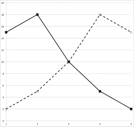
Table 1 below shows a data table for our hypothetical study of CT colonography:
Table 1: Data from a hypothetical study of diagnosis of colorectal cancer by CT colonography showing 50 patients with and 50 patients without cancer by reference standard, and the diagnostic rating score attributed by a radiologist observer who uses the following scale to rate their belief that cancer is present or absent: 1 – Definitely normal; 2 – Probably normal; 3 – Equivocal; 4 – Probably has cancer; 5 – Definitely has cancer.
Rating score
Reference diagnosis 1 2 3 4 5
Cancer 2 5 10 18 15
No cancer 15 18 10 5 2
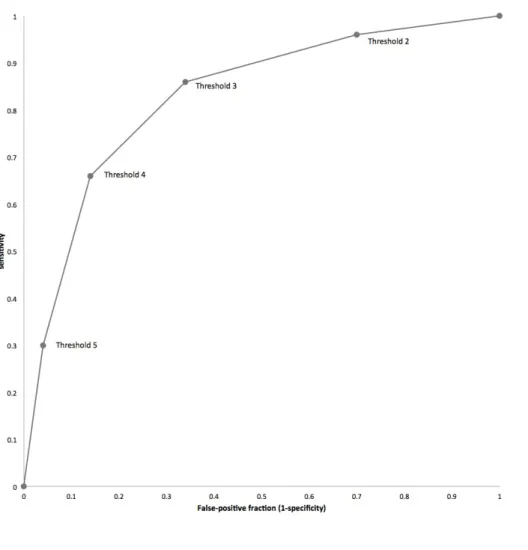
If we apply the diagnostic threshold for cancer at 5 (“definitely cancer”) then 15 patients with cancer are diagnosed correctly (true-positive), as are 48 without (true-negative). However 35 patents with cancer have been “missed” (false-negatives) and 2 patients without cancer diagnosed with disease (false-positives); i.e. sensitivity = 0.30 and specificity = 0.96.
Dropping the diagnostic threshold to include those patients labeled “probably cancer” results in 33 true-positives at the cost of 7 false-positives. At this threshold sensitivity = 0.66 and specificity = 0.86.
A diagnostic threshold dropped to include “equivocal” patients means 43 true-positives and 17 false-positives; sensitivity = 0.86, specificity = 0.66.
A diagnostic threshold dropped to include “probably not cancer” patients means 48 true-positives and 35 false-positives; sensitivity = 0.96, specificity = 0.30.
Of course, dropping the diagnostic threshold to include “definitely not cancer” (a small proportion of whom may actually have cancer) will mean that all possible thresholds
entail a positive diagnosis; i.e. there are 50 true-positives but also 50 false-positives; sensitivity = 1.0, specificity = 0.0.
The figure below is a graph that plots these sensitivity/specificity pairs for each diagnostic threshold, i.e. a ROC plot.
Figure 1: ROC plot of the data shown in Table 1. The diagnostic thresholds from which the curve is built are labelled on the curve; for example, “Threshold 4” indicates the sensitivity and corresponding false positive rate at the diagnostic threshold of “Probably has cancer” (Threshold explanations are described in the legend for Table 1).The empiric ROC AUC is 0.828 (all ROC curves drawn using Eng J. ROC analysis: web-based calculator for ROC curves. Baltimore: Johns Hopkins University 2006. Available from: http://www.jrocfit.org).
ROC AUC
As explained in the section above, the ROC plot therefore describes the diagnostic performance of a test over the whole range of possible thresholds. Performance is usually summarised across all these thresholds using ROC AUC, corresponding to the area under the curve. The maths are complex but, in simple terms, they calculate how
likely it is that the test will rank two patients, one with disease and one without, in the correct order of their likelihood of having disease, across all possible thresholds(1, 5). A more intuitive way to express AUC is the chance that a randomly selected patient with disease will be ranked above a randomly selected patient without disease(2). Thus, the greater the AUC, the better the test at achieving this separation. A perfect test would have 100% sensitivity with a false-positive fraction of 0. This point lies at the extreme top left hand corner of the ROC plot space and a test this accurate at all thresholds would have an AUC of 1.0. If the ROC curve is a straight line connecting the extreme bottom-left (sensitivity, FPR: 0,0) and top-right (1,1) corners of the ROC plot space (sometimes called the “chance diagonal”) this describes a test with no
discriminatory ability; AUC = 0.5 (equivalent to picking a test result by tossing a coin). The AUC for the data in Figure 1 is 0.828, indicating a test that is better than chance at discriminating patients with disease.
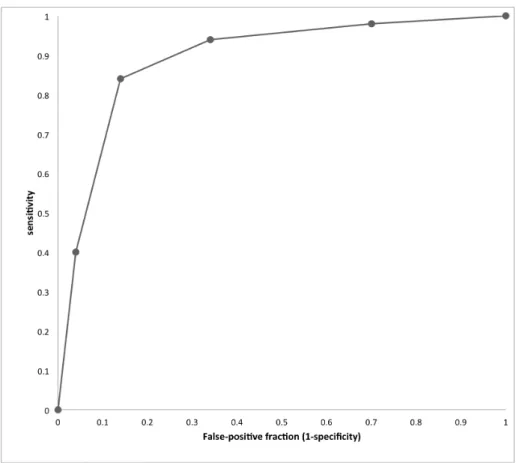
In table 2 below, test sensitivity has been inflated while specificity remains the same as in Table 1.
Table 2: Example data for the situation where CT more sensitive than the test in Table. 1 but which retains identical specificity.
Rating score
Reference diagnosis 1 2 3 4 5
Cancer 1 2 5 22 20
No cancer 15 18 10 5 2
The ROC plot for these data is shown in Figure 2 below; the curve has moved upwards compared to figure 1 and ROC AUC rises to 0.891.
Figure 2: ROC plot of data from Table 2. The empiric AUC is 0.891.
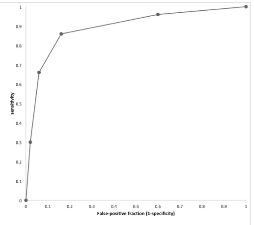
Conversely, in table 3 below, test specificity has been inflated by the same amount but sensitivity remains the same as in table 1; The AUC again rises to 0.891 again but the shape of the curve is different to Figure 2, having moved towards the y-axis, reflecting the fact that specificity rather than sensitivity has improved.
Table 3: Example data for the situation where CT is more specific than the test in Table. 1 but which retains identical specificity.
Rating score Reference diagnosis 1 2 3 4 5 Cancer 2 5 10 18 15 No cancer 20 22 5 2 1
Figure 3: The Roc curve for these data is shown below. The empiric ROC AUC is 0.891. The curve has moved to the left compared to Figure 1.
In table 4 below, sensitivity has been raised to the level seen in table 2 but these gains are exactly mirrored by loss of specificity.
Table 4: Example data for the situation where CT is as sensitive as the test in table1 but where these gains are exactly offset by diminished specificity.
Rating score
Reference diagnosis 1 2 3 4 5
Cancer 1 2 5 22 20
No cancer 1 2 5 22 20
Figure 4 below shows the ROC plot arising from these data. This time the curve is actually a straight line and the empiric AUC is 0.5, suggesting the test has no discriminatory value.
Figure 4: ROC plot for the data presented in table 4. The empiric ROC AUC is 0.50.
When faced by an individual patient and their test result in clinical practice, we must settle on a threshold that denotes a positive test. The ROC plot is actually a composite of two distributions of diagnostic certainty, i.e. for patients both with and without
disease. Figure 5 below shows the distribution of confidence scores for diseased and normal patients plotted separately (data taken from Figure 1). The two distributions cross at a confidence score of 3. The threshold that best separates patients with and without disease can be estimated by looking at the ROC plot (Figure 1) and identifying the threshold on the cure that lies nearest to the top left-hand corner of the plot space. This “best operating point” can be moved to maximise sensitivity at the expense of specificity, and vice-versa, but is conventionally placed where the test optimally separates diseased from non-diseased patients.
Figure 5: Plot of data from Figure 1. The x-axis represents confidence scores and the y-axis their frequency. Patients with cancer are represented by the dashed line and patients without cancer by the solid line. The two distributions cross at a confidence score of 3, indicating that this is the diagnostic threshold that best separates patients with and without cancer. Moving this boundary to the right or left of the graph is akin to raising or lowering the diagnostic threshold respectively. If CT were perfect at discriminating between patient groups, the two distributions would not cross. The less good a test at discriminating between diseased and non-diseased patients, the more the two distributions will overlap.
MRMC ROC studies
When performing studies of radiological tests, it is usually desirable to have as many readers as possible who each read multiple cases. Such studies are known as “multi-reader, multi-case” studies (MRMC)(6, 7). The MRMC design is popular because once a radiologist has viewed 20 cases there is less information to be gained by asking him to view a further 20 than by asking a different radiologist to view the same 20. This procedure enhances the generalisability of study results (i.e. the extent to which study results reflect the “real-world” situation) and having multiple readers interpret multiple cases enhances statistical power. Because multiple radiologists view the same cases, “clustering” occurs. For example, small lesions are generally seen less frequently than larger lesions, i.e. reader observations are clustered within cases. Similarly, more experienced readers are likely to perform better across a series of cases than less experienced readers, i.e. results are correlated within readers. For MRMC studies complex bootstrap resampling and multilevel modelling is needed to account for
clustering, linking results from the same observers and cases, so that 95% confidence intervals are not spuriously narrow (8).
If 100 different radiologists were asked to rate the CT scans from our hypothetical study, then we would likely get 100 different ROC curves. Several factors underpin this: Some radiologists will be more experienced than others, some will have more intrinsic competence, and all will have differing internal thresholds (also known as implicit thresholds) for calling disease – we are all aware of colleagues who have reputations as “over-callers” or “under-callers”. The net result is that because diagnosis for the same image may differ depending upon who is interpreting it, there is no single ROC curve for any imaging modality that incorporates human interpretation. The curve is therefore an amalgam of both the intrinsic technical ability of the test to resolve disease and the ability of the radiologist to detect it. On average, we would expect the more able and/or experienced radiologists to have a greater AUC than those who are less able and/or experienced.
What are the advantages of ROC AUC?
ROC AUC is a single metric and so it is easy to compare between different tests without having to conceptually “juggle” with sensitivity and specificity values that usually move in different directions. Proponents state that by measuring and averaging across all possible diagnostic thresholds the total “inherent” performance of a test is determined. This is achieved irrespective of an individual threshold used for diagnosis, and ROC is constant across the prevalence of abnormality in the dataset(4).
Some proponents argue that it is most sensible to have a method that simply compares diagnostic accuracy across all possible diagnostic thresholds, and one that is
independent of prevalence. For example, Zweig and Campbell wish to look at the performance of a laboratory test in isolation across all scales of measurement since they argue this provides the best assessment of intrinsic test accuracy(9). They go on to argue that different misclassification costs and prevalence (both discussed in the sections below) are important but should not be incorporated into ROC AUC since doing so detracts from clarity around the intrinsic accuracy of the test itself(9). The fact that no a priori knowledge is needed regarding the diagnostic thresholds at which a test would likely be used in clinical practice could be regarded as an advantage of ROC AUC. This is especially the case where such clinical diagnostic thresholds are simply not established.
Also, the ROC curve accounts for different thresholds existing between readers, known as “response criteria”. The assumption is that each individual technology has its own intrinsic ROC curve and that different readers will lie at different points on this same curve. The visual nature of data means that it is easy to compare different curves, especially they are displayed on the same scale.
What are the disadvantages of ROC AUC?
Clinical comprehension and relevance
ROC AUC combines across sensitivity and specificity values yielding a single metric that facilitates comparison between diagnostic tests. However, sensitivity and
specificity are familiar to clinicians and easy for them to understand. In contrast, ROC AUC has little meaning for clinicians (especially non-radiologists), patients, or health-care providers. While it can be appreciated that a test whose AUC is 0.9 is “better” than one whose AUC is 0.8, how does this translate into gains in terms of patients
diagnosed with and without disease?
It is well-established that the capabilities of a diagnostic test are best understood by patients and clinicians when presented in terms of gains and losses to individuals(10), and are most meaningful when these gains/losses are presented at diagnostic
thresholds relevant to clinical practice, along with the appropriate clinical context and representative disease prevalence. ROC AUC is not directly reconcilable to individual patients and so lacks clinical interpretability, and it is obscure what change in AUC is clinically important. The ROC curve itself suggests an operating point that best
separates diseased from non-diseased patients, and this can be explained in terms of gains and losses to individual patients, but ROC AUC plays no role once an individual threshold has been identified. Moreover, clinicians are uninterested in diagnostic performance across all possible thresholds. Rather, they are only interested in those thresholds that are clinically relevant to their decision-making. How a test performs at near 100% sensitivity or specificity is clinically absurd in most cases. Interpreting the entire AUC gives clinically illogical or irrelevant thresholds the same weight as those that are reasonable and important. Moreover, two different tests may have the same AUC overall but have very different performance characteristics at the diagnostic threshold most appropriate to clinical practice. The use of “partial” AUC (PAUC), which considers the area under segments of the curve near to important clinical
thresholds. However, choosing a relevant range of thresholds may often prove more problematic than simply picking a single clinically relevant threshold.
Are sensitivity and specificity equally important?
On average, the calculation of ROC AUC treats sensitivity and specificity as equally important. Notably, the conventional operating point occurs where the test optimally separates diseased and non-diseased patients (Figure 5). But what if sensitivity and specificity are not equally important? On reflection, it is obvious that the clinical consequences of gains/losses in sensitivity are not equivalent to those for specificity. Taking our CT colonography example, ROC AUC on average regards a true-positive diagnosis of cancer as equally beneficial as a true-negative diagnosis, and a false-negative diagnosis as equally detrimental as a false-positive. It follows that, when using ROC AUC as a performance measure, a false-positive diagnosis of cancer on CT colonography is valued on average as equivalent to a missed diagnosis of cancer. The consequence for the first patient is an unnecessary colonoscopy that will ultimately prove to be normal whereas the consequence for the second is delayed treatment or even death. No-one would argue that these two situations are clinically equivalent yet they are treated as equivalent when ROC AUC is used as a measure of diagnostic performance. Supporting this, a mammographic study found that women were prepared to tolerate up to 500 false-positive diagnoses in order to achieve a single additional true-positive diagnosis of cancer(12). Indeed, Lusted's original statistical decision analysis for diagnosis of active tuberculosis rated the cost of one false negative as equivalent to 400 false positive diagnoses(13).
Take the example given in Figure 4: Here sensitivity at a diagnostic threshold of a confidence score of 3 or more was raised to 94% for patients with cancer but was offset by equally diminished specificity with the results that the AUC is 0.5. Would patients and doctors agree the test is of no value at all? While the author would not argue that sensitivity should be enhanced at the cost of such enormously diminished specificity, there are many clinical scenarios where the modest gains in sensitivity achieved by a new test would be exchanged willingly for a proportionally larger drop in specificity. Analyses that do not account for this risk finding the new test of no value when patients and their doctors might consider otherwise. ROC AUC does not allow for any clinical differentials in “misclassification cost” for patients with and without disease and, furthermore, such costs are not clinically equivalent across the whole range of possible diagnostic thresholds(1). While in practice it may be difficult to quantify precisely the exact weights of false-positive versus false-negative misclassifications
(because these may change over time and vary according to external cultural and economic conditions) it is likely that something will be known about this ratio(14).
While it is widely believed that ROC AUC weighs changes in sensitivity and specificity equally (i.e. any gain in test sensitivity would be exactly negated by an equivalent drop in specificity), this is only true for one point on the curve, where the gradient equals one. Other points on the curve assign different weights for sensitivity and specificity, which are determined by the shape of the curve, without reference to any available clinically meaningful information. It must be clarified that where the gradient equals 1 then while an increase in sensitivity and a similar decrease in specificity do carry equal weight, that does not mean that a false-negative and a false-positive are considered equally undesirable – this only applies when the prevalence of abnormality is 0.50 (see section on prevalence below). In most clinical situations, prevalence is <0.10, with the result that there are more than 9 extra false-positive events for each false-negative avoided. It is necessary to correct for prevalence odds in order to translate ROC increments into consequences for individual patients.
Test specificity is low in situations where most of the AUC is derived from the right hand side of the plot. For example, a 5% improvement in sensitivity contributes less to the AUC at values of high specificity, than the same improvement at low specificity. Thus AUC would consider a test that increased sensitivity at low values of specificity superior to a test that increased sensitivity at high values of specificity, which is not clinically meaningful. For example, when screening, better tests increase sensitivity at high values of specificity so that the programme is not overwhelmed by false-positive detections(15).
It should be noted that it is possible to implement misclassification costs into ROC AUC analysis, as described by Zweig and Campbell(9), but the procedure is far from
straightforward and, furthermore, does not appear to have filtered into study analyses (see systematic review, Chapter 6).
Confidence scores may be inconsistent and unreliable
Confidence scores are needed to build ROC plots when human observers interpret the test output, and radiology is the prime example. Confidence scores are not necessary where the test result is on a continuous scale such as occurs for laboratory tests, such as the blood glucose example already given – no human interpretation is needed and the value for blood sugar can simply be plotted against the reference diagnosis for the
patient (diabetic or not) across the whole range of values. In this context, ROC AUC can be very valuable to determine the intrinsic accuracy of a test, a fact noted by laboratorians(9). However, to build ROC plots from interpretation of medical image data by radiologists, it is necessary to assign a confidence score that reflects observers’ belief that the image is abnormal or not. This fundamental principle
underpins the shape of the ROC curve but there is no evidence that scores assigned in this way are consistent and reliable. Scores can vary across radiologists for reasons completely unrelated to diagnostic certainty. For example, a study asking what is meant by "high confidence", found that radiologists gave 10 different interpretations including, "the image quality is good", "the finding is obvious", and "the finding is familiar"(16). Confidence scales must be ordinal, i.e. levels should be ranked in a meaningful order with a constant difference between them. However, radiologists may assign scales nominally. For example, BI-RADS 2 (benign abnormality) does not imply a greater suspicion of cancer than BI-RADS 1 (no abnormality), leading to variability and error(3).
Consistent scoring is perturbed further by the multi-faceted nature of the radiological task. Take pulmonary nodules for example. A confidence score may be assigned to the probability that a nodule is present or absent, and also to whether a nodule (if present) is benign or malignant. A third score may be attached to where the abnormality is located. Thus there are three potential tasks – detection, localisation and
characterisation. It is a prerequisite for ROC AUC analysis that confidence scores are distributed normally or can be transformed to a normal distribution. This is particularly difficult to achieve for identification tasks because, having once perceived an
abnormality, readers are unlikely to then state they did so with low confidence. For example, the author, wishing to determine the utility of computer-assisted-detection (CAD) for diagnosis of colorectal polyps (17) was obliged by the USA Food and Drug Administration (FDA) to use ROC AUC as the primary outcome measure for the purpose of licensing the software. Adhering to guidance (6, 18), the author asked readers to score for the presence/absence of colorectal polyps at the patient level using a 100-point scale, with 100 reflecting complete confidence that a polyp was present and 0 the certain belief that no polyp was present. At the same time readers were asked to classify patients as normal or abnormal and, if believed abnormal, a confidence score was assigned to this belief. There were 60 patients with polyps and 47 normal patients (17). Having believed they had identified a polyp, confidence scores assigned by readers were influenced strongly by polyp size, with larger polyps
attracting higher scores. In contrast, where no polyp was identified patients were assigned no score. Furthermore, by definition observers do not see false-negative
polyps and so were not able to score these. In true-negative patients, confidence scores assigned to a polyp by readers can only apply to false-positive detections. In studies with 50% prevalence of abnormality, half of the patients may attract no per-polyp confidence score. It is possible to impose a score of zero when coding the data but this introduces a second scoring method that is inconsistent with reader scores and imposes two different scoring methods on two different groups of patients. Confidence scores were therefore bi-modal and highly non-normal because, in effect, there were two different distributions, one continuous and one binary (Figure 6). It is often
suggested that extensive scales (e.g. 100-points) and encouragement to use the whole range available will broaden distributions (4) but this contradicts clinical practice where binary decisions are appropriate. Gur et al (19) have stated that, "even when observers provide a distribution of confidence ratings, it may be more representative of the
subtleness of the depicted abnormality rather than the confidence that the observer actually ‘saw’ or did not ‘see’ it."
The binormal distribution is most often used to construct the ROC curve; i.e. it is assumed that confidence scores for both disease positive and negative patients are normally distributed, or can be transformed by a monotonic distribution (20). When publically available MRMC software is used for ROC AUC modelling, this often
requires assumptions of normality for confidence scores or their transformations when ROC curve fitting methods are used, especially for the older and most prevalent DBM (Dorfman Berbaum Metz) software; many studies, especially older research, use this software. However, where confidence scores are not normally distributed these software methods are not recommended (21-24). Although Hanley shows that ROC curves can be reasonable under some distributions of non normal data (25), concerns have been raised, particularly in imaging detection studies that measure clinically useful tests with good performance to distinguish well-defined abnormalities. In tests with good performance two factors make estimation of ROC AUC unreliable. Firstly, a “good” test means that true-positive and true-negative diagnoses tend to be confident with the result that readers’ scores are often at each end of the confidence scale. Accordingly, the confidence score distributions for normal and abnormal cases have very little overlap (19, 21-23, 26). Secondly, tests with good performance also have few false positives making ROC AUC estimation highly dependent on confidence scores assigned to possibly fewer than 5% or 10% of cases in the study (21). Thus, a wide range of confidence scores would be unexpected in a test that performed well, for example one that was ready for clinical implementation. However, a wide range of scores is necessary to build the ROC curve. When scores are not normally distributed, even if non parametric approaches are used to estimate ROC AUC, this lack of
normality may indicate additional problems with obtaining reliable estimates of ROC AUC (19, 21-23, 26).
Figure 6: Histogram of confidence ratings ascribed by 10 radiologists in a prior study of CT colonography(17). The dark brown bars represent ratings for 107 patients (of whom 60 had colon polyps) when using computer-assisted detection (CAD) whereas the light brown bars represent ratings when unassisted. The distribution is bimodal: The highest peak occurs for patients who received zero scores both with and without CAD. There is a second broader, more continuous distribution for patients, with most scores being 50 or more and a peak at
approximately 70.
The issue of true-negative results and how these can confound confidence scores can be examined further. For example, while true-negative can apply to a patient who has no abnormality, it may also apply to a patient who has an abnormality but which is, for example, considered benign rather than malignant. For example, the classic paper by Lewin et al (27) describes 4,945 mammographic screening examinations. Readers used the BI-RADS scale, with zero scores given not only to cases where no
abnormality was identified but also to cases with an abnormality that required further analysis at 6-months follow-up (i.e. likely benign). While a decision whether a
perceived abnormality is benign or malignant may use a confidence scale such as BI-RADS, when using a scale to indicate whether a lesion is present or not, there are an infinite number of locations where a lesion may be deemed not-present. A better test would be expected to improve confidence scores but there is no opportunity to improve on a score of zero for cases with no abnormality. In contrast, cases with benign lesions do present an opportunity for improved confidence scores, for example where better resolution switches an equivocal finding to benign. Also, changes in the proportion of true-negative classifications due to negative patients vs negative lesions will affect the
distribution of zero scores in the dataset. Because zero scores do not contribute to the shape of the ROC curve, AUC only summarises a subset of study data and excludes a large proportion of patients. In our colonography study (17) only 15% to 47% (varying by reader) of the 107 patients actually contributed to the shape of the ROC curve,and hence the AUC. Harrington states, "Under ROC reporting rules, the radiologist reports confidence levels only for a finding actually seen, or for a finding of normality. But seeing nothing with a given confidence level is not the same, for image quality
purposes, as seeing something with that confidence level. As a result, ROC analysis is largely silent (or misleading) on one of the most important aspects of an imaging system's performance - the ability to avoid misses"(16).
It is clear from the data I present that issues with confidence scores apply particularly when attempting to score the presence of an abnormality as opposed to situations where its character should be scored (e.g. benign vs. malignant). ROC paradigms have been developed to tackle this specifically: The “free-response” ROC paradigm (FROC) attempts to tackle the issue of lesion presence/absence at a specific location by dividing the medical image into pre-defined regions, with the radiologist then asked to indicate whether there is or is not a lesion in each individual region. The FROC curve is the plot of the lesion localisation fraction against the non-lesion localisation fraction. Jackknife alternative free response ROC curve (JAFROC) is used for analysis of MRMC data arising from such localisation studies. The issue for FROC and its derivatives is that the larger the number of locations specified, the more complex the reading and subsequent analysis. For example, a chest x-ray or mammogram may be divided into quadrants, but this procedure does not mimic the real-world clinical scenario where it is vitally important to localise an abnormality with greater precision, e.g. within a lung lobe. For our CT colonography example, in reality there are
innumerable points on the endoluminal colonic surface where a potential polyp might be found.
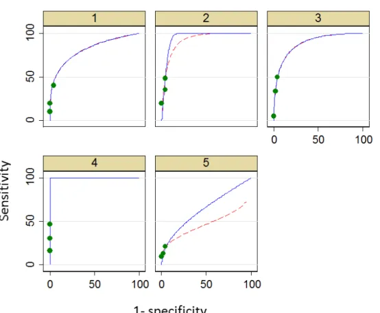
Curve extrapolation
Issues around assigning confidence scores consistently have direct consequences on the shape of the ROC curve. In the author’s 2006 study of CT colonography (17), because very few false-positive polyps were reported, data points were clustered towards the lower left hand portion (0,0) of the ROC plot space (Figure 7). In order to complete a curve across all possible thresholds, it must be extrapolated beyond the last available data point. In situations such as our prior study, the majority of the AUC is then dominated by a region where there is no data. Furthermore, changing the
statistical method used to extrapolate the curve can have a profound effect on the calculated AUC (8)(Figures 7 and 8). Gur and colleagues have pointed out that,
“selection of a specific analysis approach could affect the study conclusion” (28), noting that the problems associated with extrapolation occur, “when observers tend to be more decisive”. Indeed, many algorithms will not fit curves to “degenerate” data at all (i.e. data where there are no false-positive detections). Also, because false-positive diagnoses are infrequent, their scores exert disproportionate influence on curve shape as opposed to the more numerous true-positive scores. Thus the AUC is dominated by a small portion of the observed data. For example, in our prior study the median number of patients with false positive scores in unassisted reads was just 2 of 107 patients (17).
Figure 7: Data extrapolation: ROC plots each for an individual reader using CT colonography without CAD. Green dots indicate real data points underlying curve fitting. ROC curve are shown extrapolated from these data using LabMRMC (red dotted line) and Proproc software (blue solid line). Plots for five individual readers are shown, labeled 1 to 5.
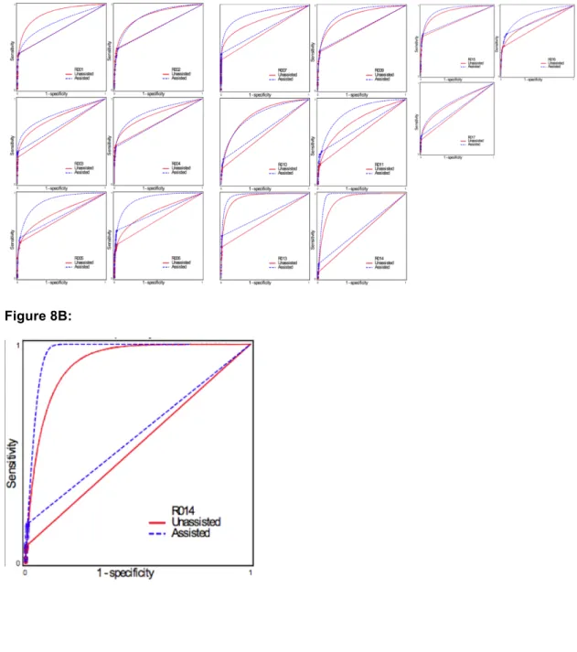
Figure 8
Figure 8A: Data extrapolation: ROC plots of individual readers using CT colonography with- and without CAD. These data are reproduced from an analysis of the study described in Chapter 2, sponsored by Medicsight plc, which was used to obtain FDA approval successfully. The primary outcome measure is diagnosis of polyps of any diameter on a per-segment basis. It can be seen that the data points cluster in the bottom left-hand area of the ROC plot space, and that the AUC is dominated by extrapolated data curves. Two types of extrapolation are shown. Figure 8A shows the data for all 17 readers. Figure 8B shows the data for a single reader (R14) markedly emphasising both the clustering and the fact that the method used for extrapolation markedly influences the ultimate AUC.
Prevalence of abnormality
As noted above, a stated advantage of ROC AUC is that it is independent of prevalence of abnormality. However, test performance usually changes with
prevalence so ROC AUC is uninformative regarding diagnostic performance at differing prevalence. AUC is calculated by ranking pairs of patients, one with disease and one without, which implicitly suggests a prevalence of 50%. In reality, the prevalence of disease in the study dataset is ignored and AUC is the same regardless. While sensitivity and specificity are independent of prevalence, the absolute numbers of patients with and without disease will change with prevalence. For example, in high prevalence situations a test has more “chance” of encountering a patient with disease and vice-versa, i.e. in high-prevalence situations the number of diseased patients will increase for a given increase in sensitivity, and the converse applies to low-prevalence situations (e.g. screening).Therefore, if a new test changes sensitivity and/or
specificity with respect to the standard test, then the raw numbers of patients diagnosed with and without disease will change, contingent on prevalence. To be useful as a performance measure overall, ROC AUC needs to incorporate realistic disease prevalence so that absolute changes in patient numbers are clinically interpretable. While sensitivity and specificity are prevalence independent, these measures keep positive and negative patients separate, whereas ROC AUC does not.
It is worth noting that while it is often stated that ROC AUC is unaffected by change in prevalence, this property arises from a model assumption. While it is true that the AUC is unaffected when one applies a different disease prevalence to an otherwise identical group, this does not hold when the group is different, for example patients referred by General Practitioners versus specialist clinics; i.e. diagnostic accuracy measured via ROC AUC in different populations of different prevalence can give different curves (although sometimes the AUC does not differ by much).
Alternatives to ROC AUC based on net benefit
I have described several problematic issues regarding use of ROC AUC as a measure of diagnostic performance of imaging studies in certain circumstances. These
encompass conceptual issues (e.g. confidence scores may not be meaningful), non-trivial statistical issues (non-normal distributions and problems with data extrapolation), practical issues (many patients do not contribute to ROC AUC), and ethical issues (patients’ and doctors values cannot be incorporated) with ROC AUC for analysis. An alternative should be easy to comprehend and express, incorporate explicit weightings for the value of gains in sensitivity vs loss of specificity, and account for disease
prevalence. In particular, it should be possible to ascribe “costs” to the misclassification of true-positive versus true-negative patients in order to account for the different clinical consequences of false-positive and false-negative diagnoses.
The need for such an alternative to ROC AUC is well-recognised and several novel methods have been proposed, although these have not enjoyed substantial penetrance into the radiological literature, probably because ROC AUC is considered so
pre-eminent (29, 30). Some authors have suggested simply moving the ROC curve operating point from one that optimises separation of events and non-events towards one event or the other, depending on the relative costs of misclassification (31). As noted already, clinicians are comfortable with using a test at a pre-specified diagnostic threshold (vs. across a range of thresholds), since this is more comprehensible and clinically relevant. Furthermore, since tests are often evaluated when close to clinical implementation, information is usually available regarding the most clinically
appropriate threshold at which the test is likely to be used. It is therefore possible to set a diagnostic threshold for test positivity, determine sensitivity and specificity for disease at that threshold, and then compare this with the results obtained for an alternative test (or the same test used under different conditions, for example with and without CAD assistance) used at the same threshold. Such a comparison would present the change in sensitivity and corresponding change in specificity for the two tests/conditions when they are compared. Because comprehension is improved when sensitivity and
specificity are combined into a single metric, it is then necessary to arrive at a method with which to achieve this. Simple summation of the change in sensitivity and change in specificity to give a “net benefit” could be performed but this would not take into account any differing misclassification costs. Therefore, in order to arrive at a
comparison that is clinically useful, it is necessary to incorporate contextual information regarding the relative importance of false negative and false positive diagnoses, and prevalence of disease.
A search of the available literature reveals that “Reclassification Improvement”, “Weighted Net Reclassification Improvement”, and “Relative Utility” have all been advocated as measures that account the differing consequences of correct and
incorrect diagnosis. A review of several different net benefit, threshold-based measures and the relationship between them has been provided by van Calster and colleagues (31), published subsequent to work starting on this thesis. Many of these measures, such as weighted-comparison (32) and Net Reclassification Index with two categories (33), are based directly on the difference in sensitivity and specificity between the two tests being assessed. Van Calster concluded that many of these measures, “are transformations of each other and hence always lead to consistent conclusions” (31).
Moons and co-workers investigate the situation where a single diagnostic test is applied at a threshold where the decision is simply to treat or not treat. They consider the consequences (i.e. clinical costs, loss of utility) of treating and not treating a patient with disease. They also consider the costs of treating a patient without disease, and quantify and incorporate this. For example, they state, “a ratio of net risks of 10 means that it is 10 times worse to withhold treatment from a diseased patient than to treat a non-diseased patient”, i.e. a benefits/costs ratio (32). Given a particular treatment threshold and treatment strategy, they show that the benefits and risks of subsequent decisions can be calculated and expressed as one parameter that they describe as “expected risks, ER” (32). They show that ER for any diagnostic test is equivalent to:
(p x ERD+) + ( [1 – p] x ERD- )
where p = disease prevalence
ERD+ = expected risks to a patient with disease ERD- = expected risks to a patient without disease
The sensitivity and specificity of the test can be calculated by estimating the probability of disease from each test result using a logistic model and dichotomising the range of estimated probabilities at the treatment threshold (Pt). Estimated probabilities greater than Pt is defined as a positive test result, and less than Pt as a negative test result.
To determine the better of two diagnostic tests (or the same test under different conditions), the difference in their expected risks at a specific threshold can be compared; d(ER). They show that:
So, if Δsensitivity is the change in sensitivity and Δspecificity is the change in specificity, we get:
D(ER) = [Δsensitivity + (1-p/p) ] x [ Pt/(1-Pt) ] x Δspecificity
This equation provides an index for the comparison of the diagnostic performance of two tests (or the same test under different conditions, for example with and without CAD).
Vickers (34) states that:
Net benefit = TP – FP x (pt/1-pt)
Where pt = the threshold at which the test is used.
TP = sensitivity x p
FP = (1-specificity)x(1-p)
Thus net benefit = sensitivity x p – ((1-specificity)x(1-p)x(pt/1-pt))
The change in sensitivity (Δsensitivity) and corresponding change in specificity (Δspecificity) would apply if two tests were compared.
We wished to investigate net benefit in situations where it is known at which threshold a test was to be used, specifically in binary situations (e.g. polyp present/polyp absent) as opposed to evaluation over a range of different thresholds. Taking the example of using CAD to interpret CT colonography, it is therefore possible to reframe the net benefit equation as follows:
Net benefit = Δsensitivity + [Δspecificity x (1/W) x (1-p/p)]
Where Δsensitivity is the change in sensitivity and Δspecificity is the change in specificity when using CAD assistance. Net benefit will be positive overall if CAD is beneficial; a zero value would indicate no benefit and a negative value would mean a net loss. We would expect CAD to increase sensitivity but decrease specificity. However, as I have explained, an increase in sensitivity may be regarded as
particularly desirable and therefore worth more than the negative consequences of a corresponding fall in specificity. In order to account for this a weighting factor “W” is used to diminish the effect of reduced specificity, achieved by multiplying Δspecificity by 1/W (i.e. the larger the value of W the less effect exerted by a given fall in
specificity). This is analogous to the expression pt/1-pt, where W is equivalent to using the test in a binary, single-threshold fashion.
p is the estimated prevalence of abnormality in the target population (i.e. the population in whom the test is to be used ultimately in clinical practice). It is necessary to
incorporate a correction for prevalence because sensitivity and specificity are used to derive TP and FP patients. When disease prevalence is low, true-negative diagnosis is easier to achieve since most subjects are disease-free. 1-p gives the proportion of disease-free subjects and dividing this by p gives the odds of having disease-free patients diagnosed over and above diseased patients. When performing a clinical trial it is often assumed that the prevalence of abnormality in the trial dataset mirrors that in the target population but this is often not the case because of a need to increase power for positive subjects (screening is the most obvious example, a situation where positive subjects are encountered relatively infrequently). My current thinking is that when using the