Environmental data visualisation for non-scienti
fi
c contexts:
Literature review and design framework
Sam Grainger
a,b,*, Feng Mao
c, Wouter Buytaert
a,baDepartment of Civil and Environmental Engineering, Imperial College London, London SW7 2AZ, United Kingdom bGrantham Institute - Climate Change and the Environment, Imperial College London, London SW7 2AZ, United Kingdom
cSchool of Geography, Earth and Environmental Sciences, University of Birmingham, Edgbaston, Birmingham B15 2TT, United Kingdom
a r t i c l e i n f o
Article history:Received 22 December 2015 Received in revised form 29 August 2016
Accepted 5 September 2016 Available online 15 September 2016
Keywords:
Science dissemination Science-society interface Knowledge exchange Visualisation
Environmental decision support User-centred design
a b s t r a c t
Environmental science is an applied discipline, which therefore requires interacting with actors outside of the scientific community. Visualisations are increasingly seen as powerful tools to engage users with unfamiliar and complex subject matter. Despite recent research advances, scientists are yet to fully harness the potential of visualisation when interacting with non-scientists. To address this issue, we review the main principles of visualisation, discuss specific graphical challenges for environmental sci-ence and highlight some best practice from non-professional contexts. We provide a design framework to enhance the communication and application of scientific information within professional contexts. These guidelines can help scientists incorporate effective visualisations within improved dissemination and knowledge exchange platforms. We conclude that the uptake of science within environmental decision-making requires a highly iterative and collaborative design approach towards the development of tailored visualisations. This enables users to not only generate actionable understanding but also explore information on their own terms.
©2016 The Authors. Published by Elsevier Ltd. This is an open access article under the CC BY license (http://creativecommons.org/licenses/by/4.0/).
Contents
1. Introduction . . . 300
1.1. The environmental science-society interface . . . 300
1.2. The role of visualisation . . . 300
1.3. Aim and structure of the paper . . . 301
2. Visual representations of data: a concise overview . . . 301
2.1. Different goals, contexts and practices . . . 301
2.2. Fundamental principles of visual perception and graphic design . . . 302
3. Visualising environmental data . . . 302
3.1. Environmental visualisation science and application . . . 302
3.2. Environmental data types . . . 302
3.3. Visualising environmental uncertainty . . . 302
4. Lessons from general, non-professional contexts . . . 304
4.1. Journalistic contexts . . . 304
4.2. Cultural contexts . . . 305
4.3. Consumptive contexts . . . 306
5. A design framework for visualisation in non-scientific professional contexts . . . 306
5.1. Preparation phase . . . 306
5.1.1. An iterative, user-centred design approach . . . 306
5.1.2. A participatory co-design process . . . 307
*Corresponding author. Department of Civil and Environmental Engineering, Imperial College London, London SW7 2AZ, United Kingdom.
E-mail address:s.grainger14@imperial.ac.uk(S. Grainger).
Contents lists available atScienceDirect
Environmental Modelling & Software
j o u r n a l h o m e p a g e :w w w . e l s e v i e r . c o m / l o c a t e / e n v s o f t
http://dx.doi.org/10.1016/j.envsoft.2016.09.004
5.1.3. Collaboration with other scientific disciplines and designers . . . 307
5.2. Development phase . . . 307
5.2.1. Identification of potential user group . . . .. . . 307
5.2.2. Identification of a real-world visualisation need . . . 307
5.2.3. Definition of user characteristics . . . 307
5.2.4. Definition of a culturally and functionally appropriate graphical and collaborative medium . . . 307
5.2.5. Development of visualisation objectives and functionality . . . 308
5.2.6. Potential for interactive and web-based technologies . . . 308
5.2.7. Embedding visualisation in a narrative context . . . 308
5.3. Visual encoding phase . . . 310
5.3.1. Abstraction of relevant data to encode . . . 310
5.3.2. Pre-agreed success criteria when deciding on visual form . . . 310
5.3.3. Appropriate selection of form and colour . . . 310
5.3.4. Visual clarity and beauty in functionality . . . 310
5.3.5. Tailoring to target audience needs and context . . . 311
5.3.6. Development of a broad range of throw away mockups, sketches and prototypes . . . 312
5.3.7. Incorporation of uncertainty-based information . . . 312
5.4. Analysis and evaluation phase . . . 314
5.4.1. Reflection on whether data is being communicated accurately and honestly . . . 314
5.4.2. Consideration of how the target user perceives the tool and whole intervention . . . 314
5.4.3. Evaluation of whether the tool and whole intervention has been effective . . . 315
6. Concluding remarks and future research directions . . . 315
Acknowledgements . . . 315
References . . . 315
Web references . . . 318
1. Introduction
1.1. The environmental science-society interface
Environmental science is an applied discipline so inevitably environmental scientists are confronted, directly or indirectly, with the need to interact with non-scientific professionals (RCUK, 2013;
Rhoads et al., 1999). As environmental managers are under
increasing scrutiny to make decisions based on highly complex and uncertain evidence (Fischhoff, 2011; Liu et al., 2008), they require a thorough and up-to-date understanding of current scientific thinking to inform their working process (Bishop et al., 2013). In response to this challenge, applied environmental sciences are becoming increasingly concerned withfinding ways to enhance the flow and use of relevant scientific information within evidence-based, professional contexts (Sutherland et al., 2012). However, despite these advancements in research and the growing avail-ability of scientific information, there remains a gap between sci-entific knowledge generation and non-scientific, societal application (Kirchhoff et al., 2013; Mikulak, 2011; von Winterfeldt, 2013).
Currently, scientists that interact with non-scientists often feel that their contributions are ignored, while the latter complain that available scientific information is not tailored to their specific needs (Liu et al., 2008; McNie, 2007). Improved uptake and application of scientific knowledge within environmental decision-making re-quires further consideration for, and investment in, the communi-cation and dissemination process (Lorenz et al., 2015). Within the interface between science and society, indifference towards communication prevents comprehension, creates mis-understandings and inconsistent or bias messages (Demeritt and
Nobert, 2014; McInerny et al., 2014), and will ultimately result in
ill informed decisions and maladaptation in the future (Kirchhoff et al., 2013).
Choices surrounding the communication of scientific knowl-edge to potentially interested non-scientific communities may also raise issues of a more ethical nature (Keohane et al., 2014). While
some audiences will be able to deal with complexity and ambiguity, others may respond with confusion, suspicion or even a skewed perception of risk (Han et al., 2011; Politi et al., 2007; Spiegelhalter
et al., 2011). Ineffective communication can result in audiences
experiencing a distorted sense of certainty, leading to poorly informed decisions and diminished trust in science (Pidgeon and
Fischhoff, 2011; Taylor et al., 2015). Scientists need tofind ways
to convey only relevant information and associated uncertainties in a format that serves the audience's own best interests (Fischhoff
and Davis, 2014). Such choices are currently underrepresented
within environmental scientific training. The ability to convey not only accurate and useful information to audiences, but also an honest picture of current knowledge continues to elude most scientists.
1.2. The role of visualisation
Traditionally, the scientific community has used explanatory graphics and images to support scientific communication such as publications or conference talks; however, thesefigures are typi-cally designed for audiences that are, to some extent, familiar with the underlying data or graphical form. Default design software can be crude and unhelpful but scientists are rarely given training in how to develop visualisations, particularly for non-scientific con-texts (McInerny et al., 2014). Until very recently, print was the only platform to visually present and analyse information, limiting our ability to interact with data and make sense of complex subject matter (Few, 2009). The advent of computer graphics, democrat-isation of data and advances in information and communications technology (ICT) have combined to shape modern visualisation (Few, 2009; Spiegelhalter et al., 2011).
Today, data visualisations are ubiquitous, appearing in various technical (e.g., information visualisation, scientific visualisation and geographic visualisation) and functional (e.g., statistical graphics, information graphics and data journalism) orientations (Bishop et al., 2013). Analytical visual tools are increasingly being devel-oped for scientific communities to analyse data and support
cross-disciplinary work (Keim et al., 2008). Graphic designers and cognitive psychologists have gained a better understanding of how we encode (represent information with graphical features) and decode (contextualise and interpret) visual information, respec-tively (Cairo, 2013). Human computer interaction, user-centred design and problem-driven visualisation research are offering increasingly effective methods to develop and evaluate visual-isation systems that explicitly consider real-world user re-quirements (Sedlmair et al., 2012).
These research and technological developments in computing, psychology and design have fed into an increased valuation of visualisation that has, to a large extent, emerged as a response to the influx of accessible information. Notwithstanding recent ad-vances, this information explosion is likely to widen information gaps as non-scientists try to understand very large amounts of data
(McInerny et al., 2014). Consequently, an informed visualisation
design process that integrates these expertise is a pivotal compo-nent within the application of scientific knowledge in society, and should therefore be regarded as an essential part of the science-society interface (Lorenz et al., 2015; McInerny et al., 2014). 1.3. Aim and structure of the paper
Visual design considerations have received limited attention within environmental science literature. This paper reviews the state-of the art of visualising environmental information, focusing on collaborative design approaches within non-scientific, profes-sional contexts. Non-scientific contexts or audiences range from professional (non-scientific domain experts, policy makers, agri-cultural communities and other decision-makers) to non-professional (interested citizens and general audiences). We define a non-scientist or non-scientific audience as any end user unfamiliar with general scientific theory, methods or communica-tion approaches. Although this article is explicitly framed around a subset of non-scientists that have an interest in applying scientific information in an occupational environment (non-scientific pro-fessionals), related research into visualisation for general (non-scientific, non-professional) audiences also informs the discussion. The following section provides an overview of the current conceptual thinking and approaches within the emerging and multidisciplinaryfield of visualisation. We review perceptual and design principles that we use later as a foundation for discussing visualisation applications within non-scientific contexts. While this information retains global relevance, we argue it is essential to consider not only visual perception, data type and graphical tech-nique but also user characteristics and context during the whole design process. Section3outlines inherent challenges of visualising environmental data and the main contributions from environ-mental visualisation disciplines. In Section4, we then summarise a range of visualisation approaches designed for general audiences since many of these principles can be adapted to non-scientific, professional contexts. Based on these discussions, Section 5 bridges visual encoding, decoding and contextual considerations within an informed design framework, particularly relevant for environmental scientists intending to develop visualisation tools in collaboration with non-scientific, professional end users.
2. Visual representations of data: a concise overview 2.1. Different goals, contexts and practices
Broadly,‘visualisation’applies to the process of making some-thing seeable to the eye, and the subsequent output of that process. In this article, the terms‘data visualisation’and‘visualisation’are used interchangeably as umbrella terms to encompass all visual
representations of data that primarily aim to facilitate the communication of information; aid understanding through pre-sentation, exploration or analysis; and, in some non-professional contexts, raise awareness and elicit affective responses (Bishop et al., 2013; Cairo, 2013; Few, 2009; Kosara, 2013a; Ziemkiewicz
and Kosara, 2009). From a user or audience perspective,
visual-isations should increase understanding; and ultimately, enhance their ability to complete a task or make an informed decision (Cairo,
2013; Few, 2009; McInerny et al., 2014). Secondary aims may relate
to creating something aesthetically appealing. However, visual-isations should not be considered as artworks but instead as care-fully engineered tools (Cairo, 2013). These visual interfaces can be static displays of quantitative information, illustrations, maps or interactive technologies; accessed through a variety of print or digital medium (McInerny et al., 2014).
As a subset of visualisation research, information visualisation (InfoVis) uses computer-based systems to provide interactive“ vi-sual representations of datasets designed to help people carry out tasks more effectively”(Munzner, 2014; p1). InfoVis scientists tend to focus on developing innovative techniques for exploratory vis-ualisations that inherently require greater interaction and discov-ery by the user (Kosara, 2013a). These systems are usually designed for users with little prior knowledge that hope to gain a fresh perspective, discover interesting relationships or incrementally gain a better understanding of how their data are structured
(Kosara, 2013a). In contrast, interactive visualisations developed
explicitly for analytical reasoning (afield known as Visual Analytics,
see Thomas and Cook, 2005) usually require users to have some
prior understanding and to spend longer examining the data (Kosara, 2013a).
Statistical graphics (such as line charts, bar charts, scatter plots, histograms, box plots and pie charts) focus primarily on commu-nicating quantitative information in the clearest way possible
(Tufte, 2001). Commonly found in scientific or business contexts,
this highly influential approach to visualisation prioritises accuracy and efficiency over aesthetics (Few, 2012). In contrast to the goals of statistical graphics, information graphics (infographics) often target general audiences by integrating decorative elements or narrative within designs. These visual displays, usually found in journalistic or public contexts, can include a combination of graphics (e.g., symbols, illustrations, maps, diagrams and charts), text and numbers. The most effective examples tend to be easy to read and visually appealing (Kosara, 2013a). Unlike InfoVis, that ask the user to interact with fluid information, infographics and statistical graphics are visual representations that communicate known or fixed data (Ziemkiewicz and Kosara, 2009). Similarly embedded within visualisation, scientific visualisation aids understanding of scientific data usingfigurative and pictorial visual representations, ranging from tornados to human bones (Few, 2009). Unlike other forms of visualisation, scientific visualisations try to‘take a picture’ of a physical form, rather than getting audiences to decode a visual language (Ziemkiewicz and Kosara, 2009).
Every visualisation, to varying degrees, conveys data and allows users to play with and scrutinise underlying information. Although some academics have tried to embed different definitions within visualisation, it is perhaps more helpful to imagine a continuum with presentation and provision of answers at one end, and exploration and the raising of questions at the other (Cairo, 2013;
Samsel, 2013). In some contexts, the communication process
takes precedence; in other more analytical contexts, user inter-activity and experience is critical to the production of an effective tool (Bishop et al., 2013). Ultimately, the criterion for judging a visualisation should not be determined by any one disciplinary approach but by considering the specific user characteristics, communication context and visualisation goals.
2.2. Fundamental principles of visual perception and graphic design Visual perception theory supposes that nothing in graphic design should be considered arbitrary (Williams, 2008). Ideally, data presentations should guide a user's attention through the most salient information quickly, without the need for text-based explanations or additional elements to direct the reader. Origi-nating at the Berlin School of Experimental Psychology in the early twentieth century, Gestalt psychological theory and associated grouping principles (i.e. proximity, similarity, enclosure, continuity and connection) determine some of the ways in which the human brain aggregates objects. Inspired by Gestalt theory, C.R.A.P. (an abbreviation for Contrast, Repetition, Alignment and Proximity) principles can draw the reader's attention to salient information, help organise information quickly and give readers a clear structure to follow (Williams, 2008).
Gestalt grouping and C.R.A.P. design principles take advantage of the visual brain's ability to detect basic differences without effort (referred to as preattentive processing) (Treisman, 1985; Ware, 2013). By creating salience (a contrasting quality or state relative to its surroundings) through such preattentive graphical features (such as Colour/Hue, Size, Orientation, Shape), certain aspects of a visual display can appear to ‘pop out’ from the screen or page
(Wong, 2010). These mechanisms are used by designers to lower
cognitive load, enhance pattern detection and perceptual inference, and ultimately solve problems more efficiently (Meirelles, 2013;
Wertheimer, 1959; Wong, 2010). (For a more detailed summary of
these fundamental principles, concepts and some practical graphic design advice, see Kelleher and Wagener, 2011; Meirelles, 2013;
Williams, 2008and a series of‘Points of View’columns written
by visualisation experts in Nature Methods1). 3. Visualising environmental data
3.1. Environmental visualisation science and application
The potential for visualisation in assisting environmental sci-entists and promoting interdisciplinary communication is a distinct and emergingfield of research (Rink et al., 2014), supported by visualisation science.2 Within environmental visualisation, the advancedfields of geographic visualisation (geovisualisation) and geovisual analytics emerged partly as a response to static con-straints, but also to support the increasing need to communicate complex environmental processes to a wider audience (Bohman et al., 2015; MacEachren, 1994; MacEachren and Monmonier, 1992). This multidisciplinary field integrates techniques from InfoVis, scientific visualisation, exploratory data analysis, visual analytics and cartography, with an emphasis on supporting geo-spatial analytical needs through the use of interactive tools (Dykes
et al., 2005). Perhaps one of the differences between geographic
and environmental visualisation is the need to incorporate more strongly the temporal domain. However, it is now possible for instance to use interactive spatial maps with sliders as a useful way to show seasonality of environmental processes, such as stream-flow. As a result of these advances, visualisation applications within applied environmental research are beginning to emerge particu-larly within geological, climate change, sustainability and land-scape planning contexts (Ballantyne et al., 2015; Bohman et al.,
2015; Sheppard, 2012; Wibeck et al., 2013), and to support
environmental decision-making and management (Arciniegas et al., 2013; Bishop et al., 2013; Eide and Stølen, 2012; MacEachren et al., 2011).
While environmental visualisation science has created oppor-tunities for more intuitive applications of environmental research, usability and contextual challenges still remain. These type of systems often display redundant information which may reduce cognitive efficiency (van Lammeren et al., 2010). Although some studies are beginning to integrate stakeholder-oriented approaches
(seeArciniegas et al., 2013; Eide and Stølen, 2012; Lorenz et al.,
2015; Michener et al., 2012; Robinson et al., 2012), many fail to
fully engage with the user perspective, preferring to rather focus on the technical aspects (McIntosh et al., 2011).
3.2. Environmental data types
Arguably, environmental data are as diverse as any other sci-entific discipline, and may share visualisation challenges from related disciplines such as chemistry, physics, and mathematics. However, the representation or‘mapping’of geographical or spatial information is fundamental to numerous environmental disci-plines. 2D representations of 3D surfaces (commonly known as maps) require consideration of projection, scale and symbolisation (Meirelles, 2013). Unlike displays of quantitative or abstract infor-mation, static spatial representations traditionally attempt to accurately represent physical characteristics of the Earth (e.g. rivers and mountains). Maps are often assumed to be the best way to display geospatial data, even when other design approaches offer more clarity. In fact, poorly considered maps can create biased scientific messages and restrict a user's ability to scrutinise the underlying data and processing (McInerny et al., 2014).
In terms of temporal data, the time series graph is commonly used to visualise chronological change (Aigner et al., 2007; Muller
and Schumann, 2003). It is particularly useful in communicating
climate information such as precipitation and temperature to sci-entists as well as non-scientific audiences. However, data that combine spatial and temporal dimensions (i.e. spatiotemporal datasets) are very common in environmental sciences and appli-cations. Because of their high-dimensionality, these pose unique visual communication challenges particularly when both space and time dimensions change simultaneously, such is the case within hydrological sciences (e.g. soil moisture and precipitation). Repre-senting changes in both time and space using a conventional 2D map therefore requires reducing one or more dimensions, e.g. by slicing or averaging (Meirelles, 2013). Deciding on which di-mension(s) to reduce requires careful consideration of the nature of the pattern (e.g. a sequence of maps vs. a space-averaged time series).
3.3. Visualising environmental uncertainty
The importance of uncertainty in environmental data and the need to communicate those uncertainties effectively has received considerable attention in recent literature (Beven, 2009; Beven
et al., 2012; among many others). Traditionally, mapping or
encoding techniques assume that all data is free from uncertainty (Brodlie et al., 2012). In fact, without an explanation of the reli-ability of data, maps are solely dependent on designer intuition and decision-making (e.g., projection, coordinate system, references and datum) (McInerny et al., 2014).
Visualisation of spatial uncertainty has attracted attention in the geovisualisation community (Kinkeldey et al., 2014; MacEachren
et al., 2005), and is especially useful for decision-makers
con-ducting spatial analyses. Within flood risk management for instance, mapping of inundation model outputs and knowledge 1 http://blogs.nature.com/methagora/2013/07/data-visualization-points-of-view.
html(last accessed 15.05.16).
2 http://www.informatik.uni-leipzig.de/bsv/envirvis2016/(last accessed
deficiencies can help decision-makers understand any potential spatial planning implications and associated uncertainties (Beven
et al., 2014). There are numerous graphical techniques available
for visualising spatial uncertainty, such as colour schema, fuzziness and transparency (Benke et al., 2011). However, the existing data-driven approach to uncertainty visualisation fails to consider spe-cific user needs and task requirements (MacEachren et al., 2005). In fact, Kinkeldey et al. (2014) argues for the development of empirically-based typologies and guidelines applied within different task-based visualisation contexts (e.g., communicative, analytical and exploratory).
While graphical statisticians and computer scientists have developed multiple ways to incorporate uncertainty within 2D visualisations (seePang et al., 1997; Shrestha, 2014; Spiegelhalter
et al., 2011), perceptual challenges remain when a third
dimen-sion is added (Brodlie et al., 2012). For example, primary axes within conventional maps are solely determined by the spatial dimensions of primary data, limiting capacity to integrate effec-tively additional variables (Kaye et al., 2012; McInerny et al., 2014). Furthermore, crisp contour maps or 3D isosurfaces run the risk of conveying a misleading impression of reality (a process known as Cartohypnosis) (Boggs, 1947, 1949; Buttenfield and Beard, 1994).
Assessments of temporal uncertainty are often associated with
forecasting and probabilities (Brown, 2010). Visualising forecast uncertainties and associated probabilities is thought to increase user trust (Joslyn and LeClerc, 2012; Roulston et al., 2006), although increased visual representation of uncertainty does not automati-cally lead to better decisions (Greis et al., 2015). Professional users have been found to prefer receiving probabilistic information from familiar formats such as‘likelihood’maps (Fig. 1) or representations of forecast‘spread’(e.g. fan charts and error bars), as opposed to displaying discrete categories (Taylor et al., 2015). By providing alternative future conditions, choices and possibilities, scenario planning and analysis are useful tools to deal with uncertainty (Pereira et al., 2010; Reilly and Willenbockel, 2010), especially in an era of uncertain trajectories of global change (Polasky et al., 2011). Presenting a range of possible outcomes and no-regret options can help decision-makers understand the inherent uncertainty of sce-nario projections (van Soesbergen and Mulligan, 2014). These scenario-based visualisation techniques have been developed around a wide range of environmental issues, such as water quality (Brouwer and De Blois, 2008),flooding (Chang et al., 2007), land-use (Dockerty et al., 2006), socio-ecological systems (Reed et al., 2013), and even environmental problems at multiple scales (Pettit et al., 2012).
While uncertainty visualisation for trained audiences is well studied (Ibrekk and Morgan, 1987), empirical evidence exploring Fig. 1.The National Oceanic and Atmospheric Administration's (NOAA) 2016 temperature outlook representing the probability (percent chance) of an abnormally warm or cool summer (NOAA, 2016).
how visually displayed uncertainty information is interpreted and used by non-scientists has only recently gained attention (Greis
et al., 2015). For interpretation of more sophisticated displays of
uncertain statistical information (e.g. survival curves); users or audiences require instruction that may not be feasible in some communication contexts (Lipkus, 2007; Spiegelhalter et al., 2011). Recent experimental studies found that user performance varied depending on glyph type and that users often ignored uncertain-based information when making decisions (Padilla et al., 2015). In addition, factors such as numeracy, user comprehension, visual appeal and familiarity may be more significant than visualisation type or the degree of uncertainty presented (Greis et al., 2015; Tak et al., 2014).
4. Lessons from general, non-professional contexts
Scientists can learn from designers that professionally communicate environmental information in a range of contexts. To this end, this section explores visual design techniques used within journalistic, cultural and residential contexts, highlighting some innovative examples that have successfully informed or affected general audiences. All three contexts share casual (as opposed to highly analytic, work-based) characteristics that, although diverge from this article's focus on professional tasks and uses, offer up insights into the importance of understanding user needs and context of use throughout the design process.
4.1. Journalistic contexts
The advent of the internet has revolutionised the way in which news is accessed and consumed. As a result, media outlets are increasingly employing data journalists to communicate important stories either through static infographics or interactive tools that can be read and scrutinised (Cairo, 2013). These visual‘articles’aim to primarily inform readers, and so, data journalists do not strive to create something aesthetically pleasing as an end in itself (Few,
2011). In the same way that written news articles aim to facilitate maximum comprehension, journalistic visualisations achieve beauty through the ease with which information is communicated. As is the case with all visualisations, understanding brain mecha-nisms and presenting information in a way that complements vi-sual system functionality is fundamental to good data journalism (Cairo, 2013).
Building on general Gestalt theory, graphical journalists will often draw a reader's attention to the most salient aspect of a data story by presenting or arranging graphical elements in a percep-tually advantageous manner, a concept referred to as visual hier-archy. Structural devices such as narrative, titles, typography, annotation, repetition and grid-based layouts are tools that can be used to effortlessly guide the reader through a visualisation (Fig. 2). Unlike exploratory visual tools that might suit scientific policy advisors, some non-scientific users need to be provided with explicit directions to help them navigate visualisations (Gough et al., 2014b; Heer et al., 2012), and because of this, data journal-ists focus on optimising form and structure before considering colour or style (Cairo, 2013). This approach is closely related to vi-sual storytelling techniques that help to guide users through an infographic or interactive tool.
Studies suggest that general audiences find stories more engaging and easier to comprehend than traditional rationale-based approaches to science communication (Bruner, 1986;
Dahlstrom, 2014; Green, 2006). As a result, media practitioners
regularly rely on narrative formats to gain the attention of their audiences and provide context for the news (Cairo, 2013). Narrative-based and interactive graphics have arisen from the need to help information-hungry audiences make sense of increasingly available, yet highly complex information (Cairo, 2013; Figueiras,
2014; Segel and Heer, 2010). A recent interactive article about
Hurricane Patricia in the New York Times demonstrates the power of concise visual storytelling (Fig. 3). Given that the general public receive most scientific information through mass media, they are likely to have already come into contact, and be predisposed to Fig. 2.‘Giant Waves’, an infographic created for Brazilian news magazine Epoca, illustrates how structural devices can be used by data journalists to guide readers (Cairo, 2013).
engage, with such journalistic approaches (Dahlstrom, 2014).Segel
and Heer (2010)introduced three genres of narrative-based
visu-alisation commonly used by data journalists, which balance ele-ments of author-driven (relying heavily on linear structures and author messaging) and reader-driven (giving readers complete freedom to explore) visualisation (Fig. 4). However, there is currently limited empirical evidence to indicate how best to inte-grate elements of visual storytelling, let alone where, when, why and for whom techniques are most effective (Figueiras, 2014; Lee et al., 2015).
4.2. Cultural contexts
Visualisation art or artistic visualisation involves mapping data to an image but unlike other types of visualisation, aims to create novel art and in some cases, interest in a subject (Gough, 2014;
Kosara, 2013a; Viegas and Wattenberg, 2007). The artwork's
aes-thetics have the power to facilitate meaningful experiences and allow audiences to personally engage with the underlying data
(Gough, 2014). Artists, environmental scientists and InfoVis scien-tists are beginning to collaborate on art-based visualisations that aim to communicate scientific data to broader audiences; helping in the long term to raise questions, elicit emotions, or promote behavioural change around a scientifically-related societal chal-lenge (Gough et al., 2014a; Samsel, 2013). Art/science collaboration is mutually beneficial as both parties are able to discover new ap-proaches to design and offer up contrasting interpretations of the world. This should also ensure that the design is visually novel and the scientific message is conveyed accurately. One particularly elegant example is‘Wind Map’by two co-leaders of Google's data visualisation group, designer Fernarda Viegas and mathematician Martin Wattenberg. This rich data-driven artwork uses visual mo-tion to show hourly surface wind forecasts over the US, either as a real time interactive tool (Viegas and Wattenberg, 2016), or as snapshot images in time (Fig. 5). Designed for non-scientists, this playful visual tool has been adopted by enthusiasts to assist with Fig. 3.Visual storytelling within a journalistic context. This map screenshot of Mexico's Pacific coast is from a New York Times interactive graphical article titled“Visualising the Size and Strength of Hurricane Patricia”(Aisch et al., 2015).
Fig. 4.Narrative-based visualisation genres (adapted fromSegel and Heer, 2010). Fig. 5.‘Wind Map’(March 21st, 2012) by Fernanda Viegas and Martin Wattenberg. This artistic map represents a historical snapshot of windflowing over the contiguous United States (Viegas and Wattenberg, 2012).
numerous leisure activities and exhibited in world-leading galleries (Gough, 2014).
4.3. Consumptive contexts
Innovative visualisation systems are now being developed to inform everyday decision-making (Pousman et al., 2007). Providing effective feedback on residential resource use may contribute to a more environmentally sustainable society (Rodgers and Bartram, 2011). Advances in sensing and pervasive computing technologies enable the integration of such information within the home. However, screen-based interfaces traditionally used in work envi-ronments require significant effort and attention, and therefore are not appropriate to support everyday activities (Rodgers and
Bartram, 2011). Artistic and ambient visualisations provide an
alternative way to communicate this information to resource users in a personally meaningful manner. By sensitively integrating aesthetically pleasing and usable point-of consumption feedback devices throughout the home, residents subconsciously become aware of real-time changes in their consumption, informing future behaviour (Fig. 6). User studies suggest that aesthetically pleasing, abstract designs induce positive emotions in participants, unlike representations of the environment that often produce feelings of guilt (Rodgers and Bartram, 2011). However, this study'sfindings indicate that no one approach works for everyone, and that some users may still prefer traditional numerical representations (Rodgers and Bartram, 2011).
5. A design framework for visualisation in non-scientific
professional contexts
This section synthesises best practice from multiple disciplines that have the potential to improve visual communication and application of scientific information within a variety of non-scientific, professional contexts. These guiding principles are intended to address common misconceptions and provide a foun-dational framework that attempts to bridge visual encoding, decoding and contextual considerations for applied environmental researchers. Although presented in a linear fashion with some stages relying on outcomes from previous actions, the whole design process should be highly iterative (Sedlmair et al., 2012). We have organised the guidelines into four distinct phases presented here chronologically. However, revisiting and gradually refining earlier ideas and understanding is encouraged (Sedlmair et al., 2012). New opportunities are also highlighted, although we are not suggesting that these approaches will work in all contexts, but merely that
they are tools to consider when constructing tailored visual stra-tegies. This set of guidelines assumes that a preliminary commu-nication context and problem has already been identified, and that the visualisation designer intends to inform or encourage under-standing, rather than persuade users.
5.1. Preparation phase
The following considerations focus on the integration of end users and experts within the design process, and are adapted from a problem-driven visualisation framework devised bySedlmair et al.
(2012). Their methodology draws on lessons from their own or
other real-world design studies to provide practical guidance on this topic from the fields of human computer interaction (HCI), social science and software engineering. It is important that these preliminary steps are taken before any task characterisation or encoding begins.
5.1.1. An iterative, user-centred design approach
User-centred design (UCD) is a framework, originating from product and software development, whereby user characteristics (needs, wants and limitations) are given explicit consideration throughout the whole design process (Beyer and Holtzblatt, 1998). When defining, developing and testing a visualisation system, end user consultation helps the designer learn about the domain ex-pert's background, expertise, behaviour, goals, as well as their work environment and familiarity with technology (potential context of use) (McInerny et al., 2014).
To establish user requirements within a UCD approach, a com-bination of interview and observational methods are often used. Visualisation design studies3are particularly successful when re-searchers try to become familiar with the end user's real-world environment by observing them in their workplace and occasion-ally interrupting them to gain clarification (an approach known as contextual inquiry (Holtzblatt and Jones, 1993)) (Sedlmair et al., 2012). Just talking to users is not enough because what they say they do or need fails to generate a complete picture of the user's real-world situation (Sedlmair et al., 2012). Fully implementing a UCD approach requires an iterative design process involving pro-totype usability testing and an evaluation of tool efficacy from the Fig. 6.The Ambient Canvas is an LED-based prototype embedded within a kitchen backsplash to inform residents of their household water use (photographed here on the left). On the right, morning (top), afternoon (middle) and evening (bottom) snapshots show how the display changes or‘fills’over time as more water is used (Rodgers and Bartram, 2010).
3 ”A design study is a project in which visualisation researchers analyse a specific
real-world problem faced by domain experts, design a visualisation system that supports solving this problem, validate the design, and reflect about lessons learned in order to refine visualisation design guidelines.“(Sedlmair et al., 2012; p2432).
user's perspective. If this approach is taken, visualisation designers must strive to achieve a balance between too few, lengthy iterations and too many, rapid ones. Otherwise, this can lead to fatigue, un-reliable feedback and ultimately, indifference towards the process. Furthermore, it is essential that researchers learn just enough to characterise the visualisation problem and user; rather than adopting a full ethnographic approach, that takes so long, the need for the visualisation elapses.
Apart from these general guidelines and potential pitfalls, there is currently limited empirically-based practical guidance for con-ducting problem-driven visualisation research. Within HCI and social science there has been a conspicuous absence of general-isable, off-the-shelf methodologies, yielded from design study ex-periences. Therefore, further experimentation, within real-world decision-making contexts, is needed to help identify near-optimal design study frameworks (Sedlmair et al., 2012).
5.1.2. A participatory co-design process
Participatory Design is an extension of UCD and requires active involvement of end users and other stakeholders within a co-design process (McIntosh et al., 2011; Robertson and Simonsen, 2012). To improve the likelihood of long-term adoption, visual-isation designers should attempt to collaborate with potential end users throughout the whole design process (Karpouzoglou et al.,
2016; Lorenz et al., 2015). Insights from a truly collaborative
design process also have the potential to strengthen and shorten information exchange and pathways between domain experts and information providers in the long term (McInerny et al., 2014). However, it is important to consider that not all collaborations are beneficial and care should be taken not to commit to the process prematurely (Sedlmair et al., 2012).
5.1.3. Collaboration with other scientific disciplines and designers
Gathering and processing environmental data is central to environmental science, but creating visual representations of data may require additional expertise. Advances in communication technology make it possible for researchers from various disci-plines to collaborate on projects (Buytaert et al., 2014). Just in the same way that creating music requires experts in composing, playing and instrument making, visually communicating data effectively could benefit from collaboration between scientific and creative expertise (Gough et al., 2014b).
As environmental scientists, we should look outside of our disciplinary boundaries, by consulting experts not only in visual-isation systems but also the visual arts, social science, computer science, HCI, user experience design and interface design
(McInerny et al., 2014; Vervoort et al., 2014). Real-world
experi-ences and principles from practitioners familiar with targeting and working with non-scientific audiences could inform collaborative attempts by environmental scientists (e.g. citizen science activ-ities). By combining different techniques from different disciplines, solutions can be found that would have otherwise been unreach-able (Kosara, 2013a).
5.2. Development phase
A successful development of visualisation systems requires continuous problem characterisation and a continuously evolving understanding of how the intended audience thinks and their contextual requirements (Gough, 2014; Ziemkiewicz et al., 2012). We suggest conducting the following actions before the encoding phase, although not necessarily in the order presented below.
5.2.1. Identification of potential user group
From the outset, it is important to make contact with and select
a realistic target user or user group. This might comprise of specific policy makers, civil servants, decision-makers from multiple levels of society, as well as private stakeholders or farmers. It is worth remembering, however, that prematurely committing to a target user or user group and their requirements is a common mistake made by design studies, often resulting in wasted time and effort (Sedlmair et al., 2012).
5.2.2. Identification of a real-world visualisation need
Designers should attempt where feasible to become familiar with the target user's context of use and professional challenges (see also following step‘definition of user characteristics’) in order to ascertain whether and how visualisation can enable sufficient and relevant insight. Existing information sources and successful decision-making tools should be identified early on, as target users are unlikely to try something new if they already have something that works well or displays similar capabilities (Sedlmair et al., 2012). Furthermore, the potential added value of a visualisation-based solution should be determined from the start. In many cases, a well-structured sentence or numerical representation can more concisely convey the intended message. When aiming to continuously support decision-making processes, clarification of a long-term user requirement will need to be identified to fully validate the operational tool.
5.2.3. Definition of user characteristics
Within visualisation research, the significance of user charac-teristics (i.e. user cognitive abilities, personality traits and domain expertise) on visualisation effectiveness is becoming increasingly understood; and, as a result, tailored approaches within decision-making environments are increasingly acknowledged as advanta-geous (Conati et al., 2014). Design features and forms need to be sensitive to the diversity of user expertise and reasoning processes even within user groups (MacEachren et al., 2005; McInerny et al., 2014). Large user groups or audiences in particular, will have different cultural, institutional and disciplinary backgrounds and this must be considered throughout the design process. Scientists might be able to make certain assumptions when creating graphics for a scientific audience. If, however, the audience is new to the subject matter or unfamiliar with the graphical form or medium of the device, they may feel overwhelmed. In this case, including graphical explainers or legends within a tool could make compre-hension easier. At the same time, it is important not to patronise an audience by underestimating their ability. When creating visualisation-based systems for a group of‘policy-makers’or‘ de-cision-makers’, environmental scientists should resist the tempta-tion to assume or generalise user expertise without prior investigation. For example, policy makers do not all share the same understanding of statistical or scientific methods (Mastrandrea et al., 2010). In such a situation, it might be appropriate to intro-duce a switch option, allowing users to select scales, locations and scenarios that best match their expertise and context (Buytaert et al., 2014).
5.2.4. Definition of a culturally and functionally appropriate
graphical and collaborative medium
When trying to connect and communicate a complex dataset or uncertain model outputs, a computer-based system offers a lot of options with regard to user-computer interaction and immersion (Karpouzoglou et al., 2016). Environmental scientists shouldfind out early on whether a computerised tool is the most suitable means of interaction. Some non-scientists are unfamiliar with computer in-terfaces and may require substantial training and time to familiarise themselves with the system before they obtain equal benefit. A hand drawn sketch might, in some setting such as outdoors, be the most
practical and cost-effective means of communication. Some visual forms suit a private user environment whereby users can interact with data in a tailored environment such as a web application, while other approaches work better when presenting to small or large audiences. Despite the clear benefits and the speed of technological change, environmental scientists should remain cautious and humble about the potential to develop computer-based visual-isations, particularly in remote developing contexts. This is an area of research that needs a lot more methodological experimentation (seeKarpouzoglou et al., 2016).
5.2.5. Development of visualisation objectives and functionality It is essential to not only encode data in an appropriate manner but also to ensure that intermediate visualisation goals and ulti-mate outcomes are considered from the start (Spiegelhalter et al., 2011). Successful design also requires sensible estimation of what success constitutes and entails (Lipkus and Hollands, 1999;
McInerny et al., 2014). Adopting a UCD approach is central to
these activities because communicating information that serves no purpose for the intended audience is a fruitless endeavour. Unlike other visual forms, visualisation is primarily “an expression of purpose”.4Understanding what you intend to achieve should help to parametrise the design approach and features (Gough et al.,
2014b). For example, clarifying tool functionality helps to
deter-mine the extent to which a visualisation system should be explanatory or exploratory which, in turn, is essential before elaborating on the graphical form, structure or style. Broadly, vis-ualisation systems assist completion of a specific task or generate useful insight towards solving a longer-term problem. From an environmental science perspective, visualisation functions range from descriptions of a physical process to gaining insights that can be applied to potential decision-making scenarios. When designing static graphics that primarily intend to inform readers, visualisation designers could, for example, validate early ideas by asking ques-tions such as:
- Does function require presentation of several data variables? - Does function require the reader to compare?
- Does function require the reader to quantify?
- Does function require the reader to detect correlations or relationships?
5.2.6. Potential for interactive and web-based technologies
It is believed that information-processing can be improved through greater interaction (Parsons and Sedig, 2011), and web technologies provide considerable potential in thisfield (Sundar, 2004). Due to the advent of smartphones and tablets, non-scientists are becoming increasingly familiar with web-based, interactive devices and interfaces. This popularity could be lever-aged by scientists as a way to reach multiple audiences and enable them to dissect and scrutinise science in an accessible and appealing format (McInerny et al., 2014). Interactive and web-based technologies can be understood in at least two ways.
Thefirst category relates to interaction between end users and the visualisation system. Recent advances in data science and interactive web technology enable the users to not only passively receive the information, but also acquire information in a reactive or proactive way (Heller et al., 2001; Spiegelhalter et al., 2011). The emergence of visual analytic techniques has created opportunities for intuitive user exploration and highly dynamic and adaptable
displays. Interactive elements and tools such as select, zoom, sort andfilters in the interactive visualisation system make it easier to view and manipulate very large environmental databases (Heer
et al., 2012). The emergence of visual analytic techniques has
created opportunities for intuitive user exploration and highly dynamic and adaptable displays.
By allowing personal or collaborative exploration, interactive visualisations generate insight, and aid formation and testing of hypotheses that were previously unknown (Buytaert et al., 2014). Interactivity allows users to‘learn by doing’, developing a person-alised mental model of what may have originally been a diverse and highly complex dataset (Beddington, 2011; Karpouzoglou et al., 2016). These tools enable users to explore particular aspects and put relevant information into their own world view (Beddington,
2011; McInerny et al., 2014; Segel and Heer, 2010). They also have
the capacity to incorporate multi-dimensional data that would have previously been challenging to integrate.
When targeting diverse audiences, interactive tools can include optional explanations and hyperlinks, and help users explore multiple representations (Spiegelhalter et al., 2011). They are not justfixed products but a means by which users can gradually and intuitively undergo transformations (Woodward et al., 2015). In contrast, traditional static approaches can create a disconnect be-tween the information provided and the end user's decision envi-ronment. While graphics frame data stories, interactive visual tools let users drive stories for themselves.
Secondly, it is important to consider interactions between a diverse range of information providers and users. Visual commu-nication is not always a one-way process, from information pro-vider to user. A visualisation system with high levels of social interactivity may allow end users to re-create the visual repre-sentation based on existing work or their own data, and interact with colleagues and collaborators (Heller et al., 2001). Information provider and user sometimes have a blurred boundary, and the communication process is usually two-way or even multidirec-tional among a number of players (McMillan and Hwang, 2002), especially if the visualisation system is incorporated into social network or online collaboration platforms (Ariel and Avidar, 2015). For example, web-based systems with chat capabilities provide shared visual spaces for multiple collaborators to exchange im-mediate feedback and co-design in real-time (Buytaert et al., 2014;
Karpouzoglou et al., 2016). Constructive interactions between
providers and individual users will improve the process of dissemination, knowledge production and real-world application
(Kirchhoff et al., 2013). These developments can be leveraged by
applied environmental scientists as a way to target non-scientific stakeholders. However, understanding when and how to inte-grate interactivity requires careful consideration of user re-quirements and tool functionality.
5.2.7. Embedding visualisation in a narrative context
While using anecdotal evidence within empirical research is often viewed as unscientific or even manipulative (Katz, 2013), considering less formal, narrative principles when designing visu-alisations can make complex, scientific information more comprehensible, memorable and credible to unfamiliar audiences (Dahlstrom, 2014; Ma et al., 2012). This is exemplified by the gap-minder project (Rosling, 2016), an interactive visualisation tool that allows users to explore socio-economic statistics through time, creating a tailored data story (Fig. 7).
When targeting non-scientific audiences, scientists could consider creating digestible and relatable visual stories that focus on a particularly salient subset of scenarios and data sources, rather than every aspect of the scientific story (Krzywinski and Cairo, 2013; Ma et al., 2012; McInerny et al., 2014).Fig. 8illustrates how 4 Charles Eames quoted in an interview with Digby Diehl“What is Design?”
a narrative-based approach can be particularly effective at communicating environmental stories over time. These type of visualisations (commonly referred to as‘small multiples’) comprise a series of graphics, laid out in gridded plots, displaying data slices or categories with the same basic design structure (Tufte, 2001). Plotting some data together can result in unclear, or worse still, misleading representations. Combining graphs in this way takes advantage of the brain's ability to immediately compare and see changes, patterns or differences in information (Heer et al., 2012). Readers can easily see differences, rather than having to retain a picture in their mind and rely on their working memory.
Visualisations may need to guide users or audiences through the data and instruct them on how the image should be read, helping to build and ideally retain an understanding of the underlying data structure (Gough et al., 2014b). Emphasising narrative within a visualisation allows users to create linkages with new knowledge and in many cases, build emotional connectivity within the communication process (Karpouzoglou et al., 2016). Nevertheless, when adopting techniques that ordinarily target general audiences (e.g., embellishments, storytelling and metaphor), scientists within professional contexts should take into consideration the potential emotional response of the user and the perceived legitimacy and Fig. 7.Interactive bubble chart from the gapminder project, showing the relationship between how long people live and much money they earn. Each circle (bubble) represents a country. The bigger the circle the higher the population. The circle colours correspond with the four main world regions. The play button and subsequent animation allows users to view changes in the data since 1800 up until 2015 (Rosling, 2016). (For interpretation of the references to colour in thisfigure legend, the reader is referred to the web version of this article.)
Fig. 8.Narrative-based infographic from the Los Angeles Times, using small multiples to show weekly changes in Californian drought in 2016. This periodically updated web article contains 231 maps dating back to the beginning of the drought (Kim and Lauder, 2016).
credibility of the tool. Moreover, without careful consideration of data framing or disproportionate affective responses, non-scientific users can potentially interpret‘data stories’in a plethora of ways (Katz, 2013; Kosara and Mackinlay, 2013).
5.3. Visual encoding phase
After establishing an understanding of visualisation aims and user needs, the encoding and presentation process can begin. From the outset, it is important to be aware of the potential impact encoding choices can have on the user or audience. Every graphical feature affects the readability of data. For static visualisations that are primarily aiming to present data, it is especially important to try to optimise the encoding process as much as possible. In contrast, interactive encoding needs to withstand a more adaptable design space.
5.3.1. Abstraction of relevant data to encode
Understanding the audience, context of use and visualisation goals, will help determine what data are most relevant for visual encoding. For example, how comprehensive and precise the sci-entific understanding needs to be. Available data and information that could be particularly relevant or helpful, should be determined in consultation with end users. Scientists should also aim to select accurate and easily updatable datasets.
5.3.2. Pre-agreed success criteria when deciding on visual form Even with a good understanding of perceptual design principles, deciding on an effective graphical form for a given task is not al-ways straightforward. Common sense, familiarity and experience may suggest that times series charts are the clearest way to convey change over time. Similarly, one might expect bar charts to be very effective at comparing quantities and scatter charts at displaying correlation. However, given the range of visualisation functions, there are inevitably exemptions. Graphics that improve compre-hension are different from those that induce behavioural change, or equally, users find attractive (Ancker et al., 2006; Spiegelhalter
et al., 2011). There might be various ways to clarify data but
pre-defining and revisiting the purpose of the tool or representation will help to narrow the possibilities. Hence, visualisation form de-pends on the task it is intending to help with (Cairo, 2013). Ulti-mately, when deciding on the type of visualisation, designers should always consider their objectives and audience needs (i.e. overall functionality) (Cairo, 2013).
5.3.3. Appropriate selection of form and colour
Despite its importance within environment-related graphical communication (Sherman-Morris et al., 2015) and the emergence of tools such as colorbrewer (Brewer and Harrower, 2016), colour continues to be used inappropriately. Default or arbitrary colour schemes are often selected based on intuition, rather than perceptual principles. For example, rainbow colour schemes are very popular within environmental science, despite being highly problematic and misleading (Borland and Taylor, 2007; Light and Bartlein, 2004; Silva et al., 2011) (Fig. 9). For a detailed explana-tion of rainbow colour scheme misuse, refer to a blog post by Robert Kosara (Kosara, 2013b).
Fig. 10exemplifies the perceptual benefit of monochrome bar
charts particularly when accurate comparisons of numerical data are the reader's primary goal (Cairo, 2013). To reduce the risk of inappropriate colour use, use form attributes, such as position and shape, before changing colour hue or intensity. Intensity is a gen-eral term that applies to two separate colour attributes: brightness and saturation (Few, 2012) (Fig. 11). When trying to present spatial differences in sequential data, a single hue with low intensity
corresponding with low values, and the same hue with high in-tensity representing high values is recommended (Harrower and
Brewer, 2003; Kelleher and Wagener, 2011) (Fig. 12). To convey
contrasting high and low values relative to an average value, consider diverging colours with intense hues at both ends of the colour scheme (Harrower and Brewer, 2003; Kelleher and Wagener, 2011) (Fig. 9B;Fig. 13).
Categories are best represented using contrasting colour hues at equal intensity (Harrower and Brewer, 2003; Kelleher and
Wagener, 2011). It is also important to consider, and if possible
follow, cultural or natural connotations of specific colours based on the target audience. For example, western audiences may link the colour red with danger while for chinese audiences this may imply good fortune. Representing high temperatures in red and low temperatures in blue is a typical example of natural connotation use (Silva et al., 2011). When representing data that relates to a visible object, selecting the corresponding colour is likely to quicken user recognition. For example, data corresponding with blueberries should be encoded in blue (Lin et al., 2013) (Fig. 14). 5.3.4. Visual clarity and beauty in functionality
Design solutions are often most effective when a lot is communicated with little, focusing on beauty in terms of clarity and functionality (e.g. the‘Keep It Simple, Stupid’ (KISS) design principle). Similarly, beauty should be seen as an indicator of functionality and truth rather than purely aesthetics (Cairo, 2013). Technique-driven projects often fall back on familiar ‘novel’ approaches at the expense of usability (McIntosh et al., 2011;
Sedlmair et al., 2012). Overloading the user with elaborate
graph-ical cues, or requiring them to decode complex visual puzzles limits understanding, heightens the risk of perceptual stress, and can inadvertently distract them from the core data messages (McInerny
et al., 2014; Tufte, 2001). Users unfamiliar with certain
domain-specific graphical conventions or those ordinarily put-off by tech-nical content, are likely to engage better with a well-crafted, sympathetic graphics thanfigures with excessive shapes, colours and textures (Krzywinski, 2013). Although recent advances in user interface design and computer graphics has brought many possi-bilities, too many animations orflashy components can obscure data meaning.
Visualisation designers should aim to recreate the structure and meaning of the data in an engaging and memorable way
(Manovich, 2011). Information or data should be visually conveyed
in a clear and intuitive manner, without over-simplifying or dumbing-down the overall message (Bishop et al., 2013). If the underlying information is sufficiently novel, designers should avoid sensationalising the data, focusing on UCD choices instead (Gough et al., 2014a,b).
Within science, embellished graphics can be perceived as being detached from the underlying data (Kosara, 2013a), giving promi-nence and, therefore, advocating particular information (Pidgeon
and Fischhoff, 2011); or as a diversionary tactic away from the
‘hard’science. Nevertheless, engagement and accuracy should not necessarily been seen as mutually exclusive outcomes. In a pure science communication context, for example, aesthetics might be worth considering if striving to create something memorable that will help to spread awareness about a specific scientific challenge (Borkin et al., 2013). However, an attractive image cannot qualify as an effective visualisation if it does not accurately convey anything meaningful or credible (Holmes, 1984; Kosara, 2013a).
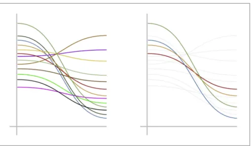
Cairo (2013)describes how to achieve visual clarity by
graphi-cally highlighting particularly relevant aspects of the data, while keeping secondary information in the background to see the overall trend (Fig. 15). While it is important to exclude data that is irrele-vant to the user's professional culture or decision scenarios,
presenting tailored relationships and comparisons in context with other less relevant data, may deepen overall meaning for the user (Cairo, 2013; Heer et al., 2012).
5.3.5. Tailoring to target audience needs and context
Tailoring adheres to user heterogeneity, and accepts that visu-alisation comprehension and interpretation are highly dependent on user perceptions and capabilities (Lorenz et al., 2015). Para-chuting default or familiar techniques into displays or tools
irrespective of the intended target, encourages complacency and heightens the risk of misinterpretation. As we have argued for earlier in this article, effective (e.g., usable, useful and relevant) visual communication tools within professional contexts should be customised, based on an understanding of user characteristics, as well as the potential context of use (Fig. 16) (Hawkins et al., 2008;
Lorenz et al., 2015). Such an approach enhances an audience's or
user's ability to contextualise what could otherwise be interpreted as highly abstract and inactionable scientific information Fig. 9.An identical equivalent potential temperature (C) analysis at 700 hPa from the European Centre for Medium-Range Weather Forecasts (ECMWF). The primary task for the reader would be to identify frontal zones. Two meteorological products: A rainbow-type map with colour gradients that could actively mislead users, particularly those unfamiliar with the subject or task (A). A redesigned map using a diverging colour scheme and a sensible colour scheme, resulting in more efficient pattern recognition and user understanding (B) (Stauffer et al., 2015). (For interpretation of the references to colour in thisfigure legend, the reader is referred to the web version of this article.)
(Karpouzoglou et al., 2016; Lorenz et al., 2015; Spiegelhalter et al., 2011).
5.3.6. Development of a broad range of throw away mockups, sketches and prototypes
User-centred visualisation designers should find inspiration from wireframing and rapid software prototyping (from thefields of HCI and software engineering, respectively); and focus on developing a large quantity of simple ideas with a broad
consideration space, rather than trying to generate an optimal so-lution within a small space (Sedlmair et al., 2012) (Fig. 17). They should continually reflect and challenge whether the tool is likely to fulfil its intended purpose. Keeping an‘agile’approach to pro-totype development allows designers to adapt outputs as user needs change (Sedlmair et al., 2012).
5.3.7. Incorporation of uncertainty-based information
Inherent uncertainty and associated assumptions within envi-ronmental data are challenging to communicate with conventional graphics (see Section3), and are therefore often overlooked when communicating to non-scientific audiences (Beven et al., 2012;
Buytaert et al., 2014; Olsson and Andersson, 2007). While there
are many design solutions that may appeal to non-scientists, it is essential that visualisation systems within professional contexts retain scientific integrity (McInerny et al., 2014). For example, omitting uncertainty and traceable links to data and models may improve the overall aesthetic, but such oversimplification is likely to undermine the tool's credibility as a decision support system. This is particularly relevant when the derivation process of knowledge is not fully understood or if it becomes perceived as non-trustworthy (Benke et al., 2011).
When visually communicating uncertainty to a broad audi-ence, graphics need to be sufficiently attractive to gain and hold attention (Spiegelhalter et al., 2011). Designers often integrate elements of narrative or metaphor within presentations to ach-ieve this (Spiegelhalter et al., 2011). However, an overemphasis on aesthetics may emotionally‘affect’or appeal to audiences to the extent that they are left with a false impression of truth, rather than interpreting the display as a function of expert judgement and incomplete knowledge (Gough et al., 2014a; Nicholson-Cole, Fig. 10. Encoding the same data using three graphical forms: bars (top), areas (middle)
and colour saturation (bottom) (Cairo, 2013).
Fig. 11.Three attributes of colour: Hue (top), saturation (middle) and brightness (bottom). (For interpretation of the references to colour in thisfigure legend, the reader is referred to the web version of this article.)
Fig. 12.Using one colour hue and a sequential scheme is recommended when map-ping quantitative data (Kelleher and Wagener, 2011). (For interpretation of the refer-ences to colour in thisfigure legend, the reader is referred to the web version of this article.)
Fig. 13.Using contrasting colour hues and a diverging scheme is recommended when mapping data with average or important midway values (e.g. 0C) (Kelleher and Wagener, 2011). (For interpretation of the references to colour in thisfigure legend, the reader is referred to the web version of this article.)
Fig. 14.Take advantage of existing colour recognition when encoding categorical data (Lin et al., 2013). (For interpretation of the references to colour in thisfigure legend, the reader is referred to the web version of this article.)
2005; Spiegelhalter et al., 2011). Extra dimensionality can also be incorporated within more complex glyphs that are designed using a variety of perceptual features (McInerny et al., 2014). By combining numbers, words and visual elements, data journalism and infographic design offer novel approaches to conveying un-certainty; for example, leveraging perceptual principles within word clouds or tree maps to represent probabilities for discrete
events with multiple outcomes (Spiegelhalter et al., 2011). More general best practices include: acknowledging known ignorance and limited data quality; assuming users or audiences have low scientific literacy; avoiding designer cognitive bias (Pappenberger
et al., 2013); reducing the risk of user-induced inferences by
making explicit comparisons; and providing an option for audi-ences to access an additional, more detailed acknowledgement of Fig. 15.The difference between displaying a complete dataset (left) and highlighting only the relevant (right).
Fig. 16.Two bar charts, visualising an identical precipitation time-series, tailored for a farmer (top) and a scientist (bottom). The lack of a Y axis label on the top graph is deliberate: For farmers, displaying the relative values and general trends are often more useful; for a scientist the actual values are the priority.
information limitations and uncertainty (Spiegelhalter et al., 2011).
5.4. Analysis and evaluation phase
Conventional, technique-driven visualisation systems end with the production of afinal artifact or tool seemingly ready for use. However, we argue that reflexivity and analysis are essential steps within an iterative, UCD approach.
5.4.1. Reflection on whether data is being communicated accurately
and honestly
Graphical excellence must truthfully and accurately reflect the information attempting to be conveyed (Kelleher and Wagener,
2011; Tufte, 2001). Consequently, how a user interprets visual
in-formation should to be taken into account during the whole design process. Non-persuasive visualisations need to convey ignorance, together with knowledge, to provide the most truthful represen-tation of current scientific understanding (Fischhoff, 2013; Kelleher and Wagener, 2011; Keohane et al., 2014; van Soesbergen and Mulligan, 2014). It is critical within customisable interactives, for example, that user-driven selections of scale, location and scenarios match their expertise and context without losing the overall sci-entific message of the dataset (Katz, 2013; Krzywinski and Cairo,
2013; McInerny et al., 2014). That is to say, users should always
be able to trace the visual patterns back to the data to be considered an effective visualisation (Kosara, 2013a). Unlike scientists that in theory exclusively rely on logic, real-world decisions are inevitably
emotional (Gough et al., 2014b; Pfister and Bohm, 2008). As a consequence, visualisation designers must acknowledge the affec-tive response their visualisation could stir up in end users and make the necessary adjustments. Persuading users, or introducing bias by overstating the value of certain information conveyed should also be avoided within a professional environment (Bishop et al., 2013). For example, misleading maps can potentially generate bias in audiences’perceptions. Potential bias or misinterpretation created along a chain of (re)users will also need to be considered (McInerny
et al., 2014). If communicating results or interacting with
non-scientists is done without sufficient care, initial impressions can potentially become permanent misunderstandings (Buytaert et al., 2014). It is therefore important to understand these inaccuracies and make allowances throughout the design process.
5.4.2. Consideration of how the target user perceives the tool and whole intervention
To ensure the visualisation is read and scientific knowledge generated is‘put into action’, visualisation designers should also consider how the end user perceives the tool and design process. The interface between environmental science and society is enhanced when visualisation-based systems (White et al., 2010), data sources (Cash et al., 2003) and the whole development, design and implementation process (Jones et al., 2014; Liu et al., 2008) are perceived as:
- Credible: dependable, unbiased, accurate and of high quality.