JOURNAL
Navigation Support in Complex Open Learner Models: Assessing Visual Design Alternatives
Julio Guerraa, Christian D. Schunnb, Susan Bullc, Jordan Barria-Pinedad and Peter Brusilovskyd
aInstituto de Inform´atica, Universidad Austral de Chile, Valdivia, Chile;bLearning Research and Development Center, University of Pittsburgh, Pittsburgh, PA;cConsultant, London, UK;dSchool of Computing and Information, University of Pittsburgh, Pittsburgh, PA
ARTICLE HISTORY Compiled May 16, 2018 ABSTRACT
Open Learner Models are used in modern e-learning to show system users the con-tent of their learner models. This approach is known to prompt reflection, facilitate planning and navigation. Open Learner Models may show di↵erent levels of de-tail of the underlying learner model, and may structure the information di↵erently. However, a trade-o↵ exists between useful information and the complexity of the information. This paper investigates whether o↵ering richer information is assessed positively by learners and results in more e↵ective support for learning tasks. An interview pre-study revealed which information within the complex learner model is of interest. A controlled user study examined six alternative visualization prototypes of varying complexity and resulted in the implementation of one of the designs. A second controlled study involved students interacting with variations of the visual-ization while searching for suitable learning material, and revealed the value of the design alternative and its variations. The work contributes to developing complex open learner models by stressing the need to balance complexity and support. It also suggests that the expressiveness of open learner models can be improved with visual elements that strategically summarize the complex information being displayed in detail.
KEYWORDS
Open learner model; navigation support; user study
1. Introduction
A learner model (LM) representing student knowledge or skills is an important part of adaptive educational systems, which is typically kept hidden from the learner and used for various personalization needs. A stream of research on open learner models (OLM) argues that opening these models to the students through a special interface could increase the value of learner models. It has been demonstrated that OLM could improve system’s transparency, open a channel for student feedback about the model, as well as to enable the student to better understand the state of their knowledge, reason about their knowledge, and use this understanding to better plan his or her learning (Bull & Kay, 2010). A question that has not yet been well-explored is how
much information about one’s own knowledge the student should be exposed to, to achieve these benefits. Student knowledge has been modelled using knowledge compo-nents of di↵erent granularity levels from coarse grain coursetopics to fine-grainskills
and concepts (e.g. Brusilovsky & Mill´an, 2007). Finer-grain models can clearly o↵er students more information to support their understanding, reasoning, and planning, but finer-grain visualizations are prone to produce information overload and might overwhelm students. In cases where information overload is a concern, it is important to consider how this might be usefully addressed. For example, how much information is enough?
This paper presents our exploration of a finer-grain OLM for the domain of in-troductory programming. This area provides natural support for multi-level domain and learner modeling. On the one hand, programming knowledge for a language like
Java could be considered at the level of broad topics such as variables, conditions, loops, etc. This is the way in which topics are presented in textbooks and courses (with a chapter or a lecture usually devoted to one such topic). On the other hand, knowledge analysis reveals many dozens of small domain concepts such as a specific operators, data types, etc., for which students can have di↵erent levels of knowledge. In our past work, we extensively explored personalization and OLM at the larger topic level (Sosnovsky & Brusilovsky, 2015). We demonstrated that topic-level OLMs could guide students to the most appropriate topics, improve learning outcomes, and in-crease their engagement. However, we also observed several limitations of topic-level modeling. For example, averaging knowledge over relatively large topics, topic-level OLMs might hide treacherous knowledge “holes” – missing concepts within otherwise reasonably learned topics. It also o↵ers little support for guiding students to the most appropriate learning content within a topic. Indeed, in a topic-level learner model, it is not clear how the problems associated with a topic specifically contribute to the estimated topic knowledge. In contrast, finer-level modeling permits the distinction of problems that can help fill the knowledge “holes” (or gaps) from those that would push the student to practice already well-learned concepts.
In this work, we augment a topic-level OLM with a more fine-grained concept-level extension and evaluate whether the finer-grained model o↵ers better support for activities that rely on OLM, such as next problem selection. While traditional Intelligent Tutoring Systems are designed to e↵ect such personalization for learners (see e.g. Woolf, 2009), an advantage of OLMs for this purpose is that they can facilitate reflection and planning alongside navigation (Bull & Kay, 2016). We started the design of this OLM representation by interviewing students (pre-study) who were familiar with a topic-level OLM to corroborate our ideas of the potential value of the fine-grained information. Then, we conducted a user study (Study 1) that engaged students in comparing several designs of concept-level OLM in three contexts. The visualization that was considered most favorably by students was then implemented and evaluated in the second study (Study 2). This study focused on a context for which an OLM could be especially useful: selecting appropriate problems to practice. To understand whether our fine-grained model visualization o↵ers too much or too little information in this context, we contrasted three versions of the new design. The basic version incorporates the topic-level and the concept-level representations of the LM. Another version o↵ered additional information by displaying aggregated information of the class group at both (topic and concept) levels. The third version complements the basic version, o↵ering additional visual elements to support the interpretation of the information already available. In this paper we present both studies and discuss the results obtained. We believe that these results o↵er guidance for the future work
on fine-grained OLM.
2. Related Work
OLMs have been argued to support a variety of aspects of learning, including: promot-ing metacognitive activities such as reflection, plannpromot-ing and monitorpromot-ing; facilitatpromot-ing interaction including navigation support and interaction with peers; and promoting positive a↵ective states (e.g. Bull & Kay, 2016, for an overview). Furthermore, stud-ies of specific OLMs have revealed significant benefits to learning (e.g. Brusilovsky, Somy¨urek, Guerra, Hosseini, & Zadorozhny, 2015; Kerly & Bull, 2008; Long & Aleven, 2013; Mitrovic & Martin, 2007; Shahrour & Bull, 2009). This has led to OLMs becom-ing a focus of attention not only in the traditional intelligent tutorbecom-ing context, but also more broadly, such as with MOOCs (e.g. Cook, Kay, & Kummerfeld, 2015; Kay, Reimann, Diebold, & Kummerfeld, 2013); E-portfolios (e.g. Gilliot, El Mawas, & Gar-latti, 2016; Raybourn & Regan, 2011); and social media (e.g. Alotaibi & Bull, 2012; Shi & Cristea, 2016). Thus, once identified, visualizations that are especially helpful in supporting learning can be applied across a range of online learning settings.
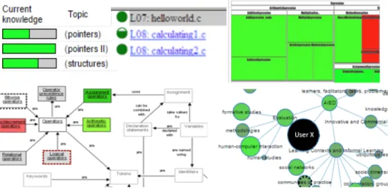
As well as having been implemented for a variety of contexts as indicated above, OLMs have been designed with di↵erent levels of interactivity and complexity (Bull & Kay, 2010). In the context of this paper, the most relevant work is that on the pre-sentation and understandability of OLM visualisations. It has been recognized that, as a representation of a learner model (which is a complex system running in the background), an OLM has to be designed to be understandable and interpretable in order to provide pedagogical support (Bull, 2012; Law, Grundy, Cain, & Vasa, 2015). The most common form of open learner model is a simple set of skillometers, where (part-)filled bars indicate the extent of knowledge or understanding of each topic or concept, etc. (e.g. Corbett & Bhatnagar, 1997; Long & Aleven, 2013; Mitrovic & Martin, 2007; Weber & Brusilovsky, 2001). Such simple visualizations are easy to in-terpret at a glance, allowing students to quickly compare their knowledge across a curriculum, or to focus in on specific areas. However, where there are many topics or concepts modelled, it can become necessary to scroll through the topics, making such comparisons more difficult. More complex, structured visualizations often allow more topics or concepts to be displayed in the same space, which can be helpful in large domains with fine-grained learner models, and where there are many links between di↵erent elements of the domain. However, the trade-o↵ can be that the complexity of the visualization makes it harder to identify specific strengths and weaknesses. Ex-amples of more detailed, structured visualizations which use color or size of nodes to represent concepts include concept maps (e.g. P´erez-Mar´ın, Alfonseca, Rodr´ıguez, & Pascual-Neito, 2007), proficiency maps (e.g. Zapata-Rivera, Hansen, Shute, Under-wood, & Bauer, 2007) and hierarchical trees (e.g. Kay, 1997). Zoomable treemaps (e.g. Brusilovsky, Baishya, Hosseini, Guerra, & Liang, 2013; Kump, Seifert, Beham, Lind-staedt, & Ley, 2012) can be considered intermediate to the above-mentioned simple and structured visualisations, as they conserve space by allowing users to zoom in to cells to view sub-topics, but comparing knowledge across the curriculum is more diffi -cult. To illustrate, Figure 1 gives excerpts from: a simple skillometer-type visualization (from Bull & Mabbott, 2006); similar simple bullets visualization (from Brusilovsky & Yudelson, 2008); treemap (from Brusilovsky et al., 2013); and two structured views showing concept nodes and links in a concept map (from Mabbott & Bull, 2006); and a hierarchical network visualization (from Bull, Johnson, Masci, & Biel, 2016).
Figure 1.Simple and structured OLM visualization examples
While some studies have found that simple indicators like skillometers are preferred by students (Duan, Mitrovic, & Churcher, 2010), other studies support more complex representations such as concept maps (Maries & Kumar, 2008), for example, as tools to represent and refine assessment claims on learners knowledge (Zapata-Rivera et al., 2007). Given the di↵erences between relative benefits and limitations of the var-ious visualizations, consideration needs to be given as to whether simple or complex visualizations are more suitable for a specific case. For example, several factors may contribute to the likely suitability of any given visualization: the target user group; the specific learning context; the learning tasks; and the purpose of viewing the model (Bull & Kay, 2016). Moreover, some researchers have o↵ered multiple OLM views, from simple to detailed to structured, giving options that satisfy di↵erent students’ preferences (Bull et al., 2010; Conejo, Trella, Cruces, & Garcia, 2011; Duan et al., 2010; Mabbott & Bull, 2004).
Recent work has taken the issue of complexity and interpretability further by ex-tending the OLM with more elaborate features such as indicators of e↵ort, progress, or working style (Papanikolaou, 2015). This type of work bridges the gap between OLM and Learning Analytics dashboards (Verbert et al., 2013), in which the data shown to learners include not only estimations of knowledge-related attributes, but also broader learning traces and other information provided by teachers. Other research in OLM has combined automated knowledge estimations and teacher input. For example in the work of Bull and Mabbott (2006), teachers are allowed to define the level of knowledge that is expected for various stages of a course, providing additional information about progress beyond a comparison to the domain (or course content). Further research has investigated allowing students to compare not to a teacher’s predefined level, but to the knowledge or progress of other students by giving them access to the learner models of each other (e.g. Brusilovsky et al., 2016; Bull & Britland, 2007; Bull, Mab-bott, & Abu Issa, 2007; Hsiao, Bakalov, Brusilovsky, & Knig-Ries, 2013; Shi & Cristea, 2016; Upton & Kay, 2009), which o↵ers a social dimension that can also encourage collaboration and competition among students.
Our previous work on a questionnaire study of a wide variety of visualisations from di↵erent systems found that students expected structured visualisations such as visualizations of Prerequisites and of a Hierarchical Tree (from Mabbott & Bull, 2006)
to best support the task of identifying what to work on next, but claimed to prefer simpler skill meters for comparing to peers (Bull, Brusilovsky, Araujo, & Guerra, 2016). However, it was unclear why students might prefer these structured representations over other structured views such as concept maps. Furthermore, experienced OLM users have indicated a preference for having both simple and more complex OLM visualisations available (Bull, 2012).
Given the potential for significant benefits to learning, explorations into providing additional information around OLMs, and the potential wide applicability of OLMs in newer educational technologies, it is an ideal time to further investigate the tradeo↵s between simplicity and complexity in OLM views. It is also useful in this context to consider how to combine the benefits of each to build on the success of systems that o↵er multiple views. In the next sections we use Mastery Grids to investigate these issues.
3. Mastery Grids Framework
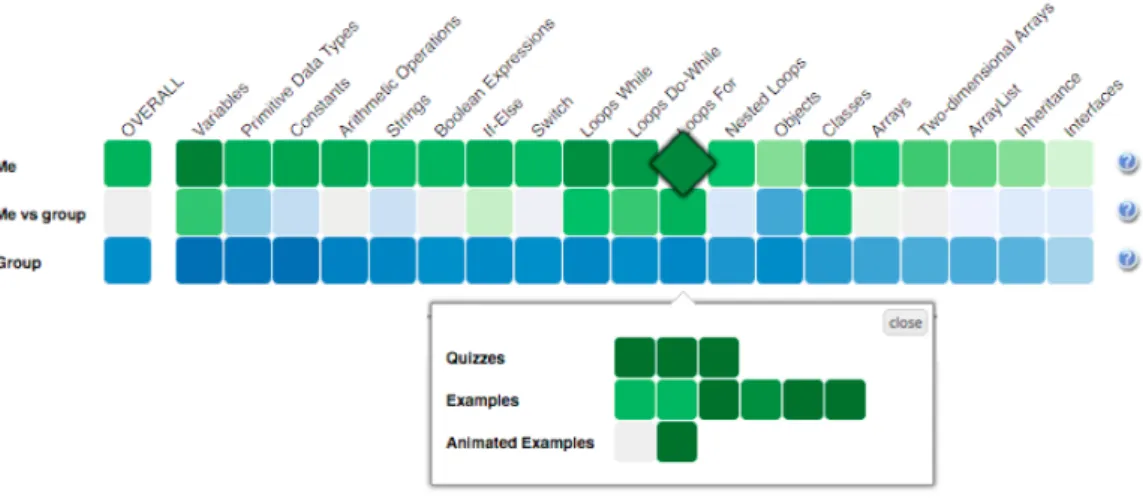
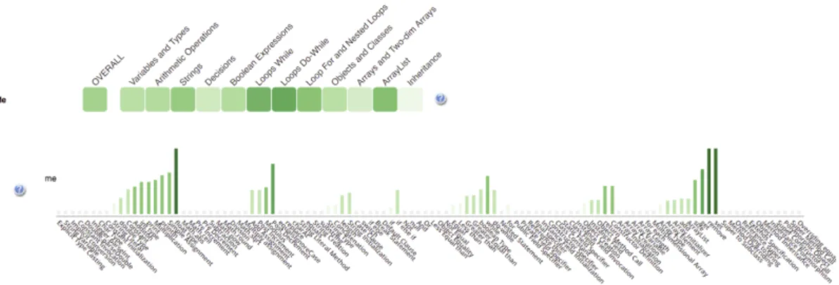
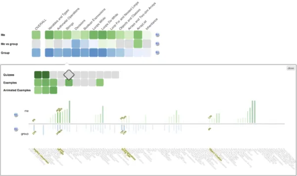
The starting point of our exploration of fine-grained OLMs is the Mastery Grids (MG) interface, which combines OLM visualization, social comparison, and a personalized interface for accessing learning content (Brusilovsky et al., 2016; Guerra, Hosseini, Somy¨urek, & Brusilovsky, 2016; Loboda, Guerra, Hosseini, & Brusilovsky, 2014). The original MG interface uses a coarse-grained OLM that aggregates and visualizes the learner’s knowledge about course topics (relatively coarse grained units of domain knowledge). Figure 2 shows Mastery Grids with the social comparison feature acti-vated. The first row of cells represents the learner’s knowledge for each course topic using di↵erent intensities of green (darker green corresponding to more knowledge). The third row represents the average topic-by-topic knowledge of the peer group (in this case, the rest of the class) using di↵erent intensities of blue. The second row o↵ers an easy comparison using a di↵erential color: it becomes green when the learner is ahead, or blue if the class is ahead. By clicking in a topic cell, the content activities within the topic are displayed forming several additional rows of cells. Each cell on this second level is linked to a specific learning activity and the intensity of cell color represents student progress for this activity. This design turns a OLM into an interac-tive navigational tool with adapinterac-tive navigation support that guides students to most appropriate learning content. MG is a domain-independent framework and so far, we have developed MG-based courses for Java, Python, and SQL programming. These courses were used as research platforms to evaluate the e↵ects of the MG-based OLM with and without social comparison on learning and engagement (Brusilovsky et al., 2016; Guerra et al., 2016).
In the context of this paper, it is important that the MG interface is built on top of a learner modeling and personalization framework that includes a two-level do-main model and a content model. These models comprise an informational structure relating coarse-grained knowledge elements (topics), fine-grained knowledge elements (concepts), and items of learning content (learning activities). The domain model de-fines the structure of domain knowledge connecting concepts and topics in a hierarchy. The content model defines how activities are connected to the domain knowledge (i.e., which topic the item belongs to and which concepts it allows the students to prac-tice). Since this framework is used to implement the finer-grained OLM on top of the topic-level MG, we introduce the most essential components of this framework below.
Figure 2. Mastery Grids interface for Java programming
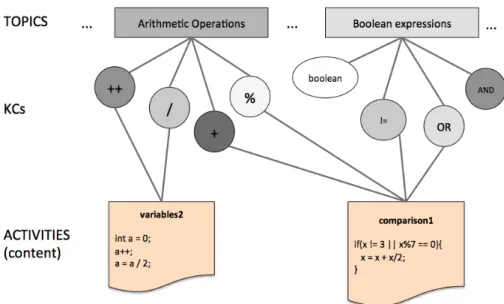
• TheFine-Grained Domain Modelis composed of a set of Knowledge Components (KCs) that represent elementary units of knowledge such as skills or concepts. For the Java domain, we use 114 KCs from an ontology developed by our group. Examples of KCs areint data type,addition, variable initialization,String con-catenation,for loop,constructor, and inherited method.
• TheCoarse-Grained Domain Model is composed of a list of topics that represent relatively large fragments of domain knowledge. While the KC-level model is defined by the structure of the domain, the list of topics reflects a pedagogical approach to teaching the domain. Our infrastructure allows di↵erent instructors to introduce their preferred sequence of topics for the domain. Structurally, each topic could be mapped into a subset of KCs. Taken together, topic and KCs define a two-level hierarchical domain model.
• Activities-KC mapping is used to connect learning activities (examples, prob-lems, animations) to a set of KCs to allow them to be practiced in the activities. This mapping can be established manually or automatically. For the Java do-main, this mapping is done automatically by the content parser presented in (Hosseini & Brusilovsky, 2013), with optional expert refinement (see Huang, Guerra-Hollstein, & Brusilovsky, 2016). In this domain, content activities have between 2 and 70 associated KCs.
• Activity-Topic mapping associates each course activity with one of the course topics. This mapping, which essentially defines the structure of a course, is usu-ally done manuusu-ally by course instructors who adopt a specific sequence of topics. In the Java domain, the structure of activities was assembled with the help of instructors of programming courses. The organization of the course influences the decomposition of topics into KCs: an activity only contains KCs of the topic in which it belongs or from topics covered previously.
• TheLearner Model represents an estimation of learner knowledge for each com-ponent of the domain model. The sources for this knowledge estimation are activity traces produced by the learner’s work with di↵erent learning activities. The Learner Model uses these activity traces and the mapping between activ-ities and domain model components (topics or KCs) to update the learner’s knowledge level for each topic or concept related to the activity performed. For example, when the learner solves a problem that contains the KC for-loop, the
Figure 3. Partial representation of Domain, Content and Learner Model. Learner model is represented by the darkness of the KCs and topics.
LM will consider this as evidence of knowing the KC and will update its esti-mation. Details of the current Learner Model implementation can be found in (Huang, Guerra, & Brusilovsky, 2016; Huang, Guerra-Hollstein, & Brusilovsky, 2016).
Figure 3 shows a fragment of the Domain and Content models with some relations between topics, activities and concepts. Each topic is associated to a set of concepts. Activities (content) in the bottom of the figure have many concepts associated which could belong to di↵erent topics. The current state of the individual Learner Model is represented by the color of the concept nodes using a gray scale (the darker, the higher the knowledge estimated in the KC).
4. Study 1: Informing the Fine-Grained OLM Design Process 4.1. Design Considerations
We stated that a coarse-grained topic-level OLM provides limited support for impor-tant tasks such as the ability to recognize knowledge gaps and next problem selection. To address this problem, we designed and implemented a fine-grained OLM visualiza-tion that fully reflects the informavisualiza-tion maintained by the Learner Model in our infras-tructure described in the previous section. The additional support that fine-grained features could o↵er to the learner has roots in the information science foundations and information visualization field. Detailed information can allow students to make decisions on what content to target by providing traces allowinginformation foraging
(Pirolli & Card, 1999). Also, detailed representation could help to make sense of the learner model being shown by means of the external anchoring that a detailed LM represents if visualized (Liu & Stasko, 2010).
We started with the idea of adding a fine-grained representation complementing the current coarse-grained visualization, instead of modifying the latter representation. This decision was motivated by two reasons. First, we are looking to provide extra support for students and at the same time, not lose the benefits we have observed
regarding the coarse-grained visualization. Second, having both representations is an approach to deal with the information overload based in Shneiderman’s well-known information seeking mantra: overview first, zoom and filter, then details-on-demand
(Shneiderman, 1996). In the contents of Mastery Grids OLM, the coarse-grained topic based visualization accounts for the overview, and the detailed or fine-grained LM accounts for thedetails on demand.
We name the resulting visualization of our work as “Rich” OLM, or simplyR-OLM, to stress the idea of enriching the original topic-based OLM (Mastery Grids) with the linked fine-grain OLM features.
4.2. A Pre-Study Interview: Collecting Critical Issues for the Design Before designing a visualization of the fine-grained OLM, we considered the ways in which more detailed information could be helpful to students, and, in particular, how detailed information could support the di↵erent ways in which students use the system. We expected that students use the system with di↵erent goals, but we did not have a precise understanding of these goals.
To better understand these issues, we performed semi-structured interviews with 9 undergraduate and graduate students of the University of Pittsburgh who were familiar with the topic-level Mastery Grids. Subjects received a compensation of US$20. The interview was structured in two parts. The first part focused on prior experiences with Mastery Grids: amount of use, understanding of what it shows, and goals when using it. The second part focused on the potential value of the more detailed information.
The questions asked in the first part included:What do you think is or are the goals of this system?, How do you think this system helps students?,What do you think is the ideal way to use it? There were also some interview questions about the social features in the system:What did you make of the progress of others in the system?,
Did you considered the progress of others while using MG?, Did you feel you were lagging behind or getting ahead? The first part of the interview finished by considering a scenario in which the subject had to prepare for a quiz, and questions targeted the perception of helpfulness of Mastery Grids for this goal.
From this first part of the interview, several important insights emerged:
• The general perception of the system was positive, some subjects even reported that it had a clearer content structure than did the book.
• Students used the system di↵erently. Some liked to go sequentially and do all content activities, whereas others just wanted to verify if they know all that is relevant in the topic and were not interested in completing everything. Some subjects mentioned they would have liked a “super” quiz that covered all the contents of the topic.
• Student opinion about social comparison features was generally positive (“en-courages the competitive spirit”, “useful to quantify / want to catch up”), or indi↵erent (“I don’t care”), and only one subject reported that it could be dis-couraging if you are lagging behind. One subject gave a di↵erent interpretation of the progress of others: “I think [darker cells on the others’ row] means that people are struggling with it”.
In the second part of the interview, the subjects were introduced to the concept space. The relations topic-KC and activity-KC were explained and illustrated with examples. Then questions were asked about the perceived helpfulness and use of these
details, such asDo you think the information of others will be helpful for you? How?,
Do you think this information will be helpful for others? How? Attention was directed to each of the associated pieces of information: the concepts in each topic, the relations of concepts and activities, the level of knowledge and progress the learner will see in each concept, and the possibility of seeing this fine grained information for the rest of the class. Subjects were told that the Learner Model could estimate the level of learner knowledge in each concept (KC), but also the amount of work (i.e., number of completed activities) associated with each concept.
From this second part of the interview, several additional important insights emerged:
• Fine-grained information about students and peers’ progress was perceived to be valuable, although with some ambiguity regarding which particular infor-mation was of interest. For example, students did not make clear distinctions between progress as completion of the content, e↵ort, or progress as the amount of knowledge gained.
• Some students expressed no interest in fine-grain social comparison.
• Although perceived as useful, a clear concern about complexity was expressed. As more information was added, the OLM became more complicated to understand and interpret.
• The students suggested that topic visualization should be maintained because it provides context. It was easier for students to navigate the content via or-dered topics. They recommended that the fine-grained view be linked to and complement the coarse-grained view.
• It was suggested that link between topics and concepts should be shown because it is useful to know “what is inside” the topic.
• The interview pointed to the need to limit the information provided for each concept (e.g., either knowledge progress or content completion but not both). These insights from the interviews guided the development of the fine-grained visu-alization. They provided a first level of understanding of the potential value of showing this information and some directions of what information to show. However, the in-terviews did not say much about how to visualize the information. We follow up on this issue in the next section.
4.3. The Study Organization: Comparing Design Options for a Fine-Grained OLM
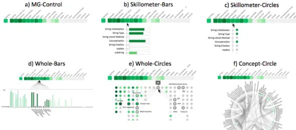
Study 1 was a controlled user study to learn how to e↵ectively visualize the knowledge-component (KC) space and how much information to include. We designed five di↵ er-ent visualizations with di↵erent levels of information about the concept space and its relationships. All visualizations include the topic level visualization (Mastery Grids). We excluded the social comparison features in this first study in order to focus on complexity issues within the fine-grained level. These designs, together with a control version (Mastery Grids alone), are presented in Figure 4. Visualization options varied in terms of the amount of information displayed (show KCs only within the topic vs. all KCs at the same time; show connections between KCs), and the visual element used for representing each KC (bars or circles). Knowledge in each KC is represented with shades of green as in Mastery Grids, and in the case of using bars to represent KCs, we represent such information with both color and size. Uniformly including color avoided
Figure 4. The 6 visualizations prototyped for Study 1.
possible biases caused by the use or non-use of color. The particular visualisations were inspired by a wide range of common visual representations previously used in OLM such as skillometers (e.g. Bull & Mabbott, 2006; Corbett & Bhatnagar, 1997; Long & Aleven, 2013; Mitrovic & Martin, 2007; Weber & Brusilovsky, 2001),bar charts or
histograms (e.g. Mazzola & Mazza, 2010; Shi & Cristea, 2016), andconcept maps (e.g. Duan et al., 2010; Mabbott & Bull, 2006; P´erez-Mar´ın et al., 2007). Prototypes were created based on initial thoughts about manageable complexity (e.g., limiting amount of depth shown in the concept maps). The prototypes were presented to subjects as paper mock-ups along with verbal descriptions of their interactivity features (e.g. how a visualization would react when a concept wasmouseovered).
• Skillometer-Bars: Shows the list of KCs in the currently pointed-to topic. Each KC is represented with its name and a bar indicating the estimated knowledge. • Skillometer-Circles: Similar to Skillometer-Bars, but with KCs represented by
colored circles.
• Whole-Bars: Shows all KCs in the course (114) with a bar chart that parallels the coarse-grained visualization. When topics are pointed to, related KCs are highlighted.
• Whole-Circles: KCs are positioned under the topic to which they belong and represented with colored circles. When a concept is pointed to, the name is shown and the connections to other concepts are also shown with the names of the related concepts. These connections are Skill-Combinations (Huang, Guerra-Hollstein, & Brusilovsky, 2016) and represent pairs of concepts that should be practised together.
• Concept-Circle: Another view of the whole space with KC names and connections shown all at the same time. KCs are represented with small colored circles. Pointing to a KC will highlight its connected KCs. Pointing to a topic will highlight the group of related concepts in the circle.
Expanding a visualization in this way allows the additional information to be seen as with a zoomable treemap (e.g. Brusilovsky et al., 2013; Bull, Johnson, et al., 2016; Kump et al., 2012), but without losing the overall context while drilling down; and maintains the benefits of allowing students to expand and collapse nodes as with some
structured OLM visualisations such as hierarchical trees (e.g. Kay, 1997) or network visualisations (e.g. Bull, Johnson, et al., 2016).
Forty two subjects completed the study. The subjects were graduate (MS) Informa-tion Science students and undergraduate Computer Science students at the University of Pittsburgh. All subjects had taken a course in which Mastery Grids was used as a practice support system, and thus all of them were generally familiar with the Mastery Grids functionalities. Each subject received US $20 for participation.
Subjects were given a presentation describing the Learner Model, including all the information described above, and a description of the visualizations shown in Figure 4. We provided several mock-ups for each visualization to illustrate interactivity. Clar-ifications were given as requested to ensure that the features of the more complex representations were understood.
Then subjects received a survey with three parts, each focusing on a di↵erent sce-nario in order to provide a broad subjective evaluation. Part 1 involved a general scenario with no specific directions about the context of using the system. In this sce-nario, the instructions stated were “For each of the visualizations indicate to which extent you agree with the following statements”. Part 2 involved the scenario of prepar-ing for a quiz on a specific topic. In this scenario, the instructions were complemented with “SCENARIO:You are preparing for a quiz next class about the last lecture topic: ‘Strings’”. Part 3 presented the scenario of a midterm exam covering a number of topics and included the instruction “SCENARIO:You are preparing for the Midterm which covers all topics until ‘Loops For’”. In each part, questions were phrased to match the specific scenario. For example, in the case of part 2, questions explicitly ask the subject to consider the support provided by each visualization to prepare for the specific topic of the quiz.
The survey questions covered di↵erent functions (the examples in parenthesis are the questions as phrased for Part 1):performance evaluation(“The visualization helps me to check whether I am doing well enough in the course”), knowledge evaluation
(“The visualization makes me think about my knowledge in the course”),strengths and weaknesses identification (two questions: “The visualization helps me to identify the strengths (weaknesses) in my knowledge of the course contents”),motivation to explore
(“The visualization motivates me to look for further material to learn more about the course contents”),ease of understanding (“The visualization is easy to understand”), andtopic awareness (“The visualization helps me to have a better idea of the content involved in each of the topics of the course’). Each part of the survey was presented as a matrix, with the rows containing the questions and the columns containing the six visualizations to facilitate comparative answers. In Parts 2 and 3, where the overall stated goal is to prepare for a quiz or midterm exam, we included two additional items:
plan next (“The visualization helps me to plan what to do next in order to prepare for the quiz”), andquantify work (“The visualization helps me to quantify how much work I should do to prepare for the quiz”).
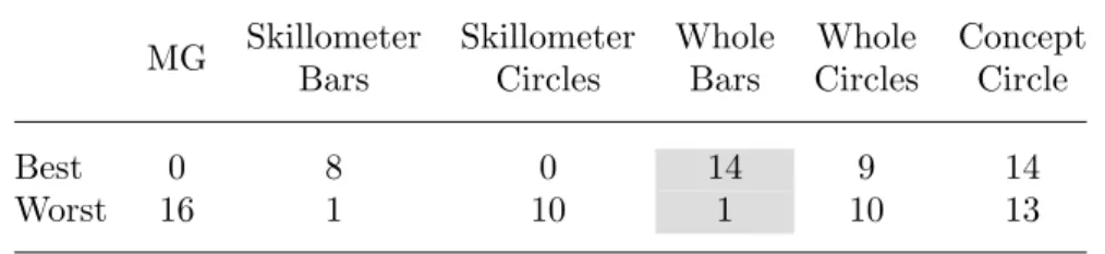
At the end of the session, subjects were asked to indicate which visualization was best and which was worst, and to provide an explanation for each choice.
4.4. Study 1 Results
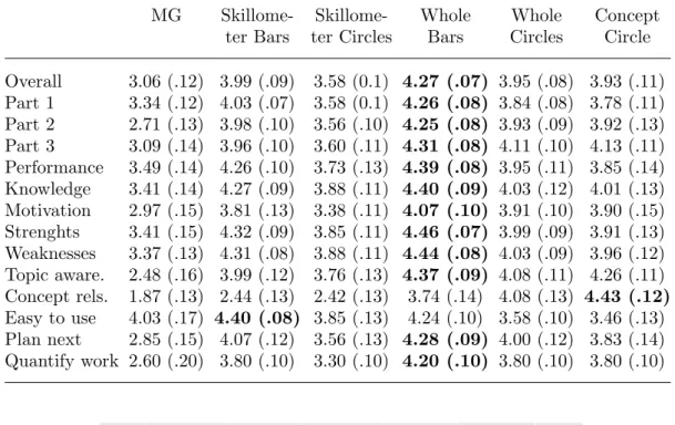
The results of the questionnaire applied are displayed in Table 1, which shows that Whole-Bars were generally the most preferred across dimensions. We applied a Repeated-measures Anova on the average of the answers per visualization across
Table 1. Results of Study 1 showing mean score of the questionnaire answers and standard error of the mean (in parenthesis). First row averages across questions in all scenarios. Rows 2-4 average across questions in each scenario. Higher values in each row are highlighted.
MG Skillome- Skillome- Whole Whole Concept
ter Bars ter Circles Bars Circles Circle Overall 3.06 (.12) 3.99 (.09) 3.58 (0.1) 4.27 (.07) 3.95 (.08) 3.93 (.11) Part 1 3.34 (.12) 4.03 (.07) 3.58 (0.1) 4.26 (.08) 3.84 (.08) 3.78 (.11) Part 2 2.71 (.13) 3.98 (.10) 3.56 (.10) 4.25 (.08) 3.93 (.09) 3.92 (.13) Part 3 3.09 (.14) 3.96 (.10) 3.60 (.11) 4.31 (.08) 4.11 (.10) 4.13 (.11) Performance 3.49 (.14) 4.26 (.10) 3.73 (.13) 4.39 (.08) 3.95 (.11) 3.85 (.14) Knowledge 3.41 (.14) 4.27 (.09) 3.88 (.11) 4.40 (.09) 4.03 (.12) 4.01 (.13) Motivation 2.97 (.15) 3.81 (.13) 3.38 (.11) 4.07 (.10) 3.91 (.10) 3.90 (.15) Strenghts 3.41 (.15) 4.32 (.09) 3.85 (.11) 4.46 (.07) 3.99 (.09) 3.91 (.13) Weaknesses 3.37 (.13) 4.31 (.08) 3.88 (.11) 4.44 (.08) 4.03 (.09) 3.96 (.12) Topic aware. 2.48 (.16) 3.99 (.12) 3.76 (.13) 4.37 (.09) 4.08 (.11) 4.26 (.11) Concept rels. 1.87 (.13) 2.44 (.13) 2.42 (.13) 3.74 (.14) 4.08 (.13) 4.43 (.12) Easy to use 4.03 (.17) 4.40 (.08) 3.85 (.13) 4.24 (.10) 3.58 (.10) 3.46 (.13) Plan next 2.85 (.15) 4.07 (.12) 3.56 (.13) 4.28 (.09) 4.00 (.12) 3.83 (.14) Quantify work 2.60 (.20) 3.80 (.10) 3.30 (.10) 4.20 (.10) 3.80 (.10) 3.80 (.10)
Figure 5. Overall perception of usefulness of the di↵erent visualization prototypes to “plan what to do next”. Error bars represent 2 Standard Errors of the mean.
scenarios. Results of this analysis indicate that participants significantly preferred all options over the simple coarse-grained option (MG), F(5,190) = 27.220, p < .001, partial ⌘2 =.417. Simple comparisons between pairs of the 5 options including fine-grained visualization showed thatSkillometer Bars are preferred overSkillometer Cir-cles t= 5.951,p < .001, but not over the other options; thatWhole-Bars is preferred overSkillometer Bars t= 3.207,p=.003, overWhole Circlest= 3.633,p=.001, and overConcept Circle t= 3.825, p < .001. No significant di↵erence was found between
Concept Circle and Whole Circles. These results confirm Whole-Bars as the overall most preferred.
Analyses on specific questions of the survey showed the overall same trend headed byWhole-Bars. As an example of this, Figure 5 shows the mean evaluation of helping to plan what to do next (plan next) across the two detailed scenarios (part 2 and part 3). The only di↵erent pattern of responses was observed for the question about ease of use, where the control version has a high preference overConcept Circle,Whole Circles
andSkillometer Circles, but it was lower (although not significantly) thanSkillometer Bars and Whole-Bars.
Table 2. From Study 1, the number of times each visualization was chosen as best or worst. Note that some subjects selected more than one visualization as best or worst.
MG Skillometer Bars Skillometer Circles Whole Bars Whole Circles Concept Circle Best 0 8 0 14 9 14 Worst 16 1 10 1 10 13
the quiz scenario, especially for the aspects of identifying strengths and weaknesses,
knowledge reflection, motivation to explore, and topic awareness, which suggest that there was room to improve the designs to better support quiz preparation.
As shown in Table 2, the overall preferences for the best visualization identified two complex representations Whole-Bars and Concept-Circle as best. However, one of the two leaders, theConcept-Circle was also frequently rated as the worst because of “overwhelming” complexity. This aligns with previous research on structured visu-alisations, where the same visualization could be rated as the most or least liked by di↵erent students (Mabbott & Bull, 2004).
From Study 1, we learned that students prefer bars to circles for representing their knowledge of concepts, perhaps because bars are easier to understand. These findings are consistent with preferences for skillometers over other options found in previous research (Duan et al., 2010; Mabbott & Bull, 2006), but also suggest that the preference might be due to the visual element used (the bar) and not necessarily the level of complexity o↵ered (e.g., there was no di↵erence betweenWhole-Bars and Skillometer-Bars).
Visualizations with connections, which were evaluated as more complex, were not judged as more helpful in any of the aspects. However, preferences forConcept-Circle
were extremely divided (best and worst). Multiple preferences in respect to visualiza-tion have been recognized in the literature and were usually addressed by presenting alternative visualizations (Bull, Johnson, et al., 2016; Conejo et al., 2011; Duan et al., 2010; Mabbott & Bull, 2004).
As suggested with reference to di↵erent learning goals (e.g. Bull et al., 2016), we also learned from this study that visualizations might bring di↵erent levels of support depending on the scenario. These scenarios involved di↵erent goals students have while using the system. Interestingly, the current alternatives did not seem to support the
quiz scenario well, and other features might be needed to improve this (in the next section we introduce a new visualization element Learning Gauge designed to pro-vide that additional support. The observed di↵erences between scenarios also suggest that it is important to specify well-defined tasks to evaluate design alternatives when considering specific contexts. Although evaluation for Whole-Bars and Skillometer-Bars are similar in the questionnaire, subjects stated that for tasks like preparing for a midterm, they would prefer to use a visualization that showed the whole concept space. This was a strong reason to select a visualization that includes both global and local context. Therefore, we concluded that the sweet spot in providing useful informa-tion across scenarios with manageable complexity was the Whole-Bars visualization. However, we acknowledge that there could be value in further exploringConcept-Circle
Figure 6. R-OLM interface. The top part of the figure shows the topic-based (coarse-grained) OLM, and the bottom part shows a long bar-chart representing the concept space (fine-grained) OLM.
Figure 7. R-OLM interface. When a topic is mouseovered, the concepts related are highlighted and connected to pointed topic.
5. The R-OLM
Following the results of Study 1, we implemented R-OLM based on the Whole-Bars
prototype for further evaluation. Figure 6 shows the final implementation of R-OLM filled with data from a course of Java programming. R-OLM shows a student’s cur-rent knowledge on two levels – topics and concepts. The connections between topic, concepts, and learning activities could be explored by interacting with the visualiza-tion. When a topic is moused over, related concepts are highlighted and the rest are shaded, as shown in Figure 7. Figure 8 shows the viewinside a topic (the learner clicks a topic): the activities associated with the topic are shown and the concepts related to this topic are highlighted, with their names at the bottom of each bar. Also shown in Figure 8, when the learner mouse overs a cell corresponding to an activity inside a topic, its related concepts are highlighted in the bar-chart allowing the student to easily identify which conceptual elements are associated with each content item.
In addition to this form of R-OLM, which is based on the results of the study 1 and indicated in our further studies as KC, we implemented two design alternatives. One design alternative extended the social comparison to the level of concepts. This design, indicated in our further studies as KCS, was based on the results of the pre-study interview, where students assessed social comparison as valuable. In the KCS
Figure 8. Activity selection support in R-OLM interface. When the learner points to (mouseovers) an activity cell the concepts related to the pointed activity are highlighted. This interface appears after entering a topic (in this case, the topicStrings.)
latter are represented in the form of blue bars opposite the green bars of the learner’s knowledge progress (Figure 9).
The second design alternative attempted to address the complexity concerns ex-pressed by subjects in Study 1 and previous interviews. Instead of adding new infor-mation to our already complex base design KC, we added a visual support tool to help learners in interpreting the fine-grained information displayed in the KC design. Our main main goal was to support learners in selecting the most appropriate activ-ity to practice. The relationship between concepts and activities visualized when a potential activity is moused over (Figure 8) does provide all necessary information – seeing which concepts this activity allows the student to practice along with the cur-rent knowledge level of these concepts aims to help the student to estimate how hard this activity might be and how much could be learned from it. However, this infor-mation might be hard to digest. To shortcut this digestion process, we calculated and visualized alearning opportunity for each learning activity given the current state of student knowledge by counting the number of related concepts (KCs) that are already known, familiar (or partially known) and not known (or new) to the learner based on predefined thresholds (Equation 1).
learning opportunity= 0.5⇤kcsf amiliar+kcsnew kcsknown+kcsf amiliar+kcsnew
(1) To visualize thislearning opportunity score, we designed an interface feature in the form of a gauge (we called this the learning gauge). We chose this type of represen-tation because of its ability to represent single values and at the same time to set meaningful boundaries that can be easy to understand and interpret. Gauges have been repeatedly used in critical interfaces such as cars and cockpit panels because of their ability to deliver a straightforward message (Hutchins, 1995), and have also been used successfully in learning analytics visualizations (de la Fuente Valent´ın & Solans, 2014; Falakmasir, Hsiao, Mazzola, Grant, & Brusilovsky, 2012; Fulantelli, Taibi, & Arrigo, 2013; Khan & Pardo, 2016).
Figure 9. Activity selection support in R-OLM interface with the social comparison features enabled. Note that social comparison is enabled for both the topic-based and the concept-based visualizations.
Figure 10. Activity selection support in R-OLM interface with thelearning gauge. The gauge shows the potential learning to be achieved if the pointed content activity is attempted.
Figure 11. Details of the Gauge visual aid.
As said before, the learning gauge does not add extra information, as the social comparison feature does, but instead presents an interpretive view of the information already shown in the visualization. Figure 10 shows the design alternativeKCG with thelearning gaugeadded to the base design KC. As mentioned before, this gauge aims to guide students to choose learning content to maximize learning, either by alerting the student about content that does not provide new knowledge, or alerting the student of content that might be too difficult (too many new concepts). Thelearning gauge is only shown when the learner has entered a topic, and the needle is positioned when the learner mouses over an activity cell.
The three design alternatives of R-OLM were built using the javascript library d3
(www.d3js.org) on top of the original Mastery Grids interface. The presence of these three design alternatives allows us to run a controlled study that attempted not just to “prove” the value of R-OLM, but to determine the proper balance between complexity and support. This will allow us to later consider appropriate additional visualizations in line with recommendations about benefits of providing multiple visualizations (e.g. Bull, Johnson, et al., 2016; Mabbott & Bull, 2004). For our evaluation we selected one of the key tasks for which R-OLM was designed - helping students in selecting the best activity to practice within the selected topic. This study is described in the following section.
6. Study 2: Evaluating R-OLM 6.1. Study Design
To evaluate R-OLM, we designed a controlled user study contrasting three design al-ternatives presented above (KC, KCS, and KCG). Because learners use the system with di↵erent purposes, and these di↵erent purposes would likely influence the eval-uation of the visual features, we set a specific goal for subjects to achieve through a defined task oriented to learning: find content that is most likely to increase mastery in a specific topic. However, other reasonable goals, such as free exploration of the content, self-assessment, or comparison, might have changed the evaluation results; a point we take up in the general discussion.
All three alternatives of the interface include both the coarse grained (topic-based) and the fine-grained (concept-based) visualization. The KC alternative (Figure 8) in-cluded these mentioned features and removes the social comparison and the gauge features. The KCG alternative (KC + Gauge) shown in Figure 10 added only the
learning gauge. The gauge appeared alongside the activity list within a topic. The KCS alternative (KC + Social Comparison) shown in Figure 9, extended the KC de-sign with oth topic-level a and concept-level social comparison features, but did not include the learning gauge. As noted earlier, the logic behind contrasting these three
interface variations was to examine the extent to which each interface feature (social comparison or learning gauge) impacted use of system that included fine- and coarse-grained representations. The literature and our previous studies (pre-study, and study 1) confirmed the value of the fine-grained representation. Study 2 aimed to further advance understanding of complex OLM interfaces.
We used a version of the Java course with 12 topics (Variables and Types, Arith-metic Operations, Strings, Decisions, etc). Each topic had between 13 and 29 content activities of di↵erent types (see Section 3). The presence of multiple topics enabled a within-subject design with subjects performing the same overall task for di↵erent topics but using di↵erent visualizations across topics. A simple interface was created to allow subjects to complete the steps of the study at their own pace.
The study was conducted with 29 subjects. All of them were master students of the Information Science School and had some background knowledge in programming. All subjects were familiar with the Mastery Grids interface because they had used this system before in a course taken in previous terms. The subjects represented stu-dents with some background in programming that are mostly refreshing programming knowledge now partially forgotten. Subjects were compensated with US$ 20 for their participation in the study.
The study was conducted in six sessions (there were six sessions, with each sub-ject attending only one session), but with subsub-jects individually following computer-provided instructions. Before starting the tasks, subjects completed apretestconsisting of 24 problems covering 12 topics (2 problems per topic). The pretest goals were to: (a) score the prior knowledge of the subjects, and (b) initialize the Learner Model. After the pretest, subjects viewed a short video explaining the core KC visualization and its features.
The overall process consisted in three blocks of 4 tasks each, and each block fo-cused in one of the three interface options. The order of visualizations (the blocks) was counter-balanced across subjects using a Latin-Square design. Then, each subject completed tasks in each of the visualization options, and di↵erent subjects faced the visualizations in di↵erent orders. In each block of tasks, we first introduce the visual-ization with a short tutorial explaining its features, a training step in which subjects could try the visualization, and a short test to corroborate that subjects understood the visualization features. If a subject failed this test, they were asked to call the study coordinator for clarifications.
Each task involved one specific topic which was marked in the interface as a target topic. The instructions were: “Focus on the topic marked with the orange dot. Select the best activity (to maximize your mastery of the target topic) by right-clicking in its cell. Just pick the activity, avoid solving quizzes or going through examples.” Each topic was seen only once (12 topics = 1 topic per task x 4 tasks per visualization x 3 visualizations) and topics were assigned randomly to avoid confounding e↵ects of topic.
After every second task, the subjects were asked to fill out a task survey. This survey targeted the perceived usefulness of the visualization, broken down into di↵erent aspects such as the ability of the interface to lead the learner to useful content, or avoid content that was too advanced or too simple. Table 3 presents the survey items. Answer options were on a 7-point Likert scale (1:Strongly disagree - 7:Strongly agree), and some items were reversed (R) coded. Additionally, because interface complexity is a particular concern within R-OLM, we included four workload-related questions
from the NASA-TLX1 survey (see the last 4 items in Table 3). These questions were presented with sliders running from 0 to 1. To facilitate presentation of results per survey item, the Table presents question identifiers in the first column.
Finally, after the series of 12 tasks were completed, subjects were asked to fill out a final survey in which they were asked to (1) rank the three interfaces according to their own preference and explain their ranking, and (2) rate the ease of understanding and ease of use of each visualization using a 7point Likert scale (1:Extremely easy -7: Extremely difficult).
Subjects spent roughly between half an hour and an hour and a half completing Study 2 (median = 40 minutes, mean = 50 minutes). Subjects occasionally did not explicitly select an activity at the end of a task: one subject missed the activity se-lection in all 12 tasks, two missed this in 10 tasks, four missed it in two tasks, and one subject missed it in 1 task. Analyses focusing on selected activities do not include these missing cases.
As expected,given their previous participation in programming courses, subjects had a relatively high pre-test scores (M edian = .79). We further classified subjects intolower orhigher pretest groups using a median split for maximal statistical power.
6.2. Survey Results: Perceived Di↵erences among Visualizations
As shown in Table 3, the KCG was generally perceived as better: more useful, and lower mental demand, higher performance, lower e↵ort, and lower frustration. How-ever, statistical significance should not be assessed at the individual item level for lack of conceptual and statistical precision. Instead, we performed a Factor Analysis using Varimax rotation to create coherent clusters of survey items that also provided greater measurement precision. Three factors were discovered, but sometimes had items that were not a close conceptual match. The misfitting items were removed (confidence,
thinkKnowledge), and mean scores were calculated for each factor. The first factor, called USEFUL, included usefulChoose, findLearn, and avoidEasier. The second fac-tor, CRITICAL, includedcriticalEfficacy and criticalEfficiency. We note that from a conceptual perceptive, the efficiency (as task completed by unit of time) is not nec-essarily always a positive outcome, because spending more time in choosing activities may be the result of positive metacognitive processes, such as self-reflection. The third factor,UNHELPFUL, included the two negative items,ledLessUseful and notHelpful. Means and standard deviations for each factor are reported in Table 4. Repeated measures ANOVA by condition was performed on these scores, with Pretest-group (high, low) as a between-subjects factor. Sphericity was violated for the USEFUL
factor, and so the Greenhouse-Geiser correction was applied.
A significant e↵ect of treatment was found for the score USEFUL, F(1.4,37.7) = 3.961,p=.041, partial⌘2 =.128. Simple contrasts (comparingKCGagainstKC and KCS) showed a marginally significant di↵erence betweenKCGandKCS,F(1,27) = 4.134, p = .052, partial ⌘2 = .133, indicating Gauge was viewed as more useful. The lack of significance prevents us from making strong claims. Nevertheless, we note that the positive perception of the KCG condition is consistent across the dependent variables.
No significant di↵erence was found for the other two variables CRITICAL and
UNHELPFUL. Also, no significant e↵ect of pretest group, nor interaction between pretest group and treatment were found.
Table 3. Questions on the surveys (usefulness and self-reflectiontask survey, and TLX survey) and mean of answers in each condition. Values for TLX survey contains 2 decimals because the scale is from 0 to 1.
Means
Item Statement/Question KC KCG KCS
confidence I am confident that I selected a good activity for the tasks
6.0 6.1 5.9
usefulChoose The visualization was useful to decide which activity to choose
5.9 6.0 5.6
ledLessUseful (R) The visualization at times led me to less useful activities
3.7 3.3 3.6
findLearn The visualization helped me to find activities where I think I can learn something new
6.3 6.3 5.8
thinkKnowledge The visualization made me think about my own knowledge in programming concepts
6.1 6.2 6.1
notHelpful (R) The visualization did not help me much while searching a good activity for the target topic
3.1 2.7 2.9
avoidEasier The visualization helped me to avoid choosing activities which I think are too easy for me
5.7 5.7 5.5
avoidHarder The visualization helped me to avoid choosing activities which I think are too hard for me
4.9 4.9 4.7
criticalEfficacy Without the visualization I will probably fail to select a good activity for the target topic
5.0 5.3 5.2
criticalEfficiency Without the visualization I will probably spend more time selecting an activity for the target topic
5.6 5.9 5.7
TLX1 Mental Demand: How mentally
demanding was the task? (very low - very high)
0.30 0.26 0.29
TLX4 Performance: How successful were you in accomplishing what you were asked to do? (scale is reversed: perfect - failure)
0.22 0.17 0.20
TLX5 E↵ort: How hard did you have to work to accomplish your level of performance? (very low - very high)
0.27 0.24 0.30
TLX6 Frustration: How insecure, discouraged, irritated, stressed, and annoyed were you? (very low - very high)
0.16 0.13 0.16
Table 4. Mean (and SD) for each condition on the three factors derived from the task survey.
KC KCG KCS
Mean SD Mean SD Mean SD
USEFUL 5.95 0.74 6.01 0.75 5.60 1.01
CRITICAL 5.30 1.16 5.57 1.08 5.44 1.02
Table 5. Mean (and SD)workload across TLX survey survey responses within each condition; lower values are desired.
KC KCG KCS
Mean SD Mean SD Mean SD
workload 0.24 0.21 0.20 0.16 0.24 0.18
Figure 12. Interaction between condition and pretest group forworkload(combined TLX items).
Similar analyses were run for TLX items regarding mental demand, performance,
e↵ort and frustration. A factor analysis suggested there was only one factor, and thus we averaged across the four items to produce the variableworkload (see Table 5).
Then we performed a repeated measures ANOVA onworkload as a function of con-dition with pretest group added as a between subjects factor. Neither the main e↵ect of condition nor main e↵ect of pretest groups were significant. However, a significant in-teraction between condition and pretest groups was foundF(2,54) = 3.412, p=.040, partial⌘2 =.112, showing a lower level of workload in theKCG condition for subjects with lower pretest (see Figure 12). Pairwise comparisons using a Bonferroni correction showed a significant di↵erence between treatmentsKCG and KC (p = .033), and a marginally significant di↵erence betweenKCGand KCS (p=.063).
6.3. Behavior Results: Di↵erences among Treatments
The click data collected while subjects completed the tasks provides an objective measure of how the di↵erent features a↵ect the way learners use the system. The following measures were analyzed:
• countSelectActs: number of activities selected per task (subjects might have thought twice before going to the next task).
• lastSelectedActDifficulty: difficulty value of the final activity selected in each task; this value corresponds to the computed estimated learning (see Equation 1 in Section 5) .
• lastSelectedActRelativeRanking: the relative difficulty rank of the final selected activity among all the activities that the user has mouseovered. The rank is normalized by dividing by the number of activities mouseovered to produce a value that ranges between 0 and 1, with 0 being the highest possible ranking.
Table 6. Mean and SD within each condition for each of the behavioral variables. study conditions
KC KCG KCS
Activity Measure Mean SD Mean SD Mean SD
countSelectActs 0.97 0.64 1.00 0.71 0.97 0.49
lastSelectedActDifficulty 0.74 0.13 0.77 0.13 0.73 0.12 lastSelectedActRelativeRanking 0.39 0.30 0.31 0.30 0.41 0.30 countMouseoverActivities 3.02 4.31 4.74 5.81 3.53 5.64
countMouseoverConcepts 0.50 1.06 0.84 2.21 0.66 1.41
countActivityOpened 2.03 3.58 1.63 2.92 1.59 2.33
• countMouseoverActivities: number of mouseovers on activities, including only mouseover actions lasting at least 1 second to reduce noise of inadver-tent/accidental actions.
• countMouseoverConcepts: number of mouseovers on concepts (KCs), again in-cluding only mouseover actions lasting at least 1 second.
• countActivityOpened: count of activities open, even though we advised subjects not to open activities.
Table 6 reports mean and standard deviation (SD) by condition for each behavioral variable. To analyze di↵erences of behavior among treatments, we aggregated the log data variables grouping tasks within each treatment (4 tasks in each treatment) and performed a repeated-measures ANOVA on log activity variables by treatment, with pretest group included as a between subject factor. Two subjects who missed the se-lection of activities in tasks (one subject missed sese-lection for all 12 tasks, one subject missed the selection in 10 tasks) were removed from these analyses. The normality (Shapiro-Wilk) assumption holds only for the variable lastSelectedActRelativeRank-ing. Sphericity (Mauchly’s test) holds for variableslastSelectedActRelativeRanking and
countMouseoverActivities.
While Table 6 shows a consistent pattern of more activity with thegauge (KCG), results of the ANOVA analyses only found a significant e↵ect of condition for last-SelectedActRelativeRanking, F(2,46) = 4.700, p = .014, partial ⌘2 = .170. Pairwise comparisons with a Bonferroni correction showed a marginally significant di↵erence be-tween treatmentsKCGandKC (p=.083), and betweenKCGandKCS (p=.053). Subjects selected more difficult activities (relative to the difficulty of the activities inspected) when using KCG (M ean = .299, SE = .038), compared to when using KC (M ean=.414, SE =.046) or when using the KCS (M ean=.410,SE =.033). Figure 13 shows the pattern of this e↵ect.
No significant interaction between treatment and pretest group was found for any of the log variables. However, a significant e↵ect of pretest group was found for count-MouseoverActivities, F(1,23) = 8.709, p = .007, partial ⌘2 =.275, and countActivi-tyOpened,F(1,23) = 6.477,p=.018, partial⌘2=.220. High pretest subjects did less mouse-over activities, but they opened activities more, regardless of the visualization.
6.4. Results: Overall perception of the visualizations
At the end of the study session, subjects provided an overall evaluation of their expe-rience. Table 7 summarizes the ranking that subjects gave each of the three visualiza-tions along with the mean and standard deviation of for the survey quesvisualiza-tions about
Figure 13. Relative difficulty rank of the selected activity. Lower value means more difficult activities were selected.
Table 7. Survey 2 summary. Count of rank preferences (rank 1 is top preference), and means and standard deviations for ratings of overall ease of understanding and ease of use.
Difficult to Difficult to Ranking of Visualizations Understand Use
Rank1 Rank2 Rank3 Mean SD Mean SD Mean SD
KC 0 13 15 2.5 0.5 2.5 1.4 2.4 1.4
KCG 20 6 2 1.4 0.6 2.2 1.5 1.9 1.2
ease of understanding and ease of use. With reference to ranking, theKCGwas con-sidered the best by 20 subjects and the worst only for 2 subjects, significantly higher than the other conditions by a Friedman test, 2(2) = 19.9, p < .001. Although there was a similar tendency forKCG to be reported as easier to understand and use, the di↵erences were not statistically significant.
In the free text explanations of the rankings, ten subjects explicitly referred to the advantages of using the gauge. For example, one subject said “the Gauge provides a summary/overview of the knowledge both the student have mastered and haven’t learned, which saves a great bunch of time for comparing between di↵erent concepts and keeping a clear track of all processes”. However, three subjects expressed con-cern about the gauge and how it works. For example, one subject said “the gauge is somewhat distracting because some exercise covers concepts under other topics, and the number in the gauge always seduce me choose the one that can cover more new topics”.
Five subjects discussed the value of social comparison features. For example, one subject noted, “in the social comparison I have a direct and obvious guide as to where others skills are and therefore where my skills should probably be”. Four subjects valued comparison as motivating: e.g. “comparison motivates us to perform better and improve our knowledge in the programming concepts”. However, 7 subjects expressed null interest of these features: e.g. “I am not concerned about the progress of the class and how much I have completed when compared to them”.
7. Summary and Conclusions
In this work, we presented a design and evaluation process used to develop R-OLM, specifically an OLM system combining coarse-grained and fine-grained pieces of the underlying learner model. The main goal of adding detailed information into the vi-sualization was to improve navigation support, helping students to focus on the most useful learning content. Since more detailed information generally adds complexity to the visualization making it harder to understand, our challenge was to balance the total amount of information displayed against the potential support o↵ered. This chal-lenge is of special importance in this context because our target users (learners) are not domain experts (who are the usual consumers of advanced visualization, Sedlmair, Meyer, & Munzner, 2012), but relative novices whose main concern is related to the learning subject and the learning task. We expected that the learners would be willing to expend some e↵ort in understanding the visualization of the learner model, but it was not clear whether it would be sufficient for the case of complex visualization.
Through interviewing students, we verified that students expected to find the de-tailed information of value. At the same time, we confirmed that they recognized complexity as a potential issue. The results reinforced the idea ofcomplementing the coarse-grained visualization with a linked fine-grained representation instead of replac-ing the whole interface with an extended version. This approach, which complies with the foundational Information Seeking Mantra –overview first, zoom and filter, then details-on-demand (Shneiderman, 1996), allows the system to integrate new features without losing its current benefits (Brusilovsky et al., 2016; Loboda et al., 2014). The pre-study was also helpful for deciding which information in the complex learner model to prioritize, and further enabled us to test several prototypes.
The next step was a user study (Study 1) in which we contrasted R-OLM prototypes of di↵ering complexity. Our aim at this point was to identify a single visualization
that was considered useful, to allow us to more extensively investigate possibilities for combining an overview with more detailed information in a visualization before considering the potential for multiple such options in future investigations. Results showed a preference for theWhole-Barsinterface, which combined a holistic view of the fine-grained model with a progress-bar approach to representing knowledge. Students claimed to find this visualization easier to understand, even though it presented a detailed and complete view of the whole concept space. This suggests that the Whole-Bars representation provides a useful compromise between complexity and learner support.
Having chosen the detailed information to be shown and the visual representation combining the coarse- and fine-grained details, we implemented R-OLM. However, we were still cautious about the potential e↵ect of interface complexity, even within the selected optimized representation. This concern was magnified by our intention to further add social comparison features, which in the past have demonstrated benefits in engaging students within the system (Brusilovsky et al., 2016). To assess the impact of this increase in complexity, we created an alternative extension of R-OLM with a learning gauge, which summarized the information already presented in R-OLM rather than complementing it with the new social information. This gauge provided an interpretable view of the information shown when the learner is pointing to content items, allowing her to quickly judge the potential benefit of each content item.
In a second user study, we evaluated the developed R-OLM in the context of problem selection. To determine whether our R-OLM o↵ered the right amount of information to support this task, we compared three versions of the interface: i) a basic R-OLM, ii) a version with a support tool to help the user in comprehending the OLM data (the gauge), and iii) a version that o↵ers additional information on top of the basic version data by adding social comparison at both topic and concept levels. The evaluation focused on a clearly defined task: to find activities that could increase students’ mas-tery of specific topics. Results revealed a positive e↵ect of the gauge and null e↵ect of the social comparison features. The gauge was especially beneficial in reducing work-load that less-prepared learners needed to complete the task, resulting in a very clear preference over the other visualizations. These results provide evidence of the ben-efits of summarizing information in complex open learner model visualizations. We acknowledge that these results are limited by the specific task used in the evaluation and may be relevant only in contexts similar to ours. In other situations, the e↵ects of a summary feature (in this case the gauge) may not be as beneficial. For example, in some cases these less-prepared learners might benefit from spending time on prepara-tion as opposed to being ledefficiently towards an activity by the gauge (e.g. to allow them to develop stronger self-evaluation skills). Of course, such considerations can be taken into account to develop di↵erent indicators that lead learners towards di↵erent pedagogical goals.
The version enabling social comparison features, although preferred by subjects more than the simpler version (KC), showed no improvement and did not influence any of the other aspects, i.e. levels of workload, usefulness and difficulty of use and understanding, than the simpler version. A possible explanation for this null e↵ect is that the task examined in the study was not aligned to the comparison features; thus, while subjects still recognized the benefits of social information, they did not need it for the task at hand. Therefore, we cannot make strong claims about the e↵ect of the added complexity, and the evaluation of such features needs more exploration to identify whether this approach will be positive as has been found in practice using the basic Mastery Grids interface (Brusilovsky et al., 2015), and also with other OLMs using a
skillometer approach (Bull et al., 2007) and multiple unstructured visualisations (Bull & Britland, 2007).
Our work o↵ers several useful insights into design processes and design features of OLMs. The central message is a cautionary note regarding complexity when adding new features to OLMs. Pre-studies and usability studies of prototypes could be espe-cially useful to determine the right balance for a given context. More specifically in terms of design features, our work points to the value of providing “expressiveness” to the learner model visualization with summary features (such as the learning gauge) that could facilitate the interpretation of the information presented (Papanikolaou, 2015) and can assist the learners in various tasks supported by the OLM (such as finding the right content). This line of research bridges OLM and an emerging area of learning analytics shown to learners (Bodily & Verbert, 2017).
We think these results are encouraging and open several lines of future research. One clear extension of the work is to broaden the evaluation to a more environmentally valid set up. This will allow us to discover issues and confirm benefits when students use the features with diverse goals (regular study and practice, preparing for exam, exploring content, etc). We would also like to design and examine more efficient approaches to present social information in R-OLM, for example, using a gauge-like feature to summarize the social comparison information. Another aspect to explore is to provide several representations of R-OLM that learners can choose, and/or allow them to activate or deactivate visual features. Researchers have shown in the past the benefit of this approach while it does not suppose an increase of confusion (Mabbott & Bull, 2004).
Although the main role of most OLMs is to present the learner model to the learner (and potentially other users) to show their understanding, some OLMs also allow learners to help in the maintenance of their learner model. This includes allowing the user to: provide data directly to their model (Bull & Mabbott, 2006; Cook & Kay, 1994); choose from dialogue options to challenge the model (Dimitrova, 2003; Van Labeke, Brna, & Morales, 2007); use a chatbot to negotiate the model contents (Kerly & Bull, 2008; Suleman, Mizoguchi, & Ikeda, 2016). Future work can be directed towards improving ways to highlight di↵erences between the student’s and the system’s viewpoints on the learner’s knowledge for a range of visualizations, to further facilitate interactions around maintaining the learner model.
Over the last several years, we observed an increased interest to open learned models based on the demonstrated benefits to learning using OLMs (e.g. Brusilovsky et al., 2016; Kerly & Bull, 2008; Long & Aleven, 2013; Mitrovic & Martin, 2007; Shahrour & Bull, 2009), and the popularity of self-regulated learning ideas. This resulted in a broader use of OLMs in newer technologies such as MOOCs (e.g. Cook et al., 2015; Kay et al., 2013), e-portfolios (e.g. Gilliot et al., 2016; Raybourn & Regan, 2011) and social media (e.g. Alotaibi & Bull, 2012; Shi & Cristea, 2016). There is also a rapidly increasing interest in learner dashboards and other kinds of learning analytics for learners (Bodily & Verbert, 2017) where the user-centered design gains importance. In this context, we believe that our results could be of interest to a reasonably large community of researcher and practitioners.
References
Alotaibi, M., & Bull, S. (2012). Combining facebook and open learner models to encourage collaborative learning. InProceedings of international conference on computers in
educa-tion.
Bodily, R., & Verbert, K. (2017). Trends and issues in student-facing learning analytics reporting system