Multiple Foci Drill-Down through Tuple and
Attribute Polyarchies in Tabular Data
Nathan Conklin, Sandeep Prabhakar, Chris North
Department of Computer Science
Virginia Polytechnic Institute and State University
Blacksburg, VA 24061
{nconklin, sprabhak, north}@cs.vt.edu
http://infovis.cs.vt.edu/
Abstract
Information analysis often involves decomposing data into sub-groups to allow for comparison and identification of relationships. Breakdown Visualization provides a mechanism to support this analysis through user guided drill-down of polyarchical metadata. This metadata describes multiple hierarchical structures for organizing tuple aggregation and table attributes. This structure is seen in sport statistics, financial data, organizational structures, and other fields. A spreadsheet format enables comparison of visualizations at each level of the hierarchy. Breakdown Visualization allows users to drill-down a single hierarchy then pivot into another hierarchy within the same view. We utilize a fix and move technique that allows users to select multiple foci for drill-down. We present an analysis scenario that demonstrates how Breakdown Visualization can be used to perform financial statement analysis.
Keywords
information visualization, polyarchy, multiple foci, drill-down, tuple aggregation, attribute formulae, financial analysis
1 Introduction
In many domains, data analysts work to identify patterns within large data sets and then attempt to discover events that may have caused the pattern to occur. For example, financial analysts attempt to identify key events that have enabled a particular company to perform well. Similarly, sports analysts are always trying to understand why a particular team is able to do well. Meanwhile, the competition continues to look for weaknesses. Both financial and sports analysts need to be able to drill-down through the data in an attempt to identify behavior causalities.
Data aggregation is typically required to generate an overview of very large data spaces [16]. The aggregation provides a reduced data representation, allowing analysts to identify patterns. They need to breakdown this overview. By comparing the detailed subsets to the
overview, analysts can understand what factors affect the overall behavior.
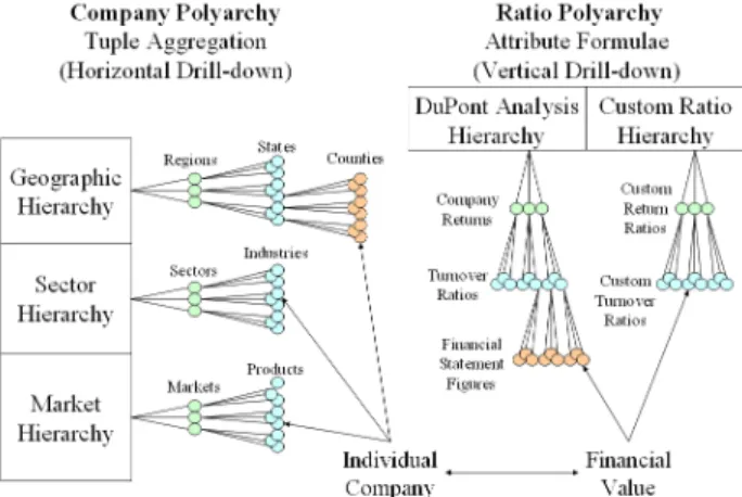
A hierarchy can be used when dividing data from a superset into subsets. The parent node is the superset (aggregated data) and the children nodes are the subsets (subgroup details). Most data sets can have multiple hierarchical relationships within them. For example, the financial market can be decomposed hierarchically based on sector, geography, capitalization, product types, or financials. Each company has a place in each of these hierarchies. These multiple intersecting hierarchies define a financial market polyarchy [12]. In sports, NCAA college basketball teams can be organized hierarchically based on division, geography, tournament position, player position, and statistics. These hierarchies combine into a sports polyarchy.
Breakdown Visualization allows for decomposition of tabular data. The data is organized as a set of tuples and attributes. The tuples and attributes can be organized hierarchically based on:
• Tuple aggregation
• Attribute formulae
As shown in Figure 1, multiple hierarchies describe how the data tuples can be aggregated. Tuple aggregation is implemented by grouping the data based on categorical information. Table attributes are aggregated using mathematical formulae similar to spreadsheets.
This organization is common in many application domains. In the example of the financial polyarchy, tuple aggregation includes grouping companies based on geography, sectors, and products. An individual company exists as a leaf node in each of the aggregated hierarchies. Financial ratio formulae are used to aggregate data from income statements and balance sheets. These formulae are based on common financial indicators used in financial statement analysis. Specific formulae exist as either a leaf node or intermediate node within the formulae hierarchies. The visualization is motivated by the DuPont Analysis [14] technique for fundamental analysis.
Figure 1: Polyarchical structure where each company and financial value is a node in each of the hierarchies.
Breakdown visualization enables users to navigate through the metadata polyarchies while the details are displayed in a spreadsheet format. Each cell in the spreadsheet represents a time series data set corresponding companies and financial values identified. This format allows the user to compare the overview to the details along with comparing multiple detail views.
2 Related
Work
Hierarchies are common information structures used when organizing related items. Many visualization techniques have evolved for visualizing and interacting with hierarchies. Cone Trees [13], Hyperbolic Trees [9], Treemaps [8], and many others assist in visualizing the structure. Visage [15] and structure-based brushes [5] demonstrate the use of drill-down and roll-up operations. However, most of these tools are targeted toward visually presenting a single hierarchy.
More recently, research examines multiple hierarchies. Multi-trees [6] visually present multiple hierarchies with shared subtrees. Each node has multiple children and may have alternative contexts, or paths to that node. The Time Tube [3] allows for the comparison of a single hierarchy that has changed over time. It displays a sequence of disk trees that visualize how a website hierarchy has evolved. Taxonomy Visualization [7] also displays multiple trees as a sequence. A line connects nodes that are common in each of the hierarchies. Polyarchy Visualization [12] introduces a general polyarchy as multiple intersecting hierarchies that share at least one node. The visualization introduces the idea of a visual pivot. From any node in a hierarchy, the user can pivot to that node’s position in an intersecting hierarchy. This allows the user to understand the multiple hierarchical contexts of selected nodes. The class of multiple hierarchies that have been examined include the general polyarchy, hierarchies with shared subtrees, and changing hierarchies. Breakdown Visualization uses the
general polyarchy for organizing the attribute formulae. An individual formula may exist as a leaf or intermediate node within intersecting hierarchies.
An aggregation polyarchy is utilized for organizing the tuple grouping. Within an aggregation polyarchy, all tuples exists as leaf nodes at the bottom level of each hierarchy. Intermediate nodes correspond to the aggregation of tuples by grouping them. The multiple hierarchies represent different ways of hierarchically grouping the leaves. These hierarchies intersect through common leaf nodes. The tuple aggregation is similar to database PivotTables [10]; however, multiple hierarchies exist for organizing the field ordering.
Instead of concentrating on displaying the structure of the polyarchies, Breakdown Visualization focuses on utilizing the polyarchical structure to support customized drill-down. The visualization shows the drill-down paths of a user across multiple hierarchies and visualizes the data for each node. A tabular format is used to show the intersection of the drill-down paths. Spreadsheet Visualization [2], TableLens [11], FOCUS [17], and others have noted the capability of the tabular format to build multiple visual representations that allow the user to compare related data sets visually.
Spreadsheet Visualization allows users to visualize and aggregate attribute formula. Rows and columns define formula for computing the values shown within the different views. Polaris [18] utilizes a PivotTable approach to aggregate and drill-down through data. With this approach, row headers and column headers are determined by the assignment of fields to different axes. This approach has difficulty scaling because the number of rows increases exponentially with each level of drill-down. Breakdown Visualization allows for both column-based formulae aggregation and row-column-based tuple aggregation. It utilizes a polyarchical drill-down path to allow for deep drill-down into either dimension.
3 Overview
Financial statement analysis involves pattern identification using financial metrics. The goal is to identify the behaviors that affect company performance. An analyst has the task of organizing the data in an attempt to understand the behaviors. Typically, the DuPont Analysis ratio tree is used to lead the analysis. Figure 2 shows a typical ratio tree used in DuPont Analysis.
The user starts by looking at the Return on Equity (ROE) values for a company. They compare the value over time to understand the direction the company is headed. To understand which causalities affect the behavior of the ROE, the user needs to drill-down through the ratio hierarchy. By comparing children ratios to the parent ratio, the analyst can identify which financial indicators have the largest affect on the parent’s behavior. It is
important to identify the lowest level causalities because they can drive management decisions and direct the company’s planning.
Figure 2: DuPont ratio formula hierarchy used to aggregate financial attributes.
Analysts need to be able to compare these values between companies to understand the significance of the ratios. For example, some markets require a large amount of fixed assets while others require high inventories to succeed. Because of this, it is important for the analyst to compare these ratios between various product, sector, and geographic groups. They need to be able to drill-down based on company grouping as well as financial ratios.
4 Breakdown
Visualization
Breakdown Visualization supports this DuPont Analysis by allowing users to drill-down both company and ratio polyarchies. The company polyarchy is generated from the Standard & Poor’s classifications that are provided as part of the COMPUSTAT database [4]. These classifications define hierarchies based on sector, industry, geographic location, primary and secondary markets, credit ratings, and more. The attribute formulae hierarchy utilizes ratios identified in a DuPont Analysis. However, many financial analysts prefer to use their own hierarchically structured formulae when performing fundamental analysis. The ratio polyarchy is the combination of these intersecting hierarchies. This structure is shown in Figure 1.
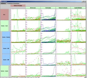
A vertical breakdown occurs as a user traverses the ratio polyarchy while a horizontal breakdown is based on the company polyarchy. The corresponding nodes in the company and ratio polyarchies act as column and row headings in Breakdown Visualization (Figure 3). Each node identifies the values to display in a particular cell. The financial metric displayed is determined by the column heading. Likewise, the company grouping is determined by the row heading. The user can determine which visualization to show for each cell, row, or column. Visualizations currently supported include a scatterplot, line graph, and bar graph.
Figure 3: Breakdown Visualization showing an initial drill-down in the tuple and attribute polyarchies.
Attribute formulae make up the column polyarchy at the top of the visualization. The formulae shown in Figure 2 are related to each other because the parent ratio is derivable from its children ratios. The tuple aggregation hierarchy is shown as the vertical hierarchy. As a user drills down through the hierarchy, they break down the aggregated datasets into their subgroups.
Breakdown Visualization allows the user to drill-down on both dimensions. Each cell provides a time series visualization of the data. The spreadsheet layout allows for comparisons between companies and ratios. As required by a thorough financial analysis, users can compare a company to its sector and can compare ratios to identify causalities.
Breakdown Visualization uses the indented hierarchical format to show the drill-down path. This hierarchy only shows the drill-down path and bottom-level leaf nodes. This allows the analyst to see the path they took while breaking down the dataset along with the choices available for further drill-down. Figure 4 demonstrates the visual representation of the drill-down. In this figure, a user has drilled down into the technology sector in the hierarchy. They decide to further explore the software industry and click on the node to break it down.
Figure 4: Single focus drill-down path showing only its bottom-level leaf nodes.
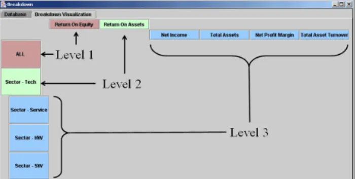
Users are initially presented with an overview (Figure 7) showing the ROE for all companies. As the user breaks down the aggregated dataset, that overview remains the top left cell in the visualization. Figure 5 shows the hierarchical drill-down in both the vertical and horizontal hierarchies. Level 1 corresponds to the root of both hierarchies. Level 2 corresponds to its children and so on. Hierarchy levels are indented in both the vertical and the horizontal breakdown paths. The user selects the path to traverse by clicking on the ratios or the aggregated groups and selecting it for a breakdown. As the user traverses deeper into the hierarchy, the earlier levels will disappear. The drill-down path always remains in view.
Figure 5: Levels in the drill-down hierarchies. 4.1 Drill-Down through Polyarchies
A user might be subdividing data based on one classification and notice an interesting trend. This trend may prompt them to decide to do further breakdown based on a different criterion. In the finance example, the user might have broken down the data based on sector. Upon seeing the visualizations for the different sectors, the user might want to view the effects of the ratios in different geographic regions for a particular sector. This might allow him/her to obtain a better understanding of the trend that they have noticed. The user needs to be able to do further drill-down using a different hierarchy. Breakdown Visualization allows drill-down using a different hierarchy by allowing the user to pivot into the other hierarchy. This pivot is similar to the PivotTable, breaking down the current level based on the child nodes defined in the new hierarchy. The user drills into a second hierarchy using its new location for further breakdowns. However, this pivot is different when compared to the visual pivot introduced by Robertson, et. al. [12]. When the user moves from one hierarchy to another, the path to that node in the new hierarchical structure is not shown. Instead, the new children nodes are shown as the next level in the current drill-down path. Figure 6 shows the pivot from a sector based to a geographic based drill-down through the company polyarchy.
Figure 6: Drill-down path showing a pivot from the sector hierarchy to the geography hierarchy.
The ability to pivot into separate hierarchies allows the analyst to relate different aspects of the data. For example, a financial analyst may traverse a path similar to Figure 6 to determine if the recent recession that affected the software industry was centralized within a specific geographic region. Figure 11, shown in the scenario, demonstrates a pivot across hierarchies within Breakdown Visualization.
4.2 Multiple Foci Drill-Down Paths
It is common for analysts to need multiple focus points within their drill-down path. The identification of causalities may indicate multiple children nodes showing a similar behavior. The analyst needs to drill-down and compare each of these paths in order to determine the events that are driving the behavior. Multiple foci are needed to allow the analyst to build separate drill-down paths.
The fix and move technique allows the users to construct multiple drill-down paths. The user selects a node to fix in either the company or ratio polyarchy. The user then drills down on a different node while the drill-down hierarchy retains the fixed node. He/she is then able to start a separate drill-down path by later selecting the fixed node for breakdown. This technique adds the capability of multiple foci within the same drill-down hierarchy. Users can interactively explore the data through drill-down and roll-up operations in each polyarchy. They can examine several drill-down paths by fixing and unfixing nodes. This allows them to discover deeper relationships by splitting the analysis in multiple directions. This interaction allows the user to identify causalities when moving from an overview into the details.
Colors can be used to assist the user in navigating the hierarchy. They may be assigned to individual levels in the drill-down or to each hierarchy. Assigning color based on level allows the user to quickly identify drill-down depth because the color changes at each level. Assigning a different color for each hierarchy allows the user to quickly visualize the pivot onto a new hierarchy and back. All of the nodes within a hierarchy are coded
with the same color, assisting users in identifying nodes within the same hierarchy.
A fully expanded aggregation tree can quickly overwhelm users. This problem commonly occurs within a PivotTable. Providing an interactive drill-down hierarchy avoids overwhelming the user with the details of a fully expanded tree. By hiding intermediate sibling nodes in the drill-down hierarchy, more display room is available to allow the user to focus attention on the leaves and the drill-down path. This allows the user to have a richer interaction with the visualizations in each cell.
4.3 Interaction Techniques
Several interaction techniques are provided to assist analysts as they navigate through the data.
Drill-down and Roll-up
The drill-down and roll-up techniques are used to navigate through the polyarchy in a manner similar to a hierarchy. Drill-down allows the user to divide a large dataset into separate subsets. Additional support is provided to allow the user to pivot from one hierarchy to another. Similar to Visage, the roll-up of the hierarchy represents a movement back to the parent values. The drill-down path acts as a set of intermediate views with each level of depth introducing an additional level of detail.
Fix and Move
As discussed earlier, this technique allows for multiple foci while drilling down the polyarchies. These multiple foci allow the user to split the drill-down path and simultaneously drill-down in separate directions.
Brushing and Linking
Support for coordinated brushing across the separate views is extremely important. This interaction technique allows the user to identify and relate the patterns between different cells [1]. As a set of points are selected, colored lines are drawn that connect the time series data. This allows the user to identify how the values are changing over time.
When the time series data is brushed, all of the views on that row are updated. This provides the analyst with the ability to compare the different patterns occurring within each of the different attributes. Additionally, corresponding parent and children rows highlight the same time-series data points. This allows the user to compare the tuple aggregated overviews with the drilled down detail views.
Details on Demand
As the user selects points for brushing, further details are obtained for the individual points. These values are shown on demand in the detail window at the bottom of
the visualization. These details include values corresponding to the selected tuples and attributes. Analysts can use the detailed values when comparing specific points between different views.
5 Scenario
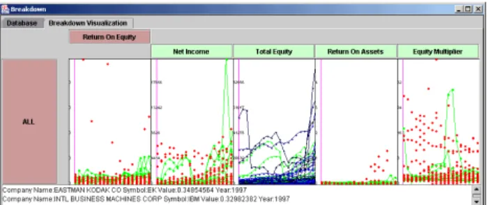
A financial analyst is interested in using Breakdown Visualization to perform a DuPont Analysis. The visualization opens with an overview that displays the root nodes of the initial hierarchies. The analyst starts exploring the overview, identify outliers and patterns within the time-series data. This interaction is shown below in Figure 7. The figure demonstrates brushing across the time-series data and requesting details for specific points.
Figure 7: The user interacts with an initial overview to identify patterns and examine details on demand.
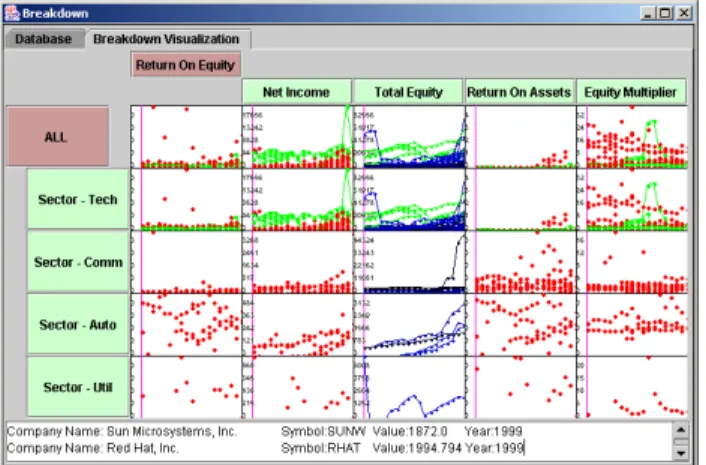
The analyst decides to breakdown the ROE ratio and continues to explore the financial data. They click the root node to drill-down to the next level of the attribute formulae. Figure 8 demonstrates the breakdown of the ROE ratio into its children ratios. The analyst interacts with the new set of views and notices a pattern of high levels of ROE and return on assets (ROA) in recent years.
Figure 8: Horizontal drill-down to the second level in the attribute formulae polyarchy.
The detail window shows several technology related companies. Due to this, the analyst hypothesizes that this pattern in ROE may be occurring within specific sectors or industries. They decide to navigate the tuple aggregation polyarchy in an attempt to identify the industries that are performing well. The user clicks on the root to select it for a breakdown based on sector. The
sector groups are shown in Figure 9 as the user drills down the tuple aggregation polyarchy.
Figure 9: Vertical drill-down into the second level of the tuple aggregation polyarchy. The user clicks on the communications sector and fixes the node.
While comparing the sectors to the overview in the top left cell, the analyst notices that the pattern occurring within the technology and communications sectors. They decide to fix the node for the communications sector (Figure 9) and drill-down into the tech sector. The user then begins to explore the data as shown in Figure 10.
Figure 10: The user then drills down into technology sector subgroups.
Noticing that a few communications companies demonstrate this trend, the analyst decides to decompose this sector further. Knowing that the communications companies are organized geographically, they choose to drill-down the sector based on geography. The results of this drill-down are shown in Figure 11. This demonstrates how the drill-down path pivots across intersecting hierarchies.
Figure 11: The communications sector is decomposed based on geography. This demonstrates the pivot across intersecting hierarchies.
The analyst is satisfied with the groupings used to organize the data. After further exploration and group comparison, the analyst identifies an interesting pattern occurring with Oracle TM. As shown in Figure 11, Oracle has demonstrated a higher ROE compared to companies in each of the other groups. The analyst compares the trend in each of the ratios to the ROE. They notice that the ROA ratio seems to have the most impact on Oracle’s ROE. As a result, they decide to breakdown the ROA in an attempt to understand what caused the sudden increase in ROA values.
Figure 12: The Return On Assets ratio is selected for drill-down.
The decomposition of ROA is demonstrated in Figure 12. The figure shows that an increase in the Net Profit Margin has caused an increase in Net Income and a resulting increase in Return on Assets. This has driven the overall behavior in the ROE for Oracle. The analyst may now decide that they want to understand what factors are driving the Net Profit Margin. They may decide to breakdown the sector based on product grouping in order to determine which products are influencing the behavior.
6 Implementation
A relational database is used to organize the financial data. A single table is used to store the financial statements for each of the companies. A second table defines the metadata used to organize the companies hierarchically. This table contains the categorical information describing each company. Similarly, an additional table is used to organize the attribute formula polyarchy. This table includes the path hierarchies along with the formula used to compute values for each node. The same organization can be used to analyze business units within a single company, sport statistics, and other domains that can be described by multi-dimensional datasets.
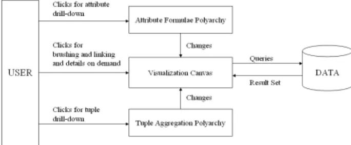
6.1 System Architecture
The architecture utilizes three primary components to support the visualization. The attribute formulae polyarchy wraps the formulae metadata and supports the user’s drill-down path. Similarly, the tuple aggregation polyarchy wraps the categorical metadata. Both components are coordinated with the visualization canvas. As users navigate either polyarchy, the canvas is changed to display the data associated with the new row or column headings. The visualization canvas may query the database to obtain financial values. This component architecture is shown in Figure 13.
Figure 13: System diagram showing the interaction between the components.
The visualization canvas acts on events that are generated by both the attribute and tuple polyarchies. It builds database queries and lays out visualizations based on these events. The user can also interact with visualization canvas through brushing and linking requesting details on demand.
6.2 Pivoting Across Hierarchies
Drill-down through the attribute formulae polyarchy follows the same model as the general polyarchy. Upon a pivot into a new hierarchy, the ratio is found in the second hierarchy and drill-down continues from that point. However, pivoting across the aggregation polyarchy requires a different approach. Because nodes are built based on grouping, the same node does not exist in both polyarchies. Pivoting across aggregation hierarchies should instead move the user to the deepest node that contains the same subset of points. On an initial pivot, this is usually the root node. However, when a user has drilled deep into one hierarchy, the corresponding location in the intersecting hierarchy may be a deeper node.
Figure 14 demonstrates a pivot from the geography hierarchy into the sector hierarchy and back again. The red links trace the drill-down path through the polyarchy. The yellow node shows a fixed node, where a user has set a second focus point. As the user traverses the polyarchy, the data is separated into different groupings based on categorical values. This is the same as the model used in the PivotTable.
Figure 14: Pivoting across aggregation hierarchies allows the user to drill-down based on different categorical values.
For each focal point, Breakdown Visualization keeps track of the last drill-down location in each of the aggregation hierarchies. This allows the system to determine its new location rapidly when a user reenters an aggregation hierarchy. This is demonstrated in Figure 14, where pivoting from the technology sector back into the geography hierarchy continues the drill-down from its last location.
Database queries are formed as the user drills down through the polyarchy. As the user navigates, the queries are built by adding additional filters to the WHERE clause. This query formation is analogous to that of Polaris [18].
7 Conclusion
Breakdown Visualization presents a technique for drilling down through aggregation polyarchies. This technique allows a user to build customized drill-down paths that can move between intersecting aggregation hierarchies. Using this technique, the visualization guides users as they drill-down through the aggregated datasets.
The visualization allows for decomposition of tabular data using tuple aggregation and attribute formulae polyarchies. These polyarchies allow a user the flexibility to navigate through tuple and attribute groupings. The customized drill-down paths along with the spreadsheet format allow users to compare the parent and children aggregates. This provides users with the ability to understand causalities that affect overall behavior. This understanding helps to improve an analyst’s decision-making capabilities.
Breakdown Visualization solves the problem of allowing independent drill-down paths by using the fix and move technique. This technique enables a user to compare low-level details between multiple focal points. Showing only the drill-down path and leaf nodes avoids the scaling issues that occur in a fully expanded tree.
8 Future
Work
Continued work is in progress to improve the capabilities of the user interface. This includes allowing the user to define the aggregation sequences that construct the tuple aggregation polyarchy similar to the PivotTable. Support is also needed to allow users to define customized formulae during analysis. This may include the ability to define formula by combining data primitives.
The polyarchical drill-down is a new approach for data exploration. Further studies are needed to evaluate its capabilities and differences when compared to visual pivot tables.
Acknowledgements
The authors would like to thank Raman Kumar for his introduction to DuPont Analysis along with his assistance in obtaining access to the COMPUSTAT data.
References
1. Becker, R. and Cleveland, W. Brushing scatterplots.
Technometrics, 29(2), pp. 127-142, 1987.
2. Chi, E., Barry, P., Riedl, J., Konstan, J., A Spreadsheet Approach to Information Visualization. Proc. IEEE Information Visualization, pp. 17-24, 1997.
3. Chi, E., Pitkow, J., Mackinlay, J., Pirolli, P., Gossweiler, R., and Card, S. Visualizing the evolution of web ecologies.
Proc. ACM SIGCHI, pp. 400-407, 1998.
4. COMPUSTAT Industrial Annual database,
http://www.compustat.com/, Standard and Poor, 2001. 5. Fua, Y. H., Ward, M., and Rundensteiner, E., Navigating
Hierarchies with Structure–Based Brushes. Proc. IEEE Information Visualization, 1999.
6. Furnas, G., and Zacks, J., Multitrees: Enriching and reusing hierarchical structure. Proc. ACM SIGCHI, pp. 330-336, 1994.
7. Graham, M., Kennedy, J., and Hand, C., A comparison of set-based and graph-based visualizations of overlapping classification hierarchies. Proc. ACM AVI, pp. 41-50, 2000. 8. Johnson, B., and Shneiderman, B., Tree-maps: A Space
Filling Approach to the Visualization of Hierarchical Information Structures. Proc. IEEE Visualization, pp. 284-291, 1991.
9. Lamping, J., Rao, R., and Pirolli, P., A Focus+Context Technique Based on Hyperbolic Geometry for Visualizing Large Hierarchies. Proc. ACM SIGCHI, pp. 401-408, 1995. 10. Microsoft Excel – User’s Guide, Microsoft, Redmond, WA,
1995.
11. Rao, R., and Card, S. The Table Lens: Merging Graphical and Symbolic Representations in an Interactive Focus+Context Visualization for Tabular Information. Proc ACM SIGCHI, pp. 318-322, 1994.
12. Robertson, G., Cameron, K., Czerwinski, C., Robbins, D., Polyarchy Visualization: Visualizing Multiple Intersecting Hierarchies. Proc. ACM SIGCHI, 2002.
13. Robertson, G., Mackinlay, J., and Card, S. Cone Trees: Animated 3D Visualizations of Hierarchical Information.
Proc. ACM SIGCHI, pp. 189-194, 1991
14. Ross, S., Fundamentals of Corporate Finance, McGraw Hill, 2000.
15. Roth, S., Lucas, P., Senn, J., Gomberg, C., Burks, M., Stroffolino, P., Kolojejchick, J., Dunmire, C., Visage: A user interface environment for exploring information. Proc IEEE Information Visualization, pp. 3-13, 1996.
16. Spence, R., Information Visualization, ACM Press, 2000. 17. Spenke, M., Beilken, C., and Berlage, T. FOCUS: The
Interactive Table for Product Comparison and Selection.
Proc ACM UIST, 1996.
18. Stolte, C., and Hanrahan, P., Polaris: A System for Query, Analysis and Visualization of Multi-dimensional Relational Databases. Proc IEEE Information Visualization, 2000. 19. Wilson, R., Bergeron, R., Dynamic Hierarchy Specification
and Visualization. Proc. IEEE Information Visualization, 1999.