Perceptually Optimizing Textures for Layered Surfaces
Alethea Bair*
Texas A&M University Donald House
# Texas A&M University
Colin Ware+ University of New Hampshire
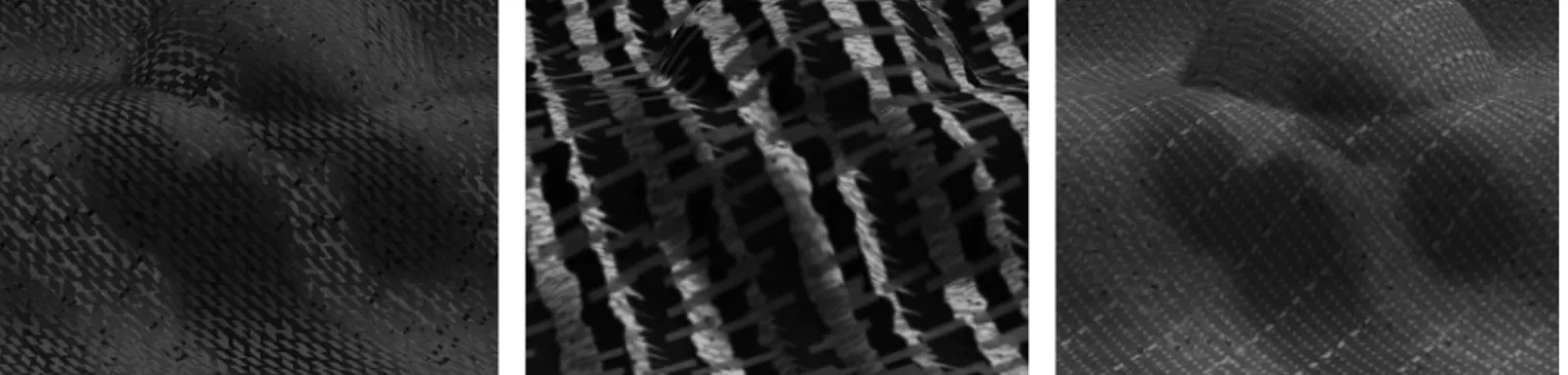
Figure 1: Experimentally determined highly-rated layered surface texturing solutions.
Abstract
In this paper, we take a new look at the problem of texturing surfaces so that they can be displayed layered over each other but remain clearly visible. Finding optimal textures that solve this problem is complex because of the perceptual interactions between the visual effects of parameters controlling texture generation. Instead of using controlled experiments to investigate this problem, we use a genetic algorithm based human-in-the-loop parameter space search to build a large database of human-rated textures. This database is then analyzed with a variety of data-mining techniques, including clustering, principle component analysis, neural networks, and histogram analysis. We detail this analysis, concluding with a set of guidelines for building strong layered surface textures, and a display of a number of example textures.
CR Categories: I.3.3 [Computer Graphics]: Picture/Image Generation; I.6.6 [Simulation and Modeling]: Simulation Output Analysis
Keywords: perception, visualization evaluation, layered surfaces, genetic algorithm, data mining, principal component analysis, neural networks
1 Introduction
The problem of visualizing layered surfaces is important in many application areas, including medical imaging, geological imaging, oceanography, and meteorology. However, the problem is difficult because of visual confounding between the images of the two surfaces. In real-life, examples of layered surfaces include objects behind foliage or smoke, or objects submerged in water. In such situations, we use a combination of stereoscopy, motion parallax, vergence and focusing of the eye to augment shading and shape cues to disambiguate the scene. On a computer display, however, many of these cues are not available.
Following Interrante et al. [1997], who reported that giving overlapping surfaces partially transparent textures can help to define and distinguish them, we are interested in exploring the problem of how to produce simple draped textures for two surfaces so that they remain clearly visible. Optimal textures, like those from our experiments shown in Figure 1, should reveal the shape of each surface without visually interfering with textures on other layers. Since textures can be arbitrarily complex, it can take ten to twenty parameters to define a texture with a reasonably complex set of texture elements and color components. Thus, using traditional psychophysical methods to find optimal parameter settings is impractical, since controlled experiments typically allow varying only one or two parameters at a time. Further, such experiments have limited applicability when the visual effects of varying parameters are highly interrelated and nonlinear.
2 Experimental Process
In other papers we outline our experimental methodology using a human-in-the-loop genetic algorithm to search the texture parameter space [House and Ware 2002, House et al. 2005], while collecting a database of rated textures. In our layered-surface experiment we used five subjects, each going through three runs of the algorithm, producing a database of 9720 textures, subjectively rated on a scale from 0 (unusable) to 9 (excellent visibility of both surfaces). Figure 2 shows the distributions of how textures were rated in the first generation (600 initial textures were generated randomly), and the ratings distribution of the complete dataset. Clearly the algorithm is successful in producing a high percentage of highly rated textures.
*email: [email protected] #email: [email protected] +email: [email protected]
For the experimental trials, a display of two textured overlapping surfaces was presented in stereo, using a frame sequential CRT display and shutter glasses, and visually rocked about the screen central vertical axis to provide motion parallax. Both stereo and motion cues have been shown to significantly improve three-dimensional comprehension [Ware and Frank, 1996]. There was no attempt to represent focus cues, however texture parameters providing low-pass filtering on each layer could be used to create the illusion that one or both of the surfaces were out of focus. Both the stereo and rocking motion provided very strong depth cues. Some of the highly rated textures from our experiments, especially ones with the top surface entirely semi-opaque, do not work at all as still frames, but are very clear with stereo and motion.
Figure 2: Ratings distribution for all experimental trials.
3 Parameterization
The texture generation algorithm that we used had a total of 61 parameters, or 122 parameters for a pair of textures for the two surfaces. Each texture was made up of four layers; a background and three layers of features composited over the background. Two of the feature layers were lines, and the third layer consisted of dots. Lines provided the ability to create crosshatching and linear structure, while dots provided the ability to create a high frequency, mottled look. We believe this to be a reasonably complete parameterization of the texture space. It can create all the textures used by Watanabe and Cavanagh [Watanabe and Cavanagh, 1996] and more. We do not, however, consider textures dependent on the surface such as those used by Interrante et al. [1997].
The textures were mapped onto the two surfaces shown in Figure 3, which were sized so that each surface was covered by 64 (8x8) texture tiles and arranged so that they were non-interpenetrating.
Figure 3: Bottom and top surfaces
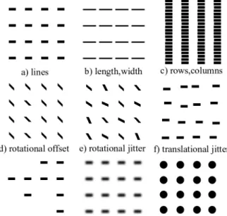
Textures were parameterized as follows. Each surface had a background HSV color, opacity (though the bottom surface was always opaque), overall rotation (which rotates all the feature layers together to angles between -45º and 45º), and a controllable low-pass filter width. Each feature layer consisted of features drawn on a grid, with an HSV color and opacity, and a variety of shape and drawing parameters. Some of the parameters used to vary the feature layers are shown in Figure 4.
Shown in Figure 4a is a standard set of lines on a 4x4 grid. Line length and width parameters shown in 4b, can be varied to change the line size and aspect ratio. Also, the number of rows and columns in the grid can vary to create large-scale ordering of the features, like the 20x4 grid shown in Figure 4c. Note that vertical lines are perceived, even though the actual feature lines are horizontal. The features are also given a rotational offset between -90° and 90° (45° shown), and horizontal and vertical offsets (not pictured). Features are randomized in several ways: rotational jitter is shown in Figure 4e, translational jitter in 4f, (horizontal and vertical jitter are separate parameters). Figure 4g demonstrates the drawing probability parameter (set at 0.5), which is the probability that a feature is drawn at each grid cell. Finally, Figure 4h demonstrates blurring, which is controlled by a parameter that adjusts Gaussian low-pass filter width. Dots and lines use the same parameters, except that dots use the width parameter as a diameter, and ignore length and rotational parameters. All features are drawn with the length and width parameters interpreted as fractions of grid cell diagonal length. As a result, the actual feature size depends both on the grid spacing and the length and width parameters. Finally, binary parameters were used to turn on and off the use of filtering, drawing probability, and rotational and translational jitter. These parameters were determined to have little benefit and will not be used in future experiments.
Figure 4: Parametric variations of feature layers.
4 Data Mining
Several techniques for data mining were used to explore the database of 9720 rated textures to extract information on what makes strong texture pairs for texturing layered surfaces. These included clustering, principal component analysis, neural
networks, and histogram analysis. Results for clustering were presented previously [House and Ware 2002].
4.1 Principle Component Analysis
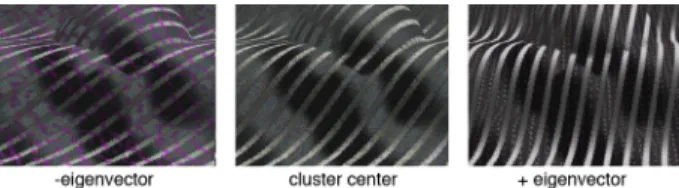
We used Principle Component Analysis (PCA) to find the principle directions of variance in the set of textures rated highly (either 8 or 9). Eigenvalues from the analysis measure the variance in the direction of each principal direction or eigenvector. For purposes of visualization, eigenvectors that account for a large portion of the variance within the clusters might be considered as 'free variables' that can be varied across the range of a cluster without degrading the quality of the textures. Figure 5 shows a cluster mean and two textures created by adding and subtracting the scaled principle eigenvector. The eigenvector changed the top rotation, as well as the hue, size, randomness and opacity of one of the top features. The texture on the bottom remains small and grainy, while the main features on the top – the lines, do not change at all. The cluster was rated an 8, and contained nine texture sets. Since cluster sizes were generally not large enough to run PCA for 122 variables, eigenvectors were found from the combination of several nearby clusters. It should be noted that if the scaling of the eigenvector puts the new texture set outside of the domain of the original cluster, this analysis is no longer necessarily valid. Even so, in many cases the eigenvector can be scaled far beyond these boundaries and the textures still have high quality.
Figure 5: Cluster center and textures along primary eigenvector. With our 122-dimensional data, the principle components have relatively large parameter components in many dimensions, making them difficult to interpret. Also, depending on the individual cluster, it requires around 85 of the 122 eigenvectors to account for 90% of the variance. This fits with our intuition that the space is highly non-linear, and the parameters interact in complex ways to make perceptually good textures.
By analysis of the eigenvectors, the features were ordered according to which ones tended to have more variation in all of the good clusters. The eigenvectors with the ten highest eigenvalues were selected. Then, features were ordered by the sum over the eigenvectors of the five highest magnitudes of the features in the selected eigenvectors. This approach was chosen as being reasonable through inspection of the data. Features with the highest sums might therefore be useful as free parameters when constructing good textures. This method does not provide specific rules for making good textures, since variation across the parameter space is ignored. However, it does give an indication of which parameters are more important, and suggests areas that should be looked at more closely.
Several trends were clear. Comparable parameters always varied more on the top surface than the bottom surface. Also, with the exception of opacity, comparable parameters for the surface background varied more than those for the features. This implies that the bottom surface characteristics are more important than the
top, and the element characteristics are more important than the background for creating good textures.
The color variables hue, saturation and value, were parameters of interest. In all cases, the hue and saturation variables had more variation than value. Certain settings of the value parameter are likely to be much better than others for creating good textures. On the other hand, saturation and hue might be free variables that can be used to encode other information, or simply to change the visualization to aesthetic taste. Interestingly, the parameters that encode the shape of the elements, such as the number of rows and columns in the grid, size and shape of the elements, and randomness of the features, always varied less than the color parameters. Thus we can conclude that the features must have good placement, size and shape before parameters like color, rotation and filtering can have much of an effect on visualization quality. Finally, the opacity of the top surface background and features varied more than expected. This is probably because the actual coverage of the top surface is a complex function of the four opacities, the size, randomness, separation and probability of being drawn of each of the features. Finally, binary variables, such as those used to switch randomization on and off, also displayed very high variance, but this was considered to be a false positive since a binary distribution is biased toward higher variability than a continuous variable.
4.2 Neural Networks
In order to learn more about the structure of the dataset, we constructed and trained a neural network to the data [Haykin 1999, Craven and Shavlik, 1997]. We built a 2-layer, fully connected back-propagation network with 122 inputs corresponding to the features space, 20 hidden, and 10 outputs corresponding to the 0-9 texture ratings. Sigmoid transfer functions between both sets of layers output 1 if the weighted input is above some threshold and -1 otherwise. So each texture is input as a vector of features, and the output is one of the classes (0-9). The 20 hidden units are a large data reduction, but the network learned to categorize with reasonable accuracy. Figure 6 shows the histogram of ratings given by the network for textures rated as a 9 by humans, showing that most are rated between 7 and 9. Histograms for the other rating groups had a similar spread. It should be noted that the human ratings are subjective and almost certainly varied from subject to subject. Although a network could learn an exact mapping of textures to weights, it would probably not generalize well to another dataset. Given a network that does a good job classifying the textures, understanding the meaning of the weights is difficult. The non-linearity of the sigmoid function prevents a simple analysis of weight vectors, however simply looking at which features had large magnitude weights proved interesting. Fortunately, many of the weights leading to the output layer were very small. If the weights leading to a specific output node are positive, large values of those parameters will increase the chance of the class being selected. Likewise, large values with negative weights decrease the chance of the class.
Figure 6: Network classification of all textures rated 9. Analyzing the weights for textures rated as 9 lead us to the following indications. The top background should have a small alpha, little blurring, and a high rotation. The top lines should have a grid with few rows, and the lines should have small length and thickness, small horizontal and rotational jitter, but large vertical jitter. The second set of lines should not be drawn, and the top dots should have a low probability of being drawn, a small size, and on a grid with few columns. The bottom surface should have a high value background color, with high value, highly saturated lines with few columns, and high value, low saturated dots with a small radius, and a lot of vertical variance. Figure 7 shows a texture we created based on these feature characteristics, where parameters unspecified by the analysis were generally set to the central parameter value. It actually works well as a single image, but is especially effective when rocked so that motion cues are available.
The results for textures rated as 8 had similar weights to those weighted 9, except they showed a tendency for the bottom surface to have a blue-violet hue, and the top dots a red hue. Interestingly, the hypothesis tests discussed later actually show a slight trend in the opposite direction. Again, the shape parameters show much stronger patterns than the color parameters. The anisotropic grid structure on top forms banding across the whole texture, and the high rotation on the top maximizes the comparative rotation between the perceived lines on top and bottom. Interestingly, the high vertical jitter on the top lines does not greatly increase the perceived randomness.
Figure 7: Texture created according to neural network weights.
We also looked at the weights that produce bad textures – those rated as 0. The results made sense. The top background is saturated and opaque, both the top lines and dots are small and transparent, and the bottom surface has saturated lines. This serves as a nice sanity check; bad textures are ones where you cannot see the bottom layer, and with almost no texturing visible on the top.
4.3 Histogram Analysis
Given the results from the clustering, PCA and neural networks, as well as a certain amount of intuition, various hypotheses were made and tested on the data through histogram comparison. We used Matlab [The Mathworks, Inc. 2003] for this portion of the analysis. The good data used for these tests are all textures rated either 8 or 9, and contained 3078 textures. For most hypotheses, the test was on some nonlinear combination of discrete and continuous variables. This nonlinear combination introduces structure in the distribution of the combined data. Thus, in order to understand what histogram analysis is telling us about the deviation of our data from purely random data, it is necessary, in most cases, to compare each histogram computed from our database with the corresponding histogram obtained from a data set whose parameters were generated from a uniform distribution.
4.3.1 Rotation
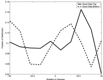
We first look at overall rotational orientation of the textures on the two surfaces. Figure 8 shows the distribution of rotations for the top and bottom surfaces. Note that in this case, since rotation of a surface is defined by only one parameter, the random distribution would be flat and so is not shown.
Since the features are all arranged on grid structures, which tend to create both horizontal and vertical banding, it makes sense that some relative rotation might help to visually separate the two surfaces. We see a strong tendency for the top surface to have about a 25° rotation, while the bottom surface tends to be at -45°, 5-15°, or 45°. This suggests that about a 10-20° difference in rotation across the surfaces might be optimal.
4.3.2 Filtering
Gaussian low-pass filtering was included both as a possible aesthetic aid, and to simulate depth-of-field cues. Figure 9 shows the filtering distributions for the top and bottom surfaces. Note that filtering was turned on and off with a binary parameter, so the random distribution is biased to have half of the textures with no filter (width of 1) and an even distribution for the other possible filter kernel widths. The bottom surface rarely uses the filter, but has a high kernel width when it is used. The top surface uses the filter more often, but uses a smaller kernel width when it does.
Figure 9: Filtering width on top and bottom surfaces
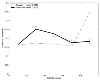
4.3.3 Top Coverage
Figure 10 compares top coverage in the good dataset with top coverage in a completely random dataset. Because of the complex interaction between the top background layer and the three layers of textures, a measure of top coverage was estimated as follows:
Here, C is the total coverage, αback is the background opacity, Ai is
the area covered by a feature layer, αi is the feature opacity and pi
is the probability of being drawn for a feature layer. This estimate assumes that the features are drawn randomly. Note that for cases like the middle texture in Figure 1, this measure of coverage is not accurate. The black lines have twice the frequency as the blue lines, so the blue lines exactly cover half of the black lines. The actual coverage does not change much, but the coverage by our calculated measure goes up significantly. For this reason, the average coverage is likely overestimated for high coverages and underestimated for small coverages, and the textures with an estimated top coverage of 1 or 0 can be ignored. With this in mind, the peak around 30-50% would probably move toward 50%, and be more pronounced. Interestingly, the top coverage mean for the good textures is almost exactly at 50%. Therefore we estimate that an optimal top coverage is somewhere in a range between 40-50%. Only five bins were used because opacity was discrete with five bins.
Figure 10: Estimate of total coverage on the top surface.
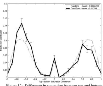
4.3.4 Color
Colors of the surface backgrounds and features were constructed with hue, saturation and value parameters. Common sense dictates that differences in these parameters between the top and bottom surface might improve the textures. Differences between surfaces were found by comparing the most prominent features, i.e. the features that covered the most area with the highest alpha and probability of being drawn. Value difference across the two surfaces is shown in Figure 11. Peaks at -0.7, -0.4, 0.4 and 0.6 show an interesting bimodal distribution that should be investigated further. However, only the peaks at -0.4, 0.4 and the dips at -0.6, 0.5 are significant according to the plotted confidence intervals. Also, the negative mean and the higher peak at -0.4 show a trend toward the bottom surface being 40% lighter.
Figure 11: Difference in value between the top and bottom surfaces.
The perceptual difference in saturation is slightly harder to calculate, since value affects the amount of perceived saturation. In the extreme case of black, there is no difference between fully saturated and unsaturated color. Therefore we measured the difference in saturation between surfaces as
Bottom Top Bottom Top difference
S
S
V
V
S
=
(
−
)
,where S denotes saturation and V denotes value. The nonlinearity of this equation is what produces the spike at zero seen in Fig. 12.
The most obvious pattern is a preference for textures where the bottom is about 70% more saturated than the top. There is also a smaller trend for the two surfaces to have the same saturation.
Figure 12: Difference in saturation between top and bottom surfaces.
Finally, difference in hue is only valid when both surfaces have high saturations and values. Therefore, we used
Bottom Top Bottom Top Bottom Top difference
H
H
V
V
S
S
H
=
(
−
)
,where H denotes hue, S denotes saturation and V denotes value. This multiplication of four variables causes the large spike at zero seen in Fig. 13. Interestingly, almost no significant difference from random is visible. This suggests that hue might be a free variable to be used aesthetically or to encode information, though the trend is a slight preference for the top being more violet and the bottom redder.
Figure 13: Difference in hue across surfaces. Next, we look at the randomness of each surface, as parameterized by horizontal, vertical and rotational jitter. We analyze the translational parameters separately from the rotational because there was no way we knew of to find a correspondence between perceived randomness with translation or rotation. Translational jitter was measured by,
2 2 vertical horizontal trans
J
J
J
=
+
Like the color comparisons, randomness comparisons were made between the most prominent features on each surface. Translational jitter, shown in Figure 14, shows that larger differences in randomness are preferred, with a bias toward the bottom being more random than the top. The rotational jitter comparison shown in Figure 15 also shows a preference for larger differences, and this time a bias toward the top being more random than the bottom. However, the bias magnitude is only about 1/15th the size of the translational randomness bias.
Figure 14: Translational jitter differences across surfaces.
Figure 15: Rotational jitter differences across surfaces We also looked at the size and shape of the features, as well as the grid structure on the top and bottom surfaces. First we discuss the area of the features and the area of the grid cells, since the two both contribute to the total size of the features. Figure 16 shows the product of the number of rows and number of columns for grids on both top and bottom surfaces, with the random distribution for comparison. The top surface has grids biased towards having fewer rows and columns, which will make the features on top larger (since the features are scaled by the diagonal of a grid cell). The feature area graph shown in Figure 17 also shows a preference for good textures having larger features on the top than the bottom. Interestingly, both the size and randomness bias is reflected in the layered texture examples chosen by Black and Rosenholtz [1995] of fence posts in front of grass, and blinds in front of a tiled floor.
Unequal numbers of rows and columns proved very important in the experiment, as anisotropic grids turned out to be a handy way to get large-scale order. The lines of dots seen on the top surfaces in Fig. 5 are a result of a top grid layer with about four times as many rows as columns. The type of information gained from long strokes on a curved surface can be present either in the grid horizontal to vertical ratio, or simply in the ratio of length to width of the strokes. Figures 18 and 19 show our results.
The most striking pattern is that in both cases, one surface tends to prefer a certain ratio when the other avoids it. It is likely that as the genetic algorithm evolved, the two surfaces starting with random distributions coevolved to tend toward different ratios. The feature size ratio shows a preference for the bottom having longer, skinnier features. The grid size ratio shows a preference for the top having more pronounced lines of features. This could either be the result of the top surface having lower frequency structure and thus showing up better with large-scale patterns and order, or simply because of a slight initial random bias in the distributions that was accentuated by the observed modes.
Figure 16: Grid density (rows x columns).
Figure 17: Feature area (length x width).
Figure 18: Feature aspect ratio
Lastly, we comment that the number of features drawn on the top and bottom surfaces with high probability and high opacity was generally either one or two. It was rarely necessary to use three feature layers to make a highly-rated texture.
Figure 19: Grid aspect ratio
5 Summary of Results
We attempt here to combine the results from the various data analysis methods into general guidelines for making layered surface textures. We then build textures based on these guidelines, demonstrating their effectiveness, as well as breaking some of the guidelines to see the effect.
For smoothly varying surfaces, like the ones used in our experiments, we can make the following recommendations for constructing effective textures:
• Textures across the two surfaces should have a relative rotation of at least 200 with respect to each other.
• Coverage (net opacity) on the top surface should be between 30 and 50%.
• Features on the top surface should be larger in scale than on the bottom surface.
• The top surface should appear more structured and the bottom surface more random.
• Aspect ratios of texture features should be different across the surfaces.
• Color values on the bottom surface should be 40% of full scale brighter than on the top surface. Alternatively, the top surfaces could be 40% of full scale brighter than the bottom. Saturation should also be higher on the bottom.
• Color hues can be chosen freely.
We can also observe that the use of low-pass filtering is not indicated, and that constructing textures from a single set of lines and a single set of dots is sufficient for producing strong results. Figure 20 (shown on the color plate page only) is a set of crossed eye stereo pairs demonstrating the effects of following and not following these rules. These give some idea of the actual presentation, although their low resolution and the absence of motion cues make them considerably weaker than they appear on screen. Nevertheless, they do indicate the trends we have found. Figure 20a is a default texture hand-created according to our results. Each surface has two feature layers with appropriate saturations, values, randomness, and filtering. The grid sizes and feature areas were picked from the most common range in the distributions, and the grid and feature aspect ratios were picked from the peaks for each surface in Figures 18 and 19. On the bottom, both feature layers were drawn with probability 100%, and on the top the first layer is drawn at 100% and the second at 40%. Figure 20b shows a version where the second feature layer on the top is drawn at 100% and the first not at all. While not quite as striking as 20a, it still does a good job of showing both surfaces. Note that when we left the first layer being drawn at 40% the larger features were quite distracting. Although not one of our rules, it makes sense that randomized features should be smaller than regular ones to avoid this distraction. Finally, Figure 20c shows a version with the blue and red hues switched between the top and bottom. The effect is much more strident, but still visually very readable, demonstrating our finding that hue is freely variable.
Next we break various rules. Figure 20d shows the result when the top surface has a very fine grid similar to the bottom surface. Even though the same top area is covered, the fine texture on the top blends with the texture on the bottom and it becomes very difficult to see the shape of the top. Figure 20e increases the top translational randomness, making the top shape harder to pick out. Figure 20f flips the top and bottom surface values, which makes the top surface very easy to read but the bottom surface is now too dark to easily see its texture or shading cues.
6 Future Work
We have completed a detailed study of the problem of texturing layered surfaces, using unusual parameter space search and data mining methods. Our results do not reach the level of theory, but do constitute a sound set of general guidelines for producing good textures.
Using the results from this experiment, we have designed a new experiment to further explore the layered surface texturing problem and to correct some of the shortfalls of the current experiment. The experiment will use a simplified set of variables, and fewer feature layers to simplify analysis. In this experiment, color will be generated in a perceptually uniform color space, and parameters will be defined so that concepts of interest have uniform or as close as possible to uniform distributions, which will produce histograms that are easier to analyze. The new experiment will also vary the surfaces themselves with each presentation, and provide a wide range of spatial frequencies in the surfaces, removing the bias toward very smooth surfaces inherent in the current experiment. Finally, it will use a more objective measure for quality evaluation than we used for the current work. We expect that the results will allow more subtle aspects of high-quality textures for this problem to be explored, and stronger guidelines to be developed.
7 Acknowledgements
This work was supported in part by the National Science Foundation ITR’s 0326194 and 0324899, the Center for Coastal and Ocean Mapping – University of New Hampshire, the Visualization Laboratory – Texas A&M University, and the Texas A&M Department of Architecture.
References
BLACK M. J., AND ROSENHOLTZ R. 1995. Robust Estimation of Multiple Surface Shapes from Occluded Textures. International Symposium on Computer Vision. 485-490.
CRAVEN, M., AND SHAVLIK, J. 1997. Using Neural Networks for Data Mining. Future Generation Computer Systems, 13, 211-229.
HAYKIN, S. 1999. Neural Networks, A Comprehensive Foundation, Second edition, Prentice-Hall, Upper Saddle River, NJ.
HOUSE, D., AND WA R E, C. 2002. A Method for the Perceptual Optimization of Complex Visualizations, Proceedings of Advanced Visual Interfaces (AVI’ 02), 148-155.
HOUSE, D., BA I R, A., AND WARE, C. 2005. On the Optimization of Visualizations of Complex Phenomena, Proceedings of IEEE Visualization 2005 (to appear).
INTERRANTE, V., FUCHS, H., AND PIZER, S.M. 1997. Conveying shape of smoothly curving transparent surfaces via texture. IEEE Trans. On Visualization and Computer Graphics 3(2) 98-117.
KIU, M-H., AND BANKS, D. C. 1996. Multi-Frequency Noise for LIC,
Proceedings of IEEE Visualization 96, 121-126.
THE MATHWORKS INC., 2003. Matlab 6.5.1.199709 Release 13.
WATANABE, T., AND CAVANAGH, P. 1996. Texture Laciness. Perception, 25, 293-303.
WARE, C., AND FRANK, G. 1996. Evaluating stereo and motion cues for visualizing information nets in three dimensions. ACM Transactions on Graphics 15(2) 121-140.