Liberal Arts and Engineering Studies California Polytechnic State University, San Luis Obispo
Visualizing Relationships between Related Variables:
Improving Physics Education through D3.js Network Visualizations
A Senior Project presented to the Faculty of Liberal Arts and Engineering Studies California Polytechnic State University, San Luis Obispo In Partial Fulfillment of the Requirements for the degree Bachelor of Arts in Liberal Arts and Engineering Studies by Stephanie Friend March 2015 © 2015 Stephanie FriendTable of Contents
Deliverable Background Physics Education Taxonomies Data Visualization Taxonomies System Architecture Visualizations Figure 1. Visualization of Problem Set Variable Distribution Figure 3. Relevant Equations to a Chapter Figure 4. Relevant Equations to a Variable Analysis and verification Evaluation Method Overall Rating of Visualizations Figure 5. Professororiented Visualizations Figure 6. Studentoriented Visualizations Figure 7. Undirected Graph Boxplots Table 2. Quantitative Analysis of Physics Majors/Minors Suggestions for Improvement Completion of Goals Societal impacts Beyond Cal Poly Personal Next Steps Conclusion ReferencesIntroduction
The use of data in web and mobile applications is exploding. Mass amounts of data are analyzed using complex algorithms and visualized using a variety of techniques and graphs. This information is often portrayed as a simple and understandable data visualization to help companies analyze information such as financial metrics or web traffic. Data visualizations have a similar potential to analyze and simplify information when used in the educational realm. phiMap is a web application that was conceptualized by two Cal Poly professors, Dr. Eric White and Dr. Sandrine FischerWhite. It began development this summer with the help of a physics student, George Jing. phiMap analyzes and visualizes physics problem sets and equations by allowing one to select specific exercises, chapters and more from an engineering physics book. phiMap then has the ability to audit these problem sets using physics education taxonomies and display relationships between concepts, equations, and exercises through useful visualizations. In my research, I have created Javascript visualizations for phiMap that serve to simplify the processes of both teaching and learning physics. These visualizations aim to present relationships between physics variables in an easy to understand manner, and they could eventually have a huge impact on physics education. phiMap could prove to be an amazing resource, first at Cal Poly and potentially across the United States.Deliverable
As my deliverable for my senior project, I have created four distinct network visualizations that augment phiMap. Each visualization uses phiMap’s database of chapters from Randall Knight’s Physics for Scientists and Engineers: A Strategic Approach, Standard Edition (3rd Edition, 2012) to portray information about the various topics to readers. This book was chosen due to its use in Cal Poly’s series engineering physics classes. Two of the visualizations are meant as tools for the professor when assigning problem sets, and two of the visualizations are meant as tools for the student whenlearning physics. The first set of visualizations is accessible within the phiMap web application and pulls directly from a database of problem sets that the Cal Poly physics department has chosen for their students. The second set of two visualizations is compatible with phiMap but work as independent web pages, as an examination into the possibilities that phiMap holds for benefits to students. The four types of visualizations are explained in more detail in the Implementation section of this paper.
Background
Similar Applications
Most web applications related to physics education focus on presenting problem sets and exercises to students. For example, Problem Roulette is a project that allows students to view random but topicrelated pastexam problems (Evrard). Mastering Physics is an online program by Pearson that allows students to view homework assignments and tutorials (Antonenko). The Problem Solving Learning Portal by Iowa State University captures the way that students solve problems by requiring them to fill in categories such as “relevant concepts” and “qualitative analysis”. phiMap fills a void by focusing on educational research and the professor, applying known taxonomies to problem sets and allowing professors to see the analysis.phiMap’s Approach
phiMap uses the Taxonomy of Introductory Physics Problems (TIPP) to analyze problem sets, which focuses on the cognitive processes that students used and knowledge domains that they have to access. The taxonomy views the student as completing 4 cognitive steps when processing knowledge: retrieval, comprehension, analysis, and knowledge utilization (Teodorescu et al, 2013). phiMap provides a variety of resources to analyze the problem sets using this taxonomy. Many of the visualizations that I have provided for use within phiMap use basic concepts from this taxonomy to analyze whether problem sets will be meaningful for students.Data Visualization Taxonomies
Existing taxonomies for data visualizations aid in designing the most effective visualization by dividing data visualizations into categories and determining an appropriate type of graph. There are 5 main categories that data visualizations are typically separated into (Introduction). Geospatial and temporal data visualizations are irrelevant to this project as they deal with geography and time. The three other main categories are multidimensional, hierarchical, and network. Network visualizations were chosen because in each instance, variables are connected to each other through a relationship. The specific type of network visualization used in this project is an undirected graph, or a nodeedge where the edge between two nodes does not have a direction. While undirected graph is the conventional name, especially within Computer Science, these types of visualizations are referred to as force graphs in D3, due to their relationship to physical properties to optimize the layout by repulsive nodes.System Architecture
phiMap is a web application, meaning that it utilizes the user’s web browser as the client, allowing the user to interact with a database. Once published, a web application can be visible to anyone with a web browser and an internet connection and is accessible on any device that can access the internet. The server side of the web application is built through the Django framework, Python, and a SQLlite database where the data is stored. Python is used to query the database and return information that can be represented in an HTML template or D3 data visualization, then returning the results in a format that can be used by template HTML files. Django makes a lot of things easier, such as interacting with a database in order to manipulate the data. The clientfacing interface of the web application is built with Twitter Bootstrap, HTML, CSS, Javascript, and the visualizations are created using the Javascript language, the JQuery library, and the D3 Javascript library. The D3.js Data Driven Documents Javascript library is intended for easy data manipulation and visualizations. It was chosen over other visualization libraries because of the vast documentation and examples that it has. D3.js is widely usedin industry, and knowledge of the library is a highly applicable skill as well. I implemented each visualization using D3 examples, and tutorials as a basis.
Implementation
Timeline
Visualizations were developed using an iterative process as well as regular input from the professors involved with phiMap. Research into creating the visualizations began in September and main development and incorporation of the visualizations into the phiMap database began in December. Weekly meetings with the phiMap team occurred October through February. 2014 September: Topic refinement, Research (Relevant technologies), Experimentation October November: Research (Visualization design), Experimentation, Paper December: First force graph visualization created, More research and experimentation 2015 January: Development February: Main development completed, User evaluation created March: User testing, Analysis, Final development, Paper, Presentation
Visualizations
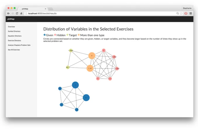
Four types of visualizations were created as part of my deliverable. These visualizations may be applied to each chapter in the phiMap database. Each visualization is outlined below. Professor-oriented Visualizations Problem Set Variable Distribution Figure 1. Visualization of Problem Set Variable DistributionThis visualization is meant to aid the professor in assigning problem sets to students. The visualization will show the professor if relevant variables to the chapter are distributed equally throughout the problem set. Equal distribution is represented not only by the number of times that the variable occurs, but also by whether the variable is meant to be solved for (the target variable), given as a specific value, or hidden (neither of the above). Once a problem set is selected to analyze, variables are connected in a nodeedge graph to other variables of the same type. A graph with a disproportionate number of one type of variable will appear unbalanced. A graph with a more even distribution of types, where variables occur as multiple types, will be more connected. A node also becomes larger as it occurs more times in a problem set, showing if a variable is over or underrepresented. Finally, a graph with a disproportionate number of one type of variable will appear unbalanced, while a graph with a more even distribution of types, where variables occur as multiple types, will be more connected. Problem Set Difficulty Figure 2. Visualization of Problem Set Difficulty
One is able to select a group of problems. These three problems are then represented as nodeedge graphs, and they are shown relative in difficulty to the other problems. Nodes represent variables and edges represent equations. Variables are closer in distance to each other if they occur together multiple times in the problem set, hypothetically making the problem easier. This visualization was not tested in the user evaluation.
Student-oriented Visualizations
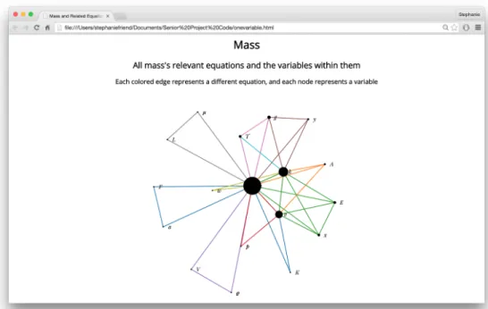
Figure 3. Relevant Equations to a Chapter
These two visualizations are meant to help the beginning physics student with their problem solving skills. Nodes represent variables and edges represent equations. In the first visualization, one variable (in this case, mass) is centralized, and all related equations and variables are connected. In the second visualization, all relevant equations to Chapter 14 are represented as a set of lines and variables. Each equation is connected to other equations by cooccurring variables. Both visualizations have the potential to help students when trying to solve a problem for a specific variable. Students can visually see how different variables are connected to each other and better connect the dots for which equations they can use to solve a problem.
Analysis and verification
Evaluation Method
A user evaluation was created to analyze the success of my visualizations and obtain suggestions on how to improve their usability. This evaluation can be viewed here. The evaluation contains
demographic questions about the participants as well as quantitative and qualitative questions about the visualizations. Following the demographic portion, the evaluation contains two main sections to evaluate the success of the visualizations created for my senior project. One section focuses on a visualization meant for professors, while the other section focuses on two visualizations meant for students. Two versions of the evaluation were distributed, each with a different set of visualizations shown first. The evaluation concludes with general questions about how the visualizations could improved as well as possible applications within physics education. The evaluation was distributed to 2 physics classes and the physics department. 61 participants had taken the survey at the time of analysis. 3 were professors, 4 were physics majors or minors, and all other participants were currently in a physics class. 27% had experience with visualizations and 17% had experience with undirected graphs.
Overall Rating of Visualizations
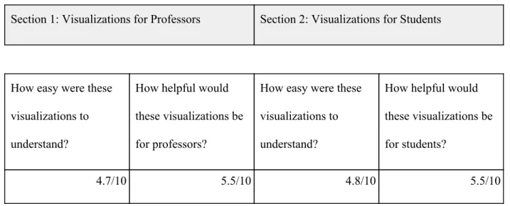
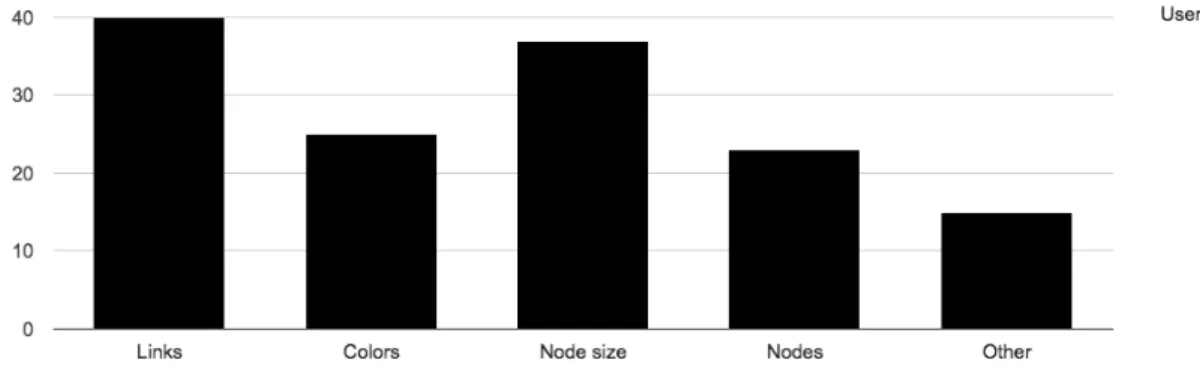
I asked 2 main questions about each set of visualizations. Each question could be answered from 110 on the Likert scale. This data can be seen below. Each mean was within 0.5 of 5, but the standard deviation for each data point was around 2.5, showing that the data had a wide spread. Even though my data was slightly lower than my goal, the large standard deviation shows that many people still found the visualizations easy to understand, as well as useful. Section 1: Visualizations for Professors Section 2: Visualizations for Students How easy were these visualizations to understand? How helpful would these visualizations be for professors? How easy were these visualizations to understand? How helpful would these visualizations be for students? 4.7/10 5.5/10 4.8/10 5.5/10Table 1. Quantitative Analysis of All Participants One of my goals in user testing was obtaining specific information on the aspects of the visualizations that the participants found confusing. For both visualizations, 40% of users found the meaning of the lines confusing. 15 30% of participants found other aspects of the graphs as well. This data can be seen in the bar graphs below.
Figure 5. Professor-oriented Visualizations
Figure 6. Student-oriented Visualizations
Demographic Influences on Data
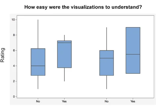
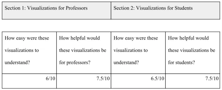
Knowledge of directed and undirected groups raised the mean of how easy it was to understand the visualizations. A difference in the spread of the data can be seen in the boxplots below. This information predicts that if the intended user was first taught about undirected graphs, they would be able to better understand the meaning of the visualizations. Figure 7. Undirected Graph BoxplotsIt is difficult to compare the results of students compared to professors due to the low number of participants, and each professor had varied responses to each question. However, physics majors rated the application much higher than engineering physics students. This information can be seen below.
Section 1: Visualizations for Professors Section 2: Visualizations for Students How easy were these visualizations to understand? How helpful would these visualizations be for professors? How easy were these visualizations to understand? How helpful would these visualizations be for students? 6/10 7.5/10 6.5/10 7.5/10
Table 2. Quantitative Analysis of Physics Majors/Minors
Suggestions for Improvement
In addition to the numerical data I collected, I also gained qualitative suggestions as to how to improve my visualizations. Many students asked for an improved key to explain the visualizations in detail. Participants also thought that an example problem or more labels and explanations alongside the visualization would be helpful as well. There seemed to be the most confusion over the lines in the visualization, with many suggestions for them to appear more spread out or for some of them to be removed.
Completion of Goals
I had a few personal goals as well while completing my senior project. I gained a thorough understanding of the capabilities of the D3 Javascript library. I also gained familiarity with Python and Django, connecting frontend code with data and and basic knowledge of best visualization design practices.Societal impacts
The societal impacts of phiMap are immense. Once complete, it will not only have the ability to impact engineering physics classes at Cal Poly but also the potential to impact physics education across theUnited States. Through the use of different teaching methodologies for physics, phiMap will lead to new and innovative ways to teach physics. It also serves as a platform for future physics, computer science, design, and possibly education students to enhance their skills and improve their resumes. The work on phiMap will never be complete, as new visualizations, relationships, and methodologies can always be created and studied. Through the use of my visualizations, teachers will be able to analyze problem sets and better serve their students, improving the success of students in physics courses at Cal Poly and beyond.
Beyond Cal Poly
As phiMap gains more capabilities, it would also be optimal to expand its scope past Cal Poly. This is difficult due to the need for a database of problems; however, many schools use the same textbook. phiMap could also provide the ability for users to upload their own textbooks or problem sets for analysis as a solution to this problem. Furthermore, it would be interesting to look into how quickly physics textbooks become out of date and how this would affect the viability of phiMap. However, my visualizations are independent of the current data and therefore could be used with any textbook.
Personal Next Steps
Individually, I plan to continue growing my knowledge of the D3 library, Javascript, and visualization design. The technology industry is continuing to become more datadriven, and with a deep technical knowledge of the API, I can become a highly valuable software engineer and user interface designer, using my expertise for a variety of circumstances.
Conclusion
As technology continues to grow, data visualizations will become an important educational resource for all fields of study. The possibilities for influencing physics education through phiMap are immense dueto the variety of important relationships that could be portrayed. My research and work on the data visualizations will be instrumental in making sure phiMap is as effective as possible. Through the proper use of physics education and data visualization taxonomies, phiMap could become an amazing and easy to understand resource for professors and students alike.
References
Antonenko, Pavlo D., Craig A. Ogilvie, Dale S. Niederhauser, John Jackman, Piyamart Kumsaikaew, Rahul R. Marathe, and Sarah M. Ryan. "Understanding Student Pathways in Contextrich Problems."Education and Information Technologies 16.4 (2011): 32342. Web. Evrard, August E et al. "Problem Roulette: Studying Introductory Physics in the Cloud." American Journal of Physics (2013): n. pag. Web. Handbook of Data Visualization. Berlin: Springer, 2008. Heer, Jeffrey, and Maneesh Agrawala. "Software Design Patterns for Information Visualization." IEEE Transactions on Visualization and Computer Graphics, 12.5 (2006): 853860. Iliinsky, Noah P. N., and Julie Steele. Designing Data Visualizations. Sebastopol, CA: O'Reilly, 2011. Print. "Introduction to Data Visualization Tags: Data, Visualization ."Visualization Types. N.p., n.d. Web. 30 Nov. 2014.Kirk, Andy. Data Visualization: A Successful Design Process; a Structured Design Approach to Equip You with the Knowledge of How to Successfully Accomplish Any Data Visualization Challenge Efficiently and Effectively. Birmingham, UK: Packt Pub, 2012. Kosara, R, F Drury, L.E Holmquist, and D.H Laidlaw. "Visualization Criticism." IEEE Computer Graphics and Applications, 28.3 (2008): 1315. Krusberg, Zosia. "Emerging Technologies in Physics Education." Journal of Science Education and Technology, 16.5 (2007): 401411. Teodorescu, Raluca E., Cornelius Bennhold, Gerald Feldman, and Larry Medsker. "New Approach to Analyzing Physics Problems: A Taxonomy of Introductory Physics Problems." Physical Review Special Topics Physics Education Research 9.1 (2013): n. pag. Web.