AN OVERVIEW
Rajender Parsad, Manoj Kumar Khandelwal and RS Tomar I.A.S.R.I., Library Avenue, Pusa, New Delhi - 110 012
[email protected], [email protected]; [email protected] 1. Introduction
JMP Statistical Discovery Software is a comprehensive and interactive statistical package. It dynamically links data with graphics for interactive exploration, understanding, and visualization of the data. This allows one to click on any point in a graph, and see the corresponding data point highlighted in the data table, and other graphs. It can work with a variety of data formats, such as text files, Microsoft Excel files, SAS datasets, and ODBC-compliant databases. It supports Windows, Macintosh and Linux operating systems. It has a flexible working environment: user-friendly menu-based interface for the new user and allows for custom programming and script development via JSL, "JMP Scripting
Language". JSL is an interpreted scripting language which is executed at runtime, and provides for manipulating JMP application platform objects in a coherent and coordinated way. It is a SAS Product and was founded by John Sall in 1989. It is generally pronounced as “jump”. The latest version is JMP 9. More details about JMP can be seen at www.jmp.com. The other JMP products are JMP Clinical and JMP Genomics.
2. Getting Started with JMP Statistical Discovery Software
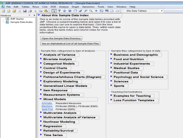
To open JMP Software, Go to Start Programs JMP JMP 8 or Just double-click the icon on your desktop. Initial view of JMP is a menu bar, a toolbar, the Tip of the Day window, and the JMP Starter window. See Figure 2.1
Figure 2.1: First view of JMP Window
Tip of the Day window provides tips about using JMP that you might not know. It can be closed by selecting close button. To view it again, select HelpTip of the Day.
JMP Starter window is helpful in navigating in JMP. It presents a collection of starting points, grouped by categories that organize platforms and commands by task with descriptions to guide ones selections. One can browse the various options available through
Click Category. These categories include File, Basic, Model, Multivariate, Reliability, Graph, Surface, Measure, Control, DOE, Tables and SAS. In case, JMP Starter Window gets closed, one can always return to the JMP Starter window by opening it from the View menu (ViewJMP Starter). A brief description of these click categories is given in the sequel.
File category consists of various options such as
Model Category:
Reliability Category:
Surface Category:
Measure Category:
DOE Category:
SAS Category:
From JMP Starter window, one can also select Preferences. The choices available are:
general operation and appearance of JMP.
background color of windows and graphs.
type, style, and size of fonts.
graphic formats for copy and drag results from RTF and HTML files.
communications settings.
default directory paths for file locations.
results initially presented by each analysis or graph platform.
settings for importing and exporting data to suit our needs or situation. The JMP Statistical Discovery Software has the following Menu bar.
Menu Headings:
File performs most routine file functions, such as opening, closing and saving.
Edit performs most common editing functions such as cutting and pasting.
Tables performs table functions, such as sort, subset, join, transpose and merge.
Rows performs row operations (JMP treats rows as observations).
Cols performs column operations (JMP treats columns as variables).
DOE facilitates the Design of the Experiment.
Analyze performs most statistical analyses.
Graph generates a variety of plots.
Tools displays analysis window tools.
View appears only under the Windows operating system environment.
Window selects among currently opened windows and performs window operations.
One can see below the detailed description of all the options available in above-mentioned menu headings.
FILE MENU
builds the new data table, new script window, new project and new Journal.
opens an existing JMP data table.
closes the active window.
writes an open text file to a JMP data table.
writes the active data table, journal, or layout to a file.
restores the current data table to its condition when it was last saved.
links to data base at a different location.
lets one to open an internet browser within JMP.
selects default preferences.
printing options.
previews ready to print window.
selects desired print format.
reveals a submenu that lists the JMP tables, scripts, and journals most recently opened.
saves the script of the executed analysis.
saves the executed analysis and data table as a project.
exits JMP software.
EDIT MENU
undo the last action if possible.
redo the last action if possible.
cuts selection and keeps it in clipboard.
copies selection.
copies selection only in text format.
preserves the data table's column labels in the copied image
uses the first line of information on the clipboard as column headers.
clears the data at the end of the current data table.
selects all data in data table.
saves selection in desired format.
runs script if there is one in the current window.
submits the JMP scripts as a SAS program to SAS server.
gives the ability to find and replace text in data tables and scripts.
finds the line in the data table for observations that meet our criteria.
saves a report just as it appears in the report window.
reveals a submenu to customize menus and toolbars. Revert to factory defaults resets the menus and toolbars to the arrangement when we first installed JMP.
TABLES MENU
ROWS MENU
request summary statistics by grouping columns.
creates a new data table that is a subset of the active data table.
sorts a JMP data table by one or more columns.
creates a new data table from the active table by stacking specified columns into a single new column.
creates a new data table from the active table by dividing one or more columns to form multiple columns.
creates a new data table by interchanging rows and columns.
creates a new data table from two or more open tables by combining them end to end.
creates a new data table by merging (joining) two tables side by side.
updates one data table with values from a second table.
displays descriptive statistics in tabular format.
creates a new data table showing the pattern that the missing data in original data table creates.
* Recall that JMP treats rows as observations
excludes selected rows from statistical analyses.
suppresses (hides) rows so they do not appear in plots and graphs.
labels or identifies points on all scatter plots.
changes highlighted points in all scatter plots to the colors one select.
lists markers.
searches for observations meeting our criteria.
returns to last selection.
utilities on row selection.
clears all active row states in the data table.
lets one color or mark points in plots.
lets one browse or edit cells.
deletes all selected rows from a JMP data table.
adds new rows (default=20)
moves highlighted rows to the location one specify in the move rows window.
lets select rows, create subsets and animate selected rows.
COLS MENU
*Recall that JMP treats columns as variables
creates a new column.
add more than one column at a time to a table.
highlights a specific column in the table.
opens the column information for a selected column.
assigns a role to the selected column and saves the role with the data table.
displays the column's formula editor to create a formula that computes column values.
lets one set up a column so that it only accepts certain values.
is a toggle command that labels or identifies points on all scatter plots.
locks column into left-most position in the data grid
is a toggle command that suppresses (hides) columns so they do not appear in plots and graphs.
is a toggle command used to exclude selected columns from statistical analyses.
lets one apply attributes and properties to multiple columns.
lets one move columns according to the selection from its submenu:
deletes selected columns from the data table.
lets one quickly recode data that is coded incorrectly.
DOE MENU
create a design tailored to meet specific requirements.
allows one to specify continuous factors, and two- and three-level categorical factors.
define a number of continuous factors.
specify a set of continuous and categorical factors with arbitrary numbers of levels.
define a set of factors that are ingredients in a mixture.
creates a design by spreading the design points out to the maximum distance possible between two points.
create an optimal design for models that are nonlinear in the parameters.
make inner and outer arrays from signal and noise factors.
optimize a recipe for a mixture of several ingredients.
add more runs to an existing data table. Replicate, add center points, fold over or add model terms.
computes power, sample size, or the effect size one want to detect for a given alpha and error standard deviation.
ANALYZE MENU
investigates the distribution of values in each column.
studies the relationship of two variables.
models one or more response variables with one or more predictor variables.
fits one or more y variables to a model of x variables.
performs nonlinear modeling, time series analysis and neural network analysis.
explores correlation, scatterplot matrix and performs cluster, principal components, discriminant and item analysis.
performs reliability, survival and recurrence analysis. Here is a brief description of the Analyze platforms:
Distribution describes the distribution of each column one choose for analysis with histograms, box plots and normal plots for continuous columns, and divided (mosaic) bar charts for nominal and ordinal columns. One can also compare the computed mean and standard deviation of the distribution to a constant and examine the fit of a variety of different distributions.
Fit Y by X describes each pair of X and Y columns one specify. The displays and reports vary depending upon the modeling types (continuous, nominal, ordinal) one assign to the X and Y columns. The four combinations of response and factor modeling types lead to the four analyses: bivariate analysis, one-way analysis of variance, contingency table analysis, and logistic regression.
Matched Pairs analyzes the special situation where multiple measurements are taken on a single subject, and a paired t-test or repeated measures analysis is needed.
Fit Model gives the general fitting platform for fitting one or more Y columns by all the effects one create. The general fitting platform fits multiple regression models, models with complex effects, response surface models, and multivariate models including discriminant and canonical analysis. Leverage plots, least-squares means plots, and contour plots help one visualize the whole model and each effect. Special dialogs lets one request contrasts, custom tests, and power details. The Fit Model platform also has special effect screening tools such as the cube plots, a prediction profiler, and a contour profiler, for models with multiple responses.
Modeling is for advanced models that are nonlinear in their parameters, or models that have correlated terms. In some cases, the form of the model is not important.
Screening provides analysis of screening designs.
Nonlinear fits the response (Y) as a function of a nonlinear formula of the specified x variable and parameters. Nonlinear fits models that are nonlinear in their parameters. Nonlinear fitting begins with a formula one can build in a column using the formula editor. This formula has parameters to be estimated by the nonlinear platform. On launching Nonlinear, one can interact with a control panel to do the fitting and plotting of results.
Partition fits classification and regression trees.
Neural Net implements a simple one-layer neural net.
Time Series performs simple forecasting and fits ARIMA models.
Gaussian Process fits no-error-term models. These are common in areas like computer simulations, where a given input always results in the same output.
Categorical does tabulation and summarization of categorical response data.
Choice performs analysis of choice experiments, and for making probabilistic statements about human choice. Useful in marketing research and product design.
Multivariate Methods provide analysis methods for multivariate data. Cluster analysis, correlations, principal components, and discriminant analysis are the purveyance of this set of tools.
Multivariate describes relationships among response variables with correlations, a scatterplot matrix, a partial correlation matrix, the inverse correlation matrix, a multivariate outlier plot or a jackknifed outlier plot, and principal components analysis. One can also display the covariance matrix and see a three-dimensional spinning plot of the principal components.
Cluster clusters rows of a JMP table using the hierarchical, k-means, or EM (expectation maximization) method. The hierarchical cluster method displays results as a tree diagram of the clusters followed by a plot of the distances between clusters. The k-means cluster option, suitable for larger tables, iteratively assigns points to the number of clusters one specify. The EM mixture clustering method is for mixtures of distributions and is similar to the k-means method.
Principal Components performs principal component analysis. The purpose is to derive linear combinations of variables that describe the variability in the original variables.
Discriminant predicts classification variables (nominal or ordinal) based on a known continuous response. Discriminant analysis can be regarded as inverse prediction from a multivariate analysis of variance.
PLS analyzes data using partial least squares.
Item Analysis fits response curves from Item Response Theory (IRT) for analyzing survey or test data.
Reliability and Survival allows analysis of univariate or multivariate survival and reliability data.
Life Distribution performs analysis of time-to-event data, including distributional fitting.
Fit Life by X provides for accelerated life-testing analysis.
Survival analyzes survival data using product-limit (Kaplan-Meier) survival computations.
Fit Parametric Survival launches a personality of the Fit Model platform to accomplish parametric fitting of censored data.
Fit Proportional Hazards launches a personality of the Fit Model platform for proportional hazard regression analysis that fits a Cox model.
GRAPH MENU
produces bar and pie charts.
produces overlay of a single numeric or categorical x column and all specified numeric y variables.
produces a three-dimensional rotatable display of values from any three numeric columns in the active data table.
constructs a contour plot for one or more response variables, y, for the values of two x variables.
is a scatter plot which represents its points as circles and see up to five dimensions at once (x position, y position, size, color, and time).
draws a parallel coordinate plot, which shows connected line segments representing each row of a data table.
produces a rectangular array of cells drawn with a one-to-one correspondence to data table values.
displays tree maps.
allows quick production of scatterplot matrices.
constructs a plot using triangular coordinates
used to construct Ishikawa Charts, also called Fishbone Charts, or cause-and-effect diagrams
produces quality control charts.
Variability or Continuous Gauge charts are for responses whose values can be measured on a continuous scale. Attribute Gauge charts are for responses whose values are binary or categorical.
produces Pareto Charts.
used in quality control, measures the conformance of a process to given specification limits.
is available for tables with columns whose values are computed from model prediction formulas.
works the same as the Profiler command.
plots surfaces and points in three dimensions based on formulas or data.
is available for tables with columns whose values are computed from model prediction formulas.
TOOLS MENU
VIEW MENU
opens the JMP Starter Window.
displays a pane at the left side of the JMP window that lists the name of each window opened in JMP.
displays a pane at the left side of the JMP window that shows PC's file system.
displays a pane at the left side of the JMP window that lists all open projects.
displays a pane at the bottom of the JMP window that monitors JSL statements (JSL scripts) as they execute.
displays a window that lists all available toolbars with a checkbox to show or hide them.
detach or re-attach the log window to the bottom of the screen, right-click log and select float log window
hides or shows the status bar at the bottom window edge.
Arrow: A default tool used to identify, highlight, and magnify points. Click on a point to highlight it. Click and hold on a point to identify the point. Shift-Click to extend a selection
Help: To access JMP Help. Select the help tool and then click graphs, plots, or tables to see help windows.
Selection: To select rows and columns in the data table or areas of a report. Use Shift-Click to extend the selection. To deselect click in the selected area.
Scroller: To grab a report and scroll by dragging.
Grabber: To direct manipulation of plots, charts, axes, and formula components.
Brush: To highlight an area of points in plots. When one clicks, a rectangle appears. Move the rectangle over points to highlight them. Alt-Click to change the size of the selection rectangle and also extend the selection.
Lasso: To highlight an irregular area of points in plots.
Magnifier: To zoom in on any area of a plot. Alt-Click to restore the original plot.
Crosshairs: A movable set of axes to measure points and distances in graphical displays.
Annotate: To add editable text notes to a JMP report, journal, or layout window.
Line: To draw thin, thick, or dashed lines which can have arrows on the ends.
Polygon: To draw any shaped polygon. May be spline smoothed.
Simple Shape: To draw either oval shapes or rectangles. May be filled or raised for a three-dimensional effect.
WINDOWS MENU
displays a duplicate view of an open data table.
closes all data tables when the active window is a data table.
closes all open windows.
organizes the open windows within JMP.
redraws active window.
quick way to change the font size JMP uses.
moves the active window behind all other windows generated by the current JMP session, leaving the next window in the sequence showing.
changes the name of an active JMP window.
suppresses the display of the active window but does not close it.
displays a list of all hidden windows
allows one to select the window one want to be the active window.
HELP MENU
To access the main help features from the help menu in JMP.
Figure 2.2: JMP Help Window and Statistics Index Window
One can read books on JMP in *.pdf format using Help Books (JMP Introductory Guide, JMP User Guide, JMP Stat and Graph Guide, JMP DOE Guide, JMP Scripting Guide, JMP Menu Card, JMP Quick Reference Card etc.). Also there is a Statistics Index window available in HelpIndexesStatistics. From this window one can get help about various statistical terminologies with Topic help and an example on it. See on the right of Figure 2.2.
3. Working with JMP Importing Data
If one have data that exists in a format other than a *.jmp file, one can import it and save it as a JMP data table. The list below gives the file types which can be imported into JMP.
Microsoft Excel (.xls), Microsoft Excel 2007 (.xlsm, .xlsx, .xlsb) on Windows.
Text (.txt).
Text with comma-separated values (.csv).
Tabbed separated values (.tsv).
SAS transport (.xpt, .stx) files.
Minitab files (.mtw, .mtp).
FACS (.fcs).
Microsoft Access Database (.mdb) on Windows.
Database (dBASE) (.dbf, .ndx, .mdx) on Windows.
Data (.dat) files.
HTML (.htm, .html).
SAS versions 6-9 (.sd2, .sd5, .sd7, .sas7bdat) on Windows.
3.1 Open a JMP Data Table : There are several ways to open a data table:
Go to the Sample Data directory in its default location. For example:
D:\Program Files (x86)\SAS\JMP\8\Support Files English\Sample Data
The Sample data can also be viewed from menu Help Sample data. It opens a screen which look like as Figure 3.1.1. One can open a number of sample JMP tables from various listed disciplines.
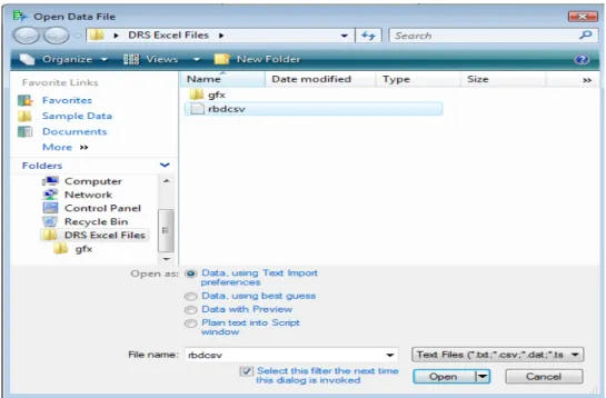
3.2 Open an Excel file in JMP
Selecting File Open (or clicking the Open Data Table button on the JMP Starter window) presents a file selection window with a list of existing tables.
By clicking the drop-down menu just above the Open Tab, displays a list of files with extensions which one can open in JMP. One can open an EXCEL file by selecting *.xls, *.xlsx files. Alternatively, On clicking All files select the required Excel file, one gets 3 options for Always enforce Excel Row1 as labels, as "Best Guess", "Always" and "Never". It is preferred to use Best Guess option to open an Excel file (See Figure 3.2.1)
Figure 3.2.1: Opening a Excel file through Open Data File dialog box
3.3 Open a CSV (Comma Separated Value) file in JMP :
Go to File Open. It opens the Open Data File dialog box. Now click Text files from the drop-down button just above Open tab. Select the required CSV file by browsing then it displays 4 options. Select any of the first three options to open the file.
3.4 Creating a New Data table
JMP data tables (Figure 3.4.1) have two parts: 1) data grid containing rows and columns of data, and 2) three data panels for the whole table, columns, and rows. The counts of table rows and columns appear in the corresponding column and rows data panel. In the data grid, a row number identifies each row, and each column has a column name. Within the data grid’s red triangles for rows and columns, specific data can be selected based on variable attributes, and rows can be marked by specific column information, and column variables can be pre-designated as X, Y, weights, or frequency. Within the data panel red triangle for the whole table, summary statistics can be computed, missing data patterns can be analyzed, and table transformations (sort, transpose) are possible. These same options are available on a full menu bar under Table, Columns, or Rows.
Figure 3.4.1: A Data Table
To create a new data table Select FileNew Data Table. To edit any column properties like column name, data type, modeling type and format etc. just double-click that column and do the required changes. It's very simple to enter the data just like MS-EXCEL. One can enter the values one by one and press enter key. If one wants to add multiple rows at once then right-click in the blank space say, say after seventh row then a Add Rows dialog box opens as in Figure 3.4.2. One can specify the number of rows to add. Similarly to add a new column, right-click on the blank space next to the last column. JMP data table is saved with *.jmp extension.
Figure 3.4.2: Add Rows Dialog Box
Specifying the Values’ Type :
The small icon to the left of the column name in the columns panel can be used to declare the modeling type of the variable. JMP uses three modeling types to determine how to analyze the column’s values:
Continuous ( ) Values are numeric measurements.
Ordinal ( ) Values are ordered categories, which can have either numeric or character values.
Nominal ( ) Values are numeric or character classifications. To assign a different modeling type to a variable
1. Click the icon next to the variable name. 2. Select the appropriate modeling type.
The cursor changes to a hand when you move the mouse over a red triangle icon (also called Hot-spot button) ( ) and diamond-shaped disclosure button ( ). Click the red triangle to reveal the menu and select a menu icon. Clicking the disclosure button opens and closes sections of the output report.
4. Data Management in JMP
4.1 Creating a Subset Data TableOne can create a new data table that is a subset of all rows and columns, only highlighted rows and columns, or randomly selected rows from the active data table.
Steps: First select the rows or columns that one wants to take in new data table. Select
TablesSubset. A Subset window appears as in Figure 4.1.1
Figure 4.1.1: Subset Window
Options in Subset Window
One can select various options from Rows & Columns list. Some important options are discussed below:
1. Random - sampling rate: Creates a subset table whose data is a random proportion of the active data table. Enter the proportion of the sample in the text box. For example, if one wants a random 50% of the data to be included in the new table, enter 0.5 in the text box. 2. Random - sample size: Creates a subset table whose data is a random sample of the active
data table. Enter the size of the sample in the text box. For example, if one want 16 random rows to be included in the new table, enter 16 into the text box.
3. Output table name: One can give the name of output table name. After clicking OK, a new data table gets created.
4. Link to original data table: To keep the subset table and any plot or graph of that subset table linked to the original table, check this box..
5. Copy formula: To include formulas from the original table in the output columns, check this box.
6. Suppress formula evaluation:To prevent JMP from evaluating columns’ formulas when
the new table is created, check this box.
Stratified Subsets
If one specify a sample size and add stratification columns, the sample size represents the size per stratum, rather than the size of the whole subset. See Figure 4.1.2.
Figure 4.1.2: Stratified Subset option
There are also two columns that can be saved for stratified random subsets, Selection
Probability and Sampling Weight. Check the corresponding check box to save these columns.
Creating a Subset Data Table from a Report
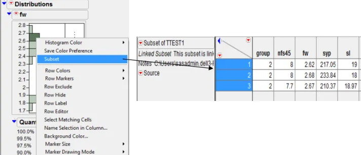
The following given two methods produce linked subsets table from a data table. 1) Using a Histogram
Open TTEST.xls file. Select Analyze Distribution. Put fw in Y, Columns OK. One can use the histogram to create a new data table containing the data in the histogram’s highlighted bars. To create a subset, double-click a highlighted bar. Or, right-click anywhere in the histogram and select Subset from the menu. The subset table appears, as shown in Figure 4.1.3.
2) Using a Pareto Plot
From the output that contains a Pareto Plot (by selecting GraphPareto Plot), one can use the Pareto Plot to create a new data table containing the data in the Pareto Plot’s highlighted bars. To create a subset, double-click a highlighted bar.
Figure 4.1.3: Subset created from a Histogram of variable fw from TTEST data table
4.2 Sorting Data Tables
One can sort a JMP data table by columns in either ascending or descending order. By default, columns sort in ascending order. One can either create a new table that contains the sorted values, or replace the original table with the sorted table. By default, it creates a new data table as Untitled.
Steps: Open TTEST.xls file. Select Tables Sort. Highlight the name of the column by which one would like to sort, say nfs45. See the Sort window as in Figure 4.2.1. Click the By button to add them to the sort list The columns one add to the list establish the order of precedence for sorting. To replace the original data table with the sorted table instead of creating a new table with the sorted values, click the box beside Replace Table. Click OK.
Figure 4.2.1: Sort Window
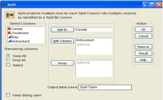
4.3 Splitting Columns
One can create a new data table from the active table by splitting one column into several new columns. This column is split according to the values found in another column, referred to as the Split By column. One can also split columns according to the values of one or more grouping variables.
Splitting a Column: Basic Example
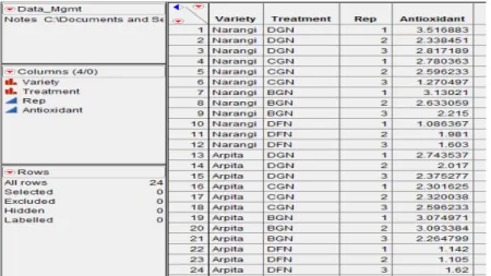
Steps: Open Data_Mgmt.jmp file. The variety column shows that there were two Varieties, Arpita and Narangi. The objective of this example is to split the Antioxidant column into two new columns, one for each variety. See the table as in Figure
Figure 4.3.1: Original Data_Mgmt.jmp data table To sort in Ascending Order
To sort in Descending Order
Figure 4.3.2: Split Window
Select Tables Split. Add Antioxidant Split Columns and Variety Split By Column (See Figure 4.3.2.). The default is (Drop All) to omit any columns that are not in the Split
By, Split Columns, or Group fields, so select the option Keep All choice to include these columns in the new table. Give "Split table" in Output table name field. Click OK.A new data table is created that looks like Figure 4.3.3. The values from the original antioxidant column are now split into the new columns named Arpita and Narangi. One can rename the new columns so the names are meaningful. Also, notice that the columns other than variety and antioxidant are exactly the same as they were in the original table.
Figure 4.3.3: New Table created by splitting Antioxidant column by Variety column The names of these new columns are values from the variety column, and the values in the new columns are from the antioxidant column.
4.4 Stacking Columns
One can rearrange data table by stacking two or more columns into a single new column, preserving the values from the other columns. Or, one can stack a set of columns into multiple groups.
Steps: Use Split Table.jmp data table. In the data table, there are two columns Arpita and
Narangi (See Figure 4.4.1). If one wants these two columns to be stacked into a single column and call this new column as Antioxidant. Go to TablesStack. Select Arpita and Narangi Stack Columns. One can give the Output table name say ‘Stacked Table’. Enter Antioxidant as Stacked data ColumnOK. See Figure 4.4.2 for Stack Window and below it is the New data table (Stacked Table, Figure 4.4.3). A new column named Variety gets created.
Options in Stack Window
Some important options are discussed below:
1. Multiple series stack: To stack selected columns into two or more columns, check this box. Specify the number of columns into which one wants the selected columns to be stacked by entering the number into the Number of Series box. This box appears only when Multiple series stack box is checked.
2. Eliminate missing rows: To eliminate missing data from the new table, check this box. 3. Drop non-stacked columns: To include only the stacked columns in the new table, check
this box.
Figure 4.4.1: Original Table (Split Table)
Figure 4.3.3: New Table (Stacked Table)
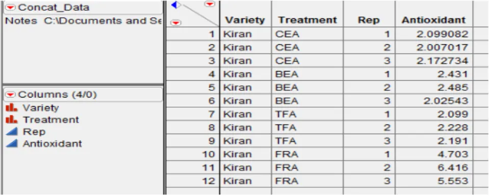
4.5 Concatenating Data Tables
One can concatenate data tables in JMP to combine rows from two or more data tables. One can create a new data table or append rows to the first data table. If a column name is the same in the data tables one want to concatenate, the column in the new data table lists the values from all data tables in the order of concatenation. If the two original data tables have columns with different names, those columns are included in the new data table showing missing values.
Steps: Open Data_Mgmt.jmp and Concat_Data.jmp (See Figure 4.5.1). Select Tables
Concatenate. Add Data_Mgmt & Concat_Data tables to concatenate as shown in Figure 4.5.2. Give New Concat Table name in the Output table name field OK. See the output in Figure 4.5.3.
Figure 4.5.1: Concat_Data.jmp data table
Options in Concatenate Window:
Some important options are discussed below:
1. Save and evaluate formulas: To request that JMP include all formulas. If one do not select this option, no formulas are included in the new data table. Note: If columns with the same name have different formulas, the formula from the first data table is saved in the concatenated data table.
2. Create source column: To add a column called Source Table to the new data table. This column identifies the name of the source data table in the corresponding rows.
3. Append to first table: To append rows to the data table listed first in the Data Tables to
be Concatenated field instead of creating a new data table.
A column named Variety gets
Figure 4.5.2: Concatenate Window
Figure 4.5.3: Result of Concatenating Two Data Tables
If there are two columns that do not match between the data tables say, antioxidant1 and antioxidant2, so the new concatenated data table has both antioxidant1 and antioxidant2 columns. These columns have missing values for rows from the data table in which the column did not exist.
4.6 Joining Data Tables
One can combine two data tables into one new table by selecting Tables Join. Tables can be joined in three different ways:
1. By combining them according to row number.
2. In a Cartesian fashion, where one form a new table consisting of all possible combinations of the rows from two original tables.
3. By matching the values in one or more columns that exist in both data tables.
4.6.1 Join by Row Number
Joining tables by row number joins the two tables side by side, and the new table has all columns from both tables (unless one specify to include only certain columns).
a) Joining Tables with an Unequal Number of Rows - If one want to join two tables with unequal number of rows, the new table will have values for rows found in both tables.
Steps: Open Variety.jmp and Season.jmp data table. Make Variety as current data table by highlighting it. Select Tables Join.Select Season in Join..With Box. Select By Row
Number in Matching Specialization Box. Give Output table name as 'Join table'. Click
OK (See Figure 4.6.1.1 for Output).
Figure 4.6.1.1: Joining Tables by Row Number
b) Joining Columns with the Same Name - If the two tables have same column names , the names of these columns in the new table appear as “column name of table name.” For example, if one joined tables named Animal Data and Reptile Data, and both tables contained a column named gender, the new table contains columns named 'gender of Animal Data' and 'gender of Reptile Data' , as shown in Figure 4.6.1.2.
c) Joining All Columns - If one want to combine rows from each data table so that new data table contains all columns from two data tables.
Steps: Open Concat_Data.jmp and Join_all.jmp. Select Tables Join.Select Join_all in Join..With Box, See Figure 4.6.1.4 for Join Window. Select By Row Number in
Matching Specialization Box. Give Output table name as 'New Joined Table'. Click OK. See Figure 4.6.1.5 for Output.
Figure 4.6.1.3: Join_all.jmp data table
Figure 4.6.1.4: Join Window
d) Joining Only Specified Columns - If one doesn’t want all columns from the original data tables to be in the joined table say, only want Variety, Treatment, Rep & Antioxidant from 'Concat_Data' and only Antioxidant from 'Join_all' to be in the new joined table.
Steps: Select Tables Join.Select Join all col JMP in Join…With Box. Select By Row
Number in Matching Specialization Box. Click Select columns for joined table in the
Output Columns area to specify the subset of columns one want. Select all the columns one want from both tables in the Source Columns list and click Select. In this example, select Variety, Treatment, Rep & Antioxidant from 'Concat_Data' and only Antioxidant from 'Join_all' list. The box in the Output Columns area lists the columns one want in the new table. The tables Concat_Data.jmp and Join_all.jmp (See Figure 4.6.1.5) have identical data in the Variety, Treatment & Rep columns, so only one of them is needed in the joined table. Give Output table name as 'Joined selected'. Click OK. The new table has only the selected columns. See Figure 4.6.1.6 for output.
Figure 4.6.1.5: Joining Only Specified Column
4.6.2 A Cartesian Join - When doing a Cartesian join, JMP joins two tables in a Cartesian fashion, where it forms a new table consisting of all possible combinations of the rows from two original tables. This creates cases in the output table so there will be one case for each combination of column values. For example, as Figure 4.6.7 shows, JMP crosses the data in table Variety with the data in table Season to display all combinations of the values in each set (the table named Joined table).
Steps: Open Variety.jmp & Season.jmp. Select Tables Join. Select Season in Join…
With Box. Select By Cartesian Join in Matching Specialization Box. Give Output table
name as 'Joined Table'. Click OK. See Figure 4.6.2.1 for Output.
Variety.jmp Season.jmp Joined table.jmp
Figure 4.6.2.1: Joining tables using Cartesian Join
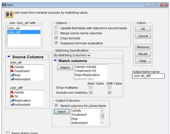
4.6.3 Join by Matching Columns - If one wants to join by matching columns, JMP finds specified column(s) values that exist in both tables and combines all values associated with that value into a new data table. Note: To join by matching columns, the columns must have the same data type (numeric, character, or row state).
a) Joining Tables with the Same Rows in Different Order
Suppose one have one data table containing students’ names, ages, and sexes & another data table containing their names, height, and weight. Instead of working with two separate tables, one would like to combine the tables into one data table containing students' name, age, sex, height and weight.
Steps: Open Students1.jmp & Students2.jmp in the Sample Data Directory. Select Tables
Join.Select Students2 in Join...With Box. Select By Matching Columns in Matching
Specialization Box. Highlight name from Students1’s list and name from Student2’s list
Match. One want the new table to contain only one row for each name, so check the
Drop multiples boxes for both tables (Figure 4.6.3.1). Give 'joining by matching' as Output
table name. Then, click OK. See partial output in Figure 4.6.3.2.
Figure 4.6.3.2: Joining Students1.jmp with Students2.jmp by matching columns If one want only name, age, sex, height & weight in the new data table then check Select
columns for joined table and select required columns from Source Columns from Join window in Figure 4.6.3.1.
b) Joining Tables with Different Numbers of Rows and Different Column Names
Suppose one have the following two data tables with different number of rows and different column names as in Figure 4.6.3.3. In the new table, one only want one column for Variety, one column for Treatment, one column for Rep and two columns for Antioxidant— Antioxidant from Join_all and Antioxidant from Join_diff as in Figure 4.6.3.4.
Join_all.jmp Join_diff.jmp
Figure 4.6.3.3: Join_all.jmp & Join_diff.jmp data tables
Steps: Open Join_all.jmp & Join_diff.jmp. Select Tables Join. Select Join_diff in
Join...With box. Select By Matching Columns in the Matching Specification area. Highlight Variety, Treatment, and Rep from Join_all's list. Highlight Variety, Trt, and Replication from Join_diff’s list. Click Match. Check the Include Non Matches boxes for both tables. Check the box beside Select columns for joined table. Highlight Variety, Treatment, Rep and Antioxidant from Join_all list Select. Highlight Antioxidant from
Join_diff list Select. Give 'join all_diff' as Output table name. The Join Window should look like as Figure 4.6.3.5 and click OK.
Note: The yield column from Little.jmp (Antioxidant of Join_diff) has missing values whenever there were no matching values in Join_all.
Figure 4.6.3.5: Join by Matching Columns Window
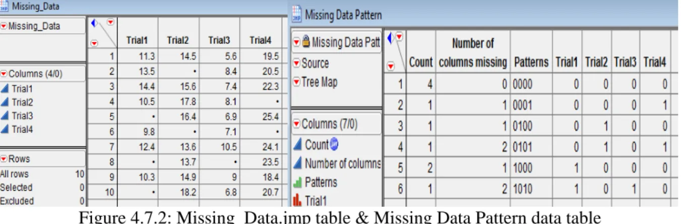
4.7 Missing Data Pattern
If data table contains missing data, one might want to determine whether there is a pattern that the missing data creates. The pattern might help one make discoveries about the data.
Steps: Open Missing_Data.jmp. (See data table shown to the left of Figure 4.7.2). Select
Tables Missing Data Pattern. Highlight the columns from which one would like to find missing data. Select Trial1, Trial2, Trial3 and Trial4 from Select Columns list. Click Add
Columns OK (See Figure 4.7.1). By Default, Output table name is 'Missing Data Pattern'. See the Missing Data Pattern Table as shown to the right of Figure 4.7.2.
Figure 4.7.1: Missing Data Pattern Window
Figure 4.7.2: Missing_Data.jmp table & Missing Data Pattern data table Figure 4.7.2 shows the following patterns:
Row 1 shows that there are four instances where all rows in Trial 1, Trial 2, Trial 3, and Trial 4 have no missing values.
Row 2 shows that there is one row in the source table whose one missing value is in the Trial 4 column.
Row 3 shows that there is one row in the source table whose one missing value is in the Trial 2 column.
Row 4 shows that there is one row in the source table whose two missing values are in the Trial 2 and Trial 4 columns.
Row 5 shows that there are two instances where Trial1 column have two missing values.
Row 6 shows that there is one row in the source table whose two missing values are in the Trial 2 and Trial 4 columns.
4.7 Generating Random Data
Steps: Open a New Data Table from JMP Starter Window. Go to RowsAdd Rows or one can right click in rows area or go to hotspot button. Add 20 rows. Right Click on Column1
Formula... See Figure 4.7.1. In JMP Formula Editor Window, from Functions
(grouped), scroll down to Random. Here, we will select Random Normal (there are many distributions to choose from). Click OK. JMP will populate the new column with simulated standard normal data. See the Standard Normal data filled in Column1 column shown to the right of Figure 4.7.1.
Figure 4.7.1: New Data Table
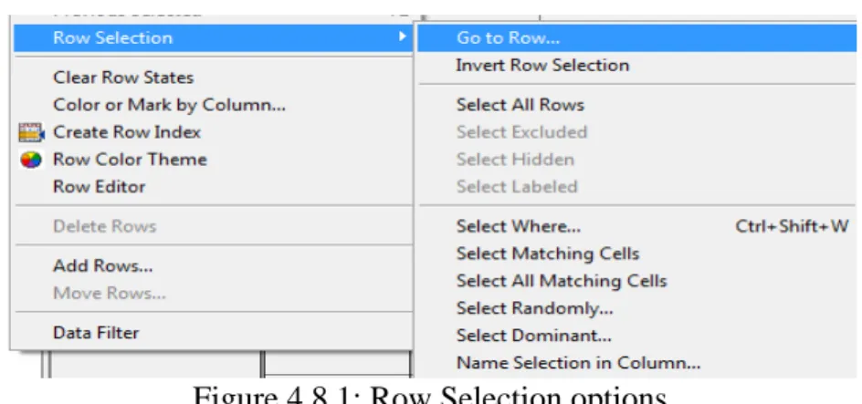
4.8 Selecting specific rows
Go to Rows Row Selection and one can see various options available as shown in Figure 4.8.1. There are various options available which are discussed below:
Figure 4.8.1: Row Selection options 1. Go to Row... : Go to specific row number.
2. Invert Row Selection: Select all deselected rows in data table. 3. Select All Rows: Selects all rows in data table.
4. Select Excluded: Selects all excluded rows regardless of their current selection status and deselects any other previously selected rows
5. Select Hidden: Selects all hidden rows regardless of their current selection status and deselects any other previously selected rows
6. Select Labeled: Selects all labeled rows regardless of their current selection status and deselects any other previously selected rows
7. Select Where...: Select rows based on some criteria that one enter.
8. Select Matching Cells: Select rows in the active data table with values that are similar to the highlighted row(s).
9. Select All Matching Cells: Select rows in all open data table with values that are similar to the highlighted row(s).
10. Select Randomly: Selects rows randomly.
11. Select Dominant: Useful for Pareto charts: selects the high or low values for a column. 12. Name Selection in Column: Use current selection to add a column using 1s and 0s to
indicate the selection.
The fat plus next to the variable name under the Columns Panel tells us that a formula is stored in the
5. Graphics in JMP
5.1 Mosaic Plot displays a mosaic bar chart for each nominal or ordinal response variable. A mosaic plot is a stacked bar chart where each segment is proportional to its group’s frequency count. A two-way frequency table can be graphically portrayed in a mosaic plot. The plot is divided into small rectangles such that the area of each rectangle is proportional to a frequency count of interest.
Steps: Open Big Class.jmp data table from sample data folder. Go to Analyze Fit Y by
X. Put age to Y, Response and sex to X, Factor. See the Figure 5.1.1 for output.
Figure 5.1.1: Contingency Analysis Mosaic Plot
Note: When one click on a section in the mosaic plot, the section is highlighted and corresponding data table rows are selected.
5.2 Bar, Line and Pie Chart Graph Chart creates a bar for each level of a categorical X variable, and charts a count or statistic (if requested). One can have up to two X variables as categories. The X values are always treated as discrete values.
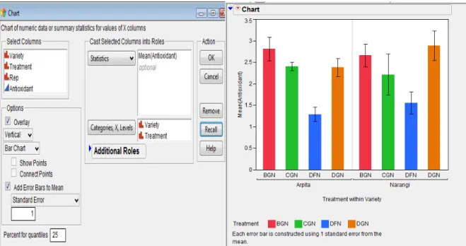
Steps: Open Data_Mgmt.jmp data table. Go to Graph Chart. Select Antioxidant from
Select Columns list, Click Statistics. There are various options on which one can plot analysis variable. If one want Standard Error Bars to be shown then Select Mean from this list. Error bars can be added to charts that involve means of variables. Check Add Error
Bars to Mean. One can plot variety of Error bars like Range, Standard Error, Standard Deviation, Confidence Interval. As of now select Standard Error from this list. The number of standard errors can be specified. On X-axis If we want treatments to be shown within variety then select first Variety and then Treatment and take it to Categories, X, Levels. The Chart dialog box will look like as in Figure 5.2.1. The output is shown on the right of Figure 5.2.1.
Figure 5.2.1: Chart Dialog Box and Bar Chart output with Standard error bars.
One can place the legend inside the Chart using Grabber tool . One can also change the legend settings by double-clicking on the legend. Right click on the chart, select Chart
OptionsLine Chart and one can see the output of Line chart with Standard error bars in Figure 5.2.2. Go to the hot spot button of Chart and select Stack Bars. Again go to hot spot button select Label options Label by percent of total value. See the output on the right of Figure 5.2.2.
Figure 5.2.2: Line Chart with standard error bars and Stacked Bar Chart
One can also change the Stacked bar chart to Pie chart by going to the hotspot button and selecting the required option.
5.2 Contour Plot constructs contours of a response in a rectangular coordinate system. To create a contour plot, one need two variables for the x- and y-axes and at least one more variable for contours (although optionally, one can have several y-variables).
Steps: Open the Little Pond.jmp data table in the Sample Data folder. Go to Graph
Contour Plot. For this example, the coordinate variables X and Y X role for the plot, and Z (which is the pond depth) Y, (contour variable) OK. See Figure 5.2.1 for launch dialog box of contour plot. The function Z should be a function of exactly two variables. Those variables should be the x-variables entered in the contour plot launch dialog. See Figure 5.2.2 for the output.
Figure 5.2.1: Launch Dialog for Contour Plot
By default, the contour levels are values computed from the data. One can specify own number of levels and level increments with options Contour Values:Specify in the Contour Plot Launch dialog, or options in the hotspot button on the Contour Plot title bar Change
Contours Specify Contours. One can also label the contours from the hotspot button
Label Contours.
Figure 5.2.2 Contour Plot Output with legend and contour labels
5.3 Overlay Plot produces plots of a single X column and one or more numeric Y’s. The Overlay Plot platform does not accept non-numeric variables for the y-axis.
Steps: Open Spring.jmp data table in the sample data folder. The column called April is the numeric day of the month, and the remaining columns are various weather statistics. Now go to GraphOverlay Plot.The values in the column called April are the days of the month. Put April X role. Daily humidity measures at 1:00 PM and 5:00 PM, Humid1:PM and
Humid5:PM are assigned as Y variables. The Sort X option causes the points to be connected in order of ascending X-values. Otherwise, the points are connected in row order. Click OK. See Figure 5.3.1 for the output.
Figure 5.3.1: Overlay Plot with legend
Go to hot spot button of Overlay Plot and select Y Options Connect Points. Adjacent points are connected for each Y variable (See Figure 5.3.2). One can also try various options such as Needle, Step and Range plot.
Figure 5.3.2: Overlay Plot with Connected Points
Range Plot connects the lowest and highest points at each x value with a line with bars at each end.
Needle draws a vertical line from each point to the x-axis.
Step joins the position of the points with a discrete step by drawing a horizontal line from each point to the x value of the following point, and then a vertical line to that point.
Function Plot plots a formula (stored in the Y column) as a smooth curve. To use this function, store a formula in a column that is a function of a single X column. Assign the formula to the Y role.
Now, Go to hot spot button Overlay Plot No Overlay. This option does not overlay any Y’s or groups. It creates a separate plot for each Y and Group.
Separate Axes lets one associate each plot with its own set of XY-axes. If Separate Axes is off, the vertical axis is shared across the same row of plots and the horizontal axis is shared on the same column of plots. See Figure 5.3.3 for the output.
Figure 5.3.3: Separate X axis and Shared X axis Overlay plot.
Plotting Two or More Variables with a Second Y-axis
Go to GraphOverlay plot. Assign Humid1:PM, Humid5:PM and Temp as Y role. Select
Temp and click Left Scale/Right Scale tab. Humid1:PM & Humid5:PM variables are given as left axis and Temp variable is given right axis to display in plot. The screen will look as shown to the left of Figure 5.3.4. Click OK. See the output shown to the right of Figure 5.3.4
Figure 5.3.4: Overlay Plot Dialog box & Overlay plot output.
If one wants to connect points only for one of the variables say, Temp then go to the bottom of Overlay Plot in the area Right Scale and Right-click Temp and click Connect Points. One
can see the format of temp variable. It changed to Bold and Italic format. The legends can be repositioned with the hand tool .
Figure 5.3.6: Overlay Plot output of connected points for Temp variable only
5.4 Bubble Plot is a scatter plot which represents its points as circles (bubbles).It displays the plot upto five dimensions at once (x position, y position, size, color, and time).
The following roles are used to generate the bubble plot.
Y, X columns become the (x, y) coordinates of the bubbles in the plot. These values can be continuous or categorical, where the bubbles are positioned by the category indices.
Sizes controls the size of the bubbles. The area of the bubble is proportional to the Size column’s value. If Size is left blank, the default bubble size is proportional to the number of rows in that combination of Time and ID.
ID variables are optional and used to identify rows that should be aggregated and displayed as a single bubble. The default coordinates of each bubble are the averaged x- and y-values, and the default size of each bubble is the sum of the sizes of all aggregated members. A second ID variable provides a hierarchy of categories, but the bubbles are not split by the second category until they are selected and split interactively. If a second
ID variable is specified, then Split and Combine buttons appear on the graph for this use. For example, one may specify a country as the first ID variable, resulting in a separate aggregated bubble for each country. A second ID variable, perhaps designating regions within each country, would further split each country when the interactive Split button under the graph is pressed.
Time columns cause separate coordinates, sizes, and colors to be maintained for each unique time period. The bubble plot then shows these values for a single time period.
Coloring causes the bubbles to be colored. If the Coloring variable is categorical, each category is colored distinctly. If the Coloring variable is numeric, a continuous gradient of colors from blue to grey to red is used.
The Bubble Plot platform is used in one of two modes
• static mode, when one specify only X, Y, and Size variables.
• dynamic mode, where Time and ID variables are additionally specified.
Open SATByYear.jmp data table in the sample data folder. Go to Graph Bubble Plot. Select ACT Score (2004) Y, SAT Math X and Region & State ID. See Figure 5.4.1 for the Buubel plot output with splitting and combining a bubble.
Figure 5.4.1: Splitting a Bubble
When one click Combine, the splitted bubbles again get combined into one single bubble (as per first ID variable).
Static Example: Go to GraphBubble Plot. Put SAT VerbalY and SAT MathX column. Take StateID and % Taking (2004)Sizes.
Figure 5.4.2: Static Bubble plot output
Select this bubble and click Split The bubble vanishes and explodes into its second ID variable
From the above graph (See Figure 5.4.2) one can see that
there is a strong correlation between verbal and math scores
States that have a large % Taking (large bubbles) are grouped together in the lower left of the graph.
This data can also be shown according to Region, only revealing the state-level information when needed. The following graph (See Figure 5.4.3) is identical to the previous one, except there are two ID variables: Region, then State.
Figure 5.4.3: Static Bubble plot Output with two ID variables
Dynamic Example Assign the variables as in following dialog box See Figure 5.4.4
Figure 5.4.4: Dynamic Bubble plot dialog box and output
When one click OK, the following report appears See on the right of Figure 5.4.4. Since there is a Time variable, controls appear at the bottom of the report for progressing through the time levels. Click Step to move forward by one year. Click Go to see the animated, dynamic report. It’s interesting to note that as time progresses, the SAT Math Score increases.
5. Statistical Analysis through JMP
All the examples and exercise are taken from "Analysis of data" (http://www.iasri.res.in/design/Analysis%20of%20data/Analysis%20of%20Data.html) and also see Design Resources Server (http://www.iasri.res.in/design/)
5.1 Descriptive Statistics
Example 5.1: An experiment was conducted to study the hybrid seed production of bottle gourd (Lagenaria siceraria (Mol) Standl) Cv. Pusa hybrid-3 under open field conditions during Kharif-2005 at Indian Agricultural Research Institute, New Delhi . The main aim of the investigation was to compare natural pollination under field conditions. The data were collected on 10 randomly selected plants from each of natural pollination and hand pollination on number of fruit set for the period of 45 days, fruit weight (kg), seed yield per plant (g) and seedling length (cm). The data obtained is as given below:
Group No. of fruit
Set (45days) Fruit weight (kg) Seed yield/plant (g) Seedling length (cm)
1 7.0 1.85 147.70 16.86 1 7.0 1.86 136.86 16.77 1 6.0 1.83 149.97 16.35 1 7.0 1.89 172.33 18.26 1 7.0 1.80 144.46 17.90 1 6.0 1.88 138.30 16.95 1 7.0 1.89 150.58 18.15 1 7.0 1.79 140.99 18.86 1 6.0 1.85 140.57 18.39 1 7.0 1.84 138.33 18.58 2 6.3 2.58 224.26 18.18 2 6.7 2.74 197.50 18.07 2 7.3 2.58 230.34 19.07 2 8.0 2.62 217.05 19.00 2 8.0 2.68 233.84 18.00 2 8.0 2.56 216.52 18.49 2 7.7 2.34 211.93 17.45 2 7.7 2.67 210.37 18.97 2 7.0 2.45 199.87 19.31 2 7.3 2.44 214.30 19.36
{Here 1 denotes natural pollination and 2 denotes the hand pollination}
1. Obtain mean, standard deviation, median, coefficient of skewness, coefficient of kurtosis, minimum and maximum values of all the characters.
2. Obtain mean, standard deviation, median, coefficient of skewness, coefficient of kurtosis, minimum and maximum values of all the characters for each group separately.
3. Test whether the data follows a normal distribution or not for all the characters? Do it separately for each of the two groups.
5. Prepare 2-way frequency table between group and fruit set after 45 days. 6. Create a stem and leaf plot and box plot for all the characters.
7. Create a stem and leaf plot and box plot for all the characters for each group separately. 8. Create Normal Quantile Plot and CDF Plot for each characters
Analysis using JMP
Here Group is "classification variable".
1. First open the DESCRIPTIVE_STATS.xls file in JMP using FileOpen dialog box. 2. The first step is to make sure that grouping factor/classificatory variable is nominal. Click
on the blue triangle to the left of Factor (Group) and select nominal.
3. For Question 1, Go to Analyze Distribution, (Select all the characters fs45, sw, syp and sl) from Select Columns Y, Columns OK. In the Output Window, click on the red triangle (hotspot) on the left of Distributions and Select Stack. Now click on the red triangle on the left of fs45 and select Display Options More Moments. For all the characters repeat it for sw, syp and sl also and one will get the output as in Figure 5.1.1 4. For Question 2, Repeat Step 2 and in addition to it, Select group from Select Columns
By and one will get the descriptive statistics for each group seperately.
5. For Question 3, There are various ways to check the normality of the data. One way is go to the output of Step 3, click the hot spot button for each character and Go to Continuous
Fit Normal (In the output window) Fitted Normal Goodness of Fit. One can also get the Diagnostic plot. See the Figure 5.1.2 for Goodness of Fit test for variable fs45.
6. For Question 4, First change the scale of variables fs45, sw and syp from continuous to either nominal or ordinal. Go to Analyze Distribution.Select all the characters fs45, sw, syp and sl from Select Columns Y, Columns OK. See the output in Figure 5.1.3
7. For Question 5, Go to Analyze Fit Y by X. Select group from Select Columns box
X factor and fs45 to Y, Columns OK.
8. For Question 6 and 8, In the Output of Step 3, click the red triangle button of characters fs45, fw, syp and sl and select Stem and Leaf, Normal Quantile and CDF Plot option to get the required output.
9. For Question 7, Stem and Leaf plot for each group separately See Step 4 and do the require steps.
When one click any of bluetrianglethen it expand/contract the output.
Figure 5.1.2: Normality check for character fs45
Outlier Box Plot
25th Percentile
Interquartile
Range 75th Percentile Possible Outliers
Shortest Half Bracket Mean Confidence Diamond Right-clicking on the box plot reveals a menu that allows one to toggle on and off the Mean
Confid Diamond and Shortest Half Bracket.
Quantile Box Plot and Quantiles Table
One can get the Quantile Box plot by clicking hotspot button in the output window for variable sl and select Quantile Box Plot.
100.0% maximum 19.36 99.5% 19.36 97.5% 19.36 90.0% 19.286 75.0% quartile 18.9425 50.0% median 18.22 25.0% quartile 17.5625 10.0% 16.779 2.5% 16.35 0.5% 16.35 0.0% minimum 16.35
Figure 5.1.3: Discrete Frequency Table Output
One can always save the output by clicking File Save As and select required format to save it as RTF file(*.rtf), Word document(*.doc), JPEG image(*.jpg) or HTML(*.html) file etc. as in Figure 5.1.4. By default JMP Output/Reports are saved with .jrp extension.
To copy a portion of a report, get the selection tool ( ) and click on the area(s) one want to select. Then goto Word document and paste it.
5.2 Tests of Significance Based on t - distribution Example 5.2: Using the data from Example 5.1 test
1. Whether the mean of the population of Seed yield/plant (g) is 200 or not?
2. Whether the natural pollination and hand pollination under open field conditions are equally effective or are significantly different?
3. Whether hand pollination is better alternative in comparison to natural pollination?
Analysis using JMP
1. First open the TESTSIG.xls file in JMP using File Open dialog box. 2. Make sure variable 'group' is nominal.
3. For Question 1, Go to Analyze Distribution. Select the variable syp from Select
Columns Y, Columns OK. Now in the output, click on the red triangle on the left of syp and select Test Mean option. In the Test mean dialog box, put 200 as specify hypothesized mean. If one wants the Nonparametric Wilcoxon Signed Rank test then check the required box. See the Figure 5.2.1 for output.
4. For Question 2, Go to Analyze Fit Y by X.Put nfs45, fw, syp and sl variables into Y,
Response and group X, Factor box OK. First we test that whether variances are equal or not? So in the output window, click the hotspot button on the left of Oneway
Analysis and select UnEqual Variances. (See the result shown to the left of Figure 5.2.2). Now If variances are equal then we select Means/Anova/Pooled t to get independent samples t test. For a test without the assumption of equal variances i.e. Assuming unequal variances select t test instead from hotspot button of Oneway Analysis. See the output shown to the right of Figure 5.2.2.
5. To answer the Question 3, one has to perform the one tail t-test. The easiest way to convert a two-tailed test into a one-tailed test is take half of the p-value provided in the output of 2-tailed test output for drawing inferences.
Output:
Figure 5.2.2: Two Sample t-test output
Note: If one wants Sum of Squares in ANOVA table to be displayed upto four decimal points then double click in the output of Sum of Squares. A Column Numeric Format dialog box appears as in Figure 5.2.3. The Format is Fixed Dec. Change the Dec to four and Click OK.
Figure 5.2.3: Column Numeric Format Dialog box
Also one can sort the columns in the output. Right click in the output area and Select Sort by
Column... It displays all the numeric columns on which one can sort in ascending or descending order.. See Figure 5.2.4.
Figure 5.2.4: Sorting columns in the output.
5.3 Correlation and Regression
Example 5.3: The following data was collected through a pilot sample survey on Hybrid Jowar crop on yield and biometrical characters. The biometrical characters were average Plant Population (PP), average Plant Height (PH), average Number of Green Leaves (NGL) and Yield (kg/plot).
S.No. PP PH NGL Yield S.No. PP PH NGL Yield 1 142.00 0.525 8.2 2.470 24 55.55 0.265 5.0 0.430 2 143.00 0.640 9.5 4.760 25 88.44 0.980 5.0 4.080 3 107.00 0.660 9.3 3.310 26 99.55 0.645 9.6 2.830 4 78.00 0.660 7.5 1.970 27 63.99 0.635 5.6 2.570 5 100.00 0.460 5.9 1.340 28 101.77 0.290 8.2 7.420 6 86.50 0.345 6.4 1.140 29 138.66 0.720 9.9 2.620 7 103.50 0.860 6.4 1.500 30 90.22 0.630 8.4 2.000 8 155.99 0.330 7.5 2.030 31 76.92 1.250 7.3 1.990 9 80.88 0.285 8.4 2.540 32 126.22 0.580 6.9 1.360 10 109.77 0.590 10.6 4.900 33 80.36 0.605 6.8 0.680 11 61.77 0.265 8.3 2.910 34 150.23 1.190 8.8 5.360 12 79.11 0.660 11.6 2.760 35 56.50 0.355 9.7 2.120 13 155.99 0.420 8.1 0.590 36 136.00 0.590 10.2 4.160 14 61.81 0.340 9.4 0.840 37 144.50 0.610 9.8 3.120 15 74.50 0.630 8.4 3.870 38 157.33 0.605 8.8 2.070 16 97.00 0.705 7.2 4.470 39 91.99 0.380 7.7 1.170 17 93.14 0.680 6.4 3.310 40 121.50 0.550 7.7 3.620 18 37.43 0.665 8.4 1.570 41 64.50 0.320 5.7 0.670 19 36.44 0.275 7.4 0.530 42 116.00 0.455 6.8 3.050 20 51.00 0.280 7.4 1.150 43 77.50 0.720 11.8 1.700 21 104.00 0.280 9.8 1.080 44 70.43 0.625 10.0 1.550 22 49.00 0.490 4.8 1.830 45 133.77 0.535 9.3 3.280 23 54.66 0.385 5.5 0.760 46 89.99 0.490 9.8 2.690
1. Obtain correlation coefficient between each pair of the variables PP, PH, NGL and yield. 2. Obtain partial correlation between NGL and yield after removing the linear effect of PP
and PH.