Visual Analysis for Spatio-Temporal Event Correlation in Manufacturing
Dominik Herr1,2, Kuno Kurzhals3, Thomas Ertl11Institute for Visualization and Interactive Systems, University of Stuttgart 2Graduate School advanced Manufacturing Engineering, University of Stuttgart
3Institute of Cartography and Geoinformation, ETH Zurich {firstname.lastname}@vis.uni-stuttgart.de, [email protected]
Abstract
The analysis of events with spatio-temporal context and their interdependencies is a crucial task in the manu-facturing domain. In general, understanding this context, for example investigating error messages or alerts is important to take corrective actions. In the manufac-turing domain, comprehending the relations of errors is often based on the technicians’ experience. Validation of cause-effect relations is necessary to understand if an effect has a preceding causality, e.g., if an error is the result of multiple issues from previous working steps. We present an approach to investigate spatio-temporal relations between such events. Based on a time-sensitive correlation measure, we provide multiple coordinated views to analyze and filter the data. In collaboration with an industry partner, we developed a visual analytics approach for error logs reported by machines that covers a multitude of analysis tasks. We present a case study based on real-world event logs of an assembly line with feedback from our industry partner’s domain experts. Furthermore, we discuss how our approach is applicable in other domains.
1.
Introduction
The increasing importance of Industry 4.0 is associ-ated with equipping different machinery with numerous sensors that provide a constant feed of multivariate data, logged in large databases. Although the analysis of such databases is dominated by statistical modeling and ma-chine learning, the incorporation of visual analytics, has proven to be a valuable research subfield. New visual analytics approaches provide a general understanding of complex dependencies and work flows, e.g., by showing abnormal process behavior in a production line [1]. In the context of manufacturing, monitoring systems with live prediction of possible issues in the machinery are often a desirable goal. The development of such systems re-quires expert knowledge to help understand the complex relation between different events. However, the knowl-edge of possibly existing correlations is often limited and based on the experience of domain experts. Further,
it requires specialized knowledge to decide if statistical correlations are also semantically plausible. Once this in-formation is accessible, event sequences can be labeled to improve machine learning methods to detect correlations automatically. Visual analytics can support the reason-ing for common event analysis tasks and communicates complex changes in events during the development and deployment of such monitoring systems. In addition, ex-perts can also directly use gained insights to improve the productivity of a production line. This work focuses on manufacturing data that was collected from an assembly line. We collaborated with an industry partner who pro-vided us access to their recorded data and the knowledge of domain experts. We analyzed their requirements in an iterative design process and derived design decisions for multiple coordinated views that support their anal-ysis tasks. In our case study, we demonstrate how the combination of different data views helps find answers for typical domain specific questions. Our contributions are: (1) A comprehensive visual analytics approach to analyze spatial, temporal, and relational questions for discrete event data. We foster the interplay of event time-lines, correlation plots, projections, and a spatial layout view, which supports hypothesis building and validation. (2) A real-world application of our approach, presented in a case study with assembly line manufacturing data. (3) Domain expert feedback and a detailed discussion of limitations and possible application scenarios for our approach in other domains.
2.
Related Work
The identification and analysis of relations in high-dimensional or multivariate data is an important task. With the goal to support experts, there is an ongoing re-search effort to provide more accurate models for event dependencies and to make those relations comprehen-sible by domain experts. In the following, we give an overview of approaches that use statistics to build re-lational models to extract correlation information and discuss visualization approaches that enable users to in-teractively analyze relations in high-dimensional data. Proceedings of the 53rd Hawaii International Conference on System Sciences | 2020
Statistical Event Dependency Modeling Modeling relationships through mathematical inference [2, 3] is used in many research domains. In the area of computer vision, statistical inference is used to extract key elements from images and connect them with ontologies to extract semantical meaning [4]. When the models are built by observation-based data, they are implicitly endangered of including bias to their predictions [5]. Several ap-proaches intend to identify and prevent bias in the field of machine learning. For example, Kilbertus et al. [6] present a concept to identify and remove discriminative criteria in the data. The prediction and handling of error events and attacks in networks is similar to the correlation of events in a production line. Qin and Lee [7] describe a scenario in which security administrators are hampered by the abundance of alerts reported within a system. To reduce the amount of shown information, they build a correlation graph that clusters alert patterns. In another approach, Qin and Lee [8] take isolated attack alarms and correlate them to predictattack plans. Xie et al. [9] use Bayesian networks to detect attacks with a focus on real time detection. All presented approaches use graphs or similar structures to model their correlations. Because we want to visualize the temporal aspect of the correlating events, graphs scale not well for interpretation, which is why we opted for other visual representations of the data. Further, they are solely based on statistics or machine learning, often preventing domain experts to understand how the results came to being. This may result in a lack of confidence in the results. Our approach enables ex-perts to verify found correlations by themselves, which increases the general confidence in the results validity.
Visual Analysis for Event Relationships Various vi-sualization techniques were proposed to help experts un-derstand statistical models and the relations in their data. Van den Elzen and van Wijk [10] present a system to construct and analyze decision trees based on a node-link diagram. Further, they use a confusion matrix to pro-vide information about the nodes’ classification certainty. M¨uhlbacher et al. [11] propose to interactively optimize decision trees with the goal to also enable non-expert users to select suitable decision trees. Strobelt et al. [12] extract interpretable patterns of state changes in recur-rent neural networks to build and validate hypotheses about the models’ internal functions. Such approaches can be used to understand, how statistical models operate. Our approach can be used complementary to validate the models’ results by analyzing the data directly.
To efficiently identify causal dependencies of events, the identification of event sequences is very important. Several approaches exist that extract and visualize se-quential patterns [13], present the distribution of
com-mon sequences [14]), or even allow to search for fuzzy sequences [15]. As datasets may contain a large amount of such sequences, Cappers and van Weijk [16] present an event querying system that allows for fuzzy searches that provide feedback, which event sequences match the searched pattern. Likewise, Kr¨uger et al. [17] use a visual query language to highlight semantically anno-tated events to extract or confirm complex movement sequences. Instead of filtering the data on the model level, Monroe et al. [18] reduce the visual complexity to assist users in getting an overview of relevant data. Sedl-mair et al. [19] analyze in-car communication network data to identify error and warning messages by defining state machines for the messages and then visualizing the states’ transitions over time. Further, the user can vi-sually compare multiple state machines to find possible dependencies. Shi et al. [20] show network sensor data on a radial tree view that represents the network’s rout-ing logic to detect outliers that need to be investigated. They use a correlation graph to show the similarity of the sensor nodes, which is used during the outlier analysis. Xu et al. [1] present an approach in which they show pro-cess anomalies by visually aggregating similar propro-cess sequences so that dissimilar sequences are more easily distinguishable. Their system focuses on the identifica-tion of errors in a producidentifica-tion line, but not necessarily their correlation or preceding event sequences. Concepts to extract and analyze event patterns are especially impor-tant after a hypothesis about correlations between events was formed. Our approach focuses on the visual anal-ysis of error correlations and experts can validate their findings visually with other views.
3.
Approach
With emphasis on the analysis of events that are po-tentially interdependent, we first present the underlying data model and necessary processing. Furthermore, we review the requirements of typical analysis tasks for this type of data. Our requirement analysis and the final de-sign decisions were derived in an iterative dede-sign process in collaboration with an industry partner that uses assem-bly line production. Over multiple sessions, we discussed and adapted the design of the presented visualizations according to the requirements and the knowledge of the domain experts. To provide an easier entry point for en-gineering experts and to address the different levels of complexity of the requirements, our approach combines views that provide views known by the experts, such as the layout of the production line, and scatterplots that show the correlation of the error classes, which are con-nected through brushing & linking. To meet this demand, we decided to use visualizations that are connected with a brushing & linking approach to provide the data.
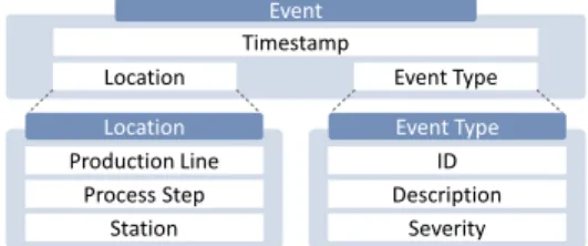
Timestamp
Event
Location Event Type
ID Event Type Description Severity Production Line Location Process Step Station
Figure 1: Data model provided by our industry collaboration part-ner. An event comprises a timestamp, a location, and an event type. The main definition of an event is generic, the definition of location and event type are application specific.
Production Line
Process Step Highlighted Available Unavailable Station
Figure 2: Hierarchical structure of a production line. Each line has several process steps. These steps contain stations that per-form the same task in parallel to increase the processing speed. Stations have a visual indication if data at a station is highlighted (orange), available (white), or if no events were reported (gray).
3.1.
Data Model and Processing
To gain insights about interdependencies between different types of events, we require the data to meet specific requirements, which we present in the following. Further, we describe how we define the event correlation metric that we use throughout our approach.
Data Properties We assume that the data comprises time-discrete events with the following information: Time: the point in time of each event’s occurrence Location: information about each event’s origin Event Type: an identifier that describes the event type Timeprovides information about the date and time when the event occurred. Thelocationdescribes where the event happened. Event typeinformation relates to the actual event and can be arbitrarily complex. Figure 1 shows the structure of the data provided by our industry collaboration partner. Thelocationhas a hierarchical structure: it starts with the production line, which com-prises several process steps that perform individual tasks (e.g., welding). These steps contain stations that perform the individual operations to fulfill the task (see Figure 2). The events of our industry partner originate from stations in a specific production line. The event ID is coupled with the location and the event type includes a human-readable description of the event. Further, the event type provides a severity level (information, error, etc.), which we limited to events that stop the machine
from functioning. An exemplary event is:
Timestamp
z }| {
04.12.2017 06:11:38;
Location
z }| {
Line=1; PID=4553; Station=2; Description: Fehler bei Bewegung X125D X-ACHSE LINKS
| {z }
Event Type
We will use the termevent classto distinguish events from their specific time-dependent instances.
Pairwise Event Correlation To derive a pairwise cor-relation between two event classes, there needs to be an understanding of when two events are similar. In the data provided by our industry collaboration partner, two sce-narios can cause an event relation: (1) the entire process step has a problem and therefore all stations in the pro-cess step report the same event, and (2) the stations are part of different process steps and the event is caused by a product that is being processed by both stations. Thus, we need to take the temporal and spatial distance of two given events into account. In the first case, we need to check if the events are part of the same process step. The second case, it is necessary to know how long it takes a product to be transported from station A (which is the causeof the relation) and station B (which isaffected). Our correlation metric assumes that a correlation caused by a product that is transported between the stations. The products are transported on a conveyor belt that runs at a constant speed. Therefore, the distance between sta-tions can also be seen as a temporal distance (travel time) between two given stations. Formally, we define the pair-wise correlationC(EA,EB)of two event classesEAand
EBthrough the correlation plausibility of their instances:
C(EA,EB) =
plausible co-occurrences ofEAandEB
z }| {
∑
ei∈EA∑
ej∈EB IsPlausible(ei,ej) |EA|+|EB| | {z } occurrences ofEAandEB ,whereIsPlausible(ei,ej)defines if two eventseiandej
are similar based on their spatial and temporal distance:
IsPlausible(ei,ej) =
0 ej’s station is located beforeei’s, 1 the start time ofejis within a
rea-sonable timeframe aftereiwas re-ported (see below),
0 else.
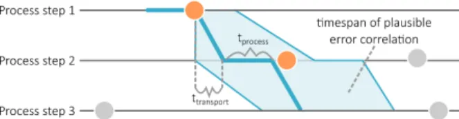
The expected travel time between two stations is the sum of the transport times between stationstt and the
passed stations’ processing times tp. In addition, we
allow a fuzzy time window around the total time to com-pensate for dynamic changes in the production process
Figure 3: Schematic description of fuzzy matching. The time frame is based on the transport time between stations and process-ing time of the stations themselves with an offset of 10 %. Events within an allowed time frame are colored in orange.
(e.g., unexpected delays). For the investigated dataset, we allow for a deviation of up to 10 % for the estimated time for transport and processing. Figure 3 demonstrates the described event matching, where colored events are considered as a match and mismatches are grayed out.
3.2.
Requirements and Design Rationales
We aim for a visual analytics approach that provides insight on the relations between events and their spatial and temporal coherence. In the long term, our approach could incorporate an event predictor where the visual-izations help validate the predictions. The following requirement analysis is based on typical research ques-tions for spatio-temporal data as proposed by Andrienko et al. [21]. Hence, the requirements can be categorized according to the four categorieswhen,where,what, and relationalcoherences. As we focus on the extraction of possible event relationships, we did not consider the category compare/relate in our approach.
Category 1: When
The temporal data dimension provides important infor-mation to answer multiple questions:
Q1 When did an event (re-)occur?
Q2 In which order did different events occur? To answer these questions, a timeline representing the discrete occurrence of single events is one of the most common and therefore familiar visualizations to many people. As a single timeline with pictograms representing different event types is limited in terms of scalability, we distribute the events based on their location along the vertical axis. For our collaboration partners, it is important to investigate the temporal order of issues in the log files with respect to the questions Q1 & Q2.
Category 2: Where
Spatial context becomes important to identify specific locations that might be involved in a chain of events:
Q3 Where did an event occur?
Q4 What is the spatial relationship between events that occur together?
All questions related to the spatial context can be intuitively represented on a map or plan. In our assem-bly line example, we provide a floor plan containing the layout of the machines and the conveyor belts that the products are transported on. Such a visual representation indicates the spatial distance between the locations that reported events, the stations’ connectivity, and the hier-archical structureof the production line, as described in Section 3.1. Alternative approaches such as graphs or list-based representations would abstract too much from the spatial context, hence we decided for the direct representation on a map (Figure 7B).
Category 3:What
Finding the details about a specific event that incorpo-rates the information when and where it was reported:
Q5 What happened when an event occurred at a spe-cific time?
The meaning of an event is not always included in the data. Usually, domain experts are required to answer this question. Combining the information provided by the timeline and the map helps reconstruct what caused an event. In our case, the event types are already annotated by our collaboration partner to include human-readable text (e.g., which component of a machine is not opera-tional) that is displayed on demand.
Category 4:Relational
Understanding how different events relate to each other is important to identify possible chains of events that lead to failures:
Q6 Which pattern does an event belong to? Q7 Which events usually occur together?
Q8 Which co-occurrences are persistent and which are outliers?
Q9 Which locations are similar regarding reported events?
The most common approaches to visualize relations between data are matrix and graph visualizations. How-ever, these approaches have limited capabilities when it comes to visualizing temporal changes. Time-to-space mappings [22] often result in visualizations that require much space and animated techniques are not suitable for comparison. We discarded hybrid visualizations (e.g., combining graphs and matrices) due to the afore-mentioned requirement that the proposed visualizations should be similar to visualizations that the experts are fa-miliar with. Such approaches are intransparent regarding the way they aggregate the presented data. To take the
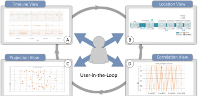
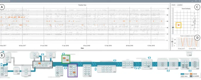
Figure 4: Visual analysis approach with four linked views for spatio-temporal event analysis: A In theTimeline View, individ-ual events can be investigated in full detail. B TheLocation View
provides the spatial context to specific events. C TheProjection Viewhelps identify multiple and the D TheCorrelation View pair-wise event co-occurrences over time.
temporal changes in the dataset into consideration, we decided to provide two views that present temporal statis-tical measures and the overall relatedness of the data: (1) a projection view that indicates high correlations between event types or locations based on their events by spatial proximity and (2) a line plot that shows pairwise correla-tions between event types over time that has analogies to a parallel coordinates plot where the discrete time steps are the dimensions. In combination, the relational ques-tions can be investigated with our proposed analytical approach. In our case study (Section 4.1), we exemplify how different issues relate to each other can be found.
3.3.
Visual Analytics Approach
Our approach consists of four linked views (see Fig-ure 4) that provide an overview and detailed temporal (A), spatial (B), and relational (C & D) information.
Experts can search and filter for specific event messages. The design of our approach aims for a combination of abstracted overviews for correlation analysis and detailed views for the temporal and spatial components of the data that represent the underlying data domain.
A Timeline View This view provides a de-tailed plot of individual events over time. Each row corresponds to a station in the production line, the hor-izontal axis represents time. The rows are ordered first by the process step and then by the station number. An alternating background color helps distinguish different process steps. A tooltip provides detailed information about individual events. By selecting an area on the time-line, the contained events’ locations and event classes are highlighted in the other views.
B Location View Spatial context is important to relate events with the location of the process steps and stations where they occurred. Hence, a map is available in theLocation View. Stations that do not contain any events for the analyzed range of time are grayed out,
while selected stations are highlighted in orange. In case experts select events in other views, the stations where the selected events were reported from are highlighted. This view helps to interpret correlations from the views
C (temporal correlation) and D (projection of
event/loca-tion similarity) and provides detailed informaevent/loca-tion about the spatial domain of the data.
C Projection View Since event classes can cor-relate although they are located at process steps that are far apart, a general overview of their overall correlation is necessary. Our approach includes a view that projects the correlation matrix of the event classes or locations based on t-distributed stochastic neighborhood embed-ding (t-SNE) [23, 24] onto a two-dimensional plane. This way, the potential correlations are displayed through spa-tial proximity. Due to the data loss during the dimension reduction process, not all of the event classes can be placed correctly. To prevent users from assuming event type relations due to falsely placed event types, we indi-cate the placement quality of each event class with a color coding.Our placement quality uses the measure proposed by Mokbel et al. [25]. Users can set projection quality threshold with a slider to filter event classes.
D Correlation View This view provides an ab-stracted overview of the pairwise event class correlations over time as a line chart. Each line corresponds to a specific pair of event classes. On the horizontal axis, the temporal dimension of the data is discretized by modi-fiable time intervals. The default interval is one week due to the production line’s schedule. Within each inter-val, the correlation measure defined in Equation 3.1 is used. To prevent data loss, only thesourceevent must start within the time interval, whereas theaffectedevent can also be later. As this view is prone to visual clutter, experts can use a slider to set a threshold to filter the shown event class pairs either based on average or maxi-mum correlation. Selecting lines in the correlation view highlights those lines in orange, whereas other lines are grayed out. The affected event classes and their corre-sponding events are also highlighted in the other views. Combination of Views By a combined analysis of the linked views, all questions mentioned in Section 3.2 can be addressed. We provide examples how to derive in-sights of the corresponding categories in Section 4.1. System Architecture Our prototype is implemented with C# and .NET Framework 4.6. The data is stored in a relational Microsoft SQL Server database.We use Dapper1to map the data from the database to our client’s data model. The front-end is implemented as a Windows Presentation Foundation (WPF) desktop client. During
an analysis run, data from a specified timespan is re-trieved from the server and processed on the client. We used the SciChart WPF Framework2to implement the Correlation,TimelineandProjection Views.
4.
Evaluation
We evaluated our approach with three domain experts from our industry collaboration partner in two stages: (1) We gathered findings with our approach, according to the questions Q1 – Q9. Our case study demonstrates how to extract these findings (Section 4.1). (2) We inter-viewed the three domain experts in a feedback session (Section 4.2). We presented how the findings can be derived with our approach. Following the demonstra-tion, we handed out questionnaires and asked the experts to rate the findings, the importance of the individual questions, and the visualization views. Afterwards, we discussed the individual findings and improvement sug-gestions with the experts. We applied a Likert scale that ranged from 1 (not expected/not useful/impossible) to 7 (very expected/very useful/very easy) for the ratings. Further, the experts had the option to give no answer. The first expert was only involved in the evaluation and did not know the system before, whereas the latter two experts were also involved during the development of our prototype. The same experts participated in all parts of the study. One expert is responsible for the produc-tion line where the analyzed events originated from. The second expert is a project leader tasked with the advance-ment of industry 4.0 concepts, for example, to make collected data available to workers in an understandable way. The third expert is a team leader and responsible for the implementation of the accessibility of data on the shop floor level in the factory.
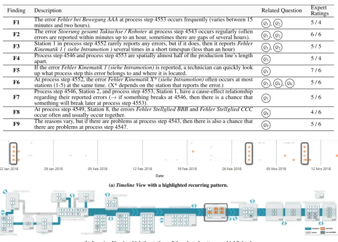
Initially, we derived nine findings with our prototype. Table 1 presents these findings along with ratings from two of the three domain experts (see Section 4.2 for de-tails). The second expert opted out of the insight rating, as she is not involved in the daily routine of the produc-tion line and cannot assess the plausibility of specific findings. Section 4.1 demonstrates, how these findings can be acquired.
4.1.
Case Study
Following the general analysis questions introduced in Section 3.2, our case study demonstrates, how the approach can be applied to derive findings (Table 1). The dataset analyzed for our evaluation comprised 20,872 error events reported over a timespan of four months. All events occurred in the same production line, which contains 19 process steps and 96 stations in total. As different parts of the event data are relevant to answer
2 https://www.scichart.com/
Figure 5: TheTimeline Viewprovides an overview of rare (high-lighted events at the top) and frequent events (high(high-lighted events at the bottom). The highlighted events within process step 4553; Station 4 contain the error typeFehler bei Bewegung AAA.
a question (e.g., temporal or spatial information), users may choose different views to enter the analysis. When did errors occur? (F1–F3)
One of the most relevant questions regarding the tempo-ral aspect of the data are if there are events that occur very frequently or just occasionally. Especially the first question can be efficiently solved with theTimeline View (Figure 7A). Experts may search for a time range where
a station reports many events. This provides a quick overview if the reported events are all of the same class or if multiple event classes contribute to the high amount of error reports. To inspect a specific event class, users can filter for all events of the type of interest (e.g., by using the text search) to inspect its occurrences in the Timeline View. In Figure 5, process step 4553; Station 4 reports a high number of events. After selecting the events during the second week of January, the selection output shows that 139 of the 143 events are the event typeFehler bei Bewegung AAA. By highlighting all er-rors of this event class, it becomes clear that this error is the most often occurring event type throughout the entire analyzed range of time (880 of 1069 events). We reported this as FindingF1to the interviewed experts of our industry partner (see Table 1).
Where are the stations that reported errors?
(F4 & F5) / →
The most intuitive way to solve questions related to space is to use theLocation View(Figure 7B). With the linked
views, experts can either quickly locate the station that reported a specific error or find event types related to a se-lected location. In more complex scenarios, the view can be used to provide a link between an abstract pattern of events. For example, the pattern highlighted in Figure 6a seems to recur over time. Through a selection of one pattern occurrence it becomes apparent that all events occur at the same process step, but at different stations (see Figure 6b). This insight is part of the FindingsF5& F6(see Table 1).
Which events or locations are related? (F6–F9)
/ → / /
Due to its complexity, finding relations between event classes is more difficult. Usually, an interesting pattern
Table 1: Nine findings presented to the domain experts. All findings were derived with respect to the related analysis questions. The experts rated the findings according to how useful they are to improve the manufacturing process (1 = not useful – 7 = very useful). Some of the findings were anonymized to protect the industry collaboration partner’s intellectual property.
Finding Description Related Question ExpertRatings
F1 The errorminutes and two hours).Fehler bei Bewegung AAAat process step 4553 occurs frequently (varies between 15 Q1, Q2 5 / 4
F2 The errorerrors are reported within minutes up to an hour, sometimes there are gaps of several hours).Stoerung gesamt Taktachse / Roboterat process step 4543 occurs regularly (often Q1, Q2 6 / 6
F3 Kinematik 1 ( siehe Intramotion )Station 1 in process step 4552 rarely reports any errors, but if it does, then it reportsseveral times in a short timespan (less than an hour)Fehler Q1, Q2 5 / 5
F4 Process step 4546 and process step 4553 are spatially almost half of the production line’s lengthapart. Q3 5 / 4
F5 If the errorup what process step this error belongs to and where it is located.Fehler Kinematik 1 (siehe Intramotion)is reported, a technician can quickly look Q3 7 / 6
F6 At process step 4552, the errorstations (1-5) at the same time. (X* depends on the station that reports the error.)Fehler Kinematik X* (siehe Intramotion)often occurs at most Q3, Q4, Q6 5 / 6
F7
Process step 4546, Station 2, and process step 4553, Station 1, have a cause-effect relationship regarding their reported errors (→if something breaks at 4546, then there is a chance that something will break later at process step 4553).
Q7 5 / 6
F8 At process step 4549, Station 8, the errorsoccur often and usually occur together. Fehler Stellglied BBBandFehler Stellglied CCC Q8 4 / 6
F9 The reasons vary, but if there are problems at process step 4543, then there is also a chance thatthere are problems at process step 4547. Q9 5 / 6
(a)Timeline Viewwith a highlighted recurring pattern.
(b)Location Viewin which the stations of the selected pattern are highlighted.
Figure 6: TheLocation Viewprovides experts with a spatial context to selected events. The annotated pattern in theTimeline View6a indicates that various events occur at the same time. Further, this pattern repeats at several points in time. TheLocation View6b shows, that the stations, where the errors occurred, are all part of the same process step and where this process is located in the production line.
or unexpected outlier leads to the need to inspect the rela-tion between event classes or locarela-tions. One possibility is to start with the event typeProjection View(Figure 7C)
and select two or more event classes that are close to each other. To verify the event class’ relation, experts can check theLocation Viewto quickly assess if the re-lationship is plausible or use theTimeline Viewto see the distribution of the highlighted events. Alternatively, theCorrelation View(Figure 7D) allows to check if the
correlation persisted during the analyzed period of time or if the correlation is temporally restricted. In Figure 7, a group of event classes that is clearly separated from the other classes (see ocher rectangle) was highlighted. The selected events were all parts of the process steps 4547, 4768, and 4549, which are highlighted in theLocation View. The process steps are emphasized with blue, green, and purple borders respectively. One can use the Cor-relation Viewto verify, which error classes have a high correlation and use theTimeline Viewto see, when the
events occurred. FindingF8(see Table 1) was derived analogously to the presented example.
Another possibility to find relationships is to use the locationProjection Viewto analyze event correlations on an overview level. In Figure 7, a group of three stations was selected in theProjection View. TheLocation View shows that the stations are part of different process steps and theCorrelation Viewindicates that the relationship is not caused by a single pair of event types, but that it is composed of multiple relations. FindingsF7&F9(see Table 1) were both derived similarly to this example.
If the experts are interested in a specific group of error messages (e.g., errors that mention a specific sensor), they can use the text search component to highlight only errors or locations that contain the entered text. This is especially useful in combination with the Correlation View, as errors can be part of many correlation pairs and the filter helps to find these correlation pairs faster. Further, it enables users to broaden their exploration,
Figure 7: Through the selection of a clearly separated group of events types , error dependencies between the process steps 4547 , 4768 and 4549 become apparent. An expert can verify this hypothesis through theCorrelation Viewand theTimeline View.
for example, if they start with a very specific error, but then they want to similar events. The pattern shown in Figure 6a was discovered by starting with the insight from the example in the previous scenario (Where are the stations that reported errors?), in which events were observed that occurred at the same time. Through the selection of these events, it becomes apparent that all descriptions are similar (Fehler in Kinematik...). Possible further steps are to use the text search to find similar events or to verify the similarity of the event classes in theEvent Projection View.
4.2.
Feedback Session
For each finding (see Table 1), the experts were asked to state if the finding is plausible. They were further asked to rate how expected the finding is, how useful it is to improve the manufacturing process, and how much effort is required to derive the insight with their current methods. The second expert opted out of the insight rating, as she is not involved in the daily routine of the production line and cannot assess the plausibility of spe-cific findings. All of the findings were deemed plausible by the experts. Generally, none of the questions were rated with less than four points (borderline) and most questions scored at least five points on average. This means that all of the findings we derived were deemed to be useful insights. Before we introduced the system, we asked the experts to rate the requirement questions (1 not important– 7very important). All of our research questions got ratings higher than five, which indicates that our system meets the analysis requirements of our domain experts. At last, we asked the domain experts to evaluate our system. They were asked to rate, how well they subjectively understand the individual views (1not
at all– 7very well), how much the views help to derive insight from the data, if the overall system helps gain insights, and if the system could be useful in other areas of the company.
TheTimeline Viewand theLocation Viewwith aver-age scores of 5.3 and 6.3 respectively were better under-stood than theCorrelation Viewand theProjection View, which scored 4 on average each. The score difference can be expected, as theTimeline Viewand theMap View are easy to read, understand, and interpret. Further, they do not transform or aggregate the data. Generally, we observed that the scores for the first two views are sim-ilar, but expert 1 (head of production line) gave much better scores for theCorrelation Viewand theProjection View than the other experts (7 and 6 compared to 2/3 and 3/3). Compared to the understandability score, the experts rated the helpfulness of the views mostly equal or higher than the respective views’ understandability. We further asked for oral feedback for their scoring: The Timeline Viewand theLocation Vieware simple enough to be used by anyone who has a general understanding of the production line, including operators on the shop floor during their daily routine. This led them to give a high understandability and helpfulness score. The other two views are more suitable for experts that are specialized in the analysis of the overall production line performance. The head of the production line is a specialized user and gave the views very high scores (six or seven points).
During the presentation, the experts noticed a relation between two stations that are both part of processes that add components to the production line. The expert re-sponsible for the production line explained that, although it cannot be shown with the currently available data, this may be a plausible finding if the supplier of the added
components switches at this point in time. This finding led to the general consent of the domain experts that the incorporation of data from other departments would help especially during the reasoning step after building hy-potheses using the presented approach. The experts also suggested incorporating data about products that were taken out of the production line due to issues and link this information to the machine error reports.
5.
Discussion
Our approach scales well with respect to the displayed timespan. With the multi-level data abstraction provided by the different views, even data from over a year can be investigated. However, our current implementation re-quires a pre-processing stage that calculates correlations and projections for a fixed timespan. For the application to streaming data, we will need to adapt our models to update dynamically if new relevant data becomes avail-able. One example for such an adaption could be the extension of the correlation matrix to support dynamic updates or change it to an approximate model for rela-tional data [26]. We further need to extend the reasoning process after an expert found a possible relation between event types. As our domain experts suggested during the feedback session, one possibility to improve this process is to incorporate more details about the events, such as the processed products during the error report. This could lead to new insights such as varying error type relations depending on products or other factors.
As a consequence of our feedback from the domain experts, we have to differentiate between two types of analysis: (1) Maintenance analysis, where the timeline and the location view are important and could replace the existing technique. Both views are easy to interpret and provide valuable information to react to incidents. (2) The comprising analysis of events and their interde-pendencies that serves to understand and prevent future incidents. This requires a trained domain expert. For deployment of our approach, we therefore suggest to pro-vide a maintenance version, displaying only the location and the timeline view, and an expert mode that provides all views. With this approach, both analysis types can be addressed by minor modifications of the interface.
In the case study, we presented the application of our approach to event data from an assembly line. However, our approach is not limited to a single scenario. We argue that numerous application scenarios that fit into our data model (Section 3.1) can be investigated to support analytical reasoning.
Treatment data from patients is arguably most similar to production data, as it is also based on a specific se-quence of events (e.g., medical treatments) where experts may be interested in error correlations (e.g., symptoms).
One of the most important differences is that the sequence of the processes is more time-critical in the production domain than in the health sector, where they are more fuzzy. For example, two patients in a hospital get the same treatments. However, the length of the treatments themselves and the time between their application may vary. In a production line, the same process (producing a component twice) has more strict timings.
Additionally, our approach is also applicable to other network structures. As an example, modern cars cre-ate individual logs for their inherent system of sensors. Understanding cause-effect relations in this domain is similar to the scenario in our case study. Changing the spatial context in the layout view by showing a car model (similar to Sedlmair et al. [19]) would adapt our approach for this application scenario.
In eye-tracking research, recorded gaze points form a trajectory that describeswhenandwherea participant looked at a visual stimulus. Additionally, to answer the questionwhatwas investigated, areas of interest are an-notated. With our approach, correlations in the viewing behavior of multiple participants could be investigated. Identifying high correlations of visits on areas of interest between participants indicates how similar they attended to the stimulus. This is an important analysis task in eye tracking research, e.g., for diagnostics of autism [27].
6.
Conclusion and Future Work
We presented a new visual analytics approach with focus on manufacturing data. Our approach improves on current analysis methods by providing a comprehensive framework covering numerous analysis questions. It was developed in collaboration with domain experts based on data from a real production line.
For future work, we will apply our approach in other data domains, as discussed in Section 5. Since the sup-ported analysis tasks can be transferred in other research areas, we aim to improve data understanding in these areas as well. Regarding the manufacturing domain, we plan to incorporate multiple aspects: To this point, our approach is applied to logged data, collected over the past four years. This data provides a solid base to derive insights and learn from to improve the manufacturing pro-cess. In the long run, we plan to deploy a live monitoring system that is capable to inform technical staff about the overall state of an assembly line. Hence, we will investigate how live data can be processed and displayed appropriately in the different views. For the timeline and location views, animations would be possible. The other two views show metrics based on similarity matri-ces, which is a limitation for live processing. We will investigate alternative methods capable to approximate our results with streaming data. Given the large number
of events recorded over time, we will investigate how to include a labeling and classification approach that is capable to predict future issues before they happen. In combination with visual feedback from our approach, the analysts can supervise the learning phase, interpret prediction results, and verify or falsify them. Including such an approach might require additional views with new visualizations. Furthermore, we plan to conduct longitudinal studies with domain experts, allowing them to inspect the data on their own. With the feedback from the experts, we aim to improve the efficiency of different manufacturing processes in the future.
Acknowledgments
We thank our industry collaboration partner for the provided feedback during the development and the evalu-ation of the presented approach.
References
[1] P. Xu, H. Mei, L. Ren, and W. Chen, “ViDX: Visual diag-nostics of assembly line performance in smart factories,” Transactions on Visualization and Computer Graphics, vol. 23, no. 1, pp. 291–300, 2017.
[2] J. Pearl,Causality: Models, reasoning, and inference. Cambridge: Cambridge University Press, second edi-tion ed., 2009.
[3] J. Peters, D. Janzing, and B. Sch¨olkopf, Elements of causal inference: Foundations and learning algorithms. MIT Press, 2017.
[4] D. Lopez-Paz, R. Nishihara, S. Chintala, B. Sch¨olkopf, and L. Bottou, “Discovering causal signals in images,”
inIEEE Conference on Computer Vision and Pattern
Recognition (CVPR 2017), pp. 6979–6987, IEEE, 2017. [5] T. G. Dietterich and E. B. Kong, “Machine learning bias,
statistical bias, and statistical variance of decision tree algorithms,” tech. rep., Department of Computer Science, Oregon State University, Oregon, USA, 1995.
[6] N. Kilbertus, M. R. Carulla, G. Parascandolo, M. Hardt, D. Janzing, and B. Sch¨olkopf, “Avoiding discrimination through causal reasoning,” inAdvances in Neural Infor-mation Processing Systems (NIPS), pp. 656–666, 2017. [7] X. Qin and W. Lee, “Statistical causality analysis of
in-fosec alert data,” inInternational Workshop on Recent Advances in Intrusion Detection, pp. 73–93, 2003. [8] X. Qin and W. Lee, “Attack plan recognition and
predic-tion using causal networks,” in20th Annual Computer Security Applications Conference, pp. 370–379, 2004. [9] P. Xie, J. H. Li, X. Ou, P. Liu, and R. Levy, “Using
bayesian networks for cyber security analysis,” in Interna-tional Conference on Dependable Systems and Networks (DSN), pp. 211–220, 2010.
[10] S. van den Elzen and J. J. van Wijk, “Baobabview: Interac-tive construction and analysis of decision trees,” inIEEE Conference on Visual Analytics Science and Technology (VAST), pp. 151–160, 2011.
[11] T. M¨uhlbacher, L. Linhardt, T. M¨oller, and H. Piringer, “TreePOD: Sensitivity-aware selection of pareto-optimal decision trees,”Transactions on Visualization and Com-puter Graphics, vol. 24, no. 1, pp. 174–183, 2018.
[12] H. Strobelt, S. Gehrmann, H. Pfister, and A. M. Rush, “LSTMVis: A tool for visual analysis of hidden state dynamics in recurrent neural networks,” Transactions on Visualization and Computer Graphics, vol. 24, no. 1, pp. 667–676, 2018.
[13] S. Guo, K. Xu, R. Zhao, D. Gotz, H. Zha, and N. Cao, “EventThread: Visual summarization and stage analysis of event sequence data,”Transactions on Visualization and Computer Graphics, vol. 24, no. 1, pp. 56–65, 2018. [14] K. Wongsuphasawat and D. Gotz, “Exploring flow, fac-tors, and outcomes of temporal event sequences with the outflow visualization,”Transactions on Visualization and Computer Graphics, vol. 18, no. 12, pp. 2659–2668, 2012. [15] Y. Chen, P. Xu, and L. Ren, “Sequence synopsis: Opti-mize visual summary of temporal event data,” Transac-tions on Visualization and Computer Graphics, vol. 24, no. 1, pp. 45–55, 2018.
[16] B. C. M. Cappers and J. J. van Wijk, “Exploring mul-tivariate event sequences using rules, aggregations, and selections,”Transactions on Visualization and Computer Graphics, vol. 24, no. 1, pp. 532–541, 2018.
[17] R. Kr¨uger, T. Tremel, and D. Thom, “VESPA 2.0: Data-driven behavior models for visual analytics of movement sequences,” inInternational Symposium on Big Data Vi-sual Analytics (BDVA), pp. 1–8, IEEE, 2017.
[18] M. Monroe, R. Lan, H. Lee, C. Plaisant, and B. Shneider-man, “Temporal event sequence simplification,” Transac-tions on Visualization and Computer Graphics, vol. 19, no. 12, pp. 2227–2236, 2013.
[19] M. Sedlmair, P. Isenberg, D. Baur, M. Mauerer, C. Pig-orsch, and A. Butz, “Cardiogram: Visual analytics for automotive engineers,” inConference on Human Factors in Computing Systems (SIGCHI), pp. 1727–1736, 2011. [20] L. Shi, Q. Liao, Y. He, R. Li, A. Striegel, and Z. Su,
“SAVE: Sensor anomaly visualization engine,” inIEEE Conference on Visual Analytics Science and Technology (VAST), pp. 201–210, 2011.
[21] N. Andrienko, G. Andrienko, and P. Gatalsky, “Ex-ploratory spatio-temporal visualization: An analytical re-view,”Journal of Visual Languages & Computing, vol. 14, no. 6, pp. 503–541, 2003.
[22] F. Beck, M. Burch, S. Diehl, and D. Weiskopf, “A taxon-omy and survey of dynamic graph visualization,” Com-puter Graphics Forum, vol. 36, no. 1, pp. 133–159, 2017. [23] L. van der Maaten and G. Hinton, “Visualizing data using t-SNE,”Journal of machine learning research, vol. 9, no. Nov, pp. 2579–2605, 2008.
[24] L. van der Maaten, “Accelerating t-SNE using tree-based algorithms,”Journal of machine learning research, vol. 15, no. 1, pp. 3221–3245, 2014.
[25] B. Mokbel, W. Lueks, A. Gisbrecht, and B. Hammer, “Visualizing the quality of dimensionality reduction,”
Neu-rocomputing, vol. 112, pp. 109–123, 2013.
[26] B. Taskar, P. Abbeel, and D. Koller, “Discriminative prob-abilistic models for relational data,” inConference on Uncertainty in artificial intelligence(Darwiche, Adnan and Friedman, Nir, ed.), pp. 485–492, Morgan Kaufmann Publishers Inc., 2002.
[27] F. Shic, K. Chawarska, J. Bradshaw, and B. Scassellati, “Autism, eye-tracking, entropy,” in7th International Con-ference on Development and Learning (ICDL), pp. 73–78, 2008.