1
Overlapping Inequality: A Study of Racial Disparities in North Carolina Counties
By Libby Doyle
Senior Honors Thesis Department of Political Science University of North Carolina at Chapel Hill
March 25th, 2019
Approved: _________________________________ Dr. Frank Baumgartner, Thesis Advisor _________________________________ Dr. Isaac Unah, Reader
2
Table of Contents
Chapter 1: Introduction (p. 3-4) Chapter 2: Literature Review (p. 4-13)
2.1 Prevalence of Racial Disparity 2.2 Quality of Governance
Chapter 3: Theory and Hypotheses (p. 13-15) 3.1 Institutional Racism Theory 3.2 Quality of Governance Theory
Chapter 4: Data Collection and Methods (p. 15-18) Chapter 5: Results (p. 18-27)
5.1 Exploring Institutional Racism 5.2 Exploring Quality of Governance Chapter 6: Discussion (p. 27-31)
6.1 Evaluating the Institutional Racism Theory 6.2 Evaluating the Quality of Governance Theory Chapter 7: Conclusion (p. 31-32)
Tables and Figures
Appendix A: Descriptive Statistics Tables Appendix B: Codebook
3
1. Introduction
Throughout the United States, racial inequality is pervasive, appearing across a wide array of sectors and geographic areas. Consequently, research on the cause and instance of such inequality, particularly between Black and White populations, is common in many academic fields. Researchers across disciplines often focus on racial disparities, or when the proportion of a particular racial/ethnic group within a system is greater than their proportion in the general population, to understand the persistence of inequality in the United States (Schrantz and McElroy 2000).
For example, recent research on police activity in North Carolina found racial disparities in traffic stops and searches across the state (Baumgartner, Epp, and Shoub 2018). Between 2002 and 2016, police officers representing local police departments and sheriff’s offices throughout one hundred counties in North Carolina, performed 11,385,130 traffic stops (Baumgartner, Epp, and Shoub 2018). Among these stops, Black drivers were pulled over approximately 88% more frequently than White drivers. Similarly, during this period, officers searched nearly 5.6% of the cars they stopped. On average, Black drivers were stopped and subsequently searched 58.8% more often than White drivers in North Carolina counties during this time period. This finding has implications for researchers hoping to understand the relationship between police activity and race. The empirical evidence of racial inequality in policing presented in this research is replicated across fields and sectors of society.
4 society such as poverty, health, and education would allow researchers to study wider trends in inequality. This thesis explores the relationship between race and outcomes in a number of indicators of inequality in North Carolina. This paper seeks to understand if and how indicators of inequality cluster and overlap among these populations and whether an underlying factor or theory may drive such relationships.
In order to explore this topic, this paper focuses on the patterns that emerge when
comparing Black rates, White rates, and Black-White ratios (BWRs) across ten policy indicators in North Carolina. The ten indicators–traffic stops, traffic searches, below poverty,
unemployment, receiving SNAP benefits, household renter, no health insurance, adult mortality, less than a high school degree, and registered voters–cover a wide array of sectors within society and are collected from numerous databases.
(Insert Table 1 about here)
This paper finds high BWRs across all but one of these ten indicators, indicating the prevalence of racial inequality in North Carolina. This thesis also closely examines patterns between Black rates and White rates to explore what factors or underlying patterns may drive disparate outcomes in these indicators for particular populations. By analyzing if and how these rates cluster by population and relate across distinct sectors of society, including health
5
2. Literature Review
2.1 Prevalence of Racial Disparit
ies
Although many of the legal impediments to equal civil rights and political involvement were remedied in the century and a half following the end of the Civil War in 1865, racial inequality still persists in the United States (Reich 2015). Scholars have many explanations and theories for this persistence of racial inequality in the United States, from the forces of the market economy, to a legacy of racial animus, to the shortcomings of democratic institutions (Reich 2015; Leach 2002). Although the conceptual explanations for the endurance of racial inequality may vary, it is clear that such inequality is pervasive across sectors of society. Within each of these areas, there exists a body of scholarship that assesses the establishment and
perpetuation of such trends. The following section of this literature review examines existing scholarship in each sector, illustrating that not only are such disparities abundant, but so is research on them. This review provides an essential basis for the study of inequality throughout this paper and guides the choice of indicators ultimately included in the dataset for this analysis.
Policing
Research on police traffic stops and searches has reliably found evidence that Black drivers are more likely to be stopped and searched than their White counterparts (Baumgartner et al. 2018; Close and Mason 2007; Epp et al. 2016; Rosenfeld 2012). To discern patterns in police stops, Epp and colleagues analyze the results from a survey of 2,329 people, administered to the driving population of the Kansas City metropolitan area. In particular, this research focuses on investigatory stops, a tool utilized by officers that are employed as a pretext to investigate
6 likelihood of being stopped (Epp 2016). The authors find that not only do such stops decrease trust in police and increase fear of the police, they actually cause many people to alter their behavior, with almost half of Black drivers indicating that they avoid driving in particular areas due to these fears (Epp 2016).
In a study on police traffic searches, Close and Mason find that the disproportionate number of Black and Latino drivers searched reflects a pattern of personal and culturally biased policing (Close and Mason 2007). Their analysis of Florida Highway Patrol data from 2000-2002 found that racial and ethnic minorities constitute 45% of all driver searches, yet they only
represent about 33% of the population of Florida and 35% of stops in the dataset (Close and Mason 2007). In a similar study analyzing traffic stop data from the St. Louis Metropolitan Police Department, Rosenfeld and colleagues found that young Black drivers were
disproportionately subjected to discretionary searches (Rosenfeld 2012). Their analysis showed that 14% of the stops of young Black men resulted in a search, while about 8% of stops of young White men resulted in a search (Rosenfeld 2012). Interestingly, this study found that the race effect for Black males over the age of 30 was non-existent, finding in some analyses that they were actually less likely than their White males equivalents to be searched. Likewise, a study by Tillyer and Engel on particular combinations of driver race/ethnicity, gender, and age found that young, Black male drivers were more likely to receive warnings and citations (Tillyer and Engel 2013). These studies indicate that there is a tendency within police forces to pull over and search young Black men, suggesting that officers may be ascribing a stereotypical ‘criminal profile’ to this demographic (Tillyer and Engel 2013; Rosenfeld 2012).
2002-7 2016, a period during which a total of 20 million stops occurred ((Baumgartner, Epp, and Shoub 2018). Utilizing population data, Baumgartner and colleagues calculated Black-White Stop Rate Ratios, finding that Blacks were 63% more likely to be stopped than Whites (Baumgartner, Epp, and Shoub 2018). The use of population statistics as a baseline in this analysis may yield
unreliable results as not all individuals in a population are eligible to drive, or are able to drive. To remedy this problem, the authors adjust for the differential propensity to drive by race, finding a Black-White Stop Rate Ratio of 1.94 once adjusted, or a 94% increase in stops for Black drivers (Baumgartner, Epp, and Shoub 2018). Researchers also calculated the Search Rate Ratios by dividing the Black search rate, calculated by dividing Black searches by Black stops in the dataset, with the White search rate. This yielded a 2.15 Black-White ratio (referred to as a BWR throughout this paper), meaning that Black drivers were 115% more likely to be searched than their White counterparts (Baumgartner 2018). This data and the method of comparing Black-White ratios is used throughout this paper.
The psychological and behavioral impact, as well as the sheer scale, of racial disparities in police traffic stops and searches demonstrated throughout these papers pose important implications for the well-being of Black populations. As a result, both stops and searches are included as indicators of inequality in the ensuing analysis.
Economic
8 inequality in the United States (Reich 2015). Reich discusses the role of capitalism in driving income inequality, arguing that such a system disproportionately benefits rich White men and women. The study of economic inequality is essential to this paper, as various indicators of economic inequality relate to many of the other inequalities discussed throughout this paper.
In a study on wealth accumulation, researchers at the Urban Institute argue the particular importance of studying wealth inequality (McKernan 2013). The racial gap in wealth, which is calculated as the value of all the assets owned by a person, has continued to increase in recent years. In 1983, the average wealth of White households was $230,000 higher than for Black and Hispanic families, a number which had skyrocketed to $623,000 for White families compared to Black families by 2010 (McKernan 2013). The authors argue that wealth, rather than income inequality, depicts a broader picture of economic racial disparities in the United States because it takes into account factors such as educational attainment, savings accounts, and insurance, which in turn affect the level of opportunity and security in a person’s life (McKernan 2013).
9 indicators discussed throughout this paper, illustrating the interrelated nature of racial inequality in the United States.
Health
Another sector in which researchers observe significant racial disparities is in the health field. Racial disparities are consistently found across a wide selection of indicators within the field, with Black individuals having a higher death rate for most of the 15 leading causes of death in the United States (Williams and Mohammed 2008). Since many health indicators and
outcomes are closely tied to environmental or societal experiences, research on racial inequality in the health field often can take a multi-sector approach. One such paper by Williams and Mohammed reviews research on inequality in health that was published in PubMed between 2005 and 2007. The researchers argue a case for the importance of studying racial inequality in health outcomes by presenting significant findings from a number of studies. According to Williams and Mohammed, data indicates that almost 100,000 Black individuals die prematurely every year, who wouldn’t have if these disparities had not existed (Williams and Mohammed 2008). Interestingly, for multiple indicators, these racial differences exist at every level of SES. For example, Black women with college degrees continue to have higher infant mortality rates than White women who have not completed high school (Williams and Mohammed 2008). This demonstrates that while racial inequality across some indicators may overlap with poor outcomes in another sector (the economic sector in this case), some disparities may be driven by a purely racialized factor.
10 authors argue that racial health disparities exist on a deadly scale (Williams and Jackson 2005). Williams and Jackson then discuss the extent to which these racial health disparities can be derived from historical, economic, and cultural contexts (Williams and Jackson 2005). Finding that many racial disparities in the health sector stem from social determinants, the authors argue for further research on how inequality intersects across academic disciplines (Williams and Jackson 2005). Due to data collection constrictions, this thesis explores just two health indicators, adult mortality and adults without health insurance, to understand the relationship between poor health outcomes and other indicators of inequality that Williams and Jackson describe in their 2005 paper.
Education
Racial disparities within the education system are widespread and manifest themselves in many forms. An article by the Brookings Institution outlines a number of racial disparities within the United States education system in order to demonstrate the multiple, and often
interconnected, areas where education researchers find disparities. The article discusses
disparities in educational attainment, highlighting the fact that White students are more likely to complete high school and college than their Black counterparts (Sablich 2016). The article also emphasizes disparities that often receive less attention, such as the fact that White and Asian students are more likely to be offered advanced placement courses and the finding that non-Black teachers typically have lower performance expectations for non-Black students than non-Black teachers do (Sablich 2016).
11 educational disparities into distinct classifications: disparities due to differential treatment, due to SES, and due to differential responses to educational practices (APA 2012). The report also extolls the historical benefits of de-segregation in schools, while pointing out that schools have slowly been re-segregating with minority students attending schools where at least 70% of students are of the same race or ethnic group (APA 2012). The authors find strong relationships between educational disparities and disparities in socioeconomic and health indicators (APA 2012). This finding supports the concept that racial disparities are connected across sectors, rather than distinct phenomena.
A forthcoming article published by the Center for Education Policy Analysis (CEPA) explores the relationship between geography and racial/ethnic test scores (Reardon forthcoming). Utilizing data from over 200 million standardized math and reading tests from public school students, the authors demonstrate that achievement gaps persist across the United States, but vary greatly across geographic areas, with economic, demographic, segregation, and school
characteristics explaining 44-73% of this variation (Reardon forthcoming). Reardon and his colleagues find that the largest differences in achievement are found where there exist large racial/ethnic disparities in SES, in more affluent places, and more segregated neighborhoods. Conversely, they find that these disparities are smaller in poor school districts, with low SES disparities, and low numbers of minority students (Reardon forthcoming). This extensive study has implications for researchers interested in understanding the intertwined nature of inequality in the United States.
Civic Engagement
12 Christopher Clark explores the importance of descriptive representation of the Black population in state legislatures (Clark 2019). In his analysis, Clark finds that the civic engagement of the Black population is highly influenced by the Black seat share, or the proportion of Black representatives elected to a state legislature (Clark 2019). Further studies have tied the racial composition of local governments and voters to inequality in other sectors of society. In a 2015 study, Rodriguez and his colleagues explore the relationship between the racial composition of the electorate and racial disparities in mortality. This study calculated that between 1970 to 2004 there was an excess of 2.7 million Black deaths, resulting in about one million lost Black votes in the 2004 general election (Rodriguez et al. 2015). This result is noteworthy because it implies that high Black mortality rates affect the composition of the electorate, in turn affecting the likelihood that elected officials will address the issue of racial health inequality (Rodriguez et al. 2015). Existing literature illustrates the need to further study the connection between racial disparities in voter registration and turnout and unequal outcomes in other areas of society.
2.2 Quality of Governance
Another concept to consider is whether good and bad outcomes occur due to the quality of governance, rather than race. A whole body of literature focuses on the role that institutions and actors within them have in shaping outcomes for citizens. In Making Democracy Work, Putnam and his colleagues explore the role of Italian democratic institutions in promoting the welfare of citizens (Putnam 1994). Putnam’s simple model of governance throughout this book involves a process through which citizens demand societal change and governments react appropriately, ultimately implementing a policy choice. Putnam applies this model to the
13 twelve indicators of institutional performance (Putnam 1994, 70-75). These twelve indicators, which includes “Housing and Urban Development” and “Family Clinics”, suggest that the performance of institutions is closely tied to outcomes for citizens. Italian artist, Ambrogio Lorenzetti’s 14th century fresco, “The Allegory of Good and Bad Governance” is a useful visual representation of this concept (Rubenstein 1958). In this fresco, Lorenzetti contrasts the peace and wealth brought to citizens under a good government, with the chaos and distress brought about under a bad government (Rubenstein 1958). While much of the literature previously discussed points to the need to study the prevalence of racial disparities, this section of the literature demonstrates the importance of examining the possible link between institutions and racial disparities. Putnam’s work draws an important tie between governance and good or poor outcomes for citizens. The following analysis investigates which, if either, of the two theories outlined in this literature review explains differential outcomes between whites and blacks across a number of sectors of society.
3. Theory and Hypotheses
As demonstrated in the literature review above, inequality is abundant in the United States. From who receives food stamps, to who graduates from high school with a degree, there are identifiable inequalities both within and between Black and White populations. My thesis explores two theories which could explain the patterns that emerge during the analysis of race rates across the indicators included in this dataset.
3.1 Institutional Racism Theory
14 early history of the United States centered around the idea of individual racism, or the belief that a particular race is inherently superior to another race (Lippard and Gallagher 2014). Although many White citizens in the United States likely still ascribe to this offensive view, modern racism is often characterized as taking on the form of institutional racism. Institutional racism, a term which was first introduced by Stokely Carmichael and Charles Hamilton in their significant book, Black Power, refers to racism embedded in policies in the political, social, and economic institutions of society (Lippard and Gallagher 2014). This theory explores the legacy of
individual racism in the United States, arguing that it can be traced to contemporary racial animus, which manifests itself in institutions that control wealth, education, and health among many others (Lippard and Gallagher 2014). When institutional racism drives inequality, Blacks systematically and consistently experience worse outcomes than Whites. From this theory, I derive two hypotheses of how systemic racism will affect outcomes for Blacks.
H1: Across sectors of society, Blacks will experience worse outcomes than Whites. H2: Racial disparities in indicators of inequality will be correlated with each other.
3.2 Quality of Governance Theory
15 would be characterized by robust correlation across high Black rates and White rates, while good governance would involve strong relationships between low Black and White rates.
Quality of governance can also be examined at the geographic level. Because many of the responsibilities and duties of government are managed by local officials, it is reasonable to argue that one might observe the effects of good or poor governance in specific counties. If a county’s government is performing poorly, one would expect to see correlated high Black and White rates in indicators of inequality. Furthermore, you might expect a county to consistently be ranked at the top of ordered lists of inequality for each indicator. Conversely, if a neighboring county had a high performing government, one would not necessarily expect similar outcomes. From this explanation of the potential effect of quality of governance, I derive two hypotheses:
H3: If the quality of governance determines outcomes, then rates within races will be correlated across indicators.
H4: If the quality of county-level governance determines outcomes, then counties with high (low) rates for Whites will have high (low) rates for Blacks.
4. Data Collection and Methods
The final dataset used to compare the ten indicators of inequality discussed in this paper was compiled from a number of publicly available rsources. The following section outlines the sources for this dataset and discusses the process used to calculate White rates, Black rates, and Black-White ratios (BWRs). For a comprehensive explanation of each variable in this dataset and relevant calculations, please refer to the codebook in Appendix A.
16 by dividing the Black rate by the White rate. These race rates were calculated in a number of ways depending on the type of data and the baseline population in the dataset. Unless otherwise stated, race rates are reported as the percentage of the population experiencing that outcome. The methods for calculating these rates are discussed in further detail below.
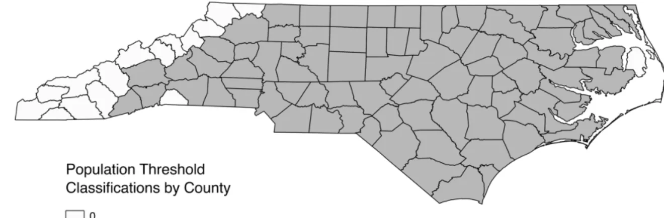
In addition to BWRs, a variable entitled “threshold” was calculated based off of the Black population of each county (US Census 2010). In the threshold variable, counties with a Black population of less than 1,000 were coded as 0, while counties with a greater population were coded as 1. Figure 1 illustrates the location of each of the 16 counties which did not meet this population threshold, and were excluded from this paper’s analysis. Geographically, 15 of these counties are located in the western, mountainous region of North Carolina, and one county, Dare, is located on the eastern coast.
(Insert Figure 1 about here)
This threshold is necessary to address overstated disparities created by low population numbers. For example, in Madison county, where the Black population is 240, compared to a White population of 20,035 the calculated BWR for stops is 92.88. This number is significantly higher than the calculated average BWR of 1.88 for stops once the threshold is applied.
Missing data is coded with a “.” in this dataset. In general, missing data occurs in counties with low populations, where low Ns could produce unreliable data. Data was typically coded as missing within the downloaded datasets, and therefore did not require recoding.
Policing
17 and 2016, which contains records of 11,385,130 traffic stops and 634,634 traffic searches
(excluding the Highway Patrol). In this data, the Black rate and White rate of stops were calculated by dividing the number of Black or White stops in a county by the Black or White population of that county during the most recent census in 2010. Search rates, on the other hand, were calculated by dividing the number of Black or White searches by the number of Black or White stops in a county. BWRs were then calculated by dividing the Black rate of either stops or searches by the corresponding White rate.
Economic
Data on poverty rates, unemployment rates, receipt of food stamps/SNAP, and household type were collected from the American Community Survey (ACS) 2016 5-year Estimates (U.S. Census Bureau 2016). The ACS is an ongoing survey that provides an array of annual data and estimates on the United States population. Social Explorer, the site where this data was
downloaded, provides access to decennial census and ACS data tables. Social Explorer also allows researchers to easily download ACS and Census data. For each of these economic
indicators, the downloaded dataset includes the percentage of the population an indicator applied to for both White and Black populations. Therefore, to calculate the BWR for poverty,
unemployment, SNAP, and household tenure, the Black percentage was simply divided by the corresponding White percentage for each particular indicator. For example, the BWR for unemployment was calculated by generating a new variable that consisted of the Black percentage unemployed divided by the White percentage unemployed.
Health
18 age with three categories: Under 18 years, 10 to 64 years, and 65 years and over. In order to calculate the race rates for this indicator, the population without insurance was summed across each of the three age groups and then divided by the total population of that race, which was provided in the dataset. For example, the Black rate of no health insurance coverage was
calculated by adding the Black population without health insurance at under 18, 18 to 64, and 65 years and over and then dividing it by the total population. This rate was then divided by the White rate, which was calculated in the same way, to derive the BWR of no health insurance.
Data on adult mortality was collected from the North Carolina State Center for Health Statistics’ County Health Databook (NCDHHS 2018). This dataset, which covers mortality from 2012-2016, is the only indicator not reported at the percentage level, but rather it is reported as its rate per 100,000 persons in the population. The mortality BWR was calculated by dividing the provided Black death rate per 100,000 of the population by the corresponding White rate.
Education
19 female less than high school and the Black male less than high school populations and dividing them by the total Black population over 25 years old. This rate was then divided by the White rate, calculated in the same manner, to produce BWRs for each category of educational attainment.
5. Results
5.1 Investigating Institutional Racism
Prevalence of Racial Disparity
Figure 2 provides a summary of the calculated county-level Black-White Ratios (BWRs) for all ten indicators. A BWR of greater than one indicates that the Black population is more likely to experience a negative outcome in an indicator than their White counterparts. For example, a BWR of 1.89 for traffic stops means that, on average, Blacks are 89% more likely to be pulled over by the police than White drivers. BWRs were calculated by dividing the Black rate by the White rate for each of the ten indicators.
(Insert Figure 2 about here)
20 economic indicators. Each of these BWRs is greater than two, meaning that Blacks are, on
average, more than 100% more likely than Whites to have negative outcomes in these indicators. The findings outlined above support H1, which posits thatacross sectors of society, Blacks will experience worse outcomes than Whites. The high BWRs reveal a clear racial disparity, with Blacks more likely to experience worse outcomes than Whites in nine out of ten indicators. The prevalence of racial disparities in this dataset partially supports the theory that institutional racism affects outcomes for black and whites.
Correlations Across Policy Domains
While the high BWRs in Figure 2 demonstrate the presence of an average racial disparity across North Carolina counties, it is also useful to understand how these BWRs relate to each other. The BWR correlation matrix in Table 2 helps us to learn more about relationships between BWRs.
(Insert Table 2 about here)
In statistics, a correlation coefficient tells us about both the direction and the strength of a linear relationship between two variables. The values of correlation coefficients range from -1 to 1. A value of -1 indicates a perfectly negative relationship, while a value of 1 indicates a
21 unemployment go up. Similarly, the coefficient on traffic stops and less than high school is -0.32, indicating a negative relationship, albeit a weak one. As one indicator increases, we would expect the other to decrease. The greatest coefficient in this table, 0.54, describes the positive relationship between receiving SNAP and not having health insurance. The findings presented in Table 2 show that there are no particularly strong relationships between BWRs, and therefore do not confirm H2, which hypothesized that racial disparities in indicators of inequality will be correlated with each other. Although there are high rates of inequality when comparing outcomes for Blacks and Whites, there does not appear to be a connection across indicators and policy domains. Instead, Table 2 shows a few positive relationships, but none that are greater than 0.54. The scatterplot in Figure 3 illustrates this relationship.
(Insert Figure 3 about here)
Counties with residuals with a value of |1.5| or greater are labeled in this figure. The regression line illustrates the positive relationship between the two indicators, but the spread of points, which each represent a county, as well as the number of outliers also indicates that this relationship is not very strong. This is an important point because this is the strongest
relationship between BWRs for indicators, showing that all other relationships are even weaker. The majority of counties cluster around the lower end of the regression line, with BWR values between 1 to 1.5 for no health insurance and between 1.5 to 3 for receiving SNAP. The
22 illustrated by Table 2 and Figure 3 suggest that the institutional racism theory does not fully account for the calculated racial disparities in this dataset.
5.2 Investigating Quality of Governance
Race-Specific Rates
The second theory outlined in this paper examines the idea that the quality of governance affects outcomes for individuals. While studying the magnitude and relationship between BWRs was essential to exploring the institutional racism theory, it is useful to examine the component race rates that make up those ratios. Figure 4 shows a side-by-side comparison of the average Black rate, White rate, and Total rate for each indicator.
(Insert Figure 4 about here)
For all indicators, excluding registered voters, the Black rates are greater than the White rates. This reflects the earlier finding that BWRs are greater than one, signifying a disparity in which Blacks are more likely to experience a specific outcome than Whites. Figure 4 also helps us to visualize the differences in the magnitude of rates both within indicators and between them. For example, the traffic stops indicator shows a stark contrast between White and Black rates, while the adult mortality indicator appears to be closer to equal–although not quite–across each rate. In order to further understand the how these race-specific rates compare across indicators, I generated two correlation matrices for Black and White rates. Table 3 illustrates the relationship between Black rates across the ten indicators.
(Insert Table 3 about here)
23 between the Black rates of unemployment and household renter is -0.47. This means that within each pair of indicators, when one increases, the other is expected to decrease. Because economic indicators like poverty and unemployment are often considered related, it is curious to see that for Blacks, at least within North Carolina counties, they actually tend to be inversely related– although not strongly. Another relationship to consider is between receiving SNAP benefits and poverty. With a correlation coefficient of 0.63, this is the strongest relationship between two Black rates in this table. Figure 5 illustrates this relationship in a scatterplot.
(Insert Figure 5 about here)
Similar to the previous scatterplot, the regression line in Figure 5 illustrates a positive relationship. This correlation is intuitive because one would assume that someone below poverty would also be eligible and likely to receive SNAP benefits. Outliers with a residual, or error term, greater than |9| are labeled with their county name. This is an interesting outcome because food stamp eligibility is typically determined by annual household income, which is also how poverty status is determined. H3 posits that if the quality of governance determines outcomes, then rates within races, in this case Black rates, will also be correlated across indicators. The coefficients between Black rates in Table 3 differ in both size and direction, indicating that the results do not support the third hypothesis. Again, Figure 5 shows the strongest relationship between Black rates for all indicators, which means that all other relationships are even weaker. If the quality of governance drove outcomes across the board for populations, we would expect to see it reflected in high relationships between indicators. Similarly, Table 4 examines the relationship between White rates across indicators.
24 Table 4 again demonstrate a variety in the strength and direction of relationships between indicators, with coefficients in this table ranging from -0.33 to 0.79. The coefficient of 0.79 describes the relationship between the White rate receiving SNAP and White rate with less than a high school degree, and is the strongest across each of the three correlation matrices discussed thus far. In comparison, the coefficient between Black rate receiving SNAP and the Black rate with less than a high school degree was 0.52.
(Insert Figure 6 about here)
Figure 6 demonstrates the relationship between the White rates for receiving SNAP and less than a high school degree, with counties with residuals greater than |4.0| labeled. Unlike the two previously discussed scatterplots, this plot illustrates a strong positive relationship. The points, which each represent a county, are closely clustered around the regression line, save for a few outliers. In contrast to Table 3, which showed the correlations between Black rates, Table 4 contains relatively more strong positive relationships. Between Black rates, only eight
correlation coefficients were positive and greater than 0.3, while 14 coefficients in the White rate matrix meet this criteria. In addition, five of these coefficients exhibit strong positive
25 (Insert Table 5 about here)
This table only shows the relationship between populations when looking at the same measure of inequality. For instance, the table shows that the White rate of the population below poverty and the Black rate below poverty are positively correlated with a coefficient of 0.39. All comparisons across indicators have been removed as it would be illogical to compare, for
example, the Black unemployment rate with the White adult mortality rate and draw any
conclusions about their relationship. In this table, a low correlation, indicates that between these two population groups, their rates across counties do not tend to be related. For example, the coefficient between Black and White rates of unemployment is just 0.03. If we observed a low rate of unemployment for Whites in a North Carolina county, we would not necessarily expect a corresponding low Black unemployment rate. Such a low coefficient indicates that there is no linear relationship between the two variables. Conversely, high correlations such as those in the policing sector in this table, indicate that there is a strong linear relationship. Of the ten
relationships shown in this table, seven of them have positive correlations, and three have strong positive relationships indicating that Blacks and Whites are not across the board affected by inequality in the same manner. H4 investigates the relationships between Black and White rates, and suggests that if the quality of county-level governance determines outcomes, then counties with high (low) outcomes for Whites will have high (low) outcomes for Blacks. Table 5 offers up evidence that H4 may apply to specific sectors, namely policing, but that it cannot be confirmed across all sectors of society.
(Insert Figure 7 about here)
26 residual greater than or equal to |3.0| labeled. The majority of counties are clustered around the lower end of the regression line, between 0 to 15 percent on both axes, reflecting the relatively low overall rate of searches performed by police. But, although the average total population rate of search is 6.92%, the average rate of search for Blacks is about 2.85 percentage points higher than the White rate of search. The strong relationship between both stops and searches across Black and White rates is an interesting finding given the amount of literature that focuses on stark racial disparities in policing. While this scatterplot still demonstrates a racial disparity, it also has interesting implications for how police in specific areas may systemically act towards both Whites and Blacks. The findings presented in Table 5 and Figure 7 do not confirm H4 since White and Black rates for all indicators do not exhibit strong positive relationships. Despite this, these results are noteworthy because they paint a much more complicated picture of inequality than the quality of governance theory assumes.
County-Level Governance
Embedded within H4 is also an assumption about the role of local government in determining outcomes for the population. Tables 6 through 8 further explore this idea that the quality of governance within counties will drive outcomes.
(Insert Table 6 about here)
27 much more likely to be pulled over than Blacks in this county. Across all ten indicators, Orange appears the most frequently in the top five list, with four appearances, followed by Hyde, Perquimans, Chatham, and Chowan with three each. In contrast, Martin, Bladen, Caswell, and Alexander appear in the bottom five counties three times each. Although some counties do appear multiple times in either the bottom or the top five, no clearly consistent counties or patterns emerge when looking at this table.
Similar to Table 6, Tables 7 and 8 list the top five and bottom five counties for Black rates and White rates respectively. By looking at the trends in the component rates that make up the BWRs we can ascertain whether there are geographic trends in inequality within each population. This would allow us to learn more about whether there are counties that can be classified as the “best” or the “worst” places to be for Black or White residents.
(Insert Table 7 and 8 about here)
28 county-level governance determines outcomes. These results suggest that the driving forces behind racial inequality and poor outcomes in these indicators across sectors of society are complex and not easily explained by either of the two theories investigated above.
6. Discussion
The theory section of this paper outlines two models to predict and explain the patterns that emerge when exploring differences within and between White and Black populations across ten indicators of inequality in this dataset. The following section evaluates how well these theories describe the findings presented in the results section.
6.1 Evaluating the Institutional Racism Theory
The first theory posits that institutional racism drives consistently poor outcomes for Blacks across sectors of society. Institutional racism refers to the influence of racial bias in institutions, which results in systematically poor outcomes for a particular racial group. If this theory of institutional racism as a driver of outcomes in these indicators were accurate, we would expect to see a number of outcomes in this dataset. First, we would expect to see consistently high BWRs across all indicators. Second, we would anticipate that these BWRs would be highly correlated with each other. This theory assumes that racism is ingrained not just within one institution, but throughout many in society. Therefore, the theory suggests that we would see high positive correlations throughout Table 2, which describes the relationship between BWRs. A high BWR in one sector would be replicated across all other sectors, demonstrating an institutional pattern of inequality .
29 affected by an indicator at the same rate, so where poverty is high for the White population in a county, you would also observe high poverty rates for the Black population and vice versa. Furthermore, we would expect to see no correlations between BWRs in Table 2, because these would be unrelated.
What we actually see in the results of this analysis is a more complex portrayal of racial inequality than either of the two scenarios outlined above. Figure 2 clearly demonstrates the existence of a racial disparity in North Carolina across all indicators, besides registered voters. In particular, the high BWRs within the economic indicators, point to a persistent and substantial disparity. For both the receiving SNAP and unemployment variables, the minimum calculated BWR is greater than one, meaning that in all 84 counties in this analysis, Blacks perform worse than Whites in these indicators. This finding supports H1, that across sectors of society, Blacks will experience worse outcomes than Whites. Although this seems to be strong evidence for the institutional racism theory, the picture gets more complicated when you examine the relationship between BWRs. Out of all of the pairings between indicators, 11 coefficients are greater than |0.30|, indicating moderately strong relationships. Of these coefficients, only the relationships between no health insurance and SNAP and less than high school and SNAP are greater than |0.5|. This finding does not support H2 for this theory, which hypothesizes that racial disparities in indicators of inequality will be correlated with each other. Although there are some
30
6.2 Evaluating the Quality of Governance Theory
The second theory outlined in this paper discusses the notion that the quality of governance affects outcomes in indicators of inequality. Under this theory, the quality of governance drives outcomes for both Blacks and Whites across sectors of society. If this model held, the expected results in this analysis would be quite different from those outlined in the institutional racism section above. First, we would expect to see high positive correlations between Black rates and White rates in Tables 3 and 4, respectively. We would also likely see high positive correlations in Table 5, which shows the relationships between Black and White rates on shared indicators. High positive correlations on shared indicators between these populations means that within a county, Black and White rates move in the same direction, indicating that these populations are both either negatively or positively affected by the systems in place. For example, a correlation coefficient that nears the value of one between the Black and White rates of less than high school suggests that the school system, and subsequently student performance, is not racially driven, but rather a product of the quality of the institution and its governance. In this situation, policies may be randomly, but not racially arbitrary. Another way to examine the effects of quality of governance is at the geographic level. Because this data looks at the county-level for each indicator, we can examine the outcomes for Blacks and Whites within sectors to discern whether any counties reliably have poor or good outcomes. If a county consistently ranks in the top five most unequal counties for both Blacks and Whites, it may point to a problem with poor quality of governance. Likewise, if a county appears in the bottom five counties, it could signify good governance in action. Furthermore, if a county always appears in either the top five or bottom five counties for BWRs, as illustrated in Table 6, it may point to a combination of both racism and governance. This would indicate that a county could
31 However, if this theory did not hold, we would expect different outcomes in the results of the analysis of this data. If quality of governance did not affect the outcomes in these indicators, we would see low correlations between race-specific rates and between Black and White rates in Table 5. This would indicate that there is another factor that causes differences across indicators between these two populations besides the quality of governance. In addition, if quality of governance did not explain the outcomes across populations we would likely not see consistent patterns in the types of counties that are considered the most or least unequal, as illustrated by Tables 6 through 8. Rather than consistently appearing in the top five or bottom five for an indicator of inequality, counties would more or less be randomly distributed throughout these lists.
Similar to the racism theory outlined above, the actual results of this analysis point to a more complicated picture than simply bad or good governance. H3 posits that if the quality of governance determines outcomes, then rates within races will be correlated across indicators. The low number of strong positive correlations between indicators for Black rates in Table 3 and for White rates in Table 4, do not support this hypothesis. H4 further examines the theory of quality of governance, and posits that if the quality of county-level governance determines outcomes, then counties with high (low) rates for Whites will have high (low) rates for Blacks. As described above, one expected result of this hypothesis is that we would see high correlations between Black and White rates in Table 5. Of the ten relationships that this table illustrates, seven of them are positively correlated, four of which show a strong correlation with a coefficient greater than 0.50. This finding does not support the idea that the quality of governance is the factor that drives outcomes across all indicators for both populations.
32 The coefficients on traffic stops (0.86) and searches (0.92) show the strongest relationships in this entire analysis. These two indicators occur within the same sector, and are by definition related to each other. Such strong relationships have important implications for those interested in studying the performance of police officers. Unlike many of the papers on policing presented in the literature review, these strong correlations suggest that police in certain counties could also be systematically more or less aggressive in their policing tactics. Where police pull over a lot of White drivers, they may also pull over a lot of Black drivers, causing a strong correlation
between the two race rates. While quality of governance does not seem to extend to all sectors of society in this analysis, this finding suggests that it could be restricted to specific sectors and the actions of institutional players.
In addition, the rankings of counties by Black rates, White rates, and Black-White ratios in tables 6 through 8 do not reveal a discernible pattern. H4 suggests that the quality of the county-level governance is what drives outcomes for populations. But, as described in the results section, a number of counties appear multiple times in the bottom and top five for inequality, with the most frequently occurring counties ranging from just three to six appearances in these lists. Outcomes are not consistently good or bad within counties, which suggests that another explanation besides quality of governance likely drives the outcomes discerned in this analysis.
7. Conclusion
33 mechanisms that reproduce it throughout society are not clear and straightforward. The lack of a strong conclusion or theory to describe the patterns in this analysis points to a need to continue to study and understand the persistence of racial inequality and its multiple manifestations in
sectors of society.
34
Tables and Figures
Tables
Table 1. Definitions of Indicators
Note: Refer to Chapter 4 and Appendix A for a list of sources and more detailed explanations of indicators.
Variable Description
Traffic Stops Total number of traffic stops in a county.
Traffic Searches Total number of traffic searches in a county.
Poverty Total number of people below the federal poverty line in a county.
Unemployment Total number of unemployed individuals in the population 16 years and over in a county.
Receiving SNAP Total number of individuals receiving Supplemental Nutrition Assistance Program (SNAP) benefits.
Household Renter Total number of occupied housing units inhabited by a renter (not the owner) in a county.
No Health Insurance Total number of individuals without health insurance in a county.
Adult Mortality The number of adults per 100,000 population who have died in a county.
Less than High School Total number of adults age 25 or older with less than a high school degree as their highest degree attained in a county.
35 Table 2. Black-White Ratio Correlations
Note: Correlation coefficients greater than |0.3| are included in this table. Coefficients greater than or equal to |0.6| are bolded. Education Civic Traffic Stops Traffic Searches Poverty Unemploy-ment Receiving SNAP Household Renter No Health Insurance Adult Mortality < High School Registered Voters Policing Traffic Stops Traffic Searches Economic Poverty Unemployment 0.32
Receiving SNAP 0.34 0.36
Household Renter
Health
No Health Insurance 0.40 0.54 0.35
Adult Mortality
Education
< High School -0.32 0.51 0.37
Civic
Registered Voters 0.36 -0.38
36 Table 3. Black Rate Correlations
Note: Correlation coefficients greater than |0.3| are included in this table. Coefficients greater than or equal to |0.6| are bolded.
Education Civic Traffic Stops Traffic Searches Poverty Unemploy-ment Receiving SNAP Household Renter No Health Insurance Adult Mortality < High School Registered Voters Policing Traffic Stops Traffic Searches Economic Poverty -0.31 Unemployment -0.30
Receiving SNAP -0.42 0.63 -0.47
Household Renter 0.38
Health
No Health Insurance 0.38 -0.36 0.39
Adult Mortality 0.30
Education
< High School -0.54 0.33 0.52 -0.36
Civic
Registered Voters 0.47 -0.53
37 Table 4. White Rate Correlations
Note: Correlation coefficients greater than |0.3| are included in this table. Coefficients greater than or equal to |0.6| are bolded.
Education Civic Traffic Stops Traffic Searches Poverty Unemploy-ment Receiving SNAP Household Renter No Health Insurance Adult Mortality < High School Registered Voters Policing Traffic Stops
Traffic Searches -0.39
Economic
Poverty -0.34
Unemployment 0.40
Receiving SNAP -0.48 0.66 0.50
Household Renter 0.37 -0.38
Health
No Health Insurance -0.38 0.60 0.53
Adult Mortality 0.51 0.45 0.69 0.40
Education
< High School -0.42 0.60 0.79 -0.34 0.57 0.57
Civic
Registered Voters -0.33
38 Table 5. Black and White Rate Correlations
Note: Correlation coefficients between Black and White rates for the same indicator are included. Coefficients greater than or equal to |0.6| are bolded.
Education Civic Traffic Stops Traffic Searches Poverty Unemploy-ment Receiving SNAP Household Renter No Health Insurance Adult Mortality < High School Registered Voters Policing
Traffic Stops 0.86
Traffic Searches 0.92
Economic
Poverty 0.39
Unemployment 0.03
Receiving SNAP 0.46
Household Renter 0.60
Health
No Health Insurance 0.16
Adult Mortality 0.30
Education
< High School 0.59
Civic
Registered Voters -0.34
Policing Economic Health
39 Table 6. Black White Ratio Rankings by County
Note: The most frequently occurring counties in the top five and bottom five are as follows:
Top: Orange (4 indicators) and Hyde, Perquimans, Chatham, and Chowan (3 indicators each) Bottom: Martin, Bladen, Caswell, and Alexander (3 indicators)
Rank Traffic Stops
Traffic
Searches Poverty
Unemploy-ment
Receiving SNAP
Household Renter
No Health Insurance
Adult Mortality
< High School
Registered Voters 1 Yadkin Northampton Moore Currituck Wake Wilson Chowan Transylvania Hyde Cumberland 2 Randolph Mecklenburg Wilson Hyde Hyde Person Perquimans Orange Pamlico Cabarrus 3 Henderson Orange Perquimans Bertie Pitt Davidson Craven Henderson Tyrrell Hoke 4 Davidson Onslow Chowan Washington Tyrrell Nash Orange New Hanover New Hanover Onslow
5 Union Durham Lincoln Perquimans Chowan Vance Chatham Chatham Craven Edgecombe
… … … …
80 Pender Bladen Stokes Martin Caswell Onslow Greene Alexander Davidson Tyrrell
81 Jones Person Hyde Davie Wilkes Alexander Camden Yadkin Gaston Alexander
40 Table 7. Black Rate Rankings by County
Note: The most frequently occurring counties in the top five and bottom five are as follows: Top: Hyde, Perquimans, and Tyrell (4 indicators)
Bottom: Alexander (5 indicators) and Cabarrus (4 indicators) Rank Traffic Stops Traffic
Searches Poverty
Unemploy-ment
Receiving SNAP
Household Renter
No Health Insurance
Adult Mortality
< High School
Registered Voters 1 Cabarrus Perquimans Scotland Hyde Hyde Pitt Perquimans Transylvania Tyrrell Cabarrus 2 Mecklenburg Gates Chowan Lincoln Washington New Hanover Chowan Cleveland Hyde Camden 3 Wake Duplin Tyrrell Currituck Tyrrell Davidson Craven Henderson Caswell Mecklenburg 4 Currituck Stokes McDowell Tyrrell Chowan Gaston Hyde Rutherford Bertie Orange 5 Guilford Rutherford Montgomery Perquimans Perquimans Wilson Lincoln Anson Surry Guilford
… … … …
41 Table 8. White Rate Rankings by County
Note: The most frequently occurring counties in the top five and bottom five are as follows: Top: Duplin (4 indicators) and Richmond (3 indicators)
Bottom: Wake (6 indicators) and Orange (4 indicators) Rank Traffic
Stops
Traffic
Searches Poverty
Unemploy-ment
Receiving SNAP
Household Renter
No Health Insurance
Adult Mortality
< High School
Registered Voters
1 Tyrrell Perquimans Robeson Martin Bladen Onslow Duplin Richmond Duplin Martin
2 Currituck Duplin Duplin Onslow Rutherford Cumberland Montgomery Robeson Sampson Brunswick
3 Guilford Gates Hyde Anson McDowell New Hanover Hyde Columbus Wilkes Durham
4 Mecklenburg Pamlico Richmond Cleveland Richmond Durham Sampson Cleveland Montgomery Chatham
5 Cabarrus Stokes Wilkes Camden Caldwell Pitt Anson Rowan Surry Orange
… … … …
80 McDowell Washington Camden Wake Iredell Perquimans Nash Mecklenburg Mecklenburg Anson 81 Richmond Northampton Currituck Currituck Durham Gates Cabarrus Durham Pitt Cumberland
82 Gates Hoke Union Granville Orange Union Camden Wake New Hanover Hertford
83 Bertie Camden Wake Durham Mecklenburg Tyrrell Wake Chatham Orange Onslow
42
Figures
Figure 1. Population Threshold Classifications
Note: Counties classified as 0 did not meet the Black population threshold of 1,000. These counties are: Alleghany, Ashe, Avery, Cherokee, Clay, Dare, Graham, Haywood, Jackson, Macon, Madison, Mitchell, Polk, Swain, Watauga, and Yancey.
43 Figure 3. Scatterplot of the BWR Receiving SNAP by BWR without Health Insurance
44 Figure 4. Average Black Rate, White Rate, and Total Rate by Indicator
45 Figure 5. Scatterplot of the Black Rate Below Poverty by Black Rate Receiving SNAP
46 Figure 6. Scatterplot of the White Rate Receiving SNAP by White Rate Less than High School
47 Figure 7. Scatterplot of the White Rate of Police Searches by the Black Rate of Police Searches
48
Appendix A: Descriptive Statistics Tables
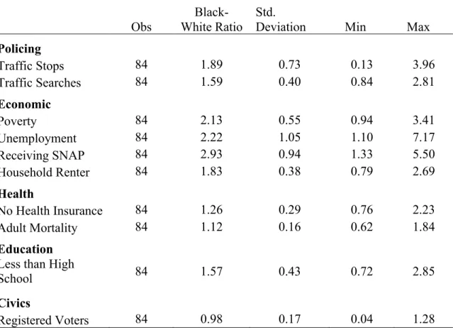
Table A-1. Calculated Black-White Ratios
Obs
Black-White Ratio
Std.
Deviation Min Max
Policing
Traffic Stops 84 1.89 0.73 0.13 3.96
Traffic Searches 84 1.59 0.40 0.84 2.81
Economic
Poverty 84 2.13 0.55 0.94 3.41
Unemployment 84 2.22 1.05 1.10 7.17
Receiving SNAP 84 2.93 0.94 1.33 5.50
Household Renter 84 1.83 0.38 0.79 2.69
Health
No Health Insurance 84 1.26 0.29 0.76 2.23
Adult Mortality 84 1.12 0.16 0.62 1.84
Education
Less than High
School 84 1.57 0.43 0.72 2.85
Civics
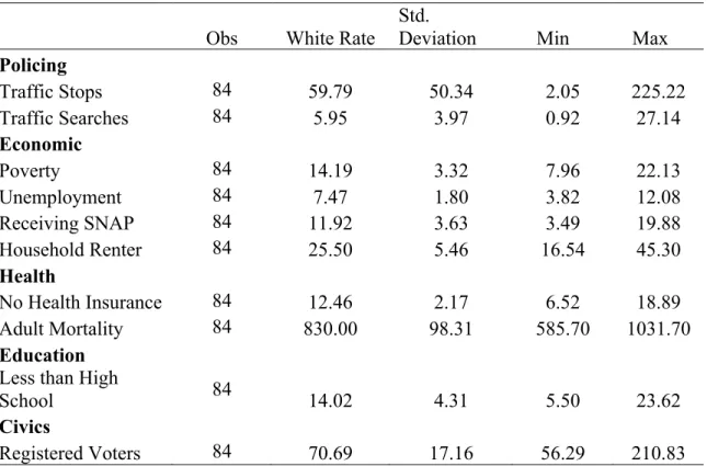
49 Table A-2. Calculated White Rates
Obs White Rate
Std.
Deviation Min Max
Policing
Traffic Stops 84 59.79 50.34 2.05 225.22
Traffic Searches 84 5.95 3.97 0.92 27.14
Economic
Poverty 84 14.19 3.32 7.96 22.13
Unemployment 84 7.47 1.80 3.82 12.08
Receiving SNAP 84 11.92 3.63 3.49 19.88
Household Renter 84 25.50 5.46 16.54 45.30
Health
No Health Insurance 84 12.46 2.17 6.52 18.89 Adult Mortality 84 830.00 98.31 585.70 1031.70
Education
Less than High
School 84 14.02 4.31 5.50 23.62
Civics
Registered Voters 84 70.69 17.16 56.29 210.83
Table A-3. Calculated Black Rates
Obs Black Rate
Std.
Deviation Min Max
Policing
Traffic Stops 84 115.45 97.99 2.70 335.26
Traffic Searches 84 8.80 5.11 1.30 34.68
Economic
Poverty 84 29.25 6.80 14.40 46.59
Unemployment 84 15.62 5.22 7.72 39.61
Receiving SNAP 84 32.55 7.63 15.62 51.15
Household Renter 84 46.29 10.83 14.77 66.53
Health
No Health Insurance 84 15.31 2.55 8.34 24.89 Adult Mortality 84 922.80 97.30 554.10 1204.40
Education
Less than High
School 84 21.05 5.88 9.63 40.72
50 Registered Voters 84 67.38 11.71 8.16 87.33
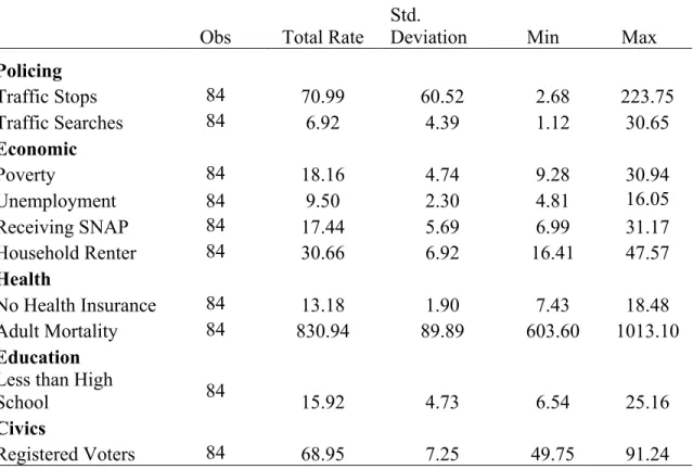
Table A-4. Calculated Total Rates
Obs Total Rate Std. Deviation Min Max
Policing
Traffic Stops 84 70.99 60.52 2.68 223.75
Traffic Searches 84 6.92 4.39 1.12 30.65
Economic
Poverty 84 18.16 4.74 9.28 30.94
Unemployment 84 9.50 2.30 4.81 16.05
Receiving SNAP 84 17.44 5.69 6.99 31.17
Household Renter 84 30.66 6.92 16.41 47.57
Health
No Health Insurance 84 13.18 1.90 7.43 18.48 Adult Mortality 84 830.94 89.89 603.60 1013.10
Education
Less than High
School 84 15.92 4.73 6.54 25.16
Civics
51
Appendix B: Codebook
General Information: This dataset is comprised of data retrieved from multiple datasets. For ease of understanding, the following codebook is categorized by the source from which each variable was received.
List of Variables
county: The name of the North Carolina county.
fips: The FIPS code, or Federal Information Processing Standard, of the county which the following variables apply to.
Census of Population and Housing, 2010 (U.S. Census Bureau 2010)
PopTotal: The total population of the county. PopWhite: The total White population of the county. PopBlack: The total Black population of the county.
Threshold: A binary indicator for the total Black population of a county. (1= Black population is greater than or equal to 1,000, 0=Black population is less than 1,000)
2002-2016 North Carolina Traffic Data (Baumgartner, Epp, and Shoub 2018) B_stops: Total number of Black traffic stops.
W_stops: Total number of White traffic stops. stops: Total number of stops.
searches: Total number of traffic searches. B_searches: Total number of Black traffic searches. W_searches: Total number of White traffic searches. WR_stops: White stop rate (=(W_stops/PopWhite)*100). BR_stops: Black stop rate (=(B_stops/PopBlack)*100).
BWR_stops: Black White ratio of stops (=(BR_stops/WR_stops)*100). TR_stops: Total rate of stops (=(stops/PopTotal)*100)
BR_searches: Black search rate (=(B_searches/B_stops)*100). WR_searches: White search rate (=W_searches/W_stops).
BWR_searches: Black White ratio of searches (=BR_searches/WR_searches). TR_searches: Total rate of searches (=searches/stops)
Social Explorer Tables: ACS 2016, 5-Year Estimates (U.S. Census Bureau 2016) WR_unemp: White unemployment rate (percent provided in ACS dataset). BR_unemp: Black unemployment rate (percent provided in ACS dataset).
52 TR_belowpov: Total rate below poverty (=total population below poverty/total population). WR_HHRenter: Rate of White population renting households (percent provided in ACS dataset). BR_HHRenter: Rate of Black population renting households (percent provided in ACS dataset). TR_HHRenter: Total rate of population renting households (=population renting/total population) W_HI_pop: White Civilian Noninstitutionalized Population.
W_u18_noHI: White population under 18 years old without health insurance.
W_1864_noHI: White population between 18 and 64 years old without health insurance. W_65o_noHI: White population over 64 years old without health insurance.
B_HI_pop: Black Civilian Noninstitutionalized Population.
B_u18_noHI: Black population under 18 years old without health insurance.
B_1864_noHI: Black population between 18 and 64 years old without health insurance. B_65o_noHI: Black population over 64 years old without health insurance.
BWR_unemp: Black White ratio of unemployment rates (=BR_unemployed/WR_unemployed). BWR_belowpov: Black White ratio of below poverty rates (=BR_belowpov/WR_belowpov). BWR_HHRenter: Black White ratio of household renter rates (=BR_HHRenter/WR_HHRenter). WR_noHI: Rate of White population without health insurance
(=(W_u18_noHI+W_1864_noHI+W_65o_noHI)/W_HI_ pop)). BR_noHI: Rate of Black population without health insurance
(=(B_u18_noHI+B_1864_noHI+B_65o_noHI)/B_HI_ pop)). TR_noHI: Total rate of population without health insurance
(=total population without health insurance/total population)
BWR_noHI: Black White ratio of population without health insurance (=BR_noHI/WR_noHI). W_educ_pop: White Alone Population 25 Years and Over.
W_hsless_m: White Alone Population 25 Years and Over: Male: Less than High School Diploma. W_hsless_f: White Alone Population 25 Years and Over: Female: Less than High School Diploma. B_educ_pop: Black Alone Population 25 Years and Over.
B_hsless_m: Black Alone Population 25 Years and Over: Male: Less than High School Diploma. B_hsless_f: Black Alone Population 25 Years and Over: Female: Less than High School Diploma. WR_hsless: White rate of population with less than high school diploma
(=(W_educ_hsless_male+W_educ_hsless_female)/W_educ_pop)). BR_hsless: Black rate of population with less than high school diploma
(=(B_educ_hsless_male+B_educ_hsless_female)/B_educ_pop)). TR_hsless: Total rate of population with less than high school diploma
(=total population with less than high school/total population) BWR_hsless: Black White ratio of population with less than high school diploma
(=BR_hsless/WR_hsless).
WR_snap: White rate of population receiving SNAP benefits (percent provided in ACS dataset). BR_snap: Black rate of population receiving SNAP benefits (percent provided in ACS dataset).
TR_snap:
Total rate of population receiving SNAP benefits (=total population receiving SNAP/total population)
53
County Health Databook, 2012-2016 (NCDHHS 2018)
WR_mort: White rate of adult mortality (per 100,000 population). BR_mort: Black rate of adult mortality (per 100,000 population). TR_mort: Total rate of adult mortality (per 100,000 population).
BWR_mort: Black White ratio of adult mortality (BR_mortality/WR_mortality).
Voter Statistics, September 12, 2017 (NCSBE 2017) B_regstvote: Black registered voters.
W_regstvote: White registered voters.
WR_regstvoter: White rate of registered voters (=W_regstvote/PopWhite). BR_regstvoter: Black rate of registered voters (=B_regstvote/PopBlack).
54
References
American Psychological Association (APA). 2012. Ethnic and Racial Disparities in Education:
Psychology’s Contributions to Understanding and Reducing Disparities. A Report by the
American Psychological Association Presidential Task Force on Educational Disparities.
Baumgartner, Frank R., Derek A. Epp, and Kelsey Shoub. 2018. Suspect Citizens: What 20
Million Traffic Stops Tell Us About Policing and Race. New York: Cambridge University
Press.
Clark, Christopher. J. 2019. Gaining Voice: The Causes and Consequences of Black
Representation in the American States. Oxford University Press.
Close, Billy R. and Mason, Patrick L. 2006a. Searching for Efficient Enforcement: Officer
Characteristics and Racially Biased Policing. Review of Law and Economics 3, 2:
263-321.
Epp, Charles R., Steven Maynard-Moody, and Donald Haider-Markel. 2016. Beyond Profiling:
The Institutional Sources of Racial Disparities in Policing. Public Administration Review
77, 2: 168–178.
Leach, Colin W. 2002. Democracy’s Dilemma: Explaining Racial Inequality in Egalitarian
Societies. Sociological Forum 17, 4: 681-696.
Lippard, Cameron D., and Charles A. Gallagher. 2014. Contemporary Forms of Racism. Race
and Racism in the United States: An Encyclopedia of the American Mosaic 1: 42-43.
Santa Barbara, CA.
McKernan, Singe-Mary, Caroline Ratcliffe, Eugene Steuerle, and Sisi Zhang. 2013. “Less Than
Equal: Racial Disparities in Wealth Accumulation.” The Urban Institute. Washington,
55 NCDHHS. 2018. “2018 County Health Data Book.” North Carolina State Center for Health
Statistics.
NCSBE. 2017. “Voter Statistics, September 12, 2017.” North Carolina State Board of Elections.
Putnam, Robert D., Robert Leonardi, and Raffaella Y. Nanetti. 1994. Making Democracy Work:
Civic Traditions in Modern Italy. Princeton, NJ: Princeton University Press.
Reardon, S.F., Demetra Kalogrides, and Ken Shores. Forthcoming. The Geography of
Racial/ethnic Test Score Gaps. The American Journal of Sociology.
Reich, Michael. 2015. Racial Inequality. Radical Political Economy: Explorations in Alternative
Economic Analysis, pp. 197-202. New York, NY: Taylor and Francis Group.
Rodriguez, J. M., Arline T. Geronimus, John Bound, & Danny Dorling. 2015. Black Lives
Matter: Differential Mortality and the Racial Composition of the US Electorate, 1970–
2004. Social Science & Medicine, 136: 193-199.
Rosenfeld, Richard, Jeff Rojek, and Scott Decker. 2012. Age Matters. Journal of Research in
Crime and Delinquency 49, 1: 31-55.
Rubinstein, Nicolai. 1958. Political Ideas in Sienese Art: The Frescoes by Ambrogio Lorenzetti
and Taddeo Di Bartolo in the Palazzo Pubblico. Journal of the Warburg and Courtauld
Institutes 21, 3: 179-207.
Sablich, Liz. 2016. “7 Findings that Illustrate Racial Disparities in Education.” Brookings
Institution. Washington, D.C.
Schrantz, Dennis and Jerry McElroy. 2000. Reducing Racial Disparity in the Criminal Justice
System: A Manual for Practitioners and Policy Makers. Washington, DC: Sentencing
56 Tillyer, Rob, and Robin S. Engel. 2013. The Impact of Drivers’ Race, Gender, and Age During
Traffic Stops: Assessing Interaction Terms and the Social Conditioning Model. Crime
and Delinquency 59, 3: 369-395.
U.S. Census Bureau. 2010. Census of Population and Housing, 2010. Prepared by Social
Explorer.
U.S. Census Bureau. 2016. “Social Explorer Tables: ACS 2016, 5-Year Estimates”. Prepared by
Social Explorer.
Williams, David R., and Chiquita Collins. 2001. Racial residential segregation: a fundamental
cause of racial disparities in health. Public health reports 116, 5: 404-416.
Williams, David R. and Pamela B. Jackson. 2005. Social Sources of Racial Disparities in Health.
Health Affairs 24, 2.
Williams, David R. and Selina A. Mohammed. 2008. Discrimination and Racial Disparities in