Identity Management Guidelines
Version 5.2 - September 2014
This document is subject to periodic revision.Please check www.leeds.ac.uk/comms to make sure you have the most recent copy. This revision is an update to the original guidelines, fi rst developed
in 2006. They contain rules and guidance relating to printed material only, and signpost further sources of help and information relating to other media.
Marketing Communications Team
Introduction
From the Marketing Director 1
Introduction to the guidelines 2
Summary of the system principles 3
Help and advice 4
Contents
PART 1
System components 6
The logo 7
The logo – clear space and minimum size 8
The logo – suffi cient contrast 9
The logo – misuse and what is acceptable 10-11
Identifi cation architecture 12
Use of the University of Leeds crest 13
The corporate colour palette 14
Working with colour and creating palettes 15
Typefaces 16
Accessibility 17
The identity band 18
Internally produced desktop publishing 19
Photography 20-22
Publications and documents 23
Identifi cation architecture 24-25
Alignment across formats and sizes 26-34
Grids 35
Use of grids 36
Use of type on covers 37
Image placement 38-39
Back covers 40
Posters and fl yers 41
Certifi cates 38
External partnerships (logo placement) 42-45
PART 2
Style guidance 47
Overview 48
Covers – creating the identity band 49
Example covers 50
Spreads – guidance 51
Copy density – a rough guide 52
Example spreads 53-54
Example magazine covers 55
Example display material 56
Archive of original guidance (from 2006) 57-67
Signage 68
Stationery 69
The Identity Management (IM) guidelines were fi rst produced in 2006 to bring greater cohesion, consistency and professionalism to our appearance. Our reputation for excellence in many areas of our work means we have a strong basis on which to build. The way we present ourselves also infl uences perceptions so it’s important that our print and digital materials support our reputation for excellence. The framework for external suppliers (in design, web and video production) is being renewed so this is the ideal time to refresh these guidelines along with new advice on using our identity across new media. The IM framework provides a mechanism through which we will develop a cohesive institutional identity. The guidelines are designed to enable us to tailor communications to specifi c audiences whilst ensuring a clear association with the University in a coherent manner.
After consultation with users internally and our external designers and web developers, we have simplifi ed and clarifi ed where necessary but we have not made any signifi cant changes.
From Martin Holmes, Marketing Director, University of Leeds
Introduction
The University design teams and the approved list of suppliers for design and print are familiar with these guidelines and will assist you in their implementation. Please ensure that you and all your design, print and photographic suppliers have access to and a clear understanding of the guidelines.
Thank you for taking the time to read this and to familiarise yourself with the guidelines.
These guidelines will strengthen our visual identity. Whilst extensive, they do not cover every scenario. Colleagues in marketing and communications are happy to offer advice and support.
Martin Holmes, Marketing Director March 2012
Welcome to the Identity Management guidelines for the University of Leeds.
These guidelines have been prepared to help you adopt the Identity Management system. They are aimed at anyone responsible for producing or commissioning visual printed material for the University. The reason for the refresh was to simplify and clarify the guidelines and to include examples to assist the process.
They are intended to cover most requirements. However, guidelines are a living document and will evolve over time as new or additional guidance is needed.
The guidelines have been organised into two parts:
Introduction to the guidelines
Part one
Contains details of all the component principles and elements that comprise the system – the ‘nuts and bolts’ and the ‘do’s and dont’s’.
From the basics; like where to place the logo and at what size, how to use the identity band and correctly setting up the basic architecture and layout of covers, to our principles concerning photography, colour and typefaces.
Part one is there to help everyone – individuals across campus who are looking for help when producing internal documents, faculty marketing teams who commission visual communications and also the designers, internal and external, who produce much of our creative printed output.
Introduction
Part two
Contains further information, suggestions and guidance on the design of professionally-produced materials such as;
• brochures and magazines • posters and fl yers
• exhibition or event materials
Along with some examples of existing work and an archive of the original design details from 2006. Part two has been prepared to assist anyone commissioning or designing creative printed communications.
The University design teams and the approved list of suppliers for design are familiar with these guidelines and will assist you in their implementation.
Introduction
Summary of the system principles and components
The Identity Management system comprises a number of principles and components that when used together will deliver a cohesive, professional and quality presentation of the University as a whole, whilst enabling us to effectively engage our many audiences with our broad base of subject matter.
The constants
The University logo
A developed logo in a single form suitable for the widest possible range of applications.
A fi xed place for the logo to appear on all materials. Faculties, schools and departments and services will no longer be identifi ed by using individual logos. Instead they will be identifi ed by name. There will be a fi xed relationship between their names and that of the University that will be evident on all materials. Centres and institutes may retain any existing individual logos but these will be used in a defi ned relationship with the University logo.
University crest
Please note; the University crest will continue to be used for legal, statutory and ceremonial purposes. For further guidence, please contact
Jeremy Harmer [email protected] 0113 343 4292
Identity band
A band device will be used across most applications to hold them together visually and to provide a clear space within which the University logo will appear. Over time the band will become a secondary identifi cation and branding element and help with recognition of the University of Leeds.
Typefaces
Three typeface families will be used for all University printed materials. On all professionally-produced material, either Trade Gothic and/or Sabon should be used exclusively. Where these fonts are not available (on local internal documents, for example) the Arial font family should be used instead. There is an alternative set of fonts for web applications www.leeds.ac.uk/comms/toolkit
Grids
Layout grids will help to create greater cohesion and continuity across printed materials whilst providing suffi cient fl exibility across our breadth of needs. These grids will be most noticeable on document covers. Colour
A core palette, that includes the University’s existing green and red colours – along with black, white and a University beige – should be used for corporate and other centrally produced materials.
Corporate style
The components above when used together with the corporate colour palette will create a clear corporate style which will be used to provide cohesion and professionalism across all central and University-wide materials.
The variables
ColourThe previous extended colour palette has proved limiting and caused confusion and duplication, so we have dispensed with this. However, we would like to draw attention to some of the suggestions and advice on page 15 about working with colour in a sympathetic and creative manner.
Faculties, schools, departments, centres, institutes and services should be encouraged to build a consistent palette – creating their own colour theme across a suite of materials or choosing to work in the palette, item by item.
Images
Some general style guidance is given on appropriate styles and types of images we should be using. Choice of images should be made on the basis of subject matter and audience suitability. Think quality, not quantity. Avoid cliched, generic and dated images. Consider commissioning new photography, or explore the image library for new ideas
imagelibrary.leeds.ac.uk
Use stock photography only where it will enhance, not as a default choice.
Design styling
Within the system, there is the design fl exibility to tailor materials appropriately for subject matter and audience through the use of relevant images, colours, treatment of type (working within the approved typeface families), and overall design ‘styling’. As a general thought, we suggest the content (text and images) should ‘shout’ more than the design. Sympathetic, assured design will always compliment strong content, and will help portray our gravitas,
Where to go for help and advice
Introduction
For help and advice on how to implement and work with the Identity Management system, we have developed, together with an approved framework of external suppliers, a network of expertise. This network is in place to help us all achieve improved and more consistent visual communications across the University and to the wider world.
Graphic design Matthew Clark
[email protected] Leigh Marklew
Web, social media, copyright and legal matters Jeremy Harmer
[email protected] Richard Ashby
[email protected] Trademarks and logo permissions Jeremy Harmer
[email protected] Video production Sue Underwood
Print management (including all stationery and promotional merchandise enquiries)
Print and Copy Bureau [email protected] 0113 343 3939 Signage Estates Helpdesk [email protected]
Faculty of Arts and
Faculty of Performance Visual Arts and Communication
Terry Hill [email protected]
Faculty of Biological Sciences Kirsten Wilson
Faculty of Education, Social Sciences and Law (ESSL)
Robert Picton [email protected] Faculty of Engineering Victoria Price [email protected] Faculty of Environment Liz Hills
Leeds University Business School Samantha Mullany
Faculty of Maths and Physical Sciences Steve Scales
[email protected] Faculty of Medicine and Health Shagufta Bibi
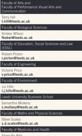
In addition to these sources of help, each Faculty has a Marketing Manager, who should be contacted in the fi rst instance should individuals, schools, departments etc. wish to produce or commission any visual communications. They will be able to offer help and advice and suggest suppliers from the external framework for professionally commissioned work.
Image library
A user-friendly image library has been developed by the Communications and Press Office. This resource works as a great place to store the bank of images we have built up over the past few years. It also functions as a central ‘hub’ where we can all share our high-quality images and video. This should help us to save money, avoid duplication of effort and give us all to access the very best images for each application. imagelibrary.leeds.ac.uk
System components
Section 1
The logo 7
The logo – clear space and minimum size 8
The logo – suffi cient contrast 9
The logo – misuse and what is acceptable 10-11
Identifi cation architecture 12
Use of the University of Leeds crest 13
The corporate colour palette 14
Working with colour and creating palettes 15
Typefaces 16 Accessibility 17
The identity band 18
Internally produced desktop publishing 19
This is the University of Leeds logo.
The preferred colour for reproduction of the logo is single colour black or white.
On single colour material, clothing, badges, stationery and signage, the logo may also be reproduced in
either Leeds Green (Pantone® 3435c) or Leeds Red
(Pantone® 187c).
On full colour literature and printed material, only the black or white logo may be used.
The logo should always appear right-aligned on all University materials.
The University logo is a fi xed artwork. It must not be altered or recreated in any way. The University of Leeds logotype and symbol should always retain the relationship shown here. Neither the tower symbol nor the typography should be used independently of the other. The only exception permissible is when used on social media sites for offi cial University business and with approval of the webmaster, Jeremy Harmer
[email protected] 0113 343 4292
The logo
System components
Logo colour palette
Pantone Black c CMYK 60.40.40.100 RGB 0.0.0 HEX 000000
Pantone White CMYK 0.0.0.0 RGB 255.255.255 HEX FFFFFF
Pantone 3435c CMYK 100.0 .81.66 RGB 0.80.47 HEX 00502F
Pantone 187c CMYK 0.100.79.20 RGB 196.18.48 HEX C41230
The logo – clear space and minimum size
To ensure that the University logo always appears clearly and unobstructed, it is important to provide an area of clear space around it.
The minimum clear space areas are shown here. No other object should appear within this area at any time, and where possible, this clear space should be increased.
x 0.5x
0.5x 0.5x
0.5x 0.5x
The logo should maintain a clear space equal to 0.5x (half the size of the tower symbol) around the whole logo
The University logo should always be legible and must never lose its integrity when reduced to a small size. To ensure this, the logo should never appear in print smaller than 25mm in width.
25mm
System components
The logo – suffi cient contrast
When applying the logo over a background colour, (using only the black or white .eps (vector) format, which retains a transparent background) the integrity and legibility of the logo must always remain. There must always be suffi cient contrast between the logo and its surroundings, ensuring its visibility and impact.
These gradations of grey demonstrate the correct amount of contrast necessary between the University of Leeds logo and its background.
Our commitment to making our communications accessible to all means that we should always aim for maximum legibility. This should therefore guide the judgement on acceptable contrast.
In this context, the words ‘University of Leeds’ and the square will always appear either in black (on a white or coloured background) or in white (reversed out of a coloured background). The tower symbol will appear as the background colour.
The logo – misuse and what is acceptable
nce
port
tion
ures
To find out more about working with the University of Leeds contact:
[email protected] 0113 343 0900
GENERATING
BUSINESS LEEDS
The Medical Library – A Short History Our Centenarian Alumni
Chair in Palliative Care The University logo should, if possible, appear on
a plain background and at high contrast with its background colour (see page 9).
If it is being used outside of the identity band, eg on a poster, a fl yer or at the foot of a magazine-style publication, please ensure there is suffi cient contrast with the background image to give clear legibility of the logo.
Column 3 to the right shows acceptable examples.
1 2 3
The logo – misuse (continued)
To ensure the integrity and legibility of the logo, a few rules must be adhered to.
These examples are not acceptable:
Do not alter the proportion (or aspect ratio) of the logo. It should never be ‘squashed’ or ‘squeezed’.
Do not make the tower white
Do not reproduce the logo in two colours Do not resize individual elements of the logo
Do not add elements within the clear space
Do not reproduce the logo using another typeface
Do not create a box around the logo
Do not re-align elements of the logo
Do not add a drop shadow to the logo
Do not outline the logo
Do not add a containing shape to the logo
UNIVERSITY OF LEEDS
Do not outline the tower’s box
Identifi cation architecture
Faculties, schools, departments, centres, institutes and services should always be clearly identifi ed as being part of the University of Leeds.
This will be achieved by establishing a visual relationship between their names when they appear on signs, printed materials, badges, websites, presentations and the like.
The visual relationship will be created through the size of type used for the two names, and/or the positioning of the names in relation to one another. These will become fi xed arrangements appropriate to the application.
The standard and preferred layout (above) sets out the undermining principle of University of Leeds logo ranged right and owner identifi cation (faculty, school etc) ranged left.
In circumstances where width is limited and it would not be possible to range the owner identifi cation to the left (eg DL leafl ets, narrow banner stands, badges, single column press advertsing etc) it is permissable to place these details underneath the logo, following the spacing principles shown.
Faculty of Engineering School of Civil Engineering
FACULTY OF ENGINEERING FACULTY OF ENGINEERING
Document Title Document Title Document Title
Faculty of Engineering School of Civil EngineeringFACULTY OF ENGINEERING FACULTY OF ENGINEERING
Document Title Document Title Document Title
The standard and preferred layout.
University of Leeds logo ranged right, owner identifi cation ranged left.
For use on all printed literature and publications, irrespective of the identity band inclusion.
Institute for Particle Science and Engineering
Institute for Particle Science and Engineering
System components
School of Mechanical Engineering
University Library
Faculty of Engineering
Faculty of Engineering
University Library
x 0.5x 0.5x
0.5x
y
y z
z
FACULTY OF ENGINEERING
School of Mechanical Engineering
FACULTY OF ENGINEERING When space (width) is limited, this option may be employed.Use of the University of Leeds crest
Reproduction of the crest is restricted to scholarly, ceremonial, presidential or board-related purposes. Such use of the crest must be approved to ensure that it is used appropriately and that the reproduction is rendered in a suitable manner. The crest is also appropriate for permanent markers, such as architectural elements produced in stone, metal or glass.
The crest can be used on sports wear for individuals or teams representing the University – please check in advance for approval.
For further information please contact: Jeremy Harmer
[email protected] 0113 343 4295
The corporate colour palette
This core colour palette should underpin the corporate style of the University. These colours will be instantly recognisable as University of Leeds material. The colours will be used on materials such as signage, uniforms and livery.
Using the core palette will help maintain consistency and cohesion in the presentation of the University. The core University colours are Leeds Green
(Pantone® 3435), Leeds Red (Pantone® 187), Leeds
Black (Pantone® Black) and Leeds Beige (Pantone®
9060).
There are no other ‘compulsory’ colours in the University colour palette. However, the use of carefully considered palettes is one of the key factors in producing high quality material. There follows some general advice on working with colours, and building palettes to achieve a more consistent and professional fi nish across all visual communication.
Leeds Green
Spot: Pantone 3435 CMYK: 100.0 .81.66 RGB: 0.80.47 HEX: 00502F
Leeds Red
Spot: Pantone 187 CMYK: 0.100.79.20 RGB: 196.18.48 HEX: C41230
Leeds Black
Spot: Pantone Black CMYK: 60.40.40.100 RGB: 0.0.0 HEX: 000000
Leeds Beige
Spot: Pantone 9060 CMYK: 0.1.7.3 RGB: 246.241.228 Hex: F6F1E4
System components
Working with colour and creating palettes
Use colours to create an individual palette for a single document or item, or for a suite of materials. You may also create a colour theme for your area, using selected colours from a palette.
Here we show how to select different colours from a wider palette to create your own colour scheme, that could be appropriate to your content and audience. As a general rule, avoid using too many colours together. Materials appear more contemporary, stylish and professional when colour is used carefully and in line with good practice.
Always balance the use of colour with white or clear space as this again contributes positively to a high quality and professional appearance.
Similar palettes
A simple way to make a professional colour palette is to select colours from the same area within a wider palette, ie all blues (set 1) or all greens (set 4). Select a dark tone, mid tone and a light tone to give the document varying contrast. These palettes are effective for smaller documents with specifi c subject matter and target audience, eg you could use a green palette for environmental studies.
Mixed palettes
To make a mixed palette, use of complementary colours and contrasting tonal values is key. Select a dark tone, mid tone and a light tone. Never use colours with similar tonal values as this will result in the document looking fl at and uninteresting.
Set 1 100.47.0.69 100.0.0.0 87.24.0.0
Examples of similar palettes (all values are CMYK)
Examples of mixed palettes (all values are CMYK) Set 2
100.0.8.47 100.0.15.0 15.0.6.0
Set 3 100.0.8.47 91.0.51.0 18.0.15.0
Set 4 100.0.67.72 15.0.100.30 11.0.100.0
Set 5 0.100.100.51 0.95.91.0 0.60.60.0
Set 6 0.51.100.83 0.80.100.0 0.50.100.0
Set 7 4.73.67.0 18.30.56.0 6.6.38.0
Set 8 28.100.0.9 0.69.0.0 0.34.0.0
Set 1 100.47.0.69 100.0.0.0 11.0.100.0
Set 2 0.0.0.100 100.0.0.0 18.0.15.0
Set 3 100.0.8.47 18.0.100.6 0.100.0.0
Set 4 0.51.100.83 18.30.56.0 15.0.100.30
Set 5 0.100.100.51 6.6.38.0 0.22.100.0
Set 6 0.95.89.0 0.50.100.0 0.0.51.0
Set 7 72.100.0.0 0.100.0.0 0.11.18.6
Set 8 0.100.100.35 0.30.0.0 11.0.100.0
System components
Typefaces
Three typefaces have been selected for use across all University of Leeds printed materials. These are Trade Gothic, Sabon and Arial. There is an alternative set of fonts for web applications, for further
information see
www.leeds.ac.uk/comms/toolkit Professionally produced materials
For all professionally designed and produced materials, Trade Gothic or Sabon should be used. You may use one or both of these typefaces in any single item.
For headlines or displays, it is recommended that the fonts can utilise reduced or increased kerning (letter-spacing) or leading (line-spacing) to achieve a desired effect or style. Please take care to maintain legibility when employing any of these typographical modifi cations.
On occasions where Trade Gothic and Sabon are unavailable, the Arial typeface should be used exclusively instead.
NEVER MIX THE USE OF TRADE GOTHIC AND SABON WITH ARIAL IN THE SAME DOCUMENT. Internally generated materials (see page 19) For any local documents (produced from within faculties, schools, departments etc) the Arial typeface should be used. Impactful documents can be produced using Arial – using Regular for body text, Bold for sub-headings and Black for large headings. If the user is comfortable working with type it is suggested for headings and display text that the fonts can utilise reduced or increased kerning (letter-spacing) or leading (line-spacing) to achieve a desired effect or style. Please take care to maintain legibility when employing any of these typographical modifi cations.
Trade Gothic*
Trade Gothic Light
ABCDEFGHIJKLMNOPQRSTUVWXYZ abcdefghijklmnopqrstuvwxyz
Trade Gothic Medium
ABCDEFGHIJKLMNOPQRSTUVWXYZ abcdefghijklmnopqrstuvwxyz
Trade Gothic Bold No. 2
ABCDEFGHIJKLMNOPQRSTUVWXYZ abcdefghijklmnopqrstuvwxyz
Trade Gothic Bold
ABCDEFGHIJKLMNOPQRSTUVWXYZ abcdefghijklmnopqrstuvwxyz
Trade Gothic Condensed No. 18 ABCDEFGHIJKLMNOPQRSTUVWXYZ abcdefghijklmnopqrstuvwxyz
Trade Gothic Condensed No. 18 ABCDEFGHIJKLMNOPQRSTUVWXYZ abcdefghijklmnopqrstuvwxyz
* not shown here, but permissible, are all the oblique/italic variants.
Sabon
Sabon RomanABCDEFGHIJKLMNOPQRSTUVWX abcdefghijklmnopqrstuvwxyz
Sabon Italic
ABCDEFGHIJKLMNOPQRSTUVWX abcdefghijklmnopqrstuvwxyz
Sabon Bold
ABCDEFGHIJKLMNOPQRSTUVWX abcdefghijklmnopqrstuvwxyz
Sabon Bold Italic
ABCDEFGHIJKLMNOPQRSTUVWX abcdefghijklmnopqrstuvwxyz
Arial
Arial Regular
ABCDEFGHIJKLMNOPQRSTUVWX abcdefghijklmnopqrstuvwxyz
Arial Italic
ABCDEFGHIJKLMNOPQRSTUVWX abcdefghijklmnopqrstuvwxyz
Arial Bold
ABCDEFGHIJKLMNOPQRSTUVWX abcdefghijklmnopqrstuvwxyz Arial Bold Italic
ABCDEFGHIJKLMNOPQRSTUVWX abcdefghijklmnopqrstuvwxyz Arial Black
ABCDEFGHIJKLMNOPQRSTUV abcdefghijklmnopqrstuvwxyz 0123456789
Accessibility, alternative formats and our legal disclaimer
The Disability Discrimination Act 1995 requires that the University, as a service provider, takes reasonable steps to ensure that all printed material and marketing activities are accessible to people with disabilities.
These guidelines have been prepared considering best practice. Typefaces have been chosen for their legibility and grids provided to ensure uncluttered design. Suggestions have been made to help determine suffi cient contrast between type and backgrounds and are also refl ected in the guidance on photography.
Some documents may need to be made available in plain text formats and at larger sizes. Every publication must include information about how to obtain versions in alternative formats. The following wording should be used;
Alternative formats
If you require any of the information
contained in this prospectus in an
alternative format eg Braille,
large print or audio, please email
[email protected]
Ideal position for this statement would usually be fi nal text page, inside back cover or back cover.
Font size should be 12pt.
Please contact The Disability Team if you require any further information.
[email protected] www.equality.leeds.ac.uk
Legal disclaimer
If your publication includes dates and other information about programmes or courses you must use the legal disclaimer.
The most up-to-date version is available here comms.leeds.ac.uk/downloads
The ideal position for this statement would usually be on the back cover, but if this is not possible it can be placed on the inside back cover, the inside front cover or the fi rst text page. Font size should be a minimum of 6pt.
Design credits
Please do not credit the designer anywhere on a printed publication.
Anyone wishing to commission new design will be able to source the designer of any existing work through their faculty marketing team, the Communications and Press Offi ce or Print and Copy Bureau.
The identity band
The identity band is used as a key unifi er within the identity management system.
The strength of the University of Leeds identity will rely strongly on this system being upheld. It is to be used on the covers of all documents, publications and newsletters and should also be used on posters, fl yers and pop-up stands. It has been developed in a slightly different form for use on the web.
The identity band also provides the space within which the faculty, school, department, centre or institute can be identifi ed by name.
The faculties, schools, departments, centres and institutes of the University will no longer be permitted to use logos to identify themselves.
The identity band should always appear across the top of the cover page on all printed material - both internally generated and professionally produced. The band should always be used at the prescribed depth for the relative page size (see table, right). The identity band can only be used to contain the University of Leeds logo and the relevant faculty, school, department, centre or institute name. Document titles and all other text must always appear below the identity band in the image area.
Please see
• ‘Publications and documents’ (section 2) for more detailed information and specifi c measurements • ‘Style guidance’ (section 3) for more suggestions
and examples of how we use the identity band.
Identity band height (Portrait orientation)
Logo size
A0 poster - 120mm 190mm width
A1 poster - 90mm 140mm width
A2 poster - 70mm 100mm width
A3 poster - 80mm* 75mm width
A4 cover - 70mm 65mm width
A5 cover - 50mm 55mm width
A6 cover - 35mm 40mm width
A7 fl yer - no band** 35mm width
DL cover - 50mm 45mm width
Square cover - 60mm 65mm width
*The identity band for an A3 portrait poster should be 80mm depth if placing the logo at the top of the page. If it is felt that an 80mm identity band takes up too much space on an A3 poster, place the University logo in the bottom right-hand corner and use a 50mm deep band at the foot of the page or dispense with the band altogether. See page 30 for more information.
**For A7 size, where the document is likely to be a postcard or mini-fl yer, it is advisable to dispense with the identity band and place the University logo at the bottom right of the face or reverse.
Image area
Image area
Image area
Image area
There are templates available on the Identity Management website for some commonly produced desktop published materials (ie internal offi ce items, temporary signs etc produced in Microsoft Word, PowerPoint).
comms.leeds.ac.uk/downloads They include:
• PowerPoint slides • basic letterhead
• cover sheets (portrait and landscape) All items and materials produced internally via desktop publishing should use all the constant components of the Identity Management system (ie logo placement, faculty/school identifi cation, identity band, typeface, grids etc). They should be produced in the Arial typeface.
If the items are for distribution across the University, they should be produced using the corporate University colour palette.
Internally produced desktop publishing
School of Geography
FACULTY OF ENVIRONMENT
Module Manager: Dr Ian Hope
Name: ...
Degree Programme: ... Level 1 Practical Module 2005/06
Semester 1 BLG&1301/BLGY1107 School of Biology
FACULTY OF ENVIRONMENT Document Title Semester 1
School of Biology FACULTY OF ENVIRONMENT
Document Title Semester 1
School of Geography FACULTY OF ENVIRONMENT
Document Title Semester 1
Handbook
Don’t lose this handbook, you’ll receive additional sections as you progress through the course.
Tel: 0113 343 2828 Fax: 0113 343 091 Faculty of Biological Sciences
Newsletter
Inside
Researchers within sight of a breakthrough on blindness David Walsh
Knowledge at Hand
Duis autem vel eum iriure dolor in hendrerit in vulputate velit esse molestie consequat, vel illum dolore eu feugiat nulla facilisis at vero eros et accumsan et iusto odio dignissim qui blandit praesent luptatum zzril delenit augue duis dolore te feugait nulla facilisi. Lorem ipsum dolor sit amet, consectetuer adipiscing elit, sed diam nonummy nibh euismod tincidunt ut laoreet dolore magna aliquam erat volutpat At vero eos et accusam et justo duo dolores et ea rebum. Stet clita kasd gubergren, no sea takimata sanctus est Lorem ipsum dolor sit amet. Lorem ipsum dolor sit amet, consetetur sadipscing elitr, sed diam nonumy eirmod tempor invidunt ut labore et dolore magna aliquyam erat, sed diam voluptua. At vero eos et accusam et justo duo dolores et ea rebum. Stet clita kasd gubergren, no sea takimata sanctus est Lorem ipsum dolor sit amet. Lorem ipsum dolor sit amet, consetetur sadipscing elitr, sed diam nonumy eirmod tempor invidunt ut labore et dolore magna aliquyam erat, sed diam voluptua. At vero eos et accusam et justo duo dolores et ea rebum. Stet clita kasd gubergren, no sea takimata sanctus est Lorem ipsum dolor sit amet. Duis autem vel eum iriure dolor in hendrerit in vulputate velit esse molestie consequat, vel illum dolore eu feugiat nulla facilisis at vero eros et accumsan et iusto odio dignissim qui blandit praesent luptatum zzril delenit augue duis dolore te feugait nulla facilisi. Lorem ipsum dolor sit amet, consectetuer adipiscing elit, sed diam nonummy nibh euismod tincidunt ut laoreet dolore magna aliquam erat volutpat. Ut wisi enim ad minim veniam, quis nostrud exerci tation ullamcorper suscipit lobortis nisl ut aliquip ex ea commodo consequat. Duis autem vel eum iriure dolor in hendrerit in vulputate velit esse molestie consequat, vel illum dolore eu feugiat nulla facilisis at vero eros et accumsan et iusto odio dignissim qui blandit praesent luptatum zzril delenit augue duis dolore te feugait nulla facilisi. Congue nihil imperdiet doming id quod mazim placerat facer possim assum. Lorem ipsum dolor sit amet, consectetuer adipiscing elit, sed diam nonummy nibh euismod tincidunt ut laoreet dolore magna aliquam erat volutpat. 2 Letters
3 Multi-speed Leeds 4 Poisinous Memories 5 Romantic Resurrection 6 Liquorice Tales 8 Counselling Move 9 In the News 9 Honours 9 Small Ads 9 VC’s Column 9 Notice Board Next Issue: November 29
Duis autem vel eum iriure dolor in hendrerit in vulputate velit esse molestie consequat, vel illum dolore eu feugiat nulla facilisis at vero eros et accumsan et iusto odio dignissim qui blandit praesent luptatum zzril delenit augue duis dolore te feugait nulla facilisi. Lorem ipsum dolor sit amet, consectetuer adipiscing elit, sed diam nonummy nibh euismod tincidunt ut laoreet dolore magna aliquam erat volutpat. Ut wisi enim ad minim veniam, quis nostrud exerci tation ullamcorper suscipit lobortis nisl ut aliquip ex ea commodo consequat. Duis autem vel eum iriure dolor in hendrerit in vulputate velit esse molestie consequat, vel illum dolore eu feugiat nulla facilisis at vero eros et accumsan et iusto odio dignissim qui blandit praesent luptatum zzril delenit augue duis dolore te feugait nulla facilisi. Nam liber tempor cum soluta nobis eleifend option congue nihil imperdiet doming id quod mazim placerat facer possim assum. Lorem ipsum dolor sit amet, consectetuer adipiscing elit, sed diam nonummy nibh euismod tincidunt ut laoreet dolore magna aliquam erat volutpat. Ut wisi enim ad minim veniam, quis nostrud exerci tation ullamcorper suscipit lobortis nisl ut aliquip ex ea commodo consequat. Lorem ipsum dolor sit amet, consectetuer adipiscing elit, sed diam nonummy nibh euismod tincidunt ut laoreet dolore magna aliquam erat volutpat. Ut wisi enim ad minim veniam, quis nostrud exerci tation ullamcorper suscipit lobortis nisl ut aliquip ex ea commodo consequat. At vero eos et accusam et justo duo dolores et ea rebum. Stet clita kasd gubergren, no sea takimata sanctus est Lorem ipsum dolor sit amet. Lorem ipsum dolor sit amet, consetetur sadipscing elitr, sed diam nonumy eirmod tempor invidunt ut labore et dolore magna aliquyam erat, sed diam voluptua. At vero eos et accusam et justo duo dolores et ea rebum. Stet clita kasd gubergren, no sea takimata sanctus est Lorem ipsum dolor sit amet. Lorem ipsum dolor sit amet, consetetur sadipscing elitr, sed diam nonumy eirmod tempor invidunt ut labore et dolore magna aliquyam erat, sed diam voluptua. At vero eos et accusam et justo duo dolores et ea rebum. Stet clita kasd gubergren, no sea takimata sanctus est Lorem ipsum dolor sit amet. Feature: Complete story on page 10
Duis autem vel eum iriure dolor in hendrerit in vulputate velit esse molestie consequat, vel illum dolore eu feugiat nulla facilisis at vero eros et accumsan et iusto odio dignissim qui blandit praesent luptatum zzril delenit augue duis dolore te feugait nulla facilisi. Lorem ipsum dolor sit amet, consectetuer adipiscing elit, sed diam nonummy nibh euismod tincidunt ut laoreet dolore magna aliquam erat volutpat
Duis autem vel eum iriure dolor in hendrerit in vulputate velit esse molestie consequat, vel illum dolore eu feugiat nulla facilisis at vero eros et accumsan et iusto odio dignissim qui blandit praesent luptatum zzril delenit augue duis dolore te feugait nulla facilisi. Lorem ipsum dolor sit amet, consectetuer adipiscing elit, sed diam nonummy nibh euismod tincidunt ut laoreet dolore magna aliquam erat volutpat At vero eos et accusam et justo duo dolores et ea rebum. Stet clita kasd gubergren, no sea takimata sanctus est Lorem ipsum dolor sit amet. Lorem ipsum dolor sit amet, consetetur sadipscing elitr, sed diam nonumy eirmod tempor invidunt ut labore et dolore
Duis autem vel eum iriure dolor in hendrerit in vulputate velit esse molestie consequat, vel illum dolore eu feugiat nulla facilisis at vero eros et accumsan et iusto odio dignissim qui blandit praesent luptatum zzril delenit augue duis dolore te feugait nulla facilisi. Lorem ipsum dolor sit amet, consectetuer adipiscing elit, sed diam nonummy nibh euismod tincidunt ut laoreet dolore magna aliquam erat volutpat At vero eos et accusam et justo duo dolores et ea rebum. Stet clita kasd gubergren, no sea takimata sanctus est Lorem ipsum dolor sit amet. Lorem ipsum dolor sit amet, consetetur sadipscing elitr, sed diam nonumy eirmod tempor invidunt ut labore et dolore magna aliquyam erat, sed diam voluptua. At vero eos et accusam et justo duo dolores et ea rebum. Stet clita kasd gubergren, no sea takimata sanctus est Lorem ipsum dolor sit amet. Lorem ipsum dolor sit amet, consetetur sadipscing elitr, sed diam nonumy eirmod tempor invidunt ut labore et dolore magna aliquyam erat, sed diam voluptua. At vero eos et accusam et justo duo dolores et ea rebum. Stet clita kasd gubergren, no sea takimata sanctus est Lorem ipsum dolor sit amet. Duis autem vel eum iriure dolor in hendrerit in vulputate velit esse molestie consequat, vel illum dolore eu feugiat nulla facilisis at vero eros et accumsan et iusto odio dignissim qui blandit praesent luptatum zzril delenit augue duis dolore te feugait nulla facilisi. Lorem ipsum dolor sit amet, consectetuer adipiscing elit, sed diam nonummy nibh euismod tincidunt ut
laoreet dolore magna aliquam erat volutpat. magna aliquam erat volutpat.
Ut wisi enim ad minim veniam, quis nostrud exerci tation ullamcorper suscipit lobortis nisl ut aliquip ex ea commodo consequat. Duis autem vel eum iriure dolor in hendrerit in vulputate velit esse molestie consequat, vel illum dolore eu feugiat nulla facilisis at vero eros et accumsan et iusto odio dignissim qui blandit praesent luptatum zzril delenit augue duis dolore te feugait nulla facilisi. Nam liber tempor cum soluta nobis eleifend option congue nihil imperdiet doming id quod mazim placerat facer possim assum. Lorem ipsum dolor sit amet, consectetuer adipiscing elit, sed diam nonummy nibh euismod tincidunt ut laoreet dolore magna aliquam erat volutpat. Ut wisi enim ad minim veniam, quis nostrud exerci tation ullamcorper suscipit lobortis nisl ut aliquip ex ea commodo consequat. Lorem ipsum dolor sit amet, consectetuer adipiscing elit, sed diam nonummy nibh euismod tincidunt ut laoreet dolore magna aliquam erat volutpat. Ut wisi enim ad minim veniam, quis nostrud exerci tation ullamcorper suscipit lobortis nisl ut aliquip ex ea commodo consequat. Duis autem vel eum iriure dolor in hendrerit
in vulputate velit esse molestie consequat, vel illum dolore eu feugiat nulla facilisis at vero eros et accumsan et iusto odio dignissim qui blandit praesent luptatum zzril delenit augue duis dolore te feugait nulla facilisi. Lorem ipsum dolor sit amet, consectetuer adipiscing elit, sed diam nonummy nibh euismod tincidunt ut laoreet dolore magna aliquam erat volutpat At vero eos et accusam et justo duo dolores et ea rebum. Stet clita kasd gubergren, no sea takimata sanctus est Lorem ipsum dolor sit amet. Lorem ipsum dolor sit amet, consetetur sadipscing elitr, sed diam nonumy eirmod tempor invidunt ut labore et dolore magna aliquyam erat, sed diam voluptua. At vero eos et accusam et justo duo dolores et ea rebum. Stet clita kasd gubergren, no sea takimata sanctus est Lorem ipsum dolor sit amet. Lorem ipsum dolor sit amet, consetetur sadipscing elitr, sed diam nonumy eirmod tempor invidunt ut labore et dolore magna aliquyam erat, sed diam voluptua. At vero eos et accusam et justo duo dolores et ea rebum. Stet clita kasd gubergren, no sea takimata sanctus est Lorem ipsum dolor sit amet. Duis autem vel eum iriure dolor in hendrerit in vulputate velit esse molestie consequat, vel illum dolore eu feugiat nulla facilisis at vero eros et accumsan et iusto odio dignissim qui blandit praesent luptatum zzril delenit augue duis dolore te feugait nulla facilisi. Lorem ipsum dolor sit amet, consectetuer adipiscing elit, sed diam nonummy nibh euismod tincidunt ut laoreet dolore magna aliquam erat volutpat. Ut wisi enim ad minim veniam, quis nostrud exerci tation ullamcorper suscipit lobortis nisl ut aliquip ex ea commodo consequat. Duis autem vel eum iriure dolor in hendrerit in vulputate velit esse molestie consequat, vel illum dolore eu feugiat nulla facilisis at vero eros et accumsan et iusto odio dignissim qui blandit praesent luptatum zzril delenit augue duis dolore te feugait nulla facilisi. Congue nihil imperdiet doming id quod mazim placerat facer possim assum. Lorem ipsum dolor sit amet, consectetuer adipiscing elit, sed diam nonummy nibh euismod tincidunt ut laoreet dolore magna aliquam erat volutpat. Ut wisi enim ad minim veniam, quis nostrud exerci tation ullamcorper suscipit lobortis nisl ut aliquip ex ea commodo consequat. Lorem ipsum dolor sit amet, consectetuer adipiscing elit, sed diam nonummy nibh euismod tincidunt ut laoreet dolore magna aliquam erat volutpat. Ut wisi enim ad minim veniam, quis nostrud exerci tation ullamcorper
Duis autem vel eum iriure dolor in hendrerit in vulputate velit esse molestie consequat, vel illum dolore eu feugiat nulla facilisis at vero eros et accumsan et iusto odio dignissim qui blandit praesent luptatum zzril delenit augue duis dolore te feugait nulla facilisi. Lorem ipsum dolor sit amet, consectetuer adipiscing elit, sed diam nonummy nibh euismod tincidunt ut laoreet dolore magna aliquam erat volutpat Duis autem vel eum iriure dolor in hendrerit in vulputate velit esse molestie consequat, vel illum dolore eu feugiat nulla facilisis at vero eros et accumsan et iusto odio dignissim qui blandit praesent luptatum zzril delenit augue duis dolore te feugait nulla facilisi. Lorem ipsum dolor sit amet, consectetuer adipiscing elit, sed diam nonummy nibh euismod tincidunt ut laoreet dolore magna aliquam erat volutpat. Ut wisi enim ad minim veniam, quis nostrud exerci tation ullamcorper suscipit lobortis nisl ut aliquip ex ea commodo consequat. Duis autem vel eum iriure dolor in hendrerit in vulputate velit esse molestie consequat, vel illum dolore eu feugiat nulla facilisis at vero eros et accumsan et iusto odio dignissim qui blandit praesent luptatum zzril delenit augue duis dolore te feugait nulla facilisi. Nam liber tempor cum soluta nobis eleifend option congue nihil imperdiet doming id quod mazim placerat facer possim assum. Lorem ipsum dolor sit amet, consectetuer adipiscing elit, sed diam nonummy nibh euismod tincidunt ut laoreet dolore magna aliquam erat volutpat. Ut wisi enim ad minim veniam, quis nostrud exerci tation ullamcorper suscipit lobortis nisl ut aliquip ex ea commodo consequat. Lorem ipsum dolor sit amet, consectetuer adipiscing elit, sed diam nonummy nibh euismod tincidunt ut laoreet dolore magna aliquam erat volutpat. Ut wisi enim ad minim veniam, quis nostrud exerci tation ullamcorper suscipit lobortis nisl ut aliquip ex ea commodo consequat. At vero eos et accusam et justo duo dolores et ea rebum. Stet clita kasd gubergren, no sea takimata sanctus est Lorem ipsum dolor sit amet. Lorem ipsum dolor sit amet, consetetur sadipscing elitr, sed diam nonumy eirmod tempor invidunt ut labore et dolore magna aliquyam erat, sed diam voluptua. At vero eos et accusam et justo duo dolores et ea rebum. Stet clita kasd gubergren, no sea takimata sanctus est Lorem ipsum dolor sit amet. Lorem ipsum dolor sit amet, consetetur sadipscing elitr, sed diam nonumy eirmod tempor invidunt ut labore et dolore magna aliquyam erat, sed diam voluptua. At vero eos et accusam et justo duo dolores et ea rebum. Stet clita kasd gubergren, no sea takimata sanctus est Lorem ipsum dolor sit amet. Ut wisi enim ad minim veniam, quis nostrud exerci tation ullamcorper suscipit lobortis nisl ut aliquip ex ea commodo consequat. Duis autem vel eum iriure dolor in hendrerit in vulputate velit esse molestie consequat, vel illum dolore eu feugiat nulla facilisis at vero eros et accumsan et iusto odio dignissim qui blandit praesent luptatum zzril delenit augue duis dolore te feugait nulla facilisi. New Talent and Future Classics vero eros et accumsan et iusto odio dignissim qui blandit praesent luptatum zzril delenit augue duis dolore te feugait nulla facilisi.
laoreet dolore magna aliquam erat volutpat.
Undergraduate Handbook
Don’t lose this handbook, you’ll receive additional sections as you progress through the course.
Tel: 0113 343 2828 Fax: 0113 343 091 Faculty of Biological Sciences Information
Latest Information for Students Duis autem vel eum iriure dolor in hendrerit in vulputate velit esse molestie consequat, vel illum dolore eu feugiat nulla facilisis at vero eros et accumsan et iusto odio dignissim q
Biology Group Meeting Room 3
Elective Handbook electives for new and returning undergraduates
CALENDAR
2006-2007CALENDAR
2006-2007 Facilities Group Meeting Room 12 NoteAlthough not shown here, you may include an image on covers and powerpoint slides. Please see guidance on photography.
Images are a key element of the Identity Management system.
They help to express the organisation, communicating our messages and our style. In using images we are trying to project some important messages about the University. These should aim to refl ect our: • Heritage
• gravitas
• academic excellence • internationalism • inclusiveness
• cutting-edge research and teaching. When commissioning or selecting images the following prompts should be considered: • Is the image inspiring and assured? • Does it convey ambition and determination? • Does the image feel real rather than contrived,
posed or too generic?
• Does it portray the University, subject or life with integrity?
• Is the image contemporary, dynamic, engaging? Explore how the use of colour, contrast, propping and angles could help convey these messages, eg would the image be better in black and white?
The following pages provide a rough guide to some common topics.
System components
Photography – some tips on achieving the best images
Guidance on briefi ng photography can be sought from the Communications and Press Offi ce or the relevant faculty marketing team. As well as appropriate briefi ng forms there is also an onsite photographer available from the Print and Copy Bureau and an approved list of photographers of varying costs, if required. This guidance is vital as it will ensure that any commissioned photography is in appropriate format and at appropriate resolution for intended print processes.
Permission and release forms
When using pictures of people that can be recognised you must have their permission and a release form signed.
comms.leeds.ac.uk/downloads Image library
A user-friendly image library has been developed by the Communications and Press Office. This resource works as a great place to store the bank of images we have built up over the past few years. It also functions as a central ‘hub’ where we can all share our high-quality images and video. This should help us to save money, avoid duplication of effort and give us all to access the very best images for each application. imagelibrary.leeds.ac.uk
Originals of all high-quality images which have been taken for the University should be uploaded to the Image Library.
Contact Richard Ashby for further details [email protected]
People and portraiture
Avoid passport style head and shoulder pictures. Try using tight cropping as it can be more fl attering, dynamic, and engaging.
High contrast lighting could also be used to heighten intensity. Black and white can also be used to improve bad lighting and photography. Place people in context, in their situation or with the tools of their trade wherever possible.
Buildings
Avoid eye-level pictures that try to show complete structures. Buildings should be exciting, dramatic places of learning and culture. Use details, oblique angles and layers to create intrigue and drama. Would the building be better illuminated and photographed at night? Avoid empty or messy situations and untidy rooms.
Landscapes
Avoid middle distance photography without a defi ned focal point. Connect people with landscapes where possible whether they are urban or rural. As with the buildings look at using dramatic angles and crops.
System components
Teaching and learning
Teaching and learning situations can be quite boring, but when portrayed well can be exciting and enlightening. Avoid photographs of large lecture theatres and entire classrooms full of people. Concentrate on individuals or small groups of students at a time. Strong lighting and bright colours in clothing or surrounding objects will help these images appeal to a wider audience. Strong individual facial expressions or body language can also help create an engaging shot.
Concepts
Avoid cliched photographs which present a concept too obviously. Concepts can be a step into the abstract, increasing interest and intrigue. Images should only tell a single aspect of ‘the story’ and be an introduction or a hint. Close-ups and off-balance compostion will help the image to appear more creative than a standard photograph. Concept style photography is also a good option when an image is needed quickly or cheaply, as they are readily available and easily photographed.
Narrative
Narratives within photography should be conveyed subtely and professionally. Do not try to tell the whole story within one photograph, as this will result in a cluttered and confusing image. Simplicity and composition are key to effective narration. Avoid images which look like stock photography with set-up poses and scenery, eg for a photograph which is aimed towards international students, don’t use six students of all different nationalities sitting together in the cafe. Use one or two students in each photograph.
Photography – some tips on achieving the best images
System components
Publications and documents
Section 2
Identifi cation architecture 24-25
Alignment across formats and sizes 26-34
Grids 35
Use of grids 36
Use of type on covers 37
Image placement 38-39
Back covers 40
Posters and fl yers 41
Identifi cation architecture
University owned Faculty/department owned School owned Institute owned
A key element in achieving greater cohesion is a consistent approach to identifying the University, its faculties, schools, departments, centres and institutes and the relationships between them. All documents and publications produced should comply with the identifi cation architecture. Identifi cation of faculty, school, department, centre or institute will always be placed in the band, left aligned and cover no more than half the width of the page.
The architecture is designed and structured so that no faculty, school, department, institute or centre will lose recognition or individuality but so that all areas will be recognised as part of the University. This consistent relationship with the University of Leeds logo is fundamental to the management of the identity.
Publications and documents
Faculty of Engineering School of Civil EngineeringFACULTY OF ENGINEERING FACULTY OF ENGINEERING
Document title
Document title Document title Document title
Institute for Particle Science and Engineering
Document title
Faculty of Engineering Document title
School of Civil Engineering FACULTY OF ENGINEERING
Document title
FACULTY OF ENGINEERING
Document title University owned
Faculty or department owned
Faculty name: Trade Gothic Bold No. 2 - 24pt
School owned
School name: Trade Gothic Bold No. 2 - 24pt Faculty name: Trade Gothic Light 12pt (caps)
Institute or centre owned
Institute name: Trade Gothic Bold No. 2 - 24pt Faculty name: Trade Gothic Light 12pt (caps)
Identifi cation architecture
General University material
On general University material, the University logo should be used at the top of the document cover, right aligned and anchored towards the bottom of the identity band on all occasions.
To identify faculties or departments
Where you wish to identify the faculty or department as the owner / author of the document, the University logo should always be right aligned and anchored towards the bottom of the identity band.
The faculty name should appear left aligned and within the identity band, anchored towards the bottom. On A4 documents, the faculty name should always be 24pt in either Trade Gothic Bold No. 2 or in Arial for DTP documents.
To identify schools
Where you wish to identify the school as the owner/ author of the document, the University logo should always be right aligned and anchored towards the bottom of the identity band.
The school name should appear left aligned and within the identity band, anchored towards the bottom of the band. On A4 documents, the school name should always be 24pt in either Trade Gothic Bold No. 2 or in Arial for DTP documents. If desired, the faculty name may appear below the school name at 12pt on A4 documents in either Trade Gothic Light or in Arial for DTP documents. It should also be anchored towards the bottom of the band.
To identify centres and institutes
Where you wish to identify the centre or institute as the owner / author of the document, the University logo should always be right aligned and anchored towards the bottom of the identity band.
The name of the centre or institute should appear left aligned and within the identity band, anchored towards the bottom of the band. The name should always be 24pt on A4 documents in either Trade Gothic Bold No. 2 or in Arial for DTP documents. If desired, the faculty name may appear below the centre or institute name at 12pt on A4 documents in either Trade Gothic Light or in Arial for DTP documents. It should also be anchored towards the bottom of the band.
Note
Text point sizes are for A4 page size. For detailed grids of different document dimensions, please see pages 26-30.
Publications and documents
Institute for Particle Science and Engineering
Alignment A4
In placing the name of faculties, schools, departments, centres or institutes, the size of the name must not exceed 50% of the width of the document. The name must always be left aligned on document covers.
The document title must only appear below the identity band.
The title size and position is optional according to design needs.
If denoting the identity band by the use of a rule only, the rule should be 200mm wide, starting 5mm in from the edge of both edges (not aligned with the logo). Rule weight should be 0.5, 0.75 or 1pt, depending on preference.
Always use a black or white version of the logo, in the .eps (vector) format, for optimum quality.
A4 PORTRAIT (210mm wide x 297mm tall)
Identity band height Logo size Page margin
70mm 65mm 10mm
A4 LANDSCAPE (210mm tall x 297mm wide)
Identity band height Logo size Page margin
60mm 65mm 10mm
FACULTY OF ENGINEERING
Document title
Institute owned
Institute name: Trade Gothic Bold No. 2 24pt on 25pt leading Faculty name: Trade Gothic Light 12pt
Publications and documents
70mm
64mm logo 65mm
Institute for Particle
Science and Engineering
Newsletter
Issue 563 January 2012Alignment A4 newsletter
As most newsletters have a name or masthead, the depth of the identity band has been adjusted for newsletters only to accommodate this. The area below the identity band is to contain the newsletters name, masthead, issue number and publication date. Use two contrasting blocks of colour for the newsletter identity band, not a fi ne rule.
Always use a black or white version of the logo, in the .eps (vector) format, for optimum quality.
A4 PORTRAIT (210mm wide x 297mm tall)
Identity band height Logo size Page margin
70mm (40+30mm) 65mm 10mm
Newsletter name: Trade Gothic light 48pt (-40 Indesign tracking)
Publications and documents
70mm
36mm
64mm logo 65mm
40mm
Alignment A5
Document title
8mm 8mm
Document title
8mmInstitute of Structural 8mm
and Civil Engineering
FACULTY OF ENGINEERING
Institute owned
Institute name: Trade Gothic Bold No. 2 14pt on 15pt leading Faculty name: Trade Gothic Light 10pt
University owned
Publications and documents
In placing the name of faculties, schools, departments, centres or institutes, the size of the name must not exceed 50% of the width of the document. The name must always be left aligned on document covers.
The document title must only appear below the identity band.
The title size and position is optional according to design needs.
If denoting the identity band by the use of a rule only, the rule should be 138.5mm wide, starting 5mm in from the edge of both edges (not aligned with the logo). Rule weight should be 0.5, 0.75 or 1pt, depending on preference.
Always use a black or white version of the logo, in the .eps (vector) format, for optimum quality.
A5 PORTRAIT (148.5mm wide x 210mm tall)
Identity band height Logo size Page margin
50mm 55mm 8mm
50mm 45mm
Alignment Third A4 (DL size)
When placing the name of faculties, schools, departments, centres, institutes or services on Third A4 documents they must appear right aligned beneath the University of Leeds Logo within the identity band.
The document title must only appear below the identity band.
The title size and position is optional according to design needs.
If denoting the identity band by the use of a rule only, the rule should be 89mm wide, starting 5mm in from the edge of both edges (not aligned with the logo). Rule weight should be 0.5, 0.75 or 1pt, depending on preference.
Always use a black or white version of the logo, in the .eps (vector) format, for optimum quality.
THIRD A4 (DL) (99mm wide x 210mm tall)
Identity band height Logo size Page margin
50mm 45mm 7mm
Document title
7mm 7mm
Document title
7mm
7mm 4mm 4mm
FACULTY OF ENGINEERING
Document title
7mm
7mm 4mm 4mm
School of Civil Engineering
School owned
School name: Trade Gothic Medium 14pt Faculty name: Trade Gothic Light 10pt Faculty owned
Faculty name: Trade Gothic Medium 14pt Faculty of Engineering
Publications and documents
50mm 46mm logo 45mm
Alignment square (210mm x 210mm)
In placing the name of faculties, schools, departments, centres or institutes, the size of the name must not exceed 50% of the width of the document. The name must always be left aligned on document covers.
The document title must only appear below the identity band.
The title size and position is optional according to design needs.
If denoting the identity band by the use of a rule only, the rule should be 200mm wide, starting 5mm in from the edge of both edges (not aligned with the logo). Rule weight should be 0.5, 0.75 or 1pt, depending on preference.
Always use a black or white version of the logo, in the .eps (vector) format, for optimum quality.
SQUARE (210mm wide x 210mm tall)
Identity band height Logo size Page margin
60mm 65mm 10mm
School owned
School name: Trade Gothic Bold No. 2 24pt Faculty name: Trade Gothic Light 12pt
Publications and documents
School of Civil Engineering
FACULTY OF ENGINEERINGDocument title
60mm 54mm
Alignment A3 posters
Publications and documents
School of Process, Environmental and Materials Engineering FACULTY OF ENGINEERING
School of Process, Environmental and Materials Engineering
FACULTY OF ENGINEERING
School of Process, Environmental and Materials Engineering
FACULTY OF ENGINEERING
On posters at A3 and above it is not compulsory to include the identity band, or the name of faculties, schools, departments, centres or institutes. If the University logo is included at the top of the page, the identity band must be used. If the name of the owner is included at the top of the page, the size of the name must not exceed 50% of the width of the document. The name must always be left aligned when used.
If denoting the identity band by the use of a rule only, the rule should start 10mm in from the edge of both edges (not aligned with the logo). Rule weight should be 0.5-2pt, depending on preference.
Always use a black or white version of the logo, in the .eps (vector) format, for optimum quality.
A3 PORTRAIT POSTER (297mm wide x 420mm tall) Identity band height
(if required)
Logo size Page margin
80mm (top) 75mm 14mm
50mm (foot) 75mm 14mm
A3 LANDSCAPE POSTER (420mm wide x 297mm tall) Identity band height
(if required)
Logo size Page margin
50mm 75mm 14mm
School owned logo 75mm
74mm
44mm 80mm
50mm 14mm
14mm 14mm
14mm 14mm
Alignment A2 posters
Publications and documents
School of Process, Environmental and Materials Engineering
FACULTY OF ENGINEERING
School of Process, Environmental and Materials Engineering
FACULTY OF ENGINEERING
School of Process, Environmental and Materials Engineering FACULTY OF ENGINEERING
On posters at A3 and above it is not compulsory to include the identity band, or the name of faculties, schools, departments, centres or institutes. If the University logo is included at the top of the page, the identity band must be used. If the name of the owner is included at the top of the page, the size of the name must not exceed 50% of the width of the document. The name must always be left aligned when used.
If denoting the identity band by the use of a rule only, the rule should start 10mm in from the edge of both edges (not aligned with the logo). Rule weight should be 1-2.5pt, depending on preference.
Always use a black or white version of the logo, in the .eps (vector) format, for optimum quality.
A2 PORTRAIT POSTER (420mm wide x 594mm tall) Identity band height
(if required)
Logo size Page margin
70mm 100mm 18mm
A2 LANDSCAPE POSTER (594mm wide x 420mm tall) Identity band height
(if required)
Logo size Page margin
60mm 100mm 18mm
School owned
School name: Trade Gothic Bold No. 2 36pt/36pt leading (-40 Indesign tracking) logo 100mm
63mm
54mm 70mm
60mm 18mm
18mm 18mm
18mm 18mm
Alignment A1 posters
Publications and documents
School of Process, Environmental and Materials Engineering
FACULTY OF ENGINEERING
School of Process, Environmental and Materials Engineering
FACULTY OF ENGINEERING
School of Process, Environmental and Materials Engineering FACULTY OF ENGINEERING
On posters at A3 and above it is not compulsory to include the identity band, or the name of faculties, schools, departments, centres or institutes. If the University logo is included at the top of the page, the identity band must be used. If the name of the owner is included at the top of the page, the size of the name must not exceed 50% of the width of the document. The name must always be left aligned when used.
If denoting the identity band by the use of a rule only, the rule should start 10mm in from the edge of both edges (not aligned with the logo). Rule weight should be 1-2.5pt, depending on preference.
Always use a black or white version of the logo, in the .eps (vector) format, for optimum quality.
A1 PORTRAIT POSTER (594mm wide x 841mm tall) Identity band height
(if required)
Logo size Page margin
90mm 140mm 20mm
A1 LANDSCAPE POSTER (841mm wide x 594mm tall) Identity band height
(if required)
Logo size Page margin
80mm 140mm 20mm
School owned logo 140mm
80mm
72mm 90mm
80mm 20mm
20mm 20mm
20mm 20mm
Alignment A0 posters
Publications and documents
School of Process, Environmental and Materials Engineering
FACULTY OF ENGINEERING
School of Process, Environmental and Materials Engineering
FACULTY OF ENGINEERING
School of Process, Environmental and Materials Engineering FACULTY OF ENGINEERING
On posters at A3 and above it is not compulsory to include the identity band, or the name of faculties, schools, departments, centres or institutes. If the University logo is included at the top of the page, the identity band must be used. If the name of the owner is included at the top of the page, the size of the name must not exceed 50% of the width of the document. The name must always be left aligned when used.
If denoting the identity band by the use of a rule only, the rule should start 10mm in from the edge of both edges (not aligned with the logo). Rule weight should be 1-3pt, depending on preference.
Always use a black or white version of the logo, in the .eps (vector) format, for optimum quality.
A0 PORTRAIT POSTER (841mm wide x 1189mm tall) Identity band height
(if required)
Logo size Page margin
120mm 190mm 25mm
A0 LANDSCAPE POSTER (1189mm wide x 841mm tall) Identity band height
(if required)
Logo size Page margin
110mm 190mm 25mm
School owned
School name: Trade Gothic Bold No. 2 66pt/70pt leading (-40 Indesign tracking) logo 190mm
106mm
96mm 120mm
110mm 25mm
25mm 25mm
25mm 25mm
Grids (.eps fi les) are available from the Communication and Press Offi ce website comms.leeds.ac.uk/downloads
They are a useful tool when laying out design in the most popular formats.
Size format
A4 Portrait cover
Portrait internal Landscape cover Landscape internal Portrait newsletter cover
A5 Portrait cover
Portrait internal Landscape cover Landscape internal
A6 Portrait cover
Portrait internal Landscape cover Landscape internal DL
(99x210)
Portrait cover Portrait internal Square
(210 x 210) Cover Internal
DVD Cover
Label
CD Cover
Label Pull-up
bannerstand
2300mm x 800mm (popular format, used by Print and Copy Bureau)
Oversize A4 (218 x 304)
Portrait cover (for possible use on folders etc)
Grids
A4 portrait cover
210mm square cover DL cover
DVD cover
A5 landscape cover
A4 portrait internal A4 newsletter cover 2300 x 800mm pull-up bannerstand
©
U
niv
ersity
o
fLe
ed
s2
006