DEGREE PROJECT IN COMPUTER SCIENCE AND ENGINEERING,
SECOND CYCLE, 30 CREDITS
STOCKHOLM
,
SWEDEN
20
20
A user centered approach to
developing an interactive
dashboard that supports task
planning
ANTONIOS
PAPADOPOULOS
Abstract
The R&D of Scania and specifically the EPIC group initiated a research, to upgrade,
the software update process of an ECU (electronic unit). This procedure, requires
many steps, involves many people and departments and demands constant data
monitoring. The current solution provided by the company, two excel spreadsheets,
is not very efficient for the employees, it is failing to meet the users’ requirements and
expectations, and originates many concerns. For that reason the EPIC department
wanted to explore new alternatives in order to provide an easier, user friendly
solution, which supports and provides more accurate collaboration within teams. In
the world of automotive industry, this action is very common since many companies,
such as Volvo, have invested many efforts in research in order to utilize those long
complex processes. These studies were analysed and considered fundamental for
their methods, their research work and the general approach they used in each
case.
This research aimed to approach the problem in a user-centered way, by deploying
a participatory design methodology, which included interviews, workshops, usability
tests and questionnaires. The objectives were firstly, to understand the main issues
of the current solution, the main requirements and needs from the user's perspective
and finally to suggest a new way to improve the interaction. The main focus was
aligned with the most prominent problem, which was the lack of task planning for
both short and long term periods. The research led to suggestions of a new
information architecture and the introduction of a dashboard with an interactive
timeline. The introduction of streamlines (dates) , interactions (panning, zooming)
and coloured boxes (tasks), aimed to support users and meet their expectations
regarding the task planning. The outcome revealed that the current solution was
sufficient for identifying and completing simple tasks, however the user’s needs were
overcoming the potentials of a static table. The interactive dashboard, as a new
solution, provided better insights, larger set of functions, new information
architecture and improved user experience. Despite the fact that some participants
raised concerns regarding the interactions and the learning curve, the overall
experience was described more friendly than the current. The discoveries of the
research regarding the two visualizations can be evaluated only on the basis of task
planning as a feature, and not in general.
Sammanfattning
Avdelningen EPIC, på Scanias FoU, påbörjade en studie för att förbättra den
nuvarande processen för att uppdatera mjukvaran i en ECU (electronic unit). Denna
process är tämligen omfattande och kräver involvering av många personer och
avdelningar, samt också konstant dataövervakning. Den nuvarande lösningen består
av två Excelark och lyckas inte med att möta de användarkrav som ställs, vilket ger
upphov diverse svårigheter. Av denna anledning ämnade EPIC utforska andra
alternativ, som medför en enklare och mer användarvänlig lösning och som
underlättar för teamen att samarbeta. Inom bilindustrin är detta en mycket vanlig
företeelse, där företag som Volvo redan genomfört omfattande forskning för att
underlätta dessa komplexa processer. Dessa studier har analyserats och hänsyn har
tagits till de metoder som användes.
Studierna löste problemet genom att tänka utifrån ett användarcentrerat perspektiv.
Detta gjordes genom att ta fram en designmetodik för deltagande, som bestod av
intervjuer, workshops, användbarhetstester och frågeformulär. Målet var först och
främst att skapa en förståelse för de huvudsakliga problemen gällande den
nuvarande lösningen, samt att ta reda på användarkraven och slutligen föreslå en ny
lösning. Största fokus lades på kort- och -långtidsplanering, som var ett tydligt
problem hos användarna. Forskningen gav till slut upphov till en mer effektiv
informationsarkitektur, där en dashboard med en interaktiv tidslinje introducerades.
Denna tidslinje innehöll datum, interaktioner, såsom panorering och zoomning, och
kommande uppgifter i form av färgade boxar i syfte att underlätta för användarna i
deras planering. Resultatet visade att den nuvarande lösningen var tillräcklig för att
identifiera uppgifter, men att användarnas krav översteg potentialen hos en statisk
tabell. Den nya lösningen, i form av en interaktiv dashboard, visade sig ge större
insikt hos användarna, med dess nya informationsarkitektur och förbättrade
användarupplevelse. Dessa upptäckter som forskningen av de två visualiseringarna
givit upphov till kan endast evalueras i form av planering som en funktion, och inte
generellt.
A user centered approach to developing an interactive
dashboard that supports task planning
Antonios Papadopoulos
KTH Royal Institute of Technology Stockholm,Sweden
ABSTRACT
The R&D of Scania and specifically the EPIC group initiated a research, to upgrade, the software update process of an ECU (electronic unit). This procedure, requires many steps, involves many people and departments and demands constant data monitoring. The current solution provided by the company, two excel spreadsheets, is not very efficient for the employees, it is failing to meet the users’ requirements and expectations, and originates many concerns. For that reason the EPIC department wanted to explore new alternatives in order to provide an easier, user friendly solution, which supports and provides more accurate collaboration within teams. In the world of automotive industry, this action is very common since many companies, such as Volvo, have invested many efforts in research in order to utilize those long complex processes. These studies were analysed and considered fundamental for their methods, their research work and the general approach they used in each case. This research aimed to approach the problem in a user-centered way, by deploying a participatory design methodology, which included interviews, workshops, usability tests and questionnaires. The objectives were firstly, to understand the main issues of the current solution, the main requirements and needs from the user's perspective and finally to suggest a new way to improve the interaction. The main focus was aligned with the most prominent problem, which was the lack of task planning for both short and long term periods. The research led to suggestions of a new information architecture and the introduction of a dashboard with an interactive timeline. The introduction of streamlines (dates) , interactions (panning, zooming) and coloured boxes (tasks), aimed to support users and meet their expectations regarding the task planning. The outcome revealed that the current solution was sufficient for identifying
and completing simple tasks, however the user’s needs were overcoming the potentials of a static table. The interactive dashboard, as a new solution, provided better insights, larger set of functions, new information architecture and improved user experience. Despite the fact that some participants raised concerns regarding the interactions and the learning curve, the overall experience was described more friendly than the current. The discoveries of the research regarding the two visualizations can be evaluated only on the basis of task planning as a feature, and not in general.
INTRODUCTION
Scania AB is a global company which formed in the beginning of the previous century and it could be characterised as a commercial vehicles manufacturer. Throughout the years, the company broadened their paths into sales, financial, services and managed to create and provide to the client not only a vehicle but a complete infrastructure for support. Today Scania is expanded to over 100 countries, with production units in Asia, Europe and Africa and sales departments all over the world. Such a large organisation is facing many challenges throughout their development process, especially when departments from different countries or continents should coordinate in order to deliver the product on time under specific quality standards. Therefore, the communication between teams and departments is vital, and the organisation focuses on efforts to support their employees with the required tools. Every truck and bus, contain many ECUs, each of them dedicated to support one functionality, for example braking system, air pressure in the tires, horn system, lighting system and many more. When a new ECU is about to be introduced, there are two critical parts that need attention, software and hardware. From a hardware perspective there are not many considerations since it needs only
to be installed in the vehicle the first time, but the concerns from a software perspective are many. The people who are responsible for the software updates, maintenance and troubleshooting are the System Owners (SOs). Some of their tasks are to develop the new software, make sure that the new updates are documented and aligned with the diagnostic specification, guarantee the high quality of the software and the robustness of the code, send the code for testing and many more tasks.
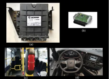
Figure 1: Examples of ECU in the vehicles
The image (a) of Figure 1 above, presents what is an ECU as a physical device, a simple black box. This box includes an electrical circuit, image (b) of Figure 1, and every circuit runs a software, in order to provide a specific functionality. Every vehicle, either truck or bus, contains hundreds to thousands of ECUs. The ECUs are providing support not only to the driver but also to the passengers. On the one hand, the picture (c) of Figure 1 presents the "STOP" button, which is pressed by the passengers when they want to notify the driver that they want to exit the vehicle to the next stop. Under this button there is an ECU which is triggered by pressing, and the functionality that supports it is to transfer information to the driver’s console. The information will travel from the button’s ECU through a channel (cables), to the "brain" of the vehicle (at the front part) and will inform the brain for the intended action. Therefore, another ECU will be responsible to light up the correct icon on the driver’s dashboard and inform about the action.
On the other hand the picture (d) of Figure 1 presents the driver’s console with all the available
actions, and each of them is feasible due to ECUs. When the drivers press the brake pedal, there is a specific ECU ( belongs to the BMS, brake management system), to "listen" and trigger the action of braking, and send that information to the vehicle’s brain. Therefore the brain will enable another ECU to actually start the process of breaking.
Based on those two examples it is very clear that the functionality and the coordination of ECUs is highly important and critical. An ECU does not only carry important functionality as a unit, but also the communication and the coordination with the others is very important in order for the company to provide a safe and pleasant experience to passengers.
SOFTWARE UPDATE PROCESS
The process of updating the ECU’s software includes concrete but rather complex steps. All of them explained below in an abstract view:
● There is an ECO (Electrical Change Order), a document that contains all the information about the changes that need to be introduced in the next update. This document contains all the requirements for the new update and the technical details such as, functionality features, port numbers, system architecture, function architecture and more.
● The board of managers will meet in order to decide if the suggested update is feasible and desired at that moment and if they approve it, they will assign it to a SO.
● The SOs will receive the ECO, and if needed, the managers will explain in detail about the new changes
● The SOs will plan the development steps with their team. They will be responsible to implement the requirements described in the ECO and make sure to deliver before the deadline. The process of introducing a new software update lasts approximately two years, and during every year there are four fixed months that a SO can release a new update. These months are called SOP (Start Of Production), and an example is SOP1901, which refers to the release of January 2019. The managers will specify the exact SOP in which the software update should be released. ● The final step is testing and includes different
has a first draft of the code, they can send the software for testing in order to validate that it runs flawlessly when flashed to the hardware (electrical circuit). The integration test takes place after the first complete draft (almost all the changes are implemented) and evaluates the integration of the new ECU in coordination with other ECUs in the simulator. Finally, before releasing the software, the SO has to perform a field test. This test takes place inside the premises of the company, and the software is flashed in an ECU inside a real vehicle. The functionality is tested in a real case scenario and the testers can evaluate whether this update supports the per-formance of the vehicle, and the update delivers the initial goal written in the ECO.
CATEGORIES OF ECU
Scania provides two different categories of ECUS, in-house and bought. The first one, is developed totally at the Scania laboratories and requires more technical background from the assigned SO, when the latter one is bought by another company. The SO that will handle the second one can also be from managerial background since it is not required technical skills.
DEADLINES
During a software update SOs have to meet different deadlines, some of them are flexible and others not. There are some very strict deadlines called VIP, with VIP1 meaning the start of the software development, and the VIP7 is the latest deadline for submission. Besides those hard deadlines, there are others referring to testing months, or test weeks as they called internally. These test weeks are taking place, one time every month and an example of their name is TW1901, which is referring to the test week of January 2019. SOs can send their software at these test weeks, in order to get feedback from Scania laboratories about their software. The labs are sending their feedback two weeks after they received the software, and they inform the SO about the quality of their software.
CURRENT SOLUTION
The current solution that Scania provides to SOs are excel documents and for that process there are two main spreadsheets that define the whole structure of
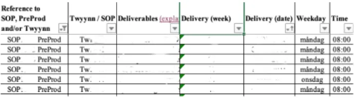
the process. The first spreadsheet provides three different tabs. Those tabs are Content, Deadlines and Deliverable.
Figure 2: Tabs of the excel sheet related to the user’s tasks
The first tab (Content) provides information about the software history, which software versions are installed in that specific ECU, and a brief description about every version. The next tab (Deadlines) provides a list with tasks and when the list is very long, the users have the option to filter out the results. The users can filter the list per SOP, TW, Delivery Week, date, and title (Figure 3). The last tab (Deliverable) provides to users a list with information per task.
Figure 3:Deadline tab - this is the task list presented to
users. Filtering options are applicable in order to find a
task
When the users want to find information about a specific task, they firstly have to find the title of that task, under the Deadline tab, and then navigate to the Deliverable tab, and search for that specific title throughout the list. In the last tab there is no filter option.
Once they find the task, they can extract information from the different columns of that row (Figure 4).
Figure 4:Deliverables tab - the list with the tasks which consists information such as description of task, the assigned person, and who is the customer
The second excel sheet is called COIN, and provides the users all the deadlines for a wide range of SOP(approximately 10 years). The users have to use
this table in order to find critical deadlines (VIP1-VIP7) about the software update process. Filter option is not provided. The image below presents a screenshot of this document.
Figure 5: COIN excel sheet - this table presents to the SOs all the major deadlines for every SOP (range 10 years)
The stakeholders during the software update are facing many problems and the whole process demands a lot of effort. It requires remembering multiple deadlines and fetching information from different systems and documents. The users have to fetch information, process it in order to shape a decision and schedule their work sprint, therefore these tasks can become very complex and cumbersome. Even though the experienced SOs managed to overcome some obstacles and use the system adequately the learning curve for the new SOs is really big and very demanding.
For that reason, Scania is trying to digitize this internal process that is very difficult to keep track. The Research and Development department initiated this research to introduce a new tool to monitor the development process of ECU’s software updates. This process is very complex and the current solution faces many challenges.
RESEARCH QUESTION
What are the main problems that the employees of large automotive organizations are facing working with traditional visualizations? Would an interactive visualization improve their user experience and support them in task planning?
BACKGROUND
Dashboard is a powerful tool that is used to promote decision making, cognition enhancement and content
awareness by visualizing information in different ways [20] [9] [22]. Due to the information load, the exploration and the discovery of the information’s value [11] can become a very challenging task. In order to achieve the highest possible levels of cognition, sense making and reflection, the contribution of information visualization techniques, alongside with the interaction/graphical design can provide a usable, useful and helpful experience. [23].
As Few described in one his book "Information Dashboard Design: Displaying Data for At-a-Glance Monitoring'' a dashboard is “a visual display of the most important information needed to achieve one or more objectives, consolidated and arranged on a single screen so the information can be monitored at a glance” [12]. Designing a dashboard is always a great challenge since a great load of data should be displayed in a single page, clearly and without distraction in a way easy for the reader to consume and under-stand the data [12]. In addition, the nature of the tasks, the users’ background, the context of use and the tools (personal computer, mobile device), are parameters that affect the design process of every dashboard [23]. All these factors make the process of designing a dashboard a new challenge every time, and based on the target and the aim, different sub rules are applied. A wide range of information visualization techniques [13] can be explored in order to define the most applicable format considering data load, interaction and complexity.
Many companies strive to the development of dashboards, especially the large industries which are handling a great load of data, and aim to share information to different departments and employees. The automotive industry is an example, since many studies have been conducted throughout the years to explore the possibilities of introducing a new dashboard, a new visualization or in general a new design approach in order to upgrade the user experience and improve the working life of their employees [17] [21] [10] [5].
Besides the design techniques and methods from an academic perspective, in every design research the context of the inquiry (buildings, stakeholders, terms, rules, limitations) is highly affecting the process. The design approach is significantly different between a small and a large company. When designing for a small company the levels of freedom and potential research methods are different in
comparison with a large industrial setting, in which the stakeholders are not constantly available, the researcher is not always accepted by the employees, the support of the management team is not always given and most important the denial of change from some group of people. A great example can be considered a research which took place back in 1995 until 2002, when Volvo IT wanted to introduce a new design technique for the time (Robust Design RD), in their design and development process. This initiative was mainly aimed to improve the design and development process, create pilot projects by utilizing the RD technique, and train the managers on how to work on RD’s terms. This inquiry was considered very important for the rest of this thesis, since it pointed out the obstacles, the limitations, and the research techniques in a large environment. Nevertheless, the most important highlight was the neglect from the employees to adapt something new that could improve their daily work life, on the basis that they are proud engineers of a successful company [17].
Another design inquiry which provided valuable insights for this thesis was another initiative from Volvo IT, to introduce the Action Design Research (ADR). The report of this research highlights the need to avoid operating under the rules of traditional research methods where the problem of sequencing and separation was emerging, and adopt the ADR principles which they impose an iterative process based on working hypotheses refined over repeated cycles of research [21]. The information system that was targeted at this research was a Competence Management System (CMS), which previously relied on databases or spreadsheets. The researchers embodied the ADR principles into their methodology and proceeded with the experiment. The methodology of this research acted as inspiration for this thesis, which studied in detail and adapted to current settings and environment. The projects had many similarities since both applied design techniques in an interactive information system for monitoring data, with aim to improve it and provide better user experience.
From a design perspective many valuable insights and information regarding the design process of an interactive dashboard were provided by another research, which took place again in Volvo but in another department. This research is conceptually closer so far to the objectives of the thesis. The researcher deployed a user centered approach to
research, compare, evaluate and conclude which dashboard visualization reveals the most value for the users. Very valuable learning was the author’s reflection regarding the methods and the potential better performance alongside with the choice of focus only on aspects of the dashboard. The outcome presented that there are more concerns regarding the artifact, but a research can not target all of them at once. In more detail the researcher aimed to design a visualization of production data, presented in a visually efficient dashboard in order to achieve better monitoring of the assembly line. This research was important not for the organizational context but for the design techniques and the way the researcher undertook the process, especially considering the importance of the data. [10]
The importance of the real data flow and the need of an adequate visualization tool for multivariate data was mentioned and pointed out to another research, which took place at Outfox Intelligence AB in collaboration with KTH. [5]. The researcher instructed a user-centered approach in order to conclude the most appropriate visualization for the research objective.
The last two researches were great inspiration for the thesis, since they are facing almost similar opportunities and they approached the problem in a user-centered way.
METHODOLOGY
This research can be considered as a case study since the researcher included a small number of participants (N=8). A participatory design approach was deployed, in the spectrum of user centered methodology [4], including all the users throughout the process, but selecting to engage in depth one specific user (super user). This user was the most experienced, could provide detailed input and was very determined to contribute to the project. The first phase included semi-structured interviews with the stakeholders, in order to get familiar with the context and the users’ problems. After that brainstorming sessions took place and analysis of the findings with the super user, whose input was very important. The next step, after understanding the problem in detail, was to explore and discover new ideas and based on them to generate the first externalizations (low fidelity prototypes). These prototypes were introduced , to six
stakeholders, in the context of a workshop. The last step of the first phase was to study the results from the workshop and with the contribution from the super user to identify the main problems and the main focus area.
The second phase consisted by a comparative usability test, where the participants were provided with two high fidelity designs and a task list. The first design was the current solution provided by Scania, and the second design was the result from the findings from phase one. The list included both simple and complex tasks, which the users had to perform in both designs. The tasks were chosen based on the main problem and the focus of the study, which were identified in the previous phase. By the end of each test, the participants filled in a SUS questionnaire [7] [8] and took part in an informal interview with the researcher in order to discuss details about their experience.
Initial Interviews with the SOs
Semi-structured interviews were conducted [14] with purpose to get familiar with the current process, the tools/components, users’ expectations and main problems. The participants were encouraged to express their experience about the current solution, the specific steps they follow in the process and the main problems they are facing. This step included six (N=6) stakeholders. All of them had the role of the System Owner in the organization, and worked in similar systems. The majority of the participants (N=4) were working with the in-house ECUs and only the two of them were working with bought ECUs. The interviews took place in the premises of the organization and the participants were fully aware about the researcher’s role. During the interviews, the sessions were voice recorded and the participants were informed about that beforehand. The participants answered questions about their job tasks and no personal data were required, asked or preserved.
Participatory Design with the Super User
Throughout the research, a specific user (super user) who had the most years of experience and worked in many teams inside the organization, was engaged more in the process of analysing data and brainstorming [19]. The super user contributed a lot to the research, by providing continuously his feedback about the new findings and the processes inside the
company. His input was decisive and fundamental. The role of this user was to assist and support during the study, provide information and explanations where needed, assess findings, and suggest solutions to dilemmas based on his experience. The meetings with the super user were organised on a weekly basis, in order to continue fast with the research but also to have the time for the other meetings with the stakeholders.
The super user organized brief seminars to introduce the researcher to all the available tools that the SOs are using daily, by explaining the purpose, and also by providing hands on experience to all of them. More specifically, he demonstrated flashing tools (GADGET, SPIN), parameterization components (PSM), version handling (Per-force, 3D experience) and task management tools (Jira).
In addition, he explained in depth the COIN and the excel spread-sheet, by performing actions. Even though he was very experienced and he was already familiar with the excel sheet, he faced difficulties while describing it to the researcher. Sometimes, it was cumbersome to match a deadline date with the correct SOP, and he failed to remember more than two deadlines without checking again.
Finally, he informed the researcher that Scania provides tools to perform tasks, but at the same time is developing new more advanced systems that can also support other functionalities. This was the case for example, with the GADGET and SPIN tool. The problem was that they introduced the new one, but they did not disregard the previous one, therefore some users decided to use the newer version when others did not. Of course, this fact provoked inconsistencies among employees and processes.
Prototyping
Designing low-fidelity prototypes aimed to communicate the ideas and the suggestions from the first phase of interviews to users. These prototypes were used in the workshop with the goal to present a suggested flow, validate ideas and concepts and get feedback about the structure. The designs were developed with the online tool balsamiq [1].
This method was deployed also after the end of the workshop, in order to create high-fidelity prototypes to use them for the usability tests. The purpose of these prototypes was to present to users a more formal
version of the findings and to compare the two different visualizations. The latter designs were developed with the Sketch tool [3].
Workshop
The idea behind the workshop was to gather all the available stakeholders and present to them the low-fidelity prototypes [18]. The main purpose was to validate the ideas, generated at this point from the interviews and the brainstorming sessions with the super user, and also get feedback and suggestions. The stakeholders were gathered together in one room, in order to participate all together and provide richer and more spherical feedback. The potential brainstorming and the conversation among them, since they were handling different kinds of ECUs would be extremely helpful. The aim was also to encourage and motivate them to discuss their problems in order to capture different perspectives from all of them. The generated externalizations were introduced to them and the goal was to validate the learning and the findings from the previous step, and also to understand which is the most emerging problem they are facing with the current solution.
To organise the workshop, six (N=6) SOs were invited to participate. The workshop took place in a meeting room at the premises of the company. The designs were presented to them in a big wide screen, while the researcher was introducing them to the workflow and explaining the structure. The participants were encouraged to raise questions and express their opinions openly about the suggested structure. All the participants were aware about the session and the role of the researcher and no personal data were required, asked or preserved.
Comparative Usability Testing
The main goal of this method is to compare two different designs, discover flaws and problems in each one, improve them upon the participants’ feedback and identify usability advantages of one design over the other [15]. Personal meetings were organised with each of the eight participants, the sessions took place in the meeting rooms of the organization. The total number of participants was eight (N=8), and all of them signed a consent form before starting the test.
The session started with an introduction about the conceptual aspect of the test. What are the objectives
of a comparative usability test, how it will be performed in this specific context, and the participants were encouraged to ask if any detail was not clear, in order to feel comfortable with the process. After that, the participants were informed about the research aspect of the test. It was explained how the two designs were developed, the research steps and the findings from previous phases. The critical part of this conversation was the explanation of the flow and features for both designs.
When the participants were feeling comfortable, the two designs were introduced. The first design (Design A) included a static visualization (current solution), which is a table in an excel spreadsheet , and the second (Design B) included an interactive timeline. Therefore, the participants offered some time to explore each design by themselves, get more familiar by using them, and raise questions regarding the designs and the task list. The test was built upon six tasks, and all of them were targeted to the problem mentioned by the users in the first phase of the research. The participants mainly had to find either upcoming or completed tasks and some important deadlines. After the end of each test, the participants had to fill in a SUS questionnaire.
The questionnaire deployed in order to capture aspects such as users’ satisfaction, design’s effectiveness and efficiency. Despite the questionnaire, an informal interview was deployed to get more detailed feedback about the test. The aim of the interviews was mainly to collect impressions and feelings of the experience in order to analyze and rationalize the results from the questionnaire.
RESULTS
This section is presenting the main findings from the research, the problems that were identified and the results from the usability tests. First of all the discoveries from the interview phase will be presented and which problem was identified as the most critical. Afterwards, the workshop will be explained in detail and the outcome from that session will be provided. Both the interviews and the workshop, with the contribution of the super user, shaped the new interactive visualization to support the users. This visualization contains many new features that the previous solution was lacking. All the details about this visualization will be presented and explained in
depth. Finally, the settings of the usability tests alongside with the results from the questionnaires and the final interviews.
Initial Interviews
The interview phase included six participants and all of them provided valuable information about their work settings. There is no doubt that the current solution was not efficient for the users, but it was critical to identify the main problems that create this non-satisfying experience. In the next paragraphs will be presented opinions and concerns from the participants, and how they described their interaction with the current solution. The participants will be mentioned as P1-P6, in order to map them with the relative statement/opinion.
During the interviews, all the participants mentioned that the table in the excel sheet does not provide any feedback about the status of the tasks. They were able to find the task on the table but they could not extract information whether this task was completed or not. If the task was completed they wanted to learn additional details such as the required steps, tools, dates and who was the responsible operator. This functionality was not provided by the current table.
In the list with the problems was also added the lack of documentation. Many participants (P3,P4,P6) reflected on the fact that the absence of documentation was a factor which increased anxiety and pressure. They also stated that during their first steps as SOs, this problem made the learning curve of processes, documents and duties. A similar opinion was also stated about the tools, since in the beginning they were not aware about the available tools and their functionality.
On the one hand, some participants (P2,P5,P6), mentioned that the table is a very organized and well integrated solution for less frequent tasks. They mentioned that the table provides a structured and easy way to find simple information and throughout the years they became experienced interacting with it and they felt confident with it. On the other hand, when they had to perform the same action multiple times, it started to become more difficult to operate, and also time consuming. By that point, it also added the frustration about the lack of reminders and notifications. There were many times that a deadline was updated and there was no infrastructure to notify the users. They had to visit the excel sheet
continuously if they wanted to be updated about the deadlines.
Finally, another important issue was referred to the process, and how difficult it was for some of them (P1,P3) to remember the flow and the specific steps. They mention that, from the beginning and even now, that they are experienced, they have problems to remember the next step in the process. The process description is very vague due to a combination of multivariate data. They would prefer to have a structure or a basic skeleton so they can refer to.
The initial interviews revealed the most emerging and dominant problem faced by all the participants (P1-P6), that the information retrieval from the table, about the task distribution over time is very poor. The participants explained that they could filter the tasks by SOP, test week, and find the due date, but this action did not reveal any insight regarding the general workload. They lacked essential information about the task distribution of the week, month or any specific time frame. Due to this fact, it was very demanding for them to build a plan for a sprint, or schedule the tasks based on any criteria (due date, task severity). Therefore the task planning feature was not feasible, and they were based more on estimations and experience.
Workshop
One of the most important discoveries from the workshop, was that actually all of the SOs, followed their own steps. Since there was no clear infrastructure to provide exact steps for the users, they decided to create their own paths in their own favourite way. When the new suggested structured flow was presented, many steps and tools were unknown to participants and they were very confused. When a discussion was initiated between them, they discovered that everyone used different tools for the same purpose. An example was that the majority of the participants were using GADGET as a flashing tool, when at the same time the rest of them used SPIN. When they wanted to extract information about a task, three of them logged in to Jira, when the others preferred to access the Perforce system. The most important finding was that they were not aware about the other tools, even though they might fit to their processes better.
Besides that, the discussion among the participants provided more information about their expectations. The main outcome throughout this conversation was the role of the tool, and the accessibility. The participants concluded that they prefer to use this new system as an assistant to support them to their daily work life, since they wanted to use it as a live data streaming dashboard. They already had many tools to edit information and they agreed that one more tool would not be considered a good solution. Regarding the accessibility, they suggested providing it as an online tool, accessible inside the premises and network of Scania, in order to have access to it to every meeting room.
The confusion among the participants led to a constructive and insightful discussion about the procedure, the different steps and tools. Receiving a good overview from the interviews regarding the problems, the workshop added value and more understanding about the root of the problems and the practicalities of the process.
Visualization
In this section will be introduced the new interactive timeline design. This design is a result from the outcome of the interviews and the workshop combined with the assessment from the super user. The suggestions from the super user’s side, introduced a new information architecture, totally different from the current’s solution.
Figure 6: SOs gathered for the workshop. The presentation of the low fidelity prototypes
"Applying filters for all the categories (SOP, TW, Dates) is not effective and is time consuming" - super user
Super user strongly argued that if the information about the tasks is not presented at once then it is very
difficult for the SO to organize and plan. He wanted to categorize the tasks per ECU (as it was so far), but then he suggested displaying all the available information at once, without applying additional filters. Based on the requirements and the input from the super user, the idea emerged to not disclose to users many filtering potentials, but a more interactive experience. The image below (Figure 7) displays a screenshot of the new timeline where the filtering of the different SOP is presented in stream lines, instantly. Each task belongs to one and only streamline, and that is the SOP that belongs to. The new timeline introduced many changes not only in the information architecture but also at the look and feel.
Figure 7: Timeline - no filtering is needed for the SOP, in-troduction of streamlines
"SOs are never aware of a task status instantly" - super user
This idea triggered the colouring aspect of the visualization. The colours are following the strict guides of Scania UX Library [2] and the mapping of the colour values was decided based on these guidelines. The picture below (Figure 8) presents all the possible instances.
Figure 8: Timeline - colour mapping of the tasks, and major deadlines. The vertical line indicates the current day
The list below presents the meaning of the background color:
● Blue: upcoming tasks that needs to be performed ● Green: tasks that have been successfully
completed
● Red: tasks that have not been completed, but deadline has passed
● Orange: tasks that the due date is close to the current day
● Purple: important strict deadlines, mostly the VIP(1-7)
Interactions
At some point during the workshop it was pointed out that the current’s solution visualizations were lacking any kind of interactions. For that reason it was decided to provide interactions based on the requirements from the users and the feedback from the super user.
"It would be nice to provide them with a tool that they can use to search for a specific month in the future. This will allow them to plan better" - super user
This feedback triggered the idea of panning/scrolling backwards and forwards. The users can either pan, scroll or zoom in and zoom out to move forwards/backwards so it would be easy for them to get a very good overview about the workload of a specific time period.
"It should be easier to find information about a task, without navigating to different tab" - super user
The users seemed to be upset about the structure of the current solution and the fact that they had to change tabs in order to find information. When the search was more advanced, more than one task, then this process was becoming demanding and the use of external tools , pads or notes , was necessary in order to keep notes. This problem was approached with the hover effect and the pop-up box. The users could hover over a task-box and then get immediately all the information.
The picture below presents the pop-up box on hover.
Figure 9:Hover functionality - hovering over a task box will present the required information about that task
Usability Test
This section presents the details and the findings from the usability test. The participants received two designs and a list of tasks to perform. The list of the tasks is presented below:
(1) Find the next task that needs to be performed (2) Find the next three tasks that needs to be
performed for SOP1
(3) Find the last three completed tasks of SOP3 (4) Find the last three tasks of SOP3
(5) Find the description for the next task of SOP2 (6) Find the VIP5 deadline for SOP2 and SOP3 Regarding the first design of the static excel sheet table, the users did not seem to face any issue performing the tasks. They were very familiar with the environment and they could instantly think and process the steps they had to follow in order to complete the task.
In the beginning all the participants followed the same actions, they started by applying filters for SOP and dates, in order to start from the current date. As a second step was to find either the upcoming or the past task. The question that was not possible to perform was the third, since this design was not providing any information about the status of the task. In addition, for the fifth question they had to change tab ( Deliverable) in order to find the list of tasks, and there to find the specific task row. By the time they found the specific row, they could extract information from the different columns. Finally, the last question was successfully completed with filtering actions. The last two questions were very time consuming for all the participants.
Regarding the new interactive visualization, the users did not face many problems completing the tasks even though it was the first time using it. They could undertake all the tasks and they managed to complete them faster than the first design. All of them started by locating the vertical line (indicator for the current day) and therefore based on the requirements they either scrolled/panned backwards or forwards. The streamlines supported them to find the required SOP, and it was easy for them to search for the boxes (task boxes). For the third question, the colouring feature helped them to understand the status of the task very quickly, and the deployed interactions made the experience simpler. The interactions supported the participants successfully as well in the last question.
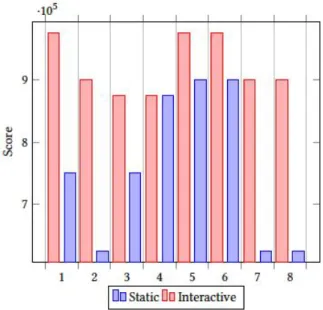
At the end of every test, the participants had to fill in a SUS questionnaire in order to get data about the qualitative aspect of their experience. Also, it was a good way to get an overview of the usability of one design over the other. In this section will be presented the results from the SUS questionnaire, which will display the perceived usability from the users’ perspective. The evaluation from the scores was conducted according to the study of Bangor and Kortum [6]. The table (Figure 10) presents the guidelines to analyze the SUS scores, and the histogram (Figure 11) presents the scores of the SUS questionnaire for both the visualizations.
Figure 10: SUS Score Table
Figure 11: Average SUS score per user
On the one hand, the average score for the static visualization is 71.5 which ranks the experience to "Good", however, there are few scores that ranked the experience as "Poor". On the other hand, the average score for the interactive visualization is 91.8 which ranks the overall experience as "Excellent", and the lowest ranking is 87.5 which maintains the ranking to the same levels.
Discussions with the Participants
After the end of each questionnaire, an informal interview was conducted, to get even more details about their experience. The participants expressed their opinions and reflected on their experience regarding the two designs. The participants mentioned that the coloring feature attracted the most attention at first glance, since they discovered that they can track the status of a task. As they said it felt really intuitive and helpful, to understand the progress of each task. In addition, they liked the color mapping since they could retrieve information instantly, and that was something they were looking for. They could understand the meaning of each color, and they liked that. More specifically, they noted that the different colors are not only a good way to understand the task status, but also to get feedback about the task deadline that is about to be due (orange color).
Besides that, some of the participants (P1,P2,P5) mentioned that the interactions are very helpful and
supportive to the planning feature since they can navigate in future dates and back. However, three of the participants (P2, P3, P4) even though they liked the introduction of the interactions, they raised concerns since they faced some problems with the interactivity. While interacting they faced difficulties such as:
(1) Panning: the mouse or trackpad was not responding fast, and sometimes they needed time to stop and focus on the task box they wanted. In addition, some mouses had an infinite scroll, and they could scroll a lot either forwards or backwards
(2) Zooming: the mouse or the trackpad made the zooming interaction sometimes difficult.
(3) Hovering: Some users use the cursor so they can read the description of a box but instead the pop-up box prevents them. In addition, two of them (P3, P7) mentioned that sometimes they were trying to read some data with the help of the mouse cursor and the pop-up box (hover effect) disturbed them. Contradictory opinions were raised regarding the real estate of the visualization. A group of them (P1, P4, P7, P8) worried that in the case of many tasks the large number of boxes will compromise the visibility and the improved experience of the design. On the other hand, the rest of them found this case really interesting and insightful since the visualization would actually deliver the intended information. They supported that in this case, it will be profitable for them to face many boxes, since this will notify and alarm them about the workload of a specific time frame.
Moreover, the removal of the filtering options and the introduction of the streamlines, was perceived as a smooth and helpful change. Participants were really excited about this feature, and according to them they have a more visual way to find immediately, in which SOP a task belongs to, and all the tasks per SOP.
In addition, few of them (P4,P7,P6), suggested at least in the beginning to introduce to the portal both of the visualizations, since they feel familiar with the table. They noted that the table is an insufficient tool to support them, but due to familiarity, they feel more confident especially in the beginning to provide both of the solutions.
Last but not least, all the participants commented that the stream line structure in combination with the
colouring feature provides good experience, and it could support them to constantly be informed about their deadlines.
DISCUSSION
This research aimed to discover critical flaws of the current system, analyze them and suggest a new way to improve user experience and enhance the planning feature. The discoveries from all the steps, proved the poor levels of experience and the limitations of the current solution related to users’ requirements and expectations. The high level demands from the users’ perspective failed to meet with the potentials of the deployed table, both in terms of size and interactivity. Overall, it seems that the new interactive tool, managed to approach in an efficient way the problems of the users, and provided a better solution than the current one. The research succeeded to deliver a valid suggestion (product) that could meet the users’ requirements and of course it could improve the user experience. The mission was not trivial, since the users were working with multivariate data, fetched from different systems and documents. The design methods deployed in the beginning, indicated that the main problem of the table was that it could not deliver in an efficient way the information to users. As the participants stated, the table was well integrated and delivered simple and clear information about a task. However, when the number of tasks was increasing, the usability and the efficiency were decreasing. It seems that the table is a simple way of providing information but maybe it is too simple. Users’ requirements for planning and searching failed to be operated in that table. When the users wanted to find out about the distribution of tasks in a specific time frame, it was impossible. Besides the fact of the information delivery, the lack of interactivity and the limited set of functions was also restricting the users. When they had to apply many filters in order to find a task, and then clear and apply again for another one, was too cumbersome.
Users were complaining that not only the information is not delivering much of a value, but also that the required effort to retrieve that information is very demanding.
On the one hand, the comments about the interactive timeline were very positive and promising.
Users seemed to feel very confident operating in that visualization and the additional features which supported the experience (coloring , interaction), provided value to users. The visualization managed to address part of the users’ requirements, especially those which were in the spectrum of the planning feature. Important finding from the analysis of the SUS questionnaire in combination with the interviews, was the reasoning about the scores. All of the participants mentioned that they provided a high score to the first design (current solution) due to the fact that they were familiar with the table and they knew how to operate. On the contrary, since they were performing for the first time with the interactive visualization, the high scores were related only in terms of satisfaction and not of familiarity.
On the other hand, the timeline did not receive only good comments. It seems that some of the users faced problems while operating the tasks with the interactions. As every new technology, it introduces both advantages and disadvantages. Users confronted some challenges with the panning/scrolling since it was not very easy to find and focus on a specific task at once. Sometimes, they needed time in order to focus on a specific date frame, and the trackpad sensitivity was a negative aspect. The fact that the users had to handle this interaction either with the mouse or the trackpad was increasing the difficulty levels and the invested effort. Also, the unintentionally actions from the trackpad, either scroll or zoom, while the user was operating on something else(reading the text box), was decreasing the performance of the visualization.
Additionally, the research was conducted under some limitations. Of course at this point, there is no implication that the timeline is a better solution compared to the table in general, since this research and the usability tests were focused mainly on the planning feature. The tasks were focused on searching and finding tasks or deadlines close to the current day either in the past or in the future. The comparison between the two designs, was targeted towards that direction, and can only provide valuable results regarding the planning feature. Of course, the requirements from the users’ side were more and throughout the study were increasing, but the main goal of this study was focusing on the exploration of task planning.
Another important fact about this thesis, relies that is highly affected by the super user and his personal preferences. In this participatory approach, all the users were part of the total process (design and evaluation), but the role of the super user was more critical and active. Since most of the information was derived from the super user, it is very possible that the structure and the workflow are focused on his personal and his team preferences. Especially in cases when he was evaluating situations or he provided suggestions in critical points of the research, it is very likely that he approached the process from his own perspective, and if there was someone else in this place then the designs might be different.
The criteria to choose this specific person were, his years of experience, the fact that he has been part of different teams in the organization and faced different ways of working, his knowledge about the different tools and of course his willingness to support the research.
Regarding the chosen methods, the deployed techniques provided valuable insights. The first phase of interviews was a very good start to gather information, and the workshop acted both as a filter about the findings and also as a fruitful brainstorm among the participants. Finally, the usability tests revealed qualitative aspects of each interface, and exposed weaknesses and strong points. On the other hand, this chosen path was not the only the one. At the beginning, they were suggested other methods such as the user's observations during their work day to get a more practical overview of the process, but their time schedule and the different tasks they had to undertake made this approach impossible. The advantage of this method, if applicable, would be that it might reveal more detailed insights rather than the interviews. Also, this method could support the thesis with numbers (count the time for completing tasks) and add a quantitative aspect. This aspect could also be embodied in the usability tests, and compare the time that the participants need to complete each task.
CONCLUSION
The conducted research, concluded to the result that the static table is a good and well integrated approach that supports users well in identifying tasks.
However, the problem is that the requirements from the users’ perspective are exponentially growing and the specifications of the table are constantly failing to meet their needs and deliver the required level of results.
Overall, the specific table structure that was deployed, was preventing users from retrieving information about the task status, the overall distribution and required a lot of effort and time in order to retrieve the information. The users faced many problems with the current solution, and the most dominant is the lack of planning potential. The absence of clear structure, the limited set of actions and the basic visualization schemes introduced many problems and inconsistencies. The current visualization was successfully presenting information as plain data, but was failing to communicate other values such as task distribution and work load.
Based on the results of the study, the interactive timeline visualization, provided better insights and improved the user experience regarding the planning feature. Despite the disadvantages, it provided the foundations of a solid visualization that can meet the demanding requirements from the user's perspective and deliver sufficient information value. The combination of the visualization with the available set of interactions seemed to approach the planning requirement in good terms. There is no expectation that the introduction of the timeline would radically change the experience and improve it without any disadvantage. The intention, though, was to introduce a new way of retrieving information from a visualization that can support in a better way the users’ requirements. In the study it was also found that the users were satisfied by the introduction of the interactive timeline, but also hesitated to include it as the only solution in their daily work life. When introducing a new tool in such a large organization the demanded learning curve can become really big, and the employees are always required to invest time and effort.
Despite that fact, the diversity in the employees’ background is also an important factor. For example in that specific case of the research, SOs might have technical background or managerial, therefore the category of the assigned ECU is based on that. As stated before, the ECUs can be either in-house (more technical) or bought (just management). Therefore,
the introduction of a new tool, requires sufficient training to all the affected employees, and on some occasions might need a lot of time.
Heavy industrial settings are eager to adapt innovation and new technologies, but they are facing issues with the scale of the organization. The size of the company and the diversity of both departments and employees can delay the adoption of new technologies. Scania can be considered a large automotive industrial company, with many departments around the world, and employees with a broad background. Overall, the intention is to develop and explore
FUTUREWORK
As a next step in this research, is the development of the dashboard with the interactive timeline as a proof of concept artifact. The aim will be to analyze the performance of the users and the efficiency. A working prototype in the user’s daily work life will provide more insights than some isolated usability tests about the time line performance and it’s efficiency. However, the interesting part will be the required time that the users will need in order to feel confident using only the timeline, if this will be the company's final choice. Also the exploration and the research of the other problems mentioned from the participants, could improve, equip and support the current suggestion and expand it to support more features. Finally, a more quantitative approach to this research could evolve and validate hypotheses and results from this thesis or continue in a different path.
ACKNOWLEDGMENTS
I would like to thank my parents who have been my support from the first day. They always inspired, supported, and motivated me to follow my dreams and a life path that I will remember forever. Without them, this masters/adventure would not be possible. I will always be grateful. Finally, I want to dedicate this research to my everything, aka Sofia.
REFERENCES
[1] Balsamiq. https://balsamiq.com/.
[2] Scania UI. https://scania.github.io/corporate-ui-docs/. [3] Tool sketch. https://www.sketch.com/.
[4] Abras, C., Maloney-Krichmar, D., Preece, J., et al. User-centered design.Bainbridge, W. Encyclopedia of Human-Computer Interaction. Thousand Oaks: Sage Publications 37, 4 (2004), 445–456.
[5] Ahrsjö, C. Real-time event based visualization of multivariate abstract datasets: Implementing and evaluating a dashboard visualization prototype, 2015.
[6] Bangor, A., Kortum, P. T., and Miller, J. T. An empirical evaluation of the system usability scale. Intl. Journal of Human–Computer Interaction 24, 6 (2008), 574–594.
[7] Brooke, J. Sus: a retrospective. Journal of usability studies 8, 2 (2013), 29–40.
[8] Brooke, J., et al. Sus-a quick and dirty usability scale. Usability evaluation in industry 189, 194 (1996), 4–7.
[9] Charleer, S., Klerkx, J., and Duval, E. Learning dashboards. Journal of Learning Analytics 1, 3 (2014), 199–202.
[10] Christer-Nilsson, C. User centered design of a monitoring dashboard-for better energy performance. Master’s thesis, 2015.
[11] Fekete, J.-D., Van Wijk, J. J., Stasko, J. T., and North, C. The value of information visualization. In Information visualization. Springer, 2008, pp. 1–18.
[12] Few, S. C. Information Dashboard Design: Displaying Data for At-a-Glance Monitoring. Jonathan G.Koomey, Cheshire, CT, USA, 2013.
[13] Freitas, C. M., Luzzardi, P. R., Cava, R. A., Winckler, M., Pimenta, M. S., and Nedel, L. P. On evaluating information visualization techniques. In Proceedings of the working conference on Advanced Visual Interfaces (2002), ACM, pp. 373–374.
[14] Jonathan Lazar, Jinjuan Heidi Feng, H. H. Research methods in human computer interaction. In Research Methods in Human-Computer Interaction, L. Lawrence, Ed. Morgan Kaufmann publishers, 50 Hamshire Street, Cambridge, 2017, ch. 8, pp. 187–228.
[15] Jonathan Lazar, Jinjuan Heidi Feng, H. H. Research methods in human computer interaction. In Research Methods in Human-Computer Interaction, L. Lawrence, Ed. Morgan Kaufmann publishers, 50 Hamshire Street, Cambridge, 2017, ch. 7, pp. 263–298.
[16] Marcus, A. Design, User Experience, and Usability: Web, Mobile, and Product Design: Second International Conference, DUXU 2013, Held as Part of HCI International 2013, Las Vegas, NV, USA, July 21-26, 2013, Proceedings, vol. 8015. Springer,2013.
[17] Mashhadi, A. F., Alänge, S., and Roos, L.-U. Introducing robust design in product development: Learning from an initiative at volvo. Total Quality Management & Business Excellence 23, 9-10 (2012), 1191–1205.
[18] Ørngreen, R., and Levinsen, K. Workshops as a research methodology. Electronic Journal of E-learning 15, 1 (2017), 70–81.
[19] Sanoff, H. Participatory design: Theory and techniques. [20] Schwendimann, B. A., Rodríguez-Triana, M. J., Vozniuk, A.,
Prieto, L. P., Boroujeni, M. S., Holzer, A., Gillet, D., and Dillenbourg, P. Understanding learning at a glance: An overview of learning dashboard studies. In Proceedings of the sixth international conference on learning analytics & knowledge (2016), ACM, pp. 532–533.
[21] Sein, M., Henfridsson, O., Purao, S., Rossi, M., and Lindgren, R. Action design research. Management Information Systems Quarterly 35, 1 (2011), 37–56.
[22] Verbert, K., Govaerts, S., Duval, E., Santos, J. L., Assche, F., Parra, G., and Klerkx, J. Learning dashboards: an overview and future research opportunities. Personal and Ubiquitous Computing 18, 6 (2014), 1499–1514.
[23] Yigitbasioglu, O. M., and Velcu, O. A review of dashboards in performance management: Implications for design and
research. International Journal of Accounting Information Systems 13, 1 (2012), 41–59.