Design with Subtle Cues:
Visual Expression of Connectedness and Its Downstream Effects
by
Jihye Kim
A dissertation submitted in partial fulfillment of the requirements for the degree of
Doctor of Philosophy (Design Science) in the University of Michigan
2013
Doctoral Committee:
Table of Contents
Dedication ………...ii
List of Tables………....v
List of Figures ………vi
Abstract………..vii
CHAPTER 1 INTRODUCTION... 1
CHAPTER 2 CULTURAL DIFFERENCES AND REFLECTIONS OF HARMONY... 4
2.1INTRODUCTION... 4
2.2LITERATUREREVIEW ... 5
2.2.1 Cultural differences in social orientation... 5
2.2.2 Cross-cultural studies... 6
2.2.3 Corporate logos... 7
2.3EXPERIMENT1... 8
2.3.1 Design principles... 9
2.3.2 Method ... 10
2.3.3 Results... 11
2.3.4 Discussion... 12
2.4EXPERIMENT2... 14
2.4.1 Method ... 14
2.4.2 Results... 14
2.4.3 Discussion... 15
2.5GENERALDISCUSSION ... 16
CHAPTER 3 CONNECTED SHAPES AND INTERDEPENDENT SELF-CONSTRUAL... 19
3.1INTRODUCTION... 19
3.2LITERATUREREVIEW ... 20
3.2.1 Product expression ... 20
3.2.2 Mechanism of meaning projection ... 24
3.3HYPOTHESIS... 28
3.4EXPERIMENT1... 29
3.4.1 Method ... 29
3.4.2 Results and discussion ... 30
3.5EXPERIMENT2... 32
3.5.1 Method ... 32
3.5.2 Results and discussion ... 34
3.6GENERALDISCUSSION ... 35
3.6.1 Theoretical and practical implications... 36
3.6.2 Limitations and future research ... 37
CHAPTER 4 CONNECTED SHAPES AND COOPERATIVE BEHAVIOR... 39
4.1INTRODUCTION... 39
4.2LITERATUREREVIEW ... 40
4.2.1 Social connectedness and prosocial behavior... 40
4.2.2 Social norms and prosocial behavior... 41
4.2.3 The present research ... 42
4.3EXPERIMENT1... 43
4.3.1 Method ... 43
4.3.2 Results... 45
4.3.3 Discussion... 47
4.4EXPERIMENT2... 48
4.4.1 Method ... 48
4.4.2 Results... 50
4.4.3 Discussion... 52
4.5GENERALDISCUSSION ... 53
CHAPTER 5 CONCLUSION... 58
List of Tables
Table 1 Design principles of repetition, continuation, unity and harmony ... 9
Table 2 Logotypes and overall shapes ... 13
Table 3 Main color... 13
Table 4 Repetition, continuation, unity and harmony... 13
Table 5 The significance of predictor variables... 16
Table 6 Coding scheme and results ... 31
List of Figures
Figure 1 The top five Korean logos and the top five US logos ... 15
Figure 2 The bottom five Korean logos and the bottom five US logos... 15
Figure 3 Visual stimuli and results of the picture frame pilot study... 26
Figure 4 Logos representing connectedness ... 30
Figure 5 Experimental stimuli: connected (left) and control (right) objects ... 33
Figure 6 Counts of interdependent descriptions (a) and independent descriptions (b)... 35
Figure 7 Connected symbols (left) and control symbols (right) ... 44
Figure 8 Contribution decisions by cue and contribution norm ... 46
Figure 9 Mean contributions over time by contribution norm conditions ... 49
ABSTRACT
CHAPTER 1 Introduction
Just like the combination of musical chords produces a pleasing effect, harmonious social interaction among members of a social group is critical for their basic survival and subsistence or that of society. In their work to promote harmonious social interaction, previous design efforts have mainly focused on ecological or architectural variables to construct physical space in a way that people can easily mingle with one another. However, limited attention has been paid to design of small-scale artifacts in our surroundings. Although the well-known Chinese folk practice or philosophy of Feng Shui is concerned with the placement of objects in order to bring harmony in various aspects of life, little scientific research has tested the role of everyday artifacts in influencing social interaction.
This dissertation explores how objects can promote harmonious social interaction, with a particular focus on their communicative functions. The communicative view on objects has been studied across various fields and from diverse perspectives (e.g., Crilly, Good, Matravers, & Clarkson, 2008; Gros, 1984; Peirce, 1940; Vihma, 1995). For example, in semiotics (Peirce, 1940), objects are seen as symbols, signs, or language-like systems. Despite a diversity of perspectives on understanding the role of objects, there seems to be agreement that that objects
convey meaning through their design and that manipulating the design of objects can be an
effective way to communicate specific meanings. This process is important because the mental construct activated by (the design of) objects can in turn influence subsequent attitude and
Objective and scope
This dissertation aims to shed light on design that expresses social harmony and its downstream influence on social interaction. In doing so, this investigation contributes to the understanding of human response to visual form and meaning, and provides implications for promoting meaningful social interaction.
This research focuses on a specific aspect of design, visual form, but the broader term design is used throughout this dissertation. The visual form of an object is not only conceived as part of the Gestalt, referring to external coverage and surface of the object, but also taking part in the perception process as an object for interpretation (Vihma, 1995). The terms visual form and
visual appearance are used interchangeably. Moreover, the terms objects and artifacts are also interchangeably used throughout the dissertation not only to refer to tangible products, but also to intangible products in a broad range of media.
In addition to visual form, this research focuses on employing the communicative power of design as a source of influence on particular human attitudes and behaviors, rather than understanding the nature of the communication process. Although this research (Chapter 2) examines perceivers’ interpretation of form, it does not employ the semiotic approach or any other communication models considering design intent in evaluating or classifying form.
Lastly, since social harmony or harmonious social interaction is a broad and vague concept to measure, this research (Chapter 3 and 4) focuses on social connectedness and prosocial behavior that are established concepts in the literature. Prosocial behavior, defined as actions that benefit other people or society as a whole (Twenge, Baumeister, Ciarocco, & Bartels, 2007), is seen as key to promoting harmonious interpersonal or group interaction; the same is true for social connectedness. The term social connectedness and other related concepts such as self-construal
Structure: Three essays
The first part of this dissertation investigates how visual form reflects meaning of social harmony, particularly by comparing design manifestation cross-culturally. It has been well documented that cultural differences exist in the extent to which social harmony matters to a group. This cultural difference influences various types of cultural practice, including visual practice such as art and design. Visual form reflecting local cultural values is more preferred by members of a culture and thus these forms are dominant in each culture (Zhang, Feick, & Price, 2006); In light of this relationship, comparing actual design practices from individualistic vs. collectivistic cultures can reveal formal qualities associated with social harmony as well as cultural preferences for aesthetics. Therefore, the first essay (Chapter 2) includes two studies that analyze form and perceived meaning of actual corporate logos from Korea and the US, and discusses implications for visual communication design for different cultures.
This dissertation then explores downstream consequences of visual expression, particularly
investigating visual expression of connectedness and its influence on feeling of social connectedness and cooperative behavior. Specifically, the second essay (Chapter 3) explores the literature on communicative functions of products, mechanism of downstream effects, and social connectedness. It then presents two experiments conducted to identify design features that
represent connectedness (i.e., connectedness cues) and to measure the effect of connectedness cues on one’s self-construal (Markus & Kitayama, 1991). The third essay (Chapter 4) further examines the effect of connectedness cues on cooperative behavior. It includes two studies
employing a public goods game to examine how connectedness cues influence monetary contribution decisions in different levels of contribution norms. These studies provide a unique
technique to influence prosocial attitude and behavior through design characteristics of objects in our surroundings.
CHAPTER 2 Cultural Differences and Reflections of Harmony
2.1 INTRODUCTION
In our ever-shrinking world, physical borders have become more blurred and companies are becoming more global or multinational. Companies that have become truly global are not only moving their headquarters to other countries but also using branding strategies and marketing messages that appeal to a global market (Mueller, 2004). Therefore, it is important for marketers to understand local cultural values and deliberately reflect them in executing marketing communication messages in order to communicate their products or brands more effectively and persuasively (Aaker, 2000).
Understanding cultural differences may be the key to developing internationally accepted brands or products and communicating with global consumers. To understand and explain cultural similarities and differences, the dimension of individualism and collectivism (Triandis, 1995) has received the most attention by researchers specializing in cross-cultural research. The fundamental distinction between individualism and collectivism appears in their social orientation, that is, their relative emphasis on social connectedness with others. Individualistic cultures, such as those of the United States and Western Europe, stress the development and differentiation of a unique personality and identity, and autonomy. In contrast, in collectivistic cultures, such as those of China, Korea, and Japan, the impact of group membership on self-definition results in a desire to maintain in-group harmony.
design for examining cultural differences. Prior literature indicates the importance of corporate visual identity specifically for multinational companies facing the choice between a standardized and a localized corporate identity. Despite its importance, empirical cross-cultural studies on corporate visual identity have been limited. Furthermore, prior cross-cultural studies on graphic design in general have mostly focused on examining differences in visual motifs and overall form such color and shape.
Thus, the current study compares Korean and US corporate logos particularly in communicating the sense of harmony. Prior cross-cultural research on aesthetic preference has demonstrated that people tend to prefer visual form congruent or associated with cultural values sought in each culture (e.g., June & Lee, 2007; Marcus & Gould, 2000; Zhang, Feick, & Price, 2006). Because people in collectivistic cultures tend to pursue harmony in a group than those in individualistic cultures, we hypothesize that Korean logos would reflect a greater sense of harmony in their visual syntax and semantics. This paper presents the results of two studies to support our hypothesis. In the first study, we examined cultural differences in formal qualities (syntax) by conducting a content analysis of actual corporate logos used in Korea and the US. In the second study, we conducted a survey to understand meaning (semantics) represented in logos.
2.2 LITERATURE REVIEW
2.2.1 Cultural differences in social orientation
studies inspired by the dimension of individualism and collectivism have typically compared differences between East Asians and European North Americans (Lehman, Chiu, & Schaller, 2004) using nationality as a proxy for a person’s underlying cultural values of individualism vs. collectivism (Brockner, 2003).
2.2.2 Cross-cultural studies
Researchers have studied cultural differences in design (e.g., Albers-Miller & Gelb, 1996; Cutler & Javalgi, 1992; June & Lee, 2007; Marcus & Gould, 2000), in attempt to suggest the most effective marketing methods and strategies to target people in different countries. They have
found significant cultural differences in how products are presented to customers, many of them explaining the cultural difference through cultural models of individualism and collectivism. For example, American university websites showed a high degree of individualism throughout by way of frequent pictures of individuals, direct address (using "you" as opposed to "we"), personalization features, expression of private opinion, individual success stories, etc. In
contrast, Indian sites displayed images of groups, used formal speech, included mission statements that impacted the larger group, and stated opinions on group behavior (Rajkumar, 2003).
Psychological studies have demonstrated cultural differences in aesthetic preference with
emphasis on theorizing such cultural differences. For example, based on culturally different conflict resolution styles, Zhang and his colleagues (2006) examined cultural preference for
angular vs. rounded shapes. The collectivistic tradition values harmonious relationship between self and environment and thus encourages conflict avoidance. On the other hand, the individualistic tradition values free will of individual agency and encourages conflicting will (Nisbett, Peng, Choi, & Norenzayan, 2001). Meanwhile, angular vs. rounded shapes evoke different perceptions; angular (rounded) shapes are regarded as a confrontation (compromise)
attractiveness perception depends on the qualities that are sought (Aronoff, Woike, & Hyman, 1992), they argued that collectivistic cultures where people seek harmony find rounded shapes
more attractive; individualistic cultures where individuality and toughness are sought, angular features are more attractive. Consistent with their expectations, they found that rounded shapes
are more preferred and prevalent in collectivistic cultures.
Taken together, the extant literature suggests that culture systematically influences visual form, such that cultural values or culturally influenced cognitive tendencies are manifest in the visual form. In other words, people find certain visual form more appealing when the qualities evoked by the form are congruent with their cultural value, thereby making the form more prevalent in each culture. For example, because people in collectivistic countries tend to maintain harmonious relationships between people to a greater extent than those in individualistic countries, it is reasonable to predict that visual form associated with the general concept of harmony would be the more dominant presentational form in collectivist cultures.
2.2.3 Corporate logos
The present study explores the possibility of systematic cultural differences in visual communication of harmony manifest in corporate logos. Because actual logos from a culture should be a good reflection of its population’s cognitive or aesthetic preference (Zhang, Feick, & Price, 2006), we propose that logos from collectivistic cultures would be perceived as more harmonious than those from individualistic cultures. To verify our hypothesis, we examined corporate logos in Korea and the US. We selected the US and Korea as representative countries of individualistic cultures and of collectivistic cultures, respectively. Previous research notes a large cultural difference between the two countries (Hall, 1989; Hofstede, 2001). For example, Hofstede (2001) reported that South Korea ranked 43rd in individualism, whereas the US was the most individualistic of the 50 countries.
In order to structure our analysis of corporate logos, we took a semiotic approach to visual communication. According to Morris (1971), a completed semiotic analysis of signs would take three distinct kinds of studies: Syntactics, semantics and pragmatics. Syntactics would study the formal relations of the sign. Semantics is the study of connotative meaning of a sign; what the image represents. Pragmatics on the other hand is the study of interactional meaning. It helps determine the origin of the meaning of a sign by understanding some of the factors such as codes, modality, sender, receiver and context. Using the semiotic approach, the present study looks at syntactics and semantics of logos in communicating harmony1. In other words, we examined the formal qualities (syntax) in Experiment 1 and meaning (semantics) of logos in Experiment 2.
2.3 EXPERIMENT 1: Analysis of formal qualities
Experiment 1 was designed to understand differences in formal qualities across Korean and US logos. Provided that harmony is about relationships among parts in a group, we are particularly interested in examining relationships of visual elements in logos. We propose that we would observe more harmonious compositions of elements in Korean logos than US logos. In order to define harmonious compositions, we employed standard design principles.
1 Pragmatic analysis may include the study of how logos are interpreted differently by context or perceiver, which is not within
2.3.1 Design principles
[image:16.612.67.555.337.551.2]Both construction and perception of any products involves certain design elements (e.g., line, plane, color, etc) and design principles (e.g., unity, contrast, balance, proportion, etc). Design elements are the parts marking up a product, and design principles refer to general rules of perception that involve the relationship between the parts of a visual display (Lauer, 1979). There are a large number of design principles that influence each other. And there is no fixed rule for the use of each principle, and there could be multiple ways to achieve the same principle. The design principle of unity, for instance, refers to a congruity among the elements of a design such that they look as though they belong together or as though there is some visual connection beyond mere chance that has caused them to come together (Lauer, 1979).
Table 1 Design principles of repetition, continuation, unity and harmony
Principles Descriptions
Repetition Element repeats itself in various parts of the design to relate parts to each other.
Continuation The continuity in the form of a line, an edge, or a direction from one form to another creates a fluid connection among compositional parts. Unity vs. Variety The congruity or agreement among the elements in a design; it
describes the feeling that all the elements in a work belong together and make up a coherent and harmonious whole.
Variety, on the other hand, provides diversity. Variety acts to counter unity.
Harmony vs. Contrast Harmony is another term for unity; harmony is achieved in a body of work by using similar elements throughout the work; it gives an uncomplicated look to a piece of artwork or sculpture.
Contrast is created by using elements that conflict with one another. Contrast acts to counter harmony.
involves placing elements together, would not be easy for coders to differentiate in small visual displays such as logos. Table 1 describes the four principles of interest. In our research, we define that better satisfying principles of repetition, continuation, and unity/harmony leads to more harmonious composition. We predict that Korean logos would better satisfy design principles of repetition, continuation, and unity or harmony. In other words, Korean logos would have more harmonious compositions than US logos. To verify our hypothesis, we conducted a content analysis of logos in terms of the aforementioned design principles. In addition to design principles, we examined general visual form, such as overall shape and color.
2.3.2 Method
Logo Samples
The sample corporate logos were collected from a business information database, OneSource Global Business Browser. Besides selecting parent corporations located either in Korea or the US, we limited our search to small and medium sized corporations having less than 500 employees. Small and medium corporations are more likely to reflect the local culture, thereby better serving our research goals of understanding cultural differences. We also limited the search to business-to-business (B2B) manufacturing industries (such as chemical, metal, construction, transportation, wood & forestry, and utility & energy). Then, we eliminated corporations that do not have websites, which resulted in 197 Korean and 3000 US corporations. Among 3000 US corporations, we randomly selected 197 US corporations while keeping their industry proportion same as the Korean samples’. For the final 197 Korean and 197 US samples, we collected their brand logos from the home pages of their websites typically showing their CI at the top of webpage. Then, we excluded logos consisting of word-marks (i.e., freestanding words of company names or acronym) because they may expose the corporations’ nationality. We also excluded logos looking similar to well-known corporate logos to ensure low perceived familiarity. This yielded 83 Korean and 79 US logos for content analysis.
Coding Scheme
and continuation, unity and harmony). The overall shape was measure as either (1) rounded or (2) angular. The color categories included (1) blue, (2) red, (3) yellow, (4) green, (5) gray, and (6) black. Following the general definitions of principles, in our study we instructed the coders about principles of repetition, continuation, unity and harmony as follows.
• Repetition: the use of the same or similar visual elements.
• Continuation: the continuation of line, edge or direction from one to another.
• Unity/Variety: the sense of oneness, of things belonging together and making up a coherent whole; the opposite concept of variety, defined as the elements with enough change or difference to enhance each other.
• Harmony/Contrast: the use of elements of the same type that go together; the opposite concept of contrast, defined as the use of elements that stand out because they are not alike. Repetition and continuation were measured as either (1) low or (2) high. Unity was measured as either (1) variety or (2) unity, and harmony was measured as either (1) contrast or (2) harmony. In addition, the coders also classified logos by their logotype, following Wheeler’s definition of brand-logo classification (Wheeler, 2003). The logotype was coded as either (1) letterform, (2) pictorial or (3) abstract.
2.3.3 Results
The average inter-coder agreement was 73%. Given that this study is exploratory in nature, the agreement rate over 70% can be used as acceptable criteria (Lombard, Snyder-Duch, & Bracken, 2002). Country and each of the individual variables were treated as categorical variables, and χ2
tests were used to identify the difference between Korean and US logos.
Logotype(see Table 2) 70 percent of Korean logos were symbolic, while only 48 percent of the US logos were symbolic. The US logos were more pictorial logos (30 percent) than the Korean logos (13 percent). These differences in the logotype proportions were statistically significant (χ2
= 9.82, p<.01), indicating that the Korean logos are more symbolic than pictorial.
Korean logos (76 percent) were perceived as rounded while most of the US logos (52 percent) were perceived as angular.
Main color (see Table 3) The most frequently used main color was blue for both countries. The second highest ranked color was red for Korean logos and black for US logos. Interestingly, only 6 percent of the Korean logos were black and none of the Korean logos was yellow. However, the US logos contained 22 percent of black and 10 percent of yellow as the main color.
Repetition (see Table 4) We found no difference between countries in terms of the repetition principle used in logo designs, χ2 =.81, p=.37. The majority of the Korean logos contained a
repetition of elements in their designs and this trend was the same for the US logos.
Continuation (see Table 4) The continuation principle was found to be significantly more frequent in the Korean logos (91 percent) than the US logos (66 percent), indicating that design elements in the Korean logos were arranged in a more visually connected way than were the US logos, χ2 =4.61, p<.05.
Unity/Harmony (see Table 4) For the principle of unity, the Korean logos were perceived as having more unity and less variety than the US logos, and the difference was marginally significant, χ2=3.42, p=.06. Similarly, the principle of harmony were found to be more frequent
for the Korean logos than for the US logos (χ2=6.79, p<.01), indicating that the Korean logos
were perceived as more harmonious and less contrasting in their design principles.
2.3.4 Discussion
observed cultural difference in perceived harmony or unity. In other words, the stronger visual sensation of harmony in the Korean logos may have resulted from the stronger visual continuity observed between visual elements in the logos. Furthermore, we found that the Korean logos were perceived as more rounded and abstract than the US logos. These findings about shape and logotype are consistent with the existing literature on cultural preference for aesthetic and communication strategies. Asian consumers have been found to prefer rounder shapes, whereas US consumers tend to prefer more angular shapes (e.g., Henderson, Cote, Leong, & Schmitt, 2003; Zhang, Feick, & Price, 2006). Advertising or brands in the diffusive Korean culture are more symbolic/abstract or high context than those in the specific US culture (e.g., June & Lee, 2007; Taylor, Miracle, & Wilson, 1997).
Table 2 Logotypes and overall shapes
Logotype (%) Overall shape (%) Letterform Pictorial Symbolic Angular Rounded
Korea 16.7 13.3 71.1 24.1 75.9
U.S 21.5 30.4 48.1 51.9 48.1
Notes: Logotype: Inter-coder reliability = 85%; χ2 = 9.82; df=2; p<.01, Overall shape: Inter-coder reliability=82%;
[image:20.612.73.549.450.512.2]χ2 =13.33; df=1; p<.001
Table 3 Main color
Main color (%)
Blue Red Yellow Green Gray Black Total
Korea 45.8 25.3 0 18.1 4.8 6.0 100
U.S 38.0 10.1 10.1 11.4 8.9 21.5 100
Notes: Inter-coder reliability = 74%, χ2 =23.55; df=5; p<.001
Table 4 Repetition, continuation, unity and harmony
Repetition (%) Continuation (%) Unity (%) Harmony (%) Low High Low High Variety Unity Contrast Harmony
Korea 24.1 75.9 19.3 90.7 10.8 89.2 7.2 92.8
U.S 30.4 69.6 34.2 65.8 21.5 78.5 21.5 78.5
Notes: Repetition: Inter-coder reliability=75%; χ2 =.81; df=1; p=.37, Continuation: Inter-coder reliability=54%; χ2
=4.61; df=1; p<.05, Unity: Inter-coder reliability=71%; χ2=3.42; df=1; p=.06, Harmony: Inter-coder
[image:20.612.66.548.564.624.2]2.4 EXPERIMENT 2: Analysis of meaning
Although the results from Experiment 1 suggested that Korean logos have more formal qualities that contribute to perceived visual harmony than the US logos, it is still unclear whether Korean logos semantically communicate the greater sense of harmony. Therefore, Experiment 2 was designed to examine the semantic communication of harmony in logos. That is, it involved a direct measure of the sense of harmony in logos; with the same logo samples used in Experiment 1, we conducted a survey to ask participants to rate each logo on how effective it is in communicating a sense of harmony.
2.4.1 Method
A total of 255 subjects (69% male; age mean=28; SD=9.32) participated in an online survey on Amazon Mechanical Turk. Subjects were asked to look at logo designs proposed for a corporation whose slogan is “togetherness in harmony”, and to evaluate how well each logo represents the corporate slogan. Among the 83 Korean and 79 US logo samples used in Experiment 1, each subject was presented with randomly selected 10 Korean logos and 10 US logos one by one, and rated how effectively each logo represents the concept of togetherness in harmony on a 7-point Likert scale from 1 – ‘very ineffective’ to 7 – ‘very effective’. Each logo was seen by 31 subjects on average (mean=31.49; range=29~34; SD=1.19).
2.4.2 Results
2.4.3 Discussion
The results from Experiment 2 showed that Korean logos are more effective in representing the meaning of harmony. Consistent with the findings from Experiment 1, we found that Korean logos semantically represent the sense of harmony better than the US logos. As shown in Figure 2, the highest rated logos in their effectiveness score reflect repetition, continuation, unity and harmony in terms of formal qualities, suggesting that perceiving those design principles may contribute to the semantic interpretation of harmony.
KR logos
Mean (SD) 5.45 (1.34) 4.90 (1.54) 4.84 (1.44) 4.67 (1.81) 4.48 (1.79)
US logos
Mean (SD) 4.94 (1.90) 4.91 (1.63) 4.65 (1.41) 4.64 (1.78) 4.44 (1.52)
Figure 1 The top five Korean logos and the top five US logos
KR logos
Mean (SD) 1.87 (1.52) 1.87 (1.09) 2.00 (1.50) 2.03 (1.10) 2.06 (1.55)
US logos `
[image:22.612.68.543.453.616.2]Mean (SD) 1.53 (1.14) 1.70 (0.88) 1.79 (1.08) 1.85 (1.23) 1.94 (1.17)
Figure 2 The bottom five Korean logos and the bottom five US logos
model using a stepwise method (adjusted R2 = .263; F(3,158) = 20.143, p<.0001) shows that design principles of repetition and continuation, and overall shape significantly contribute to the effectiveness score (see Table 5). This indicates that repetition, continuation and roundedness positively influence the sense of harmony. Specifically, repetition has the biggest impact on the semantic interpretation of harmony, followed by roundedness and continuation.
Table 5 The significance of predictor variables
Predictor variable Beta P value Repetition .334 p<.0001 Overall shape (roundedness) .297 p<.0001
Continuation .195 p<.05
(Design principles of unity and harmony were not significant predictors in this model.)
2.5 GENERAL DISCUSSION
The present research investigated the impact of culture on the visual communication of harmony in corporate logos. Because a collectivistic culture emphasizes harmonious social relationships, we predicted that visual form communicating such qualities would be more frequently observed in a collectivistic culture. Our results are consistent with our expectations.
Our studies provide evidence that the collectivistic value of seeking harmonious relationships is formally and semantically better represented in logos from a collectivistic country. In Experiment 1, two coders analyzed formal compositions in corporate logos in two different countries, Korea and the US. We found that Korean logos compared to US logos better satisfy design principles of continuation, unity and harmony than the US logos. We also observed that Korean logos are more rounded and abstract than US logos. In Experiment 2, participants rated how well each logo represents the meaning of harmony. The result showed that Korean logos represent the meaning of harmony more effectively than US logos.
formal qualities in communicating the semantic meaning of harmony. In particular, visual roundedness and continuity, which was more frequently observed in Korean logos (vs. US logos), are expected to contribute to achieving a greater sense of harmony.
These results make several contributions to the existing literature. Most importantly, the present study contributes to cross-cultural research on corporate visual identity. Even if verbal components in marketing communication have been broadly studied in the marketing and advertising field, research on visual components in communication remains limited. In particular, our findings provide implications for more effective and persuasive logo design by reflecting local cultural values. Moreover, although most prior research on corporate visual identity has focused on consumer businesses or brands, our study examined B2B industries and provided information about logo design of B2B corporations.
Second, in prior cross-cultural research on corporate logos (e.g., June & Lee, 2007), corporate samples tend to contain the largest corporations that run multinational businesses and international marketing communication (e.g., samples are collected from the Fortune Magazine’s list of the largest corporations). However, such samples might not reflect the values of one single culture, thereby weakening their argument about not only cultural difference but also why cultural differences are observed. Here, our studies collected logo samples from small and medium sized corporations, which, we believe, provides a better test of design styles in each country and the differences between two countries.
Third, the current study contributes to existing empirical research on cultural differences in graphic design. Although prior research in the design field has focused on basic elements, layout, and general theme in visual display, to the best of our knowledge, our research is the first to examine cultural differences in compositional rules of visual elements, i.e., design principles. Although we focused on corporate logos in the present research, our findings are also applicable to a wide range of graphic design such as book, magazine, and package.
preference, the content analysis does not show direct inference for cultural differences in corporate logos from the US and Korea, nor does it suggest what types of designs are preferred or effective in the two countries. Therefore, in future research, experimental studies or surveys are needed to directly access whether logo designs perceived as more harmonious are more preferable or effective in collectivistic cultures. Moreover, the present study only investigated Korean and US corporations, so the findings may not be applicable to other nations. Thus, future research is needed to analyze a large sample of countries in order to test external validity.
Second, the present study focused only on a particular visual component of corporate identity, that is, a logo. However, visual components of CI consist of other typographic elements such as names and taglines that could reflect the concept of harmony even more effectively. Korean taglines contain more additional values, like appeals to family, friend, neighbor, and emotion than American taglines, reflecting characteristics of diffusive culture (June & Lee, 2007). Therefore, it would be interesting to observe how logos reflect the concept of harmony in conjunction with taglines in future research.
CHAPTER 3 Connected Shapes and Interdependent Self-Construal
3.1 INTRODUCTION
The relationship between environmental cues and human behavior has long been considered in both psychology and design. Ecological variables such as lighting, color, temperature, scent and spatial layout in a setting can influence people’s behavior even without their awareness. Extant research has documented a number of such findings. For example, classical music leads customers to buy more expensive wine (Areni & Kim, 1993), and pleasant ambient scent in a store influences the perception of product quality as well as consumer spending (Chebat & Michon, 2003). Clean scent facilitates ethical behavior (Liljenquist, Zhong, & Galinsky, 2010) and bright lighting can reduce crime (Painter & Farrington, 1999). The color pink has been shown to have a calming effect, serving to reduce violent and aggressive behavior (Schauss, 1979; Snyder, 1981); thus some prison cells are painted pink to calm prisoners (e.g., Ben Hill County Jail).
known about how physical characteristics of objects affect social perceptions and behavioral outcomes. This is surprising given that man-made objects or products are expressive on their own insofar as they conveying meanings through their formal properties such as shape, size, color and texture.
In our present research, we examine how product expression can lead to meaningful downstream consequences. For example, can the design of a plate upon which food is served increase donations at a charity banquet? Can the design of coffee mugs used by people at a business meeting enhance cooperative behavior? Understanding the potential impact of product expression in everyday life settings may not only provide a practical technique for designers to influence human behavior, but may also contribute to design education and philosophy.
This paper focuses on the role of product expression as a situational cue that promotes interdependent self-construal, which in turn may be predictive of a variety of behaviors such as how close one sits to a new acquaintance, well-being and prosocial behavior. In particular, we propose and demonstrate that representation of connectedness in product form leads to a greater sense of social connectedness and thereby judgments of the self as an interdependent entity. We begin by reviewing the extant literature related to product expression, i.e., the communicative functions of product form. We also review the prior literature on priming and social connectedness. We then present two experiments that investigate the extent to which design features expressive of the theme of connectedness influence social connectedness (how one views oneself in relation to others).
3.2 LITERATURE REVIEW
3.2.1 Product expression
1990; Lewalski, 1988). Product expression thus plays a critical role in determining consumer responses and market success. The form can attract consumers to a product, communicate information, and enhance product experience (Bloch, 1995).
Communicative functions of products
Designers started considering the communicative functions of products in reaction to the method of conception based on practical functions that was pervasive in the 1960s. Since then, semantic approaches for analyzing and improving symbolic qualities of a product form have been introduced in academia and practice. In the 1980s, for example, Krippendorff and Butter (1984) introduced product semantics – defined as the study of symbolic qualities of man-made forms in cognitive and social contexts, and their use and application in industrial design – to facilitate communications between a product and its user.
Gros’ (1984) theory of product language, an example of applied product semantics, suggests a useful way to employ semantic concepts in design. In his conceptual model, Gros makes a distinction between the practical functions and language functions of products. The product language functions can be subdivided into two parts, the formal aesthetic functions and the
semantic functions. The formal aesthetic functions (related to ‘visceral level’ in design; Norman, 2004) refer to formal aspects that can be observed regardless of the meaning, corresponding to syntax (or grammar) in a science of language. These aspects evoke aesthetic impressions among perceivers, that is, the sensation that stems from perceptions of attractiveness (or unattractiveness) in products (Crilly, Moultrie, & Clarkson, 2004).
origin and affiliation (Mono, 1997). The symbolic functions (related to ‘reflective level’ in design; Norman, 2004) provide information associated with what is imagined. Whereas the indicating function refers to what the product is seen to indicate about itself or the socio-cultural context, the symbolic function is about what is seen to symbolize about its user (Crilly et al., 2004). This is analogous to Langer’s distinction between signs and symbols: “Signs announce their objects to him (the user), whereas symbols lead him to conceive their objects” (Langer, 1963: p. 61). The symbolic function is based on cultural and social convention and tradition; thus the message and meaning of a product is determined by cultural norms and context.
Crilly and colleagues (2004) reviewed and integrated a number of existing models and frameworks from a wide range of disciplines, and developed a general framework to understand consumer responses to product form. This framework, in line with Gros’ theory of product language, takes a semiotic perspective of product design by considering consumer responses to product appearance as one stage in a communication process. The process of communication eventually prompts cognitive, affective and behavioral responses to a product, which is moderated by a number of variables, including consumers’ individual characteristics and cultural/situational factors (for a comprehensive review, see Crilly et al., 2004). In this model, aesthetic impression, semantic impression, and symbolic association of consumer responses correspond to formal aesthetic functions, indicating functions, and symbol functions (respectively) in Gros’ theory. As Crilly et al. (2004) noted, the product language functions do not operate independently; they influence one another when consumers react to product design.
The influence of product expression
Prior studies in marketing and in design have demonstrated the importance of product expression with respect to consumer decision-making (e.g., Creusen & Schooermans, 2005; Van Rompay, Pruyn, & Tieke, 2009), brand impression (e.g., Bloch, 1995; Childers & Jass, 2002; Karjalainen, 2007), self-expression (e.g., Belk 1988; Goffman, 1990; Richins, 1994) and identity formation (e.g., Belk 1988; Sirgy 1982; Solomon 1983). Consumer research on product expression or symbolism has primarily focused on consumer-product interaction in the context of consumption, with limited attention devoted to how product expression can influence behaviors beyond those relating to product purchase or use. Can the influence of product expression extend beyond the typical consumer-product interaction to other aspects of people’s lives?
Psychological studies have found that representational qualities of products are capable of being situational cues that shape people’s inner psyche or social activities. For example, mere exposure to a gun increased aggression among college students (Berkowitz & Lepage, 1967) and exposure to a briefcase elicited the concept of competition and made subjects perceive ambiguous social interactions as less cooperative (Kay, Wheeler, Bargh, & Ross, 2004). Further, green products were found to stimulate altruistic behavior (Mazar & Zhong, 2010), and exposure to the Apple company logo increased creativity (Fitzsimons, Chartrand, & Fitzsimons, 2008). Although these studies have demonstrated that product-associated meanings can influence behavior that is not directly related to product use, they have been limited to examining meanings that largely capture symbolic associations and depend less on product appearance. For example, symbolic meanings attached to a gun (i.e., aggression) are determined by cultural norms and values assigned to the general product category rather than the design form of the gun.
We sometimes encounter obvious relations between particular formal features and expressive qualities, although it is not always easy to verbalize the relationship. For example, angular and rounded shapes tend to generate different associations. Angular shapes tend to activate associations with traits that express energy, toughness, and strength. In contrast, rounded shapes tend to activate associations with traits that express approachabilty, friendliness, and harmony (Arnheim, 1974). People also generally perceive rounded logos as more harmonious and less
The departure point for the present paper involves regarding products as actively conveying meaning through their own intrinsic, physical qualities rather than as passive reflection of values and norms that are assigned to them. We focus on meanings determined by the characteristics in product appearance and examine how those meanings can affect one’s judgments of the self in relation to others. We suggest that when people perceive a certain form, associated meanings are activated, and this in turn triggers responses that are consistent with the meanings. In the next section, we discuss this process in greater detail.
3.2.2 Mechanism of meaning projection
A dominant theory of cognitive representation has been the semantic associative network (e.g., Collin & Loftus, 1975; Neely, 1977). Concepts are represented in memory as nodes, and relations are represented as associative pathways between the nodes. According to this theory, once a concept is activated, associated concepts are also triggered through a spreading activation. When a part of the memory network is activated, the activation spreads along associative pathways to related areas in memory. For example, activation of nurse would produce spreading activation to associates such as doctor and hospital. The spread of activation serves to make these associates available for further cognitive processing and thereby facilitates priming.
Priming refers to an implicit memory effect in which some previously activated information impacts the processing of subsequent information. For example, a word such as dog (the target word) is recognized more quickly when it is preceded by a related prime word (e.g., cat) than when it is preceded by an unrelated word (e.g., computer). Psychological research has long demonstrated that priming has consequences for judgments, emotions, and behavior even without our awareness, and a cue, such as an object, a word, or a symbol in the surrounding environment, can trigger the initial mental activation (Bargh, Chen, & Burrows, 1996).
sensations and other psychological states related to concrete bodily concepts can produce transfer effects in a wide range of social psychological phenomena in metaphorically consistent ways. For example, people who simply held a warm beverage described a target individual as having a warmer personality (Williams & Bargh, 2008). Similarly, Ackerman, Nocera, and Bargh (2010) showed that tactile features of products such as hardness, weight, and texture influence impressions during social interactions. For example, people sitting on hard chairs were more rigid in negotiating the sale price of a new car, and people evaluated job candidates more seriously when reviewing resumes on a heavy rather than a light clipboard. People who completed a difficult puzzle tended to view a subsequent social interaction as being more difficult, harsh and argumentative.
These prior studies illustrate that conceptual metaphors operate to influence diverse cognitive processes that shape social attitudes and behavior. Moreover, they suggest how physical features of objects may trigger initial mental constructs that generate downstream effects across multiple conceptual domains. This prior line of research has focused on the existence and nature of the responses rather than the source of influence (i.e., the material objects). Hence, how visual sensory aspects of a product, which make up the core aspect of a product form, play a role remains unclear. It is likely that visual appearance of products provides a powerful source of influence because the product form can provide a shortcut to meaning.
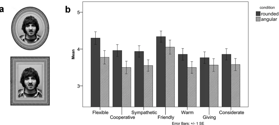
Pilot study: Demonstration that form impacts social meaning
shown in either a rounded or an angular picture frame (see Figure 3a). The results (see Figure 3b) showed that people perceive an image of a person in a rounded picture frame as having a more
flexible and cooperative personality than the same person in an angular picture frame (flexible:
[image:33.612.82.528.257.458.2]t(151)=2.09, p<.05; cooperative: t(151)=1.97, p<.05; no other difference reached statistical significance). Meanings associated with a rounded shape (e.g., harmony, friendliness, approachability) generated downstream influence on personality perceptions, suggesting a metaphorical relation between the concrete concept of visual roundedness and the abstract concept of social friendliness.
Figure 3 Visual stimuli and results of the picture frame pilot study: (a) A person in a rounded picture frame (top) and the same person in an angular picture frame (bottom); (b) Results
3.2.3 Social connectedness
A basic human need is to feel connected or related to other human beings (Baumeister & Leary, 1995; Deci & Ryan, 2000). Prior research has shown that feeling connected to others enhances psychological and physical well-being (Brown, Nesse, Vinokur, & Smith, 2003), and leads to a greater sense of empathy (Cialdini, Brown, Lewis, Luce, & Neuberg, 1997) as well as trust and cooperation (Glaeser, Laibson, Scheinkman, & Soutter, 2000).
in whether one views the self either as independent (or individualistic) or interdependent (or
collectivistic) has been referred to as one’s self-construal (Markus & Kitayama, 1991). Individuals with an independent self-construal tend to see the self as detached from their social context, and value autonomy and uniqueness. Those with an interdependent self-construal, on the other hand, see the self as more intertwined with the social context, and value maintaining group harmony and fitting in. Which type of self-construal is dominant is known to be highly
influenced by culture (Markus & Kitayama, 1991), with Westerners being more independent than interdependent and East Asians being more interdependent than independent.
A number of researchers in cultural psychology have shown that self-construal influences cognitive styles, aesthetic preference (Zhang, Feick, & Price, 2006), motivation, and social behaviors (Van Baaren, Horgan, Chartand, & Dijkmans, 2004). For example, individuals who are highly interdependent have been found to report higher self-confidence when thinking of a
close friend (Gabriel, Reaud, & Tippin, 2007), and sit closer to a new acquaintance (Holland, Roeder, Van Baaren, Brandt, & Hannover, 2003) than those who are relatively less interdependent. Overall, those with a highly interdependent self-construal put more effort into being close to others and derive more personal satisfaction from their close relationships than individuals who perceive themselves as less interdependent (Markus & Kitayaman, 1991).
Previous research has also shown that interdependence predicts health and well-being (Kitayama,
Karasawa, Curhan, Ryff, & Markus, 2010), and fosters prosocial behavior (Ashton-James, Baaren, Chartrand, Decety, & Karremans, 2007; Karremans, Van Lange, & Holland, 2005; Van Lange, 1999).
Although there are two distinct types of self-construal, people do not always fall into either one
or the other (Oyserman, 2011). In fact, all of us have both independent and interdependent self-concepts. However, the relative accessibility of these self-concepts can be influenced by
We suggest that one’s feeling of connectedness is situationally malleable such that it can be
influenced by relevant words or images. In particular, we examine how “product expression” can affect one’s sense of interdependence. We propose that once a product form activates meanings relevant to the concept of connectedness, this leads to a self-construal that is more interdependent. This poses a twofold question: first, what type of visual form evokes the concept of connectedness; and second, can the visual form of the product lead to a greater sense of
interdependence?
3.3 HYPOTHESIS
What forms are expressive of the concept of interdependence or connectedness? The word
connect (“Connect”, 2012) was originally from Latin, connectere which means “to fasten together, to tie, join together (from con- “together” + nectere “to bind/tie/fasten”). According to Oxford English Dictionary, meaning of connection (“Connection”, 2012) is the condition of being related to something else by a bond of interdependence, causality, logical sequence, coherence, or the like; interdependence is defined as the condition of depending on one other.
Thus, we propose that forms having parts or elements joined together by a mutual dependence can represent the concept of connectedness. Synonyms of the words connect and interdependent (“Interdependent”, 2012) could provide further insights on various embodiments of the mutual dependence. Synonyms include the following: affix, attach, bridge, fasten, get into, hook, plug into, tie in, yoke, intertwined, interwoven, joint, knit together, linked, mutual, parallel, reciprocal, relevant, similar, tied up, matched, completing, and complementary.
We hypothesize that perceiving these characteristics in a joining relationship among formal visual elements in products communicate the general concept of being connected. We further hypothesize that the concept activates the related construct of social connectedness; and as such, one’s feeling of being socially connected is likely to become more salient. In Experiment 1, we investigate visual characteristics of forms that represent the concept of connectedness (i.e.,
3.4 EXPERIMENT 1: Design Task
The goal of this study was to understand design features that represent the concept of connectedness. The meaning of connectedness can be represented in various ways, but we were interested in how the theme of connectedness is physically embedded in product forms through design features, especially in terms of joint relationships between design elements. We sought to identify design dimensions contributing to the meaning of connectedness and to understand the characteristics of each dimension.
3.4.1 Method
Experiment 1 involved a task in which participants were asked to design visual images expressive of connectedness. A total of 39 undergraduates (29 females, mean age=19) from an introductory psychology class at the University of Michigan participated in the design task. They were informed that a company was about to launch a new product and needed a logo/trademark that visually communicates the new brand slogan, connectedness. They were told to imagine that they were designers who had to create a brand logo and to design a logo/trademark that visually communicates the concept of connectedness. They were then asked to draw the visual images on sheets of paper that were provided to them. They were instructed not to communicate the concept through words (e.g., the word connectedness) but rather to communicate the concept abstractly through geometric or organic shapes. They were asked to generate as many design ideas as they could for 15 minutes and to indicate the final design (or designs) that they wished to present to the company.
3.4.2 Results and discussion
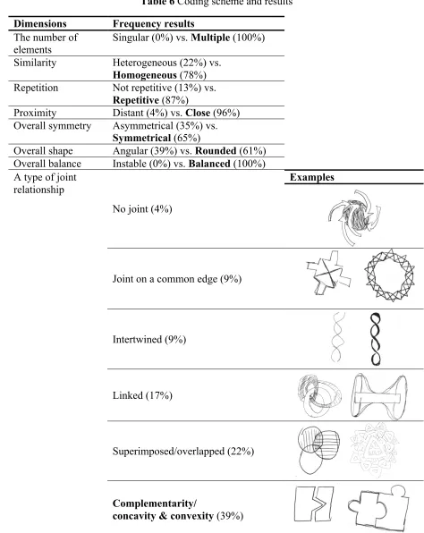
Two independent coders with an industrial design background who were blind to the study hypotheses rated each logo on seven dimensions using bipolar adjectives in a dichotomous format. The dimensions included overall shape, number of shape elements, similarity among shape elements, proximity, balance, symmetry, and repetition (see Table 6). The coders also sorted logos by six types of joint relationship (no joint, joint on a common edge, intertwined, linked, superimposed, complementarity) and evaluated each logo on a 5-point scale as to how well it represented the theme of connectedness.
Inter-coder agreement was relatively high (80%). When disagreements between the coders arose, a third coder reconciled them. We used frequencies to identify common characteristics in each dimension. The majority of the logos were perceived as having multiple and homogenous shape elements: they used the same elements repetitively arranged in close proximity. The overall shapes of the logos were generally perceived as symmetrical, rounded and balanced. In terms of joint relationships between the individual elements, 78% of the logos had shape elements either locked in complementary relationships (e.g., concavity and convexity; 39%), superimposed/overlapped on each other (22%), or linked (17%). Figure 4 shows four logos that had the highest ratings (mean = 4.5) on effective representation of the connectedness theme.
Table 6 Coding scheme and results Dimensions Frequency results
The number of elements
Singular (0%) vs. Multiple (100%)
Similarity Heterogeneous (22%) vs. Homogeneous (78%) Repetition Not repetitive (13%) vs.
Repetitive (87%)
Proximity Distant (4%) vs. Close (96%) Overall symmetry Asymmetrical (35%) vs.
Symmetrical (65%)
Overall shape Angular (39%) vs. Rounded (61%) Overall balance Instable (0%) vs. Balanced (100%)
Examples
No joint (4%)
Joint on a common edge (9%)
Intertwined (9%)
Linked (17%)
Superimposed/overlapped (22%) A type of joint
relationship
Complementarity/
concavity & convexity (39%)
In sum, the majority of participants visually expressed the concept of connectedness through specific types of physical continuity or joints between multiple, similar shape elements. The types of joint relationships included complementarity (i.e., concave-convex relations), link, and intertwinement. Thus joint relationships in design features seem to be a key characteristic that people invoke to visually communicate the concept of connectedness. Building on the priming literature reviewed above (i.e., spreading activation tends to be symmetric) we make the reverse inference relative to the finding in Experiment 1 and hypothesize that designs that feature joint relationships may prime connectedness and self-construal.
3.5 EXPERIMENT 2: Connectedness design cues prime self-construal
We next examined the effect of connectedness design cues on interdependent self-construal. In particular, Experiment 2 investigated whether particular design features (i.e., connectedness cues) as implemented in common products generate greater interdependent self-construal.
3.5.1 Method
Stimuli
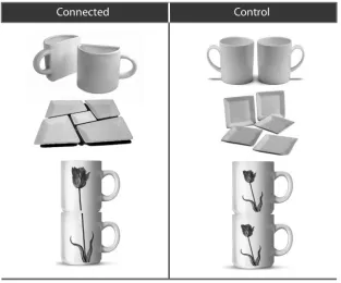
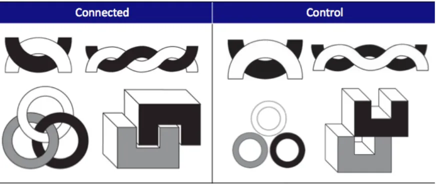
Based on design characteristics of connectedness that were identified in Experiment 1, we adopted images of real products with design characteristics of connectedness: three “connected” objects and three counterpart objects (i.e., control) as shown in Figure 5. The connected objects were a set of products having a complementary relationship to complete a form or function, whereas the control objects lacked the cues for complementarity but were otherwise matched to the connected objects in terms of standard design features such as the number of elements, function, similarity and proximity.
aggregate measure of connectedness (r=.78). The connected objects (M=5.52, SD=0.95) were rated significantly higher in connectedness than the control objects (M=4.90, SD=1.08;
[image:40.612.151.464.223.483.2]t(155)=3.82, p<.001). The connected objects (M=5.15, SD=0.92) were also perceived to be more novel than the control objects (M=3.14, SD=0.78; t(155)=14.87, p<.001). There was no difference in liking between the connected and control objects (p=.37) which indicates that any significant differences on main dependent measures we obtain are unlikely to be due to differences in liking.
Figure 5 Experimental stimuli: connected (left) and control (right) objects
Procedure
order. For each object they viewed, participants were asked to describe it with three adjectives. After participants viewed the objects, they completed a modified Twenty Statement Test (TST; Kuhn & McPartland, 1954) in which they completed ten statements that begin with “I am.”
Coding scheme
TST is a standard self-construal measure that allows participants to define themselves or construe their identity in reference to their social roles, groups, status, and relationships. The content of self-description in the TST was coded as independent, interdependent, or not relevant by using a standard TST coding scheme (Gardner et al., 1999). Descriptions about personal traits, ability and attitudes (e.g., “I am smart,” “I am tall”) were coded as independent self-description, whereas descriptions about social roles or membership (e.g., “I am a mother,” “I am a student of the University of Michigan”) were coded as interdependent self-descriptions. Descriptions that referred to neither personal attributes nor social membership, such as statements referring to their situation (e.g., “I am doing this survey”), and other miscellaneous statements (e.g., “I am a penguin,”) were coded as ‘not relevant.’
3.5.2 Results and discussion
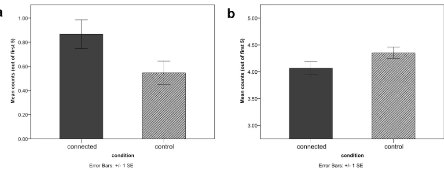
those in the connected objects condition produced marginally fewer independent descriptions (M= 4.07, SD= 1.26) than did those in the control objects condition (M=4.35, SD=1.11;
t(211)=1.75, p=.08) (see Figure 6).
[image:42.612.83.536.296.470.2]Exposure to connected objects resulted in more interdependent descriptions than was found with control objects. In other words, viewing objects that were connected (compared to those were not connected) shifted one’s self-construal towards greater interdependence. It is noteworthy that viewing three product images can systematically affect one’s self-concept in relation to others. The results importantly provide support for our prediction that product form communicates meaning which in turn influences judgments in a manner congruent with the activated meaning.
Figure 6 Counts of interdependent descriptions (a) and independent descriptions (b)
3.6 GENERAL DISCUSSION
more interdependent than self-descriptions after viewing connected mugs and a connected set of dinner plates compared to control objects (Experiment 2).
3.6.1 Theoretical and practical implications
This research demonstrates the value of attending to the design properties of objects and their messages in delivering subtle cues to influence human perception, cognition and behavior. We suggest that the results may apply beyond product design to broader domains associated with visual communications. Understanding the potential impact of product expression may yield novel insights regarding designers’ roles and their design philosophies. An awareness of this influence will inform designers about their role in potentially having more far-reaching influence that extends beyond pleasing users and provide them with practical techniques on how to realize such influence.
The present findings also contribute to a better understanding of product meaning or symbolism as an environmental influence. The assertion that product meaning is used for expressing one’s self-concept or identity has been well documented in design and consumer research. It has long been acknowledged that product meaning can serve the consumer’s goal for satisfying a need or for impression management, and also play a role in generating situational self-concept and behavior (e.g., clothing symbolism influences role performance). The current paper explores the role of product meaning in terms of design features and suggests that product meaning can also exert an influence on self-construal even without possession or consumption of the product. It, therefore, contributes to extensive ongoing efforts to promote desirable behavior by using design features of products as situational cues that influence one’s internal state. We hope that this research encourages an active sharing of ideas among researchers in related disciplines, especially between behavioral scientists who concentrate on the effect of environmental cues on human behavior and designers who are interested in behavior change.
and have downstream behavioral consequences. These insights have implications for the promotion of healthy, prosocial behavior. For instance, previous studies have shown that an interdependent self-construal leads to more prosocial behavior (Ashton-James, Baaren, Chartrand, Decety, & Karremans, 2007). Drawing on this prior evidence, we expect that perceiving the connectedness cues will result in greater likelihood of prosocial behavior, potentially mediated by interdependent self-construal. These hypotheses about the relation between connectedness cues, products, self-construal, and prosocial behavior await empirical testing in future studies.
3.6.2 Limitations and future research
Despite the theoretical and practical implications of our findings, there are potential limitations that we wish to acknowledge. First, in Experiment 2 images of products were presented to participants in a product evaluation format. This controlled setting might have exaggerated the priming effect of product expression by having participants pay overt attention to the products. Given that human actions are situated and influenced by various contextual factors, future research should consider more realistic settings in which products are situated and investigate the circumstances under which product forms serve as situational primes. Moreover, the present studies primarily focused on the impact of connected shapes on one particular type of judgment: interdependent self-construal. It remains an open question whether contextually relevant, meaningful downstream effects can be demonstrated with other types of meanings and in other domains. Future studies will have to test the robustness of the present findings by demonstrating the range of meanings that are associated with different product forms, and the types of contexts and judgments that may be susceptible to such influences.
of their design details, especially when the brand has a stable brand image. We may need to consider the influence of design-associated meanings only when associations evoked by other factors are less salient. Therefore, the relative strength or congruency between meanings of products as a function of a range of variables should be considered by designers when seeking to harness the influence of product expression.
Third, although we reason that the connected objects influence cognitive accessibility of the general concept of connectedness or interdependence, the current research is silent on how that comes about. Indeed, there are likely to be multiple possible pathways in activating the general concept. For example, perceiving the connected objects and making sense of the multiple pieces that need to be physically together for visual completion, participants may need to project themselves onto the products to understand product expression. This process of empathetic or bodily experience may be responsible for corresponding changes in one’s self-concept. In addition, unlike in visual arts or graphics, products hold additional meanings associated with product use. Therefore, the connected objects in our study may have simply afforded an action possibility of connecting pieces or/and communicated such meanings more symbolically, that is, meanings of mentally connecting owners/users who share the set. Future research should seek to further elucidate the mechanisms underlying the effects observed in the present research.