Useful and Usable
Abstract
This paper evaluates the quality of recommendations for improving a user interface resulting from a usability evaluation. The study compares usability comments written by different authors, but describing similar usability issues. The usability comments were provided by 17 professional teams who independently evaluated the usability of the website for the Hotel Pennsylvania in New York. The study finds that only 14 of the 84 studied comments (17%) addressing six usability problems contained recommendations that were both useful and usable. Fourteen recommendations were not useful at all. Sixteen recommendations were not usable at all. Quality problems include recommendations that are vague or not actionable, and ones that may not improve the overall usability of the application. The paper suggests characteristics for “useful and usable recommendations,” that is, recommendations for solving usability problems that lead to changes that efficiently improve the usability of a product.
Keywords
Usability recommendation, usability comment, usability evaluation quality, usability evaluation problems, usability test report, usability evaluation report, usability testing, expert review, web evaluation, usability politics, persuasive communications.
Permission to make digital or hard copies of all or part of this work for personal or classroom use is granted without fee provided that copies are not made or distributed for profit or commercial advantage and that copies bear this notice and the full citation on the first page. To copy otherwise, or republish, to post on servers or to redistribute to lists, requires prior specific permission and/or a fee. Copyright 2006, ACM.
Rolf Molich Dialog Design Skovkrogen 3
DK-3660 Stenlose, Denmark [email protected]
Robin Jeffries Google
1600 Amphitheatre Parkway Mountain View, CA 94043, USA [email protected]
Joseph S. Dumas Design and Usability Center Bentley College
Introduction
While there is substantial literature on how to conduct usability evaluations (for example, Nielsen (1993), Rubin (1994), Dumas and Redish (1999), Mayhew (1999), Preece, Rogers and Sharp (2002)), little attention has been paid to the way that usability evaluations lead to recommendations for changes. This is a critical step in making sure that the results of evaluations have an appropriate impact on product development. If the translation from problem to solution is flawed, or if the recommendations are not taken seriously by the product team, a usability evaluation is a costly step that may have little impact on the product. How good are the recommendations that seasoned usability professionals provide in their reports? How well do evaluators communicate to developers the changes needed? We examined this issue using a corpus of 17 experienced evaluators assessing the same web application, nine of them doing a usability test, and eight doing an expert review. We analyzed the problems reported by the largest number of teams for the presence of recommendations, as well as for the usefulness and usability of what was
recommended.
Related Work
The Didactic Literature
Dumas and Redish (1999) state that when people come to a usability tester, they expect that person to not only conduct a test competently, but also be able to tell them how to solve the problems that the test finds. They provide eight pages of advice out of 374 about recommending changes. The advice is appropriate and includes several non-trivial examples, but perhaps is a bit short.
Rubin (1994) uses five pages out of 314 to provide advice about how to develop recommendations. His focus is on effective communication with the product team. The advice is appropriate, but a bit short considering that he starts the section "Develop Recommendations" by stating "At last we come to the raison d'etre for the entire usability process." There are few examples of actual recommendations.
Jeffries (1994) contains four pages with eight detailed recommendations for improving problem reports based on a large corpus of informal problem reports.
Snyder (2003) recommends the use of group methods to choose optimal solutions to usability problems. Written communication of problems and
recommendations is de-emphasized. Note, however, that this book is mainly about paper prototyping and that the author mentions that her advice might be different for usability tests of production systems.
Nielsen (1993), Preece et al. (2002), and Mayhew (1999) do not address problem communication.
In summary, surprisingly many of the recognized textbooks in the area do not seem to consider writing useful and usable recommendations a problem area. The textbooks that discuss recommendations use a disproportionally low number of pages to provide advice, mainly focusing on effective communication with the product team.
The Research Literature
We found only a few research studies that had
recommendations or redesigns on developers rather than the quality of the recommendations.
Sawyer, Flanders, and Wixon (1996) measured the effectiveness of evaluative techniques in getting usability improvements into products in a commercial environment (Digital Equipment Corporation). The study reports on 10 usability inspections in which each usability problem description was accompanied by one or more recommendations for a fix to the problem. They defined the “committed impact ratio” as (problems committed to fix / total problems found).
In the 10 inspections, they achieved an average committed impact ratio of 78%. Sawyer et al. conclude that making detailed recommendations increases the impact of inspections. The paper notes that there may be a considerable difference between the committed impact ratio and the completed-to-date impact ratio.
Hornbaek and Frokjaer (2005) did a study of how developers of a job web portal assessed usability problems and associated redesign proposals as input to their systems development. Problems and redesign proposals were generated by 36 student evaluators using an inspection technique and usability testing. Evaluators each summarized their most critical usability findings in three redesign proposals, one for each of the three parts of the web portal they evaluated.
Developers assessed redesign proposals to have higher utility in their work than usability problems; they were seen as constructive and concrete input. The paper suggests that redesign proposals are a powerful com– munication tool and that we ought to use them more.
Dumas, Molich and Jeffries (2004), using the same corpus as this paper, suggest that engineers sometimes have trouble correctly taking action from problem descriptions.
Molich, Ede, Kaasgaard, and Karyukin (2004), in their analysis of reports from nine teams who studied the hotmail.com web site, found that most of the reports (taken as a whole) suffered from usability defects. The defects include the following:
report too long
no executive summary
no severity classification of problems
unclear or vague problem descriptions. However, that paper does not examine individual usability recommendations made by the teams.
Comparative Usability Evaluation 4 (CUE-4)
This paper is based on results from the CUE-4 study. In this study, 17 professional teams simultaneously and independently evaluated the usability of the web site for the Hotel Pennsylvania in New York,www.hotelpenn.com. Particular focus was put on the OneScreen reservation system by iHotelier
(www.iHotelier.com). The system is being used by hundreds of hotels.
Each team selected their favorite evaluation method: expert review (judgment, without users) or usability test (with users). A few teams left it up to the
teams had one week to complete the evaluation and write their report. Usability test teams had two weeks. The difference in time allotted was mainly due to the need for the usability team to obtain participants.
Teams had 1-5 members. The average team size was 1.6 persons. The 17 teams’ combined practical usability experience ranged from 5 to 40 years. The total experience for all teams was 254 years, and the average was 15 years.
Teams signed up to do this study as part of a CHI 2003 workshop. The study was conducted in March 2003. Further information about approach, analysis
techniques, and general results of the CUE-4 study can be found in Molich and Dumas (2007). Molich (2003) contains the original, anonymized reports submitted by the teams.
In the instructions to the CUE-4 study teams, they were asked to provide a short description of how the
usability problem could be solved. This description was required only if the comment was about a usability problem, and only if they were reasonably sure that their suggested solution would actually make the interface more usable.
Analysis of Recommendations
Three raters (the authors) developed rating scales and trained on using the levels consistently by rating the recommendations for three CUE-4 usability problems that were each reported by 8-9 teams. The 5-point rating scales for usefulness and usability were developed in an initial informal pass. Then, in a pilot analysis each rater rated each training comment independently. We decided that agreement had been
reached when the difference between the maximum and minimum ratings were one scale point or less, for example 3/2/3 but not 4/2/3. This occurred for 56% of the items (15 of 27) on the usefulness scale, and 52% on the usability scale (14 of 27). Larger differences were discussed and used to refine the scales and develop associated rules of thumb. At the end the raters reached 89% agreement.
After the pilot analysis was completed and the scales and associated rules established, the raters
independently rated the usefulness and the usability of the recommendations in the 84 comments for all usability problems reported by 10 or more of the 17 CUE-4 teams (six problems). We chose these problems because of the broad consensus among the teams (and the authors) that these were real usability problems. We thus avoid issues of disagreement over whether there was a problem to be solved.
The ratings are based on the rating scales below. We have not conducted usability tests to determine which of the proposed solutions would actually improve the usability of the OneScreen interface. The developers of the web site have not been available to judge the usefulness, usability, and technical feasibility of the recommendations.
Usefulness rating scale
A useful recommendation describes an effective idea for solving the usability problem. The description does not contain any bad suggestions. The quality of the description is not considered as long as the idea is comprehensible (it is considered in the usability rating). 5 Fully useful: Describes an effective idea for solving
words: About as good as it's going to get, given that the instructions requested a “short
description”.
4 Useful: Describes an effective idea for solving the problem. The idea has minor flaws, omissions or bad elements that may influence the usability of the resulting solution. In other words: Good in most ways, but someone could have done better, even within the limitations of the short
explanation.
3 Partly useful: Describes an idea that would solve a significant part of the problem. However, the recommendation also leaves significant parts of the problem unaddressed. This classification is also used when the recommendation contains roughly equal magnitudes of good and bad ideas, when it would solve the problem only for
approximately half of the users, or when the idea could introduce new usability problems.
2 A few useful elements: Describes an idea that would solve only a minor part of the problem, or that would solve the problem only for a minor group of users. This classification is also used when part of the description is so vague that the usefulness of the idea is doubtful, or when the recommendation contains a few good ideas but a larger number of bad ideas that would introduce new, serious usability problems in the solution. 1 Not useful or misleading: Describes an idea that
would not increase or might even decrease the usefulness of the product. This classification is also used when the recommendation is so vague or unclear that we do not understand it.
X We did not recognize anything in the comment that would serve as a recommendation.
Usability rating scale
A usable recommendation communicates precisely and in reasonable detail what the product team should do to implement the idea behind the recommendation.
When we evaluate the usability of a recommendation, we first consider the recommendation fully useful and then judge how usable the recommendation is. A recommendation that is not considered useful at all may thus still be fully usable and vice versa. This approach makes the two rating scales independent. We also take into consideration that the instructions to the participants stated that the recommendation should be short.
5 Fully usable: The recommendation communicates precisely and in reasonable detail what the product team should do. In other words: About as good as it's going to get, given the request for a short description.
4 Usable: The recommendation communicates precisely and in some detail what the product team should do. Minor details are missing; this may influence the usability of the resulting solution. In other words: Good in most ways, but someone could have done better, even within the limitations of the short explanation.
3 Partly usable: The recommendation communicates some information about what the product team should do. The recommendation leaves some important decisions regarding the implementation of the solution to the product team. This could introduce new usability problems in the solution. 2 Mostly unusable: The recommendation contains a
most of the description is vague, unclear, or difficult to understand. The recommendation is essentially a statement of direction; it leaves many important decisions regarding the implementation of the solution to the product team. This could introduce new usability problems in the solution.
1 Unusable: The recommendation is totally vague, unclear, or incomprehensible for the product team. The recommendation leaves all decisions regarding the implementation of the solution to the product team. This could introduce new usability problems in the solution.
X We did not recognize anything in the comment that would serve as a recommendation.
Rating process
After the first round of independent ratings, agreement had been established for 52% or 88 of the 168 ratings (84 for usefulness and 84 for usability). After three rounds of discussions in which many rating mistakes were corrected, consensus was reached for 79% or 133 of the 168 ratings. For the sake of completeness, we add that full agreement was achieved in only 4 out of 84 cases for usefulness (5%) and in 16 of 84 cases (19%) for usability; 17 of these 20 full agreements were extremes, 1/1/1 or 5/5/5.
Many rating mistakes resulted from simple oversights, or from letting the usefulness rating influence the usability rating of a recommendation. Many of the recommendations where we could not reach consensus were implicit recommendations (discussed below) where we differed on whether there was a recommendation at all.
Finally, we computed the average of our final (revised) usefulness and usability ratings. If one author rated a comment “X” (no recognizable recommendation), the average was based on the ratings provided by the remaining two authors. If two or three authors rated a comment “X”, the comment was not considered in the evaluation of the recommendations. Three comments were eliminated in this process, reducing the total number of comments to 81.
Results
The following sections illustrate our key findings based on sample recommendations for the issues we
analyzed. The complete list of all six issues and all 84 comments with our ratings of each recommendation is available from the authors.
Issue 1: First time users have problems with the form labels.
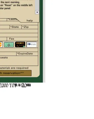
Problem: Address/credit card input area: Labels for the form occupy the same space as the typing area. The labels disappear if you start to type, but if you try to delete them first, nothing happens. See Figure 1 on page 169.
A team suggested:
PLACEMENT OF LABELS IN THE TEXT BOX AREAS
This was seen as ‘strange’ by most users – they were unsure when clicking into the box (some tried to highlight the text to cut it). Also losing sight of the labels once the field was filled in was considered strange. Although everyone figured out how it worked, it was an unnecessary distraction.
reduces the overall effectiveness by forcing too much on a limited screen space. Place the calendar and room selector on the same page, with the logic to calculate the cost (fully itemized to show taxes etc) based on selections. Use a ‘Proceed to booking’ button to go to a second page for capturing name card info etc, and transferring the cost, room type & date information. (usefulness rating 5.0, usability rating 5.0)
Contrast the above recommendation with: FORM – NON-TYPICAL
The form was not what people were used to seeing. They had trouble positioning the cursor in a place that ‘felt right’. Every subject clicked several times in the first field to verify that typing was possible and that it would happen correctly. The form appears to be scrunched – labels and subject-supplied text use the same screen area.
... centering the labels might allow the cursor position to be noticed more quickly.
(usefulness rating 1.0, usability rating 5.0)
Although the latter recommendation is fully usable (there is no doubt as to what should be done), we were not convinced that centering the labels would actually improve the usability of the application.
Issue 2: Credit card logos appear clickable. Problem: Credit card images: the icons in the right hand side (above the CardHolder field) appear clickable, but they are just meant to indicate what cards are acceptable. See Figure 1.
A team suggested: FORM – CREDIT CARD ICONS
Credit card icons are not clickable, but most people tried to set card. People are used to providing the card type along with the number and expiration date. It is not widely known that card type is redundant.
To make this display fit the mental model of the user, it would be good if the icon reacted like buttons. These ’buttons’ need not work on the back side but would help the user.
(usefulness rating 5.0, usability rating 4.3)
Contrast the above recommendation with: CHECKOUT:CREDIT CARD ICONS LOOK CLICKABLE.
Some users may be inclined to click on the credit card icons to specify which card they are using.
Suggested solution: Change the visual presentation to discourage this unnecessary behavior.
(usefulness rating 5.0, usability rating 1.0)
This advice is vague. Several teams were vague about how the appearance of a selected icon would be different from a non-selected one.
Here is a different recommendation for the credit card icon issue:
CREDIT CARD ICONS CAUSE USERS TO FEEL THEY MUST SELECT ONE FOR A SUCCESSFUL TRANSACTION.
Several users felt that they had to click on the proper credit card icon for a successful reservation. When nothing happened upon clicking the icon, users
Suggestion: The icons appear to serve no purpose. If this is the case, they should be removed so as to avoid any confusion.
(usefulness rating 1.3, usability rating 5.0)
The above assumption is incorrect. The icons inform users of which credit cards are accepted by the hotel. On the other hand, the recommendation (“remove icons”) is very precise and actionable.
Issue 3: Room type “Run of house” not understood by users.
Problem: One room type (“Run_Of_House”) is
unexplained. Its description is the uninformative phrase “Run of House Room Type,” which may appear in the center column as shown in Figure 1.
Google gives the following explanation for “Run of the house”: “When you select ‘Run of House’, your actual room will be determined by the hotel, based on
availability, at the time of check-in.” However, only one team gave any evidence that they knew what it meant. In addition, this room type always showed up as “not available”. Several evaluators seem to have
meticulously checked every available date – a full year’s worth – to determine this.
The most highly rated suggestion was: TERMINOLOGY
What does Run_of_house mean? This sounds like hotel terminology. I could not find any Run_of_house rooms for the entire year so why is this term even in the list? Change this term so that it is meaningful to occasional users of the hotel system.
(usefulness rating 5.0, usability rating 2.0)
The low usability rating was given because this
comment offers no suggestion for how the term should be changed. If the product team did not understand that “Run_Of_House” may be difficult to understand for users, chances are that they may not be able to come up with a significantly better term or to offer an appropriate explanation of the term.
Contrast the above recommendation with:
... Run_of_House, which no participant understood. Recommendation: Eliminate Run_of_House altogether. (usefulness rating 1.0, usability rating 5.0)
This recommendation is fully usable (there is no doubt as to what should be done), but the advice is bad because “Run_of_House” may be important to the business even though it is currently unused (“Never take a fence down before you know why it was set up”)
Issue 4: Number of nights differs from number of days selected.
Problem: The system requires users to select both a check-in and a check-out date. Some users reserving for only one night incorrectly only selected one date box. When reserving for multiple nights, some users selected the last night they were staying rather than the morning they intended to check out. See Figure 1 on page 169.
A team suggested:
SELECTING DATES CONFUSING.
Suggestion: Use a half-shaded box to indicate the start of a stay and another oppositely half-shaded box indicating the checkout day. The shading should be used such that it appears that the right half of the start day is shaded and the left half of the checkout day is shaded.
(usefulness rating 4.7, usability rating 5.0)
Contrast the above recommendation with: CHECK-OUT DAYS CONCEPT IS DIFFICULT.
To avoid the whole concept of check-out only days, consider reformulating the interface so that the user clicks the first and last nights they want to stay, instead of check-in and check-out. days You could make this even clearer by having the first selected day be formatted to indicate that only the last half of the day is selected.
People are often confused figuring out the dates of their stay because the check-in and check-out days are not full days. By changing the mental model to “nights you want to stay,” the interface could clarify it for them. Note that this change in model would have to be tested on some actual users in the prototype stage.
(usefulness rating 3.7, usability rating 3.0)
The team suggests that the first selected day should be “formatted to indicate that only the last half of the day is selected”. While this is a good idea, details of how to do it are missing, and there is no similar suggestion for the check-out date.
Here is another recommendation for this issue. IT IS NOT CLEAR HOW TO SELECT OR DE-SELECT THE RESERVATION PERIOD.
It is not clear that you need to select the check-in and checkout days as opposed to the night you want to
stay. The reviewer failed this task a few times. It is highly likely that customers would fail a few times as well.
Recommendation: ... include an optional date field. (usefulness rating 1.3, usability rating 1.3)
The recommendation to include an optional date field is vague: Where should it be added? How should it work? It also violates the basic business proposal of the web site: Select check in and check out dates from a calendar. This recommendation at least requires a justification.
Issue 5: No apparent way to specify a non-smoking room.
Problem: Making special requests (in particular, for a non-smoking room) must be done via a text field marked “Comments/Requests”. This was far from obvious to participants, and even those who noticed the field had no confidence that it would be read by staff, or that there were non-smoking rooms available.
Teams struggled with this problem. The most highly rated recommendation was:
IT WAS NOT CLEAR TO ANYONE HOW TO INDICATE THEIR SMOKING PREFERENCE.
None of the users thought to check about smoking until I specifically asked them about it, but at that point all of them (2 smokers, 4 nonsmokers) indicated that smoking preference was very important. Three users would have called the hotel, and the other 3 entered their request in the comments field, but only after a hint from the facilitator.
alternative is to put the words “smoking preference” in the comments field as a clue to indicate where the user should enter their preference.
(usefulness rating 3.7, usability rating 4.0)
While all teams specifically mentioned non-smoking, other special requests were also identified as worthy of being explicitly called out. They include: handicap access, low/high floor, street view, “allergy room”, early/late check-in. It’s not clear which of these should be called out and which can be covered in the
“Comments/Requests” field – the list of potential requests is limitless and the line must be drawn somewhere. Some teams justified their choices with comments made by test participants.
One critical aspect of this problem is that it depends on what the hotel is able to handle at their end (do they have a notation for non-smoking in their database, or will it need to be completely handled by human intervention?) This cannot be mandated by iHotelier, which adapts its system to meet the backend capabilities of the various hotels. Three teams
recognized this as an issue and explicitly called it out.
Another recommendation for this issue was: RECOGNITION RATHER THAN RECALL.
... several important options (like allergy rooms, non-smoking/smoking, street or back yard view) are missing from the reservation page. This cannot be justified by the lack of space. There is a large empty green area on top of page. Number of persons, and number of rooms is shown twice. ... This empty or underused space could be allocated to the missing options that might make it or break it to users with
special needs (like asthma, wheel chair, or urge to have a view over Manhattan).
Seemingly the only way to inform the hotel about special requests was to use the field “Requests” under the credit card information. Even when participants were told to write “TEST” in this field half of them didn’t realize that this field could be used for requesting an asthma room.
Recommendation: Eliminate the logo (which is not clickable) and the green bar on top, avoid duplication of information, and eliminate inactive room choices to make room for important options like allergy, non-smoking, and easy-access rooms.
(usefulness rating 2.0, usability rating 3.0)
This comment exhibits a number of typical problems:
Violates business constraints (“Eliminate the logo”).
Vague (“make room for important options ...”).
Personal opinions. Nothing in the test report indicates that test participants confirmed that the seemingly duplicate information was not useful.
Issue 6: Help window difficult to close.
The average quality of the recommendations for this issue were considerably higher than for any other issue. Four out of ten teams provided top rated suggestions for this issue, all stressing consistency, for example:
HELP WINDOW: CLOSING IS NOT CONSISTENT
The color is the same as the form. There is no close box. The user must figure out that clicking on Help is a toggle and it closes the window as well.
REC: Use a consistent window type with an ‘X’ in the upper left like other windows on the site.
(usefulness rating 5.0, usability rating 5.0)
Figure 2. Expanded Help window
Types of recommendations
The CUE-4 instructions stated that solutions should be included only if you're reasonably sure. The following figures suggest that usability evaluators consider providing a potential solution an important part of the service they render most of the time.
Table 1 shows the main types of recommendations we identified:
Table 1. Types of Recommendations
Recommendation Type Number Percentage Explicit recommendation
for change
67 (80%)
Implicit recommendation for change
12 (14%)
Implicit recommendation for leaving the interface as it is despite an identified usability problem
2 (2%)
No recommendation 3 (4%)
An implicit recommendation for change does not contain an explicit recommendation prefaced with Recommendation,Suggestion, or a verb in the
imperative form. Implicit recommendations often sound like complaints or unprocessed observations of test participant difficulties, for example:
MISSING INFORMATION.
The recommendation seems to be Explain “Run_Of_House”. But, in several cases, the three authors had difficulty resolving among themselves whether an implicit recommendation implied an explicit one or should be counted as no recommendation.
We suggest that implicit recommendations should always be replaced with explicit ones.
Here’s one of the three comments that contained no recommendation at all, not even an implicit one:
ROOM DAYS/NIGHTS WAS CONFUSING.
Four of 6 users initially thought they were selecting the nights by clicking on the calendar, not the days. Three of these users eventually figured it out when they noticed the number of nights didn’t match what they expected. (In the words of User 3, “It’s talking days and I’m talking nights.”) User 6 never realized that his reservation was for 3 nights, not 4. User 5, who was not confused by this, had previously worked as a manager at a hotel.
Results
Figure 3 and Table 2 depict the quality of the recommendations for the six issues discussed in this paper.
Figure 3 shows the usefulness and usability of each of the 81 analyzed recommendations. Seven
recommendations (9%) had usefulness and usability ratings that both exceeded 4.5 (shown in red in Figure 3). High-quality recommendations comprised only 14 of the 81 recommendations (17%) (light gray area in the upper right corner, usefulness ≥ 4.0 and usability ≥ 4.0). Even the area where usefulness and usability are
both at least 3.0, contains only 34 of the 81 recommendations (42%). In addition, 14
recommendations were not useful at all (usefulness < 2.0), and 16 recommendations were not usable at all (usability < 2.0)
Figure 3. Usefulness and usability of 81 analyzed recommendations.
Table 2 shows that 8 of the 17 teams had no recommendations that were both useful (≥4.0) and usable (≥4.0). For all 17 teams, most of the
Table 2 shows the average usefulness and usability for the recommendations provided by each of the 17 teams for the six usability issues we examined. Each row in the table represents one of the 17 CUE-4 teams.The third column shows the number of recommendations on which the average is based. The fourth column shows the method used by the team (Usability Text, Expert Review). The column, Useful & Usable, shows the number of recommendations whose usefulness and usability were both rated ≥ 4. For some teams the number of recommendations exceeds six because they provided more than one recommendation for some of the issues.
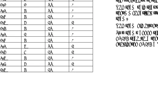
Table 2. Quality of Recommendations
Useful Usable #Recomm Method Useful &
Usable
4.2 3.3 6 UT 2
4.0 4.2 6 UT 2
4.0 3.8 7 UT 3
4.0 2.9 6 UT 2
3.7 2.9 5 ER 1
3.7 2.2 2 UT 0
3.6 3.3 4 UT 0
3.6 1.8 4 ER 0
3.5 2.7 6 ER 1
3.4 2.4 4 ER 0
3.3 3.3 1 UT 0
3.1 2.8 4 ER 0
2.9 3.3 7 UT 1
2.9 2.6 5 ER 1
2.7 3.7 4 ER 0
2.1 3.9 6 UT 1
1.9 1.7 4 ER 0
Discussion
It might be argued that participating professionals faced study-related constraints that could have affected the quality of their recommendations negatively, such as limited space to fully describe the recommendation, no opportunity to provide screen mockups to illustrate recommendations that were difficult to express textually, no access to subject matter experts in business and development constraints, etc. However, the comments on the realism of the evaluations that each team was asked to provide the end of the study (Molich (2003)) do not support this argument:
Nine teams said that the CUE-4 process was identical to the process they normally used with respect to recommendations.
Six teams said that they would have spent more time on recommendations in a real project; however, it appears that the additional time would have been used to increase the usability of the recommendations by adding wireframes, doctored screenshots, etc. No team expressed doubts about the usefulness of their recommendations.
One team said that they would have worked out recommendations together with the development team.
One team did not comment on the realism.
A number of factors may account for the variability in the quality of the recommendations:
Insufficient training.
Lack of guidelines and exemplary recommendations.
No widely recognized techniques for systematically producing useful and usable recommendations.
There are types of usability issues that are inherently hard to write useful and usable recommendations for, for example issues that require major changes in business or technical constraints, or that require a major redesign of the product. However, the CUE-4 problems we studied did not include these types.
For this specific set of problems (84 of the 747 problem reports we received), the usability testing teams recommendations were, on the average, rated as better on both usability and usefulness than the expert review teams (see Table 2). Since this is a small and not randomly chosen subset of the full set of problem reports, we can't generalize this conclusion to the larger data set. Further research is needed to determine whether this is a robust difference.
Making Recommendations Useful
Communicate each recommendation clearly at the conceptual level.
Some recommendations were simply too vague to make sense of. We counted recommendations as not useful when the vagueness was at a conceptual level. “Include an optional date field” (issue 4) is a good example. Would a developer – or even a usability professional – know what to do given that
recommendation as a solution to the problem of users not entering the correct number of nights for their reservation?
We believe that the recommendations we consider vague were quite clear to the teams who wrote them, but they only make sense given a lot of information in the evaluator’s head that didn’t make it onto the paper. Evaluators should either find a colleague to read their usability recommendations with vagueness in mind or, at a minimum, give the report a rest and come back to it with the explicit goal of finding recommendations that need more context.
Ensure that the recommendation improves the overall usability of the application.
An ideal recommendation solves the usability problem it is intended to address without making other parts of the application less usable. We were surprised by a number of recommendations that could cause usability problems elsewhere and would not make the
problematic situation better.
“Move [the credit card] symbols to a location outside the form, perhaps below the “finish reservation” button” (issue 2) is a good example. Moving the symbols away from the credit card fields would not change their affordance and might even confuse users because the symbols are separated from seemingly associated fields.
Be aware of the business or technical constraints. Sometimes one or more of the product constraints has to be overturned to solve a usability problem
effectively, but when an outside evaluator does this, their recommendation must demonstrate an
understanding of those constraints. It is important to make clear that alternatives within the constraint envelope have been considered and rejected (and why), and that the problem is serious enough to
warrant revisiting the basic assumptions of the product.
Never overturn business constraints for a minor
usability problem – it seriously reduces the credibility of the evaluator. If business values are irrelevant to usability assessments, it’s not hard to also conclude that usability is irrelevant to business.
A proposal to eliminate the hotel’s logo in order to make space for non-smoking room requests is an example of a business constraint that Hotel Pennsylvania is unlikely to relax.
Recommending that some functionality or screen element be removed is a step that needs careful analysis by the evaluator and justification to the product team. For example, the recommendation to eliminate the “Run of house” option simply because no participant understood it (issue 3) could be seen as the result of a superficial analysis.
Solve the whole problem, not just a special case. A recommendation must address all important aspects of the solution. Don’t assume that the product team can figure out important usability aspects on their own.
Sometimes this was caused by the evaluator only noticing the special case; at other times, the original problem description was broad enough, but the solution focused in on a smaller problem.
The most obvious example of this was the problem of participants having trouble selecting an ending date for their reservation (issue 4). Some solutions only solved the problem for the specific case of one-night stays.
Make it clear that sweeping changes must be tested. In some cases, evaluators made it clear that their proposal was speculative, and cautioned the product team to usability test the new design before
implementing, but this happened less frequently than we believe it should have.
Making Recommendations Usable
Make recommendations specific and clear. Typically, this refers to vagueness in the face of constraints. The broad outlines of a solution may be painted, but how those outlines become an
implementation, given constraints such as limited space, is not clear. “Change the visual presentation [of the credit card icons] to discourage this unnecessary behavior” (issue 2) is a good example. There are probably multiple ways that a the visual presentation could appropriately be changed, but there are an even larger number of inappropriate changes to the button in this context. Giving guidance on such details is helpful to the product team, if only as a starting point for consideration of alternatives.
community. Our results show, however, that most teams failed to observe some of them in one or more of their recommendations.
Practitioner’s Take Away
Do as you preach. Show a good example by making your usability recommendations useful and usable.
Communicate each recommendation clearly at the conceptual level.
Ensure that the recommendation improves the overall usability of the application.
Be aware of the business or technical constraints.
Show respect for the product team’s constraints.
Solve the whole problem, not just a special case.
Make recommendations specific and clear.
Avoid vagueness by including specific examples in your recommendations.
Acknowledgments
Thanks to Carolyn Snyder, Chauncey Wilson, Hannu Koskela, Peter Carstensen, Anker Helms Jørgensen, Søren Lauesen, Jan Chr. Clausen and two anonymous JUS reviewers for thoughtful comments on early versions of this paper.
References
Dumas, J.S., Molich, R., & Jeffries, R. (2004) Describing Usability Problems: Are We Sending the Right
Message? Interactions, XI.4, pp. 24-29.
Dumas, J.S., & Redish, J.C. (1999) A Practical Guide to Usability Testing. Bristol, UK: Intellect Books.
Hornbaek, K., & Frokjaer, E. (2005) Comparing usability problems and redesign proposals as input to practical systems development. In Proceedings of CHI 2005. New York, NY: ACM Press, pp. 391-400.
Jeffries, R. (1994) Usability Problem Reports: Helping Evaluators Communicate Effectively with Developers. In J. Nielsen and R.L. Mack (Eds.), Usability
Inspection Methods. New York, NY: John Wiley, pp. 273-294.
Mayhew, D. J. (1999) The Usability Engineering Lifecycle. San Francisco, CA: Morgan Kaufman. Molich, R. (2003) Comparative usability evaluation -
CUE. http://www.dialogdesign.dk/cue.html. Molich, R., & Dumas, J. (2007) Comparative usability
evaluation (CUE-4), accepted for publication in Behaviour & Information Technology.
Molich, R., Ede, M., Kaasgaard, K., & Karyukin, B. (2004) Comparative usability evaluation. Behaviour & Information Technology, 23, pp. 65-74.
Nielsen, J. (1993) Usability Engineering. San Diego, CA: Academic Press.
Preece, J., Rogers, Y., & Sharp, H. (2002) Interaction Design. New York, NY: John Wiley.
Rubin, J. (1994) Handbook of Usability Testing. New York, NY: John Wiley.
Sawyer, P., Flanders, A., & Wixon, D. (1996) Making a Difference - The Impact of Inspections. In M.J. Tauber (Ed.), Human Factors in Computing Systems - CHI 96 Conference Proceedings. Reading, MA: Addison Wesley, pp. 376-382.
Author Biographies
Rolf Molich owns and manages DialogDesign, a small Danish usability consultancy, which he founded in 1993. Rolf conceived and
coordinated the comparative usability evaluation studies CUE-1 - CUE-7 where a total of more than 60 professional usability teams tested or reviewed the same applications. Rolf is the author of the best-selling Danish book User Friendly Computer Systems of which about 30,000 copies have been sold. Since early 2007, the book is available in English with the title Usable Web Design. Rolf is the co-inventor of the heuristic inspection method (with Jakob Nielsen). Rolf graduated as a software engineer from the Technical University of Denmark in 1974. From 1974 to 1997, he worked as a project manager and software methods specialist for a number of Danish companies.
Robin Jeffries is currently User Experience Lead at Google, where she works to better understand the broad spectrum of Google users and to adapt usability techniques to new application paradigms. Prior to that, she was a Distinguished Engineer at Sun
Microsystems, where she worked in the CTO's office bringing attention to users and user experience across the company. She has been a researcher at Hewlett-Packard Laboratories, Carnegie-Mellon University, and the University of Colorado. One thread of her research has focused on comparing usability methods as used by practitioners and improving various aspects of usability methodologies.
Joe Dumas, has more than 30 years experience as a human factors and usability professional. He is a recognized expert in the assessment of the usability of
information technology. His book, A Practical Guide to Usability Testing, co-authored with Ginny Redish, has become a classic in the field. Joe not only writes