Food Access and Food Deserts:
Durham County, North Carolina
Thane Maxwell
December 9, 2010
Cornell University
1
Table of Contents:
I: Introduction Summary………..… 3 Background……….... 3 II: Data Data Sources……….. 4 Limitations……….. 5 III: Methodology Data Preparation………. 6 Base Maps……… 8Spatial Buffer Maps……… 8
Analysis Maps……… 8
IV: Analysis Context Maps………..……… 9
Analysis of Base Maps……….. 9
Analysis of Spatial Buffer Maps……….. 9
Analysis of Analysis Maps……….. 9
Analysis of Scatterplots and Graphs……… 10
Table 3: Urban Food Desert ...………. 11
V: Conclusion Conclusions of Analysis……… 12
Recommendations for Further Research……….………. 12
Policy Implications……….. 13
VI: Maps and Graphs Context Maps Map 1: Regional Context……….…. 14
Map 2: Roads……….…. 15
Map 3: Public Transportation Routes ……….……….….. 16
Map 4: Zoning Designations……….………. 17
Base Maps Map 5: Food Retailers and Black Population………..…………. 18
Map 6: Food Retailers and Population Density ……….………… 19
Map 7: Food Retailers and 1999 Median Household Income ……….. 20
Map 8: Food Retailers and 1999 Poverty Rate ……….. 21
2 Proximity Maps
Map 10: Black Population vs. Proximity……….… 23
Map 11: Population Density vs. Proximity……… 24
Map 12: Median Household Income vs. Proximity……… 25
Map 13: Poverty Rate vs. Proximity……….. 26
Map 14: Car Ownership Rate vs. Proximity ………. 27
Analysis Maps Map 15: Black Population vs. Area within ½ Mile Proximity ……… 28
Map 16: Black Population vs. Area within 1 Mile Proximity……… 29
Map 17: Median Household Income vs. Area within ½ Mile Proximity……… 30
Map 18: Median Household Income vs. Area within 1 Mile Proximity……….. 31
Map 19: Poverty Rate vs. Area within ½ Mile Proximity……… 32
Map 20: Poverty Rate vs. Area within 1 Mile Proximity……….. 33
Map 21: Car Ownership Rate vs. Area within 1 Mile Proximity……….. 34
Map 22: Area within 1/2 Mile Proximity……….. 35
Map 23: Area within 1 Mile Proximity……… 36
Map 24: Urban Food Desert……….. 37
Scatterplots Scatterplot 1: Area within ½ Mile Proximity vs. Black Population………... 38
Scatterplot 2: Area within 1 Mile Proximity vs. Black Population………. 38
Scatterplot 3: Area within ½ Mile Proximity vs. Median Household Income……… 39
Scatterplot 4: Area within 1 Mile Proximity vs. Median Household Income……….. 39
Scatterplot 5: Area within ½ Mile Proximity vs. Poverty Rate……… 40
Scatterplot 6: Area within 1 Mile Proximity vs. Poverty Rate………..… 40
Bar Graphs Bar Graph 1: Population within Proximity vs. Black Population……… 41
Bar Graph 2: Population within Proximity vs. Median Household Income………….. 41
3 I: Introduction
Summary
This report documents the spatial distribution of food retailers in Durham County, North Carolina (Population 217,396), using ArcGIS software (Geographical Information Systems) as its primary methodological tool. For the purposes of this study, food retailers are defined to include large supermarkets, corner-store mini-marts, ethnic-specific specialty grocery stores, convenience store food marts, cooperative grocery stores, and farmers markets. Restaurants are not included. The locations of these stores are mapped in relation to several other distributions of spatial information, including demographic, socioeconomic, and car ownership data.
The objective of the analysis is to illustrate, both visually and statistically, inequalities in access to nutritious food. These inequalities are shown through the spatial relationships between food retailer locations and Durham County’s concentrations of population in terms of race, ethnicity, income, poverty status, and car ownership. The study concludes that Durham County, NC is indeed characterized by a significantly unequal distribution of food access. Although there is not evidence of a general negative correlation between poverty and food access, due to the concentration of Durham’s poor in the central regions of the city, areas with the lowest Median Household Incomes and highest poverty rates generally experience a relative lack of access to those stores who typically offer the kinds of food products essential to a healthy lifestyle. Race, however, proves a much stronger determinant than income or poverty. The lack of access is pronounced in the areas with the highest percentage of black population. In particular, one area is identified as an urban food desert, serviced by ethnic-specialty stores and mini-marts only, with none of its area located within 1 mile of an actual supermarket. This area, consisting of 12 census block groups on the south side of the city of Durham, is 92% black and extremely poor. 20% of workers over the age of 16 in this area do not own vehicles.
This paper recommends policy changes that focus on the existing resources of the
communities in this food desert in order to improve access to nutritious food. Community-based approaches such as farmers markets and community gardens should be top priority, but only in conjunction with public education outreach programs centered on nutrition, food sources and the food industry, food preparation and cooking methods, and the many dimensions of a healthy lifestyle. Suggestions for extensive further research are provided.
Background
Access to healthy food has recently become a major issue in public policy circles and mainstream media. Increased attention is being paid to the spatial distribution of
supermarkets and grocery stores offering food products of a sufficient quality and variety to support the nutritional needs of families. Nutrition is now a focal point of public health discourse as America continues to deal with its endemic public health crises –particularly
4
obesity, diabetes, and cardiovascular disease – in the context of passionate public debate over the future of the health care system.
A cottage industry has developed in the fields of public health, sociology, and food systems research, around the study of the “food deserts” and their health implications.
Policymakers are certainly taking note, and First Lady Michelle Obama has even taken on food deserts as one of her signature issues, and a central component of her Let’s Move!
campaign against childhood obesity.1 While a full literature review thus exceeds the scope of this report, it will suffice to note the product of an extensive collaborative initiative by the US Department of Agriculture, the Institute of Medicine, and the National Research Council, to better understand the overall problem and potential solutions.2
The growing popular interest in questions of climate change, environmental justice, energy sources, water resources, and global food systems has also contributed to the increased attention to food access, particularly in the urban context. However, urban and regional planning has been slow to join the steadily rising voice of community-based approaches to food security.
II: Data Data Sources
Table 1: Sources of Geospatial Data
DATA SOURCE
Population United States 2000 Census – Summary File 13 Race and Ethnicity
Income and Poverty Car Ownership
United States 2000 Census – Summary File 1 United States 2000 Census – Summary File 34 United States 2000 Census – Summary File 3
Zoning City of Durham, NC5
Routes Durham Area Transit Authority
City of Durham, NC
NC Municipal Boundaries NC Department of Transportation6 Roads NC Department of Transportation
Food Retailers Multiple: Google Earth, Google Street View, etc.
1 http://www.letsmove.gov/ (Last accessed December 5, 2010).
2 “The Public Health Effects of Food Deserts: Workshop Summary.” 2009. Paula Tarnapol Whitacre, Peggy Tsai,
and Janet Mulligan. Rapporteurs; National Research Council.
3 From NC OneMap, a geospatial data resource service provided by the NC Geographic Information Coordinating
Council. US Department of Commerce, Bureau of the Census, Washington, DC. 20020417, onemap_prod.SDEADMIN.cenbg00
4 From American Factfinder: US Department of Commerce, Bureau of the Census, Washington, DC. 5 City of Durham, NC, office of Durham Geographic Information Systems
5
Demographic data for the 2000 Census Block Groups, including race and ethnicity, were obtained from NC OneMap, a geospatial data resource service provided by the NC Geographic Information Coordinating Council. NCGICC offers geospatial data files with Census data from Summary File 1 already joined to the Bureau of the Census TIGER/Line shapefiles.
Data for the following variables was obtained through American FactFinder, from the 2000 US Census Summary File 3 database: “Median Household Income in 1999,” “Poverty Status in 1999,” “Private Vehicle Occupancy for Workers age 16 and over,” and “Means of
Transportation to Work for Workers age 16 and over.” Data was collected for all block groups within Durham County, and then joined to the aforementioned shapefiles
containing SF1 data through ArcGIS, using the Block Group Identification number as the primary key for the join.
Geospatial data showing zoning designations for all of Durham County, as well as all routes and stops for the public bus system provided by the Durham Area Transit Authority, was obtained from the municipality of Durham, North Carolina’s office of Geographic
Information Systems.
Food retailer data was acquired through independent research from multiple sources. The primary source was a simple search for “supermarkets” through Google Earth Pro software. From Google Earth, I exported these points as a KLZ file, extracted the single KLZ file to a set of individual KLM files, and converted the KLM files to point shapefiles using the Garmin Application developed by the University of Minnesota Department of Natural Resources. I then added new points which had not yet shown up, using the Yellow Pages and other internet searches (farmers markets, cooperatives, tiendas, mini-marts, etc).
Data Limitations
The primary limitation of the data was the highly irregular municipal boundary of the city of Durham, North Carolina. For this reason, the subject area was defined as Durham
County. Not only are the municipal boundaries completely independent of the census block group boundaries – the level at which all of this study’s census data is aggregated – but they are also extremely chaotic, with many small islands of unincorporated areas within the municipal boundaries and small islands of incorporated areas around the fringe of the main city. This seems to be somewhat normal for the state of North Carolina, but presented a challenge for this study. I originally wanted to focus on urban and suburban areas in the municipality itself because including rural areas in the analysis results in a fundamentally different empirical question. However, I could not simply attribute the census data for entire block groups to the peripheral slivers and islands of incorporated area which happened to fall inside them, even though the majority of the block group was not within the municipal bounds. Therefore, the final subject area remained the county of Durham.
6 III: Methodology
Data Preparation
The first step was to select those census block groups which contained a majority of their area within the municipal boundaries of the city of Durham, North Carolina. Four block groups were removed from the dataset for which the majority of their area was zoned with a “University” designation. The educational institution in question is Duke University, which is an expensive private university, with a predominantly affluent, out-of-state student population. I believed these University block groups to be distorting my
demographic and socioeconomic analyses because their student populations were being expressed as outlier populations of extremely poor white people without cars. These block groups were omitted from the analysis in order to present more accurate variation of variables among permanent residents of the area, rather than transient, temporary
residents with unique features because of their student status. Of 199 total block groups in Durham County, North Carolina, I omitted the 3 block groups of which the majority of land is zoned for Duke University use. Thus my final data set contained 126 block groups. As stated before, the census data collected through American FactFinder from Summary File 3 was joined to the geospatial census block group files which already contained census data for Summary File 1, using the Block Group Identification number as the primary key for the join.
All other data, including zoning, public transportation systems, roads, and supermarkets, was then clipped to the defined study area, using the final set of included census block groups as the target for the clip.
The dataset of food retailers contained 99 stores. I was careful to go through the data thoroughly to delete irrelevant cases, such as corporate offices of food retail companies, a gourmet restaurant called “Watts Grocery,” supermarket pharmacy listings, etc. I
confirmed the specific type of each retailer by visiting their websites, using Google Street View to physically view the store, and incorporating my local knowledge of the area. I then categorized each retailer using the following key:
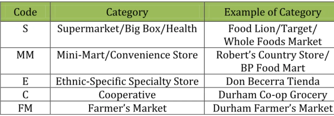
Table 2: Food Retailer Categorization (Database) Code Category Example of Category
S Supermarket Food Lion
BB Big Box Wal-mart
CS Convenience Store BP Food Mart MM Mini-Mart Robert’s Country Store
E Ethnic-Specific Specialty Store Don Becerra Tienda H Health Food Store Whole Foods Market C Cooperative Durham Co-op Grocery FM Farmer’s Market Durham Farmer’s Market
7
To allow more visually accessible analysis, these categories were condensed to the following:
Table 3: Food Retailer Categorization (Analysis)
Code Category Example of Category S Supermarket/Big Box/Health Food Lion/Target/
Whole Foods Market MM Mini-Mart/Convenience Store Robert’s Country Store/
BP Food Mart E Ethnic-Specific Specialty Store Don Becerra Tienda C Cooperative Durham Co-op Grocery FM Farmer’s Market Durham Farmer’s Market
For the spatial buffer analysis, I created a new shapefile with only those food retailers categorized in the above categorization system as “Supermarkets.” This restriction was used in lieu of data on specific products offered, to approximate those stores who generally provide a full range of nutritious options.
The Durham Farmers Market was not included in this new supermarkets dataset because although it is a primary source of nutritious local food products located in the heart of the city, it is only open two days per week, and the range of foods provided is limited by seasonal variation.
Although their role in improving local food access are applauded, Durham’s three
cooperative grocery stores are also not included in this analysis. A note of explanation on the three cooperatives follows:
Durham Co-op Grocery: Started by a group of Duke University students in 1971 as a buying club to purchase groceries in bulk, the Durham Co-op Grocery has expanded into a small cooperative grocery in the downtown area. However, the store has struggled with embezzlement and other financial difficulties, and is currently
considering moving the store location from the poor inner city to a less dense, more affluent neighborhood on the outskirts of town. Its membership has plummeted from a peak of 3,000 in the 1990’s to its current number of around 350.7
TROSA Grocery: A small cooperative started in May 2010 to serve Durham’s inner city, this grocery is operated by Triangle Residential Options for Substance Abusers, a highly respected comprehensive substance abuse treatment program.8 The
cooperative grocery, while initially successful, is too new to be included in the study as a robust food resource for the community.
Durham Central Market: This is a new cooperative, planned for the core of the downtown area, which has not yet opened. A location was secured in May 2010.9
7http://www.thedurhamnews.com/2007/04/28/53630/food-co-op-not-cooperating.html (Last accessed 12/6/10) 8http://www.trosainc.org/program/index.htm (Last accessed 12/7/10)
8 Base Maps
The base maps (Maps 5 – 9) show the census block groups symbolized according to several different variables: population density, percentage black population, median household income, poverty rate, and car ownership. The Jenks method of natural breaks is used for all classification schemes. Census data on “total black only population” was normalized by “total population” in order to yield percentages. Census data on “population below poverty line” was normalized by “total population for whom poverty data was collected,” in order to yield poverty rates. Census data on “car, truck, or van occupancy for workers age 16 or over” was normalized by “workers age 16 or over” to yield car ownership rates. Food retailer locations, categorized by type, are overlaid on top of these distributions.
Spatial Buffer Maps
The buffer maps (Maps 10-14) show the same symbolizations of census data variables at the block group level, with the new “supermarkets only” dataset overlaid on top. Half-mile and one-mile spatial buffers were included for these supermarkets, using the Buffer tool under the Analysis heading in ArcToolbox.
Analysis Maps
The analysis maps (Maps 15-24) show percentages of each block group’s area attributed to the spatial buffer areas around supermarkets shown in the previous maps. Again, the Jenks method of natural breaks is used for all classification schemes. To calculate these
percentages, I first clipped the buffer files to the county boundary, so that I wouldn’t be calculating areas outside the county. I then clipped the block group shapefiles using the half-mile buffer as the target for the clip, and again using the one-mile buffer as the target for the clip. I then used the Calculate Areas tool, located under the Spatial Statistics heading in ArcToolbox, to calculate the areas of the new polygons, which represented the portions of each block group within the buffers. The new calculated areas were in square meters because the projection of my data is 1983 North Carolina State Plane. I added a field to the attribute table and converted these areas to square miles. I added another field and calculated it as the percentage of the block group within the buffer (area within buffer divided by total block group area). I added another field and calculated it as the total number of persons living within the buffer (percentage of area within the buffer multiplied by total population of block group).
This final step represents an ecological fallacy. I attributed the characteristics of a larger level of aggregation (census block groups) to a smaller level of aggregation within it (areas within buffers). I assumed an equal distribution of population within each block group, and this is certainly not an accurate assumption. For the purposes of this study, however, it is simply the best data available to allow for a more rigorous analysis of the spatial issue being explored. Specifically, it allowed me to aggregate the data for selected bins of my
9
variables (See Bar Graphs 1-3 and Table 3) and provide comparisons of proximity for those bins.
IV: Analysis Context Maps
Maps 1-4 are provided in order to establish a general familiarity with the layout of Durham county and its major city, Durham, North Carolina. A regional context map shows the county in relation to the state of NC and the country as a whole. Subsequent maps show public transportation routes, roads, and zoning designations.
Base Maps
The base maps (Maps 5-9) show black population, population density, median household income, poverty rate, and car ownership, using the Jenks method of natural breaks for all classification schemes. Food retailer locations, categorized by type, are overlaid on top of these distributions. From these maps we can already begin to see the urban food desert in the south side of the city, clearly demonstrating the importance of race in determining the distribution of food access. This area is serviced only by ethnic-specific specialty stores and mini-marts, whereas the other areas in the county with similar levels of income, poverty, density, and car ownership, are better serviced by proper supermarkets.
Buffer Maps
The buffer maps (Maps 10-14) show the same census data variables, with “supermarkets only” overlaid on top, with half-mile and one-mile spatial buffers around them. These buffers help to interpret the scale of the map and better illustrate the trends of proximity shown in the base maps, this time focusing on supermarkets only. The spatial illustration of proximity to these stores thus identifies visually those areas within reasonable proximity to a full range of nutritious retail foods. The urban food desert on the south side of the city, characterized by predominantly black population and high rates of poverty, is easily seen. Thus, once again we see race as a far stronger determinant of supermarket proximity than density, income, poverty, or car ownership.
Analysis Maps
The analysis maps (Maps 15-24) show percentages of each block group’s area within the defined proximity areas around supermarkets. Again, the Jenks method of classification is used. Maps 15-21 show these percentages in relation to the race, income, poverty, and car ownership variables. Maps 22-23 show the proximity percentages alone, using a fill-color
10
classification method rather than the previous graduated symbols. Map 24 shows the urban food desert highlighted in orange. The trends emphasized previously are confirmed.
Scatterplots
The scatterplots show, for each block group, the percentage of population living within the half-mile and one-mile radii of supermarkets, in relation to demographic and
socioeconomic data.
Scatterplots 1 and 2 show these percentages in relation to each block group’s percentage of black population. Both of these scatterplots appear fairly random, suggesting no significant correlation between the two variables, except for those values above the 80% black
population mark. Above that mark, we see a slight decline in the population within 1 mile, and a drastic decline in the population within a half mile. This confirms the visual
presentation in the corresponding maps, in which those block groups with the highest black population percentages were surrounded by, but not included in, the supermarkets’ buffer areas. The food desert identified visually shows up here statistically.
Scatterplots 3 and 4 show the same proximity percentages in relation to 1999 Median Household Income, calculated as a percentage of the Durham county MHI. In both scatterplots we see negative correlations between the two variables. This makes
theoretical sense from a social science perspective because the affluent tend to live in low-density suburban areas in which they are happy to drive relatively longer distance to commercial centers. Again, the maps confirm this statistical observation visually. As in most American cities, the inner-city residents are more likely to be poor, and are therefore generally more likely to live within immediate proximity of many of the city’s facilities. We can also note, however, a trend in the scatterplot at the extreme low end of the income range in which those block groups with the lowest median household incomes (below 50% of the county MHI, for example) demonstrate a decline in proximity.
Scatterplots 5 and 6 show the proximity variables in relation to poverty rate. The same trend is shown here as in the MHI graphs. We see a positive correlation between poverty and proximity, which is consistent with the negative correlation between income and proximity. However, we again see the deviation from that pattern at the extreme high end of the poverty rate spectrum. Excluding the one block group with almost 50% poverty and almost 100% of its population within the 1 mile radius, the most poor areas are generally not well-served by supermarkets.
Bar Graphs
The bar graphs show more specifically the trends highlighted above. I intended to create graphs showing the aggregated proximity percentages for all block groups within each bin designated for race, income, and poverty variables. I believe this is possible, perhaps using Microsoft Access software, but I don’t know how to do it and I couldn’t find anyone who
11
does. Alternatively, I manually calculated those aggregated percentages for selected bins that I chose based on the preliminary scatterplot analysis.
Bar Graph 1 shows proximity based on black population, and here we can clearly see the racial trend evidenced in the maps and scatters. Compared to the total proximity
percentages for all block groups in Durham County, those block groups with less than 50% black population have much higher proximity rates. Those with a majority black
population have lower proximity rates, and this trend is increasingly true as black
population increases. Once again we see that those areas with the highest black population percentages are the least-well served by supermarkets.
Bar Graph 2 shows proximity based on income. The negative correlation between income level and proximity is clear, supporting the theory that the wealthy have moved to the periphery. The change in that trend at the lowest end of the income range is also illustrated – those block groups with an MHI less than 50% of the county MHI, when aggregated together, are home to extremely low percentages of people who live within close proximity of the supermarkets.
Bar Graph 3 shows proximity based on poverty status. Again, the wealthy are shown to have low proximity rates because of their residence on the periphery of the city. We then see a general trend of a negative correlation between poverty rate and proximity through the 10%-40% range, with the highest end of the poverty range remaining an exception due to the one block group we saw in the scatterplot with an extremely high poverty rate and nearly 100% proximity rate. However, our food desert, with zero of its area within a 1 mile radius of supermarkets, remains starkly contrasted to all other areas.
Table 3 shows specific comparative data for the urban food desert.
Table 3: Aggregated Statistics for Urban Food Desert vs. Durham County
Block Groups Total Pop Black Density (sq.mi) MHI MHI % of county Pov Rate Car Own 1/2 Mile Radius 1 Mile Radius Food Desert 11 16701 92% 3520 24487 57% 30% 82% 0% 0% County 126 217396 40% 734 42741 100% 13% 92% 15% 44%
12 V: Conclusion
Analysis Conclusions
While proximity to supermarkets demonstrates interesting non-linear relationships to income, poverty, and car ownership, the most significant finding of this analysis is the role of racial distribution as a determinant of supermarket proximity. To some extent, the other census data variables serve as useful controls in the visual representation of the food
access problems in Durham County. An urban food desert, surrounded by but not included in any reasonable proximity of supermarkets, is identified. This area’s extremely high percentage of black population (92%) is clearly the most relevant factor in determining its lack of access to nutritious food products. As only 82% of the working population in this food desert own a vehicle, and we can presume that a significant proportion of the young and elderly are also transit-dependent, we can infer serious transportation implications for food access.
Further inquiry into the food access situation in the rural areas of this county surrounding the city could potentially identify an entirely different kind of food desert. These areas are characterized by high car ownership, therefore the conclusions are less obvious. However, this paper calls for a more sophisticated understanding of rural mobility (for example, for the elderly) and of nature of the food distribution systems in these areas. Such an
understanding would require a broader regional analysis.
Recommendations for Further Research
There are a variety of different areas in which further research could enhance this study. The most obvious would be field research on the specifics products available at each store, and their prices. This would allow a more accurate categorization of retailers based on the types of products offered and the nutritional implications for patrons.
Public health data would also add a powerful new dimension to the analysis. Specifically, data on obesity, diabetes, and chronic disease (cardiovascular and others) could begin to illustrate the relationships between food access and health. One possible source of this data, which I pursued extensively but unsuccessfully, is public school health survey data. One step I considered for this report, and would have been possible, but for which there was insufficient time, was the geocoding of food retailer addresses. This would allow a network analysis which would document the service areas of each food retailer based on the available transportation networks, both through the public bus system and by roads. A network anaylsis would provide a more sophisticated presentation of food access than the simple spatial buffer analysis performed in this study. Data on intersections, stoplights, and driving times would further enrich the network analysis option and allow for the incorporation of different transportation modes (walk, bus, car, etc). To take it one step further, data could be collected on physical urban design features that determine walk or bike access, as well as data on age and disability that could show transit-dependency.
13 Policy Implications
The inequity in the spatial distribution of access to retailers offering healthy food products has a range of policy implications. Most obvious is a simultaneous bottom-up and top-down approach to genuine community development projects. From above, policy at all levels of governance can promote farmers markets, urban agriculture programs, and private retail development in areas that may have untapped markets, such as the urban food desert identified in this study. These policies will be most effective if they support community-based solutions focusing on the existing resources of a community, and driven by well-resourced organizing efforts. Farmers markets and urban agriculture have
demonstrated a multitude of positive effects on public health, social cohesion, cultural awareness, economic stimulation, and psychological or spiritual growth.
Strategies to improve access to food, however, must be complemented by extensive public health education programs and community outreach programs to also improve access to information about nutrition, food sources and the food industry, food preparation and cooking methods, and the many dimensions of a healthy lifestyle.
Increased attention must also be paid to the other planning-specific dimensions of public health, including the distribution and quality of urban green spaces, the safety of
transportation routes and the pedestrians who share them, and the policing of neighborhoods to combat violent crime.
No social problem is one-dimensional, and no solutions stand on their own. This range of issues must be explored and pursued holistically, with a comprehensive reform of our social services programming and our democratic system at its heart.
14 MAP 1
15 MAP 2
16 MAP 3
17 MAP 4
18 MAP 5
19 MAP 6
20 MAP 7
21 MAP 8
22 MAP 9
23 MAP 10
24 MAP 11
25 MAP 12
26 MAP 13
27 MAP 14
28 MAP 15
29 MAP 16
30 MAP 17
31 MAP 18
32 MAP 19
33 MAP 20
34 MAP 21
35 MAP 22
36 MAP 23
37 MAP 24
38 SCATTERPLOT 1 SCATTERPLOT 2 0% 10% 20% 30% 40% 50% 60% 70% 80% 90% 100% 0% 10% 20% 30% 40% 50% 60% 70% 80% 90% 100%
Ar
ea
wit
hi
n
1/
2 Mil
e
Rad
iu
s
of
Super
mar
ke
t
Black Population
Census Block Groups: Black Population and
Proximity to Supermarkets (1/2 Mile Radius)
0% 10% 20% 30% 40% 50% 60% 70% 80% 90% 100% 0% 10% 20% 30% 40% 50% 60% 70% 80% 90% 100%
Ar
ea
wit
hi
n
1
Mile Rad
iu
s
of
Super
mar
ke
ts
Black Population
Census Block Groups: Black Population and
Proximity to Supermarkets (1 Mile Radius)
39 SCATTERPLOT 3 SCATTERPLOT 4 0% 10% 20% 30% 40% 50% 60% 70% 80% 90% 100% 0.0 0.5 1.0 1.5 2.0 2.5 3.0 3.5 4.0
Ar
ea
wit
hi
n
1/
2 Mil
e
of
Super
mar
ke
t
1999 MHI as percentage of Durham County MHI
Census Block Groups: 1999 Median Household Income
and Proximity to Supermarkets (1/2 Mile Radius)
0% 10% 20% 30% 40% 50% 60% 70% 80% 90% 100% 0.0 0.5 1.0 1.5 2.0 2.5 3.0 3.5 4.0
Ar
ea
wit
hi
n
1
Mile of
Super
mar
ke
ts
1999 MHI as percentage of Durham County MHI
Census Block Groups: 1999 Median Household Income
and Proximity to Supermarkets (1 Mile Radius)
40 SCATTERPLOT 5 SCATTERPLOT 6 0% 10% 20% 30% 40% 50% 60% 70% 80% 90% 100% 0% 5% 10% 15% 20% 25% 30% 35% 40% 45% 50%
Ar
ea
wit
hi
n
1/
2 Mi
le
of
Super
mar
ke
ts
Population below Poverty Line
Census Block Groups: Poverty Rate and
Proximity to Supermarkets (1/2 Mile Radius)
0% 10% 20% 30% 40% 50% 60% 70% 80% 90% 100% 0% 5% 10% 15% 20% 25% 30% 35% 40% 45% 50%
Ar
ea
wit
hi
n
1
Mile of
Super
mar
ke
ts
Population below Poverty Line
Census Block Groups: Poverty Rate and
Proximity to Supermarkets (1 Mile Radius)
41 BAR GRAPH 1 BAR GRAPH 2 0% 5% 10% 15% 20% 25% 30% 35% 40% 45% 50% All Block Groups Less than 50% Black More than 50% Black More than 80% Black More than 90% Black Food Desert (92% Black)
P
er
cen
t
Ar
ea
wit
hi
n
Rad
iu
s
of
Super
mar
ke
ts
Selected Bins: Black Population Percentage
Black Population and Proximity to Supermarkets
1/2 Mile Radius 1 Mile Radius 0% 10% 20% 30% 40% 50% 60% All Block Groups More than County MHI Less than County MHI Less than 80% County MHI Less than 50% County MHI Food Desert (57% county MHI)
P
er
cen
t
Ar
ea
wit
hi
n
Rad
is
u
of
Super
mar
ke
ts
Selected Bins: 1999 MHI as percentage of 1999 Durham County MHI
1999 Median Household Income and
Proximity to Supermarkets
1/2 Mile Radius 1 Mile Radius
42 BAR GRAPH 3 0.00 0.10 0.20 0.30 0.40 0.50 0.60
P
er
cen
tag
e
of
Ar
ea
wit
hi
n
Rad
iu
s
of
Super
mar
ke
ts
Selected Bins: Percent of Population below Poverty Line
Poverty Rate and Proximity to Supermarkets
1/2 Mile Radius 1 Mile Radius