Shine on Transport Model Simulation Data: Web-based Visualization
in R using Shiny
Antje von Schmidt, Rita Cyganski, Matthias Heinrichs
Institute of Transport ResearchGerman Aerospace Center (DLR) Germany, Berlin
e-mail: [email protected], [email protected], [email protected]
Abstract-Microscopic transport demand models often use a large amount of data as input and provide detailed information for each individual trip as simulation output. Exploring this data can become very complex. Usually, several types of aggregation and disaggregation are performed on a spatial, temporal or demographic level. Consequently, often a combination of different tools is used for analyzing, communicating and validating the data. This paper introduces an interactive, user-friendly and scalable web application, which integrates different types of evaluations. Guidance and recommendations are given on how to implement such an application in R using Shiny.
Keywords-transport demand model; simulation data; visualization; R; Shiny.
I. INTRODUCTION
Transport models are used to provide a realistic picture of the current traffic situation, to predict future development of transport demand or to make scenario-based analysis of various possible development paths, such as an aging population, changed prices or new mobility trends. The microscopic transport demand model TAPAS [1][2], which is addressed in this paper, reflects the individual mobility behavior. A large amount of different input data is required for this purpose. Within a simulation run, TAPAS calculates daily mobility patterns for each individual in the analysis area. Thereby, it provides individual trip chains with specific spatial and temporal information as well as a detailed description of each person and the associated household as simulation output. The sum of these gives an overall picture of the transport demand within a specified study area and timescale.
Not only the validation of input and output data, but also the analysis and communication of simulation results are not an easy task, especially if the target audience is heterogeneous and several output media have to be covered. There are many visualization types available, and which one to choose strongly depends on the research question and the domain of interest. In the field of transport research, different types of aggregation and disaggregation are performed, may they be on a spatial, temporal, or demographic level. A wide range of visualization tools are available [3]. Some of them can be used out of the box, and others require programming skills or are only intended for a certain type of visualization, spatial or non-spatial. Consequently, often a combination of
these tools is used, also because commercial software solutions or eye catching animations are usually too expensive for being applied within research projects. In general, a flexible and extensible approach is preferable, which allows adaptation to the respective needs. The aim of this paper is to introduce the application “Transport Visualizer” (TraVis). It is an interactive, user-friendly and scalable web-based solution for analyzing, communicating and validating the simulation data of a transport model, such as TAPAS. The simulation data include both the input and the output data of the model. The application is implemented in R and Shiny. R is a popular, flexible and powerful programming language for statistical computing, data analysis and visualization, which is widely used in the scientific field [4]. With the help of the Shiny framework [5] it is possible to convert R analyses to an interactive web application. While TraVis is currently intended for internal use only, it is planned to make the application available as open source in the near future.
The paper is organized as follows: Related work is discussed in Section II, followed by an introduction of the simulation data used with TAPAS in Section III. Section IV describes the implementation requirements. The realization of the TraVis application is outlined in Section V. Finally, Section VI summarizes this paper and gives some ideas for future work.
II. RELATED WORK
For a long time, the role of visualization in transport modelling was largely limited to the static presentation of aggregated final results, primarily through statistical tables and simple graphs or the provision of key indicators describing the development of transport demand [6][7]. In recent years, map-based representations where increasingly used within the transport domain. In particular, an increase in the level of detail can be seen: from a general overview of the study area, over a certain part, time or topics down to the visualization of individual travel behavior [8]-[11]. Modern web technologies [12]-[14] and the growing availability of data have contributed to a significant increase in dynamic and interactive forms of visualization. In transport, as in other research fields, it is necessary to analyze the visualization requirements and consider the type of data to be visualized, the audience to be addressed, the purpose of the visualization, the appropriate level of detail, the aspects of
the data that should be transmitted, and the target medium for which the visualization is generated. A general framework for the visualization of transport data and models is defined in [15].
However, the type of visualization is also important. Charts are often used to represent information on a high or intermediate level of detail. Which one should be used depends on the data type and on what is to be shown. In [16], a chart selector guide and four basic methods of data analysis are defined that can help to choose the right chart type for comparison, composition, distribution, and relation. The comparison of single values, such as totals or means, is best shown with regular bar or column charts, while line charts are more suitable for identifying distributions of continuous values or the development of a measure over time. Stacked charts can be used to represent the absolute or relative changes within the composition of categorical variables. Scatter and bubble charts are suitable for representing correlations between two respective three numerical variables, whereas parallel coordinates can be used to point out relationships between multivariate data. A chord diagram is a common way to illustrate interrelation between data in a matrix, whereas data with a spatial context are typically represented by suitable maps. For example, a choropleth map can help to identify regional varieties, while flow maps show the quantity of movements between geographical units. Spatial changes between scenarios are usually achieved by difference maps, whereas animated maps can be used to represent differences over time. There are many more ways for visualizing data, and not all of them can be given here. Hence, only a brief insight into the diversity is given. A good overview can be found at [17].
Although many visualization concepts and tools are available, the challenge remaining is to integrate these different approaches and to enable the users to perform their analyses without mastering programming languages or using a variety of tools.
III. SIMULATION DATA
Microscopic transport demand models usually require a variety of different input data, such as population, locations, network, transport offers, timetable, land use and property data. All this data is very heterogeneous in terms of format and time frame. TAPAS, for instance, requires a highly differentiated synthetic population as main input for the simulation, which is generated by the SYNTHESIZER [18].
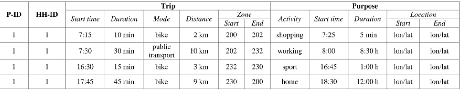
Within such transport models, household information plays an important role in the choice of destination and means of transport. Therefore, a synthetic population contains information at both the person and household level. A TAPAS simulation needs for each individual the age, sex and a status variable. The latter is set to one of the following values: child under 6 years, pupil, student, employed (fulltime or halftime), unemployed, or retired. In addition, information on possible mobility options is required, such as driving license, public transport ticket, bike or the mobility budget. Household information comprises the number of persons, the total household income, the number and type of vehicles that belong to the household as well as the spatial reference of the address. The simulation results, on the other hand, provide detailed information for each individual trip, including, among other, trip purpose, transport mode chosen, start and end time of the trip as well as of the activities, and the coordinates of the visited location. Table I provides an excerpt of the simulation output. Overall, data associated with an average simulation run is quite vast, reaching roughly 13 million trips for the city of Berlin for the current population forecast of 3.8 million inhabitants in 2030 [19].
IV. IMPLEMENTATION REQUIREMENTS
Exploring the simulation data of a transport model can become very complex. Which information should be provided depends on the story to tell. Furthermore, the tabular representation of the simulation data in Section III is understandable for machines but not easily readable by humans, especially when handling large amounts of data. Most of all, the spatial context will be lost. Based on related work, the following aspects were selected as requirements for the implementation.
A. Data type
As mentioned before, the simulation data include a variety of heterogeneous data types, which all have to be taken into account for exploring the data in a disaggregated or aggregated manner. Besides the data with a spatial context like activity location (point), traffic flow (line), vehicle density (polygon) or origin-destination matrices (line and point), there are also descriptive variables. These can be further subdivided into continuous, discrete and categorical data, such as the trip length, person age, or the activity selected.
TABLEI.GENERATED INDIVIDUAL DAILY ACTIVITY PLAN FOR ASAMPLE PERSON
P-ID HH-ID
Trip Purpose
Start time Duration Mode Distance Zone Activity Start time Duration Location
Start End Start End
1 1 7:15 10 min bike 2 km 200 202 shopping 7:25 5 min lon/lat lon/lat
1 1 7:30 30 min public
transport 10 km 202 232 working 8:00 8:30 h lon/lat lon/lat 1 1 16:30 15 min bike 3 km 232 230 sport 16:45 1:00 h lon/lat lon/lat 1 1 17:45 45 min bike 9 km 230 200 home 18:30 12:00 h lon/lat lon/lat
B. Target audience and purpose
The visualizer shall help modelers to review the model values and disseminate the results to a wider audience, including both the scientific community and the public. Therefore, different media, including scientific publications, static presentations or interactive visualizations is intended.
C. Level of detail
The target application should contain all levels of detail of spatial, temporal, and demographic dimensions. It shall be possible to aggregate simulated data at both levels – for the complete study area or parts of it. This can be used, e.g., to validate the applied synthetic population, including the vehicle fleet and mobility options. The simulation result should be used for computing common key indicators of the transport demand (e.g., modal split) by aggregation. At the most detailed level, the individual travel behavior should be extracted from the simulation output and visualized. In addition, the stationary transport (parking vehicles) should be included in the analysis, as it can provide useful information for future urban planning. This can be taken into account, for example, if autonomous driving is offered within the simulation, as it is assumed that the space required for parking will change considerably [20].
D. Output medium and interactivity
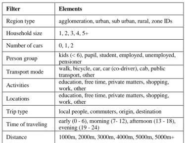
According to the different audience and purpose, both static as well as dynamic media have to be addressed. To understand changes, for example between different scenario parameters or time frames, it is essential to provide the possibility to compare the corresponding simulation results. To take a closer look at certain aspects of the simulation output, the use of filters should be supported, including the following filter types: specific groups of persons or households, mode choice, location, trip purpose, time of traveling, distance, trip type and specific part of the study area. Detailed filter options are shown in Table II.
TABLEII.FILTER OPTIONS
Filter Elements
Region type agglomeration, urban, sub urban, rural, zone IDs Household size 1, 2, 3, 4, 5+
Number of cars 0, 1, 2
Person group kids (< 6), pupil, student, employed, unemployed, pensioner
Transport mode walk, bicycle, car, car (co-driver), cab, public transport, other
Activities education, free time, private matters, shopping, work, other
Locations education, free time, private matters, shopping, work, other
Trip type local people, commuters, origin, destination Time of traveling early (0 - 6), morning (7- 12), afternoon (13 - 18), evening (19 - 24) Distance 1000m, 2000m, 3000m, 4000m, 5000m, 5000m+
Another essential aspect is the opportunity to adjust the resolution of the spatial aggregation, where travel analysis zones or the European wide standardization for geographically grids [21] may be applied. To address the various target media, it is required to export appropriate figures and to show the results on screen.
E. Visualization type and customization
With regards to the different types of data and the various target media, the application should contain suitable visualizations, such as different charts, maps and animations. This is necessary for presenting the simulation data according to the desired level of detail. Furthermore, the application should be scalable so that new types of reporting can be integrated immediately. Besides the choice of the right visualization type, it is also very important to have the opportunity to change their appearance. Therefore, it is required to customize layout related attributes, such as the color of the bars, the chart background, and the position of labels or of the legend as well as the appropriate font type and size. With the focus on internationalization, it is also necessary to supply different languages in order to automatically generate the required labels for the visualization.
V. REALIZATION IN RUSING SHINY
All simulation data are stored in a PostgreSQL/PostGIS database. A corresponding view lists all existing simulations of a research project and several SQL functions were written for data preparation. This would also make it possible to parse the data with conventional programs. However, the aim is to enable users to perform their analyses automatically and without the use of alternative tools. Because of the popularity, flexibility, as well as the computational power of R and the possibility of combining it with the interactivity of modern web user interfaces by using Shiny, this application architecture was chosen for TraVis. The functionality of Shiny can be easily enhanced by including HTML widgets for interactive visualization types, requiring usually no further web development skills.
A. Application structure
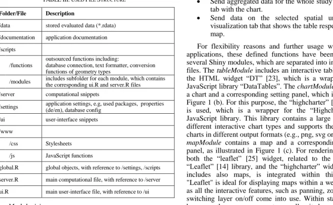
A basic Shiny application is usually structured either in one script (app.R) or split into two: a user-interface script (ui.R) and a computational script (server.R). This is most likely sufficient for small applications, but the programming code can quickly become unwieldy in larger ones. Therefore, it is recommended to split these main scripts further to make the code easier to maintain for developers. This can be additionally supported by a modular application design. Currently, there are no suggestions or best practices for organizing R scripts within large applications. Therefore, the file structure shown in Table III was developed and is used within TraVis.
TABLEIII.USED FILE STRUCTURE
Folder/File Description
/data stored evaluated data (*.rdata) /documentation application documentation /scripts
/functions
outsourced functions including:
database connection, text formatter, conversion functions of geometry types
/modules includes subfolder for each module, which contains the corresponding ui.R and server.R files /server computational snippets
/settings application settings, e.g, used packages, properties (de/en), database config /ui user-interface snippets
/www
/css Stylesheets /js JavaScript functions
global.R global objects, with reference to /settings, /scripts server.R main computational file, with reference to /server ui.R main user-interface file, with reference to /ui
B. Modularizing
The aim is to implement a flexible and scalable application. For this purpose, it is important to keep the programming code clear and manageable. Recently, the capability to use modules was added to Shiny as a new feature [22]. Shiny modules can be used to capture functionality and avoid name collisions by using name spaces for the input and output elements. This is especially important as element ids must be unique within a Shiny application. The following module functions for the evaluation part were defined so far:
Include a tab set with three tabs, in order to avoid information and visual overlays.
Show a table in one tab.
Render a chart in one tab and supply a setting panel to adjust the chart layout individually. This includes customization options, such as the type of the chart, an adoptable color scheme for matching the respective project’s corporate design, text alignment and legend position. Furthermore, provide the possibility to export the generated chart as a printable image.
Render a map in one tab, enabling support for panning, zooming and switching layer on/off, as well as for exporting the map as a printable image. Supply a settings panel to adjust the map layout individually. This includes customization options, such as the color scheme and legend position. Supply a panel with elements to filter the simulation
output according to the filter options given in Table II.
Send aggregated data for the whole study area to the tab with the chart.
Send data on the selected spatial unit to the visualization tab that shows the table respectively the map.
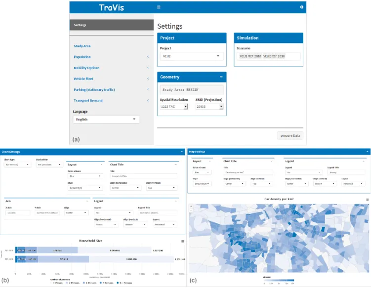
For flexibility reasons and further usage within other applications, these defined functions have been split into several Shiny modules, which are separated into individual R files. The tableModule includes an interactive table by using the HTML widget “DT” [23], which is a wrapper of the JavaScript library “DataTables”. The chartModule contained a chart and a corresponding setting panel, which is shown in Figure 1 (b). For this purpose, the “highcharter” [24] widget is used, which is a wrapper for the “Highcharts” [13] JavaScript library. This library contains a large number of different interactive chart types and supports the export of charts in different output formats (e.g., png, svg or jpeg). The
mapModule contains a map and a corresponding settings panel, as illustrated in Figure 1 (c). For rendering the map, both the “leaflet” [25] widget, related to the JavaScript “Leaflet” [14] library, and the “highcharter” widget, which includes also maps, is integrated within this module. "Leaflet" is ideal for displaying maps within a web browser, as all the interactive features, such as panning, zooming and switching layer on/off come into use. Within static media, however, these maps are not as well suited as maps from “Highcharts”, especially since they have no built-in export interface. To support the different defined output media, both possibilities have been integrated in TraVis. Furthermore, a
filterModule was created, which includes a panel with the defined filter options and the functionality of filtering the data accordingly. The tableModule, chartModule and
mapModule are wrapped within the higher-level
analysisModule module. This module includes the tab set panel, where each tab represents the settings of one of the sub-modules, and additionally the interface to the data aggregation functionality for the chartModule. The corresponding data to be displayed is then transferred to all sub-modules as parameters. The analysisModule is used several times in the application, currently for evaluating the population, mobility options, vehicle fleet and stationary traffic. Further, an analysisPlusModule has been created for evaluating the transport demand. The analysisPlusModule
additionally contains the filterModule and is used many times as well in the application. This modular design makes the application easily expandable. Finally, the elements of the user-interface and the related computational parts can be organized better, which makes it also easier for the developer to maintain such an application.
C. Data managagement
Analyzing large amounts of data within the R environment can slow down the performance, because all data is kept in the working memory. For this reason, the disaggregated simulation data is not loaded directly into R. Instead, some data preparation steps are done within the database before, e.g., filtering, mapping or aggregation to the target spatial resolution, to reduce the amount of data.
The simulation results generated by TAPAS are not overwritten when simulation parameters are adjusted, but new result data is generated. Once generated, the data is static and can be stored in corresponding R objects. This has the advantage that the data does not have to be retrieved from the database again for a new simulation evaluation.
D. Internationalisation
Results of research projects often have to be presented in different languages. Therefore, it is necessary to adjust the labels of the figures, e.g., titles, axes or legends, accordingly. This can be done automatically in the TraVis application. Switching between English and German is currently implemented. A general approach for multi-language support within a Shiny application can be found at [26].
E. Application frontend
The user-interface of TraVis is built with a dashboard for Shiny applications [27]. It includes three parts: header,
sidebar and body. The header is currently used for displaying the application name and to toggle the sidebar. Further elements can be integrated. The sidebar contains the navigation of the application. The top menu item is related to the main settings. Here, it is possible to select one or more simulation runs belonging to a chosen research project. Furthermore, the target spatial resolution can be defined. The spatial scope can be further restricted using the study area menu item. The main setting panel is shown in Figure 1 (a). All other menu items refer to evaluation tasks and currently relate to population, mobility options, vehicle fleet, stationary traffic, and transport demand. The sidebar also offers the possibility to define the target language, which will be used within the entire session. The body includes the main panel. Depending on the chosen evaluation task, the corresponding module analysisModule or respective
analysisModulePlus will be shown. At present, evaluations can be performed for the entire study area and parts thereof on a spatial, temporal and demographic level.
Figure 1. TraVis user-interface showing the main setting panel (a), the chart view (b) with aggregated household data for 2010 versus 2030 of Berlin and the map view (c) with a regional zoom of the city of Berlin representing the predicted car density per km2 for 2030.
VI. CONCLUSION AND FUTURE WORK
This paper introduces a flexible and scalable approach for developing an interactive, user-friendly and scalable web-based application for analyzing, communicating and validating the simulation data of a microscopic transport model with R and Shiny. But the development of such a tool is not always straightforward. If a comprehensive application has to be created, the implementation can quickly become complex and time-consuming. It is therefore recommended to create readable and reusable code. This includes creating a suitable file structure within the R workspace, splitting the programing code into multiple files, deploying functions or even packages, and the use of Shiny modules. This approach could also be used to analyze research results within a different domain.
Upcoming work will focus on the visualization of time-space-related data, such as the individual travel behavior or the computed transport volume. The aim will be to provide such visualizations within R and extend the presented TraVis application accordingly. Furthermore, it is planned to make the application available as open source.
REFERENCES
[1] M. Heinrichs, D. Krajzewicz, R Cyganski, and A. von Schmidt, “Disaggregated car fleets in microscopic travel demand modelling,” 7th
International Conference on Ambient Systems, Networks and Technologies, pp. 155-162, 2016, doi: https://doi.org/10.1016/j.procs.2016.04.111, accessed: 2018.09.18
[2] M. Heinrichs, D. Krajzewicz, R Cyganski, and A. von Schmidt, „Introduction of car sharing into existing car fleets in microscopic travel demand modelling,” Personal and Ubiquitous Computing, Springer, pp. 1055-1065, 2017 doi: https://doi.org/10.1007/s00779-017-1031-3, accessed: 2018.09.18
[3] N. Yau, „Visualize this: the flowingdata guide to design,
visualization, and statistics,“ Wiley Publishing, 2011, ISBN: 978-0-470-94488-2
[4] R Core Team, “R: A language and environment for statistical
computing. R Foundation for Statistical Computing, Vienna,
Austria, 2017, http://www.R-project.org, accessed:
2018.09.18
[5] W. Chang, J. Cheng, JJ. Allaire, Y. Xie, and J. McPherson, “Shiny: Web Application Framework for R,” 2017
https://CRAN.R-project.org/package=shiny, accessed:
2018.09.18
[6] J. L. Bowman, M. A. Bradley, and J. Gibb, “The Sacramento Activity-based Travel Demand Model: Estimation and Validation Results,” presented at the European Transport Conference, 2006
[7] R. M. Pendyala, R. Kitamura, A. Kikuchi, T. Yamamoto, and S. Fujii, “Florida Activity Mobility Simulator: Overview and Preliminary Validation Results,” Transportation Research Record (1921), pp. 123-130, 2005
[8] X. Liu, W. Y. Yan, and J. Y. Chow, “Time-geographic relationships between vector fields of activity patterns and transport systems,” Journal of Transport Geography, 42, pp. 22-33, 2015
[9] O. Klein, "Visualizing Daily Mobility: Towards Other Modes of Representation," A. Banos, and T. Thevenien (Eds.), Geographical Information and Urban Transport Systems, Wiley Online Library, pp. 167-220, 2013
[10] H. Guo, Z. Wang, B. Yu, H. Zhao, and X. Yuan, "Tripvista: Triple perspective visual trajectory analytics and its application on microscopic traffic data at a road intersection," Visualization Symposium (PacificVis), IEEE Pacific, pp. 163-170, 2011, ISBN: 978-1-61284-935-5
[11] R. Cyganski, A. von Schmidt, and D. Teske, “Applying
Geovisualisation to Validate and Communicate Simulation Results of an Activity-based Travel Demand Model,” GI_Forum - Journal for Geographic Information Science. pp. 575-578, 2015
[12] M. Bostock, V. Ogievetsky, and J. Heer, "D3: Data-Driven Documents", IEEE Transactions on Visualization and Computer Graphics, IEEE Press, 17 (12), pp. 2301–2309, 2011, doi: https://doi.org/10.1109/TVCG.2011.185, accessed: 2018.09.18
[13] Highsoft, "Highcharts: interactive JavaScript charts for your webpage," 2009, https://www.highcharts.com, accessed: 2018.09.18
[14] V. Agafonkin, "Leaflet: a JavaScript library for interactive maps," 2011, https://leafletjs.com, accessed: 2018.09.18
[15] M. Loidl et al., “GIS and Transport Modeling-Strengthening the Spatial Perspective,” ISPRS International Journal of Geo-Information, Bd. 5, pp. 84, 2016
[16] A. Abela, “Advanced Presentations by Design: Creating
Communication That Drives Action,” Pfeiffer, edition 2th
, 2013, ISBN: 978-1-118-34791-1
[17] Ferdio, “Data Viz Project,” http://datavizproject.com,
accessed: 2018.09.18
[18] A. von Schmidt, R. Cyganski, and D. Krajzewicz, „Generation of synthetic populations for transport demand models, a comparison of methods taking Berlin as an example“, "Generierung synthetischer Bevölkerungen für
Verkehrsnachfragemodelle, ein Methodenvergleich am
Beispiel von Berlin" (original title), In HEUREKA'17 - Optimierung in Verkehr und Transport, FGSV-Verlag, pp. 193-210, 2017
[19] Berlin Senate Department for Urban Development and Housing, “Population Forecast for Berlin and the Districts 2015 - 2030” https://www.stadtentwicklung.berlin.de/planen/ bevoelkerungsprognose, accessed: 2018.09.18
[20] D. Heinrichs, „Autonomous Driving and Urban Land Use,“ in Autonomous Driving. Technical, Legal and Social Aspects, Springer Open, pp. 213-231, 2016, ISBN: 978-3-662-48845-4
[21] INSPIRE, http://inspire.ec.europa.eu, accessed: 2018.09.18
[22] J. Cheng, "Modularizing Shiny app code," 2017, https://shiny.rstudio.com/articles/modules.html, accessed: 2018.09.18
[23] X. Yihui, "DT: A Wrapper of the JavaScript Library 'DataTables', " R package version 0.4, 2018, https://CRAN.R-project.org/package=DT, accessed: 2018.09.18
[24] J. Kunst, "highcharter: A Wrapper for the 'Highcharts' Library," R package version 0.5.0, 2017, https://CRAN.R-project.org/package=highcharter, accessed: 2018.09.18
[25] J. Cheng, B. Karambelkar, and Y. Xie, "leaflet: Create Interactive Web Maps with the JavaScript 'Leaflet' Library,"
R package version 2.0.2, 2018,
https://CRAN.R-project.org/package=leaflet, accessed: 2018.09.18
[26] C. Ladroue, "Multilingual Shiny App," 2014, https://github.com/chrislad/multilingualShinyApp, accessed: 2018.09.18
[27] W. Chang and B. Borges Ribeiro, "shinydashboard: Create Dashboards with 'Shiny'," R package version 0.7.0, 2018, https://CRAN.R-project.org/package=shinydashboard, accessed: 2018.09.18