Exploring the efficiency of users’ visual analytics strategies based on
sequence analysis of eye movement recordings
A. C¸ o¨ltekina*, S.I. Fabrikantaand Martin Lacayob
aGeographic Information Visualization and Analysis Unit, Department of Geography, University
of Zurich, Zurich, Switzerland;bDepartment of Geography, San Diego State University,
San Diego, CA, USA
(Received 26 April 2010; final version received 11 July 2010)
Visual analytics is often based on the intuition that highly interactive and dynamic depic-tions of complex and multivariate databases amplify human capabilities for inference and decision-making, as they facilitate cognitive tasks such as pattern recognition, association, and analytical reasoning (Thomas and Cook 2005). But how do we know whether visual analytics really works? This article offers a generic evaluation approach combining theory-and data-driven methods based on sequence similarity analysis. The approach system-atically studies users’ visual interaction strategies when using highly interactive interfaces. We specifically ask whether the efficiency (i.e., speed) of users can be characterized by specific display interaction event sequences, and whether studying user strategies could be employed to improve the (interaction) design of the dynamic displays. We showcase our approach using a very large, fine-grained spatiotemporal dataset of eye movement record-ings collected during a controlled human subject experiment with dynamic visual analytics displays. With this methodological approach based on empirical evidence, we hope to contribute to a deeper understanding of how people make inferences and decisions with highly interactive visualization tools and complex displays.
Keywords: visual analytics strategies; eye tracking; sequence analysis; map use; efficiency
1. Introduction
Vision is the strongest among the senses in humans: the literature suggests that we use more than 40% of our brain to process visual input (Hoffman 2000, Ware 2008). Therefore, using graphics (visuals) to enhance cognition and understanding seems immediately obvious (Thomas and Cook 2005). Many approaches exist to study the validity of the assumption that graphical representations are more efficient than their nongraphical counterparts. For example, one such approach is calledcognitive fit theory(CFT), which studies the fit of technology to a task (Vessey 1991). Dennis and Carte (1998) used CFT for geographic decision-making tasks and have shown that people were faster and more accurate using maps as opposed to tabular representations in making multicriteria decisions, ifthe geographic regions of interest were adjacent to each other on the map (elsethey were faster, but not accurate). Measuring human response to different depictions using theories such as the CFT allows us to explore the fitness of the displays for human inference and decision-making. However, we must also acknowledge that humans are not as homogenous as visual analytics *Corresponding author. Email: [email protected]
ISSN 1365-8816 print/ISSN 1362-3087 online #2010 Taylor & Francis
DOI: 10.1080/13658816.2010.511718 http://www.informaworld.com
services. Developments in data availability coupled with more affordable technology lead to research toward personalizing geovisualizations (Wilsonet al. 2010), where, naturally, the individual (or group) differences also matter.
In this article we suggest a generic exploratory approach to study individual and group differences for geovisual analytics tasks with dynamic displays using eye tracking. Our suggested approach employs both atheory-and adata-driven analysis of eye movement recordings using sequence similarity analysis methods to compare gaze sequences. Differences and similarities found in fixation sequences may be parallel to cognitive differences and similarities of the viewers (Stark and Ellis 1981, Brandt and Stark 1997, West et al. 2006). Additionally, patterns found in viewing sequences may be helpful to establish whether there are distinct strategies that a group of users employ (e.g., Aaltonen et al. 1998, Byrneet al. 1999). We propose a systematic analysis of similarity in participants’ fixation sequences for the identification of users’ visual analytic exploration actions (e.g., inspect, query, zoom) with interactive visual analytics displays based on an action taxonomy provided by Gotz and Zhou (2009). The proposed approach also helps address problems encountered trying to analyze high-resolution spatiotemporal datasets such as eye tracking data. Our software PoP Analyst developed for this purpose bridges the gap between raw data obtained from eye tracking devices to sequence analysis software. We demonstrate our approach with a case study by exploring and identifying the similarities and differences in the strategies of efficient (faster) and less efficient (slower) map users.
2. Background and related work
In a previous empirical usability study with 30 participants, we evaluated twoinformationally equivalent (Larkin and Simon 1987), but differently designed interactive map interfaces (Coltekinet al. 2009). The study was designed as a between-subject experiment and eye move-ment analysis was coupled with traditional usability metrics to identify possible design issues. Initial analyses included statistical tests for satisfaction, effectiveness (accuracy of response), and efficiency (response speed). Additionally, common eye tracking metrics such asfixation count, fixation duration,andtime to first fixationwere used as overall indicators of participants’ ease or difficulty using the studied interfaces (see Section 2.2 for a definition offixation). Using a subset of collected eye movement data from the previous experiment mentioned above, this article suggests a methodological approach for a systematic analysis of participants’ efficiency (or the lack of it) while performing visual analytics actions. In this analysis we specifically try to answer the following questions: Why are some users multiple times more efficient than others, and what do faster (more efficient) and slower (less efficient) users do differently when solving the given visual analytics tasks? Can we refine our understanding of how efficient and less efficient users interact with highly interactive visual analytics displays?
2.1. Theory- (top-down) and data-driven (bottom-up) approaches
One way to study the differences in the efficiency of visual analytics activities is to identify a hypothetical event sequence (e.g., with eye movements as a proxy) and compare the strategies
of faster and slower users to this predetermined, baseline sequence (referred to ashypothetical sequence from now on). Sometimes also termed as ‘optimal scanpath,’ a hypothetical eye movement sequence is expected to be the shortest path to a target, with a relatively short fixation duration at that target (Goldberg and Kotval 1999, p. 635), and deviations from this may demonstrate inefficiency in information search tasks. We consider comparing partici-pants’ recorded sequences to a hypothetical sequence atheory-driven(top-down) approach. A hypothetical sequence can be obtained in a cognitive walkthrough session where experts consider possible usage scenarios (Polsonet al. 1992). It is also possible to combine theory-(top-down) anddata-driven(bottom-up) sequence patterns within or between groups, as well as one individual’s records over several stimuli and/or stages of training (Goldberg and Kotval 1999, Fabrikantet al. 2008, 2010). Following the theory-driven approach, we complement our exploratory analysis with a data-driven (bottom-up) approach by identifying macro- and micropatterns in the recorded sequences. The question we search to answer with data-driven analysis is whether we can find patterns hidden in the recorded data that will allow us to learn more about why groups differ in their efficiency solving visual analytical tasks. Hence, we study thesimilarities in fixation sequencesin the high-performing (fast and accurate) partici-pants and compare them to a group of equally accurate but slower participartici-pants.
2.2. Gaze path: a fixation sequence
A fixation is a spatiotemporal phenomenon in vision, which describes a single location where eyes stay fixed longer than a time threshold (Yarbus 1967). A minimum duration (temporal feature) and maximum radius (spatial feature) is necessary to define and depict a fixation. Eye tracking systems typically ask their users to provide a threshold value for each. Fixations occur sequentially, that is, individuals move their eyes to the next visual target in a quick, seamless manner (this phenomenon is called asaccade). A node-and-link depiction is commonly used to visualize entire gaze paths with changing node sizes, where the changes in node size represent varying fixation lengths (see Figure 1a).
In Figure 1, the fixations are numbered to indicate their viewing order. Although Figure 1a depicts a simple gaze plot, typical gaze plots rarely consist of only five fixations. In eye movement recordings that are longer than a few seconds, depiction of gaze paths becomes impossible to interpret visually because of excessive over-plotting (e.g., Figure 1b). Recording times and the number of participants vary between eye movement studies. However, even in a modest study, the obtained data can be prohibitively large for qualitative visual inspection of gaze plots (Fabrikant et al. 2008, Coltekin et al. 2009). Among the common approaches to dealing with this problem, one solution is to implement a time slider that allows a restricted time window to be displayed. The viewer can then explore the data over a shorter time interval. However, using a time slider is not sufficient to make sense of long or multiple recordings, as it is impractical to assume that the viewer can remember and compare everything he or she has seen. Alternatively, gaze paths can be analyzed for their spatial (geometric) and temporal similarities in an aggregated manner (e.g., Brandt and Stark 1997, Duchowskiet al. 2010). A common way to aggregate fixation data for analysis is by producing fixation density maps. Such maps can provide insight into visual behavior of groups, but they do not represent the order of events.
2.3. Sequence similarity analysis
Spatiotemporal similarities between trajectories have been studied by many researchers from different fields including GIScience (e.g., Andrienko et al. 2007, Dodge et al. 2009,
Gudmundssonet al. 2009) and some of these methods can also be used for eye movement data (e.g., Noton and Stark 1971, Fabrikantet al. 2008). With an emphasis ontemporal similarities, the fixation sequences in eye movement data can also be analyzed by employing methods that are used for sequence analysis of biochemical microsystems and structures as in genomics (e.g., Noton and Stark 1971, Hacisalihzade et al. 1992, West et al. 2006). Abbott (1995) is frequently cited as the first person to apply sequence similarity analysis to social science data. A variety of sequence analysis algorithms exist in bioinformatics to identify sequence similarity or dissimilarity expressed by a distance function. However, sequence analysis methods are far from being ‘standardized.’
Several studies in geography have also employed sequence alignment methods to trajectory analysis (Joh et al. 2002, Shoval and Isaacson 2007, Wilson 2008). However, these are not eye movement studies. On the contrary, most eye movement studies found in cartography and geovisualization (Steinke 1987, Brodersenet al. 2001) have not made use of eye movement sequence similarity analysis. Fabrikant et al. (2008) have employed sequence alignment analysis for evaluating small multiple and animated displays. In this article, we employ sequence similarity methods on eye movement data to specifically study users’ efficiency in visual analytics activities in both a theory- and a data-driven manner.
3. Methods
3.1. Eye movement data collection
Eye movement data collection was carried out in a controlled laboratory environment at the University of Zurich. The original experimental setup was optimized for a usability study with eye tracking (Coltekinet al. 2009). Details regarding the experimental setup and the respective data collection procedures can be found in Coltekinet al. (2009). In the scope of this article, eye movement recordings are most relevant. We employed a near-infrared-enabled remote Figure 1. (a) An example of a gaze path including a sequence of fixations (nodes) and saccades (links). (b) Over-plotting. Fixations occlude each other and the stimulus.
video eye tracker (TobiiTMX120, Tobii Technology AB, Sweden) and recorded at 60 Hz temporal resolution, with the fixation threshold set to 100 ms, and a radius of 50 pixels. The threshold values do not come from clearly established rules. However, in the body of published literature these values are typical for similar studies (e.g., Goldberg and Kotval 1999, Jacob and Karn 2003). We recorded the eye movements of 30 participants solving three typical visual analytics tasks using two different interactive display designs that presented the same information. It was a between-subject design, that is, half of the participants worked with one design and the second half with the other.
3.2. Participant selection
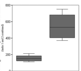
For the study reported in this article, we selected participants (N = 30) first on their effectiveness (response accuracy) and then on their efficiency (response speed). We removed the participants if they answered all questions incorrectly. Of the remaining (N= 27), we identified the 10 fastest and 10 slowest participants by aggregating completion times over two tasks. This left us with two groups (N= 20) and 40 sequences to study. Among the selected participants, 9 are geography experts and 11 are nonexperts. Figure 2 depicts the clearly distinguishable difference in response speed between the fast and slow groups.
The average of the fast group is 2.59 minutes (155.42 seconds), and the average of the slow group is 9.17 minutes (550.41 seconds). The ANOVA confirms that there is a highly significant difference (F = 65.85, P , 0.01) between the averages of the fastest 10 participants and slowest 10 participants. Also note the significant variance difference between the fast and the slow group in Figure 2. The fast group seems much more homogenous in terms of the response speed. This could be due to the fact that there are more experts in the fast group (six of 10) compared with the slow group.
Although participants viewed two interfaces (see Figure 3) in a between-subject setup, grouping as presented in Figure 2 is independent of the interface. This is because the areas of interest (AOIs) are classified based on function rather than location, which is explained in more detail in the following section.
Figure 2. Central tendency and spread of task completion time for the 10 fastest and the 10 slowest participants.
3.3. Task analysis and the ‘hypothetical sequence’
Although design issues are also critical in visual analytics, at this point it is important to mention that in the scope of this article we are not particularly concerned about the effectiveness of the interface designs (see Coltekinet al. 2009, for a comparative study of interface designs). Our focus in this article is on the efficiency of visual analyticsstrategies different user groups seem to employ. The two studied interfaces offer identical visuospatial exploration actions, which we classified according to Gotz and Zhou (2009), to explore Figure 3. The studied interfaces labelled with AOIs that are categorized according to their visual analytics action: (a) Mapmaker, National Atlas of the United States (Natlas 2010) and (b) Carto.net (2010).
crime data in the United States. For example, the inspect, query,change-metaphor, and change-range(zoom, pan, etc.) are present in both of the tested interfaces, even though they are positioned in different locations. All exploration activities and the relevant AOIs that belong to the data exploration actionSelectare labeled as S,Locateas L,Respondas R, and the map area as M (Figure 3).
The visual analytics tasks (Table 1) were presented to users in a systematic rotation to avoid potential learning effects. Before recording began, participants were shown two task-relevant locations in the map display to avoid possible bias from differences in previous knowledge of the geography of the United States. Participants did not receive any additional training or practice opportunities for the tasks or the interface elements.
To identify the hypothetical event sequence and respective AOIs, a cognitive walk-through(Polsonet al. 1992) was performed with the experiment leaders and the interface designers. Once a participant receives and understands the task, the expected participant behavior for Task 1 involves a quick overview of the map (M), selecting (S) appropriate attributes to change the display to depict ‘assaults,’ finding the relevant state (i.e., Maine) and respective county (i.e., Washington) using appropriate locate (L) tools (e.g., zoom and pan), and finally identifying the correct piece of information for the response (R) and/or which button(s) they must press to display the answer. For Task 2, as the location (i.e., Oregon) is mentioned before the attribute (i.e., murder rate) in the question, a participant is expected to start with the map (M), locate the State (L), then select the attribute (S), and move on to the areas where the response is displayed (R).
As a result, the expected consecutive action sequence, that is, thehypothetical sequence is as follows: Task 1: MSLMR (map, select, locate, map, respond); Task 2: MLSMR (map, locate, select, map, respond), yielding an average hypothetical sequence: M(SL|LS)MR (map, [select, locate] or [locate, select], map, respond). The average hypothetical sequence is denoted by a regular expression, that is, when a search is performed using this syntax, sequences MSLMR and MLSMR are both found.
As mentioned earlier, we specifically categorized the visual analytics activities based on the higher level task taxonomies reported in earlier task analysis studies with visual displays. For example, according to Knapp (1995), geographic information system specialists use four primary ‘visual operators’:locate,identify,compare, andassociate. Zhou and Feiner (1998) and Gotz and Zhou (2009) also suggested a visual task taxonomy, in which they suggested tasks such asdistinguish,locate,and identify(among others) as a means to perform visual search that allows data exploration, and enables visual inference making. In this text, we avoid the word ‘identify’ as this is used as a label in one of the interfaces and may confuse the reader. We userespondinstead.
3.4. Data preprocessing with PoP Analyst
An ArcGIS Toolbox called Point Pattern Analyst (PoP Analyst) was developed in-house to extract discrete event sequences from continuous gaze paths based on predefined AOIs, and to visualize gaze paths in a GIS.1Figure 4 shows the complete sequence generation process. Table 1. The tasks included in the sequence similarity analysis (Coltekinet al. 2009).
Task I What is the number of assaults in Washington County (Maine, ME) in 2000? Please provide anumber.
Task II Which county in the State of Oregon (OR) has the highest murder rate in 2000? Please provide thecounty name.
PoP Analyst allows users to create manually or automatically an AOI table for parsing eye movement fixation data to create a sequence. For example, fixations that fall within the Select, Locate, and Respond AOI’s are recorded as S, L, and R, respectively, using the time stamp to create an ordered sequence. Consequently, a series of fixations starting with the AOI Select, then Locate, to Respond and back to Locate, would generate a sequence SLRL. When the data are imported to PoP Analyst, they are stored in a ‘database file’ (.dbf). After this, it is possible to perform selections and filtering based on attributes (fields). Once the data are ‘clean’, the user can create a table with assigned codes for the chosen AOIs. If needed, this encoding can be manually edited. The table with the AOI codes is used by the ‘Create Sequence’ tool and the sequences are then created. These steps can be automated using ESRI’s Model Builder to create automated or semiautomated workflows. Currently, PoP Analyst can create sequences that can be opened by three different sequence analysis software packages: Clustal G (Clustal 2010), TraMineR (TraMiner 2010), and eyePatterns (Westet al. 2006), the latter of which we use in this study to analyze our sequences.
3.5. Sequence similarity analysis
There are several ways to compare our hypothetical sequence with the recorded participant sequences to identify possible similarities and dissimilarities. For example, a simple string search function allows to identify sequences that match a certain pattern. The eyePatterns software (Westet al. 2006) offers such a function. Because the order of fixations is more important in sequence analysis than the fixation count, the search is performed on the collapsed sequences. A collapsed sequence is a ‘compressed’ version of an expanded sequence. For example, if there is a fixation on M 3 times, the expanded sequence is MMM and thecollapsedsequence is M.
The theory-driven approach can be further supported by clustering the data based on similarity measures. Many similarity detection algorithms exist for sequential data, such as the well-known Levenshtein dissimilarity measure (Levenshtein 1966). Levenshtein’s (1966) string-edit algorithm assesses the similarity of two string sequences by counting the number of necessary steps (i.e., insertions, deletions, or substitutions for each character) to convert one string into the other. Smith and Waterman (1981) also offered a similarity measure for sequential data based on string-editing. Their algorithm is often used for pairwise local alignments that allow pattern discovery between two and more sequences (Smith and Waterman 1981). Another common similarity measure in sequence analysis is by Needleman and Wunsch (1970). Needleman and Wunsch’s global sequence alignment algorithm employs a scoring scheme to align two sequences by introducing a reward for matching, a cost for gaps, and a penalty for mismatches. The similarity of sequences is typically expressed in a similarity matrix that can be input to various multivariate explora-tory data analysis methods. A popular method to identify groups of similar sequences is, for Figure 4. PoP Analyst’s workflow presented as used in ArcGIS Model BuilderTM.
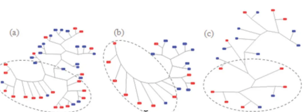
example, hierarchical average linkage clustering (Westet al. 2006), starting with the pair of sequences that have the highest similarity score and progressively leading to the least similar pair. The result of the clustering process can be inspected with a dendrogram. Another classic method for identifying groups of similar items is multidimensional scaling (MDS), also available in West et al.’s eyePatterns software. Clustering and MDS can be helpful for validating theory-driven assumptions such as we have made in this study. Do user groups defined based on speed alone also cluster in terms of viewing (inference making) behavior? Clustering is also helpful for data-driven analysis because it might reveal unexpected patterns. We first apply the Levenshtein (1966) and Needleman and Wunsch (1970) algo-rithms implemented in eyePatterns to generate a distance matrix and to visualize the results of the similarity analyses with both a cluster dendrogram (Figure 5) and MDS (Figure 6) to inspect the clustering.
Another method that can be useful for both theory- and data-driven analyses is calculating the transition frequencies (see Figures 7 and 8) between events in a sequence. Therefore, for example, if there are many transitions between two AOIs, this information can be used as a metric indicating ‘inefficient scanning with extensive search’ (Goldberg and Kotval 1999, p.640). In this study, we analyze the transition frequencies between the AOIs, and finally execute a local alignment to detect potential microlevel cycles. We finish the microlevel analysis querying for specific revealing patterns in selected sequences.
Figure 5. Clustering based on Levenshtein distances and the average linkage clustering. (a) Both tasks combined (40 sequences), (b) Task 1 (20 sequences), (c) Task 2 (20 sequences). Faster partici-pants are represented in red. Dotted lines mark the visually identified clusters.
Figure 6. Clustering based on the Needleman and Wunsch sequence alignment algorithm and MDS. (a) Both tasks combined (stress level: 0.09), (b) Task 1 (stress level 0.09), (c) Task 2 (stress level 0.08). Faster participants are represented in red. Dotted lines mark the visually identified clusters.
4. Results
When grouping the participants based on their accuracy and speed alone, not surprisingly, we found that experts are faster than nonexperts. In the fast group, there are 6 (out of 10) geography experts. Hence, as we study the strategies of the fast group, we are also arguably studying the strategies of experts. For all of the studied 40 sequences, the expanded sequence length varies between 51 and 1047 letters, and the collapsed sequences vary from 3 to 275 letters. For the fast group (20 sequences), the expanded sequence lengths vary from 51 to 352 letters, and from 3 to 26 when collapsed. For the slow group (20 sequences), the expanded sequence lengths vary from 275 to 1047, and from 5 to 107 when collapsed. The slower, thus less efficient participants, as expected, consistently have longer (thus less efficient) gaze paths in expanded and in collapsed sequences, possibly indicating more inefficient visual search loops (cycles).
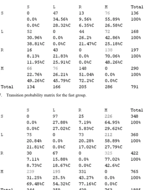
Figure 8. Transition probability matrix for the slow group. Figure 7. Transition probability matrix for the fast group.
4.1. Top-down analysis: string matching for the hypothetical sequence
Searching for the participant sequences for our average hypothetical sequence M(SL|LS)MR (either MSLMR or MLSMR), we find that 17 of the 40 (42.5%) sequences have this pattern. The distribution of these sequences in the fast and slow groups is nearly equal: of the 17 sequences nine are from slower and eight are from faster participants. Because the propor-tion of those who follow the hypothetical sequence is approximately the same in both groups (42.5%), what do the rest of the participants do? One group is significantly faster than the other, are there perhaps ‘hidden’ similarities within these groups? These questions lead us to data-driven approaches.
4.2. Identifying groups of similar behavior
Using Levenshtein’s (1966) string-edit algorithm (the ‘default’ scoring scheme in eyePatterns) and average linkage clustering, we analyzed the data for all 40 sequences to confirm whether fast and slow groups emerge. It is immediately apparent from the resulting dendrogram (Figure 5) that the fast group has many similar sequences, whereas the slow group does not. Similar to the greater variance identified in response speed for the slow group compared to the fast group (Figure 2), we again find a greater variance in viewing behavior for the slow group. Note that the spatial distances in the dendrogram are not necessarily scaled to the sequence similarities, but counting the number of branches between the sequences allows meaningful interpretation (West et al. 2006).
To validate these results, we used another scoring scheme for clustering (Figure 6) based on the Needleman and Wunsch (1970) sequence alignment algorithm. As mentioned earlier, this algorithm calculates the similarity based on a match reward (set to 1), a gap cost (set to 0), and a mismatch penalty (set to-1). We visualize the results using MDS (Kruskal and Wish 1978).
Similar to the results represented in the dendrograms (Figure 5), we find that the fast group (red labels) clusters more consistently than the slow group (blue labels) (Figure 6). In MDS, the visualized spatial distances are proportional to the similarities (or distances) between sequences, that is, when inspecting Figure 6, the labels that appear close (or overlapping) represent similar sequences. The so-called stress level can be used to determine how well output distances in an MDS configuration match the similarity of the input data. Using Kruskal’s stress formula 1, a rule of thumb suggests that 0 is considered a perfect match, any number less than 0.05 is exceptional, and more than 0.15 is unacceptable (Kruskal and Wish 1978). The stress levels for our results are in the acceptable ranges.
The 15 sequences from the faster participants (out of 20) that are found to be most similar by both algorithms are circled in Figures 5 and 6. Nine of the 15 sequences (60%) are from experts, and nine (not necessarily the same ones) of the 15 (60%) are participants solving Task 1. Eight of the 15 (53.3%) sequences came from participants using carto.net and seven of the 15 (47.7%) from Natlas, indicating that the stimuli did not have a strong effect on the fastest 15 strings. The task, participant background and training, or the stimuli type/design can affect the inference making (e.g., gaze) behavior. Therefore, we also looked at the possible clustering based on task, participant background, and design independently. Although the total set of 40 sequences do not clearly cluster based on either task or interface design, the sequences for the fast group cluster based on task, and those of the slow group cluster based on the interface design.
Each matrix cell has three values in the transition probability matrices as shown in Figures 7 and 8. The first line shows the tallies (count), the second line shows the ‘row probabilities’ (AOI in the rowleads toAOI in the column) and the third line shows the ‘column probabilities’ marked with C after the percent sign (AOI in the columncomes from the AOI in the row). For example, in Figure 7, we can study the relationship between the AOIs Select (S) and Locate (L). The number of transitions from S to L is 47, with a 34.56% probability that Sleads toL (i.e., participant looked at S then at L, instead of R or M), and with 28.32% probability that the gaze at Lcomes fromS (instead of R or M). Comparing the row probabilities(first row in Figure 7), we see that the highest probability is that S leads to M, in other words, faster participants are most likely to look at the map (M, 55.89%) after a Select (S) operation (instead of L or R). Comparing thecolumn probabilities for S (first column in Figure 7), we see that the highest probability that a participant selected an attribute (S) (49.26%) is after looking at the map (M).
An overview of the tallies in both matrices (Figures 7 and 8) shows that the slow group is more likely to go back and forth between all the AOIs. The tallies come from the collapsed sequences, which are still considerably longer for the slower participants. This cycling behavior confirms what we suspected based on the sequence lengths alone. Comparing the tallies in the two matrices shown in Figures 7 and 8, we can see that the highest transition occurs between M and R and the lowest between S and R in both groups.
The column probabilities share overall tendencies between groups. However, row probabilities reveal a difference: while in both groups S leads to M the most, in the fast group it is least likely that M leads toS. For the slow group, it is more likely that M leads to S than M to L, that is, the faster participants selected (S) the attribute first, then checked the map (M), maybe use zoom tools to locate (L), and then move on, whereas the slower participants are more likely to cycle between Select (S) and Map (M). A closer look at the differences tells us a similar story, as summarized in Tables 2 and 3.
Table 2 demonstrates that the chances that the participants find the answer after viewing the map (R leads to M) is approximately 7% higher in the fast group. Members of the slow group, after looking at the map, most likely go back to select (M leads to S approximately 9% more in the slow group than in the fast group). Once the response is found (R), the fast group is more likely to proceed to L or S, whereas the slow group is more likely to go back to M (R leads to M approximately 7% more in the slow group than in the fast group).
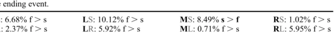
The transition probabilities also show that the slow group is cycling between S and M a lot more; M leads to S approximately 9% more for the slow group (Table 2) and more than 20% more move from S to M (Table 3). L leads to M and L leads to S are more frequent in the fast group compared to the slow group, and M leads to L is more frequent in the slow Table 2. The row transition probability differences based on Figures 7 and 8 for the fast (lowercasef) and the slow (lowercases) groups. When slower participants are more likely to perform the transition, the line is highlighted in gray (s.f). Bolded AOI labels are the starting event and the gray AOI labels the ending event.
SL: 6.68% f.s LS: 10.12% f.s MS: 8.49%s.f RS: 1.02% f.s
SR: 2.37% f.s LR: 5.92% f.s ML: 0.71% f.s RL: 5.95% f.s
SM: 9.06%s.f LM: 16.03%s.f MR: 7.77% f.s RM: 6.96%s.f
group compared to the fast group (Table 2), which indicates that the faster group uses the locate (L) (e.g., navigational tools, zoom, pan) more efficiently. After responding, approxi-mately 7% more of the slow participants go back to M (R leads to M, Table 2), and confirming this, 5% more of the slow participants arrive from R at M (Table 3), potentially indicating slower participants feeling uncertain about their response.
4.4. Local alignment and pattern discovery
Transition probabilities are basically Markov chains, that is, they consider the local ‘state’ immediately before and after an event but do not reveal possible repetitive cycles longer than two-letter long patterns and do not reveal where in the sequence they occur. For this reason, we locally aligned the 15 sequences that clustered earlier using eyePatterns’ Smith and Waterman (1981) algorithm implementation (Westet al. 2006). A snippet from the results can be seen in Figure 9.
Local alignments between individual pairs of sequences, followed by a string search, may help reveal additional microlevel patterns. The local alignments among the fast participants do not have many surprising behavioral patterns. However, we have identified several ‘microlevel’ cycles. These cycles show that although there is a constant interaction with the map throughout a sequence, select and locate (e.g., SMS, LML) appear more often at the beginning of a sequence, whereasresponse (MRM), as expected, appears more toward the end of a sequence. This pattern roughly holds also for the slower participants, with additional ‘MRM’ cycles appearing in the middle of the sequence. This may again suggest that the faster participants indeed have a more direct (possibly more confident), thus efficient, visual analytics strategy. The slow group repeatedly returns to study the map. Very long strings such as SMSMSMSMSM and RMRMRMRMRM are considerably more present with the slower users. The RMRMRMRMRM string can be identified in 13 of the total number of sequences (32%); in 3 sequences from the faster participants (23%) and in 10 from the slower participants (77%). Similarly, the SMSMSMSMSM cycle can be seen in 8 sequences (20% of all sequences) of which only two (25%) are fast, and six are slow participants (75%).
Table 3. The column transition probability differences based on Figures 7 and 8 for the fast (lower-casef) and the slow (lowercases) groups. The gray highlight denotes slower participants that are more likely to perform the transition (s.f). Gray AOI labels are starting events, and bolded AOI labels denote the ending events.
LS: 17.00% f.s SL: 1.3% f.s SM: 3.04%s.f SR: 0.52% f.s RS: 3.22% f.s RL: 7.67% f.s LM: 2.61%s.f LR: 4.45% f.s MS: 20.22%s.f ML: 8.53%s.f RM: 5.66% f.s MR: 4.96%s.f
Figure 9. Local alignment of two fast participants.
sequence. However, we are left with the question why there are differences between the fast and the slow groups, and what and where are these differences? Looking at the background of our participants, we find that proportionally more experts are in the fast group, which agrees with previous findings in usability studies (e.g., Stenforset al. 2003). The varying length of the visual analytics sequences across slow and fast participants confirms that faster participants are more efficient in their visual search strategies as they require fewer fixations (Goldberg and Kotval 1999) to solve the visual analytics tasks.
We then followed a data-driven analysis approach applying multiple sequence explora-tion methods and found that the slower participants spend more time repeatedly inspecting the map in comparison with the faster participants. A cycle ofre-fixations(moving back and forth between AOIs) can be interpreted in two contradictory ways: either alocalized learning took place and people attend more to what they know and find useful (i.e., have a greater interest) or they feel uncertain and want to confirm the information that they have found (Goldberg and Kotval 1999). This hesitant behavior seems to appear more when the information is presented both in a verbal (text) and in an iconic (graphic) format, and sometimes is referred to assemantic uncertainty (Stenfors et al. 2003). Jacob and Karn (2003) distinguished between anencodingtask and aninformation searchtask, and sug-gested that in the former the repetitive clusters indicate greater interest, whereas in the latter they indicate inefficiency or difficulty in recognizing the targeted item. Our findings in this case study confirm the latter, as we grouped the participants based on their efficiency in a visuospatial information search task, and the less efficient group has many more repetitive cycles. As a result of the clustering, we also find that the faster participants have similar sequences based on the task, and slower participants have similar sequences based on the display design (they are not necessarily faster with one stimuli over the other, but their visual scan patterns change when the design changes). We interpret this as another indication of the saliency effect found by Fabrikantet al. (2010) and others, showing that naive participants tend to extract information based on perceptual salience rather than thematic relevance.
6. Conclusions
The interaction between a display and a user can be affected by many factors including the nature of the task and the design of the displays (Yarbus 1967, Olson 1979, Stark and Ellis 1981, Brandt and Stark 1997), but ultimately the interaction is highly controlled by the user (Stenforset al. 2003). Theories such as the scanpath theory (Noton and Stark 1971) suggest that this ‘moderating internal mental power’ or ‘plan/schema of visual activity’ has a strong correlation to human eye movements (Yarbus 1967, Privitera 2006). This is why the eye movement studies can be very helpful in uncovering visual analytics strategies of users, and how these strategies relate to the task at hand, and/or the display design. Eye movements are fairly reliable as a proxy to attention, and, in recent years, data are straightforward to collect (Duchowski 2007). However, as in other areas, we seem to be able to collect data at higher (temporal) resolutions faster than we can analyze it (Thomas and Cook 2005).
Fixation sequences obtained through eye movements are very complex to analyze and understand, not only because the data may be difficult to group and filter but also because
there are different ways to measure similarity between gaze paths which may yield different results (Lorigo et al. 2006). In this article, we suggest employing the well-established sequence analysis methods borrowed from bioinformatics that are rarely used in empirical studies to assess the utility and usability of dynamic geovisual analytic displays, and in the process introduce our own software PoP Analyst that helps to support this. Our case study demonstrates that it is possible to identify visual analytic activity patterns and strategies paying attention to individual and group differences. The identified differences might allow us to enhance our understanding of cognitive spatial processes when performing visual analytics tasks. As Slocumet al. (2001) suggested, when such differences are identified, two approaches are possible to address the question ‘what to do with them’: integrate the insights from the findings in education (training) of potential users, or modify the design to meet the needs of the user. Therefore, a future direction for this kind of work could be to first study the task- and stimuli-based clustering more in depth and then to modify the design of the interfaces for further comparative testing. Additionally, another important future direction could be to systematically compare and contrast methods, thresholds, and tools that are used in sequence analysis of eye movement recordings to establish benchmarks and guidelines for this kind of empirical work.
Acknowledgments
This study was partially funded by the Swiss National Fund (award numbers 200021_120434/1: C¸ o¨ltekin and 200021-113745: Fabrikant) and the US Fulbright – Swiss Scholarship Program. The authors thank Benedikt Heil and Simone Garlandini for their substantial contribution in the initial stages of this project. The authors express their gratitude to Andreas Neumann of carto.net and John P. Donnelly of natlas.gov for answering their questions regarding the design considerations of the two stimuli used in this experiment. They are grateful for the helpful comments from four anonymous reviewers who provided feedback that improved the article.
Note
1. PoP Analyst is licensed under LGPL, that is, GNU lesser general public license, (GNU 2010) and can be downloaded at http://popanalyst.dynalias.org. Please cite this article if you use the software.
References
Aaltonen, A., Hyrskykari, A., and Raihii, K.J., 1998. 101 spots, or how do users read menus?In:
Proceedings of the CHI’98, 18–23 April 1998. Los Angeles: ACM Press, 132–139.
Abbott, A., 1995. Sequence analysis: new methods for old ideas.Annual Review of Sociology, 21, 93–113.
Andrienko, G., Andrienko, N., and Wrobel, S., 2007. Visual analytics tools for analysis of movement data.SIGKDD Explorer Newsletters, 9 (2), 38–46.
Brandt, S. and Stark, L., 1997. Spontaneous eye movements during visual imagery reflect the content of the visual scene.Journal of Cognitive Neuroscience, 9 (1), 27–38.
Brodersen, L., Andersen, H.H.K., and Weber, S., 2001. Applying eye-movement tracking for the study of map perception and map design.National Survey and Cadastre Denmark, 4 (9), 1–98. Byrne, M.D.,et al., 1999. Eye tracking the visual search of click-down menus.In:Proceedings of the
CHI 99, 15–20 May 1999. Pittsburgh: ACM Press, 402–409.
Carto.net., 2010. An online interactive map interface showing the crime and poverty rates in the
U.S.A. in 2000 [online]. Available from: http://www.carto.net/papers/svg/us_crime_2000/
[Accessed 28 June 2010]
Coltekin, A.,et al., 2009. Evaluating the effectiveness of interactive map interface designs: a case study integrating usability metrics with eye-movement analysis. Cartography and Geographic
Information Science, 36 (1), 5–17.
Duchowski, A.T., 2007.Eye tracking methodology: theory and practice. 2nd ed. London: Springer. Duchowski, A.T.,et al., 2010. Scanpath comparison revisited.In:Proceedings of the ETRA 2010,
22–24 March 2010. Austin: ACM Press, 219–226.
Fabrikant, S.I.,et al., 2008. Novel method to measure inference affordance in static small multiple displays representing dynamic processes.The Cartographic Journal, 45 (3), 201–215.
Fabrikant, S.I., Rebich-Hespanha, S., Hegarty, M., 2010. Cognitively inspired and perceptually salient graphic displays for efficient spatial inference making.Annals of the Association of American
Geographers, 100 (1), 1–17.
Goldberg, J.H. and Kotval, X.P., 1999. Computer interface evaluation using eye movements: methods and constructs.International Journal of Industrial Ergonomics, 24, 631–645.
GNU, 2010. The GNU project- free software foundation [online]. http://www.gnu.org/licenses/ licenses.html [Accessed 28 June, 2010].
Gotz, D. and Zhou, M.X., 2009. Characterizing users’ visual analytic activity for insight provenance.
Information Visualization, 8 (1), 42–55.
Gudmundsson, J.,et al., 2009. Compressing spatio-temporal trajectories.Computational Geometry –
Theory and Applications, 42 (9), 825–841.
Hacisalihzade, S., Stark, L., and Allen, J., 1992. Visual perception and sequences of eye movement fixations: a stochastic modeling approach.IEEE Transactions on Systems, Man and Cybernetics, 22 (3), 474–481.
Haklay, M. and Tobon, C., 2003. Usability evaluation and PPGIS: towards a user-centred design approach.International Journal of Geographical Information Science, 17 (6), 577–592. Hoffman, D.D., 2000.Visual Intelligence, how we create what we see. New York: W.W. Norton &
Company Ltd.
Jacob, R. and Karn, K., 2003. Eye tracking in human-computer interaction and usability research: ready to deliver the promises. In: Hyo¨na, J., Radach, R. and Deubel, H., eds.The mind’s eye:
cognitive and applied aspects of eye movement research. Amsterdam: Elsevier, 573–605.
Joh, C.H.et al., 2002. Activity pattern similarity: a multidimensional sequence alignment method.
Transportation Research Part B, 36, 386–403.
Knapp, L.K., 1995. A task analysis approach to the visualization of geographic data.In: Nygers, T.L.,
et al., eds.Cognitive aspects of human computer interaction for geographic information systems.
The Netherlands: Kluwer Academic Publishers, 355–371.
Kruskal, J.B. and Wish, M., 1978.Multidimensional scaling. Beverly Hills, CA: Sage Publications. Larkin, J.H. and Simon, H.A., 1987. Why a diagram is (sometimes) worth ten thousand words.
Cognitive Science, 11 (1), 65–100.
Levenshtein, V.I., 1966. Binary codes capable of correcting deletions, insertions and reversals.
Doklady Physics, 10, 707–710.
Lorigoet al., 2006. The influence of task and gender on search and evaluation behaviour using Google.
Information Processing and Management, 42 (4), 1123–1131.
Natlas, 2010.Map maker, an online interactive map interface of National Atlas of the United States
[online]. Available from: http://nationalatlas.gov/natlas/Natlasstart.asp [Accessed 28 June 2010] Needleman, S.B. and Wunsch, C.D., 1970. A general method applicable to the search for similarities in
the amino acid sequence of two proteins.Journal of Molecular Biology, 48, 443–453.
Noton, D. and Stark, L., 1971. Scanpaths in eye movements during pattern perception.Science, 171 (3968), 308–311.
Olson, J., 1979. Cognitive cartographic experimentation.Cartographica: The International Journal
for Geographic Information and Geovisualization, 16 (1), 34–44.
Polsonet al., 1992. Cognitive walkthroughs: a method for theory-based evaluation of user interfaces.
International Journal of Man-Machine Studies, 36 (5), 741–773.
Privitera, C.M., 2006. The scanpath theory: its definition and later developmentsIn: Rogowitz, B.E., Pappas, T.N., and Daly, S.J., eds.Proceedings Vol. 6057 Human Vision and Electronic Imaging XI,
San Jose, CA, USA, 15–19 January 2006.
Slocum, T.A. et al., 2001. Cognitive and usability issues in geovisualization. Cartography and
Geographic Information Science, 28 (1), 61–75.
Smith, T.F. and Waterman, M.S., 1981. Identification of common molecular subsequences.Journal of
Molecular Biology, 147 (1), 195–197.
Shoval, N. and Isaacson, M., 2007. Sequence alignment as a method for human activity analysis in space and time.Annals of the Association of American Geographers, 97 (2), 282–297.
Steinke, T.R., 1987. Eye movement studies in cartography and related fields.Studies in Cartography,
Monograph 37, Cartographica, 24 (2), 40–73.
Stenfors, I., More´n, J., and Balkenius, C., 2003. Behavioural strategies in web interaction: a view from eye-movement research.In: Hyo¨na¨, J, Radach, R. and Deubel, H., eds.,The mind’s eye: cognitive
and applied aspects of eye movement research. Amsterdam: Elsevier, 633–644
Stark, L.W. and Ellis, S.R., 1981. Scanpaths revisited: cognitive models direct active looking.In: Fisher, D.F.,et al., eds.,Eye movements: cognition and visual perception, Hillsdale, NJ: Lawrence Erlbaum Associates. 193–226.
Thomas, J.J. and Cook, K.A., 2005.Illuminating the path: the research and development agenda for
visual analytics. National Visualization and Analytics Ctr, Los Alamitos, CA: IEE Computer
Society Press.
TraMineR, 2010.Sequence analysis in R[online]. Available from: http://mephisto.unige.ch/traminer/ [Accessed 28 June 2010].
Vessey, I., 1991. Cognitive fit: theory-based analysis of the graphs versus tables literature.Decision
Sciences, 22 (1), 219–241.
Ware, C., 2008.Visual thinking and for design (Morgan Kaufmann series in interactive technologies). Burlington, MA: Morgan Kaufmann Publishers.
West, J.M.et al., 2006. EyePatterns: software for identifying patterns and similarities across fixation sequences.In:Proceedings of the ETRA 2006, 27–29 March 2006, San Diego, CA. New York:
ACM Press, 149–154.
Wilson, C., 2008. Activity patterns in space and time: calculating representative Hagerstrand trajec-tories.Transportation, 35, 485–499.
Wilson, D., Bertolotto, M., and Weakliam, J., 2010. Personalizing map content to improve task completion efficiency. International Journal of Geographical Information Science, 24 (5), 741–760.
Yarbus, A.L., 1967.Eye movements and vision. New York: Plenum Press.
Zhou, M.X. and Feiner, S.K., 1998. Visual task characterization for automated visual discourse synthesis.In:Proceedings of CHI ’98, 18–23 April 1998, Los Angeles CA, 392–399.