Recent Large Graph Visualization Tools :
A Review
Sorn Jarukasemratana
Tsuyoshi Murata
Large graph visualization tools are important instruments for researchers to understand large graph data sets. Currently there are many tools available for download and use under free license,others in research papers or journals, each with its own functionalities and capabilities. This review focuses on giving an intro-duction to those large graph visualization tools and emphasizes their advantages over other tools. Criteria for selection of the tools being reviewed are it was recently published (2009 or later), or a new version was released during the last two years. The tools being reviewed in this paper are igraph, Gephi, Cytoscape, Tulip, WiGis, CGV, VisANT, Pajek, In Situ Framework, Honeycomb and two visualization toolkits which are JavaScript InfoVis Toolkit and GraphGL. The last part of the review presents our suggestion on building large graph visualization platform based on advantages of tools and toolkits that are being reviewed.
1 Introduction
Large graph visualization and analysis are proven to be vital in many research fields such as sociology, biology, and computer science. Visualization tools are important instruments for researchers to make an understanding of large graph data sets. Cur-rently, there are many tools available with each its own strengths and weaknesses, advantages and dis-advantages. Some tools are available to download under free license. Some tools have appeared in re-search papers but are not available for public use. In this review, we introduced the tools and toolkits that are in active development which are capable of handling graphs with more than 10,000 nodes. The selection criteria are that it was published recently (2009 or later) or within two years of a new version release.
The review consists of three parts; tools, toolk-its and our suggestion on large graph visualization
最近の大規模グラフ可視化ツールレビュー
Sorn Jarukasemratana,村田剛志,東京工業大学, Tokyo Institute of Technology.
コンピュータソフトウェア, Vol.30, No.2 (2013),pp.159–175. [解説論文] 2012年3月30日受付.
platform. In the first part (section 1), visualization tools are reviewed. The review does not cover ev-erything that the tool can do, but focuses more on its advantages compared to other tools. In toolkits part (section2), introduction to very recent toolkits are given. The toolkits being reviewed are already creating an impact in visualization field and are still in very active development. The last part (section 3) presents our suggestion on large graph visualiza-tion platform which is based on advantages of tools and toolkits that being reviewed.
There is a related research about visualization tools; GSVR by Bruno Pinaud and Pascale Kuntz [32], that provides an on-line guide for choosing graph visualization software. The website asks for requirements such as graph size, graph type, or de-sired analysis functionalities, then shows the search results of suitable visualization tools. However, GSRV only provides tools that are available for download and excludes those that only appear in research papers or academic conferences. More-over, some tools are outdated, not being actively developed, or no longer available for download. Therefore, this review focuses on recent tools from research papers and conferences or tools which are still being actively developed that contain
advan-160
tages that distinguish it from others.
In addition to the visualization tools that we re-viewed in this paper, there are some other tools that are worth mentioning, although they do not satisfy our selection criteria. LGL (Large Graph Layout) [43] [48]is one of the oldest tools which can be used to dynamically visualize large networks on the order of hundreds of thousands of vertices and millions of edges. Web Community Chart [47]is a tool for navigating the Web and for observing its evolution through web communities. It shows the evolutions of communities that are extracted from the snapshots of the whole Japanese Web archives that are crawled every year. Koshida et al. [44] de-veloped Social Cosmo Browser, a tool for visualiz-ing large graphs on the order of millions of vertices. Communities are extracted from given graph, and they are projected to 3D space based on MDS (mul-tiple dimensional scaling). As an attempt for visu-alizing temporal changes of social media, Itoh et al. [45]developed a 3D visualization system which enables users to select a topic, find some events that are related to the topic within a specific time span, and drill down the details of the events. Mat-subayashi et al. [46]developed an interactive real-time graph visualization system using HTML5 and WebCL. Their fast approximate method of force-directed placement enables the visualization with time complexity O(n), where n is the number of vertices in a graph.
2 Large graph visualization tools Visual representation of graphs has high impact on graph analysis. New visualization can bring new discovery or new knowledge about the data set[41]. Each year, according to state-of-the-art report on visual analysis of large graphs by Landesberger et al. [40], new graph visualizing applications or new visualization techniques are presented, each with its own purposes and advantages. Moreover, some visualization tools can be enhanced with the plug-ins that are constructed to add more functionality. Many researchers construct plugins for visualiza-tion tools and then use that plugin to achieve their goals.
Constructing new visualization tools or plugins is a time consuming and complex task. It is perhaps better to use existing tools in research if they meet
their needs. In this section, we aim to provide a short introduction of visualization tools and their capabilities in order to assist other researchers to select the right visualization tools for their projects. Each tool has its own characteristics such as input types of the dataset, visual representation styles, interaction techniques, analytic tasks, or al-gorithms that it can perform. Graphs with time at-tribute or dynamic graphs are also important when selecting a tool because dynamic graphs will require much more visualization space.
The challenge of visualizing large graphs is that there are too many nodes and edges to be displayed. This can lead to many problems; for example, mem-ory shortage, long computation time, or insufficient display space. Users’ cognitive ability is also lim-ited, which can be an obstacle for visualizing large graphs. Two main strategies for countering com-putational problems are 1) finding more process-ing power and 2) inventprocess-ing better methods or algo-rithms to compute the data. Finding better hard-ware is also an alternative; such as parallel comput-ing with super computer, grid or cloud computcomput-ing, or using GPU to assist drawing. Inventing new methods mostly means either creating new algo-rithms or modifying existing ones to achieve better results with the same processing power. Lack of display space can be easily solved by making the display bigger such as wall display or table top dis-play. These strategies have their advantages be-cause users can observe the entire graph while see-ing all the details. However, some very huge data sets such as Facebook accounts or Twitter users are not able to be displayed even with a very large screen. Therefore, the next strategy for displaying large data sets is to divide those data into many pieces and display only the part that is critical for users, such as selecting one node and display-ing only the nodes that are connected with that node. With this method, we have the local view of a small fraction of the entire graph but the full view of the graph is lost. Another method is to abstract the data and display the whole graph by sacrificing some or most of the details. Many tech-niques are used for this strategy such as clustering the nodes and displaying the clusters, or transform-ing data into charts or matrixes. With this method, overview of the graph is visible but the details are lost.
Furthermore, time-varying graphs or dynamic graphs are gaining much more attention in research fields recently. In normal graphs, connections be-tween nodes and edges are the main point of con-cern. However, in dynamic graphs, time is another element that needs to be considered. In dynamic graphs, node and edge attributes can change over time or even graph structures can evolve. Display-ing the large static graphs in full detail is diffi-cult enough, displaying the whole dynamic graph is much harder. In order to display dynamic graphs in a limited space, some strategies are needed. The first strategy is to select time, and display only the graphs of that time. This strategy is mostly used with animations to display the changing of graphs in each specific time or with time scroll bar and let users control the flow of time themselves while showing the changes in graphs. Another strategy is to abstract the time such as changing from 2D graph to 3D graph and use third axis for time.
2. 1 Cytoscape
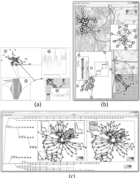
Cytoscape [2] is an open source network visu-alization and analysis software based on Piccolo framework [22] [28]. Currently in beta version of Cytoscape 3.0, stable version 2.8 (Figure 1a) [4]is launched in 2011, Overall, this tool is highly ef-ficient and easy to use tool for large graph visu-alization and analysis. It is able to display more than 500,000 nodes, and it contains many analysis functions along with visualization techniques. Due to its plugin system and huge communities that support it, Cytoscape functionalities are expand-ing rapidly.
Built with Java system, this tool originated from biology research field, mainly for biomolecu-lar interaction networks such as protein-protein or protein-DNA interaction. However, as Hou et al. [1]suggest, Cytoscape offers most of the important functionalities needed for visual analytic of graph data. Also for the later versions of Cytoscape, all biological functions are moved to plugin sections. Thus this tool can now be considered as a general platform for visualizing and analyzing complex net-works. Cytoscape core provides basic functionali-ties such as layout of networks or selection of nodes while its plugin architecture allows some plugins to be added later to provide more features. Hou et al. also stated that one of the biggest advantages of
Fig. 1 Example of Cytoscape images (a) main window (b) large graph visual-ization by Cytoscape
Cytoscape is its large user society that keeps con-tributing for making more plugins. Cytoscape also received huge compliments from outside of bioinfor-matics field when it was chosen as the winner for large scale graph visualization tools held by UM-BEL [3]from 26 large graph visualization tools.
Cytoscape’s core functions are mainly about vi-sualization and basic analysis of graphs. Cytoscape layouts network in 2D format with standard algo-rithm such as cyclic, spring, and tree, and it is also possible to modify the layout algorithms via addi-tional plugins. Panning, zooming and bird’s eye view are offered for graph visualization. Nodes’ properties such as color, size, shape, or border can be easily customized, and with later version, it is possible to use graphics for representing nodes. Nodes’ graphics can be generated or acquired re-motely via URL such as online profile pictures of social networks. Edge properties such as size, color, alpha value (amount of transparency in an image), or style can easily be modified as well. Node and edge attributes can be viewed in a table format which works similar spreadsheet application. From the table, users can sort or select nodes and edges like selecting them from the graph. An attribute equation function has recently been added in the latest version[4]. This feature allows users to apply formulas to the whole columns in the table, similar to spreadsheet programs like Microsoft Excel. Fil-ter functions are well made and easy to use. Users can combine many filters together and can perform operations such as union, intersection, or inversion to single out groups of nodes. Moreover, selected nodes and edges can be separately modified such as the changes of properties, layouts, scales, or rota-tions. File import functions are also up to the stan-dard. Many existing graph file formats and spread
162
sheet data with delimiters are supported. For bioin-formatics information, it is also possible to down-load graphs directly from Cytoscape’s database.
Functions for basic graph analysis are also inte-grated in its core application. Simple metrics such as clustering coefficient, diameter, radius, central-ization can be calculated. Fit line and fit power law line are also included. Moreover, some values can be visualized in graph layout. For example, nodes’ degrees can be used as nodes’ size or edges’ weight can represent edges’ thickness.
Maximum graph size of Cytoscape, like other large graph visualization applications, is depended on memories of the machines that it is run on. Since this program is using Java, JVM memory limit de-termines the maximum size of the graphs. How-ever, 32bit version of JVM has very low maximum memory limit. In 32bit Microsoft Windows, JVM can use only about 1400M or 2200M memory on Linux system, even it machines have more physi-cal memory than that. To solve this 32bit memory problem, 64bit version is introduced. This allowed JVM to exceed memory limit of 32bit system. With 64bit JVM, theoretically, maximum memory limit is now 264. In real practice, the maximum memory
limit of 64bit system is the maximum amount of physical memory that can fit into your system. We did a testing on Cytoscape with a large data set (9,940 nodes, 1,000,209 edges). 32bit version failed to load the data set, while 64bit version can load the data set. It was reported that with 5000M of ram via 64bit JVM, Cytoscape can load and dis-play a data set of 500k nodes and 500k edges on a personal computer (Figure 1b).
Plugin is probably the most fascinating feature of this software. There are more than 140 plugins available to download via their website or down-load manager functions in the software. Plugins are both developed by Cytoscape developer team themselves and its users’ community. The reason developer team decided to put some functionality as plugins is that they wanted to minimize the core part of the program and keep it as general as possible. Plugins from community side mostly come with research papers and have specific goals in mind. Although most plugins are created for use in bioinformatics field, their functionalities can be used in other research fields as well.
One of the recent plugins such as the one
devel-Fig. 2 AllegroMCODE [5]plugin architecture
oped by Jun Sung Yoon and Won-Hyong Chung [5]allows Cytoscape to use Nvidia’s CUDA system (parallel GPUs architecture shown in Figure 2) to run its algorithms. Furthermore, this plugin also allows XML-RPC (XML remote protocol) to let powerful GPU computing server help the calcula-tion on user’s computer. The speed increase is sig-nificant, 200-400 times faster than the computing without the plugin. In the experiment performed by Yoon and Chung, processing time for normal MCODE algorithm on large graph (31,215 nodes and 317,706 edges) is 145.91 seconds. On the other hand, with AllegroMCODE, the processing time is only 0.52 seconds (278 times faster). This plugin allows Cytoscape to be able to perform a calcula-tion very fast, resulting in faster exploracalcula-tion and analyzation of the data set. Moreover, it allows re-searchers to perform experiments on a larger data set which are normally impossible to do due to the lack of processing power.
Most of the plugins are distributed with free li-cense and can be used for non-commercial pur-poses. Some plugins’ source codes are even avail-able for download online.
2. 2 Tulip
Tulip [19]is a large graph visualization program developed by David Auber in 2003 [20]. Tulip 4.1, the latest version, was released in October 2012. Tulip can render graphs with more than 2 million nodes (Figure 3), the largest graph in this review. Tulip is only available on Microsoft Windows.
Tulip’s main functionalities are graph drawing, clustering and visualizing of large graphs. Tulip offers many algorithms based on those 3 function-alities. Built with C++ and OpenGL, Tulip is able to display graphs in 3D and has the ability to display more than 2 million nodes on personal computers. One of the reasons that Tulip can
dis-Fig. 3 Tulip rendering 2,758,119 nodes and 6,885,658 edges
play such a huge number of elements is that it uses OpenGL as the rendering engine. OpenGL or Open Graphic Library is an API for producing 2D or 3D computer graphics. OpenGL also allows the use of GPU to help computation which can speed up the rendering exponentially [23]. Frame rate (the rate at which an imaging device produces unique con-secutive images) is crucial for an interaction with graphs. Frame rate is normally expressed in fps or frames per second. It is possible to render large graph on non-GPU accelerated machine but it will take a huge amount of time just to draw one frame. This makes interaction with large graph impossi-ble. However, on Tulip which used OpenGL, the fps of large graph is acceptable and is in interactable rate. The example of Tulip rendering power on large graph can be seen on 9th DIMACS Implemen-tation Challenge - Shortest Paths video clip. The graph size is 2,758,119 nodes and 6,885,658 edges [49]. The video shown in developer’s website [50] shows graph navigation, node selection, and short-est path creation, all are done in instantaneous re-sponse time.
Many visual properties of graphs can be adjusted in Tulip, such as node/edge sizes, colors, shapes, textures, and glyphs. Edges can be animated using textures. There are also many layout algorithms such as planar, tree, and force directed. Property mapping can be done easily with Tulip. For ex-ample, users can assign high degree nodes to have brighter color or assign high centrality value nodes to have bigger size. Tulip can also perform edge bundling which helps clean the graphs and make clustered structures easier to detect.
One of the interesting features of the visualiza-tion of Tulip is the synchronized multiple views. In
addition to the normal node-link view, Tulip offers scatter plot, adjacency matrixes, histograms, par-allel coordination, self-organizing maps, and more, which can be added later via plugin system. The key point is that when users perform actions such as selecting, partitioning, or clustering, those ac-tions will affect every view. For example, when the users use a filter function to select nodes which have high degree and then change those nodes’ color into black, with parallel view, those nodes in every view will also change to black. Tulip has 2 lens func-tions for helping its focus and context visualization; which are fisheye lens and magnifying lens.
For graph interaction, in addition to normal pan and zoom interaction, Tulip includes Bring and Go technique developed by Moscovich et al. [21]. Bring and Go technique supports node-link travelling by bringing adjacency nodes which are normally out-side of current view port into the screen so that the user can choose to crawl to next nodes. Af-ter users select next nodes, zoom out animation, translate animation, and zoom in animation will be used to move user’s view to those nodes. The ani-mations greatly enhance user’s spatial awareness of the crawling.
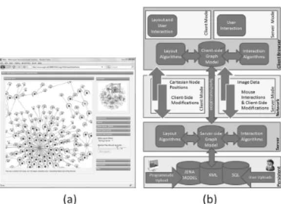
2. 3 WiGis
WiGis [6]is a web-based large graph visualizing tool system developed by Grettarson et al.. WiGis contains 2 parts, a client and a server, which are connected via intranet or internet. Basic idea of WiGis is to let all the time consuming calculation to be done on a server while a client performs lighter tasks and interacts with users. With this architec-ture, client’s computer processing power and mem-ory has no effect at all on the sizes of the graphs that are being visualized. This allows any com-puter to visualize large graphs. This architecture is shown in Figure 4b.
In Wigis, the whole graph model must be stored in a server. The server capability will determine the limit of the sizes of the graphs that a client can display. In the research of Grettarson et al., graphs up to 1 million nodes and 2 million edges can be displayed with this system. A client with good internet connection can access the tool from anywhere in the world. This feature of WiGis al-lows the users to bypass system limitations (mem-ory limit, calculation time, and rendering power),
164
Fig. 4 (a) WiGis client (b) WiGis architecture
but requires internet access instead.
WiGis has 2 modes of operation, client mode and server mode. In client mode, graph models are sent to a client’s computer then the client’s computer it-self will perform the drawing. Since this application runs solely on web browsers such as Mozilla Firefox or Google Chrome (Figure 4a), its drawing tools are DHTML images for nodes and SVG lines for edges. Using JavaScript, both drawing tools are native to web browser and require no other plugin or special environment. This mode is used when the graphs or parts of the graphs that the users are visualizing is small enough for the user’s computer to perform the drawing by itself. The threshold value of this mode varies by computer to computer. When users inter-act with models in client mode, the models which are stored in servers will be interacted in the same way to keep consistency. This synchronization is done by AJAX coding.
When the amount of nodes and edges being viewed exceeds client’s computer’s limit, WiGis switches to server mode. In this mode, all layout computations and interactions are computed in a server. Once calculations are done, the bitmap im-ages of the result are sent to the client for display. During this mode, client’s main role is to capture user’s interactions such as mouse clicks or drags and send them back to the server. These are done by JavaScript on client’s web browser. The whole process needs to be done in a very fast manner to make visualization smooth.
WiGis offers limited selection of graph layouts in 2D format from its JavaScript drop down menu. Notable characteristic of layout in WiGis is that it will apply new layout only on nodes that are
displayed in main window (in client’s machine) at that time, not the whole graph. This is due to WiGis architecture that allows the client side to store only partial model of the whole graph while in client mode. Users can use panning, zooming and overview methods for changing their view. Abstraction techniques such as clustering are also available to use. Another useful interac-tion funcinterac-tion of WiGis is interpolainterac-tion, invented by Trethewey and Hollerer [7]. This allows the mov-ing of one node to affect other nodes (from some nearby nodes up to every node in the graph). This function can create meaningful layouts with just a few interactions especially when the graphs have specific topological characteristics such as tree or planar.
A major disadvantage of this technique is that the server receives heavy work load, especially when multiple clients are running at the same time. For each client, the server must allocate memory for storing the whole graph, and that memory must be reserved at all times on the server until the client ends its session. Another limitation of this sys-tem is that a decent internet connection is required on client machines. Average image size generated from the server is about 30kB. To make interactions as smooth as 10 frames per second, internet speed must be at least 300kB/s.
2. 4 CGV
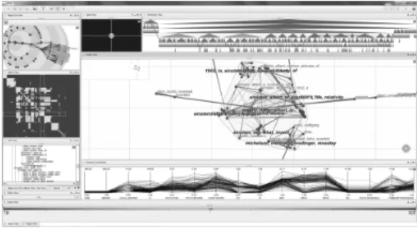
CGV [8] or Coordinated Graph Visualization is a 2D graph visualizing tool developed by Tominski et al. [9]. CGV’s strategy for handling large graphs is to avoid drawing the whole graphs in full detail. Nodes and edges are abstracted in many meaning-ful ways when users are looking at the whole graph. While zoom level is high, graphs are viewed as nor-mal node-link diagram. CGV highly emphasizes interactions and visualization techniques. These in-teractions and techniques are based on various re-search papers. Techniques used in this program are multiple views visualization, Magic eye view based on Walker layout by Buchheim er al. [10], Reingold-Tilford layouts [11], Text tree view, Edge-bundling, Pan-scroll navigating and more. By offering many coordinated views, users’ understanding of the data sets is improved.
CGV’s multiple views system consists of 7 views pointing to the same data at the same time
(Fig-Fig. 5 CGV interface showing 7 types of view
ure 5). The views are magic eye view, splat view, matrix view, hierarchy view, text tree view, paral-lel coordination view and main graph view. Any actions done to a node in any view will result in changing on all views. For example, hovering mouse over a node in main view will trigger high-lights on that node in all other views. Views with animation such as magic eye and main view are cor-responded accordingly to allow users to keep track of each change. For example, when users select a node from text tree view, camera in main view automatically zoom out, pan to target region and then zoom in on the selected node. Some actions such as panning or zooming affect only the views that the users are currently interacting with.
Unlike most visualization tools, CGV’s main graph layout cannot be selected, but it is chosen automatically from spring embedded, LinLog or squarified treemap layouts depending on the sit-uations. Edges can be represented with 3 styles: plain, proportional and bundled. Proportional style can display weight contribution to the node. Bundled style can make graphs look cleaner and let users spot the clusters property. Apart from pan, zoom, and cross view interaction, main view offers other interaction methods such as pan-wheel inter-action with radar view. Pan-wheel interinter-action acts in the same behavior as pressing middle mouse but-ton in the web browser while radar view provides look-ahead objects. These 2 techniques are based on the work by Gustafson et al. [12]. Edge crawling action is also available in main view. This can be performed by ctrl and shift click on a node to lock, then right/left click on edge corresponding to that node. Due to the hierarchical structure of visual-ization, users can expand/collapse nodes by double left/right clicks, respectively. Another useful
visu-alization function in main view is the lens which is based on the previous work by the developer of this program [13]. There are 4 types of lens avail-able to use; 1) local edge lens - edges that are not connected to any nodes in lens area will grey out, 2) layout lens - nodes that are connected to the nodes in lens range will be temporary moved into lens area, 3) fisheye lens - provide magnifier like zooming in lens area, 4) composite lens - lens that combine all 3 other lenses. Lens can be activated by middle mouse button and can be configured in view setting window.
CGV also offers dynamic filtering. Filtering is a coordinate action which means that it will af-fect all views. Each filter function can be union or intersected with each other. This function can greatly help in the visualization of large network where each node has many attributes. Filtered ob-jects can be made dim or totally disappear.
2. 5 VisANT
VisANT [24]is a large graph visualization pro-gram specifically made for bioinformatics. Using J2EEtm and Tomcat server, its first version is de-veloped by Hu et al. in 2004[25]. The current latest version 4.03 is released in August 2012. VisANT, by all means, is not suitable for visualizing or ana-lyzing normal networks at all since most functional-ities are very specific for bioinformatics field. How-ever, VisANT offers many advantages compared to other visualization tools in bioinformatics field in-cluding visualization tools in other fields as well. The first major advantage is that VisANT is al-lowed to run in many forms, according to users’ needs; Java applet, Java web application, stand-alone Java local application and batch mode (com-mand line). The next advantage is that VisANT was made on client/server framework which allows many online functionalities.
Running VisANT in Java applet is the easiest method for accessing VisANT because it can be run anywhere with Java supported web browsers and an internet connection. Moreover, with this method, VisANT is always the latest version. Drawback of this method is that the users are not allowed to in-teract with local files due to security reasons. Java web application version of VisANT is very simi-lar to the applet version but the users can access their local files, and web browsers are not needed
166
in this mode. However, Java runtime is required. Stand-alone local application of VisANT is oriented more toward plugin developers. Users that use this version need to update VisANT manually, which is good for plugin development. The last mode, batch mode or command line mode, are for automated multiple processes or time consuming operations. This mode runs its computation in the background process where users’ interactions are not needed. This mode is also designed for running VisANT on super/cluster computers. With this mode, VisANT can handle up to millions nodes and edges. Macro or script writing skill is required for this mode of operation.
VisANT server contains a huge database of bioin-formatics information such as associations between proteins or gene expressions. VisANT client can get those data directly from VisANT database via the internet. This method is suitable for the vi-sualization of some specific interested topics that are changing or updated frequently. For example, the data such as Wikipedia or bioinformatics data are suitable because these data sets are the same for everyone, and are updated all the time. When data is updated, everyone that is currently working on that data will know and receive the latest ver-sion. Moreover, users can search for specific pro-teins, gene compounds or pathways and then dis-play them in the main window. This paradigm is applicable for any huge graph with many clusters or partitions as well. Another advantage for using client/server framework is its online data storage. VisANT users need to create an account for login. In return, VisANT allows users to save sessions on-line which means that users are not bound to cur-rent working machines. This proves to be useful when current machine does not have capacity for processing large data. Users can continue working on better machine with the same session and login name.
2. 6 igraph library
Igraph library [33] is an open source ANSCI C based library for graph analysis. Igrpah was de-veloped and published in 2006 by G´abor Cs´adir and Tam´az Nepusz [34]. The goals of developing igraph are to create a library that can handle large scale graphs, and at the same time can be embed-ded to existing high level languages such as GNU
R or Python. Igraph performs analysis tasks ex-tremely well, due to its efficient algorithms, but on the downside its graph visualization is somewhat limited.
The latest release version is 0.6 which was re-leased in June 2012. Igraph continues to become more and more complex and accumulate up-to-date algorithms into its library. For example, igraph probably has the highest number of graph lay-out available compared with other tools in this re-view. All well-known layouts are included, such as Fruchterman Reingold, Kamada Kawai, DrL, Sugiyama, lgl and more. At the same time, more and more system can run igraph. The latest is the Ruby environment. The disadvantages of igraph are the lack of graph visualization and graph inter-action functions. This is because most of its func-tions are for graph analysis and it mostly runs on command line based platform. Also its usage and installation is a less user-friendly than other normal “install and run” graph visualization softwares.
Unlike other tools mentioned above, igraph is a library and thus cannot run on its own. However, there is an advantage with this approach - which is flexibility. Igraph can be used in almost every modern platform such as Microsoft Windows, Ap-ple Mac OS and many Linux distributions. Igraph can be installed in 4 forms, as a C library, as an R package, as a Python extension module, or as a Ruby extension. The advantage of this approach is that igraph can work with the benefits of each plat-form, for example, unique functionalities of GNU R environment or Ruby’s object orient nature.
The key to this flexibility of igraph lies in its ar-chitecture. Three-layer architecture is used. The lowest layer is basic graph operations implemented in C. Graph data manipulation occurs only in this layer. The second layer is graph operations layer, also written in C. Most analysis functionalities are performed in this layer. The highest layer is in-terface layer. This layer is where igraph communi-cates with other high level languages such as R or Python. Igraph on every platform uses the same lowest layer and second layer.
By using C in their low level architecture, and with the careful implementation of algorithms, igraph is very fast. This is one of the objectives of the developers since igraph was designed to work with large scale data set in the first place. Igraph
can handle up to millions of nodes and edges. The capacity depends solely on user’s machine memory. Moreover, for large scale calculation, Grid comput-ing can be used with igraph. For new users, igraph is very well documented and has many useful tuto-rials which make up somewhat for the complexity of the installation.
2. 7 Pajek
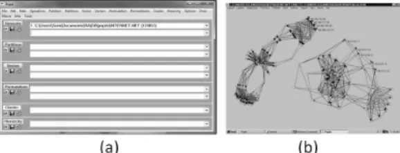
Pajek [17] is probably one of the oldest large graph visualization and analysis tool that is still in use and updated. It was created by Vladimir Batagelj and Andrej Mrvar [18] in 1996 for Mi-crosoft Windows. To solve memory limit problem, Pajek 2.5 was released in September 2011 along with Pajek4G for using 4 gigabytes maximum mem-ory in 32bit Pajek, and Pajek64 for 64bit system with practically no maximum memory limit. Pajek 3.07 is released in October 2012. Since displaying the whole graphs in detail is not possible for large graphs, Pajek offered both abstraction and selec-tion approach for this problem. Moreover, Pajek offers many algorithms for network analysis. This is due to the developers who have continuted up-dating this program for a very long period of time. Pajek’s structure is unique compared to more recent visualization tools where users can inter-actively modify the graph structure and change node/edge attributes through direct manipulations. It contains 2 separated windows, main window and draw window (Figure 6a and 6b). Main window is for data manipulation such as load/save files, and performing algorithms on data set such as cluster-ing or partitioncluster-ing. Draw window are mainly for visualization only. By separating 2 windows from each other, Pajek can perform data manipulation faster compared to the other tools that combine both view together. This is because graph view is not being rendered until users order it. Users can observe graphs visually only when “draw” com-mand is clicked to pop out the draw window. Some visualizing modifications such as changing graph layouts or changing display properties (node names or edge colors) can be done in draw window. Pa-jek is also known for its ability to display bipartite graphs and temporal networks (dynamic graphs).
Pajek use 6 types of data to perform the visual-ization and analysis, namely - network, partition, vector, cluster, permutation and hierarchy.
Net-Fig. 6 (a) Pajek main window (b) Pajek draw window
work is the list of nodes, edges, and how they are connecting to each other. This is the most impor-tant data. Partition is a group indication of each node. Each node can belong to only one partition. Vector displays additional values for nodes. Each node can have many vector values. Vectors are nor-mally used for displaying node attributes such as nodes’ size, label, or weight. Cluster is very simi-lar to partition. Cluster is a subset of vertices that generate from clustering algorithm. Permutation is a node reordering list. Lastly, hierarchy displays hi-erarchical order of vertices (such as tree structure). Main window consists of many drop-down lists for managing all 6 data types. These drop-down lists are acting as history functions found in photo editing programs like Adobe Photoshop. Users can select each action that users have done in the past from this drop-down list. This action reverts graphs back to that state. This is very useful when users want to make changes to the data set with various algorithms and compare the results. When users make changes to data set, it will create a copy of data set and apply changes to that newly created data set instead. This function is similar to “fork” function used in SVN. In my opinion, this is very useful for graph visualizing tools.
Series of menus are on top of the main window. Upon selecting the menu, long list of functions are shown. Each category belongs to each data type, such as “Permutation” contains operations that af-fect permutation of networks such as random or-dering or inverse.
Draw window is for visualizing selected data set from main window. Users can perform visualization techniques such as changing layouts, pan, zoom, rotate, remove node labels or export graph to 3D format which can be viewed with external 3D visu-alization tools.
168
Overall, Pajek is a very powerful tool, consid-ering all the algorithms and functionalities it has. However, Pajek is very complex to use due to its unique user interface and rich functions.
2. 8 Gephi
Gephi[35] [36], developed by Mathieu Bastian, is one of the most popular open source softwares for visualization and analysis of large networks (Fig-ure 7). Gephi has been selected for Google Sum-mer of Code event every year since 2009, thus gain-ing popularity and reputation from the community. Written in Java language on Netbeans platform, Gephi can run on all modern platforms including Microsoft Windows, Apple Mac OS X, and Linux. The main goal of Gephi is exploratory data analysis - an approach to understanding and summarizing the main characteristics of the data set in easy to understand form, usually with visual graphs. Thus many visualization techniques are included in this tool. Gephi’s 3 main concepts are usability, perfor-mance, and modularity.
Real time graph visualization and manipulation is the main feature of Gephi. To achieve its “real time” goal, fast rendering engine is needed. Gephi uses OpenGL as their main visual engine. This boosts the graphical performance tremendously compared to other tools that use CPU as their rendering engine. Gephi can display up to 50,000 nodes and 500,000 edges at the same time. It can perform many graph manipulation such as dynamic filtering, clustering, customizing colors, changing sizes, edge bundling and more. Many graph lay-outs are available and can be added to the system with plugin feature. With its unparalleled ability to manipulate graphs’ visual, Gephi got its nickname as “Photoshop for graphs”.
Gephi uses plugin system to support its modular architecture, which allows any developer to create more functionality and then add it to the system. This is one of the advantages of using Netbeans platform. Another feature that makes Gephi stand-out from other tools is the usability. Most function-ality in Gephi is in GUI format and offer real time results.
Gephi is still in very active development state. In version 0.8.1 beta, released in March 2012, Gephi introduced timeline function which enables Gephi to handle dynamic networks.
Fig. 7 Preview image of Gephi 0.7
2. 9 In Situ Framework
In Situ framework is proposed by Hadlak et al. [14] for visualizing dynamic graph structure. “In Situ” in user interface field means to display or perform another function within the program itself. For example, while writing a document with word processing program, users can edit pictures with-out using any picture editing program. But, users can edit a picture by using picture editing function of word processing program itself. In this case, In Situ visualization means users can use other type of visualization technique within other visualization technique (Figure 8a and 8b). For example, while users view the whole graph with node-edge layout, users can select an area or a cluster and then ex-pand it in another window. Then, users can view that area with bar chart or other visualization tech-nique. With this metaphor, large scale graphs or dynamic graphs can be easily explored.
In Situ framework defines 9 types of graph visu-alization based on structure and time.
UU: unreduced structure / unreduced time -Users can see full detailed graphs with all time points. Thus this method requires very large dis-play space and is seldom used.
SU: selected structure / unreduced time - Only interested nodes or clusters are selected for viewing at every time points. This visualization is mainly for observing the change of attributes in time as-pect, such as viewing the number of customers en-tering a particular shop during the day.
AU: abstract structure / unreduced time - Since displaying the whole graphs in full detail is resource consuming, this method offers to display only ab-stract of the whole graphs such as clustering or
dis-Fig. 8 In Situ Framework. (a) 1: base visu-alization in node-link diagram. 2: dis-playing subgraph in complexity plot. 3: displaying subgraph in 1.5D tech-nique. 4: detailng subgraph from 3 with matrix view. (b) Use case from village network, Rostock, Ger-many. (c) Use case from gene SVN, base visualization shows temporal and branching of data in tree form while 2 selections are displaying for find the differences between these 2 time steps.
play graphs in attributes chart instead while dis-playing all time points.
US: unreduced structure / selected time - If graphs are relatively small but contain many time points, only important time points can be selected and displayed.
UA: unreduced structure / abstract time - Time attributes can be abstracted in many ways such as using height or z-axis or alpha valued for display-ing time points. Another possible method is to use average value from all time points.
SS, SA, AS, and AA are the combination of the above methods.
“Zoom, Filter and Analyze Further”: once users decide which area to investigate, they can select that area with mouse clicks or dragging of a mouse to create a selection box over that area. This step
is when In Situ visualization starts to show its ef-fectiveness. With normal visualization, once area is selected, main view port will zoom to that area, while with In Situ, users can choose to keep the overview in main window and open selected area in new window with different visualization technique. Methods such as AS and SA are used in this step. If a network is very large or contains many time points, this step may need to be performed more than once.
“Details on Demand”: the last step in the mantra is done by US or SU depending on which aspect is being focused (time or structure) or done by SS if both aspectd are specified. Techniques used in this phase are called detailed techniques.
2. 10 Honeycomb
Honeycomb is a large scale network analysis tool based on colored matrix developed by Ham et al. [16]. Honeycomb applies 2 levels of abstraction to large graphs before displaying. The first step is to abstract node-link data into clusters by some means such as topological or hierarchical properties, and to apply those data into colored matrix. Represent-ing graph in matrix format can grant users new in-sight, and also improve users’ understanding of the data sets.
In a normal adjacency matrix without weight, each cell will be either 0 or 1 which can be rep-resented by white and black in a colored matrix. However, when nodes are clustered, these cells must represent their abstract values. For example, when 3x3 nodes matrix is clustered into one cell and there are four 1 and two 0 values (self-edge is not al-lowed), the value representing the cell is 4/6 which is 0.67. This value will be translated into colors and put into that cell. (Figure 9)
Matrix visualization of large network has sev-eral advantages over typical node-link diagrams. First of all, matrix requires much less computation power. Ham et al. managed to draw 37,000 nodes
170
with more than 400,000 edges with just 200M of RAM. Second, especially in dense network, a node-link diagram is very hard to understand. It is al-most impossible to find any meaningful meaning due to human perception limit. Matrix diagram offers much less complexity especially when visual-izing dynamic networks by time slider or animation. Node-edge dynamic animation is harder to under-stand due to the movement of node-edge positions, while in matrix visualization, only cell attributes are changing. Third, a matrix diagram offers the connectionless region of the network. This knowl-edge is hard to conceive in node-knowl-edge visualization and it is proved to be valuable in network analysis such as social networks.
The visualization starts with the matrix of the overview of whole dataset. Since each cell repre-sents a cluster of lower level matrix, users can clink on a cell to open that cell in another matrix win-dow. The cell itself which is represented by col-ored coding, can display many types of relations. The most basic one is connection count between clusters: the thicker the colors, the more connec-tion it has. However, this representation some-times cannot differentiate two clusters from each other. Therefore, Ham et al. offered two methods for displaying cells; which are asymmetric values, and deviation from expected values.
In direction-oriented networks such as social net-works, it is not necessary for 2 nodes to have edges point to each other in order to be connected. The asymmetry values will be counted when X points to Y while Y does not point to X. Ham et al. showed that, in their experiment data set, these values can instantly single out the entity that have many out-going connection while having less incoming con-nection. This clearly depicted the structure of the organization in the data set which was used in this experiment. Deviation from expected values is an-other technique introduced in Honeycomb. This method works in the same way as applying chi-square analysis. Experiments by Ham et al. showed that this value can also single out the anomalies in the data set.
3 Visualization toolkits
If visualization tools, reviewed in section 1, are tools for visualization, visualization toolkits are tools used for constructing visualization tools.
Toolkit in software engineering generally means a set or a container of tools that compliments each other in order to help users create a final prod-uct. In this case, visualization toolkits are toolk-its whose aim is the construction of visualization programs. Most toolkits come with specific pro-gramming languages such as Java or C++. There are many toolkits for visualization framework such as Prefuse [26], The InfoVis Toolkits [27], Piccolo [22] [28], and The Visualization Toolkit (VTK) [42]. These tools can be used to make visualization tools like Cytoscape [2] (made from Piccolo toolkit) or used for constructing small graph application with fixed database such as World flights [29] which is used for viewing flight routes from major airlines around the world.
In this section, we decided to introduce 2 newly created visualization toolkits. These are selected in this review for their outstanding per-formance on graph visualization. JavaScript In-foVis Toolkit provides highly interactive visualiza-tion while GraphGL can display graphs with more than 100,000 nodes on web browsers. Both are web browser-based visualization toolkits.
3. 1 JavaScript InfoVis Toolkit
As name implies, this JavaScript InfoVis Toolkit [30]provides tools for interactive data visualization for web using JavaScript. This small toolkit pro-vides highly interactive graph visualization via web browsers. The main advantages of this toolkit are that it is very easy to implement and it contains many pre-construct animations and interactions.
This toolkit offers many structured classes which are radial graph, force directed graph, icicle graph [37]- hierarchical clustering space filling visualiza-tion, sunburst graph [38]- radial space filling vi-sualization, bar chart, pie chart, area chart, tree map, and more. Input data of InfoVis toolkit is given with JSON [39](JavaScript Object Notation - something similar to XML) which is easy for hu-mans to understand. JavaScript InfoVis Toolkit emphasizes on view transitions and animations, which make the visualization very interactive and easy to follow. For example, when users click on one of the nodes in Figure 10 (a), the clicked node will be moved to the center of the circle and all other nodes will rearrange themselves automati-cally to maintain circular figure as seen in Figure
(a)
(b)
Fig. 10 JavaScript InfoVis Toolkit screen-shot, using radial graph structure. (a) displaying tree structured data. (b) a graph after one of the leaf node in (a) is selected.
10 (b). Since the distance from the center node to other nodes represents path length, it is easy to understand that center node in Figure 10 (b) has the highest path length of 4 while maximum path length of center node in Figure 10 (a) is 2. An-imations and interactions of nodes and edges are already embedded in structured classes. Users do not need to manage any animation at all. The only requirement for running visualization is to input the data set into structured classes. This project
is under open source license and many demos are available online at the developer’s website.
3. 2 GraphGL
GraphGL [31]is a library for large scale graph visualization. By using WebGL as its core li-brary and JavaScript as its programming language, this library fully supports 3D visualization in web browser. Its advantage over other toolkits is that GraphGL can render large scale graphs (more than 100k nodes and 200k edges) on web browser while maintaining reasonable performance at 3-5 frames per second (Figure 11). Normally, graph render-ing on web browser is done by usrender-ing Java based such as VisANT [24]or using browser itself such as Wigis [6]. The maximum limit of nodes and edges that can be rendered at the same time is severely limited, which prevents the whole graph from be-ing rendered. Their solutions are to use visualiza-tion techniques (VisANT) or render on a remote server (WiGis). However, with WebGL, it is pos-sible to render large graph on web browser. This allows researchers to easily explore the large data set. GraphGL’s goal is to be an open source net-work exploration tool for the web.
GraphGL imports data by JSON [39], same as JavaScript based library, which can be easily inter-grated into Java applet or Java application. We-bGL, based on OpenGL ES 2.0, uses GL calls which are faster than Java2D which in turn make graph drawings faster and use less memory. Moreover, WebGL also utilizes GPU in order to draw objects.
Fig. 11 GraphGL drawing 100k nodes in web browser.
172
If a running machine has GPU installed, the result will be even faster. GraphGL, developed by Urban ˇ
Skudnik, has emerged only recently and still away from its completion, but it has shown its potential from the examples in developer’s website.
4 Suggestions for large graph visualization platform
In our opinion, for displaying large graphs, there are three main technological challenges. The first is the amount of memory needed. To maintain all nodes and edges of large graphs while performing various analysis tasks, a large memory is required. On normal personal computers, 4G of RAM is more than enough for everyday use but it may not be enough for large graphs. This problem can be easily fixed by purchasing more memories and installing them on the machine. However, if we want to dis-play the same graphs on other computers, those computers must also be upgraded. The second is computation time. This refers to the tasks that require much computation power such as complex or time consuming algorithms. Some tasks require hours or days. Unlike the memory problem where memory can be added for as easy solution, upgrad-ing CPU is much harder. New CPU will require new mainboard and new mainboard may conflict with memory or other hardware. Moreover, up-grading CPU on personal computer, in most cases, is not efficient at all. Another solution is to let pow-erful computer do the calculation instead, such as super computer or cloud or grid computing. How-ever, accessing those machines is troublesome and requires special coding technique. And the third is rendering power. Rendering millions of nodes and edges takes a lot of time. To interact with graphs, users should acquire at least 1 frame per second of rendering speed. This problem is already widely re-searched and the solution is to use GPU to help ren-der the graphs. It is possible to install graphic cards for every computer that visualizes large graphs, but powerful graphic cards are expensive and it is not very cost efficient.
Therefore, to provide a solution for the above 3 problems, we propose a 3-Tier framework (Figure 12), a framework that allows users to view and in-teract with large graphs in a very fast manner and also allows heavy computation tasks from any
com-Fig. 12 Over view of 3-tier framework
puter. This system is based on WiGis [6]and Alle-groMCODE [5].
The 3-Tier framework consists of 3 parts: a client, a server and a super computer. Client will be run on web browser that supports JavaScript and WebGL. Main tasks of the client are to inter-act with users. These include displaying graphs to users, recieving users’ inputs and sending them to the server, performing login authorization, receiv-ing models uploaded from users, and exportreceiv-ing re-sult to other formats. Large scale rendering will not be executed by the client but instead will use WiGis framework’s server mode method; send user’s inter-actions to a server, let the server render it and then send bitmap images to the client. Light rendering tasks such as rendering overview will be done on client with WebGL or other toolkits. Login system is proved to be very useful by VisANT[25]because it allows users to save their sessions online and can continue working from any machine. Another ben-efit of using web based client is that the client will always be the latest version.
A server, which is the most important part of the system, is where the whole graph model is stored. After receiving interaction commands from a client via the internet, the server will compute and ren-der the results into bitmap images and send them to the client. Therefore, the server must have a large memory pool in order to store large graph models. Server may need to store more than one model at the time if multiple clients are running at a same time. One of the advantages of having all models stored in the same place is that the result can be shared between users. For example, if user A and B are working on the same data set, if user A performs a clustering task on the data set which takes sev-eral hours to complete, and if user B performs the same task after user A, then user B should get the results immediately since user A has already
com-puted it. Another advantage is that it is very easy to update the data since there is only one data for those users. These 2 characteristics are normal in bioinformatics field where database is shared as in Cytoscape’s and VisANT’s databases, and should also be used in another field as well. For render-ing speed, Tulip [20] or AllegroMCODE [5] have shown that using GPU can speed up the rendering dramatically. Therefore, it is necessary for a server to have multiple powerful GPUs in order to render large graphs effectively. The server will also per-form light computation tasks for its client and then send the results back once it is done. However, in some cases, if computation is heavy and time con-suming, the server may transfer the calculation to a super computer instead.
A super computer mainly receives heavy compu-tation task from a server, generate results, and then return them back to the server. The server should then store the results (in case the same calculation was asked again) and send the results to its client. The difficult part here is to perform a computation on super computer. Ordering a computation on multiple CPUs system is not as simple as working on a single CPU system. However, this part should be done automatically by the server and not users. Since this system is based on WiGis client server framework, it has the same drawback. The problem is that the internet connection is required. More-over, the connection should be fast. To receive a smooth real time graph manipulation, at least 5 frames per second should be acquired. Image size and internet connection speed is one factor that influences the frame per second. The size of the image file sent from server is depended on the res-olution of the image. At 600x600 pixels resres-olution, the average size is 34kB. While at 1200x1200 pixels resolution (4 times of 600x600 pixels area) the av-erage size becomes about 150kB (1.2mb). Assume that internet connection speed is at 1mb per second (common internet connection speed in residential areas in the USA [6]), the frame rate of 1200x1200 pixels image is less than 1 frame per second from network delay alone. However, WiGis framework uses bitmap image, which is uncompressed image format. It is possible to compressed bitmap image into other picture format to reduce the network de-lay.
Another challenge of large graph visualization,
Fig. 13 In Situ Viewer concept art
apart from hardware restriction budget, is user’s own cognitive ability. In our opinion, CGV [9]and In Situ framework [14]are very suitable for solving this problem. CGV solves the problem by providing many views of the data that synchronize with each other while In Situ uses the top down approach, viewing from top level to lower level with options to change the visualization style in any level. How-ever, since 3-Tier’s server should support only main view of graphs which is rendering heavy, overview view such as node-link or Reingold-Tilford layout should be maintain by the client itself. On the other hand, In Situ framework is interesting but its implementation may prove troublesome for 3-Tier system, since their main view is divided into many small windows. Therefore, we want to introduce In Situ viewer, a tool for managing various views visualization (Figure 13). This viewer will act as a roll of film that stores the states of visualization. Each time users decide to jump to the next level or to change the visualization technique, current main view will be stored in the film slot and let new visualization take the main view. Users can also select old views in film slot to bring them back to main view. Each view in film slot will contain the link with its previous view to show the relations to users. This state metaphor is adapted from Pa-jek [18]files management system, but this is used for storing graph states instead. This viewer should work well with 3-Tier system since main view is a bitmap image sent from its server. A client just needs to store those images in a viewer. However, on the server side, each time users perform a store event, the server need to store those model stages
174
as well which can consume some memories.
Acknowledgments
The authors would like to thank Prof. Ken Wakita (Tokyo Institute of Technology), Prof. Hi-roshi Hosobe (National Institute of Informatics), and Ms. Reiko Yamamoto (JST CREST) for their insightful comments. This research was supported by JST, CREST.
References
[ 1 ] Zhou, H., Shaverdian, A.A., Jagadish, H.V. and Michailidis, G.: Multiple step social structure anal-ysis with Cytoscape, in IEEE Symposium on Vi-sual Analytics Science and Technology,VAST 2009, pp. 263–264.
[ 2 ] http://www.cytoscape.org/
[ 3 ] http://www.mkbergman.com/415/cytoscape- hands-down-winner-for-large-scale-graph-visualization/.
[ 4 ] Smoot, M. E., Ono, K., Ruscheinski, J., Wang, P.L. and Ideker, T.: Cytoscape 2.8: new features for data integration and network visualization, Bioin-formatics, Vol. 27, issue 3 (2011), pp. 431–432. Pub-lished online 2010 December 12.
[ 5 ] Yoon, J. S. and Chung, W. H.: A GPU-accelerated bioinformatics application for large-scale protein interaction networks, APBC poster presentation, 2011.
[ 6 ] Gretarsson, B., Bostandjiev, S., O’Donovan, J. and H¨ollerer, T.: WiGis: A Framework for Scal-able Web-Based Interactive Graph Visualizations, in 17th International Symposium, Graph Drawing 2009, pp. 119–134 .
[ 7 ] Trethewey, P. and H¨ollerer, T.: Interactive ma-nipulation of large graph layouts., Technical report, Department of Computer Science, University of Cal-ifornia, Santa Barbara., 2009.
[ 8 ] http://www.informatik.uni-rostock.de / ct/software/CGV/CGV.html
[ 9 ] Tominski, C., Abello, J. and Schumann, H.: CGV An interactive graph visualization system,
Computers & Graphics, Vol. 33, Issue 6 (2009), pp. 660–678.
[10] Buchheim, C., Junger, M. and Leipert, S.: Im-proving Walker’s algorithm to run in linear time, in Proceedings of the international symposium on graph drawing(GD), Berlin, Springer, 2002. [11] Reingold, E.M. and Tilford J.S.: Tidier drawings
of trees,IEEE Transactions on Software Engineer-ing, Vol. 7, Issue 2 (1981), pp. 223–228.
[12] Gustafson, S., Baudisch, P., Gutwin, C. and Wedge I.P.: clutter-free visualization of off-screen locations, inProceedings of the SIGCHI conference on human factors in computing systems(CHI), New
York, ACM, 2008.
[13] Tominski, C., Abello, J., van Ham, F. and Schu-mann, H.: Fisheye tree views and lenses for graph visualization, in Proceedings of the international conference information visualisation (IV), Silver Spring, MD, IEEE Computer Soc. Press, 2006. [14] Steffen, H., Hans-Jorg, S. and Heidrun, S.:
In Situ Exploration of Large Dynamic Networks,
IEEE Transactions on Visualization and Computer Graphics, Vol. 17, Issue 12 (2011), pp. 2334–2343. [15] Keim, D. A., Mansmann, F., Schneidewind, J.
and Ziegler, H.: Challenges in visual data analysis, inProc. of Information Visualization, 2006, pp. 9– 16.
[16] Ham, F., Schulz, H.J. and Dimicco, J.M.: Hon-eycomb : Visual Analysis of Large Scale Social Net-works, inProceedings of the 12th IFIP TC 13 Inter-national Conference on Human-Computer Interac-tion: Part II, 2009.
[17] http://pajek.imfm.si/doku.php
[18] Batagelj, V. and Mrvar, A.: Pajek - Analysis and Visualization of Large Networks, Graph Drawing Software, J¨unger, M., Mutzel, P. (Eds.), Springer, Berlin, 2003, pp. 77–103.
[19] http://tulip.labri.fr/TulipDrupal/
[20] Auber, D.: Tulip: A huge graph visualisation framework, Graph Drawing Softwares, Mathemat-ics and Visualization, Mutzel, P. and J¨unger, M. (eds.), Springer-Verlag, 2003, pp. 105–126.
[21] Moscovich, T., Chevalier, F., Henry, N., Pietrige, E. and Fekete, J.D.: Topology-aware navi-gation in large networks, inProceedings of the ACM CHI Conference on Human Factors in Computing Systems, 2009, pp. 2319–2328.
[22] http://www.piccolo2d.org/index.html
[23] Bastian, M., Heymann, S. and Jacomy, M.: Using Computer Games Techniques for Improv-ing Graph Visualization Efficiency, inIEEE-VGTC Symposium on Visualization, 2010.
[24] http://visant.bu.edu/
[25] Hu, Z., Mellor, J., Wu, J. and DeLisi, C.: VisANT: an online visualization and analysis tool for biological interaction data, BMC Bioinformat-ics, Vol. 5, 17.
[26] Heer, J., Card, S.K. and Landay, J.: Prefuse: a toolkit for interactive information visualization, inProceedings of the ACM Conference on Human Factors in Computing Systems, 2005 , pp. 421–430. [27] Fekete, J.D.: The InfoVis Toolkit, in Proceed-ings of the 10th IEEE Symposium on Information Visualization, 2004, pp. 167–174.
[28] Bederson, B.B., Grosjean, J. and Meyer, J.: Toolkit Design for Interactive Structured Graph-ics, IEEE Transactions on Software Engineering, Vol. 30, Issue 8 (2004), pp. 535–546.
[29] http://senchalabs.github.com/philogl/ PhiloGL/examples/worldFlights2/ [30] http://thejit.org/
[31] http://gephi.org/tag/webgl/
[32] Pinaud, B., Kuntz, P. and Picarougne, F.: The website for graph visualization software references (GVSR), in Proceedings of the 14th international conference on Graph drawing, 2007.
[33] http://igraph.sourceforge.net/
[34] Cs´ardi, G. and Nepusz T.: The igraph software package for complex network research, Inter Jour-nal,Complex Systems, 2006, p. 1695.
[35] http://gephi.org/
[36] Bastian, M., Heymann, S. and Jacomy M.: Gephi: an open source software for exploring and manipulating networks, inInternational AAAI Conference on Weblogs and Social Media, 2009. [37] Kruskal, J.B. and Landwehr, J.M.: Icicle Plots:
Better Displays for Hierarchical Clustering, The American Statistician, Vol. 37, No. 2(1983), pp. 162–168.
[38] Stako, J. and Zhang, E.: Focus+Context Dis-play and Navigation Techniques for Enhancing Ra-dial, Space-Filling Hierarchy Visualizations, in Pro-ceedings of the IEEE Symposium on Information Vizualization 2000.
[39] ECMA-262 ECMAScript Language Specifica-tion 5.1 ediSpecifica-tion, European AssociaSpecifica-tion for Standard-izing Information and Communication Systems, Geneva, Switzerland, 2011.
[40] Landesberger, T.V., Kuijper, A., Kohlhammer, J., Wijk, J.J.V., Fekete, J.D. and Fellner, D.W.: Visual Analysis of Large Graphs: State-of-the-Art and Future Research Challenges,Computer Graph-ics Forum, Vol. 30, Issue 6(2011), pp, 1719–1749. [41] Tollis, I.G., Battista, G.D., Eades, P. and
Tamassia, R.: Graph Drawing: Algorithms for the Visualization of Graphs, Prentice Hall Engineer-ing/Science/Mathematics, 1998.
[42] http://www.vtk.org/ [43] http://lgl.sourceforge.net/
[44] Koshida, M., Hosobe, H. and Wakita, K.: A Hierarchical Visualization Method for Large-Scale Social Networks,Computer Software, Vol.28, No.2(2011), pp. 202–216. (in Japanese)
[45] Itoh, M., Yoshinaga, N., Toyoda, M. and Kit-suregawa, M.: Analysis and Visualization of Tem-poral Changes in Bloggers’ Activities and Interests, inProceedings of IEEE Pacific Visualization Sym-posium(PacificVis2012), 2012, pp. 57–64.
[46] Matsubayashi, T., Nishida, K., Hoshiide, T.
and Fujimura, K.: Graph visualization of stream-ing data usstream-ing HTML5 inProceedings of 8th Neteco Symposium, 2012. (in Japanese)
[47] Toyoda, M. and Kitsuregawa, M.: Web Com-munity Chart : A Tool for Navigating the Web and Observing Its Evolution,IEICE transactions on in-formation and systems, Vol. E86-D, No. 6 (2003), pp. 1024–1031.
[48] Adai, A.T., Date, S.V., Wieland S. and Mar-cotte E.M.: LGL: creating a map of protein function with an algorithm for visualizing very large biologi-cal networks,Journal of Molecular Biology, Vol. 340 (2004), pp. 179–190. [49] http://www.dis.uniroma1.it/challenge9 /papers.shtml [50] http://www.youtube.com/watch?v =wxjU1gCRhCA Sorn Jarukasemratana
Currently a Ph.D. student at Tokyo Institute of Technology under the supervision of Dr. Tsuyoshi Mu-rata. He graduated his master de-gree from University of Tampere, Finland with M.Sc. in User Interface Software De-velopment. His bachelor degree is obtained from faculty of engineering, Chulalongkorn University, Thailand with computer engineering major.
Tsuyoshi Murata
He is an associate professor in the Department of Computer Science, Graduate School of Information Science and Engineering, Tokyo In-stitute of Technology. He obtained his doctor’s degree in Computer Science at Tokyo Institute of Technology in 1997, on the topic of Machine Discovery of Geometrical Theorems. At Tokyo Institute of Technology, he conducts research on Web mining and social network analysis.
![Fig. 2 AllegroMCODE [5] plugin architecture](https://thumb-us.123doks.com/thumbv2/123dok_us/1737962.2744511/4.773.407.693.105.223/fig-allegromcode-plugin-architecture.webp)