4980 Great America Parkway Santa Clara, CA 95054 USA +1(408)496-7400
Data Analysis and Reporting
with Brio Intelligence 6.6
Tables, Pivot Tables, Charts, and Reports
Data Analysis and Reporting with Brio Intelligence 6.6 — Tables, Pivot Tables, Charts, and Reports
Part Number 1209893
© Copyright 2002 Brio Software All rights reserved. Printed in the USA.
This product and related products and documentation are protected by copyright and are distributed under licenses restricting their use, copying, distribution, and
decompilation. No part of this product or related documentation may be reproduced in any form by any means without prior written permission of Brio Software and its licensors.
Brio Software
4980 Great America Parkway Santa Clara, CA 95054 +1(408)496-7400 [email protected] [email protected] www.Brio.com
Refer to the Brio Software License Agreement in this package before installing or using the product.
If you find any errors or problems with this documentation, please notify Brio Software. Brio Software does not guarantee that this document is without error. The information in this document is subject to change without notice.
Trademarks
Brio®, Brio Inform™, Brio Intelligence™, Brio Performance Applications™, Brio Performance Builder™, Brio Performance Suite™, Brio Performance Platform™, Brio Portal™, Brio Reports™, Brio Software™, Personal SQR™, and SQR™ are trademarks or registered trademarks of Brio Software in the United States and other countries. All other marks are the trademarks or servicemarks of Brio’s suppliers or partners and are the property of such third parties.
About This Book
CHAPTER 1 Introduction CHAPTER 2 Working with Tables
CHAPTER 3 Analyzing Data with Pivot Tables CHAPTER 4 Charting Data
CHAPTER 5 Designing Custom Reports Glossary
Index
About This Book
Audience . . . 1-xi In This Book . . . 1-xi Typographic Conventions . . . 1-xii Related Documents . . . 1-xiii Help . . . 1-xiii CHAPTER 1 Introduction
Brio Ingelligence’s Approach to Data Analysis and Reporting . . . 1-2 Brio Intelligence Reports . . . 1-3 CHAPTER 2 Working with Tables
Table Section . . . 2-2 Creating a Table . . . 2-3 Tables as a Data Staging Area . . . 2-3 Manipulating Table Data . . . 2-4 Limiting Data in a Table . . . 2-4 Sorting a Table . . . 2-5 Adding Computed Items . . . 2-6 Adding Grouping Columns . . . 2-7 Adding Date Groups . . . 2-9 Applying Data Functions to Tables . . . 2-10 Grand Total . . . 2-10 Break Total . . . 2-11 Working with Table Components . . . 2-12 Selecting Columns and Rows . . . 2-12 Deleting Columns . . . 2-12 Formatting Commands . . . 2-12 Table Menu Command Reference . . . 2-13
CHAPTER 3 Analyzing Data with Pivot Tables
Pivot Section . . . 3-2 Creating a Pivot Table . . . 3-3 Pivoting Data . . . 3-3 Charting a Pivot Table . . . 3-4 Working with Pivot Tables . . . 3-4 Selecting Pivot Table Elements . . . 3-4 Moving Pivot Table Elements . . . 3-5 Changing Label Nesting Levels . . . 3-6 Sorting Pivot Tables . . . 3-6 Using Data Calculations in Pivot Tables . . . 3-7 Adding Totals and Subtotals . . . 3-7 Adding Cumulative Totals . . . 3-8 Using Data Functions . . . 3-9 Using Surface Values in Data Functions . . . 3-11 Using Weighted Functions . . . 3-12 Adding Computed Items . . . 3-14 Pivot Menu Command Reference . . . 3-15 CHAPTER 4 Charting Data
Chart Section . . . 4-2 Charting Basics . . . 4-3 Chart Terminology . . . 4-3 Understanding Chart Dimensions . . . 4-4 Creating Charts . . . 4-5 Determining What Chart Format to Use . . . 4-6 Working with Two-dimensional Charts . . . 4-7 Using Pie Charts to Analyze Data . . . 4-7 Positioning Pie Slices . . . 4-8 Showing Positive and Negative Values . . . 4-8 Showing Pie Percentages . . . 4-9 Adding Lines to Labels . . . 4-9 Rotating Pie Charts . . . 4-9 Using 2-D Bar Charts to Analyze Data . . . 4-9
Contents vii Understanding Stacked Bar Charts . . . 4-13 Understanding Area Charts . . . 4-14 Understanding Ribbon Charts . . . 4-15 Understanding Line Charts . . . 4-16 Understanding Combination Charts . . . 4-16 Manipulating Chart Data . . . 4-18 Using Different Scales to Compare Related Values . . . 4-18 Using Data Functions in Charts . . . 4-19 Adding Computed Items . . . 4-20 Sorting Chart Items . . . 4-21 Sort Items . . . 4-22 Reference Items . . . 4-22 Functions . . . 4-23 Creating Pivot Tables from Charts . . . 4-23 Drilling into Charts . . . 4-24 Hiding and Focusing on Charted Data . . . 4-25 Focus On Items . . . 4-25 Hide Items . . . 4-25 Working with Chart Elements . . . 4-26 Selecting Chart Elements . . . 4-26 Changing the View of a Chart . . . 4-26 Zooming Charts . . . 4-26 Rotating and Elevating Charts . . . 4-27 Displaying Axis Grid Lines . . . 4-27 Inserting Text . . . 4-28 Changing Chart Legends . . . 4-29 Customizing Chart Properties and Labels . . . 4-30 Setting General Chart Properties . . . 4-30 Setting Chart Label Axis Properties . . . 4-32 Setting Chart Value Axis Properties . . . 4-33 Setting Bar Chart Properties . . . 4-34 Customizing Chart Patterns, Colors, and Labels . . . 4-35 Changing Chart Color Schemes and Fill Patterns . . . 4-35 Changing Chart Data Labels . . . 4-36 Changing Color of Chart Elements, Lines, and Text . . . 4-37 Chart Menu Command Reference . . . 4-38
CHAPTER 5 Designing Custom Reports
Report Section . . . 5-2 Report Section Elements . . . 5-3 Report Section Toolbar . . . 5-4 Expression Line . . . 5-5 Report Components . . . 5-7 Creating a Custom Report . . . 5-8 Inserting Additional Tables in a Custom Report . . . 5-10 Adding Report Groups . . . 5-10 Inserting Report Headers and Footers . . . 5-11 Inserting Page Headers and Footers . . . 5-11 Adding Other Report Elements . . . 5-12 Working with Graphic Elements . . . 5-12 Working with Fields . . . 5-13 About Computed Fields . . . 5-14 Inserting Limit Values . . . 5-15 Inserting Page Breaks . . . 5-16 Working with a Report Page . . . 5-17 Displaying Rulers . . . 5-17 Using Grids . . . 5-17 Using Design Guides . . . 5-17 Setting Up a Report . . . 5-18 Specifying Page Size . . . 5-18 Specifying Page Margins . . . 5-19 Setting Up Page Columns . . . 5-19 Enhancing Report Data . . . 5-20 Sorting Report Items . . . 5-20 Adding Computed Items . . . 5-21 Applying Data Functions . . . 5-22 Applying Break Totals . . . 5-23 Hiding and Focusing on Reported Data . . . 5-24 Focus On Items . . . 5-24 Hide Items . . . 5-24 Using Multiple Data Sources in a Report . . . 5-25 Creating Smart Reports . . . 5-27
Contents ix Formatting Report Items . . . 5-27 Converting Detail Reports from Versions Earlier than 6.0 . . . 5-29 Display Differences . . . 5-30 Conversion of Detail Report Categories . . . 5-30 Conversion of Data Area . . . 5-30 Conversion of Facts . . . 5-31 Conversion of Smart Reports . . . 5-31 Conversion of Graphic Objects . . . 5-31 Report Menu Command Reference . . . 5-32 Glossary
About This Book
Welcome to Data Analysis and Reporting with Brio Intelligence 6.6 — Tables,
Pivot Tables, Charts, and Reports. This book is designed to help you learn the
Brio Intelligence application, part of the Brio Intelligence integrated suite of powerful and easy-to-use business intelligence tools for query, OLAP analysis, and analytical reporting across the extended enterprise.
Audience
Data Analysis and Reporting with Brio Intelligence 6.6 is written for all levels of
Brio Intelligence users, from those who need to simply retrieve and view data in a report format, to those who need to build queries and reports as well as analyze data.
In This Book
Data Analysis and Reporting with Brio Intelligence 6.6 – Tables, Pivot Tables, Charts, and Reports, one of four books that explain how to use Brio Intelligence
(see “Related Documents” on page xiii), shows you how to use Brio
Intelligence to analyze database information and create a wide range of reports including tables, pivot tables, charts, and free-form, presentation-quality reports for broad-scale publishing across the organization.
■ Chapter 1, “Introduction,” introduces the types of reports available in Brio
Intelligence and provides an overview of reporting concepts. It also explains Brio Intelligence’s approach to analyzing and reporting data.
■ Chapter 2, “Working with Tables,” explains how to use tables to organize
■ Chapter 3, “Analyzing Data with Pivot Tables,” explains how to use pivot
tables to quickly summarize or cross-tabulate large amounts of data.
■ Chapter 4, “Charting Data,” explains how to use Brio Intelligence’s charting
features to perform interactive analysis of your data in a graphic format.
■ Chapter 5, “Designing Custom Reports,” explains how to use the Report
Designer, Brio Intelligence’s dynamic analytical report writer, to create free-form, presentation-quality reports.
In addition, a glossary and index provide definitions and easy access to information contained in the book.
Typographic Conventions
This book uses the following type conventions:
■ Options, buttons, or tabs that you need to choose and text that you need to
type are indicated in bold.
Select Typical Install. Type 1234.
■ Key names are shown in square brackets.
Press [Down Arrow]
■ Two key names joined with a plus sign (+) are consecutive keystrokes. Press
and hold down the first key while pressing the second key. Press [Ctrl+Z].
■ Options in a menu command path are separated with an arrow. The
example indicates that you are to open the File menu and choose the Open
menu item.
Choose File→Open. [Ctrl+O]
Note When an instruction includes a menu command, the toolbar icon (if one exists) for the command appears in the left margin. The keyboard shortcut (if one exists) for the command is listed in brackets at the end of the line.
Help xiii
■ Files, directories, and paths are shown in a monospace font.
Sample1.bqy is located in the BrioQuery/Samplesdirectory. ■ A Note, Tip, or Caution is a brief side-note that deserves special attention or
does not fit within the normal flow of text. These types of information are set off in the text by an icon in the margin.
Tip This is an example tip.
Caution This is an example caution.
Related Documents
Along with the Data Analysis and Reporting with Brio Intelligence 6.6 book, there are three additional Brio Intelligence books:
■ Getting Started with Brio Intelligence 6.6 – Query and Results provides an
overview of Brio Intelligence and explains the user interface and basic commands. It includes how to retrieve data, how to query new data and change existing queries, and how to query a single database as well as multiple databases. It also covers how to work with query results.
■ Brio Intelligence 6.6 Administrator’s Guide explains data modeling,
including how to modify existing data models, and create new data models. It also discusses metadata definitions, database connectivity, and document scheduling.
■ Brio Intelligence Object Model and Executive Information Systems explains
the Brio Intelligence Object Model and how to create custom EIS applications using JavaScript.
Help
Brio Intelligence comes with a number of user manuals as well as an extensive online help system. If you need help with Brio Intelligence and cannot find the answers you need in the documentation, and you have a current Brio Technical Support agreement, call Brio Technical Support at +1(800)337-6324 (within North America) or +1(619)610-5769. You may also send an email message to
Please be prepared to provide your valid customer number and company name. You also need to know the version of Brio Intelligence you are using.
✰
1-1
1
Introduction
Welcome to Data Analysis and Reporting with Brio Intelligence 6.6 Tables, Pivot
Tables, Charts, and Reports. This book shows you how to use Brio Intelligence
to analyze database information and create a wide range of reports including tables, pivot tables, charts, and free-form, presentation-quality reports for broad-scale publishing across the organization.
This book assumes that you are familiar with the terms and concepts covered in Getting Started with Brio Intelligence 6.6.
This chapter introduces the types of reports available in Brio Intelligence and provides an overview of reporting concepts. It also explains Brio Intelligence’s approach to analyzing and reporting data. This chapter includes:
■ Brio Ingelligence’s Approach to Data Analysis and Reporting ■ Brio Intelligence Reports
Brio Ingelligence’s Approach to Data Analysis and Reporting
Once a query is processed and data results are returned to the desktop, you can use Brio Intelligence’s reporting and analysis tools to create custom views, cross-sections, and drill-downs to slice and dice data and view the
multidimensional relationships it contains. You may create as many different views of the data as you wish, and display the information in any form and from any angle possible. You can also use Brio Intelligence to work
autonomously with data. Even without a database connection, you can analyze data and produce reports.
Brio Intelligence’s report features include:
■ A point-and-click interface for intuitive custom report building. ■ Easy, non-procedural navigation between reporting sections.
■ A drag-and-drop Outliner tool for developing reports and analyzing data. ■ Interactive pivot reporting that lets you perform unrestricted drill-down
analysis of different data relationships.
■ Extensive formatting tools for creating compelling data presentations. ■ An easy-to-use, interactive charting utility for graphically displaying and
Brio Intelligence Reports 1-3
Brio Intelligence Reports
Brio Intelligence enables you to create a wide variety of reports, including:
■ Tables – Columnar arrangements of data. Tables are used as building blocks
in other reporting sections. You can apply limits to tables, add computed items, include subtotals and grand totals, as well as summary totals such as sum, count or average.
■ Pivot tables – Interactive tables that quickly summarize or cross-tabulate
large amounts of data. You can rotate rows and columns to see different summaries of data or display the details for areas of interest. A pivot table summarized data by using a summary function that you specify, such as Sum, Count, or Average. You can include subtotals and grand totals automatically, or use your own formulas by adding computed items.
■ Charts – A visual display of information; fully interactive,
three-dimensional views of data. Brio Intelligence displays data from results sets as bars, lines, columns, pie slices, or other shapes in the chart. When you create a chart, the values from the worksheet are automatically represented in the chart. Charts are linked to the data they are created from and are updated when you change the data.
■ Custom reports – Using Brio Intelligence’s Report Designer, you can create
free-form presentation-quality reports with graphic objects, predefined fields, band-style report data from multiple data sources and computed fields, charts, and pivots; Smart reports allow you to embed charts and pivot tables and show only the data that is relevant to the section in which they are placed.
2-1
2
Working with Tables
This chapter explains how to use tables to organize your data. It contains:
■ Table Section ■ Creating a Table
■ Tables as a Data Staging Area ■ Manipulating Table Data
■ Working with Table Components
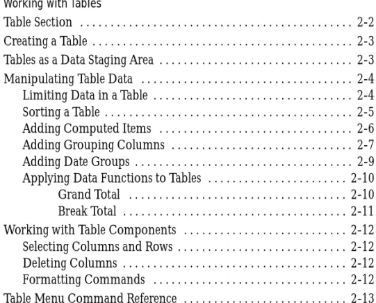
Table Section
A table is a columnar arrangement of data. In Brio Intelligence, tables are used as building blocks in other reporting sections. Table sections function in much the same way as the Results section. All of the commands that are available on the Results menu are also available on the Table menu. However, you cannot apply complex limits or aggregate data in the Table section.
The data in a Table section is derived from the section that is active when you choose to insert a new table. When you insert a Table section from the Results section, the new Table Section is attached to the Results section. This means any changes to the results set are immediately propagated to the Table section. You can also create additional tables, pivot tables, charts, and other reports form a Table section’s dataset just as you would from the Results section. Limits, computed columns, grouping columns, and other actions that modify the active section’s data set carry over to all tables and reporting sections built from that section.
Column Heading Limit Line Sort Line Section Pane Catalog Pane Results Columns Column Title Row Cell Table Outliner Table Menu Select All Corner
Tables as a Data Staging Area 2-3
Creating a Table
Use the Table Outliner to construct, plot, and manage data. To create a table based on the Results section data:
1
From the Results section, choose Insert→New Table.If the Table Outliner is not already displayed, click Outliner on the Section title bar.
2
Drag Results items from the Catalog pane to the Table Outliner. Brio Intelligence automatically populates the table columns.Tables as a Data Staging Area
Computed items in the Results section become mere data elements when added to a Table section. Thus, the Table section can become an intermediate calculation staging area. This ability comes in handy in applications where you wish to place limits on computed items.
For example, suppose you wanted a report of the top 10 producers in your organization. It is easy to add a computed item to your Results section that is based on the Rank function. (This function lets you find out each producer’s rank relative to the others.) However, when you try to limit the results based on that ranking, Brio Intelligence informs you that limits cannot be placed on aggregate items.
To get the results you want, you need to insert a new Table section that is based on your Results section. Then add all the relevant Results items, including the computed Rank field. Once Rank is a column in the table, it is no longer a computed item. It is a regular number on which you can now place a limit. Since the Table section is based on the Results section, your Top 10 report will automatically be updated each time you run the query.
Manipulating Table Data
The Table menu provides a number of commands that allow you to manipulate the data in the Table section.
Limiting Data in a Table
Limiting data in a table filters the data displayed in the table columns. You can apply limits in the Table section in addition to any limits set in the originating section. Limits set in the Table section are automatically propagated to any other reports that inherit their data set from the table. You can apply only one limit per column.
To return data to the display and make it available for reporting, delete or suspend the limit.
To limit data in a table:
1
Select a column (click the column heading) and choose Table→Limit. [Ctrl+L] The Limit dialog box appears.2
Select an arithmetic or logical operator from the drop-down list.3
Define the potential limit values by clicking one of the following options:■ Show Values – Shows column values associated with the item.
■ Custom Values – Supplies an empty field for inputting custom values. Click
the check mark to add a value to the list.
4
In the Values list, select the values to include in the limit definition.Individually select values or click Select All and deselect the values you do not want to include.
5
When the values are highlighted in the values panel, click OK.The limit is applied to the column and the column name is added to the Limit line.
Manipulating Table Data 2-5 To remove a limit in a table:
To remove all limits in a table:
Sorting a Table
The rows in a table can be sorted by one or more columns in ascending or descending order. You can also apply sequenced, nested sorts to columns in the Table section.
To sort a column:
To apply sort conditions using the Sort line:
1
Click Sort on the Section Title bar to display the Sort line.2
Drag Results items from the Catalog pane to the Sort line.You can add items to the Sort line that are not in the Outliner.
3
Establish a final sort sequence by reordering sort items.Items are sorted left to right on the sort item. To reorder the sequence, drag each item to its new position.
4
Double-click specific sort items to toggle ascending and descending sort orders. Ascending is the default sort order.5
Click Sort Now on the Sort line.➤ Select the limit item that you want to remove and choose Table→Remove. [Del]
➤ Click Limit on the Limit line and choose Table→Remove. [Del]
➤ Select the column you want to sort and choose Table→Sort Ascending or Sort Descending.
Adding Computed Items
You can rank and provide statistics for the values represented in the totals or subtotals in your Table section. The Add Computed Item feature enables you to build equations to compute totals, or to apply functions to existing values. Computed items are like normal data items and can be included in reports or reused to compute other data.
For example, you can modify an Amount Sold item by building an equation around it, multiplying by a Unit Price item, and renaming the resulting item
Revenue. You can also apply a scalar function such as Cume to Amount Sold and return each individual value as a cumulative running total, or simply multiply
Amount Sold by the local tax rate to find the tax owed on each sale.
The Computed Item dialog is used to build a computed item expression. The computed item expression is a value, variable, logic statement, or equation that instructs Brio Intelligence how to perform a computation.
To create a computed item:
1
Choose Table→AddComputed Item.The Computed Item dialog box appears.
2
In the Name field, type a name that describes the computation.Manipulating Table Data 2-7
3
Define the new data item by building an expression in the Definition text box. Use the operator buttons to insert arithmetic and logical operators at the insertion point.■ Click Reference to display the Reference dialog box, and select Request
items to place in the equation.
■ Click Functions to apply scalar functions using the Functions dialog box.
You also may type any portion of the equation or the entire equation directly into the Definition text box using JavaScript. The names are case sensitive, and you must replace spaces in item names with underscores (‘_’).
4
If necessary, click the Options button to set a new data type for the item.5
When the equation is complete, click OK.The computed item is added to the Outliner and appears as a column in the table.
Adding Grouping Columns
Grouping columns, like computed items, is a way of creating new data in your results set by grouping data from an already existing column. You can use grouping columns to consolidate non-numeric data values into more general group values and map the group values to a new column in the data set. Grouping columns are new items added to the Table section and are available for use in report sections.
For example, your company sales database may contain the items: State, Sales Region, and Country, which allow you to aggregate data on different levels in reports. However, suppose you are looking to track sales by subregion, or want to see data for one state versus an average for all other states combined. You can do this by grouping states together to create a subregion item or other custom dimension.
To add a grouping column:
1
Select a column as a base for your grouping column.2
Choose Table→Add Grouping Column.The Grouped Column dialog box appears. Use the column values to build the grouping categories for the new item.
3
Type a name for the new column in the Column Name field.4
Create custom group values and link them to values in the base column. ■ Click New Groups to create groups and add them to the Groups list.■ Select a group, and then select items from the Available Values list and use
the arrows to add them to the Items In Group list for the selected group.
■ Remove selected values from a group by using the arrow to move them back
to the Available Items list.
■ Double-click a group name to modify it.
■ Specify options for ungrouped values as follows:
❑ Column Name – Names the new grouping column in the table.
❑ New Groups – Creates a custom group to be displayed as a value in the
new grouping column.
❑ Options – Indicates how to represent unassigned values within the
grouping column, that is, as null values, as members of a default group (named in the adjacent edit field), or as their own individual groups.
❑ Groups – Selects a custom group to define by adding or removing items. ❑ Items In Group – Removes an item from a selected custom group. ❑ Available Values – Adds items to a selected custom group.
Manipulating Table Data 2-9
■ Select one of the following options to define the preferences for ungrouped
columns:
❑ Null – Leaves the values ungrouped and disaggregated. ❑ Default – Allows you to specify a default name to assign to all
ungrouped values.
❑ Individual Group – Assigns each ungrouped values the name originally
assigned to it.
5
When the grouping definitions are complete, click OK.The new grouping column is added to the Outliner and to the table. You can modify a grouping column to change the group structure. To modify a grouping column:
Adding Date Groups
Use date breakout columns to separate date-typed columns into Year, Quarter, and Month items. The new items are automatically derived using date
functions available to computed items.
For example, when you add date groups for an item Order Date, the item is broken into constituent date items. A new Year item is created as an integer,
Qtr as a string, and Month as a new date.
To break out date items:
1
Select a date-type column in the Content pane.2
Choose Table→Add Date Group.Note This feature automatically sets the display format of the new Month item to mmm so that the data sorts correctly. Quarters are based on the calendar year beginning 1/1.
➤ Select the grouping column and choose Table→Modify Column.
Applying Data Functions to Tables
In the Tables section, data functions can be used only for totals and subtotals. Data functions return to the underlying values and recalculate the value according to the type of function specified.
You can apply a break (subtotal), grand, or custom total to any column. A grand total on a numeric column applies a default sum function. However, each column can have a number of grand totals, each with a different aggregate function applied to it. Table 2-1 lists the data functions that you can use with break totals and grand totals.
To calculate a column total:
Brio Intelligence adds a row labelled Total to the bottom of the table and displays the total as the last entry in the selected column.
Grand Total
To apply a grand total to a column using a data function:
1
Select a column and choose Table→Grand Total.Ta b l e 2 - 1 Break Total and Grand Total Data Functions
Function Description
Sum Returns sum of underlying values.
Average Returns average of underlying values.
Minimum Returns lowest of underlying values.
Maximum Returns highest of underlying values.
Count Returns number of underlying values.
Other Allows you to create a custom function using JavaScript.
Manipulating Table Data 2-11
2
Select a data function from the Grand Total Function drop-down list.3
Select one or more columns to be totaled from the Add Grand Total To list and click OK. The total and any subtotals in the column are computed to reflect the new data function.Break Total
To apply a break total (subtotal):
1
Select a column and choose Table→Break Total. The Insert Break Total dialog box appears.2
Select a break column from the At Every Break drop-down list.3
Select the data function you want to apply from the Break Total Function drop-down list.4
Select one or more columns on which to display the break total and click OK.Working with Table Components
Brio Intelligence offers a number of options for working with table
components (that is, columns and rows) in the Table section. These commands are found on the Format and Results menus. Many of these commands also have corresponding toolbar icons and shortcut menu items.
Selecting Columns and Rows
To select a column:To select a row:
Deleting Columns
To delete a selected column from the Results table (and Outliner):
If an item is removed from the Content pane, it is completely removed from the Outliner and the data set.
Caution Remove items with caution as computed items and other report sections may draw data values from the deleted item.
Formatting Commands
You can use the commands available on the Format menu to change the appearance of fonts, backgrounds, borders, color, row heights, and column widths. For more information on formatting options, see Getting Started with
Brio Intelligence 6.6.
➤ Click anywhere inside the column.
➤ Click the row header (row number).
➤ Choose Results→Remove. [Del]
Table Menu Command Reference 2-13
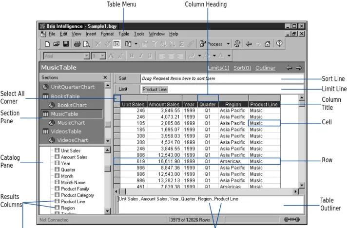
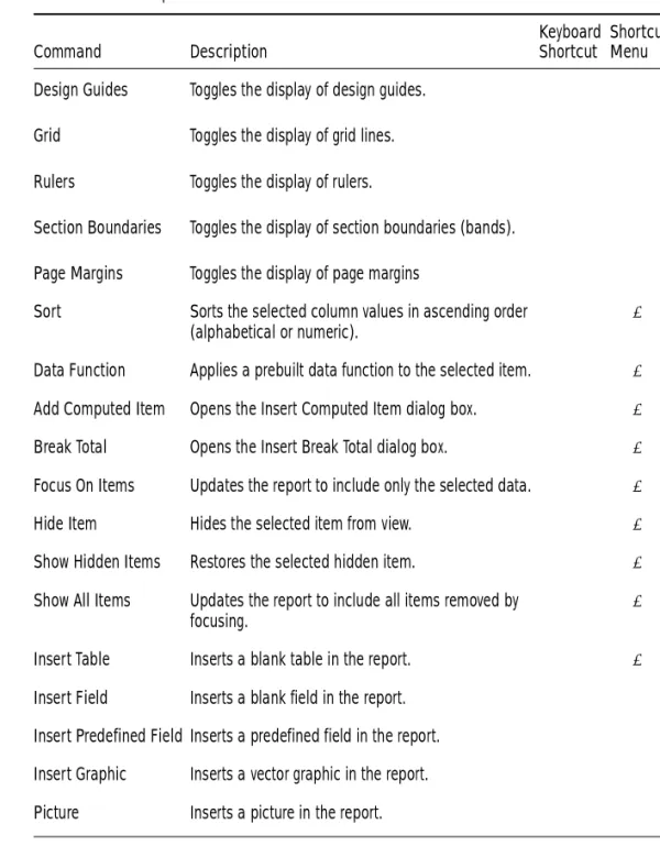
Table Menu Command Reference
Table 2-2 provides a quick reference to the commands available on the Table menu and lists any related shortcuts.
Ta b l e 2 - 2 Table Menu Commands
Command Description
Keyboard Shortcut
Shortcut Menu
Limit Opens the Limit dialog box. [Ctrl+L] ✔
Sort Ascending Sorts the selected column values in ascending order (alphabetical or numeric).
✔
Sort Descending Sorts the selected column values in descending order (alphabetical or numeric).
✔
Add Computed Item Opens the Insert Computed Item dialog box. ✔
Add Grouping Column Opens the Grouped Column dialog box. Use to merge dimension labels into new groupings and aggregate the associated data.
✔
Add Date Groups Separates date-type items into year, quarter, and month items.
Modify Column Use to modify a computed column or a group column.
[Ctrl+M] Remove Removes the selected column (or Outliner item). [Del] ✔
Break Total Opens the Insert Break Total dialog box. ✔
Grand Total Opens the Insert Grand Total dialog box. ✔
Hide Column Hides the selected column from view. ✔
3-1
3
Analyzing Data with Pivot Tables
This chapter explains how to use pivot tables to quickly summarize or cross-tabulate large amounts of data. It contains:
■ Pivot Section
■ Creating a Pivot Table ■ Working with Pivot Tables
■ Using Data Calculations in Pivot Tables
Pivot Section
The Pivot section enables you to extract meaningful information from your query results. Pivot tables are interactive tools used to slice and dice data for ad-hoc, interactive, and multidimensional analysis. Pivot tables allow you to add, move, rename, focus on, and group dimensions to gain customized views of the data. You can rotate or pivot rows and columns to see different
summaries of data or display the details for areas of interest. You also can automatically include subtotals and grand totals, or use your own formulas by adding computed items.
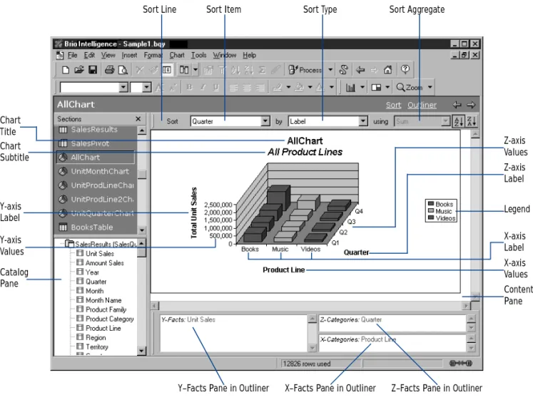
Sort Line
Top Labels
Sort Type
Side Labels Pane in Outliner Top Labels Pane in Outliner Facts Labels Pane in Outliner
Dimension Tab Data Labels Facts Content Pane Catalog Pane Request Items Sort Aggregate Side Labels Sort Item
Creating a Pivot Table 3-3
Creating a Pivot Table
Pivot tables are made up of:
■ Facts – Core numeric data that you slice and dice dimensionally in your
analysis.
■ Dimensions – Descriptive items that break aggregate data (facts) into
logical categories. In the Pivot section, dimensions are either Top Labels or Side Labels.
For example, if you choose to analyze Unit Sales by region, the numbers are your data values or facts. Region is a dimension. Presented in aggregate, facts are subdivided by your chosen dimension labels.
To create a pivot table:
1
Choose Insert→New Pivot.2
If the Outliner is not visible, click Outliner on the Section title bar.3
In the Catalog pane, select one or more Request items and choose Pivot→Add Selected Items→Outliner Pane.■ Add Request items such as Unit Sales or Amount Sales to the Facts pane in
Outliner to create the data grid.
■ Add dimensions such as Product Line or Region to the Top and Side Labels
panes in Outliner to create subdivisions.
Items are hierarchically ordered in the sequence in which they appear in the Outliner panes.
Pivoting Data
Use the Pivot feature to reorient the axes of a pivot table and view your data in new ways. Pivoting a table allows you to more easily compare the new data to data in the originating table, which makes pivot tables more powerful than common spreadsheets.
To pivot data in a table:
➤ Select a dimension handle and drag it to any position on the same or opposite dimensional axis.
Charting a Pivot Table
You can automatically generate charts from your current pivot table to view a graphic representation of your data.
To automatically chart your pivot table:
Brio Intelligence creates a new Chart section that displays a bar chart based on the data from the pivot table.
Working with Pivot Tables
You can select pivot table elements and perform a wide range of tasks with data elements. Since report sections organize data hierarchically, if you alter a data value item, all instances of the item within the report are affected.
Selecting Pivot Table Elements
To select a facts column for formatting, layout, or modification:
To select a column of Side Labels or a row of Top Labels for formatting, layout, or analysis:
To select one complete row or column for formatting or analysis:
To select an individual Top Label or Side Label for formatting: ➤ Choose Insert→Chart This Pivot.
➤ Click anywhere on the column of data values. Do not click on the label.
➤ Click the dimension handle at the end of the column or row of labels.
➤ Press the modifier key ([Alt] for Windows, [Option] for Macintosh, or [Ctrl+Alt] for Motif). Then, click the row or column label.
Working with Pivot Tables 3-5
Moving Pivot Table Elements
To move a column to a new location in the Content pane:
To remove Request items from the Outliner or columns from the Content pane:
Note When you delete a Request item from the Outliner or a column from the Content pane, you cannot use the Undo feature to reinsert the column or Request item.
To move a pivot element item using the Outliner:
The display updates to reflect the repositioning or reassignment of the item.
Note To move items between Top Labels or Side Labels panes and the Fact pane (or vice versa), you must first remove them from the Outliner, and then add them again to the chosen pane. ➤ Select the column in the Content pane and drag it to a new position.
➤ Select the element you want to remove and choose Pivot→Remove Selected Item.
➤ Click the item name in the Outliner pane to select it, then drag the item to a new position or to another Outliner pane.
✏
Changing Label Nesting Levels
In pivot tables, labels from one dimension frequently are nested within another dimension. Nesting means that one set of labels appears as a subdivision of labels at a higher level of data. You can change the way labels nest to emphasize different relationships.
For example, you can show Year and Quarter as data items in the Top Labels pane in Outliner. The Quarter labels (Q1, Q2, Q3, and Q4) are nested within each year label (1998, 1999). If you move Year after Quarter, then each year is displayed as a subset of each quarter. In this case, Q1 values are broken down by labels 1998, 1999.
To change the nested level of labels:
1
With more than one data item in an Outliner pane, select a data item in the Outliner.2
Drag that item to the other side of the second data item in the same pane in Outliner.The labels in those dimensions switch positions and the data is nested in a different manner.
Sorting Pivot Tables
Sorting facts or dimensions enables you to display objects in ascending and descending order according to value.
To sort plotted values and labels:
1
If the Sort line is not visible, click Sort on the Section title bar.2
In the Sort list, select the item that you want to use as the basis of your sort.3
In the By drop-down list, click the sort type (either a label or value).4
In the Using drop-down list, select the method of calculation for a data value. By default, Brio Intelligence plots data in ascending order. To sort in descending order, click the descending icon.Using Data Calculations in Pivot Tables 3-7
Using Data Calculations in Pivot Tables
The Pivot section provides a number of way to perform data calculations that can help you analyze business trends. These calculations range from simple totals and subtotals that are useful in most types of pivot tables to more complex data functions for specialized contexts.
Adding Totals and Subtotals
You can calculate totals for both columns and rows in a pivot table. If you layered dimension items along the top or side of your pivot table, you can calculate totals for any level in the hierarchy. When you select inner
dimensions for totaling, subtotals are created for each of the categories in the outer dimensions.
For example, suppose your pivot table has facts of Units and Amount Sold. These facts are further broken down by Region and Territory on the side, and by Year and Quarter on top. Calculating totals by Region produces a total row at the bottom of the pivot table, summing the data from all regions for each column. Calculating totals by Quarter produces one total column under each year label, summing the data for each set of four Quarter labels.
Tip An intelligent aggregate is applied to the specified data when totaling unless you specify otherwise. For example, the total of a column of averages will calculate an average rather than a sum total.
To add totals to a pivot table:
1
Click a side or top dimension.2
Choose Pivot→Add Totals.Brio Intelligence adds totals and breaks them according to the next higher dimension item.
To add subtotals to pivot tables:
1
Select an inner dimension.2
Choose Pivot→Add Totals.Brio Intelligence adds subtotals to each one of the categories of the next higher dimension.
Adding Cumulative Totals
Add cumulative totals to break totals by dimension and restart them at each dimensional grouping in a pivot table. Cumes work best when all dimensions are located at the top or side of the pivot table, and data label column heads are placed orthogonally.
To add a cumulative total:
1
Select a fact in the pivot table’s data grid.2
Choose Pivot→Add Cume.The Pivot Cume dialog box appears.
3
If desired, type a new name for the pivot cume.4
Select the scope of the pivot cume from the drop-down list.The Scope drop-down list includes all of the dimensions in the pivot table. The default scope is the lowest level dimension that appears in the pivot table.
5
Click OK.A new fact column is added that maintains a cumulative running total of the original fact by the dimension (scope) specified.
Using Data Calculations in Pivot Tables 3-9
Using Data Functions
Data functions enable you to change the nature of the values displayed in a pivot table and allow you to decide the kind of value represented in a pivot table. When you use a data function, Brio Intelligence recalculates the selected values according to the function applied to the underlying data values (which are originally from the Results section).
Data functions are particularly useful if you want to display different types of values side by side. If you add the same fact (such as Amount Sales) to the Outliner several times, you can apply a different data function to the very same dimension.
For example, you can show the total sale, average sale, and maximum sale of each product by quarter. Each of these computed items uses Amount Sales as its underlying value. They only differ in the data function used to calculate them.
Note When you add multiple instances of a Request item to the Facts pane in Outliner, Brio Intelligence appends number to the name (for example, Amount_2, Amount_3).
To apply a data function:
1
Select a fact in the pivot table’s data grid.2
Choose Pivot→Data Function→Function.The data values are recalculated and populate the row or column of the pivot table.
Tip You can change the label of the new column or row if you wish. Table 3-1 lists the data functions available in the Pivot section.
Ta b l e 3 - 1 Data Function Definitions
Function Description
Sum Returns sum of all values. This is the default setting.
Average Returns average of all values.
Count Returns number of values.
✏
Note Null values are empty values for which no data exists. Null values are not equal to zero.
Maximum Returns highest value.
Minimum Returns lowest value.
% of Column Returns surface values as a percentage of their respective column item.
% of Row Returns surface values as a percentage of their respective row item.
% of Grand Returns surface values as a percentage of all like values in the pivot table.
Increase Returns the incremental difference between the final two instances of a total column or row. Apply only at the innermost dimensional level of a pivot table.
% Increase Returns the percent difference between the final two instances of a total column or total row. Apply only at the innermost dimensional level of a pivot table.
Non-Null Average Returns average of values; null values excluded.
Null Count Returns number of null values.
Non-Null Count Returns number of values; null values excluded. Ta b l e 3 - 1 Data Function Definitions
Function Description
Using Data Calculations in Pivot Tables 3-11
Using Surface Values in Data Functions
Data functions, when applied to total rows or columns, can either apply calculations to surface values (the values displayed in the pivot table) or
underlying values (the values from the original Results section).
When applied to surface values, data functions recalculate the values in the visible cells or surface of the pivot table. When applied to underlying values, data functions return to the unaggregated values beneath the pivot table and recalculate based on those values. When underlying values are used, the results often appear incongruous with the aggregate surface values of the chart element. In other words, a total of the underlying values does not match the total of the surface figures.
Consider a simple pivot table with two values of 20 and 30. Each of these is already a total of underlying values:
An average of the underlying values yields the result of:
An average of the surface values yields a result of:
To match surface-level values in your calculation, you can instead apply surface values to the totals derived from data functions. For example, if you use surface values for an average applied to a total, the total is converted to the average of the surface values in the corresponding element.
To use surface values:
➤ Choose Pivot→Use Surface Values. 20 = 8+12
30 = 10+20
12.5 = (8+12+10+20)÷4
Using Weighted Functions
Weighted averages can be very useful for a variety of purposes, such as survey research or when you want to include demographic information in your pivot tables. For example, suppose you took a survey of 100 people, 75 male and 25 female. But according to census data in that geographic region you should have surveyed 50 males and 50 females. The data you have is skewed toward males. To correct for this, you assign a weight or weighting factor to correct for the sampling error in your survey. To calculate a weight you take the expected amount and divide it by the actual amount.
In the example, the men would have a weighting factor of:
The women would have a weight of:
Any calculation would calculate each man as 0.6666 and each woman as 2. Weighted averages can also be used to apply different levels of importance to a given item. Take, for example, a survey, which has multiple questions. The responses can be rated on a scale of 1 to 5. By assigning a weight to each question based on the level of importance (the higher the number the more important), and using that weight in calculating a weighted average, you can arrive at averages that are more meaningful.
To use weighted averages, you must add a column of data to the database. This data indicates the relative weight of each corresponding value in another column. The statistical calculation for weighted averages depends on the following mathematical formula:
Ta b l e 3 - 2 Weighted Values Example
Customer ID Units Sold Type of Store Weight
1435 80 Electronics 8
50÷75 = 0.6666
50÷25 = 2
c×w
Using Data Calculations in Pivot Tables 3-13 To use weighted averages:
1
Ensure that a column of data with the weighted values exists in the database.2
In the Query section, select the Topic item for which weighted values are needed.3
Choose Query→Data Functions→Weight.The Reference dialog box appears.
4
Select the item that contains the weighted values and click OK.The item in the Request line is renamed to indicate it is a weighted value.
5
Process the query.The weighted values are returned in the Results section.
6
Go to the Pivot section and drag the Weighted item from the Catalog pane to the Outliner.You may now use all of the various data functions on the weighted values.
Note Weighting functions work only in the pivot section.
1539 200 Computer 10
1634 60 Electronics 8
1213 900 Discount 2
Ta b l e 3 - 2 Weighted Values Example
Customer ID Units Sold Type of Store Weight
Adding Computed Items
Use the Add Computed Items command to create new elements in the Pivot section. Computed items enable use to build equations or apply functions to existing data values. Computed items are like normal data items and can be included in pivot tables or reused to compute other data.
To add a computed item:
1
Choose Pivot→AddComputed Item.The Computed Item dialog box appears.
2
In the Name field, type a name that describes the computation.The default name is Computed, which is numbered sequentially if there is more than one. If you assign a name to a computed item that is identical to an existing scalar function name, Brio Intelligence numbers the name starting with the number 2.
3
Define the new data item by building an expression in the Definition text box. Use the operator buttons to insert arithmetic and logical operators at the insertion point.■ Click Reference to display the Reference dialog box, and select Request
Pivot Menu Command Reference 3-15
4
If necessary, click the Options button to set a new data type for the item.5
When the equation is complete, click OK.The computed item is added to the Outliner and appears as a column in the pivot table.
Pivot Menu Command Reference
Table 3-3 provides a quick reference to the commands available on the Pivot menu and lists any related shortcuts.
Ta b l e 3 - 3 Pivot Menu Commands
Command Description
Keyboard Shortcut
Shortcut Menu
Add Selected Items Adds the selected item as a Top Label, Side Label, or Fact.
✔
Remove Selected Items Removes the selected item. [Del] ✔ Modify Modifies the selected computed item. [Ctrl+M] ✔ Sort Reorders the selected item by labels, by values,
ascending, or descending.
Add Totals Adds the selected item to the Measures pane. ✔
Add Computed Item Allows you to add a new data item derived from calculations performed on an existing item.
✔
Add Cume Adds cumulative totals to break totals by dimension and restarts them at each dimensional grouping.
✔
Data Function Applies a prebuilt data function to the selected item.
✔
Use Surface Values Allows data functions to recalculate the values in the visible cells or surface of the pivot table
✔
Drill Anywhere Allows you to drill to any item. ✔
Drillup Returns the original view of data that you drilled. ✔
Focus On Items Updates the pivot table to include only the selected data.
Hide Items Hides the selected item. ✔
Show Hidden Items Restores the selected hidden item. ✔
Show All Items Updates the pivot table to include all items. ✔
Group Items Groups the selected dimensions. [Ctrl+G] Ungroup Items Ungroups the selected dimension. [Ctrl+U] Restore Name Restores the original name of a renamed item. ✔
Refresh Data Updates the data according to the selected option. Choose between After Process, When Section Displayed, Manually, or Refresh Now. Ta b l e 3 - 3 Pivot Menu Commands (Continued)
Command Description
Keyboard Shortcut
Shortcut Menu
4-1
4
Charting Data
This chapter explains how to use Brio Intelligence’s charting features to perform interactive analysis of your data in a graphic format. It includes:
■ Chart Section ■ Charting Basics ■ Creating Charts
■ Determining What Chart Format to Use ■ Working with Two-dimensional Charts ■ Working with Multidimensional Charts ■ Manipulating Chart Data
■ Working with Chart Elements
Chart Section
The Chart sections enables you to see meaningful summaries of your data. Graphic snapshots help you recognize patterns, trends, and other relationships that might not be apparent in columns and rows of tabular data.
The Chart section opens with an initial plot area for the chart. Because chart construction and manipulation is managed with the Outliner, plotting, viewing, and reviewing are easy and intuitive. Also, Brio Intelligence charts respond dynamically to your commands. When you make a change in a charted item, you see your chart instantly redrawn to reflect the change. Experimenting with different combinations of data can be surprisingly informative. Legend Catalog Pane Content Pane
Y–Facts Pane in Outliner X–Facts Pane in Outliner Z–Facts Pane in Outliner Y-axis Label Z-axis Label X-axis Label Y-axis Values Z-axis Values X-axis Values Chart Title Chart Subtitle
Charting Basics 4-3
Charting Basics
A chart is a graphic representation of data. Except for pie charts, all charts plot data with reference to a horizontal X-axis and a vertical Y-axis.
Multidimensional charts sometimes plot data on an additional Z-axis. A pie chart uses the metaphor of the pie as a whole to delineate the relative values of the parts or slices.
In Brio Intelligence, you construct a chart by dragging Request items from the Catalog pane to the Outliner. At least two items must populate the Outliner to plot a usable chart. Table 4-1 lists the appropriate uses for the Outliner panes.
Chart Terminology
Table 4-2 defines the chart terminology used in Brio Intelligence. Ta b l e 4 - 1 Outliner Pane Usage
Axis Pane Usage
X-Categories Label data (non-quantifiable data values) only. For example, product list-ings, periodic information (for example, day, month or year).
Y-Facts Exclusively for facts or quantifiable values.
Z-Categories Facts or label data depending on the chart type.
Ta b l e 4 - 2 Chart Terminology
Term Definition
Axes Straight lines on a chart that provide a framework for measurement and ref-erence. Typically, the X-axis and Z-axis are used to display label items and the Y-axis shows values or facts (measurable items), such as units and amounts.
Values Graphic indicators that represent data. Brio Intelligence bar charts display values in either vertical or horizontal bars. Pie charts use wedge-shaped slices to represent values.
Plot Area The area bounded by the axes is called the plot area. In the case of the pie chart, the plot area is defined by a circle representing the totality of all data items.
Understanding Chart Dimensions
To understand the differences among charts, you have to distinguish between dimensions in space and dimensions of data. The two dimensions are distinct. Space can be represented as three dimensions along the X, Y and Z axes as shown in Figure 4-1.
t
Planes In all charts (except pie charts), planes provide background and graphed ref-erence for charted values. Planes define horizontal, vertical, and background fields for a chart.
Legend An information box containing color-keyed labels used to identify different data values represented on a chart.
Grid Lines Straight horizontal and vertical lines arranged in scaled increments that provide calibrated guidelines for value interpretation.
Bar A linear measure of a value used in bar charts.
Slice A spacial measure of a value used in pie charts.
F i g u r e 4 - 1 Outliner Panes Corresponding to The X, Y, And Z Axes in the Chart Area
Ta b l e 4 - 2 Chart Terminology (Continued)
Creating Charts 4-5 Two dimensions of data must be represented in 2-D space. At least three dimensions of data are necessary to use the third spatial dimension (Z-axis). But three or more dimensions of data can be represented in 2-D space. For example, cluster and stack represent data categories in two spatial dimensions (X-axis and Y-axis only).
Creating Charts
Interactive charts consists of two layout elements: graphical elements (for example, chart bars or pie slices) and axis labels. When you assign Request items to panes in the Outliner, they become values or labels in your chart. The instructions below are a starting point for building charts. As you use and become familiar with the Chart section, you will learn ways to create the exact type of chart that fits your needs.
To create a chart using the Chart outliner:
1
Choose Insert→New Chart to create a new Chart section.2
If the Outliner is not visible, click Outliner on the Section title bar to display the Outliner.3
Drag each line item to be included in the chart from the Catalog pane to an Outlinerpane:
■ Drag values or facts (such as Units or Amount) in to the Y-Facts pane in
Outliner to create bar charts, pie charts or ribbon charts.
■ Drag a label item (such as Name, Product, or State) into the X-Categories
pane in Outliner to create a 2-D chart.
■ Drag a label item to the Z-Categories pane in Outliner to add a third
dimension to your chart.
4
Select a chart type from the Chart drop-down list.Note You can select and drag multiple items to the same Outliner pane to add multiple values or labels for analysis. Items are hierarchically ordered in the sequence in which they appear in the Outliner panes.
Determining What Chart Format to Use
The chart you want to use usually depends on the data you want to analyze. Once you place Request items in the Outliner, you select how you want to display and analyze this data by selecting a chart format.
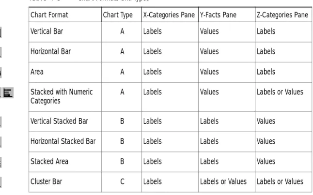
Brio Intelligence supports 11 chart formats that graphically represent data, all of which can be viewed as 2-D or 3-D objects. Charts are also categorized by type, which is defined by how they plot values and labels along the X. Y. and Z axes. Chart types include:
■ Type A – Values or facts default to Y-Facts pane. ■ Type B – Values or facts default to Z-Categories pane.
■ Type C – Values or facts can be placed in either Y-Facts or Z-Categories
panes.
Table 4-3 lists the chart formats available in Brio Intelligence and explains how to place values and labels in the Outliner panes to generate the various chart types.
Ta b l e 4 - 3 Chart Formats and Types
Chart Format Chart Type X-Categories Pane Y-Facts Pane Z-Categories Pane
Vertical Bar A Labels Values Labels
Horizontal Bar A Labels Values Labels
Area A Labels Values Labels
Stacked with Numeric Categories
A Labels Values Labels or Values
Vertical Stacked Bar B Labels Labels Values
Horizontal Stacked Bar B Labels Labels Values
Stacked Area B Labels Labels Values
Working with Two-dimensional Charts 4-7
Working with Two-dimensional Charts
Pie and bar charts (of the non-stacked variety) lend themselves well to representing two dimensions of data. For example, imagine charting the amount of sales by product type. In pie charts, the two dimensions are represented by slices of a pie. In bar charts, the data is represented by bars along the X and Y axes.
Using Pie Charts to Analyze Data
Of all charts, the pie chart is the easiest to understand. Pieces (slices) of the pie are drawn to represent the relative value of a measurable item category to the whole. Pie charts represent additional dimensions of data by further
subdividing the pie.
In a pie chart, Request items placed in the X-Categories pane represent itemized slices of the pie. Request items placed in the Y-Facts pane define the quantitative whole of the pie.
Line C Labels Labels or Values Labels or Values
Bar-Line Combination C Labels Label or Two Values Label or Two Values
Pie Not Applicable
Ta b l e 4 - 3 Chart Formats and Types (Continued)
To create a pie chart:
1
From the Chart drop-down list, select Pie.2
Drag a value from the Catalog pane to the Y-Facts pane in Outliner. An pie chart without slices appears.3
Drag one or more label items from the Catalog pane to the X-Categories pane in Outliner. The pie charts is differentiated to reflect subcategories. A legend depicting details of the selection appears.Note Since pie charts plot data using only two axes, Brio Intelligence disables the Z-Categories pane in Outliner when creating a pie chart.
Positioning Pie Slices
You can pull individual pie slices out of the pie chart. To toggle the position of a pie slice:
A check mark appears on the shortcut menu next to Pull Out Slice to indicate that this feature is active. Choose this option again to clear the check mark and restore the pie slice to its original position.
Showing Positive and Negative Values
Pie slices show positive values by default.
To toggle the display of negative and positive values:
A check mark appears next to Show Negative Values to indicate that negative values are shown. Choose this option again to clear the check mark and show ➤ Select a slice of the pie and choose Pull Out Slice on the shortcut menu.
➤ Select a slice of the pie and choose Show Negative Values on the shortcut menu.
Working with Two-dimensional Charts 4-9
Showing Pie Percentages
To toggle the display of each pie slice value as a percentage:
A check mark appears next to Show Pie Percentages to indicate that percentages are displayed on the chart (in parentheses next to the pie chart label). Choose this option again to clear the check mark and remove the percentages from view.
Adding Lines to Labels
To add a pointer line between an individual pie slice and its label:
Rotating Pie Charts
To rotate the perspective angle or elevation of a pie chart:
1
Click Rotate on the Shortcut menu.The rotate icon appears on the pie chart.
2
Click the rotate icon and move the dotted line to a new location.When you release the mouse button, the chart is redrawn to reflect the adjusted perspective. If you cannot drag the rotate icon in a certain direction, the chart has reached its farthest possible rotation in that direction.
Using 2-D Bar Charts to Analyze Data
Bar charts are the most common type of business chart and are especially useful for comparative analysis when you want to focus on comparing values and place less emphasis on time. Use a bar chart to illustrate comparisons among individual items.
Two-dimensional bar charts are plotted using a single item in each of the X-Categories and Y-Facts panes in Outliner. The Z-Categories pane is not populated in 2-D bar charts.
➤ Select a slice of the pie and choose Show Pie Percentages on the shortcut menu.
➤ Select the pie slice to which you want to add a pointer and choose Format→Line To Label.
To create a 2-D bar chart:
1
Select a bar chart format from the Chart drop-down list. The default chart format is Vertical Bar.2
Drag a label item from the Catalog pane to the X-Categories pane in Outliner. Data labels appear on the horizontal axis in the Chart area.3
Drag a value from the Catalog pane to the Y-Facts pane in Outliner.A chart is plotted that summarizes the selected value (Y-Facts pane) as it relates to the subcategories of the label item (X-Categories pane).
Brio Intelligence automatically scales the data represented on the Y-axis and adds appropriate labels. The Legend provides an index of label information with a coordinated color scheme.
Working with Multidimensional Charts 4-11
Working with Multidimensional Charts
Frequently, you want to represent more than two dimensions of data at a time. For example, you may want to see how the sales of product types break down by years or quarter. There are numerous ways to chart three or more
dimensions of data. You can project data into the third dimension of space. You can also represent the data in two spatial dimensions.
About 3-D View
By default, Brio Intelligence imparts a 3-D look to your chart objects. These objects appear in the chart space as 3-D objects with depth. That does not mean that you are plotting three dimensions of data or using three dimensions of space to represent data. It is simply a visual effect that can be turned off.
Note If you turn off 3-D View, you cannot view charts that use a third dimension in space.
To toggle 3-D View:
A check mark appears next to the 3-D View option to indicate it is active. Choose this option again to clear the check mark and turn off 3-D view.
Note You can also select to view objects in 3-D using the Properties dialog box. For more information, see “Customizing Chart Properties and Labels” on page 4-30.
➤ Choose Format→3-DView.
✏
Creating Three-dimensional Bar Charts
You can add more information your bar chart by adding an additional item or items to the Z-Categories pane in Outliner. Using multidimensional charts, you can show various relationships between three or more items in easy-to-understand bar chart formats.
Brio Intelligence plots the added data in rows that extend back along the chart’s Z-axis.
To create a multidimensional bar chart:
1
Select a bar chart format from the Chart drop-down list. The default chart format is Vertical Bar.2
Drag a label item from the Catalog pane to the X-Categories pane in Outliner.3
Drag a label item from the Catalog pane to the Z-Categories pane in Outliner.4
Drag a value from the Catalog pane to the Y-Facts pane in Outliner.A chart is plotted that summarizes the selected value (Y-Facts pane) as it relates to the subcategories of the label items (X-Categories and Z-Categories panes).
Understanding Clustered Bar Charts
You can change your chart perspective so that the Z-axis data extended in the third dimension is shown as clusters displayed in the foreground. This charting option is useful when Z-axis bars are hard to distinguish in standard bar formats.
Cluster charts can be used to juxtapose categories in one label item. For example, use clustered bars to compare stores of different types. Alternatively, cluster bars can also be used to compare two different value items, such as Amount of Sales and Units Sold.
Note You can only display cluster bar charts in vertical format.
Working with Multidimensional Charts 4-13 To cluster bars representing divisions in label items (Z-Categories pane for values):
1
Select Vertical Cluster Bar from the Chart drop-down list.2
Drag a fact item from the Catalog pane to the Z-Categories pane and label items to the X-Categories and Y-Facts panes in Outliner.To cluster bars representing two different value items (Y-Facts pane for values):
1
Select Vertical Cluster Bar from the Chart drop-down list.2
Drag two fact items to the Y-Facts pane and a label item to the X-Categories pane.Understanding Stacked Bar Charts
Another way to represent the third dimension of data is through stacking. In this way, a single bar on the chart can show data for more than one category of data. For example, a single bar can represent the amount of sales for CD-ROM drives in one year on top of a bar representing sales for other years. Stacked bar charts can stack data vertically or horizontally.
Stacked bar charts t show the relationship of parts to the whole. Stacking techniques differ depending on whether you are representing divisions within data categories or stacking two separate numeric categories.