Journal of
Marine Science
and Engineering
Article
Analysis and Visualization of Coastal Ocean Model
Data in the Cloud
Richard P. Signell1,* and Dharhas Pothina2
1 Woods Hole Coastal and Marine Science Center, U.S. Geological Survey, Woods Hole, MA 02543, USA 2 U.S. Army Engineer Research and Development Center, Vicksburg, MS 39180, USA;
* Correspondence: [email protected]; Tel.:+1-508-457-2229
Received: 6 March 2019; Accepted: 1 April 2019; Published: 19 April 2019 Abstract: The traditional flow of coastal ocean model data is from High-Performance Computing (HPC) centers to the local desktop, or to a file server where just the needed data can be extracted via services such as OPeNDAP. Analysis and visualization are then conducted using local hardware and software. This requires moving large amounts of data across the internet as well as acquiring and maintaining local hardware, software, and support personnel. Further, as data sets increase in size, the traditional workflow may not be scalable. Alternatively, recent advances make it possible to move data from HPC to the Cloud and perform interactive, scalable, data-proximate analysis and visualization, with simply a web browser user interface. We use the framework advanced by the NSF-funded Pangeo project, a free, open-source Python system which provides multi-user login via JupyterHub and parallel analysis via Dask, both running in Docker containers orchestrated by Kubernetes. Data are stored in the Zarr format, a Cloud-friendly n-dimensional array format that allows performant extraction of data by anyone without relying on data services like OPeNDAP. Interactive visual exploration of data on complex, large model grids is made possible by new tools in the Python PyViz ecosystem, which can render maps at screen resolution, dynamically updating on pan and zoom operations. Two examples are given: (1) Calculating the maximum water level at each grid cell from a 53-GB, 720-time-step, 9-million-node triangular mesh ADCIRC simulation of Hurricane Ike; (2) Creating a dashboard for visualizing data from a curvilinear orthogonal
COAWST/ROMS forecast model.
Keywords: ocean modeling; cloud computing; data analysis; geospatial data visualization
1. Introduction
Analysis, visualization, and distribution of coastal ocean model data is challenging due to the sheer size of the data involved, with regional simulations commonly in the 10GB–1TB range. The traditional workflow is to download data to local workstations or file servers from which the data needed can be extracted via services such as OPeNDAP [1]. Analysis and visualization take place with environments like MATLAB®and Python running on local computers. Not only are these datasets becoming too large to effectively download and analyze locally, but this approach requires acquiring and maintaining local hardware, software, and personnel to ensure reliable and efficient processing. Archiving is an additional challenge for many centers. Effective sharing with collaborators is often limited by unreliable services that cannot scale with demand. In some cases, a subset of analysis and visualization tools are made available through custom web portals (e.g., [2,3]). These portals can satisfy the needs of data dissemination to the public but don’t have the suite of scientific analysis tools needed for collaborative research use. In addition, the development and maintenance of these portals require
J. Mar. Sci. Eng.2019,7, 110 2 of 12
dedicated web software developers and is out of the reach of most scientists. The traditional method of data access and use is becoming time and cost inefficient.
The Cloud and recent advances in technology provide new opportunities for analysis, visualization, and distribution of model data, overcoming these problems [4]. Data can be stored in the Cloud efficiently in object storage which allows performant access by providers or end users alike. Analysis and visualization can take place in the Cloud, close to the data, allowing efficient and cost-effective access, as the only data that needs to leave the Cloud are graphics and text returned to the browser. As these tools have matured, they have lowered the barrier of entry and are poised to transform the ability of regular scientists and engineers to collaborate on difficult research problems without being constrained by their local resources.
The Pangeo project [5–7] was created to take advantage of these advances for the scientific community. The specific goals of Pangeo are to: “(1) Foster collaboration around the open source scientific Python ecosystem for ocean/atmosphere/land/climate science. (2) Support the development with domain-specific geoscience packages. (3) Improve scalability of these tools to handle petabyte-scale datasets on HPC and Cloud platforms.” It makes progress toward these goals by building on open-source packages already widely used in the Python ecosystem, and supporting a flexible and modular framework for interactive, scalable, data-proximate computing on large gridded datasets. Here we first describe the essential components of this framework, then demonstrate two coastal ocean modeling use cases: (1) Calculating the maximum water level at each grid cell from a 53 GB, 720 time step, 9 million node triangular mesh ADCIRC [8] simulation of Hurricane Ike; (2) creating a dashboard for visualizing data from the curvilinear orthogonal COAWST/ROMS [9] forecast model.
2. Framework Description
Pangeo is a flexible framework which can be deployed in different types of platforms with different components, so here we describe the specific framework we used for this work, consisting of:
• Zarr [10] format files with model output for cloud-friendly access • Dask [11] for parallel scheduling and execution
• Xarray [12] for working effectively with model output using the NetCDF/CF [13,14] Data Model • PyViz [15] for interactive visualization of the output
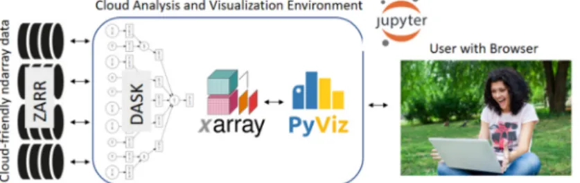
• Jupyter [16] to allow user interaction via their web browser (Figure1).
J. Mar. Sci. Eng. 2019, 7, x FOR PEER REVIEW 2 of 12
maintenance of these portals require dedicated web software developers and is out of the reach of most scientists. The traditional method of data access and use is becoming time and cost inefficient.
The Cloud and recent advances in technology provide new opportunities for analysis, visualization, and distribution of model data, overcoming these problems [4]. Data can be stored in the Cloud efficiently in object storage which allows performant access by providers or end users alike. Analysis and visualization can take place in the Cloud, close to the data, allowing efficient and cost-effective access, as the only data that needs to leave the Cloud are graphics and text returned to the browser. As these tools have matured, they have lowered the barrier of entry and are poised to transform the ability of regular scientists and engineers to collaborate on difficult research problems without being constrained by their local resources.
The Pangeo project [5–7] was created to take advantage of these advances for the scientific community. The specific goals of Pangeo are to: “(1) Foster collaboration around the open source scientific Python ecosystem for ocean/atmosphere/land/climate science. (2) Support the development with domain-specific geoscience packages. (3) Improve scalability of these tools to handle petabyte-scale datasets on HPC and Cloud platforms.” It makes progress toward these goals by building on open-source packages already widely used in the Python ecosystem, and supporting a flexible and modular framework for interactive, scalable, data-proximate computing on large gridded datasets. Here we first describe the essential components of this framework, then demonstrate two coastal ocean modeling use cases: (1) Calculating the maximum water level at each grid cell from a 53 GB, 720 time step, 9 million node triangular mesh ADCIRC [8] simulation of Hurricane Ike; (2) creating a dashboard for visualizing data from the curvilinear orthogonal COAWST/ROMS [9] forecast model. 2. Framework Description
Pangeo is a flexible framework which can be deployed in different types of platforms with different components, so here we describe the specific framework we used for this work, consisting of:
• Zarr [10] format files with model output for cloud-friendly access
• Dask [11] for parallel scheduling and execution
• Xarray [12] for working effectively with model output using the NetCDF/CF [13,14] Data Model
• PyViz [15] for interactive visualization of the output
• Jupyter [16] to allow user interaction via their web browser (Figure 1).
We will briefly describe these and several other important components in more detail.
Figure 1. The Pangeo Cloud framework used here: Zarr for analysis ready data, on distributed,
globally accessible storage; Dask for managing parallel computations; Xarray for gridded data analysis, PyViz for interactive visualization and; Jupyter for user access via a web browser. The framework works with any Cloud provider because it uses Kubernetes, which orchestrates and scales a cluster of Docker containers.
2.1. Zarr
Zarr is a Cloud-friendly data format. The Cloud uses object storage. Access to NetCDF files (the most commonly used format for model data) in object storage is poor, due to the latency of object
Figure 1. The Pangeo Cloud framework used here: Zarr for analysis ready data, on distributed, globally accessible storage; Dask for managing parallel computations; Xarray for gridded data analysis, PyViz for interactive visualization and; Jupyter for user access via a web browser. The framework works with any Cloud provider because it uses Kubernetes, which orchestrates and scales a cluster of Docker containers.
We will briefly describe these and several other important components in more detail. 2.1. Zarr
Zarr is a Cloud-friendly data format. The Cloud uses object storage. Access to NetCDF files (the most commonly used format for model data) in object storage is poor, due to the latency of object
J. Mar. Sci. Eng.2019,7, 110 3 of 12
requests and the numerous small requests involved with accessing data from a NetCDF file. Therefore, we converted the model output from NetCDF format to Zarr format which was developed specifically to allow Cloud-friendly access to n-dimensional array data. With Zarr, the metadata is stored in JSON format, and the data chunks are stored as separate storage objects, typically with chunk sizes of 10–100 mb, which enables concurrent reads by multiple processors. The major features of the HDF5 and NetCDF4 data models are supported: Self-describing datasets with variables, dimensions and attribute, supporting groups, chunking, and compression. It is being developed in an open community fashion on GitHub, with contributions from multiple research organizations. Currently, only a Python interface exists, but it has a well-documented specification and other language bindings are being developed. The Unidata NetCDF team is working on the adoption of Zarr as a back-end to the NetCDF C library. Data can be converted from NetCDF, HDF5 or other n-dimensional array formats to Zarr using the Xarray library (described below).
2.2. Dask
Dask is a component that facilitates out-of-memory and parallel computations. Dask arrays allow handling very large array operations using many small arrays known as “chunks”. Dask workers perform operations in parallel, and dask worker clusters can be created on local machines with multiple CPUs, on HPC with job submission, and on the Cloud via Kubernetes [17] orchestration of Docker [18] containers.
2.3. Xarray
Xarray is a component which implements the NetCDF Data model, with the concept of a dataset that contains named shared dimensions, global attributes, and a collection of variables that have identified dimensions and variable attributes. It can read from a variety of sources, including NetCDF, HDF, OPeNDAP, Zarr and many raster data formats. Xarray automatically uses Dask for parallelization when the data are stored in a format that uses chunks, or when chunking is explicitly specified by the user.
2.4. PyViz
PyViz is a coordinated effort to make data visualization in Python easier to use, easier to learn, and more powerful. It is a collection of visualization packages built on top of a foundation of mature, widely used data structures and packages in the scientific Python ecosystem. The functions of these packages are described separately below along with the associated EarthSim project that is instrumental in advancing and extending PyViz capabilities.
2.5. EarthSim
EarthSim [19,20] is a project that acts as a testing ground for PyViz workflows specifying, launching, visualizing and analyzing environmental simulations such as hydrologic, oceanographic, weather and climate modeling. It contains both experimental tools and example workflows. Approaches and tools developed in this project often are incorporated into the other PyViz packages upon maturity. Specifically, key improvements in the ability to represent large curvilinear mesh and triangular mesh grids made the PyViz tools practical for use by modelers, e.g., TriMesh and QuadMesh.
2.6. PyViz: Datashader
Datashader [21] renders visualizations of large data into rasters, allowing accurate, dynamic representation of datasets that would otherwise be impossible to display in the browser.
J. Mar. Sci. Eng.2019,7, 110 4 of 12
2.7. PyViz: HoloViews
HoloViews [22] is a package that allows the visualization of data objects through annotation of the objects. It supports different back-end plotting packages, including Matplotlib, Plotly, and Bokeh. The Matplotlib backend provides static plots, while Bokeh generates visualizations in JavaScript that are rendered in the browser and allow user interaction such as zooming, panning, and selection. We used Bokeh here, and the visualizations work both in Jupyter Notebooks and deployed as web pages running with Python backends. A key aspect of using HoloViews for large data is that it can dynamically rasterize the plot to screen resolution using Datashader.
2.8. PyViz: GeoViews
GeoViews [23] is a package that layers geographic mapping on top of HoloViews, using the Cartopy [24] package for map projections and plotting. It also allows a consistent interface to many different map elements, including Web Map Tile Services, vector-based geometry formats such as Shapefiles and GeoJSON, raster data and QuadMesh and TriMesh objects useful for representing model grids.
2.9. PyViz HvPlot
HvPlot [25] is a high-level package that makes it easy to create HoloViews/GeoViews objects by allowing users to replace their normal object .plot() commands with .hvplot(). Sophisticated visualizations can therefore be created with one plot call, and then if needed supplemented with additional lower-level HoloViews information for finer-grained control.
2.10. PyViz: Panel
Panel [26] is a package that provides a framework for creating dashboards that contain multiple visualizations, control widgets and explanatory text. It works within Jupyter and the dashboards can also be deployed as web applications that work dynamically with Dask-powered Python backends. 2.11. JupyterHub
JupyterHub [27] is a component that allows multi-user login, with each user getting their own Jupyter server and persisted disk space. The Jupyter server runs on the host system, and users interact with the server via the Jupyter client, which runs in any modern web browser. Users type code into cells in a Jupyter Notebook, which get processed on the server and the output (e.g., figures and results of calculations) return as cell output directly below the code. The notebooks themselves are simple text files that may be shared and reused by others.
2.12. Kubernetes
Kubernetes [17] is a component that orchestrates containers like Docker, automating deployment, scaling, and operations of containers across clusters of hosts. Although developed by Google, the project is open-source and Cloud agnostic. It allows JupyterHub to scale with the number of users, and individual tasks to scale with the number of requested Dask workers.
2.13. Conda: Reproducible Software Environment
Utilizing both Pangeo and PyViz components, the system contains 300+packages. With these many packages, we need an approach that minimizes the possibility of conflicts. We use Conda [28], “an open source, cross-platform, language agnostic package manager and environment management system”. Conda allows installation of pre-built binary packages, and providers can deliver packages via channels at anaconda.org. To provide a consistent and reliable build environment, the community has created conda-forge [29], a build infrastructure that relies on continuous integration to create packages for Windows, macOS, and Linux. We specify the conda-forge channel only when we create
J. Mar. Sci. Eng.2019,7, 110 5 of 12
our environment, and use specific packages from other channels only when absolutely necessary. For example, currently, over 90% of the 300+packages we use to build the Pangeo Docker containers are from conda-forge.
2.14. Community
The Pangeo collaborator community [30] plays a critical role in making this framework deployable and usable by domain scientists like ocean modelers. The community discusses technical and usage challenges on GitHub issues [31], during weekly check-in meetings, and in a blog [32].
3. System Application
3.1. Deployment on Amazon Cloud
We obtained research credits from the Amazon Open Data program [33] to deploy and test the framework on the Amazon Cloud. The credits were obtained under the umbrella of the Earth System Information Partners (ESIP) [34], of which USGS, NOAA, NASA, and many other federal agencies are partners. Deploying the environment under ESIP made access possible from government and academic collaborators alike.
3.2. Example: Mapping Maximum Water Level During a Storm Simulation from an Unstructured Grid (Triangular Mesh) Model
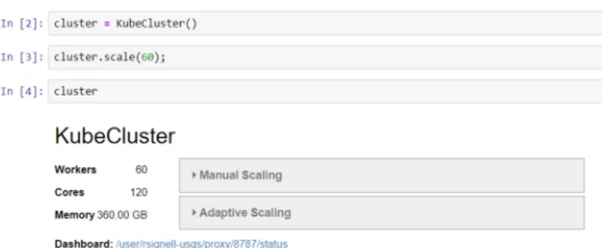
A common requirement in the analysis is to compute the mean or other property over the entire grid over a period of simulation. Here we illustrate the power of the Cloud to perform one of these calculations in 15 s instead of 15 min by using 60 Dask workers instead of just one, describing a notebook that computes and visualizes the maximum water level over a one week simulation of Hurricane Ike for the entire model mesh (covering the US East and Gulf Coasts).
The notebook workflow commences with a specification of how much processing power is desired, here requesting 60 Dask workers utilizing 120 CPU cores (Figure2). The next step is opening the Zarr dataset in Xarray, which simply reads the metadata (Figure3). We see we have water level variable called zeta, with more than 9 million nodes, and 720 time steps. We can also see data is arranged in chunks that each contain 10 time steps and 141,973 nodes. The chunk size was specified when the Zarr dataset was created, using Xarray to convert the original NetCDF file from Clint Dawson (University of Texas), and using the Amazon Web Services command line interface to upload to Amazon S3 object storage.
J. Mar. Sci. Eng. 2019, 7, x FOR PEER REVIEW 5 of 12
example, currently, over 90% of the 300+ packages we use to build the Pangeo Docker containers are from conda-forge.
2.14. Community
The Pangeo collaborator community [30] plays a critical role in making this framework deployable and usable by domain scientists like ocean modelers. The community discusses technical and usage challenges on GitHub issues [31], during weekly check-in meetings, and in a blog [32]. 3. System Application
3.1. Deployment on Amazon Cloud
We obtained research credits from the Amazon Open Data program [33] to deploy and test the framework on the Amazon Cloud. The credits were obtained under the umbrella of the Earth System Information Partners (ESIP) [34], of which USGS, NOAA, NASA, and many other federal agencies are partners. Deploying the environment under ESIP made access possible from government and academic collaborators alike.
3.2. Example: Mapping Maximum Water Level During a Storm Simulation from an Unstructured Grid (Triangular Mesh) Model
A common requirement in the analysis is to compute the mean or other property over the entire grid over a period of simulation. Here we illustrate the power of the Cloud to perform one of these calculations in 15 s instead of 15 min by using 60 Dask workers instead of just one, describing a notebook that computes and visualizes the maximum water level over a one week simulation of Hurricane Ike for the entire model mesh (covering the US East and Gulf Coasts).
The notebook workflow commences with a specification of how much processing power is desired, here requesting 60 Dask workers utilizing 120 CPU cores (Figure 2). The next step is opening the Zarr dataset in Xarray, which simply reads the metadata (Figure 3). We see we have water level variable called zeta, with more than 9 million nodes, and 720 time steps. We can also see data is arranged in chunks that each contain 10 time steps and 141,973 nodes. The chunk size was specified when the Zarr dataset was created, using Xarray to convert the original NetCDF file from Clint Dawson (University of Texas), and using the Amazon Web Services command line interface to upload to Amazon S3 object storage.
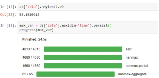
After inspecting the total size that zeta would take in memory (58 GB), we calculate the maximum of zeta over the time dimension (Figure 4), and Dask automatically creates, schedules and executes the parallel tasks over the workers in the Dask cluster. The progress bar shows the parallel calculations that are taking place, in this case reading chunks of data from Zarr, computing the maximum for each chunk, and assembling each piece into the final 2D field.
Figure 2. Starting up a Dask cluster with KubeCluster, which use Kubernetes to create a cluster of
Docker containers. A Dashboard link is also displayed, which allows users to monitor the work done by the cluster in a separate browser window.
Figure 2. Starting up a Dask cluster with KubeCluster, which use Kubernetes to create a cluster of Docker containers. A Dashboard link is also displayed, which allows users to monitor the work done by the cluster in a separate browser window.
J. Mar. Sci. Eng.2019,7, 110 6 of 12
J. Mar. Sci. Eng. 2019, 7, x FOR PEER REVIEW 6 of 12
Figure 3. Reading a Zarr dataset from s3 storage in Xarray. Note the data looks as if it were read from
a local NetCDF file or an OPeNDAP service, with the defined data type, shape, dimensions, and attributes.
Figure 4. Calculating the maximum value zeta (water level) over the time dimension. The “persist”
command tells Dask to leave the data on the workers, for possible future computations. The progress command creates progress bars that give the user a visual indicator of how the parallel computation is progressing. Here was see for example that 4813 Zarr reading commands were executed.
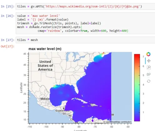
Once the maximum water level has been computed, we can display the results using the GeoViews TriMesh method, which when combined with the rasterize command from Datashader, dynamically renders and rasterizes the mesh to the requested figure size (here 600 × 400 pixels) (Figure 5). The controls on the right side of the plot allow the user to zoom and pan the visualization, which triggers additional rendering and rasterization of the data (Figure 6). In this way, the user can see investigate the full resolution of the model results. Even with this 9 million node grid, rendering is fast, taking less than 1 s. This will become even faster with PyViz optimizations soon to be implemented.
Figure 3. Reading a Zarr dataset from s3 storage in Xarray. Note the data looks as if it were read from a local NetCDF file or an OPeNDAP service, with the defined data type, shape, dimensions, and attributes.
After inspecting the total size that zeta would take in memory (58 GB), we calculate the maximum of zeta over the time dimension (Figure4), and Dask automatically creates, schedules and executes the parallel tasks over the workers in the Dask cluster. The progress bar shows the parallel calculations that are taking place, in this case reading chunks of data from Zarr, computing the maximum for each chunk, and assembling each piece into the final 2D field.
J. Mar. Sci. Eng. 2019, 7, x FOR PEER REVIEW 6 of 12
Figure 3. Reading a Zarr dataset from s3 storage in Xarray. Note the data looks as if it were read from
a local NetCDF file or an OPeNDAP service, with the defined data type, shape, dimensions, and attributes.
Figure 4. Calculating the maximum value zeta (water level) over the time dimension. The “persist”
command tells Dask to leave the data on the workers, for possible future computations. The progress command creates progress bars that give the user a visual indicator of how the parallel computation is progressing. Here was see for example that 4813 Zarr reading commands were executed.
Once the maximum water level has been computed, we can display the results using the GeoViews TriMesh method, which when combined with the rasterize command from Datashader, dynamically renders and rasterizes the mesh to the requested figure size (here 600 × 400 pixels) (Figure 5). The controls on the right side of the plot allow the user to zoom and pan the visualization, which triggers additional rendering and rasterization of the data (Figure 6). In this way, the user can see investigate the full resolution of the model results. Even with this 9 million node grid, rendering is fast, taking less than 1 s. This will become even faster with PyViz optimizations soon to be implemented.
Figure 4.Calculating the maximum value zeta (water level) over the time dimension. The “persist” command tells Dask to leave the data on the workers, for possible future computations. The progress command creates progress bars that give the user a visual indicator of how the parallel computation is progressing. Here was see for example that 4813 Zarr reading commands were executed.
Once the maximum water level has been computed, we can display the results using the GeoViews TriMesh method, which when combined with the rasterize command from Datashader, dynamically renders and rasterizes the mesh to the requested figure size (here 600×400 pixels) (Figure5). The
controls on the right side of the plot allow the user to zoom and pan the visualization, which triggers additional rendering and rasterization of the data (Figure6). In this way, the user can see investigate the full resolution of the model results. Even with this 9 million node grid, rendering is fast, taking less than 1 s. This will become even faster with PyViz optimizations soon to be implemented.
J. Mar. Sci. Eng.2019,7, 110 7 of 12
J. Mar. Sci. Eng. 2019, 7, x FOR PEER REVIEW 7 of 12
Figure 5. The TriMesh method from GeoViews is used to render the 9 million node mesh, and
Datashader rasterizes the output to the requested width and height.
Figure 6. Using the controls on the right, the user has selected pan and wheel_zoom, which enables
dynamic exploration of the maximum water level result in a region of interest (here the Texas Coast).
The notebook is completely reproducible, as it accesses public data on the Cloud, and the software required to run the notebook is all on the community Conda-Forge channel. The notebook is available on GitHub [35], and interested parties can not only download it for local use, but launch it immediately on the Cloud using Binder [36].
3.3. Example: Creating a Dashboard for Exploring a Structured Grid (Orthogonal Curvilinear Grid) Model In addition to dynamic visualization of large grids, the PyViz tools hvPlot and Panel allow for easy and flexible construction of dashboards containing both visualization and widgets. In fact, hvPlot creates widgets automatically if the variable to be mapped has more than two dimensions. We
Figure 5. The TriMesh method from GeoViews is used to render the 9 million node mesh, and Datashader rasterizes the output to the requested width and height.
J. Mar. Sci. Eng. 2019, 7, x FOR PEER REVIEW 7 of 12
Figure 5. The TriMesh method from GeoViews is used to render the 9 million node mesh, and
Datashader rasterizes the output to the requested width and height.
Figure 6. Using the controls on the right, the user has selected pan and wheel_zoom, which enables
dynamic exploration of the maximum water level result in a region of interest (here the Texas Coast).
The notebook is completely reproducible, as it accesses public data on the Cloud, and the software required to run the notebook is all on the community Conda-Forge channel. The notebook is available on GitHub [35], and interested parties can not only download it for local use, but launch it immediately on the Cloud using Binder [36].
3.3. Example: Creating a Dashboard for Exploring a Structured Grid (Orthogonal Curvilinear Grid) Model In addition to dynamic visualization of large grids, the PyViz tools hvPlot and Panel allow for easy and flexible construction of dashboards containing both visualization and widgets. In fact, hvPlot creates widgets automatically if the variable to be mapped has more than two dimensions. We
Figure 6.Using the controls on the right, the user has selected pan and wheel_zoom, which enables dynamic exploration of the maximum water level result in a region of interest (here the Texas Coast). The notebook is completely reproducible, as it accesses public data on the Cloud, and the software required to run the notebook is all on the community Conda-Forge channel. The notebook is available on GitHub [35], and interested parties can not only download it for local use, but launch it immediately on the Cloud using Binder [36].
3.3. Example: Creating a Dashboard for Exploring a Structured Grid (Orthogonal Curvilinear Grid) Model In addition to dynamic visualization of large grids, the PyViz tools hvPlot and Panel allow for easy and flexible construction of dashboards containing both visualization and widgets. In fact, hvPlot
J. Mar. Sci. Eng.2019,7, 110 8 of 12
creates widgets automatically if the variable to be mapped has more than two dimensions. We can demonstrate this functionality with the forecast from the USGS Coupled Ocean Atmosphere Wave and Sediment Transport (COAWST) model [9]. In Figure7, a simple dashboard is shown that allows the user to explore the data by selecting different time steps and layers. This was created by the notebook code cell shown in Figure8. The curvilinear orthogonal grid used by the COAWST model is visualized using the QuadMesh function in GeoViews. As with the TriMesh example, the user has the ability to zoom and pan, which Datashader re-renders the data (within a second) and then delivers the result to the browser (Figure9). This notebook is also available on GitHub [34], where it can be examined, downloaded, or run on the Cloud (using the “launch Binder” button).
J. Mar. Sci. Eng. 2019, 7, x FOR PEER REVIEW 8 of 12
can demonstrate this functionality with the forecast from the USGS Coupled Ocean Atmosphere Wave and Sediment Transport (COAWST) model [9]. In Figure 7, a simple dashboard is shown that allows the user to explore the data by selecting different time steps and layers. This was created by the notebook code cell shown in Figure 8. The curvilinear orthogonal grid used by the COAWST model is visualized using the QuadMesh function in GeoViews. As with the TriMesh example, the user has the ability to zoom and pan, which Datashader re-renders the data (within a second) and then delivers the result to the browser (Figure 9). This notebook is also available on GitHub [34], where it can be examined, downloaded, or run on the Cloud (using the “launch Binder” button).
Figure 7. Simple dashboard for interactive, dynamic visualization of model results (here from the
curvilinear orthogonal grid COAWST forecast model).
Figure 8. Notebook cell that generates the dashboard in Figure 7. COAWST uses a curvilinear grid,
we specify that HvPlot use the QuadMesh method to visualize the potential temperature, that we want to rasterize the result, and that by the GroupBy option, to create widgets for the time and vertical layers. We then specify that we want to use the ESRI Imagery tile service for a basemap, and overlay the visualization on top. Finally, we change widgets to type Select, which provide a dropdown list of values (instead of the default slider).
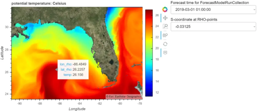
Figure 9. Zooming into the Gulf of Mexico on the COAWST forecast temperature, using the pan and
wheel zoom controls. The hover control is also selected, which allows data values to be displayed along with their coordinates.
Figure 7. Simple dashboard for interactive, dynamic visualization of model results (here from the curvilinear orthogonal grid COAWST forecast model).
J. Mar. Sci. Eng. 2019, 7, x FOR PEER REVIEW 8 of 12
can demonstrate this functionality with the forecast from the USGS Coupled Ocean Atmosphere Wave and Sediment Transport (COAWST) model [9]. In Figure 7, a simple dashboard is shown that allows the user to explore the data by selecting different time steps and layers. This was created by the notebook code cell shown in Figure 8. The curvilinear orthogonal grid used by the COAWST model is visualized using the QuadMesh function in GeoViews. As with the TriMesh example, the user has the ability to zoom and pan, which Datashader re-renders the data (within a second) and then delivers the result to the browser (Figure 9). This notebook is also available on GitHub [34], where it can be examined, downloaded, or run on the Cloud (using the “launch Binder” button).
Figure 7. Simple dashboard for interactive, dynamic visualization of model results (here from the
curvilinear orthogonal grid COAWST forecast model).
Figure 8. Notebook cell that generates the dashboard in Figure 7. COAWST uses a curvilinear grid,
we specify that HvPlot use the QuadMesh method to visualize the potential temperature, that we want to rasterize the result, and that by the GroupBy option, to create widgets for the time and vertical layers. We then specify that we want to use the ESRI Imagery tile service for a basemap, and overlay the visualization on top. Finally, we change widgets to type Select, which provide a dropdown list of values (instead of the default slider).
Figure 9. Zooming into the Gulf of Mexico on the COAWST forecast temperature, using the pan and
wheel zoom controls. The hover control is also selected, which allows data values to be displayed along with their coordinates.
Figure 8.Notebook cell that generates the dashboard in Figure7. COAWST uses a curvilinear grid, we specify that HvPlot use the QuadMesh method to visualize the potential temperature, that we want to rasterize the result, and that by the GroupBy option, to create widgets for the time and vertical layers. We then specify that we want to use the ESRI Imagery tile service for a basemap, and overlay the visualization on top. Finally, we change widgets to type Select, which provide a dropdown list of values (instead of the default slider).
J. Mar. Sci. Eng.2019,7, 110 9 of 12
J. Mar. Sci. Eng. 2019, 7, x FOR PEER REVIEW 8 of 12
can demonstrate this functionality with the forecast from the USGS Coupled Ocean Atmosphere Wave and Sediment Transport (COAWST) model [9]. In Figure 7, a simple dashboard is shown that allows the user to explore the data by selecting different time steps and layers. This was created by the notebook code cell shown in Figure 8. The curvilinear orthogonal grid used by the COAWST model is visualized using the QuadMesh function in GeoViews. As with the TriMesh example, the user has the ability to zoom and pan, which Datashader re-renders the data (within a second) and then delivers the result to the browser (Figure 9). This notebook is also available on GitHub [34], where it can be examined, downloaded, or run on the Cloud (using the “launch Binder” button).
Figure 7. Simple dashboard for interactive, dynamic visualization of model results (here from the
curvilinear orthogonal grid COAWST forecast model).
Figure 8. Notebook cell that generates the dashboard in Figure 7. COAWST uses a curvilinear grid,
we specify that HvPlot use the QuadMesh method to visualize the potential temperature, that we want to rasterize the result, and that by the GroupBy option, to create widgets for the time and vertical layers. We then specify that we want to use the ESRI Imagery tile service for a basemap, and overlay the visualization on top. Finally, we change widgets to type Select, which provide a dropdown list of values (instead of the default slider).
Figure 9. Zooming into the Gulf of Mexico on the COAWST forecast temperature, using the pan and
wheel zoom controls. The hover control is also selected, which allows data values to be displayed along with their coordinates.
Figure 9.Zooming into the Gulf of Mexico on the COAWST forecast temperature, using the pan and wheel zoom controls. The hover control is also selected, which allows data values to be displayed along with their coordinates.
4. Discussion
The Pangeo framework demonstrated here works not only on the Cloud, but can run on HPC or even on a local desktop. On the local desktop, however, data needs to be downloaded for analysis by each user, and parallel computations are limited to the locally available CPUs. On HPC, there may be access to more CPUs, but the data still needs to be downloaded to the HPC center. On the Cloud, however, anyone can access the data without it having to be moved and have virtually unlimited processing power available to them. On the Cloud, Pangeo allows similar functionality to Google Earth Engine [37], allowing computation at a scale close to the data, but can be run on any Cloud, and with any type of data. Let us review the advantages of the Cloud in more detail:
Data access: Data in object storage like S3, can be accessed directly from a URL without the need of a special data service like OPeNDAP. This prevents the data service from being a bottleneck on operations, or data access failing because the data service has failed. It also means that data storage on the Cloud is immediately available for use by your collaborators or users. While data services like OPeNDAP can become overwhelmed by too many concurrent requests, this doesn’t happen with access from object storage. Object storage is also extremely reliable, 99.999999999% with default storage on Amazon, which means if 10,000 objects are stored, you may lose one every 10 million years. Finally, data in object storage are not just available for researchers to analyze, but are also available for Cloud-enabled web applications to use. This includes applications that have been developed by scientists as PyViz dashboards, then published using Panel as dynamic web applications with one additional line of code.
Computing on demand: On the Cloud, costs accrue per hour for each machine type in use. It costs the same to run 60 CPUs for 1 min as it does to run 1 CPU for 60 min, and because nearly instantaneous access is available, with virtually unlimited numbers of CPUs, big data analysis tasks can be conducted interactively instead of being limited to batch operations. The Pangeo instance automatically spins up and down Cloud instances based on computational demands.
Freedom from local infrastructure: Because the data, analysis, and visualization are on the Cloud, buying or maintaining local computer centers, high power computer systems, or even fast internet connections is not necessary. Researchers and their colleagues can analyze and visualize data from anywhere with a simple laptop computer and the WiFi from a cell phone hotspot.
We have demonstrated the Pangeo framework for coastal ocean modeling here, but the framework is flexible and is being used increasingly by a wide variety of research projects, including climate scale modeling [38] and remote sensing [39]. While the framework clearly benefits the analysis and visualization of large datasets, it is useful for other applications as well. For example, the AWS Pangeo instance we deployed was used by the USGS for two multi-day machine learning workshops that
J. Mar. Sci. Eng.2019,7, 110 10 of 12
each had 40 students from various institutions with a diversity of computer configurations, operating systems, and versions. The students were able to do the coursework on the Cloud using their web browsers, avoiding the challenges encountered when the course computing environment needs to be installed on a number of heterogeneous personal computers.
While there are numerous benefits to this framework, there are also some remaining challenges [40,41]. One important challenge is cost. The Cloud often appears expensive to researchers because much of the true cost of computing is covered by local overhead (e.g., the physical structure, electricity, internet costs, support staff). Gradual adoption, training, and subsidies for Cloud computing are some of the approaches that can help researchers and institutions make the transition to the Cloud more effectively. Another challenge is cultural: Scientists are accustomed to having their data local, and some do not trust storage on the Cloud, despite the reliability. Security issues are also a perceived concern with non-local data. Finally, converting the large collection of datasets designed for file systems to datasets that work well on object storage is a non-trivial task even with the tools discussed above.
Once these challenges are overcome, we can look forward to a day when all model data and analysis takes place on the Cloud, with all data directly accessible and connected by high-speed networks (e.g., Internet 2) and common computing environments can be shared easily. This will lead to unprecedented levels of performance, reliability, and reproducibility for the scientific community, leading to more efficient and effective science.
Several agencies have played key roles in the development of these open-source tools that support the entire community: DARPA (U.S. Defense Advanced Research Projects Agency) provided significant funding for Dask, and ERDC (U.S. Army Engineer Research and Development Center) has provided significant funding through their EarthSim project for developing modeling-related functionality in the PyViz package. We hope that more agencies will participate in this type of open source development, accelerating our progress on expanding this framework to more use cases and more communities. 5. Conclusions
Pangeo with PyViz provides an open-source framework for interactive, scalable, data-proximate analysis and visualization of coastal ocean model output on the Cloud. The framework described here provides a glimpse of the scientific workplace of the future, where a modeler with a laptop and a modest internet connection can work interactively at scale with big data on the Cloud, create interactive visual dashboards for data exploration, and generate more reproducible science.
Author Contributions:Conceptualization, R.P.S.; methodology, software and writing, R.P.S. and D.P.
Funding:This research benefited from National Science Foundation grant number 1740648, and EarthSim project was funded by ERDC projects PETTT BY17-094SP and PETTT BY16-091SP. This project also benefited from research credits granted by Amazon.
Acknowledgments:Thanks to Ryan Abernathy, Joe Hamman, Matthew Rocklin, and rest of the Pangeo team for creating the community and tools that made this work possible. Thanks to Clint Dawson at the University of Texas for providing the ADCIRC simulation, and to John Warner from USGS for the COAWST forecast. Thanks to Jacob Tomlinson from the British Met Office, Joe Flasher from Amazon, John Readey from the HDF Group and Annie Burgess from ESIP for making our Pangeo deployment on AWS possible. Thanks to Filipe Fernandes for help building Conda-Forge packages for this project. Thanks to CollegeDegrees360 for the "Girl Using Laptop in Park" photo [42]. Any use of trade, product, or firm names is for descriptive purposes only and does not imply endorsement by the U.S. Government.
Conflicts of Interest:The authors declare no conflict of interest. References
1. Hankin, S.C. NetCDF-CF-OPeNDAP: Standards for Ocean Data Interoperability and Object Lessons for Community Data Standards Processes.OceanObs092010, 450–458.
2. MARACOOS OceansMap. Available online:http://oceansmap.maracoos.org/(accessed on 26 February 2019). 3. AOOS Model Explorer. Available online:http://p.axds.co/?portal_id=16(accessed on 26 February 2019).
J. Mar. Sci. Eng.2019,7, 110 11 of 12
4. Committee on Future Directions for NSF Advanced Computing Infrastructure to Support U.S. Science in 2017–2020. InFuture Directions for NSF Advanced Computing Infrastructure to Support U.S. Science and Engineering in 2017–2020; National Academies Press: Washington, DC, USA, 2016. [CrossRef]
5. Abernathey, R.; Paul, K.; Hamman, J.; Rocklin, M.; Lepore, C.; Tippett, M.; Henderson, N.; Seager, R.; May, R.; Del Vento, D. Pangeo NSF Earthcube Proposal.Figshare, 2017.
6. Pangeo Project Web Page. Available online:https://pangeo.io(accessed on 28 February 2019).
7. Ennard-Bontemps, G.; Abernathey, R.; Hamman, J.; Ponte, A.; Rath, W. The Pangeo Big Data Ecosystem and its use at CNES. InProceedings of the 2019 Conference on Big Data from Space, 19-21, Munich, Germany; Soille, P., Loekken, S., Albani, S., Eds.; Publications Office of the European Union: Luxembourg, 2019; pp. 49–52. [CrossRef]
8. ADCIRC Model Web Page. Available online:https://adcirc.org(accessed on 28 February 2019).
9. Warner, J.C.; Armstrong, B.; He, R.; Zambon, J.B. Development of a Coupled Ocean–Atmosphere–Wave– Sediment Transport (COAWST) Modeling System.Ocean Model.2010,35, 230–244. [CrossRef]
10. Zarr format web page. Available online:https://zarr.readthedocs.io/en/stable(accessed on 28 February 2019). 11. Dask project web page. Available online:https://dask.org(accessed on 28 February 2019).
12. Xarray project web page. Available online:http://xarray.pydata.org(accessed on 28 February 2019). 13. NetCDF format web page. Available online:https://www.unidata.ucar.edu/software/netcdf/(accessed on 28
February 2019).
14. CF Metadata web page. Available online:http://cfconventions.org(accessed on 28 February 2019). 15. PyViz project web page. Available online:http://pyviz.org(accessed on 28 February 2019). 16. Jupyter project web page. Available online:https://jupyter.org(accessed on 28 February 2019). 17. Kubernetes web page. Available online:https://kubernetes.io(accessed on 28 February 2019). 18. Docker web page. Available online:https://www.docker.com(accessed on 28 February 2019).
19. EarthSim project web page. Available online:https://earthsim.pyviz.org(accessed on 28 February 2019). 20. Pothina, D.; Rudiger, P.; Bednar, J.; Christensen, S.; Winters, K.; Pevey, K.; Ball, C.; Brener, G. EarthSim:
Flexible Environmental Simulation Workflows Entirely Within Jupyter Notebooks. SciPy 2018, 48–55. [CrossRef]
21. Datashader project web page. Available online:http://datashader.org(accessed on 28 February 2019). 22. HoloViews project web page. Available online:https://holoviews.org(accessed on 28 February 2019). 23. GeoViews project web page. Available online:https://geoviews.org(accessed on 28 February 2019). 24. Cartopy project web page. Available online:https://scitools.org.uk/cartopy(accessed on 28 February 2019). 25. HvPlot project web page. Available online:https://hvplot.pyviz.org(accessed on 28 February 2019). 26. Panel project web page. Available online:https://panel.pyviz.org(accessed on 28 February 2019).
27. JupyterHub project web page. Available online:https://jupyterhub.readthedocs.io(accessed on 28 February 2019). 28. Conda web page. Available online:https://conda.io(accessed on 28 February 2019).
29. Conda-Forge web page. Available online:https://conda-forge.org(accessed on 28 February 2019).
30. Pangeo collaborators web page. Available online: https://pangeo.io/collaborators.html(accessed on 28 February 2019).
31. Pangeo issues web page. Available online:https://github.com/pangeo-data/pangeo/issues(accessed on 28 February 2019).
32. Pangeo blog web page. Available online:https://medium.com/pangeo(accessed on 28 February 2019). 33. Open Data on AWS web page. Available online:https://aws.amazon.com/opendata/(accessed on 28 February 2019). 34. Earth System Information Partners Federation (ESIP) web page. Available online:https://www.esipfed.org
(accessed on 28 February 2019).
35. Reproducible Jupyter Notebooks. Available online:https://github.com/reproducible-notebooks(accessed on 28 February 2019).
36. Binder Service Web Page. Available online:https://mybinder.org(accessed on 28 February 2019).
37. Gorelick, N.; Hancher, M.; Dixon, M.; Ilyushchenko, S.; Thau, D.; Moore, R. Google Earth Engine: Planetary-Scale Geospatial Analysis for Everyone.Remote Sens. Environ.2017,202, 18–27. [CrossRef] 38. Busecke, J.J.; Abernathey, R.P. Ocean Mesoscale Mixing Linked to Climate Variability. Sci. Adv. 2019,
J. Mar. Sci. Eng.2019,7, 110 12 of 12
39. Cloud Native Geoprocessing of Earth Satellite Data with Pangeo. Available online: https://medium. com/pangeo/cloud-native-geoprocessing-of-earth-observation-satellite-data-with-pangeo-997692d91ca2 (accessed on 28 February 2019).
40. Olanrewaju, R.F.; Burhan ul Islam, K.; Mueen Ul Islam Mattoo, M.; Anwar, F.; Nurashikin Bt. Nordin, A.; Naaz Mir, R.; Noor, Z. Adoption of Cloud Computing in Higher Learning Institutions: A Systematic Review. Indian J. Sci. Technol.2017,10, 1–19. [CrossRef]
41. Vance, T.C.; Wengren, M.; Burger, E.F.; Hernandez, D.; Kearns, T.; Merati, N.; O’Brien, K.M.; O’Neil, J.; Potemra, J.; Signell, R.P.; et al. From the Oceans to the Cloud: Opportunities and Challenges for Data, Models, Computation and Workflows.Frontiers Marine Sci.2019,6, 211. [CrossRef]
42. “Girl Using Laptop in Park” Photo from Flickr Photo-Sharing Web Site. Available online:https://www.flickr. com/photos/83633410@N07/7658165122(accessed on 28 February 2019).
©2019 by the authors. Licensee MDPI, Basel, Switzerland. This article is an open access article distributed under the terms and conditions of the Creative Commons Attribution (CC BY) license (http://creativecommons.org/licenses/by/4.0/).