I N T H I S C H A P T E R
Customizing a Pivot Table
3
Although pivot tables provide an extremely fast wayto summarize data, sometimes the pivot table defaults aren’t exactly what you need. You can use many powerful settings to tweak the information in your pivot table. These tweaks range from making cosmetic changes to changing the underlying calcu-lation used in the pivot table.
In Excel 2007, controls to customize the pivot table are found in a myriad of places: the Options ribbon, the Design ribbon, the Field Settings dialog box, the Data Field Settings dialog box, the PivotTable Options dialog box, and context menus. Rather than cover each set of controls sequentially, this chapter seeks to cover functional areas in customiz-ing pivot table customization:
I Minor Cosmetic Changes—Changing blanks
to zeros, adjusting the number format, renam-ing a field. Although these changes are minor, they are annoying and affect almost every pivot table that you create.
I Layout Changes—Comparing three possible
layouts, showing/hiding subtotals and totals.
I Major Cosmetic Changes—Using table styles
to quickly format your table.
I Summary Calculation—Changing from Sum
to Count, Min, Max, and more. If you have a table that defaults to Count of Revenue instead of Sum of Revenue, you need to visit this sec-tion.
I Advanced Calculation—Using settings to
show data as a running total, % of total, and more.
I Other Options—Quickly reviewing more
obscure options found throughout the Excel interface.
Making Common Cosmetic Changes . . . .46
Making Layout Changes . . . .52
Case Study: Converting a Pivot Table to Values . . . .56
Customizing the Pivot Table Appearance with Styles and Themes . . . .61
Changing Summary Calculations . . . .65
Adding and Removing Subtotals . . . .68
Using Running Total Options . . . .70
Case Study: Producing Revenue by Line of Business Report . . . .77
Making Common Cosmetic Changes
A few changes need to be made to almost every pivot table. These changes make your pivot table easier to understand and interpret.
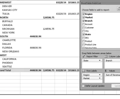
Figure 3.1 shows a typical pivot table. This pivot table has two fields in the Row Labels area and one field in the Column Labels area.
3
Figure 3.1
A default pivot table.
This pivot table contains several annoying items that you might want to change quickly:
I The default table style uses no gridlines. This makes it difficult to follow the rows and columns across.
I Numbers in the values area are in a general number format. There are no commas, currency symbols, and so on.
I For sparse datasets, there are many blanks in the values area. The blank cell in B6 indi-cates that there were no sales in Denver for branch 101313. Most people would prefer to see a zero instead of blanks.
I Excel renames fields in the values area with the unimaginative name Sum of Revenue. You can change this name.
You can correct each of these annoyances with just a few mouse clicks. The following sec-tions address each issue.
47
Making Common Cosmetic ChangesApplying a Table Style to Restore Gridlines
The default pivot table layout contains no gridlines. This format is annoying and a giant step backward. Luckily, you can easily apply a table style. Any table style that you choose will be better than the default.
Follow these steps to apply a table style:
1. Make sure that the active cell is in the pivot table. 2. From the Ribbon, choose the Design tab.
3. Three arrows appear at the right side of the PivotTable Style gallery. Click the bottom arrow to open the complete gallery, as shown in Figure 3.2.
4. Choose any style other than the first style from the drop-down. Styles toward the bot-tom of the gallery tend to have more formatting.
3
Figure 3.2
The gallery contains 75 styles to choose from.
It doesn’t matter which style you choose from the gallery; any of the 74 other styles are bet-ter than the default style.
➔
For more details about customizing styles,see“ Customizing the Pivot Table Appearance with Styles and Themes,”p. 61.Changing the Number Format to Add Thousands Separators
If you’ve gone to the trouble of formatting your underlying data, you might expect that the pivot table would capture some of this formatting. Unfortunately, it does not.
Even if your underlying data fields were formatted with a certain numeric format, the default pivot table presents values formatted with a general format.
For example, in the figures in this chapter, the numbers are in the hundreds of thousands. At this level of sales, you would normally have a thousands separator and probably no deci-mal places. Although the original data had a numeric format applied, the pivot table rou-tinely formats your numbers in an ugly general style.
You access the numeric format for a field in the Data Field Settings dialog box. There are four ways to display this dialog box:
I Right-click a number in the values area of the pivot table and choose Value Field Settings.
I Double-click the Sum of Revenue cell in cell A3 of Figure 3.3.
I Click the drop-down arrow on the Sum of Revenue field in the drop zones of the PivotTable Field List. Then choose Field Settings from the context menu.
I Select any cell in the values area of the pivot table. From the Options ribbon, choose Field Settings from the Active Field group.
As shown in Figure 3.3, the Data Field Settings dialog box is displayed. To change the numeric format, click the Number Format button in the lower-left corner.
3 Figure 3.3 Display the Data Field Settings dialog box and then click Number Format.
In the Format Cells dialog box, you can choose any built-in number format or choose a cus-tom format. The cuscus-tom number format shown in Figure 3.4 displays numbers in thousands with a Kabbreviation after the number.
Although Excel 2007 offers a Live Preview feature for many dialog boxes, the Format Cells dialog box does not offer one.You must assign the number format and then click OK twice to see the changes.
NO
49
Making Common Cosmetic ChangesReplacing Blanks with Zeros
One of the elements of good spreadsheet design is that you should never leave blank cells in a numeric section of the worksheet. Even Microsoft believes in this rule; if your source data for a pivot table contains 1 million numeric cells and 1 blank cell, Excel 2007 treats the entire column as if it were text. This is why it is incredibly annoying that the default setting for a pivot table leaves many blanks in the values area of some pivot tables.
The blank tells you that there were no sales for that particular combination of labels. In the default view, an actual zero is used to indicate that there was activity, but the total sales were zero. This value might mean that a customer bought something and then returned it, result-ing in net sales of zero. Although there are limited applications in which you would want to differentiate between having no sales and having net zero sales, this seems rare. In 99% of the cases, you should fill in the blank cells with zeros.
Follow these steps to change this setting for the current pivot table: 1. Select a cell inside the pivot table.
2. On the Options ribbon, choose the Options icon from the Pivot Table Options group to display the PivotTable Options dialog box.
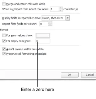
3. On the Layout & Format tab, in the Format section, type 0next to the field labeled For
Empty Cells Show (see Figure 3.5). 4. Click OK to accept the change.
3
Figure 3.4
Choose an easier-to-read number format from the Format Cells dialog box.
The result is that the pivot table is filled with zeros instead of blanks, as shown in Figure 3.6.
3
Figure 3.5
Enter a zero here to replace the blank cells with zero.
Enter a zero here
Figure 3.6
Your report is now a solid contiguous block of non-blank cells.
51
Making Common Cosmetic ChangesChanging a Field Name
Every field in the final pivot table has a name. Fields in the row, column, and filter areas inherit their names from the heading in the source data. Fields in the data section are given names such as Sum of Revenue. In some instances, you may prefer to print a different name in the pivot table. You might prefer Total Revenue instead of the default name. In these situ-ations, the capability to change your field names comes in quite handy.
Although many of the names are inherited from headings in the original dataset, when your data is from an external data source, you might not have control over field names. In these cases, you might want to change the names of the fields as well.
To change a field name in the values area, follow these steps:
1. Select a cell in the pivot table that contains the appropriate value. In Figure 3.7, the val-ues area contains both hours and revenue. If you want to rename Sum of Revenue, select any cell from B5:B24.
2. On the Options ribbon, select the Field Settings icon from the Active Field group. 3. In the Data Field Settings dialog box, type a new name in the Custom Name field. You
can enter any unique name you like. One common frustration occurs when you would like to rename Sum of Revenue to Revenue. The problem is that this name is not allowed because it is not unique; you already have a Revenue field in the source data. To work around this limitation, you can name the field and add a space to the end of the name. Excel considers “Revenue” (with a space) to be different from “Revenue” (with no space). Because this change is cosmetic, the readers of your spreadsheet will not notice the space after the name.
The new name appears in the pivot table. Now look at cell B5 in Figure 3.7. The name Revenue (with a space) is less awkward than the default Sum of Revenue.
3
Figure 3.7
The name typed in the Custom Name box appears in the pivot table. Although names should be unique, you can trick Excel into accepting a similar name by adding a space to the end of it.
Making Layout Changes
Excel 2007 offers three layout styles instead of the two styles available in previous versions of Excel. The new style—Compact Layout—is promoted to be the default layout for your pivot tables.
Layout changes are controlled in the Layout group of the Design ribbon, as shown in Figure 3.8. This group offers four icons:
I Subtotals—Moves subtotals to the top or bottom of each group, or turns them off.
I Grand Totals—Turns the grand totals on or off for rows and columns.
I Report Layout—Uses the Compact, Outline, or Tabular forms.
I Blank Rows—Inserts or removes blank lines after each group.
3
If you rename a field in the row, column, or filter areas, the dialog box that opens in response to Field Settings is called Field Settings instead of Data Field Settings.This dialog box has different options, but the Custom Name field is located in the same place as shown in Figure 3.7.
TIP
Figure 3.8
The Layout group on the Design ribbon offers dif-ferent layouts and options for totals.
Using the New Compact Layout
By default, all new pivot tables use the compact layout shown in Figure 3.6. In this layout, multiple fields in the row area are stacked up in column A. Note in the figure that the Denver market and Midwest region are both in column A.
The compact form is suited for using the Expand and Collapse icons. Select one of the mar-ket cells—A7 as an example—and click the Collapse Entire Field icon on the Options rib-bon. Excel hides all the detail below this field and shows only the regions, as shown in Figure 3.9.
53
Making Layout ChangesAfter a field is collapsed, you can show detail for individual regions by using the plus icons in column A, or you can click Expand Entire Field on the Options ribbon to see the detail again.
3
Figure 3.9
Click the Collapse Entire Field icon to hide levels of detail.
Collapse icon
Plus icon
Figure 3.10
When you attempt to expand the innermost field, Excel offers to add a new innermost field.
If you select a cell in the innermost row field and click Expand Entire Field, Excel displays the Show Detail dialog box, as shown in Figure 3.10, to allow you to add a new innermost row field.
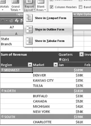
Using the Outline Form Layout
When you select Design, Layout, Report Layout, Show in Outline Form, Excel fills column A with the outermost row field. Additional row fields occupy columns B, C, and so on. Figure 3.11 shows the pivot table in Outline form.
3
Figure 3.11
The Outline layout puts each row field in a sepa-rate column.
This layout is better suited if you plan to copy the values from the pivot table to a new loca-tion for further analysis. Although the Compact layout offers a clever approach by squeez-ing multiple fields in one column, it is not ideal for reussqueez-ing the data later.
By default, both the Compact and Outline layouts put the subtotals at the top of each group. You can use the Subtotals drop-down on the Design ribbon to move the totals to the bottom of each group, as shown in Figure 3.12.
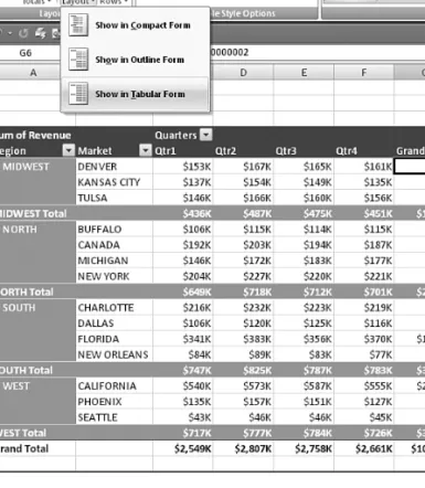
Using the Traditional Tabular Layout
Pivot table veterans will recognize the tabular layout shown in Figure 3.13. This layout is similar to the one that has been used in pivot tables since their invention. In this layout, the subtotals can never appear at the top of the group.
55
Making Layout Changes3
Figure 3.12
With subtotals at the bottom of each group, the pivot table occupies several more rows.
The tabular layout is probably the best layout if you hope to later use the resulting sum-mary data in a subsequent analysis.
C A S E
S T U D Y
Converting a Pivot Table to Values
Say that you want to summarize your dataset to show sales by Region, Market, and Quarter.Your goal is to export this data for use by another system.
The result in Figure 3.13 is close to the desired output, with a few exceptions:
I The subtotals in rows 9, 14, 19, and 23 should be removed.
I The blank cells in A7:A8, A11:A13, A16:A18, and A21:A22 should be filled in.
I The grand total should be removed from row 24 and column G.
I The pivot table should be converted from a live pivot table to static values.
To make these changes, follow these steps: 1. Select any cell in the pivot table.
2. From the Design ribbon, choose Grand Totals, Off for Rows and Columns.
3
Figure 3.13
The tabular layout is sim-ilar to pivot tables in prior versions of Excel.
57
Converting a Pivot Table to Values3. Select Design, Subtotals, Do Not Show Subtotals. 4. Select A5:F19, as shown in Figure 3.14.
3
Figure 3.14
After removing the total and subtotal informa-tion, select the data and one row of headings.
5. Press Ctrl+C to copy the data from the pivot table.
6. In a blank section of the workbook, choose Home, Clipboard, Paste, Paste Values to make a static copy of the data. The final step is filling in the blank cells in the first column of the table.
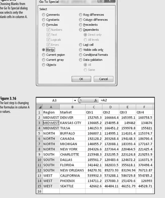
7. Select column A of the dataset.
8. In the Editing group of the Home ribbon, choose the Find & Select drop-down and then choose Go To Special. 9. In the Go To Special dialog box, as shown in Figure 3.15, select Blanks and click OK.
10. Type the equal sign (=), press the up-arrow key, and then press Ctrl+Enter to accept this formula for all the blank cells.This combination enters a formula in which each blank cell inherits the value from the cell above it, as shown in Figure 3.16.
If you attempt to choose Copy and then Paste Values, Excel complains that you cannot use this com-mand on nonadjacent cells. Instead, follow steps 11–13.
C A U T I O N
11. Reselect the cells in column A.
12. Click the Copy icon in the Clipboard group on the Home ribbon. 13. Choose Paste Values from the Paste drop-down on the Home ribbon.
The result is a solid block of summary data, as shown in Figure 3.17.These 90 cells are a summary of the 1.1 million cells in the original dataset, but they also are suitable for exporting to other systems.
3
Figure 3.15
Choosing Blanks from the Go To Special dialog box selects only the blank cells in column A.
Figure 3.16
The last step is changing the formulas in column A to values.
59
Converting a Pivot Table to ValuesControlling Blank Lines, Grand Totals, Subtotals, and Other Settings
Additional settings in the pivot table allow you to toggle various elements.Subtotals can be moved to the top or bottom of the group or turned off entirely. As noted previously, moving the subtotals to the top of the group saves a few rows in the pivot table. However, top subtotals are available only when the layout is set to Compact or Outline. Use the Subtotals icon on the Design ribbon to choose the subtotals option. Figure 3.18 shows the subtotals at the top of each group.
Grand totals can appear at the bottom of each column and/or at the end of each row, or they can be turned off altogether. Settings for grand totals appear in the Grand Totals drop-down of the Layout group on the Design ribbon. The wording in this drop-drop-down seems just a bit confusing.
If you would like a grand total column on the right side of the table, you need to select On for Rows only. Even though it is a grand total column, each total is totaling a single row. Similarly, to add a grand total row, you need to select On for Rows Columns only. Each individual grand total in the total row is totaling the cells in a column.
In Figure 3.18, the grand total column appears because the Grand Totals drop-down is set to On For Rows Only.
The Blank Rows drop-down allows you to insert blank lines between groups. In Figure 3.18, the blank lines in rows 13, 19, and 25 appear because Insert Blank Line After Each Item was selected in the Blank Rows drop-down.
3
Figure 3.17
The final dataset is suit-able for exporting to another system.
As you examine the pivot table in Figure 3.18, you might think the area around B8:B9 appears strange. Whereas the sales figures for columns C, D, and E are closely aligned with the headings, the Qtr1 heading in B8 appears far away from the sales figures in B9:B29. This happens because all the headings in B8:E8 are left-aligned. Something is causing col-umn B to be too wide. That something is the text Colcol-umn Labels in B7. This text, plus Row Labels in A8, is a new feature in Excel 2007. Although this feature might have been
designed to improve readability, it is annoying that the text makes column B too wide. To remove these text entries, click the Field Headers icon in the Show/Hide group on the Options ribbon. This group also has icons to turn off the plus and minus buttons or to hide the PivotTable Field List. Figure 3.19 shows this section of the Ribbon, as well as the pivot table with all three items turned off.
3
Figure 3.18
Subtotals at the top, grand totals for the rows, and blank lines between groups are controlled through icons in the Layout group on the Design ribbon.
Row & Column Field Headers
61
Customizing the Pivot Table Appearance with Styles and ThemesCustomizing the Pivot Table Appearance with Styles
and Themes
The PivotTable Styles gallery on the Design ribbon offers 84 built-in styles. Grouped into 28 styles each of Light, Medium, and Dark, the gallery offers variations on the accent colors used in the current theme.
Note that you can modify the thumbnails for the 84 styles shown in the gallery by using the four check boxes in the PivotTable Style Options group. In Figure 3.20, the 84 styles are shown with all four of the option buttons unchecked.
In Figure 3.21, the 84 styles are shown with accents for row headers, column headers, and alternating colors in the columns.
The PivotTable Style Options group appears to the left of the PivotTable Styles gallery. If you want banded rows or columns, it is best to choose this option before opening the gallery. Some of the 84 themes do not support banded columns or banded rows.
3
Figure 3.19
In Excel 2007, field head-ers serve little purpose.
Show/Hide Group
By checking the Banded Columns check box prior to opening the gallery, you can see which styles support the banded columns. If the Banded Columns or Rows check box is selected and the thumb-nail in the gallery does not show the effect, you know to avoid that style.
TIP
Excel 2007’s Live Preview feature works in the styles gallery. As you hover your mouse cur-sor over style thumbnails, the worksheet shows a preview of the style.
3
Figure 3.20
The 84 thumbnails appear one way when no style options are checked.
Figure 3.21
The 84 thumbnails appear differently with three style options checked.You can see that many of the styles do not support banded columns, even though this option is chosen.
Customizing a Style
You can create your own pivot table styles. The new styles are added to the gallery and will be available on every new pivot table created on your computer.
Say that you want to create a pivot table style in which the banded colors are two rows high. Follow these steps to create the new style:
63
Customizing the Pivot Table Appearance with Styles and Themes1. Find an existing style in the PivotTable Styles gallery that supports banded rows. Right-click the style in the gallery and choose Duplicate. Excel displays the Modify Table Quick Style dialog box.
2. Choose a new name for the style. Excel initially appends a 2to the existing style name, so you have a name like PivotStyleMedium16 2.
3. In the Table Element list, click on First Row Stripe. A new section called Stripe Size appears in the dialog box.
4. Choose 2 from the Stripe Size drop-down, as shown in Figure 3.22.
3
Figure 3.22
Customize the style in the Modify Table Quick Style dialog box.
5. If you want to change the stripe color, click the Format button. The Format Cells dia-log box appears. Here, click the Fill tab and then choose a fill color. Click OK to accept the color and return to the Modify Table Quick Style dialog box.
6. In the Table Element List, click on Second Row Stripe. Change the Stripe Size drop-down to 2.
7. Click OK. Prepare to be disappointed that the change didn’t work. It’s okay, though. When you modified table style Medium 16, you actually created a brand new style. The pivot table is still formatted in the original style.
8. Open the PivotTable Styles gallery. Your new style is added to the top of the gallery in the Custom section. Choose the style to apply the formatting, as shown in Figure 3.23.
Choosing a Default Style for Future Pivot Tables
You can control which style is the default style to use for all future pivot tables on the com-puter. The default can either be one of the built-in styles or a new custom style that you modified.
In the PivotTable Styles gallery on the Design ribbon, right-click the style and choose Set as Default.
Modifying Styles with Document Themes
The formatting options for pivot tables in Excel 2007 are impressive. The 84 styles, bined with 8 combinations of the Style options, make for hundreds of possible format com-binations.
In case you ever become tired of these combinations, you can visit the Themes drop-down on the Page Layout ribbon. Twenty built-in themes are available here. Each theme has a new combination of accent colors, fonts, and shape effects. Choosing a new theme affects the fonts and colors in your pivot table styles.
To change a document theme, open the Themes drop-down on the Page Layout ribbon. As you hover the mouse cursor over the themes in the drop-down, Live Preview shows you the colors and fonts in your table, as shown in Figure 3.24. To select a theme, click on it.
3
Figure 3.23
Your new style is avail-able at the top of the gallery.
Changing the theme affects the entire workbook. It changes the colors, fonts, and effects of all charts, shapes, tables, and pivot tables on all worksheets of the active workbook.
C A U T I O N
Some of the themes have contemporary fonts.You can apply the colors from a new theme without changing the fonts in your document by using the Colors drop-down in the Themes group on the Page Layout ribbon.
65
Changing Summary CalculationsChanging Summary Calculations
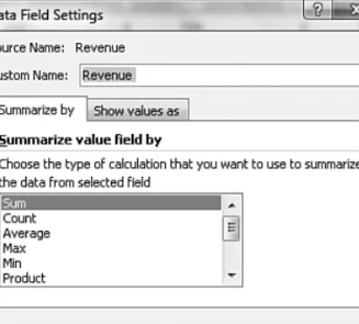
When creating your pivot table report, Excel , by default, summarizes your data by either counting or summing the items. Instead of Sum or Count, you might want to choose func-tions such as Min, Max, and Count Numeric. In all, 11 opfunc-tions are available. However, the common reason to change a summary calculation is that Excel incorrectly chose to count instead of sum your data.
Understanding Why One Blank Cell Causes a Count
If all the cells in a column contain numeric data, Excel chooses to sum. If just one cell is either blank or contains text, Excel chooses to count.
In Figure 3.25, the worksheet contains more than 60,000 numeric entries in column N and a single blank cell in N2. The one blank cell is enough to cause Excel to count the data instead of summing.
In Excel 2007, the first clue that you have a problem appears when you click the check box for Revenue in the Fields section of the PivotTable Field List. If Excel moves the Revenue field to the Row Labels drop zone, you know that Excel considers the field to be text instead of numeric.
3
Figure 3.24
Choose a document theme to modify the colors and fonts in the built-in styles.
Be vigilant while dragging fields into the Values drop zone. If a calculation appears to be dramatically too low, check to see whether the field name reads Count of Revenue instead of Sum of Revenue. When you created the pivot table in Figure 3.26, you should have noticed that your company had only $68,613 in revenue instead of $10 million. This should be a hint to notice that the heading in B3 reads Count of Revenue instead of Sum of Revenue. In fact, 68,613 is the number of records in the dataset.
3
Figure 3.25
The single blank cell in N2 causes problems in the default pivot table.
Figure 3.26
Your revenue numbers look anemic. Notice in cell B3 that Excel chose to count instead of sum the revenue.This often happens if you inadver-tently have one blank cell in your Revenue column.
You can easily override the incorrect Count calculation. Activate the Data Field Settings dialog box by double-clicking on Count of Revenue and then change the Summarize Value Field By setting from Count to Sum, as shown in Figure 3.27.
Using Functions Other Than Count or Sum
Excel offers a total of 11 functions in the Summarize By section of the PivotTable Field dia-log box. The options available are as follows:
I Sum—Provides a total of all numeric data.
I Count—Counts all cells, including numeric, text, and error cells. This is equivalent to the Excel function =COUNTA().
I Average—Provides an average. Figure 3.28 shows a report detailing average sales per region and product line. An analyst might wonder why the average housekeeping sale in the West is $152 higher than in the Midwest.
67
Changing Summary CalculationsI Max—Shows the largest value.
I Min—Shows the smallest value.
I Product—Multiplies all the cells together. For example, if your dataset has cells with values of 3, 4, and 5, the product would be 60.
I Count Nums—Counts only the numeric cells. This is equivalent to the Excel function
=COUNT().
I StdDev andStdDevP—Calculate the standard deviation. Use StdDevP if your dataset
contains the complete population. Use StdDev if your dataset contains a sample of the population. Figure 3.29 shows the results of two tests. Although the students averaged 87% on both tests, the math test had a higher standard deviation. Standard deviations explain how tightly results are grouped around the mean.
I Var andVarP—Calculate the statistical variance. Use VarP if your data contains a com-plete population. If your data contains only a sampling of the comcom-plete population, use Var to estimate the variance.
3
Figure 3.27
Change the function from Count to Sum in the Data Field Settings dia-log box.
Figure 3.28
Average sales per region and product line.
Adding and Removing Subtotals
Subtotals are undeniably an essential feature of pivot table reporting. Sometimes you may want to suppress the display of subtotals, and other times you may want to show more than one subtotal per field.
Suppress Subtotals When You Have Many Row Fields
When you have many row fields in your report, subtotals can mire your view. Take the example in Figure 3.30. You might want to suppress the subtotals for the Market and Product Line fields.
3
Figure 3.29
A low standard deviation on the science test means that all the stu-dents understand the concepts equally well. A higher standard devia-tion on the math test indicates that student scores were spread over a wider range.
Figure 3.30
Sometimes you don’t need subtotals at every level.
To remove subtotals for the Product Line field, click on the Product Line field in the drop zone section of the PivotTable Field List. Choose Field Settings. In the Field Settings dia-log box, choose None under Subtotals, as shown in Figure 3.31.
Repeat this step for other row fields. After repeating these steps for Market, you’ll find the report in Figure 3.32 to be much easier on the eyes.
69
Adding and Removing SubtotalsAdding Multiple Subtotals for One Field
You can add customized subtotals to a row or column label field. Select the Region field in the drop zone of the PivotTable Field List and choose Field Settings.
3
Figure 3.31
Choose None to remove subtotals at the Product Line level.
Figure 3.32
After specifying None for two fields, you give the report a cleaner look.
If you want to suppress the subtotals for all the row fields, it is easier to choose Design, Layout, Subtotals, Do Not Show Subtotals.
In the Field Settings dialog box, choose Custom and select the types of subtotals you would like to see. The dialog box in Figure 3.33 shows five subtotals selected for the Region field.
3
Figure 3.33
By selecting the Custom option in the Subtotals section, you can specify multiple subtotals for one field.
Using Running Total Options
So far, every pivot table created has used the Normal option. When you want to create run-ning totals or compare an item to another item, you have eight choices other than Normal. The nine options are on the second tab of the Data Field Settings dialog box. To access them, follow these steps:
1. Select a cell in the values area of your pivot table. Or, select the Sum of Revenue cell. 2. On the Options ribbon, click the Field Settings icon in the Active Group field. 3. Click the Show Values As tab in the Data Field Settings dialog box.
Initially, the Show Values As drop-down is set to Normal, and the Base Field and Base Item list boxes are grayed out, as shown in Figure 3.34.
The capability to create custom calculations is another example of the unique flexibility of pivot table reports. With the Show Data As setting, you can change the calculation for a particular data field to be based on other cells in the values area.
When you click the Show Values As drop-down, you have eight choices other than Normal. The choices are
I % of Row—Shows percentages that total across the pivot table to 100%.
I % of Column—Shows percentages that total up and down the pivot table to 100%.
I % of Total—Shows percentages such that all the detail cells in the pivot table total to 100%.
I Difference From—Shows the difference of one item compared to another item or to
71
Using Running Total OptionsI % of—Expresses the values for one item as a percentage of another item.
I % Difference From—Expresses the percentage change from one item to another item.
I Running Total In—Calculates a running total.
I Index—Calculates the relative importance of items.
The following sections illustrate a number of these options.
3
Figure 3.34
Access the second tab of the Data Field Settings dialog box to see the running total options.
Display Change from Year to Year with Difference From
Companies always want to know how they are doing this month compared to last month. Or, if their business is seasonal, they want to know how they are doing this month versus the same month of last year.
To set up such a report, double-click the Sum of Revenue field and click the Show Values As tab. In the Show Data As drop-down list, select Difference From. Because you want to compare one year to another, select Years from the Base Field option. In the Base Item field are several viable options. If you always want to compare one year to the prior year, select the (Previous) option, as shown in Figure 3.35. If you have several years’ worth of data and want to always compare to a base year of 2007, you could select 2007.
Figure 3.35 shows both the dialog box settings and the report that results from the settings. The report shows that January 2008 revenue was $55K higher than the same month in 2007.
3
Figure 3.35
The Difference From option allows you to compare two different time periods.
Compare One Year to a Prior Year with % Difference From
The % Difference From option is similar to Difference From. This option displays the change as a percentage of the base item. In Figure 3.36, the report shows 2008 as a percent-age change from 2007.
Track YTD Numbers with Running Total In
If you need to compare a year-to-date (YTD) total revenue by month, you can do so with the Running Total In option. In Figure 3.37, the Revenue field is set up to show a Running Total In with a base field of Invoice Date. With this report, you can see that the company earned a total of $2.6 million through March 2007.
Determine How Much Each Line of Business Contributes to the Total
The head of the company is often interested in what percentage of the revenue each divi-sion of the company is contributing. You can use the % of Row option, as in Figure 3.38, to show such a report. Each row totals to 100%. You can see that Maintenance contributed 70.97% of the revenue in February, but only 59.82% in December.
When you use an option from the Show Data As drop-down list, Excel does not change the headings in any way to indicate that the data is in something other than normal view. It is helpful to manu-ally add a title above the pivot table to inform the readers what they are looking at.
NO
73
Using Running Total OptionsCreate Seasonality Reports
A seasonality report is great for seeing the seasonality of your business. The % of Column option produces percentages that total to 100% in each column. Figure 3.39 shows a report in which Jan+Feb+Mar+…+Dec add to 100% for each year.
Measure Percentage for Two Fields with % of Total
The option % of Total can be used for a myriad of reports. Figure 3.40 shows a report by Region and Product Line. The values in each cell show the percentage of revenue
contribution from that region and line. Cell F8 shows that sales from Maintenance account for 66.53% of the total revenue. The South region’s sales of Maintenance account for 21.95% of total sales.
3
Figure 3.36
The % Difference From option shows that rev-enue from January 2008 is up 8.02% over January 2007.
Figure 3.37
The Running Total In option is great for calcu-lating YTD totals.
3
Figure 3.38
The % of Row option produces percentages that total to 100% in each row.
Figure 3.39
The % of Column option produces percentages that total to 100% in each column.This option is great for measuring seasonality.
75
Using Running Total Options3
Figure 3.40
The % of Total option produces a report in which every cell is a per-centage of total sales. The manager of the South Region Maintenance depart-ment can use this report to explain why his department should get a raise this year.
Compare One Line to Another Line Using % Of
The % Of option allows you to compare one item to another item. This comparison might be relevant if you believe that housekeeping and landscaping should be related. You can set up a pivot table that compares each product line to landscaping revenue. The result is shown in Figure 3.41.
Track Relative Importance with the Index Option
The final option, Index, creates a fairly obscure calculation. Microsoft claims that this calcu-lation describes the relative importance of a cell within a column.
Look at the normal data at the top of Figure 3.42. To calculate the index for Georgia Peaches, Excel first calculates Georgia Peaches x Grand Total Sales. This would be $180 x $848. Next, Excel calculates Georgia Sales x Peach Sales. This would be $210 x $290. It then divides the first result by the second result to come up with a relative importance index of 2.51.
3
Figure 3.41
This report is created using the % Of option with Landscaping as the base item.
Figure 3.42
Using the Index function, Excel shows that peach sales are more important in Georgia than in Tennessee.
C A S E
S T U D Y
77
Producing Revenue by Line of Business ReportProducing Revenue by Line of Business Report
You have been asked to produce a report that provides a comprehensive look at revenue by product line.This analysis needs to include revenue dollars by product line for each market, the percent of revenue that each product line represents within the markets, and the percent total company dollars that each market represents within the product lines. Here are the steps to follow:
1. Place your cursor inside your data source. Choose the Insert ribbon and then click the Pivot Table icon.
2. When the Create PivotTable dialog box appears, simply choose OK. A new worksheet is created with the beginnings of a pivot table report and the PivotTable Field List, as shown in Figure 3.43.
3
The index report is shown at the bottom of Figure 3.42. Excel explains that peaches are more important to Georgia (with an index of 2.51) than they are to California (with an index of 0.49).
Even though Georgia sold more apples than Tennessee, apples are more important to Tennessee (index of 1.51) than to Georgia (index of 0.34). Relatively, an apple shortage will cause more problems in Tennessee than in Georgia.
Figure 3.43
After clicking OK, you get this blank pivot table report.
3
Figure 3.44
Setting up the row and column fields.
Figure 3.45
Having three copies of Sum of Revenue doesn’t look useful…yet.
3. Click the Market field in the fields section of the PivotTable Field List to automatically move Market to the Row Labels drop zone.Then drag the Product Line field into the Column Labels drop zone, as shown in Figure 3.44.
4. Drag the Revenue field into the Values drop zone three times to create three separate revenue data items.There is a new Sum Values item in the Column Labels drop zone. Move this to the Row Labels drop zone, as shown in Figure 3.45.
79
Producing Revenue by Line of Business Report3
Figure 3.46
Use the drop-down in the Values drop zone to access Field Settings for a particular data field.
6. Change the name of the data field to Total Revenue, as shown in Figure 3.47. Then click the Number Format button to open the Format Cells dialog box. Change the format of the data item to Currency and then close both dialog boxes by clicking OK.
Figure 3.47
Set up the first Revenue item as normal.
7. Open the Data Field Settings for the Sum of Revenue2 field.
8. Change the name of the data field to Percent of Market. On the Show Values As tab, in the Show Values As drop-down, select the % of Row option. After you do that, choose the Number Format button to open the Format Cells dialog box. Change the format of the cells to Percentage, as shown in Figure 3.48. Close both dialog boxes by clicking OK twice.
3
Figure 3.48
Use % of Row to get the Percentage of Market.
9. Open the Date Field Settings dialog box for Sum of Revenue3.
10. Change the name of the data field to Percent of Company. On the Show Values As tab, choose the % of Column option. After you do that, choose the Number button to open the Format Cells dialog box. Change the for-mat of the cells to Percentage and then close both dialog boxes by clicking OK.
As shown in Figure 3.49, your product line analysis is complete! You have the Total Revenue field, which gives you the rev-enue dollars by product line for each market.Then you have the Percent of Market field, which shows you the percent of revenue that each line represents within the markets. Finally, you have the Percent of Company field, which shows line of business revenue as a percentage of total company dollars.
81
Next StepsNext Steps
Note that other pivot table customizations are covered in subsequent chapters:
I Sorting a pivot table is covered in Chapter 4.
I Filtering records in a pivot table is covered in Chapter 4.
I Grouping daily dates up to months or years is covered in Chapter 4.
I Adding new calculated fields is covered in Chapter 5.
I Using data visualizations and conditional formatting in a pivot table is covered in Chapter 4.
In the next chapter, we discuss the filtering, sorting, and data visualization options available in Excel 2007. Using these tools is a great way to focus your pivot table on the largest dri-vers of success for your business.
3
Figure 3.49
The completed report shows three calculations for every data cell.