Pierre Caserta, Olivier Zendra
To cite this version:
Pierre Caserta, Olivier Zendra. Visualization of the Static aspects of Software: a survey. IEEE
Transactions on Visualization and Computer Graphics, Institute of Electrical and Electronics
Engineers, 2011, 17 (7), pp.913-933.
<
10.1109/TVCG.2010.110
>
.
<
inria-00546158v1
>
HAL Id: inria-00546158
https://hal.inria.fr/inria-00546158v1
Submitted on 13 Dec 2010 (v1), last revised 28 Jan 2011 (v2)
HAL
is a multi-disciplinary open access
archive for the deposit and dissemination of
sci-entific research documents, whether they are
pub-lished or not.
The documents may come from
teaching and research institutions in France or
abroad, or from public or private research centers.
L’archive ouverte pluridisciplinaire
HAL
, est
destin´
ee au d´
epˆ
ot et `
a la diffusion de documents
scientifiques de niveau recherche, publi´
es ou non,
´
emanant des ´
etablissements d’enseignement et de
recherche fran¸cais ou ´
etrangers, des laboratoires
publics ou priv´
es.
Visualization of the Static aspects of Software:
a survey
Pierre Caserta and Olivier Zendra
Abstract—Software is usually complex and always intangible. In practice, the development and maintenance processes are time-consuming activities mainly because software complexity is difficult to manage. Graphical visualization of software has the potential to result in a better and faster understanding of its design and functionality, saving time and providing valuable information to improve its quality. However, visualizing software is not an easy task because of the huge amount of information comprised in the software. Furthermore, the information content increases significantly once the time dimension to visualize the evolution of the software is taken into account. Human perception of information and cognitive factors must thus be taken into account to improve the understandability of the visualization. In this paper, we survey visualization techniques, both 2D- and 3D-based, representing the static aspects of the software and its evolution. We categorize these techniques according to the issues they focus on, in order to help compare them and identify the most relevant techniques and tools for a given problem.
Index Terms—Visualization of Software, Software Comprehension, Software Maintenance, Human Perception.
F
1 INTRODUCTION
S
OFTWARE quickly becomes very complex when its size increases, which hinders its development. The very large amount of information represented in software, at all granu-larity levels, especially the tremendous number of interactions between software elements, make understanding software a very difficult, lengthy and error-prone task. This is even truer when one has not been involved in its original development.The maintenance process is indeed known to be the most time-consuming and expensive phase of the software life cycle [54]. Most of the time spent in this maintenance process is devoted to understanding the maintained system. Hence, tools designed to help understand software can significantly reduce development time and cost [55], [56].
Moreover, software is virtual and intangible [14]. Without a visualization technique, it is thus very hard to make a clear mental representation of what a piece of software is. Basically, visualizing a piece of software amounts to drawing a picture of the software [57], because humans are better at deducing information from graphical images than numerical information [58], [59], [60]. One way to ease the understanding of the source code is to represent it through suitable abstractions and metaphors. This way, software visualization provides a more tangible view of the software [61], [62]. Experiments have shown that using visualization techniques in a software development project increases the odds of succeeding [63], [64]. Visual representation of software relies on the human per-ceptual system [65]. Using the latter effectively is important to reduce the user cognitive load [66], [67], [68]. Indeed, how people perceive and interact with a visualization tool strongly
• P. Caserta is at INPL Nancy University, LORIA Laboratory, Nancy,
France. E-mail: [email protected]
• O. Zendra is at INRIA Nancy Grand-Est, Nancy, France. E-mail:
(c) 2010 IEEE. Personal use of this material is permitted. Permission from IEEE must be obtained for all users, including/ republishing this material for advertising or promotional purposes, creating new collective works for resale or redistribution to servers or lists, or reuse of any copyright components of this work in other works.
influences their understanding of the data, hence the usefulness of the system [65], [69], [70]. In this paper, we survey 2D and 3D visualizations as a whole, since both have pros and cons [71], [72]. 2D visualizations have actually been the subject of many studies and began to appear in commercial products [73], [74], but the recent trend is to explore 3D software visualizations [75], [76] despite the intrinsic 3D navigation problem [77].
Software visualization can address three distinct kinds of aspects of software (static, dynamic, and evolution) [62]. The visualization of thestatic aspects of software, focuses on visual-izing software as it is coded, dealing with information that is valid for all possible executions of the software. Conversely, the visualization of the dynamic aspects of software provides information about a particular run of the software and helps understand program behavior. Finally, the visualization of the
evolution of the static aspects of softwareadds the time dimension to the visualization of the static aspect of software. We tackle only the visualization of the static aspects of software and its evolution, in this paper; dynamic aspects of software fall beyond its scope.
Over the past few years, researchers have proposed many software visualization techniques and various taxonomies have been published [78], [79], [80], [81]. Some prior works [82], [83], [84], [85] dealt with the state of the art of similar fields at the time they were written, but they do not include the most recent developments. Other more recent works [76], [86] cover only a particular subset of the domain. Conversely, our paper is an up-to-date survey on the whole domain of visualization of the static aspects of software and its evolution. We present a very wide coverage of different kinds of visualization techniques, explaining every one and giving its pros and cons.
We categorized the visualization techniques according to their characteristics and features so as to make this paper valuable both to academia and industry. One of our goals is to help find promising new research directions and select tools to tackle a specific concrete development issue, related to the understanding of the static aspects of software and its evolution.
Visualization of the static aspects of software can be split into two main categories: visualization that gives a picture of
Level Focus Section Visualization Technique Representation References Year T ime T V isualization
Line Line properties 2 Seesoft 2D colored pixel [1], [2] 1992 Sv3d 3D colored cuboid [3], [4] 2003 Class Functioning, Metrics 3 Class BluePrint 2D layers and graph [5], [6], [7] 1999
Ar
chitectur
e
Treemap 2D/3D colored nested boxes [8], [9], [10] 1991 Organization Circular Treemap 2D/3D colored nested circles [8], [11] 1991 4.1 City/Cities 3D city metaphor [12], [13], [14], [15] 1993 Sunburst 2D colored radial display [16], [17], [18] 1998 Solar System 3D solar system metaphor [19], [20] 2003 Voronoi Treemap 2D colored irregular shapes [21] 2005 Dependency Structure Matrix 2D table [22], [23], [24] 1981
UML 2D diagrams [25] 1996
Geon 3D geon diagrams [26], [27], [28] 1998 Relationships Solar System 3D solar system metaphor [19], [20] 2003 4.2 Landscape 3D landscape metaphor [29], [30] 2004 Hierarchical Edge Bundles 2D graph with bundled edges [31] 2006 City/Cities 3D city metaphor with edges [32], [33], [34] 2007 3D Clustered Graph 3D clustered graph [35] 2007 Polymetric views 2D graph [5], [36], [37] 1999 Solar System 3D Solar system metaphor with edges [19], [20] 2003 Metrics 4.3 UML MetricView 2D UML diagrams with charts on top [38] 2005 Treemap metrics 2D nested boxes with color and texture [39] 2005 City 3D City metaphor [40], [41], [42], [43] 2005 UML Area Of Interest 2D diagrams with area of interest [44], [45] 2006
V
isualizing Evolution
Line Changes 5.1 Code Flow cable-and-plug wiring metaphor [46], [47] 2007
Class 5.2 TimeLine 3D building metaphor [48] 2008
Archi.
Organizational Changes 5.3.1 Hierarchical Edge Bundles 2D graph with bundled edges [49] 2008 Evolution Matrix 2D matrix [50], [51] 2001 Metrics Evolution 5.3.2 RelVis 2D Kiviat diagrams and graph [52] 2005 City/Cities 3D city metaphor with animation [48], [53] 2008
TABLE 1
Synthetic view of our paper organization and the classification we propose for methods visualizing the static aspects of software.
the software at time T on the one hand and visualization that shows the evolution of software across versions on the other hand. Both pertain to the static aspects of software but the notion of time is added in the second category. In each of these categories, we consider three levels of granularity, based on the level of abstraction : source code level, middle level (package, class or method level), and architecture level [87], [88].
Our paper is organized as follows. In the first part (Section 2 to 4), we consider visualization of the static aspects of software at time T. Section 2 presents visualization techniques that help visualize source code at line level. In Section 3 we discuss visualization techniques that provide insight into classes and help understand their internals. Section 4 deals with visu-alization techniques that focus on visualizing three different architectural aspects of software. The first (Section 4.1) looks at the overall source code’s organization packages, classes and methods. The second (Section 4.2) looks at relationships between components, be they based on inheritance or static call graph. The third (Section 4.3) looks at metrics to visualize and manage the quality of the software.
In the second part of our paper (Section 5), we present the smaller number of visualization techniques dealing with the evolution of the static aspects of software. This part of the paper is organized in a similar way to the first part. Section 5.1 thus presents visualization techniques that help visualize source code line changes across versions. In Section 5.2, we discuss visualization techniques that provide insight into how classes evolve across versions of the software. Section 5.3 deals with visualization techniques that focus on visualizing two different architectural aspects of software evolution. The
first one (Section 5.3.1) visualizes the overall source code organization changes. The second one (Section 5.3.2) visualizes how software metrics evolve. Note that we are not aware of any visualization technique that focuses on visualizing how relationships change across software versions. Finally, we draw our conclusion in Section 6.
To help the reader, Table 1 provides a summary overview of the classification of the visualization methods and the section describing the method in our paper. The table also specifies the year in which each method appeared, thus helping to outline how the software visualization field has evolved.
2 CODELINECENTEREDVISUALIZATION
This section deals with visualization at the source code line level (see details in section 2 in Table 1). Nevertheless, the vi-sualizations presented here have a higher degree of abstraction than just displaying the source code itself. Source code editors thus fall outside the scope of this section and paper.
SeeSoft[1], [2] is a source code-based visualization technique by Eick, Steffen and Summer. This visualization technique is a miniaturized representation of the source code lines of the software. A line of code is represented by a colored line with a height of one pixel and a length proportional to the length of the code line. Indentation of the code is preserved so the structure of the source code stays visible even when a large volume of code is displayed. To fill the window and to display large quantities of source code simultaneously, a line of code can be represented by a single colored square (Fig. 1(a)). This square representation reduces the visualization of the source
code to a minimum, allowing the visualization of several source code files at a time by placing their representations side-by-side, thus providing rapid access to the overall source code of the software in a single view.
Marcus, Feng and Maletic [3], [4] based their visualization technique on SeeSoft and added a third dimension to create the sv3D visualization technique. The latter maps each line of source code to a rectangular cuboid in the same manner as the SeeSoft visualization technique. Files are represented as a group of rectangular cuboids placed on a 2D surface (Fig. 1(b)). To visualize the entire software, groups of rectangular cuboids (classes) are positioned in a 3D space. With this third dimension, sv3D is richer in terms of actions and interactions than SeeSoft. Users can move and rotate groups of cuboids to arrange the visualization as they wish. Zooming provides an efficient way to focus on a precise part of the visualization. The displayed information can be filtered and managed by adding transparency [89] or dispersing and regrouping rectangular cuboids of the same color at distinct heights.
The color of each pixel corresponds to a particular charac-teristic of the source code line. In both figures 1(a) and 1(b), the color shows the type of source code line control structure. The developer is generally able to mentally re-map colored pixels to lines of code, which helps navigate through the source code. Various mappings are possible, for instance the age of the line can be represented by a red (most recent) to blue (oldest) color scale. The creators of SeeSoft mentioned that even though individual colored squares are small, their color is perceivable and often follows a regular pattern.
In the sv3D visualization technique, the third dimension enables mapping of more source code line numerical prop-erties. This visualization technique is very expressive because of the large number of visual parameters available to display information (height, depth, shape, x-position, y-position, and color above and below the Z axis). However, the simultaneous displaying of all the available visual parameters is likely to lead to an information overload and to fail to effectively represent the software. Balancing expressiveness and effectiveness is thus a very important criterion to obtain an understandable visualization technique [90]. In Figure 1(b), the height of the cuboid represents the nesting level of the control structure (the higher the cuboid, the higher the nesting). This mapping uses few parameters to avoid a cognitive overload.
SeeSoft was used by Bell Laboratories during the 90s on a software containing millions of lines of code and developed by thousands of software developers. Their feedback on the Seesoft visualization technique was positive [2]. They espe-cially appreciated being able to have both a global overview and a finely detailed view, by simply moving the mouse over a colored pixel.
Comparing the two previous visualizations shows that the SeeSoft visualization technique cannot display the control structure’s nesting level at the same time as the control struc-ture itself. sv3D, on the other hand, is able to show both the nesting level and the control structure by using the third dimension.
As far as we know, the sv3D visualization, introduced in 2003, was the last visualization of the static aspects of software to directly map source code lines to a visual representation. The more recent visualizations rely on higher level representations, more loosely associated with the source code lines.
(a) (b)
Fig. 1. (a) SeeSoft and (b) sv3D from [3].
3 CLASS-CENTREDVISUALIZATION
In this section, we present a visualization technique that helps understand the inner functioning of a class, alone or in the context of its immediate inheritance hierarchy (see details in section 3 in Table 1).
Understanding the functioning of a single class helps grasp the way in which larger parts of the overall system work. Some research has been done on visualizing the cohesion within a class [91]. Cohesion metrics describe the degree of connectivity among software components and indicate whether a system has been well designed. However, a cohesion metric (as a numerical value) is difficult to define precisely and to quantify. Visualizing cohesion can therefore be useful to detect several design problems and give clues about the design quality.
Theclass blueprint [5], [6], [7] is a lightweight visualization technique that displays the overall structure of a class, the control flow among the methods of the class, and how methods access attributes. This visualization technique was introduced by Lanza and Ducasse.
Fig. 2. Class Blueprint from [92].
The class blueprint (bottom left of Figure 2) is divided into five layers (left to right): initialization, interface, imple-mentation, accessors and attributes. Methods and attributes are represented as nodes placed in the layer they have been assigned to. For instance, a method responsible for creating an object and initializing its attributes is placed in the first layer. Method invocation sequences are represented by edges directed from left to right. Node size is mapped to software metrics. Semantic information is mapped to the colors of nodes and links (for instance, a red node is a ”getter” method).
The class blueprint visualization technique shows the pur-pose of methods within a class and the relationship between
(a) (b) (c) (d) Fig. 3. (a) Node-Link diagrams (b) Treemap (c) circular Treemap (d) Sunburst. These figures display the same system.
methods and attributes. It conveys information that is oth-erwise hard to notice because that would require a line-by-line understanding of the entire class. It also uses metrics to show information pertaining to methods and attributes. The metrics mapped to nodes corresponding to attributes are the number of external accesses (width) and number of internal accesses (height). The metrics mapped to nodes corresponding to methods are the number of invocations (width) and the number of lines of code (LOC) in the method (height). All these metrics except LOC are related to the coupling between modules in the software and help locate modules that require the highest maintenance effort.
With this visualization, visual patterns can be quickly de-tected, which improves the understanding of the class. Visual patterns use node size, distribution layers, node color, edges, and the way the attributes of a class are accessed. For example, in a class blueprint:
• several big methods can reveal an important class of the
system.
• a predominant interface layer means a class that acts as
an interface.
• many accessor methods (red) and many attributes (blue)
with few other methods describe a class that mainly defines accessors to attributes.
• a cluster of methods structured in a deep and often
narrow invocation tree pattern means that the developer has decomposed an implementation (probably a complex algorithm) into methods that invoke each other and pos-sibly reuse some parts.
• attribute nodes that are accessed uniformly by groups
of method nodes reveal a certain cohesion of the class regarding its state management since multiple methods access the same state.
More examples can be found in [5], [6], [7].
Few available visualization tools cover class understanding, like this one. Furthermore, the class blueprint visualization technique supports class understanding within the context of the immediate inheritance hierarchy, by displaying how a subclass fits within the context of its parent, brothers and children. Visual patterns in the context of inheritance may thus be found as well. Experiments in [7] have shown that the class blueprint visualization is useful to better understand classes compared to source code reading.
4 ARCHITECTUREVISUALIZATION
Visualizing the architecture of software [93] is one of the most important topics in the visualization of software field [86], [94],
[95], [96]. Object-oriented software is generally structured hier-archically, with packages containing sub-packages, recursively, and with classes structured by methods and attributes. Visual-izing the architecture consists in visualVisual-izing the hierarchy and the relationships between software components. As is clear in Table 1, many visualization techniques tackle the architecture level.
Being able to have a global overview of the system is considered very important [97] to decide which components need further investigation and to focus on a specific part of the software without losing the overall visual context [18].
This section deals with representations of the overall archi-tecture, such as tree, graph and diagram model representations. We present visualization techniques focusing on visualizing three different aspects of the software architecture. First, the software global architecture, including code source organiza-tion, to see how packages, classes and methods are organized. Second, relationships between components, be they based on inheritance or call graphs. Third, metric-centered visualizations to visualize the quality of the software. As we will detail, some representations are better to visualize an aspect of software but less efficient to visualize another.
4.1 Visualizing Software Organization
A tree model is perfect for representing packages, classes and methods organization. But the classic node-link diagram is inappropriate for tree representation, quickly becoming too large and making poor use of the available display space (Fig. 3(a)). Moreover, the amount of textual information contained in nodes should be limited because too much will quickly clutter the display space, causing information overload [87], [98]. For this reason many tree layout algorithms have been developed to optimize the visual representation of the tree [99], [100], [101], [102]. These visualizations are mainly 2D representations but they can be extended to 3D representations. This section presents several visualization techniques that show the source code organization. Most of them use tree representations that are not specific to software visualization but are applied to software (see details in section 4.1 in Table 1 page 2).
The Treemap visualization was introduced by Johnson and Shneiderman [8], [9]. It provides an overall view of the entire software hierarchy by efficiently using the display area [10] (Fig 3(b)). This visualization is generated by recursively slicing a box into smaller boxes for each level of the hierarchy, using horizontal and vertical slicing alternatively. The resulting visu-alization displays all the elements of the hierarchy, while the paths to these elements are implicitly encoded by the Treemap nesting. Figures 3(a) and 3(b) represent respectively a common
tree and its equivalent Treemap (color helps understand the transformation mechanism).
A circular Treemap is a visualization technique based on nested circles, where circles contain sub-categories in smaller circles. Sibling nodes are at the same level and share the same parent (Fig. 3(c)). Representing the hierarchy using circles instead of rectangles makes it easier to see groupings and hierarchical organization, because all the edges and leaves of the original tree remain visible. Different layouts have been studied to have circles efficiently fill the available space [11].
Stasko and Zhang proposed theSunburstvisualization tech-nique [18], which is an alternative to nested geometry, to represent tree models. This visualization technique relies on a circular or radial display to represent the hierarchy (Fig. 3(d)). It uses nested discs or portions of discs to compactly visualize each level of the hierarchy [16], [17]. Its main principle is that the deepest in the hierarchy is the furthest from the center. The smallest disc at the center of the visualization thus represents the root element, while the child nodes are drawn further from the center within the arc subtended by their parents. Exper-iments in [103] have shown that the performance of typical tasks (such as localization, comparison and identification of files and directories inside huge hierarchies) with a Sunburst and a Treemap visualization is equivalent but the Sunburst is easier to learn and more pleasant than a Treemap. The size of packages, classes and methods of the hierarchy are represented in all techniques, i.e. Treemap, circular Treemap or Sunbust.
One drawback of the nested tree representation is that elements are hard to differentiate. Research has therefore been undertaken on a Treemap to explore the hypothesis of giving irregular shape to the elements. This is the main idea of the
Voronoi Treemap[21] since various shapes allow a much better differentiation than mere rectangles (Fig. 4). Every package, class and method will therefore have its own unique shape.
Fig. 4. Voronoi Treemap from [21].
Another drawback of a Treemap is that the implicit hierarchi-cal structure is hard to discern. To help distinguish the structure level in the Voronoi Treemap visualization, elements high in the hierarchy are colored dark red while objects further down the hierarchy are blurred (Fig. 4). A Shadowed Cushions Treemap [104] is a another visual technique designed to provide a better insight into the internal structure of the Treemap. Experiments in [105] have shown that users prefer interacting with this shadowed cushion Treemap and are faster in performing a sub-structure identification.
Some works aim to represent a Treemap and a circular Treemap in three dimensions by displaying the sub-structure at
different levels of elevation in the 3D space [106], [107], [108], [109]. A circular Treemap can be displayed in 3D by turning circles into cylinders [11] and by linking the height of each cylinder with the depth of the element in the hierarchy (Fig. 5). Experiments in [107], [108] have shown that 3D Treemaps are better than 2D Treemaps to visualize depth in the hierarchy. Like a 3D Treemap, the 3D circular Treemap provides a better perception of the depth of elements in the tree. The notion of depth of elements in the tree is linked to the height of cylinders in the 3D visualization (Fig. 5(d)).
(a) (b) (c) (d)
Fig. 5. (a) level 0 (b) level 1 (c) level 2 (d) 3D view.
Storey, M ¨uller and Wong developed the SHriMP (Simple Hierarchical Multi-Perspective) tool [110], [111], [112]. SHriMP combines several graphical high-level visualizations with tex-tual lower-level views to ease navigation within large and complex software (Fig. 6). In fact, SHriMP regroups a set of visualization techniques among which the user can easily switch depending on his/her needs. Figure 6 shows a Treemap visualization technique to display the software organization in a single window. Colored boxes represent packages (yellow), classes (light green), methods (green and blue), attributes (red). The most interesting feature is that each box can display its cor-responding source code. This feature makes it possible to have both the source code organization and a miniaturized view of the source code itself in a single visualization. Documentation can be seen in the same way.
Fig. 6. The Treemap visualization from the SHriMP application.
To ease browsing source code, SHriMP features a hypertext-browsing technique on object types, attributes and methods. The hyperlinks can be used to navigate over the source code using animated translation and zooming motions over the software visualization. The fully zoomable interface of SHriMP supports three zooming approaches: geometric, semantic and fisheye zooming. Geometric zooming consists in scaling a specific node in the nested graph while hiding information in the rest of the system. Fisheye zooming [113] allows the user to zoom in on a particular piece of the software, while simultaneously shrinking the rest of the graph to preserve contextual information. Semantic zooming displays a particular view inside a node depending on the task at hand.
With all these features, SHriMP is a very good visualiza-tion tool to explore software structures and browse program source code. Human cognitive and perceptual capabilities are effectively exploited using smooth, interactive animations to show the part of the hierarchy focused upon. These animations allow the human perceptual system to immediately track the position of the software component focused upon [68]. This technique represents a lower cognitive burden than if the selected part is just highlighted without animated transition. In addition, according to [114], [115], it makes the visualization more understandable and more enjoyable .
SHriMP views have been very successful and integrated into several systems [116] such as the Rigi reverse engineering environment, which significantly impacted research tools and industry [117], [118], [119]. Experiments in [56] have shown that the ability to switch seamlessly between visualization techniques, as well as regrouping code, documentation and graphical high-level views, were useful features to ease naviga-tion and software understanding. A visualizanaviga-tion that focuses on facilitating source code exploration can indeed enhance development and maintenance activities.
Visualizing software using a real-world metaphor consists in representing software with a familiar context, by using graphic conventions the user immediately understands [14], [89], [120], [121], [122]. According to Dos Santos et al. [123], this technique allows faster recognition of the global software structure and better and faster understanding of complex situations, prevent-ing the most problematic aspect of 3D software visualization, i.e. disorientation. Visualization based on real-world metaphors relies on the human natural understanding of the physical world, including spatial factors in perception and navigation.
In 1993, Dieberger proposed to represent information as a City metaphor to solve the navigation problem [12], [13], [124]. In our paper, we use the term City metaphor when the whole software is represented by a single city whose buildings represent classes, whereas we created the termCities metaphor
when the whole software is represented by several cities. In the Cities metaphor, the cities can represent packages (where buildings symbolize classes) or classes (where the buildings symbolize methods).
Our world as it is structured [125] provides a natural way of splitting elements into sub-elements. For instance, the Earth is divided into countries, countries into cities, cities into districts, and districts contain streets, buildings, gardens, and monu-ments that themselves comprise buildings and gardens. These different degrees of granularity are used as an analogy for the software hierarchy. For instance, in a possible mapping the Earth represents the overall system, countries packages, cities files, districts classes and buildings methods. This kind of software visualization provides a large-scale understanding of the overall system. Knight and Munro [126] were the first to try representing software as Cities. They named their visualization ”The Software World” [14], [127].
Panas, Berrigan and Grundy [15] developed a very detailed Cities metaphor to represent software. Their metaphor is as close as possible to real cities, with an extremely detailed and realistic visualization, with trees, streets, street lamps (Fig. 7). By doing this, the authors intend to enable a very intuitive interpretation of a software system. The user is free to zoom and navigate through the city representing the software.
Fig. 7. Realistic City metaphor representing software from [15].
It is strongly believed that real-world metaphors do not have to correspond exactly with reality and that small discrepancies do not hinder understanding. In fact, we consider that small discrepancies, especially simplification of the reality, can help focus on the important information of the visualization.
Graham, Yang and Berrigan proposed another real-world metaphor to represent software: theSolar system[19], [20]. This visualization represents the software as a virtual galaxy made up of many solar systems (Fig. 8). Each solar system represents an entire package. Its central star is an icon that symbolizes the package itself, while planets in orbit around it represent classes within the package. The orbit level indicates the depth of a class in the inheritance tree: the farther from the star, the deeper in the inheritance tree. Blue planets represent classes, light blue planets interfaces. Solar systems are shown as a circular formation to improve readability, but the position of planets and solar systems can be moved by the user, which is a very interesting feature that few visualizations offer.
Fig. 8. Solar System metaphor from [19].
The Solar System metaphor has several interesting properties but if we compare the two real-world metaphors, it could be argued that the Solar System metaphor offers fewer levels to represent the organization of software source code. Broadening the Solar System metaphor to a Universe metaphor could nonetheless offer extra levels to represent packages brought together within upper-packages symbolized by Galaxies.
4.2 Visualizing Relationships in the Software
Visualizing relationships in the software is a harder task than visualizing the software hierarchy, because components can have a much larger number of relations of many kinds, such
as inheritance, method calls, accesses (see details in section 4.2 in Table 1 page 2).
Graphshave all the characteristics needed to represent rela-tionships between components by considering software items as nodes and relationships as edges [128], [129], [130], [131], [132]. However, visualizing all software relationships can be equivalent to visualizing a huge graph with many different interconnections, especially for large software applications. The resulting visual representation can thus be very confusing, with plenty of edge congestions, overlapping and occlusions, which makes it almost impossible to investigate an individual node or edge.
A solution to avoid cluttered 2D graphs is 3D representation of the graphs [133], [134]. With 3D, the user can navigate to find a view without occlusions. However navigation through a 3D graph is difficult and quickly disorientating, sometimes requiring that navigation be started again from scratch [123]. Solutions have been proposed, such as restricting the user’s navigation freedom [135] or by generating automatic camera paths through the 3D graph [136].
One visual alternative to the node-link representation of graphs is a square matrix with identical row and column labels. The number of relations between a row element and a column element is shown in the matrix. Also called the
Dependency Structure Matrix (DSM) [22], [23], [24], it provides a simple, compact, and visual representation of relations in a complex system. This technique has been successfully applied to identify software dependencies among packages and subsys-tems. DSM has been enriched with more visual information to identify cycles [137], [138], and class coupling [139].
UML class diagrams are probably the most popular graph-based software visualization. Their purpose is to display inter-class relations such as inheritance, generalization, associations, aggregations and composition. Like other graphs, when UML class diagrams grow they become gradually visually complex and prone to information overload (Fig. 9(a)).
One way to reduce the visual complexity of a UML class diagrams is to reduce the number of overlapping edges. But this is not the only criterion, some studies [140], [141] point out some important aesthetic preferences such as the use of an orthogonal layout (produces compact drawings with no overlap, few crossings, and few bends), the horizontal writing of the labels, the join of inheritance edges that have the same target, correctly labeled edge.
To do this, the GoVisual UML visualization takes into ac-count aesthetic preferences [25] (Fig 9(b)) to provide a better perception, by drawing generalization relationships within the same class hierarchy in the same direction, avoiding nesting of class hierarchies, and using colors to highlight distinct class hierarchies and generalizations. Figure 9(b) is obviously more understandable than 9(a), which confirms that aesthetic preferences described above are very important [142].
UML class diagrams were originally created to be drawn on 2D surfaces. Several works represent UML diagrams in 3D, using the 3rd coordinate to display more information [26], [27], [28].
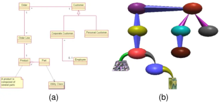
Irani, Ware and Tingley usedgeon diagramsto represent UML class diagrams 10(a) [143], [144]. Geons are object primitives consisting of 3D solids such as cones, cylinders, and ellipsoids, along with information about how they are inter-connected. The technique is based on an elaborate theory of structural
(a) (b)
Fig. 9. (a) Classical Layout. (b) GoVisual Layout from [25].
object recognition by Biederman [59], which suggests that if the information structure can be mapped onto structured objects then the structure will be automatically extracted as part of normal perception [58]. An interesting characteristic of the geon diagram is that color and texture play a secondary role in perceptual object recognition, so they can be used to represent secondary characteristics. In Figures 10(a) and 10(b), we can see a UML class diagrams and its equivalent geon diagram. Any UML class diagrams can be turned into its equivalent geon diagram [145].
Several experiments in [146] showed that a geon diagram is both easier to understand and easier to remember than traditional UML class diagrams because of the use of simple 3D primitives.
(a) (b)
Fig. 10. (a) UML diagram (b) equivalent geon diagram.
We already described in Section 4.1 theSHriMPmulti-view visualization tool. SHriMP also embeds some visualization techniques to display relationships in the software.
One of them shows the static call graph of the software, representing methods by boxes and calls between methods by edges. The source code of the method can thus be seen without losing the call graph context, which is very convenient to understand communications between methods. The hypertext browsing and zooming explained in Section 4.1 are still valid for this visualization technique.
Another visualization technique embedded in SHriMP aims at showing every relationship in the software at once. Fig-ure 12 featFig-ures a nested graph representing the source code hierarchy. The technique used is very similar to the SHriMP source code organization visualization described in Section 4. Relationships are directly visible as colored arcs layered over the nested graph. Arcs are labeled with the text : ”extends by”,
Fig. 11. Call graph visualization from the SHriMP application.
”implemented by”, ”is type of”, ”calls”, ”accesses”, ”creates”, ”has return type”, ”has parameter type”, ”cast to type”. Figure 12 shows that a box can be turned into a source code editor on demand without loosing the high-level visualization.
Fig. 12. Nested boxes visualization from SHriMP.
Since displaying many arcs over a nested graph can lead to confusion, work has been done to reduce this visual complexity by filtering features to keep only the nodes and links that are needed to answer a specific question (e.g. display only ”calls” edges that target package A) [147].
TheExtravistool uses a Hierarchical Edge Bundles visualiza-tion technique to visualize hierarchical and non-hierarchical relationships of the software created by Holten [31]. The main idea is to display connections between items on top of a hierarchical representation. Figure 13 shows a software system and its associated static call graph. Software elements are placed on concentric circles according to their depth in the hierarchical tree. The edges are displayed above the hierarchi-cal visualization and represent the actual hierarchi-call graph. The same technique can be used on top of other visualizations of the hierarchy such as Treemaps, circular trees and others.
Some studies use spline edges to naturally indicate the rela-tionship direction with no explicit arrow [148]. The Hierarchical Edge Bundles uses a color interpolation on edges to represent the communication direction from caller (green) to callee (red). Thus, Figure 13 shows that the packages at the bottom receive many calls from other packages.
To reduce the visual clutter and edge congestion, [149] bundles edges together by bending them. The edge bundling strength is controlled by aβparameter, which alters the shape
(a)β= 0 (b)β= 0.75 Fig. 13. Hierarchical Edge Bundles from [31].
of the spline edges (Fig. 13). Ambiguity problems are thus partially resolved and relationships between components can be displayed in a better manner. The visualization also allows selecting a specific edge for further inspection.
To emphasize short edges, individual edges and sub-groups of edges, visual alpha blending is used to draw long edges at lower opacity than short edges. This result provides an efficient rendering for visualization of edges.
Experiments in [31] show that the majority of the participants regarded the technique as useful for quickly gaining insight into class relationships. In general, the visualization was also found aesthetically pleasing. Hierarchical Edge Bundles can be displayed on top of many different hierarchical structure rep-resentations but most participants preferred the radial layout over the other alternatives.
TheCity or Cities metaphorscan also be used to depict rela-tionships. The Cities visualization presented in Section 4.1 pro-poses a ”satellite view” to observe the cities from above. From this point of view, the user sees cities (packages) connected via streets and water. Streets represent two-directional calls between packages. Water shows unidirectional calls. Clouds cover cities that are not of current interest to the user, which provides a realistic way of filtering information.
Alam and Dugerdil proposed another way to visualize re-lationships with a City metaphor. Their visualization tech-nique namedEvospaces[32], [33] displays relationships as solid curved pipes between buildings (classes) or between objects inside buildings (methods). A colored segment moving along a pipe suggests the direction of the relation from the origin to the destination (Fig. 14). For instance, if the user wants to display call relationships of a selected class, pipes will be drawn from the selected building and segments will move to callee classes. Curved pipes are used instead of straight ones to avoid overlapping and visual occlusions.
Textured buildings increase the feeling of navigating through a real city. This visualization provides more details when focusing on a class. The user can enter a building and see that it contains objects representing methods and local variables. Like for buildings, relationships can be displayed at method level.
Evospaces allows many interactions such as seeing metric values, changing the appearance of objects, opening the cor-responding source code file. To reduce disorientation, a 2D minimap can be displayed in a corner of the screen to show the user current position in the city. This combination of 3D and
Fig. 14. Evospaces visualization from [33].
2D views helps the user make precise situation assessments for his/her navigation [150].
Panas, Epperly, Quinlan, Sæbjørnsen and Vuduc [34] use a
Cities metaphor to represent software. We name it ”The Unified Single-View City”. In their visualization (Fig. 15), methods are represented by buildings, which are placed on blue plates that symbolize classes. These blue plates are spread on green plates that represent packages. The height of a green plate (package) depends on the depth of the package in the hierarchy, which creates virtual mountains. The resulting visualization looks like anIsland metaphor, with sky and water between islands added for better aesthetics.
Relationships between components are represented by sev-eral graphs that can be displayed alone or simultaneously. Available graphs comprise function calls, class calls and class inheritance. Since cities are placed on plates, the resulting visualization looks like a graph with cities drawn on each node. The fact that plates are positioned on several planes eases the display of relationships.
Fig. 15. The Cities and Island metaphor from [34].
The visualization of Fig. 15 was created with the Vizz3d tool [151], [152]. Vizz3d helps create new representations by defining only graphical objects and the mapping, instead of hard-coding them. Vizz3D is very versatile and the resulting visualizations can be completely different.
One drawback of City and Cities metaphors is that they can only be laid out on a two dimensional plane that makes displaying relationships between components problematic. A solution could be walkways or roads. However, placing build-ings to minimize roadways overlapping is a complicated task
[19]. The Unified Single-View City tries to solve this by putting cities on several planes at different heights.
With the 3D Solar System layout presented in Section 4.1, relationships can be more efficiently displayed (Fig. 8), because every Solar System can be moved (in the 3D space) to avoid crossing edges. The Solar system visualization technique may display relationships such as coupling and inheritance using colored edges. This has no real-world connection but does not distort the user’s understanding (Fig. 8). Nevertheless, if too many relations are displayed simultaneously, the visualization and 3D graph representation would be unclear. The authors of the 3D Solar system thought that using gravity to represent coupling seems a little too esoteric.
Balzer and Deussen proposed theSoftware landscape metaphor
[29], [30] that can be considered a hybrid metaphor borrowing from the Solar system, the Island and the Cities metaphors. Its authors use 3D nested hemispheres to represent package hierarchy (Fig. 16). The outermost hemisphere represents the root package and it contains hemispheres corresponding to the packages that are directly contained in the root package. Classes are represented as circles on a platform representing its package, while methods and attributes are displayed as simple colored boxes on the circle (Fig. 16(a)).
Another interesting point is how the Software landscape metaphor represents relationships between components, with a Hierarchical nettechnique. The idea is to route relationship links according to the hierarchy levels in the software (Fig. 16(b)). The edges of objects from a hierarchy level are grouped together and forwarded to the next (higher) level. The resulting visualization looks like a 3D tree with no overlap. This tech-nique avoids overlapping but makes tracking a single edge difficult. Various kinds of relationships can be shown by using colors to represent the connection, whose size indicates the number of relationships.
(a) (b)
Fig. 16. (a) 3D nested spheres from [29] (b) Hierarchical net from [30].
Soon after the Software Landscape visualization, Balzer and Deussen [35] developed another 3D visualization also based on a clustered graph layout, to display large and complex graphs (Fig. 17). Their technique uses clustering, dynamic transparency and edge bundling to visualize a graph without altering its structure or layout. The main idea is to group remote vertices and classes into clusters. The contents of a cluster are visible when the user focuses on a sub-part of the graph, without being bothered with the details of distant clusters. The degree of transparency is dynamically adapted to the viewer location [153]. The nearer the viewer, the more transparent the cluster, with the most remote ones hiding their contents. This is a very interesting feature because it allows a comprehensible interactive visualization of large systems, with
detailed information on focused parts. In addition, edges are routed and bundled together visually as one port of communi-cation between two clusters, which makes it easier to track an individual edge. An edge shows more details when the user view is focused on it.
The visibility of nodes and links is thus changing con-tinuously, with smooth transitions in terms of detail levels while navigating through the visualization, which makes large graphs manageable. Figure 17 shows a graph with more than 1500 nodes and 1800 edges within 126 clusters, representing the inheritance relationships between classes of a large piece of software.
Fig. 17. Clustered graph layout from [35].
The clustered graph layout produces a more comprehensible representation of complex graphs. The example in Figure 17 shows inheritance relationships but another interesting use of this technique is to represent coupling between classes. Since coupled classes are likely to be considered together during development, these classes are placed close to one another in the 3D space, so as to be considered as a big cluster.
4.3 Metric-centred Visualization
A software metric is a numeric measure of some property of a piece of software or its specifications [154], [155], [156], [157], [158]. Its purpose is to quantify a particular characteristic of a software. Software metrics are interesting because they provide information about the quality of the software design [159], [160], [161] and provide ways to monitor this quality throughout the development process [162]. Static software met-rics effectively describe various aspects of complex systems, e.g. system stability, resource usage and design complexity.
The visualization of software can transform the numerical data provided by metrics into a visual form that enables users to conceptualize and better understand the information [70], [163], [164]. The main challenge is to find effective mappings from software metrics to graphical representations [165].
In this section we describe several visualization techniques that use static software metrics. Most of these visualization techniques use an existing visualization but properties on graphical elements are related to software metrics. For instance, a software metric related to the size of the software component can be mapped to the size of the graphical elements (see details in section 4.3 in Table 1 page 2).
Software metrics can effectively describe various aspects of complex architectures and are thus worth combining with UML class diagrams. UML class diagrams provide a represen-tation of the software design but they show little information. Termeer, Lange, Telea and Chaudron [38] proposed the Met-ricViewvisualization that displays metric icons on top of UML diagram elements (Fig 18) [36]. Bar and pie charts are mapped to metric values, in a configurable way. A 3D mode of this visualization is available just by turning 2D bars in 3D cuboids.
(a) (b)
Fig. 18. (a) MetricView height bars (b) MetricView pie charts
The main drawback of this technique is the occlusion of the diagram by the icons, especially with 3D icons. This can be partially solved by using sliders to control the transparency of the UML diagram and the metric icons.
Instead of drawing icons on top of UML elements, Byelas and Telea [44], [45] developed a method namedarea of interest
(AOI) that brings together software elements that share some common properties (Fig. 19) by building a contour that en-closes these elements and by adding colors within the AOI to display software metrics. The AOIs are shown on top of the UML class diagrams without changing its layout, to prevent disorientation.
Fig. 19. Areas Of Interest from [45].
Each AOI has its own texture such as horizontal lines, vertical lines, diagonal lines and circles. These simple textures differentiate better when they overlap, creating a visually different pattern. Visual techniques such as shading and trans-parency are also used for a better perception of several areas, thus minimizing the visual clutter. One different metric can be associated to each AOI and its value is added to the texture
using a red (high) to blue (low) color scale. This helps to show how metric values change over one AOI. When AOIs overlap, the color information for each AOI still can be seen on the texture.
The system shown in Figure 19 represents over 50 classes with 7 areas of interest. Here, the AOIs regroup classes that have a high level functional property in common, for instance classes containing the user interface code (A1: GUI), classes that are the application entry point (A5: main) and classes containing the application control code (A6:core). Byelas and Telea defined the participation degreepi,j of a classCj in an
areaAias the code percentage ofCjspecific toAi: an OpenGL
class has p = 0.5 if it has 50% OpenGL-specific code. The authors consider that their participation degree metric helps understand how the identified property maps to actual classes, i.e. whether the code follows the intended design, and whether there are modularity problems.
Several facts can be noticed from Figure 19:
• Few AOI overlap so few classes participate in two high
level functional properties and none takes part in three, which indicates a good functional modularity.
• The B class is over a red color inA5 andA6so the class
is strongly involved in two different AOIs.
• The E class is over a red color inA6and a blue color inA1
so the class participates strongly in the former and weakly in the latter.
Authors have mentioned that if more than three AOIs over-lap then information becomes hard to understand. Neverthe-less their visualization can show up to 10 areas of interest, each with its own metric, on a diagram of up to 80 classes. However, we think this visualization may be prone to eyestrain because of the large number of colors and textures.
Polymetric views [5], [36], [37], created by Lanza, Ducasse and Demeyer, is a lightweight visualization of software en-riched with software metrics (Fig. 20). They implemented this technique in the ”CodeCrawler” tool [166] built on top of the Moose reengineering framework [167], [168]. This visualization technique is also available as a stand-alone tool and as an an open-source software visualization plug-in for the Eclipse framework. Polymetric views propose a completely config-urable graph-based representation to create multiple visualiza-tions depending entirely on the mapping between metrics and visual characteristics. The authors wanted to have a very clear definition of each metric so onlydirectones are available, which means that their computation does not depend upon another metric [169].
All the graph characteristics are based on metrics that define node width, height, x- and y-coordinates and color, and edge width and color. This freedom of mapping makes it possible to visualize several aspects of the software using the most appropriate visualization. For instance, Figure 20(a) shows an inheritance tree where nodes represent classes and edges represent the inheritance relationship between them. Node width and height represent the number of all descendants of the class and the number of methods in the class, respectively. Node color is used to represent the number of immediate children. The goal of this mapping is to show how classes share methods through the inheritance hierarchy. Figure 20(a) shows that m andnseem to be well designed because every sub-class is higher than it is wide, which means they inherit parent methods and have not many immediate children. On the contrary, oandp are small, wide and black because they
(a) (b)
Fig. 20. Polymetric views from [36]: (a) Inheritance Tree and (b) Correlation graph.
have few methods and many immediate children that are at the end of the inheritance hierarchy.
In Figure 20(b), nodes represent methods, while both node color and x-coordinate represent the number of code lines. The y-coordinate node represents the number of statements. This mapping provides a method size overview, to detect empty methods and very big methods. Figure 20(b) shows that method O does not include any statement and method
Ncontains several lines of code but no statement at all. These methods have to be checked further and maybe deleted. In contrast, method P has more statements than lines of code, which indicates bad code formatting. ClassM, that has many statements and lines of code, seems to be a good candidate for a split.
Other visualization techniques such as histogram, checker, staple, confrontation, circle and others can be designed in a similar way [5], [36], [37].
Holten, Vliegen and Wijk used texture and color to show two software metrics on a Treemap (Fig. 21) [39]. This choice is based on the fact that human visual perception enables rapid processing of texture [170]. The authors used the color range to visualize one software metric and a synthesized texture distortion to visualize another one. The use of these two visual characteristics provides a high information density, helps find correlation between metrics and can reveal interesting patterns and potential problem areas.
Fig. 21. Treemap with color and texture from [39].
In Figure 21 methods are the deepest level of the hierarchy and are visualized as boxes, while packages and classes are
implicitly represented (see Section 4.1). This mapping is com-posed of two metrics:
• the number of callers (FANIN) is shown by a color scale
white-pink-red-black.
• the number of callees (FANOUT) is represented by a
texture distortion scale. The higher the metric, the more distorted the texture.
In the object-oriented paradigm, it is generally desirable that methods with high FANIN (critical methods) have low FANOUT to keep them from depending on too many other methods. The first ellipsis from the top shows methods with high FANIN and low FANOUT. The second ellipsis shows methods with low FANIN and high FANOUT. The third shows methods with fairly high FANIN and medium FANOUT, which may reveal a design issue.
Langelier, Sahraoui and Poulin [40] think that the simplicity of the chosen visual representation is crucial for human percep-tion. Their visualization, named ”VERSO”, uses simple boxes to represent classes, and cylinders for interfaces (Fig. 22). The human visual system is a pattern seeker of enormous power and subtlety [164], and relying on these simple shapes fosters a better and faster recognition of the underlying information without overloading the visualization.
Fig. 22. VERSO from [40].
Three graphical properties of the boxes (height, color and angle) can be used to represent metrics. Although any metric can be mapped to any of the properties, the default mappings have the following underlying semantics:
• Box height is naturally related to code size.
• Box color is related to coupling. Since red is associated
with danger, red symbolizes high coupling, which is dan-gerous in the object-oriented paradigm.
• Box angle represents the lack of cohesion, because twisted
boxes look more chaotic.
The software architecture is shown either by a Treemap or a sunburst layout (Section 4) representing the package hierarchy, while classes are represented by boxes within their package.
The inheritance hierarchy is not represented but the user can select a class and see classes that have an inheritance relation-ship with it. Several types of relationrelation-ships are available such as ”in”, ”out”, and ”in/out”, ”aggregation”, ”generalization”, ”implementation”, ”invocation”. The visual importance of use-less elements can be reduced to focus on a subset of elements. A global view of the system is kept by only modifying the colors of filtered boxes. Filters are based on metric values or inheritance relationships.
This visualization places the human at the center of the decision process to help semi-automatically detect anomalies that are tricky to fully automatically detect [41]. One example is the detection of a Blob anti-pattern [171], which requires checking numerous criteria. Indeed a Blob class is a class that has a high complexity, low cohesion, and whose classes related by an ”out” association have little complexity, high cohesion and are deep in the inheritance tree. To help detect a Blob, complexity is first mapped to height, lack of cohesion is mapped to twist and depth in the inheritance tree is mapped to color. A filter is then applied to select only the classes with a very high level of complexity (to reduce the search space, classes with an extremely high value are colored in black). Then twisted classes are checked to identify potential suspects. Finally a filter is applied on each potential Blob to see if associated ”out” classes are small (low complexity), straight (high cohesion) and blue (deep in the inheritance tree). If so, the selected class is indeed a Blob anti-pattern.
The process to find design anomalies may be a bit complex but Dhambri, Sahraoui and Poulin point out some important facts about automatic design anomaly detection [41]. First, there is no consensus on how to decide whether a particular design violates a quality heuristic. Second, detecting dozens of anomaly candidates is not helpful if they contain many false positives. The authors said that the detection is more effective and useful when it is seen as a inspection task supported by a software visualization tool. We agree. Experiments in [41] confirmed that using VERSO to find anomalies is easier than manual inspection and that the variability of the number of anomalies detected is lower when using VERSO than when conducting a full manual search.
CodeCityis a visualization tool proposed by Wettel and Lanza that represents the software with a City metaphor [42]. This visualization is also available as a stand-alone tool and as an an open-source 3D software visualization plug-in for Eclipse. CodeCity displays classes as buildings and packages as city districts. Classes within the same package are grouped together using a Treemap layout to slice the city into districts (Fig. 23).
Fig. 23. CodeCity class-level disharmonies map from [43].
Another idea to define building location in the city is proposed in [15]. The authors chose the amount of coupling between software components to determine building layout: the closer the buildings, the higher the coupling. This layout is interesting because seeing coupling this way is very intuitive and very efficient for detecting problematic areas within the
software. But the overall layout may drastically change be-tween versions, which confuses the user [172].
In CodeCity, many metrics can be mapped to city charac-teristics. The default mapping creates an intuitive semantic mapping that helps reason about the system. The Number Of Methods (NOM) metric is mapped to building height, thus showing the amount of functionality in classes, while the Number Of Attributes (NOA) metric is represented as the width of a building. A class with many methods but few attributes is thus represented as a tall and thin building whereas a class with a large number of attributes and few methods appears as a platform. The authors claim that this visualization reveals big and thin class extremes, and also gives a feeling of the magnitude of the system and the distribution of the system intelligence.
However, the resulting city looks unrealistic because very diverse building shapes appear. This is problematic because it goes against the gestalt principles [173] that state that humans efficiently distinguish at most six different shapes. The authors [174] think that having only five different building heights can reduce the cognitive load because humans tend to organize visual elements into groups or patterns when objects look alike [175]. Moreover, using only five different heights of building decreases the visual complexity and makes a more realistic and familiar city, hence easing navigation. In the EvoSpace visualization (Section 4.2), the authors push this principle a bit further by accentuating the differences with textures on buildings. The textures used from the smallest kind of building to the highest are: house texture, city hall texture, apartment block texture and office buildings texture (Fig. 14).
The color and transparency of several buildings can be changed by the user to visually focus on a subset of buildings. The point of view can be moved around the visualization with a high degree of freedom but to limit disorientation it is not possible to pass through buildings or go underground.
The CodeCity visualization helps detect high-level design problems using software metrics [43]. Classes with design issues are singled out by coloring their representative building with a vivid color corresponding to the issue. This creates a visual ”disharmonies map” of the city, providing a way to focus on problematic classes (Fig. 23).
CodeCity also features a finer-grained representation that extends the previous one by explicitly depicting the methods [43]. Each building is now composed of a set of bricks repre-senting methods within the class. The disharmonies map can be shown at the method-level, and thus provide a very precise localization of design problems (Fig. 24).
Other techniques to spot potential design issues have been proposed. In the realistic City metaphor presented in Sec-tion 4.1, the authors of [15] mapped building texture to a metric related to the quality of the class source code. Old and collapsed buildings indicate source code that needs to be refactored, which is a realistic and intuitive way to indicate design problems. A second technique, the ”CocoViz” visualiza-tion proposed by Boccuzzo and Gall [176], [177], focuses on visualizing whether a system is well-designed or not. Their main idea is that misshaped objects symbolize potential badly designed software elements. In addition, misshaped objects draw attention so they are very easy to spot. Simplified 3D real objects represent classes. For instance, the house metaphor is composed of a cone for the roof and a cylinder for the body. Each visual characteristic of these two objects may represent a
Fig. 24. CodeCity method-level disharmonies map from [43].
normalized software metric. If the house is out of proportion, then the class may have a design problem.
In the Cities and Island metaphor presented in Section 4.2, the authors claimed that showing a lot of information in a single view was better than in multiple views [67], because a single view is easier to navigate through and always presents the same familiar picture of the system. Their visualization thus displays a lot of information (architecture, relationships, metrics) through a uniqueunified single-view visualization [34] (Fig. 15).
As all available metrics have to be displayed in one single view, the authors add 2D icons on top of each building to convey information. The height, width, depth and texture of every visual object can express metrics as well. This visualiza-tion technique thus provides a very complete summary of the overall system but the underlying problems of single view are information overload and disorientation [67]. The key asset of this visualization in order to overcome information overload is the use of the cities metaphor to represent the structure of the system architecture. However, no empirical experiments were conducted on this visualization technique.
Nevertheless, we agree that the city metaphor is adapted to implicitly represent the software structure and metrics, displaying a lot of information at the same time.
On the contrary, the Solar system metaphor presented in Section 4 can only show one metric at a time, because planet size is the only parameter available to map a metric. So the visualization is split into five modes where five different met-rics are mapped to planet size: lines of code (LOC), weighted methods per class (WMC), depth of inheritance tree (DIT), number of children (NOC) and coupling. These metrics are part of the well-know CK metric set, which has been empirically validated as a good quality indicator and as a useful predictor of fault-prone classes [178], [179], [180]. In addition to mapping the chosen metric to the planet size, the metric value is also displayed as text under each planet. Filters can be applied to the overall system to display only the planets that have metric values within the defined interval.
5 VISUALIZINGSOFTWAREEVOLUTION
Visualizing software evolution is not easy because adding the time dimension implies a lot of extra data. Nevertheless,
visu-alizing software evolution helps explain the current state of the software and depict important changes such as refactoring and growing modules [181], [182]. It provides useful information such as the modules that have been under heavy maintenance or on the contrary barely touched along their entire evolution [183].
The field of software evolution visualization also includes vi-sualizations to understand how different developers interacted on various parts of the system [184], [185], [186]. This type of visualization will not be treated in this paper because it falls beyond its scope, since we exclusively consider the software itself and not its development process.
Most techniques to visualize evolution are based on a static visualization technique, but show one ”image” for each version of the software and animate the transition between them. Other types of visualization of the evolution display the entire evolution in a single image.
This section about evolution follows the same pattern as the previous parts of this paper. First, we present source code evolution visualizations in Section 5.1. Section 5.2 then tackles the visualization of single class evolution. Finally, we look into architecture evolution visualization in Section 5.3.
5.1 Visualizing Source Code Line Changes
This section presents a visualization technique to understand how the detailed structure of source code changes during development (see details in section 5.1 in Table 1 page 2).
Telea, Auber and Chevalier proposed the Code flows visu-alization technique that displays source code line evolution across file versions [46], [47]. Code flows look like a complex cable-and-plug wiring metaphor(Fig. 25). They make it possible to visually track a given code fragment throughout its evolution with guaranteed visibility. It also highlights more complex events such as code splits and merges (S and M in Figure 25). This level of detail gives a lot of information and means that it is possible to focus on the evolution of one specific source code file. In Figure 25, four versions of a source code class are represented from left to right using code flows with an icicle layout [102]. Bundled edges show what a specific source code line becomes in the next version of the class. For more readability, source code lines that remain the same are colored in black.
Fig. 25. Code flow from [47] (modified)
This visualization technique provides a good general overview of a class code changes. It shows whether source code changed significantly or remained unaltered. It can display large classes with more than 6,000 lines.
5.2 Visualizing Class Evolution
This section presents a visualization technique to understand how class methods evolve with software releases (see details in section 5.2 in Table 1 page 2).
Wettel and Lanza created thetimelinevisualization technique to depict class evolution (Fig. 26). It relies on a detailedBuilding metaphor where every building represents a class and every brick represents a method. Each method stays at the same spot across versions of the class; when the method disappears, the spot remains empty. Color is used to depict the age of methods, from light yellow for recent or revised methods to dark blue for the most long-standing. The age of a method is an integer value representing the number of versions that the method ”survived” up to that version.
Fig. 26. Timeline from [48]: evolution of the ”Graphics3D” class of the Jmol software
The timeline visualization is very useful to show how many methods the class defines and when new methods are created and disappear. Some evolutionary patterns can be found, for instance a building (class) that evolves and loses an ever-increasing number of bricks (methods) looks unstable. Another example is when a large number of bricks are suddenly added from one version to another, meaning that the class is becoming more important in the software. Correlating the timeline visu-alizations of several classes enables the detection of massive refactoring as well as files that participate in the same change [187].
5.3 Visualizing Software Architecture Evolution
Visualizing the evolution of the software architecture is one of the most important topics in the field of software evolution visualization. Having a global overview of the entire system evolution is considered very important because it can explain and document the current state of software design.
In this section, we present visualization techniques that focus on visualizing three different aspects of the evolution. First, how the global architecture of the software, including code source organization, changes over versions. Second, how relationships between components evolve. Third, how metrics evolve with releases. Some representations are better to visual-ize an aspect of software but less efficient to visualvisual-ize another. We will thus detail all the pros and cons of each visualization.
![Fig. 2. Class Blueprint from [92].](https://thumb-us.123doks.com/thumbv2/123dok_us/1872400.2773302/4.918.474.838.695.877/fig-class-blueprint-from.webp)
![Fig. 8. Solar System metaphor from [19].](https://thumb-us.123doks.com/thumbv2/123dok_us/1872400.2773302/7.918.471.840.664.869/fig-solar-system-metaphor-from.webp)
![Fig. 13. Hierarchical Edge Bundles from [31].](https://thumb-us.123doks.com/thumbv2/123dok_us/1872400.2773302/9.918.77.445.422.652/fig-hierarchical-edge-bundles-from.webp)
![Fig. 14. Evospaces visualization from [33].](https://thumb-us.123doks.com/thumbv2/123dok_us/1872400.2773302/10.918.77.447.82.303/fig-evospaces-visualization-from.webp)
![Fig. 19. Areas Of Interest from [45].](https://thumb-us.123doks.com/thumbv2/123dok_us/1872400.2773302/11.918.473.837.690.962/fig-areas-of-interest-from.webp)
![Fig. 20. Polymetric views from [36]: (a) Inheritance Tree and (b) Correlation graph.](https://thumb-us.123doks.com/thumbv2/123dok_us/1872400.2773302/12.918.473.844.76.319/fig-polymetric-views-inheritance-tree-b-correlation-graph.webp)
![Fig. 23. CodeCity class-level disharmonies map from [43].](https://thumb-us.123doks.com/thumbv2/123dok_us/1872400.2773302/13.918.477.836.755.971/fig-codecity-class-level-disharmonies-map-from.webp)
![Fig. 24. CodeCity method-level disharmonies map from [43].](https://thumb-us.123doks.com/thumbv2/123dok_us/1872400.2773302/14.918.478.832.83.346/fig-codecity-method-level-disharmonies-map-from.webp)