Food and Nutrition in Numbers
2014
The designations employed and the presentation of material in this information product do not imply the expression of any opinion whatsoever on the part of the Food and Agriculture Organization of the United Nations (FAO) concerning the legal or development status of any country, territory, city or area or of its authorities, or concerning the delimitation of its frontiers or boundaries. The mention of specific companies or products of manufacturers, whether or not these have been patented, does not imply that these have been endorsed or recommended by FAO in preference to others of a similar nature that are not mentioned.
The views expressed in this information product are those of the author(s) and do not necessarily reflect the views or policies of FAO.
ISBN 978-92-5-108617-9 © FAO, 2014
FAO encourages the use, reproduction and dissemination of material in this information product. Except where otherwise indicated, material may be copied, downloaded and printed for private study, research and teaching purposes, or for use in non-commercial products or services, provided that appropriate acknowledgement of FAO as the source and copyright holder is given and that FAO’s endorsement of users’ views, products or services is not implied in any way.
All requests for translation and adaptation rights, and for resale and other commercial use rights should be made via www.fao.org/contact-us/licence-request or addressed to copyright@fao.org.
FAO information products are available on the FAO website (www.fao.org/publications) and can be purchased through publications-sales@fao.org.
Contents
Foreword 1
Introduction 3
Economy 4
Population 6
Prices 8
Trade 10
Undernourishment 12
Undernutrition 14
Overweight/Obesity 16
Food security indicators 18
Dietary energy supply 20
Cereals - excluding beer 22
Starchy roots 24
Sugar and sweeteners 26
Fruit and vegetables 28
Meat 30
Oilcrops 32
Fish 34
Milk - excluding butter 36
Inequality within countries 38
Water 48
Greenhouse gas emissions 50
Organic agriculture 52
Country Profiles 56
Part 1 : 237
Definitions 237
Foreword
At the first International Conference on Nutrition, held in 1992, global leaders
pledged to “act in solidarity to ensure that freedom from hunger becomes a
real-ity.”
Although great progress has been made in reducing the prevalence of hunger,
over 800 million people are still unable to meet their daily calorie needs for
liv-ing healthy lives. About one in nine people go to bed daily on an empty stomach.
In cases where food is available, often the quality of the food does not meet
mi-cronutrient (vitamin and mineral) needs. More than two billion people continue to
suffer from nutritional deficiencies such as vitamin A, iron, zinc and iodine. While
the world is grappling with issues of undernutrition, there is also the growing
problem of obesity, which now affects around 500 million people. Many countries
are facing a triple burden of malnutrition, where undernourishment,
micronutri-ent deficiency and obesity exist in the same community and household.
ICN2 presents another opportunity for the global community to make a
commit-ment and take action to address this global menace. The two outcome docucommit-ments
of ICN2 - the Rome Declaration and the Framework for Action - will provide the
basis for renewed commitment and focused action for addressing malnutrition
within the coming decade. Experiences from the Millennium Development Goals
indicate that, with a united commitment, we can achieve significant results. We
must now move forward with the same determination as we address new global
challenges through the Sustainable Development Goals.
Having clear indicators to measure progress is very important. Statistics are a
fundamental tool in this process, necessary to identify problems and monitor
progress. The better the data, the better policies can be designed to improve
nutrition worldwide. Without good data, it is impossible to evaluate or
deter-mine the impact of policies, or hold stakeholders accountable for pledges they
make. For statistics to effectively inform food and agriculture policies, they need
to be accessible and clear to policymakers at global, regional and country levels.
This publication presents selected key indicators related to food and nutrition
outcomes that stakeholders can use to prioritise their actions.
This food and nutrition pocketbook was produced jointly by the FAO Statistics and
Nutrition Divisions. It is part of the FAO Statistical Yearbook suite of products and
is one of the tools that can be used as building blocks for evidence-based policy
making. It includes data from FAOSTAT as well as from other partners in the
organization and in the international community.
There are still gaps in the information. We hope that ICN2 will provide the forum
for discussion on ways to improve the data to better monitor nutrition.
Anna Lartey
Pietro Gennari
Introduction
Overcoming malnutrition in all of its forms – caloric undernourishment,
micronu-trient deficiencies and obesity – requires a combination of interventions in
differ-ent areas that guarantee the availability of and access to healthy diets. Among the
key areas, interventions are required in food systems, public health systems and
the provision of safe water and sanitation. This pocketbook not only focuses on
indicators of food security and nutritional outcomes but also on the determinants
that contribute to healthy lives.
The pocketbook is structured in two sections:
• Thematic spreads related to food security and nutrition, including detailed
food consumption data collected from national household budget surveys,
• Comprehensive country and regional profiles with indicators categorized
by anthropometry, nutritional deficiencies, supplementation, dietary
en-ergy supplies, preceded by their "setting".
The setting
provides demographic indicators as well as health status indicators
based on mortality patterns and the provision of safe water and sanitation.
Anthropometry
indicators provide information not only on the prevalence of acute
and chronic forms of under-nutrition but also on the prevalence of obesity. Their
co-existence is often referred to as the double burden of malnutrition.
Nutritional deficiency
indicators reveal food security issues at the national level
based on the adequacy of energy supplies; they also reveal the prevalence of
mi-cronutrient deficiencies, often referred to as “hidden hunger”. Combined with
an-thropometric measurements, they allow for the identification of the triple burden
of malnutrition (under-nutrition, obesity and hidden hunger). Regarding hidden
hunger, indicators concerning iodine and vitamin A have been selected.
Dietary
indicators are based on national food supplies and inform on the overall
quality of diets. Focus is also on the importance of diets during the first 1 000
days of an infant’s life, with indicators selected on the quality of breastfeeding,
dietary diversity and meal frequency.
The choice of indicators was guided by the following criteria: relevance to health,
food security and nutrition, comparability over time, and availability, in
particu-lar for low-income countries. But the criteria were relaxed for several indicators
given their importance and the lack of available substitutes. It is hoped that
the presence of data gaps will bring about greater efforts to collect the
neces-sary information because only with timely and reliable data can interventions
be designed and targeted towards those in most need. Wherever available,
dis-aggregated data by gender have been provided. Such data are indeed key to
mainstreaming gender in policies and programmes.
Economy
Changes in the wider economy, including growing global integration, also affect the per-formance of the agriculture sector. Higher overall economic growth also raises con-sumers’ incomes and hence food demand. Changing interest rates influence capital in-vestments, land values and storage levels, while inflation affects input prices, revenues and credit costs. Fluctuations in exchange rates have an important bearing on interna-tional competitiveness and trade flows. While some sectors have been hard hit, agriculture has demonstrated resilience during the recent economic downturn.
CHART 1:Value added in agriculture, industry, and services as shares of GDP (2012)
0 25 50 75 100 Africa Asia Latin America and the C
aribbeanOceania
perc
ent
Agriculture Industry Services
CHART 2:Agriculture value added per worker, countries with the highest values in 2012
(2000 and 2012)
Bahamas Germany Denmark Austria Spain Lebanon Luxembourg Singapore Sweden Bermuda Italy Japan Australia Belgium Finland Netherlands Puerto Rico Norway Iceland France
20000 40000 60000 constant 2000 US$
2000 2012
CHART 3:Annual value added in agriculture growth (2012) Romania Republic of Moldova Paraguay Trinidad and Tobago Kazakhstan Azerbaijan Montenegro Antigua and Barbuda Lesotho Spain Gambia Mauritania Namibia Saint Vincent and the Grenadines Afghanistan Saint Lucia Belize Burkina Faso Mongolia Sudan
−20 0 20 40
percent Countries with
highest values Countries withlowest values
CHART 4:Value added in agriculture as share of GDP (2000 to 2012)
● ● ● ● ● ● ● ● ● ● ● ● ● ● ● ● ● ● ● ● ● ● ● ● ● ● ● ● ● ● ● ● ● ● ● ● ● ● ● ● ● ● ● ● ● ● ● ● ● ● ● ● 10 20 30
2000 2005 2010
perc
ent
● Africa ● Asia ● Latin America ●
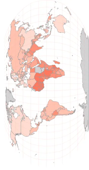
FIGURE 1:Value added in agriculture as share of GDP (percent, 2012)
No data available
0 ~ < 2.3
2.3 ~ < 6.3
6.3 ~ < 11
11 ~ < 21
Population
A combination of declining mortality rates, prolonged life expectancy and younger pop-ulations in regions characterized by high fer-tility has contributed to world population growth. While growth rates have been slow-ing since the late 1960s, the world’s popula-tion has nevertheless doubled since then, to approximately 7 billion. Population growth is generally highest where income levels are low. This is especially true in cities. Since 2008, there have been more people living in cities than in rural areas.
CHART 5:World rural and urban population (1992 to 2020)
0 2 4 6 8
1992 2000 2010 2020
billion pe
ople
Rural Urban
Data after 2010 are projections. CHART 6:Annual population growth over the
last ten years (2013)
Niue N. Mariana Islands Saint Helena Lithuania Republic of Moldova Latvia Bulgaria Wallis and Futuna Is. American Samoa Ukraine Eritrea Turks and Caicos Is. Niger Jordan Western Sahara Oman Kuwait Bahrain United Arab Emirates Qatar
−5 0 5 10
percent Countries with
highest values Countries withlowest values
CHART 7:Life expectancy at birth, countries with the lowest values in 2012 (2000 and
2012) Sierra Leone Botswana Lesotho Swaziland Central African Republic DR Congo Mozambique Côte d'Ivoire Chad Angola Nigeria Equatorial Guinea Burundi Guinea−Bissau Cameroon Mali South Sudan Somalia Malawi Guinea
40 45 50 55
years 2000 2012
CHART 8:Total economically active population (1990 to 2013)
● ● ● ● ● ● ● ● ● ● ● ● ● ● ● ● ● ● ● ● ● ● ● ● ● ● ● ● ● ● ● ● ● ● ● ● ● ● ● ● ● ● ● ● ● ● ● ● ● ● ● ● ● ● ● ● ● ● ● ● ● ● ● ● ● ● ● ● ● ● ● ● ● ● ● ● ● ● ● ● ● ● ● ● ● ● ● ● ● ● ● ● ● ● ● ● 0 500 1000 1500 2000
1990 1995 2000 2005 2010
million pe
ople
● Africa ● Asia ● Latin America ●
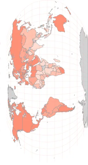
FIGURE 2:Rural population, share of total population (percent, 2013)
No data available
0 ~ < 16
16 ~ < 32
32 ~ < 47
47 ~ < 65
Prices
High food prices can be an impediment to food security. By reducing real income, rising prices can worsen the prevalence of hunger and mal-nutrition through lowering the quantity and quality of food consumed. The impact of high and increasingly volatile prices falls heaviest on the poor, who may spend as much as 80 percent of their incomes on food. The lack of dietary diversification aggravates the problem, as price increases for one staple cannot eas-ily be compensated for by switching to other foods. In addition, farmers are less likely to invest in measures to raise productivity when price changes are unpredictable. The recent significant declines in food prices should help ease these problems.
CHART 9:FAO food price index, annual deflated (1990 to 2014)
●●●●●● ●● ● ●● ●●● ●●● ● ● ● ● ● ●● ● ●● ● ● ●● ●● ● ●● ● ●● ●● ●● ● ● ● ●●●● ●● ● ●● ●●●● ● ● ● ● ● ● ● ● ● ● ● ●● ● ● ● ●●●●●● ● ● ● ●●● ●●● ● ● ● ● ●● ●● ● ● ●●●● ●● ● ● ● ● ●● ●●● ●● ● ● ● ● ● ● ● ● ● ●● ● ●● ●● ● ● ● ● ● ● ● ● ● ● ● ● ● ● ● ● ● 100 150 200 250
1990 1995 2000 2005 2010 2014
inde x ● ● ● ● ● ● Food Meat Dairy Cereals Oils Sugar
CHART 10:Food consumer price index, countries with the highest values in 2013
(2000 and 2013)
Egypt Malawi Sierra Leone
Jamaica Sao Tome and
Principe Suriname Zambia Nigeria Ghana Haiti Serbia Ethiopia Syria Kenya Myanmar Turkey Trinidad and Tobago Guinea Venezuela Angola
0 2000 4000 6000
index 2000 2013
CHART 11:Agriculture producer price index, countries with the highest values in 2012
(2005 and 2012)
Eritrea Kazakhstan Niger Tajikistan Kyrgyzstan Serbia Ghana Ukraine Viet Nam Mozambique Indonesia Argentina Cuba Iran (Islamic Republic of)
Ethiopia Mongolia Zambia Venezuela Belarus Mauritius
200 400 600 index 2005 2012
CHART 12:Food consumer price index (2000 to 2013)
● ● ● ● ● ●●●●● ●●●●● ●●●● ● ● ● ● ● ● ●● ● ● ● ●● ● ● ● ● ● ● ● ● ● ● ● ● ● ● ● ● ● ● ● ● ● ● ● ● ● ● ● ● ● ● ● ● ● ● ● ● ● ● 100 200 300
2000 2005 2010
inde
x
FIGURE 3:Food consumer price index (index, 2013)
No data available
100 ~ < 240
240 ~ < 500
500 ~ < 980
Trade
Most of the food consumed worldwide is grown locally. Where there is not enough lo-cal production to meet demand, trade has been instrumental in filling the gap. The scale of food and agricultural trade today is unprece-dented. In real terms, the value of interna-tional flows has increased around fivefold over the past 50 years, reflecting global trends in the overall volume of trade. However, this ex-pansion has been unevenly distributed across regions. High-income countries have generally outpaced developing regions, although several of the latter have comparative advantages in food and agricultural production.
TABLE 1:Imports and exports of food (billion US$, 2011)
Imports Exports
Africa 51 23
Latin Am. and the Carib. 52 112
Oceania 2 1
Asia 203 142
CHART 13:Top food importing countries in 2011 (2000 and 2011)
United Arab Emirates Egypt Malaysia Indonesia India Republic of Korea
Saudi Arabia Mexico Canada Spain Russian Federation Belgium Italy France United Kingdom Netherlands Japan Germany United States of America China
0 20 40 60 80
billion US$ 2000 2011
CHART 14:Top food exporting countries in 2011 (2000 and 2011)
United Kingdom Denmark Poland Mexico India Thailand Australia Malaysia Indonesia Italy Argentina Belgium Spain Canada China France Germany Netherlands Brazil United States of America
0 30 60 90
billion US$ 2000 2011
CHART 15:Exports of cereals (2000 to 2011)
● ● ● ● ● ● ● ● ● ● ● ● ● ● ● ● ● ● ● ● ● ● ● ● ● ● ● ● ● ● ● ● ● ● ● ● ● ● ● ● ● ● ● ● ● ● ● ● 0 5 10 15 20
2000 2002 2004 2006 2008 2010
billion c
onstant 2005 US$
● Africa ● Asia ● Latin America ●
FIGURE 4:Import value index (2004-2006 = 100) (index, 2011)
No data available
71 ~ < 150
150 ~ < 180
180 ~ < 220
220 ~ < 270
Undernourishment
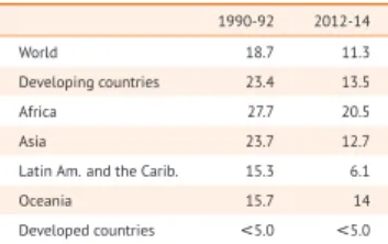
Undernourishment refers to food intake that is insufficient to meet dietary energy require-ments for an active and healthy life. About 805 million people are estimated to be chronically undernourished in 2012–14. This number has fallen by 100 million over the last decade, and by 209 million since 1990-92. Despite progress, the number is still high, and marked differences across regions persist. Latin Amer-ica and the Caribbean have made the greatest overall progress, with modest progress in sub-Saharan Africa and Western Asia, which have been afflicted by natural disasters and conflict.
TABLE 2:Prevalence of undernourishment (percent, 1990-92 and 2012-14)
1990-92 2012-14
World 18.7 11.3
Developing countries 23.4 13.5
Africa 27.7 20.5
Asia 23.7 12.7
Latin Am. and the Carib. 15.3 6.1
Oceania 15.7 14
Developed countries <5.0 <5.0 CHART 16:Asian countries with the highest
number of people undernourished in 2012-14 (1990-92 and 2012-14)
Uzbekistan West Bank and
Gaza Strip Cambodia Tajikistan Iran (Islamic Republic of)
Nepal Thailand Sri Lanka Yemen Afghanistan Iraq Myanmar North Korea Philippines Viet Nam Indonesia Bangladesh Pakistan China India
0 100 200 300
million people 1990−92 2012−14
CHART 17:African countries with the highest number of people undernourished in 2012-14
(1990-92 and 2012-14)
Central African Republic Niger Guinea Cameroon Senegal Côte d'Ivoire Burkina Faso Malawi Angola Rwanda Chad Zimbabwe Madagascar Zambia Mozambique Uganda Kenya Nigeria Tanzania Ethiopia
0 10 20 30
million people 1990−92 2012−14
CHART 18:Number of people undernourished (1990-92 to 2012-14)
● ● ● ● ● ● ● ● ● ● ● ● ● ● ● ● ● ● ● ● ● ● ● ● ● ● ● ● ● ● ● ● ● ● ● ● ● ● ● ● ● ● ● ● ● ● ● ● ● ● ● ● ● ● ● ● ● ● ● ● ● ● ● ● ● ● ● ● ● ● ● ● ● ● ● ● ● ● ● ● ● ● ● ● ● ● ● ● ● ● ● ● 0 200 400 600
1990−92 2000−02 2005−07 2009−11 2012−14
million pe
ople
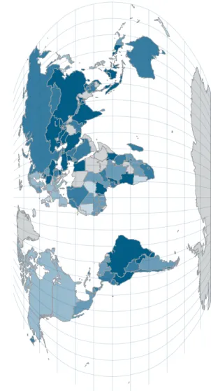
FIGURE 5:Prevalence of people undernourished (percent, 2012-14)
No data available
0 ~ < 5
5 ~ < 15
15 ~ < 25
25 ~ < 35
Undernutrition
Undernutrition is just one of the burdens of malnutrition and is caused by poor absorption or poor biological use of nutrients consumed as a result of repeated infectious disease. It includes being underweight for one’s age, too short for one’s age (stunted), dangerously thin for one’s height (wasted) and deficient in vi-tamins and minerals (micronutrient malnutri-tion). It can impose high economic and so-cial costs in countries at all income levels. Mi-cronutrient deficiencies – namely vitamin A, anemia and iodine – are forms of undernutri-tion.
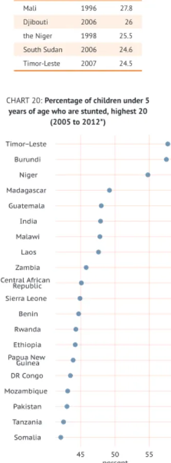
TABLE 3:Countries with highest share of children under 5 years of age who are wasted
(percent) Year Share
Mali 1996 27.8
Djibouti 2006 26
the Niger 1998 25.5
South Sudan 2006 24.6 Timor-Leste 2007 24.5
CHART 19:Percentage of children under 5 years of age who are underweight, highest 20
(2005 to 2012*)
Myanmar DR Congo Nigeria Burkina Faso Mali Central African Republic Cambodia Burundi Nepal Ethiopia Côte d'Ivoire Djibouti Pakistan Laos South Sudan Somalia Bangladesh Niger India Timor−Leste
25 30 35 40 45
percent
CHART 20:Percentage of children under 5 years of age who are stunted, highest 20
(2005 to 2012*)
Somalia Tanzania Pakistan Mozambique DR Congo Papua New Guinea Ethiopia Rwanda Benin Sierra Leone Central African Republic Zambia Laos Malawi India Guatemala Madagascar Niger Burundi Timor−Leste
45 50 55
percent TABLE 4:Countries with the lowest vitamin A
supplementation coverage rate among children ages 6-59 months (percent)
Year Share Sao Tome and Principe 1999 95.6
Mali 1997 92.7
Haiti 1999 92
Ethiopia 1993 88.2
Burkina Faso 1999 84.5
TABLE 5:Countries with the highest prevalence of iodine deficiency in children
under 5 years of age (percent) Year Share
Lesotho 1999 100
Ghana 1998 100
Chad 1994 99.6
Tunisia 1993 99.1
FIGURE 6:Prevalence of anemia among children under 5 years of age (percent, 2011)
No data available
5 ~ < 20
20 ~ < 35
35 ~ < 45
45 ~ < 65
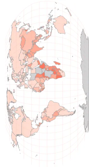
Overweight/Obesity
Overweight and obesity are defined as abnor-mal or excessive fat accumulation that may im-pair health. These phenomena are measured by the Body Mass Index (BMI); a BMI above than 25 kg/m2indicates overweight, and
obe-sity if it exceeds a level of 30 kg/m2. A high
BMI is associated with a higher prevalence of non-communicable diseases, including cardio-vascular disease, type-2 diabetes, various can-cers and osteoarthritis. The global prevalence of overweight and obesity has risen in all re-gions and is also increasing in nearly all coun-tries.
CHART 21:Prevalence of over-acquisition (1990-92 and 2012-14)
0 10 20 30 40
Decountriesveloped Developingcountries World
perc
ent
1990−92 2012−14
CHART 22:Prevalence of overweight among children under 5, countries with the highest
values, male (2005 to 2012*)
Morocco Kyrgyzstan Uzbekistan Algeria West Bank and
Gaza Strip Kazakhstan Azerbaijan Mongolia Iraq Macedonia Serbia Bosnia and Herzegovina Syria Montenegro Armenia Egypt South Africa Georgia Libya Albania
12 15 18 21
percent
CHART 23:Prevalence of overweight among children under 5, countries with the highest
values, female (2005 to 2012*)
Benin Kazakhstan Sao Tome and
Principe Algeria Uzbekistan Montenegro Mongolia Azerbaijan Indonesia Iraq Armenia Serbia Macedonia South Africa Bosnia and Herzegovina Syria Georgia Egypt Libya Albania 15 20 percent CHART 24:Prevalence of over-acquisition (1990-92 to 2012-14)
● ● ● ● ● ● ● ● ● ● ● ● ● ● ● ● ● ● ● ● ● ● ● ● ● ● ● ● ● ● ● ● ● ● ● ● ● ● ● ● ● ● ● ● ● ● ● ● ● ● ● ● ● ● ● ● ● ● ● ● ● ● ● ● ● ● ● ● ● ● ● ● ● ● ● ● ● ● ● ● ● ● ● ● ● ● ● ● ● ● ● ● 20 25 30
1990−92 2000−02 2005−07 2009−11 2012−14
perc
ent
FIGURE 7:Prevalence of overweight and obesity, adults (percent, 2008)
No data available
7.4 ~ < 22
22 ~ < 37
37 ~ < 57
57 ~ < 72
Food security indicators
Food security is a complex phenomenon that manifests itself in numerous physical condi-tions resulting from multiple causes. The World Food Summit of 1996 established four dimensions of food security: availability, ac-cess, stability and utilization.The State of Food Insecurity in the World 2013introduced a suite of indicators organized around these four di-mensions with a view to overcoming the draw-backs that arise from relying solely on one in-dicator for the measurement of food security - the prevalence of undernourishment indica-tor.Availabilitycaptures not only the quan-tity, but also the quality and diversity of food.
Accesscomprises indicators of physical access and infrastructure.Stabilityis divided into two groups: the first covers factors that measure exposure to food security risk, and the second focuses on the incidence of shocks.Utilization
includes variables that determine the ability to utilize food as well as the outcomes of poor utilization.
All available data for each dimension of food security have been compiled, and changes in these dimensions of time have been analysed. Overall, the analyses suggest positive devel-opments over time. Many developing coun-tries have made significant progress in improv-ing overall food security and nutrition. But this progress has been uneven across both regions and dimensions of food security. Sub-Saharan Africa and Southern Asia have made the least headway, while Eastern Asia and Latin Amer-ica have made the most progress in improving food security.
Food security indicators, data and meta-data, are available at: http://www.fao.org/ publications/sofi/2014/en/
Dietary energy supply
The dietary energy supply (DES) is the food available for human consumption, expressed in kilocalories per person per day. At the coun-try level, it is calculated as the food remaining for human use after taking out all non-food uti-lization, including exports, industrial use, ani-mal feed, seed, wastage and changes in stocks. In 1961 the average global calorie availability was as low as 2 193 kcal/cap/day; by 2011, it had reached 2 868 kcal/cap/day, and was centered more around a narrow base of staple grains as well as meat and dairy products.
CHART 25:Share of DES (2009-11)
0 20 40 60 80
Decountriesveloped Developingcountries World
perc ent Cereals (excl. beer) Starchy roots Sugar and sweeteners Milk (excl. butter) Meat and offals Veg. oils and animal fats
CHART 26:Dietary energy supply, top 20 in 2009-11 (1990-92 and 2009-11)
United Kingdom Lithuania Poland Kuwait Switzerland Norway Greece Egypt Portugal Germany France Israel Italy Luxembourg Ireland Montenegro United States of America Turkey Belgium Austria
2500 3000 3500 kcal/cap/day 1990−92 2009−11
CHART 27:Dietary energy supply, bottom 20 in 2009-11 (1990-92 and 2009-11)
Zambia Chad Namibia Timor−Leste Madagascar Ethiopia Tajikistan North Korea Afghanistan Haiti Tanzania Rwanda Central African Republic Congo Kenya Yemen Zimbabwe Bolivia Mozambique Botswana
1600 1800 2000 2200 kcal/cap/day 1990−92 2009−11
CHART 28:Dietary energy supply (1990-92 to 2009-11)
● ● ● ● ● ● ● ● ● ● ● ● ● ● ● ● ● ● ● ● ● ● ● ● ● ● ● ● ● ● ● ● ● ● ● ● ● ● ● ● ● ● ● ● ● ● ● ● ● ● ● ● ● ● ● ● ● ● ● ● ● ● ● ● ● ● ● ● ● ● ● ● ● ● ● ● ● ● ● ● 2400 2600 2800
1995 2000 2005 2010
kcal/cap/day
● Africa ● Asia ● Latin America ●
FIGURE 8:Dietary energy supply (kcal/cap/day, 2009-11)
No data available
1 912 ~ < 2 360
2 360 ~ < 2 690
2 690 ~ < 2 980
2 980 ~ < 3 320
Cereals - excluding beer
Cereals are made up of wheat, rice, barley, maize, rye, oats, millet, sorghum and others. Cereals are the most important food source for human consumption. Developing countries surpassed developed ones in total cereal con-sumption in the early 1980s and now account for 61 percent of world consumption. World average per capita rice consumption has lev-eled off since the late 1980s, following mild declines in several countries of Eastern and Southern Asia. Similar trends characterize con-sumption trends for wheat.
CHART 29:Food supply of cereals (1990-92 and 2009-11)
0 500 1000
Decountriesveloped Developingcountries World
kcal/cap/day
1990−92 2009−11
CHART 30:Food supply of cereals, top 20 in 2009-11 (1990-92 and 2009-11)
Niger Iraq Viet Nam Laos Afghanistan Turkey Nepal Turkmenistan Cambodia Algeria Indonesia Tunisia Burkina Faso Azerbaijan Gambia Mali Bangladesh Morocco Lesotho Egypt
1500 1800 2100
kcal/cap/day 1990−92 2009−11
CHART 31:Food supply of cereals, bottom 20 in 2009-11 (1990-92 and 2009-11)
Rwanda Samoa Central African Republic Uganda Congo Grenada Bahamas Antigua and Barbuda Somalia Iceland Bermuda Saint Kitts and Nevis
Cyprus Angola Netherlands Spain Dominican Republic Australia Switzerland Ecuador
300 400 500 600 700 800 kcal/cap/day 1990−92 2009−11
CHART 32:Food supply of cereals (1990-92 to 2009-11)
● ● ● ● ● ● ● ● ● ● ● ● ● ● ● ● ● ● ● ● ● ● ● ● ● ● ● ● ● ● ● ● ● ● ● ● ● ● ● ● ● ● ● ● ● ● ● ● ● ● ● ● ● ● ● ● ● ● ● ● ● ● ● ● ● ● ● ● ● ● ● ● ● ● ● ● ● ● ● ● 1000 1200 1400
1995 2000 2005 2010
kcal/cap/day
FIGURE 9:Share of DES from cereals (percent, 2009-11)
No data available
18 ~ < 30
30 ~ < 40
40 ~ < 51
51 ~ < 65
Starchy roots
Starchy roots include potatoes, sweet pota-toes, cassava, yams and other roots, and they represent the mainstay of diets in poor countries, many of which are located in sub-Saharan Africa and are characterized by low overall food consumption levels. The high de-pendence on roots, tubers and plantains re-flects the agro-ecological conditions of these countries and, to a large extent, also the per-sistence of poverty and lack of progress to-wards diet diversification.
CHART 33:Food supply of starchy roots (1990-92 and 2009-11)
0 50 100 150
Decountriesveloped Developingcountries World
kcal/cap/day
1990−92 2009−11
CHART 34:Food supply of starchy roots, top 20 in 2009-11 (1990-92 and 2009-11)
Malawi Peru Madagascar Sao Tome and
Principe Cameroon Liberia Gabon Uganda Vanuatu Togo Nigeria Rwanda Central African Republic Angola Mozambique Congo Benin Solomon Islands Côte d'Ivoire Ghana
200 500 800 1100 kcal/cap/day 1990−92 2009−11
CHART 35:Food supply of starchy roots, bottom 20 in 2009-11 (1990-92 and
2009-11) Afghanistan Honduras Guatemala United Arab Emirates Mauritania Iraq Gambia Yemen Saudi Arabia Somalia West Bank and
Gaza Strip Malaysia Djibouti Mexico Belize Nicaragua Niger Pakistan Burkina Faso Republic of Korea
20 40 60
kcal/cap/day 1990−92 2009−11
CHART 36:Food supply of starchy roots (1990-92 to 2009-11)
● ● ● ● ● ● ● ● ● ● ● ● ● ● ● ● ● ● ● ● ● ● ● ● ● ● ● ● ● ● ● ● ● ● ● ● ● ● ● ● ● ● ● ● ● ● ● ● ● ● ● ● ● ● ● ● ● ● ● ● ● ● ● ● ● ● ● ● ● ● ● ● ● ● ● ● ● ● ● ● 100 200 300
1995 2000 2005 2010
kcal/cap/day
● Africa ● Asia ● Latin America ●
FIGURE 10:Share of DES from starchy roots (percent, 2009-11)
No data available
0 ~ < 4.5
4.5 ~ < 9
9 ~ < 17
17 ~ < 24
Sugar and sweeteners
This group includes sugar cane, sugar beet, honey and other sweeteners. Consumption of sugar has been growing rapidly in devel-oping countries, which now accounts for al-most three-quarters of global consumption, up from just over half in the 1980s. Consump-tion in high-income countries has stagnated, partially as a result of the rapid expansion of corn-based sweeteners in the United States of America.
CHART 37:Food supply of sugar and sweeteners (1990-92 and 2009-11)
0 100 200 300 400
Decountriesveloped Developingcountries World
kcal/cap/day
1990−92 2009−11
CHART 38:Food supply of sugar and sweeteners, top 20 in 2009-11 (1990-92 and
2009-11) Croatia Kiribati Argentina Suriname Chile Denmark Mexico Germany Jamaica Saint Lucia Guatemala Belgium Costa Rica Barbados New Zealand Malta Switzerland United States of America Cuba Trinidad and Tobago
350 400 450 500 550 600 kcal/cap/day 1990−92 2009−11
CHART 39:Food supply of sugar and sweeteners, bottom 20 in 2009-11 (1990-92
and 2009-11) Nepal North Korea Niger Rwanda Sierra Leone Benin Burkina Faso Laos Ethiopia China Liberia Bangladesh Madagascar Central African Republic Turkmenistan Afghanistan Chad Cameroon Côte d'Ivoire Zambia
50 100 150 200
kcal/cap/day 1990−92 2009−11
CHART 40:Food supply of sugar and sweeteners (1990-92 to 2009-11)
● ● ● ● ● ● ● ● ● ● ● ● ● ● ● ● ● ● ● ● ● ● ● ● ● ● ● ● ● ● ● ● ● ● ● ● ● ● ● ● ● ● ● ● ● ● ● ● ● ● ● ● ● ● ● ● ● ● ● ● ● ● ● ● ● ● ● ● ● ● ● ● ● ● ● ● ● ● ● ● 200 300 400
1995 2000 2005 2010
kcal/cap/day
● Africa ● Asia ● Latin America ●
FIGURE 11:Share of DES from sugar and sweeteners (percent, 2009-11)
No data available
0 ~ < 5
5 ~ < 8.5
8.5 ~ < 11
11 ~ < 15
Fruit and vegetables
World production of fruit and vegetables has experienced a remarkable increase. Output has been growing at an annual rate of approx-imately 3 percent during the last decade. But, beyond their monetary value, fruit and vegeta-bles play an important role in improving di-ets. WHO and FAO recommend a minimum of 400 g of fruit and vegetables per day – exclud-ing starchy root crops – for the prevention of chronic diseases such as heart disease, cancer and diabetes, and for the prevention and alle-viation of several micronutrient deficiencies.
CHART 41:Food supply of fruit and vegetables (1990-92 and 2009-11)
0 50 100 150
Decountriesveloped Developingcountries World
kcal/cap/day
1990−92 2009−11
CHART 42:Food supply of fruit and vegetables, top 20 in 2009-11 (1990-92 and
2009-11) Italy Algeria Cuba Saint Vincent and the Grenadines Armenia Greece Dominican Republic Turkey Israel China Egypt Sao Tome and
Principe Montenegro
Dominica Albania Iran (Islamic Republic of)
Uganda Ghana Gabon Rwanda
100 200 300 400 kcal/cap/day 1990−92 2009−11
CHART 43:Food supply of fruit and vegetables, bottom 20 in 2009-11 (1990-92
and 2009-11) Burkina Faso Chad Ethiopia Togo Zambia Zimbabwe Gambia Lesotho Somalia Mozambique Timor−Leste Nicaragua Namibia Mongolia Bangladesh Mauritania Afghanistan Cambodia Djibouti Fiji
20 40 60
kcal/cap/day 1990−92 2009−11
CHART 44:Food supply of fruit and vegetables (1990-92 to 2009-11)
● ● ● ● ● ● ● ● ● ● ● ● ● ● ● ● ● ● ● ● ● ● ● ● ● ● ● ● ● ● ● ● ● ● ● ● ● ● ● ● ● ● ● ● ● ● ● ● ● ● ● ● ● ● ● ● ● ● ● ● ● ● ● ● ● ● ● ● ● ● ● ● ● ● ● ● ● ● ● ● 100 125 150 175
1995 2000 2005 2010
kcal/cap/day
● Africa ● Asia ● Latin America ●
FIGURE 12:Share of DES from fruit and vegetables (percent, 2009-11)
No data available
0 ~ < 3.5
3.5 ~ < 6.5
6.5 ~ < 9
9 ~ < 13
Meat
Meat includes bovine, mutton and goat, pig meat and poultry. Although the world econ-omy is now growing at a slower rate, higher incomes have caused a shift in diets towards more animal-based products, notably towards more meat. This shift has been particularly strong in developing countries, with the poul-try sector underpinning growth. For instance, meat consumption in China went from ap-proximately 29 kcal/cap/day in the 1960s to about 450 kcal/cap/day today. Agriculture is being affected, not only through the growth of livestock production, but also through the linkages to other sectors that supply feeding stuffs, such as crops and fisheries. Globally, livestock production is the largest user of agri-cultural land.
CHART 45:Food supply of meat (1990-92 and 2009-11)
0 100 200 300
Decountriesveloped Developingcountries World
kcal/cap/day
1990−92 2009−11
CHART 46:Food supply of meat, top 20 in 2009-11 (1990-92 and 2009-11)
Chile United States of America Montenegro United Kingdom Saint Lucia China New Zealand Austria Mongolia French Polynesia Switzerland Australia Samoa France Bahamas Iceland Bermuda Finland Argentina Luxembourg
300 400 500 600 kcal/cap/day 1990−92 2009−11
CHART 47:Food supply of meat, bottom 20 in 2009-11 (1990-92 and 2009-11)
Bangladesh India Sri Lanka Sierra Leone Rwanda Gambia Guinea Nigeria Nepal Ethiopia Tanzania Ghana Côte d'Ivoire Malawi Togo Benin Chad Mozambique Liberia Zambia
20 40 60
kcal/cap/day 1990−92 2009−11
CHART 48:Food supply of meat (1990-92 to 2009-11)
● ● ● ● ● ● ● ● ● ● ● ● ● ● ● ● ● ● ● ● ● ● ● ● ● ● ● ● ● ● ● ● ● ● ● ● ● ● ● ● ● ● ● ● ● ● ● ● ● ● ● ● ● ● ● ● ● ● ● ● ● ● ● ● ● ● ● ● ● ● ● ● ● ● ● ● ● ● ● ● 100 150 200 250 300
1995 2000 2005 2010
kcal/cap/day
● Africa ● Asia ● Latin America ●
FIGURE 13:Share of DES from meat (percent, 2009-11)
No data available
0 ~ < 5
5 ~ < 10
10 ~ < 12
12 ~ < 16
Oilcrops
The oilcrops group is made up of soyabeans, groundnuts, sunflower seed, rape and mus-tard seed, cotton seed, coconuts, sesame seed, palm kernels and olives. This has been one of the most vibrant sectors of world agricul-ture in recent decades. One of the key reasons for this has been an increase in use of these products for both food and non-food purposes. World production, consumption and trade of oilcrops have been dominated by a small num-ber of crops, however, including oilpalm, soy-beans and rapeseed.
CHART 49:Food supply of oilcrops (1990-92 and 2009-11)
0 20 40 60
Decountriesveloped Developingcountries World
kcal/cap/day
1990−92 2009−11
CHART 50:Food supply of oilcrops, top 20 in 2009-11 (1990-92 and 2009-11)
Central African Republic Gabon Israel Ghana Benin French Polynesia Zambia Guyana Cameroon Uganda Niger Burkina Faso Fiji Solomon Islands Chad Sri Lanka Sao Tome and
Principe Vanuatu Samoa Kiribati
0 200 400 600
kcal/cap/day 1990−92 2009−11
CHART 51:Food supply of oilcrops, bottom 20 in 2009-11 (1990-92 and 2009-11)
Kyrgyzstan Argentina Mongolia Azerbaijan Venezuela Nepal Iraq Georgia Estonia Tajikistan Bolivia Uzbekistan Namibia Republic of Moldova Madagascar Iran (Islamic Republic of)
Honduras Hungary Ukraine Afghanistan
0 5 10 15
kcal/cap/day 1990−92 2009−11
CHART 52:Food supply of oilcrops (1990-92 to 2009-11)
● ● ● ● ● ● ● ● ● ● ● ● ● ● ● ● ● ● ● ● ● ● ● ● ● ● ● ● ● ● ● ● ● ● ● ● ● ● ● ● ● ● ● ● ● ● ● ● ● ● ● ● ● ● ● ● ● ● ● ● ● ● ● ● ● ● ● ● ● ● ● ● ● ● ● ● ● ● ● ● 100 200
1995 2000 2005 2010
kcal/cap/day
● Africa ● Asia ● Latin America ●
FIGURE 14:Share of DES from oilcrops (percent, 2009-11)
No data available
0 ~ < 1
1 ~ < 3.5
3.5 ~ < 7
.7
7.7 ~ < 13
Fish
Fish is an important component in people’s di-ets, providing about 2.9 billion people with almost 20 percent of their average intake of animal protein. Capture fisheries continue to dominate world output, but aquaculture ac-counts for a growing percentage of total fish supply. Fishery sectors are particularly im-portant in developing countries, for providing both food and livelihoods.
CHART 53:Food supply of fish (1990-92 and 2009-11)
0 20 40
Decountriesveloped Developingcountries World
kcal/cap/day
1990−92 2009−11
CHART 54:Food supply of fish, top 20 in 2009-11 (1990-92 and 2009-11)
France Solomon Islands
Cambodia Fiji Vanuatu Barbados Antigua and
Barbuda Spain Myanmar Portugal French Polynesia
Samoa Malaysia Republic of Korea
Lithuania Norway Japan Kiribati Iceland Maldives
100 200 300
kcal/cap/day 1990−92 2009−11
CHART 55:Food supply of fish, bottom 20 in 2009-11 (1990-92 and 2009-11)
Ethiopia Afghanistan
Uzbekistan Tajikistan Mongolia Guinea−Bissau
Paraguay Lesotho Guatemala
Rwanda West Bank and
Gaza Strip Swaziland Bolivia Zimbabwe
Pakistan Niger Nepal Liberia Kyrgyzstan
Djibouti
0 5 10
kcal/cap/day 1990−92 2009−11
CHART 56:Food supply of fish (1990-92 to 2009-11)
● ● ● ● ● ● ● ● ● ● ● ● ● ● ● ● ● ● ● ●
● ● ● ● ● ● ● ● ● ● ● ● ● ● ● ● ● ● ● ●
● ●
● ● ● ● ● ● ● ● ● ● ● ● ● ● ● ● ● ●
● ● ● ● ● ● ● ● ● ● ● ● ● ● ● ● ● ● ● ●
20 40 60 80
1995 2000 2005 2010
kcal/cap/day
FIGURE 15:Share of DES from fish (percent, 2009-11)
No data available
0 ~ < 1
1 ~ < 2
2 ~ < 3.5
3.5 ~ < 5
Milk - excluding butter
Milk products vary significantly from region to region and among countries in the same re-gion, depending on available technology, di-etary habits, and cultural norms. Until now, the per capita consumption of milk and milk prod-ucts has been greater in high-income coun-tries. But this gap,vis-à-visdeveloping coun-tries, is shrinking as incomes are rising, popu-lations are growing and more people are mov-ing to cities. This growmov-ing demand for milk and milk products offers an opportunity for produc-ers (and other actors in the dairy chain) in high-potential, peri-urban areas to enhance their livelihoods through increased production.
CHART 57:Food supply of milk (1990-92 and 2009-11)
0 100 200 300
Decountriesveloped Developingcountries World
kcal/cap/day
1990−92 2009−11
CHART 58:Food supply of milk, top 20 in 2009-11 (1990-92 and 2009-11)
Germany Ireland United Kingdom France Belgium Kyrgyzstan Estonia Somalia United States of America Luxembourg Switzerland Sweden Greece Romania Kazakhstan Finland Netherlands Montenegro Albania Iceland
300 400 500
kcal/cap/day 1990−92 2009−11
CHART 59:Food supply of milk, bottom 20 in 2009-11 (1990-92 and 2009-11)
Liberia Laos Mozambique North Korea Cambodia Togo Malawi Sierra Leone Timor−Leste Ghana Zambia Solomon Islands Nigeria Côte d'Ivoire Philippines Indonesia Angola Benin Viet Nam Congo
10 20 30 40
kcal/cap/day 1990−92 2009−11
CHART 60:Food supply of milk (1990-92 to 2009-11)
● ● ● ● ● ● ● ● ● ● ● ● ● ● ● ● ● ● ● ● ● ● ● ● ● ● ● ● ● ● ● ● ● ● ● ● ● ● ● ● ● ● ● ● ● ● ● ● ● ● ● ● ● ● ● ● ● ● ● ● ● ● ● ● ● ● ● ● ● ● ● ● ● ● ● ● ● ● ● ● 100 150
1995 2000 2005 2010
kcal/cap/day
FIGURE 16:Share of DES from milk (percent, 2009-11)
No data available
0 ~ < 1
1 ~ < 3
3 ~ < 6
6 ~ < 8.5
Inequality within countries
TABLE 6:Average dietary energy (available for) consumption (kcal/cap/day)
Country National Urban Rural Male Female
Albania (2005) 2 925 2 889 2 954 2 908 3 154
Azerbaijan (2006) 2 856 2 754 2 964 2 845 2 934
Bangladesh (2005) 2 119 2 079 2 145 2 118 2 132
Bolivia (2003-04) 1 866 2 001 1 639 1 841 1 976
Brazil (2008-09) 2 078 2 100 1 971 2 114 1 985
Bulgaria (2001) 2 753 2 677 2 899 2 744 2 796
Côte d’Ivoire (2002) 2 105 2 016 2 173 2 117 2 026
Cambodia (2009) 2 055 2 047 2 057 2 043 2 108
Chad (2009) 2 461 2 315 2 498 2 455 2 514
DR Congo (2004-05) 1 687 1 616 1 718 1 676 1 755
Ecuador (2005-06) 2 366 2 339 2 412 2 314 2 611
Egypt (1997) 2 629 2 166 2 981 2 602 2 864
Ethiopia (1999-2000) 2 035 1 530 2 114 2 028 2 067
Georgia (2005) 2 368 2 064 2 658 2 397 2 357
Ghana (1998-99) 2 302 2 328 2 290 2 291 2 331
Guatemala (2006) 2 290 2 525 2 072 2 263 2 405
Haiti (1999-2000) 2 324 2 127 2 432 2 330 2 315
Hungary (2004) 2 450 2 344 2 646 2 381 2 796
Indonesia (2008) 1 997 1 882 2 083 1 993 2 042
Iraq (2007) 2 582 2 656 2 404 2 571 2 690
Kenya (2005-06) 1 799 2 065 1 690 1 792 1 816
Laos (2008) 2 571 2 433 2 627 2 576 2 484
Lithuania (2002) 2 811 2 681 3 075 2 769 2 870
Malawi (2004-05) 2 237 2 477 2 206 2 215 2 326
Mali (2001) 2 276 2 441 2 211 2 268 2 419
Mexico (2008) 2 124 2 116 2 151 2 107 2 184
Mozambique (2002-03) 1 955 1 674 2 088 1 999 1 784
Nepal (2003) 3 862 3 342 3 952 3 844 3 960
Nicaragua (2005) 2 412 2 550 2 237 2 403 2 432
Niger (2007-08) 1 938 1 723 1 979 1 938 1 932
Pakistan (2005-06) 1 949 1 829 2 011 1 936 2 152
Panama (2008) 2 371 2 509 2 124 2 401 2 288
Papua New Guinea (1996) 2 003 2 003 1 993 2 153
Paraguay (1997-98) 2 837 2 832 2 842 2 839 2 829
Peru (2003-04) 2 118 2 196 1 973 2 094 2 231
Philippines (2003) 1 900 1 900 1 875 2 055
Republic of Moldova (2006) 2 690 2 333 2 946 2 680 2 713
Sri Lanka (1999-2000) 2 182 2 117 2 192 2 190 2 138
Sudan (2009) 2 238 2 366 2 176 2 254 2 126
Tajikistan (2007) 2 617 2 597 2 625 2 618 2 612
Tanzania (2007) 2 238 2 359 2 196 2 243 2 218
Timor-Leste (2001) 2 180 2 157 2 187 2 158 2 378
Togo (2006) 2 159 2 391 2 041 2 146 2 216
Uganda (2005-06) 2 006 2 146 1 980 2 022 1 954
Venezuela (2004-05) 2 189 2 189 2 231 2 107
Viet Nam (2006) 2 116 2 056 2 138 2 127 2 077
CHART 61:Average dietary energy (available for) consumption (1996-2009*)
Bolivia Kenya DR Congo Brazil Peru Niger Uganda Zambia Pakistan Togo Cambodia Guatemala Indonesia Mozambique Ethiopia Panama Viet Nam Bangladesh Mexico Côte d'Ivoire Timor−Leste Sri Lanka Tanzania Malawi Mali Nicaragua Ghana Iraq Ecuador Haiti Chad Tajikistan Laos Hungary Georgia Paraguay Bulgaria Republic of Moldova Albania Azerbaijan Egypt Lithuania Nepal
1.5 2.0 2.5 3.0 3.5 thousand kcal/cap/day
Rural Urban
CHART 62:Average dietary energy (available for) consumption (1996-2009*)
DR Congo Mozambique Kenya Niger Uganda Bolivia Brazil Côte d'Ivoire Indonesia Philippines Ethiopia Zambia Viet Nam Venezuela Cambodia Bangladesh Sri Lanka Pakistan Papua New Guinea Mexico Togo Tanzania Peru Panama Haiti Malawi Ghana Georgia Timor−Leste Guatemala Mali Nicaragua Laos Chad Ecuador Tajikistan Iraq Republic of Moldova Hungary Bulgaria Paraguay Egypt Lithuania Azerbaijan Albania Nepal
2.0 2.5 3.0 3.5 thousand kcal/cap/day
TABLE 7:Protein contribution to dietary energy (available for) consumption (%)
Country National Urban Rural Male Female
Albania (2005) 13 13 13 13 13
Azerbaijan (2006) 11 11 11 11 11
Bangladesh (2005) 9 10 9 9 10
Bolivia (2003-04) 14 16 12 14 15
Brazil (2008-09) 14 14 14 14 14
Bulgaria (2001) 7 8 7 7 7
Côte d’Ivoire (2002) 12 12 12 12 12
Cambodia (2009) 13 15 12 12 13
Chad (2009) 13 13 13 13 13
DR Congo (2004-05) 9 10 9 9 9
Ecuador (2005-06) 11 12 10 11 11
Egypt (1997) 13 13 13 13 13
Ethiopia (1999-2000) 10 11 10 10 10
Georgia (2005) 12 12 12 12 12
Ghana (1998-99) 9 10 9 9 9
Guatemala (2006) 11 12 11 11 11
Haiti (1999-2000) 10 10 10 10 10
Hungary (2004) 13 13 13 13 13
Indonesia (2008) 10 11 10 10 10
Iraq (2007) 12 12 12 12 12
Kenya (2005-06) 12 12 11 12 12
Laos (2008) 11 12 11 11 12
Lithuania (2002) 12 12 12 13 12
Malawi (2004-05) 14 13 14 14 13
Mali (2001) 11 11 11 11 11
Mexico (2008) 15 15 14 15 15
Mozambique (2002-03) 12 12 12 12 12
Nepal (2003) 10 11 10 10 10
Nicaragua (2005) 11 11 12 12 11
Niger (2007-08) 12 11 12 12 11
Pakistan (2005-06) 12 12 12 12 12
Panama (2008) 14 15 12 14 14
Papua New Guinea (1996) 10 10 10 10
Paraguay (1997-98) 12 13 11 12 12
Peru (2003-04) 12 13 12 12 12
Philippines (2003) 11 11 11 11
Republic of Moldova (2006) 14 14 14 14 14
Sri Lanka (1999-2000) 10 11 10 10 10
Sudan (2009) 12 12 13 12 13
Tajikistan (2007) 11 11 11 11 11
Tanzania (2007) 12 11 12 12 12
Timor-Leste (2001) 8 9 8 8 8
Togo (2006) 12 13 12 12 12
Uganda (2005-06) 10 10 10 10 10
Venezuela (2004-05) 14 14 14 14
Viet Nam (2006) 11 12 10 11 11
CHART 63:Protein contribution to dietary energy (available for) consumption
(1996-2009*) Bulgaria Timor−Leste DR Congo Bangladesh Ghana Haiti Uganda Indonesia Ecuador Nepal Ethiopia Viet Nam Sri Lanka Laos Tajikistan Azerbaijan Guatemala Paraguay Mali Kenya Mozambique Nicaragua Peru Tanzania Niger Panama Cambodia Côte d'Ivoire Georgia Togo Pakistan Lithuania Bolivia Iraq Egypt Albania Hungary Chad Mexico Malawi Republic of Moldova Brazil Zambia
9 12 15
percent
Rural Urban
CHART 64:Protein contribution to dietary energy (available for) consumption
(1996-2009*) Bulgaria Timor−Leste DR Congo Ghana Bangladesh Papua New Guinea Uganda Haiti Ethiopia Sri Lanka Indonesia Nepal Tajikistan Mali Azerbaijan Ecuador Viet Nam Nicaragua Philippines Guatemala Niger Tanzania Kenya Mozambique Laos Togo Iraq Pakistan Paraguay Côte d'Ivoire Lithuania Georgia Peru Egypt Albania Cambodia Hungary Chad Malawi Republic of Moldova Venezuela Brazil Panama Bolivia Mexico Zambia
7.5 10.0 12.5 15.0
percent
TABLE 8:Fat contribution to dietary energy (available for) consumption (%)
Country National Urban Rural Male Female
Albania (2005) 32 32 32 32 31
Azerbaijan (2006) 24 25 23 24 25
Bangladesh (2005) 11 13 10 11 13
Bolivia (2003-04) 18 20 16 18 19
Brazil (2008-09) 29 29 29 29 29
Bulgaria (2001) 24 25 23 24 24
Côte d’Ivoire (2002) 20 21 19 20 20
Cambodia (2009) 17 22 16 17 17
Chad (2009) 19 21 19 19 19
DR Congo (2004-05) 31 32 30 31 30
Ecuador (2005-06) 24 25 24 24 25
Egypt (1997) 24 29 20 24 25
Ethiopia (1999-2000) 10 13 9 10 10
Georgia (2005) 25 25 26 25 25
Ghana (1998-99) 19 23 17 18 19
Guatemala (2006) 19 21 17 19 20
Haiti (1999-2000) 23 26 22 23 24
Hungary (2004) 39 40 38 39 39
Indonesia (2008) 24 25 24 24 24
Iraq (2007) 26 27 23 26 28
Kenya (2005-06) 22 23 21 22 22
Laos (2008) 9 14 7 9 13
Lithuania (2002) 39 40 38 40 39
Malawi (2004-05) 15 21 14 15 14
Mali (2001) 17 21 16 17 19
Mexico (2008) 29 29 26 29 29
Mozambique (2002-03) 21 29 17 20 23
Nepal (2003) 12 16 12 12 13
Nicaragua (2005) 24 25 21 23 24
Niger (2007-08) 16 21 15 16 17
Pakistan (2005-06) 24 26 23 24 25
Panama (2008) 29 32 23 28 30
Papua New Guinea (1996) 19 19 19 22
Paraguay (1997-98) 29 31 28 29 30
Peru (2003-04) 15 15 13 15 15
Philippines (2003) 15 15 15 17
Republic of Moldova (2006) 30 32 29 30 30
Sri Lanka (1999-2000) 19 20 19 19 19
Sudan (2009) 22 23 22 22 22
Tajikistan (2007) 24 26 24 24 25
Tanzania (2007) 18 22 17 18 18
Timor-Leste (2001) 17 19 17 17 19
Togo (2006) 16 18 15 15 17
Uganda (2005-06) 11 15 11 11 11
Venezuela (2004-05) 27 27 28 27
Viet Nam (2006) 12 15 11 12 13
CHART 65:Fat contribution to dietary energy (available for) consumption (1996-2009*)
Laos Ethiopia Bangladesh Uganda Viet Nam Nepal Peru Malawi Togo Niger Cambodia Mali Bolivia Tanzania Guatemala Ghana Mozambique Timor−Leste Chad Côte d'Ivoire Sri Lanka Zambia Egypt Kenya Nicaragua Haiti Pakistan Panama Azerbaijan Iraq Bulgaria Ecuador Tajikistan Indonesia Georgia Mexico Paraguay Republic of Moldova Brazil DR Congo Albania Hungary Lithuania
10 20 30 40
percent
Rural Urban
CHART 66:Fat contribution to dietary energy (available for) consumption (1996-2009*)
Ethiopia Uganda Bangladesh Laos Nepal Viet Nam Malawi Peru Togo Philippines Niger Cambodia Tanzania Timor−Leste Bolivia Sri Lanka Mali Chad Ghana Guatemala Côte d'Ivoire Zambia Kenya Papua New Guinea Mozambique Haiti Nicaragua Indonesia Bulgaria Ecuador Tajikistan Pakistan Georgia Egypt Azerbaijan Venezuela Iraq Brazil Mexico Panama DR Congo Paraguay Republic of Moldova Albania Hungary Lithuania
10 20 30 40
percent
TABLE 9:Carbohydrate contribution to dietary energy (available for) consumption (%)
Country National Urban Rural Male Female
Albania (2005) 55 55 56 55 56
Azerbaijan (2006) 65 64 66 65 64
Bangladesh (2005) 80 77 81 80 78
Bolivia (2003-04) 67 65 71 68 66
Brazil (2008-09) 57 57 57 56 57
Bulgaria (2001) 69 68 70 69 68
Côte d’Ivoire (2002) 68 67 69 68 67
Cambodia (2009) 71 63 72 71 70
Chad (2009) 68 66 68 68 67
DR Congo (2004-05) 60 58 61 60 61
Ecuador (2005-06) 65 64 66 65 64
Egypt (1997) 63 58 67 63 62
Ethiopia (1999-2000) 80 76 81 80 80
Georgia (2005) 63 63 62 63 63
Ghana (1998-99) 72 68 74 72 71
Guatemala (2006) 70 67 72 70 69
Haiti (1999-2000) 67 64 69 68 66
Hungary (2004) 48 47 49 48 48
Indonesia (2008) 65 64 66 65 65
Iraq (2007) 62 61 64 62 60
Kenya (2005-06) 67 65 67 67 67
Laos (2008) 80 74 82 80 75
Lithuania (2002) 48 47 49 48 49
Malawi (2004-05) 71 66 72 71 73
Mali (2001) 72 69 73 72 70
Mexico (2008) 56 55 60 56 56
Mozambique (2002-03) 68 59 72 68 65
Nepal (2003) 78 73 78 78 76
Nicaragua (2005) 65 63 67 65 64
Niger (2007-08) 72 68 73 73 71
Pakistan (2005-06) 64 62 65 64 63
Panama (2008) 58 53 65 58 56
Papua New Guinea (1996) 71 71 71 68
Paraguay (1997-98) 59 57 61 59 58
Peru (2003-04) 73 72 75 73 73
Philippines (2003) 74 74 74 72
Republic of Moldova (2006) 56 55 57 56 56
Sri Lanka (1999-2000) 70 69 71 70 70
Sudan (2009) 66 65 66 66 65
Tajikistan (2007) 65 64 66 65 65
Tanzania (2007) 70 67 72 70 70
Timor-Leste (2001) 74 73 75 74 73
Togo (2006) 72 70 73 72 71
Uganda (2005-06) 79 75 80 79 79
Venezuela (2004-05) 59 59 58 59
Viet Nam (2006) 77 73 79 78 75
CHART 67:Carbohydrate contribution to dietary energy (available for) consumption
(1996-2009*) Hungary Lithuania Albania Brazil Republic of Moldova Mexico Paraguay DR Congo Georgia Zambia Iraq Pakistan Panama Tajikistan Indonesia Azerbaijan Ecuador Nicaragua Egypt Kenya Chad Haiti Côte d'Ivoire Bulgaria Sri Lanka Bolivia Tanzania Mozambique Guatemala Malawi Cambodia Mali Togo Niger Ghana Timor−Leste Peru Nepal Viet Nam Uganda Ethiopia Bangladesh Laos
50 60 70 80
percent
Rural Urban
CHART 68:Carbohydrate contribution to dietary energy (available for) consumption
(1996-2009*) Hungary Lithuania Albania Mexico Panama Republic of Moldova Brazil Paraguay Venezuela Iraq DR Congo Egypt Zambia Georgia Pakistan Azerbaijan Ecuador Nicaragua Tajikistan Indonesia Mozambique Haiti Bolivia Kenya Chad Côte d'Ivoire Papua New Guinea Bulgaria Guatemala Mali Cambodia Tanzania Sri Lanka Togo Ghana Niger Philippines Peru Timor−Leste Malawi Laos Viet Nam Nepal Bangladesh Uganda Ethiopia
50 60 70 80
percent
TABLE 10:Share of animal protein in total protein (available for) consumption (%)
Country National Urban Rural Male Female
Albania (2005) 41 42 41 41 42
Azerbaijan (2006) 30 30 30 30 31
Bangladesh (2005) 18 21 16 18 21
Bolivia (2003-04) 31 32 28 31 31
Brazil (2008-09) Bulgaria (2001)
Côte d’Ivoire (2002) 38 42 35 37 42
Cambodia (2009) 40 47 38 40 42
Chad (2009) 19 27 18 19 23
DR Congo (2004-05) Ecuador (2005-06)
Egypt (1997) 31 42 25 31 33
Ethiopia (1999-2000) Georgia (2005)
Ghana (1998-99) 35 37 35 34 38
Guatemala (2006) 24 27 21 24 26
Haiti (1999-2000) 18 21 17 18 18
Hungary (2004) Indonesia (2008)
Iraq (2007) 26 27 24 26 27
Kenya (2005-06) 24 28 21 24 22
Laos (2008) 26 30 25 26 29
Lithuania (2002) 55 54 58 55 55
Malawi (2004-05) 27 34 26 28 22
Mali (2001) 15 22 12 14 20
Mexico (2008) 35 36 28 35 34
Mozambique (2002-03) 15 22 13 16 13
Nepal (2003) Nicaragua (2005)
Niger (2007-08) 6 13 5 6 7
Pakistan (2005-06) 19 22 17 19 19
Panama (2008) 49 50 46 48 50
Papua New Guinea (1996) 34 34 32
Paraguay (1997-98) 56 59 52 56 56
Peru (2003-04)
Philippines (2003) 28 28 27 30
Republic of Moldova (2006) 41 44 39 41 40
Sri Lanka (1999-2000) 24 26 23 24 23
Sudan (2009) 24 26 23 24 26
Tajikistan (2007) 14 16 14 14 15
Tanzania (2007)
Timor-Leste (2001) 13 16 12 13 13
Togo (2006) 13 21 8 13 17
Uganda (2005-06) 20 25 20 21 19
Venezuela (2004-05) 41 41 41 41
Viet Nam (2006) 26 31 25 26 28
CHART 69:Share of animal protein in total protein (available for) consumption
(1996-2009*)
Niger Nepal Togo Timor−Leste
Mali Mozambique
Tajikistan Bangladesh
Haiti Pakistan
Chad Uganda Guatemala
Kenya Sri Lanka
Iraq Egypt Viet Nam
Laos Malawi Mexico Bolivia Azerbaijan
Zambia Côte d'Ivoire
Ghana Cambodia Republic of Moldova
Albania Panama Paraguay Lithuania
20 40 60
percent
Rural Urban
CHART 70:Share of animal protein in total protein (available for) consumption
(1996-2009*)
Niger Nepal Timor−Leste Mozambique Tajikistan
Togo Haiti Pakistan
Uganda Mali Bangladesh
Kenya Malawi Chad Sri Lanka Guatemala
Iraq Viet Nam
Laos Philippines
Zambia Bolivia Azerbaijan Papua New Guinea
Egypt Mexico Ghana Republic of
Moldova Venezuela Albania Côte d'Ivoire
Cambodia Panama Lithuania Paraguay
10 20 30 40 50 percent
Water
A very small proportion of the planet’s water is available for human use. Of the 2.5 percent of the world’s water that is freshwater, more than two-thirds is locked in glaciers, ice caps and permafrost, and about one-third is groundwa-ter. The remaining 1.3 percent of the world’s total freshwater is surface water in rivers, lakes and swamps and in other forms such as ice and snow. Global demand for water has risen sharply over the last hundred years. The im-pact of water stress and water scarcity is likely to grow further, particularly when considering climate change.
TABLE 11:Countries with highest percentage of freshwater resources withdrawn by
agriculture (percent, 2000-2010)
Year %
Kuwait 2002 2460
the United Arab Emirates 2005 2208
Saudi Arabia 2006 867.9
Libya 2000 512
Qatar 2005 451.7
CHART 71:Total water withdrawal per capita, highest 20 (2000 to 2010*)
Egypt Pakistan Uruguay Timor−Leste Australia Ecuador New Zealand Iran (Islamic Republic of)
Estonia Azerbaijan Suriname Canada United States of America Tajikistan Kyrgyzstan Kazakhstan Guyana Uzbekistan Iraq Turkmenistan
1000 2000 3000 4000 5000 m3/yr/cap
CHART 72:Freshwater withdrawal by agricultural sector, shares of total, highest 20
(2000 to 2010*)
Tajikistan Iran (Islamic Republic of)
Suriname Senegal Laos Ethiopia Mauritania Kyrgyzstan Pakistan Cambodia Bhutan Eritrea Viet Nam Turkmenistan Swaziland Madagascar Guyana Nepal Afghanistan Somalia
92 94 96 98
percent CHART 73:Saline soils (2000 to 2005*)
0 10 20 30 40 50 Africa Developed
Latin America andthe C aribbean
North Africa andCentral Asia South andEast Asia
FIGURE 17:Freshwater resources withdrawn by agriculture (percent, 2000 to 2010*)
No data available
0 ~ < 50
50 ~ < 150
150 ~ < 500
500 ~ < 900
Greenhouse gas emissions
GHG emissions from agriculture, including crop and livestock production, forestry and as-sociated land-use changes, are responsible for a significant fraction of human-induced emis-sions – about 20-24 percent globally. To-tal GHG emissions from agriculture alone con-tribute more than 5 billion tonnes CO2eq,rep-resenting 10-12 percent of total GHG emis-sions. FAO estimates that agricultural produc-tion will have to increase by 60 percent by 2050 to satisfy the expected demands for food and feed, if current trends continue. This is projected to lead to a 30 percent increase in GHG emissions from the agricultural sector.
CHART 74:Greenhouse gas emissions in agriculture (2011) 0 500 1000 1500 2000 Africa Asia Latin America and the C
aribbeanOceania
thousand gigagrams C
O2
eq
CHART 75:Greenhouse gas emissions, highest 20 in 2011 (2000 and 2011)
Colombia Canada Germany Nigeria Viet Nam Myanmar France Thailand Bangladesh Mexico Ethiopia Russian Federation Argentina Pakistan Indonesia Australia United States of America Brazil India China
200 400 600 800 thousand gigagrams CO2eq
2000 2011
CHART 76:Land use total emissions, highest 20 in 2011 (2000 and 2010)
Zimbabwe Colombia Angola Argentina Peru Paraguay Zambia Ecuador Papua New Guinea Myanmar Tanzania Bolivia Cameroon Venezuela Malaysia Canada DR Congo Nigeria Brazil Indonesia
0 400 800 1200
thousand gigagrams CO2eq 2000 2010
CHART 77:Emissions by subsectors (2010)
−2000 0 2000 4000
thousand gigagrams C
O2
eq
All GHG agricultural sectors Net forest conversion
Cultivation histoils and peat fires Burning savanna
FIGURE 18:Total greenhouse gas emissions (thousand gigagrams CO2eq, 2010)
No data available
−112 ~ < 0
0 ~ < 250
250 ~ < 750
Organic agriculture
Organic agriculture is a production manage-ment system that aims to promote and en-hance ecosystem health, including biological cycles and the biological activity of soil. It is based on minimizing the use of external in-puts, and represents a deliberate attempt to make the best use of local natural resources. Methods are selected to minimize pollution of air, soil and water. Synthetic pesticides, min-eral fertilizers, synthetic preservatives, phar-maceuticals, genetically modified organisms (GMOs), sewage sludge and irradiation are pro-hibited in all organic standards.
CHART 78:World organic agriculture area (2004 to 2011)
● ● ● ● ● ● ● ● ● ● ● ● ● ● ● ● ● ● ● ● ● ● ● ● 10 20 30
2004 2006 2008 2010
million ha
●Developed ● ●
countries Developingcountries World
CHART 79:Organic agriculture, share of total agricultural area, highest 20 (2011)
Germany Uruguay Timor−Leste Slovenia Dominican Republic Switzerland Italy Finland Faroe Islands Slovakia Sao Tome and
Principe French Guiana Latvia Czech Republic Estonia Sweden Austria Liechtenstein Falkland Islands (Malvinas) Samoa
25 50 75 100
percent
CHART 80:Organic agriculture area, highest 20 (2011) Mexico Falkland Islands (Malvinas) Sweden Czech Republic Austria Poland Turkey United Kingdom Brazil Canada Uruguay France Germany India Italy Spain China United States of America Argentina Australia
0 3 6 9
million ha CHART 81:Organic agriculture area (2004 to 2011)
● ● ● ● ● ● ● ● ● ● ● ● ● ● ● ● ● ● ● ● ● ● ● ● ● ● ● ● ● ● ● 0 2 4 6 8
2004 2006 2008 2010
million ha
● Africa● Asia ● Latin America ●
FIGURE 19:Organic agriculture, share of total agricultural area (percent, 2011)
No data available
0 ~ < 1
1 ~ < 5
5 ~ < 10
10 ~ < 50
World
1992 2002 2014
Setting
Total population (mln) 5 494.8 6 280.8 7 243.7
Rural population (mln) 3 092.9 3 284.5 3 362.5
GDP per capita, PPP (const. 2011 I$) 8 724.1 10 443.5 13 972.5
Mortality rate, under-5 (per 1 000 live births)
Life expectancy at birth (years) 66.2 68.3 70.8
Improved water source (% pop.) 77.1 83.8 89.4
Improved sanitation facilities (% of pop.) 48.6 57.3 63.7
Open defecation (%) Cause of death (%)
Anthropometry
Low-birthweight babies (% of births) Wasting, children under-5 (M/F, %) Severe wasting, children under-5 (M/F, %) Stunting, children under-5 (M/F, %) Underweight, children under-5 (M/F, %) Underweight, adults (%)
Overweight, children (M/F, %) Overweight and obesity, adults (M/F, %)
Prevalence of food over-acquisition (%)* 23.1 25.0 29.6
Nutritional deficiencies
Anemia, women (pregnant/non-pregnant, %) Anemia, children under-5 (%)
Vitamin A deficiency, total pop. (%) Iodine deficiency, children (%)
Prevalence of undernourishment (%)* 18.7 14.9 11.3
Number of people undernourished (mln)* 1 014.5 929.9 805.3
Depth of food decifit (kcal/cap/day)* 139 111 84
Supplementation
Vitamin A suppl., children 6-59 mths. (%) Iodized salt consumption (% of households)
Diet
Exclusive breastfeeding, children<6 mths. (%) Min. dietary diversity, inf. and young child. (%) Min. meal frequency, inf. and young child. (%)
Dietary energy supply (kcal/cap/day)* 2 595 2 719 2 881
Average dietary energy supply adequacy (%)* 113 116 122
Average protein supply (g/cap/day)* 69 75 79
Average supply of animal protein (g/cap/day)* 24 28 31
Average fat supply (g/cap/day)* 66 73 81
Share of dietary energy supply
Cereals - excluding beer (%)* 50.6 48.1 34.8
Starchy roots (%)* 5.0 5.1 2.6
Sugar and sweeteners (%)* 8.7 8.5 16.8
Pulses (%)* 2.2 2.1 0.6
Treenuts (%)* 0.3 0.4 0.0
Oilcrops (%)* 1.6 1.9 0.0
Vegetables (%)* 2.0 2.8 1.5
Fruits - excluding wine (%)* 2.5 2.8 3.0
Alcoholic beverages (%)* 2.5 2.3 10.1
Stimulants (%)* 0.2 0.2 1.9
Meat and offals (%)* 7.0 7.7 16.9
Vegetable oils and animal fats (%)* 10.8 11.3 8.5
Fish, seafood and aquatic products (%)* 1.0 1.1 1.7
Milk - excluding butter (%)* 4.4 4.5 7.3