EFFECT OF PROMOTIONS ON SALES AND CLASSIFYING STORES BASED ON CONSUMER RESPONSE
Moumita Karmakar
A thesis submitted to the faculty of the University of North Carolina at Chapel Hill in partial fulfillment of the requirements for the degree of Master of Science in the Department of Statistics and Operation Research.
Chapel Hill 2011
ABSTRACT
MOUMITA KARMAKAR: Effect of promotions on sales and classifying stores based on consumer response
(Under the direction of Steve Marron.)
In this project, we determine base sale volume as a first step to identify effect of promotions on sale. Then we classify stores based on consumer response to promotions. We analyze three data sets which contain data on sale prices(in US dollars) in presence or absence of promotions.
Dataset1 : The first data set (containing 5 time series of two year daily sales transactions at different levels of product in absence of promotions) we perform sizer analysis on each of the raw data series to determine base sale volume. For each of five series mode represents the price (in US Dollar) around which maximum sales occur. We then take logarithm of each series and perform the sizer analysis for each. From sizer analysis of both raw and log-transformed series we can say that each of the five series is unimodal.
Dataset2 : For the second data set (containing 10 time series of two year daily sales trans-actions at different levels of product with many promotions), we do sizer analysis to assess the underlying pattern of the time series data as first step. To determine significant difference between promotion and non-promotion weeks, Distance-Weighted Discrimination (DWD) is per-formed on the second data set. From sizer analysis of raw data series we can say that except third and sixth series all series are unimodal and from log-transformed series except 2nd, 3rd, 4th and 6th all series are unimodal. DWD on second data set showed that for most of the the series differences between promotion weeks and non-promotion weeks are prominent and for rest of the series the difference are not that prominent.
ACKNOWLEDGMENTS
TABLE OF CONTENTS
Introduction . . . 1
Data Description . . . 1
Dataset 1 . . . 1
Dataset 2 . . . 2
Dataset 3 . . . 2
Literature Review . . . 2
Analysis of data set 1 . . . 4
SiZer Analysis . . . 4
Analysis of data set 2 . . . 6
SiZer Analysis . . . 6
Functional Data Analysis View . . . 8
Visualization by PCA . . . 10
Distance Weighted Discrimination . . . 11
Analysis of data set 3 . . . 14
Data Set 3 . . . 14
FDA VIew and PCA projection plots for Promotion and non-promotion week both 14 Conclusion . . . 15
APPENDIX . . . 17
Dataset1 . . . 17
Dataset2 . . . 21
Introduction
Retailers offer promotions to affect consumer purchase behavior. In order to estimate effect of promotions, a retail manager has to determine the sales volume in the absence of the promotion i.e base sale volume. In this project, we study base sale volume from the first data set (containing 5 time series of two year daily sales transactions at different levels of product in absence of promotions) by performing sizer analysis on each of the raw data series. Sizer analysis reveals that all series are unimodal. For each series mode represents the value around which sales become maximum. To study the difference between promotional and non-promotional weeks, we perform Distance-Weighted Discrimination (DWD) on second data set (containing 10 time series of two year daily sales transactions at different levels of product with many promotions). DWD showed that for most of the series differences are prominent and for rest of the series the difference are not prominent.
In order to tailor promotions to local consumer needs, it is helpful to understand which promotions work at which store locations. By identifying stores which responds similarly to certain promotions, managers can determine future promotional plans.In our project, we identify difference between stores from the third data set (consisting of 300 weekly time series from 300 stores with many promotions) by performing several FDA techniques. The result showed that stores behave more or less the similar way.
Data Description
The data consist of sales transactions of the past two years in presence and absence of promotions by stores.
Dataset 1
Series number Store Description Item Description
Series 1 stores in a single city a single subcategory
Series 2 stores in a single province a single subcategory
Series 3 stores outside a city but same province a single subcategory
Series 4 stores products from a brand name
Series 5 stores single product
Dataset 2
It consists of 10 time series at different levels of products averaged over all stores with many promotions.
Dataset 3
It consists of 300 weekly time series from 300 stores. Each store has 104 weekly sales trans-actions in presence and absence of promotions.
Literature Review
Marron, Todd and Ahn (2007) introduced Distance Weighted Discrimination as a method for discrimination. In a high dimension and low sample size (HDLSS) scenario, support vector machine (SVM) suffers from data pilling problem, which occurs if many data points have identical projection onto the normal vector of the SVM hyperplane. As a result, SVM fails to classify the data points and data points pile up on top of each other. The DWD approach is developed to obviate the drawbacks of SVM in a HDLSS scenario. Marron, Todd and Ahn (2007) compared the DWD method with several competing methods e.g. SVM, MD and RLR in a variety of simulations in different HDLSS settings like non-HDLSS to extreme HDLSS settings. They noticed that each classification rule has some settings which best suits it but DWD performs as good as the best method in each of the simulation settings. They also verified the performance of DWD in two real data examples. The first one is the microarray gene expressions data from Perou et al. (1999) and the second one is the Wisconsin diagnostic breast cancer data. In the first data set, they studied four groups of binary classification problems, chosen for biological interests. Overall, DWD did pretty well compared to other methods. Although DWD is quite effective in these settings, Marron, Todd and Ahn (2007) explained the need to verify the effectiveness of DWD in settings different from the HDLSS.
Zhao, Marron and Wells (2004) described how Functional Data Analysis (FDA) tools can be effectively used in Longitudinal data analysis(LDA). Through a simple toy data set they showed that PCA coupled with FDA visualizations can analyze the population structures quite efficiently. Zhao, Marron and Wells (2004) claimed that this FDA visualization technique can be successfully implemented in longitudinal data analysis. With the help of yeast cell cycle gene expression data,they showed that the FDA visualization technique not only helps to analyze the population structure but also reveals the periodicity hidden in the data set.
if the underlying curve has any jump then sizer is able to capture this jump by creating jump funnel in sizer map. Qiao et al. (2010) introduced weighted DWD as an improvement over DWD. Original DWD generally performs well for balanced dataset or standard classification problems while this appropriately constructed DWD performs well for nonstandard classification problem. Qiao et al. (2010) discussed adaptive weighting scheme for DWD and also provided theoretical justifications for the improvement. They evaluated the performance of this new version of DWD on real data sets.
Analysis of data set 1
For the data set 1, as a preliminary step we perform sizer analysis for each of the five time series. All of the statistical analysis were implemented in Matlab 7.
SiZer Analysis
The SiZer map is a graphical device for the display of significant features with respect to location and bandwidth through assessing the SIgnificant ZERo crossings of the derivative. An example of an important feature is a bump, where a bump is characterized by going up one side and coming down the other. The role of SiZer is to attach significance to these bumps. When a bump is present there is a zero crossing of the derivative of the smooth and the bump is statistically significant when the derivative estimate is significantly positive to the left and significantly negative to the right.The color scheme is blue (red) in locations where the curve is significantly increasing (decreasing), and the intermediate color of purple is used where the curve cannot be concluded to be either decreasing or increasing. Gray is used to indicate regions where the data are too sparse to make statements about significance, because there are not enough points in each window. The Matlab functions for these analysis can be found at
http://www.unc.edu/~marron/marron_software.html.
Fig. 1: SiZer plot of series1of data set1. The upper plot shows the family of smooths. The green dots represent “jitter plot” of the raw data. The lower plot is the SiZer map. The SiZer map shows that the underlying curve is unimodal and the mode is around 70. The mode is around 70 which implies that maximum sales occur around price$70.
After taking logarithm of the series 1 and performing the same sizer analysis we did not see any significant change. The SiZer plot of logarithm of series 1 reveals that the series is unimodal.
Fig. 2: SiZer plot of Logarithym of series 1of data set1. The upper plot shows the family of smooths. The green dots represent “jitter plot” of the raw data. The lower plot is the SiZer map. The SiZer map shows that the underlying curve is unimodal and the mode is around 4.3.
Analysis of data set 2
SiZer Analysis
Fig. 3: SiZer plot of series2of data set2. The SiZer map shows that the underlying curve is unimodal and the first mode is around 10.
Fig. 4: SiZer plot of logarithm of series2of data set2. The SiZer map shows that the underlying curve is bimodal and the first mode is around3and the second is around5.
Functional Data Analysis View
We perform two FDA techniques. First, FDA view of each series and PCA projection plot are provided to enable a comprehensive visualization of the high-dimensional data. Second, DWD is performed to discover significant differences of sales transactions between promotional weeks and non-promotional weeks.
Fig. 5: FDA view of series 2 of data set 2. As shown in the plot PC1 reveals that promo and non-promo weeks are different. PC2, PC3 and PC4 show nearly periodic structure. PC1 and PC2 explain 55% of variation.
In Figure 5.4, FDA view of logarithm of series 2 of data set 2 shows that difference between promotional weeks and non-promotional weeks are prominent.
Fig. 6: FDA view of log transformed series 2 of data set 2. From raw data plot and PC1 plot difference between promo weeks and non-promo weeks is clear.
Visualization by PCA
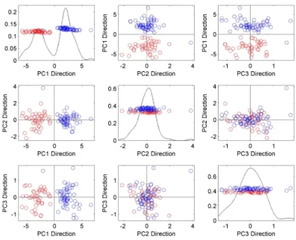
The goal of the PCA is to find orthogonal vectors in data space which account for the largest portion of variance in data. Thus, the 1st principal component vector (PC1) is defined along the direction to which the data have the maximum variance. Perpendicular to the PC1, the 2nd principal component vector (PC2) is defined such that the data assumed the maximum variance along that direction. This process is iterated until a suitable number of orthogonal vectors are determined. By projecting the data onto PC directions, one can achieve a dimension-reduction and it also helps to visualize high-dimensional data. In Figure 5.5, PCA projection plots of the Series 2 of dataset 2 are provided. Each circle represents a week in this study (n = 104). We have used red for the promotional week and blue for the non-promotional week. Along the diagonal, the upper left plot shows the distribution of the projection of 104 points onto the 1-st principal component direction vector (PC1). The second and the third plots correspond to projection on the 2-nd principal component direction vector (PC2) and projection on the 3-rd principal component direction vector (PC3). The off-diagonal plots are the distribution of two-dimensional projection onto two different direction vectors. As shown in the PCA projection plots of series 2, separation between two groups is significant.
PCA projection plot of logarithm of series 2 of data set 2 shows that promotional weeks and non promotional weeks are different.
Fig. 8: PCA projection plots of log transformed series 2 of data set 2. Red circles represent promo week and blue circles represent non-promo week. Separation between the two groups is clear.
Distance Weighted Discrimination
Fig. 9: PCA projection plots using DWD direction of series 2 of data set 2. Red circles represent Promo Week and blue circles represent non-promo Week. Separation between two groups is prominent.
Then we take the logarithm of the series and perform the same DWD. In Figure 5.8 difference between promo and non-promo weeks are prominent.
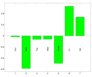
LabeledBarplot
Fig. 11: Loadings of 7 elements on the DWD direction. Mon,Tue,Wed,Thirs,Fri,Sat,Sun stand for seven days of week. Friday, Saturday have positive impact on DWD direction and rest of them has negative impact on DWD direction.
Analysis of data set 3
Data Set 3
For data set 3, we first perform FDA on 300 weekly time series in the presence of both promotion and non-promotion week. Here we want to distinguish among stores based in the presence of both promotion and non-promotion.
FDA VIew and PCA projection plots for Promotion and non-promotion week both
Fig. 12: FDA view of different stores in presence and absence of promotion. Each curve denote a single store. From the plot we can say that all store have more or less similar pattern.From the raw data plot we can say the the store denoted by green behaves little diiferent than others. PC1 and PC2 captures almost 79 % of variation.
In figure 6.2, PCA projection plot of the different stores in presence and absence of promotion is provided.
Fig. 13: PCA projection plots of the different stores in presence and absence of promotion. Each dot represent a single store.It seems that the difference among stores is not apparent.
Conclusion
In this report, We analyze three data sets.
the five series of all non-promoted items are unimodal. For each series the mode is that value around which maximum sales occur.
2. For second data set, sizer analysis on all the ten original as well as log transformed series shows that some of them are bimodal and some of them are unimodal. FDA view for most of the series of data set 2 showed significant difference between promo weeks and non-promo weeks and for most of the series PC1 and PC2 capture the maximum variation. From the PCA projection plot, we can say that for most series, difference between promotional weeks and non-promotional weeks are prominent while for the rest its not.
APPENDIX
Dataset1
Fig. 14: SiZerplot of series 2 of data set 1. The sizer map shows that the underlying curve is unimodal and the mode is around 15 .
Fig. 16: SiZerplot of series 4 of data set 1. The sizer map shows that the underlying curve is unimodal and the mode is around 165.
Fig. 18: SiZerplot of log transformed series 2 of data set 1. The sizer map shows that the underlying curve is unimodal and the mode is around 3.5.
Fig. 20: SiZerplot of log transformed series 4 of data set 1. The sizer map shows that the underlying curve is unimodal and the mode is around 5.3.
Dataset2
I gave the plots for which the sizer analysis of original series and log transformed series shows different results.
SiZer Analysis
Fig. 23: SiZerplot of log transformed series 3 of data set 2.This sizer map shows that the underlying curve is bimodal. Comparing with the original one the two modes are equally significant.
Fig. 25: SiZerplot of log transformed series 4 of data set 2.The sizer map shows that the underlying curve is bimodal.The mode around 7 is not significant.
For the FDA view plots , PCA projection plots and LabeledBarplots for data set 2, here I provide the code.
addpath(genpath(’C:/Users/moumita/Desktop/project2modified’)); %datasetABC dataABC=xlsread(’setABC.xls’); indpromo=find(dataABC(:,2)==1); indnonpromo=find(dataABC(:,2)==0); dataABCnew=dataABC([indpromo; indnonpromo],:); dataABCnew= dataABCnew(1:728,:);
dataABCfinal=reshape(dataABCnew(:,1), 7, 104);
promo = dataABCfinal(:,1:39);
nonpromo= dataABCfinal(:,40:104);
mdir=[];
mcolor = [ones(39,1) * [1 0 0] ; ones(65,1) * [0 0 1]] ;
curvdatSM(dataABCfinal,struct(’icolor’,mcolor)); %FDA view plot
paramstruct = struct(’npcadiradd’,3,’icolor’,mcolor);
scatplotSM(dataABCfinal,mdir,paramstruct); %PCA projection plot
dwddir = zeros(7,1);
dwddir(1:7,1) = DWD1SM(promo, nonpromo);
paramstruct = struct(’icolor’,mcolor);
scatplotSM(dataABCfinal,dwddir,paramstruct);
Labels = {’Sun’,’Mon’,’Tue’,’Wed’,’Thurs’,’Fri’,’Sat’};
param = struc(’nshow’,0,’DWD Loading of each element’);
REFERENCES
Chaudhuri, P. and J.S. Marron. 1999. “SiZer for exploration of structures in curves.”Journal of the American Statistical Associationpp. 807–823.
Kim, CS and JS Marron. 2006. “SiZer for jump detection.”Journal of Nonparametric Statistics 18(1):13–20.
Marron, JS, M.J. Todd and J. Ahn. 2007. “Distance-weighted discrimination.”Journal of the American Statistical Association102(480):1267–1271.
Park, C., JS Marron and V. Rondonotti. 2004. “Dependent SiZer: goodness-of-fit tests for time series models.”Journal of Applied Statistics31(8):999–1017.
Perou, C.M., S.S. Jeffrey, M. Van De Rijn, C.A. Rees, M.B. Eisen, D.T. Ross, A. Pergamen-schikov, C.F. Williams, S.X. Zhu, J.C.F. Lee et al. 1999. “Distinctive gene expression patterns in human mammary epithelial cells and breast cancers.”Proceedings of the National Academy of Sciences96(16):9212.
Qiao, X., H.H. Zhang, Y. Liu, M.J. Todd and JS Marron. 2010. “Weighted Distance Weighted Discrimination and its asymptotic properties.”Journal of the American Statistical Association 105(489):401–414.
Rondonotti, V., JS Marron and C. Park. 2007. “SiZer for time series: A new approach to the analysis of trends.”Electronic Journal of Statistics1:268–289.