Building a Better Style Guide
Whitney Quesenbery, Cognetics Corporation
51 Everett Drive, Princeton Junction, NJ 08550
http://www.cognetics.com [email protected]
ABSTRACT
Why are style guides so frequently created, but so rarely successful? All too often, businesses ask for a style guide as a means to create a common look and feel, in the belief that it will solve usability problems and establish consistency between applications – only to be disappointed in the results. Even if such a style guide is followed carefully, the resulting interfaces may not meet usability goals.. This paper explores strategies for creating a style guide that is more than a simplistic rules book. By making the style guide part of the process, it can be used to promote a shared vision, to help the product meet business and usability requirements for consistency and…it may actually be used.
INTRODUCTION
All too many projects to improve the usability of a user interface start with a request to create a style guide. To many user-centered designers, a style guide is the documentation of a design – the end of a design process – not a starting point for usability. And yet, we continue to create them, despite that fact that they may do little to address real usability problems or create a common approach to interaction. This paper describes some tactics and techniques for creating style guides that present and organize the appropriate information in a usable structure.
WHAT’S IN A STYLE GUIDE?
Style guides can be classified as platform (or language) guide, general design guides, or corporate style guides for a specific application. Although they overlap in many ways, each has a different focus.
Platform Guides
The vast majority of publicly-available guides are in the first category. These style guides focus on rules for presentation elements, including visual design elements such as color, logos, fonts or icons; page or screen layouts including spacing, justification and common items; and the correct usage for standard controls such as buttons, drop-down selections, radio button or check boxes.
This focus is understandable for style guides written for operating system platform or software languages. These guides must provide basic information for other groups using their tools to create software products, documenting the
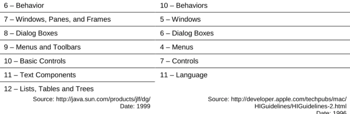
capabilities of the platform as well as providing guidance to designers. In Table 1, we see that the Java Look and Feel Guidelines and Macintosh Human Interface Guidelines have very similar tables of contents despite having been written in different eras (as computer eras go) and in different companies. The same general pattern is also followed in sections of the ISO 9241 Ergonomic Requirements for Office Work with Visual Display Terminals. Although this standard also includes guidance and requirements for physical interaction as well as two sections on task requirements and usability, most of the sections focus on visual display guidelines for dialogs, information, and user assistance.
Java Look and Feel Guidelines Macintosh Human Interface Guidelines 1 - The Java Look and Feel
2 - The Java Foundation Classes
Preface
3 - Design Considerations 1 - Human Interface Principles 2 - General Design Considerations
3 - Human Interface Design and the Development Process
4 – Visual Design 9 – Color
6 – Behavior 10 – Behaviors 7 – Windows, Panes, and Frames 5 – Windows
8 – Dialog Boxes 6 – Dialog Boxes
9 – Menus and Toolbars 4 – Menus
10 – Basic Controls 7 – Controls
11 – Text Components 11 – Language
12 – Lists, Tables and Trees
Source: http://java.sun.com/products/jlf/dg/ Date: 1999
Source: http://developer.apple.com/techpubs/mac/ HIGuidelines/HIGuidelines-2.html Date: 1996
Table 1: Comparison of Tables of Contents for Two Style Guides
Design Guides
Design guides, especially those written for web interfaces, often take a broader view, looking at the overall structure of a site and how the user navigates through it as an important design element. They may also include a primary focus on the process for creating a usable interface design. For an example of each type of design guides compare the Web Style Guide (published on the web as the “Yale Style Manual”) and the IBM Web Design Guidelines.
Web Style Guide IBM Web Design Guidelines Interface Design
Basic Interface Design – Information Access – Navigation – Links and Navigation
Site Design
Site Structure – Site Elements – Intranet Design -Site Covers
Page Design
Graphic Design – Design Grids – Headers and Footers – Typography – Consistency – Tables – Page Length – Cross Platform Issues – Editorial Style - Frames
Web Graphics
Color Primer – Graphic File Formats – Illustrations – Optimizing Graphics – Tags – Backgrounds – Image Maps
Web Multimedia and Animation
Design and AudioVisual Elements – Digital Video – Digital Audio – GIF Animation
Planning User Analysis
Competitive and Market Analysis Strategy Content -Development Tools and Technology - Schedule of Time and Resources
Design
Structure - Navigation - Text - Visual Layout and Elements - Media
Production
Preparation Browser Compatibility Creating Images -Cascading Style Sheets - Final Testing - Rollout
Maintenance Administration e-Commerce Topics Customer Support
Trust Product Navigation Product Information -Purchase Transaction
Source: http://info.med.yale.edu/caim/manual/contents.html Source: http://www-3.ibm.com/ibm/easy/eou_ext.nsf/Publish/572
Table 2: Tables of Contents for Design-Type Style Guides
Both of these examples offer excellent advice for a user-interface designer, but neither offers a definitive set of standards. Instead, they focus on establishing best-practices in design process and solutions for some common design problems.
Neither the platform style guide nor the design guide provide a perfect model for creating a corporate application style guide. The first type is too detailed, and, for product teams working in a familiar environment, spends too much time on platform basics. The second is too general and usually fails to meet the need for definitive answers to basic design questions. The IBM Web Design Guidelines even states this explicitly:
“We developed these guidelines by studying a cross-section of users and sites, but there may be contexts that we did not examine. If you learn from your user feedback that a different solution works better in your situation than one we offer here, then of course you should do what works best in your situation. To provide the best Web solutions, always use these guidelines in conjunction with a user-centered design process.”
Corporate Application Guides
Corporate style guides are a hybrid of platform guides and design guides. They need to provide look and feel guidelines to ensure basic consistency (or compatibility) across the applications they serve. In addition to providing reference material, a corporate style guide also serves an educational purpose, illustrating both the conceptual approach to the user interface and, often, a process to ensure that usability is built into the design from the beginning. (A sample table of contents for a corporate application style guide is included as an appendix to this document.)
GOALS FOR A CORPORATE APPLICATIONS STYLE GUIDE
This brings us face-to-face with a need to understand why a corporate style guide is created in the first place. Without knowing what problem the style guide is intended to solve, it is impossible to structure the information effectively, or to plan the process of creation, review and implementation. These scenarios illustrate three possible goals:
A senior manager says, “We need a style guide to ensure that all of our applications share a common look and feel.” The underlying business goal may be usability, but it may also be to save development time by supplying standard answers to difficult design questions. In this scenario, the style guide may be seen as the simplest executive order that can be given to solve a “problem with usability.”
A user-centered design group decides to publish a style guide to assist product groups in creating usable interfaces, saying, “We know a lot about what it takes to create a usable design and would like to communicate this to all of the design teams.” In this scenario, the style guide may be seen as a way to create a formal mechanism for enforcing best practices.
A product team may wish to document their own work – “We need a way to keep track of the decisions we have made, and to communicate them within our team.” This goal is usually based on the demands of working in a large design team, or a need to hand the design work from one group to another, for example, from an outside consultant to an internal staff, or to new hires.
These scenarios can be summarized in terms of usability goals for efficiency, effectiveness and satisfaction:
Usability Characteristic
Goal
Efficient Improved Quality: The time required to design of the user interface will be reduced because basic guidelines are clearly documented, tools are shared, and best practice guidance is available for other decisions Effective Improved Process: User interface will be able to work together better
because shared design guidelines are available. Initial designs will be more effective, with less re-work to solve usability problems required. Satisfying Improved Usability: The user experience will be improved, both for the
designers and users. Designers will have the satisfaction of creating excellent interfaces, while users will benefit from increased usability.
Table 3: Usability Goals For Corporate Styles
None of these goals seem controversial, or unattainable, so the answer to why style guides don’t always meet their goals does not lie in the goals themselves. The problem lies in the rest of the ISO 9241 definition of usability – that is applies to specific users, in a specified context. In other words, who is expected to use the style guide and what is the cultural environment of the group for whom it is being created? Is the style guide being imposed on an unwilling audience or is it
welcomed by the people who will have to use it? Is usability an accepted or novel concept? Do current products have a similar interface or are there many different approaches? Are the teams collegial or competitive (do they even know each other)?
The answers to these questions may not change the information included in the style guide, but the process of creating, gaining approval and maintaining it must adjust to the context. Simply gaining high-level executive sponsorship is not enough. No matter how high the authority, guidelines imposed on an unconvinced audience are often followed just to the letter of the law – if not simply ignored. The worst-case outcome is a user interface design that follows all of the
guidelines, but does not really work well. Its designers are likely to blame the style guide for dictating solutions which hampered the ‘brilliant design’ they wanted to create. Whether those designers are forced to live within the guidelines or allowed to make exceptions, the credibility of the work is damaged.
WHO USES A STYLE GUIDE?
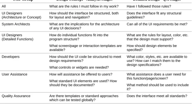
In addition to clarifying the business goals for a style guide, it is also important to know who its users will be. The obvious answer is “user interface designers,” but the answer is not that simple. A more detailed analysis would include in the user group a variety of specialists, and would also take into account differences based on the stage of the project, as seen in the table below:
User Group Design Concept - Analysis Stages Detailed Design - QA Stages All What are the rules I must follow in my work? Have I followed those rules? UI Designers
(Architecture or Concept)
How should the interface be structured, both for layout and navigation?
Does the interface fit any structural guidelines?
System Architects What are the implications for the architecture of any UI decisions?
Can all of the UI requirements be met? UI Designers
(Detailed Functions)
How do individual functions fit into the program structure?
What screen/page or interaction templates are available?
What are the rules for layout, color, etc. that the design must support?
How should design elements be specified?
Developers How should the UI code be structured to meet design requirements?
What controls or widgets are needed?
What color, styles, etc. are available to use? How can I match them to the design specifications?
User Assistance How will assistance be offered to users? What standard UI elements are used? How should they be documented?
What assistance does a user need for this function/page/screen?
What method should be used to include it?
Quality Assurance Are there templates or standard approaches which can be tested globally?
Does the interface meet all standards?
Table 4: Style Guide Users
For each user group, use of the style guide shifts during the project. It starts out supplying a conceptual overview, but quickly moves into a role as a detailed reference guide. It is this mix of requirements that makes the contents of a style guide so difficult to structure.
There are two other user groups whose members often overlap with the groups listed above:
Creators of the Style Guide. The group that creates the style guide needs to be able to manage this process. This includes a need to have a convenient way to review both individual sections and the entire guide, and a way to see an overview of the contents. The danger here is that because this group controls the guide, their needs will take precedence over the needs of the longer-term users.
Modifiers of the Style Guide. Any user may also fall into a group of people who want to request changes or
here is that this need will be ignored entirely or only given lip service. This is especially true if the group creating the style guide feels embattled.
CREATING AN EFFECTIVE STYLE GUIDE
To be effective, a style guide must not only contain good guidelines, it must be used and accepted. The process in this case may be as important as the actual product.
Process
It is impossible to prescribe a single process for all of the organizational and political contexts in which a style guide is created. There are, however, some general approaches that can be applied.
Start early
This is especially true if the style guide is supporting (or an outgrowth of) a current design effort. If you wait until the design is nearly complete to begin assembling the design guidelines, you miss the opportunity to have all design stakeholders invested in its creation and content.
Make the emerging work widely available
This is an important aspect of building broad support. It makes it possible to solicit comments and questions from stakeholders before the guidelines are final, and to incorporate feedback. One way to make the work available is to work in hypertext and make drafts available online, rather than trying to manage a traditional word-processing document. In a politically-sensitive environment, it can be tempting to work in private until the entire style guide is complete, delaying conflicts until ‘later.’ In any situation, there are risks in making the incomplete work available, but like evaluating an early prototype, the advantages usually outweigh those risks. One example is a situation in which a designer bases decisions on a version of a guideline that changes later. Clear identification of the status of the overall guide and each guideline is essential.
Make the process transparent
Include (or make available) meeting minutes or other discussion topics. Provide links from the minutes to standards or guidelines that are discussed, so that stakeholders can follow the progress of the work. Don’t wait until an item is complete to include it for comment. Early concepts or tentative decisions (along with any discussions of
alternatives) should be included as long as they are clearly identified as ‘in progress.’
Make the context visible
Many style guides are so formal that they are stripped of any context. Many guidelines are written to resolve conflicts; others provide a definitive answer to design problems for which there are many possible solutions. Although you certainly don’t want to drag all of your ‘dirty linen’ into the final style guide, it is important that readers be able to recognize the implications of the work.
Structure and Organization
One of the biggest mistakes is to treat a style guide as a narrative book rather than a reference work. Only the authors and reviewers will read it all the way through. Everyone else will use the style guide to look up the information they need as they need it.
Put it online
Save trees, costs and time by distributing the style guide online. It is always surprising to see how often web teams and others creating online applications assume that their own documentation must be in a word-processing document. Avoid this trap and plan for online access from the beginning.
Write for hyperlinks
Use hypertext to connect related topics, link to examples and illustrations, and generally make it possible for users to browse. This also allows you to avoid repeating information in more than one place, with the associated
maintenance problems which can cause.
Design for reference
Only one topic should be included in each hypertext page so that topics can be linked easily. For example, if you have a description of two controls and a comparison between them, you should create three pages, with links from each control to the comparison.
Contents
In distilling the language of guidelines down to the essential rules, the richness of the decision-making process is often lost. An important role for the style guide is to help the entire user interface team work better.
Guide design decisions
Style guides are usually effective in documenting simple rules like colors and fonts. The problem is that few of the important design decisions can be based on simple rules; more often “it depends.” Making the guidelines helpful to designers means creating comparison tables between options (for example, showing strengths and weaknesses of lists, trees and grid controls) or providing other information to help them make good design decisions.
Give design elements ‘mission statements’
It can often be difficult to communicate the essence of a design element or interaction style, especially when guidelines are not clear-cut. Rather than bury this information in the formal (“must” and “shall”) language of standards, include a simple mission statement to explain how the element enhances the user experience. These mission statements may be the first step in creating a formal guideline, acting as a checkpoint to ensure that everyone agrees on the basic issues. In some cases, it may not be possible to create a more detailed guideline. In either case, the mission statement serves to document the intent of any later work and can be used as a test against which proposed guidelines are measured.
Connect design guidelines to user analysis
Include documentation of user characteristics, demographics or profiles for all of the user groups considered in creating the style guide. When there is data from usability tests or other user analysis to back up a guideline, include it. This not only provides a clear user-centered basis for any decisions, but can also be helpful in determining when a guideline needs to be re-considered or expanded.
CASE STUDIES
Two examples from Cognetics’ experience illustrate the value of using a style guide to document and support an ongoing design process:
A multi-designer, complex product
In this project, the goal of the style guide was to help a group of UI designers create an interface for a new modular product that would share a common look and feel and be very usable. Each designer worked in a small cross-functional team on one of the modules. Weekly design meetings served as a forum to compare approaches and resolve any issues. The group created both design guidelines and programming requirements. As decisions were made in these meetings, the information was posted to a web site for review. Topics ranged from visual and layout standards to guidance on design approaches. The style guide functioned both as a collaboration and a publication tool, serving both the design group and (later) the program architects and developers.
A web site for online sales of several publications
In this project, a small central design team created design guidelines for a larger group of product and content developers. Both the core group and the product teams were spread out geographically, making collaboration difficult. The style guide became a primary communication tool, with one team member assembling all of the content for the team. Easy access to the growing site also enabled the product designers to review the guidelines and ensure that the work would meet their requirements.
Mission Statement Example
Popup windows will: Reduce the need for navigation by... showing additional detail collecting input just-in-time Increase user success in navigation by...
providing better information scent
showing options for actions collecting missing information Stop the action for a user response for…
Although these two projects differed in terms of organization, and the development and design processes there were many commonalties:
Initial attempts to create visual design guidelines quickly revealed dependencies on the design for of user interaction and navigation. Create a structure for the style guide that allowed us to collect (and link between) different aspects of the design as it emerged was important.
In both cases, there were many strong design voices that needed to be reconciled. Providing a forum for discussion with concrete examples helped move the conversation from “opinion wars” to a debate on the issues.
By using the style guide as a tool during the creation of the design, the staff became accustomed to using it as a daily reference tool. In addition to the obvious value of creating a useful tool, it meant that there were fewer surprises when the guide was released.
The inclusion of critical information for the developers, such as image libraries and stylesheet examples, gave them a reason to access the sites on an ongoing basis. In one case, there was a push to add more related information to the style guide site because it was a tool which was already being used.
The inclusion of design rationale with visual and interaction rules helped new designers understand the reasoning behind the guidelines. This also provided a good starting point for discussion when a decision had to be revisited.
USING A STYLE GUIDE TO BUILD CONSENSUS
Making and living with design decisions can be difficult, especially when several different products and different designers must all live with common guidelines. As a document, a style guide houses the details of the design that must be followed. As a process, the construction of the style guide can be used to create a shared design vision for the look and feel it documents. Our experience at Cognetics has been that when the style guide is the central location for all design material and its creation is part of the process, the guide itself can help build consensus among the team.
SAMPLE TABLE OF CONTENTS FOR A CORPORATE APPLICATION STYLE GUIDE 1. Introduction
Includes all front-matter and preface material, including the scope, authors, review and maintenance process and any terminology that must be established. Topics in this section include:
Scope
Authors
Using this Style Guide
Update and Maintenance Process 2. User-Centered Design Principles
Includes all basic principles and usability goals as well as any user analysis. Short general descriptions of designs that implement these principles may be included here, along with links to related documents. Depending on the scope of the style guide, this material may be very general or more specific. Related documents should include cross-references to any other corporate guidelines which affect the design or development of the user interface, including localization, corporate identity, or developer information, as well as useful design references.
Design Heuristics
Usability Goals
User Characteristics (and sample user data for mockups)
Accessibility Guidelines
Related Documents 3. Design Process
The contents of this section depends on the context in which the guide will be used. This is an appropriate place to put information about a general user-centered design process (or specific techniques used). This section may also include links to meeting minutes, or to other related processes such as requirements analysis or
development processes.
User-Centered Design Process
Relationship to the Development Process
Design Tools and Templates 4. User Interface Metaphors
This section documents the user interface concept and metaphors used. It is more specific than the UCD Principles, documenting an approach to the user interface to be used in all applications included in the scope. In addition, this section may contain any general guidelines on performance or task orientation that must be considered in designing the interface architecture. It also includes an overview of how the interface will provide user assistance.
UI Concept or Vision
Key Metaphors
User Assistance Design 5. Architecture or Structure
If the style guide prescribes a standard frame or site structure, the guidelines for it are included here. This may include the function of anchor pages such as the home page or main menu, and navigation methods or devices that are supported.
UI Architecture or Site Structure
Menus or Control Bars
Home Page (or Desktop or Main Menu) 6. Page or Window Layout
This section includes guidelines for the overall layout of a page or window. It includes descriptions of the layout templates for each function or type of page, and should relate these page types to the overall UI architecture. It may also include guidelines for the use of specific page structures such as popup windows, wizards or frames.
Page Structure
Layout Templates or Grids
Using Popup Windows
Using Frames
Headers and Footers 7. Controls
This section includes specifications and usage guidelines for all controls or other granular design elements. Depending on the development environment, this section may contain only general references or very specific display and interaction specifications. This section is also a place for aids to the designer such as control comparison charts. In some cases it is possible to include samples of each control in action so the designer can exercise it to see if it meets their needs.
General Guidelines
Control Comparison Charts
Descriptions Of Each Controls 8. Interactions
The guidelines in this section cover the user interactions with the interface. It may include summaries of control interactions, guidelines for interface behavior or other topics specific to the product environment.
Keyboard Shortcuts
Mouse, Joystick, Tablet or Other Pointers 9. User Assistance and Text
This section covers all text and other user assistance associated with the user interface, including labels, prompts, help text, messages, tooltips and accessible alternative text. Writing guidelines may be provided in a single section, or included with each type of text in the interface. If there are guidelines for terminology, a glossary of terms to use should be included.
Text in the Interface
Labels and Prompts
User Terminology Glossary
Writing Guidelines
Messages
Status Bar Messages
Error Messages
User Assistance
Types of User Assistance
Tooltips
Embedded Help 10. Common Functions
In many cases, a style guide may include designs for common functions, which are typically a group of controls, interactions or text. These may be stand-alone user interfaces such as a search function, or may be a complex element that is used in many functions. The section documents these functions, including any guidelines for their use.
Required Fields
Any Other Common Functions 11. Visual Design
The visual design section should be written as a reference guide, with detailed descriptions of each element and links to resources such as images or stylesheets.
Logos
Fonts
Colors
Images and Icons Styles
12. Audio and Multimedia Design
This section includes any guidelines for the use of audio or other multimedia elements.
Using Multimedia Elements
Audio
Animation