Damien M. Berahzer. Scroll Placement and Handedness. A Master’s Paper for the M.S. in I.S. degree. April, 2005. 46 pages. Advisor: Diane Kelly
This study explored how individuals categorized on handedness (being left or right hand
dominant) reacted to having the vertical scroll bar of a web browser relocated to the left
side of the screen. The relocation of the vertical scroll bar served as an alternative to the
relocation of the prominent left aligned main navigation menu for most websites. Fifteen
participants were recruited for the study. Each participant interacted with two versions of
a web site in a modified browser to complete a set of ten short tasks. Participants
completed tasks by interacting with a traditional and non-traditional vertical browser
alignment. Left and right-handed participants were determined to be strikingly different
in operation. Vertical scroll relocation produced some interesting results and responses.
Headings:
Handedness, User Interface Design, Scroll Placement, User-Centered
by
Damien M. Berahzer
A Master’s paper submitted to the faculty of the School of Information and Library Science of the University of North Carolina at Chapel Hill
in partial fulfillment of the requirements for the degree of Master of Science in
Information Science.
Chapel Hill, North Carolina April 2005
Approved by
Table of Contents
Introduction... 2
Literature Review... 4
Menu and Scroll Placement ... 4
Handedness ... 6
Method ... 11
Participants... 16
Apparatus ... 16
Procedure ... 19
Results and Discussion ... 26
Conclusion ... 35
Future Work ... 38
Appendix A... 40
Appendix B ... 41
Appendix C ... 42
Scroll Placement and Handedness
Introduction
Right aligned, left aligned, top aligned or bottom aligned. What constitutes the correct
and most efficient alignment for the main navigation of a website? Studies indicate that
most users expect the main navigation to be “almost exclusively located at the upper left
side of a web page” (Bernard, 2001). Likewise, “51% of the most popular Websites are
located flush against the left margin of the browser” (Bailey, 2002). There is a clear bias
towards having the website and main navigation of the site left aligned. However, this
practice may be one based on convention (Nielsen, 1999) rather than on empirical
evidence supporting the use of this alignment.
Contributors to this debate have explored measurements of efficiency for task
completion versus varying menu alignments. Factors considered include menu alignment,
distance between targets, width of targets, accuracy of task completion, time taken to
complete tasks and eye movement. While these factors contribute considerably to
determining what may constitute the correct alignment for the main navigation of a
website, many of the respected contributors have neglected to consider other elements
that may prove instrumental to this debate. Two such factors are (1) Scroll placement and
(2) Handedness. Merriam-Webster Online Dictionary defines handedness as: a tendency
This study introduced the relocation of the scroll bar as a viable alternative to the
multiple alignments possible for the main navigation. It relocated the vertical scroll bar to
the left of the screen, placing it closer to the prominent left aligned website navigation. In
tandem, it explores this possibility in relation to handedness (i.e. Does handedness act as
a variable that determines the perceived usability of different scroll bar alignments?). It is
interesting to note that little research has been done on website usability and handedness.
Much of the research in usability has restricted itself to right-handed participants. This
may be an unfair practice that forces left-handers to conform to right-handed constraints.
By neglecting to explore the difference between these two user groups we run the risk of
developing biased applications that possess the potential to cause harm to its users.
The study thus examined the interaction of right-handed and left-handed users
with two simulated versions of a website in a browser. One version (referred to as the
traditional system) consists of a left aligned website menu and a right aligned vertical
scroll bar. The other version (referred to as the non-traditional) consists of a left aligned
Literature Review
Menu and Scroll Placement
For a long time research has focused to a great extent on the type of menus that are most
effective. In 1988 Callahan, Hopkins, Weiser and Shneiderman examined the
productivity level experienced by users when interacting with linear and pie menus. They
found that pie menus consisting of exactly 8 items yielded a 15-20% increase in
productivity of users when compared to its linear counterpart (1988, p. 100).
However, fewer studies exist that have explored the placement of menu on a
website. Nielsen (1999) called the prevalence of left justified menus the “yellow fever
syndrome”. He proclaimed to “never be a fan” of this menu placement because it takes
up 20% of the screen. Since then screen resolution has vastly improved and this figure
may decrease from any where between 10 to 15 % depending on user preferences. While
acknowledging that the use of a left aligned navigation may be more of a convention, he
purports that there are few usability reasons for the practice. Alternatively, he suggests it
should be located on the right side of the screen as opposed to the prevalent left aligned
menu placement. His two reasons are:
(1) Fitt’s Law (Kabbash, Patrick, Mackenzie and Buxton, p. 474) which states
that the time to acquire a target is a function of the distance to and size of the
target. Since the menu and scroll bar are objects that need to be manipulated
by the user in finding information, placing the menu to the right minimizes the
possibility of moving the scroll bar to the left even though this would have
achieved his goal of minimizing click distance.
(2) Users always look at the content first. Therefore, it makes most sense to place
content as close to the left border as possible to save the user time as he/she
reads from left to right (obviously this is not including those cultures in which
users read from right to left). After users are finished reading the content they
can naturally shift their gaze to the right to decide where they want to go next.
Kalbach and Bosenick (2003) also challenge the “current leading Web design
thought that the main navigation should be left justified.” Their experiment contrasted the
usability of two Web page layouts: one with a left aligned main navigation menu and the
other with a right aligned main navigation menu. The results showed that there was no
major difference in task completion for the different menu alignments. In other studies
their results also pointed to user indifference to the location of the main menu for the sites
tested.
William Hudson (2002) questions the validity of placing menu items to the right
of the screen. To combat Nielsen and others, he suggests that the other element of Fitt’s
law, size, can combat the distance issue. If items are made larger then the time to acquire
the target is reduced. Also, many users now utilize the scroll wheel, thumb wheel and
arrow keys to achieve scrolling within a website. According to Hudson the jury is still out
on right-sided menus.
In parallel with Hudson’s views, the findings of Hofer and Zimmermann (2000)
findings indicate that the left aligned menu out performed all other menu alignments by a
factor of two while the right aligned menu yielded the longest time for task completion.
Even less work is done that examines the relocation of the vertical scroll bar as a
factor influencing the usability of a web site. Dr. Bailey (2002) reports that experiments
illustrate users prefer to have the scroll bar closer to the information (menus, list boxes
etc) it was manipulating. He gives the ultimate alternatives for designers seeking to
achieve the right combination of information, scroll bar alignment. He states that
designers have one of two options:
(1) Move the most frequently used information to be near the vertical scrollbar, or
(2) Move the scrollbar to be closer to the information.
His first alternative mirrors the heart of the menu placement debate; move the menu items
to the place that affords the user the highest usability. His second alternative is the one
most contributors to the debate failed to consider.
Handedness
Right and left-handed individuals represent an operationally differentiated group that may
exhibit differences in efficiency for application layouts. Booth and Hancock (2004) noted
that there were significant discrepancies between left and right handed users when trying
to acquire menu targets placed at different location on the screen. This experiment looked
at differences in efficiency for right and left-handed individuals when interacting with
circular and rectangular pop-up menus using the stylus input device. They gave two
potential ways to compensate for the discrepancy in performance based on handedness
(1) Provide and adaptable display that would allow the user to choose which
menu placement suits him/her best and
(2) To model the application in such a way that it automatically adapts the display
based on the handedness exhibited by the user.
This was one of the few experiments that addressed issues of handedness in application
design and suggested ways of accounting for this difference.
Most other studies have neglected to focus on handedness as a major variable or
used only a sample of right handed participants. It seems researchers have stayed away
from the issue of handedness for many reasons. Booth, Fisher and Po (2005) “ensured
that all subjects were right-handed” (p. 294) to minimize any experimental bias due to
handedness variables. Kalbach and Bosenick (2003) justify the use of right aligned web
menus based on the prevalence of right handed users. For the most part there has been
little work conducted that study relationships between usability and handedness. Studies
have instead focused on dominant and non-dominant hand performance.
Kabbash, Mackenzie and Buxton (1993) explored the performance of users for
preferred and non-preferred hands when interacting with input devices. They explored in
more details the functions of clicking (equivalent to link selection) and dragging
(equivalent to page scrolling using the scroll bar). For function such as scrolling the
non-dominant hand performed just as well as its non-dominant counterpart.
Hinckley, Pausch, Profitt and Kassell (1998) discuss the use of a two handed user
interface designed to augment a model for a three-dimensional neurosurgical
visualization. This study attempted to surpass the boundaries of the current “WIMP”
this model, new interfaces will need to “broaden the input capabilities of computers and
improve the sensitivity of our interface designs to the rich set of human abilities and
skills” (p. 261). They cite Card and Moran as having said that “technology must include a
technical understanding of the user himself and of the nature of the human computer
interaction” (p. 262).
Jakob Nielsen (2000) outlined the importance of having a “User-Centered
Structure” in the development of e-commerce web sites. In one of his studies he reported
that two models for the organization and display of information were compared and that
the one that was designed according to the “most users’ mental model” (the way that
most users thought about the domain or product lines) had a success rate of 80 percent.
The other one that was structured according to the company’s internal mode of thinking
only had a 9 percent success rate.
Preece, Rogers and Sharp (2002) stated that developers must “be more principled
in deciding which choices to make by basing them on an understanding of the users” (p.
5). They argue that these considerations are essential for optimizing the user’s interaction
with the systems. The importance of the user continues to be an emphatic consideration
in the design an implementation of any systems project. In spite of this most research has
neglected to focus on handedness as a way of understanding differentiated users. Without
a true understanding of left-handed users, we cannot fully claim to have developed
user-centered applications.
Apart from the principles of a user-centered approach there are other reasons why
handedness is an important consideration. According to Coren (1992), “there are reasons
the left-hander” (p. 249). Left-handers are pressured into manipulating work with their
right hands or adopting awkward postures in order to manipulate right handed devices.
What seems now as a simple adaptation by the minority (left-handers using right-handed
mice) may have severe consequences in the future when human-computer interaction
becomes more complex. A simple device such as a pair of scissors can illustrate this
point. The first attempt at correcting scissors to include left-handers resulted in
manufacturers adjusting the handle only. Subsequently, manufacturers were forced to
move beyond the mere adjustment to include the more expensive step of adjusting blades
so that left-handers could see the object they were cutting.
Differences between left and right-handers should be taken into account when
applications are developed. Traditionally left-handers have been “ignored by designers,
engineers and manufacturers” (McManus 2002). This practice is one that may lead dire
consequences. McManus grasp the gravity of this practice, “in the words of Thomas
Carlyle, ‘Man is a tool-using animal…. Without tools he is nothing, with tools he is all,’
then without left-handed tools a left-hander risks being nothing” (p. 280).
The research reported in this paper explored the trends in interaction for
left-handed and right-left-handed users by conducting a usability study in which participants
interacted with a traditional (left aligned website menu and a right aligned vertical scroll
bar) and non-traditional (left aligned website menu and a left aligned vertical scroll bar )
website and browser layout. Not much literature exists that explores the relationship
between menu placement, handedness and scroll placement. This experiment examined
any relationship among these three factors and provides a framework for furthering the
The quantitative data were used to characterize traits between the user groups
however, the qualitative data contributed more notably to the findings presented. The
qualitative data were collected from a questionnaire where users were asked to reflect
upon their interaction with a layout to which they were unaccustomed. The results of this
study contribute some understanding of the missing elements to the menu placement
debate, specifically, scroll placement and handedness. Scroll placement allows us to
examine the alternatives that extend beyond the website by incorporating the browser
itself as part of the problem. Conversely handedness allows us to gain a better
understanding of the human-computer interaction. This understanding can be
Method
The study presented users with an opportunity to interact with a non-traditional web
browser, where the vertical scroll bar was located to the left of the screen. An
examination of the interaction of left versus right-handed individuals to this type of
browser layout adds to the understanding of how we may correctly address menu
placement. By extension, this research may be helpful in the development of a technically
unbiased system.
The structure of the study was as follows:
(1) The participants were divided into two groups: left-handers constituted one
group while right-handers constituted the other group.
(2) Each participant interacted with both applications (the traditional left aligned
menu, right aligned vertical scroll bar and the non-traditional left aligned
menu, left aligned vertical scroll bar.
(3) Half the participants of each group were presented with the left aligned menu,
left aligned vertical scroll bar first. The other half interacted with the left
aligned menu, right aligned vertical scroll bar first.
(4) All participants were given the same set of ten tasks per site to perform.
(5) All tasks were presented to the participants in a random order by utilizing a
random function developed in Flash ActionScript1 2.0.
1
(6) The results of each group were examined to determine if trends existed within
a group. Then results were compared and contrasted between groups.
(7) Qualitative data were also obtained by asking the user to reflect upon, and
examine their interaction with the different systems.
The time taken for users to complete the set of ten tasks was obtained by
examining server logs. Each task presented to the user was linked to a specific image
which was stored on a server. Likewise, each button was also linked to a specific image
stored on the same server. Each image acted as a tag that identified which task was
randomly presented to the user and which button was clicked by that user. The server
recorded the time of each image request. The difference between the task image request
(as the task was presented to the user by the system) and the correct button request (when
the user clicked on the correct button) was recorded as the time used to successfully
complete a given task.
The tasks were developed based on content derived from popular news websites
such as CNN.com and WRAL.com. It was assumed that the categories used on such sites
would be familiar and logical to web users. An attempt was made to make the tasks
between applications similar. For example the traditional system possessed a task that
required the user to select the “Politics” button while the non-traditional system had a
task that required the user to select the “Government” button. To test that these tasks
were reasonable, a small pilot study preceded the experiment. The pilot study consisted
of four individuals, none of whom took part in the actual experiment.
Each set of ten tasks consisted of five tasks that required participants to view to an
the task. For example, the task that required the user to select the classifieds button had
the words “Your one stop Classifieds Finder” located to the bottom of the classifieds tool
shown in the picture. The remaining five tasks did not present the user with an image. It
should be noted that even when an image was not visible to the user, the program
requested the image that corresponded to that particular task from the server. This was
necessary for tracking the time that each task was presented to the user.
Table 1 lists the tasks presented to the users and the buttons that corresponded to
the correct selection for the traditional application. Table 2 lists the tasks presented to the
users and the buttons that corresponded to the correct selection for the non- traditional
application.
Table 1: Tasks presented to participants with the button that represented the right choice for completion of the task in the traditional application.
Button Task
Home Page Click on the link that will return you to the Home Page of the website. Weather You would like to know what the temperature will be tomorrow. Please
Click on the link that will give you this information.
Business Click on the button that will lead you to the information provided in the picture shown below.
Sports This is your favorite past time. You love to get the latest and greatest on it. Examine the picture below to decide which link will yield the
information you desire.
Politics A major event is about to take place. You intend to keep up to date with the proceedings. It involves these two gentlemen. Select the ink that will take you to the information.
Law The headlines read: “A federal judge dismissed a lawsuit claiming that American chemical companies committed crimes.” Click on the link in which the headlines may be found.
Health The picture below illustrates information that may be found by clicking on this link. Please click on the link.
Entertainment “We’re the knights of the round table.” ‘Spamalot’ stars David Hyde Pierce, Hank Azaria, Christopher Sieber, Steven Rogen and Tim Curry. Click on the link that will allow you to get more information on the even shown below.
About Us The mission, the people, the history and information on the members of the website may be found by clicking on this link. Please do so now.
Table 2: Tasks presented to participants with the button that represented the correct choice for completion of the task in the non-traditional application.
Button Task
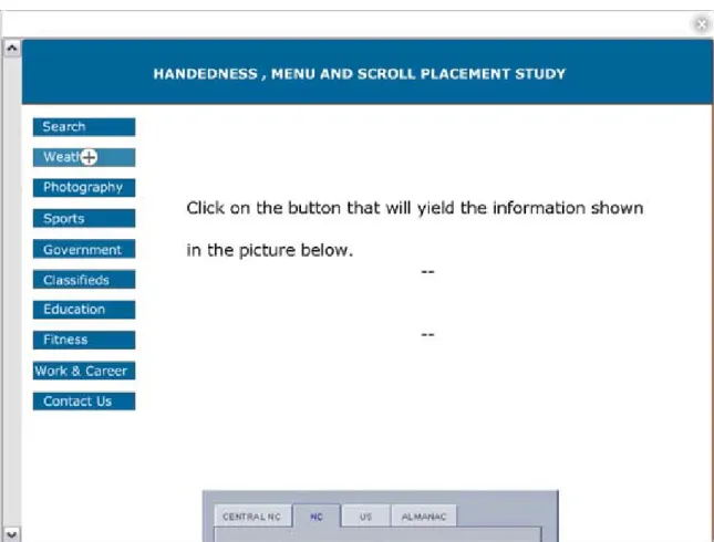
Search You are uncertain of which category the information you are seeking may be found. Select the button that will allow you to find where the information may be found on the site.
Weather Click on the button that will yield the information shown in the picture below.
Photography You once were a journalist and believe that the true power of telling a story lies in the magic of the pictures. Click on the button that will allow you to access these images.
Sports March March March Madness! You love basketball and follow your team that’s heading to the national championship. Click on the button that will give you the latest information on your team.
Government Legislators in your local town are debating the impacts of implementing a state lottery. You intend to keep yourself up to date with the
Classifieds You know exactly what you want. All that’s left is for you to find it and buy it. You use the tool shown below. Click on the button that would have taken you to this tool.
Education You are very passionate about this area. Click on the button that led you to the material shown below.
Fitness You have heard about a novel machine that promises great results for getting and staying in shape. You want to find out more about it. Click on the button that will lead you to this device.
Work & Career
You have been contemplating making some changes in your life. You are looking into your options. Click on the button that yielded the
information show below.
Contact Us You need more information. Click on the button that would have yielded the page show below.
Friedman and Nissenbaum (1996) outline biases that may be associated with
computer systems. For this experiment consideration is made to their interpretation of
Preexisting and Technical bias. Preexisting Bias exist when computer systems embody
“biases that exist independently, and usually prior to creation of the system” (p. 334).
Nielsen’s mention of convention of left handed menu may constitute such a bias.
Convention may have established the bias of left aligned menus.
Technical Bias “arise from technical constraints or technical consideration” (p.
334). The current User Interface and system manipulation within a Windows Operating
System Environment may constitute such a bias; by having application menus be left
aligned by default and having mouse pointers that angle to the left. To combat some of
these biases the application was designed to have no menus aligned for the browser (this
Window – File, Edit, Back options etc.). The mouse pointer was also transformed into a
cross hair located inside a circle. This type of design allows the cursor to be orientation
neutral (Po, 298) reducing any bias toward a particular handedness group.
Participants
Fifteen participants were recruited from among members subscribed to the School of
Information and Library Science at Chapel Hill Student mailing lists. An email was sent
to members of these lists inviting them to participate in this study. Seven of the
participants were left-handed (3 male participants and 4 female participants) and eight
were right-handed (5 male participants and 3 female participants) so that 53% were male
47% were female. Since all participants indicated using a web browser more that 10
times per week, none of them had to be trained in the general principles of web usage.
Two left-handed participants reported that English was not their first language. One left
handed participant mentioned that he generally used a left-handed mouse whenever he
got the opportunity but was just as comfortable using a right-handed mouse.
Apparatus
Participants were asked to interact with two Flash developed applications that were
mock-ups of a website in a browser (Figure 1a and 1 b). These applications covered the
entire screen of the monitor, so that the only thing the user saw was the mock website
(i.e. there was no task bar and no wallpaper space displayed). This was done to minimize
Figure 1a. Mock up of a website in a browser with a left aligned web menu and a left aligned vertical scroll bar.
The application ran on a Dell Dimension 8200 series computer with a 2.8 GHz
Pentium(R) 4 processor and a 19" Dell P991 Trinitron monitor with maximum resolution
of 1280 X 1024 pixels. For this study the resolution was set to a resolution of 1024 X
768. The application itself was developed using specifications of 800 X 600. However,
the built in fscommand2 function of Flash was utilized to allow the application to fit
exactly to whatever screen resolution was used on a given monitor. This meant that all
the components of the application were displayed at a size 1.28 times that which it was
2
created. The size increase meant that the targets (buttons on the website, and the scroll up
and scroll down arrows of the vertical scroll bar) were easier to acquire. Images requested
by the application were hosted on a server running Apache 2.0. This server did not host
any other content for the duration of the study.
Figure 1b. Mock up of a website in a browser with a left aligned web menu and a right aligned vertical scroll bar.
The application was built with certain differences and limitations.
(1) The traditional pointer was replaced with a circle that had a cross hair running
preference to being right or left-handed as is shown by the tilted pointer that
points to the left in typical right-handed mice.
(2) The application was developed to resemble a website in a browser; however the
browser portion of the application did not posses “Standard Buttons”, “Links” and
“Address” bar of most IE browsers. These options are normally left aligned and
may constitute a form of preexisting Technical Bias. Addressing this issue is
beyond this study. Also for purposes of this study the only option other than
scrolling that could be performed on the browser portion was to close it out.
(3) The scroll wheel ability found on most mice was not programmed into the
application. Users were not told of this limitation but were observed to see if they
tried to use this functionality as well as other ways for navigating through the
website.
For tasks that required participants to examine an image, most of the image
positioned below the initial viewable portion of the screen. This ensured that participants
had to scroll for some of the tasks, preventing them from simply keeping the cursor
positioned over the menu and not interacting fully with the application.
Procedure
The study was approved by the UNC Behavioral IRB, Study # LIBS 2005-033.
Participants were informed verbally of the contents of the study at the beginning of the
scheduled participation time. They were told that they were being asked to interact with
two versions of an application that simulated a website in a browser. These two
differences between the applications and no participants asked about these differences
before they began the study. However, participants were told that they were free to ask
questions at anytime if they needed clarification on anything during the course of the
study.
At the beginning of the study participants were asked a fill out an entry
questionnaire (See Appendix A) in order to categorize them. Specifically, they were
asked which hand represented their more dominant hand to determine their handedness.
They were also asked to indicate their gender and whether English was their native
language. Upon completion of the entry questionnaire participants were allowed to begin
interacting with one version of the application when ready. Half the participants of each
group was presented with the traditional system (left aligned menu and right aligned
vertical scroll bar) and the other half with the nontraditional (left aligned menu and left
aligned vertical scroll bar).
In each system participants were presented with a set of ten tasks. The order in
which the tasks were given was completely random. The system first presented the user
with a task to accomplish. A participant successfully completed a task by selecting the
button on the left aligned menu that corresponded to the scenario given in that task. A
new task (webpage) appeared after the user successfully completed the task. If
participants incorrectly completed a task they were given a message by the application
that informed them of the error. The message stated, “There seems to be an error in your
selection. Please try again” (See Figure 2). Participants repeated the task until they
completed it successfully. This ensured that participants took time to correctly interact
errors message pushed it down by two lines. In this scenario participants were forced to
scroll to see the image again if they needed to view it to remind them of the content. This
element also helped to ensure that participants took time to interact with the application.
During their interaction notes were taken that reflected the behavior of participants. For
example some participants were seen trying to use the scroll wheel and others attempted
to use arrow keys to navigate through the site.
Figure 2. Error message given to participants when they clicked on the incorrect button. Incorrect in this study refers to the button the system expected the user to click on.
For both applications the main site navigation consisting of ten buttons was
different for each application (See Figure 3). The difference in menu contents helped to
negate the possibility of participants memorizing the button options in one application
and then decreasing their time for completing tasks for the other application that
followed. The buttons comprised of white Verdana text on a dark blue background which
changed to a lighter shade of blue when participants positioned the cross hair pointer over
the buttons. This helped participants to be certain of which button they were going to
select for the given task.
Figure 3: Navigational Menus for both applications.
Not all tasks were constructed to be simple and straight forward. Participants were
required to use judgment in selecting a button to successfully complete tasks. This factor
individuals utilize cognitive resources making decisions as to where they may find the
information they seek.
Figure 4: Successful Completion of tasks message.
After successfully completing the set of ten tasks the participants were given a
message (See Figure 4) stating, “You have come to the end of this part of the experiment.
Thank you for participating.” to inform them that they had come to the end of that part of
the study. Upon successful completion of the set of ten tasks participants were asked to
fill out a post system questionnaire (See Appendix B). This was done for each application
to complete an exit questionnaire (See Appendix C). This questionnaire focused on
comparing the two applications. They were asked to indicate if they preferred one
application to the other and to state why.
The times taken for participants to complete tasks were obtained by examining the
Web server logs for the machine on which the images were hosted. Times to complete
tasks were determined by calculating the time between a task being presented to the user
and the correct button being clicked. Each task requested an image that identified the task
when loaded and each button requested an image that identified that button when clicked.
Figure 5 shows an example of the serve logs.
---.ils.unc.edu - - [28/Mar/2005:10:53:53 -0500] "GET /thesis/image06.jpg HTTP/1.1" 200 13220 "http://152.2.81.140/thesis/image06.jpg"
"Shockwave Flash"
---.ils.unc.edu - - [28/Mar/2005:10:54:17 -0500] "GET /thesis/button06.jpg HTTP/1.1" 200 13822 "http://152.2.81.140/thesis/button06.jpg"
"Shockwave Flash"
---.ils.unc.edu - - [28/Mar/2005:10:54:17 -0500] "GET /thesis/image00.jpg HTTP/1.1" 200 13220 "http://152.2.81.140/thesis/image00.jpg" "Shockwave Flash"
---.ils.unc.edu - - [28/Mar/2005:10:54:23 -0500] "GET /thesis/button00.jpg HTTP/1.1" 200 13821 "http://152.2.81.140/thesis/button00.jpg" "Shockwave Flash"
---.ils.unc.edu - - [28/Mar/2005:10:54:23 -0500] "GET /thesis/image03.jpg HTTP/1.1" 200 63718 "http://152.2.81.140/thesis/image03.jpg"
"Shockwave Flash"
---.ils.unc.edu - - [28/Mar/2005:10:54:38 -0500] "GET /thesis/button03.jpg HTTP/1.1" 200 13820 "http://152.2.81.140/thesis/button03.jpg"
"Shockwave Flash"
---.ils.unc.edu - - [28/Mar/2005:10:54:38 -0500] "GET /thesis/image04.jpg HTTP/1.1" 200 50628 "http://152.2.81.140/thesis/image04.jpg"
"Shockwave Flash"
---.ils.unc.edu - - [28/Mar/2005:10:55:06 -0500] "GET /thesis/button04.jpg HTTP/1.1" 200 13809 "http://152.2.81.140/thesis/button04.jpg"
"Shockwave Flash"
In the server logs shown above task seven (identified by the request for
image06.jpg) was presented to the user at 10:53:53 a.m. Button six (identified by the
request for button06.jpg) was clicked at 10:54:17 a.m. Images and buttons JPEGs were
related to the task by a factor of minus one. The time taken to complete task seven
corresponded to the time between the request for image06.jpg and button06.jpg (in this
Results and Discussion
Tables 3 and 4 show the total times in seconds for right-handed and left-handed
participants to complete the set of ten tasks for the right aligned (traditional system) and
left aligned (non-traditional system) vertical scroll bar. The shaded cells indicate those
participants that interacted with the traditional system first. Right-handed participants 1,
2, 3 and 8; and, left-handed participants 2, 4, 5 and 6 interacted with this version of the
application first.
Table 3: Time in seconds for right-handed and left handed participants to complete set of ten tasks when using the RIGHT aligned vertical scroll bar.
Participant Times for Right and Left Handed Participants when interacting with the Right Aligned Scroll Bar
1 2 3 4 5 6 7 8 Average
STD. DEV. Right Handed
Times 102 103 145 91 160 100 98 88 110.9 26.5
Left Handed
Times 67 89 123 99 104 195 105 111.7 40.5
Table 4: Time in seconds for right-handed and left handed participants to complete set of ten tasks when using the LEFT aligned vertical scroll bar.
Participant Times for Right and Left Handed Participants when interacting with the Left Aligned Scroll Bar
1 2 3 4 5 6 7 8 Average
STD. DEV. Right Handed
Times 59 100 100 162 258 83 178 88 128.5 66.0
Left Handed
The figures illustrated in the tables above do not indicate any major difference in
efficiency of task completion between left and right handed users when using either a
right aligned or left aligned vertical scroll bar. However, there were differences among
participants that may have contributed to this occurrence. English was not the native
language for two of the left handed participants. These participants required further
explanation on some of the tasks. For example, one participant never encountered the
word classifieds before; this corresponded to a task that was associated with button six of
the application with the left aligned vertical scroll bar. Clarification of terms increased
the time for these participants to complete tasks. These participants also expressed being
highly nervous during the study due to their language constraints.
While there may be other factors that accounted for differences in time taken to
complete task among users those mentioned above are considered to be comparably
different and unique to only these two participants. Removing these participants’ times
results in a noted difference between efficiency of task for right-handed and left-handed
individuals. Table 5 and Table 6 show the modified averages for right-handed and
left-handed users when interacting with the right and left aligned vertical scroll bar
applications. The times for the participants mentioned before were not included in this
average and is denoted by having the times scratched off in the tables.
The averages show a considerable difference between right-handed and
left-handed individuals. Left left-handed individuals performed better on both applications
suggesting that there is a difference in the way both groups operate on a functional level
Table 5: Modified Average Times in seconds for right-handed and left handed participants to complete set of ten tasks when using the LEFT aligned vertical scroll bar.
Modified Participant Times for Right and Left Handed Participants when interacting with the Right Aligned Scroll Bar
1 2 3 4 5 6 7 8 Average
STD. DEV. Right Handed
Times 102 103 145 91 160 100 98 88 110.9 26.5
Left Handed
Times 67 89 123 99 104 195 105 92.8 15.8
Table 6: Modified Average Times in seconds for right-handed and left handed participants to complete set of ten tasks when using the LEFT aligned vertical scroll bar.
Modified Participant Times for Right and Left Handed Participants when interacting with the Left Aligned Scroll Bar
1 2 3 4 5 6 7 8 Average
STD. DEV. Right Handed
Times 59 100 100 162 258 83 178 88 128.5 66.0
Left Handed
Times 84 107 182 75 98 195 146 102 27.5
The tables also indicate that participants generally took more time to complete the
set of tasks in the application with the left aligned vertical scroll bar (See Table 7). These
results do not support the theory of Fitt’s Law. Having the scroll bar located to the left
closer to the main navigation did not increase the efficiency (i.e. reduce the time taken) of
task completion by users. However, further analysis of the experiment shows that the
Table 7: Comparison of average times for right-handed and left-handed participants to complete the set of tasks for the right and left aligned vertical scroll bars.
Right-Handed
Participants
Left-Handed
Participants
Right Aligned Vertical
Scroll Bar
110.9 92.8
Left Aligned Vertical
Scroll Bar
128.5 102
This occurrence may be accounted for in the differences between tasks for the
different applications. Participants were given unique task in each application and the
main navigations of the applications were notably different, only having two overlapping
categories (the Weather and Sport buttons). The rest of the tasks dealt with unique
categories which meant that each set of ten tasks could differ in overall difficulty for each
participant. It should be noted that 80% of the participants rated both sets of tasks as
having the same level of difficulty.
One other reason that accounted for this difference was that some of the
participants took extra time to notice the scroll bar located on the left side of the screen.
Some participants were seen dragging the pointer to the far right border of the screen
where they expected to find to scroll bar. When asked about this they indicated having
bar would pop when the auto hide3 is feature turned on. Some participants tried right
clicking on the piece of the image they saw hoping to reveal the rest of it some how.
Others just stared at the screen trying to decipher the meaning held in the small visible
piece of the picture.
Six participants (3 right-handed and 3 left handed, constituting 40.0% of the
participants) took a while to notice the scroll bar when it was placed on the left side of the
screen. Of these, two of the right-handers and two left-handers interacted with the left
aligned vertical scroll bar first. These participants simply did not expect to find the
vertical scroll bar on the left side of the screen. One participant’s word sums it best, “It
was confusing at the beginning because I was looking for the scroll bar on the wrong side
[right side where it generally is] of the screen. Actually I was not looking for it, I
assumed that it was just going to be at the right, but it wasn’t”.
This was interesting behavior, especially as participants completed the entry
questionnaire which asked participants to indicate where they would expect to find the
vertical scroll bar. This question could have potentially acted as an indicator that the
study may be looking at scroll placement options. These participants stuck to what they
were familiar with and only explored other options when they were certain that the
system would not give them what they expected.
Table 8 illustrates the difficulty level participants assigned to the set of tasks for
each application along with the difficulty rating they assigned for using the system in
general. Participants were asked to rate the tasks and ease of using the systems as: 1) Not
Difficult, 2) Somewhat Difficult and 3) Very Difficult. In general most participants rated
3
the tasks in the application where the vertical scroll bar was located on the right as being
not difficult. Most participants also rated the use of this system as being not difficult as
well. Most interesting of these results was that 61.5% of the participants who rated tasks
in both systems as having the same level of difficulty rated use of the system in which the
vertical scroll bar was located on the left to be more difficult to use. In contrast only one
of these participants (participant 003R) rated the right aligned vertical scroll system to be
more difficult to use.
Table 8: Difficulty rating participants assigned to tasks and system utilization by right and left-handed users (Participant are assigned a numeric ID followed by and R or L where R represents right-handers and L represents Left-handers)
Task Difficulty System Difficulty Right Side Left Side Right Side Left Side
001R not not not somewhat
002R not not not somewhat
003R not not somewhat not
004R not somewhat not somewhat
005R not somewhat not not
006R not not not somewhat
007R not not not somewhat
008R not not not not
001L not not not somewhat
002L not not not not
003L somewhat somewhat not somewhat
004L not not not not
005L not not not not
006L not not not somewhat
007L somewhat somewhat not somewhat
73.3% of the participants (6 right-handers and 5 left-handers) preferred to have
the scroll bar located on the right side of the screen, 13.3% (1 right-hander-12.5% and 1
left-hander-14.3%) had no preference. All of the participants who took a while to locate
the vertical scroll bar when it was located on the left side of the screen preferred having it
on the right. Most participants preferred the right aligned vertical scroll bar because it
was what they were accustomed to. The reasons given for preferring the scroll bar located
on the right or left side of the screen are summarized in Table 7.
Table 7. Participants reasons for preferring one vertical scroll bar alignment over the other. Preferred vertical scroll on right side Preferred vertical scroll on left side
I preferred it only mildly. It wasn’t that I hated the scroll on the left, it jus that I’m not used looking for it there. So the scroll on the right seemed easier and therefore preferable.
Because the navigation buttons were on the left side, having the scroll bar on the same side minimized how far I had to move the mouse.
Just because it keeps the navigation bar and scroll bar separate, preventing me from hitting a link when meaning to scroll and vice versa.
Navigation Tools are close to each other and thus are easier to find and quicker to use.
I think with time I could become more proficient with the scroll on the left, but I was already used to it being on the right.
Firstly that is where I am used to finding it. Secondly because I am right-handed and the mouse is to the right hand of the keyboard. It’s mostly because of habit.
used to it. I did not expect to see it on the left. Just used to bar being on the right, also may be because mouse is on the right.
I am used to the right hand scrolling feature. Accustomed to the right-hand scroll bar placement. Felt like I’m “reaching across” to use the left-hand scroll bar. It felt unnatural and awkward.
80% (7 right-handers and 5 left-handers) of the participants stated that they would
prefer to have a choice is deciding where the scroll bar was located. Most of these
participants felt that having a choice would better accommodate the preferences of
different users and that having the ability to control configuration was desirable even if
they were not going to use the feature. While most participants preferred the right aligned
vertical scroll bar they still preferred having the choice to decide where it should go.
For the remaining 20% of the participants having the ability to choose where the
vertical scroll bar was aligned did not matter. These participants felt that they could adapt
easily to whichever side it was on or that the default setting of having the scroll bar
placed on the right satisfied their preference, thus making a choice unnecessary.
Only two participants used the vertical scroll bar as the only means of navigation
through the sites. The remaining 86% of the participants attempted to use the scroll
wheel, arrows keys, page up and page down keys. These participants attempted to use
these shortcuts first, before utilizing the scroll up and scroll down buttons on the vertical
stated that they would have preferred to use this mechanism for scrolling through pages
rather than resorting to using the scroll up and scroll down buttons on the vertical scroll
Conclusion
This study broadens the scope of the issue of menu placement on websites. It introduced
the possibility of relocating the vertical scroll bar closer to the prevalent left aligned
menus found on most sites today. It ventured into exploring this possibility along side
focusing on handedness as a contributing factor to the debate and in so doing explored
missing considerations. Studies have used Fitt’s Law as a major element for conducting
research with regards to menu placement. Yet not many have considered handedness or
the possibility of relocating the vertical scroll bar of web browsers as being important.
The study investigated whether there were differences in performance and
preference between left-handed and right-handed users when interacting with two
versions of a website in a browser. Left-handers do seem to perform better on tasks in
general than their right-handed counterparts regardless of alignment of the vertical scroll
bar. This suggests that there are differences between these two groups that should be
explored when addressing issues associated with Web graphical user interface design.
Without exploring these differences we cannot claim to truly develop user-centered
applications.
All but one of the left-handed individuals in this study generally utilize a
handed mouse. Most commented on how they simply trained themselves to use a
right-handed mouse because it was so prevalent. This subtle forced use of a widespread device
between operationally differentiated users can prevent the undue and unnecessary evil of
subjecting individuals to unfair constraints.
The outcome of exploring these differences may not change any product or
practice to any major extent but may help to prevent biases from being built into novel
and widespread technology products. Technology has advanced far enough to make
consideration for these differences with minor burdens being placed on developers and
technology pioneers. This study explored this possibility by introducing the relocation of
the scroll bar to the opposite side of the screen from which it is generally found in web
browsers. There is no clear correlation to scroll placement and handedness; however,
preexisting experience with a right aligned vertical scroll bar was affected the results
obtained in this study. Participants’ predetermined notions of where the scroll would be
located did not affect their desire to be able to control or alter the system. While the
majority of participants preferred to have the scroll bar aligned to the right, most of
participants favored having a choice in deciding where the scroll bar would be located.
This choice, the ability to control the configuration of an application, can reduce
the occurrence of forcing individuals to conform to a standard that does not suit them
best. While individuals tend to adapt quickly to technology as in the case of left-handers
training themselves to use right-handed mice, technology can aid users in developing
practices and procedures that maximize their potential and productivity. Interesting
practices and contribution to technology may have existed had left-handers always been
afforded the use of a left-handed mouse.
The results of time taken to perform a set of task obtained by examining the
bar closer to the menu items reduced the time taken by users to acquire a target (buttons
on the menu). However, given the novelty of the experiment and the unfamiliarity of
users to the relocation of the vertical scroll bar, these results cannot be used as a means of
soundly contradicting Fitt’s law. Participants’ preoccupation with expecting to find a
vertical scroll bar located on the right side of the screen increased the amount of time it
took them to complete the tasks given. Fitt’s law may prove to be true under different
circumstances. Participants generally commented on how much easier the tasks became
once they discovered the vertical scroll bar on the left of the screen and then appeared to
easily adapt to this new configuration.
Participants also quickly adapted to not having some of the functionality they
expected to find when viewing a website in a browser. This shows only that users can
make do with the minimum. The fact that so many participants expected and tried to use
the missing functionality points to the decreasing significance of having a “correct menu
placement” debate. Participants utilize other means for navigating through websites. They
no longer need to acquire a specific target to get at the information they seek. Distance
between scroll bar buttons and menu items becomes less important. Even the participants
who used only the vertical scroll bar to navigate up and down in the sites tried using the
scroll space between the up and down scroll buttons to achieve scrolling. This region
requires less accuracy to acquire and may reduce the time needed to obtain the
information sought.
One interesting idea that came from one participant in the study suggested
grouping the up and down activity of the vertical scroll bar with the back and forward
browsers. This participant felt that the location of these in relation to each other
unnecessarily increased the time taken for users to navigate through a site. Requiring the
user to traverse the horizontal distance between the scroll-down and back buttons of a
web browser is highly inefficient, and, in this case of this user, very annoying. This
presents an interesting idea that interface designers may explore. It may make sense to
group web browser navigation elements.
While the results of this experiment yielded some interesting observations
mention should be made of the study limitations. The sample size was relatively small
and consisted mainly of participants engaged in Information and Library Science
programs. These individuals constitute a specialized group that may be more sensitive to
issues of usability and navigation than the general community of web users. There was
also no randomization process for selecting these participants from the community of
users from which they were drawn. As such the sample was not representative of the
general body of web users. However, the system that a particular user interacted with first
was determined by using a process of random assignment.
Future Work
The difference in performance between left and right-handers is an area of study that may
be further explored to construct theories of development that incorporate guidelines for
producing biased free systems. It may open the doors for new possibilities in graphical
user interface arrangement that may help individuals to maximize the productivity and
potential. This uncharted territory may lead to the development of new practices that may
More research should be done to examine the effects of having the vertical scroll
bar relocated to the left of the screen. In this type of study participants should be aware
the relocation of the scroll bar and should have prior experience interacting with such a
configuration. The results of such an experiment may prove to change the entire nature of
the menu placement debate. It may result in the death of the debate as the placement of
the menu no longer holds center stage in this issue. Users may define their own location
of the vertical scroll bar and may adjust it at will to accommodate changes in web menu
Appendix A
Entry QuestionnairePlease select one. Participant # 00__
(1) Which hand represents your more dominant hand?
(a) Left Hand (b) Right Hand
(2) How often would you say you use the Internet?
(a) 0 – 5 times per week
(b) 6 – 10 times per week
(c) more than 10 times per week
(3) When using a web browser where do you expect to find the main navigation menu?
(a) Left Side of the screen
(b) Right Side of the screen
(c) Top of the screen
(d) Bottom of the screen
(4) When using a web browser where do you expect to find the vertical scroll bar?
(a) Left Side
(b) Right Side
(5) What is your gender?
(a) Male
(b) Female
(6) Is English your native language?
Appendix B
Post System QuestionnairePlease select one or write your views Participant # 00__
(1) On which side of the system was the scroll bar?
(a) Left Side (b) Right Side
(2) How difficult were the tasks on the sites?
(a) not at all difficult
(b) somewhat difficult
(c) very difficult
(3) How difficult was it for you to use the system?
(a) not at all difficult
(b) somewhat difficult
(c) very difficult
(3) Please share in your own words the experience of using the system.
________________________________________________________________________
________________________________________________________________________
________________________________________________________________________
________________________________________________________________________
________________________________________________________________________
Appendix C
Exit QuestionnaireParticipant # 00__
(1) Did you prefer one system’s interface to the other?
(a) Yes (b) No
(2) If yes, which one? _________________________
(3) Please indicate why you did or did not prefer one interface to the other.
________________________________________________________________________
________________________________________________________________________
________________________________________________________________________
________________________________________________________________________
________________________________________________________________________
________________________________________________________________________
(3) Would you prefer to have a choice in deciding where the scroll bar is located?
(a) Yes (b) No (c) Does not matter
(4) Why or Why not?
________________________________________________________________________
________________________________________________________________________
________________________________________________________________________
________________________________________________________________________
________________________________________________________________________
References
A Quiz designed to give you Fitts (1999)
<http://www.asktog.com/columns/022DesignedToGiveFitts.html> (2004, December 9).
Arias, E., Hal, E., Fisher, G., Gorman, A., & Scharff, E. (2000) Transcending the individual human mind-Creating shared understanding through collaborative design. Communications of the ACM, 7 (1), 84 – 113.
Bailey, B. (2002). Location of the scroll bar. Evidence-Based Information, Training and Tools for Optimizing the Usability of Computer Systems.
<http:www.webusability.com/article_location_of_scrollbar_2_2002.htm.> (2005, April 2).
Bernard, M. (2001). Developing schemas for the location of common web objects. Proceedings of the human factors and ergonomics society, 1161-1165.
Bernard, M. (2001). User expectations for the location of web objects. Proceedings of CHI ’01, 171-172.
Booth, K., Fisher, B. & Po, B. (2005) Comparing cursor orientations for mouse, pointer and pen interaction. Proceeding of CHI’05, 291-300.
Booth, K., & Hancock, M. (2004) Improving menu placement strategies for pen
input. Proceedings of the 2004 conference on Graphics Interface London, Ontario, Canada 221-230.
Bosenick, T., & Kallbach, J. (2003) Web page layout: A comparison between left- and right-justified site navigation menus. Journal of Digital Information, 4 (1), Article 153.
Callahan, J., Hopkins, D., Weiser, M., & Shneiderman, B. (1988) An empirical comparison of pie vs. linear menus. Proceedings of CHI’98, 95-100.
Card, S., Moran, T., & Newell, A. (1980) The Keystroke-Level model for user
performance time with interactive Systems. Communications of the ACM, 23 (7), 396 – 410.
Friedman, B., & Nissenbaum, H., (1996). Bias in computer systems. ACM Transactions of Information Systems, 14 (3), 330-347.
Harrison, B., Fishkin, P., Gujar, A. Mochon, C., & Want, R. (1998) Squeeze me, hold me, tilt me! An exploration of manipulative user interfaces. CHI, 18-23.
Hinckley, Ken, Kassell, N., Paush, R. & Profitt, D (1998). Two-Handed virtual
manipulation. ACM Transactions on Computer-Human Interaction, 5 (3), 260 – 302.
Hudson, William (2002) Navigate on the right? The jury is still out. <
http://www.syntagm.co.uk/design/articles/navright.htm> (2004, December 08).
Kabbash, Patrick, Mackenzie, S. & Buxton, W. (1993) Human performance using computer input devices in the preferred and non-preferred hands .Proceedings of the SIGCHI Conference on Human Factors in Computing Systems, 2001, Seattle, Washington: 293 – 300.
MacKenzie, S. & Soukoreff, W (2003). Card, English, and Burr (1978) – 25 years later. Proceedings of CHI’03, 760-761.
McManus, C. (2002) Right hand, left hand: The origins of asymmetry in brains, Bodies, Atoms and Cultures. Massachusetts: University Press
Nielsen, J. (2004). The Need for Web Design Standards. (Alert Box Nov. 2004) < http://www.useit.com/alertbox/20040913.html> (2004, December 09).
Nielsen, J. (2000). Designing web usability. Indiana: New Riders.
Nielsen, J. (1999). When bad design elements become the standard. (Alert Box Nov. 1999) < http://www.useit.com/alertbox/991114.html> (2004, December 09).