90
Malaysian Journal of Computer Science. Vol. 25(2), 2012
VISUALIZING QUR’ANIC WORDS WITH PARALLEL PLOT
Raja Jamilah Raja Yuso 1, Roziati Zainuddin 2, Mohd. Sapiyan Baba 3, Nazean Jomhari 4, Zulkifli Mohd
Yusoff 5
1,2,3,4Faculty of Computer Science and Information Technology,
5 Academy of Islamic Studies,
University of Malaya, 50603, Kuala Lumpur
Email: 1 [email protected], 2[email protected], 3 [email protected], 4 [email protected], 5
ABSTRACT
Parallel plot is a relatively new type of plot in comparison to scatter plot. The aim of this paper is to find out the effectiveness of parallel plot visualization in comparison to the scatter plot for novice users. Comparison through literature shows that parallel and scatter plot visualization techniques offer similar visualization features. A study was conducted based on the parallel plot in Parallel Coordinate for the Qur’an (PaCQ) interface using a relational model, Goals Operators Methods and Selection Rules (GOMS) analysis and user performance evaluation. Based on the GOMS analysis, the subtasks and operation time involved in exploring data in scatter plot exceeds the subtasks and operation time in parallel plot in relation to the PaCQ interface developed for novice user even though, earlier studies found that scatter plot is easier to use. The GOMS analysis shows that the average time taken to complete tasks for the parallel plot is shorter then the scatter plot. A user performance evaluation shows no significant difference in the scores of interpreting the parallel plot within three levels of educational level of novice users. These findings provide evidences that the parallel plot is more effective for PaCQ designed for novice users.
Keywords: Information Visualization, Parallel plot, Scatter plot, Multidimensional, GOMS analysis
1.0 INTRODUCTION
Research in visualization sometimes addresses the issue of expert and novice users. The term novice is some-times used in an unclear manner. According to Fisher [1] novice users are those without experience in con-ducting certain tasks. Although, given certain amount of period, experience can be gained by novice user and expertise can be developed in the task involved. There is also the term naive user, those who lack analytical and critical skills; in particular when using a system without knowing how the system functions. Novice and naive users may overlap Therefore in the context of this paper, the terms novice and naïve are bothreferredto as novice.
The usage of parallel plot visualization technique is usually associated with experts. However, very little re-search has been conducted on the perceptibility and performance of novice users using parallel coordinate. The perpendicular plots are popular among novice users since this representation isintroduced in mathematical classes insecondary school level. The aim of this paper is to find out the effectiveness of parallel plot visuali-zation in comparison to the scatter plot for novice users. It is an extension of work previously completed [2]. In this paper, the advantages and disadvantages of the parallel plot are discussed. A relational model of the parallel plot is outlined based on an interface developed for novice user, called Parallel Coordinate for the Qur’an (PaCQ). PaCQ is an interface developed for learning Qur’anic words in the JuzAmma (the 30th part ofthe Qur’an). Goals Operators, Methods and Selection Rules (GOMS) techniques then used to analyze the PaCQ interface based on the relational model. Finally, a user performance evaluation of the novice users inter-preting the parallel plot is discussed focusing on the following:
To evaluate the graphical perceptibility of parallel plot using PaCQ interface.
To investigate the correlation between the score and the time taken to complete the task related to in-terpreting the parallel plot.
To investigate the performance of interpreting the parallel coordinate graph based on the question-naire given:
91
Malaysian Journal of Computer Science. Vol. 25(2), 2012 2.0 PERPENDICULAR PLOT
The perpendicular plots are referred to plots that use the x and y coordinates in a Cartesian system. Scatter plot and a line chart are example of such plots. These plots can be related to two dimensional variables although multidimensional variables are also possible to be displayed with overlapping techniques [3], increasing data representation density for display space efficiency [4] and small multiples techniques [4]. These techniques give rise to new type of charts such as stacked graphs, horizon graphs [4] and vizrank[3].
Interpreting a scatter plot involves identifying correlations, functional dependencies, clusters and other rela-tions [5][6]. Sometimes these could be detected by looking at direction, forms, strength and outliers of the plot. For example, if the scatter plots forms a line with negative or positive slops, then a negative or positive relation could be implied between the attributes involved. Based from these, relations of the attributes volved could be predicted. However, if the dimensionality increases, the number of different plots to be in-spected increases by m(m-1)/2, where m is the number of attributes in the set of data [3]. The data can be dif-ferentiated via color, symbol or shapes. Values of attributes are represented as points and only the position is effected within the perpendicular x, y axis and not its size, shape and color [3].
The disadvantage of this plot is that only limited number of data items can be visualized in the screen [7] alt-hough this could be overcome. Analysis of the scatter plots, for example, can be difficult and time consuming since the x and y projection increases exponentially with the number of attributes [8] [3]. In a larger dataset, the points can overlap and may not be perceived [4] [3] [7]. Bertini and Santucci [9] estimated that a human cannot distin-guish between two points in a region smaller than of 14 X 14 virtual pixels. This particular prob-lem is called the occlusion probprob-lem, where occlusion is the number of identifiable points relative to any other visible points [9]. In addition, sometimes data need to be compared across multiple charts [4] [10] and this is difficult if the data set is large.
However, these plots have existed for a long time and are popularly utilized [6] by those who have learned how to interpret them easily. The perceptibility of the data characteristic is therefore considered reliable. Heer and et. al [4] refer this as the graphical perception.
There are several operations used with scatter plots, especially to reduce cluttering and to enhance the occlu-sion percentage. Jittering and distortion can be used to promote occluocclu-sion [9]. While jittering displaces the overlapped items around their original position so that they are visible, distortion presents more detail data in less dense region and less detail data in denser region. Other possible operations are zooming (making the dis-play bigger or smaller), panning (scrolling or moving the disdis-play to the intended position), filtering and selec-tion detail-on-demand (choosing items to be analyzed), brushing (highlighting) and 3D manipulaselec-tion [11].
Application of scatter plots, line charts and their families are not surprisingly wide. It had been use in contact of visualization of geographical data (such as NASA earth observation database), molecular biology project [12], financial data (such as stock prices and exchange rates), public policy (such as crime rates) [4], just to mention a few. Many of the targeted users are in the category of experts. Related tools for scatter plots are VisDB [12], VizRank [3], Spotfire [11] and XGobi [13].
3.0 PARALLEL PLOT
92
Malaysian Journal of Computer Science. Vol. 25(2), 2012
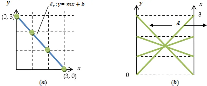
Therefore, a line in the plane, can be represented in the plane as many lines. Fig. 2 illustrates an ex-ample of the parallel plot for a negative slope. Fig. 3 illustrates exex-ample of a positive slope.
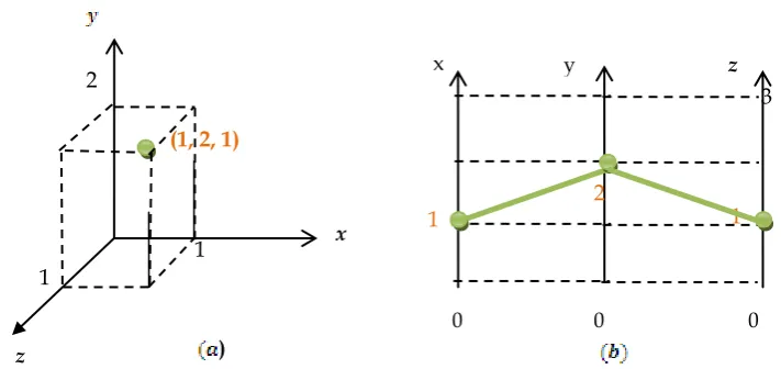
When a third dimension is added in the plane, a third line is added in the plane as illustrated in Fig. 4 (a) and (b) the point (1, 2, 1).
Fig. 3: (a) positive slope line in the Cartesian plane (b) line in the parallel plane
=
(0, 0)
(3, 3)
x
) 0
3 x (3, 0)
(0, 3)
0
3
x
x
)
Fig. 2: (a) negative slope line in the Cartesian plane (b) line in the parallel plane
= (3, 0) x
)
Fig. 1: (a) point (3,0) in the Cartesian plane (b) point (3,0) on the line in the parallel plane
0
y
[image:3.595.173.443.96.219.2] [image:3.595.142.480.339.480.2] [image:3.595.139.473.521.663.2]93
Malaysian Journal of Computer Science. Vol. 25(2), 2012
The main disadvantage of parallel plots are that the display is considered cluttered and hard to interpret if there are too many dimensions and set of attributes to be shown, but this would depend on the size of the monitor displaying the data [3, 14, 15, 16]. This problem is related to the occlusion problem, which had been men-tioned earlier in perpendicular section. Interpretation of parallel coordinate is harder and requires expert knowledge [14] [17], although there is also evidence showing, that parallel plots are not difficult to manipulate and can result in a more accurate interpretation of data even by novice users [16-18]. Also, parallel coordinate is not suitable for visualizing data sets in the range of hundreds to thousands with relationships among attrib-utes that can only be easily identified for two adjacent axes [19, 20]. Rearranging of the axes can overcome the mentioned problem.
The advantage of this plot is that it uses the display space more effectively, thus increasing the number of data a human can work with at the same time [4]. However, [19] found that 11 axes is the maximum threshold for a human to efficiently analyze the data. Also, N-dimensional properties can be visible from the screen [8].
The operations related to parallel plots are very similar to the scatter plots, i.e., zooming, panning, filtering and selection, detail-on-demand, focus+context, linking+brushing [21, 14, 22] and 3D manipulation. Also, rear-ranging the axes can improve analysis between two ad-jacent axes [14, 15]. Some example of real application of parallel plots are in network attacks data [23], land satellite data [24], climate analysis [25], data envelop-ment analysis [26], fuel injection simulation [13], and many others. The related tools for parallel plots usually include other types of visualization as well for example GGobi [27] and ComVis [22].
4.0 AN ANALYSIS OF PARALLEL PLOT USING A RELATIONAL MODEL
The analysis of the parallel plot is based on a tool developed called the PaCQ interface. The PaCQ interface was developed incorporating parallel plot visualization for supporting the Muslims of non-Arabic speakers to enhance their comprehension of an Arabic document called the Qur’an using the theory of word recognition. The PaCQ interface lets the user go through the Qur’an chapter by chapter (also known as sura). The user can also browse the Qur’an sentence by sentence (also known as ayah). The interface was built using only the last 30th part of the Qur’an, which is also known as JuzAmma. The default interface visualizes the frequencies of words [28] in JuzAmma and where these words can be found. In browsing through the Qur’an, the user can add up their vocabulary to the list that is stored in the system. The PaCQ interface visualizes the overall per-centage of their vocabulary in comparison to each sura. Also, the PaCQ interface gives a comparison chart of all words in one sura and displays percentages of these words contain in other suras.
In this section, a relational model of the PaCQ interface is described. This is followed with GOMS analysis based on the relational model.
Fig. 4: (a) 3 dimensional lines in the Cartesian plane (b) 3 parallel lines represented in the parallel P3 plane
z
0 x
) (1, 2, 1)
3
y z
x
0 0
2
1 1
[image:4.595.125.481.87.255.2]94
Malaysian Journal of Computer Science. Vol. 25(2), 2012
4.1 The PaCQ interface
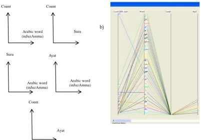
The PaCQ interface was built using Java language using Eclipse IDE. Fig. 5a) shows the sketch of a scatter plot for two variables, while Fig. 5b) is the same representation in the PaCQ interface. When plotting multi-variable, for example using four variables such as in Fig. 6a), the scatter plot represents these variables within five plots, Fig. 6b) shows the representation of four variables in the parallel plot.
Sura Count
a) b)
Fig. 6: a) shows the sketch of 5 scatter plots while b) is the same representation in par-allel plot of the PaCQ interface
Sura
Arabic word (inJuzAmma) Arabic word (inJuzAmma) Count
Arabic word (inJuzAmma) Ayat
Count
Ayat
Arabic word (in JuzAmma) Count
a) b)
[image:5.595.114.460.170.361.2] [image:5.595.112.515.434.715.2]95
Malaysian Journal of Computer Science. Vol. 25(2), 2012
4.2 The PaCQ interface relational model
A relational model can be associated with a database system. The parallel plot is represented as attributes of a table in a database. This can be considered as a simpler approach in explaining the concept to a user. In this study, there are several variables set model for the PaCQ interface:
The Arabic word, A, where A= all Arabic words in Sura1(Al-Fatihah) and JuzAmma of the Qur’an.
The Vocabulary words, V, where V A.
o Note: the vocabulary for a user in the scope of the study is limited to only the Arabic words
in JuzAmma.
The word count, C where C = {c: c } and is the set of natural numbers. The corresponding Sura, S where S = {s: s , s=1 and s 114}.
o Note: Suras in JuzAmma are from Sura number 78 to 114 and the Sura al-Fatihah is sura 1.
The corresponding Ayah, Y, where Y = {y: y , y 46}.
o Note: the maximum number of Ayah / verse in JuzAmma is 46.
The percentage of Arabic word, T, where T = { t: t , t 100}
The main relations between these variables can be written as:
= {(c, a, s, y): There are c counts of Arabic words in JuzAmma and can be found in Sura s and
Ayah y} where c C, a A, s S and y Y.
= {(v, s, t): There is T percentage of the vocabulary words V in Sura S} where v V, s S, t T. = { ( , s, t): There is T percentages of Arabic words in Sura contain in other Suras S in
JuzAmma and C count of Arabic words in the Sura S} where : P( ) } and P( ) is exactly one
Sura in Juz Amma and s S, t T.
4.3 The GOMS analysis for perpendicular plot
96
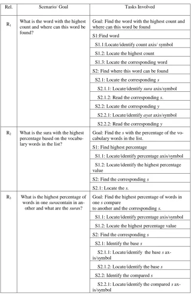
[image:7.595.106.499.101.701.2]Malaysian Journal of Computer Science. Vol. 25(2), 2012 Table 1: Relations and the corresponding tasks.
Rel. Scenario/ Goal Tasks Involved
R1 What is the word with the highest count and where can this word be found?
Goal: Find the word with the highest count and where can this word be found
S1:Find word
S1.1:Locate/identify count axis/ symbol
S1.2: Locate the highest count
S1.3: Locate the corresponding word
S2: Find where this word can be found
S2.1: Locate the corresponding s
S2.1.1: Locate/identify sura axis/symbol S2.1.2: Read the corresponding s. S2.2: Locate the corresponding y
S2.2.1: Locate/identify ayat axis/symbol S2.2.2: Read the corresponding y
R2 What is the sura with the highest percentage based on the vocabu-lary words in the list?
Goal: Find the s with the percentage of the vo-cabulary words in the list.
S1: Find highest percentage
S1.1: Locate/identify percentage axis/symbol
S1.2: Locate/identify the highest percentage value
S2: Find the corresponding s
S2.1: Locate the s.
R3 What is the highest percentage of words in one suracontain in
an-other and what are the suras?
Goal: Find the highest percentage of words in one s compare
to another and the corresponding s.
S1.1: Locate/identify percentage axis/symbol
S1.2: Locate the highest percentage value
S2: Find the corresponding s
S2.1: Identify the base s
S2.1.1: Locate/identify the base s ax-is/symbol
S2.1.2: Locate/identify the base s
S2.2: Identify the compared s
97
Malaysian Journal of Computer Science. Vol. 25(2), 2012
4.3.1 GOMS analysis for relation R1
For relation R1, the lowest level tasks involve are ‘identify count symbol’, ‘locate the highest count’, ‘locate the corresponding word’, ‘identify sura symbol’, ‘read the corresponding sura no.’, ‘identify ayat symbol’, ‘read the corresponding ayat no’. In a parallel plot, these tasks may involve other subtasks:
The user need to locate the count axis – (1) 1.
‘Locate the highest count’; the user may be confronted with a cluttered display. However, there will not be much problem in comparing to the next highest point since the points are display vertically in-stead of horizontally in the perpendicular view. Therefore, the subtasks involved may be as the fol-lowing:
o Select/locate the region with the highest point – (2). o Zoom into the region – (3).
o Read the highest count value – (4).
Locate the corresponding word; at this point, the words in the parallel plot will also be overlapping with each other. Therefore, the subtask is:
o Click the highest count value – (5).
This action can be connected to a filtering function. Once this value is clicked, the system can auto-matically display the corresponding related attribute, which is the word, the s. and the y. All other re-lated values can be faded out or temporarily filtered off the display screen, consequently simplifying all subtasks that come after this.
o View the display word on the word axis.
Locate the word axis – (6). Read the word – (7). Locate sura / ayat axis – (8 ).
Read the corresponding s or y. At this point, in the parallel plot, there are many possible sura and
ayat related to the highest word count but it is possible to read all the s and y – (9). 4.3.2 GOMS analysis for relation R2
In order to achieve the goal for relation R2, the lowest level tasks involved are ‘identify percentage ax-is/symbol’, ‘locate the highest percentage value’, ‘locate the s’.
Locate percentage symbol – (1).
Locate the highest percentage value - (2). Locate the sura no. – (3).
4.3.3 GOMS analysis for relation R3
In order to achieve the goal for relation R3, the lowest level tasks involve are ‘identify percentage symbol’, ‘locate the highest percentage value’, ‘identify the base sura symbol’, ‘identify the base sura no.’, ‘identify the compared sura symbol’, ‘identify the sura no. compared’. In the parallel plot, the subtasks involve are as the following:
Locate the percentage axis – (1).
Locate the highest percentage value: in this case, since the scale of percentage from 0-100 is at a de-tectable value, the user can follow the sequence of task as in relation to locate the highest count, which will involve 3 subtasks – (2-4).
At this point, the user can use a filter function such as clicking on the highest percentage value to dis-play the corresponding attributes (the base and compared sura). This action automatically reduces the subtasks that come next – (5).
o Locate the base sura axis – (6).
o Locate the base sura no. – (7).
o Locate the compared sura axis – (8).
o Locate the compared sura no. – (9).
98
Malaysian Journal of Computer Science. Vol. 25(2), 2012
[image:9.595.204.396.139.261.2]4.3.4 GOMS analysis estimated time for tasks related to relation R1, R2 and R3
Table 2: GOMS estimated operation duration [23].
Table 3: The estimated time for relation, R1, R2 and R3for parallel plot Operation Duration(sec)
Click-mouse-button
0.20
Shift-click-mousebutton
0.48
Cursor movement 1.10
Mental Preparation 1.35
Determine Position 1.20
Lowest Level Tasks Time/s R1
Locate/identify count axis/ symbol 1.2
Locate the highest count 1.2 +0.2+ 1.2
Locate the corresponding word 0.2
Locate/identify s axis/symbol 1.2 Read the corresponding s. 1.2 Locate/identify ayat axis/symbol 1.2
Read the corresponding y 1.2
TOTAL 8.8
R2 Locate/identify percentage ax-is/symbol
1.2
Locate/identify the highest percent-age value
1.2
Locate the s 1.2
TOTAL 3.6
R3 Locate/identify percentage ax-is/symbol
1.2
Locate the highest percentage value 1.2 +0.2+ 1.2
Locate/identify the base s ax-is/symbol
1.2
Locate/identify the base s 1.2 Locate/identify the compared s
ax-is/symbol
1.2+1.2
[image:9.595.179.425.279.705.2]99
Malaysian Journal of Computer Science. Vol. 25(2), 2012
Table 2 shows the GOMS estimated operation time for each low level tasks. The table is used to estimate the time to accomplish relation R1, R2 and R3. Table 3 shows the calculated time to accomplish the tasks using parallel coordinate plots; 8.8s, 3.6s and 8.6s for R1, R2 and R3, respectively. These timing can be considered reasonable.
4.4 The GOMS analysis for scatter plot
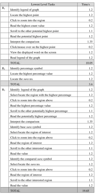
GOMS analysis described in section 4.3 with regards to R1, R2 and R3 was also carried out for the scatter plot. For relation R1, there are 11 tasks involve, for relation R2, there are 3 tasks involve and for relation R3, there are 19 tasks involve. Referring to Table 4, the time taken to complete tasks related to R1, R2 and R3 are 10.05s, 3.6s and 19.65s, respectively.
4.5 Comparing parallel and scatter plot through GOMS analysis
For the parallel plot, 9 tasks are involved to accomplish goals related to R1, 3 for R2 and 9 for R3. While in the scatterplot, 11 tasks are involved to accomplish goals related to R1, 3 for R2 and 19 for R3. The times taken to accomplish goals related to relations R1, R2 and R3 in the parallel plot are 8.8s, 3.6s and 8.6s, respectively, while in the scatter plot, 10.05s, 3.6s and 19.65s, respectively. In terms of the task and time taken to complete relations R1, R2 and R3, the parallel plot is analyzed to be better then the scatter plot. Therefore, the average time taken to complete tasks of relations R1, R2 and R3 is 7 for the parallel plot and 11.1 for the scatter plot.
4.6 User performance evaluation
A user study was conducted to evaluate the performance of novice users interpreting the parallel coordinate graph in the PaCQ interface. This section describes the conducted study and the results found.
4.6.1 Evaluation design
Participants were chosen from the Faculty of Science Computer and Information Technology of University of Malaya. 15 participants were involved, with 3 main categories according to their level of education. All of them can be considered as novice users since they do not have experience in interpreting parallel plots. There are five participants in each category:
High school academic qualification faculty staffs. Bachelor degree students.
Master degree students.
The participants were given a questionnaire with 7 questions based on the parallel coordinate graph in the PaCQ interface. The questions are related to the 3 relations described earlier, R1 (word count and word posi-tion informaposi-tion), R2 (vocabulary percentage informaposi-tion) and R3 (comparing percentage of content of words between sura). The questions also incorporated instructions on how to interact with the parallel plot.
100
[image:11.595.141.463.110.765.2]Malaysian Journal of Computer Science. Vol. 25(2), 2012
Table 4: The estimated time for relation, R1, R2 and R3 for scatter plot
Lowest Level Tasks Time/s
R1
Identify legend of graph 1.2
Locate the highest point 1.2
Click to zoom into the region 0.2
Read the highest count value 1.2
Scroll to the other potential highest point 1.1
Read the potential highest point 1.2
Interpret the comparison 1.35
Click/mouse over on the highest point 0.2
View the displayed word on the screen 1.2
Read legend of the graph 1.2
TOTAL 10.05
R2 Identify percentage symbol 1.2
Locate the highest percentage value 1.2
Locate the sura no. 1.2
TOTAL 3.6
R3 Identify legend of the graph 1.2
Select/locate the region with the highest percentage 1.2
Click to zoom into the region above 0.2
Read the highest percentage value 1.2
Scroll to the other potentially highest percentage 1.1
Read the potentially highest percentage 1.2
Interpret the comparison 1.35
Identify base sura symbol 1.2
Select/locate the region of interest 1.2
Click to zoom into the region above 0.2
Read the region of interest 1.2
Scroll to the other interested region 1.1
Read the value 1.2
Identify the compared sura symbol 1.2
Select/locate the sura no. 1.2
Click to zoom into the region above 0.2
Read the region of interest 1.2
Scroll to the other interested region 1.1
Read the value 1.2
101
Malaysian Journal of Computer Science. Vol. 25(2), 2012
4.6.3 Results
The graphical perceptibility:
[image:12.595.183.404.204.392.2]The participants were asked to rate what they thought of the parallel plot graph shown to them in the PaCQ interface. The rating was from 1 to 5 with 1 for “very hard to understand” and 5 for very easy to understand. Table 5 shows the detailed description, while Table 6 shows the mean and standard deviation. It can be ob-served that the mean rating before the test is 1.8 and after the test is 3.2, with standard deviation of 0.68 and 0.86, respectively.
Table 5: Description of rating scale Rating scale Description
1
Very hard to understand
2 Hard to understand
3 Average/Neutral
4 Easy to understand
[image:12.595.188.402.360.465.2]5 Very Easy to understand
Table 6: Graphical Perceptibility of Parallel Coordi-nate
Perception of Parallel
Coordi-nate before test
Perception of Parallel plotafter test Mean
1.80 3.20
Std. Deviation 0.676 0.862
The Correlation:
The Pearson correlation between percentage of the total score and the time taken to complete the tasks were found to be non-significant, r(13) = 0.457; p>0.05. Table 7 shows this result. The scatter plot from Fig. 2 also shows no linear relation between these two variables.
Table7: Person Correlations Percentage of the total
score
Time Taken to complete
task
Per-centage of the total score
Pearson Cor-relation
1 0.457
Sig. (2-tailed) 0.087
Time Taken to com-plete task
Pearson Cor-relation
0.457 1
Sig. (2-tailed) 0.087
The performance related to the percentage score:
102
Malaysian Journal of Computer Science. Vol. 25(2), 2012
[image:13.595.183.420.154.349.2]In Fig. 2, we can see that 14 out of 15 participants (93%) scored above 70% in interpreting the parallel plot questionnaire.
Table 8: The means and standard deviation of 3 categories of participants for percentage level score
N Mean Std. Devi-ation
Std. Error
95% Confidence Interval for Mean
Lower Bound
Upper Bound
High
school 5 1.80 .837 .374 .76 2.84
Bachelor Degree
5 2.20 .447 .200 1.64 2.76
Master Degree
5 2.20 .447 .200 1.64 2.76
[image:13.595.166.425.380.732.2]Total 15 2.07 .594 .153 1.74 2.40
Table 9: One way ANOVA Percentage level score Sum of
Squares df
Mean
Square F Sig.
Between
Groups 0.533 2 0.267 0.727 0.503
Within Groups
4.400 12 0.367
Total 4.933 14
103
Malaysian Journal of Computer Science. Vol. 25(2), 2012
The performance related to the time taken to complete the task:
Table 10 shows the means and standard deviation for the time taken to complete the tasks. The means to com-plete the tasks for high school participants, bachelor degree participants and master degree participants are 18.2, 35.6 and 24.2, respectively. It was found from the one way ANOVA test (see Table 11), that there was significant difference in the time taken to complete the tasks between the three educational level of partici-pants, F(2,14) = 12.64, p <0.05. In Table 12, the Scheffe’s test shows that the bachelor degree participants took
[image:14.595.169.418.216.390.2]more time to complete the tasks compared to the other two groups. There was no significant difference in the time taken to complete the tasks between the Master degree and the High School group.
[image:14.595.164.427.414.514.2]Table 10: The means and standard deviation of 3 categories of participants for time taken to complete task
[image:14.595.99.486.556.759.2]Table 11: One way ANOVA for time taken to complete task
Table 12: Comparison of time taken to complete task between participants in the 3 levels of education *. The mean difference is significant at the 0.05 level.
N Mean Std. Devi-ation Std. Error 95% Confidence Interval for Mean
Lower Bound
Upper Bound
High School
5 18.20 3.633 1.625 13.69 22.71
Bachelor Degree
5 35.60 8.112 3.628 25.53 45.67
Master De-gree
5 24.20 3.701 1.655 19.60 28.80
Total 15 26.00 9.071 2.342 20.98 31.02
Sum of Squares df
Mean
Square F Sig.
Between
Groups 781.200 2 390.600 12.64 .001 Within Groups
370.800 12 30.900 Total
1152.000 14
(I) Edu-cation
Level (J) Education Level
Mean Differ-ence
(I-J)
Std.
Error Sig.
95% Confidence In-terval Lower Bound Upper Bound Scheffe High School
Bachelor Degree -17.400* 3.516 .001 -27.20 -7.60
Master Degree -6.000 3.516 .271 -15.80 3.80
Bachelor Degree
High School 17.400* 3.516 .001 7.60 27.20
Master Degree 11.400* 3.516 .023 1.60 21.20
Master Degree
High School 6.000 3.516 .271 -3.80 15.80
104
Malaysian Journal of Computer Science. Vol. 25(2), 2012 5.0 DISCUSSION
The mean for the graphical perceptibility at the beginning was low (1.8). In other words, the participants found that the parallel plot was difficult to understand. This is consistent with the findings of other researches on parallel coordinate [3, 14, 15, 16]. However, at the end of the session, the average rating increases to 3.8, meaning that once the participants know how to interact with the graph, they found that it is much easier then what they have expected. The data shown to the users can be interpreted accurately even by novice users. This was also found by Siirtola & Räihä [16], Siirtola, Laivo, Heimonen, & Raiha [18] and Henley, Hagen, & Bergeron [17].
No significant corelation was found between the time taken to complete the tasks and the percentage score in the parallel plot. However, the mean time taken to complete the tasks between the Bachelor degree group and the other two groups (the High School and the Master level) were significantly different. There was no significant difference in the mean time taken to complete the tasks between the High School and the Master level groups. This indicates that higher education level does not nescessarily mean a faster speed of completion the tasks.
The performance related to the percentage of scores between the three levels of education groups was found to be non significant. Again, this indicates that higher education level does not nescessarily mean a better performance percentage score. Here, there is evidence showing that novice users can also interpret the parallel coordinate graph accurately, contradicting the arguments of Yuan, Guo, Xiao, Zhou, & Qu [14] and Henley, Hagen, & Bergeron [17], stating that expert users are needed to interpret the graph.
6.0 CONCLUSION
A relational model of parallel coordinate was used for the analysis of parallel plot based on an interface called PaCQ. Although it was found that the parallel plot does not score well in graphical perceptibility among users, results show that novice users can interpret parallel plots relatively well. The GOMS analysis of tasks related to the parallel plot also shows that the time taken to complete the tasks related to the parallel plot is well below 10s. The user study among novices with three different levels of education shows no significant difference in the scores of interpreting the parallel plot. These findings provide evidences that that parallel plot is more effective to be used in the PaCQ interface designed for novice users.
REFERENCES
[1] Fisher, J., Defining the novice user. Behaviour & In-formation Technology, 1991. 10(5), 437-441.
[2] Yusof, R.J.R, Zainudin, R., Baba, M.S. and Yusoff, Z.M. 2011. “Parallel versus Perpendicular Plots: A Comparative Study”, A. Abd Manaf et al. (Eds.): ICIEIS 2011, Part IV, Communica-tions in Computer and Information Science (CCIS) 254, pp. 436–448.
[3] Leban, G., et al., VizRank: Data Visualization Guided by Machine Learning. Data Min. Knowl. Discov., 2006. 13(2): p. 119-136.
[4] Heer, J., N. Kong, and M. Agrawala, Sizing the horizon: the effects of chart size and layering on the graphical perception of time series visualizations. In Proceedings of the 27th interna-tional Conference on Human Factors in Computing Systems (Boston, MA, USA, April 04 - 09, 2009). CHI '09. ACM, New York, NY, 1303-1312, 2009.
[5] Keim, D.A. and H. Kriegel, Visualization Techniques for Mining Large Databases: A Compari-son. IEEE Trans. on Knowl. And Data Eng, 1996. 8, 6 (Dec. 1996), 923-938.
105
Malaysian Journal of Computer Science. Vol. 25(2), 2012
[7] Ankerst, M., Keim, D. A., & Kriegel, H. P. (1996). Circle Segments: A Technique for Visually Exploring Large Multidimensional Data Sets. Proc. Visualization ‘96. San Francisco, CA.
[8] Inselberg, A., Parallel Coordinates, visual multidimensional geometry and its application. Springer, London, 2009.
[9] Bertini, E., & Santucci, G. (2005). Improving 2D scatterplots effectiveness through sampling, displacement, and user perception. Proceedings of Ninth International Conference on Infor-mation Visualization, (pp. 826-834).
[10] Chou, S.-Y., S.-W. Lin and C.-S. Yeh, Cluster identifi-cation with parallel coordinates. Pattern Recognition Letters, 1999 Vol. 20, Issue 6, Pp. 565-572.
[11] Ahlberg, C. (1996). Spotfire: An information exploration environment. ACM SIGMOD Rec-ord, (pp. 25-29).
[12] Keim, D. A., & Kriegel, H. (1996). Visualization Techniques for Mining Large Databases: A Comparison. IEEE Trans. on Knowl. and Data Eng., 8 (6), 923-938.
[13] Symanzik, J., Majure, J. J., & and Cook, D. (1996). The linked ArcView 2.1 and XGobi envi-ronment—GIS, dynamic statistical graphics, and spatial data. In S. Shekhar & P. Bergougnoux (Ed.), Proceedings of the 4th ACM International Workshop on Advances in Geographic infor-mation Systems (pp. 147-154). New York, NY: ACM.
[14] Yuan, X., et al., Scattering Points in Parallel Coordinates. IEEE Transactions on Visualization and Computer Graphics, 2009. pp. 1001-1008, November/December, 2009.
[15] Forsell, C. and J. Johansson, Task-based evaluation of multi-relational 3D and standard 2D par-allel coordinates. IS&T/SPIE’s International Symposium on Electronic Imaging, Conference on Visualization and Data Analysis 2007 (San Jose, USA, 2007), SPIE: Bellingham and IS&T: Springfield, 2007.
[16] Siirtola, H. and K.J. Räihä, Interacting with parallel coordinates. Interacting with Computers, 2006. 18(6):1278-1309.
[17] Henley, M., M. Hagen, and R.D. Bergeron, Evaluating Two Visualization Techniques for Ge-nome Comparison. Information Visualization IV '07. 11th International Conference, vol., no., pp.551-558, 4-6 July 2007, 2007.
[18] Siirtola, H., et al., Visual Perception of Parallel Coordinate Visualizations. Information Visuali-sation, 2009 13th International Conference, vol., no., pp.3-9, 15-17 July 2009, 2009.
[19] Johansson, J., Perceiving patterns in parallel coordinates: determining thresh-olds for identifica-tion of relaidentifica-tionships. Informaidentifica-tion Visualizaidentifica-tion 2008. Vol 7, 2, 152-162.
[20] Novotny, M. and H. Hauser, Outlier-Preserving Focus+Context Visualization in Parallel Coor-dinates. Visualization and Computer Graphics, IEEE Transactions, 2006. vol.12, no.5, pp.893-900.
[21] Hauser, H., F. Ledermann, and H. Doleisch, Angular brushing of extended parallel coordinates. Proceedings of the IEEE Symposium on Information Visualization (InfoVis'02), IEEE Comput-er Society (2002) pp. 127-131, 2002.
[22] Matkovic, K., et al., Interactive visual analysis and exploration of injection systems simulations. Visualization and Computer Graphics, IEEE Transactions, 2005. VIS 05. IEEE, vol., no., pp. 391- 398.
[23] Choi, H., H. Lee, and H. Kim, Fast detection and visualization of network attacks on parallel coordinates. Computers & Security, 2009. Vol 28, Issue 5, July 2009, Pp. 276-288.
[24] Yong, G., et al., Exploring uncertainty in remotely sensed data with parallel coordinate plots. International Journal of Applied Earth Observation and Geoinformation, 2009. Vol. 11, Issue 6, pp 413-422.
106
Malaysian Journal of Computer Science. Vol. 25(2), 2012
[26] Weber, C.A. and A. Desai, Determination of paths to vendor market efficiency using parallel coordinates representation: A negotiation tool for buyers. European Journal of Opera-tional Research, 1996. Vol. 90, Issue 1, pp 142-155.
[27] Swayne, D.F., et al., GGobi: evolving from XGobi into an extensible framework for interactive data visualization. Comput. Stat. Data Anal. , 2003. 43, 4, 423-444.
[28] Yusof, R.J.R, Zainudin, R., Baba, M.S. and Yusoff, Z.M., 2009. “T-Test for Visualizing Fre-quently Used Arabic Words”, Journal of Applied Sciences 9(5), 988-992.
[29] John, B.E. and D.E. Kieras, The GOMS family of user interface analysis techniques: compari-son and contrast. . ACM Trans. Comput.-Hum. Interact, 1996. 3(4): p. 320-351.
BIOGRAPHY
Raja Jamilah Raja Yusof is a lecturer in the Department of Software Engineering at the Faculty of Computer Science and Information Technology. She has taught Software Engineering subjects both the undergraduate and master levels. She is also an associate member of Centre of Qur’anic Research University Malaya. Her research interest includes Human Computer Interaction, Requirements, Cognitive studies and Islamic infor-mation system.
Roziati Zainuddin is a Professor in the Department of Artificial Intelligence at the Faculty of Computer Sci-ence and Information Technology. She has taught and supervised many Artificial IntelligSci-ence subjects/research in the undergraduate, master and PhD levels. Her research interest related to Intelligence Multimedia System.
Mohd. Sapiyan Baba is a Professor in the Department of Artificial Intelligence at the Faculty of Computer Science and Information Technology. He has taught and supervised many Artificial Intelligence sub-jects/research both the undergraduate, master and PhD levels. His research interest includes AI and Education, Cognitive Model Robotics Wayfinding, Bioinformatics: Data Mining and Image Processing, Multimedia Visu-alization.
Nazean Jomhari is a lecturer in the Department of Software Engineering at the Faculty of Computer Science and Information Technology. She has taught Software Engineering subjects both the undergraduate and master levels. She is also an associate member of Centre of Qur’anic Research University Malaya. Her research inter-est includes Interface Design (older adult, child, autistic and disable children).
![Table 2: GOMS estimated operation duration [23].](https://thumb-us.123doks.com/thumbv2/123dok_us/8651211.867801/9.595.179.425.279.705/table-goms-estimated-operation-duration.webp)