ChIPOTle v1.0: A Tool to Identify Genomic
Regions Enriched in ChIP-chip Experiments
Michael Buck, UNC-CH Lieb lab, 2005
Description
ChIPOTle is a Microsoft Excel add-in Macro that analyzes yeast ChIP-chip data generated on whole-genome tiled arrays.
Introduction
In contrast to mRNA microarray experiments, in which each arrayed element usually measures the abundance of one mRNA species, in ChIP-chip experiments each element measures the abundance of a population of fragments of assorted lengths due to chromatin shearing. Therefore, arrayed elements representing genomic regions 1- to 2-kb downstream or upstream from the binding site will also detect enrichment. This effect produces a peak over several arrayed elements containing genomically adjacent DNA. This is non-random behavior that is not expected from spuriously high ratio measurements. ChIPOTle takes advantage of this fact and uses it as an independent confirmation of enrichment for a given genomic region.
ChIPOTle works by determining a sliding window average across each chromosome. A window of selected size (default 1 kb) is slid across a region or chromosome, and the average log2 ratio of any arrayed elements that fall within that window is
determined. The window is moved downstream by the step size (default 0.25 kb), and then the calculation is repeated iteratively for the whole chromosome. This sliding average will identify binding sites as peaks. The height of peaks caused by spuriously high ratios will be reduced, since the probability of a neighboring genomic element also having a high ratio is low. ChIPOTle also defines a array density value for each peak based on the number of independent arrayed elements used to construct the peak.
The utility of this approach is that it does not depend on the absolute number of targets, but on the density of their distribution. It is appropriate for detecting any number of targets that are distributed with a frequency less than approximately three times the average sheared chromatin size. For example, if the average sheared chromatin size were 1 kb, this method would be useful for the detection of any protein predicted to be spaced at intervals of at least 3 kb. A drawback to this approach is that it requires high-resolution tiling arrays.
Setting up and running the Microsoft Excel CHIPOTLE Macro
1) Start excel by double clicking on the ChIPOTle.xla file. You may get a security warning, and if so click "enable marcos". This will start Excel with the macro loaded. ChIPOTle will add a menu option to the excel Tools toolbar “CHIPOTLE”.
If you are having problems, make sure Excel’s security setting for macros is set to medium or low. Excel’s security setting may be changed in the tools- macros -security menu option.
2) Open a spreadsheet containing your data in five columns (Spot name, log2 ratio,
3) To run ChIPOTle , go to the tools – CHIPOTLE menu option. You will be presented with a set of options.
Setting Parameters
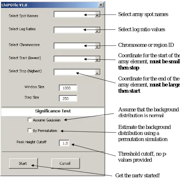
1.) You will be prompted to select the cells containing the required input data. Select the cells containing the spot names (string), log ratios (real), chromosome number (string or number), start and stop coordinate (integer).
2) Selecting window size and step size: The program was designed to use a window size equal to the average shearing size of the DNA used in the ChIP. The step size should be set at ~¼ the shear size. Default settings – window size 1000 bases, step size 250 bases (Figure 1) .
3) Select significance criteria: (A) Peak height cutoff (log2 ratio value, default 1.0),
to use as a cutoff for significant peaks. (B) Assume that the background distribution is Gaussian. (C) Estimate the background distribution using a permutation
simulation. See “Picking a significance criterion” below for more details.
4) Permutation Parameters – If you selected permutation simulation, two additional parameters are required before the program will run. These are the number of permutations and the p-value. The number of permutations is the number of times all the data will be shuffled and the sliding window used to determine the negative peak distribution. The larger this number the longer it takes to run the program. The p-value is used in determining the cutoff via permutation simulations. In addition, the user should pay close attention to the number of significant negative regions (Significant Negative Regions). If there are many significant negative
regions when compared to significant positive regions (Significant Regions), then the p-value cutoff should be decreased. A p-value cutoff that produces about 50 times more significant regions then false regions may be satisfactory.
Running the program
1) ChIPOTle retrieves the chromosome number, start, and end coordinates for each array element from the inputted data.
2) If selected, ChIPOTle estimates a cutoff for the selected p-value. The program updates its progress in the bottom left of the window.
3) The program calculates the sliding-window average for your data and outputs several data sheets.
Output
1) ChIPOTle will add the following sheets to the data workbook:
SummarySheet - Contains all the data with the spot start and stop Significant Regions - Lists all regions above the positive cutoff
Significant Negative Regions - Lists all regions below the negative cutoff Chromosomes aveP - Contains full output for each chromosome
Peaks - Lists all the positive peaks above the positive cutoff Description - Lists the settings for CHIPOTLE run
FDR - Lists all peaks identified by CHIPOTLE with the p-value and q-value for false discovery rate when using the permutation simulation approach.
A) “Significant Regions” and “Significant Negative Regions”
Chromosome – Chromosome Number Position – Start of window
Ave Log Ratio – Sliding window average for that region starting at
position
# of spots – Counts the number of independent spots used to get the
average
Names – List the name of the spots for that region
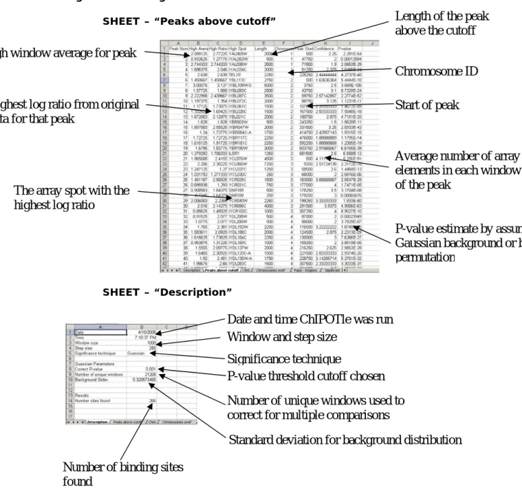
B) Peaks above cutoff
Peak Number – Peak ID number by location
High Average – Highest window average for that peak High Ratio – Highest log ratio for that peak
High Spot – The array element with the highest log ratio Length – The length of the peak above the cutoff
Chromosome – Chromosome location or region
Peak Start – The first window average above the cutoff
Array density – A measure of the number of independent spots in the
peak. A “1” means that only one spot was used it make that peak above the cutoff, therefore, this peak may not be reliably enriched.
P-value – Probability of enrichment via Gaussian or permutation
C) FDR
Peak Number – Peak ID number by height
High Average – Highest window average for that peak High Ratio – Highest log ratio for that peak
High Spot – The array element with the highest log ratio Chromosome – Chromosome location or region
Peak Start – The first window average above the cutoff P-value – Probability of enrichment via permutation Q-value – Q-value for determining FDR
Figure 1. Loading required input data and running ChIPOTle
Select array spot names
Select log ratio values
Chromosome or region ID
Coordinate for the start of the
array element, must be smaller
then stop
Coordinate for the end of the
array element, must be larger
then start
Assume that the background
distribution is normal
Estimate the background
distribution using a
permutation simulation
Threshold cutoff, no
p-values provided
Figure 2. Looking at Results
SHEET – “Peaks above cutoff”
SHEET – “Description”
High window average for peak
Highest log ratio from original
data for that peak
The array spot with the
highest log ratio
Length of the peak
above the cutoff
Chromosome ID
Start of peak
Average number of array
elements in each window
of the peak
P-value estimate by assuming a
Gaussian background or by
permutation
Date and time ChIPOTle was run
Window and step size
Significance technique
P-value threshold cutoff chosen
Number of unique windows used to
correct for multiple comparisons
Standard deviation for background distribution
Number of binding sites
Figure 3. Making Charts
Chromosomal Maps of sliding window average - Sheet “Chromosomes
aveP” contains all the sliding window average data. Step 1) Select the window
average for the
chromosome or region desired.
Step 2) Insert line chart
Step 3) Select chromosomal location for category X-axis
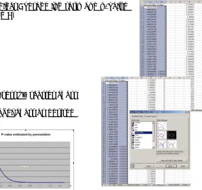
Figure 4. P-value vs Average Window log ratio chart (only for
permutation simulations)– Sheet “P-value Histogram” contains the results from the permutation simulation.
Step 1) Select Average log ratio and p-value (cols A and B)
Step 2) Insert xy scatter chart Step 3) Label chart as desired
Figure 5. Distribution of all peaks – Sheet “P-value Histogram” contains
the height of all peaks found in the experiment. Step 1) Select column K
Step 2) Insert column chart
Step 3) Select column J for category X-axis
Picking a significance criterion
ChIPOTle has three options for determining the significance of enrichment found in ChIP-chip experiment.
1. Peak height cutoff
Any peak with a height above the average log2 ratio inputted will be saved in
the Significant Regions and the Peaks worksheets. This approach does not estimate the p-value for each window or peak.
2. Background Gaussian distribution
The background or non-enriched population is assumed to a symmetric Gaussian distribution about the mean of zero. For most ChIP-chip datasets this is the case but is not true for all experiments. See “Is my data Gaussian” below if your not sure if you data fits this assumption. Using the Gaussian distribution is the most powerful approach in ChIPOTle for estimating the p-value of enrichment. Under the null hypothesis, the distribution of the
average log2 ratio within each window is again Gaussian, with mean zero and
variance equal to the variance of a single log ratio divided by the number of elements in the window. Thus the nominal p-value for a window with average ratio w can be calculated using the standard error function (ERF) as follows:
(1)
⎟
⎠
⎞
⎜
⎝
⎛
−
=
n
w
ERF
P
window1
σ
where σ is the standard deviation for the background distribution, and n is the number of microarray elements used in the window. The p-values reported by ChIPOTle are corrected for multiple comparisons using the conservative Bonferroni correction.
3. Estimate background using permutation
The background or non-enriched population is assumed only to be symmetric about the mean of zero. This approach only looks for peaks in the sliding window averages and does not estimate a p-value for every window. In addition the p-values for peaks are not correct for multiple testing.
Therefore, ChIPOTle includes an additional output sheet FDR which contains the false discovery rate statistics. The peaks are identified from the data as any window or group of windows with the same value having a preceding and following window of a lower value. Only these peaks will be tested for
enrichment, reducing the total number of statistical test required. The significance of enrichment for a peak is estimated by comparing it’s height to the height of peaks caused by chance (non-enriched). The height of peaks caused by chance is estimated by a permutation simulation of all non-enriched regions. Since, ChIP-chip experiments do not specifically deplete any genomic fragments, any array element or peak with negative log ratio can be assumed to belong to the non-enriched population. With the
assumption of symmetry about the mean for the non-enriched population we can estimate the complete non-enriched population by reflecting the negative distribution onto the positive axis. For example, a negative peak of depth -0.5, which should occur only by chance, will occur as often as a positive peak of height 0.5 by chance. From this distribution of the non-enriched positive
peaks, CHIPOTLE estimates the probability of enrichment for each peak found.
First the genomic order of the data is randomized and then a sliding window average is determined with the user specifications. Negative peaks are determined and their depth’s counted. This is repeated a selected (default = 100) number of times and the distribution of the peaks is used to determine the p-value for enrichment.
Is my data Gaussian?
The quick and easy check using Microsoft excel data “Analysis ToolPak”. The steps
below demonstrate how to make a plot similar to a Q-Q plot in microsoft excel.
1. Count the number of elements in your dataset.
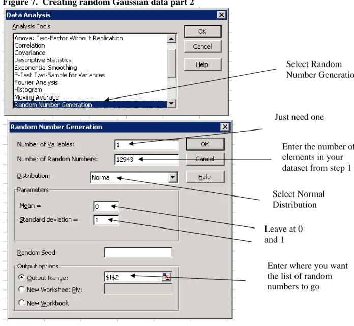
2. Create a list of random number from a Normal distribution using data analysis
toolpak addin.
Figure 6. Creating random Gaussian data
Select data
analysis, if you
don’t have this
option make sure
you have the
ToolPak add-in
installed.
Figure 7. Creating random Gaussian data part 2
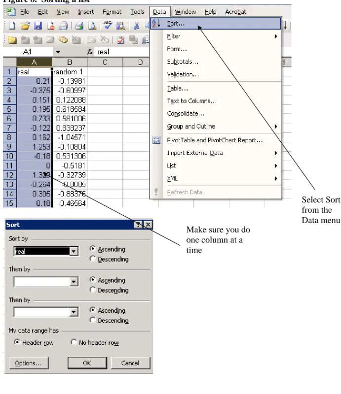
3. Sort your dataset and the random number dataset individually in ascending order
Select Random
Number Generation
Just need one
Enter the number of
elements in your
dataset from step 1
Select Normal
Distribution
Leave at 0
and 1
Enter where you want
the list of random
numbers to go
Figure 8. Sorting a list
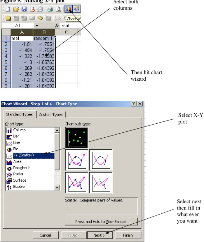
4. Make a x-y plot of the two data sets
Select Sort
from the
Data menu
Make sure you do
one column at a
time
Figure 9. Making X-Y plot
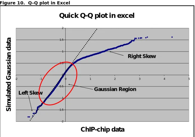
5. Interpret the plot! (Figure 10)
a. Try drawing a line for the linear region of the plot? If there is not a linear region your data is not Gaussian. It may have a bimodal distribution depending on percentage of arrayed elements enriched in the IP. When you enrich greater then > 20 % of the arrayed elements the data distribution is more bimodal then normal.
Select both
columns
Then hit chart
wizard
Select X-Y
plot
Select next
then fill in
what ever
you want
b. Is there a heavy skew to the left? Are there many spots above the line in the bottom left of the chart? If there is a heavy skew on the left side of the distribution then the Gaussian assumption may be too liberal. Depending on how heavy the tail is you may want to use the permutation simulation approach.
c. Does the line intersect (0,0)? If not the data may need to be
normalized or centered. A slight deviation < 0.05 from (0,0) is ok, but too much will invalidate the assumption of symmetry.
Figure 10. Q-Q plot in Excel
Quick Q-Q plot in excel
-2 -1.5 -1 -0.5 0 0.5 1 1.5 2 -2 -1 0 1 2 3 4 5