A thesis submitted to the University of Trento for the degree of Doctor
of Philosophy
Computational Aesthetics in HCI: Towards a
Predictive Model of Graphical User Interface
Aesthetics.
Aliaksei Miniukovich
Advisor: Prof. Dr. Antonella De Angeli
International Doctoral School in Information and Communication
Technologies
Statement of Contribution
This thesis reports research principally done by the author, as a part of his doctoral research.
This thesis consists of the following publications:
Chapter 2.
Miniukovich, A., & De Angeli, A. (2014, May). Quantification of interface visual complexity. In
Proceedings of the 2014 international working conference on advanced visual interfaces (pp. 153-160). ACM.
Miniukovich, A., & De Angeli, A. (2014, October). Visual impressions of mobile app interfaces. In
Proceedings of the 8th Nordic Conference on Human-Computer Interaction: Fun, Fast, Foundational (pp. 31-40). ACM.
Miniukovich, A., & De Angeli, A. (2015, April). Computation of interface aesthetics. In Proceedings of the 33rd Annual ACM Conference on Human Factors in Computing Systems (pp. 1163-1172). ACM. The paper has been recognized with an honorable-mention award.
Chapter 3.
Miniukovich, A., & De Angeli, A. (2016). Computational Aesthetics: From Webpages to Websites.
Under review at ACM TOCHI.
Miniukovich, A., & De Angeli, A. (2015, July). Visual diversity and user interface quality. In
Proceedings of the 2015 British HCI Conference (pp. 101-109). ACM.
Miniukovich, A., & De Angeli, A. (2016). Pick Me! Getting Noticed on Google Play. To appear in Proceedings of the 34rd Annual ACM Conference on Human Factors in Computing Systems. ACM. The paper has been recognized with an honorable-mention award.
Table of Contents
INTRODUCTION ... 6
1.1
I
NTRODUCTION... 7
1.1.1 MOTIVATION ... 7
1.1.2 THEORY ... 8
1.1.3 METHODOLOGY ... 9
1.1.4 INCREMENTAL DEVELOPMENT ... 10
1.1.4.1 Model Development ... 11
1.1.4.2 Model Application ... 12
1.1.5 THESIS CONTRIBUTION ... 13
MODEL DEVELOPMENT ... 15
2.1
Q
UANTIFICATION OFI
NTERFACEV
ISUALC
OMPLEXITY... 16
2.1.1 INTRODUCTION ... 16
2.1.2 RELATED WORK ... 17
2.1.2.1 Amount of Information ... 17
2.1.2.2 Organization of Information ... 18
2.1.2.3 Discriminability of Information ... 20
2.1.3 EXPLORATORYSTUDY ... 20
2.1.3.1 Data collection ... 20
2.1.3.2 Automatic metrics ... 21
2.1.3.3 Results ... 24
2.1.4 DISCUSSION ... 24
2.1.5 CONCLUSION ... 26
2.2
VISUAL
IMPRESSIONS
OF
MOBILE
APP
INTERFACES ... 27
2.2.1 INTRODUCTION ... 27
2.2.2 RELATED WORK ... 27
2.2.2.1 Visual Complexity ... 28
2.2.2.2 Measures of Visual Complexity ... 30
2.2.2.3 Mobile Design Specificity ... 31
2.2.3 STUDY 1 ... 31
2.2.3.1 Method ... 31
2.2.3.2 Results ... 33
2.2.3.3 Discussion ... 33
2.2.4 STUDY 2 ... 34
2.2.4.1 Method ... 34
2.2.4.2 Automatic Metrics ... 34
2.2.4.3 Results ... 36
2.2.4.4 Discussion ... 36
2.2.5 CONCLUSION ... 38
2.3
C
OMPUTATION OFI
NTERFACEA
ESTHETICS... 39
2.3.1 INTRODUCTION ... 39
2.3.2 RELATED WORK ... 39
2.3.2.1 Collecting Aesthetics Scores ... 40
2.3.2.2 Measuring Aesthetics Automatically ... 40
2.3.2.3 Complexity Roots of Aesthetics ... 41
2.3.3 METRICS ... 41
2.3.4 STUDY 1 ... 43
2.3.4.1 Stimuli ... 43
2.3.4.2 Participants ... 44
2.3.4.3 Design ... 44
2.3.4.4 Procedure ... 44
2.3.4.5 Results ... 44
2.3.4.6 Discussion ... 46
2.3.5 STUDY 2 ... 47
2.3.5.1 Stimuli ... 47
2.3.5.2 Participants ... 47
2.3.5.3 Design & Procedure ... 48
2.3.5.4 Results ... 48
2.3.6 GENERAL DISCUSSION ... 50
2.3.7 CONCLUSION ... 51
MODEL APPLICATION ... 52
3.1
C
OMPUTATIONALA
ESTHETICS:
F
ROMW
EBPAGES TOW
EBSITES... 53
3.1.1 INTRODUCTION ... 53
3.1.2 RELATED WORK ... 54
3.1.2.1 Aesthetics Computation ... 54
3.1.2.2 Webpages VS Websites ... 56
3.1.3 WEBSITE AESTHETICS COMPUTATION ... 57
3.1.3.1 Webpage Evaluation ... 57
3.1.3.2 Website Evaluation ... 61
3.1.4 STUDY METHOD ... 62
3.1.4.1 Stimuli Selection ... 62
3.1.4.2 Experimental Design ... 63
3.1.4.3 Participants ... 63
3.1.4.4 Procedure ... 64
3.1.4.5 Instrument ... 65
3.1.4.6 Apparatus ... 65
3.1.5 RESULT ... 65
3.1.5.1 Method Validation ... 65
3.1.5.2 Website-Level Factors ... 66
3.1.5.3 Webpage Selection ... 67
3.1.5.4 Full-Page Computation ... 67
3.1.5.5 Impression Evolution ... 68
3.1.6 DISCUSSION ... 68
3.1.6.1 Method ... 68
3.1.6.2 Website-Level Factors ... 69
3.1.6.3 Webpage Selection ... 69
3.1.6.4 Full-Page Computation ... 70
3.1.6.5 Impression Evolution ... 70
3.1.7 CONCLUSION AND FUTURE WORK ... 70
3.2
V
ISUALD
IVERSITY ANDU
SERI
NTERFACEQ
UALITY... 72
3.2.1 INTRODUCTION ... 72
3.2.2 RELATEDWORK ... 73
3.2.2.1 GUI Quality ... 73
3.2.2.2 Visual Diversity ... 74
3.2.2.3 Measures of Visual Diversity ... 75
3.2.3 EXPLORATION OF VISUAL DIVERSITY ... 76
3.2.3.1 Study 1 ... 76
3.2.3.2 Study 2 ... 77
3.2.3.3 Study 3 ... 78
3.2.4 CONCLUSIONS ... 81
3.3
P
ICK ME!
G
ETTINGN
OTICED ONG
OOGLEP
LAY... 83
3.3.1 INTRODUCTION ... 83
3.3.2 RELATED WORK ... 84
3.3.2.1 First Impression ... 85
3.3.2.2 Visual Saliency and Complexity ... 85
3.3.2.3 Metrics and Measures ... 85
3.3.3 STUDY PREPARATION ... 86
3.3.3.1 Hypotheses ... 86
3.3.3.2 Stimuli Sampling ... 87
3.3.3.3 Design ... 87
3.3.4 COMPUTATION OF SALIENCY AND COMPLEXITY ... 88
3.3.4.1 Saliency ... 88
3.3.4.2 Complexity ... 88
3.3.5 STUDY RESULTS ... 93
3.3.5.1 Data Preparation ... 93
3.3.5.2 Measure Validation ... 93
3.3.5.3 Hypothesis Testing ... 94
3.3.6 STUDY DISCUSSION ... 94
3.3.6.1 App Popularity ... 94
3.3.6.3 Implications ... 95
3.3.7 CONCLUSION ... 96
CONCLUSION ... 97
4.1
C
ONCLUSION... 98
4.1.1 SUMMARY ... 98
4.1.2 MODEL OF DESIGN AESTHETICS ... 99
4.1.3 FUTURE WORK ... 99
4.1.3.1 Theory ... 99
4.1.3.2 Practice ... 100
4.1.3.3 Methodology ... 100
4.1.3.4 Limitations ... 100
BIBLIOGRAPHY ... 102
1.1
Introduction
This thesis describes the development and validation of a predictive model of graphical user interface (GUI) aesthetics. The development was informed by the processing-fluency theory of aesthetic pleasure and involved outlining several visual dimensions of GUI designs, which could affect aesthetics impression. Each of the dimensions was grounded in theory and represents a unique visual aspect of GUI design. The resulting model automatically evaluates the design dimensions and combines them in an estimate of the average impression that GUI appearance would make on the user population. The model was validated in a number of user studies proving high validity and reliability. The model outputs an aesthetics score of user impression and could inform the creation of more beautiful GUIs by highlighting which of the design dimensions could be improved. The thesis describes the studies that validated the model on several types of GUIs and demonstrated a potential application of the model in future research and practice.
1.1.1
Motivation
This thesis presents a predictive model of visual aesthetics for graphical user interfaces. Aesthetics corresponds to the perception-based impression of GUI visual appearance, which influences the user appreciation and attitude towards the GUI. The model analyzes GUIs and forecasts the scores that the user would give to the aesthetics of the GUIs. The ability to forecast differentiates the model from past work, which proposed descriptive models summarizing and structuring aesthetics-related phenomena (Tractinsky, 2013; Hassenzahl, 2005; Lavie & Tractinsky, 2004; Moshagen & Thielsch, 2010). Ten user studies have tested the validity and reliability of the model on various GUIs, such as websites, mobile apps and app icons.
HCI work has recognized visual aesthetics as a distinct and impactful component of GUI quality (Kurosu & Kashimura, 1995; Tractinsky, 1997). A relevant corpus of research has discussed the properties of aesthetics (Tractinsky et al., 2006; Lindgaard et al., 2006; 2011) and its interdependence with other UX dimensions (Tractinsky et al., 2000; De Angeli et al., 2006; Sonderegger & Sauer, 2010). Some scholars have developed multi-item measurement scales for aesthetics (Lavie & Tractinsky, 2004; Moshagen & Thielsch, 2010), positioned it relative to the other quality components in UX models (Hassenzahl, 2004; Van Schaik & Ling, 2008; Hartmann et al., 2008), speculated about its antecedents (Hall & Hanna, 2004; Bauerly & Liu, 2006; Tuch et al., 2009), outcomes (Cyr et al., 2010; Braddy et al., 2008; Thielsch et al., 2013) and its decreasing impact on UX as usage time passed (Karapanos et al., 2009; Sonderegger et al., 2012). However, the outcomes of these investigations still struggled to directly inform the creation of aesthetical GUIs, which appeared a substantial challenge requiring a solution (Hassenzahl, 2012).
As a possible solution, the aesthetics design guidelines (Sutcliffe, 2009; 2002; Chang et al., 2002) tried to extrapolate design principles from the psychological knowledge on human perception. However, such knowledge was derived from experimenting with the sets of polygons, which is typical in psychology research, and not from experimenting with realistic GUIs. These guidelines gave recommendations either too general to be useful (e.g., in Sutcliffe, 2009, “we naturally see the complete object such as a circle” tells little about beauty,), or too specific to be non-controversial and to apply in the multitude of real-world situations. Thus, “low saturation pastel colours should be used for backgrounds” (Sutcliffe, 2009) contradicts Lindgaard et al.’s (2011, p. 20) observation of high-aesthetics pages tending to have bright and saturated backgrounds. The low-saturation pastels may fit some situations, but not all of them.
al., 2004 or study 3 in Lindgaard et al., 2006). Including more samples in an analysis extends the validity and reliability of results. Third, computational aesthetics can rely on a continuous score to describe a design, whereas the guidelines often assume a dichotomy, e.g., a design is categorized as either symmetrical or asymmetrical, which oversimplifies real-world GUIs. Finally, computational aesthetics can give recommendations that require less expertise to interpret than the guidelines: the aesthetics-estimation algorithms can visualize design dimensions, which substantially facilitates understanding design and making design improvements (Rosenholtz et al., 2011).
A small corpus of recent research had targeted developing the methods of aesthetics computation in HCI, and the methods had shortcomings. Some of them did not rely on a theory to motivate the identification of design dimensions or the link between the dimensions and aesthetics (e.g., Datta et al., 2006). Instead, these methods relied on examining countless GUI features, which might have happened to correlate with aesthetics scores, but lacked a theoretical backing to substantiate the correlation. As an illustrative example, webpage appreciation happened to depend on webpage meta keywords, and number of scripts and applets embedded in a webpage (Ivory et al., 2001; Ivory & Hearst, 2002) or coarseness, contrast and directionality of webpage textures (Wu et al., 2011). Because the methods used a large number of features and statistical methods suitable for the many-feature situations (e.g., the classification and regression tree analysis in Ivory & Hearst, 2002, or support vector machines in Wu et al., 2011), they could not result in simple explanations on how aesthetics could be improved. Any such explanation would require an expert to interpret the outcome of algorithms. The past attempt to build easy-to-understand good-webpage profiles (Ivory & Hearst, 2002) gave confusing results (e.g., having an italicized word on a webpage happened to attribute the webpage to the poor-design category).
Other computational methods (Ngo et al., 2003; Ngo, 2001; Ngo et al., 2000) did rely on the theories of design aesthetics from visual arts (e.g., Arnheim, 1954 as cited in Ngo et al., 2000) and leveraged relatively few features. However, the attempts to validate these methods had produced limited and contradictory evidence. Only few of Ngo’s computational measures (Ngo, 2001; Ngo et al., 2000; 2003) produced scores correlating with aesthetics scores and these few successful measures differed across different studies. For example, Purchase et al. (Purchase et al., 2011) tested each of 14 of Ngo’s aesthetics measures on just 15 datapoints and found only few of the measures to correlate with webpage aesthetics (for the color versions of webpages, these measures included proportion, cohesion and balance). Zheng et al. (2009) tested only webpage balance, symmetry, and equilibrium. Equilibrium did not correlate with webpage aesthetics. Altaboli et al. (2011) also tested three measures – webpage balance, unity and sequence – and found unity and sequence to correlate with aesthetics. Balance did not correlate with aesthetics, which, again, contradicted the other two studies and the theory.
This thesis addresses the shortcomings of the past methods for GUI aesthetics computation. It leverages the processing fluency theory (Reber et al., 2004) to drive the selection of design dimensions and user studies to validate the relationship between the dimensions and GUI aesthetics. The outlined dimensions constitute a major theoretical contribution of the thesis. The algorithms to estimate the dimensions constitute a major practical contribution of the thesis. The work has resulted in a predictive model of GUI aesthetics, which has been validated on several types of GUIs.
1.1.2
Theory
however only the psychological position allows for building predictive models: the artistic position relies on cases studies and post-hoc analyses of experiences, which can only result in descriptive models. This thesis aimed at building a predictive model of aesthetics, and thus, has stayed within the psychological position.
Within the psychological position, different theories of aesthetics exist, which could provide the rationale for the selection of aesthetics design dimensions. Berlyne’s collative theory (Berlyne, 1971) tried to explain aesthetics preferences as an outcome of “pleasingness”, which in turn depended via an inverted U-shaped link on the collative variables, such as uncertainty, complexity or surprisingness. All collative variables were presumed to measure the physiological arousal of organisms due to new incoming information mismatching existing knowledge or expectations. Berlyne’s models could not explain a large amount of empirical evidence and should no longer be considered valid (Martindale et al., 1990). A prototype-preference theory (Whitfield, 1983) described the aesthetics preference as an outcome of prototypicality: higher resemblance to a prototype would lead to higher aesthetical appreciation. This theory also failed to explain some empirical evidence, e.g., the peak-shift effect (a preference for the stimuli that resemble a prototype, but also include a dose of novelty, (Ramachandran & Hirstein, 1999; Hekkert et al., 2003)). The processing fluency theory (Reber et al., 2004; Reber, 2012; Winkielman et al., 2002) explains aesthetics preferences as a function of how fluently a mind can process a stimulus: higher fluency leads to a lower mental effort and higher aesthetic appreciation. The processing of stimuli in the mind happens subconsciously and very quickly, which explains the recent HCI findings suggesting that stable aesthetics preferences form very quickly (Lindgaard et al., 2006; 2011; Tractinsky et al., 2006). The processing-fluency theory does not account for the preferences that conscious reasoning produces, and thus, could only explain the subconscious-based part of aesthetic pleasure (Armstrong & Detweiler-Bedel, 2008; Silvia, 2012). Nonetheless, the subconscious part appeared to be universal (Reber, 2012) and was easier to associate with design dimensions than the reasoning-based part that heavily depended on user’s culture, education, personal experience and other variables that are difficult to control for. The thesis has relied on the theory of processing fluency to guide the development of design dimensions that could predict design aesthetics.
The applications of processing-fluency theory to aesthetics (Reber, 2012) built on the description of aesthetics attributes by the philosopher George Santayana (1955): aesthetics is a value-positive,
intrinsic, and objectified concept (cf., Moshagen & Thielsch, 2010). The attribute of value-positive
implies that aesthetics results in pleasure, leaving unpleasantness (e.g., due to the possible provocative nature of artworks) outside of this thesis focus. The attribute of intrinsic implies that aesthetics results in preferences almost immediately, without the interference of elaborate reasoning about the standards of beauty or usefulness. Such elaborate standards cannot be inborn; they are learnt. The non-reliance on elaborate reasoning and learnt standards implies that everyday objects – including GUIs – can be intrinsically beautiful. The attribute of objectified implies aesthetics perception is directed towards an object, rather than towards body sensations: enjoying the warmth of hot coffee does not make the coffee beautiful. Aesthetics cannot be sensed; it can only result from the mind interpretation of object properties.
This thesis focuses on aesthetics as “pleasure regarded as the quality of a thing” (Santayana, 1955) and does not consider the developmental, ethical or socio-cultural phenomena associated with aesthetics. Furthermore, the thesis only focuses on the pleasing appearance of visual stimuli and does not consider the aesthetics of music, language, mathematical proofs and other non-visual phenomena. Lastly, the thesis focuses only on the visual stimuli that qualify as GUIs or parts of GUIs, and does not consider the stimuli unrelated to HCI, such the patterns of dots and lines from psychology studies or paintings from visual arts.
1.1.3
Methodology
studies; the dimensions that do not satisfy psychometric criteria (e.g., confuse participants or do not correlate with similar items) are excluded from the initial set. The exclusion results in the final set of design dimensions, which could be used to evaluate GUI aesthetics. However, because the dimensions are operationalized as semantic-differential items, the evaluation always requires the user input on each dimension for each GUI. Collecting such user input takes substantial time and effort, and is difficult to replicate on a large scale.
Unlike the empirical approach, the black-box approach relies on computation instead of user input, and thus, can be applied on a large scale. The approach implies a researcher initially selects a large number of low-level design features, which might or might not be related to design aesthetics, since the selection is rarely based on a theory (e.g., Ivory & Hearst, 2002; Wu et al., 2011). Such features often cannot be easily attributed to a human-meaningful design dimension, as they describe very low-level visual aspects of design. The large number of initial features also conditions the researcher to use complex statistical methods (such as, support vector machines), which do not explicate the nature of feature-aesthetics relationship. Not knowing the nature of feature-aesthetics relationship – as it could be expressed by a linear, quadratic or another higher-degree polynomial – determines the naming of approach as black-box: researcher sees the input and output of black-box systems, but not the relationship between the input and output. Not knowing the nature of the relationship also makes difficult, if not impossible, the interpretation of features into design improvements. In addition, the absence of feature-backing theory does not let researchers claim that the feature-aesthetics relationship is causal or generalize the relationship to the types of GUIs not tested in researchers’ studies.
Similar to the black-box approach, the theory-led approach uses computation to estimate the visual dimensions of designs, but relies on a theory to back the selection of dimensions. The reliance on the theory increases the validity of dimensions and explicates the nature of dimension-aesthetics relationship (e.g., a causal, linear relationship), and thus, eases the interpretation of dimensions into design improvements. The reliance on computation facilitates the prediction of GUI aesthetics on a large scale, as no human input is involved in the prediction once a model is built and validated. This thesis used the theory-led methodological approach and selected the processing-fluency theory to back the outline of design dimension. The processing-fluency theory asserted complexity to underlie aesthetics, which resulted in the outlined dimensions being visual complexity-based.
To validate the design dimensions and their measures (a dimension could have several associated measures), the thesis relied on two groups of methods. The first group of methods involved no human input. The design dimensions were visualized and reviewed for various stimuli (such as, webpages and mobile app layouts). If the visualizations showed a dimension to perform as expected by the processing-fluency theory, the dimension-underlying algorithm and algorithm parameters were retained. Then, if the scores of several dimensions correlated too strongly, the dimensions were merged or dropped – this ensured that each dimension described a unique aspect of design. Finally, dimension measures were analyzed: the strong cross-correlations amongst the measures of the same dimension suggested the high convergent validity of measures, whereas the absence of strong cross-correlations amongst the measures of different design dimensions suggested the high divergent validity of measures.
The second group of validation methods relied on human input: participants rated the visual complexity and aesthetics of various GUIs; the human scores were correlated against computed scores. The significance of correlations confirmed that a dimension indeed described GUI complexity or aesthetics; the direction of correlation – if matched the theory-suggested direction – supported the validity of dimensions. For example, more contour congestion should lead to higher complexity and lower aesthetics, which indeed was the case and was considered a sign of validity of the contour-congestion measure. Further, the scores for several types of GUIs (e.g., for webpages and mobile apps layouts) were collected in the studies. A design dimension should bear a similar effect on all types of GUIs: the high similarity in the reported-computed correlations for different GUIs suggested a higher dimension validity and robustness.
1.1.4
Incremental Development
(in under 500 ms, Tractinsky et al., 2006; Lindgaard et al., 2006; 2011). Third, such very-quick opinions are primarily perception based: they depend on the visual dimensions of stimuli since the users have little to no time for cognitive elaboration. Forth, visual dimensions of stimuli determine the visual complexity of stimuli (cf., Reber et al., 2004). Fifth, the dimensions can be quantified automatically. These theoretical assumptions have undergone incremental development and resulted in the predictive model of GUI aesthetics.
The work described in this thesis consisted of two phases: development of GUI aesthetics model, and application of different aspects of the model. The phases are detailed in Chapters 2 and 3 and briefly outlined in Figure 1. Chapters 2 & 3 are based on three published papers each.
Figure 1. Outline of research undertaken in the thesis.
1.1.4.1
Model Development
A processing-fluency based aesthetics model would rely on several visual complexity dimensions, which needed to be defined and operationalized. Psychology (Oliva et al., 2004; Reber et al., 1999) and HCI (Nadkarni & Gupta, 2007; Forsythe, 2009) had studied visual complexity and described its possible dimensions. However, these dimensions were not outlined in a single source and not operationalized for GUIs in a machine-suitable form – humans could easily understand the descriptions, such as “quantity of detail or color” (Oliva et al., 2004), whereas machines could not and required much more detailed and formalized descriptions.
colors). The number of dominant colors impacted complexity directly, and aesthetics indirectly; color range impacted only aesthetics. Combining these two sub-dimensions in a single variable of colorfulness might have caused the correlation between aesthetics and colorfulness to be weak in previous research (Reinecke et al., 2013), as the two sub-dimensions correlated with aesthetics in opposite directions. Overall, the automatic measures explained up to 51% of variance in the aesthetics scores of webpages, which was an encouraging result for computational aesthetics.
The focus of the thesis work then shifted towards the evaluation of reliability and ecological validity of the findings. Participants in the initial studies (Chapter 2.1) saw only webpages and only for the very brief 50ms exposure time. Such experimental setup maximized the chance of positive result: 50ms exposure durations allowed neither reading nor conscious elaboration, and participants set ratings relying on low-level visual features (Lindgaard et al., 2011), which the automatic measures were specifically tailored to estimate. The experimental set-up could not test if the measures predicted well the aesthetics of non-webpage stimuli or non-immediate aesthetics. Addressing these concerns, chapter 2.2 describes two studies, which were also presented at ACM NordiCHI’14 (Miniukovich & De Angeli, 2014b). One study extended to mobile apps the claim that immediate aesthetics (t < 0.5 sec) carried over into deliberate aesthetics (several sec, Lindgaard et al., 2006; Tractinsky et al., 2006). Such extension suggested that the automatic measures could predict both immediate and deliberate aesthetics of mobile apps. The other study directly tested if the measures could predict mobile app aesthetics (Android apps). The results mirrored the results of sub-chapter 2.1 on webpages: all computed scores correlated with reported aesthetics and complexity scores, with the exception of color range (correlated only with aesthetics) and symmetry (correlated only with complexity). An additional exception was the measure of dominant colors, which no longer correlated with aesthetics. A regression analysis showed the automatic measures explained up to 40% of variance in mobile app complexity and 36% of variance in mobile app aesthetics – less than for webpages, but nonetheless an encouraging result given this was one of the first such studies on mobiles.
The positive results of studies of chapters 2.1 & 2.2 required consolidation, which were targeted in two further studies, one on websites and one on mobile apps. The studies – described in chapter 2.3 and also presented at ACM CHI’15 (Miniukovich & De Angeli, 2015a) – featured two additional automatic measures, more participants, more stimuli, and more-objective sampling techniques. The new automatic measures described grid quality and amount of white space. Also the measure of symmetry was improved, making it more intuitive when visualized. The studies paid close attention to stimuli sampling: biases may be introduced if only few individuals – often, researchers themselves – select the stimuli. The studies instead resorted to crowdsourcing (study 1) or random selection (study 2) as a remedy for such biases: crowdworkers suggested websites from one of three (eCommerce, corporate, news) genres, no more than five websites per worker; an automatic website analyzer randomly picked some apps from Apple’s Play Store, again in one of three genres (business, travel and entertainment). The inverse correlation between visual complexity and aesthetics seemed well-established, and participants only rated aesthetics in the studies. The results again corroborated the results of past studies. The automatic-measure scores correlated with user scores as expected; when combined in a linear regression model, the measures explained up to 49% of variance in website aesthetics and up to 36% of variance in iPhone app aesthetics.
1.1.4.2
Model Application
The second phase of the work investigated the application of different aspects of the aesthetics model. The model and computational methods were applied in diverse contexts, such as the estimation of holistic aesthetics, exploration of visual diversity of GUIs, and prediction of mobile app success.
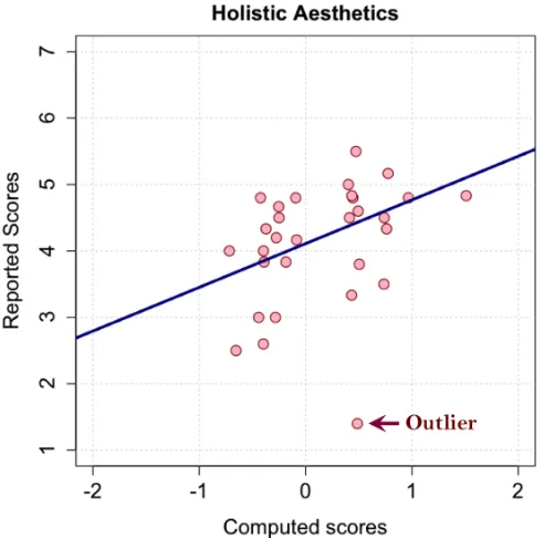
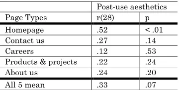
which suggested that one page could stand in for the whole website. A subsequent analysis suggested homepages to suit aesthetics computation better than other pages. Then, the study explored four website-level parameters that could have impacted user impression (number of pages per website, average page length, number of links per page, and average page loading time) and found only the number of pages per website to correlate with user aesthetics scores. Third, the below-top-screen parts of webpages did impact the user, however, the gain in aesthetics-prediction accuracy was small. The top-screen webpage parts could be used for aesthetics estimation. Overall, the study demonstrated that the automatic measures could account for the holistic aesthetics: computed scores did correspond to the reported, after-use aesthetics scores.
Chapter 3.2 applies the computation-based approach to predict GUI visual diversity. Diversity is considered a part of GUI aesthetics (cf., Moshagen & Thielsch, 2010), and only emerges in the live-GUI context, when the user navigates from one live-GUI layout to another. Visual diversity describes the heterogeneity across different layouts of GUI and can be either harmful – if the user feels lost – or beneficial – if the user feels entertained. The harmful effect could be expected from the processing-fluency principle “the simpler, the better”. However, the results of three studies of chapter 3.2 (also ACM BritishHCI’15, Miniukovich & De Angeli, 2015b) showed the latter to be true, at least for the GUIs that were studied. Higher visual diversity led to positive outcomes, suggesting that visual diversity overwhelming the user might be the concern of the past (e.g., such negative effect was described in Grudin, 1989). The only exception emerged in the analysis of shopping mobile apps; popularity correlated inversely with diversity. Such exception might originate from users’ dislike for flashy ads, which feature in shopping apps and increase visual diversity. All other indicators of system success – popularity of news and business apps, website aesthetics score, and user view of website-owning companies – correlated positively with diversity. The positive diversity-aesthetics correlation also corroborated the inclusion of diversity in the model of GUI aesthetics (Moshagen & Thielsch, 2010).
Chapter 3.3 (accepted to ACM CHI’16, Miniukovich & De Angeli, 2016) applies the complexity-based visual dimensions from the aesthetics model to study the popularity of mobile apps on Google Play. The study hypothesized that the saliency and complexity of app icons influenced app success: if the user noticed (saliency) and liked an icon (complexity) in a very long Google Play list, they would choose that icon app for a try. In such circumstances of discretionary use, the appearance – which converts into impression very quickly upon a user-system encounter – would be crucial to the success of systems in discretionary-use contexts, as the user spends only short time considering a system and swiftly switches to alternatives if not immediately pleased (cf., Kim & Fesenmaier, 2008). The study estimated the complexity dimensions that were applicable to app icons and one dimension of visual saliency. Results supported the hypothesis. The number of app comments (which strongly correlated with the number of app installs) was taken as the metric of success. The estimates of saliency and complexity correlated with the metric and explained up to 38% of metric variance. Considering that numerous factors could influence app popularity – ranging from the reviews of past users to the number of bugs in an app – explaining 38% of app success by analyzing app icons appeared an encouraging result. The study of chapter 3.3 concludes the work of this thesis, and also provides insights in the future of predictive models of GUI quality: the study features several visualizations of design dimensions, which designers may use for the incremental improvement of designs (Rosenholtz et al., 2011).
1.1.5
Thesis Contribution
The thesis describes the development and validation of the predictive model of GUI aesthetics. The developmental work has produced four major contributions: two theoretical, one practical and one methodological contribution.
possible improvements to designers.
As the second theoretical contribution, the thesis validates a number of theories and empirical results. First, the thesis provides some evidence that the observed weakness in colorfulness-aesthetics connection (Reinecke et al., 2013) might stem from not distinguishing two aspects of colorfulness, the number of dominant colors and color range (Chapters 2.1 and 2.2.). These two aspects might correlate with aesthetics in opposite directions. Second, the thesis confirms the strong negative correlation between visual complexity and aesthetics, and thus, computationally supports the predictions of the processing-fluency theory (Chapters 2.1 & 2.2). Third, the thesis demonstrates the visual diversity of GUIs to correlate positively with aesthetics (Chapter 3.2). Such observation rejects the hypothesis of visual diversity overwhelming the user (Grudin, 1989) and supports including diversity in aesthetics taxonomies (Moshagen & Thielsch, 2010). Forth, the thesis confirms the link between visual aesthetics and system success (Chapter 3.3). The confirmed aesthetics-success link supports existing theoretical models of system quality (e.g., Hartmann et al., 2008). Last, the thesis confirms a strong correlation amongst immediate (150ms exposure), deliberate (4sec exposure) and post-use (unlimited time, actual use) impressions (Chapters 2 and 3). Such correlation corroborates existing evidence (Thielsch et al., 2013) and suggests that even the shortest, 150ms-based impressions could be the valid measures of aesthetics.
The practical contribution complements the first theoretical contribution: this thesis presents the automatic measures of outlined design dimensions. Such measures have been repeatedly tested on several types of GUIs and could be used in HCI studies as a replacement or addition for the user evaluation of GUI complexity, colorfulness and diversity. The measures could also be used in practice – to aid the evaluation and comparison of designs without user studies, and thus, speed up GUI development. The measure output may further be developed in visualizations, which have also been shown to facilitate design discussions (Rosenholtz et al., 2011).
MODEL
DEVELOPMENT
2.1
Quantification of Interface Visual
Complexity
Designers strive for enjoyable user experience (UX) and put a significant effort into making graphical user interfaces (GUI) both usable and beautiful. Our goal is to minimize their effort: with this purpose in mind, we have been studying automatic metrics of GUI qualities. These metrics could enable designers to iterate their designs more quickly. We started from the psychological findings that people tend to prefer simpler things. We then assumed visual complexity determinants also determine visual aesthetics and outlined eight of them as belonging to three dimensions: information amount (visual clutter and color variability), information organization (symmetry, grid, ease-of-grouping and prototypicality), and information discriminability (contour density and figure-ground contrast). We investigated five determinants (visual clutter, symmetry, contour density, figure-ground contrast and color variability) and proposed six associated automatic metrics. These metrics take screenshots of GUI as input and can thus be applied to any type of GUI. We validated the metrics through a user study: we gathered the ratings of immediate impressions of GUI visual complexity and aesthetics, and correlated them with the output of the metrics. The output explained up to 51% of aesthetics ratings and 50% of complexity ratings. This promising result could be further extended towards the creation of tLight, our automatic GUI evaluation tool.
2.1.1
Introduction
Interaction designers nowadays strive to create interfaces that are not only easy-to-use, but also pleasing to the eye. Aesthetics, therefore, has come under investigation in HCI. The relationship between visual complexity and visual aesthetics was well-established in both psychology (Reber et al., 2004) and HCI (Tuch et al., 2012). Simpler visual stimuli tend to be perceived as more aesthetically pleasing, probably due to more fluent mental processing of stimuli (Winkielman et al., 2002).
Despite the growing interest in aesthetics, little is yet known on how to design interfaces that are indeed aesthetically pleasing. Most design decisions are left to the personal taste of designer, with, often, poor results. The problem becomes more salient when addressing applications that can be designed by non-professional interface designers, such as web sites and mobile apps. To be interpreted correctly, existing aesthetic design guidelines (e.g., Sutcliffe, 2009) require wide practical experience, and are therefore of little help to non-professional designers. Automatic tools of design aesthetics evaluation, on the other hand, could quickly detect and visualize problematic design aspects.
In this paper, we present an initial study of the development of tLight, an automatic tool for GUI aesthetics evaluation. We started by adapting constructs from psychology, which are known to correlate with perceived complexity and are heavily based on the Gestalt principles. We converted a part of these constructs into a set of automatic metrics, either using existing solutions or suggesting our own algorithms. To test the metrics, a user study was conducted: ten participants rated visual aesthetics and visual complexity of 140 webpage screenshots on a 5-point Likert scale. Participants’ complexity ratings accounted for 30% of the aesthetics ratings, thus supporting our initial intent to explain aesthetics with complexity-originated metrics. Our automatic metrics also accounted for a part of complexity-independent variance in aesthetics. The best-fit regression models could explain 50% of variance in perceived visual complexity and 51% of variance in visual aesthetics.
2.1.2
Related Work
People constantly and automatically recognize, recall, memorize, attribute and evaluate, i.e. they process information coming from their surrounding environment. The fluency of this processing largely determines how complex stimuli are perceived and brings forth initial visual aesthetics judgments (Reber et al., 2004; Winkielman et al., 2002), which partially persist over time (Tractinsky et al., 2006). The initial judgments further evolve according to conscious elaboration, which could be a source of more intense aesthetic pleasure relative to processing fluency (Armstrong & Detweiler-Bedel, 2008). However, the mechanisms of how conscious thinking influences aesthetics is much less explored.
The processing of stimuli involves both pre-conscious perception and conscious cognition (cf. (Reber et al., 2004)), and accordingly, we would expect two types of stimulus complexity in the GUI domain: visual and conceptual. Most studies of GUI quality have implicitly concentrated on the conceptual side, rather than explicitly differentiated between these two types. Ivory et al. (2001) proposed and validated a set of page-level metrics of webpage quality, such as the number of words, fonts and links per page, and reading complexity. Although this was not explicitly stated, these metrics substantially resembled the concept of cognitive load (Harper et al., 2009). Depending on the website category, they could explain from 11% to 56% of webpage rating variance. Reinecke et al. (Reinecke et al., 2013) explained up to 48% of user ratings of webpage visual appeal and 65% of webpage visual complexity. Their automatic complexity metric took into consideration the amount of text per page, the number of text and non-text areas, and images, and colorfulness.
Unlike the studies above, Wu et al. (Wu et al., 2011) identified low-level visual GUI characteristics (e.g., the number and sizes of visual blocks, and density of text characters), which accounted for 46% of variance in webpage visual quality ratings A part of their measures (e.g., the average values of hue, saturation and value of webpage screenshot), though, could represent the preferences of a particular social group rather than interface complexity, which might lower the generalizability of their results. Purchase et al. (Purchase et al., 2012) also concentrated on the visual side of complexity and operationalized it with the number of image colors (before and after color reduction), the variability in pixel luminance, the ratio of edge pixels to all pixels, and with the sizes of images saved in PNG, GIF and JPEG formats. Although their best-fit model could only explain 25% of complexity ratings, they used pixel-based metrics, without including any semantic, page-element-based metrics: therefore, no dependency on GUI type and cultural context was introduced.
Still, the studies above did not adopt a systematic approach to interface complexity; they often considered only a few of its determinants (e.g., color variability and edge density (Purchase et al., 2012)) or even simply assumed it to correspond to the number of interface elements (e.g., Ivory et al., 2001). Psychologists, on the other hand, did approach complexity more systematically, distinguishing between amount of information and organization of information (see also, van der Helm, 2000). Still, this might be not enough either. The assessment of visual complexity also depends on the discriminability of information – difficulties not in processing, but in receiving “raw” visual input. Oliva et al. (2004) investigated what visual complexity meant for the viewers of complex indoor scenes, and found that the viewers substantiated their sorting decisions according to the number of objects, colors and details (the amount of information), clutter, open space, symmetry and organization (the organization of information) and figure-ground contrast (the discriminability of information). Low figure-ground contrast reflects the difficulties in seeing rather than in processing information. Figure 2 shows the classification of visual complexity in three main determinants: amount, organization and discriminability of information.
2.1.2.1
Amount of Information
Figure 2. The classification of visual complexity determinants.
2.1.2.1.1 Visual clutter
“Clutter is the state in which excess items, or their representation or organization, lead to a degradation of performance at some task” (Rosenholtz et al., 2007, p.p.3). Existing measures of visual clutter roughly approximate the number of distinct objects in a scene, which strongly correlates with the search time of target object in a set of distractor objects (Bravo & Farid, 2004).
Researchers measured visual clutter in several ways. Mack et al. (as cited in, Rosenholtz et al., 2007) suggested using the ratio of edge pixels to all pixels of an image (the Edge Density measure). Rosenholtz et al. (2007) proposed Feature Congestion (the difficulty of introducing a visually salient object) and Subband Entropy (the amount of redundancy encoded in a scene). The algorithm of Subband Entropy resembles the algorithm of the JPEG image compressor, which was also adopted as a simple measure of Visual Complexity (Tuch et al., 2009). Each of these measures was found to correlate with search performance.
2.1.2.1.2 Color variability
Color variability is a very salient feature of scene. In a study (Oliva et al., 2004), the number of colors ranked second among the most important factors of visual complexity (after the number of objects). However, Oliva et al. (2004) did not elaborate on the notion of number of colors. Seemingly, participants meant the number of dominant colors (i.e., the colors they could easily identify), which is different from color depth (large variety of eye-unperceivable color shades).
The lack of agreement on what color variability is has resulted in a variety of different measures. Hasler et al. (2003) proposed a measure of ‘colorfulness’, which combined the mean and standard deviation of red-green and blue-yellow color components in the Lab color space. Reinecke et al. (2013) clustered image colors into 16 main W3C-defined colors and measured the area they occupied, computed the average of hue, saturation and value over an image, and re-used Hasler et al.’s measure of colorfulness (Hasler & Suesstrunk, 2003). They could explain 78% of variation in colorfulness ratings. Similarly, Wu et al. (2011) used the average values and variation in hue, brightness and saturation, and again, colorfulness (Hasler & Suesstrunk, 2003). They could explain 46% of variation in webpage visual quality ratings. Lastly, Purchase et al. (2012) accounted for almost 25% of variation in the ratings of image visual complexity. They used the number of image colors before color reduction, the number of image colors after color reduction (adopting 3 different color reduction procedures) and standard deviation in pixel luminance.
To summarize, the variety of proposed measures of color variability could be divided into three categories: the number of dominant colors (e.g., Purchase et al.’s (2012) image colors after reduction), perceived color depth (e.g., Wu et al.’s (2011) variation in hue, brightness and saturation) and idiosyncratic color preferences (e.g., Reinecke et al.’s (2013) preferences for W3C-defined colors). The last category is strongly influenced by acquired tastes (Cyr et al., 2010), and, should therefore be avoided when trying to generalize findings across different demographics.
2.1.2.2
Organization of Information
2.1.2.2.1 Symmetry
One of the Gestalt principles, mirror symmetry – the similarity of an object reflection across a straight axis – was claimed to improve interface design (Smith-Gratto & Fisher, 1998-99). However, quantifying symmetry might be problematic in HCI. Psychologists mainly studied mirror symmetry of relatively simple objects, such as dot and line patterns, or human faces. In HCI, Bauerly et al. (2006) and Tuch et al. (2010) varied the amount of global symmetry in webpages, and found a correlation with aesthetics and design preferences. However, they did not measure symmetry; they manually altered webpages to be either symmetrical or asymmetrical. In a different study, Zheng et al. (2009) used quadtree decomposition (recursive image partitioning in a tree-like structure of visually homogeneous blocks), and operationalized symmetry as vertical and horizontal mirror reflection of quadtree leafs. Surprisingly, their symmetry measure did not correlate with the ratings on “complicated-simple”. After re-using the same algorithm, Reinecke et al. (2013) also did not report an influence of symmetry on visual complexity of webpages. Lastly, image-processing scholars adopted a more sophisticated approach: they distinguished local symmetry (i.e., the symmetry over a small area of image) from global symmetry and proposed several algorithms for measuring it (Kootstra et al., 2011; Loy & Eklundh, 2006).
2.1.2.2.2 Ease of grouping
Gestalt psychologists discussed in detail what is perceived as a group and how to increase the ease of grouping (Wertheimer, 1938). Gestalt-based design guidelines (Smith-Gratto & Fisher, 1998-99) instructed designers to place related objects together and make them visually similar. Psychology first offered a strong empirical evidence of benefits of high ease of grouping (Treisman, 1982) and described several necessary criteria of grouping, such as common location, motion, color, surface, texture, size, and shape (Duncan, 1984; Duncan & Humphreys, 1989). However, even when the list of criteria is reduced to only two principles – the similarity within a visual group, and the difference between one visual group and other groups – it is still an open question how we should measure them automatically.
2.1.2.2.3 Prototypicality
An interface element can be defined as prototypical if an average user sees it as a representative of a class of elements. The profound effect of prototypicality on user perception follows from the work in psychology. One of the Gestalt principles, compliance with past experience or habit (Wertheimer, 1938), states that we see things in the way we are accustomed to see them. Strong deviation from the prototype often results in a negative experience (Hekkert et al., 2003), whereas subtle deviations are often appreciated. Pseudohomophones – non-words that sound similar to words – are another example of prototypicality-related source of processing fluency. The word-like composition basis (which participants are vastly familiar with) let participants read pseudohomophones quicker than non-words (Whittlesea & Williams, 1998). However, despite its significant role in user perception, we found no description of automatic prototypicality measurements. The work on large-scale design mining (Kumar et al., 2013) is a potential step in this direction. It allows studying existing design practices and might serve as a basis for future prototypicality measurements.
2.1.2.2.4 Grid
2.1.2.3
Discriminability of Information
The human visual system has natural limits, e.g., the minimal perceivable luminance difference between two areas or minimal perceivable dot size. Such limitations influence the discriminability of information and might cause higher visual complexity even if the amount and organization of information stay the same. Edge congestion and low figure-ground contrast are two aspects of information discriminability.
2.1.2.3.1 Edge congestion
Discriminating and tracing a line in a line congestion situation can be problematic. This issue often emerges in the domain of large-graph visualization. Wong et al. (2003) stated the problem: “the density of edges is so great that they obscure nodes, individual edges and even visual information beneath the graph”. They also proposed an interactive solution to edge congestion in graphs – the edges were bent away from users’ point of attention without changing the number of nodes or edges. A more sophisticated discussion of edge congestion comes from the research on crowding and is grounded on the notion of critical spacing – the distance between objects at which object perception starts to degrade (Levi, 2008). For example, the crowding model of visual clutter (van den Berg et al., 2009) uses eccentricity-based critical spacing to account for information loss in peripheral visual field. However, the accompanying algorithm accounts simultaneously for both visual clutter and edge congestion, and might need reconfiguration to account for edge congestion only.
2.1.2.3.2 Figure-ground contrast
Psychologists often use luminance or color contrast to manipulate perceptual fluency. For example, Reber et al. (1999) showed participants phrases in green or red on a white background (high contrast condition), and in yellow or light-blue color on a white background (low contrast condition). The high-contrast phrases were judged as true facts significantly above the chance level, whereas the low-contrast phrases were not. The authors attributed it to the difference in reading difficulty, and thus, processing fluency. Similarly, Reber et al. (2003) showed participants 70% black (high contrast) and 30% black (low contrast) words on a white background. In the high contrast scenario, the participants were significantly faster at detecting and recognizing words. Hall et al. (2004) explored text readability of web pages, and found white-black text-background combinations to be more readable than light- and dark-blue, or cyan-black combinations. However, the studies above did not measure contrast automatically.
2.1.3
EXPLORATORY STUDY
We undertook an exploratory study of GUI visual complexity and aesthetics. First, we selected webpages and took screenshots of them. Then, we collected user ratings of webpage visual complexity and aesthetics. We deliberately targeted users’ immediate impressions, which are heavily influenced by low-level, pre-semantic qualities of UIs and only depend on cultural preferences to a limited extent (cf. Lindgaard et al., 2011). Finally, we computed six automatic screenshot-based metrics and compared them against user ratings. Visual complexity determinants (Figure 2) that are not explored in the paper were left for future work.
2.1.3.1
Data collection
We analyzed screenshots of 140 webpages. We only considered homepages of websites in English with little or no animation and dynamic effects. A total of 115 of them were found on four public showcases1 featuring beautiful websites from four categories: a) coffee, b) chocolate bars and shops, c) online retailers and d) design agencies. This sample was obviously biased towards the beautiful design. To counterbalance the emphasis on beauty, we added 25 more websites from similar categories, which we considered unappealing. We took full-length screenshots of webpages in the PNG format (truecolor, 24-bit per pixel) and cropped them to fit the screen (the top part only; 1280×800 pixels).
Ten graduate students (mean age = 27.2 years, SD = 2.04; 7 – male; all fluent in English) of the local university participated in the study. The study was conducted individually in a separate room with a laptop. A researcher was always present in the room. Participants were instructed to rate webpages on a 1-5 Likert scale according to “how simple/complex the webpages were” and “how
unattractive/attractive the webpages were” (cf., (Lindgaard et al., 2006; Tuch et al., 2010; 2009; 2012), without any further explanations of the constructs (cf., (Oliva et al., 2004)). After participants signed the consent forms and adjusted their seat height and screen angle, they rated 140 (cf., Lindgaard et al., 2011; 2006; Tractinsky et al., 2006; Tuch et al., 2012) screenshots (5 screenshots were used for training). The entire procedure took ~25 min; no complaints about fatigue were reported. The experiment was run at the 1280×800 pixel resolution and 60 Hz refresh rate. We coded experimental procedures using PsychoPy2.
Each participant saw and rated each screenshot only once, one after another. First, we asked participants to focus the sight on a red fixation cross on gray background shown for 1-1.5 seconds. Second, a screenshot was flashed for 50msec (cf., Lindgaard et al., 2011; 2006; Tuch et al., 2012). Third, a black-white noise mask was flashed for 50msec (cf., Tuch et al., 2012) to cancel out extended visual perception. Fourth, participants rated visual complexity and aesthetics of webpages with no time constraints. Ratings were set using the 1-5 keyboard buttons. Both questions addressing complexity and aesthetics were shown on the screen simultaneously. Screenshot presentation was randomized. The very short presentation span (50ms) was intended to ensure we measured complexity at a perceptual level. Longer time spans would allow cognitive elaboration and cause higher individual variability in judgments (cf., Tractinsky et al., 2006).
2.1.3.2
Automatic metrics
Out of eight identified determinants of visual complexity (Figure 2), we investigated five: visual clutter, color variability, symmetry, edge congestion and figure-ground contrast. The investigation resulted in six metrics (color variability had two distinct aspects: number of dominant colors and color depth). Visual clutter and color variability metrics consisted of multiple measures; symmetry, congestion and contrast consisted of a single measure each. The metrics were implemented in Matlab and took screenshots of GUIs as input, i.e. they could be applied to any graphical interfaces, not only webpages.
2.1.3.2.1 Amount of information
From the amount of information, we modeled both visual clutter and color variability. Our visual clutter metric combined four measures from the literature. First, we took the ratio of edge pixels to all pixels (CL1, see Edge Density in (Rosenholtz et al., 2007)). Edges were detected with the Canny method; low and high thresholds were set to 0.11 and 0.27 (cf., Rosenholtz et al., 2007); the standard deviation of a Gaussian for pre-detection smoothing was √2. Then, we calculated Subband Entropy (CL2) and Feature Congestion (CL3) with authors’ settings3 (adapted for geographical map analysis, (Rosenholtz et al., 2007)). Then, we took file sizes of screenshots saved in JPEG (CL4, the JPEG quality setting set at 70, cf., Tuch et al., 2009). Finally, we conducted the maximum-likelihood factor analysis with Varimax rotation on the measures (CL1-CL4). All measures loaded on a single factor (Table 1A) and were combined in a single metric of visual clutter. To generate combined scores, we used Thomson’s method, which maximizes score determinacy.
A Factors CL1 CL2 CL3 CL4
Clutter .91 .86 .91 .93
B
C1 C2 C3 C4 C5 C6 C7 C8 C9 Color
depth .73 .89 .89 .92 .89 .20 -.11 .40 Dominan
t colors .22 .97 .60 .49 .33
Table 1. Factor loadings of A) clutter (cumulative var. g = .82) and B) color variability (cumulative var. g = .63)
2 http://www.psychopy.org/
3 We used authors’ implementation of Subband Entropy and Feature Congestion (Rosenholtz et al., 2007) cfr.
Literature describes many measures of color variability (Reinecke et al., 2013; Wu et al., 2011; Purchase et al., 2012; Hasler & Suesstrunk, 2003). We did not consider those that might involve subjective color preferences (e.g., Reinecke et al., 2013) and only took the measures that could account for the number of dominant colors or perceived color depth. A part of these measures was based on the number of colors before color reduction and had very skewed distribution (e.g., a 1280*800 image almost always span over all 256 available hues and have χ²-like distribution). Since data normality is required for regression and factor analyses, we excluded these measures from further analysis. The final set of measures is shown in Table 2. To investigate data dimensionality, we conducted maximum-likelihood factor analysis with Varimax rotation. All measures but C8 (colorfulness) and C9 (luminance SD) loaded on either of two main factors (Table 1B). C8 and C9 were excluded from further analysis. The measures C1-C7 were combined in Bartlett’s scores of color depth (Factor 1) and dominant colors (Factor 2). We expected the orthogonality of color depth and dominant color factors, and therefore used Bartlett’s score generation method rather than Thomson’s method. Bartlett’s method maximizes the independence of orthogonal factor variances.
# Measure name Measure description
C1-C3 Hue, saturation and value after color reduction.
The number of distinct values of Hue, Saturation and Value. Images were converted to the HSV color space. Color variability was reduced: only values covering more than 0.1% of image were counted.
C4 RGB colors after
color reduction. The number of distinct RGB values. Color variability was reduced: only colors covering more than five pixels were counted. C5 PNG file sizes. The file sizes of screenshots, saved in PNG format (24 bits per color). C6 Static clusters of
RGB colors after color reduction.
The number of static clusters of RGB values (323 combinations per cluster, 512 clusters maximum). Color variability was reduced: only colors covering more than five pixels were counted.
C7 Dynamic clusters of RGB colors after color reduction.
The number of dynamic clusters of RGB values. After color variability is reduced (only colors covering more than five pixels), a between-color difference is considered. If the distance in all color components is less than three, two colors are united in the same cluster. Uniting continues recursively till all used colors are assigned to a cluster.
C8 Colorfulness (Hasler & Suesstrunk, 2003)
The measure of colorfulness from (Hasler & Suesstrunk, 2003). It combines standard deviations and means of pixel values taken in the Lab color space.
C9 Luminance SD The standard deviation of pixel luminance.
Table 2. Implemented measures of color variability.
2.1.3.2.2 Organization of information
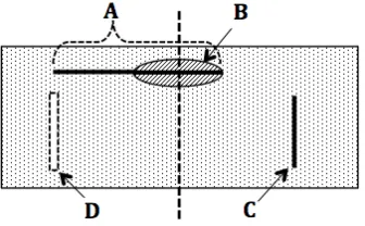
As regards the organization of information, we modeled mirror symmetry. The existing methods for symmetry detection (Loy & Eklundh, 2006) did not give satisfactory results on our data. They often detected many false symmetry axes indistinguishably from true symmetry axes4. In HCI, the presence of screen frame calls for accounting for horizontal and vertical symmetry only (cf., Tuch et al., 2010). We proposed an algorithm, which detected the mirror symmetry along the central vertical axis. First, our algorithm detected image contours based on the Canny edge detection algorithm with the low and high thresholds set to 0.11 and 0.27 (cf., Rosenholtz et al., 2007) and the standard deviation of a Gaussian for pre-detection smoothing set to 5 (high Gaussian SD allows detecting contours of text blocks rather than of individual characters). Then, the algorithm took only the vertical component of detected contours: horizontal lines across the central axis always give symmetrical key points, see Figure 3. We reduced the number of contour pixels (by taking a contour pixel and dismissing others in the 3-pixel radius) and took them as key points. Further, for each key point, the algorithm looked for a match in the 4-pixel-radius area across the central axis. Then, we took the ratio of matches (ksym) to all key points (kall) and normalized this ratio by the probability of key
4 We used authors’ implementation of the algorithm [19] cfr.
point match due to chance (more key points in the same area mean higher probability of match due to chance). The probability of incidental match depends on the number of all key points, the size of match-search area (Sa, which was constant for all screenshots, 4-pixel-radius area) and size of screenshots (Ss, which was also constant across all screenshots). The normalized ratio (Symnorm) was the metric of symmetry we used:
!"#!"#$=!!"#
!!"" ∗
!!""−! ∗!!
!!
!!
2.1.3.2.3 Discriminability of information
We operationalized edge congestion and figure-ground contrast. Edge congestion relies on the notion of critical spacing – minimal distance between objects at which the user starts having difficulties differentiating the objects. We tried out 8-, 12- and 20-pixel thresholds, which all gave similar results. Hence, we chose the 20-pixel threshold. The algorithm consisted of two main steps: detecting edges and detecting edges in close proximity. Any edge detection algorithm without pre-detection smoothing could be used (e.g., the Sobel or Prewitt algorithms); we used simple value difference of more than 50 between adjacent pixels across all three (red, green and blue) color components. The edges by different color components were combined using disjunction. In the second step, if at least two pixels of two different edges occurred in the same 20-pixel vicinity, they were marked as congested. The marking was done in both horizontal and vertical directions. Finally, we took the ratio of ‘congested’ pixels (pc) to all edge pixels (pa) as the metric of edge congestion:
!"#$=!!/!!. Edge congestion does not require chance normalization as the symmetry metric above, despite they both leverage edge detection. Whatever the reason is two edges are too close, they still impede user perception fluency.
Figure 3. An asymmetrical horizontal line (A) can give symmetrical key points (B); whereas a vertical line (C) cannot, unless it matches another line (D) on the other side.
Figure-ground contrast describes the difference in color or luminance between two adjacent areas. This difference forms an edge; the magnitude of the difference defines the strength of the edge. To detect edges, we used the Canny edge detection algorithm, which requires two input thresholds in the range of 0 to 1: low and high. Lower input thresholds allow detecting more edges (i.e., both weak and strong edges); higher thresholds allow detecting fewer edges (i.e., only strong edges). We tried out a variety of different threshold settings and rejected large values, which afforded detecting too few edges. Our low threshold was always 40% of the high threshold. The high threshold varied from 0.1 to 0.7 with a step of 0.1, which gave us seven levels (l) of edge strength (El). We counted edge pixels for each level and computed the difference between successive levels. Then, we weighted the differences and summed them up. The weakest edges received the highest weight, since they contribute the most to the difficulty of visual differentiation. Lastly, the sum was normalized by the number of all edge pixels (i.e., the edges detected with the high threshold 0.1 minus the edges detected with the high threshold 0.7). The normalized sum (Enorm) was the metric of figure-ground contrast:
!!"#$=
( !!−!!!! ∗(!− !−!! )) !
!!!
2.1.3.3
Results
We gave participants no description of complexity or aesthetics. However, the average scores of interclass correlation coefficients were satisfactory for both complexity (ICC = .69; 95% conf. interval 0.609 < ICC < 0.762) and aesthetics (ICC = .81; 95% conf. interval 0.755 < ICC < 0.851), indicating interrater reliability. We calculated rating means for each webpage and used them in a further analysis as webpage complexity and aesthetics scores.
The means of complexity and aesthetics scores were mc = 2.69 (SDc = .53) and ma = 2.98 (SDa = .66); aesthetics scores were slightly negatively skewed (ska = -.54), reflecting biased selection criteria favoring beautiful web-pages. As expected, complexity scores negatively correlated with aesthetics scores (r = -.55; p-value < .001) and could explain 30% of aesthetics score variance (R2 = .30; bconst = 4.83; bcomp = -.69; SEconst = .24; SEcomp = .09; p-value < .001).
We calculated correlations of complexity and aesthetics scores with our six automatic metrics (Table 3). All six metrics were intended to account for different aspects of perceived visual complexity, and only one metric (color depth) did not. Four metrics (visual clutter, dominant colors, contrast and edge congestion) correlated with both aesthetics and complexity, suggesting a mediation effect of complexity on aesthetics (i.e., the metrics influenced aesthetics indirectly: they influenced complexity, which, in turn, influenced aesthetics). The mediation effect was indeed observed, see Table 4. When taking complexity into account, the visual clutter influence on aesthetics was no longer significant, thus suggesting full mediation. The influence of dominant colors, contrast and congestion on aesthetics was still significant but smaller, suggesting partial mediation. The best-fit model perceived of visual complexity explained 50% of complexity scores, see Table 5a; the best-fit model of visual aesthetics explained 51% of aesthetics scores, see Table 5b. Both models included three independent variables and shared two of them: number of dominant colors and edge congestion. Visual clutter was solely relevant to complexity; color depth was solely relevant to aesthetics. Adding visual complexity scores as an independent variable to the aesthetics model gave only 6% increase in the explained variance, see Table 5c.
2.1.4
DISCUSSION
In this paper, we presented an exploratory study of perceived visual complexity and aesthetics and their relationship with five GUI complexity determinants. We operationalized three determinants (contrast, edge congestion and symmetry) with single-item metrics and the other two (visual clutter and color variability) with multi-item metrics. The employed measures of visual clutter had very high loadings (Table 1A) on a single factor, allowing us to combine them in a single complex metric of clutter. A similar analysis of color variability (Table 1B) revealed two prominent factors: the number of dominant colors and perceived color depth. Dominant colors positively correlated with perceived complexity and negatively with aesthetics; perceived color depth positively correlated with aesthetics and did not correlat