Extraction and Interactive Exploration of Knowledge from
Aggregated News and Social Media Content
Arno Scharl,
1Alexander Hubmann-Haidvogel,
1Albert Weichselbraun,
2Gerhard Wohlgenannt,
3Heinz-Peter Lang,
1Marta Sabou
11
MODUL University
Vienna, Department of New
Media Technology
Am Kahlenberg 1
1190 Vienna, Austria
+43 1 3203555 301
{scharl, hubmann-haidvogel,
lang, sabou}@modul.ac.at
2
University of Applied
Sciences Chur, Faculty of
In-formation Science
Pulvermuehlestrasse 57
7004 Chur, Switzerland
+41 812863 727
albert.weichselbraun@
htwchur.ch
3
Vienna University of
Economics and Business,
Institute for Information
Busi-ness, Augasse 2-6
1090 Vienna, Austria
+43 1 31336 5228
gerhard.wohlgenannt@ wu.ac.at
ABSTRACT
The webLyzard media monitoring and Web intelligence platform (www.webLyzard.com) presented in this paper is a flexible tool for assessing the positioning of an organiza-tion and the effectiveness of its communicaorganiza-tions. The plat-form aggregates large archives of digital content from mul-tiple stakeholders. Each week it processes millions of doc-uments and user comments from news media, blogs, Web 2.0 platforms such as Facebook, Twitter and YouTube, and the Web sites of companies and NGOs. An interactive dashboard with trend charts and complex map projections shows how often and where information is published. It also provides a real-time account of topics that stakeholders associate with an organization. Positive or negative senti-ment is computed automatically, which reflects the impact of public relations and marketing campaigns.
Author Keywords
Interactive exploration of information spaces; social media monitoring tools; Web intelligence; visual analytics.
ACM Classification Keywords
H.5.2 [Information Interfaces and Presentation]: User Inter-faces – Interaction styles.
INTRODUCTION
Interactive computing systems have been designed for ana-lyzing social media streams across various domains includ-ing sports (Marcus et al., 2011), politics (Diakopoulos et al., 2010; Shamma et al., 2010) and climate change (Hubmann-Haidvogel et al., 2009), focusing on specific aspects like (sub-)event detection (Adams et al., 2011),
classification (Hubmann-Haidvogel et al., 2009), and the analysis of video broadcasts (Diakopoulos et al., 2010). Such media monitoring tools shed light on stakeholder per-ceptions, reveal flows of relevant information, and provide timely feedback for marketing and public outreach activi-ties. Developers of such tools draw upon expertise from several disciplines including human-computer interaction, information visualization, natural language processing, and semantic systems in order to address two major challenges: (i) collect, analyze and structure very large document col-lections originating from sources that are heterogeneous in terms of their authorship, formatting, style (e.g., news arti-cle versus tweets), and update frequency (weekly, daily or minute-based); (ii) provide an interactive interface not only to select a relevant subset of the information space, but also to analyze and manipulate the extracted data.
The context-sensitive environment presented in this paper allows to analyze and manipulate the extracted knowledge, and to navigate the information space along multiple di-mensions. Such an environment, in line with the challenges described above, requires scalable information extraction algorithms, and a rapid synchronization of multiple coordi-nated views. The webLyzard platform provides accurate annotation services to enrich documents with geospatial, semantic and temporal tags. Such annotations describe complex relations, which are best understood in graphical form. For this purpose, the system synchronizes geographic maps, tag clouds, keyword graphs as well as two- and three-dimensional information landscapes. These visualiza-tions help users to understand the context of the extracted knowledge – e.g. processing search queries and showing the most relevant documents in a regional context, or com-paring the online coverage by different stakeholders. The remainder of this paper is structured into three parts: (i) the introduction of Media Watch on Climate Change, a public Web portal that aggregates environmental infor-mation from a variety of online sources including news Permission to make digital or hard copies of all or part of this work for
personal or classroom use is granted without fee provided that copies are not made or distributed for profit or commercial advantage and that copies bear this notice and the full citation on the first page. To copy otherwise, or republish, to post on servers or to redistribute to lists, requires prior specific permission and/or a fee.
media, blogs and other social media such as Twitter, YouTube and Facebook (www.ecoresearch.net/climate); (ii) a generic overview of the user interface design includ-ing the main interface elements and the synchronization mechanism employed to continuously update them; and (iii) a detailed description of the portal features including topic management, visualizations, and data services.
ENVIRONMENTAL USE CASE
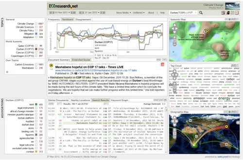
Acquiring, managing and applying knowledge are crucial steps in addressing environmental issues effectively, and ensuring that change is conceived and implemented on both regional and society-wide scales (Bowman, 2008). Climate change is a good example, characterized by diverse opin-ions of stakeholders with different backgrounds and exper-tise. Understanding the reach of topics discussed and the opinions voiced by various parties is a complex task that requires knowledge on how topics and stakeholders relate to each other. The Media Watch on Climate Change (www.ecoresearch.net/climate; Figure 1 addresses this task. It provides analytical and visual methods to support differ-ent types of information seeking behavior such as brows-ing, search, trend monitoring and visual analytics.
The platform detects and tracks the evolution of topics that are frequently mentioned in a given data sample (typically, a collection of Web documents crawled from relevant sources). The advanced data mining techniques underlying the platform extract a variety of contextual features from
the document space. A portfolio of synchronized visualiza-tions allows both an overall insight into the evolution of the data set along the dimensions defined by these contextual features (temporal, geographic, semantic, and attitudinal), and subsequent drill-down functionalities to analyze details of the data itself. A key strength of the interface is that it relies on the multiple coordinated views metaphor, also known as linked or tightly coupled views in the literature (Hubmann-Haidvogel et al., 2009), where a change in one of the views triggers an immediate update of the others (e.g., when a new document is viewed, the maps pan and zoom to the most relevant areas for this document).
The Media Watch on Climate Change currently harvests data from a range of relevant sources including 150 Anglo-American news media sites, blogs, Web 2.0 platforms (Twitter, Youtube, Facebook), scientific outlets, and the Web sites of environmental organizations and Fortune 1000 companies. At any given time, only a subset of the vast document space is displayed, depending on the selected source, time interval and affective value (e.g., positive news media articles published in the first quarter of 2012). The system automatically extracts the dominant issues that are discussed in conjunction with a selected topic – e.g. COP17 in Durban as shown in Figure 1 – and displays them through a set of charts that show the frequency and sentiment of a topic, as well as the observable level of disa-greement among stakeholders.
The search results are also mapped on geographic and se-mantic maps to show the geographic distribution of the coverage (e.g., which places are the most talked about?), as well as its semantic content (e.g., how many documents talk about a specific issue?).
While the Media Watch on Climate Change focuses on en-vironmental issues, the same technology is currently being used for other domains as well, including Web intelligence platforms for NOAA, the National Oceanic and Atmospher-ic Administration (www.noaa.gov) and the Vienna Cham-ber of Commerce (www.wkw.at).
In the next sections, we detail the generic aspects of our technology that support the development of interactive computing applications in various subject domains.
USER INTERFACE DESIGN
Following an evolutionary systems development approach (Scharl, 2000), rapid feedback cycles and agile software development (Dönmez and Grote, 2011) have been instru-mental in the conceptualization and implementation of the Media Watch on Climate Change. For this purpose, ongo-ing usability inspections have been conducted to analyze and assess the system. This low-overhead, heuristic ap-proach asks a team of experts to investigate the interface design against recognized usability principles. The evalua-tion has been performed periodically during the design and implementation phases, and improvements were integrated into the prototype early in the development cycle. A sum-mative usability evaluation will be conducted in the third quarter of 2012 (see “Summary and Conclusion” section). The webLyzard information exploration and retrieval inter-face (="dashboard") helps users to interactively identify, track and analyze topics across stakeholders and sources. It builds upon a comprehensive content repository structured along geospatial, semantic and temporal dimensions. The dashboard is divided into six main content areas, shown in Figure 2 and described in the following.
Overview of the webLyzard Dashboard
1. Sources and Settings: Drop-down elements in the upper menu let users choose the relevant constraints that are relevant for their exploration, including (i) time interval, (ii) document source, and (iii) global sentiment filter (un-filtered, positive, negative). In conjunction with full-text search capabilities and the resulting keyword graph (showing a network of co-occurring terms extracted in real time from the selected data source), the global sen-timent filter is an effective means to investigate stake-holders' associations with a topic of interest.
2. Topics: The upper left window of the dashboard contains the topic management and content navigation. On mouse-over, users have the following options: (a) click on a term to trigger the full-text search; (b) use topic markers (= small rectangles) to select the topics to be shown in the charts; (c) compute related
terms to update the associations window ('arrow down' symbol); (d) add/modify topics and email alerts with the topic editor ('settings' symbol).
3. Trend Charts: Interactive charts show the frequency of selected topics in the specified time interval (default: two months), as well as the observed sentiment and disa-greement regarding these topics.
4. Content View: The content view below shows the active document including keywords, publication date, place of publication (source geography), and primary location that is being referenced (target geography).
5. Search Results: The lower third of the dashboard dis-plays the list of terms associated with a selected topic, as well as search results ranked by similar topic or nearby location (on either the document or sentence level). 6. Visualizations: To reveal complex and often hidden
rela-tions within the document repository, webLyzard inte-grates geographic maps, ontology graphs, tag clouds, and information landscapes to visualize semantic context. Maps are re-sized automatically and can be repositioned using drag-and-drop operations (see below for a detailed description of the synchronization mechanism).
Figure 2. Main elements of the webLyzard dashboard
Temporal Controls
Users can adjust the time interval and access historic data by selecting “from” and “to” dates using the two calendar elements. This is a global setting that not only affects the trend chart, as outlined in the next section, but also limits search queries and dynamic visualizations to the chosen time interval. Dates can be selected by navigating one day or week into the past or future by using the provided back and forward buttons, respectively, or by selecting a specific date using the drop-down calendar. Selecting a new “to” date automatically updates the trend charts, the active doc-ument, as well as the semantic map in case the new date belongs to a different weekly snapshot.
Real-Time Map Synchronization
‘maxim-ize’ button increases the size of the maps; clicking on the ‘popup’ button opens the map in a separate browser win-dow (which allows using the system in multiple-screen con-figurations). Maps can be rearranged by dragging them to the desired position, and switched on and off using the but-tons in the top bar.
The various windows are tightly coupled – user actions in one window trigger an immediate update of all other dis-plays – thus supporting an interactive exploration of the information space (Hubmann-Haidvogel et al., 2009; Scharl, 2006). As an alternative to entering query terms to find specific documents, users can click on any position in the maps (not only on the markers) to retrieve articles relat-ed to that particular location, topic or domain concept. Hovering above a map previews the document closest to the current position of the mouse pointer, but does not activate it. When previewing documents, the other visualizations on the right side automatically adjust to show the immediate context of the previewed documents. Users who want to focus on a particular region can disable this default setting and "freeze" the currently displayed part of the map by pressing the pause button.
TOPIC MANAGEMENT
Registered users can add and modify topics through the topic editor, which also provides the option to set custom-ized email alerts. The mouse-over 'settings' symbol to acti-vate the editor is available in the topic management section.
Topic Editor
Each topic is represented as a list of regular expressions; i.e., a term list with optional wildcards for matching arbi-trary character strings. For computing the charts and rank-ing search results, a document is considered relevant to the topic if it contains at least one of the stated terms. The topic label (= the name to be displayed in the topic management section) itself is not considered in the matching process.
Sentiment Detection
Measures of bias in news and social media coverage are essential when investigating trends and differing percep-tions of interest groups (Scharl and Weichselbraun, 2008). A significant portion of news and social media coverage contains opinions with clear economic relevance: customer and travel reviews, for example, or articles of well-known and respected bloggers who influence purchase decisions. Analyzing and acting upon user-generated content is be-coming imperative for decision makers aiming to engage large user communities.
The ever increasing amount of articles and the limits of human cognition require automated approaches to analyz-ing the sentiment expressed in user-generated content. As part of opinion mining, sentiment detection identifies and aggregates polar opinions – i.e., positive or negative state-ments about facts. For achieving accurate results, one needs
to deal with the inherent ambiguities of human languages. webLyzard’s method to determine sentiment automatically has continually been optimized since 2003, directing partic-ular attention to the context of opinionated terms when re-solving such ambiguities (Gindl et al., 2010).
webLyzard not only uses sentiment information to enrich visualizations such as tag clouds, geographic maps and in-formation landscapes, but also offers high-performance data services (see below) for tagging third-party content.
Trend Chart
Showing the rise and decay of topics over the last two months (default value, which can be changed using the date selector), the trend chart provides the following time series:
Frequency (total, positive and negative) represents the number of occurrences in the last seven days. Selecting positive or negative coverage through the global senti-ment filter affects the data displayed in the chart. Once activated, the footer of the portal also shows the current filter status.
Sentiment shows the average sentiment towards the se-lected topic for the sese-lected source and interval.
Disagreement computed as standard deviation of the sentiment distribution reflects how contested a particular topic is (the term ‘oil spill’, for example, tends to have a low standard deviation since everyone agrees on its neg-ative connotation).
Display Features. The vertical axis is rescaled automatical-ly, a feature that is particularly useful if one keyword domi-nates the coverage and therefore obscures the distributions of the other keywords. Hovering above a data point displays the associated keywords and daily statistics (frequency, mean and standard deviation of sentiment). This mouse-over effect identifies topical trends and shows their impact on the individual peaks in the chart. Clicking on a data point triggers a search for this particular topic cluster in the preceding week.
MAP VISUALIZATIONS
Geographic Map
The geographic map shows the locations of documents based on analyzing their textual content – a process typical-ly referred to as "geo-tagging" (Amitay et al., 2004). The Active Document is highlighted by a yellow asterisk, and the letters [a-e] represent the five highest-ranking docu-ments in the Similar Topics view. If interested in a specific location rather than a topic, users can click anywhere on the map to activate the closest document (hovering above the map previews the document, but does not activate it). After entering a search term, the set of results is visualized in the geographic map. Circular markers show the target geography of the found articles. The diameter of the marker represents the number of matching documents for a given location, its color the average sentiment of these matches. Using a color range from yellow to either green or red, tra-jectories link the source and target geography of an article (source geography = location of the publisher; target geog-raphy = main location referenced in the document). The little ‘+’ symbol on the right side of the window allows users choosing alternative base maps (e.g. NASA Blue Marble, Political Borders, Google Terrain, etc.), as well as deactivating the circular markers or trajectories.
Tag Cloud
The tag cloud visualizes the most relevant keywords identi-fied in recent online publications of a stakeholder group. Terms are arranged alphabetically; size and opacity are proportional to their importance - i.e., their relative fre-quency in the text archive (more frequent terms are ren-dered in darker shades, using a larger font, less frequent terms using a smaller font and lower opacity settings). The color of terms indicates their sentiment (positive = green; neutral = black; negative = red). This allows investi-gating the "spin" across sources; e.g. typically balanced news media coverage compared to the very positive slant characteristic for corporate publications found on the Web sites of Fortune 1000 companies.
Information Landscape
Reflecting topical relatedness in large document reposito-ries, information landscapes cluster and visualize massive amounts of textual data (Krishnan et al., 2007). They im-plement the concept of ‘location’ in an innovative way that transcends the traditional geographic interpretation. The information landscape resembles a geographic map at first sight. Instead of geographic proximity, however, it repre-sents semantic similarity between documents. At the time of map generation, its topography is determined by the con-tent of the knowledge base. The peaks of the virtual land-scape indicate abundant coverage on a particular topic, whereas valleys represent sparsely populated parts of the information space. The visualization provides the following interface elements mapped onto the underlying topography (Sabol and Scharl, 2008; Sabol et al., 2010):
Captions. The keywords for each peak are calculated automatically, based on the content of surrounding doc-uments.
Document Markers. The markers [1-5] show the position of the documents from the Nearby Locations window, thus allowing a cross-interrogation along both semantic and geographic dimensions by showing topics and doc-ument clusters that are being discussed in conjunction with neighboring locations
Document Selection. Hovering above any location in the map shows a preview of the closest matching document in the active document window, clicking selects this document (each of the small gray dots, which become visible after zooming in, represents one document).
Ontology Graph
The ontology graph displays a clickable domain model that matches documents and concepts to help users determine their current location in the information space. The ontolo-gy graph depicts hierarchical relations as arrows. The cur-rently active document is highlighted by a yellow asterisk, and the letters [1-5] represent the classification of the five highest-ranking documents in the similar locations view. Clicking on a concept activates the highest-ranking docu-ment for this particular concept.
SEMANTIC SEARCH
The search box is located in the top bar of the portal. The system supports the usual wildcard characters – while the asterisk (*) symbol represents any number of unknown characters, for example, the question mark (?) represents exactly one character. The results are displayed either on the sentence or the document level:
Sentence Level. Upon entering a search query, the sys-tem lists all sentences containing the search term and groups them by document. The column headers show publication date, document sentiment, currently selected and total number of matches, and average sentiment of the displayed search results. Users can sort the results by their date of publication as well as the sentiment on both the document level and the sentence level (the color of the term reflects sentence-level sentiment).
A full-text query not only returns the search results, but also updates other views including associations, similar topics, keyword graph, various maps as well as the content view, which summarizes the highest-ranking document including source and target geography. Advanced query options ex-tend the capabilities of the simple search. They enable users to filter the search results by specifying restrictions based on document metadata (title, source, date, location, etc.).
SUMMARY AND CONCLUSION
This paper described the development of the Media Watch on Climate Change (www.ecoresarch.net/climate), a com-plex interactive computing system to extract actionable knowledge from unstructured and heterogeneous environ-mental resources. Addressing the inherent ambiguities of natural languages, the interactive process comprises docu-ment sample selection, query definition, and the configura-tion of filtering opconfigura-tions and output services.
The extraction and interactive exploration of knowledge has significant commercial potential from market research and business intelligence to campaign management, product development, and monitoring the effectiveness of outreach programs. The gathered information creates feedback loops and shows how well an organization's communication is received, understood, and remembered. By uncovering pat-terns and trends in online media coverage and making them available through an interactive dashboard, the webLyzard platform (www.weblyzard.com) and its portfolio of seman-tic technologies helps to allocate communications resources and reach target audiences effectively.
Future research will involve a summative usability evalua-tion utilizing the eye tracking facilities of the University of Applied Sciences Chur (www.cheval-lab.ch). Formal exper-iments with test users will collect quantitative performance measurements (e.g., time required to successfully complete a given task) and analyze the collected data to optimize the interface structure and guide future development efforts.
ACKNOWLEDGMENTS
The data integration, annotation and visualization methods presented in this paper were developed as part of DIVINE (www.weblyzard.com/divine), a research project funded by FIT-IT Semantic Systems of the Austrian Research Promo-tion Agency (www.ffg.at) and the Federal Ministry for Transport, Innovation and Technology (www.bmvit.gv.at).
REFERENCES
1. Adams, B., Phung, D. and Venkatesh, S. (2011). Eventscapes: Visualizing Events Ever Times with Emo-tive Facets. 19th ACM International Conference on Multimedia (MM-2011). Scottsdale, USA: 1477-1480. 2. Amitay, E., Har’El, N., Sivan, R. and Soffer, A. (2004).
"Web-a-Where: Geotagging Web Content", 27th Annual International ACM SIGIR Conference on Research and Development in Information Retrieval. Sheffield, UK: ACM Press. 273-280.
3. Bowman, T. (2008). Summary Report: A Meeting to Assess Public Attitudes about Climate Change. Silver Springs: National Oceanic and Atmospheric Administra-tion (NOAA), George Mason University.
4. Diakopoulos, N., Naaman, M. and Kivran-Swaine, F. (2010). Diamonds in the Rough: Social Media Visual Analytics for Journalistic Inquiry. IEEE Symposium on Visual Analytics Science and Technology (VAST-2010). Salt Lake City, USA: IEEE: 115-122
5. Dönmez, D. and Grote, G. (2011). "Managing Uncer-tainty in Software Development Projects", Agile Pro-cesses in Software Engineering & Extreme Program-ming. Ed. A. Sillitti. Berlin: Springer. 326-328. 6. Gindl, S., Weichselbraun, A. and Scharl, A. (2010).
Cross-Domain Contextualisation of Sentiment Lexicons. 19th European Conference on Artificial Intelligence. H. Coelho et al. Lisbon, Portugal: IOS Press: 771-776. 7. Hubmann-Haidvogel, A., Scharl, A. and Weichselbraun,
A. (2009). “Multiple Coordinated Views for Searching and Navigating Web Content Repositories”, Information Sciences, 179(12): 1813-1821.
8. Krishnan, M., Bohn, S., et al. (2007). "Scalable Visual Analytics of Massive Textual Datasets", 21st IEEE In-ternational Parallel & Distributed Processing Symposi-um. Long Beach, USA: IEEE Computer Society. 9. Marcus, A., Bernstein, M.S., et al. (2011). Twitinfo:
Aggregating & Visualizing Microblogs for Event Explo-ration. Annual Conference on Human Factors in Com-puting Systems. Vancouver, Canada: ACM: 227-236. 10. Sabol, V. and Scharl, A. (2008). "Visualizing
Temporal-Semantic Relations in Dynamic Information Land-scapes", 11th International Conference on Geographic Information Science (AGILE-2008). Girona, Spain: AGILE Council.
11. Sabol, V., Syed, K.A.A., et al. (2010). Incremental Computation of Information Landscapes for Dynamic Web Interfaces. 10th Brazilian Symposium on Human Factors in Computer Systems (IHC-2010). M.S. Silveira et al. Belo Horizonte, Brazil: BCS: 205-208.
12. Scharl, A. (2000). Evolutionary Web Development. London: Springer.
13. Scharl, A. (2006). “Tightly Coupled Geospatial Inter-faces for Collaborative Systems and Just-in-Time In-formation Retrieval Agents”, Research in Computing Science, 25: 3-18.
14. Scharl, A. and Weichselbraun, A. (2008). “An Automat-ed Approach to Investigating the Online MAutomat-edia Cover-age of US Presidential Elections”, Journal of Infor-mation Technology & Politics, 5(1): 121-132.