© 2017, IRJET | Impact Factor value: 5.181 | ISO 9001:2008 Certified Journal | Page 2860
Challenges Faced By Novices While Developing and Designing the
Visualization under BI Tools
Mamta Arvind Singh
1, Amit Kumar Singh
21
Student, Master of Computer Application, Vivekananda Education Society’s Institute of Technology,
Maharashtra, India
2
Student, Bachelor of Engineering (EXTC), Mumbai University, Maharashtra, India
---***---
Abstract- BI visualization novices always have to face many challenges to rapidly construct visualizations during
exploratory data analysis. There are certain situations where visualizations that require certain formatting but due to tool’s limitation it becomes quiet difficult to bring up the acceptable visualization. Data visualization under certain situations, where interpreting the result generated after filtering becomes challenging to explain the behaviour of the filters on any data set taken. It was found that three activities were central to the iterative visualization development process: data attribute selection based on the business question asked, visual template selection, affective colour palette selection, Formatting, Dimension and measure mapping, and interpreting the complexity in visualizations becomes quite challenging. Most of the time simple heuristics and preferred visualizations, such as bar, line and pie charts are used by the information visualization novices. From close observations, some facts and challenges were faced during implementation of certain business questions in tableau. The facts supporting such challenges and situations are discussed in this paper.
Key Words: — Data analytics, Empirical study, visualization, visualization construction, visual mapping, Business
Intelligence.
1.
INTRODUCTION
Business Intelligence tools are becoming a mainstream technology that is being utilized by SMEs and leaders – those who are not familiar with information visualization and visual data analysis. Tools such as Qlik view, Pentagon, Tableau, etc. enables anyone to upload and visualize data by automatically updating the visualizations in report, based on day to day changes occurring in data. Tableau being a business intelligence tool is efficient in developing any type of report based on the historical data provided. Because of data mining and business intelligence application many issues in the
Corporate industry has been solved. Despite of these there are situations where building a specific visualization can become a hectic task to achieve.
2.
RELATED WORK
As per Robert Amar, James Eagan, and John T. Stasko [1] first, raw data are processed and transformed into data tables (data transformations). Data Sets can be further transformed, for example by filtering, adding table calculations, and merging tables. The resultant data sets are then mapped to visualization structures (visual mappings), which are generic visual representation mechanisms such as line charts or maps with their corresponding visual properties. After the data sets are mapped to visual structures, views of the visual structures can be rendered and displayed to the user. Different views show different parts of the visual structures at various levels of abstraction from different perspectives. View transformation is an operation that changes views, e.g. zooming on a map will change the visible part of the map and the level of detail, but would not change the visual structure. The user interprets the views with a specific task in mind and can interact with the visualization by changing data transformations, visual mappings and the current view.
3.
CONCRETE TASKS FOR ANALYZING CHALLENGES
© 2017, IRJET | Impact Factor value: 5.181 | ISO 9001:2008 Certified Journal | Page 2861
to designers requires a more grounded approach. So, dimensions and measures were selected appropriately to depict the results.1) High visual complexity, due to a high number of data items, occlusion, and very spiky line-chart profiles
2) Unfamiliar visualization types, e.g. scatter plots Inappropriate scaling of measurement mappings (axes, colour, size) and 3) Inappropriate width/height ratio
Inappropriate size of the visualization , Difficulties in understanding semantics of measurements, including the selection operation (e.g. average, sum) Inappropriate levels of abstraction, either too high or too low Readability problems, e.g. bright colours, small font sizes and inappropriate positioning of labels and legends Missing numbers translating questions into data attributes, constructing visualizations that help to answer these questions from a set of data attributes, and interpreting the visualizations. The clients all experienced different obstructions that prompted disappointment and wrong conclusions, and blocked the general examination handle altogether. At the point when dissatisfaction expanded, members changed to an alternate inquiry or objective. Additionally, issues prior in the process ordinarily prompted issues at later stages, e.g. issues amid visual layout determination frequently prompted translation issues, in light of the fact that an improper format was picked. Decomposing questions and abstract goals into data attributes required the participants to decide which data attributes to choose. Despite the fact that this functioned admirably as a rule, once in a while it was tricky, e.g. one member said that the 28 data columns were overpowering: "I have many questions in my mind, such as […] where is most benefit originating from? Yet, I simply don't know how to interpret that […] in light of the fact that there are such a large number of various data and informations to scan." Another member utilized the high-level idea of "fame" like an information characteristic, yet was not able make an interpretation of this into a specific data attribute. Yet another participant wanted to investigate if one product category should be dropped, but did not know what data to look at: “It looks like office supplies is doing less well than the [other product categories]. I am not sure where I would go from there through using this data.” Such questions arose in the mind of some members .To understand this we need to understand the mental capability of the novices and same understanding can be described in detail in next section.
4.
MENTAL MODEL OF VISUALIZATION SPECIFICATION
While the distinctive models of the visualization procedure [3, 6, 35, and 38] consider client association and info, they accentuate visualization development as the change of crude information into visual portrayals. In spite of the fact that this is an extremely valuable depiction of the algorithmic handling, the visualization from our client contemplate show that BI tool amateurs ponder representation particulars. We believe that the accompanying attributes are vital to the mental model tenderfoots have about visualization detail:
(1) Separation between information/idea space and visual structure. The members in our examination pondered data attributes and ideas regularly without visual structures or properties being included, e.g. when they detailed speculations or at first chose data attributes. This demonstrates they see these to be separate from the visual structure.
(2) Constrained refinement between data attributes (or data attributes) and ideas (or concepts). The members stuck in an unwanted situation recognizing ideas and information changing over from ideas to data attributes. They rather attempted to utilize more elevated amount ideas in the representation mappings, and experienced more difficulty with data attributes that less nearly look like more elevated amount ideas (e.g. 'time to transport' was harder to use than 'deals'). This demonstrates they just utilized lower-level data attributes, for example, 'time to send' on the grounds that the larger amount ideas were not accessible.
(3) Concrete values can be utilized rather than data attributes. The members every now and again utilized information esteems, e.g. solid product offering names, rather than the information qualities.
Relationships between ideas, information properties and qualities. The members knew about connections between ideas, for instance that benefit can be figured for product offerings, and that requests could be examined after some time since they have no less than one time characteristic. They utilized those connections when characterizing which information ought to be shown in the visual structure, notwithstanding when they don't characterize how these connections are mapped on the visual structure side.
© 2017, IRJET | Impact Factor value: 5.181 | ISO 9001:2008 Certified Journal | Page 2862
bar stature. Both types of visual properties were utilized by the members, which demonstrates that they saw how the composite components are arranged and which visual properties they uncover.(5) Visual structure formats. As talked about some time recently, the members utilized formats that characterize the general components and arrangement of the representation, e.g. a guide or a line chart. This demonstrates they intentionally consider those components, particularly when they know about their names.
(6) Linking between information/idea space and visual structure. The members connected the ideas and information credits they needed to see to representations, either in a nonexclusive frame ("demonstrate me sales by product offering in a pie graph") or by applying particular visual mappings from ideas/information ascribes to components and properties from the visual structure. This demonstrates they know about the need to make connects between the two.
While these attributes mirror the absence of visualization encounter with respect to BI Tool tenderfoots, we trust that they can give a superior comprehension of the types of representations BI tool fledglings can develop effectively, and where they experience issues. The proposed mental model can be utilized to give better psychological support to visualization developments undertakings, as we will examine in the following area
5.
COMMON INTERPRETATION PROBLEMS
High visual complexity, due to a high number of data items, occlusion, and very spiky line-chart profiles, Unfamiliar visualization types, e.g. scatter plots, Inappropriate scaling of measurement mappings (axes, colour, size) and inappropriate width/height ratio, Inappropriate size of the visualization Difficulties understanding semantics of measurements, including the selection operation (e.g. average, sum), Inappropriate levels of abstraction, either too high or too low, Readability problems, e.g. bright colours, small font sizes and inappropriate positioning of labels and legends Missing numbers ,struggled with visual template selection and often selected visual templates that did not match selected data attributes well, resulting in useless visualizations, e.g. trying to see ‘time since order placed’ and ‘ship modes’ on a scatter plot, which resulted in a scatter line with heavy over plotting, because the ship mode dimension was categorical.
6.
INCOMPLETE/IMPROPER SPECIFICATION
© 2017, IRJET | Impact Factor value: 5.181 | ISO 9001:2008 Certified Journal | Page 2863
variables. For instance, one member precluded the detail of a period mapping and did not pick a data variable for time, but rather looked confounded when the middle person reacted that more information properties were required, and instantly said "I figure quarter, on the off chance that we did it by quarter?" The asked for visualization template contained a period mapping and quarter was utilized as time unit in the beforehand broke down representation, so a sensible default could have been induced.7.
VISUALIZATION PREFERENCES
The most prominent representations were bar (34% of developed visualization barring information tables), line (23%) and pie graphs (13%). Maps were additionally utilized as often as possible (12%). Two components appeared to impact their representation decisions: commonality with visualization types and heuristics in light of chose information properties and operations. Inclination for recognizable visualization was a common subject; it is talked about in detail underneath. A portion of the heuristics we watched were pie graphs for entire part investigation, line graphs for incline examination, and maps for data on geological elements. While we could recognize those heuristics and watched that they were utilized regularly, we don't realize what different heuristics were utilized or how reliably they were connected. There were many situations where rules (e.g. [6]) recommend unexpected visualization in comparison to those picked by the members. E.g. members regularly utilized pie diagrams to perform entire part examination, while few [6] prescribes bar graphs. The members additionally utilized maps in situations where they needed to look at estimations among states, where bar diagrams would have been best also. We moreover watched several situations where members utilized bar diagrams rather than line graphs for slant investigation. We watched that members firmly favoured visual types that they knew about, ordinarily line, bar, and pie graphs. Out of sight survey, members were made a request to pick known visualization types from 16 tests, and rank those by their commonality. These representations were not the same as the examples on the board: tests on the board just delineated visualization that are conceivable in Tableau, while these specimens likewise included hub interface graphs and label mists. Members knew about 4 to 14 of these visualization. We included representation types which were their main three decisions. Pie diagrams (chosen by 9 members), bar graphs (by 8) and line graphs (by 5) were the more mainstream representations. Next, we tallied how regularly every visualization sort was made amid the visualization session. We found that those 3 chart types represented more than 70% of the developed visualizations (barring information tables).
8.
OBSTACLES IN VISUALIZATION DEVELOPMENT PROCESS
Barriers are indicated with lightning bolts. 1: selection barrier; 2: visual mapping barrier; 3: interpretation barrier
Fig.1. Barriers in BI Tool Novices’ Visualization process
Barriers are indicated with lightning bolts.
1: selection barrier;
© 2017, IRJET | Impact Factor value: 5.181 | ISO 9001:2008 Certified Journal | Page 2864
The steps that are challenging for BI tool novices – translating questions into data attributes, constructing visualizations, and interpreting the visualizations –are identified with changes between various portrayals: ideas that are a piece of the mental model of the client, information that are contained in databases and data storehouses, and visualizations. For selecting the right data attributes, they have to understand the meaning of the attributes and how they relate to the higher-level concepts. (2, visual mapping boundary) is to change these information into a visual portrayal that backings noting their questions. Finally, the visualization should be connected back to the ideas in the mental model to bode well out of it, which was again a wellspring of difficulties that we saw in the examination (3, elucidation boundary). This model offers the principle components (clients' subjective preparing/mental model, information, representation) with more unpredictable models of the visualization procedure (e.g. [3, 6, 35, 38]), yet was improved by just including those exercises and components that are pertinent to the boundaries that we watched. We did exclude collaboration with representations, since we observed this because of our examination graph, however we perceive this may be an extra wellspring of troubles [8]. Past work in data representation gives assist knowledge into obstructions to visual examination. The worldview gap and the rationale gap described by Amar and Stasko [2] refer to difficulties relating the visualization to higher-level analytical activities (interpretation barrier). Kobsa reports high cognitive setup costs when using Spotfire (visualization barrier) as well as general interpretation problems (interpretation barrier) in his study of three visualization systems [7].Difficulty in understanding the behavior of the filters and their impact on the data in the view was another obstacle for which participants were concerned about. Considering a scenario, data analysis on the records of sample business data in tableau, showed that data either be live or extract always yields different number of records in visualization, on the basis of filters applied to visualizations and when added to context. This can be shown from the figure below:
Filters Applied to live data:
Normal Filters:-
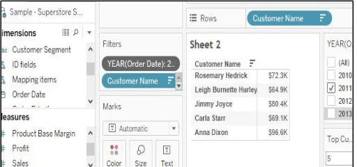
Fig 2. Top 5 customers having highest sale in the year 2011(Using Normal filter) Context Filters:-
[image:5.612.178.438.394.523.2] [image:5.612.179.435.573.693.2]© 2017, IRJET | Impact Factor value: 5.181 | ISO 9001:2008 Certified Journal | Page 2865
The filters that members add to the visualization are each independently calculated, regardless of what the other filters are doing. Members added the filter to “context”. Once data attributes were added to a context filter, then all other filters were calculated using this new data set. In this case members found that records received from the context filters and normal filters applied to live data, each time yields different values as shown in the figure above (Context filters are identified by their grey color on the Filter shelf).
Filters Applied to extract data:
Fig 4. Working on Extract data
The above figure shows the selection of extract data.
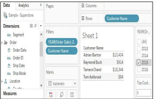
Similarly, When members were creating visualization from extract data source that was generated from the original live data used before, a data attribute when added to normal filter showed different values in the record along with one record missing in the view .i.e. members wanted to see top 5 members who are giving highest sale but with normal filters on extract data members could be able to view only 4 records.
Normal Filters:
Fig 5. Top 5 customers having highest sale in the year 2016(Using Normal filter)
[image:6.612.168.446.193.340.2] [image:6.612.172.443.477.650.2]© 2017, IRJET | Impact Factor value: 5.181 | ISO 9001:2008 Certified Journal | Page 2866
Context Filter:Fig 6. Top 5 customers having highest sale in the year 2016(Using Context filter)
The Challenge in this was to understand that Is the data in the view, showing valid result?, also why did extract did not show up with top 5 records when the year was taken as a normal filter and how did the number of records increased to show exact top 5 customers when year was added to context. Such questions impeded the thought process of members. This constitutes to be another example where tableau novices get confused and they themselves could not validate the visualization they are trying to produce.
9.
FORMATTING LIMITATIONS
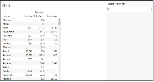
For any given visualization formatting plays an important part since it communicates the look and feel of the visualization to the spectator or the business user. Challenge here comes when members/participants wanted to change the calculated fields heading based on the parameter selection. Now Location parameter consisted of 3 options which is state, country and city but as an option “City” is chosen from the parameter, header “Location” remains unchanged which cannot be made dynamic on the click of parameters. Another difficulty faced by members was when they dragged all the relevant sheet into dashboard and positioned them very well but they forgot one formatting requirement that was to highlight a particular area of dashboard consisting of some specific sheets that was of great significance but after dragging and positioning all the sheets into the dashboard it was not possible to enclose some specific sheets into a new container without disturbing the position of the visualization. These made them to try various ways to enclose those visualization in separate container without disturbing their position on the dashboard but they failed.
Fig 7. Sales under different category based on the parameter selected
[image:7.612.172.444.121.238.2] [image:7.612.171.442.509.654.2]© 2017, IRJET | Impact Factor value: 5.181 | ISO 9001:2008 Certified Journal | Page 2867
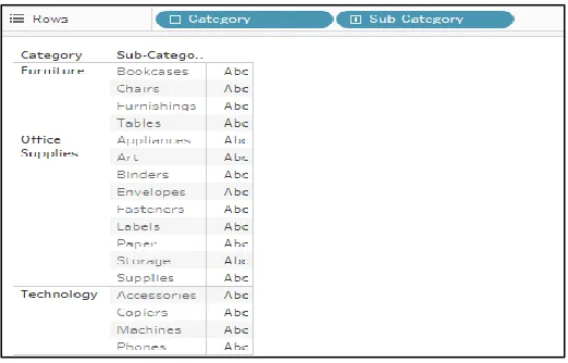
below, if the business user wants to see only the first 2 columns of its interest then removal of last column from the view is not possible unless any tricks applied to hide them. For example,Fig 8. Product categories and their sub-category
In the figure above we can see an extra column that appears after the first two columns, if the business user wants to see only the first 2 columns of its interest then removal of last is not possible unless any tricks applied to hide them.
10.
CONCLUSION
The arrangement of examination assignment is like sort of those produced before by different analysts, however various new primitives and thoughts emerged. The overall concern over here was more specifically on the examination primitives that one may anticipate that individuals will be producing as they utilize a data visualization framework such as tableau to accomplish some more elevated amount of learning objectives. These primitives can fill in as a type of basic dialect or vocabulary while talking about the abilities, points of interest, and shortcomings of various data representation frameworks. Analysts and framework designers will have the capacity to portray a framework's support for playing out these operations by recognizing its specific portrayal, connection, and interface support for the operation. For instance, how does the visualization exhibited by a framework support describing appropriations or discovering oddities? Does a framework satisfactorily encourage the calculation of determined values? Moreover, by recognizing and identifying these primitive test types, we plan to cultivate a proceeded with accentuation on the significance of logical measures of data visualization frameworks. It is crucial that data visualization framework architects both create imaginative, new representation procedures and unmistakably verbalize the expository characteristics of those systems. These investigations likewise can fill in as a casual agenda along which to survey and assess new frameworks and systems
.
11.
REFRENCES
[1] Robert Amar, James Eagan, and John T. Stasko, Low-level components of analytic activity in information visualization. In IEEE Symposium on Information Visualization, 2005. INFOVIS 2005, pages 111–117, 2005.
[2] Robert Amar and John T. Stasko. Knowledge precepts for design and evaluation of information visualizations. IEEE Transactions on Visualization and Computer Graphics, pages 432–442, 2005.
[3] Stuart Card, Jock Mackinlay, and Ben Shneiderman, editors. Readings in information visualization: using vision to think. Morgan Kaufmann Publishers Inc., San Francisco, CA, USA, 1999.
[4] Ed Chi. A taxonomy of visualization techniques using the data state reference model. In IEEE Symposium on Information Visualization, 2000. InfoVis 2000, pages 69–75, 2000.
[image:8.612.176.437.133.300.2]© 2017, IRJET | Impact Factor value: 5.181 | ISO 9001:2008 Certified Journal | Page 2868
[7] Alfred Kobsa. An empirical comparison of three commercial information visualization systems. In Proceedings of the IEEE Symposium on Information Visualization, page 123, 2001.[8] Heidi Lam. A framework of interaction costs in information visualization. IEEE transactions on visualization and computer graphics, 14(6):1149–1156, 2008.
[9] Donald A. Norman. The Design of Everyday Things. New York: Doubleday, 1990.
[10] Robert Spence. Information Visualization, Pearson Education Ltd., Harlow, England, 2001.