Wanchen Zhao. Visual Query System to Help Users Refine Queries from High-Dimensional Data: A Case Study. A Master’s Paper for the M.S. in I.S degree. April, 2018. 66 pages. Advisor: David Gotz.
Temporal queries are normally issued for cohort selection from the high-dimensional dataset in many contexts, such as medical related research areas. The idea was inspired by the difficulties when interacting with the i2b2 system, an NIH-funded National Center for Biomedical Computing based at Partners HealthCare System, which seldom provides informative feedbacks and interactive exploration about the clinical events of each query or the expecting follow-up cohort. Considering the complexity and time-consuming nature of complicated temporal queries, it would be frustrating when iterative query refining is needed. The paper presents a newly designed web-based visual query system to facilitate refining the initial temporal query to select a satisfactory cohort for a given research. A detailed interface design associated with the query time frame and the implementation of the visual query algorithm that enables advanced arbitrary temporal query logic is included. In addition, a case study with 3 participants in medical related research areas was conducted that shows the system was overall useful to help the users to gain an idea about their follow-up queries.
Headings:
Information Visualization Query Processing Algorithms User Interfaces
VISUAL QUERY SYSTEM TO HELP USERS REFINE QUERIES FROM HIGH-DIMENSIONAL DATA: A CASE STUDY
by Wanchen Zhao
A Master's paper submitted to the faculty of the School of Information and Library Science of the University of North Carolina at Chapel Hill
in partial fulfillment of the requirements for the degree of Master of Science in
Information Science.
Chapel Hill, North Carolina
April, 2018
Approved by:
___________________________
Table of Content
1 Introduction ... 2
2 Related Work ... 7
2.1 Visual Query of Temporal Dataset... 7
2.2 Visual Query System and Implementation... 8
2.3 Sequential Visualization and Analysis ... 13
3 System Description ... 16
3.1 Data Design ... 16
3.2 User Interface Design ... 17
3.2.1 Information Panel... 19
3.2.2 Query Flow Panel ... 19
3.2.3 Scatter Chart Panel ... 22
3.2.4 Distribution Panel ... 23
3.2.5 An Example Use Case ... 24
3.3 System Implementation ... 27
3.3.1 Cohort Measurements ... 27
3.3.2 Visual Query Algorithm ... 32
3.3.3 Query Flow Visualization ... 37
4 Case Study ... 39
4.1 Participants and Settings ... 39
4.2 Testing Procedure ... 42
4.3 Results and Discussion ... 43
5 Conclusion and Future Work... 52
6 References ... 54
7 Appendices ... 59
7.1 Appendix A: Experimental Tasks ... 59
1
Introduction
Nowadays, time-series-oriented data is highly expanded and critical insights are drawn upon it. For instance, a medical researcher would like to know some facts from a group of patients who is African American teenager with heart surgery before, admitted to UNC hospital, diagnosed as diabetes later and transferred to ICU where a certain series of procedures are performed before the patient is dead after 90 days. Even though
concurrence does not necessarily provide correlations, it is still a useful technique to narrow down the research population and conduct a scenario-based investigation and even analyze the correlation by "turn-on-and-turn-off" technique. Actually, in many domains, the events or query conditions happen in a certain order and useful insights are initiated based on those data.
type of events, together with a lot of patients, it can be an issue how a researcher can easily obtain the focused cohort without distracting from the trivial process of query construction caused by the nature of the high-dimensional temporal data.
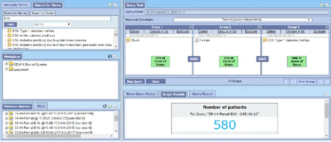
Figure 1.Query result returned by the i2b2 system.
As noted by Abouzied, Hellerstein & Silberschatz (2012), the designers of the DataPlay system, complex queries are constructed in a “trial-and-error” manner, the system should be able to facilitate defining a “correct” query in order to get meaningful results. A similar observation is also highlighted by the VISTORS system (Klimov, Shahar & Taieb-Maimon, 2010) that helps the users iteratively refine the initial query by dynamically interact with the sequential data visualization. However, how users get inspired by the presentation choices of those systems and how the data visualization is aligned with their natural thinking process when refining the query are remaining unclear.
define by the query. However, while recursively refining a temporal query, the user would insert a new event found interesting into the initial query before, within or after that time window. Only showing the events for a certain period or not specifying which period the event belongs to would make it hard for the users to get an idea about where to insert or how the statistics of the cohort would change after the insertion. For example, a researcher might want to know what had happened before a group of young boys was diagnosed as heart failure and what the new cohort would look like even if heart failure is the first event defined by the initial query. Furthermore, it will be also helpful to offer an indicator for the users to better interpret the results shown, say, how the constraints the user specifies can give an insightful cohort. To illustrate, imagine that there are only 5 patients off a 1000 sample set have a certain unique disease (a diagnose event). A researcher specified some temporal query and get those 5 patients all. Among hundreds of thousands of events all patients might have, there must be some powerful things going on for that query. But current systems hardly provide any helpful indicator to distinguish or highlight those insightful events so that users can have a chance to deep dive their query or the potential reason behind.
An effective visual query system should not only efficiently digest temporal queries with simple or linear logics but also take the complexity and flexibility of a query the user can build using easier query tools into consideration. In terms of the
Therefore, the project conducted mainly focused on the following research questions,
1. How user’s query and result should be represented for better interpretation? 2. How the visual query system helps users refine the temporal query?
3. How and where the users gain insights from by interacting with different visualization panels?
Corresponding the research questions, the project concentrated on the following tasks,
1. Implemented a temporal query algorithm that enables an arbitrary temporal query which involves more complex logic, such as sequential order with a time period and nested sequential order.
2. Investigated the visual design choices for sequential events with some certain level of abstraction and simplification as well as breaking the information horizon limited by the time window defined by the query.
2
Related Work
Modern visualization systems have been greatly influencing the way of time-oriented researching in many disciplines. With the development of visual analytics and interactive data mining techniques, researchers are now able to construct relatively complex query via varied visual query platforms.
2.1 Visual Query of Temporal Dataset
In the healthcare or medical research domain, data are highly time-sensitive and high-dimensional. As the visualization goal of this project to break the “time window” associated with the initial query, design a suitable data structure and implement the visual query execution algorithm is very important for the success of the system.
A broad definition of the visual query is a set of visual expressions to enable users to specify their goals or requests to conduct query from a data set. The traditional textual query language refers to the query language, SQL for instance, that without iconic or spatial clues to facilitate the query process (Catarci et al., 1997). The visual query
language is perceived to be more user-friendly in terms of express human’s mental image and make use of the person’s instincts to interpret visual expressions (Catarci et al., 1997, Hibino & Rundensteiner, 1995, Sassi, Dridi & Tissaoui, 2016).
(Hibino & Rundensteiner, 1997), visual query of the temporal dataset (sometimes it is called temporal visual query, TVQ) evolved to support varied dynamic interaction and visualization (Hibino & Rundensteiner, 1995, Hibino & Rundensteiner,1997, Chittaro & Combi, 2003, Carvalho & Edelweiss, 1997, Combi & Oliboni, 2012, Fernandes, Schiel & Catarci 1997).
Even though the architecture of visual query tool may vary in different contexts according to some particular focus, basically it can be categorized into 3 scopes: visualized query editor, query executer, and data source/data model (Della Penna, Magazzeni & Orefice, 2013). Previous studies were focused on one of the 3 scopes and some of them had implemented some kind of novel tool to realize the entire visual query process (as discussed in the next section).
In the scope of query executer, the visual query should be able to translate the query expressions specified by the users to a system executable language. Some previous works designed its own query grammar, data type/structure, or provided validation to eliminate the errors it might occur (Angelaccio, Catarci & Santucci, 1990, Mohan & Kashyap, 1993, Hibino & Rundensteiner, 1995, Fernandes, Schiel & Catarci, 1997, Combi & Oliboni, 2012). Some were focusing on the translation from the visual representation to SQL statement (Carvalho & Edelweiss, 1997, Balkir, Ozsoyoglu & Ozsoyoglu, 2002, Chittaro & Combi, 2003, Bauleo et al., 2014, Haag, Krüger & Ertl, 2016) or XML query language (Yong et al., 2009).
2.2 Visual Query System and Implementation
advantages and disadvantages of the potential visualization choices. Modern visual query systems provide varied ways to help the users to refine their initial query by various data visualization approaches and functionalities.
Current visual query systems majorly support two phases in terms of query construction. The first phase is to define or construct an initial query using the visual user interface. The second phase includes varied result presentations to help the user explore the data and refine the initial query if needed. Some applications were focused on the first phase while some concentrated on the second. In medical records visualization domain, many visual query systems had hybridized the features and techniques of the above two phases.
1. The First Phase: Visual Query Interface
Figure 2.By dragging and dropping variables into the different columns in the Query Tool panel, the users can define “OR” and “AND” relationships between the temporal constraints.
Figure 3.By selecting an option in the dropdown list and filling out the form, the user can specify the order and the time intervals of the temporal constraints of a query.
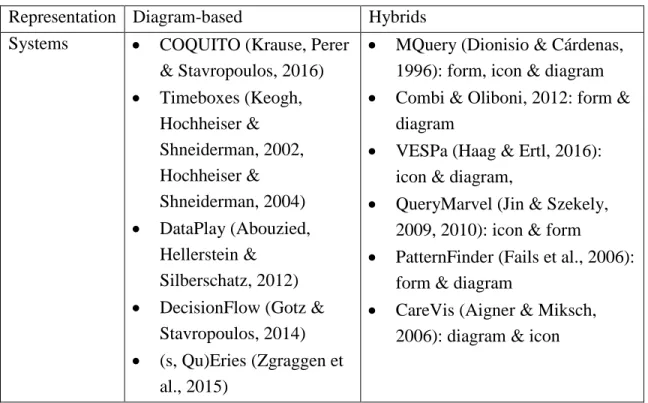
Table 1.Example visual query systems using diagram-based or hybrids query representation approach
Representation Diagram-based Hybrids Systems COQUITO (Krause, Perer
& Stavropoulos, 2016)
Timeboxes (Keogh, Hochheiser & Shneiderman, 2002, Hochheiser & Shneiderman, 2004)
DataPlay (Abouzied, Hellerstein &
Silberschatz, 2012)
DecisionFlow (Gotz & Stavropoulos, 2014)
(s, Qu)Eries (Zgraggen et al., 2015)
MQuery (Dionisio & Cárdenas, 1996): form, icon & diagram
Combi & Oliboni, 2012: form & diagram
VESPa (Haag & Ertl, 2016): icon & diagram,
QueryMarvel (Jin & Szekely, 2009, 2010): icon & form
PatternFinder (Fails et al., 2006): form & diagram
CareVis (Aigner & Miksch, 2006): diagram & icon
Most of the diagram-based visual query representation tend to be an extension of EER diagram, rather than a natural language phrase. Icon-based design often needs an additional interpretation of the icons to facilitate the users to get started. Because the interface is highly compressed and simplified by the icon, so it is helpful to have a general glance of the query, however, it can be also subtle to absorb the meaning.
Therefore, the hybrid of the multiple visualization approaches is fevered to construct the temporal query.
2. The Second Phase: Result Visualization and Data Exploration
Hochheiser & Shneiderman, 2002, Hochheiser & Shneiderman, 2004) enable the user to draw rectangular query regions on a line chart that represents sequential data over a certain period once an initial query created. Detailed information will be shown corresponding the selection. DataPlay (Abouzied, Hellerstein & Silberschatz, 2012) basically assumes query is constructed in a “trial-and-error” manner, thus it provides an “auto-correct” feature to facilitate constraint manipulation based on the real-time feedbacks from the user. DecisionFlow (Gotz & Stavropoulos, 2014) visualizes the sequential events or milestones associated the initial query in multiple views. Users can manipulate the baseline representation by the ad hoc creation of temporal pathways using the statistical comparison panel or the event aggregation panel during the exploration phase. CAVA system (Zhang, Gotz & Perer, 2015) provides multiple visualization-based cohort manipulation approaches via varied views such as visual filters, demographic distributions, clinical pathways, etc., for a given cohort to facilitate an ad hoc exploratory analysis. In EventAction (Du et al., 2016), the users are observed to benefit from
All above systems are leveraging some certain interactive visualization to facilitate either time-oriented data exploration or iterative follow-up query construction using the knowledge gained from the visual expression. Different systems tend to choose varied visualization approaches and most of them provide multiple views. Line charts, histogram, and derived Gantt charts are widely used. However, where the users gain more inspiration to refine their initial query and how satisfied and confident about the results or knowledge gained when a new set of data returned is unclear.
2.3 Sequential Visualization and Analysis
The challenges to visualize time-oriented data come from the nature of high-dimensional data. A good visualization of it should be able to abstract in a reasonable manner to provide an overview of the time sequence without losing any details or introduce potential bias when compressing. Timeline or event sequence approach is frequently used in multiple systems (Bade, Schlechtweg & Miksch, 2004,
Wongsuphasawat et al., 2012, Burch, Beck & Diehl, 2008, Du et al., 2016, Cibulski et al., 2016). The advantages of this approach are to make it clear for the relatively sequential order of events in the cohort. However, a large number of events and individuals in the cohort becomes another challenge. Some systems choose to represent the event sequence for each individual of the dataset (Bade, Schlechtweg & Miksch, 2004, Wongsuphasawat et al., 2012, Cibulski et al., 2016), while some aggregate or cluster those based on some certain measurements (Burch, Beck & Diehl, 2008, Du et al., 2016). Both approaches are still too outsized to visualize in a single view port, which requires the user to scroll the screen in order to compare the various sequence of events or individuals. Other
2012, Perer & Wang, 2014, Perer, Wang & Hu, 2015, Lex et al., 2011), tree(graph)-based data and pathway mapping (Partl et al., 2012, Nobre et al., 2017), which enable the user to interact with the pathways of the sequential events. One of the advantages of this visualization approach is to link the outcome and alternative prerequisite events.
However, the main challenges those systems are facing in common is to provide effective pathway integrating approaches and suggest similar pattern from the overwhelming possible pathways. Additionally, the pathway visualization also losses the timeline information which is critical in the context of the temporal query and sequential data exploration.
Additionally, some statistical calculation to define the characteristics of the selected cohort and how it might be changed in the query refining phase is also useful to inspire the user towards the direction of a better selection. In order to facilitate sense making from the data retrieved, merely initial summary calculation, such as average, maximum and minimum, is not sufficient. Statistical analysis (Wongsuphasawat et al, 2012, Wongsuphasawat & Gotz, 2012, Du et al., 2016, Cibulski et al., 2016) is conducted on the sequential visualization interface by dynamically interact with the system.
3
System Description
3.1 Data Design
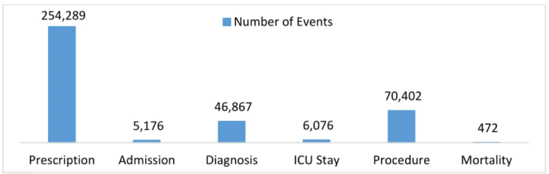
The dataset used in the system is extracted from the MIMIC-III database (Johnson et al., 2016), a freely accessible critical care database. The dataset contains partial clinical records such as procedures, admissions, diagnoses and ICU transfers of 1,000 patients. For each patient, some demographic information such as gender, age, date of birth, and ethnicity are included in the dataset. An event is defined as a clinical record for a patient with a time stamp. A series of events such as transferring to the ICU and conducting a certain procedure would happen to a patient during the period of admission to the
hospital. There are 383,282 events for the 1,000 patients in the dataset. An event must be associated with a certain event class with an event code uniquely identifies an event type. There are basically 6 event classes, including admission, ICU stay, procedure, diagnosis, medication, and mortality. The event distribution of the 6 event classes for those 1,000 patients in the dataset is shown in Figure 4. There are 2,987 different event types.
be a conclusion of a series of clinical events, such as lab test, procedures, etc., or an input of a patient when admitted to a hospital. Because the importance of the diagnosis in terms of cohort selection and the limitation of the MIMIC III database, the diagnosis records in the dataset are assigned with a fake time stamp which is the admission time of the patient to only show the existence of a certain diagnosis of that patient during a certain
admission period.
Figure 4.The number of events of each event class in the dataset
3.2 User Interface Design
The system creatively borrowed the concept of Information Gain for each event type based on the size of the cohort segmented by the query, which measures how much “information” an event type gives the users about the segmentation by a given query (details in the next section). Thus, the potentially “insightful” event types stand out to assist the query exploration. Additionally, the cohort statistics are aggregated by different event types before, within and after the time frame defined by the query, which offers the expecting size of the cohort and outcome information according to where the event type would be inserted even before the user runs the follow up query (details in the next section). In this way, it saves a significant amount of time to run potentially ineffective queries whose cohort size is either too small or even no associated event types
254,289
5,176
46,867
6,076
70,402
472
considering the high dimension and volume of the dataset in real life. Another challenge due to the complexity of temporal queries is its representation. According to the literature review, modern systems tend to construct and visualize the query in form-based and diagram-based representation as well as their hybrids. Diagram-based representation is more visually appealing, however, the tree diagram to visualize the query logic seems a little bit unintuitive to interpret without information technology background. To solve the problem, the system introduced a flowchart-like representation for the query structure along with a form of attributes and event types associated with the query.
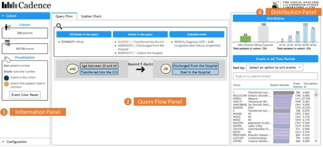
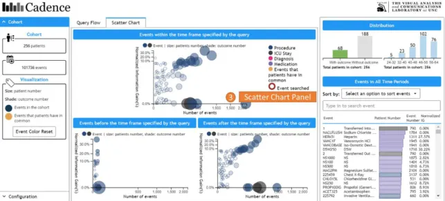
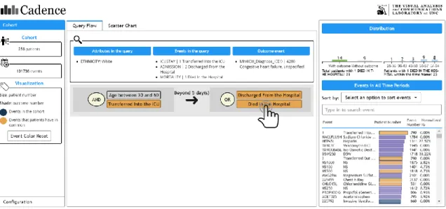
Based on the above considerations, the system is composed of 4 major panels, 3 of which are shown in Figure 5 (panel 1,2,4), while panel 3 is shown in Figure 6. The initial query has been executed in the backend when the main interface with the results returned is presented to the users.
Figure 6.The main interface contains 4 panels, including ① Information Panel(as shown in Figure 5), ② Query Flow Panel(as shown in Figure 5), ③ Scatter Chart Panel, ④ Distribution Panel(as shown in Figure 5).
3.2.1 Information Panel
The information panel (Figure 5, panel 1) contains the general information about the cohort results returned by a query. As shown in the example of Figure 5, there are 256 patients and 101,736 events in the cohort. The meaning of the color coding is also shown here with a button to reset the color to the initial state.
3.2.2 Query Flow Panel
patients who were transferred into the ICU at the age between 30 and 60, and then, 5 days later, the patients were discharged from the hospital or died”.
Figure 7.The logic of the query can be interpreted as “the patients who were transferred into the ICU at the age between 30 and 60, and then, 5 days later, the patients were discharged from the hospital or died”.
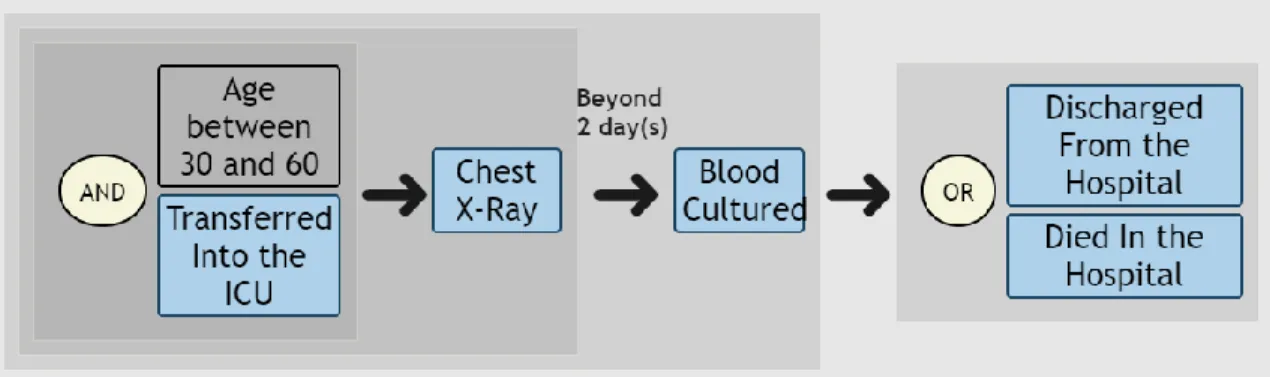
This flowchart-like representation is also capable to demonstrate more complex logic, such as the nested structure shown in Figure 8. It is more obvious that in this example the background block wrapping the basic binary logic between 2 entities works as a pair of parentheses. The users would naturally recognize the logic within a block should be completely executed before it can move further. So the query logic in Figure 8 can be interpreted as “I want the patients who were transferred into the ICU at age between 30 and 60, and then followed a chest X-ray; 5 days later, the patients conducted a blood culture; Some time after that, the patients were discharged from the hospital or died”.
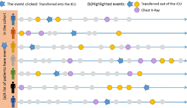
The event type in the query flow panel is clickable to retrieve a list of events that the patients associated with the clicked event type have in common. To illustrate, as shown in Figure 9, when the user clicks on an event type, say, “Transferred into the ICU”, the system will automatically know a list of patients in the cohort who have the event “Transferred into the ICU” (Figure 9 (a)). Then the system will give back a list of event types those patients have in common (Figure 9 (b)), in this case, the event type “Transferred out of the ICU” and “Chest X-Ray”, which is highlighted in orange as shown in Figure 10 and Figure 11. The bar chart will also change accordingly to reflect the distribution of outcomes and the age of those patients.
Figure 10.After the process described in Figure 9 has been finished, the system highlights the event types returned on the interface in orange. Note that all the panels have those event types returned, including the query flow panel, distribution panel and scatter chart panel (Figure 11), will be highlighted.
Figure 11.The event types returned by user’s click will be highlighted in the scatter chart panel. The bubbles representing each event type before, between or after the time frame is also clickable to highlight events. The process behind is the same as what will happen when the user clicks an event type in the query flow panel.
3.2.3 Scatter Chart Panel
Information Gain value. Information Gain (IG) measures how much “information” an event type gives the users about the segmentation by a given query. The Information Gain (IG) value is normalized for each event type in order to compare with each other. Details about the time frame and Information Gain are discussed in the next section. The bubbles represent different event types. The size of the bubbles is the number of patients, while the shade of the color represents the number of patients associated with that event type who also have the outcome event. The darker the more. All bubbles are also clickable to see the highlighted events. The user can also hover over a bubble to see detailed statistics about this event type.
3.2.4 Distribution Panel
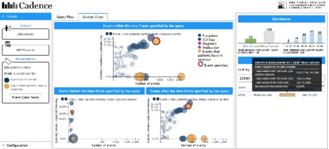
Figure 12.The user can search for a particular event type that the patients in the cohort have via the event name or code. For example, when the user types in 225401, the event type associated with this code, Blood Cultured, will be circled in the 3 scatter charts if any. The user can also click the event type searched. In this case, the patients who have event type 225401 also have event types Transferred into the ICU, Transferred out of the ICU and Chest X-Ray in common.
“225401”, the event type “Blood Cultured” is circled in all 3 scatter charts. It is obvious that there is the least number of patients before the time frame defined by the query. Pay attention that the red circle only appears if there is only one event in the result list here. The user can also sort the event types by different options. The event type is also clickable in the distribution panel to see the highlight events.
3.2.5 An Example Use Case
The main functionalities of the system are described as above, but what users can do with the system is actually not limited by those. The exploration of the results of the cohort is very open ended, which would be highly influenced by both the quality of the dataset and the initial query. With the expertise in the field of the dataset, the researchers would interpret the visualization more meaningfully. Here shows an example of the thought process to come up with some follow-up queries inspired by the system.
have Chest X-Ray before they were transferred into the ICU, while the greatest number of both events (2,163 by hovering over) and patients (202 by hovering over) within the time frame. The user can insert this event type into her follow-up query within the time frame knowing that there will be 202 patients in her new cohort.
Another interesting thing is that it is approximately true that the more event number the higher Normalized Information Gain value except some obvious outliers, such as Transferred in and out of the ICU. Well, in the context of the initial query, she does not specify a particular event happens during the ICU stay, it is not necessary that a patient would die if he or she has been transferred into the ICU before, and it is obvious that all patient would discharge from the hospital no matter what. Therefore, the initial query is too general to make the event types like ICU stay to be a special indicator of something, say, it is just like a random cut for these kinds of event types.
Figure 13.The user clicks event type “Died in the Hospital” in the query flow panel.
time frame defined by the query. The user wants a cohort no less than 150 patients, therefore, she can insert this event type she wants to include in her follow-up query within the time frame (188 patients known by hovering over) instead of after the time frame (91 patients known by hovering over) or before the time frame (2 patients known by hovering over).
Figure 14.The user switches to the scatter chart panel after clicking the event type “Died in the Hospital” in the query flow panel. She hovers her mouse over the event type Chest X-Ray to read detailed statistics about it.
After the first round of investigation, the user comes up with a follow-up query shown in Figure 8. After running the query, the new cohort is presented in Figure 15 and Figure 16. This time, the Chest X-Ray seems more special (with higher Normalized Information Gain) than before. The user can iteratively investigate the cohort returned by the query and refine the initial query to make it more concrete.
Figure 16.The result of the new cohort by the refined query. This time, the Chest X-Ray has more Normalized Information Gain, which means it gives more “information” about the segmentation by this newly refined query.
3.3 System Implementation
3.3.1 Cohort Measurements
Information Gain to show how much “information” this event type gives the user by a query.
1) Time Frame
For one patient, he or she would have a lot of medical events, such as diagnoses and procedures, happen in sequence. For example, a researcher wants a cohort of patients who admitted to the ICU, followed an invasive ventilation procedure and eventually transferred out of the ICU (shown in Figure 17(a)). In this query, there are 3 events. The first event is “admitted to ICU” (Figure 17(a)①), “invasive ventilation” as the
second(Figure 17(a)②), while “transferred out of the ICU” is the last(Figure 17(a)③). In this case, the time frame defined by the query is from the first event(Figure 17(a)①) to the last event(Figure 17(a)③) in the query. Before, within and after the time frame are defined accordingly. An outcome event (Figure 17, green bubble) is a special event the user wants to see if the patients in the cohort have or not.
There are a lot of patients in the dataset, while only the patients meet the constraints of the query will be in the cohort. Not everyone in the cohort must have the outcome event. The outcome event can appear before, within or after the time frame.
Figure 18.Only the patients meet the constraints of the query will be in the cohort. Note that not all of them have the outcome event, for example, the patient represented as a yellow icon.
2) Normalized Information Gain
without the event type X. With a certain query, the patients in the dataset will be
segmented into 2 categories, the ones in the cohort and the ones not in the cohort. Some patients with the event type X will appear in the cohort, while some will not because they do not satisfy the constraints defined by the query.
Figure 19.(a)For all the patients in the dataset, some of them have event type X, while the others do not. The patients in the dataset are divided into 2 groups, the ones in the cohort(b) and the ones not in the cohort(c). Some patients with the event type X will appear in the cohort(b), while some will not because they do not satisfy the constraints defined by the query.
For each event type, the entropy 𝐻(𝑆) of a set of patients 𝑆 is described as the impurity of a set of patients who have that event type. If the all the patients in the cohort have a certain event type X, then this set of patients is absolutely pure in terms of event type X.
𝐻(𝑆) = − 𝑝 log2𝑝 − 𝑞 log2𝑞
The Information Gain (𝐼𝐺𝑒𝑣𝑒𝑛𝑡 𝑡𝑦𝑝𝑒) is defined associated with the entropy of 3 sets of patients (Figure 19 (a), (b), (c)).
In order to compare the Information Gain (𝐼𝐺𝑒𝑣𝑒𝑛𝑡 𝑡𝑦𝑝𝑒) value of different event types, the 𝐼𝐺𝑒𝑣𝑒𝑛𝑡 𝑡𝑦𝑝𝑒 is normalized as the best “information” it can gain out of the original dataset. Therefore, the Normalized Information Gain (𝑁𝐼𝐺𝑒𝑣𝑒𝑛𝑡 𝑡𝑦𝑝𝑒) in the context of this system is defined as,
𝑁𝐼𝐺𝑒𝑣𝑒𝑛𝑡 𝑡𝑦𝑝𝑒 = 𝐼𝐺𝑒𝑣𝑒𝑛𝑡 𝑡𝑦𝑝𝑒 𝐻(𝐴)
Therefore, a perfect Normalized Information Gain will be obtained when all and only the patients with an event type X appear in the cohort by a powerful query, while a lowest Normalized Information Gain if the segmentation seems nothing special, just like an arbitrary cut.
3) Counters
Other measurements of a cohort include some basic statistics of the patients and the events within the cohort returned by the query. The numbers of patient or events are either global to a certain event type or local to a period, say before, within or after the time frame defined by the query, of that event type.
Table 2.Basic statistics of a cohort
Counter Of … Where
Patient number
The cohort returned by the query
The entire cohort
Before/within/after the time frame defined by the query
With/without the outcome event
The entire cohort
Event number
The cohort returned by the query
The entire cohort
3.3.2 Visual Query Algorithm
As discussed in the second chapter, there are basically 2 major approaches applied by previous studies to implement the temporal query, either develop its own data
structure and algorithm or translate it into SQL to manipulate the database. As pointed by Krause, Perer & Stavropoulos (2016), it is more complicated to build SQL statement from a linear structured visual query, not to mention a more complicated and nested query logic as described above.
In the project, the visual query algorithm applied the first approach. The algorithm is inspired by the mechanism of the query optimizer of model database management systems. The basic idea is to translate a JSON object with the information about the query that constructed from the front-end to a binary query tree. Then, the system conducts an in-order traversal through the binary query tree reclusively to execute the query logic represented by different relationships, such as “OR”, “AND”, “THEN”, “THEN WITHIN” and “THEN BEYOND”. Because the time frame defined by the query is critical in the context of this system, the algorithm should record the start event id as well as the end event id for each patient while traversing the query tree.
One of the challenges for the query executer is to handle any arbitrarily complex query structure and logic, such as nested query structure, the age when a specific event happens, events happen after an absolute date, and patients with some specific
the patient satisfies the demographic constraint, the executer will need to use the query tree to see if his or her event sequence is qualified. To illustrate the mechanism of the query tree, the query tree of the query in Figure 7 can be seen as Figure 20. The node of the query tree should be a relationship (“OR”, “AND”, “THEN”, “THEN WITHIN” and “THEN BEYOND”), an event type (for example, “Transferred into the ICU”), or an attribute (for example, age between 30 and 60). The relationship node cannot be a leaf node, while the event type and attribute node can only be the leaf node.
Figure 20.The query logic in Figure 7 can be translated by the executer into a binary tree, where the leaf nodes are the event types and attribute and the non-leaf nodes are the relationships.
For a query starts from a particular date, the query tree traversal logic is the same, except one difference to locate the event to start traversing by conducting a binary search via the date specified into the event sequence of the patient that the executer is dealing with. Then, from there, the executer can do the rest of traversal work.
The main challenge of the algorithm is the speed. Unlike normal SQL statement to locate a list of attributes that satisfy some constraints, the temporal query is required to satisfy a specific sequence of constraints additionally. Therefore, the best time
complexity is 𝑂(𝑁), where N is the number of items in the dataset. To get as close to this speed as possible, the event table is pre-sorted by patient id and time stamp. The
seen this second constraint before; if none, the executer will go through the rest of the events from the current event id has seen.
Figure 21.The executer records the event indexes into a list associated with an event type when it firstly sees an event of a patient. Because of the logic of the query, the executer needs to once again go through the events of this patient and the event index it currently sees is 10 and the event type is 𝑒𝑡4, then the executer will use the key 𝑒𝑡4 to locate a list of event indexes it has seen before and conduct binary search into that list to find event index 10.
To further illustrate the event cache, it is an internal hash map for each patient where the key is the event type and the value is a list of event indexes of the patient (Figure 21). When the executer sees a new event for a patient, it will firstly put the event type associated with that event into this cache and add the event index at the end of the list associated with that event type. Because the events for each patient is pre-sorted by the time stamp, therefore, the event indexes are guaranteed in chronological order. Hence, for the next time when the executer needs to find a particular event type 𝑒𝑡𝑥, it can
in the dataset and M is the number of events of the same event type for one patient. Since
𝑀 ≪ 𝑁 and M is usually very small, so the time complexity in general very close to
𝑂(𝑁).
Other operators, such as “AND”, “THEN”, “THEN WITHIN” and “THEN BEYOND” can also use this event cache to quickly locate an event index the executer has seen before. However, the behavior to go through the events for each patient is slightly different. The main idea is to let the executer know the 2 important event indexes: where the last logic block ends (𝑒𝑛𝑑𝑒𝑡𝑥), and where the current logic block is dealing with should start from (𝑠𝑡𝑎𝑟𝑡𝑒𝑡𝑥). Different operators apply different searching behaviors as shown in Figure 22. The start point of searching will be changed to where it ends for the previous logic block only when dealing with sequential operators, such as “THEN”, “THEN WITHIN” and “THEN BEYOND”. Additionally, for operators “THEN WITHIN” and “THEN BEYOND”, the executer will further qualify the event sequence with the duration of days specified. The start point of searching for operators “OR” and “AND” is the position revised by the previous sequential operator.
Figure 22.For each patient, 𝑠𝑡𝑎𝑟𝑡𝑒𝑡1 is the first event of traversal. When the executer traverses to 𝑒𝑡2, the start point is still 𝑠𝑡𝑎𝑟𝑡𝑒𝑡1 since no sequential operators before. When traversing to 𝑒𝑡3,
the start point is changed to where it find 𝑒𝑡2 which is 𝑒𝑛𝑑𝑒𝑡2. Additionally, the executer should
patient. When traversing to 𝑒𝑡4, the starting point is changed to 5 days after 𝑒𝑛𝑑𝑒𝑡3 since there is
a “THEN_BEYOND” operator before. The executer will continuously searching for 𝑒𝑡5 and 𝑒𝑡6 starting from 𝑠𝑡𝑎𝑟𝑡𝑒𝑡4, and last, it will search for 𝑒𝑡7 starting from 𝑒𝑛𝑑𝑒𝑡6 since the operator is
“THEN”.
The last, not the least challenge is to return a well-structured cohort after executing the query. The cohort not only contains a list of patients associated with the event types they have but also contains different counters for both events and patients before, within and after the time frame defined by the query. Furthermore, the counters of patients are needed for calculating the Normalized Information Gain for each event type. All the counters also follow the efficiency principle “go through event table once”. For example, the outcome event flag for each patient is modified in real time while traversal and the event counter only counts the rest of events that not have been seen by the executer before it returns true for a patient in the cohort.
3.3.3 Query Flow Visualization
The query flow diagram shown in Figure 7 and Figure 8 is constructed from a JSON object describing the query structure, which is also the input of the query executer discussed above. The implementation is derived from Dr. David Gotz’, while the main difference is the usage of CSS to highlight the nested structures and sequential
relationship. The basic idea of the implementation is to traverse the JSON object recursively and apply standardized CSS for different node types. To illustrate, for each relationship node, such as “OR”, “AND”, “THEN”, “THEN WITHIN” and “THEN BEYOND”, its 2 children and itself are contained in a flex box1. For “OR” and “AND”
1 Flex box is designed as a one-dimensional layout model, and as a method that could offer space
distribution between items in an interface and powerful alignment capabilities. Refer
relationship, the flex direction is vertical, while for “THEN”, “THEN WITHIN” and “THEN BEYOND”, the flex direction is horizontal (Figure 23). The duration information for “THEN WITHIN” or “THEN BEYOND” is attached to an arrow that separates its 2 children. A semi-transparent gray background is applied for each logic block (an operator with its 2 children), indicating the logic operation should be completely executed before it can go to the next logic block. The function of the semi-transparent gray background for each logic block works similar to a pair of parentheses in any formula or equation, but it is visually intuitive to read. Any complex query structure can be represented in this simple way.
4
Case Study
In order to investigate the effectiveness of the visual query system to facilitate obtaining ideas about a follow-up query based on the result of the initial one, an evaluation study with a semi-structured post interview was conducted to understand users’ behaviors, cognitive and affective factors during the interaction of the visualization interface. Quantitative data about the accuracy and time was collected in the evaluation experiment and notes were taken to construct necessary follow-up questions for the semi-structured post interview about the hesitation, confusion or any questions during the experiment. Qualitative data was gathered from the think aloud dialogue, post-session interview and questionnaires to further understand user’s concerns, interests, satisfaction, and feedbacks.
4.1 Participants and Settings
The current cohort selection system (i2b2) does not have a strictly comparable function to enable temporal query refining and initial data exploration. Therefore, the participants need to be the i2b2 system's user, who at least have a basic understanding of the capabilities and functions in terms of cohort selection, so that they are able to
compare the new features of the system designed and provide useful feedbacks after they complete a series of tasks.
Three participants in different medical related research areas were recruited for the case study. A pre-study survey was sent to each participant to understand their previous experience with the i2b2 system. Two of them had used its function called “Define the Sequence of Events” but found it really frustrating to build a temporal query due to the efficiency concerns and complicated process of both the query
construction/execution phase and the result exploration phase. The initial queries for the experiment were pre-defined by the study moderator based on the research areas of two of the participants and their example queries used in the i2b2 system, which was gathered from a pre-study questionnaire.
Table 3.Experiment queries pre-defined based on the research area and example query provided by the participants
Participant Research Area Initial Query
1 Health Services Research in epidemiology Complex query represented in Figure 24 2 Cardiology, nephrology, abdominal
transplant surgery
Easy query represented in Figure 25
Figure 24.A relatively complex query structure associated with participant 1’s research area was given to all participants.
Figure 25.A relatively easy query structure associated with participant 2’s research area was given to all participants.
research area. Both of the initial queries are not directly relevant to participant 3’s research areas.
Table 4.Experiment queries assigned to each participant with three test cases created Session Participant 1 Participant 2 Participant 3
Relevance Complexity Relevance Complexity Relevance Complexity 1 Less Easy More Easy Less Easy 2 More Complex Less Complex Less Complex
4.2 Testing Procedure
The study took approximately 60 minutes per session. In the first 15 minutes, the moderator helped the participant get used to the interface by going through the process of conducting data exploration and refining a query based on the results shown on the interface. Each panel and feature of the system was explained by the moderator. Participants were allowed to ask questions during this onboarding session. The participants were asked to complete a small number of simple oral tests about the meaning of the interface to measure their learning progress. When the participants were comfortable with using the system, the testing phase began.
investigating related event types. Task 6 to 8 were designed to be open-ended to see how the system helped the user gain an idea of their follow-up queries. For task 2 to 5, a timer was triggered after reading the question by the participant till they went to the next question. The participants were asked to write down the answers on the answer sheet.
After the participants completed all the tasks, the session survey (see session survey in appendix B) and a semi-structured interview were followed. In the post-session survey, the participants were required to answer 7-point Likert scale subjective questions about the experience of interacting with the system. Then, a semi-structured interview was conducted to further investigate why they felt in a certain way as well as the reason behind their behaviors. One of the questions asked was associated with their previous experience with the i2b2 system to issue a follow up query based on an initial one. The initial query presented was similar to one of the queries that he or she just completed in the test. The reason why the query is not exactly the same one was trying to reduce the learning effect through the test the participant just took. This question was for refreshing their memory to refine queries using the i2b2 system in order to understand the advantages or disadvantages of the new system.
4.3 Results and Discussion
1. Learning effect of the system was observed for those who were somehow familiar with the research question defined by the initial query, while it was overall hard for someone not in the research context.
According to the result, for participant 1 and 2, their performance (number or correct answer per second) was significantly improved in session 2 (Figure 26). For example, for participant 1 who reported very familiar with the research concepts of both sessions, actually, answered the questions all correctly with significant improvement on time in session 2. The participant 2 had three wrong answers in session 1 but corrected him/herself in the session 2 when getting more familiar with the interface. However, for participant 3, who reported slightly familiar with the research context, was almost not improved at all by constantly questioning about the research question defined by the initial query and not even felt confident about what she/he was looking at even though she/he had got the right answer in the first place.
Figure 26.For participant 1 and 2, they got significantly improved in terms of the correctness per second, while participant 3 almost not improved at all.
2. The size of the cohort was the main concern in the query selection phase.
0.023 0.024 0.010 0.046 0.052 0.012 0.000 0.010 0.020 0.030 0.040 0.050 0.060
Participant 1 Participant 2 Participant 3
Correc t An sw er p er Se con d
Task Accuracy per Second of Different Sessions
Figure 27.Detailed statistics associated with an event type when hovering over a bubble.
3. Time frame concept was helpful for the temporal query but better filtering needed.
event types and make the linkage between different panels. For example, for task 5, which gained the highest wrong answers, it involved clicking, hovering, searching actions in both scatter chart panel and distribution panel. In order to see related event types, typically, the users need to scroll down the event table to see all of them. Additionally, to check if a particular event type is related to the previously searched one, the users need to locate the new interested event type again to see if it is highlighted in orange or they have to scroll the event table until they can find it. All the above steps are too complicated especially when the event types are high dimensional.
Figure 28.The accuracy per second of task 3 to 5 is significantly lower than task 2.
Despites the above flaws, the time frame concept was highly appreciated by the participants in terms of query constructing or refining. For example, one of the
participants mentioned that his/her research often required to restrict the clinical events in a specific health care service admission period, however, the current system did not offer any information about that. She/he had no confidence if the patients in the cohort were fully qualified until they gained the data or even after recruiting that patient only to know he/she actually was a useless case for the research. Also, one of the participants found the system was helpful because it showed if there were some specific events associated with
0.20
0.02
0.08
0.02 0.12
0.04 0.03 0.03
0.12
0.01 0.01 0.01
0.00 0.05 0.10 0.15 0.20 0.25
Task2 Task 3 Task4 Task5
Correc t An sw er p er Se con d
Accuracy per Second for Task 2 - 5
a large group of patients beyond the time frame defined by the query. The participant mentioned, for instance, a researcher got a small cohort size by limiting the events in a particular health care service admission period, unfortunately. However, he/she would never know there were actually a lot of those events or a larger cohort size during some other period of time using the current i2b2 system. They had to count on their luck to guess or enlarge the cohort by loosening their constraints knowing they would need to sift the actually qualified patients later.
4. The query flow was helpful to visualize the underlining query logic and intuitive to understand and build upon.
Another interesting suggestion by one of the participants was the query
evolvement during the cohort selection phase. The participant mentioned he/she would normally include or exclude some constraints iteratively until he/she felt confident about the cohort. The current approach he/she was applying using the i2b2 system was through the naming of the query he/she issued for a given research, although it would be hard to maintain and recognize for a long term. This participant suggested it would be helpful to not only show the logic of an individual query but also revealing the evolvement of the initial query.
5. Three aspects highly impacted the follow-up queries: domain expertise, expecting cohort size, Normalized Information Gain.
In terms of the query refining, the scatter chart panel and the distribution panel are the main areas that helped the participants to gain their ideas. Even though the
participants found it was helpful to use the system to refine the initial query, they were obviously hindered by the usability issues of those two panels discussed above. Three aspects highly impacted their follow-up queries: (1) domian expertise, (2) the expected size of the cohort, and (3) the Information Gain value.
The expected size of the cohort. It was observed that the participants were trying to locate the events they were specifically interested in or within their research domain based on the size of the bubble (the number of the patients) or the top events in the event table (the ones with more patients associated with).
Information Gain. It was observed that the participants tend to scan the events from the top of the scatter chart (the ones with higher Normalized Information Gain value), if it fell into his/her research domain with a large cohort size, the participants tend to be willing to take a further look.
Figure 29.Likert scores of the post-session survey. The blue points represent the ease of
interpreting different panels; the orange points represent the interface design associated with color coding and transition; the green points represent the usefulness in terms of refining the initial query.
It was also mentioned by all the participants that the term “Information Gain” was hard to interpret when refining the query. One of the participants pointed out that the system did not have to show this term but just suggest the events with higher values. It might be helpful let the users determine which events to select without seeing a new term or concept. Query flow panel Scatter chart panel Distributio n panel Informatio n panel Color coding Interface changing Gain ideas of refining query Helpfulness of detailed statistics Ease about the time frame Interest in emphasize d events Interest in deemphasi zed events
Mean 5.7 4.0 4.3 6.0 3.3 4.3 5.7 5.7 5.0 5.0 4.7
1 2 3 4 5 6 7
6. Complexity and efficiency concerns are main barriers to refine a query.
When talking about the main barriers to refine a query using the i2b2 system, all the participants mentioned the complexity and efficiency concerns. Sometimes, they felt very frustrated when it took an entire day to run a query only to know 0 patients
5
Conclusion and Future Work
The paper described a newly designed visual query system in order to help the users to refine the initial query to select a satisfactory cohort for a given study. The project implemented a visual query algorithm that enables an arbitrary temporal query that involves more complex logic, such as nested sequential order with a time interval. Then it investigated the visual design choices for sequential events with some certain level of abstraction and simplification as well as breaking the information horizon limited by the time window defined by the query. Last, not the least, the project conducted a case study with 3 participants in medical related research areas to evaluate the user experience interacting with the different panels provided by the system and answered how the system helped them gain the ideas about the follow-up query. The system, especially the query time frame concept and temporal query representation introduced by the project, was observed overall helpful to refine an initial temporal query shown in the case study with a 93% task performance accuracy.
nature of high-dimensional dataset is to show the event types in all categories (not only procedures) such as medications and diagnosis effectively and concisely across different time frames without introducing any potential bias by truncating the dataset.
Additionally, according to the query refining behaviors observed in the case study, the system should also explore other visualization choices associated with the query time frame and corresponding cohort size to align with users’ sense-making practice about parts and whole. Last, not the least, features such as the query logic manipulating function associated with the query time frame and query evolvement representation should be considered to form a more comprehensive version of the system.
6
References
Abouzied, A., Hellerstein, J., & Silberschatz, A. (2012). DataPlay: Interactive Tweaking and Example-driven Correction of Graphical Database Queries. In Proceedings of the 25th Annual ACM Symposium on User Interface Software and Technology (pp. 207–218). New York, NY, USA: ACM. https://doi.org/10.1145/2380116.2380144 Aigner, W., & Miksch, S. (2006). CareVis: Integrated visualization of computerized
protocols and temporal patient data. Artificial Intelligence in Medicine, 37(3), 203– 218. https://doi.org/10.1016/j.artmed.2006.04.002
Angelaccio, M., Catarci, T., & Santucci, G. (1990). Query by diagram: A fully visual query system. Journal of Visual Languages & Computing, 1(3), 255–273. https://doi.org/10.1016/S1045-926X(05)80009-6
Bade, R., Schlechtweg, S., & Miksch, S. (2004). Connecting Time-oriented Data and Information to a Coherent Interactive Visualization. In Proceedings of the SIGCHI Conference on Human Factors in Computing Systems (pp. 105–112). New York, NY, USA: ACM. https://doi.org/10.1145/985692.985706
Balkir, N. H., Ozsoyoglu, G., & Ozsoyoglu, Z. M. (2002). A graphical query language: VISUAL and its query processing. IEEE Transactions on Knowledge and Data Engineering, 14(5), 955–978. https://doi.org/10.1109/TKDE.2002.1033767 Bauleo, E., Carnevale, S., Catarci, T., Kimani, S., Leva, M., & Mecella, M. (2014).
Design, realization and user evaluation of the SmartVortex Visual Query System for accessing data streams in industrial engineering applications. Journal of Visual Languages & Computing, 25(5), 577–601. https://doi.org/10.1016/j.jvlc.2014.08.002 Burch, M., Beck, F., & Diehl, S. (2008). Timeline Trees: Visualizing Sequences of
Transactions in Information Hierarchies. In Proceedings of the Working Conference on Advanced Visual Interfaces (pp. 75–82). New York, NY, USA: ACM.
https://doi.org/10.1145/1385569.1385584
Carvalho, T. P. de, & Edelweiss, N. (1997). A visual query system implementing a temporal object-oriented model with roles on a relational database. In Proceedings 17th International Conference of the Chilean Computer Science Society (pp. 38–47). https://doi.org/10.1109/SCCC.1997.636863
Chittaro, L., & Combi, C. (2003). Visualizing queries on databases of temporal histories: new metaphors and their evaluation. Data & Knowledge Engineering, 44(2), 239– 264. https://doi.org/10.1016/S0169-023X(02)00137-4
Cibulski, L., GraăźAnin, D., Diehl, A., Splechtna, R., Elshehaly, M., Delrieux, C., & Matković, K. (2016). ITEA–interactive Trajectories and Events Analysis: Exploring Sequences of Spatio-temporal Events in Movement Data. Vis. Comput., 32(6–8), 847–857. https://doi.org/10.1007/s00371-016-1255-7
Combi, C., & Oliboni, B. (2012). Visually defining and querying consistent multi-granular clinical temporal abstractions. Artificial Intelligence in Medicine, 54(2), 75–101. https://doi.org/10.1016/j.artmed.2011.10.004
Della Penna, G., Magazzeni, D., & Orefice, S. (2013). A general theory of spatial relations to support a graphical tool for visual information extraction. Journal of Visual Languages & Computing, 24(2), 71–87.
https://doi.org/10.1016/j.jvlc.2012.11.002
Dionisio, J. D. N., & Cárdenas, A. F. (1996). MQuery: A Visual Query Language for Multimedia, Timeline and Simulation Data. Journal of Visual Languages & Computing, 7(4), 377–401. https://doi.org/10.1006/jvlc.1996.0020
Du, F., Plaisant, C., Spring, N., & Shneiderman, B. (2016). EventAction: Visual analytics for temporal event sequence recommendation. In 2016 IEEE Conference on Visual Analytics Science and Technology (VAST) (pp. 61–70).
https://doi.org/10.1109/VAST.2016.7883512
Fails, J. A., Karlson, A., Shahamat, L., & Shneiderman, B. (2006). A Visual Interface for Multivariate Temporal Data: Finding Patterns of Events across Multiple Histories. In 2006 IEEE Symposium On Visual Analytics Science And Technology (pp. 167– 174). https://doi.org/10.1109/VAST.2006.261421
Fernandes, S., Schiel, U., & Catarci, T. (1997). Visual query operators for temporal databases. In , Fourth International Workshop on Temporal Representation and Reasoning, 1997. (TIME ’97), Proceedings (pp. 46–53).
https://doi.org/10.1109/TIME.1997.600781 Glenn, N. D. (2005). Cohort analysis (Vol. 5). Sage.
Glueck, M., Gvozdik, A., Chevalier, F., Khan, A., Brudno, M., & Wigdor, D. (2017). PhenoStacks: Cross-Sectional Cohort Phenotype Comparison Visualizations. IEEE Transactions on Visualization and Computer Graphics, 23(1), 191–200.
https://doi.org/10.1109/TVCG.2016.2598469
Gotz, D., & Stavropoulos, H. (2014). DecisionFlow: Visual Analytics for
High-Dimensional Temporal Event Sequence Data. IEEE Transactions on Visualization and Computer Graphics, 20(12), 1783–1792.
https://doi.org/10.1109/TVCG.2014.2346682
Applications (pp. 242–263). Springer, Cham. https://doi.org/10.1007/978-3-319-64870-5_12
Hibino, S., & Rundensteiner, E. A. (1995). A visual query language for identifying temporal trends in video data. In Proceedings. International Workshop on Multi-Media Database Management Systems (pp. 74–81).
https://doi.org/10.1109/MMDBMS.1995.520425
Hibino, S., & Rundensteiner, E. A. (1997). User Interface Evaluation of a Direct Manipulation Temporal Visual Query Language. In Proceedings of the Fifth ACM International Conference on Multimedia (pp. 99–107). New York, NY, USA: ACM. https://doi.org/10.1145/266180.266342
Hochheiser, H., & Shneiderman, B. (2004). Dynamic Query Tools for Time Series Data Sets: Timebox Widgets for Interactive Exploration. Information Visualization, 3(1), 1–18. https://doi.org/10.1057/palgrave.ivs.9500061
Informatics for Integrating Biology to the Bedside, Partners Healthcare Systems. URL: www.i2b2.org [10 (10, 2017) accessed]
Jin, J., & Szekely, P. (2009). QueryMarvel: A visual query language for temporal patterns using comic strips. In 2009 IEEE Symposium on Visual Languages and Human-Centric Computing (VL/HCC) (pp. 207–214).
https://doi.org/10.1109/VLHCC.2009.5295262
Jin, J., & Szekely, P. (2010). Interactive querying of temporal data using a comic strip metaphor. In 2010 IEEE Symposium on Visual Analytics Science and Technology
(pp. 163–170). https://doi.org/10.1109/VAST.2010.5652890
Keogh, E., Hochheiser, H., & Shneiderman, B. (2002). An Augmented Visual Query Mechanism for Finding Patterns in Time Series Data. In Flexible Query Answering Systems (pp. 240–250). Springer, Berlin, Heidelberg. https://doi.org/10.1007/3-540-36109-X_19
Klimov, D., Shahar, Y., & Taieb-Maimon, M. (2010). Intelligent visualization and exploration of time-oriented data of multiple patients. Artificial Intelligence in Medicine, 49(1), 11–31. https://doi.org/10.1016/j.artmed.2010.02.001
Krause, J., Perer, A., & Stavropoulos, H. (2016). Supporting Iterative Cohort
Construction with Visual Temporal Queries. IEEE Transactions on Visualization and Computer Graphics, 22(1), 91–100.
https://doi.org/10.1109/TVCG.2015.2467622
Lex, A., Schulz, H. J., Streit, M., Partl, C., & Schmalstieg, D. (2011). VisBricks: Multiform Visualization of Large, Inhomogeneous Data. IEEE Transactions on Visualization and Computer Graphics, 17(12), 2291–2300.
https://doi.org/10.1109/TVCG.2011.250
Intelligent User Interfaces (pp. 38–49). New York, NY, USA: ACM. https://doi.org/10.1145/2678025.2701407
MIMIC-III, a freely accessible critical care database. Johnson AEW, Pollard TJ, Shen L, Lehman L, Feng M, Ghassemi M, Moody B, Szolovits P, Celi LA, and Mark RG. Scientific Data (2016). DOI: 10.1038/sdata.2016.35. Available from:
http://www.nature.com/articles/sdata201635
Mohan, L., & Kashyap, R. L. (1993). A visual query language for graphical interaction with schema-intensive databases. IEEE Transactions on Knowledge and Data Engineering, 5(5), 843–858. https://doi.org/10.1109/69.243513
Nobre, C., Gehlenborg, N., Coon, H., & Lex, A. (2017). Lineage: Visualizing Multivariate Clinical Data in Genealogy Graphs. bioRxiv, 128579. https://doi.org/10.1101/128579
Partl, C., Lex, A., Streit, M., Kalkofen, D., Kashofer, K., & Schmalstieg, D. (2012). enRoute: Dynamic path extraction from biological pathway maps for in-depth experimental data analysis. In 2012 IEEE Symposium on Biological Data
Visualization (BioVis) (pp. 107–114). https://doi.org/10.1109/BioVis.2012.6378600 Perer, A., & Wang, F. (2014). Frequence: Interactive Mining and Visualization of
Temporal Frequent Event Sequences. In Proceedings of the 19th International Conference on Intelligent User Interfaces (pp. 153–162). New York, NY, USA: ACM. https://doi.org/10.1145/2557500.2557508
Perer, A., Wang, F., & Hu, J. (2015). Mining and Exploring Care Pathways from Electronic Medical Records with Visual Analytics. J. of Biomedical Informatics, 56(C), 369–378. https://doi.org/10.1016/j.jbi.2015.06.020
Sassi, S., Dridi, A., & Tissaoui, A. (2016). Visual Query Manager: A Query Manager for Visual Management of Semantic Databases. In 2016 Global Summit on Computer Information Technology (GSCIT) (pp. 9–14).
https://doi.org/10.1109/GSCIT.2016.19
Wang, T. D., Plaisant, C., Quinn, A. J., Stanchak, R., Murphy, S., & Shneiderman, B. (2008). Aligning Temporal Data by Sentinel Events: Discovering Patterns in Electronic Health Records. In Proceedings of the SIGCHI Conference on Human Factors in Computing Systems (pp. 457–466). New York, NY, USA: ACM. https://doi.org/10.1145/1357054.1357129
Wongsuphasawat, K., & Gotz, D. (2012). Exploring Flow, Factors, and Outcomes of Temporal Event Sequences with the Outflow Visualization. IEEE Transactions on Visualization and Computer Graphics, 18(12), 2659–2668.
https://doi.org/10.1109/TVCG.2012.225
Wongsuphasawat, K., Plaisant, C., Taieb-Maimon, M., & Shneiderman, B. (2012). Querying event sequences by exact match or similarity search: Design and empirical evaluation. Interacting with Computers, 24(2), 55–68.
Yong, Z., Bhowmick, S. S., Leonardi, E., & Widjanarko, K. G. (2009). XBLEND: Visual XML Query Formulation Meets Query Processing. In 2009 IEEE 25th International Conference on Data Engineering (pp. 1535–1538).
https://doi.org/10.1109/ICDE.2009.57
Zgraggen, E., Drucker, S. M., Fisher, D., & DeLine, R. (2015). (s, Qu)Eries: Visual Regular Expressions for Querying and Exploring Event Sequences. In Proceedings of the 33rd Annual ACM Conference on Human Factors in Computing Systems (pp. 2683–2692). New York, NY, USA: ACM. https://doi.org/10.1145/2702123.2702262 Zhang, Z., Gotz, D., & Perer, A. (2015). Iterative cohort analysis and exploration.
7
Appendices
7.1 Appendix A: Experimental Tasks
Session 1
Question 1: Describe the query shown on the interface?
(Oral response)
Question 2: ① How many patients are there in this cohort? ② How many patients in the cohort have the outcome event?
Question 3: ① Is there an event type 225401 Blood Cultured after the time frame defined by the query? ② How many patients have that event type after the time frame defined by the query? ③ How many patients are there in total that have this event type?
Question 4: ① What is the procedure event type name within the time frame defined by the query that has the HIGHEST Normalized Information Gain value? ② What
percentage of all the patients in the cohort have the above event type as well as the outcome event?
there an event type 225802 Dialysis - CRRT that the patients with the above event type have in common? ④ If ③ is yes, how many patients in total have the event type 225802 Dialysis - CRRT?
Question 6: You can play with the interface for a little while and answer: which event(s) attract your attention the most and you might want to take a further look? Please write down at least one event name or code.
Question 7: You want to construct a follow-up query based on the results of the initial query shown on the screen, what is the follow-up query? You can describe in text or draw a chart like the one on the interface.
Question 8: Where the idea that helps you construct the follow-up query above mainly comes from? (please check all that apply)
Session 2
Question 1: Describe the query shown on the interface? (Oral response)
Question 2: ① How many patients are there in this cohort? ② How many patients in the cohort have the outcome event?
Question 4: ① What is the procedure event type name within the time frame defined by the query that has the HIGHEST Normalized Information Gain value? ② What
percentage of all the patients in the cohort have the above event type as well as the outcome event?
Question 5: ① Is there an event type 225400 Bronchoscopy that exists in all time periods (before, within and after the time frame defined by the query)? ② If yes, how many patients have this event type in total whose age is between 34 and 48? ③ And is there an event type VANC1F Vancomycin HCl that the patients with the above event type have in common? ④ If ③ is yes, how many patients in total have the event type VANC1F Vancomycin HCl?
Question 6: You can play with the interface for a little while and answer: which event(s) attract your attention the most and you might want to take a further look? Please write down at least one event name or code.
Question 7: You want to construct a follow-up query based on the results of the initial query shown on the screen, what is the follow-up query? You can describe in text or draw a chart like the one on the interface.
Question 8: Where the idea that helps you construct the follow-up query above mainly comes from? (please check all that apply)
7.2 Appendix B: Post-session Survey