Usability Testing of Two Ambulatory
EHR Navigators
Gretchen Hultman1; Jenna Marquard4; Elliot Arsoniadis1,2; Pamela Mink5; Rubina Rizvi1; Tim Ramer3; Saif Khairat6; Keri Fickau7;
Genevieve B. Melton1,2,7
1Institute for Health Informatics, University of Minnesota, Minneapolis, MN; 2Department of Surgery, University of Minnesota, Minneapolis, MN; 3Department of Family Medicine, University of Minnesota, Minneapolis, MN; 4College of Engineering, University of Massachusetts Amherst, Amherst, MA; 5Division of Applied Research, Allina Health, Minneapolis, MN;
6Carolina Health Informatics Program, University of North Carolina, Chapel Hill, NC; 7Fairview Health Services, Minneapolis, MN
Keywords
Electronic health record, usability, meaningful use Summary
Background: Despite widespread electronic health record (EHR) adoption, poor EHR system usabil-ity continues to be a significant barrier to effective system use for end users. One key to addressing usability problems is to employ user testing and user-centered design.
Objectives: To understand if redesigning an EHR-based navigation tool with clinician input im-proved user performance and satisfaction.
Methods: A usability evaluation was conducted to compare two versions of a redesigned ambula-tory navigator. Participants completed tasks for five patient cases using the navigators, while em-ploying a think-aloud protocol. The tasks were based on Meaningful Use (MU) requirements.
Results: The version of navigator did not affect perceived workload, and time to complete tasks was longer in the redesigned navigator. A relatively small portion of navigator content was used to complete the MU-related tasks, though navigation patterns were highly variable across participants for both navigators. Preferences for EHR navigation structures appeared to be individualized.
Conclusions: This study demonstrates the importance of EHR usability assessments to evaluate group and individual performance of different interfaces and preferences for each design.
Correspondence to: Genevieve B. Melton 420 Delaware Street SE, Mayo Mail Code 450 Minneapolis MN 55455 Email: [email protected]
Appl Clin Inform 2016; 7: 502–515
http://dx.doi.org/10.4338/ACI-2015-10-RA-0129 received: October 16, 2015
accepted: March 29, 2016
published: June 15, 2016
Citation: Hultman G, Marquard J, Arsoniadis E, Mink P, Rizvi R, Ramer T, Khairat S, Fickau K, Melton GB. Us-ability testing of two ambulatory EHR navigators. Appl Clin Inform 2016; 7: 502–515
1. Introduction
With national mandates for universal adoption and the “Meaningful Use” [1] of Electronic Health Record (EHR) systems and other health information technology, EHRs are increasingly ubiquitous and vital for health care delivery. EHRs, however, represent both an opportunity and a challenge. Despite widespread adoption, poor user interface (UI) design continues to be a significant barrier to effective use of these systems for clinical care [1]. Errors during EHR use are due at least in part to design flaws, which can negatively impact patient safety [2]. EHR design is particularly important in high-risk healthcare environments where errors can result in severe adverse events and preventable deaths [3].
Many observed design problems can be tied to poor system usability, defined as “the extent to which a product can be used by specified users to achieve specified goals with effectiveness, efficien-cy and satisfaction in a specified context of use” [4]. One potential approach to systematically im-prove EHR usability, including the optimization and customization of these systems, is to follow user-centered design (UCD) practices, which often includes formal usability testing [5].
Objectives from the Meaningful Use (MU) program mandate that EHRs have the capability for achieving and then are used to perform certain clinical tasks at certain thresholds [7]. Examples of MU tasks include: entering orders electronically, sending prescriptions to pharmacies electronically, recording family health history, and providing patients with an after-visit summary, among others [7]. It is necessary that clinicians use EHR user interfaces as they complete these predefined MU-re-lated requirements and are ideally supported by the user interface in completing the task.
In the course of completing these clinical tasks, whether information retrieval and review, or in-formation entry, clinicians need to navigate to the appropriate area(s) in the EHR to complete these tasks [8]. This navigation process is in many ways non-value-added to actual patient care and is known to be a source of frustration among clinicians [8]. ‘Navigators’ within the EHR are one sys-tem artifact used to help provide guidance for task location, but it is unclear the extent to which navigators are usable within EHR systems [9]. If navigation processes in EHRs were improved to ef-fectively support clinical workflow, including for common required MU tasks, this would potentially allow clinicians to allocate more time to value-added clinical tasks [9].
The purpose of this study was to evaluate whether a new version of an EHR ambulatory navigator designed with user and expert input would have a positive effect on clinicians’ abilities to navigate the EHR as they completed a set of required MU tasks.
2. Methods
2.1 Navigator Redesign Process
The process of designing the navigator was initiated because of existing usability issues in the orig-inal navigator identified by clinical staff and providers. The overall design process was aimed at im-proving how the hierarchy of navigation options was structured, as well as limiting the default list of activities to necessary ones. The initial version of the navigator consisted of a set of links down the far left side of the screen (
▶
Figure 1). The navigator links were added to this list over time without removing others, resulting in a lengthy list of links that required significant scrolling to access and view all of the links. The redesign aimed to include the most essential link clinicians required, and allow for customization for specialty groups, other user groups, and individual preferences.The original navigator (
▶
Figure 1) was opened by clicking the button labeled ‘Visit Navigator;’ the navigator was also the default screen shown when entering a patient’s chart during an ambula-tory visit. The navigator consisted of a column of links divided into domains. The number of links did not vary by specialty, and consisted of approximately 40 links. Examples of links included ‘His-tory’ and ‘Meds & Orders.’ In addition to the links available to clinicians within the ‘Visit Navigator,’ an additional default 20 buttons on the far left column directed the user to specific areas of the EHR.dif-ferent specialties, along with an informatician with a background in human-computer interaction, were involved in the design process over a series of four sessions. The sessions focused upon iden-tifying key tasks by role and those tasks necessary for core ambulatory functionality. In addition to the initial group sessions, clinicians and clinic staff met with developers several times over a period of weeks, testing iterations of the modified navigator and identifying additional design issues includ-ing content, orderinclud-ing of content, and appearance of the content. Input was also solicited throughout the process from nurse assistants and nurse managers at several different clinics of different special-ties. A group of three medical informatics directors made final design decisions when requests were in conflict with one another.
In the new navigator, the far left column is reduced from 20 to 11 buttons (
▶
Figure 2). Instead of a single ‘Visit Navigator’ button, users now had two large buttons called ‘Intake’ and ‘Charting’. Clicking on either of these buttons takes the user to a screen where navigator link at the top of the screen show options pertaining to either the ‘Intake’ or ‘Charting’ process, respectively. The naming of various navigator links remained consistent between the two navigators. This division in the navi-gator was meant to better support these two relatively distinct clinical processes which traditionally are performed by the rooming staff and provider, respectively. In addition, specialties were able to add content specific to their practice using the small ‘Specialty’ button between ‘Intake’ and ‘Chart-ing’ (in▶
Figure 2, the neurology clinic’s specialty button is labeled ‘Neuro’). Sample content may in-clude relevant result views or patient instruments, as well as alerts.2.2 Participants and Setting
We conducted the usability study at a large Midwestern academic health center. Resident physicians in their 2nd to 4th year in training (n=8) were recruited to participate in this study. Participants were
experienced EHR users. All participants indicated that they would consider themselves either aver-age EHR users [6] or expert EHR users [2]. While the participants were experienced with an inpa-tient navigator with similar layout to the original ambulatory navigator, they were not experienced using either of the two versions of the ambulatory navigator. Residents in this study performed am-bulatory duties in clinics that used a different EHR, some at clinics with a different vendor and some at clinics with a different implementation of the same vender. Institutional Review Board approval was granted and all participants were provided an information sheet and had the opportunity to ask a study researcher questions.
Participants were seated at a workstation connected to a wide screen monitor with a full sized keyboard and mouse and interacted with a realistic ambulatory training environment in the EHR. We used screen recording software (Voila! by Global Delight Technologies) to capture what screens the participants looked at, where they scrolled to and clicked, and what they typed. We also audio-recorded each session.
2.3 Procedure
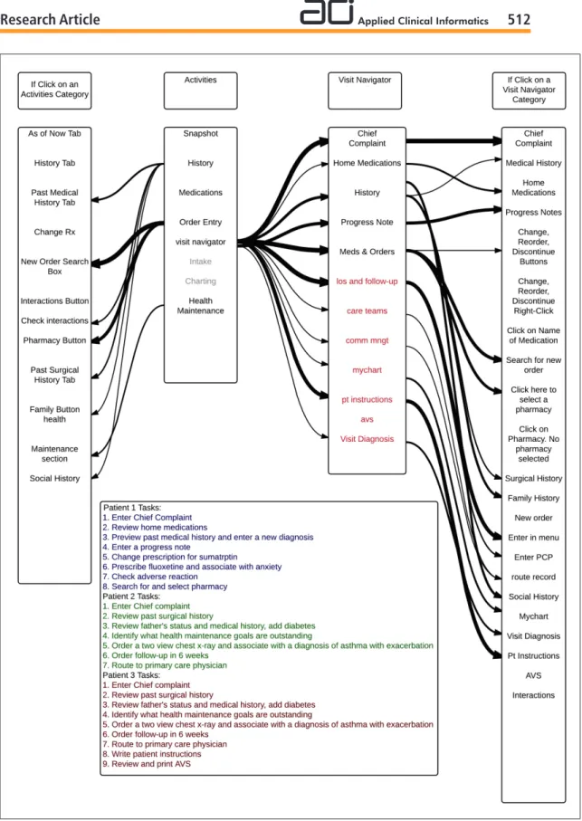
Think-aloud methods, where participants verbalize their thoughts while performing tasks, have also been shown to provide rich and valid data on non-observable cognitive aspects of the interface de-sign [6). For this study, each participant completed a set of tasks based on MU Stage 2 criteria for five patient cases. A third year resident and attending physician evaluated the cases to ensure they were of similar complexity. Participants completed two patient cases in the original navigator, two in the new navigator, and one in both navigators. The order of the cases and order of navigator use were randomized using a block design, with each participant completing patient case “Maggie” first in each navigator.
pro-vided clarification about the tasks within each case but did not provide any insight into how to per-form tasks or how well participants were perper-forming the tasks.
After completing each patient case, participants completed a Single Ease Question (SEQ) on a 7-point rating scale, to assess how difficult they found the case to be [11]. This process was repeated two more times for either the old or new navigator. Participants were then asked to complete the System Usability Scale (SUS) to provide information about their experiences with the navigator they just used [12]. At the completion of the session, each participant filled out a demographic question-naire and was asked to provide feedback about the patient cases, questionquestion-naires, and their overall ex-perience.
2.4 Analysis
We conducted three types of analyses. First, we quantitatively analyzed the time to complete the pa-tient cases, perceived complexity of each case via the SEQ, and usability of the navigator via the SUS rating. Second, we analyzed the navigation pathways (clicks) that participants took through the navigators to locate the assigned areas where they could complete the tasks. Third, the session re-cordings were reviewed and coded for themes. The two coders reviewed an overlapping sample of recordings (n=2), approximately 28% of the overall recordings (109.3 minutes), to assess reliability of the coding.
3. Results
3.1 Quantitative Analysis
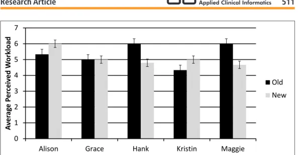
The first case that participants completed took significantly longer regardless of navigator the par-ticipant used. Therefore, the first case was excluded from further analysis as parpar-ticipants were likely learning and adjusting to the system. Each of the remaining five patient cases took similar amounts of time (
▶
Figure 3), and perceived workload on the SEQ did not vary significantly between the six patient cases, though this measure was overall relatively high for all cases (>5 out of 7 for all cases) (▶
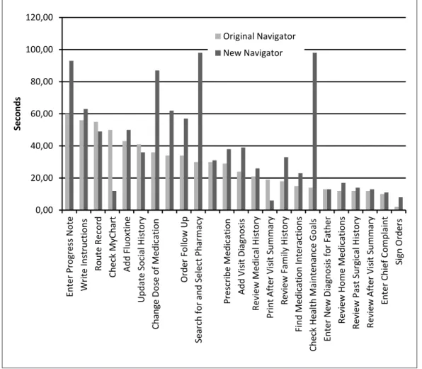
Figure 4). Taken together, these indicate that the cases were of similar difficulty, with all cases found to be fairly challenging.Somewhat surprisingly, average time to complete five of the six patient cases was longer in the new navigator. All participants completed the patient case ‘Maggie’ in both navigators, and it also took participants longer to complete this patient case in the new navigator despite random ordering for the two navigators for this case. Several individual tasks also took longer in the new navigator compared with the old navigator (
▶
Figure 4,▶
Figure 5). Scores on the SUS suggested that partici-pants had mixed preferences between the two navigators, with a slight not statistically significant overall preference for the new navigator. The average score for the original navigator was 73.8 (stan-dard deviation 14.97) and the average score for the new navigator was 78.4 (stan(stan-dard deviation 19.24).3.2 Pathway Analysis
Our navigation pathway analysis demonstrated numerous pathways are used and available for accomplishing many tasks. Between two and five pathways were used for each task, and for certain tasks other pathways were available but not used by participants. Regardless of which navigator was used, very little standardization was observed in navigation pathways between participants. Many tasks had at least three pathways used by participants, including reviewing home medications, changing a prescription, and searching for a pharmacy to e-prescribe medications. The task of re-viewing home medications had four possible pathways in the old navigator of which three were used; of the three available pathways in the new navigator for this same task, two were used. For the task of changing a prescription, there were four ways to complete the task in the old navigator with all four being used, and three ways to complete the task in the new navigator with all three used. Similarly, for the task of searching for a pharmacy, there were four ways to complete this task in the old navigator with all four used, and three ways in the new navigator with all three used.
Some of the ways participants navigated to the tasks were not anticipated, and with both navi-gators there were participants who failed to complete some tasks. For some tasks, additional path-ways were available but not used by any participants. This was the case even for simple tasks. Some pathways were unanticipated by those who did the redesign, most often when participants navigated to a task directly via the far left column buttons in the old navigator, without using the visit navi-gator. There were also several instances where participants used the “search” function to navigate to tasks that they had difficulty finding.
Despite the variation in pathways among participants, many buttons and links were not used. In the original navigator, there were 40 links in the visit navigator list, but participants only used 11 of them to complete the MU-related tasks (
▶
Table 2). In the new navigator, there were 23 links in the intake section and 15 links in the charting section (38 total links; 33 unique with 5 available in both intake and charting). Overall, participants used 12 of the links within either the intake or charting sections to complete the 22 MU stage 2 tasks, some of which were repeated more than once. This finding suggests that one consideration in the design of navigators would be to make common navi-gation options prominent and easy to find, while nesting less frequently used options within the navigation structure.High-level navigation patterns were also different depending on which navigator was used. Using the original navigator, participants frequently used both the buttons on the far left column and the links in the visit navigator (found after clicking ‘Visit Navigator’ button on the left column) to navi-gate to tasks. In the new navigator, participants used the modified large visit navigator links more often to switch between the 2 main groups of items (found after clicking ‘Intake’ or ‘Charting’ but-tons on the left column) because several of the butbut-tons on the far left and links in the original Visit Navigator were removed or were in the other part of the Navigator. While in some cases, partici-pants used the links found after going into the ‘Intake’ or ‘Charting’ portions of the new Navigator, in other cases, participants sought to use buttons on the far left. In these latter cases, users still had access to this full list of buttons but were required to go to the “More Activities” tab to access these buttons and potentially add them as customized options to the far left area.
3.3 Think Aloud Analysis
All participants verbally noted usability problems while completing most of the tasks. Many of the participants were confused by tasks such as checking the patient’s enrollment or access status for the patient portal. Participants expressed varied preferences for the navigators. With regard to the place-ment of links, one participant expressed a preference for the old navigator with links vertically ar-ranged on the side of the screen, saying that it was similar to what they were already using in the EHR. Another participant expressed a preference for the new navigator with links across the top of the screen because it reminded them of using a web browser. With regard to the number of buttons in the left column, one participant expressed a preference for the old navigator stating that having a greater number of categories made it easier to find things. Another participant expressed a prefer-ence for the reduced number of categories in the new navigator, saying of the original navigator “Do you really need all this stuff here?”
in-take and charting. Participants expressed confusion over which options were present in the inin-take and charting areas. One participant expressed, “I don’t know where that would be, maybe charting?” Because the chart automatically opened to the intake menu, it also took participants time to realize that there were two different navigator areas with different options.
4. Discussion
This study used patient cases and tasks that covered current MU Stage 2 requirements to perform a usability assessment of two ambulatory Navigators including a redesigned Navigator aimed to corre-late with clinical workflow. Our findings showed that navigating to the areas of that chart where clinicians can complete these common tasks is complex and requires careful attention by EHR de-signers. Participants expressed that the design of the navigator is important, and it appeared to affect their ability to perform tasks and their perceptions about the EHR. If the time required to complete this non-value-added task can be reduced, clinicians should be able to spend more time completing higher-value clinical tasks. The results of this study provide insight into factors that should be ac-counted for in the design process and implementation process when introducing a new navigator design. Despite the time and effort that was put into designing the new navigator, the new navigator did not have a strong impact on user performance. There are several possible explanations for this: it is possible that the two tier structure of the navigator introduced confusion and it is possible that despite efforts to reduce the number of options available, the available lists were still too long. Future research should explore these issues further.
Individual preferences for the high-level navigation structures varied greatly. There is currently a tension between EHR standardization and customization. It is unknown if there is an optimal way to complete tasks, however current workflows within EHRs often do not match preferred workflows [13]. It is possible that greater customization could help each user use the navigation patterns that are best for them. However, this would make sharing knowledge between users difficult. It is possi-ble that giving users a standard navigation pathway, even if it is not optimal would reduce confusion and improve usability. These are important issues that need further exploration. With many path-ways available, it is possible that having many options to complete the same introduced unnecessary confusion. However, eliminating pathways that individuals naturally choose introduces confusion well. The proper balance between these two choices remains unclear, and future work should ad-dress this in detail.
We observed that the navigator design did impact the pathways that participants used to com-plete tasks, indicating that navigator design is an important factor influencing user behavior. While the new navigator’s design encouraged more use of the navigator, it closed pathways that partici-pants preferred to use to use in the original navigator. Also, the new navigator may have introduced confusion about where tasks were located. Designers, IT staff, and EHR educators must therefore determine and weigh whether to place commonly used options as defaults to accommodate users’ natural navigation pathways, or to train users on how to efficiently navigate to tasks within the visit navigator and redesigned workflow. Interestingly, several participants commented verbally that tasks were perceived as easy, indicating a potential willingness to accept some difficulty while using the EHR. Additionally, it is possible that users’ previous experience and EHR effectiveness impacts the ability to adopt new tools. Because of our small sample size, we are unable to determine the effect of user expertise in the current study. This variable was not taken into account in this study. Future work should address this important variable.
nature of Meaningful Use, it was difficult to create sets of were of equal difficulty, and it was difficult to determine which tasks difficult for the majority of participants.
Our findings revealed several changes that could be made to the new navigator design to improve use. First, adjustments can be made to further clarify the two-tiered structure and make it clear that there are two separate lists of options. Lists of links can be further reduced to eliminate rarely used links. Finally, it should be investigated whether or not closing off some of the rarely used pathways improves user performance and satisfaction. Further work should be done to address simplifying the tasks that took longer in the new navigator. This analysis, however, has several limitations. It only includes time on task that participants successfully completed. Also, it only includes time from when a participant started reading a task out loud until the task was completed and excludes gaps between tasks.
This study has a number of limitations, including its small sample size and our use of only resi-dent physician subjects. While the study used an EHR test environment configured exactly as the production version, this study was conducted in a laboratory setting at a single academic health center and on a single EHR. The result therefore, may not be generalizable to a broader population of physicians, systems, and settings.
5. Conclusions
Overall, it appears that navigator design influences how EHRs are used and preferences for navi-gation are highly variable. This study confirms current anecdotes and frustrations about the many ways to complete a given task in an EHR. For each task, there were many different pathways used by participants. This flexibility accommodates differences in individual preferences, but may make for-mal training and peer-to-peer knowledge sharing more challenging. Regardless, all participants ex-perienced confusion while performing the tasks in both navigators, indicating that training on navi-gation structures including “preferred” pathways designed to be more efficient that may be benefi-cial.
Clinical Relevance Statement
This work is a step toward understanding how clinicians navigate through EHRs to complete MU-related clinical tasks. It explores what can be done to better serve clinicians performing MU-MU-related tasks.
Conflicts of Interest
The authors declare that they have no conflicts of interest in this research.
Human Subjects Protections
This study was preformed in compliance with World Medical Association Declaration of Helsinki on Ethical Principles for Medical Research Involving Human Subjects and was reviewed by the Uni-versity of Minnesota Institutional Review Board.
Acknowledgements
Fig. 1 Screenshot of a portion of the original ambulatory navigator (© 2015 Epic Systems Corporation. Used with permission).
0 100 200 300 400 500 600
Alison Grace Hank Kristin Maggie
A
ver
ag
e Time t
o Comple
te Case (sec
o
nds)
Old
New
Fig. 3 Average time to complete each patient case scenario
0,00 20,00 40,00 60,00 80,00 100,00 120,00
Enter Progress Note Write Instructions
Route Record
Check MyChart Add Fluoxtine
Update Social History
Change Dose of Medication
Order Follow Up
Search for and Select Pharmacy
Prescribe Medication Add Visit Diagnosis
Review Medical History
Print After Visit Summary
Review Family History
Find Medication Interactions
Check Health Maintenance Goals Enter New Diagnosis for Father
Review Home Medications
Review Past Surgical History Review After Visit Summary
Enter Chief Complaint
Sign Orders
Seconds
Original Navigator New Navigator
0 1 2 3 4 5 6 7
Alison Grace Hank Kristin Maggie
A
ver
ag
e
P
e
rc
eiv
e
d
W
o
rkload
Old New
Table 1
Meaningful Use tasks from set 1
Task Order
1 2 3 4 5 6 7 8 9
Description
Enter chief complaint Review home medications Review medical history
Enter a new diagnosis in past medical history Enter very brief progress note
Change dose of medication Enter a new prescription Check medication interaction
Search for and select pharmacy to e-prescribe
Table 2
Navigator characteristics
Description
Total Number of Activities Total Links Used by Participants
New Navigator
33 12
Old Navigator
References
1. Johnson CM, Johnson TR, Zhang J. A user-centered framework for redesigning health care interfaces. J Biomed Inform 2016; 38(1): 75–87.
2. Lowry SZ, Quinn MT, Ramaiah M, Schumacher RM, Patterson Emily S, North R, Zhang J, Gibbons MC, Abbott P. Technical Evaluation, Testing, and Validation of the Usability of Electronic Health Records. NIST Interagency/Internal Report (NISTIR) – 7804. 2012. Report No.: 7804.
3. Lowry SZ, Ramaiah M, Patterson ES, Vrick D, Gurses AP, Ozok A, Simmons D, Gibbons MC. Integrating Electronic Health Records into Clinical Workflow: An Application of Human Factors Modeling Methods to Ambulatory Care. NIST Interagency/Internal Report. 2011. Report No.: NISTIR 7988.
4. Abran A, Khelifi A, Suryn W, Seffah A. Usability meanings and interpretations in ISO standards. Software Quality Journal 2003; 11(4): 325-338.
5. Schumacher RM, Lowry SZ. NIST Guide to the Processes Approach for Improving the Usability of Elec-tronic Health Records. NIST Interagency/Internal Report (NISTIR). 2010. Report No.: 7741.
6. Boren MT, Ramey J. Thinking aloud: Reconciling theory and practice. IEEE Transactions on Professional Communication 2000; 43(3): 261-278.
7. Stage 2, 2015. Available from: https://www.cms.gov/Regulations-and-Guidance/Legislation/EHRIncen tivePrograms/Stage_2.html.
8. Han H, Lopp L. Writing and reading in the electronic health record: an entirely new world. Med Educ On-line 2013; 18: 1–7.
9. Zheng K, Padman R, Johnson MP, Diamond HS. An Interface-driven Analysis of User Interactions with an Electronic Health Records System. Journal of the American Medical Informatics Association : JAMIA 2008; 16(2): 228-237.
10.Jiajie Z. Better EHR: Usability, workflow and cognitive support in electronic health records. 1st ed. Zhang J and Walji M, editors. Jiajie Zhang, Muhammad Walji; 2014.
11.Sauro J, Dumas JS. Comparison of Three One-Question, Post-Task Usability Questionnaires. Greenberg, S Hudson, SE Hinkley, K RingelMorris, M Olsen,DR, editor. NEW YORK; 1515 BROADWAY, NEW YORK, NY 10036–9998 USA: ASSOC COMPUTING MACHINERY; 2009.
12.Brooke J. SUS: A “quick and dirty” usability scale. Usability evaluation in industry 1996: 189-194.
13.Saleem JJ, Flanagan ME, Wilck NR, Demetriades J, Doebbeling BN. The next-generation electronic health record: perspectives of key leaders from the US Department of Veterans Affairs. Journal of the American Medical Informatics Association 2013; 20(e1): e175-e177.